
鸿蒙原生应用 ArkUI 实战:横向滚动胶囊 + 自动续费开关卡 —— 订阅管理页的筛选与开关架构
鸿蒙原生应用 ArkUI 实战:横向滚动胶囊 + 自动续费开关卡 —— 订阅管理页的筛选与开关架构
App 54「订阅服务管理」订阅页(Func1Tab),主题色
#9B51E0梦幻紫,4 个 Tab 分别为首页(📺)、订阅(📋)、日历(📅)、统计(📊)。本篇基于54-sub-mgr/entry/src/main/ets/pages/Func1Tab.ets(共 101 行)逐段拆解,附 4 张实机截图。
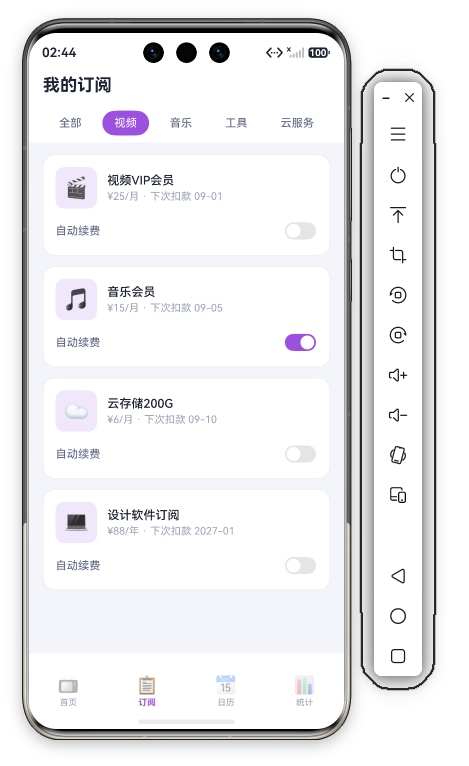
一、整体结构:三区"Header + 分类 + 列表"布局
订阅页是"分类筛选 + 订阅管理"的组合布局——3 个 @Builder 块:
build() {
  Column() {
    this.Header()
    this.CatRow()
    Scroll() {
      Column({ space: 12 }) {
        this.SubList()
      }
      .width('100%')
      .padding({ left: D.pad, right: D.pad, top: 14, bottom: D.pad + this.safeBottom + 20 })
    }
    .layoutWeight(1).scrollBar(BarState.Off).align(Alignment.Top)
  }
  .width('100%').height('100%').backgroundColor(C.bg)
}
3 块结构:Header(单行品牌头)→ CatRow(横向滚动分类胶囊)→ SubList(4 张含开关的订阅管理卡)。订阅页是"管理页"——先用分类胶囊筛选(全部/视频/音乐/工具/云服务),再对每项订阅做管理(查看下次扣款日、切换自动续费开关)。筛选 + 管理是本页核心职责,比首页的"只读总览"多了交互操作。
二、数据模型 + 状态翻转逻辑
interface Sub {
  id: number;
  emoji: string;
  name: string;
  price: number;
  cycle: string;
  nextDate: string;
  autoRenew: boolean;
}
@State subs: Sub[] = [
  { id: 1, emoji: '🎬', name: '视频VIP会员', price: 25, cycle: '月', nextDate: '09-01', autoRenew: true },
  { id: 2, emoji: '🎵', name: '音乐会员', price: 15, cycle: '月', nextDate: '09-05', autoRenew: true },
  { id: 3, emoji: '☁️', name: '云存储200G', price: 6, cycle: '月', nextDate: '09-10', autoRenew: false },
  { id: 4, emoji: '💻', name: '设计软件订阅', price: 88, cycle: '年', nextDate: '2027-01', autoRenew: true }
];
Sub 七字段:比首页多了 nextDate(下次扣款日)和 autoRenew(自动续费开关)。4 项订阅中云存储 autoRenew: false——演示数据刻意展示开关的两种状态。
private toggleRenew(item: Sub): void {
  item.autoRenew = !item.autoRenew;
  this.subs = this.subs.slice();
}
@State 数组更新经典写法:翻转 item.autoRenew 后用 this.subs = this.subs.slice() 浅拷贝触发重渲染——ArkUI 中 @State 数组的原地修改不触发刷新,必须重新赋值引用(slice())才更新 UI。
三、Header:单行标题
Header() {
  Column() {
    Text('我的订阅').fontSize(20).fontWeight(FontWeight.Bold).fontColor(C.text)
      .width('100%').padding({ top: this.safeTop + 10, left: D.pad, right: D.pad, bottom: 10 })
  }.width('100%').backgroundColor(C.card)
}
20 号加粗、safeTop + 10 顶边距、底部仅 10(比首页的 12 更小,因为下方紧跟分类胶囊行)。"我的订阅"是名词型标题(管理页),与首页"订阅管理"(主标题)区分主次。
四、CatRow:横向滚动分类胶囊
CatRow() {
  Scroll() {
    Row({ space: 10 }) {
      ForEach(this.cats, (c: string, idx: number) => {
        Text(c).fontSize(13)
          .fontColor(this.activeCat === idx ? '#FFFFFF' : C.textSub)
          .padding({ left: 14, right: 14, top: 7, bottom: 7 })
          .backgroundColor(this.activeCat === idx ? C.primary : C.card).borderRadius(16)
          .onClick(() => { this.activeCat = idx; })
      }, (c: string) => c)
    }
  }
  .scrollable(ScrollDirection.Horizontal).scrollBar(BarState.Off).width('100%')
  .padding({ left: D.pad, right: D.pad, top: 8, bottom: 8 }).backgroundColor(C.card)
}
逐点拆解:
- 横向滚动容器:
Scroll+.scrollable(ScrollDirection.Horizontal)——分类胶囊可横向滑动,scrollBar(BarState.Off)隐藏滚动条。 - 5 分类胶囊:全部/视频/音乐/工具/云服务——默认选中"全部"(
activeCat = 0)。 - 选中态:
activeCat === idx时紫底白字(C.primary),未选白底灰字(C.card)——与表单卡片的灰底胶囊(App 52/53)不同,这里用"白底 + 紫色选中"保持页面清爽,白底胶囊融入白色 Header 背景。 - 圆角 16:比表单胶囊(14)更圆——分类栏的胶囊更"药丸"形,视觉更柔和。
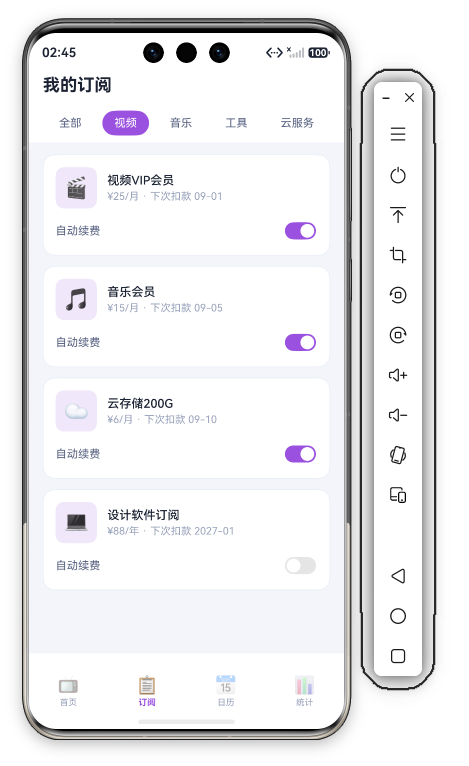
五、SubList:自动续费开关订阅卡
SubList() {
  Column({ space: 12 }) {
    ForEach(this.subs, (s: Sub) => {
      Column({ space: 12 }) {
        Row({ space: 12 }) {
          Row() { Text(s.emoji).fontSize(24) }
          .width(48).height(48).backgroundColor(C.primarySoft).borderRadius(D.rSm).justifyContent(FlexAlign.Center)
          Column({ space: 3 }) {
            Text(s.name).fontSize(14).fontWeight(FontWeight.Medium).fontColor(C.text)
            Text('¥' + s.price + '/' + s.cycle + ' · 下次扣款 ' + s.nextDate).fontSize(12).fontColor(C.textDim)
          }.alignItems(HorizontalAlign.Start).layoutWeight(1)
        }.width('100%')
        Row() {
          Text('自动续费').fontSize(13).fontColor(C.textSub).layoutWeight(1)
          Toggle({ type: ToggleType.Switch, isOn: s.autoRenew })
            .selectedColor(C.primary)
            .onChange(() => { this.toggleRenew(s); })
        }.width('100%')
      }
      .width('100%').padding(14).backgroundColor(C.card).borderRadius(D.rMd).border({ width: 1, color: C.stroke })
    }, (s: Sub) => s.id.toString())
  }.width('100%')
}
逐点拆解:
- 双行结构:上区(图标 + 名称 + 金额周期 + 下次扣款)、下区(自动续费标签 + Switch 开关)——信息区 + 操作区上下分离,比首页的单行列表多了操作层。
- 信息行:48×48 主色软底图标(
C.primarySoft淡紫)+ 14 号名称 + 12 号"¥25/月 · 下次扣款 09-01"——金额周期 + 下次扣款日一段式副文案,扣款日是订阅管理的关键信息。 - 自动续费开关:
Toggle({ type: ToggleType.Switch, isOn: s.autoRenew })+.selectedColor(C.primary)——紫色开关(开启时轨道变紫),每张卡独立开关状态。 - 开关即改即存:
onChange直接翻转状态,无保存按钮——开关操作无中间态、无需确认,所见即所得,这是管理页区别于"表单录入页"(App 52/53 有保存按钮)的核心差异。
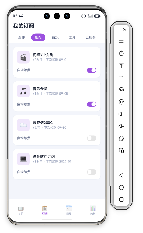
六、跨页数据自洽:订阅管理的全局闭环
{ id: 3, emoji: '☁️', name: '云存储200G', price: 6, cycle: '月', nextDate: '09-10', autoRenew: false },
private renewDays: number[] = [1, 5, 10, 18];
订阅页"下次扣款 09-01/09-05/09-10"与日历页续费日 [1, 5, 10, 18] 对应——扣款日期一致,日历页的紫色标记 = 订阅页的下次扣款日。订阅页 4 项与首页"4 项"统计一致;关掉续费 = 未来减少一笔支出,统计页趋势随之更新。
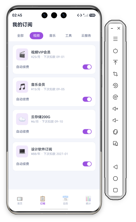
七、系列横向对比:管理型列表的开关应用
| 管理页 | 代表 App | 开关类型 | 开关范围 | 主题色 |
|---|---|---|---|---|
| 卡内开关 | App 54 订阅 | 每条独立开关 | 4 张卡 4 个开关 | #9B51E0 梦幻紫 |
| 全局开关 | App 53 保修 | 单一全局开关 | 一个开关管所有 | #00A862 生态绿 |
| 表单开关 | App 50 评价 | 录入时选择 | 提交时生效 | #5549A6 靛蓝 |
差异点:App 54 的"开关即列表管理"——每个订阅条目自带续费开关,列表既是浏览也是管理(不用进详情页就能关续费),"列表 + 开关"一体化是订阅管理的高效形态。App 53 的开关独立成卡(全局提醒),54 的开关嵌入每条卡片(逐项管理)。
八、开发者视角:调试与验证技巧
- @State 数组更新:
toggleRenew里item.autoRenew = !item.autoRenew; this.subs = this.subs.slice();——必须重新赋值数组引用(slice())才能触发 ForEach 重渲染,直接改item.autoRenew后不做 slice 的话 UI 不刷新,这是 ArkUI 状态管理的经典坑。 - 开关状态持久化:
autoRenew是内存态——应用重启后开关复位,产品化需 Preferences 持久化,并把开关状态同步到服务端/订阅平台。 - 分类筛选未实现:
activeCat切换只改选中态,列表未按分类过滤——产品化应在 ForEach 前过滤subs.filter(s => s.cat === activeCat)。 - 嵌套滚动:分类栏横向 Scroll、列表区纵向 Scroll——嵌套滚动时手势判定要小心,当前结构横向/纵向分区明确,无手势冲突。
九、演进方向
| 方向 | 当前状态 | 产品化演进 |
|---|---|---|
| 分类筛选 | 仅切换选中态 | subs.filter() 按分类过滤列表 |
| 开关持久化 | @State 内存态 | Preferences 存储 + 同步订阅平台 |
| 扣款提醒 | 仅展示扣款日 | 扣款前 3 天推送提醒 |
| 免费试用 | 无 | 标记试用订阅 + 倒计时提醒 |
| 取消续费 | 仅翻转开关 | 调用订阅平台取消接口 |
十、一句话总结
订阅页以"横向滚动分类胶囊 + 自动续费开关卡"完成了订阅的管理闭环。ScrollDirection.Horizontal 横向滚动分类栏(白底胶囊融合背景 + 紫色选中突出)、Toggle Switch 开关嵌入每张卡片(selectedColor 主紫 + onChange 即改即存)、this.subs.slice() 浅拷贝触发重渲染——101 行代码,一个"筛选分类 → 查扣款日 → 切续费"的订阅管理页,也是"列表 + 开关"一体化管理的标准范式。


作为“人工智能6S店”的官方数字引擎,为AI开发者与企业提供一个覆盖软硬件全栈、一站式门户。
更多推荐



 0
0 0
0- 0



 已为社区贡献388条内容

所有评论(0)