
鸿蒙原生应用 ArkUI 实战:@State 联动预览 + Slider —— 证件照编辑页的所见即所得架构
鸿蒙原生应用 ArkUI 实战:@State 联动预览 + Slider —— 证件照编辑页的所见即所得架构
App 51「个人证件照制作」编辑页(Func2Tab),主题色
#2D3436深灰黑(charcoal),4 个 Tab 分别为首页(🪪)、拍摄(📷)、编辑(✂️)、我的(👤)。本篇基于51-id-photo/entry/src/main/ets/pages/Func2Tab.ets(共 117 行)逐段拆解,附 4 张实机截图。
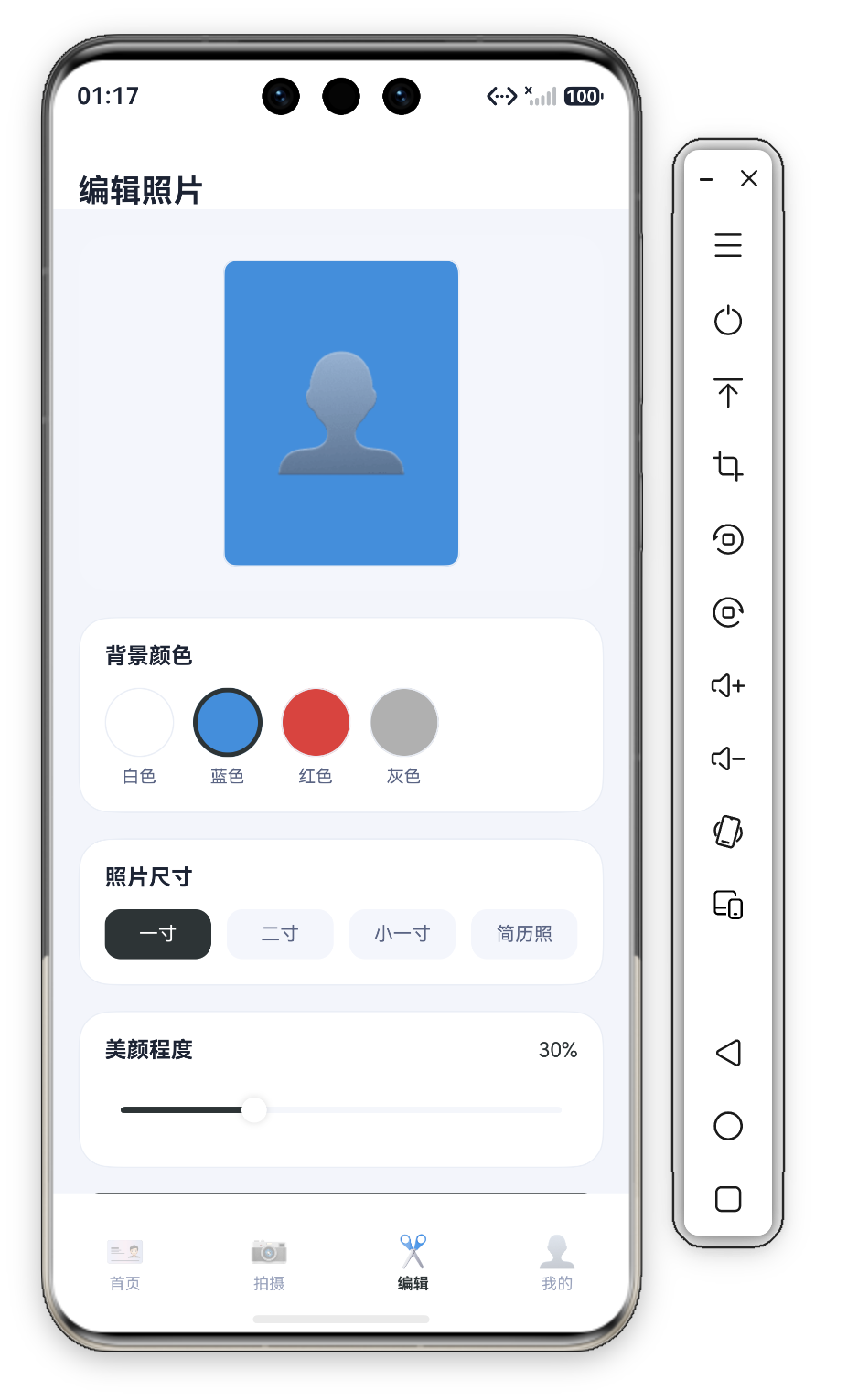
一、整体结构:六区"Header + 预览 + 背景 + 尺寸 + 美颜 + 保存"布局
编辑页是"品牌头部 + 实时预览 + 三项调整 + 保存"的六区布局——5 个 @Builder 块:
build() {
  Column() {
    this.Header()
    Scroll() {
      Column({ space: 16 }) {
        this.Preview()
        this.BgCard()
        this.SizeCard()
        this.BeautyCard()
        Button('保存到相册').fontSize(15).fontColor('#FFFFFF').backgroundColor(C.primary)
          .width('100%').height(48).borderRadius(D.rMd)
          .onClick(() => { promptAction.showToast({ message: '已保存证件照' }); })
      }
      .width('100%')
      .padding({ left: D.pad, right: D.pad, top: 16, bottom: D.pad + this.safeBottom + 20 })
    }
    .layoutWeight(1).scrollBar(BarState.Off).align(Alignment.Top)
  }
  .width('100%').height('100%').backgroundColor(C.bg)
}
6 块结构:Header → Preview(实时预览)→ BgCard(背景色)→ SizeCard(尺寸)→ BeautyCard(美颜 Slider)→ 保存按钮。三个 @State(activeBg/activeSize/beauty)贯穿全页——预览卡消费 activeBg 是"所见即所得"的核心联动。
二、三状态声明 + 数据模型
@State activeBg: number = 0;
@State activeSize: number = 0;
@State beauty: number = 30;
interface BgColor {
  id: number;
  name: string;
  color: string;
}
private bgs: BgColor[] = [
  { id: 1, name: '白色', color: '#FFFFFF' },
  { id: 2, name: '蓝色', color: '#438EDB' },
  { id: 3, name: '红色', color: '#D9433F' },
  { id: 4, name: '灰色', color: '#B0B0B0' }
];

private sizes: string[] = ['一寸', '二寸', '小一寸', '简历照'];
三个 @State:activeBg(背景色索引,默认 0 白色)、activeSize(尺寸索引,默认 0 一寸)、beauty(美颜 0-100,默认 30 轻度)。bgs 4 色对应证件照标准底色(白/蓝/红/灰),sizes 4 规格 = 首页 6 规格中的常用子集。
三、Preview:证件照实时预览
Preview() {
  Column() {
    Column() { Text('👤').fontSize(72) }
    .width(150).height(195).backgroundColor(this.bgs[this.activeBg].color).borderRadius(8)
    .justifyContent(FlexAlign.Center).border({ width: 1, color: C.stroke })
  }
  .width('100%').padding({ top: 16, bottom: 16 }).backgroundColor(C.cardSoft).borderRadius(D.rLg)
  .justifyContent(FlexAlign.Center)
}
逐点拆解:
- 证件照卡:150×195 对应 25×35mm 比例(5:7)+ 72 号 👤 + 圆角 8——与首页规格图块(40×52)同比例的放大版。
- 背景实时联动:
.backgroundColor(this.bgs[this.activeBg].color)——预览背景 = 当前选中背景色的实时值,activeBg驱动,点蓝背景预览即变蓝——所见即所得(改背景即时看效果)。 - 浅底容器:外层
C.cardSoft浅底圆角 20——预览卡放在浅色容器中,模拟"桌面上的一张证件照"。
四、BgCard:背景颜色选择(色圆 + 选中描边)
BgCard() {
  Column({ space: 12 }) {
    Text('背景颜色').fontSize(14).fontWeight(FontWeight.Bold).fontColor(C.text).width('100%')
    Row({ space: 12 }) {
      ForEach(this.bgs, (b: BgColor, idx: number) => {
        Column({ space: 6 }) {
          Column()
            .width(44).height(44).backgroundColor(b.color).borderRadius(22)
            .border({ width: this.activeBg === idx ? 3 : 1, color: this.activeBg === idx ? C.primary : C.stroke })
          Text(b.name).fontSize(11).fontColor(C.textSub)
        }.onClick(() => { this.activeBg = idx; })
      }, (b: BgColor) => b.id.toString())
    }.width('100%')
  }
  .width('100%').padding(16).backgroundColor(C.card).borderRadius(D.rLg).border({ width: 1, color: C.stroke })
}
逐点拆解:
- 44×44 色圆:
backgroundColor(b.color).borderRadius(22)——色圆底色即该背景色(白色圆/蓝色圆/红色圆/灰色圆),"所见即所点"。 - 选中描边:
width: this.activeBg === idx ? 3 : 1——选中 3 宽深描边 / 未选 1 宽浅描边,双重差异标记选中。 - 点击切换:
onClick(() => { this.activeBg = idx; })——切换activeBg,预览卡背景即时变化(联动 Preview)。
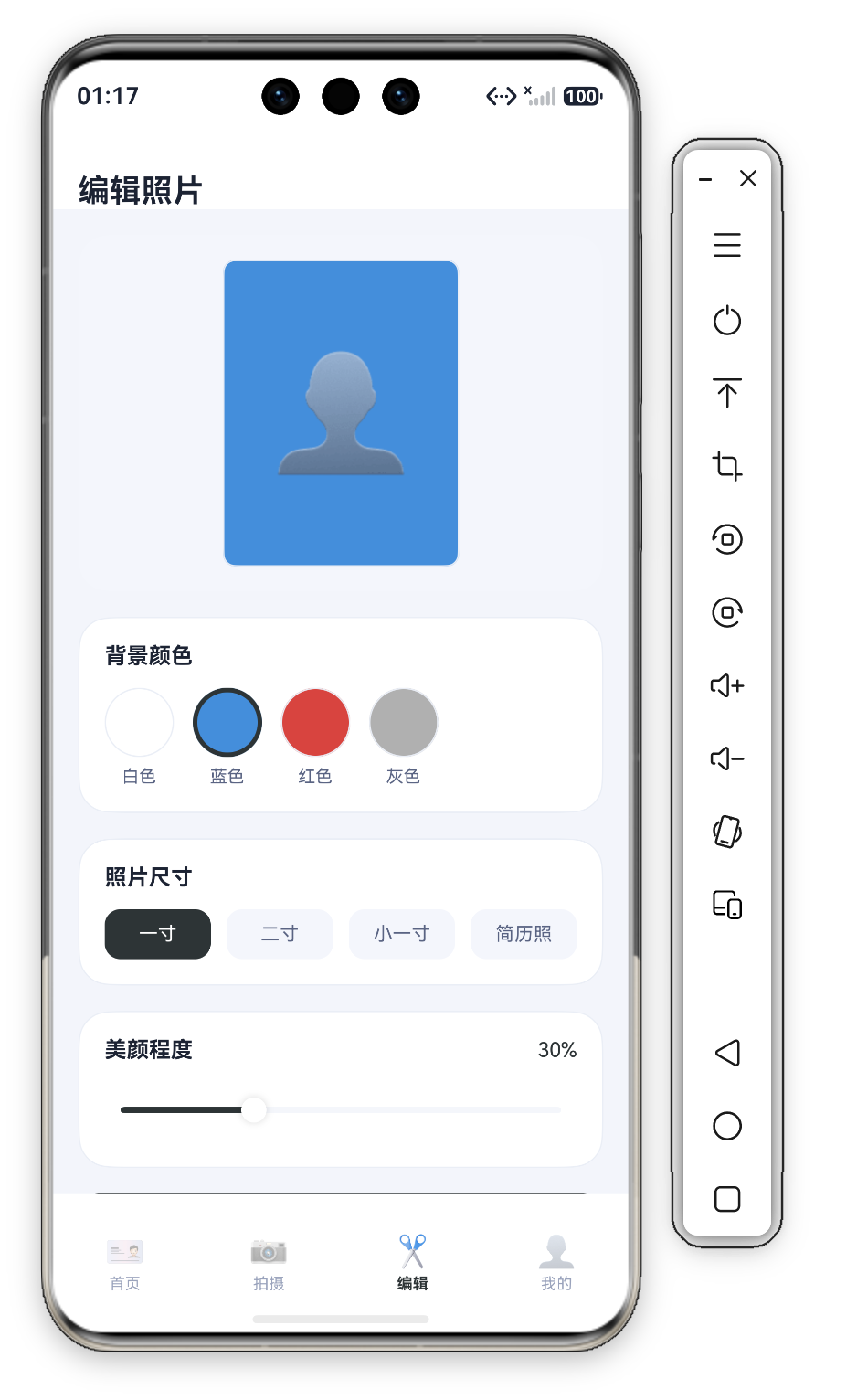
五、SizeCard:照片尺寸选择(等分胶囊)
SizeCard() {
  Column({ space: 12 }) {
    Text('照片尺寸').fontSize(14).fontWeight(FontWeight.Bold).fontColor(C.text).width('100%')
    Row({ space: 10 }) {
      ForEach(this.sizes, (s: string, idx: number) => {
        Text(s).fontSize(12)
          .fontColor(this.activeSize === idx ? '#FFFFFF' : C.textSub)
          .textAlign(TextAlign.Center).layoutWeight(1).padding({ top: 9, bottom: 9 })
          .backgroundColor(this.activeSize === idx ? C.primary : C.cardSoft).borderRadius(D.rSm)
          .onClick(() => { this.activeSize = idx; })
      }, (s: string) => s)
    }.width('100%')
  }
  .width('100%').padding(16).backgroundColor(C.card).borderRadius(D.rLg).border({ width: 1, color: C.stroke })
}
逐点拆解:
- 等分胶囊:四个
layoutWeight(1)平分,选中C.primary深底白字、未选C.cardSoft浅底灰字——系列标准胶囊选中。 - 尺寸与首页呼应:
['一寸', '二寸', '小一寸', '简历照']= 首页 6 规格中的 4 个——编辑页是首页常用规格的快捷选择。
六、BeautyCard:美颜程度 Slider(系列首次)
BeautyCard() {
  Column({ space: 10 }) {
    Row() {
      Text('美颜程度').fontSize(14).fontWeight(FontWeight.Bold).fontColor(C.text).layoutWeight(1)
      Text(this.beauty + '%').fontSize(13).fontColor(C.primary)
    }.width('100%')
    Slider({ value: this.beauty, min: 0, max: 100 })
      .selectedColor(C.primary).trackColor(C.cardSoft)
      .onChange((v: number) => { this.beauty = Math.round(v); })
  }
  .width('100%').padding(16).backgroundColor(C.card).borderRadius(D.rLg).border({ width: 1, color: C.stroke })
}
逐点拆解:
- Slider 滑块:
Slider({ value: this.beauty, min: 0, max: 100 })——系列首次 Slider 组件,0-100 美颜强度,默认 30(轻度自然,证件照需真实不过度)。 - 实时百分比:
Text(this.beauty + '%')——拖动滑块即时更新百分比,onChange((v) => { this.beauty = Math.round(v); })取整——拖动即反馈。 - selectedColor:
selectedColor(C.primary).trackColor(C.cardSoft)——已滑过深色(选中段)+ 未滑过浅色(底槽),深 = 已调、浅 = 未调。
七、保存按钮
Button('保存到相册').fontSize(15).fontColor('#FFFFFF').backgroundColor(C.primary)
  .width('100%').height(48).borderRadius(D.rMd)
  .onClick(() => { promptAction.showToast({ message: '已保存证件照' }); })
全宽深灰主按钮 48 高——保存是制作流水线的收尾。产品化后按"背景 + 尺寸 + 美颜"导出图片(ImagePacker)保存相册(@ohos.file.photoAccessHelper)+ 我的页"28 历史照片" +1。
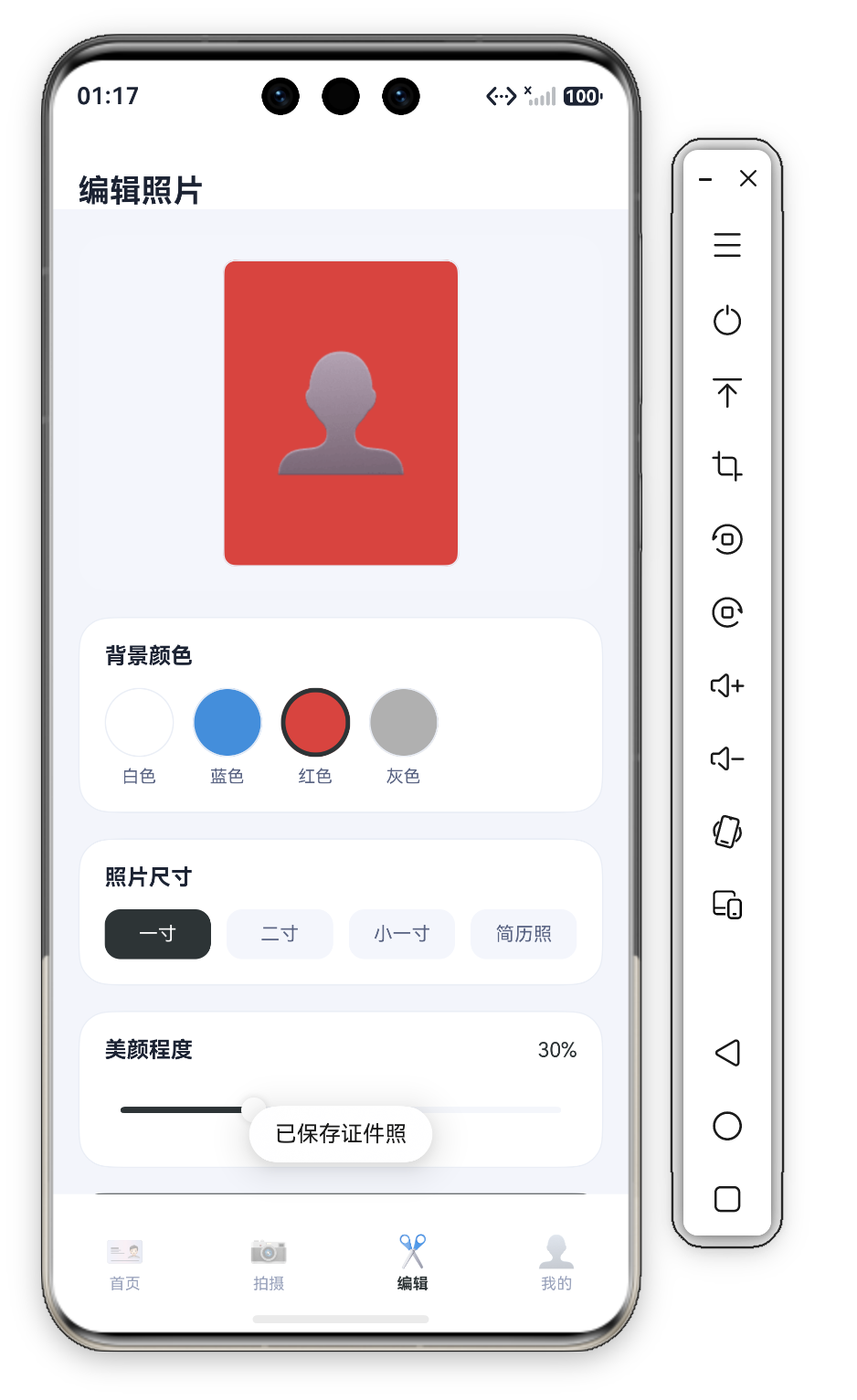
八、所见即所得:三状态联动的完整链路
.width(150).height(195).backgroundColor(this.bgs[this.activeBg].color).borderRadius(8)
.border({ width: this.activeBg === idx ? 3 : 1, color: this.activeBg === idx ? C.primary : C.stroke })
}.onClick(() => { this.activeBg = idx; })
联动链路:点击色圆(onClick 设 activeBg = idx)→ activeBg 变化触发重绘 → Preview 的 backgroundColor(this.bgs[this.activeBg].color) 更新 → BgCard 的 border 描边同步切换——一处状态变更,两处 UI 联动(预览背景 + 色圆描边),这是 ArkUI @State 声明式响应的核心机制。
九、系列横向对比:编辑器预览的三处联动
| 编辑器 | 代表页 | 预览联动 | 调整项 | 调节方式 |
|---|---|---|---|---|
| 明信片 | App 43 | 背景/祝福即时预览 | 背景/字体 | 离散选择 |
| 证件照 | App 51 编辑页 | 背景即时预览 | 背景/尺寸/美颜 | 离散 + 连续 |
| 记账 | App 47 收支 | 无预览 | 金额/分类 | 离散选择 |
差异点:App 43 明信片与 App 51 证件照是同款"状态驱动预览"模式(@State 驱动 Preview 的 backgroundColor)。本页新增 Slider 连续调节(美颜 0-100),拓展了系列的调节维度——离散选择(胶囊/色圆)+ 连续调节(Slider)的编辑器能力组合。
十、开发者视角:调试与验证技巧
- 预览联动验证:点击四个色圆确认预览背景即时变化(白/蓝/红/灰四色)、选中描边同步切换——
activeBg驱动 Preview 与 BgCard 双处。 - Slider 边界:拖动到 0(原图 0%)、100(重度 100%)——
Math.round(v)取整(显示 30% 而非 30.5%);默认值 30 的首屏显示。 - 尺寸胶囊选择:四个尺寸点击切换——
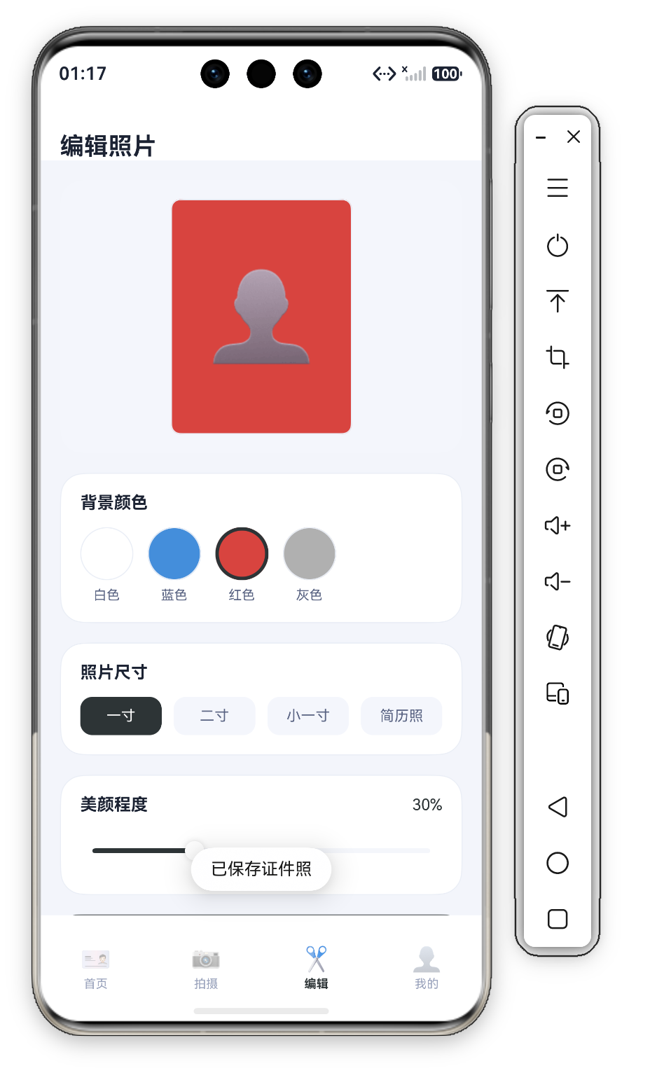
activeSize驱动选中态(深底白字 vs 浅底灰字)。 - 保存反馈:点击"保存到相册"——验证"已保存证件照" Toast。
- 深色按钮可读性:保存按钮深底白字、尺寸选中深底白字——
#2D3436白字对比度高;白色色圆 + 3 深描边对比明显。
十一、演进方向
| 方向 | 当前状态 | 产品化演进 |
|---|---|---|
| 智能抠图 | 手动选色圆换底 | @ohos.ai 图像分割一键抠图换底 |
| 尺寸联动 | 胶囊选规格,预览尺寸不变 | 预览卡按规格动态调整比例 |
| 美颜维度 | 单一 Slider(强度) | 多维:磨皮/美白/瘦脸各一 Slider |
| 合规提示 | 无 | 美颜 >70% 提示"证件照建议自然美颜" |
| 排版输出 | 单张保存 | 一版多张(6 张一寸排一张 5 寸相纸) |
十二、一句话总结
编辑页以"预览卡 + 背景/尺寸/美颜 + 保存"完成了证件照的加工。@State activeBg 驱动 backgroundColor 实时联动(所见即所得)、44×44 色圆选中 3 宽描边、layoutWeight(1) 等分胶囊、Slider 美颜 0-100 实时百分比(系列首次连续调节)——117 行代码,一个"改背景/调尺寸/美颜到满意"的编辑页,也是编辑器所见即所得模式的标准参考。


作为“人工智能6S店”的官方数字引擎,为AI开发者与企业提供一个覆盖软硬件全栈、一站式门户。
更多推荐



 3
3 0
0- 0



 已为社区贡献388条内容

所有评论(0)