
鸿蒙 ArkTS 声明式 UI 实战:从数据建模到多 Tab 业务页面的完整构建
一、鸿蒙开发背景与技术栈概览
鸿蒙操作系统(HarmonyOS)是华为面向万物互联时代打造的分布式操作系统,其应用开发框架 ArkUI 提供了一套全新的声明式 UI 范式,让开发者能够以极少的代码量构建出具备动效、状态驱动、跨设备适配能力的现代界面。在鸿蒙的整套开发体系中,ArkTS 是核心编程语言,它在 TypeScript 的基础上做了进一步的约束与增强——摒弃了 TypeScript 中部分灵活但容易引发运行时错误的特性(例如 any 类型的滥用、动态增删属性等),强制要求开发者在编译期就把类型约束写清楚,从而让 IDE 和编译器能够在第一时间发现潜在问题。这种"用严格换安全"的设计哲学,使得 ArkTS 特别适合大型团队协作和长期维护的项目。
ArkTS 的声明式 UI 范式,本质上是把"界面长什么样"和"界面随状态如何变化"这两件事彻底分离。开发者只需要用结构化的 DSL(Domain Specific Language)描述出界面的静态结构(例如一个 Column 里嵌套了几个 Row,每个 Row 里又放了 Text 和 Image),再通过状态装饰器(如 @State、@Prop、@Link、@Provide、@Consume 等)声明出哪些数据是驱动 UI 变化的"源",框架就会自动建立数据与视图之间的依赖关系。一旦状态变量发生改变,框架会精准地找到依赖这块数据的视图节点,只更新它们,而不触碰其他无关区域,这就是所谓的"精准刷新"。相比传统命令式 UI 中"手动 findViewById 再 setText"的模式,声明式 UI 大幅减少了样板代码,也让界面的可预测性更强。
ArkUI 组件体系由"容器组件"和"基础组件"两大类构成。容器组件本身不直接呈现内容,而是负责把子组件按照特定规则排列——例如 Column 负责纵向排列、Row 负责横向排列、Stack 负责层叠堆放、Flex 负责按弹性比例分配空间、Scroll 负责让超出视口的内容可滚动等。基础组件则承担具体的信息呈现与交互,例如 Text 渲染文字、Image 显示图片、Progress 展示进度、Toggle 表达开关、TextInput 接收用户输入等。容器与基础组件可以任意嵌套,形成一棵组件树,这棵树的根由 @Entry 装饰的 struct 提供,整棵树就是用户在屏幕上看到的页面。掌握容器与基础组件的组合规则,是写出高质量鸿蒙界面的基本功。
在状态管理层面,ArkTS 提供了一套分层的状态装饰器体系:@State 用于组件内部的可变状态,@Prop 用于父到子的单向同步,@Link 用于父子双向同步,@Provide/@Consume 用于跨层级的依赖注入,@StorageLink/@StorageProp 用于跨页面的全局状态。这套体系让不同粒度的状态都有合适的承载方式,避免了"所有状态都塞进一个全局 store"的过度集中,也避免了"状态散落在每个组件里难以同步"的过度分散。在本案例中,主要使用的是 @State,因为业务逻辑集中在一个入口页面内,所有交互都在该页面内部完成,无需跨组件传递。
二、项目整体结构与数据建模
在动手写界面之前,先理清业务领域的数据模型是良好工程实践的第一步。本案例是一个"肌肤检测医美"场景的应用,涉及检测维度、护理步骤、商品、对比档案、医美项目、订单六类核心数据。每一类数据都用一个 interface 做了清晰的类型定义。下面这段代码展示了五个核心 interface 的定义:
interface DimT10 {
  id: number
  name: string
  score: number
  level: string
  icon: string
}

interface StepT10 {
  id: number
  phase: string
  product: string
  note: string
  freq: number
  on: boolean
}

interface GoodT10 {
  id: number
  name: string
  brand: string
  price: number
  orig: number
  tag: string
  sold: number
  icon: string
}
这段代码定义了三个数据接口。DimT10 描述的是肌肤检测的一个维度,例如"水分度"“油脂分泌"等,包含 id(唯一标识)、name(维度名称)、score(0 到 100 的得分)、level(文字等级,如"偏干”“适中”)、icon(emoji 图标)。StepT10 描述的是护肤方案中的一个步骤,phase 字段用"早"“晚”“周护理"来区分时段,product 是产品名,note 是使用备注,freq 是每周使用频次,on 是布尔值表示该步骤是否启用。GoodT10 描述的是商城商品,除了常规的 name、brand、price、icon 外,还有 orig(原价,用于展示划线价)、tag(营销标签,如"闭口救星”)、sold(已售数量,用于营造热销氛围)。
在 ArkTS 中,interface 是定义数据形状的标准方式。与 TypeScript 不同,ArkTS 的 interface 不允许定义方法体,只能声明纯数据字段,这保证了数据层的"纯数据"特征,避免把业务逻辑混入数据结构中。
继续看剩下的三个 interface:
interface SnapT10 {
  id: number
  date: string
  score: number
  pore: number
  melanin: number
  note: string
}

interface ProjT10 {
  id: number
  name: string
  cate: string
  price: number
  times: number
  desc: string
  hot: boolean
}

interface OrdT10 {
  id: number
  name: string
  state: string
  date: string
  price: number
}
SnapT10 是"对比快照",记录某次检测的完整结果,除了综合 score 外,还单独保存了 pore(毛孔得分)和 melanin(黑色素得分),note 是本次检测的文字总结,例如"A 醇第 6 周,脸颊泛红减轻"。ProjT10 是医美项目,cate 是分类(光电梯、注射类、化学剥脱等),times 是疗程次数,hot 是是否为热门项目。OrdT10 是订单,state 用字符串"待到店"“已发货”"已完成"来表示状态,这种用字符串而非枚举的做法在小型应用里很常见,可读性好且易于扩展。
把数据模型放在文件最顶部,是鸿蒙工程的推荐做法。这样无论是界面层还是工具函数,都能在编译期就获得完整的类型检查,避免运行时才发现字段拼错。
三、写死数据常量:业务数据的静态来源
定义完接口后,接下来用 const 声明了一批静态数据数组。这些数组在应用启动时就存在,作为列表渲染的数据源。下面是检测维度和护理步骤的数据:
const DIMS10: Array<DimT10> = [
  { id: 1, name: '水分度', score: 62, level: '偏干', icon: '💧' },
  { id: 2, name: '油脂分泌', score: 78, level: '适中', icon: '🫧' },
  { id: 3, name: '毛孔状态', score: 54, level: 'T区粗大', icon: '🔎' },
  { id: 4, name: '黑色素', score: 47, level: '轻度沉着', icon: '🌗' },
  { id: 5, name: '平滑度', score: 71, level: '轻微粗糙', icon: '✨' },
  { id: 6, name: '敏感度', score: 83, level: '耐受良好', icon: '🌿' },
  { id: 7, name: '细纹弹性', score: 66, level: '初老阶段', icon: '🌸' }
]

const STEPS10: Array<StepT10> = [
  { id: 1, phase: '早', product: '氨基酸洁面', note: '温水 30 秒轻柔打圈', freq: 1, on: true },
  { id: 2, phase: '早', product: 'VC 精华 15%', note: '抗氧化 + 提亮,白天必备', freq: 1, on: true },
  { id: 3, phase: '早', product: '清爽防晒 SPF50+', note: '两指法则,每 3 小时补涂', freq: 1, on: true },
  { id: 4, phase: '晚', product: '卸妆油乳', note: '仅化妆日使用,乳化彻底', freq: 4, on: false },
  { id: 5, phase: '晚', product: 'A 醇 0.3%', note: '隔晚使用,建立耐受期', freq: 4, on: true },
  { id: 6, phase: '晚', product: '神经酰胺面霜', note: '修护屏障,A 醇后必须叠加', freq: 7, on: true }
]
DIMS10 包含了 7 个肌肤维度的数据,覆盖了水分、油脂、毛孔、黑色素、平滑度、敏感度、细纹弹性这七个最常被关注的指标。每个维度的 score 不同,对应的 level 文字也不同,这些数据会在检测 Tab 里以横条形进度条的形式逐行展示,并且根据得分高低用不同的颜色区分(高分为绿色、中分为黄色、低分为红色)。STEPS10 则是护肤流程,按"早"“晚”“周护理"三个时段组织,每个步骤的 note 字段写得非常专业,比如"A 醇后必须叠加神经酰胺面霜修护屏障”,这种文案体现了医美应用的专业性。
在 ArkTS 中,使用
Array<DimT10>这种泛型数组写法,比DimT10[]更受推荐,因为它在编译期能做更严格的类型推断,也方便配合 slice、filter、map 等数组方法做不可变更新。
商品、快照、医美项目、订单的数据也以同样的方式声明:
const GOODS10: Array<GoodT10> = [
  { id: 1, name: '多酸焕肤精华液', brand: 'DR.WU', price: 329, orig: 459, tag: '闭口救星', sold: 2361, icon: '🧪' },
  { id: 2, name: 'A醇抗皱晚霜', brand: '露得清', price: 199, orig: 269, tag: '回购王', sold: 5872, icon: '🌙' },
  { id: 3, name: '积雪草修护面膜', brand: '蒂佳婷', price: 89, orig: 129, tag: '敏感肌', sold: 8963, icon: '🌿' },
  { id: 4, name: '烟酰胺身体乳', brand: '凡士林', price: 69, orig: 99, tag: '鸡皮克星', sold: 12306, icon: '🧴' }
]

const SNAPS10: Array<SnapT10> = [
  { id: 1, date: '2026-08-26', score: 72, pore: 54, melanin: 47, note: 'A 醇第 6 周,脸颊泛红减轻' },
  { id: 2, date: '2026-07-30', score: 68, pore: 58, melanin: 50, note: '出差防晒不到位,斑点略深' },
  { id: 3, date: '2026-06-28', score: 65, pore: 60, melanin: 52, note: '刷酸建立期,下巴闭口爆发' },
  { id: 4, date: '2026-05-26', score: 63, pore: 61, melanin: 53, note: '初次建档,油脂偏高' }
]

const ORDS10: Array<OrdT10> = [
  { id: 1, name: '光子嫩肤 DPL 第 2 次', state: '待到店', date: '2026-09-05 14:30', price: 0 },
  { id: 2, name: '水光针 补水款', state: '已完成', date: '2026-08-02 10:00', price: 880 },
  { id: 3, name: '舒敏之星 导入', state: '已完成', date: '2026-07-12 15:00', price: 380 },
  { id: 4, name: 'A醇抗皱晚霜 ×2', state: '已发货', date: '2026-08-20', price: 398 }
]
这三组数据分别服务于商城 Tab、档案 Tab 和"我的"Tab。GOODS10 里每件商品都设置了原价 orig 高于现价 price,用于展示划线折扣;tag 字段是营销短词,会作为小标签贴在商品卡片左上角;sold 字段营造热销氛围。SNAPS10 是按时间倒序排列的检测快照,最新的排在最前,可以看到 score 从最早的 57 一路上升到 72,呈现一个明显的改善曲线,这正好支撑档案页的趋势柱状图。ORDS10 则混合了医美项目预约和商品购买两类订单,state 字段用文字表示状态,后续会有一个工具函数把状态文字映射成颜色。
除了上述六个主要数据源,还有三个小型常量数组用于弹框内的选项:
const BANNER10: Array<string> = ['🌸 秋季修护季 · 检测免费领面膜', '💧 水光节 第 2 人半价', '✨ 医美双 9 大促定金翻倍']
const SLOT10: Array<string> = ['10:00', '11:00', '13:30', '14:30', '15:30', '16:30']
const SKIN10: Array<string> = ['干性', '油性', '混合', '敏感', '耐受']
BANNER10 是顶部横滑的活动横幅文案,每条都是一句话营销文案,配合 emoji 增强视觉吸引力。SLOT10 是预约检测时可选择的到店时段。SKIN10 是肤质自评的可选项。这三个数组都很短,但它们让界面的数据来源统一,修改文案时只需改一处。
把所有写死数据集中在文件顶部,是一种"数据与视图分离"的轻量实践。即便没有引入正式的状态管理框架,也能让后续替换为接口请求时改动最小——只需要把 const 改成异步赋值即可。
四、工具函数:得分到颜色、状态到颜色的映射
界面层经常需要"根据某个数值返回对应颜色"这类纯函数逻辑。把它们抽成独立函数,既能在多个地方复用,又方便单独测试。本案例有两个这样的工具函数:
function dimColor10(s: number): string {
  if (s >= 75) {
    return '#0CA678'
  }
  if (s >= 55) {
    return '#F59F00'
  }
  return '#E64980'
}

function ordStateColor10(s: string): string {
  if (s === '待到店') {
    return '#F59F00'
  }
  if (s === '已发货') {
    return '#3B5BDB'
  }
  return '#0CA678'
}
dimColor10 接收一个 0 到 100 的得分,返回三种颜色之一:75 分及以上返回绿色 #0CA678(表示状态良好)、55 到 74 分返回橙色 #F59F00(表示需要关注)、55 分以下返回粉色 #E64980(表示问题较严重)。这种"分段配色"是仪表盘类界面的常见手法,让用户一眼就能从颜色判断哪个指标需要重视。ordStateColor10 则把订单状态文字映射成颜色:待到店用橙色提醒、已发货用蓝色表示运输中、已完成用绿色表示完结。
工具函数使用 function 关键字声明在 struct 外部,是 ArkTS 中唯一允许的"自由函数"形式。注意它们是纯函数——相同输入永远得到相同输出,没有副作用,这使得它们在任何上下文中调用都是安全的。
这两个函数虽然简单,但体现了"配色策略集中管理"的思想。如果未来要把绿色改成另一种色号,只需修改这一个函数,所有用到它的地方会同步生效。如果把这些颜色值硬编码在每个 Text 的 fontColor 里,一旦品牌色调整,就要满文件地找替换,极易遗漏。
五、页面入口与状态变量声明
理清数据后,进入页面本体的编写。鸿蒙的页面是一个被 @Entry 和 @Component 装饰的 struct。@Component 表示这是一个可复用的组件单元,@Entry 表示它是整个页面树的根节点,会被框架作为入口挂载到窗口上。一个 ets 文件只能有一个 @Entry。下面是入口 struct 的开头和核心状态变量:
@Entry
@Component
struct Index {
  @State curTab10: number = 0
  @State dims10: Array<DimT10> = DIMS10.slice()
  @State steps10: Array<StepT10> = STEPS10.slice()
  @State goods10: Array<GoodT10> = GOODS10.slice()
  @State snaps10: Array<SnapT10> = SNAPS10.slice()
  @State orders10: Array<OrdT10> = ORDS10.slice()
}
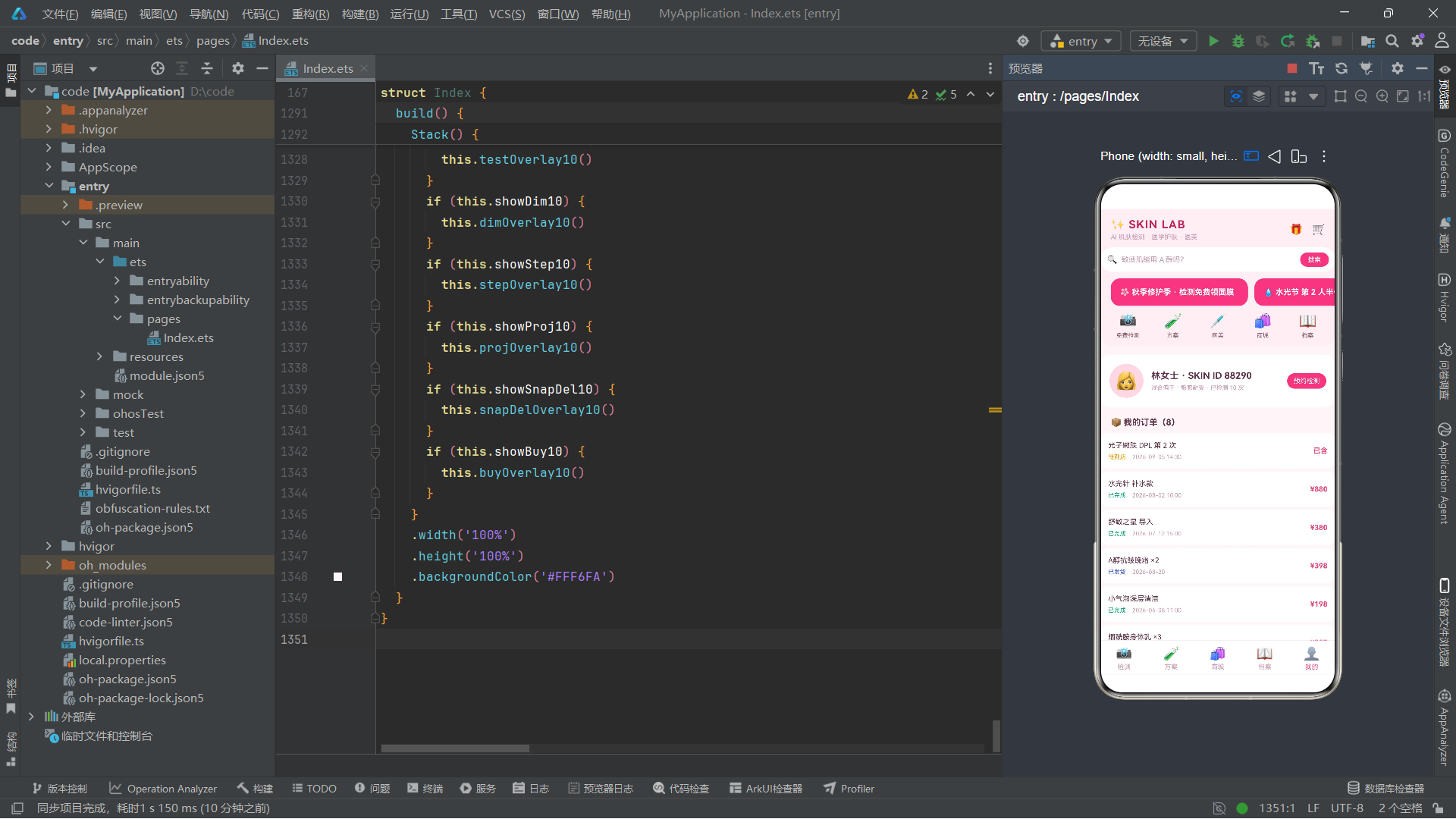
curTab10 是当前选中的底部 Tab 索引,0 到 4 分别对应检测、方案、商城、档案、我的。dims10、steps10、goods10、snaps10、orders10 是五份业务数据的"可变副本"——注意它们都用 .slice() 复制了一份,而不是直接引用常量本身。这是一个关键细节:因为 @State 变量是可变的,如果直接引用常量,后续的修改会污染原始数据;用 slice() 创建一份浅拷贝,原始常量始终保持不变,相当于一份"安全底稿"。
@State 装饰器是 ArkUI 状态管理的基础。被它装饰的变量一旦发生赋值,框架会自动触发依赖该变量的视图重新渲染。但要注意,@State 的变化检测是基于赋值(重新赋值整个变量)或数组整体替换的,直接 push、splice 修改数组元素不会触发刷新,所以本案例里凡是改数组的地方都用 map、filter 返回新数组再赋值。
紧接着是六个弹框开关状态:
  // 弹框开关
  @State showTest10: boolean = false
  @State showDim10: boolean = false
  @State showStep10: boolean = false
  @State showProj10: boolean = false
  @State showSnapDel10: boolean = false
  @State showBuy10: boolean = false
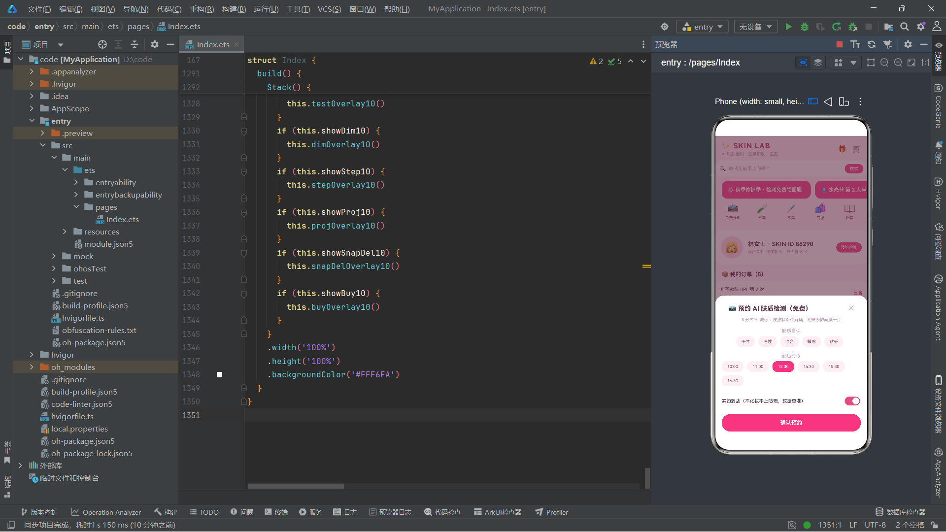
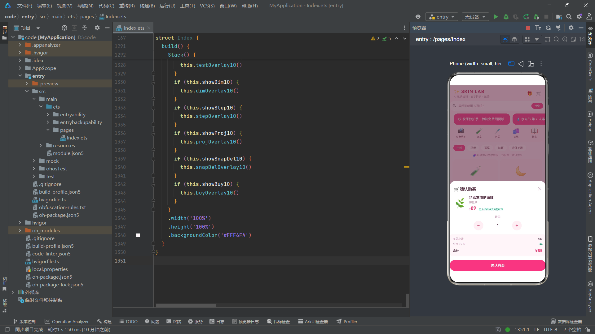
每个弹框对应一个布尔变量,true 时显示,false 时隐藏。这种"一个布尔管一个弹框"的模式在中小型应用里足够清晰,如果弹框数量更多,可以考虑用一个枚举加 currentDialog 单变量来管理,避免多个布尔同时为 true 的混乱。这里六个弹框分别是:预约检测、维度解读、编辑步骤、医美项目、删除快照、商品购买。
之后是一组与具体业务交互相关的状态:
  // 检测预约
  @State tSlot10: number = 2
  @State tBare10: boolean = true

  // 维度详情
  @State dimId10: number = 0

  // 方案步骤编辑
  @State stepId10: number = 0
  @State stepProd10: string = ''
  @State stepNote10: string = ''
  @State stepFreq10: number = 1

  // 项目详情
  @State projId10: number = 0

  // 删除对比记录
  @State snapId10: number = 0
  @State armed10: boolean = false

  // 购买
  @State buyId10: number = 0
  @State buyQty10: number = 1
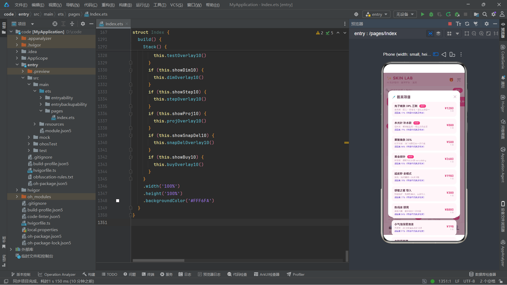
tSlot10 是选中的时段索引(默认第 3 个 13:30),tBare10 是"素颜到店"开关默认开启。dimId10、projId10、snapId10、buyId10 分别记录当前弹框要展示的"目标对象 id"——这是弹框复用的关键:弹框本身只有一份,通过改变 id 来切换它展示的内容。stepId10 为 0 时表示"新增",非 0 时表示"编辑某条已存在的步骤",配合 stepProd10、stepNote10、stepFreq10 三个字段承载表单输入。armed10 是"已知晓危险操作"的二次确认开关,删快照时必须先打开它才能点确认。buyQty10 是购买数量,默认 1。
把弹框的"显示开关"和"目标 id"分开声明,是让弹框组件保持"无状态复用"的常见技巧。弹框只关心"我该显示什么",不关心"是谁点开了我",这样同一种弹框可以被页面里任意位置触发。
六、aboutToAppear 生命周期与 animateTo 动画
struct 提供了几个生命周期回调,aboutToAppear 是最常用的一个——它在组件即将被挂载到组件树之前调用,适合做初始化。本案例在 aboutToAppear 里启动了两个无限循环动画:
  aboutToAppear(): void {
    this.getUIContext().animateTo({ duration: 1300, iterations: -1, playMode: PlayMode.Alternate, curve: Curve.EaseInOut }, () => {
      this.sparkleOp10 = 1
    })
    this.getUIContext().animateTo({ duration: 1800, iterations: -1, playMode: PlayMode.Alternate, curve: Curve.EaseInOut }, () => {
      this.shineX10 = 50
    })
  }
这里用到了两个状态变量 sparkleOp10(初始 0.3)和 shineX10(初始 -50),它们分别控制"标语闪烁透明度"和"banner 高光横向位移"。animateTo 接收两个参数:第一个是动画配置对象,第二个是闭包——闭包里只写"状态变量的目标值",框架会自动在 duration 时间内,按 curve 指定的曲线,把变量从当前值平滑过渡到目标值。
第一个动画 duration 1300 毫秒,iterations 设为 -1 表示无限循环,playMode 设为 Alternate 表示正向播放完后再反向播放(即从 0.3 到 1,再从 1 到 0.3,如此往复),curve 用 EaseInOut 让动画在开头和结尾减速、中间加速,整体感觉像呼吸一样自然。第二个动画控制 shineX10 从 -50 到 50 来回滑动,让 banner 上的高光✨图标来回扫动,模拟"光泽流动"的视觉效果。
animateTo 是 ArkUI 的命令式动画 API。与使用 animation 属性装饰器的"属性动画"不同,animateTo 可以精确控制时长、迭代次数、播放模式、插值曲线,并且能够通过闭包同时驱动多个状态变量的动画,非常适合需要循环或精细控制的场景。
注意这里用的是 this.getUIContext().animateTo(...) 而不是直接 animateTo(...)。getUIContext() 返回当前组件所在的 UIContext,通过它调用 animateTo 是鸿蒙较新版本推荐的做法,能确保动画运行在正确的 UI 上下文中,避免多实例或组件未完全挂载时的异常。aboutToAppear 时机比较靠前,此时组件树还在构建中,通过 getUIContext() 获取上下文后再启动动画,能保证动画挂载的稳定性。
七、头部构建:headerBar10 与电商美妆风格
界面构建从顶部头部开始。头部被抽成了一个 @Builder 方法 headerBar10,它包含品牌行、搜索条、横滑 banner、金刚区四个区块。先看品牌行和搜索条:
  @Builder headerBar10() {
    Column() {
      Row() {
        Column() {
          Text('✨ SKIN LAB').fontSize(17).fontWeight(700).fontColor('#C2255C').letterSpacing(1)
          Text('AI 肌肤检测 · 医学护肤 · 医美').fontSize(10).fontColor('#C99BB4').margin({ top: 3 })
        }
        .alignItems(HorizontalAlign.Start)
        .layoutWeight(1)

        Row() {
          Text('🎁').fontSize(16)
          Text('🛒').fontSize(16).margin({ left: 14 })
        }
        .alignItems(VerticalAlign.Center)
      }
      .width('100%')
      .padding({ left: 16, right: 16, top: 14, bottom: 10 })
最外层是 Column,因为头部四个区块是纵向排列的。第一个区块是一个 Row,左右分布:左侧是一个 Column 容纳品牌名和副标题,用 layoutWeight(1) 占据剩余宽度,alignItems(HorizontalAlign.Start) 让文字左对齐;右侧是一个 Row 放两个图标按钮(礼品、购物车)。这种"左侧主信息 + 右侧操作图标"是移动端顶栏的经典布局。SKIN LAB 用了较深的玫红 #C2255C,副标题用浅一些的 #C99BB4,形成层次。
@Builder 是 ArkTS 的构建器装饰器。被它装饰的方法返回一段 UI 描述,可以在其他地方通过
this.xxx()调用,相当于把一段界面"封装成可复用的片段"。与 @Component 不同,@Builder 不会产生独立组件实例,它更像是"代码片段的引用",访问外层 this 的状态变量没有额外的同步开销,非常适合在同一个 struct 内拆分界面。
接下来是搜索条:
      Row() {
        Text('🔍').fontSize(13)
        Text('敏感肌能用 A 醇吗?').fontSize(11).fontColor('#C99BB4').margin({ left: 6 }).layoutWeight(1)
        Text('搜索').fontSize(10).fontColor('#FFFFFF').padding({ left: 12, right: 12, top: 5, bottom: 5 }).borderRadius(12).backgroundColor('#E64980')
      }
      .width('100%')
      .padding({ left: 10, right: 10, top: 8, bottom: 8 })
      .borderRadius(20)
      .backgroundColor('#FFFFFF')
      .margin({ left: 16, right: 16, bottom: 10 })
搜索条是一个 Row,左侧放大镜 emoji,中间放占位文案"敏感肌能用 A 醇吗?"(用 layoutWeight(1) 撑满中间),右侧放一个粉色"搜索"按钮。整个 Row 设了 borderRadius(20) 做成胶囊形,背景白色,让它从粉色头部里"浮"出来。注意占位文案直接用 Text 显示而非 TextInput——这种"假搜索条"在展示型应用里很常见,点击后通常跳转到真正的搜索页。
接着是横滑 banner:
      Scroll() {
        Row() {
          ForEach(BANNER10, (b: string) => {
            Stack() {
              Column() {
                Text(b).fontSize(12).fontWeight(700).fontColor('#FFFFFF')
              }
              .width(210)
              .alignItems(HorizontalAlign.Start)
              .padding(14)
              .borderRadius(14)
              .backgroundColor('#E64980')
              Text('✨').fontSize(14).translate({ x: this.shineX10 }).opacity(0.85)
            }
            .width(210)
            .alignContent(Alignment.End)
            .margin({ right: 10 })
          }, (b: string) => 'bn' + b)
        }
        .padding({ left: 16, right: 16 })
      }
      .scrollable(ScrollDirection.Horizontal)
      .scrollBar(BarState.Off)
      .width('100%')
      .margin({ bottom: 10 })
外层 Scroll 设了 scrollable(ScrollDirection.Horizontal) 让它横向滚动,scrollBar(BarState.Off) 隐藏滚动条保持美观。内部是一个 Row 横向排列所有 banner 卡片,每张卡片用 Stack 层叠:底层是粉色的 Column 装文案,上层是一个✨图标,通过 translate({ x: this.shineX10 }) 让它横向位移——还记得 aboutToAppear 里的第二个动画吗?shineX10 在 -50 到 50 之间来回变化,这个✨就在 banner 右侧来回扫动,形成"高光流过"的效果。
ForEach 是 ArkUI 的列表渲染指令。它接收三个参数:数据源数组、子项渲染函数、键值生成函数。键值函数(第三个参数)非常重要——它让框架能够通过 key 判断哪些项是新增、哪些是删除、哪些是移动,从而做最小化 diff 更新,避免整列表重建。这里用 ‘bn’ + b 把文案转成 key,虽然简单但保证了唯一性。
最后是金刚区(快捷入口):
      Row() {
        ForEach([['📸', '免费检测'], ['🧪', '方案'], ['💉', '医美'], ['🛍️', '商城'], ['📖', '档案']], (e: Array<string>) => {
          Column() {
            Text(e[0]).fontSize(22)
            Text(e[1]).fontSize(9).fontColor('#8A5A6E').margin({ top: 4 })
          }
          .alignItems(HorizontalAlign.Center)
          .layoutWeight(1)
          .onClick(() => {
            if (e[1] === '免费检测') {
              this.curTab10 = 0
            }
            if (e[1] === '方案') {
              this.curTab10 = 1
            }
            if (e[1] === '医美') {
              this.showProj10 = true
            }
            if (e[1] === '商城') {
              this.curTab10 = 2
            }
            if (e[1] === '档案') {
              this.curTab10 = 3
            }
          })
        }, (e: Array<string>) => 'kg' + e[1])
      }
      .width('100%')
      .padding({ left: 8, right: 8, bottom: 12 })
金刚区是五个等宽的快捷入口,用 Row + 每项 layoutWeight(1) 实现等分。每个入口是一个 Column:上方大 emoji 图标,下方小字标签。点击逻辑用一连串 if 判断 e[1](即标签文字)来决定行为——大部分是切换 Tab(改 curTab10),但"医美"是弹出医美项目弹框(showProj10 = true),因为医美没有独立 Tab。这种"部分跳 Tab、部分弹框"的混合行为在真实应用里很常见。
金刚区是电商类应用头部的标志性结构,因形似佛教"金刚杵"的五等分造型而得名。它把高频入口集中展示,配合底部的 Tab 形成两级导航:金刚区是"快捷直达",Tab 是"主分区"。
八、底部 Tab 栏:tabItem10 与 tabBar10
底部 Tab 用了两个 @Builder 协作:tabItem10 渲染单个 Tab 项,tabBar10 把五个 tabItem10 横排起来。这种"抽单个项 + 循环组合"是构建重复 UI 的标准思路。
  @Builder tabItem10(icon: string, label: string, idx: number) {
    Column() {
      Text(icon).fontSize(20)
      Text(label).fontSize(10).fontColor(this.curTab10 === idx ? '#E64980' : '#C99BB4').margin({ top: 3 })
    }
    .alignItems(HorizontalAlign.Center)
    .padding({ top: 8, bottom: 6 })
    .layoutWeight(1)
    .onClick(() => {
      this.curTab10 = idx
    })
  }
tabItem10 接收三个参数:icon(emoji)、label(文字)、idx(该 Tab 对应的索引)。核心是 fontColor 里那句三元判断 this.curTab10 === idx ? '#E64980' : '#C99BB4'——当前选中的 Tab 文字用亮粉色,未选中的用浅粉色,让用户一眼能看出自己在哪个分区。onClick 里把 curTab10 设为 idx,触发主内容区切换。注意 @Builder 方法可以有参数,这让它的复用性大大增强。
@Builder 方法的参数在调用时是按值传递的,且在每次重渲染时都会重新求值。这意味着当 curTab10 变化时,所有 tabItem10 都会重新执行,fontColor 的三元判断会重新计算,从而正确高亮新的 Tab。这种"参数驱动渲染"是声明式 UI 的精髓。
组合五个 Tab 项的代码很简单:
  @Builder tabBar10() {
    Row() {
      this.tabItem10('📸', '检测', 0)
      this.tabItem10('🧪', '方案', 1)
      this.tabItem10('🛍️', '商城', 2)
      this.tabItem10('📖', '档案', 3)
      this.tabItem10('👤', '我的', 4)
    }
    .width('100%')
    .backgroundColor('#FFFFFF')
    .border({ width: 0.5, color: '#FFD6E4' })
  }
一个 Row 等分五个 tabItem10,顶部加一道浅粉色细边框作为分隔线。注意这里直接用 this.tabItem10(...) 调用 Builder,而不是像子组件那样写 <TabItem ... />——这是 ArkTS 调用 @Builder 的语法。五个 Tab 项的索引 0-4 与 curTab10 的取值范围一一对应,金刚区切换 Tab 时改的就是这个 curTab10。
九、检测 Tab:tabDetect10 的大分数环与七维横条
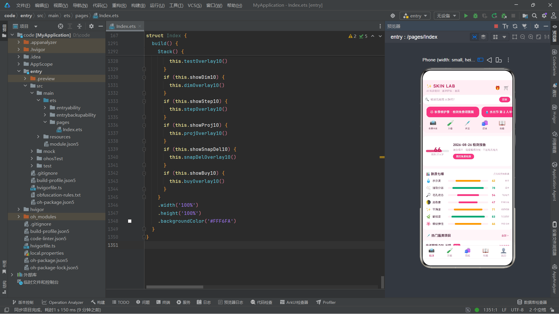
进入主内容区,第一个 Tab 是检测页。它由三个区块组成:顶部的大分数环卡片、中部的七维横条列表、底部的热门医美项目列表。先看分数环卡片:
  @Builder tabDetect10() {
    Column() {
      Row() {
        Stack() {
          Progress({ value: 66, total: 100 })
            .width(92)
            .height(92)
            .style({ strokeWidth: 9 })
            .color('#E64980')
          Column() {
            Text('66').fontSize(24).fontWeight(700).fontColor('#C2255C')
            Text('肌龄 27.4 岁').fontSize(9).fontColor('#C99BB4')
          }
          .alignItems(HorizontalAlign.Center)
        }

        Column() {
          Text('2026-08-26 检测报告').fontSize(13).fontWeight(700).fontColor('#5C3349')
          Text('混合偏干 · 轻度敏感耐受 · T 区毛孔粗大').fontSize(10).fontColor('#C99BB4').margin({ top: 5 }).lineHeight(14)
          Row() {
            Text('预约免费检测').fontSize(10).fontColor('#FFFFFF').fontWeight(700).padding({ left: 12, right: 12, top: 5, bottom: 5 }).borderRadius(14).backgroundColor('#E64980').onClick(() => {
              this.showTest10 = true
            })
          }
          .margin({ top: 9 })
        }
        .alignItems(HorizontalAlign.Start)
        .margin({ left: 16 })
        .layoutWeight(1)
      }
      .width('100%')
      .alignItems(VerticalAlign.Center)
      .padding(14)
      .borderRadius(16)
      .backgroundColor('#FFFFFF')
      .margin({ left: 14, right: 14, top: 12 })
分数环用 Stack 层叠了 Progress 和 Column:Progress 是环形进度组件,value 是当前值、total 是满值,style 的 strokeWidth 控制环的粗细,color 设为粉色;上层 Column 放"66"和"肌龄 27.4 岁"两行文字居中显示在环内。整个分数环放在 Row 左侧,右侧用 Column 放检测报告的标题、肤质描述文案、一个"预约免费检测"按钮(点击弹出预约弹框)。
Progress 是 ArkUI 的进度展示组件,支持线性(Linear,默认)、环形(Ring)、圆形(Circular)等样式。本例使用默认的环形——其实 Progress 默认是线性,要得到环形需配合 style 或类型参数。这里它配合 Stack 与居中文字组合,是"环形仪表盘"的经典写法:环表示进度,中心数字表示精确值。
接下来是七维横条列表,这是检测页的核心数据可视化:
      Column() {
        Row() {
          Text('📊 肤质七维').fontSize(13).fontWeight(700).fontColor('#5C3349')
          Text('点击维度看解读').fontSize(9).fontColor('#C99BB4')
        }
        .width('100%')
        .justifyContent(FlexAlign.SpaceBetween)

        ForEach(this.dims10, (d: DimT10) => {
          Row() {
            Text(d.icon).fontSize(16).width(26)
            Text(d.name).fontSize(11).fontColor('#5C3349').width(62)
            Column() {
              Column() {
              }
              .width(d.score + '%')
              .height('100%')
              .borderRadius(3)
              .backgroundColor(dimColor10(d.score))
            }
            .layoutWeight(1)
            .height(7)
            .borderRadius(4)
            .backgroundColor('#FFF0F5')
            Text(d.score.toString()).fontSize(11).fontWeight(700).fontColor(dimColor10(d.score)).width(28).textAlign(TextAlign.End)
            Text(d.level).fontSize(8).fontColor('#C99BB4').width(56).textAlign(TextAlign.End)
          }
          .width('100%')
          .alignItems(VerticalAlign.Center)
          .margin({ top: 10 })
          .onClick(() => {
            this.dimId10 = d.id
            this.showDim10 = true
          })
        }, (d: DimT10) => 'dm' + d.id.toString())
      }
七维横条是"自制进度条"的实现:每行一个 Row,依次是 emoji 图标(固定宽 26)、维度名(固定宽 62)、横条容器、得分数字、等级文字。横条容器是一个 Column 设了 layoutWeight(1) 撑满中间、固定高 7、圆角、浅粉背景;里面再嵌一个 Column,width 设为 d.score + '%',高度填满父容器,背景色由 dimColor10 函数根据得分返回——这样得分越高横条越长,颜色也随分数变化。整行可点击,点击后设置 dimId10 为该维度 id 并弹出维度解读弹框。
这里把"进度条"用嵌套 Column 的方式手工实现,而非直接用 Progress 组件,是因为手工实现可以更灵活地控制颜色、形状、配合周围的文字排版。在 ArkUI 里,很多时候"用容器套容器"比用现成组件更自由,这是声明式 UI 灵活性的体现。
最后是热门医美项目列表:
      Row() {
        Text('💉 热门医美项目').fontSize(13).fontWeight(700).fontColor('#5C3349')
        Text('全部 >').fontSize(10).fontColor('#E64980').onClick(() => {
          this.showProj10 = true
        })
      }
      .width('100%')
      .justifyContent(FlexAlign.SpaceBetween)
      .padding({ left: 16, right: 16, top: 16, bottom: 4 })

      ForEach(PROJS10, (p: ProjT10) => {
        Row() {
          Column() {
            Row() {
              Text(p.name).fontSize(12).fontWeight(700).fontColor('#5C3349')
              if (p.hot) {
                Text('HOT').fontSize(8).fontColor('#FFFFFF').padding({ left: 6, right: 6, top: 2, bottom: 2 }).borderRadius(6).backgroundColor('#E64980').margin({ left: 8 })
              }
            }
            .width('100%')
            Text(p.cate + ' · ' + p.desc).fontSize(9).fontColor('#C99BB4').margin({ top: 5 }).maxLines(1).textOverflow({ overflow: TextOverflow.Ellipsis })
          }
          .alignItems(HorizontalAlign.Start)
          .layoutWeight(1)

          Column() {
            Text('¥' + p.price.toString()).fontSize(13).fontWeight(700).fontColor('#E64980')
            Text('/' + p.times.toString() + '次').fontSize(8).fontColor('#C99BB4')
          }
          .alignItems(HorizontalAlign.End)
        }
        .width('100%')
        .alignItems(VerticalAlign.Center)
        .padding(13)
        .borderRadius(14)
        .backgroundColor('#FFFFFF')
        .margin({ left: 14, right: 14, top: 8 })
        .onClick(() => {
          this.projId10 = p.id
          this.showProj10 = true
        })
      }, (p: ProjT10) => 'pj' + p.id.toString())
每条医美项目是一张白色圆角卡片,左侧 Column 放项目名(带 HOT 角标,用 if (p.hot) 条件渲染)、分类与描述(maxLines 限 1 行,溢出省略号),右侧 Column 放价格和次数。maxLines(1) 配合 textOverflow({ overflow: TextOverflow.Ellipsis }) 是处理长文本的标准做法——超过一行就截断并显示省略号,保证卡片高度整齐。点击任意项目都会弹出医美项目详情弹框。
if 在 ArkUI 的 build/Builder 内部是"条件渲染"指令,不是普通的流程控制语句。当 if 条件为 true 时,对应的子组件才会被挂载到组件树;条件变为 false 时,该子组件会被销毁。这与 JavaScript 的 if 在运行时求值不同,它是声明式 UI 结构的一部分。
十、方案 Tab:tabPlan10 的早晚时间轴与步骤管理
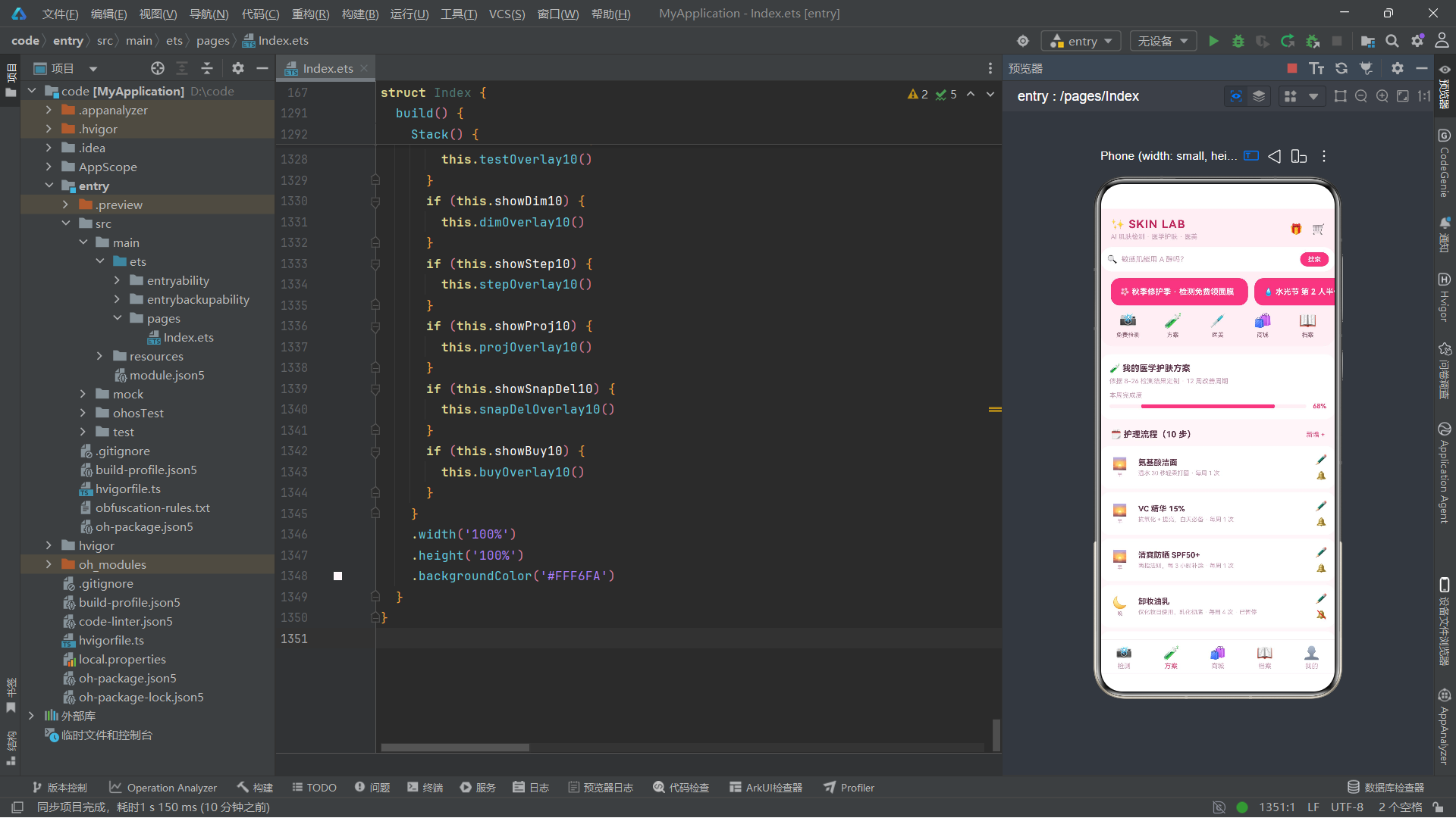
方案 Tab 展示个性化护肤流程,顶部是方案概览卡(含本周完成度进度条),下方是步骤列表。先看概览卡:
  @Builder tabPlan10() {
    Column() {
      Column() {
        Text('🧪 我的医学护肤方案').fontSize(13).fontWeight(700).fontColor('#5C3349')
        Text('依据 8-26 检测结果定制 · 12 周改善周期').fontSize(10).fontColor('#C99BB4').margin({ top: 6 })
        Text('本周完成度').fontSize(10).fontColor('#C99BB4').margin({ top: 10 })
        Row() {
          Column() {
            Column() {
            }
            .width('68%')
            .height('100%')
            .borderRadius(3)
            .backgroundColor('#E64980')
          }
          .layoutWeight(1)
          .height(6)
          .borderRadius(3)
          .backgroundColor('#FFF0F5')
          Text('68%').fontSize(10).fontWeight(700).fontColor('#E64980').margin({ left: 10 })
        }
        .width('100%')
        .margin({ top: 5 })
      }
      .width('100%')
      .alignItems(HorizontalAlign.Start)
      .padding(14)
      .borderRadius(16)
      .backgroundColor('#FFFFFF')
      .margin({ left: 14, right: 14, top: 12 })
概览卡顶部三行文字:方案标题、定制依据、本周完成度标签。下方又是一个手工进度条——外层 Column 浅粉背景,内层 Column 宽度 68%、粉色填充,右侧跟一个"68%"文字。这跟七维横条是同一套实现思路,只是这里是横向单条,那里是七条堆叠。
接着是步骤列表的标题行和列表:
      Row() {
        Text('🗓️ 护理流程(' + this.steps10.length.toString() + ' 步)').fontSize(13).fontWeight(700).fontColor('#5C3349')
        Text('新增 +').fontSize(10).fontColor('#E64980').onClick(() => {
          this.stepId10 = 0
          this.stepProd10 = ''
          this.stepNote10 = ''
          this.stepFreq10 = 1
          this.showStep10 = true
        })
      }
      .width('100%')
      .justifyContent(FlexAlign.SpaceBetween)
      .padding({ left: 16, right: 16, top: 16, bottom: 4 })

      ForEach(this.steps10, (s: StepT10) => {
        Row() {
          Column() {
            if (s.phase === '早') {
              Text('🌅').fontSize(18)
            } else if (s.phase === '晚') {
              Text('🌙').fontSize(18)
            } else {
              Text('🗓️').fontSize(18)
            }
            Text(s.phase).fontSize(8).fontColor('#C99BB4').margin({ top: 2 })
          }
          .width(36)
          .alignItems(HorizontalAlign.Center)

          Column() {
            Text(s.product).fontSize(12).fontWeight(700).fontColor('#5C3349')
            Text(s.note + ' · 每周 ' + s.freq.toString() + ' 次' + (s.on ? '' : ' · 已暂停')).fontSize(9).fontColor('#C99BB4').margin({ top: 4 }).maxLines(1).textOverflow({ overflow: TextOverflow.Ellipsis })
          }
          .alignItems(HorizontalAlign.Start)
          .layoutWeight(1)
          .padding({ left: 10 })

          Column() {
            Text('✏️').fontSize(15).onClick(() => {
              this.stepId10 = s.id
              this.stepProd10 = s.product
              this.stepNote10 = s.note
              this.stepFreq10 = s.freq
              this.showStep10 = true
            })
            Text(s.on ? '🔔' : '🔕').fontSize(13).margin({ top: 8 }).onClick(() => {
              this.steps10 = this.steps10.map((x: StepT10) => {
                if (x.id === s.id) {
                  return { id: x.id, phase: x.phase, product: x.product, note: x.note, freq: x.freq, on: !x.on }
                }
                return x
              })
            })
          }
          .alignItems(HorizontalAlign.Center)
        }
        .width('100%')
        .alignItems(VerticalAlign.Center)
        .padding(12)
        .borderRadius(14)
        .backgroundColor('#FFFFFF')
        .margin({ left: 14, right: 14, top: 6 })
      }, (s: StepT10) => 'sp' + s.id.toString() + '_' + s.on.toString())
每个步骤卡片分三段:左侧 36 宽的小 Column 放时段图标(用 if/else if/else 根据 phase 字段选择不同 emoji——早用日出、晚用月亮、周护理用日历)和时段文字;中间用 layoutWeight(1) 撑开,放产品名和备注(备注里动态拼接"已暂停"标记);右侧放两个操作:✏️ 编辑(点击把该步骤信息填入表单状态变量并弹出编辑弹框)、🔔/🔕 启停切换(点击用 map 遍历数组,把匹配 id 的那条的 on 字段取反,返回新数组赋值给 steps10)。
注意 ForEach 的 key 函数:
'sp' + s.id.toString() + '_' + s.on.toString()。这里把 on 状态也拼进了 key。这是因为当 on 从 true 变 false 时,我们希望框架把这个项视为"新项"重建,确保🔔图标刷新成🔕。如果 key 只用 id,框架可能因为"同 key 视为同项"而只更新文字不重建图标,导致图标显示滞后。把状态变量纳入 key 是处理这类细节的常用技巧。
十一、商城 Tab:goodCard10 与 tabShop10 的双列瀑布流
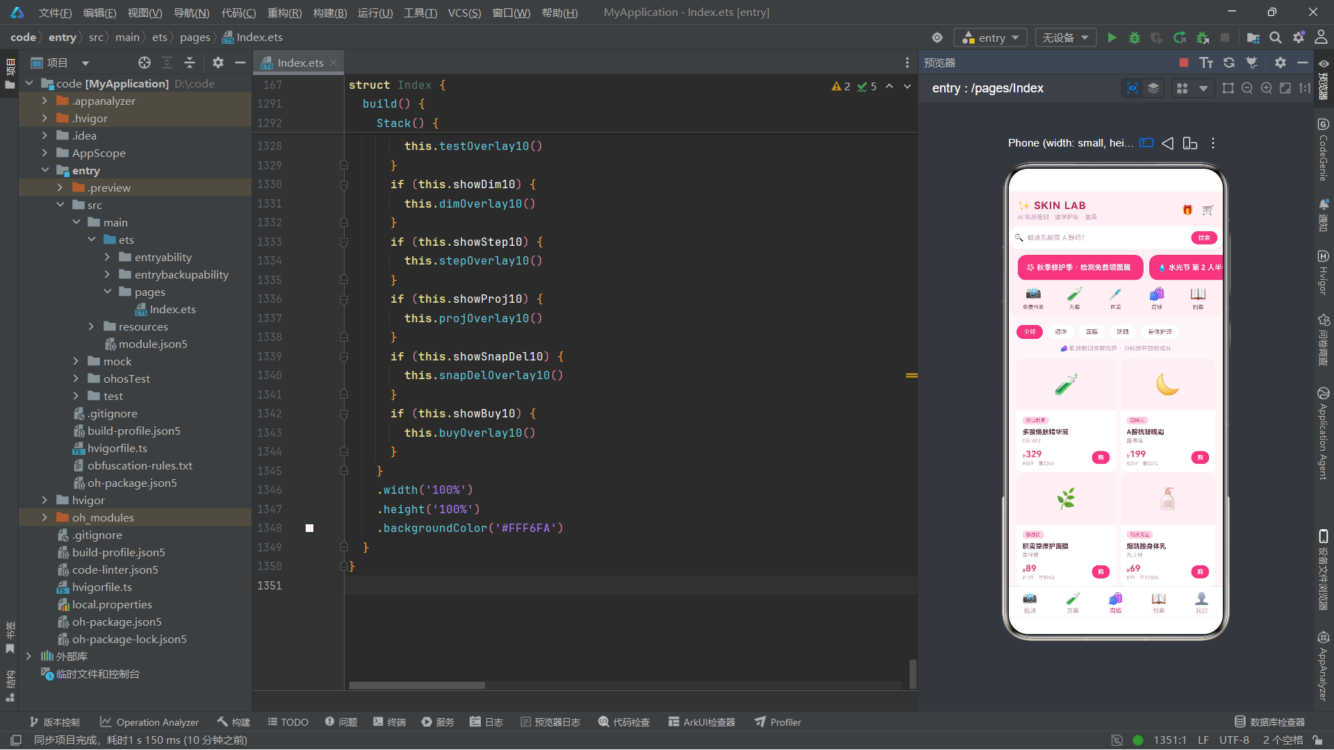
商城 Tab 用双列瀑布流展示商品。先抽单个商品卡片 goodCard10,再用两列 Column 各自 ForEven 过滤渲染。商品卡片:
  @Builder goodCard10(g: GoodT10) {
    Column() {
      Column() {
        Text(g.icon).fontSize(34)
      }
      .width('100%')
      .height(88)
      .borderRadius({ topLeft: 12, topRight: 12 })
      .backgroundColor('#FFF0F5')
      .justifyContent(FlexAlign.Center)

      Column() {
        Text(g.tag).fontSize(8).fontColor('#E64980').padding({ left: 6, right: 6, top: 2, bottom: 2 }).borderRadius(6).backgroundColor('#FFD6E4').alignSelf(ItemAlign.Start)
        Text(g.name).fontSize(11).fontWeight(700).fontColor('#5C3349').margin({ top: 6 }).maxLines(1).textOverflow({ overflow: TextOverflow.Ellipsis })
        Text(g.brand).fontSize(9).fontColor('#C99BB4').margin({ top: 3 })
        Row() {
          Column() {
            Row() {
              Text('¥').fontSize(9).fontColor('#E64980')
              Text(g.price.toString()).fontSize(15).fontWeight(700).fontColor('#E64980')
            }
            .alignItems(VerticalAlign.Bottom)
            Text('¥' + g.orig.toString() + ' · 售' + g.sold.toString()).fontSize(8).fontColor('#C99BB4').margin({ top: 2 })
          }
          .alignItems(HorizontalAlign.Start)
          .layoutWeight(1)

          Text('购').fontSize(10).fontColor('#FFFFFF').fontWeight(700).padding({ left: 10, right: 10, top: 5, bottom: 5 }).borderRadius(13).backgroundColor('#E64980').onClick(() => {
            this.buyId10 = g.id
            this.buyQty10 = 1
            this.showBuy10 = true
          })
        }
        .width('100%')
        .alignItems(VerticalAlign.Center)
        .margin({ top: 8 })
      }
      .width('100%')
      .alignItems(HorizontalAlign.Start)
      .padding(10)
    }
    .width('100%')
    .borderRadius(12)
    .backgroundColor('#FFFFFF')
  }
商品卡片分上下两块:上半是 88 高的浅粉色图标区(只放一个大 emoji,borderRadius 只设上左上右让顶部圆角与卡片对齐),下半是信息区——营销标签(alignSelf(ItemAlign.Start) 让它单独左对齐而不受父 Column 的居中影响)、商品名(单行省略)、品牌、价格行(小¥符号 + 大数字价格,用 Row 的 alignItems(VerticalAlign.Bottom) 让两者底对齐)、原价与销量小字、右侧"购"按钮。
alignSelf 是 ArkUI 中让单个子项"例外"对齐的属性。当父容器统一设置了对齐方式,某个子项需要不同对齐时,不必为它单独包一层容器,直接 alignSelf 即可,这是很实用的精细控制手段。
双列瀑布的实现:
  @Builder tabShop10() {
    Column() {
      Row() {
        ForEach(['全部', '精华', '面膜', '防晒', '身体护理'], (c: string, i: number) => {
          Text(c).fontSize(10).fontColor(i === 0 ? '#FFFFFF' : '#8A5A6E').padding({ left: 12, right: 12, top: 6, bottom: 6 }).borderRadius(14).backgroundColor(i === 0 ? '#E64980' : '#FFFFFF').margin({ right: 8 })
        }, (c: string) => 'sc' + c)
      }
      .width('100%')
      .padding({ left: 14, right: 14, top: 12 })

      Text('🛍️ 肌肤检测关联推荐 · 为你避开致敏成分').fontSize(10).fontColor('#C99BB4').padding({ left: 16, right: 16, top: 10, bottom: 4 })

      Row() {
        Column() {
          ForEach(this.goods10.filter((g: GoodT10, i: number) => i % 2 === 0), (g: GoodT10) => {
            this.goodCard10(g)
          }, (g: GoodT10) => 'gA' + g.id.toString())
        }
        .layoutWeight(1)

        Column() {
          ForEach(this.goods10.filter((g: GoodT10, i: number) => i % 2 === 1), (g: GoodT10) => {
            this.goodCard10(g)
          }, (g: GoodT10) => 'gB' + g.id.toString())
        }
        .layoutWeight(1)
        .margin({ left: 8 })
      }
      .width('100%')
      .alignItems(VerticalAlign.Top)
      .padding({ left: 14, right: 14, top: 6 })
    }
    .width('100%')
    .padding({ bottom: 12 })
  }
顶部是分类 chips(用 ForEach 渲染,i === 0 时高亮表示"全部"选中态),下方一句推荐说明,再下面是双列瀑布——用 goods10.filter((g, i) => i % 2 === 0) 取偶数索引进左列、奇数索引进右列,两列各用 layoutWeight(1) 等分宽度,右列加 left:8 间距。两列各自纵向排列卡片,因为不同商品卡片高度可能不同,左右两列的卡片不会强制对齐,自然形成"瀑布"错落感。
双列瀑布流是电商商品列表的主流形态之一。它的实现核心是"按索引奇偶分流到两列"——这种简单分流的代价是两列高度可能不平衡,但实现成本极低,在商品数量较多时视觉效果可接受。若要严格平衡两列高度,需要维护两个累计高度变量、把每件商品分到较矮的那列,复杂度上升。
十二、档案 Tab:tabArch10 的趋势柱状图与对比记录
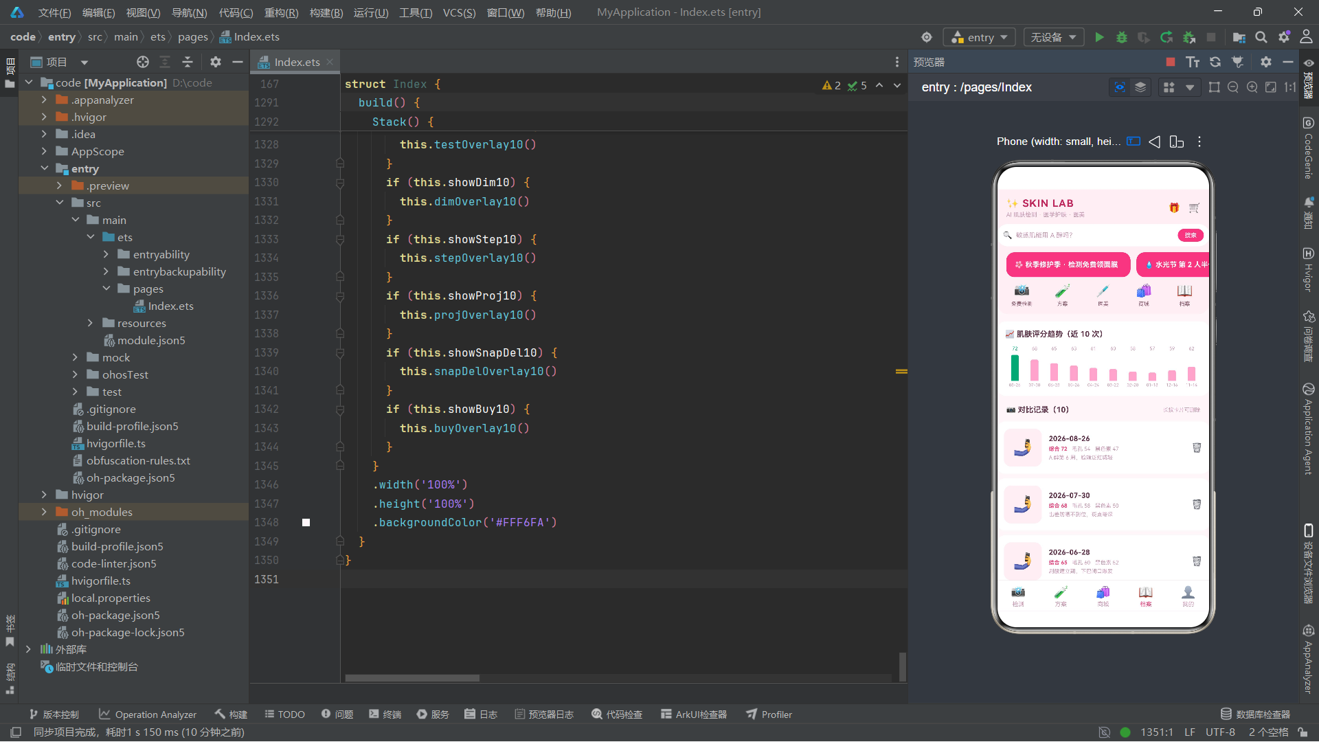
档案 Tab 用柱状图展示评分趋势、用列表展示历次检测快照。趋势柱状图是手工绘制的:
  @Builder tabArch10() {
    Column() {
      Column() {
        Text('📈 肌肤评分趋势(近 10 次)').fontSize(13).fontWeight(700).fontColor('#5C3349')
        Row() {
          ForEach(this.snaps10, (s: SnapT10) => {
            Column() {
              Text(s.score.toString()).fontSize(8).fontColor(s.score >= 70 ? '#0CA678' : '#C99BB4').margin({ bottom: 2 })
              Column() {
                Column() {
                }
                .width(13)
                .height((s.score - 50) * 2)
                .borderRadius({ topLeft: 3, topRight: 3 })
                .backgroundColor(s.score >= 70 ? '#0CA678' : '#F9A8C9')
              }
              .width('100%')
              .height(48)
              .justifyContent(FlexAlign.End)
              Text(s.date.substring(5)).fontSize(7).fontColor('#C99BB4').margin({ top: 3 })
            }
            .alignItems(HorizontalAlign.Center)
            .layoutWeight(1)
          }, (s: SnapT10) => 'sn' + s.id.toString())
        }
        .width('100%')
        .margin({ top: 12 })
      }
柱状图用一个 Row 横排所有快照,每条柱子是一个 Column:顶部是分数文字(70 分以上绿色、以下浅粉)、中间是柱体容器(高 48,justifyContent(FlexAlign.End) 让内部柱子贴底,内部柱子的 height 用 (s.score - 50) * 2 把 50-100 的分数映射到 0-100 的高度)、底部是日期文字(用 substring(5) 截掉年份只留 MM-DD)。这种"用 height 数值映射数据"的手法是手工柱状图的核心。
在 ArkUI 里没有现成的"图表组件",所有柱状图、折线图都需要用基础容器+数值映射手工拼装。这给了开发者完全的控制力,但也要求开发者自己处理坐标映射、颜色分段、溢出截断等细节。生态成熟后会有图表库封装这些,但理解底层原理依然必要。
下方是对比记录列表:
      Row() {
        Text('📷 对比记录(' + this.snaps10.length.toString() + ')').fontSize(13).fontWeight(700).fontColor('#5C3349')
        Text('长按卡片可删除').fontSize(9).fontColor('#C99BB4')
      }
      .width('100%')
      .justifyContent(FlexAlign.SpaceBetween)
      .padding({ left: 16, right: 16, top: 16, bottom: 4 })

      ForEach(this.snaps10, (s: SnapT10) => {
        Row() {
          Column() {
            Text('🤳').fontSize(26)
          }
          .width(64)
          .height(64)
          .borderRadius(12)
          .backgroundColor('#FFF0F5')
          .justifyContent(FlexAlign.Center)

          Column() {
            Text(s.date).fontSize(12).fontWeight(700).fontColor('#5C3349')
            Row() {
              Text('综合 ' + s.score.toString()).fontSize(9).fontColor('#E64980').fontWeight(700)
              Text('毛孔 ' + s.pore.toString()).fontSize(9).fontColor('#C99BB4').margin({ left: 8 })
              Text('黑色素 ' + s.melanin.toString()).fontSize(9).fontColor('#C99BB4').margin({ left: 8 })
            }
            .margin({ top: 5 })
            Text(s.note).fontSize(9).fontColor('#C99BB4').margin({ top: 4 }).maxLines(1).textOverflow({ overflow: TextOverflow.Ellipsis })
          }
          .alignItems(HorizontalAlign.Start)
          .layoutWeight(1)
          .padding({ left: 12 })

          Text('🗑️').fontSize(15).onClick(() => {
            this.snapId10 = s.id
            this.armed10 = false
            this.showSnapDel10 = true
          })
        }
        .width('100%')
        .alignItems(VerticalAlign.Center)
        .padding(12)
        .borderRadius(14)
        .backgroundColor('#FFFFFF')
        .margin({ left: 14, right: 14, top: 8 })
      }, (s: SnapT10) => 'sn2' + s.id.toString())
每条记录卡片左侧是 64×64 的浅粉方块放自拍 emoji 占位,中间用 layoutWeight(1) 放日期、三个指标文字(综合粉色加粗、毛孔和黑色素浅粉)、备注(单行省略),右侧🗑️点击触发删除弹框。注意删除前先设 armed10 = false,确保每次打开弹框时确认开关都是关闭状态,需要用户重新打开才能删——这是一种防误操作的二次确认机制。
十三、我的 Tab:tabMine10 的个人信息与订单列表
"我的"Tab 顶部是用户信息卡,下方是订单列表,最底部是一句带闪烁动效的标语。先看信息卡:
  @Builder tabMine10() {
    Column() {
      Row() {
        Stack() {
          Circle().width(52).height(52).fill('#FFD6E4')
          Text('👩').fontSize(26)
        }
        Column() {
          Text('林女士 · SKIN ID 88290').fontSize(14).fontWeight(700).fontColor('#5C3349')
          Text('混合偏干 · 敏感耐受 · 已检测 10 次').fontSize(9).fontColor('#C99BB4').margin({ top: 5 })
        }
        .alignItems(HorizontalAlign.Start)
        .margin({ left: 12 })
        .layoutWeight(1)

        Text('预约检测').fontSize(10).fontColor('#FFFFFF').padding({ left: 10, right: 10, top: 6, bottom: 6 }).borderRadius(12).backgroundColor('#E64980').onClick(() => {
          this.showTest10 = true
        })
      }
      .width('100%')
      .alignItems(VerticalAlign.Center)
      .padding(14)
      .borderRadius(16)
      .backgroundColor('#FFFFFF')
      .margin({ left: 14, right: 14, top: 12 })
头像用 Stack 层叠一个 Circle(ArkUI 的圆形绘制组件,fill 设浅粉作底)和一个 emoji 文字——这种"形状打底 + emoji 当头像"是无图片资源时的常见替代方案。右侧放姓名、肤质摘要、预约按钮。
Circle 是 ArkUI 的基础图形组件之一,同类还有 Rect、Ellipse、Path、Polyline 等。它们通过 fill、stroke、strokeWidth 等属性控制填充与描边,常用于自定义图标、占位图形、装饰元素。在缺少设计资源时,图形组件配合 Text 能快速搭出可用的界面。
订单列表:
      Row() {
        Text('📦 我的订单(' + this.orders10.length.toString() + ')').fontSize(13).fontWeight(700).fontColor('#5C3349')
      }
      .width('100%')
      .padding({ left: 16, right: 16, top: 16, bottom: 4 })

      ForEach(this.orders10, (o: OrdT10) => {
        Row() {
          Column() {
            Text(o.name).fontSize(11).fontColor('#5C3349').maxLines(1).textOverflow({ overflow: TextOverflow.Ellipsis })
            Row() {
              Text(o.state).fontSize(9).fontColor(ordStateColor10(o.state))
              Text(o.date).fontSize(9).fontColor('#C99BB4').margin({ left: 10 })
            }
            .margin({ top: 6 })
          }
          .alignItems(HorizontalAlign.Start)
          .layoutWeight(1)

          Text(o.price > 0 ? '¥' + o.price.toString() : '已含').fontSize(11).fontWeight(700).fontColor('#E64980')
        }
        .width('100%')
        .alignItems(VerticalAlign.Center)
        .padding(12)
        .borderRadius(12)
        .backgroundColor('#FFFFFF')
        .margin({ left: 14, right: 14, top: 5 })
      }, (o: OrdT10) => 'od' + o.id.toString())
每条订单左侧放订单名(单行省略)和"状态 + 日期"小字行——状态文字的 color 调用 ordStateColor10 函数,让"待到店"橙色、"已发货"蓝色、“已完成"绿色。右侧价格用三元判断:price > 0 显示金额,否则显示"已含”(表示已含在套餐里)。这种"0 元显示已含"的细节处理让医美预约类订单不显得突兀。
最底部的闪烁标语:
      Column() {
        Text('🌸 好皮肤 = 检测 + 方案 + 坚持 — SKIN LAB').fontSize(9).fontColor('#C99BB4').opacity(this.sparkleOp10)
      }
      .width('100%')
      .alignItems(HorizontalAlign.Center)
      .padding(24)
这个 Text 的 opacity 绑定了 sparkleOp10,而 sparkleOp10 在 aboutToAppear 里被 animateTo 驱动在 0.3 到 1 之间往复变化,所以这行标语会持续呼吸式闪烁,为整个页面收尾增添动感。
十四、弹框一:预约检测的底部抽屉 testOverlay10
应用有六个弹框,全部用 @Builder 单独构建,通过外层 build 里的 if 判断显隐。第一个是预约检测弹框,采用底部抽屉样式:
  @Builder testOverlay10() {
    Column() {
      Column() {
        Column() {
          Text('').fontSize(4).width(40).borderRadius(2).backgroundColor('#FFD6E4')
        }
        .width('100%')
        .alignItems(HorizontalAlign.Center)
        .padding({ top: 10, bottom: 4 })

        Row() {
          Text('📸 预约 AI 肤质检测(免费)').fontSize(15).fontWeight(700).fontColor('#5C3349')
          Text('✕').fontSize(15).fontColor('#C99BB4').onClick(() => {
            this.showTest10 = false
          })
        }
        .width('100%')
        .justifyContent(FlexAlign.SpaceBetween)
        .padding({ left: 16, right: 16, top: 4 })

        Text('8 分钟 AI 成像 + 皮肤科医生解读,附赠修护面膜一片').fontSize(10).fontColor('#C99BB4').margin({ top: 8 })
弹框外层是一个 Column,高度填满全屏、justifyContent(FlexAlign.End) 让内容卡片贴底、背景设半透明深色 #995C3349(99 是十六进制约 60% 透明度)作为遮罩、zIndex(999) 保证盖在所有内容之上。内部白色卡片顶部先放一个小抓手条(一个空的宽 40 高 4 的圆角条,是底部抽屉的视觉标志),再放标题行(左标题右关闭✕)。
zIndex 控制 Stack 内子组件的层叠顺序,数值越大越在上。弹框设 999 确保它盖住页面所有内容。配合半透明背景色(#99 + 6 位色值)形成"遮罩 + 居中卡片"的弹框基底,这是 ArkUI 自建弹框的标准范式。
接着是肤质自评和时段选择:
        Text('肤质自评').fontSize(11).fontColor('#C99BB4').margin({ top: 14 })
        Row() {
          ForEach(SKIN10, (s: string) => {
            Text(s).fontSize(10).fontColor('#8A5A6E').padding({ left: 12, right: 12, top: 7, bottom: 7 }).borderRadius(12).backgroundColor('#FFF0F5').margin({ right: 8 })
          }, (s: string) => 'sk' + s)
        }
        .margin({ top: 6 })

        Text('到店时段').fontSize(11).fontColor('#C99BB4').margin({ top: 14 })
        Flex({ wrap: FlexWrap.Wrap }) {
          ForEach(SLOT10, (t: string, i: number) => {
            Text(t).fontSize(10).fontColor(this.tSlot10 === i ? '#FFFFFF' : '#8A5A6E').padding({ left: 13, right: 13, top: 7, bottom: 7 }).borderRadius(12).backgroundColor(this.tSlot10 === i ? '#E64980' : '#FFF0F5').margin({ right: 8, bottom: 8 }).onClick(() => {
              this.tSlot10 = i
            })
          }, (t: string) => 'tt' + t)
        }
        .width('100%')
        .margin({ top: 6 })
肤质自评是一排浅粉 chips,纯展示无选中态。时段选择用了 Flex 容器配合 wrap: FlexWrap.Wrap 让 chips 自动换行——因为六个时段在一行可能放不下,Flex 的自动换行比 Row 更适合这种"数量不定、宽度自适应"的场景。每个时段 chip 的颜色用三元判断:选中的(tSlot10 === i)用粉色填充白字,未选中用浅粉底深粉字。点击改变 tSlot10 即可切换选中。
Flex 是 ArkUI 的弹性布局容器,与 Row/Column 的区别是它支持 wrap 换行、支持子项的 flexGrow/shrink 弹性比例、支持主轴方向切换。在内容数量不定、需要自动换行的场景(标签云、chip 组)比 Row 更合适。
接着是素颜开关和确认按钮:
        Row() {
          Text('素颜到店(不化妆不上防晒,数据更准)').fontSize(11).fontColor('#5C3349').layoutWeight(1)
          Toggle({ type: ToggleType.Switch, isOn: this.tBare10 })
            .selectedColor('#E64980')
            .onChange((on: boolean) => {
              this.tBare10 = on
            })
        }
        .width('100%')
        .alignItems(VerticalAlign.Center)
        .margin({ top: 12 })

        Text('确认预约')
          .fontSize(13)
          .fontWeight(700)
          .fontColor('#FFFFFF')
          .width('100%')
          .textAlign(TextAlign.Center)
          .padding({ top: 13, bottom: 13 })
          .borderRadius(22)
          .backgroundColor('#E64980')
          .margin({ top: 16, bottom: 16 })
          .onClick(() => {
            const no: OrdT10 = { id: Date.now(), name: 'AI 肤质检测(免费)', state: '待到店', date: '明天 ' + SLOT10[this.tSlot10], date: '明天 ' + SLOT10[this.tSlot10], price: 0 }
            this.orders10 = [no].concat(this.orders10)
            this.showTest10 = false
          })
      }
      .width('100%')
      .padding({ left: 16, right: 16 })
      .borderRadius({ topLeft: 22, topRight: 22 })
      .backgroundColor('#FFFFFF')
    }
    .width('100%')
    .height('100%')
    .justifyContent(FlexAlign.End)
    .backgroundColor('#995C3349')
    .zIndex(999)
    .onClick(() => {
      this.showTest10 = false
    })
  }
Toggle 是 ArkUI 的开关组件,type 设为 ToggleType.Switch 是 iOS 风格滑动开关(另有 ToggleType.Checkbox 复选框样式),isOn 绑定 tBare10,selectedColor 设粉色让开启状态与品牌色一致,onChange 回调把新状态写回 tBare10。确认预约按钮点击后,用 Date.now() 生成唯一 id,构造一条新订单(state 为"待到店"、date 拼接"明天 + 所选时段"),用 [no].concat(this.orders10) 把新订单插到数组最前,再关闭弹框。订单插到最前,"我的"Tab 的订单列表就会把最新预约显示在顶部。
Toggle 的 isOn 是一次性初始绑定,真正实现双向同步需要在 onChange 里手动写回状态变量。这是 ArkUI 受控组件的通用模式——属性传入当前值,事件回调负责更新状态,状态更新后框架重渲染把新值再传回组件,形成闭环。
十五、弹框二:维度解读居中卡 dimOverlay10
维度解读弹框是居中卡片样式,展示某个检测维度的详细解读:
  @Builder dimOverlay10() {
    Column() {
      Column() {
        Text(this.dimId10 > 0 && this.dims10.filter((d: DimT10) => d.id === this.dimId10).length > 0 ? this.dims10.filter((d: DimT10) => d.id === this.dimId10)[0].icon + ' ' + this.dims10.filter((d: DimT10) => d.id === this.dimId10)[0].name : '维度').fontSize(15).fontWeight(700).fontColor('#5C3349')
        Text('✕').fontSize(15).fontColor('#C99BB4').onClick(() => {
          this.showDim10 = false
        })

        Row() {
          Text(this.dimId10 > 0 && this.dims10.filter((d: DimT10) => d.id === this.dimId10).length > 0 ? this.dims10.filter((d: DimT10) => d.id === this.dimId10)[0].score.toString() : '-').fontSize(30).fontWeight(700).fontColor('#E64980')
          Text(' / 100').fontSize(12).fontColor('#C99BB4').margin({ left: 4 })
          Text(this.dimId10 > 0 && this.dims10.filter((d: DimT10) => d.id === this.dimId10).length > 0 ? this.dims10.filter((d: DimT10) => d.id === this.dimId10)[0].level : '').fontSize(10).fontColor('#FFFFFF').padding({ left: 8, right: 8, top: 4, bottom: 4 }).borderRadius(8).backgroundColor('#E64980').margin({ left: 10 })
        }
        .width('100%')
        .alignItems(VerticalAlign.Bottom)
        .margin({ top: 12 })

        Text('同龄同肤质人群对比:超越 58%。该维度近 3 个月呈上升趋势,与 A 醇耐受建立相关。建议:坚持当前方案 6 周后复测,期间避免叠加高浓度酸类。').fontSize(11).fontColor('#5C3349').lineHeight(18).margin({ top: 12 })

        Text('知道了').fontSize(12).fontColor('#FFFFFF').fontWeight(700).width('100%').textAlign(TextAlign.Center).padding({ top: 12, bottom: 12 }).borderRadius(20).backgroundColor('#E64980').margin({ top: 16 }).onClick(() => {
          this.showDim10 = false
        })
      }
      .width('80%')
      .padding(18)
      .borderRadius(18)
      .backgroundColor('#FFFFFF')
      .onClick(() => {
      })
    }
    .width('100%')
    .height('100%')
    .justifyContent(FlexAlign.Center)
    .backgroundColor('#995C3349')
    .zIndex(999)
    .onClick(() => {
      this.showDim10 = false
    })
  }
居中弹框与底部抽屉的区别是外层 Column 的 justifyContent 改为 FlexAlign.Center,让卡片居中而非贴底。卡片宽度 80%、圆角 18、白底。内容上:标题行用 filter 从 dims10 里按 dimId10 找出对应维度,渲染"图标+名称"和关闭按钮;分数行用大字号 30 显示分数、小字"/ 100"、一个粉色圆角 level 标签;中部一段解读文案(lineHeight 18 增大行距易读);底部"知道了"按钮关闭弹框。
注意标题行的 Text 内容写得很长——this.dims10.filter(...)[0].icon + ' ' + ...[0].name,先 filter 过滤出 id 匹配的那条(返回数组),再取 [0] 拿到对象,再读 icon/name 拼接。前面的 this.dimId10 > 0 && ...length > 0 是防 falsy 的守卫:dimId10 为 0(初始未选)或 filter 结果为空时,显示默认值"维度",避免运行时报错。这种"守卫 + filter + 取首元素"的写法在数据查找时很常见,但略显冗长,实际工程可以抽一个 getById 工具函数简化。
居中弹框的外层 onClick 关闭弹框,内层卡片的 onClick 留空——这是"点遮罩关闭、点卡片不关闭"的标准实现:外层点击事件会冒泡,内层留空 onClick 相当于消费了事件阻止冒泡到外层,从而避免点卡片内容时误关弹框。这是事件冒泡控制在弹框里的典型应用。
十六、弹框三:编辑步骤的表单 stepOverlay10
编辑步骤弹框是带表单输入的底部抽屉,包含两个 TextInput 和一个频次加减器:
  @Builder stepOverlay10() {
    Column() {
      Column() {
        Row() {
          Text(this.stepId10 === 0 ? '➕ 新增护理步骤' : '✏️ 编辑护理步骤').fontSize(15).fontWeight(700).fontColor('#5C3349')
          Text('✕').fontSize(15).fontColor('#C99BB4').onClick(() => {
            this.showStep10 = false
          })
        }
        .width('100%')
        .justifyContent(FlexAlign.SpaceBetween)
        .padding({ top: 16, bottom: 4 })

        Text('产品名称').fontSize(11).fontColor('#C99BB4').margin({ top: 12 })
        TextInput({ placeholder: '例:A 醇精华 0.3%', text: this.stepProd10 })
          .fontSize(11)
          .fontColor('#5C3349')
          .placeholderColor('#C99BB4')
          .backgroundColor('#FFF0F5')
          .borderRadius(10)
          .height(42)
          .padding({ left: 10, right: 10 })
          .margin({ top: 6 })
          .onChange((v: string) => {
            this.stepProd10 = v
          })
标题用三元判断:stepId10 === 0 显示"新增"、否则显示"编辑",复用同一个弹框完成两种功能。TextInput 是 ArkUI 的文本输入框组件,placeholder 是占位提示、text 是当前值(绑定 stepProd10)、placeholderColor 单独设占位色、backgroundColor 设浅粉底融入主题、onChange 回调把输入值写回 stepProd10。
TextInput 的 text 属性与 Toggle 的 isOn 一样,是"受控"用法:传入当前状态值,onChange 把新值写回状态,状态变化触发重渲染把新值传回 text,形成闭环。注意不要在 onChange 里做重计算或网络请求,否则每次按键都触发会卡顿;这类操作应放到提交按钮的 onClick 里。
第二个 TextInput 是备注,写法完全一样。接着是频次加减器:
        Text('每周频次').fontSize(11).fontColor('#C99BB4').margin({ top: 14 })
        Row() {
          Text('−').fontSize(18).fontColor('#E64980').width(36).height(36).borderRadius(18).backgroundColor('#FFF0F5').textAlign(TextAlign.Center).onClick(() => {
            if (this.stepFreq10 > 1) {
              this.stepFreq10 -= 1
            }
          })
          Text(this.stepFreq10.toString() + ' 次/周').fontSize(13).fontWeight(700).fontColor('#5C3349').layoutWeight(1).textAlign(TextAlign.Center)
          Text('+').fontSize(18).fontColor('#E64980').width(36).height(36).borderRadius(18).backgroundColor('#FFF0F5').textAlign(TextAlign.Center).onClick(() => {
            if (this.stepFreq10 < 7) {
              this.stepFreq10 += 1
            }
          })
        }
        .width('60%')
        .alignItems(VerticalAlign.Center)
        .margin({ top: 8 })
加减器是"左减号 + 中间数字 + 右加号"的三段 Row,减号点击在 stepFreq10 > 1 时减 1、加号点击在 < 7 时加 1,中间 Text 显示当前值。这种"手搓 Stepper"比系统组件更灵活,能自由控制样式和边界。设了 1-7 的范围,防止 0 或过大值。
提交按钮的 onClick 区分新增和编辑:
        Text(this.stepId10 === 0 ? '保存步骤' : '更新步骤')
          .fontSize(13)
          .fontWeight(700)
          .fontColor('#FFFFFF')
          .width('100%')
          .textAlign(TextAlign.Center)
          .padding({ top: 13, bottom: 13 })
          .borderRadius(22)
          .backgroundColor('#E64980')
          .margin({ top: 16, bottom: 16 })
          .onClick(() => {
            if (this.stepId10 === 0) {
              const ns: StepT10 = { id: Date.now(), phase: '晚', product: this.stepProd10.length > 0 ? this.stepProd10 : '未命名产品', note: this.stepNote10.length > 0 ? this.stepNote10 : '坚持使用', freq: this.stepFreq10, on: true }
              this.steps10 = [ns].concat(this.steps10)
            } else {
              this.steps10 = this.steps10.map((x: StepT10) => {
                if (x.id === this.stepId10) {
                  return { id: x.id, phase: x.phase, product: this.stepProd10.length > 0 ? this.stepProd10 : x.product, note: this.stepNote10.length > 0 ? this.stepNote10 : x.note, freq: this.stepFreq10, on: x.on }
                }
                return x
              })
            }
            this.showStep10 = false
          })
      }
      .width('100%')
      .padding({ left: 16, right: 16 })
      .borderRadius({ topLeft: 22, topRight: 22 })
      .backgroundColor('#FFFFFF')
    }
    .width('100%')
    .height('100%')
    .justifyContent(FlexAlign.End)
    .backgroundColor('#995C3349')
    .zIndex(999)
    .onClick(() => {
      this.showStep10 = false
    })
  }
stepId10 === 0 时走新增分支:用 Date.now() 当 id、phase 默认"晚"、product 和 note 用 length > 0 判断空值提供默认值,构造新 StepT10 用 concat 插到数组最前。否则走编辑分支:用 map 遍历,匹配 id 的那条返回新对象(其余原样返回),这种"map 替换匹配项"是函数式更新数组的标准写法,保证返回的是新数组引用,触发 @State 刷新。两个分支都最后关闭弹框。
十七、弹框四:医美项目列表 projOverlay10
医美项目弹框是一个居中大卡,内含项目列表:
  @Builder projOverlay10() {
    Column() {
      Column() {
        Row() {
          Text('💉 医美项目').fontSize(15).fontWeight(700).fontColor('#5C3349')
          Text('✕').fontSize(15).fontColor('#C99BB4').onClick(() => {
            this.showProj10 = false
          })
        }
        .width('100%')
        .justifyContent(FlexAlign.SpaceBetween)

        ForEach(PROJS10, (p: ProjT10) => {
          Row() {
            Column() {
              Row() {
                Text(p.name).fontSize(12).fontWeight(700).fontColor('#5C3349')
                if (p.hot) {
                  Text('HOT').fontSize(8).fontColor('#FFFFFF').padding({ left: 6, right: 6, top: 2, bottom: 2 }).borderRadius(6).backgroundColor('#E64980').margin({ left: 8 })
                }
              }
              .width('100%')
              Text(p.cate + ' · ' + p.desc).fontSize(9).fontColor('#C99BB4').margin({ top: 4 }).maxLines(1).textOverflow({ overflow: TextOverflow.Ellipsis })
              Text('适配度 ' + (p.id * 7 % 30 + 65).toString() + '%(依据你的肤质档案)').fontSize(9).fontColor('#7048E8').margin({ top: 3 })
            }
            .alignItems(HorizontalAlign.Start)
            .layoutWeight(1)

            Column() {
              Text('¥' + p.price.toString()).fontSize(13).fontWeight(700).fontColor('#E64980')
              Text(p.times.toString() + ' 次').fontSize(8).fontColor('#C99BB4')
            }
            .alignItems(HorizontalAlign.End)
          }
          .width('100%')
          .alignItems(VerticalAlign.Center)
          .padding(12)
          .borderRadius(12)
          .backgroundColor('#FFF6FA')
          .margin({ top: 8 })
        }, (p: ProjT10) => 'pj2' + p.id.toString())

        Text('面诊后确定最终方案 · 支持分期')
          .fontSize(10)
          .fontColor('#FFFFFF')
          .width('100%')
          .textAlign(TextAlign.Center)
          .padding({ top: 12, bottom: 12 })
          .borderRadius(20)
          .backgroundColor('#7048E8')
          .margin({ top: 14 })
          .onClick(() => {
            this.showProj10 = false
          })
      }
      .width('88%')
      .padding(16)
      .borderRadius(18)
      .backgroundColor('#FFFFFF')
      .constraintSize({ maxHeight: '78%' })
      .onClick(() => {
      })
    }
    .width('100%')
    .height('100%')
    .justifyContent(FlexAlign.Center)
    .backgroundColor('#995C3349')
    .zIndex(999)
    .onClick(() => {
      this.showProj10 = false
    })
  }
每条项目卡片比检测页里的更丰富:除了名称、HOT 角标、分类描述、价格次数外,多了一行"适配度 X%"——这个百分比用 (p.id * 7 % 30 + 65) 计算得出 65-94 之间的值,让它看起来像基于肤质档案的个性化推荐(实际是写死的伪计算)。适配度用紫色 #7048E8 区别于粉色的价格,形成色彩分工。底部"面诊后确定最终方案"按钮也用紫色,与适配度呼应。
constraintSize({ maxHeight: ‘78%’ }) 给卡片设了最大高度限制。当弹框内容很多(10 条项目)时,没有 maxHeight 会撑满或溢出屏幕;设了 maxHeight 后,内容超出会被外层裁剪。但要注意,constraintSize 只限制尺寸,要真正让内容可滚动还需配合 Scroll 组件——本例因内容量适中未加 Scroll,是简化处理。
十八、弹框五:删除二次确认 snapDelOverlay10
删除快照弹框是窄危险卡,强调"谨慎":
  @Builder snapDelOverlay10() {
    Column() {
      Column() {
        Text('⚠️').fontSize(30)
        Text('删除这条对比记录?').fontSize(15).fontWeight(700).fontColor('#5C3349').margin({ top: 10 })
        Text('删除后趋势图将缺少该时间点数据,无法恢复。').fontSize(11).fontColor('#C99BB4').margin({ top: 10 }).textAlign(TextAlign.Center).lineHeight(17)

        Row() {
          Text('我已知晓').fontSize(11).fontColor('#F03E3E').layoutWeight(1)
          Toggle({ type: ToggleType.Switch, isOn: this.armed10 })
            .selectedColor('#F03E3E')
            .onChange((on: boolean) => {
              this.armed10 = on
            })
        }
        .width('100%')
        .alignItems(VerticalAlign.Center)
        .margin({ top: 16 })

        Row() {
          Text('再想想').fontSize(12).fontColor('#C99BB4').layoutWeight(1).textAlign(TextAlign.Center).padding({ top: 11, bottom: 11 }).borderRadius(20).border({ width: 0.8, color: '#FFD6E4' }).onClick(() => {
            this.showSnapDel10 = false
          })
          Text(this.armed10 ? '确认删除' : '请先打开确认')
            .fontSize(12)
            .fontWeight(700)
            .fontColor(this.armed10 ? '#FFFFFF' : '#C99BB4')
            .layoutWeight(1)
            .textAlign(TextAlign.Center)
            .padding({ top: 11, bottom: 11 })
            .borderRadius(20)
            .backgroundColor(this.armed10 ? '#F03E3E' : '#FFF0F5')
            .margin({ left: 10 })
            .onClick(() => {
              if (this.armed10) {
                this.snaps10 = this.snaps10.filter((s: SnapT10) => s.id !== this.snapId10)
                this.showSnapDel10 = false
              }
            })
        }
        .width('100%')
        .margin({ top: 18 })
      }
      .width('74%')
      .padding(18)
      .borderRadius(16)
      .backgroundColor('#FFF5F3')
      .border({ width: 1, color: '#F03E3E' })
      .onClick(() => {
      })
    }
    .width('100%')
    .height('100%')
    .justifyContent(FlexAlign.Center)
    .backgroundColor('#995C3349')
    .zIndex(999)
    .onClick(() => {
      this.showSnapDel10 = false
    })
  }
危险弹框整体用红色调:卡片背景 #FFF5F3 浅红、边框 #F03E3E 红、Toggle 的 selectedColor 也是红,与粉色系的其它弹框形成视觉区分,提醒用户这是破坏性操作。核心机制是 armed10 开关:必须先打开"我已知晓"开关,右下角的"确认删除"按钮才会从灰态(显示"请先打开确认"、浅粉底)变成红态(显示"确认删除"、红底),点击才真正执行 filter 删除。
二次确认是破坏性操作的标准防护。除了"开关 + 按钮文案变化"这种组合,常见做法还有"长按确认"“输入特定文字确认”“倒计时确认"等。本例用开关足够轻量,又比单纯弹个确认框更强制——用户必须主动拨动开关,多一步动作让大脑有机会"反悔”。
十九、弹框六:商品购买 buyOverlay10
购买弹框是底部抽屉,展示商品摘要、数量加减、价格明细:
  @Builder buyOverlay10() {
    Column() {
      Column() {
        Column() {
          Text('').fontSize(4).width(40).borderRadius(2).backgroundColor('#FFD6E4')
        }
        .width('100%')
        .alignItems(HorizontalAlign.Center)
        .padding({ top: 10, bottom: 4 })

        Row() {
          Text('🛒 确认购买').fontSize(15).fontWeight(700).fontColor('#5C3349')
          Text('✕').fontSize(15).fontColor('#C99BB4').onClick(() => {
            this.showBuy10 = false
          })
        }
        .width('100%')
        .justifyContent(FlexAlign.SpaceBetween)
        .padding({ left: 16, right: 16, top: 4 })

        Row() {
          Text(this.buyId10 > 0 && this.goods10.filter((g: GoodT10) => g.id === this.buyId10).length > 0 ? this.goods10.filter((g: GoodT10) => g.id === this.buyId10)[0].icon : '🧴').fontSize(36)
          Column() {
            Text(this.buyId10 > 0 && this.goods10.filter((g: GoodT10) => g.id === this.buyId10).length > 0 ? this.goods10.filter((g: GoodT10) => g.id === this.buyId10)[0].name : '').fontSize(13).fontWeight(700).fontColor('#5C3349')
            Text(this.buyId10 > 0 && this.goods10.filter((g: GoodT10) => g.id === this.buyId10).length > 0 ? this.goods10.filter((g: GoodT10) => g.id === this.buyId10)[0].brand : '').fontSize(10).fontColor('#C99BB4').margin({ top: 4 })
            Row() {
              Text('¥').fontSize(10).fontColor('#E64980')
              Text(this.buyId10 > 0 && this.goods10.filter((g: GoodT10) => g.id === this.buyId10).length > 0 ? this.goods10.filter((g: GoodT10) => g.id === this.buyId10)[0].price.toString() : '0').fontSize(17).fontWeight(700).fontColor('#E64980')
              Text('已为你剔除含酒精配方').fontSize(9).fontColor('#0CA678').margin({ left: 10 })
            }
            .alignItems(VerticalAlign.Bottom)
            .margin({ top: 6 })
          }
          .alignItems(HorizontalAlign.Start)
          .margin({ left: 12 })
          .layoutWeight(1)
        }
        .width('100%')
        .padding({ left: 16, right: 16, top: 12 })
商品摘要区按 buyId10 从 goods10 里 filter 出当前商品,渲染大图标、名称、品牌、价格,以及一行绿色小字"已为你剔除含酒精配方"——这是基于肤质档案的智能提示,强化"为你定制"的产品心智。注意每个 Text 都重复写了一遍 this.buyId10 > 0 && this.goods10.filter(...).length > 0 ? ... : ... 的守卫表达式,代码冗长但保证了 dimId 为 0 或找不到商品时不报错。
数量加减器与编辑步骤的频次加减器结构一致,只是范围 1-9:
        Text('数量').fontSize(11).fontColor('#C99BB4').margin({ top: 16 })
        Row() {
          Text('−').fontSize(18).fontColor('#E64980').width(36).height(36).borderRadius(18).backgroundColor('#FFF0F5').textAlign(TextAlign.Center).onClick(() => {
            if (this.buyQty10 > 1) {
              this.buyQty10 -= 1
            }
          })
          Text(this.buyQty10.toString()).fontSize(14).fontWeight(700).fontColor('#5C3349').layoutWeight(1).textAlign(TextAlign.Center)
          Text('+').fontSize(18).fontColor('#E64980').width(36).height(36).borderRadius(18).backgroundColor('#FFF0F5').textAlign(TextAlign.Center).onClick(() => {
            if (this.buyQty10 < 9) {
              this.buyQty10 += 1
            }
          })
        }
        .width('50%')
        .alignItems(VerticalAlign.Center)
        .margin({ top: 8 })
价格明细区展示小计、会员折扣、合计:
        Column() {
          Row() {
            Text('商品小计').fontSize(10).fontColor('#C99BB4')
            Text('¥' + ((this.buyId10 > 0 && this.goods10.filter((g: GoodT10) => g.id === this.buyId10).length > 0 ? this.goods10.filter((g: GoodT10) => g.id === this.buyId10)[0].price : 0) * this.buyQty10).toString()).fontSize(10).fontColor('#5C3349')
          }
          .width('100%')
          .justifyContent(FlexAlign.SpaceBetween)
          Row() {
            Text('会员 95 折').fontSize(10).fontColor('#C99BB4')
            Text('-¥' + ((this.buyId10 > 0 && this.goods10.filter((g: GoodT10) => g.id === this.buyId10).length > 0 ? this.goods10.filter((g: GoodT10) => g.id === this.buyId10)[0].price : 0) * this.buyQty10 * 0.05).toFixed(0)).fontSize(10).fontColor('#0CA678')
          }
          .width('100%')
          .justifyContent(FlexAlign.SpaceBetween)
          .margin({ top: 8 })
          Row() {
            Text('合计').fontSize(12).fontWeight(700).fontColor('#5C3349')
            Text('¥' + ((this.buyId10 > 0 && this.goods10.filter((g: GoodT10) => g.id === this.buyId10).length > 0 ? this.goods10.filter((g: GoodT10) => g.id === this.buyId10)[0].price : 0) * this.buyQty10 * 0.95).toFixed(0)).fontSize(15).fontWeight(700).fontColor('#E64980')
          }
          .width('100%')
          .justifyContent(FlexAlign.SpaceBetween)
          .margin({ top: 10 })
        }
        .width('100%')
        .padding(12)
        .borderRadius(12)
        .backgroundColor('#FFF6FA')
        .margin({ left: 16, right: 16, top: 14 })
三行明细都用 justifyContent(FlexAlign.SpaceBetween) 让"标签左、金额右"两端对齐。小计 = 单价 × 数量;折扣 = 小计 × 0.05(95 折即减 5%);合计 = 小计 × 0.95。toFixed(0) 把浮点结果四舍五入到整数显示。这些计算都内联在 UI 描述里,随 buyQty10 变化实时重算——因为 buyQty10 是 @State,它一变就触发重渲染,金额自动更新。
确认购买的 onClick 把订单插入 orders10:
        Text('确认购买')
          .onClick(() => {
            const g: GoodT10 = GOODS10.filter((x: GoodT10) => x.id === this.buyId10)[0]
            const no: OrdT10 = { id: Date.now(), name: g.name + ' × ' + this.buyQty10.toString(), state: '已发货', date: '刚刚', price: g.price * this.buyQty10 }
            this.orders10 = [no].concat(this.orders10)
            this.showBuy10 = false
          })
注意这里从 GOODS10(原始常量)而非 goods10(state 副本)取商品——因为商品数据不会变,直接读常量更直接。构造的订单 name 带" × 数量"、state 设"已发货"、date 写"刚刚"、price 是总价。插到 orders10 最前后,"我的"Tab 的订单列表顶部就会出现这条新订单。
二十、主布局 build:Stack 层叠与 Tab 切换
所有 Builder 写好后,build 方法把它们组装成完整页面:
  build() {
    Stack() {
      Column() {
        this.headerBar10()

        Scroll() {
          Column() {
            if (this.curTab10 === 0) {
              this.tabDetect10()
            }
            if (this.curTab10 === 1) {
              this.tabPlan10()
            }
            if (this.curTab10 === 2) {
              this.tabShop10()
            }
            if (this.curTab10 === 3) {
              this.tabArch10()
            }
            if (this.curTab10 === 4) {
              this.tabMine10()
            }
          }
          .width('100%')
        }
        .layoutWeight(1)
        .scrollBar(BarState.Off)
        .edgeEffect(EdgeEffect.Spring)
        .width('100%')
        .backgroundColor('#FFF6FA')

        this.tabBar10()
      }
      .width('100%')
      .height('100%')

      if (this.showTest10) {
        this.testOverlay10()
      }
      if (this.showDim10) {
        this.dimOverlay10()
      }
      if (this.showStep10) {
        this.stepOverlay10()
      }
      if (this.showProj10) {
        this.projOverlay10()
      }
      if (this.showSnapDel10) {
        this.snapDelOverlay10()
      }
      if (this.showBuy10) {
        this.buyOverlay10()
      }
    }
    .width('100%')
    .height('100%')
    .backgroundColor('#FFF6FA')
  }
}
最外层 Stack 是整个页面的根容器。Stack 内第一层是一个 Column,纵向排列"头部 + 滚动内容区 + 底部 Tab",其中内容区用 layoutWeight(1) 吃掉头部和底部之间的所有高度。内容区是一个 Scroll,里面 Column 根据 curTab10 的值用 if 条件渲染对应的 Tab Builder——五个 if 只有一个为 true,所以同时只挂载一个 Tab 的内容。
用 Stack 作为根而非 Column,是为了让弹框能层叠在主内容之上。Stack 的子组件默认从后往前压在前面,所以列在后面的弹框 if 块在显示时会盖在 Column 主内容之上。配合弹框自身的 zIndex(999) 和全屏半透明遮罩,形成"弹框浮在最顶层"的效果。这是自建弹框体系的核心结构。
Scroll 设了 edgeEffect(EdgeEffect.Spring) 让滚动到边缘有弹簧回弹效果,scrollBar(BarState.Off) 隐藏滚动条。六个弹框的 if 判断写在 Stack 内部、Column 之后,每个弹框的布尔开关为 true 时才挂载对应 Builder,false 时该 Builder 不执行、组件不挂载——这种"按需挂载"比"始终挂载靠 opacity 控制显隐"更节省内存,因为未显示的弹框完全不占组件树节点。
二十一、整体执行流程
下面用流程图展示应用启动到交互的完整数据流。第一个图展示启动与初始化流程:
第二个图展示用户交互时状态变化引发的重渲染流程:
二十二、核心技术点对比汇总
下表对本案例中涉及的主要数据结构、组件、状态变量、装饰器、API 做系统对比:
| 类别 | 名称 | 作用 | 本案例使用场景 | 关键属性/参数 |
|---|---|---|---|---|
| 数据结构 | DimT10 | 检测维度数据 | 七维横条列表、维度解读弹框 | id, name, score, level, icon |
| 数据结构 | StepT10 | 护理步骤数据 | 方案 Tab 步骤列表、编辑弹框 | id, phase, product, note, freq, on |
| 数据结构 | GoodT10 | 商品数据 | 商城瀑布卡片、购买弹框 | id, name, brand, price, orig, tag, sold, icon |
| 数据结构 | SnapT10 | 检测快照数据 | 档案趋势柱状图、对比记录 | id, date, score, pore, melanin, note |
| 数据结构 | ProjT10 | 医美项目数据 | 检测页项目列表、医美弹框 | id, name, cate, price, times, desc, hot |
| 数据结构 | OrdT10 | 订单数据 | 我的 Tab 订单列表 | id, name, state, date, price |
| 装饰器 | @Entry | 标记页面入口 | struct Index | 一个文件仅一个 |
| 装饰器 | @Component | 声明自定义组件 | struct Index | 配合 struct 使用 |
| 装饰器 | @State | 组件内可变状态 | curTab10, dims10 等全部状态 | 赋值触发刷新 |
| 装饰器 | @Builder | 封装可复用 UI 片段 | headerBar10, tabDetect10 等 | 可带参数,用 this 调用 |
| 生命周期 | aboutToAppear | 挂载前初始化 | 启动两个循环动画 | 在 build 前执行 |
| 容器组件 | Column | 纵向排列子组件 | 几乎所有区块的容器 | alignItems, justifyContent, layoutWeight |
| 容器组件 | Row | 横向排列子组件 | 标题行、列表项行 | alignItems, justifyContent |
| 容器组件 | Stack | 层叠堆放子组件 | 分数环、头像、弹框根 | alignContent, zIndex |
| 容器组件 | Flex | 弹性布局支持换行 | 时段 chips 自动换行 | wrap: FlexWrap.Wrap |
| 容器组件 | Scroll | 可滚动视口 | banner 横滑、主内容竖滚 | scrollable, scrollBar, edgeEffect |
| 基础组件 | Text | 文本显示 | 标题、文案、数字 | fontSize, fontColor, fontWeight, maxLines |
| 基础组件 | Progress | 进度展示 | 分数环 | value, total, style, color |
| 基础组件 | Toggle | 开关切换 | 素颜到店、删除确认 | type, isOn, selectedColor, onChange |
| 基础组件 | TextInput | 文本输入 | 编辑步骤表单 | placeholder, text, onChange |
| 基础组件 | Circle | 圆形图形 | 用户头像占位 | width, height, fill |
| 渲染指令 | ForEach | 列表渲染 | 七维、步骤、商品等所有列表 | 数据源, 子项函数, key 函数 |
| 渲染指令 | if | 条件渲染 | Tab 切换、HOT 角标、弹框显隐 | 条件为 true 才挂载 |
| 动画 API | animateTo | 命令式动画 | sparkle 闪烁、shine 横移 | duration, iterations, playMode, curve |
| 布局属性 | layoutWeight | 权重分配剩余空间 | Tab 等分、卡片左右分布 | 数值表示占比 |
| 布局属性 | zIndex | 层叠顺序 | 弹框盖在主内容上 | 数值越大越在上 |
| 布局属性 | margin | 外边距 | 卡片间距、区块留白 | left, right, top, bottom |
| 布局属性 | padding | 内边距 | 卡片内文字留白 | left, right, top, bottom |
| 布局属性 | borderRadius | 圆角 | 卡片、按钮圆角 | 数值或分角设置 |
| 布局属性 | constraintSize | 尺寸约束 | 医美弹框最大高度 | maxHeight |
| 样式属性 | backgroundColor | 背景色 | 卡片底色、按钮底色 | 十六进制色值 |
| 样式属性 | fontColor | 文字颜色 | 标题深色、副文浅色 | 十六进制色值 |
| 样式属性 | opacity | 透明度 | 标语闪烁、高光 | 0 到 1 |
| 样式属性 | translate | 平移变换 | banner 高光横移 | x, y |
| 事件回调 | onClick | 点击事件 | 按钮跳转、Tab 切换 | 箭头函数 |
| 事件回调 | onChange | 值变化回调 | Toggle、TextInput | 回调接收新值 |
| 工具函数 | dimColor10 | 得分转颜色 | 七维横条配色 | 75/55 分段 |
| 工具函数 | ordStateColor10 | 状态转颜色 | 订单状态文字配色 | 待到店/已发货/已完成 |
二十三、总结与工程启示
从这份完整的肌肤检测医美应用代码可以看出,鸿蒙 ArkTS 的声明式 UI 范式非常适合构建"数据驱动、多 Tab、多弹框"的复杂业务页面。整个应用只用了一个 @Entry struct,所有状态集中管理,所有 UI 片段用 @Builder 拆分复用,没有引入额外的子组件和状态管理库,却依然把页面组织得井井有条。这种"单 struct + 多 Builder"的结构在中等复杂度场景下是性价比极高的选择——既避免了过度拆分带来的组件间通信负担,又通过 Builder 保持了代码的模块化。开发者可以把精力集中在业务逻辑和视觉细节上,而不必在组件层次设计上反复纠结。
状态管理方面,本案例全部使用 @State 一种装饰器,通过"不可变更新"(filter 返回新数组、map 返回新对象、concat 插入新数组)来触发刷新。这种做法的关键在于理解 ArkUI 的变化检测机制——@State 检测的是变量引用的变化,而非深层属性的变化。所以直接修改数组元素的属性(如 steps10[0].on = true)不会触发刷新,必须用 map 返回一个新数组、把要改的那条替换成新对象,再整体赋值给 steps10。这套"函数式更新"的范式一旦掌握,写起来非常顺手,而且天然避免了直接修改带来的副作用追踪难题。案例里 stepId10 与表单字段分离的设计也值得借鉴——把"正在编辑哪条"和"表单当前内容"分两个维度存储,新增和编辑共用一个弹框逻辑清晰。
UI 布局方面,本案例大量使用 Column 与 Row 的嵌套组合,配合 layoutWeight 实现弹性分配、配合 alignItems/justifyContent 控制对齐、配合 margin/padding 控制间距。没有使用绝对定位 position,而是通过 Stack 的 alignContent 和子项的 alignSelf 处理层叠与个别对齐。这种"以流式布局为主、层叠为辅"的策略让界面在不同屏幕尺寸下有较好的自适应性——只要不写死像素宽度,layoutWeight 和百分比宽度会自动重新分配。需要注意的是,案例里商品卡片图标区用了固定 height(88)、金刚区图标用了固定 fontSize(22),这些固定值在小屏或大屏上可能显得突兀,生产环境应考虑用 vp(虚拟像素)单位配合资源限定词做适配。
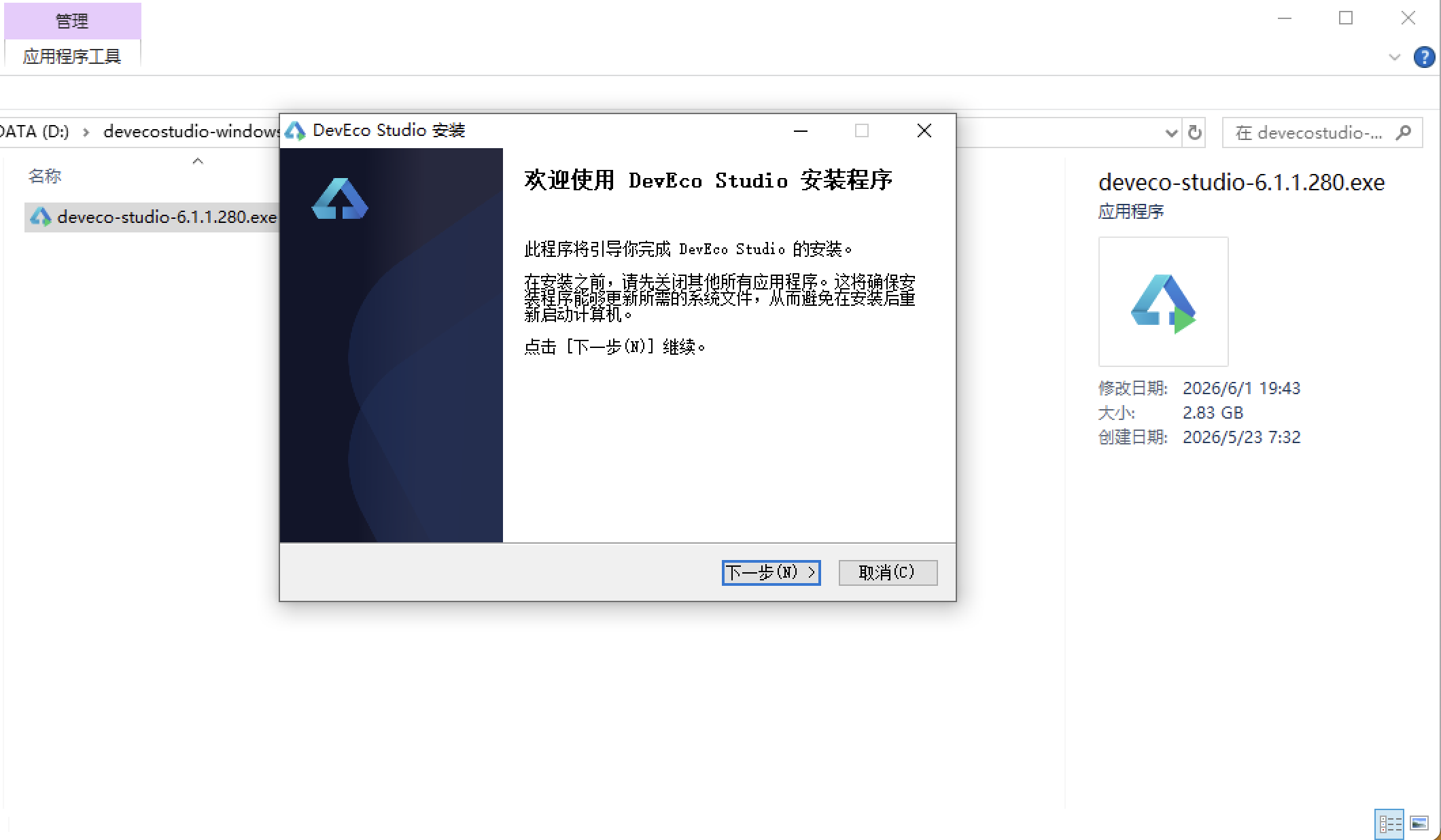
安装DevEco Studio程序
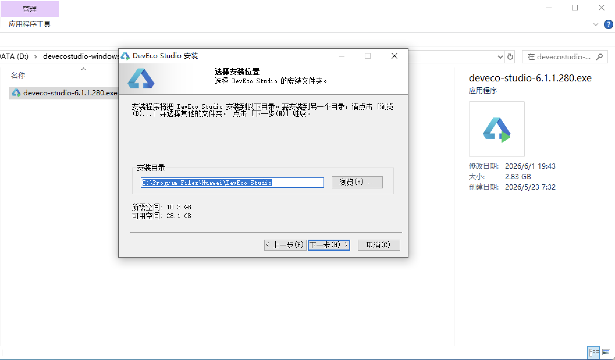
选择目标安装目录:
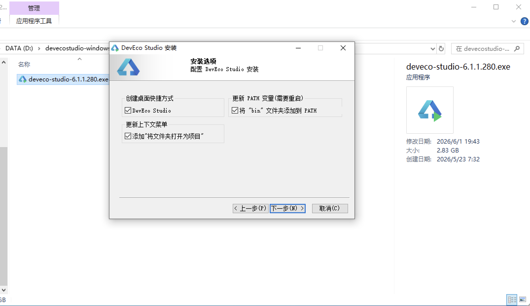
设置环境变量,但是需要重启一下:
新建一个空白模板:
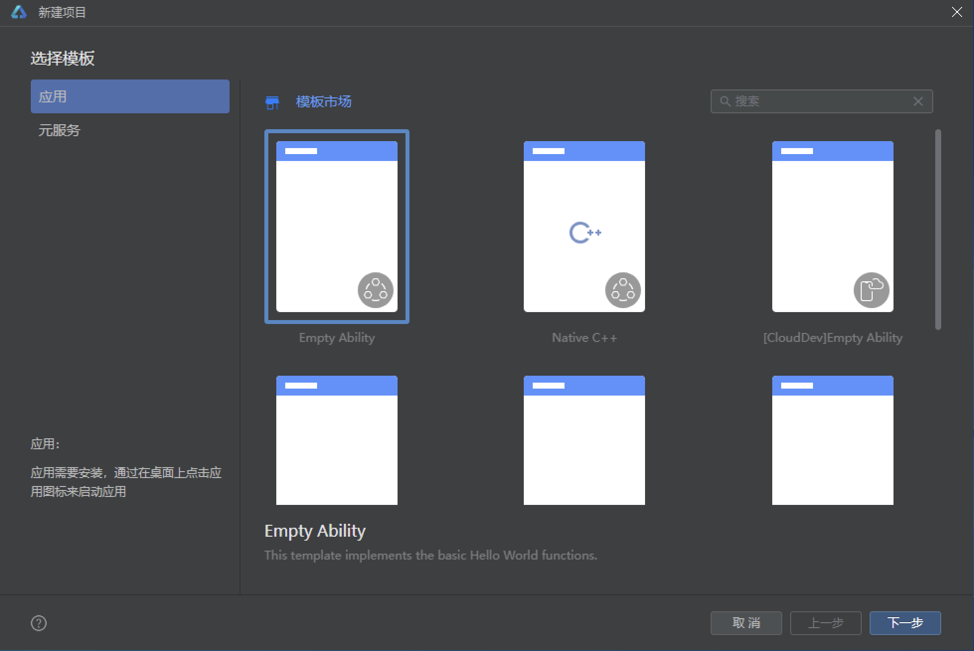
设置API为24的模板项目: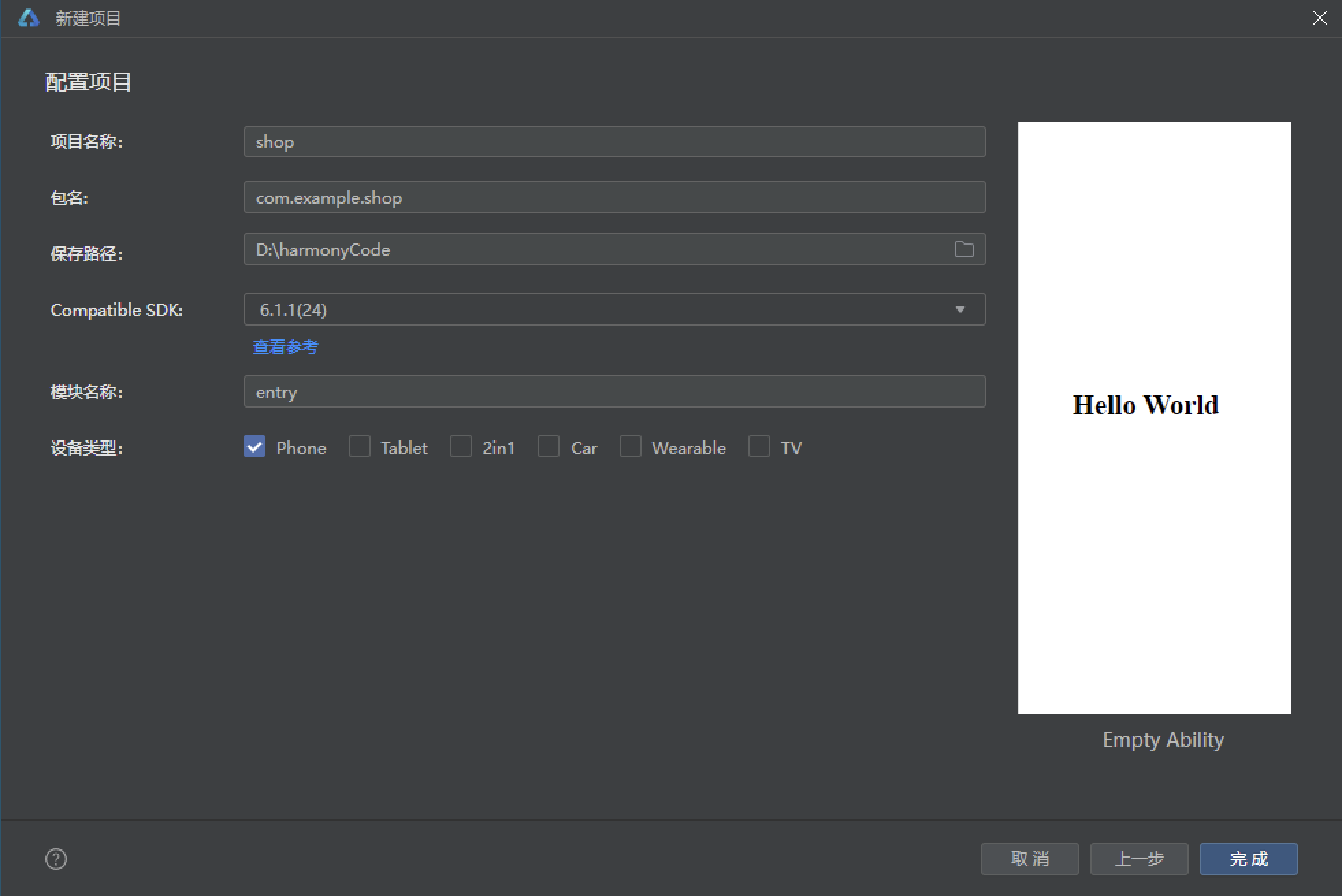
初始化项目,自动下载相关依赖:
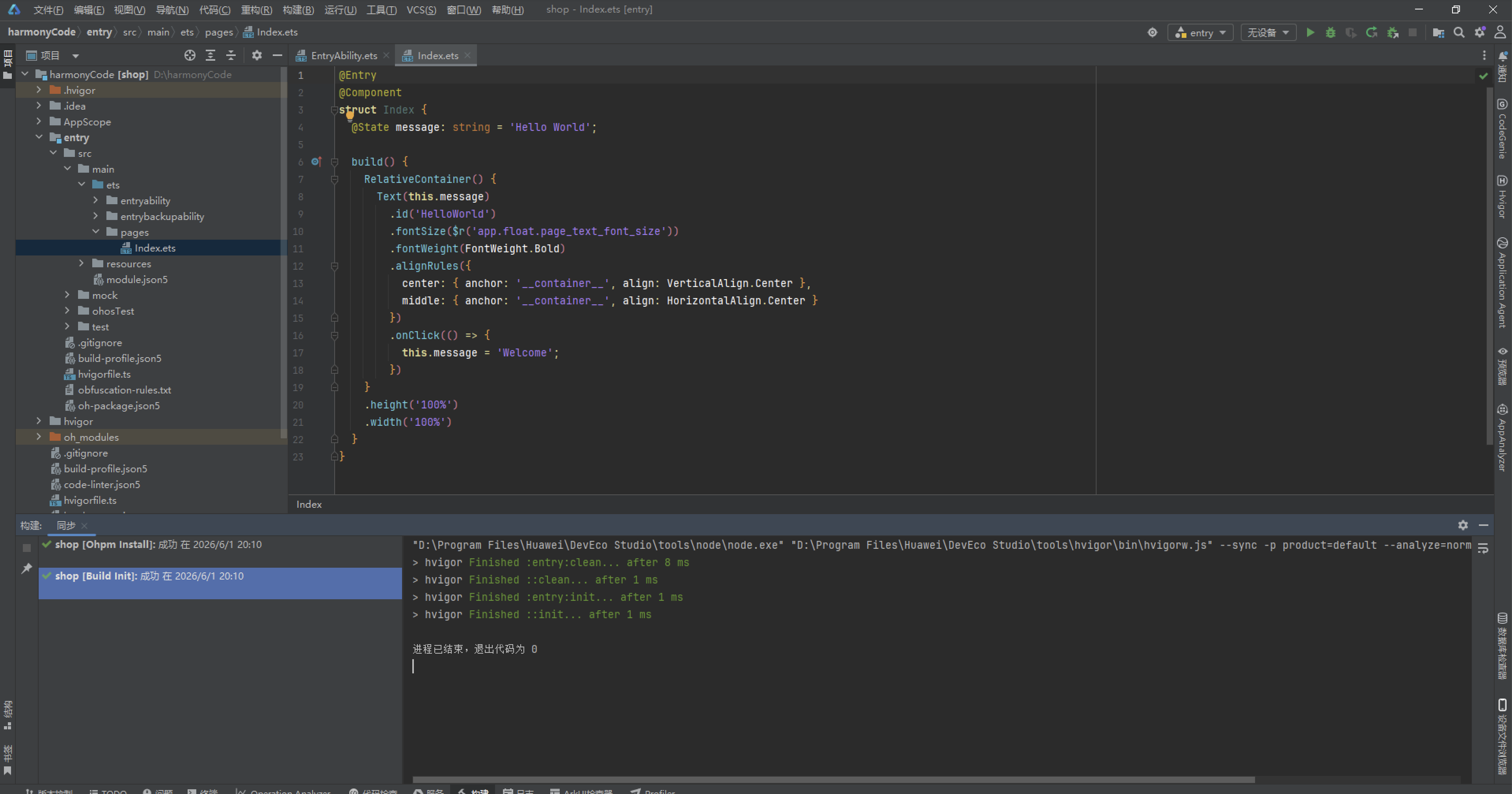
完整代码:
// ============================================================
// 奶油粉浅色 · 电商美妆头部 · 5底部Tab · 6弹框
// 布局亮点:头部 banner 横滑+分类金刚区;检测Tab五维横条+大分数环;
// 方案Tab早晚时间轴;商城Tab双列瀑布;档案Tab前后对比记录
// ============================================================
// ---------------- 数据结构 ----------------
interface DimT10 {
id: number
name: string
score: number
level: string
icon: string
}
interface StepT10 {
id: number
phase: string
product: string
note: string
freq: number
on: boolean
}
interface GoodT10 {
id: number
name: string
brand: string
price: number
orig: number
tag: string
sold: number
icon: string
}
interface SnapT10 {
id: number
date: string
score: number
pore: number
melanin: number
note: string
}
interface ProjT10 {
id: number
name: string
cate: string
price: number
times: number
desc: string
hot: boolean
}
interface OrdT10 {
id: number
name: string
state: string
date: string
price: number
}
// ---------------- 写死数据 ----------------
const DIMS10: Array<DimT10> = [
{ id: 1, name: '水分度', score: 62, level: '偏干', icon: '💧' },
{ id: 2, name: '油脂分泌', score: 78, level: '适中', icon: '🫧' },
{ id: 3, name: '毛孔状态', score: 54, level: 'T区粗大', icon: '🔎' },
{ id: 4, name: '黑色素', score: 47, level: '轻度沉着', icon: '🌗' },
{ id: 5, name: '平滑度', score: 71, level: '轻微粗糙', icon: '✨' },
{ id: 6, name: '敏感度', score: 83, level: '耐受良好', icon: '🌿' },
{ id: 7, name: '细纹弹性', score: 66, level: '初老阶段', icon: '🌸' }
]
const STEPS10: Array<StepT10> = [
{ id: 1, phase: '早', product: '氨基酸洁面', note: '温水 30 秒轻柔打圈', freq: 1, on: true },
{ id: 2, phase: '早', product: 'VC 精华 15%', note: '抗氧化 + 提亮,白天必备', freq: 1, on: true },
{ id: 3, phase: '早', product: '清爽防晒 SPF50+', note: '两指法则,每 3 小时补涂', freq: 1, on: true },
{ id: 4, phase: '晚', product: '卸妆油乳', note: '仅化妆日使用,乳化彻底', freq: 4, on: false },
{ id: 5, phase: '晚', product: 'A 醇 0.3%', note: '隔晚使用,建立耐受期', freq: 4, on: true },
{ id: 6, phase: '晚', product: '神经酰胺面霜', note: '修护屏障,A 醇后必须叠加', freq: 7, on: true },
{ id: 7, phase: '周护理', product: '水杨酸棉片 2%', note: 'T 区擦拭去角质', freq: 2, on: true },
{ id: 8, phase: '周护理', product: '保湿修护面膜', note: 'A 醇次日舒缓', freq: 3, on: false },
{ id: 9, phase: '周护理', product: '眼周按摩导入', note: '配合咖啡因眼霜', freq: 5, on: true },
{ id: 10, phase: '周护理', product: '头皮护理精华', note: '发际线防脱', freq: 2, on: false }
]
const GOODS10: Array<GoodT10> = [
{ id: 1, name: '多酸焕肤精华液', brand: 'DR.WU', price: 329, orig: 459, tag: '闭口救星', sold: 2361, icon: '🧪' },
{ id: 2, name: 'A醇抗皱晚霜', brand: '露得清', price: 199, orig: 269, tag: '回购王', sold: 5872, icon: '🌙' },
{ id: 3, name: '积雪草修护面膜', brand: '蒂佳婷', price: 89, orig: 129, tag: '敏感肌', sold: 8963, icon: '🌿' },
{ id: 4, name: '烟酰胺身体乳', brand: '凡士林', price: 69, orig: 99, tag: '鸡皮克星', sold: 12306, icon: '🧴' },
{ id: 5, name: '防晒喷雾 SPF50', brand: '安热沙', price: 238, orig: 298, tag: '补涂神器', sold: 4482, icon: '☀️' },
{ id: 6, name: 'VC粉 + B5 精华', brand: '修丽可', price: 680, orig: 880, tag: '提亮CP', sold: 1789, icon: '🍊' },
{ id: 7, name: '水杨酸棉片 2%', brand: 'Stridex', price: 55, orig: 79, tag: '刷酸入门', sold: 15678, icon: '🧻' },
{ id: 8, name: '神经酰胺屏障霜', brand: 'CeraVe', price: 168, orig: 228, tag: '修护屏障', sold: 9254, icon: '🧊' },
{ id: 9, name: '咖啡因眼部精华', brand: 'The Ordinary', price: 98, orig: 139, tag: '去浮肿', sold: 6712, icon: '👀' },
{ id: 10, name: '美白淡斑安瓶', brand: 'OLAY', price: 399, orig: 529, tag: '淡斑', sold: 3145, icon: '💧' },
{ id: 11, name: '胶原蛋白饮', brand: '资生堂', price: 298, orig: 368, tag: '内调', sold: 2457, icon: '🥤' },
{ id: 12, name: '清洁泥膜 125ml', brand: '科颜氏', price: 315, orig: 420, tag: '深层清洁', sold: 5028, icon: '🪨' }
]
const SNAPS10: Array<SnapT10> = [
{ id: 1, date: '2026-08-26', score: 72, pore: 54, melanin: 47, note: 'A 醇第 6 周,脸颊泛红减轻' },
{ id: 2, date: '2026-07-30', score: 68, pore: 58, melanin: 50, note: '出差防晒不到位,斑点略深' },
{ id: 3, date: '2026-06-28', score: 65, pore: 60, melanin: 52, note: '刷酸建立期,下巴闭口爆发' },
{ id: 4, date: '2026-05-26', score: 63, pore: 61, melanin: 53, note: '初次建档,油脂偏高' },
{ id: 5, date: '2026-04-24', score: 61, pore: 63, melanin: 55, note: '换季敏感,两颊干燥起皮' },
{ id: 6, date: '2026-03-22', score: 60, pore: 64, melanin: 56, note: '熬夜频发,暗沉明显' },
{ id: 7, date: '2026-02-20', score: 58, pore: 65, melanin: 57, note: '冬季屏障受损初期' },
{ id: 8, date: '2026-01-18', score: 57, pore: 66, melanin: 58, note: '基线建档,皮肤年龄 27.4 岁' },
{ id: 9, date: '2025-12-16', score: 59, pore: 65, melanin: 57, note: '暖气房干燥,补水不足' },
{ id: 10, date: '2025-11-14', score: 62, pore: 63, melanin: 55, note: '医美小气泡清洁后峰值' }
]
const PROJS10: Array<ProjT10> = [
{ id: 1, name: '光子嫩肤 DPL 三联', cate: '光电梯', price: 1280, times: 3, desc: '提亮 + 收毛孔 + 去红三效合一', hot: true },
{ id: 2, name: '水光针 补水款', cate: '注射类', price: 880, times: 1, desc: '玻尿酸基底 + 维生素鸡尾酒', hot: true },
{ id: 3, name: '果酸焕肤 35%', cate: '化学剥脱', price: 580, times: 1, desc: '闭口粉刺黑头一次清理', hot: false },
{ id: 4, name: '黄金微针', cate: '射频类', price: 2680, times: 1, desc: '痘坑毛孔深度 remodeling', hot: true },
{ id: 5, name: '超皮秒 全模式', cate: '激光', price: 1980, times: 1, desc: '斑点爆破 + 肤质重塑', hot: false },
{ id: 6, name: '舒敏之星 导入', cate: '舒缓修护', price: 380, times: 1, desc: '敏感期急救,无创导入', hot: false },
{ id: 7, name: '热玛吉 眼周', cate: '紧致抗衰', price: 8800, times: 1, desc: '眼周细纹一次收紧', hot: false },
{ id: 8, name: '小气泡深层清洁', cate: '清洁类', price: 198, times: 1, desc: '20 分钟黑头无处可逃', hot: false },
{ id: 9, name: '中胚层美塑', cate: '注射类', price: 1580, times: 3, desc: '营养直达真皮层', hot: false },
{ id: 10, name: '刷酸套餐(院线)', cate: '化学剥脱', price: 980, times: 4, desc: '医生面诊定制浓度', hot: true }
]
const ORDS10: Array<OrdT10> = [
{ id: 1, name: '光子嫩肤 DPL 第 2 次', state: '待到店', date: '2026-09-05 14:30', price: 0 },
{ id: 2, name: '水光针 补水款', state: '已完成', date: '2026-08-02 10:00', price: 880 },
{ id: 3, name: '舒敏之星 导入', state: '已完成', date: '2026-07-12 15:00', price: 380 },
{ id: 4, name: 'A醇抗皱晚霜 ×2', state: '已发货', date: '2026-08-20', price: 398 },
{ id: 5, name: '小气泡深层清洁', state: '已完成', date: '2026-06-08 11:00', price: 198 },
{ id: 6, name: '烟酰胺身体乳 ×3', state: '已完成', date: '2026-05-30', price: 207 },
{ id: 7, name: '黄金微针 第 1 次', state: '已完成', date: '2026-04-16 09:30', price: 2680 },
{ id: 8, name: '果酸焕肤 35%', state: '已完成', date: '2026-03-07 14:00', price: 580 }
]
const BANNER10: Array<string> = ['🌸 秋季修护季 · 检测免费领面膜', '💧 水光节 第 2 人半价', '✨ 医美双 9 大促定金翻倍']
const SLOT10: Array<string> = ['10:00', '11:00', '13:30', '14:30', '15:30', '16:30']
const SKIN10: Array<string> = ['干性', '油性', '混合', '敏感', '耐受']
// ---------------- 工具函数 ----------------
function dimColor10(s: number): string {
if (s >= 75) {
return '#0CA678'
}
if (s >= 55) {
return '#F59F00'
}
return '#E64980'
}
function ordStateColor10(s: string): string {
if (s === '待到店') {
return '#F59F00'
}
if (s === '已发货') {
return '#3B5BDB'
}
return '#0CA678'
}
// ================= 页面 =================
@Entry
@Component
struct Index {
@State curTab10: number = 0
@State dims10: Array<DimT10> = DIMS10.slice()
@State steps10: Array<StepT10> = STEPS10.slice()
@State goods10: Array<GoodT10> = GOODS10.slice()
@State snaps10: Array<SnapT10> = SNAPS10.slice()
@State orders10: Array<OrdT10> = ORDS10.slice()
// 弹框开关
@State showTest10: boolean = false
@State showDim10: boolean = false
@State showStep10: boolean = false
@State showProj10: boolean = false
@State showSnapDel10: boolean = false
@State showBuy10: boolean = false
// 检测预约
@State tSlot10: number = 2
@State tBare10: boolean = true
// 维度详情
@State dimId10: number = 0
// 方案步骤编辑
@State stepId10: number = 0
@State stepProd10: string = ''
@State stepNote10: string = ''
@State stepFreq10: number = 1
// 项目详情
@State projId10: number = 0
// 删除对比记录
@State snapId10: number = 0
@State armed10: boolean = false
// 购买
@State buyId10: number = 0
@State buyQty10: number = 1
// 特效
@State sparkleOp10: number = 0.3
@State shineX10: number = -50
aboutToAppear(): void {
this.getUIContext().animateTo({ duration: 1300, iterations: -1, playMode: PlayMode.Alternate, curve: Curve.EaseInOut }, () => {
this.sparkleOp10 = 1
})
this.getUIContext().animateTo({ duration: 1800, iterations: -1, playMode: PlayMode.Alternate, curve: Curve.EaseInOut }, () => {
this.shineX10 = 50
})
}
// ---------------- 头部(无动画 · 电商美妆风) ----------------
@Builder headerBar10() {
Column() {
Row() {
Column() {
Text('✨ SKIN LAB').fontSize(17).fontWeight(700).fontColor('#C2255C').letterSpacing(1)
Text('AI 肌肤检测 · 医学护肤 · 医美').fontSize(10).fontColor('#C99BB4').margin({ top: 3 })
}
.alignItems(HorizontalAlign.Start)
.layoutWeight(1)
Row() {
Text('🎁').fontSize(16)
Text('🛒').fontSize(16).margin({ left: 14 })
}
.alignItems(VerticalAlign.Center)
}
.width('100%')
.padding({ left: 16, right: 16, top: 14, bottom: 10 })
Row() {
Text('🔍').fontSize(13)
Text('敏感肌能用 A 醇吗?').fontSize(11).fontColor('#C99BB4').margin({ left: 6 }).layoutWeight(1)
Text('搜索').fontSize(10).fontColor('#FFFFFF').padding({ left: 12, right: 12, top: 5, bottom: 5 }).borderRadius(12).backgroundColor('#E64980')
}
.width('100%')
.padding({ left: 10, right: 10, top: 8, bottom: 8 })
.borderRadius(20)
.backgroundColor('#FFFFFF')
.margin({ left: 16, right: 16, bottom: 10 })
// banner 横滑
Scroll() {
Row() {
ForEach(BANNER10, (b: string) => {
Stack() {
Column() {
Text(b).fontSize(12).fontWeight(700).fontColor('#FFFFFF')
}
.width(210)
.alignItems(HorizontalAlign.Start)
.padding(14)
.borderRadius(14)
.backgroundColor('#E64980')
Text('✨').fontSize(14).translate({ x: this.shineX10 }).opacity(0.85)
}
.width(210)
.alignContent(Alignment.End)
.margin({ right: 10 })
}, (b: string) => 'bn' + b)
}
.padding({ left: 16, right: 16 })
}
.scrollable(ScrollDirection.Horizontal)
.scrollBar(BarState.Off)
.width('100%')
.margin({ bottom: 10 })
// 金刚区
Row() {
ForEach([['📸', '免费检测'], ['🧪', '方案'], ['💉', '医美'], ['🛍️', '商城'], ['📖', '档案']], (e: Array<string>) => {
Column() {
Text(e[0]).fontSize(22)
Text(e[1]).fontSize(9).fontColor('#8A5A6E').margin({ top: 4 })
}
.alignItems(HorizontalAlign.Center)
.layoutWeight(1)
.onClick(() => {
if (e[1] === '免费检测') {
this.curTab10 = 0
}
if (e[1] === '方案') {
this.curTab10 = 1
}
if (e[1] === '医美') {
this.showProj10 = true
}
if (e[1] === '商城') {
this.curTab10 = 2
}
if (e[1] === '档案') {
this.curTab10 = 3
}
})
}, (e: Array<string>) => 'kg' + e[1])
}
.width('100%')
.padding({ left: 8, right: 8, bottom: 12 })
}
.width('100%')
.backgroundColor('#FFF0F5')
.borderRadius({ bottomLeft: 20, bottomRight: 20 })
}
// ---------------- 底部Tab(一排5个) ----------------
@Builder tabItem10(icon: string, label: string, idx: number) {
Column() {
Text(icon).fontSize(20)
Text(label).fontSize(10).fontColor(this.curTab10 === idx ? '#E64980' : '#C99BB4').margin({ top: 3 })
}
.alignItems(HorizontalAlign.Center)
.padding({ top: 8, bottom: 6 })
.layoutWeight(1)
.onClick(() => {
this.curTab10 = idx
})
}
@Builder tabBar10() {
Row() {
this.tabItem10('📸', '检测', 0)
this.tabItem10('🧪', '方案', 1)
this.tabItem10('🛍️', '商城', 2)
this.tabItem10('📖', '档案', 3)
this.tabItem10('👤', '我的', 4)
}
.width('100%')
.backgroundColor('#FFFFFF')
.border({ width: 0.5, color: '#FFD6E4' })
}
// ============ Tab0 检测(五维横条 + 大分数环) ============
@Builder tabDetect10() {
Column() {
Row() {
Stack() {
Progress({ value: 66, total: 100 })
.width(92)
.height(92)
.style({ strokeWidth: 9 })
.color('#E64980')
Column() {
Text('66').fontSize(24).fontWeight(700).fontColor('#C2255C')
Text('肌龄 27.4 岁').fontSize(9).fontColor('#C99BB4')
}
.alignItems(HorizontalAlign.Center)
}
Column() {
Text('2026-08-26 检测报告').fontSize(13).fontWeight(700).fontColor('#5C3349')
Text('混合偏干 · 轻度敏感耐受 · T 区毛孔粗大').fontSize(10).fontColor('#C99BB4').margin({ top: 5 }).lineHeight(14)
Row() {
Text('预约免费检测').fontSize(10).fontColor('#FFFFFF').fontWeight(700).padding({ left: 12, right: 12, top: 5, bottom: 5 }).borderRadius(14).backgroundColor('#E64980').onClick(() => {
this.showTest10 = true
})
}
.margin({ top: 9 })
}
.alignItems(HorizontalAlign.Start)
.margin({ left: 16 })
.layoutWeight(1)
}
.width('100%')
.alignItems(VerticalAlign.Center)
.padding(14)
.borderRadius(16)
.backgroundColor('#FFFFFF')
.margin({ left: 14, right: 14, top: 12 })
// 七维雷达数据(横条)
Column() {
Row() {
Text('📊 肤质七维').fontSize(13).fontWeight(700).fontColor('#5C3349')
Text('点击维度看解读').fontSize(9).fontColor('#C99BB4')
}
.width('100%')
.justifyContent(FlexAlign.SpaceBetween)
ForEach(this.dims10, (d: DimT10) => {
Row() {
Text(d.icon).fontSize(16).width(26)
Text(d.name).fontSize(11).fontColor('#5C3349').width(62)
Column() {
Column() {
}
.width(d.score + '%')
.height('100%')
.borderRadius(3)
.backgroundColor(dimColor10(d.score))
}
.layoutWeight(1)
.height(7)
.borderRadius(4)
.backgroundColor('#FFF0F5')
Text(d.score.toString()).fontSize(11).fontWeight(700).fontColor(dimColor10(d.score)).width(28).textAlign(TextAlign.End)
Text(d.level).fontSize(8).fontColor('#C99BB4').width(56).textAlign(TextAlign.End)
}
.width('100%')
.alignItems(VerticalAlign.Center)
.margin({ top: 10 })
.onClick(() => {
this.dimId10 = d.id
this.showDim10 = true
})
}, (d: DimT10) => 'dm' + d.id.toString())
}
.width('100%')
.alignItems(HorizontalAlign.Start)
.padding(14)
.borderRadius(16)
.backgroundColor('#FFFFFF')
.margin({ left: 14, right: 14, top: 10 })
// 热门医美项目
Row() {
Text('💉 热门医美项目').fontSize(13).fontWeight(700).fontColor('#5C3349')
Text('全部 >').fontSize(10).fontColor('#E64980').onClick(() => {
this.showProj10 = true
})
}
.width('100%')
.justifyContent(FlexAlign.SpaceBetween)
.padding({ left: 16, right: 16, top: 16, bottom: 4 })
ForEach(PROJS10, (p: ProjT10) => {
Row() {
Column() {
Row() {
Text(p.name).fontSize(12).fontWeight(700).fontColor('#5C3349')
if (p.hot) {
Text('HOT').fontSize(8).fontColor('#FFFFFF').padding({ left: 6, right: 6, top: 2, bottom: 2 }).borderRadius(6).backgroundColor('#E64980').margin({ left: 8 })
}
}
.width('100%')
Text(p.cate + ' · ' + p.desc).fontSize(9).fontColor('#C99BB4').margin({ top: 5 }).maxLines(1).textOverflow({ overflow: TextOverflow.Ellipsis })
}
.alignItems(HorizontalAlign.Start)
.layoutWeight(1)
Column() {
Text('¥' + p.price.toString()).fontSize(13).fontWeight(700).fontColor('#E64980')
Text('/' + p.times.toString() + '次').fontSize(8).fontColor('#C99BB4')
}
.alignItems(HorizontalAlign.End)
}
.width('100%')
.alignItems(VerticalAlign.Center)
.padding(13)
.borderRadius(14)
.backgroundColor('#FFFFFF')
.margin({ left: 14, right: 14, top: 8 })
.onClick(() => {
this.projId10 = p.id
this.showProj10 = true
})
}, (p: ProjT10) => 'pj' + p.id.toString())
}
.width('100%')
.padding({ bottom: 12 })
}
// ============ Tab1 方案(早晚时间轴) ============
@Builder tabPlan10() {
Column() {
Column() {
Text('🧪 我的医学护肤方案').fontSize(13).fontWeight(700).fontColor('#5C3349')
Text('依据 8-26 检测结果定制 · 12 周改善周期').fontSize(10).fontColor('#C99BB4').margin({ top: 6 })
Text('本周完成度').fontSize(10).fontColor('#C99BB4').margin({ top: 10 })
Row() {
Column() {
Column() {
}
.width('68%')
.height('100%')
.borderRadius(3)
.backgroundColor('#E64980')
}
.layoutWeight(1)
.height(6)
.borderRadius(3)
.backgroundColor('#FFF0F5')
Text('68%').fontSize(10).fontWeight(700).fontColor('#E64980').margin({ left: 10 })
}
.width('100%')
.margin({ top: 5 })
}
.width('100%')
.alignItems(HorizontalAlign.Start)
.padding(14)
.borderRadius(16)
.backgroundColor('#FFFFFF')
.margin({ left: 14, right: 14, top: 12 })
Row() {
Text('🗓️ 护理流程(' + this.steps10.length.toString() + ' 步)').fontSize(13).fontWeight(700).fontColor('#5C3349')
Text('新增 +').fontSize(10).fontColor('#E64980').onClick(() => {
this.stepId10 = 0
this.stepProd10 = ''
this.stepNote10 = ''
this.stepFreq10 = 1
this.showStep10 = true
})
}
.width('100%')
.justifyContent(FlexAlign.SpaceBetween)
.padding({ left: 16, right: 16, top: 16, bottom: 4 })
ForEach(this.steps10, (s: StepT10) => {
Row() {
Column() {
if (s.phase === '早') {
Text('🌅').fontSize(18)
} else if (s.phase === '晚') {
Text('🌙').fontSize(18)
} else {
Text('🗓️').fontSize(18)
}
Text(s.phase).fontSize(8).fontColor('#C99BB4').margin({ top: 2 })
}
.width(36)
.alignItems(HorizontalAlign.Center)
Column() {
Text(s.product).fontSize(12).fontWeight(700).fontColor('#5C3349')
Text(s.note + ' · 每周 ' + s.freq.toString() + ' 次' + (s.on ? '' : ' · 已暂停')).fontSize(9).fontColor('#C99BB4').margin({ top: 4 }).maxLines(1).textOverflow({ overflow: TextOverflow.Ellipsis })
}
.alignItems(HorizontalAlign.Start)
.layoutWeight(1)
.padding({ left: 10 })
Column() {
Text('✏️').fontSize(15).onClick(() => {
this.stepId10 = s.id
this.stepProd10 = s.product
this.stepNote10 = s.note
this.stepFreq10 = s.freq
this.showStep10 = true
})
Text(s.on ? '🔔' : '🔕').fontSize(13).margin({ top: 8 }).onClick(() => {
this.steps10 = this.steps10.map((x: StepT10) => {
if (x.id === s.id) {
return { id: x.id, phase: x.phase, product: x.product, note: x.note, freq: x.freq, on: !x.on }
}
return x
})
})
}
.alignItems(HorizontalAlign.Center)
}
.width('100%')
.alignItems(VerticalAlign.Center)
.padding(12)
.borderRadius(14)
.backgroundColor('#FFFFFF')
.margin({ left: 14, right: 14, top: 6 })
}, (s: StepT10) => 'sp' + s.id.toString() + '_' + s.on.toString())
}
.width('100%')
.padding({ bottom: 12 })
}
// ============ Tab2 商城(双列瀑布) ============
@Builder goodCard10(g: GoodT10) {
Column() {
Column() {
Text(g.icon).fontSize(34)
}
.width('100%')
.height(88)
.borderRadius({ topLeft: 12, topRight: 12 })
.backgroundColor('#FFF0F5')
.justifyContent(FlexAlign.Center)
Column() {
Text(g.tag).fontSize(8).fontColor('#E64980').padding({ left: 6, right: 6, top: 2, bottom: 2 }).borderRadius(6).backgroundColor('#FFD6E4').alignSelf(ItemAlign.Start)
Text(g.name).fontSize(11).fontWeight(700).fontColor('#5C3349').margin({ top: 6 }).maxLines(1).textOverflow({ overflow: TextOverflow.Ellipsis })
Text(g.brand).fontSize(9).fontColor('#C99BB4').margin({ top: 3 })
Row() {
Column() {
Row() {
Text('¥').fontSize(9).fontColor('#E64980')
Text(g.price.toString()).fontSize(15).fontWeight(700).fontColor('#E64980')
}
.alignItems(VerticalAlign.Bottom)
Text('¥' + g.orig.toString() + ' · 售' + g.sold.toString()).fontSize(8).fontColor('#C99BB4').margin({ top: 2 })
}
.alignItems(HorizontalAlign.Start)
.layoutWeight(1)
Text('购').fontSize(10).fontColor('#FFFFFF').fontWeight(700).padding({ left: 10, right: 10, top: 5, bottom: 5 }).borderRadius(13).backgroundColor('#E64980').onClick(() => {
this.buyId10 = g.id
this.buyQty10 = 1
this.showBuy10 = true
})
}
.width('100%')
.alignItems(VerticalAlign.Center)
.margin({ top: 8 })
}
.width('100%')
.alignItems(HorizontalAlign.Start)
.padding(10)
}
.width('100%')
.borderRadius(12)
.backgroundColor('#FFFFFF')
}
@Builder tabShop10() {
Column() {
// 分类 chips
Row() {
ForEach(['全部', '精华', '面膜', '防晒', '身体护理'], (c: string, i: number) => {
Text(c).fontSize(10).fontColor(i === 0 ? '#FFFFFF' : '#8A5A6E').padding({ left: 12, right: 12, top: 6, bottom: 6 }).borderRadius(14).backgroundColor(i === 0 ? '#E64980' : '#FFFFFF').margin({ right: 8 })
}, (c: string) => 'sc' + c)
}
.width('100%')
.padding({ left: 14, right: 14, top: 12 })
Text('🛍️ 肌肤检测关联推荐 · 为你避开致敏成分').fontSize(10).fontColor('#C99BB4').padding({ left: 16, right: 16, top: 10, bottom: 4 })
Row() {
Column() {
ForEach(this.goods10.filter((g: GoodT10, i: number) => i % 2 === 0), (g: GoodT10) => {
this.goodCard10(g)
}, (g: GoodT10) => 'gA' + g.id.toString())
}
.layoutWeight(1)
Column() {
ForEach(this.goods10.filter((g: GoodT10, i: number) => i % 2 === 1), (g: GoodT10) => {
this.goodCard10(g)
}, (g: GoodT10) => 'gB' + g.id.toString())
}
.layoutWeight(1)
.margin({ left: 8 })
}
.width('100%')
.alignItems(VerticalAlign.Top)
.padding({ left: 14, right: 14, top: 6 })
}
.width('100%')
.padding({ bottom: 12 })
}
// ============ Tab3 档案(前后对比) ============
@Builder tabArch10() {
Column() {
// 评分趋势柱
Column() {
Text('📈 肌肤评分趋势(近 10 次)').fontSize(13).fontWeight(700).fontColor('#5C3349')
Row() {
ForEach(this.snaps10, (s: SnapT10) => {
Column() {
Text(s.score.toString()).fontSize(8).fontColor(s.score >= 70 ? '#0CA678' : '#C99BB4').margin({ bottom: 2 })
Column() {
Column() {
}
.width(13)
.height((s.score - 50) * 2)
.borderRadius({ topLeft: 3, topRight: 3 })
.backgroundColor(s.score >= 70 ? '#0CA678' : '#F9A8C9')
}
.width('100%')
.height(48)
.justifyContent(FlexAlign.End)
Text(s.date.substring(5)).fontSize(7).fontColor('#C99BB4').margin({ top: 3 })
}
.alignItems(HorizontalAlign.Center)
.layoutWeight(1)
}, (s: SnapT10) => 'sn' + s.id.toString())
}
.width('100%')
.margin({ top: 12 })
}
.width('100%')
.alignItems(HorizontalAlign.Start)
.padding(14)
.borderRadius(16)
.backgroundColor('#FFFFFF')
.margin({ left: 14, right: 14, top: 12 })
Row() {
Text('📷 对比记录(' + this.snaps10.length.toString() + ')').fontSize(13).fontWeight(700).fontColor('#5C3349')
Text('长按卡片可删除').fontSize(9).fontColor('#C99BB4')
}
.width('100%')
.justifyContent(FlexAlign.SpaceBetween)
.padding({ left: 16, right: 16, top: 16, bottom: 4 })
ForEach(this.snaps10, (s: SnapT10) => {
Row() {
Column() {
Text('🤳').fontSize(26)
}
.width(64)
.height(64)
.borderRadius(12)
.backgroundColor('#FFF0F5')
.justifyContent(FlexAlign.Center)
Column() {
Text(s.date).fontSize(12).fontWeight(700).fontColor('#5C3349')
Row() {
Text('综合 ' + s.score.toString()).fontSize(9).fontColor('#E64980').fontWeight(700)
Text('毛孔 ' + s.pore.toString()).fontSize(9).fontColor('#C99BB4').margin({ left: 8 })
Text('黑色素 ' + s.melanin.toString()).fontSize(9).fontColor('#C99BB4').margin({ left: 8 })
}
.margin({ top: 5 })
Text(s.note).fontSize(9).fontColor('#C99BB4').margin({ top: 4 }).maxLines(1).textOverflow({ overflow: TextOverflow.Ellipsis })
}
.alignItems(HorizontalAlign.Start)
.layoutWeight(1)
.padding({ left: 12 })
Text('🗑️').fontSize(15).onClick(() => {
this.snapId10 = s.id
this.armed10 = false
this.showSnapDel10 = true
})
}
.width('100%')
.alignItems(VerticalAlign.Center)
.padding(12)
.borderRadius(14)
.backgroundColor('#FFFFFF')
.margin({ left: 14, right: 14, top: 8 })
}, (s: SnapT10) => 'sn2' + s.id.toString())
}
.width('100%')
.padding({ bottom: 12 })
}
// ============ Tab4 我的 ============
@Builder tabMine10() {
Column() {
Row() {
Stack() {
Circle().width(52).height(52).fill('#FFD6E4')
Text('👩').fontSize(26)
}
Column() {
Text('林女士 · SKIN ID 88290').fontSize(14).fontWeight(700).fontColor('#5C3349')
Text('混合偏干 · 敏感耐受 · 已检测 10 次').fontSize(9).fontColor('#C99BB4').margin({ top: 5 })
}
.alignItems(HorizontalAlign.Start)
.margin({ left: 12 })
.layoutWeight(1)
Text('预约检测').fontSize(10).fontColor('#FFFFFF').padding({ left: 10, right: 10, top: 6, bottom: 6 }).borderRadius(12).backgroundColor('#E64980').onClick(() => {
this.showTest10 = true
})
}
.width('100%')
.alignItems(VerticalAlign.Center)
.padding(14)
.borderRadius(16)
.backgroundColor('#FFFFFF')
.margin({ left: 14, right: 14, top: 12 })
Row() {
Text('📦 我的订单(' + this.orders10.length.toString() + ')').fontSize(13).fontWeight(700).fontColor('#5C3349')
}
.width('100%')
.padding({ left: 16, right: 16, top: 16, bottom: 4 })
ForEach(this.orders10, (o: OrdT10) => {
Row() {
Column() {
Text(o.name).fontSize(11).fontColor('#5C3349').maxLines(1).textOverflow({ overflow: TextOverflow.Ellipsis })
Row() {
Text(o.state).fontSize(9).fontColor(ordStateColor10(o.state))
Text(o.date).fontSize(9).fontColor('#C99BB4').margin({ left: 10 })
}
.margin({ top: 6 })
}
.alignItems(HorizontalAlign.Start)
.layoutWeight(1)
Text(o.price > 0 ? '¥' + o.price.toString() : '已含').fontSize(11).fontWeight(700).fontColor('#E64980')
}
.width('100%')
.alignItems(VerticalAlign.Center)
.padding(12)
.borderRadius(12)
.backgroundColor('#FFFFFF')
.margin({ left: 14, right: 14, top: 5 })
}, (o: OrdT10) => 'od' + o.id.toString())
Column() {
Text('🌸 好皮肤 = 检测 + 方案 + 坚持 — SKIN LAB').fontSize(9).fontColor('#C99BB4').opacity(this.sparkleOp10)
}
.width('100%')
.alignItems(HorizontalAlign.Center)
.padding(24)
}
.width('100%')
.padding({ bottom: 12 })
}
// ---------------- 弹框1:预约免费检测(底部抽屉) ----------------
@Builder testOverlay10() {
Column() {
Column() {
Column() {
Text('').fontSize(4).width(40).borderRadius(2).backgroundColor('#FFD6E4')
}
.width('100%')
.alignItems(HorizontalAlign.Center)
.padding({ top: 10, bottom: 4 })
Row() {
Text('📸 预约 AI 肤质检测(免费)').fontSize(15).fontWeight(700).fontColor('#5C3349')
Text('✕').fontSize(15).fontColor('#C99BB4').onClick(() => {
this.showTest10 = false
})
}
.width('100%')
.justifyContent(FlexAlign.SpaceBetween)
.padding({ left: 16, right: 16, top: 4 })
Text('8 分钟 AI 成像 + 皮肤科医生解读,附赠修护面膜一片').fontSize(10).fontColor('#C99BB4').margin({ top: 8 })
Text('肤质自评').fontSize(11).fontColor('#C99BB4').margin({ top: 14 })
Row() {
ForEach(SKIN10, (s: string) => {
Text(s).fontSize(10).fontColor('#8A5A6E').padding({ left: 12, right: 12, top: 7, bottom: 7 }).borderRadius(12).backgroundColor('#FFF0F5').margin({ right: 8 })
}, (s: string) => 'sk' + s)
}
.margin({ top: 6 })
Text('到店时段').fontSize(11).fontColor('#C99BB4').margin({ top: 14 })
Flex({ wrap: FlexWrap.Wrap }) {
ForEach(SLOT10, (t: string, i: number) => {
Text(t).fontSize(10).fontColor(this.tSlot10 === i ? '#FFFFFF' : '#8A5A6E').padding({ left: 13, right: 13, top: 7, bottom: 7 }).borderRadius(12).backgroundColor(this.tSlot10 === i ? '#E64980' : '#FFF0F5').margin({ right: 8, bottom: 8 }).onClick(() => {
this.tSlot10 = i
})
}, (t: string) => 'tt' + t)
}
.width('100%')
.margin({ top: 6 })
Row() {
Text('素颜到店(不化妆不上防晒,数据更准)').fontSize(11).fontColor('#5C3349').layoutWeight(1)
Toggle({ type: ToggleType.Switch, isOn: this.tBare10 })
.selectedColor('#E64980')
.onChange((on: boolean) => {
this.tBare10 = on
})
}
.width('100%')
.alignItems(VerticalAlign.Center)
.margin({ top: 12 })
Text('确认预约')
.fontSize(13)
.fontWeight(700)
.fontColor('#FFFFFF')
.width('100%')
.textAlign(TextAlign.Center)
.padding({ top: 13, bottom: 13 })
.borderRadius(22)
.backgroundColor('#E64980')
.margin({ top: 16, bottom: 16 })
.onClick(() => {
const no: OrdT10 = { id: Date.now(), name: 'AI 肤质检测(免费)', state: '待到店', date: '明天 ' + SLOT10[this.tSlot10], price: 0 }
this.orders10 = [no].concat(this.orders10)
this.showTest10 = false
})
}
.width('100%')
.padding({ left: 16, right: 16 })
.borderRadius({ topLeft: 22, topRight: 22 })
.backgroundColor('#FFFFFF')
}
.width('100%')
.height('100%')
.justifyContent(FlexAlign.End)
.backgroundColor('#995C3349')
.zIndex(999)
.onClick(() => {
this.showTest10 = false
})
}
// ---------------- 弹框2:维度解读(居中卡) ----------------
@Builder dimOverlay10() {
Column() {
Column() {
Text(this.dimId10 > 0 && this.dims10.filter((d: DimT10) => d.id === this.dimId10).length > 0 ? this.dims10.filter((d: DimT10) => d.id === this.dimId10)[0].icon + ' ' + this.dims10.filter((d: DimT10) => d.id === this.dimId10)[0].name : '维度').fontSize(15).fontWeight(700).fontColor('#5C3349')
Text('✕').fontSize(15).fontColor('#C99BB4').onClick(() => {
this.showDim10 = false
})
Row() {
Text(this.dimId10 > 0 && this.dims10.filter((d: DimT10) => d.id === this.dimId10).length > 0 ? this.dims10.filter((d: DimT10) => d.id === this.dimId10)[0].score.toString() : '-').fontSize(30).fontWeight(700).fontColor('#E64980')
Text(' / 100').fontSize(12).fontColor('#C99BB4').margin({ left: 4 })
Text(this.dimId10 > 0 && this.dims10.filter((d: DimT10) => d.id === this.dimId10).length > 0 ? this.dims10.filter((d: DimT10) => d.id === this.dimId10)[0].level : '').fontSize(10).fontColor('#FFFFFF').padding({ left: 8, right: 8, top: 4, bottom: 4 }).borderRadius(8).backgroundColor('#E64980').margin({ left: 10 })
}
.width('100%')
.alignItems(VerticalAlign.Bottom)
.margin({ top: 12 })
Text('同龄同肤质人群对比:超越 58%。该维度近 3 个月呈上升趋势,与 A 醇耐受建立相关。建议:坚持当前方案 6 周后复测,期间避免叠加高浓度酸类。').fontSize(11).fontColor('#5C3349').lineHeight(18).margin({ top: 12 })
Text('知道了').fontSize(12).fontColor('#FFFFFF').fontWeight(700).width('100%').textAlign(TextAlign.Center).padding({ top: 12, bottom: 12 }).borderRadius(20).backgroundColor('#E64980').margin({ top: 16 }).onClick(() => {
this.showDim10 = false
})
}
.width('80%')
.padding(18)
.borderRadius(18)
.backgroundColor('#FFFFFF')
.onClick(() => {
})
}
.width('100%')
.height('100%')
.justifyContent(FlexAlign.Center)
.backgroundColor('#995C3349')
.zIndex(999)
.onClick(() => {
this.showDim10 = false
})
}
// ---------------- 弹框3:编辑方案步骤(底部抽屉) ----------------
@Builder stepOverlay10() {
Column() {
Column() {
Row() {
Text(this.stepId10 === 0 ? '➕ 新增护理步骤' : '✏️ 编辑护理步骤').fontSize(15).fontWeight(700).fontColor('#5C3349')
Text('✕').fontSize(15).fontColor('#C99BB4').onClick(() => {
this.showStep10 = false
})
}
.width('100%')
.justifyContent(FlexAlign.SpaceBetween)
.padding({ top: 16, bottom: 4 })
Text('产品名称').fontSize(11).fontColor('#C99BB4').margin({ top: 12 })
TextInput({ placeholder: '例:A 醇精华 0.3%', text: this.stepProd10 })
.fontSize(11)
.fontColor('#5C3349')
.placeholderColor('#C99BB4')
.backgroundColor('#FFF0F5')
.borderRadius(10)
.height(42)
.padding({ left: 10, right: 10 })
.margin({ top: 6 })
.onChange((v: string) => {
this.stepProd10 = v
})
Text('备注').fontSize(11).fontColor('#C99BB4').margin({ top: 12 })
TextInput({ placeholder: '例:隔晚使用,耳后测敏', text: this.stepNote10 })
.fontSize(11)
.fontColor('#5C3349')
.placeholderColor('#C99BB4')
.backgroundColor('#FFF0F5')
.borderRadius(10)
.height(42)
.padding({ left: 10, right: 10 })
.margin({ top: 6 })
.onChange((v: string) => {
this.stepNote10 = v
})
Text('每周频次').fontSize(11).fontColor('#C99BB4').margin({ top: 14 })
Row() {
Text('−').fontSize(18).fontColor('#E64980').width(36).height(36).borderRadius(18).backgroundColor('#FFF0F5').textAlign(TextAlign.Center).onClick(() => {
if (this.stepFreq10 > 1) {
this.stepFreq10 -= 1
}
})
Text(this.stepFreq10.toString() + ' 次/周').fontSize(13).fontWeight(700).fontColor('#5C3349').layoutWeight(1).textAlign(TextAlign.Center)
Text('+').fontSize(18).fontColor('#E64980').width(36).height(36).borderRadius(18).backgroundColor('#FFF0F5').textAlign(TextAlign.Center).onClick(() => {
if (this.stepFreq10 < 7) {
this.stepFreq10 += 1
}
})
}
.width('60%')
.alignItems(VerticalAlign.Center)
.margin({ top: 8 })
Text(this.stepId10 === 0 ? '保存步骤' : '更新步骤')
.fontSize(13)
.fontWeight(700)
.fontColor('#FFFFFF')
.width('100%')
.textAlign(TextAlign.Center)
.padding({ top: 13, bottom: 13 })
.borderRadius(22)
.backgroundColor('#E64980')
.margin({ top: 16, bottom: 16 })
.onClick(() => {
if (this.stepId10 === 0) {
const ns: StepT10 = { id: Date.now(), phase: '晚', product: this.stepProd10.length > 0 ? this.stepProd10 : '未命名产品', note: this.stepNote10.length > 0 ? this.stepNote10 : '坚持使用', freq: this.stepFreq10, on: true }
this.steps10 = [ns].concat(this.steps10)
} else {
this.steps10 = this.steps10.map((x: StepT10) => {
if (x.id === this.stepId10) {
return { id: x.id, phase: x.phase, product: this.stepProd10.length > 0 ? this.stepProd10 : x.product, note: this.stepNote10.length > 0 ? this.stepNote10 : x.note, freq: this.stepFreq10, on: x.on }
}
return x
})
}
this.showStep10 = false
})
}
.width('100%')
.padding({ left: 16, right: 16 })
.borderRadius({ topLeft: 22, topRight: 22 })
.backgroundColor('#FFFFFF')
}
.width('100%')
.height('100%')
.justifyContent(FlexAlign.End)
.backgroundColor('#995C3349')
.zIndex(999)
.onClick(() => {
this.showStep10 = false
})
}
// ---------------- 弹框4:医美项目(居中大卡) ----------------
@Builder projOverlay10() {
Column() {
Column() {
Row() {
Text('💉 医美项目').fontSize(15).fontWeight(700).fontColor('#5C3349')
Text('✕').fontSize(15).fontColor('#C99BB4').onClick(() => {
this.showProj10 = false
})
}
.width('100%')
.justifyContent(FlexAlign.SpaceBetween)
ForEach(PROJS10, (p: ProjT10) => {
Row() {
Column() {
Row() {
Text(p.name).fontSize(12).fontWeight(700).fontColor('#5C3349')
if (p.hot) {
Text('HOT').fontSize(8).fontColor('#FFFFFF').padding({ left: 6, right: 6, top: 2, bottom: 2 }).borderRadius(6).backgroundColor('#E64980').margin({ left: 8 })
}
}
.width('100%')
Text(p.cate + ' · ' + p.desc).fontSize(9).fontColor('#C99BB4').margin({ top: 4 }).maxLines(1).textOverflow({ overflow: TextOverflow.Ellipsis })
Text('适配度 ' + (p.id * 7 % 30 + 65).toString() + '%(依据你的肤质档案)').fontSize(9).fontColor('#7048E8').margin({ top: 3 })
}
.alignItems(HorizontalAlign.Start)
.layoutWeight(1)
Column() {
Text('¥' + p.price.toString()).fontSize(13).fontWeight(700).fontColor('#E64980')
Text(p.times.toString() + ' 次').fontSize(8).fontColor('#C99BB4')
}
.alignItems(HorizontalAlign.End)
}
.width('100%')
.alignItems(VerticalAlign.Center)
.padding(12)
.borderRadius(12)
.backgroundColor('#FFF6FA')
.margin({ top: 8 })
}, (p: ProjT10) => 'pj2' + p.id.toString())
Text('面诊后确定最终方案 · 支持分期')
.fontSize(10)
.fontColor('#FFFFFF')
.width('100%')
.textAlign(TextAlign.Center)
.padding({ top: 12, bottom: 12 })
.borderRadius(20)
.backgroundColor('#7048E8')
.margin({ top: 14 })
.onClick(() => {
this.showProj10 = false
})
}
.width('88%')
.padding(16)
.borderRadius(18)
.backgroundColor('#FFFFFF')
.constraintSize({ maxHeight: '78%' })
.onClick(() => {
})
}
.width('100%')
.height('100%')
.justifyContent(FlexAlign.Center)
.backgroundColor('#995C3349')
.zIndex(999)
.onClick(() => {
this.showProj10 = false
})
}
// ---------------- 弹框5:删除对比记录(窄危险卡) ----------------
@Builder snapDelOverlay10() {
Column() {
Column() {
Text('⚠️').fontSize(30)
Text('删除这条对比记录?').fontSize(15).fontWeight(700).fontColor('#5C3349').margin({ top: 10 })
Text('删除后趋势图将缺少该时间点数据,无法恢复。').fontSize(11).fontColor('#C99BB4').margin({ top: 10 }).textAlign(TextAlign.Center).lineHeight(17)
Row() {
Text('我已知晓').fontSize(11).fontColor('#F03E3E').layoutWeight(1)
Toggle({ type: ToggleType.Switch, isOn: this.armed10 })
.selectedColor('#F03E3E')
.onChange((on: boolean) => {
this.armed10 = on
})
}
.width('100%')
.alignItems(VerticalAlign.Center)
.margin({ top: 16 })
Row() {
Text('再想想').fontSize(12).fontColor('#C99BB4').layoutWeight(1).textAlign(TextAlign.Center).padding({ top: 11, bottom: 11 }).borderRadius(20).border({ width: 0.8, color: '#FFD6E4' }).onClick(() => {
this.showSnapDel10 = false
})
Text(this.armed10 ? '确认删除' : '请先打开确认')
.fontSize(12)
.fontWeight(700)
.fontColor(this.armed10 ? '#FFFFFF' : '#C99BB4')
.layoutWeight(1)
.textAlign(TextAlign.Center)
.padding({ top: 11, bottom: 11 })
.borderRadius(20)
.backgroundColor(this.armed10 ? '#F03E3E' : '#FFF0F5')
.margin({ left: 10 })
.onClick(() => {
if (this.armed10) {
this.snaps10 = this.snaps10.filter((s: SnapT10) => s.id !== this.snapId10)
this.showSnapDel10 = false
}
})
}
.width('100%')
.margin({ top: 18 })
}
.width('74%')
.padding(18)
.borderRadius(16)
.backgroundColor('#FFF5F3')
.border({ width: 1, color: '#F03E3E' })
.onClick(() => {
})
}
.width('100%')
.height('100%')
.justifyContent(FlexAlign.Center)
.backgroundColor('#995C3349')
.zIndex(999)
.onClick(() => {
this.showSnapDel10 = false
})
}
// ---------------- 弹框6:商品购买(底部抽屉) ----------------
@Builder buyOverlay10() {
Column() {
Column() {
Column() {
Text('').fontSize(4).width(40).borderRadius(2).backgroundColor('#FFD6E4')
}
.width('100%')
.alignItems(HorizontalAlign.Center)
.padding({ top: 10, bottom: 4 })
Row() {
Text('🛒 确认购买').fontSize(15).fontWeight(700).fontColor('#5C3349')
Text('✕').fontSize(15).fontColor('#C99BB4').onClick(() => {
this.showBuy10 = false
})
}
.width('100%')
.justifyContent(FlexAlign.SpaceBetween)
.padding({ left: 16, right: 16, top: 4 })
Row() {
Text(this.buyId10 > 0 && this.goods10.filter((g: GoodT10) => g.id === this.buyId10).length > 0 ? this.goods10.filter((g: GoodT10) => g.id === this.buyId10)[0].icon : '🧴').fontSize(36)
Column() {
Text(this.buyId10 > 0 && this.goods10.filter((g: GoodT10) => g.id === this.buyId10).length > 0 ? this.goods10.filter((g: GoodT10) => g.id === this.buyId10)[0].name : '').fontSize(13).fontWeight(700).fontColor('#5C3349')
Text(this.buyId10 > 0 && this.goods10.filter((g: GoodT10) => g.id === this.buyId10).length > 0 ? this.goods10.filter((g: GoodT10) => g.id === this.buyId10)[0].brand : '').fontSize(10).fontColor('#C99BB4').margin({ top: 4 })
Row() {
Text('¥').fontSize(10).fontColor('#E64980')
Text(this.buyId10 > 0 && this.goods10.filter((g: GoodT10) => g.id === this.buyId10).length > 0 ? this.goods10.filter((g: GoodT10) => g.id === this.buyId10)[0].price.toString() : '0').fontSize(17).fontWeight(700).fontColor('#E64980')
Text('已为你剔除含酒精配方').fontSize(9).fontColor('#0CA678').margin({ left: 10 })
}
.alignItems(VerticalAlign.Bottom)
.margin({ top: 6 })
}
.alignItems(HorizontalAlign.Start)
.margin({ left: 12 })
.layoutWeight(1)
}
.width('100%')
.padding({ left: 16, right: 16, top: 12 })
Text('数量').fontSize(11).fontColor('#C99BB4').margin({ top: 16 })
Row() {
Text('−').fontSize(18).fontColor('#E64980').width(36).height(36).borderRadius(18).backgroundColor('#FFF0F5').textAlign(TextAlign.Center).onClick(() => {
if (this.buyQty10 > 1) {
this.buyQty10 -= 1
}
})
Text(this.buyQty10.toString()).fontSize(14).fontWeight(700).fontColor('#5C3349').layoutWeight(1).textAlign(TextAlign.Center)
Text('+').fontSize(18).fontColor('#E64980').width(36).height(36).borderRadius(18).backgroundColor('#FFF0F5').textAlign(TextAlign.Center).onClick(() => {
if (this.buyQty10 < 9) {
this.buyQty10 += 1
}
})
}
.width('50%')
.alignItems(VerticalAlign.Center)
.margin({ top: 8 })
Column() {
Row() {
Text('商品小计').fontSize(10).fontColor('#C99BB4')
Text('¥' + ((this.buyId10 > 0 && this.goods10.filter((g: GoodT10) => g.id === this.buyId10).length > 0 ? this.goods10.filter((g: GoodT10) => g.id === this.buyId10)[0].price : 0) * this.buyQty10).toString()).fontSize(10).fontColor('#5C3349')
}
.width('100%')
.justifyContent(FlexAlign.SpaceBetween)
Row() {
Text('会员 95 折').fontSize(10).fontColor('#C99BB4')
Text('-¥' + ((this.buyId10 > 0 && this.goods10.filter((g: GoodT10) => g.id === this.buyId10).length > 0 ? this.goods10.filter((g: GoodT10) => g.id === this.buyId10)[0].price : 0) * this.buyQty10 * 0.05).toFixed(0)).fontSize(10).fontColor('#0CA678')
}
.width('100%')
.justifyContent(FlexAlign.SpaceBetween)
.margin({ top: 8 })
Row() {
Text('合计').fontSize(12).fontWeight(700).fontColor('#5C3349')
Text('¥' + ((this.buyId10 > 0 && this.goods10.filter((g: GoodT10) => g.id === this.buyId10).length > 0 ? this.goods10.filter((g: GoodT10) => g.id === this.buyId10)[0].price : 0) * this.buyQty10 * 0.95).toFixed(0)).fontSize(15).fontWeight(700).fontColor('#E64980')
}
.width('100%')
.justifyContent(FlexAlign.SpaceBetween)
.margin({ top: 10 })
}
.width('100%')
.padding(12)
.borderRadius(12)
.backgroundColor('#FFF6FA')
.margin({ left: 16, right: 16, top: 14 })
Text('确认购买')
.fontSize(13)
.fontWeight(700)
.fontColor('#FFFFFF')
.width('100%')
.textAlign(TextAlign.Center)
.padding({ top: 13, bottom: 13 })
.borderRadius(22)
.backgroundColor('#E64980')
.margin({ left: 16, right: 16, top: 14, bottom: 16 })
.onClick(() => {
const g: GoodT10 = GOODS10.filter((x: GoodT10) => x.id === this.buyId10)[0]
const no: OrdT10 = { id: Date.now(), name: g.name + ' × ' + this.buyQty10.toString(), state: '已发货', date: '刚刚', price: g.price * this.buyQty10 }
this.orders10 = [no].concat(this.orders10)
this.showBuy10 = false
})
}
.width('100%')
.borderRadius({ topLeft: 22, topRight: 22 })
.backgroundColor('#FFFFFF')
}
.width('100%')
.height('100%')
.justifyContent(FlexAlign.End)
.backgroundColor('#995C3349')
.zIndex(999)
.onClick(() => {
this.showBuy10 = false
})
}
// ---------------- 主布局 ----------------
build() {
Stack() {
Column() {
this.headerBar10()
Scroll() {
Column() {
if (this.curTab10 === 0) {
this.tabDetect10()
}
if (this.curTab10 === 1) {
this.tabPlan10()
}
if (this.curTab10 === 2) {
this.tabShop10()
}
if (this.curTab10 === 3) {
this.tabArch10()
}
if (this.curTab10 === 4) {
this.tabMine10()
}
}
.width('100%')
}
.layoutWeight(1)
.scrollBar(BarState.Off)
.edgeEffect(EdgeEffect.Spring)
.width('100%')
.backgroundColor('#FFF6FA')
this.tabBar10()
}
.width('100%')
.height('100%')
if (this.showTest10) {
this.testOverlay10()
}
if (this.showDim10) {
this.dimOverlay10()
}
if (this.showStep10) {
this.stepOverlay10()
}
if (this.showProj10) {
this.projOverlay10()
}
if (this.showSnapDel10) {
this.snapDelOverlay10()
}
if (this.showBuy10) {
this.buyOverlay10()
}
}
.width('100%')
.height('100%')
.backgroundColor('#FFF6FA')
}
}
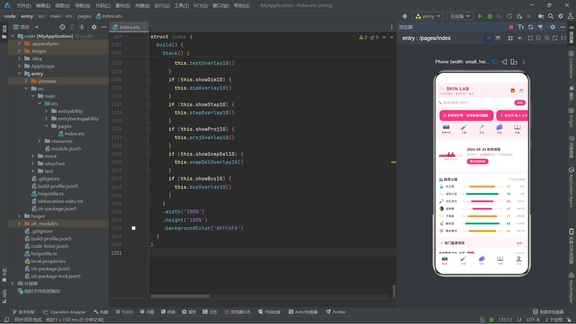
动效方面,aboutToAppear 里启动的两个 animateTo 循环动画虽然简单,却显著提升了页面的"活感"——标语呼吸闪烁、banner 高光流动,这些细节让静态界面有了呼吸节奏。animateTo 的命令式用法让动画的时长、曲线、迭代次数、播放模式都可精确控制,配合 PlayMode.Alternate 实现往返、Curve.EaseInOut 实现自然加减速。在实际工程中,还可以结合组件出现动画(appear)、消失动画(disappear)、属性动画(animation 装饰器)形成更丰富的动效体系,但要注意动画数量不宜过多,否则会分散用户注意力、影响性能。本案例只用了两个全局循环动画,节制而有效。
弹框体系是本案例的另一个亮点。六个弹框全部用 @Builder 自建,没有依赖系统的 Dialog 组件,这样做的好处是样式完全可控、能与品牌色系无缝融合,缺点是需要自己处理遮罩、zIndex、点击冒泡等细节。每个弹框都遵循"外层全屏半透明遮罩 + 内层卡片"的结构,通过 justifyContent 的 Center 或 End 区分居中卡和底部抽屉两种样式。"目标 id + 显示布尔"的双状态模式让弹框可以复用——同一个 dimOverlay10 通过改变 dimId10 就能展示任意维度的解读。这种自建弹框体系在中小型应用里完全够用,若弹框数量继续增长,可考虑封装一个通用的 Overlay 容器组件,把遮罩和居中逻辑抽出来复用。
从代码组织角度看,整个文件遵循"数据结构 → 写死数据 → 工具函数 → 页面 struct"的自顶向下顺序,阅读时从上到下层层深入,先看到数据形状、再看到数据内容、再看到纯函数逻辑、最后看到把这些组装起来的界面。@Builder 方法的排列也有讲究:先公共部件(头部、Tab 栏),再各 Tab 内容,最后弹框,主布局 build 放在末尾收口。这种"被调用者在前、调用者在后"的顺序让读者顺着调用链自然阅读,遇到 this.headerBar10 时已经知道它长什么样,不必来回翻找。整个文件虽然有一千多行,但因为组织清晰,可读性依然良好。这给我们的启示是:代码可读性不完全取决于长度,更取决于结构——只要分层清晰、命名一致、注释到位,长文件同样可以易于维护。

作为“人工智能6S店”的官方数字引擎,为AI开发者与企业提供一个覆盖软硬件全栈、一站式门户。
更多推荐


 1
1 0
0- 0


 已为社区贡献110条内容

所有评论(0)