
HarmonyOS 6效果实现:进度条使用双层 Row + Column 的方式实现:外层 Row 设置灰色背景和圆角,内层 Column 设置主色背景和动态宽度
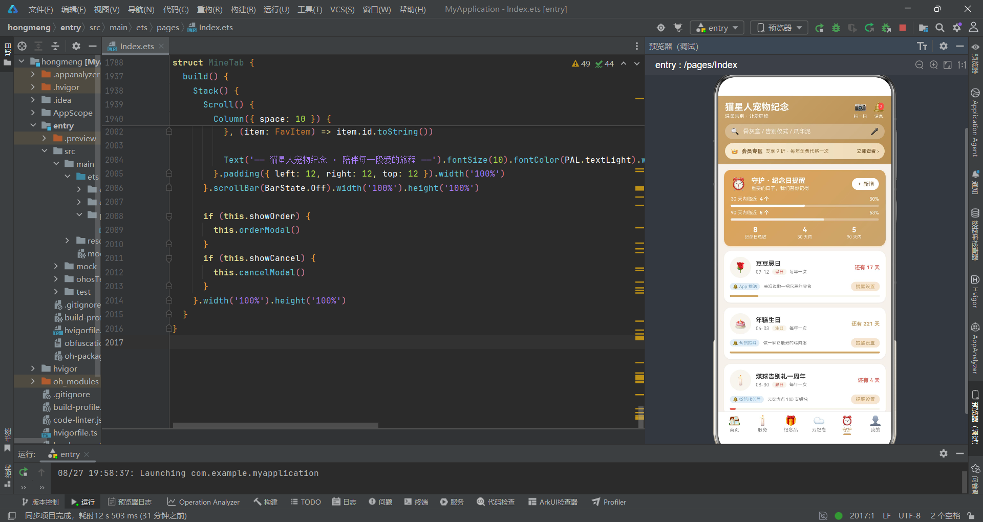
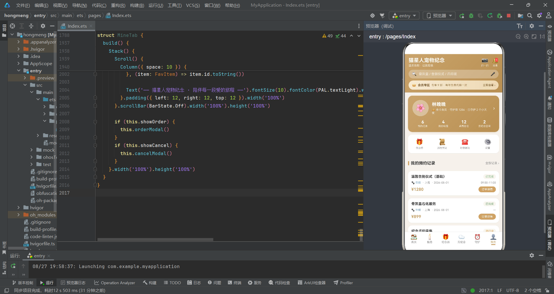
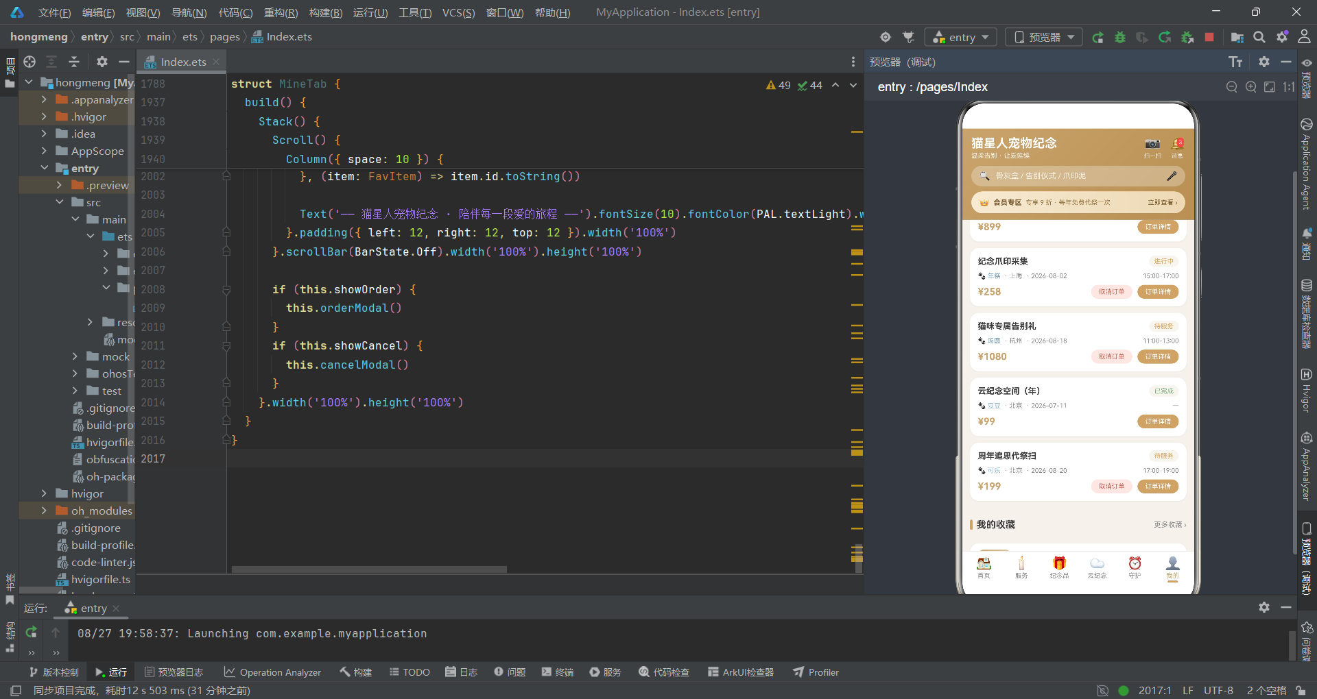
在鸿蒙生态中,声明式UI框架以其简洁的语法、强大的组件能力和高效的渲染机制,正在重塑移动应用的开发范式。本文将以一款宠物纪念服务应用为载体,从数据模型定义、调色板设计、工具函数封装,到六大功能Tab的组件化实现,逐层拆解鸿蒙 ArkTS 开发的核心技术点与最佳实践。
一、项目背景与整体架构
1.1 项目概述
这是一款面向宠物主人的纪念服务平台应用,致力于为失去爱宠的家庭提供温柔、专业的告别与纪念服务。应用涵盖告别仪式预约、纪念品定制、云纪念空间、纪念日守护等核心功能,以暖灰白为主色调,搭配香槟金与静谧蓝,营造出庄重而温暖的视觉氛围。
从技术视角来看,该项目采用鸿蒙 ArkTS 声明式UI开发范式,基于组件化架构思想,将整个应用拆分为主入口组件与六个独立的 Tab 子组件,每个 Tab 内部又通过 @Builder 装饰器封装了大量可复用的UI片段,形成了清晰的层次化结构。
1.2 技术栈与核心特性
本项目基于鸿蒙 ArkTS 语言,充分利用了声明式UI框架的各项核心能力:
- 声明式UI:通过
@Component装饰器定义组件,以声明式的方式描述UI结构 - 状态管理:使用
@State装饰器管理组件内部状态,实现数据驱动视图更新 - 自定义构建函数:通过
@Builder装饰器封装可复用的UI片段 - 布局系统:综合运用
Column、Row、Stack三大基础布局容器 - 列表渲染:使用
ForEach进行数据驱动的列表渲染 - 滚动容器:通过
Scroll组件实现内容的可滚动展示 - 对齐控制:借助
FlexAlign、HorizontalAlign、VerticalAlign等枚举实现精细的布局对齐
1.3 整体架构分层
整体架构遵循自下而上的分层设计思想:数据层定义了所有的类型接口与常量数据,工具函数层提供了数据处理与业务逻辑的支撑,组件层实现了六个独立的功能页面,最终由主入口组件统一调度与管理。
二、数据层设计:接口、调色板与常量体系
2.1 接口定义体系
数据层的核心是一组精心设计的 TypeScript 接口,它们定义了应用中所有核心数据实体的结构。
interface PetMemPalette {
  bg: string
  primary: string
  primarySoft: string
  secondary: string
  secondarySoft: string
  card: string
  text: string
  textSub: string
  textLight: string
  chip: string
  line: string
  danger: string
  dangerSoft: string
  success: string
  successSoft: string
  warn: string
  warnSoft: string
  white: string
}
PetMemPalette 接口定义了完整的调色板规范,包含主色、次色、文本色、状态色等多个维度。这种设计方式的优势在于,所有颜色都通过语义化的命名来引用,而非直接使用十六进制色值,大大提高了代码的可维护性与可扩展性。
主色与软色的配对设计是一个值得关注的细节。primary 与 primarySoft、secondary 与 secondarySoft、danger 与 dangerSoft 等一一对应的关系,体现了UI设计中的色阶思维——深色用于强调,浅色用于背景与点缀。
文本色同样分为三个层级:text 用于主要文本,textSub 用于次要说明,textLight 用于最弱化的提示信息。这种三级文本色体系能够清晰地建立视觉层次,引导用户的阅读视线。
interface GradientPalette {
  deep: string
  mid: string
  soft: string
  overlay: string
  blue: string
  blueSoft: string
}
GradientPalette 接口专门用于管理渐变色。与纯色调色板分开定义的做法,体现了设计系统的精细程度。渐变色在卡片头部、按钮背景等场景中大量使用,独立的接口定义使得渐变配置更加集中和可控。
deep、mid、soft 三个层级分别对应渐变的深色端、中间色和浅色端,配合 overlay 半透明叠加色,能够组合出丰富的视觉效果。blue 与 blueSoft 则提供了蓝色系的渐变选项,用于特定功能模块的视觉区分。
2.2 业务数据接口
interface HomePack {
  id: number
  title: string
  desc: string
  price: number
  tag: string
  icon: string
  hot: boolean
  gStart: string
  gEnd: string
}
HomePack 接口定义了首页套餐卡片的数据结构。每个字段都经过精心设计:id 作为唯一标识,title 和 desc 提供文字信息,price 存储价格数值,tag 用于展示营销标签,icon 用 emoji 表示视觉图标,hot 标记是否为热门,而 gStart 和 gEnd 则定义了卡片的渐变色起止值。
特别值得注意的是 gStart 和 gEnd 这两个字段。将渐变色配置直接嵌入数据模型中,意味着每张卡片都可以拥有独立的渐变配色。这种设计使得UI展示更加灵活多样,避免了所有卡片千篇一律的视觉单调感。
interface CeremonyService {
  id: number
  name: string
  intro: string
  cremation: string
  ashHandle: string
  duration: string
  price: number
  status: string
  tag: string
  booked: boolean
}
CeremonyService 接口描述了告别仪式服务的完整信息。相比首页套餐,服务接口包含了更详细的业务字段:cremation 表示火化方式,ashHandle 表示骨灰处理方式,duration 表示服务时长,status 表示当前预约状态,booked 标记用户是否已预约。
这种细粒度的字段设计反映了业务的复杂度。每个服务项目都涉及多个维度的信息展示,而接口定义的清晰与否,直接影响到后续组件开发的效率和质量。
interface KeepsakeItem {
  id: number
  name: string
  kind: string
  material: string
  price: number
  originPrice: number
  custom: string
  days: number
  sales: number
  badge: string
  icon: string
  gStart: string
  gEnd: string
}
KeepsakeItem 接口定义了纪念品商品的数据结构。kind 字段用于分类筛选,material 表示材质,originPrice 是原价用于显示折扣,custom 描述定制信息,days 是工期天数,sales 是销量数据,badge 是商品角标。
原价与现价的双字段设计是电商类应用的常见模式,通过 originPrice 与 price 的对比,可以计算出折扣力度,营造促销氛围。sales 销量字段则用于营造热销氛围,增强用户的购买决策信心。
2.3 更多业务接口
interface MemoryPost {
  id: number
  petName: string
  avatar: string
  city: string
  content: string
  photos: string[]
  time: string
  likes: number
  tag: string
  isPublic: boolean
}
MemoryPost 接口定义了云纪念动态的数据结构。photos 字段使用字符串数组存储多张照片,isPublic 布尔字段标记动态是否公开。这种设计支持了私密回忆与公开分享两种场景,体现了社交功能的基本要素。
interface AnnivItem {
  id: number
  name: string
  date: string
  kind: string
  freq: string
  way: string
  daysLeft: number
  emoji: string
  note: string
}
AnnivItem 接口描述了纪念日提醒的数据模型。kind 字段区分纪念日类型(忌日、生日、纪念日等),freq 定义提醒频率(每年、每半年等),way 是提醒方式(App推送、短信等),daysLeft 记录距离纪念日的剩余天数,note 存储备注信息。
剩余天数字段 daysLeft 的设计非常巧妙。它将动态计算的结果直接存储在数据模型中,使得UI层可以直接读取并展示,无需每次渲染时都进行日期计算。这种以空间换时间的策略,在数据量不大的场景下能够有效提升渲染性能。
2.4 调色板常量实现
const PAL: PetMemPalette = {
  bg: '#F5F1EC',
  primary: '#C9A46C',
  primarySoft: '#F3E7D3',
  secondary: '#7FA8C9',
  secondarySoft: '#E4EEF6',
  card: '#FFFFFF',
  text: '#3A3A3A',
  textSub: '#8C8C8C',
  textLight: '#BFBFBF',
  chip: '#F7F4EF',
  line: '#EEEEEE',
  danger: '#D96C5F',
  dangerSoft: '#FAE7E4',
  success: '#7BAE7F',
  successSoft: '#E7F2E8',
  warn: '#E0A458',
  warnSoft: '#FAF0DF',
  white: '#FFFFFF'
}
调色板常量 PAL 是整个应用的色彩基石。暖灰白 #F5F1EC 作为背景色,营造出柔和舒适的视觉基调;香槟金 #C9A46C 作为主色调,传递出庄重而温暖的情感;静谧蓝 #7FA8C9 作为辅助色,提供了视觉上的清凉对比。
色彩体系的设计遵循了严格的对应关系:每种深色都有对应的浅色版本。例如 danger: '#D96C5F' 对应 dangerSoft: '#FAE7E4',success: '#7BAE7F' 对应 successSoft: '#E7F2E8'。这种深-浅配对模式在UI实现中非常实用——深色用于文字和图标,浅色用于背景色块,既保证了视觉层次,又确保了色彩语义的一致性。
在鸿蒙 ArkTS 开发中,将颜色常量集中管理是一项重要的最佳实践。它不仅确保了整个应用视觉风格的统一,更使得主题切换、暗色模式适配等高级需求变得轻而易举。只需替换一套调色板常量,整个应用的配色方案即可完成切换。
2.5 选项常量体系
const PET_TYPES: string[] = ['狗狗', '猫咪', '兔子', '仓鼠', '鸟类', '水族', '爬宠', '其他']
const FORM_TYPES: string[] = ['简约告别', '温馨追思', '庄重仪式', '家庭式告别', '祈福送别']
const ASH_MODES: string[] = ['骨灰盒安葬', '骨灰晶石', '树葬', '花坛葬', '机构寄存', '带回自留']
const TIME_SLOTS: string[] = ['09:00-11:00', '11:00-13:00', '13:00-15:00', '15:00-17:00', '17:00-19:00']
const MATERIALS: string[] = ['胡桃实木', '白瓷', '琉璃', '黄铜', '亚克力', '天然玉石']
const FREQS: string[] = ['每年一次', '每半年', '每季度', '每月', '仅一次']
const REMIND_WAYS: string[] = ['App 推送', '短信提醒', '微信服务号', '电话提醒']
const POST_TAGS: string[] = ['温暖回忆', '告别时刻', '治愈日常', '思念信箱', '成长记录', '彩虹桥']
const KIND_CHIPS: string[] = ['全部', '骨灰盒', '纪念项链', '纪念相框', '爪印泥', '生命晶石']
const CITIES: string[] = ['北京', '上海', '广州', '深圳', '杭州', '成都', '武汉', '南京']
选项常量是连接UI与业务逻辑的重要桥梁。数组中的每一项都对应着界面上的一个可选标签或筛选条件。这些常量被设计为字符串数组而非对象数组,体现了简洁性原则——当只需要展示文本时,字符串数组足够轻量且高效。
这些选项常量覆盖了应用的各个功能模块:PET_TYPES 服务于宠物类型选择,FORM_TYPES 对应仪式形式,ASH_MODES 描述骨灰处理方式,TIME_SLOTS 提供预约时段,MATERIALS 用于纪念品材质选择,FREQS 和 REMIND_WAYS 支持纪念日提醒配置,POST_TAGS 用于云纪念动态分类,KIND_CHIPS 实现纪念品分类筛选,CITIES 则覆盖了城市选择功能。
将所有选项集中定义为常量的好处是显而易见的:首先,它们可以被多个组件共享复用,避免重复定义;其次,当业务需要调整选项时,只需修改常量定义即可全局生效;最后,集中式的常量管理也有助于代码的审阅与维护。
三、工具函数层:数据处理与业务逻辑封装
3.1 格式化函数
function priceFmt(n: number): string {
  if (n % 1 === 0) {
    return '¥' + n
  }
  return '¥' + n.toFixed(2)
}
priceFmt 函数负责价格格式化。它的实现非常简洁,但蕴含着细致的用户体验考量:当价格为整数时,直接显示 ¥1280 这样的整数形式;当价格包含小数时,则使用 toFixed(2) 保留两位小数。
这种差异化处理避免了 ¥1280.00 这样略显冗余的显示效果,同时又能正确展示 ¥899.99 这样的精确价格。对于用户而言,整数价格看起来更清爽,而带有小数的价格则传递出精确定价的感觉,两者各有适用场景。
function statusColor(s: string): string {
  if (s === '可预约' || s === '已完成') {
    return PAL.success
  }
  if (s === '紧张' || s === '进行中' || s === '待服务') {
    return PAL.warn
  }
  return PAL.danger
}
statusColor 函数根据状态文本返回对应的颜色值。这是一个典型的状态映射函数,它将业务状态与视觉表现关联起来。可预约和已完成状态使用绿色(成功色),紧张、进行中、待服务使用黄色(警告色),其他状态(如约满)使用红色(危险色)。
这种设计遵循了通用的色彩语义:绿色表示正常/可操作,黄色表示注意/进行中,红色表示禁止/危险。用户在长期使用中会逐渐形成条件反射,仅凭颜色就能快速判断状态含义。
3.2 数据查询函数
function svcOf(id: number): CeremonyService {
  let i: number = 0
  while (i < SERVICES.length) {
    if (SERVICES[i].id === id) {
      return SERVICES[i]
    }
    i = i + 1
  }
  return SERVICES[0]
}
svcOf 函数根据 ID 在服务列表中查找对应的服务项。它使用 while 循环进行线性遍历,找到匹配项后立即返回,找不到则返回第一个元素作为默认值。
值得注意的是,这里使用 while 循环而非 for 循环或数组的 find 方法。这种写法更贴近底层循环控制,在性能敏感的场景下可能略有优势。不过在实际开发中,使用 SERVICES.find(s => s.id === id) 的写法会更加简洁易读。
默认值的返回策略也是一个重要的设计决策。当找不到对应 ID 的数据时,函数返回数组的第一个元素而非 undefined 或 null。这种防御性编程的方式确保了调用方始终能获得一个有效的数据对象,避免了因数据缺失导致的运行时崩溃。
function keepsakesOf(kind: string, col: number): KeepsakeItem[] {
  let out: KeepsakeItem[] = []
  let i: number = 0
  let hit: number = 0
  while (i < KEEPSAKES.length) {
    if (kind === '全部' || KEEPSAKES[i].kind === kind) {
      if (hit % 2 === col) {
        out.push(KEEPSAKES[i])
      }
      hit = hit + 1
    }
    i = i + 1
  }
  return out
}
keepsakesOf 是一个更复杂的查询函数,它同时承担了筛选和分列两项任务。kind 参数用于按类别筛选,当值为 '全部' 时不过滤;col 参数则决定返回哪一列的数据(0 或 1),用于实现双列瀑布流布局。
函数内部维护了一个 hit 计数器,记录筛选后的元素序号。通过 hit % 2 === col 的判断,将筛选结果交替分配到左右两列。这种分列策略确保了两列数据的数量大致均衡,视觉上更加美观。
3.3 点赞交互函数
function isLikedOn(ids: number[], id: number): boolean {
  let i: number = 0
  while (i < ids.length) {
    if (ids[i] === id) {
      return true
    }
    i = i + 1
  }
  return false
}
isLikedOn 函数判断某个 ID 是否已在点赞列表中。它通过线性遍历数组来检查元素是否存在,存在则返回 true,否则返回 false。这是点赞功能的基础判断函数,用于决定点亮按钮的显示状态。
function likedNum(base: number, ids: number[], id: number): number {
  if (isLikedOn(ids, id)) {
    return base + 1
  }
  return base
}
likedNum 函数计算实际显示的点赞数。如果当前用户已点赞,则在基础点赞数上加 1;否则直接返回基础数值。这种设计将用户自己的点赞行为与公开的点赞数分开管理,既保证了数据的准确性,又提供了即时的视觉反馈。
function toggleLiked(ids: number[], id: number): number[] {
  let out: number[] = []
  let found: boolean = false
  let i: number = 0
  while (i < ids.length) {
    if (ids[i] !== id) {
      out.push(ids[i])
    } else {
      found = true
    }
    i = i + 1
  }
  if (!found) {
    out.push(id)
  }
  return out
}
toggleLiked 函数实现点赞状态的切换。它采用了函数式编程的思想——不直接修改原数组,而是创建一个新数组并返回。如果目标 ID 已存在,则在复制时跳过该元素(取消点赞);如果不存在,则在末尾追加(添加点赞)。
这种不可变数据的处理方式在状态管理中非常重要。由于 @State 装饰器监听的是变量的引用变化,直接修改数组内容可能不会触发视图更新。通过返回一个全新的数组,可以确保状态变化被正确检测到,从而触发UI的重新渲染。
在鸿蒙 ArkTS 的状态管理中,引用类型数据的更新需要特别注意。对于数组和对象,直接修改其内部属性(如
this.arr.push(item))可能无法被@State检测到。最佳实践是创建一个新的数组或对象,然后整体赋值给状态变量,这样可以确保视图得到正确更新。
3.4 折扣与日期函数
function discountOf(p: number, o: number): string {
  if (o <= 0 || o <= p) {
    return ''
  }
  return (Math.round(p / o * 100) / 10).toFixed(1).replace('.0', '') + ' 折'
}
discountOf 函数计算折扣比例并格式化为中文折扣表达。计算逻辑是 现价 / 原价 * 10,得到几折的数值。toFixed(1) 确保保留一位小数,而 replace('.0', '') 则处理整数折扣的显示——例如 8.0 折 会被优化为 8 折,更加简洁自然。
边界条件的处理也很完善:当原价为 0 或现价不低于原价时,返回空字符串,表示不显示折扣信息。这种防御性编程避免了除零错误和无意义的折扣展示。
function dayTagOf(d: number): string {
  if (d <= 0) {
    return '就在今天'
  }
  return '还有 ' + d + ' 天'
}
dayTagOf 函数将剩余天数转换为友好的文本提示。当天数为 0 或负数时,显示「就在今天」的温馨提示;否则显示「还有 N 天」。这种人性化的文本表达比单纯的数字展示更具情感温度,与产品的整体调性高度契合。
3.5 统计函数
function annivStatSoon(): number {
  let n: number = 0
  let i: number = 0
  while (i < ANNIVS.length) {
    if (ANNIVS[i].daysLeft <= 30) {
      n = n + 1
    }
    i = i + 1
  }
  return n
}
annivStatSoon 函数统计 30 天内即将到来的纪念日数量。它遍历所有纪念日,筛选出剩余天数小于等于 30 天的项目并计数。这个函数为守护页面的统计卡片提供数据支持,帮助用户快速了解近期需要关注的纪念日。
function soonPercent(): number {
  return Math.round(annivStatSoon() / annivStatTotal() * 100)
}
soonPercent 函数计算 30 天内纪念日占总数的百分比。Math.round 确保结果为整数百分比。这个百分比值用于进度条的展示,将抽象的数字转化为直观的视觉比例。
统计函数的设计体现了数据到视觉的转换流程:原始数据经过统计计算和百分比换算,最终转化为UI组件可以直接使用的数值(如进度条宽度百分比)。这种分层计算的方式使得每一步都清晰可测,也便于后续的调试与优化。
四、主入口组件:Index 架构解析
4.1 Tab 枚举定义
enum Tab {
  HOME = 0,
  SERVICE = 1,
  KEEPSAKE = 2,
  CLOUD = 3,
  GUARD = 4,
  MINE = 5
}
Tab 枚举为六个功能页面定义了清晰的数字标识。使用枚举而非直接使用数字字面量,大大提高了代码的可读性和可维护性。当开发者看到 Tab.HOME 时,能立刻明白这是首页,而不需要记住 0 代表什么。
枚举值从 0 开始连续编号,与底部导航栏的索引顺序一一对应。这种设计使得 Tab 切换逻辑非常直观——点击第 N 个导航项,就将 activeTab 设置为对应的枚举值。
4.2 主组件结构
@Entry
@Component
struct Index {
  @State activeTab: number = Tab.HOME
Index 组件是整个应用的入口组件,由 @Entry 装饰器标记。@Entry 装饰器的作用是指定该组件为页面的根组件,页面加载时会首先渲染这个组件。一个页面中只能有一个 @Entry 装饰的组件。
@Component 装饰器标记这是一个自定义组件。在鸿蒙 ArkTS 中,所有的UI单元都是组件,组件可以嵌套组合,形成复杂的界面结构。struct 关键字则定义了组件的数据结构。
@State activeTab: number = Tab.HOME 定义了组件的核心状态变量。@State 装饰器标记的变量具有响应式特性——当变量值发生变化时,依赖该变量的UI部分会自动重新渲染。初始值设为 Tab.HOME,表示应用启动时默认显示首页。
4.3 TabItem 构建函数
@Builder tabItem(tab: number, icon: string, label: string) {
  Column({ space: 2 }) {
    Text(icon).fontSize(20).fontColor(this.activeTab === tab ? PAL.primary : PAL.textSub)
    Text(label).fontSize(10).fontColor(this.activeTab === tab ? PAL.primary : PAL.textSub)
    Column().width(16).height(3).borderRadius(2).backgroundColor(this.activeTab === tab ? PAL.primary : '#00000000')
  }.layoutWeight(1).alignItems(HorizontalAlign.Center).padding({ top: 6, bottom: 6 }).onClick(() => {
    this.activeTab = tab
  })
}
tabItem 是一个用 @Builder 装饰的自定义构建函数,用于创建底部导航栏的单个 Tab 项。@Builder 装饰器可以将一段UI逻辑封装为可复用的函数,在 build 方法中通过 this.tabItem(...) 的方式调用。
每个 Tab 项由三部分组成:图标、文字标签和底部指示条。图标使用 20号字体,标签使用 10号字体,底部指示条是一个宽16高3的圆角矩形。三者在 Column 中垂直排列,间距为 2。
选中状态的判断逻辑通过三元表达式实现:this.activeTab === tab ? PAL.primary : PAL.textSub。当 activeTab 等于当前项的 tab 值时,图标和文字使用主色(香槟金),底部指示条也显示为主色;未选中时使用次要文本色,指示条背景设为完全透明(#00000000)。
layoutWeight(1) 是一个关键的布局属性。它使得每个 Tab 项在 Row 容器中平均分配宽度,确保六个 Tab 均匀分布在整个屏幕宽度上。配合 alignItems(HorizontalAlign.Center),图标和文字在各自的区域内水平居中对齐。
点击事件通过 onClick 方法绑定,点击时将 activeTab 更新为当前 Tab 的值。由于 activeTab 是 @State 变量,赋值后会触发所有依赖该变量的UI重新渲染,从而实现 Tab 切换的视觉效果。
@Builder是鸿蒙 ArkTS 中非常实用的特性。它允许开发者将重复的UI片段抽取为函数,类似于 React 中的组件组合或 Vue 中的插槽。通过参数化设计,@Builder函数可以接收不同的数据,渲染出差异化的UI,极大地提升了代码的复用性和可维护性。
4.4 顶部 Header 构建函数
@Builder headerBar() {
  Column() {
    Row({ space: 12 }) {
      Column() {
        Text('猫星人宠物纪念').fontSize(19).fontWeight(FontWeight.Bold).fontColor('#FFFFFF')
        Text('温柔告别 · 让爱延续').fontSize(10).fontColor('#F5EFE4').margin({ top: 2 })
      }.alignItems(HorizontalAlign.Start).layoutWeight(1)

      Column({ space: 2 }) {
        Text('📷').fontSize(20)
        Text('扫一扫').fontSize(9).fontColor('#F5EFE4')
      }.alignItems(HorizontalAlign.Center).onClick(() => {
      })

      Column({ space: 2 }) {
        Stack({ alignContent: Alignment.TopEnd }) {
          Text('🔔').fontSize(20)
          Text('3').fontSize(8).fontColor('#FFFFFF').backgroundColor('#FF5A4E').borderRadius(8).padding(3).margin(2)
        }
        Text('消息').fontSize(9).fontColor('#F5EFE4')
      }.alignItems(HorizontalAlign.Center).onClick(() => {
      })
    }.width('100%')
headerBar 构建函数实现了顶部导航栏。整体采用 Column 垂直布局,包含三行内容:标题行、搜索行、会员横幅。
标题行使用 Row 水平排列。左侧是应用名称与 slogan,占据主要空间(layoutWeight(1));右侧是扫一扫和消息两个功能入口。消息图标使用了 Stack 布局来实现红点徽标的叠加效果——Stack 容器将子元素堆叠在一起,通过 alignContent: Alignment.TopEnd 将徽标对齐到右上角。
Stack 是鸿蒙布局系统中的重要容器。与 Column 和 Row 的线性排列不同,Stack 允许子元素层叠显示,非常适合实现徽标、水印、遮罩等层叠效果。alignContent 属性控制子元素在 Stack 中的对齐方式,支持 TopStart、TopEnd、Center 等九种对齐模式。
    Row({ space: 8 }) {
      Text('🔍').fontSize(14)
      Text('骨灰盒 / 告别仪式 / 爪印泥').fontSize(12).fontColor('#F5EFE4').layoutWeight(1)
      Text('🎤').fontSize(14)
    }.width('100%').height(32).backgroundColor('rgba(255,255,255,0.28)').borderRadius(16).padding({ left: 12, right: 12 }).margin({ top: 10 })
搜索栏是第二行内容。它使用半透明白色背景(rgba(255,255,255,0.28)),配合 16px 的圆角,营造出轻盈通透的视觉效果。左侧是搜索图标,中间是提示文字,右侧是语音搜索图标。这种搜索框设计在渐变背景上能够很好地融合,既保持了功能完整性,又不破坏整体美感。
    Row({ space: 6 }) {
      Text('👑').fontSize(13)
      Text('会员专区').fontSize(11).fontWeight(FontWeight.Bold).fontColor('#7A5A2E')
      Text('专享 9 折 · 每年免费代祭一次').fontSize(10).fontColor('#9B7B4A').layoutWeight(1)
      Text('立即查看 ›').fontSize(10).fontColor('#7A5A2E')
    }.width('100%').height(34).linearGradient({ angle: 90, colors: [['#F7EAD2', 0], ['#EDD9B4', 1]] }).borderRadius(17).padding({ left: 12, right: 12 }).margin({ top: 8 })
  }.width('100%').padding({ left: 14, right: 14, top: 12, bottom: 10 }).linearGradient({ angle: 135, colors: [['#C9A46C', 0], ['#B98F52', 1]] })
}
第三行是会员专区横幅。它使用了从左到右的金色渐变(angle: 90 表示水平方向),与整体的香槟金主题相呼应。横幅内容包括皇冠图标、会员专区标题、权益描述和行动按钮。
整个 Header 区域使用了 135度 的香槟金渐变作为背景,从 #C9A46C 过渡到 #B98F52。这种渐变背景赋予了顶部区域丰富的视觉层次,也与下方暖灰色的内容区域形成了鲜明的区域划分。
4.5 build 方法与页面布局
build() {
  Column() {
    this.headerBar()

    Stack() {
      if (this.activeTab === Tab.HOME) {
        HomeTab()
      } else if (this.activeTab === Tab.SERVICE) {
        ServiceTab()
      } else if (this.activeTab === Tab.KEEPSAKE) {
        KeepsakeTab()
      } else if (this.activeTab === Tab.CLOUD) {
        CloudTab()
      } else if (this.activeTab === Tab.GUARD) {
        GuardTab()
      } else {
        MineTab()
      }
    }.layoutWeight(1).width('100%')

    Divider().color(PAL.line).strokeWidth(1)

    Row() {
      this.tabItem(Tab.HOME, '🏠', '首页')
      this.tabItem(Tab.SERVICE, '🕯️', '服务')
      this.tabItem(Tab.KEEPSAKE, '🎁', '纪念品')
      this.tabItem(Tab.CLOUD, '☁️', '云纪念')
      this.tabItem(Tab.GUARD, '⏰', '守护')
      this.tabItem(Tab.MINE, '👤', '我的')
    }.width('100%').backgroundColor(PAL.card).padding({ left: 4, right: 4 })
  }.width('100%').height('100%').backgroundColor(PAL.bg)
}
build 方法是组件的核心渲染方法,它描述了组件的UI结构。整个页面采用经典的三段式布局:顶部 Header、中间内容区、底部导航栏,三者在 Column 中垂直排列。
中间内容区使用 Stack 容器包裹,通过 if-else 条件判断渲染当前激活的 Tab 组件。Stack 的使用非常巧妙——它确保了六个 Tab 页面在切换时共享同一层叠上下文,为弹窗等浮层元素提供了统一的容器。layoutWeight(1) 使得内容区占据 Header 和底部导航之间的所有剩余空间。
底部导航栏由一个 Row 容器和六个 tabItem 组成。每个 Tab 项通过 layoutWeight(1) 平均分配宽度,确保在不同屏幕尺寸下都能均匀分布。Divider 组件在导航栏上方添加了一条细线,增强了区域分隔感。
这种 Tab 切换架构的优势在于结构清晰、逻辑直观。每个 Tab 都是一个独立的 @Component 组件,拥有自己的状态管理和UI逻辑,互不干扰。开发者可以专注于单个 Tab 的功能实现,而不必担心与其他 Tab 产生状态冲突。
五、首页 Tab 深度解析
5.1 组件状态定义
@Component
struct HomeTab {
  @State showQuick: boolean = false
  @State quickPet: string = ''
  @State quickPhone: string = ''
  @State quickCityIdx: number = 0
  @State quickMsg: string = ''
  @State remindIdx: number = 0
HomeTab 组件定义了六个状态变量。showQuick 控制快速预约弹窗的显示与隐藏,quickPet、quickPhone、quickCityIdx、quickMsg 分别存储弹窗表单中的宠物名、电话、城市索引和留言信息。remindIdx 则用于纪念日提醒卡片的轮播索引。
这些状态变量全部以 @State 装饰,意味着它们的变化都会触发UI的重新渲染。表单输入与状态变量的双向绑定通过 onChange 回调实现——用户输入时更新状态,状态变化时又会反映到输入框中。
5.2 弹窗遮罩构建函数
@Builder modalOverlay(onClose: () => void) {
  Column().width('100%').height('100%').backgroundColor('rgba(0,0,0,0.5)').onClick(onClose)
}
modalOverlay 构建函数创建了一个半透明的黑色遮罩层。它使用 rgba(0,0,0,0.5) 的背景色实现 50% 透明度的黑色遮罩,覆盖整个屏幕。点击遮罩层会触发 onClose 回调,关闭弹窗。
这个函数接收一个 () => void 类型的函数参数,这是 TypeScript 中定义回调函数类型的标准写法。通过参数化的关闭逻辑,同一个遮罩构建函数可以被不同的弹窗复用,每个弹窗可以传入自己的关闭处理函数。
5.3 分区标题构建函数
@Builder sectionTitle(title: string, more: string) {
  Row({ space: 6 }) {
    Column().width(4).height(16).borderRadius(2).backgroundColor(PAL.primary)
    Text(title).fontSize(15).fontWeight(FontWeight.Bold).fontColor(PAL.text).layoutWeight(1)
    Text(more).fontSize(11).fontColor(PAL.textSub)
  }.width('100%').margin({ top: 18, bottom: 10 })
}
sectionTitle 构建函数实现了统一的分区标题样式。左侧是一个 4x16 的金色竖条作为装饰,中间是加粗的标题文字,右侧是「更多」链接文字。三者在 Row 中水平排列,中间的标题通过 layoutWeight(1) 占据剩余空间,将更多按钮推到最右侧。
这种标题样式在多个 Tab 中都有使用(首页、我的页面等),是一种可复用的UI模式。将其抽取为 @Builder 函数,确保了全站标题样式的一致性,也减少了重复代码。
5.4 Banner 卡片
@Builder bannerCard() {
  Column({ space: 12 }) {
    Row({ space: 12 }) {
      Text('🕊️').fontSize(38)
      Column({ space: 4 }) {
        Text('温柔告别,好好说再见').fontSize(17).fontWeight(FontWeight.Bold).fontColor('#FFFFFF')
        Text('一对一主理人全程陪伴 · 郑重的仪式感').fontSize(11).fontColor('#F5EFE4')
      }.alignItems(HorizontalAlign.Start).layoutWeight(1)
      Text('了解 ›').fontSize(11).fontColor('#FFFFFF').padding({ left: 10, right: 10, top: 6, bottom: 6 }).backgroundColor('rgba(255,255,255,0.25)').borderRadius(12).onClick(() => {
        this.showQuick = true
      })
    }.width('100%')

    Row({ space: 0 }) {
      Column({ space: 2 }) {
        Text('12 万+').fontSize(15).fontWeight(FontWeight.Bold).fontColor('#FFFFFF')
        Text('家庭的选择').fontSize(9).fontColor('#F5EFE4')
      }.layoutWeight(1).alignItems(HorizontalAlign.Center)
      Column({ space: 2 }) {
        Text('4.9 分').fontSize(15).fontWeight(FontWeight.Bold).fontColor('#FFFFFF')
        Text('温暖评价').fontSize(9).fontColor('#F5EFE4')
      }.layoutWeight(1).alignItems(HorizontalAlign.Center)
      Column({ space: 2 }) {
        Text('365 天').fontSize(15).fontWeight(FontWeight.Bold).fontColor('#FFFFFF')
        Text('守护陪伴').fontSize(9).fontColor('#F5EFE4')
      }.layoutWeight(1).alignItems(HorizontalAlign.Center)
    }.width('100%')
  }.width('100%').padding(16).borderRadius(16).linearGradient({ angle: 135, colors: [['#C9A46C', 0], ['#7FA8C9', 1]] })
  .shadow({ radius: 10, color: 'rgba(201,164,108,0.28)', offsetX: 0, offsetY: 4 })
}
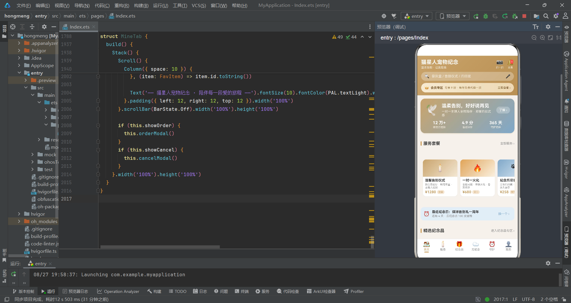
Banner 卡片是首页最醒目的视觉元素。它采用从香槟金到静谧蓝的 135度 渐变背景,配合柔和的金色阴影,营造出温暖而高级的视觉质感。
卡片内容分为上下两部分:上部是宣传语与行动按钮,下部是三个数据指标。三个数据指标(12万+家庭、4.9分评价、365天守护)通过三列等宽布局展示,每列都包含一个加粗的数字和一行说明文字。这种数据展示方式能够快速建立用户信任感,展示平台的规模与口碑。
「了解」按钮使用了半透明白色背景(rgba(255,255,255,0.25)),在渐变背景上既保持了可点击性,又不会显得突兀。点击后会触发快速预约弹窗,实现了从营销展示到转化行动的顺畅衔接。
5.5 套餐卡片
@Builder packCard(pack: HomePack) {
  Column({ space: 6 }) {
    Column() {
      Text(pack.icon).fontSize(26)
    }.width('100%').height(62).justifyContent(FlexAlign.Center).linearGradient({ angle: 135, colors: [[pack.gStart, 0], [pack.gEnd, 1]] }).borderRadius({ topLeft: 12, topRight: 12 })

    Column({ space: 3 }) {
      Text(pack.title).fontSize(12).fontWeight(FontWeight.Bold).fontColor(PAL.text).maxLines(1).textOverflow({ overflow: TextOverflow.Ellipsis })
      Text(pack.desc).fontSize(9).fontColor(PAL.textSub).maxLines(2).textOverflow({ overflow: TextOverflow.Ellipsis })
      Row({ space: 4 }) {
        Text(priceFmt(pack.price)).fontSize(13).fontWeight(FontWeight.Bold).fontColor(PAL.primary)
        Text(pack.tag).fontSize(8).fontColor(PAL.primary).backgroundColor(PAL.primarySoft).borderRadius(6).padding({ left: 5, right: 5, top: 2, bottom: 2 })
      }.width('100%')
    }.alignItems(HorizontalAlign.Start).padding({ left: 8, right: 8, bottom: 8 })
  }.width(124).backgroundColor(PAL.card).borderRadius(12).shadow({ radius: 6, color: 'rgba(58,58,58,0.06)', offsetX: 0, offsetY: 2 }).onClick(() => {
    this.showQuick = true
  })
}
packCard 构建函数渲染单个套餐卡片。卡片采用固定宽度 124px 的设计,确保在横向滚动列表中保持一致的尺寸。卡片分为上下两个区域:上方是渐变图标区,下方是文字信息区。
渐变图标区使用数据中定义的 gStart 和 gEnd 作为渐变色,每张卡片都有独特的配色。justifyContent(FlexAlign.Center) 确保图标在区域内垂直居中。FlexAlign.Center 是 Flex 布局的对齐枚举,用于控制子元素在主轴方向上的对齐方式。
文字信息区包含标题、描述和价格标签三行内容。maxLines(1) 和 textOverflow({ overflow: TextOverflow.Ellipsis }) 的组合确保了文字超出时显示省略号,不会破坏卡片布局。标题限制 1 行,描述限制 2 行,形成了清晰的视觉层次。
价格和标签并排显示:价格使用主色加粗,标签使用浅金色背景配金色文字。这种价格+标签的组合是电商类界面的经典模式,能够同时传递价格信息和营销卖点。
5.6 首页 build 方法
build() {
  Stack() {
    Scroll() {
      Column({ space: 10 }) {
        this.bannerCard()

        this.sectionTitle('服务套餐', '全部服务 ›')
        Scroll() {
          Row({ space: 10 }) {
            ForEach(HOME_PACKS, (pack: HomePack) => {
              this.packCard(pack)
            }, (pack: HomePack) => pack.id.toString())
          }.padding({ left: 8, right: 8 })
        }.scrollable(ScrollDirection.Horizontal).scrollBar(BarState.Off).height(190)
首页的 build 方法使用 Stack 作为根容器,内部嵌套一个 Scroll 滚动容器。Stack 的作用是为弹窗提供层叠容器——弹窗通过 position 定位显示在内容之上。
Scroll 组件是鸿蒙中实现滚动视图的核心组件。默认情况下,Scroll 的滚动方向是垂直方向,可以通过 scrollable(ScrollDirection.Horizontal) 设置为水平滚动。scrollBar(BarState.Off) 则隐藏了滚动条,使界面更加简洁。
ForEach 组件用于遍历数组并渲染列表项。它接收三个参数:第一个是要遍历的数组,第二个是渲染函数,第三个是键生成函数。键生成函数返回的字符串用于唯一标识每个列表项,帮助框架优化列表渲染性能。
        Row({ space: 8 }) {
          Text('⏰').fontSize(18)
          Column({ space: 2 }) {
            Text('最近纪念日:' + annivOf(HOME_REMIND_IDS[this.remindIdx]).name).fontSize(12).fontWeight(FontWeight.Bold).fontColor(PAL.text).maxLines(1).textOverflow({ overflow: TextOverflow.Ellipsis })
            Text(dayTagOf(annivOf(HOME_REMIND_IDS[this.remindIdx]).daysLeft) + ' · ' + annivOf(HOME_REMIND_IDS[this.remindIdx]).note).fontSize(10).fontColor(PAL.textSub).maxLines(1)
              .textOverflow({ overflow: TextOverflow.Ellipsis })
          }.alignItems(HorizontalAlign.Start).layoutWeight(1)
          Text('换一个 ›').fontSize(11).fontColor(PAL.secondary).padding({ left: 8, right: 8, top: 5, bottom: 5 }).backgroundColor(PAL.secondarySoft).borderRadius(12).onClick(() => {
            this.remindIdx = (this.remindIdx + 1) % HOME_REMIND_IDS.length
          })
        }.width('100%').padding(10).backgroundColor(PAL.secondarySoft).borderRadius(12)
纪念日提醒卡片是首页的一个贴心功能。它展示最近的纪念日信息,点击「换一个」按钮可以切换查看不同的纪念日。切换逻辑通过 (this.remindIdx + 1) % HOME_REMIND_IDS.length 实现,使用取模运算确保索引在数组范围内循环。
卡片使用静谧蓝的浅色背景,与页面其他元素形成视觉区分。左侧是闹钟图标,中间是纪念日名称和提示信息,右侧是切换按钮。整个卡片圆角 12px,内边距 10px,视觉上柔和舒适。
5.7 快速预约弹窗
@Builder quickModal() {
  this.modalOverlay(() => {
    this.showQuick = false
  })
  Column({ space: 10 }) {
    Text('快速预约咨询').fontSize(16).fontWeight(FontWeight.Bold).fontColor(PAL.text)
    Text('留下信息,纪念顾问将在 10 分钟内回电').fontSize(11).fontColor(PAL.textSub)

    TextInput({ text: this.quickPet, placeholder: '宠物名字(如:年糕)' }).height(40).fontSize(12).backgroundColor(PAL.chip).borderRadius(10).padding({ left: 12, right: 12 }).onChange((value: string) => {
      this.quickPet = value
    })
快速预约弹窗包含遮罩层和表单内容两部分。遮罩层通过调用 modalOverlay 构建函数生成,传入关闭弹窗的回调。表单内容是一个 Column 容器,包含标题、副标题、输入框、城市选择、留言框和操作按钮。
TextInput 是鸿蒙中的文本输入组件。它的 text 参数绑定了当前的输入值,placeholder 参数设置占位提示文字。onChange 回调在输入内容变化时触发,用于更新状态变量。这种模式实现了数据的双向绑定——输入框显示状态变量的值,用户输入又会更新状态变量。
    Scroll() {
      Row({ space: 8 }) {
        ForEach(CITIES, (city: string) => {
          Text(city).fontSize(11).fontColor(this.quickCityIdx === CITIES.indexOf(city) ? '#FFFFFF' : PAL.textSub).backgroundColor(this.quickCityIdx === CITIES.indexOf(city) ? PAL.primary : PAL.chip)
            .borderRadius(12).padding({ left: 12, right: 12, top: 6, bottom: 6 }).onClick(() => {
            this.quickCityIdx = CITIES.indexOf(city)
          })
        }, (city: string) => city)
      }.padding({ left: 8, right: 8 })
    }.scrollable(ScrollDirection.Horizontal).scrollBar(BarState.Off).height(36)
城市选择区域使用水平滚动的标签列表实现。每个城市都是一个可点击的文本标签,选中状态使用主色背景配白色文字,未选中状态使用浅灰背景配灰色文字。
选中状态的判断使用了 CITIES.indexOf(city) 来获取当前城市在数组中的索引,然后与 quickCityIdx 进行比较。这种写法虽然直观,但在性能上存在优化空间——每次渲染时都要调用 indexOf 方法查找索引,如果数组很大可能会影响性能。更好的做法是在 ForEach 的回调中直接使用索引参数。
    Row({ space: 10 }) {
      Text('取消').fontSize(13).fontColor(PAL.textSub).layoutWeight(1).textAlign(TextAlign.Center).height(38).backgroundColor(PAL.chip).borderRadius(19).onClick(() => {
        this.showQuick = false
      })
      Text('提交预约').fontSize(13).fontColor('#FFFFFF').layoutWeight(1).textAlign(TextAlign.Center).height(38).backgroundColor(PAL.primary).borderRadius(19).onClick(() => {
        this.showQuick = false
      })
    }.width('100%').margin({ top: 4 })
  }.width('80%').padding(16).backgroundColor(PAL.card).borderRadius(16).shadow({ radius: 20, color: 'rgba(0,0,0,0.15)', offsetX: 0, offsetY: 8 }).position({ x: '10%', y: '18%' }).zIndex(999)
}
弹窗底部是两个操作按钮:取消和提交预约。两个按钮平分宽度(各占 layoutWeight(1)),高度 38px,圆角 19px(即高度的一半,形成胶囊形状)。取消按钮使用灰色背景,提交按钮使用主色背景。
弹窗整体通过 position({ x: '10%', y: '18%' }) 进行定位,宽度设为 80%,左右各留 10% 的边距。zIndex(999) 确保弹窗显示在最顶层。大圆角(16px)和柔和的阴影(radius: 20)赋予了弹窗精致的视觉品质。
六、服务 Tab 深度解析
6.1 服务统计函数
function serviceOpenCount(): number {
  let n: number = 0
  let i: number = 0
  while (i < SERVICES.length) {
    if (SERVICES[i].status !== '已约满') {
      n = n + 1
    }
    i = i + 1
  }
  return n
}

function serviceBookedCount(): number {
  return SERVICES.length - serviceOpenCount()
}
服务页面顶部有一组统计数据,展示服务总数、可预约数量和已预约数量。serviceOpenCount 函数遍历服务列表,统计状态不为「已约满」的服务数量。serviceBookedCount 则通过总数减去可预约数来计算已约满的数量。
这种通过函数计算派生数据的模式,避免了在数据层维护冗余字段。当源数据变化时,计算函数会自动得出新的结果,确保了数据的一致性。
6.2 服务卡片组件
@Builder svcCard(svc: CeremonyService) {
  Column({ space: 8 }) {
    Row({ space: 8 }) {
      Text(svc.name).fontSize(14).fontWeight(FontWeight.Bold).fontColor(PAL.text).maxLines(1).textOverflow({ overflow: TextOverflow.Ellipsis }).layoutWeight(1)
      Text(svc.status).fontSize(10).fontColor(statusColor(svc.status)).backgroundColor(PAL.chip).borderRadius(10).padding({ left: 8, right: 8, top: 3, bottom: 3 })
    }.width('100%')
服务卡片是服务页面的核心UI单元。每张卡片展示一个服务项目的完整信息,包括服务名称、状态、简介、火化方式、骨灰处理方式、服务时长、价格和操作按钮。
卡片顶部第一行是服务名称和状态标签。服务名称使用 14号 加粗字体,占据主要空间;状态标签使用小号文字配合圆角背景,颜色由 statusColor 函数根据状态动态决定。这种布局在有限的空间内清晰地传达了核心信息。
    Text(svc.intro).fontSize(11).fontColor(PAL.textSub).maxLines(2).textOverflow({ overflow: TextOverflow.Ellipsis }).width('100%')

    Row({ space: 6 }) {
      Text('🔥 ' + svc.cremation).fontSize(9).fontColor(PAL.secondary).backgroundColor(PAL.secondarySoft).borderRadius(8).padding({ left: 6, right: 6, top: 2, bottom: 2 })
      Text('⚱️ ' + svc.ashHandle).fontSize(9).fontColor(PAL.primary).backgroundColor(PAL.primarySoft).borderRadius(8).padding({ left: 6, right: 6, top: 2, bottom: 2 })
      Text('⏱ ' + svc.duration).fontSize(9).fontColor(PAL.textSub).backgroundColor(PAL.chip).borderRadius(8).padding({ left: 6, right: 6, top: 2, bottom: 2 })
    }.width('100%')
服务简介使用 11号 灰色文字,限制为两行,超出显示省略号。简介下方是三个属性标签:火化方式、骨灰处理方式和服务时长。每个标签都带有 emoji 图标前缀,使用不同的配色方案:火化方式用蓝色系,骨灰处理用金色系,服务时长用灰色系。
这种彩色标签的设计既美观又实用。不同颜色对应不同的信息维度,用户可以通过颜色快速定位自己关心的属性。同时,圆角背景和内边距也让标签看起来像一个个小徽章,增强了视觉层次感。
    Row({ space: 8 }) {
      Column({ space: 1 }) {
        Text(priceFmt(svc.price)).fontSize(16).fontWeight(FontWeight.Bold).fontColor(PAL.primary)
        Text('起').fontSize(9).fontColor(PAL.textSub)
      }.alignItems(HorizontalAlign.Start).layoutWeight(1)

      if (svc.booked) {
        Text('取消预约').fontSize(11).fontColor(PAL.danger).backgroundColor(PAL.dangerSoft).borderRadius(14).padding({ left: 12, right: 12, top: 6, bottom: 6 }).onClick(() => {
          this.delId = svc.id
          this.showDel = true
        })
      }
      Text('详情').fontSize(11).fontColor(PAL.textSub).backgroundColor(PAL.chip).borderRadius(14).padding({ left: 14, right: 14, top: 6, bottom: 6 }).onClick(() => {
        this.detailId = svc.id
        this.showDetail = true
      })
      Text('预约').fontSize(11).fontColor('#FFFFFF').backgroundColor(svc.status === '已约满' ? PAL.textLight : PAL.primary).borderRadius(14).padding({ left: 16, right: 16, top: 6, bottom: 6 })
        .onClick(() => {
          if (svc.status !== '已约满') {
            this.bookId = svc.id
            this.showBook = true
          }
        })
    }.width('100%').alignItems(VerticalAlign.Center)
  }.width('100%').padding(12).backgroundColor(PAL.card).borderRadius(14).shadow({ radius: 6, color: 'rgba(58,58,58,0.06)', offsetX: 0, offsetY: 2 })
}
卡片底部是价格和操作按钮区域。价格使用 16号 加粗金色字体,下方有一个「起」字说明这是起步价。操作按钮从左到右依次是:取消预约(仅已预约时显示)、详情、预约。
预约按钮有一个巧妙的状态处理:当服务状态为「已约满」时,按钮背景变为浅灰色(PAL.textLight),且点击事件中增加了条件判断,约满状态下点击不会触发预约弹窗。这种视觉+逻辑的双重保障,确保了用户操作的正确性。
条件渲染 if (svc.booked) 展示了声明式UI的强大之处——根据数据状态决定UI是否显示,逻辑清晰直观。已预约的服务显示「取消预约」按钮,未预约的则不显示,界面简洁而不失完整。
6.3 预约弹窗
@Builder bookModal() {
  this.modalOverlay(() => {
    this.showBook = false
  })
  Column({ space: 10 }) {
    Text('预约告别仪式').fontSize(16).fontWeight(FontWeight.Bold).fontColor(PAL.text)
    Text(svcOf(this.bookId).name + ' · ' + priceFmt(svcOf(this.bookId).price)).fontSize(11).fontColor(PAL.primary)

    Scroll() {
      Column({ space: 10 }) {
        TextInput({ text: this.petName, placeholder: '宠物名字(必填)' }).height(38).fontSize(12).backgroundColor(PAL.chip).borderRadius(10).padding({ left: 12, right: 12 }).onChange((value: string) => {
          this.petName = value
        })
预约弹窗是服务页面最复杂的交互组件。弹窗包含多个表单项:宠物名字、宠物类型、预约日期、到店时段、仪式形式、骨灰处理方式和备注。由于表单内容较多,弹窗内部使用了 Scroll 组件包裹,确保在小屏幕上也能完整展示。
弹窗顶部显示服务名称和价格,让用户在填写表单时始终知道自己正在预约的是哪项服务。价格使用主色高亮,强化了价格感知。
        Text('宠物类型').fontSize(11).fontColor(PAL.textSub).width('100%')
        Scroll() {
          Row({ space: 8 }) {
            ForEach(PET_TYPES, (petType: string, idx: number) => {
              Text(petType).fontSize(11).fontColor(this.petTypeIdx === idx ? '#FFFFFF' : PAL.textSub).backgroundColor(this.petTypeIdx === idx ? PAL.primary : PAL.chip).borderRadius(12)
                .padding({ left: 12, right: 12, top: 6, bottom: 6 }).onClick(() => {
                this.petTypeIdx = idx
              })
            }, (petType: string) => petType)
          }.padding({ left: 8, right: 8 })
        }.scrollable(ScrollDirection.Horizontal).scrollBar(BarState.Off).height(34)
宠物类型选择使用水平滚动的标签列表。与首页城市选择不同的是,这里的 ForEach 回调直接使用了索引参数 idx,避免了在渲染函数中调用 indexOf 的性能损耗。这种写法更加高效,也更加简洁。
标签的选中态使用主色背景+白色文字,未选中态使用浅灰背景+灰色文字。点击标签时更新对应的索引状态变量,触发UI重新渲染,实现选中状态的切换。
        Text('仪式形式').fontSize(11).fontColor(PAL.textSub).width('100%')
        Scroll() {
          Row({ space: 8 }) {
            ForEach(FORM_TYPES, (form: string, idx: number) => {
              Text(form).fontSize(11).fontColor(this.formIdx === idx ? '#FFFFFF' : PAL.textSub).backgroundColor(this.formIdx === idx ? PAL.primary : PAL.chip).borderRadius(12)
                .padding({ left: 12, right: 12, top: 6, bottom: 6 }).onClick(() => {
                this.formIdx = idx
              })
            }, (form: string) => form)
          }.padding({ left: 8, right: 8 })
        }.scrollable(ScrollDirection.Horizontal).scrollBar(BarState.Off).height(34)

        Text('骨灰处理方式').fontSize(11).fontColor(PAL.textSub).width('100%')
        Scroll() {
          Row({ space: 8 }) {
            ForEach(ASH_MODES, (mode: string, idx: number) => {
              Text(mode).fontSize(11).fontColor(this.ashIdx === idx ? '#FFFFFF' : PAL.textSub).backgroundColor(this.ashIdx === idx ? PAL.success : PAL.chip).borderRadius(12)
                .padding({ left: 12, right: 12, top: 6, bottom: 6 }).onClick(() => {
                this.ashIdx = idx
              })
            }, (mode: string) => mode)
          }.padding({ left: 8, right: 8 })
        }.scrollable(ScrollDirection.Horizontal).scrollBar(BarState.Off).height(34)
仪式形式和骨灰处理方式的选择组件与宠物类型结构类似,但使用了不同的配色:仪式形式使用主色(金色),骨灰处理方式使用成功色(绿色)。这种差异化配色有助于用户区分不同的选择维度,减少操作混淆。
骨灰处理方式使用绿色作为选中色,可能暗含「环保、安宁」的语义联想,与产品整体的温暖调性相契合。色彩心理学在UI设计中的应用,往往能在潜移默化中影响用户的情绪和感知。
        TextArea({ text: this.remark, placeholder: '备注:宠物的习惯、忌讳、想说的话…' }).height(64).fontSize(12).backgroundColor(PAL.chip).borderRadius(10).padding(10).onChange((value: string) => {
          this.remark = value
        })
      }.width('100%')
    }.scrollBar(BarState.Off).constraintSize({ maxHeight: '60%' }).width('100%')
备注区域使用 TextArea 多行文本输入组件。它允许用户输入更多的文字信息,比如宠物的特殊习惯、忌讳的事物,或者想对宠物说的话。这些信息对于服务提供方来说非常有价值,可以帮助他们提供更加个性化、贴心的服务。
constraintSize({ maxHeight: '60%' }) 是一个重要的约束属性。它限制了滚动区域的最大高度为弹窗高度的 60%,确保弹窗底部的操作按钮始终可见,不会因为表单内容太多而被挤出屏幕。这种设计兼顾了表单的完整性和操作的便捷性。
6.4 服务页面 build 方法
build() {
  Stack() {
    Scroll() {
      Column({ space: 10 }) {
        Column({ space: 10 }) {
          Row({ space: 10 }) {
            Text('🕯️').fontSize(26)
            Column({ space: 2 }) {
              Text('告别仪式服务').fontSize(14).fontWeight(FontWeight.Bold).fontColor(PAL.text)
              Text('一对一陪伴 · 全程透明 · 尊重每一份告别').fontSize(10).fontColor(PAL.textSub)
            }.alignItems(HorizontalAlign.Start).layoutWeight(1)
            Text(servicePercent() + '%').fontSize(18).fontWeight(FontWeight.Bold).fontColor(PAL.primary)
          }.width('100%')

          Row() {
            Column().height(6).borderRadius(3).backgroundColor(PAL.primary).width(progressOf(servicePercent()))
          }.width('100%').height(6).backgroundColor(PAL.chip).borderRadius(3)
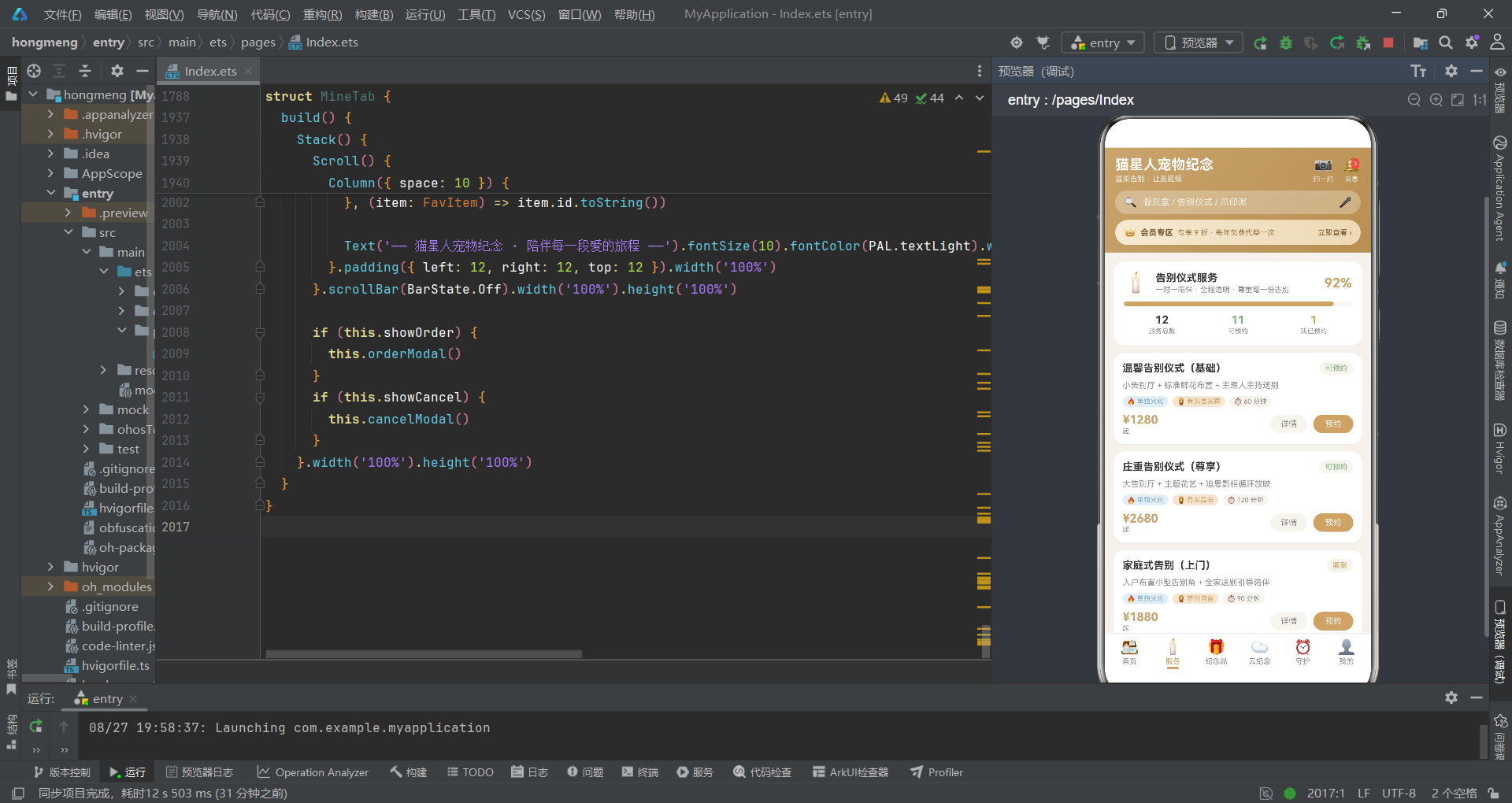
服务页面顶部是一个统计概览卡片。卡片包含标题区、进度条和三个统计数字。标题区左侧是蜡烛图标和标题文字,右侧是可预约服务的百分比。
进度条使用双层 Row + Column 的方式实现:外层 Row 设置灰色背景和圆角,内层 Column 设置主色背景和动态宽度。宽度值由 progressOf(servicePercent()) 计算得出,将百分比数字转换为带百分号的字符串,作为宽度值使用。
          Row({ space: 0 }) {
            Column({ space: 1 }) {
              Text(SERVICES.length.toString()).fontSize(15).fontWeight(FontWeight.Bold).fontColor(PAL.text)
              Text('服务总数').fontSize(9).fontColor(PAL.textSub)
            }.layoutWeight(1).alignItems(HorizontalAlign.Center)
            Column({ space: 1 }) {
              Text(serviceOpenCount().toString()).fontSize(15).fontWeight(FontWeight.Bold).fontColor(PAL.success)
              Text('可预约').fontSize(9).fontColor(PAL.textSub)
            }.layoutWeight(1).alignItems(HorizontalAlign.Center)
            Column({ space: 1 }) {
              Text(serviceBookedCount().toString()).fontSize(15).fontWeight(FontWeight.Bold).fontColor(PAL.warn)
              Text('我已预约').fontSize(9).fontColor(PAL.textSub)
            }.layoutWeight(1).alignItems(HorizontalAlign.Center)
          }.width('100%')
        }.width('100%').padding(14).backgroundColor(PAL.card).borderRadius(14).shadow({ radius: 6, color: 'rgba(58,58,58,0.06)', offsetX: 0, offsetY: 2 })
三个统计数字使用三列等宽布局展示。每列包含一个数字和一行说明文字。三个数字分别使用不同的颜色:总数用深灰色,可预约用绿色,我已预约用黄色。这种颜色编码与状态颜色体系保持一致,用户可以快速理解每个数字的含义。
「我已预约」这个统计项的命名值得玩味。它不是简单地统计已约满的服务数量,而是统计「我」预约的数量。虽然当前实现中使用的是简单的计算(总数减可预约数),但语义上它代表的是用户已预约的服务数。在真实项目中,这个数据应该来自用户的订单记录。
七、纪念品 Tab 深度解析
7.1 分类筛选与双列布局
build() {
  Stack() {
    Scroll() {
      Column({ space: 10 }) {
        Scroll() {
          Row({ space: 8 }) {
            ForEach(KIND_CHIPS, (kind: string, idx: number) => {
              Text(kind).fontSize(11).fontColor(this.kindFilter === kind ? '#FFFFFF' : PAL.textSub).backgroundColor(this.kindFilter === kind ? PAL.primary : PAL.chip).borderRadius(14)
                .padding({ left: 14, right: 14, top: 7, bottom: 7 }).onClick(() => {
                this.kindFilter = kind
              })
            }, (kind: string) => kind)
          }.padding({ left: 8, right: 8 })
        }.scrollable(ScrollDirection.Horizontal).scrollBar(BarState.Off).height(36)
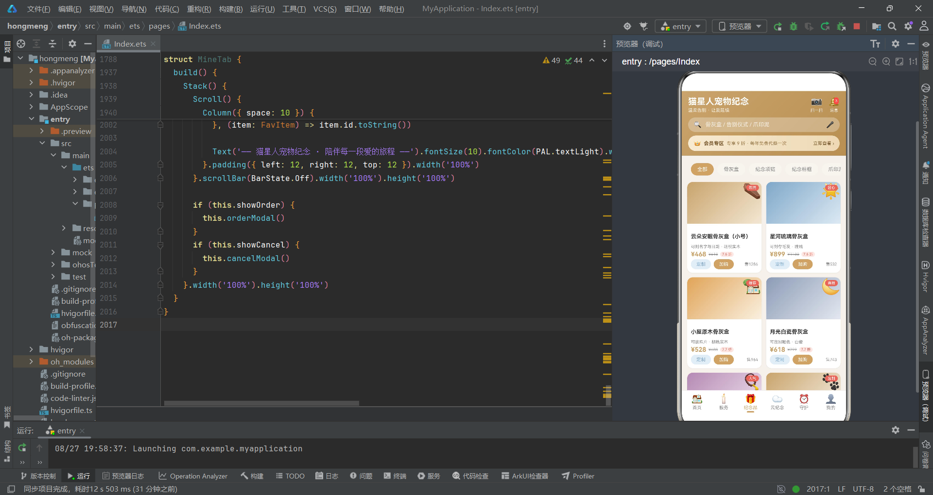
纪念品页面顶部是分类筛选栏。筛选选项使用水平滚动的标签形式,用户可以左右滑动查看更多分类。选中的分类使用主色背景配白色文字,未选中的使用灰色背景配灰色文字。
这里的选中判断使用的是字符串比较(this.kindFilter === kind),而非索引比较。这种方式更加直观——直接比较分类名称,而不需要转换为索引。当分类数组的顺序发生变化时,这种方式也更加稳健。
        Row({ space: 10 }) {
          Column({ space: 10 }) {
            ForEach(keepsakesOf(this.kindFilter, 0), (item: KeepsakeItem) => {
              this.keepCard(item)
            }, (item: KeepsakeItem) => item.id.toString())
          }.layoutWeight(1)
          Column({ space: 10 }) {
            ForEach(keepsakesOf(this.kindFilter, 1), (item: KeepsakeItem) => {
              this.keepCard(item)
            }, (item: KeepsakeItem) => item.id.toString())
          }.layoutWeight(1)
        }.width('100%').alignItems(VerticalAlign.Top)
商品列表采用双列瀑布流布局。实现方式是使用一个 Row 包含两个等宽的 Column,每个 Column 负责展示一列商品。keepsakesOf 函数的 col 参数决定返回左列还是右列的数据。
alignItems(VerticalAlign.Top) 确保两列内容从顶部开始对齐。由于每张卡片的高度可能不同(商品名称行数不同),瀑布流布局中两列的底部不会齐平,顶部对齐是最自然的选择。
这种双列布局的实现方式简单直观,但也有一定的局限性——它依赖于数据预处理(keepsakesOf 函数分列),且无法根据卡片实际高度动态调整列分配。在更复杂的场景下,可能需要使用更专业的瀑布流组件或自定义布局算法。
7.2 纪念品卡片
@Builder keepCard(item: KeepsakeItem) {
  Column({ space: 6 }) {
    Stack({ alignContent: Alignment.TopEnd }) {
      Text(item.icon).fontSize(34)
      Text(item.badge).fontSize(8).fontColor('#FFFFFF').backgroundColor(PAL.danger).borderRadius(8).padding({ left: 6, right: 6, top: 2, bottom: 2 }).margin(6)
    }.width('100%').height(92).linearGradient({ angle: 135, colors: [[item.gStart, 0], [item.gEnd, 1]] }).borderRadius({ topLeft: 12, topRight: 12 })
纪念品卡片顶部是渐变色图标区,使用 Stack 布局实现徽章的叠加效果。徽章位于右上角,使用红色背景配白色文字,标注商品的特殊属性(如热销、人气、匠心等)。margin(6) 为徽章添加了外边距,使其不会紧贴边缘。
图标区高度固定为 92px,使用数据中定义的渐变色填充。每个商品都有独特的渐变配色,这使得整个商品列表色彩丰富,不会显得单调。渐变角度统一为 135度,保持了视觉风格的一致性。
    Column({ space: 3 }) {
      Text(item.name).fontSize(12).fontWeight(FontWeight.Bold).fontColor(PAL.text).maxLines(2).textOverflow({ overflow: TextOverflow.Ellipsis }).minLines(2)
      Text(item.custom + ' · ' + item.material).fontSize(9).fontColor(PAL.textSub).maxLines(1).textOverflow({ overflow: TextOverflow.Ellipsis })
      Row({ space: 5 }) {
        Text(priceFmt(item.price)).fontSize(14).fontWeight(FontWeight.Bold).fontColor(PAL.primary)
        Text(priceFmt(item.originPrice)).fontSize(9).fontColor(PAL.textLight).decoration({ type: TextDecorationType.LineThrough })
        Text(discountOf(item.price, item.originPrice)).fontSize(8).fontColor(PAL.danger).backgroundColor(PAL.dangerSoft).borderRadius(6).padding({ left: 4, right: 4, top: 1, bottom: 1 })
      }.width('100%').alignItems(VerticalAlign.Center)
商品信息区包含名称、属性和价格三行。商品名称限制为 2 行,并设置了 minLines(2) 确保始终占据两行高度。这样做的目的是保证所有卡片的信息区域高度一致,使双列布局更加整齐。
价格行包含三个元素:现价(金色加粗)、原价(浅灰色删除线)和折扣标签(红色背景)。decoration({ type: TextDecorationType.LineThrough }) 为原价添加删除线效果,直观地表达出折扣的概念。
discountOf 函数计算出的折扣信息以红色小标签的形式展示在价格旁边,进一步强化了促销感。这种现价+原价+折扣的三重展示方式,是电商类应用激发购买欲的经典手法。
      Row({ space: 6 }) {
        Text('定制').fontSize(10).fontColor(PAL.secondary).backgroundColor(PAL.secondarySoft).borderRadius(11).padding({ left: 12, right: 12, top: 5, bottom: 5 }).onClick(() => {
          this.customId = item.id
          this.showCustom = true
        })
        Text('加购').fontSize(10).fontColor('#FFFFFF').backgroundColor(PAL.primary).borderRadius(11).padding({ left: 12, right: 12, top: 5, bottom: 5 }).onClick(() => {
          this.cartId = item.id
          this.cartQty = 1
          this.showCart = true
        })
        Text('售' + item.sales).fontSize(9).fontColor(PAL.textSub).layoutWeight(1).textAlign(TextAlign.End)
      }.width('100%').alignItems(VerticalAlign.Center)
    }.alignItems(HorizontalAlign.Start).padding(8)
  }.width('100%').backgroundColor(PAL.card).borderRadius(12).shadow({ radius: 6, color: 'rgba(58,58,58,0.06)', offsetX: 0, offsetY: 2 })
}
卡片底部是操作按钮区,包含「定制」和「加购」两个按钮,以及销量信息。「定制」按钮使用蓝色系配色,「加购」按钮使用金色系配色。两个按钮的视觉权重相当,但色彩含义不同——蓝色代表更多选项,金色代表主要行动。
销量信息位于最右侧,右对齐显示。layoutWeight(1) 确保销量文字占据按钮之外的所有剩余空间,将两个按钮推到左侧。销量数据营造了热销氛围,是社交证明(Social Proof)在电商设计中的典型应用。
7.3 定制弹窗
@Builder customModal() {
  this.modalOverlay(() => {
    this.showCustom = false
  })
  Column({ space: 10 }) {
    Text('定制纪念品').fontSize(16).fontWeight(FontWeight.Bold).fontColor(PAL.text)
    Text(keepsakeOf(this.customId).name).fontSize(11).fontColor(PAL.primary)

    Text('选择款式').fontSize(11).fontColor(PAL.textSub).width('100%')
    Scroll() {
      Row({ space: 8 }) {
        ForEach(STYLE_OPTS, (style: string, idx: number) => {
          Text(style).fontSize(11).fontColor(this.styleIdx === idx ? '#FFFFFF' : PAL.textSub).backgroundColor(this.styleIdx === idx ? PAL.primary : PAL.chip).borderRadius(12)
            .padding({ left: 12, right: 12, top: 6, bottom: 6 }).onClick(() => {
            this.styleIdx = idx
          })
        }, (style: string) => style)
      }.padding({ left: 8, right: 8 })
    }.scrollable(ScrollDirection.Horizontal).scrollBar(BarState.Off).height(34)
定制弹窗提供了款式选择、刻字内容和材质选择三个定制维度。款式选项使用水平滚动标签列表,选中态为主色背景。这种选择交互方式在移动端非常常见,操作直观,视觉效果也好。
    Text('刻字内容(免费 12 字内)').fontSize(11).fontColor(PAL.textSub).width('100%')
    TextInput({ text: this.engrave, placeholder: '如:年糕 · 2018-2026 · 永远爱你' }).height(38).fontSize(12).backgroundColor(PAL.chip).borderRadius(10).padding({ left: 12, right: 12 })
      .onChange((value: string) => {
        this.engrave = value
      })
刻字输入框提供了个性化定制的入口。占位符给出了具体的刻字示例,引导用户输入有意义的内容。「免费 12 字内」的说明既明确了字数限制,又传递了「免费」的价值感,降低了用户的心理门槛。
    Row({ space: 8 }) {
      Column({ space: 2 }) {
        Text('预计工期').fontSize(9).fontColor(PAL.textSub)
        Text(keepsakeOf(this.customId).days.toString() + ' 天').fontSize(13).fontWeight(FontWeight.Bold).fontColor(PAL.text)
      }.alignItems(HorizontalAlign.Start).layoutWeight(1)
      Column({ space: 2 }) {
        Text('定制单价').fontSize(9).fontColor(PAL.textSub)
        Text(priceFmt(keepsakeOf(this.customId).price)).fontSize(13).fontWeight(FontWeight.Bold).fontColor(PAL.primary)
      }.alignItems(HorizontalAlign.End)
    }.width('100%').padding({ top: 6, bottom: 6 }).backgroundColor(PAL.primarySoft).borderRadius(10)
弹窗底部有一个信息汇总栏,用金色浅色背景突出显示。左侧是预计工期,右侧是定制单价。这个汇总栏的设计非常重要——它在用户提交前再次确认关键信息,减少决策犹豫,提升转化率。
7.4 加购弹窗与数量选择
@Builder cartModal() {
  this.modalOverlay(() => {
    this.showCart = false
  })
  Column({ space: 12 }) {
    Text('加入购物车').fontSize(16).fontWeight(FontWeight.Bold).fontColor(PAL.text)

    Row({ space: 10 }) {
      Column() {
        Text(keepsakeOf(this.cartId).icon).fontSize(28)
      }.width(56).height(56).justifyContent(FlexAlign.Center).linearGradient({ angle: 135, colors: [[keepsakeOf(this.cartId).gStart, 0], [keepsakeOf(this.cartId).gEnd, 1]] }).borderRadius(12)

      Column({ space: 3 }) {
        Text(keepsakeOf(this.cartId).name).fontSize(12).fontWeight(FontWeight.Bold).fontColor(PAL.text).maxLines(2).textOverflow({ overflow: TextOverflow.Ellipsis })
        Text(keepsakeOf(this.cartId).custom + ' · 工期 ' + keepsakeOf(this.cartId).days + ' 天').fontSize(9).fontColor(PAL.textSub)
        Text(priceFmt(keepsakeOf(this.cartId).price)).fontSize(14).fontWeight(FontWeight.Bold).fontColor(PAL.primary)
      }.alignItems(HorizontalAlign.Start).layoutWeight(1)
    }.width('100%').alignItems(VerticalAlign.Center)
加购弹窗顶部展示商品摘要信息,包括商品图标、名称、属性和价格。用户在调整数量时可以清楚地看到自己正在购买的商品,避免误操作。
    Row({ space: 12 }) {
      Text('购买数量').fontSize(12).fontColor(PAL.text).layoutWeight(1)
      Text('−').fontSize(16).fontColor(PAL.textSub).width(30).height(30).textAlign(TextAlign.Center).backgroundColor(PAL.chip).borderRadius(15).onClick(() => {
        if (this.cartQty > 1) {
          this.cartQty = this.cartQty - 1
        }
      })
      Text(this.cartQty.toString()).fontSize(14).fontWeight(FontWeight.Bold).fontColor(PAL.text).width(36).textAlign(TextAlign.Center)
      Text('+').fontSize(16).fontColor('#FFFFFF').width(30).height(30).textAlign(TextAlign.Center).backgroundColor(PAL.primary).borderRadius(15).onClick(() => {
        if (this.cartQty < 9) {
          this.cartQty = this.cartQty + 1
        }
      })
    }.width('100%').alignItems(VerticalAlign.Center).padding({ top: 8, bottom: 8 }).border({ width: 1, color: PAL.line }).borderRadius(10)
数量选择器是加购弹窗的核心交互组件。它由减号按钮、数量显示和加号按钮三部分组成。减号按钮为灰色圆形,加号按钮为主色圆形,视觉上区分了减少和增加两种操作的权重。
边界条件的处理非常细致:减号按钮限制数量不小于 1,加号按钮限制数量不大于 9。if (this.cartQty > 1) 和 if (this.cartQty < 9) 的条件判断确保了数量在合理范围内。这种边界保护在交互设计中非常重要,能够防止无效操作带来的困惑。
    Text(cartSum(keepsakeOf(this.cartId).price, this.cartQty)).fontSize(13).fontWeight(FontWeight.Bold).fontColor(PAL.danger).width('100%').textAlign(TextAlign.End)

    Row({ space: 10 }) {
      Text('再逛逛').fontSize(13).fontColor(PAL.textSub).layoutWeight(1).textAlign(TextAlign.Center).height(38).backgroundColor(PAL.chip).borderRadius(19).onClick(() => {
        this.showCart = false
      })
      Text('确认加购').fontSize(13).fontColor('#FFFFFF').layoutWeight(1).textAlign(TextAlign.Center).height(38).backgroundColor(PAL.primary).borderRadius(19).onClick(() => {
        this.showCart = false
      })
    }.width('100%').margin({ top: 2 })
  }.width('80%').padding(16).backgroundColor(PAL.card).borderRadius(16).shadow({ radius: 20, color: 'rgba(0,0,0,0.15)', offsetX: 0, offsetY: 8 }).position({ x: '10%', y: '18%' }).zIndex(999)
}
合计金额使用红色加粗字体,右对齐显示。红色在这里的作用是强调金额数字,吸引用户注意。cartSum 函数计算总价并格式化为「合计 ¥XXX」的形式。
底部两个操作按钮:「再逛逛」和「确认加购」。「再逛逛」使用灰色背景,给用户一个继续浏览的出口;「确认加购」使用主色背景,是主要的行动号召。两个按钮平分宽度,形成平衡的视觉布局。
八、云纪念 Tab 深度解析
8.1 动态卡片组件
@Builder postCard(post: MemoryPost) {
  Column({ space: 8 }) {
    Row({ space: 8 }) {
      Column() {
        Text(post.avatar).fontSize(20)
      }.width(40).height(40).justifyContent(FlexAlign.Center).backgroundColor(PAL.primarySoft).borderRadius(20)

      Column({ space: 2 }) {
        Text(post.petName).fontSize(13).fontWeight(FontWeight.Bold).fontColor(PAL.text)
        Row({ space: 4 }) {
          Text(post.city).fontSize(9).fontColor(PAL.secondary)
          Text('·').fontSize(9).fontColor(PAL.textLight)
          Text(post.time).fontSize(9).fontColor(PAL.textSub)
        }.alignItems(VerticalAlign.Center)
      }.alignItems(HorizontalAlign.Start).layoutWeight(1)

      Text('# ' + post.tag).fontSize(9).fontColor(PAL.secondary).backgroundColor(PAL.secondarySoft).borderRadius(8).padding({ left: 6, right: 6, top: 2, bottom: 2 })
    }.width('100%').alignItems(VerticalAlign.Center)
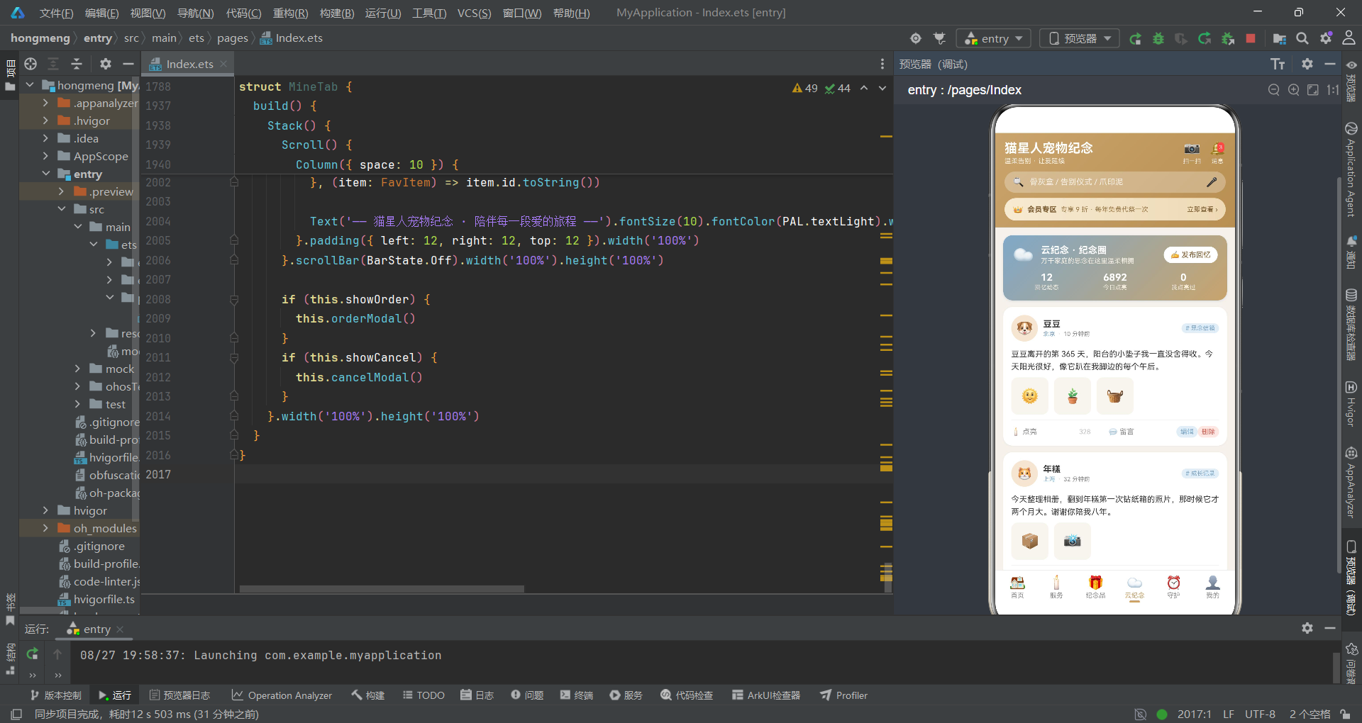
云纪念动态卡片是社交功能的核心UI单元。卡片顶部是用户信息行,包括头像、宠物名、城市、发布时间和标签。头像使用圆形设计,直径 40px,背景为浅金色。
城市与时间之间用一个点号「·」分隔,这是社交应用中常见的信息分隔方式。点号使用最浅的文本色,低调而不失功能性。标签使用蓝色系配色,与「云纪念」的主题色调相呼应。
    Text(post.content).fontSize(12).fontColor(PAL.text).lineHeight(19).width('100%')

    Row({ space: 8 }) {
      ForEach(post.photos, (photo: string) => {
        Column() {
          Text(photo).fontSize(22)
        }.width(56).height(56).justifyContent(FlexAlign.Center).backgroundColor(PAL.chip).borderRadius(10)
      }, (photo: string) => photo)
    }.width('100%')
动态正文使用 12号 字体,行高 19,确保良好的可读性。lineHeight 属性在文本展示中非常重要,合适的行高可以显著提升长文本的阅读舒适度。
照片区域使用 ForEach 遍历照片数组,每张照片显示为一个 56x56 的灰色方块。在真实项目中,这里应该使用 Image 组件展示真实图片,当前实现用 emoji 作为占位符,体现了快速原型开发的思路。
    Divider().color(PAL.line).strokeWidth(1)

    Row({ space: 0 }) {
      Text(isLikedOn(this.likedIds, post.id) ? '🕯️ 已点亮' : '🕯️ 点亮').fontSize(11).fontColor(isLikedOn(this.likedIds, post.id) ? PAL.danger : PAL.textSub).layoutWeight(1).onClick(() => {
        this.likedIds = toggleLiked(this.likedIds, post.id)
      })
      Text(likedNum(post.likes, this.likedIds, post.id).toString()).fontSize(10).fontColor(isLikedOn(this.likedIds, post.id) ? PAL.danger : PAL.textLight).width(44)
      Text('💬 留言').fontSize(11).fontColor(PAL.textSub).layoutWeight(1).onClick(() => {
      })
      Text('编辑').fontSize(10).fontColor(PAL.secondary).padding({ left: 6, right: 6, top: 3, bottom: 3 }).backgroundColor(PAL.secondarySoft).borderRadius(9).onClick(() => {
        this.editId = post.id
        this.editTitle = '写给' + post.petName + '的话'
        this.editContent = post.content
        this.editTagIdx = POST_TAGS.indexOf(post.tag)
        this.editPublic = post.isPublic
        this.showEdit = true
      })
      Text('删除').fontSize(10).fontColor(PAL.danger).padding({ left: 6, right: 6, top: 3, bottom: 3 }).backgroundColor(PAL.dangerSoft).borderRadius(9).onClick(() => {
        this.delPostId = post.id
        this.showDelPost = true
      })
    }.width('100%').alignItems(VerticalAlign.Center)
操作栏是动态卡片的交互核心,包含点亮、留言、编辑和删除四个功能。点亮按钮替代了传统的点赞功能,用蜡烛 emoji 和「点亮」的表述更符合纪念主题的情感调性。
点亮功能的状态管理使用了 isLikedOn 函数判断当前用户是否已点亮,toggleLiked 函数切换状态,likedNum 函数计算显示的点亮数。点击点亮按钮时,通过 this.likedIds = toggleLiked(this.likedIds, post.id) 更新状态数组,触发UI重新渲染。
编辑和删除按钮使用小尺寸的圆角标签样式,编辑用蓝色,删除用红色。点击编辑按钮时,会预先填充编辑表单的各个字段(标题、内容、标签、公开状态),然后打开编辑弹窗。这种数据预填充的做法大大提升了用户体验,用户不需要重新输入已有内容。
    if (!post.isPublic) {
      Text('🔒 仅自己可见的回忆').fontSize(9).fontColor(PAL.textLight).width('100%')
    }
  }.width('100%').padding(12).backgroundColor(PAL.card).borderRadius(14).shadow({ radius: 6, color: 'rgba(58,58,58,0.06)', offsetX: 0, offsetY: 2 })
}
如果动态是私密的(!post.isPublic),卡片底部会显示一行「仅自己可见的回忆」的提示,使用锁图标和最浅的文本色。这个提示虽然不显眼,但对于用户理解内容的可见范围非常重要,避免了私密内容被误判为公开的尴尬。
8.2 发布动态弹窗
@Builder pubModal() {
  this.modalOverlay(() => {
    this.showPub = false
  })
  Column({ space: 10 }) {
    Text('发布回忆').fontSize(16).fontWeight(FontWeight.Bold).fontColor(PAL.text)
    Text('把想说的话写下来,让它被温柔地记住').fontSize(11).fontColor(PAL.textSub)

    TextInput({ text: this.pubTitle, placeholder: '标题(如:豆豆离开的第一年)' }).height(38).fontSize(12).backgroundColor(PAL.chip).borderRadius(10).padding({ left: 12, right: 12 })
      .onChange((value: string) => {
        this.pubTitle = value
      })

    TextArea({ text: this.pubContent, placeholder: '写下回忆…' }).height(90).fontSize(12).backgroundColor(PAL.chip).borderRadius(10).padding(10).onChange((value: string) => {
      this.pubContent = value
    })
发布动态弹窗包含标题输入、内容输入、标签选择和公开设置四个部分。弹窗顶部的副标题「把想说的话写下来,让它被温柔地记住」具有情感引导作用,鼓励用户表达内心的感受。
标题使用单行 TextInput,内容使用多行 TextArea。内容输入框高度为 90px,可以容纳大约 4-5 行文字,足够用户写下一段完整的回忆。
    Row({ space: 8 }) {
      Text('是否公开').fontSize(12).fontColor(PAL.text).layoutWeight(1)
      Text('公开').fontSize(11).fontColor(this.pubOpen ? '#FFFFFF' : PAL.textSub).backgroundColor(this.pubOpen ? PAL.primary : PAL.chip).borderRadius(12)
        .padding({ left: 14, right: 14, top: 6, bottom: 6 }).onClick(() => {
        this.pubOpen = true
      })
      Text('仅自己').fontSize(11).fontColor(!this.pubOpen ? '#FFFFFF' : PAL.textSub).backgroundColor(!this.pubOpen ? PAL.secondary : PAL.chip).borderRadius(12)
        .padding({ left: 14, right: 14, top: 6, bottom: 6 }).onClick(() => {
        this.pubOpen = false
      })
    }.width('100%').alignItems(VerticalAlign.Center)
公开设置使用两个互斥的按钮:「公开」和「仅自己」。选中的按钮使用实色背景+白色文字,未选中的使用灰色背景+灰色文字。公开按钮用主色(金色),仅自己按钮用辅助色(蓝色),两者在视觉上有明确的区分。
这种二选一的按钮组是移动端常见的选择控件。它比下拉选择更加直观,用户一眼就能看到所有选项,点击操作也更加便捷。对于只有两个选项的场景,这种设计是最优选择。
8.3 云纪念页面头部
build() {
  Stack() {
    Scroll() {
      Column({ space: 10 }) {
        Column({ space: 10 }) {
          Row({ space: 10 }) {
            Text('☁️').fontSize(26)
            Column({ space: 2 }) {
              Text('云纪念 · 纪念圈').fontSize(14).fontWeight(FontWeight.Bold).fontColor('#FFFFFF')
              Text('万千家庭的思念在这里温柔相拥').fontSize(10).fontColor('#F5EFE4')
            }.alignItems(HorizontalAlign.Start).layoutWeight(1)
            Text('✍️ 发布回忆').fontSize(11).fontColor('#7A5A2E').backgroundColor('#FFFFFF').borderRadius(13).padding({ left: 10, right: 10, top: 6, bottom: 6 }).onClick(() => {
              this.showPub = true
            })
          }.width('100%')
云纪念页面的头部使用了从静谧蓝到香槟金的渐变背景,与其他 Tab 形成视觉区分。云朵图标和「云纪念」的名称相呼应,副标题「万千家庭的思念在这里温柔相拥」富有诗意,营造了温暖共情的社区氛围。
「发布回忆」按钮使用白色背景配金色文字,在渐变背景上非常醒目。按钮带有书写 emoji,暗示了发布内容的动作。点击按钮后打开发布弹窗,完成内容创作的闭环。
          Row({ space: 0 }) {
            Column({ space: 1 }) {
              Text(POSTS.length.toString()).fontSize(15).fontWeight(FontWeight.Bold).fontColor('#FFFFFF')
              Text('回忆动态').fontSize(9).fontColor('#F5EFE4')
            }.layoutWeight(1).alignItems(HorizontalAlign.Center)
            Column({ space: 1 }) {
              Text('6892').fontSize(15).fontWeight(FontWeight.Bold).fontColor('#FFFFFF')
              Text('今日点亮').fontSize(9).fontColor('#F5EFE4')
            }.layoutWeight(1).alignItems(HorizontalAlign.Center)
            Column({ space: 1 }) {
              Text(this.likedIds.length.toString()).fontSize(15).fontWeight(FontWeight.Bold).fontColor('#FFFFFF')
              Text('我点亮过').fontSize(9).fontColor('#F5EFE4')
            }.layoutWeight(1).alignItems(HorizontalAlign.Center)
          }.width('100%')
        }.width('100%').padding(14).borderRadius(14).linearGradient({ angle: 135, colors: [['#7FA8C9', 0], ['#C9A46C', 1]] })
        .shadow({ radius: 8, color: 'rgba(127,168,201,0.25)', offsetX: 0, offsetY: 4 })
头部下方是三个统计数字:回忆动态总数、今日点亮数、我点亮过的数量。三个数字使用三列等宽布局,白色文字在渐变背景上清晰醒目。这些统计数字不仅展示了社区的活跃度,也记录了用户自己的参与轨迹。
「我点亮过」的统计特别有意义。它记录了用户为其他家庭送上的温暖,强化了社区互助的情感连接。当用户看到自己点亮过的数量增加时,会产生一种参与感和成就感。
九、守护 Tab 与我的 Tab 解析
9.1 纪念日卡片
@Builder annivRow(item: AnnivItem) {
  Column({ space: 8 }) {
    Row({ space: 10 }) {
      Column() {
        Text(item.emoji).fontSize(20)
      }.width(44).height(44).justifyContent(FlexAlign.Center).backgroundColor(PAL.chip).borderRadius(22)

      Column({ space: 3 }) {
        Text(item.name).fontSize(13).fontWeight(FontWeight.Bold).fontColor(PAL.text).maxLines(1).textOverflow({ overflow: TextOverflow.Ellipsis })
        Row({ space: 6 }) {
          Text(item.date).fontSize(10).fontColor(PAL.textSub)
          Text(item.kind).fontSize(9).fontColor(kindColor(item.kind)).backgroundColor(PAL.chip).borderRadius(7).padding({ left: 6, right: 6, top: 1, bottom: 1 })
          Text(item.freq).fontSize(9).fontColor(PAL.textSub)
        }.alignItems(VerticalAlign.Center)
      }.alignItems(HorizontalAlign.Start).layoutWeight(1)

      Text(dayTagOf(item.daysLeft)).fontSize(11).fontWeight(FontWeight.Bold).fontColor(item.daysLeft <= 7 ? PAL.danger : kindColor(item.kind))
    }.width('100%').alignItems(VerticalAlign.Center)
纪念日卡片是守护页面的核心组件。卡片顶部一行包含图标、名称信息和倒计时。左侧是圆形的 emoji 图标,中间是纪念日名称、日期、类型和频率,右侧是剩余天数的提示。
剩余天数的颜色处理非常细致:如果剩余天数小于等于 7 天,使用红色(危险色)强调紧迫性;否则使用类型对应的颜色。这种根据紧急程度动态调整颜色的做法,能够有效吸引用户对临近纪念日的关注。
    Row({ space: 8 }) {
      Text('🔔 ' + item.way).fontSize(9).fontColor(PAL.secondary).backgroundColor(PAL.secondarySoft).borderRadius(8).padding({ left: 6, right: 6, top: 2, bottom: 2 })
      Text(item.note).fontSize(9).fontColor(PAL.textSub).maxLines(1).textOverflow({ overflow: TextOverflow.Ellipsis }).layoutWeight(1)
      Text('提醒设置').fontSize(10).fontColor(PAL.primary).backgroundColor(PAL.primarySoft).borderRadius(10).padding({ left: 10, right: 10, top: 4, bottom: 4 }).onClick(() => {
        this.remindId = item.id
        this.rFreqIdx = FREQS.indexOf(item.freq)
        this.rWayIdx = REMIND_WAYS.indexOf(item.way)
        this.rAdvance = 3
        this.showRemind = true
      })
    }.width('100%').alignItems(VerticalAlign.Center)
卡片中部一行展示提醒方式、备注信息和设置按钮。提醒方式用蓝色标签显示,备注信息用灰色文字展示,提醒设置按钮用金色按钮呈现。三者在一行内水平排列,备注信息占据中间主要空间。
点击「提醒设置」按钮时,会将当前纪念日的各项配置预填充到设置弹窗中:频率索引、提醒方式索引、提前天数。预填充使用了 FREQS.indexOf(item.freq) 的方式将字符串转换为索引,这种方式虽然简洁,但需要确保字符串与数组中的值完全匹配。
    Row() {
      Column().height(4).borderRadius(2).backgroundColor(item.daysLeft <= 7 ? PAL.danger : PAL.primary).width(progressOf(item.daysLeft > 90 ? 100 : Math.round(item.daysLeft / 90 * 100)))
    }.width('100%').height(4).backgroundColor(PAL.chip).borderRadius(2)
  }.width('100%').padding(12).backgroundColor(PAL.card).borderRadius(14).shadow({ radius: 6, color: 'rgba(58,58,58,0.06)', offsetX: 0, offsetY: 2 })
}
卡片底部是一个进度条,直观地展示距离纪念日的时间进度。进度计算逻辑为:剩余天数除以 90 天,得到百分比。如果剩余天数超过 90 天,进度条显示为满格(100%)。
进度条颜色同样根据紧急程度变化:7 天内用红色,其余用金色。进度条虽然只有 4px 的高度,但它为卡片增添了动态的视觉元素,让用户对时间的流逝有更直观的感知。
9.2 提醒设置弹窗
@Builder remindModal() {
  this.modalOverlay(() => {
    this.showRemind = false
  })
  Column({ space: 10 }) {
    Text('周年提醒设置').fontSize(16).fontWeight(FontWeight.Bold).fontColor(PAL.text)
    Text(annivOf(this.remindId).name + ' · ' + annivOf(this.remindId).date).fontSize(11).fontColor(PAL.primary)

    Text('提前多久提醒').fontSize(11).fontColor(PAL.textSub).width('100%')
    Scroll() {
      Row({ space: 8 }) {
        ForEach(ADV_DAYS, (day: number) => {
          Text(day.toString() + ' 天前').fontSize(11).fontColor(this.rAdvance === day ? '#FFFFFF' : PAL.textSub).backgroundColor(this.rAdvance === day ? PAL.danger : PAL.chip).borderRadius(12)
            .padding({ left: 12, right: 12, top: 6, bottom: 6 }).onClick(() => {
            this.rAdvance = day
          })
        }, (day: number) => day.toString())
      }.padding({ left: 8, right: 8 })
    }.scrollable(ScrollDirection.Horizontal).scrollBar(BarState.Off).height(34)

    Text('将在纪念日 ' + this.rAdvance.toString() + ' 天前通过「' + REMIND_WAYS[this.rWayIdx] + '」提醒您').fontSize(10).fontColor(PAL.textSub).width('100%').padding(8).backgroundColor(PAL.primarySoft)
      .borderRadius(8)
提醒设置弹窗提供了三个维度的配置:提醒频率、提醒方式和提前天数。其中提前天数选项使用红色作为选中色,暗示了「临近」「紧迫」的语义,与倒计时的紧急感相呼应。
弹窗底部有一行汇总提示文字,用金色浅色背景突出显示。这行文字将用户的设置转化为一句完整的自然语言描述,让用户清楚地知道提醒将如何执行。这种确认式的信息展示,减少了用户的认知负担,提升了设置的确定性。
9.3 我的页面概览
build() {
  Stack() {
    Scroll() {
      Column({ space: 10 }) {
        Column({ space: 12 }) {
          Row({ space: 12 }) {
            Column() {
              Text('🌸').fontSize(30)
            }.width(60).height(60).justifyContent(FlexAlign.Center).backgroundColor('rgba(255,255,255,0.35)').borderRadius(30)

            Column({ space: 4 }) {
              Text('林晚晚').fontSize(17).fontWeight(FontWeight.Bold).fontColor('#FFFFFF')
              Text('👑 金卡会员 · 守护值 1286 · 已守护 2 个小天使').fontSize(10).fontColor('#F5EFE4')
            }.alignItems(HorizontalAlign.Start).layoutWeight(1)
            Text(' ›').fontSize(16).fontColor('#FFFFFF')
          }.width('100%').alignItems(VerticalAlign.Center)
我的页面顶部是用户信息卡片,使用香槟金渐变背景。左侧是用户头像(樱花 emoji),中间是用户名和会员信息,右侧是一个箭头指示可以进入个人信息详情页。
会员信息展示了三个关键数据:金卡会员等级、守护值和守护的小天使数量。「守护值」是一个富有产品特色的积分概念,它将用户的各种行为(消费、点亮、发布回忆等)转化为一个情感化的数值,增强用户的参与感和归属感。
          Row({ space: 0 }) {
            Column({ space: 1 }) {
              Text(ORDERS.length.toString()).fontSize(16).fontWeight(FontWeight.Bold).fontColor('#FFFFFF')
              Text('预约记录').fontSize(9).fontColor('#F5EFE4')
            }.layoutWeight(1).alignItems(HorizontalAlign.Center)
            Column({ space: 1 }) {
              Text(FAVS.length.toString()).fontSize(16).fontWeight(FontWeight.Bold).fontColor('#FFFFFF')
              Text('我的收藏').fontSize(9).fontColor('#F5EFE4')
            }.layoutWeight(1).alignItems(HorizontalAlign.Center)
            Column({ space: 1 }) {
              Text('12').fontSize(16).fontWeight(FontWeight.Bold).fontColor('#FFFFFF')
              Text('点亮回忆').fontSize(9).fontColor('#F5EFE4')
            }.layoutWeight(1).alignItems(HorizontalAlign.Center)
            Column({ space: 1 }) {
              Text('2').fontSize(16).fontWeight(FontWeight.Bold).fontColor('#FFFFFF')
              Text('云纪念空间').fontSize(9).fontColor('#F5EFE4')
            }.layoutWeight(1).alignItems(HorizontalAlign.Center)
          }.width('100%')
        }.width('100%').padding(16).borderRadius(16).linearGradient({ angle: 135, colors: [['#C9A46C', 0], ['#B98F52', 1]] })
        .shadow({ radius: 10, color: 'rgba(201,164,108,0.3)', offsetX: 0, offsetY: 4 })
用户信息下方是四个统计数字,四列等宽排列:预约记录、我的收藏、点亮回忆、云纪念空间。这四个数据分别对应了应用的四大核心功能模块:服务、纪念品、云纪念和守护。
四个统计数字不仅是数据展示,更是功能入口。用户点击这些数字时,通常会跳转到对应的列表页面。在当前实现中,这些数字仅做展示之用,但架构上已经为后续的交互扩展预留了位置。
9.4 功能入口与订单列表
        Row({ space: 0 }) {
          Column({ space: 4 }) {
            Text('🎁').fontSize(22)
            Text('优惠券').fontSize(9).fontColor(PAL.textSub)
          }.layoutWeight(1).alignItems(HorizontalAlign.Center)
          Column({ space: 4 }) {
            Text('📜').fontSize(22)
            Text('服务凭证').fontSize(9).fontColor(PAL.textSub)
          }.layoutWeight(1).alignItems(HorizontalAlign.Center)
          Column({ space: 4 }) {
            Text('☎️').fontSize(22)
            Text('纪念顾问').fontSize(9).fontColor(PAL.textSub)
          }.layoutWeight(1).alignItems(HorizontalAlign.Center)
          Column({ space: 4 }) {
            Text('⚙️').fontSize(22)
            Text('设置').fontSize(9).fontColor(PAL.textSub)
          }.layoutWeight(1).alignItems(HorizontalAlign.Center)
        }.width('100%').padding({ top: 14, bottom: 14 }).backgroundColor(PAL.card).borderRadius(14).shadow({ radius: 6, color: 'rgba(58,58,58,0.06)', offsetX: 0, offsetY: 2 })
功能入口区使用四宫格布局,每个入口包含一个 emoji 图标和一行文字说明。图标使用 22号 字体,文字使用 9号 灰色字体。这种图标+文字的组合是移动端功能入口的经典设计,直观易懂,点击热区也足够大。
四个功能分别是:优惠券、服务凭证、纪念顾问、设置。它们覆盖了营销、售后、服务和系统四个维度,是「我的」页面的标配功能组合。
        this.mineSection('我的预约记录', '全部记录 ›')
        ForEach(ORDERS, (order: OrderRec) => {
          this.orderRow(order)
        }, (order: OrderRec) => order.id.toString())

        this.mineSection('我的收藏', '更多收藏 ›')
        ForEach(FAVS, (item: FavItem) => {
          this.favRow(item)
        }, (item: FavItem) => item.id.toString())
页面下方依次是预约记录列表和收藏列表。每个列表都有一个分区标题(通过 mineSection 构建函数创建),标题右侧有「更多」入口。列表使用 ForEach 遍历数据数组,渲染对应的行组件。
这种分区列表的布局是「我的」页面的标准模式。它将用户的各类数据按类别分组展示,结构清晰,用户可以快速找到自己需要的信息。
十、核心技术点总结与对比
10.1 布局组件对比
鸿蒙声明式UI提供了丰富的布局容器,本项目中主要使用了 Column、Row 和 Stack 三种基础布局。以下是它们的特点与适用场景对比:
| 布局组件 | 排列方向 | 核心属性 | 适用场景 | 项目中的典型应用 |
|---|---|---|---|---|
| Column | 垂直方向(纵向) | space、alignItems、justifyContent | 垂直堆叠的内容、页面主体结构、表单列表 | 卡片内容、弹窗表单、页面整体布局 |
| Row | 水平方向(横向) | space、alignItems、justifyContent | 水平排列的元素、导航栏、操作按钮组 | 底部导航栏、卡片操作区、标签选择 |
| Stack | 层叠方向(Z轴) | alignContent | 层叠效果、遮罩、徽标、弹窗 | 角标徽章、弹窗遮罩、图标叠加 |
| Scroll | 可滚动(垂直/水平) | scrollable、scrollBar | 超出屏幕的长内容、列表页 | 各 Tab 页面主体、水平标签栏 |
| ForEach | 数据驱动渲染 | - | 列表渲染、动态生成UI元素 | 服务列表、纪念品列表、动态列表 |
10.2 装饰器对比
装饰器是鸿蒙 ArkTS 声明式UI的核心特性,不同的装饰器承担着不同的职责:
| 装饰器 | 作用对象 | 核心功能 | 响应式 | 项目应用场景 |
|---|---|---|---|---|
| @Entry | struct 组件 | 标记页面入口组件 | - | Index 主组件 |
| @Component | struct 组件 | 标记自定义组件 | - | 所有 Tab 组件 |
| @State | 组件内变量 | 标记响应式状态变量 | 是 | 弹窗显隐、表单数据、选中索引 |
| @Builder | 组件内方法 | 封装可复用UI片段 | 是(依赖状态) | 卡片、弹窗、标题栏等 |
10.3 状态管理模式
本项目采用的是组件内状态管理模式,所有状态都通过 @State 装饰器定义在各自的组件内部。这种模式的特点是:
状态与组件绑定:每个组件维护自己的状态,状态变更只会影响当前组件的渲染。首页的 showQuick 状态只控制首页的弹窗,不会影响其他 Tab。
单向数据流:状态由父组件持有,通过参数传递给子组件(@Builder 函数参数)。子组件不直接修改父状态,而是通过回调函数通知父组件更新。
函数式更新:对于数组等引用类型的状态,采用创建新数组并整体赋值的方式(如 toggleLiked 函数),确保 @State 能够检测到变化并触发更新。
在更复杂的应用中,可能需要用到
@Link、@Prop、@Provide/@Consume等更高级的状态管理机制,实现跨组件的状态共享与同步。但对于本项目这种 Tab 独立、耦合度低的架构,组件内状态管理已经足够简洁高效。
10.4 弹窗实现模式对比
项目中实现了多种弹窗(快速预约、服务预约、定制、加购、发布、编辑、删除确认等),它们共享一套相似的实现模式:
| 弹窗类型 | 状态变量 | 构建函数 | 触发方式 | 典型场景 |
|---|---|---|---|---|
| 表单弹窗 | showXxx + 表单字段 | xxxModal() | 点击按钮 | 预约、定制、发布 |
| 确认弹窗 | showXxx + 目标ID | xxxModal() | 点击操作 | 删除、取消 |
| 详情弹窗 | showXxx + 详情ID | xxxModal() | 点击详情 | 订单详情、服务详情 |
所有弹窗都遵循相同的结构模式:Stack 根容器 + 条件渲染 + 遮罩层 + 内容卡片。遮罩层通过 modalOverlay 构建函数复用,内容卡片通过 position 定位和 zIndex 层级控制显示在最上层。
十一、完整总结
11.1 架构设计总结
这款宠物纪念服务应用在架构设计上展现了清晰的分层思想和良好的组件化实践。从最底层的接口定义和常量数据,到中间层的工具函数,再到上层的组件实现,每一层都有明确的职责边界。
数据层通过 TypeScript 接口定义了所有业务实体的结构,确保了类型安全和代码提示。调色板常量的集中管理使得整体视觉风格高度统一,也为后续的主题切换预留了扩展空间。选项常量的设计则将业务选项与UI实现解耦,便于维护和扩展。
工具函数层承担了数据格式化、业务查询、统计计算和交互逻辑等职责。这些纯函数不依赖任何组件状态,可以独立测试和复用。将业务逻辑从组件中抽离为纯函数,是保持组件简洁性的重要手段。
组件层采用了「主组件 + 子Tab组件」的架构。主组件负责页面框架(顶部导航、底部Tab栏)和Tab切换逻辑,每个Tab组件独立管理自己的状态和UI。这种架构使得各功能模块之间耦合度低,开发者可以并行开发不同的Tab,互不干扰。
11.2 组件化实践总结
@Builder 装饰器在项目中得到了充分的应用。从简单的遮罩层、分区标题,到复杂的卡片、弹窗,都被封装为可复用的构建函数。这种做法的好处是多方面的:
首先,它减少了重复代码。相同的UI模式(如分区标题、弹窗遮罩)只需要定义一次,就可以在多个地方调用。
其次,它提升了代码可读性。将复杂的UI拆分为多个命名清晰的 @Builder 函数,build 方法的结构就会变得非常清晰,读者可以快速了解页面的整体构成。
最后,它便于维护和修改。当需要调整某个UI元素的样式时,只需修改对应的 @Builder 函数,所有引用该函数的地方都会自动更新,确保了一致性。
11.3 状态管理总结
项目的状态管理策略简洁而有效。所有状态变量都使用 @State 装饰器定义在组件内部,遵循「谁使用,谁管理」的原则。每个弹窗对应一组状态变量(显隐状态 + 表单数据),状态作用域清晰可控。
对于数组类型的状态(如点赞ID列表),项目采用了不可变更新的方式——每次修改都返回一个新数组,然后整体赋值给状态变量。这种方式虽然在性能上略有开销,但它确保了状态变更能够被 @State 正确检测,避免了因引用未变而导致的UI不更新问题。
状态与UI的绑定通过声明式的方式实现。开发者不需要手动操作DOM,只需要描述「数据是什么样的,UI就应该是什么样的」,框架会自动完成数据到视图的映射。这种声明式的编程范式大大降低了UI开发的心智负担,让开发者可以更专注于业务逻辑本身。
11.4 用户体验设计总结
在用户体验层面,这款应用也有许多可圈可点之处。
色彩体系的设计非常成熟。暖灰白的背景、香槟金的主色、静谧蓝的辅助色,三者搭配出温暖而不失专业的视觉调性。状态色(成功绿、警告黄、危险红)的使用遵循了通用的色彩语义,用户可以仅凭颜色快速判断信息含义。
深-浅色配对的设计模式贯穿始终。每种主色都有对应的浅色版本,深色用于文字和图标,浅色用于背景和标签。这种设计既保证了视觉层次,又确保了色彩语义的一致性。
弹窗交互设计细致入微。遮罩层点击关闭、表单预填充、操作按钮的主次区分、汇总信息的高亮显示,这些细节共同构成了流畅易用的交互体验。特别是删除确认弹窗的设计,通过二次确认避免了误操作,体现了对用户数据的尊重。
文案设计同样值得称道。「温柔告别,好好说再见」「万千家庭的思念在这里温柔相拥」「被记住,就是另一种形式的陪伴」——这些富有温度的文案,与产品的情感定位高度契合,能够在用户心中建立情感连接。
11.5 技术实现亮点
从纯技术的角度看,项目中有几个特别值得关注的实现亮点:
双列瀑布流布局:通过 keepsakesOf 函数预先分列数据,再用两个 Column 并行渲染,实现了简洁高效的双列布局。虽然不是真正的瀑布流(高度动态分配),但在商品卡片高度差异不大的场景下,这种实现方式足够简单可靠。
水平滚动标签选择:将选项数组通过 ForEach 渲染为水平排列的标签,外层包裹 Scroll 实现横向滚动。这是移动端分类筛选的经典交互模式,在项目中被广泛应用于城市选择、宠物类型、仪式形式、材质选择等多个场景。
点赞/点亮状态管理:通过 isLikedOn、toggleLiked、likedNum 三个函数,将点赞的判断、切换和计数逻辑完整封装。使用ID数组存储点赞状态,既便于持久化,又便于状态同步。
统计进度条:通过双层 Column 实现进度条效果,外层作为背景,内层作为进度。进度值通过统计函数计算得出,将数据与视觉完美关联。
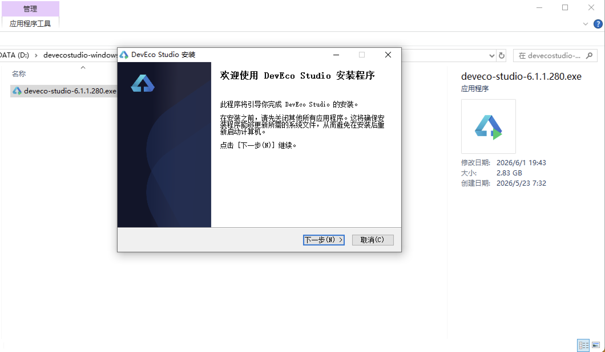
安装DevEco Studio程序
选择目标安装目录:
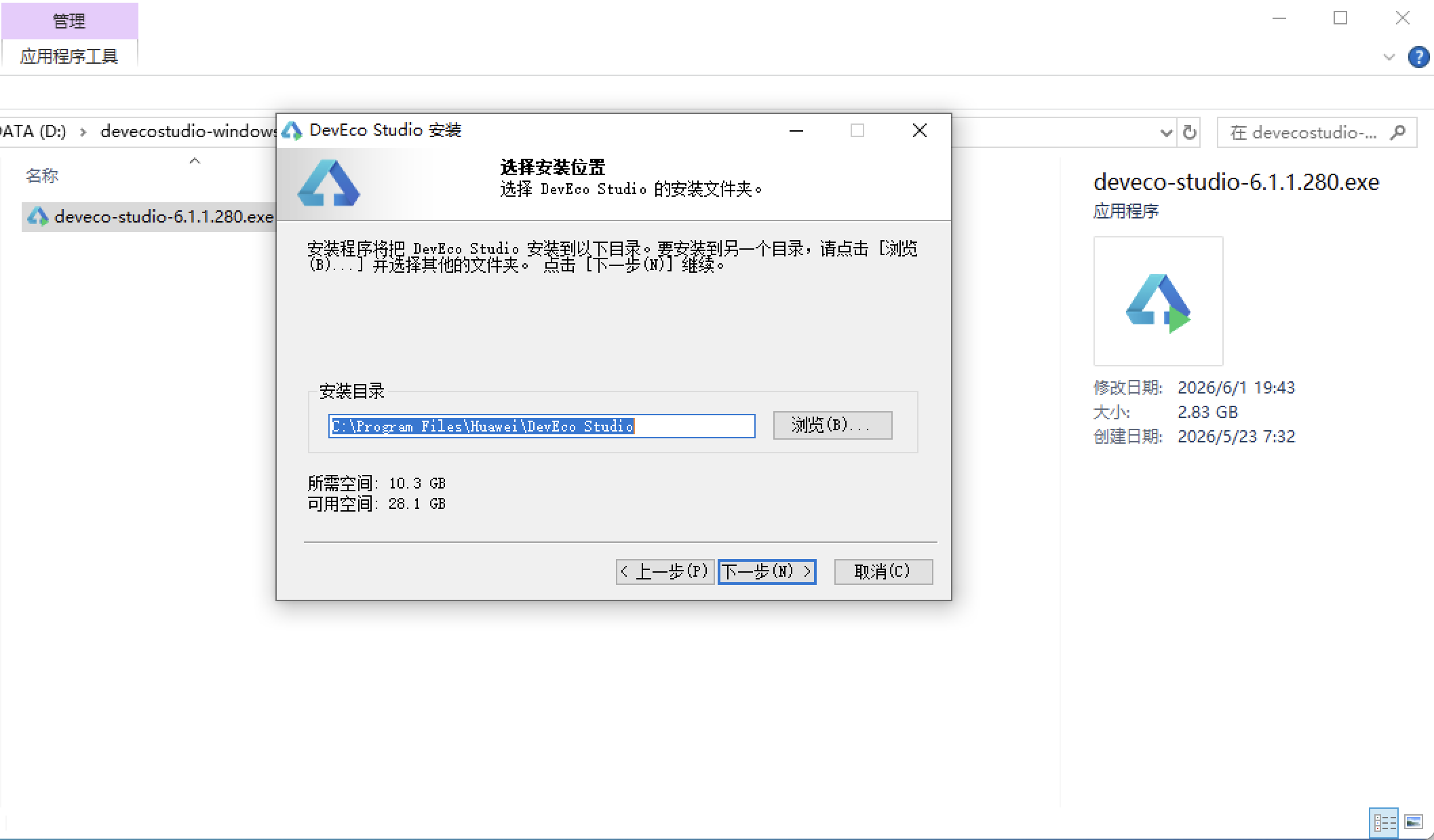
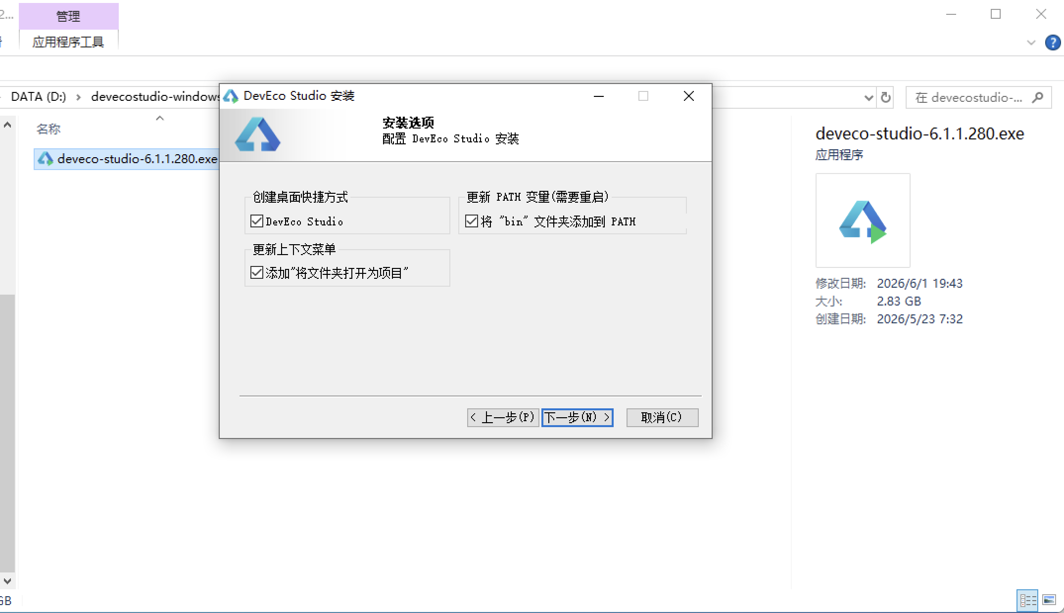
设置环境变量,但是需要重启一下:
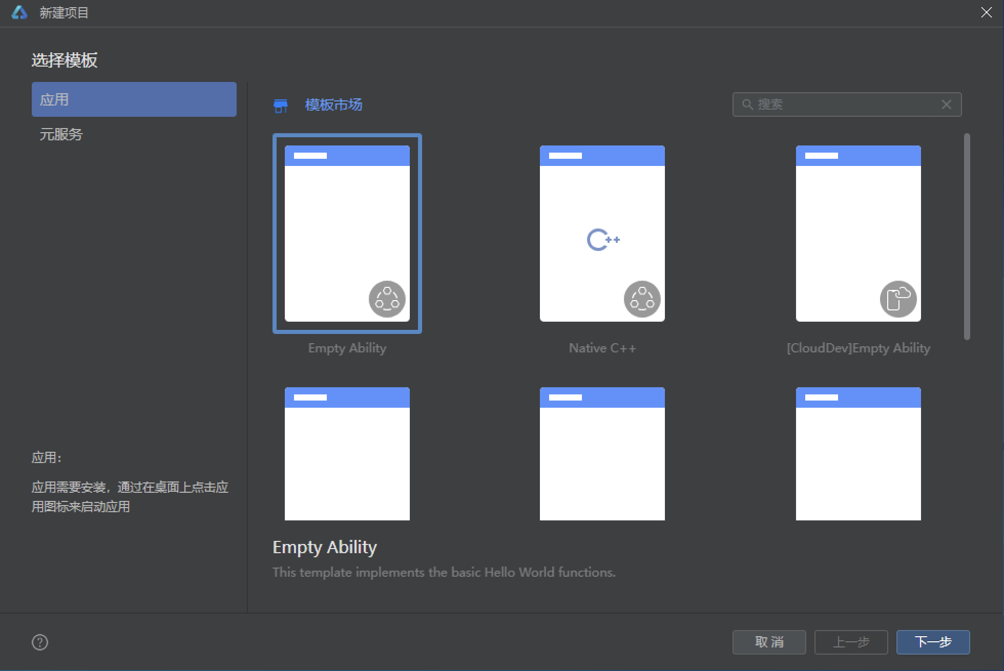
新建一个空白模板:
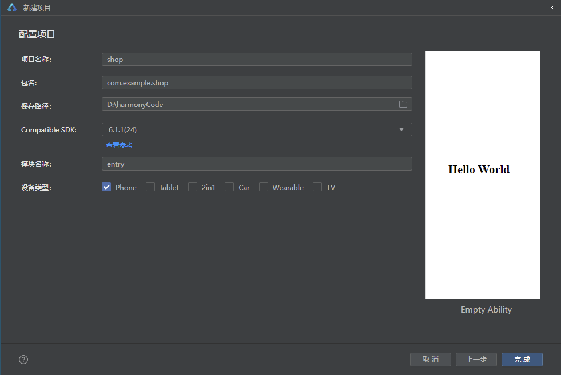
设置API为24的模板项目:
初始化项目,自动下载相关依赖:
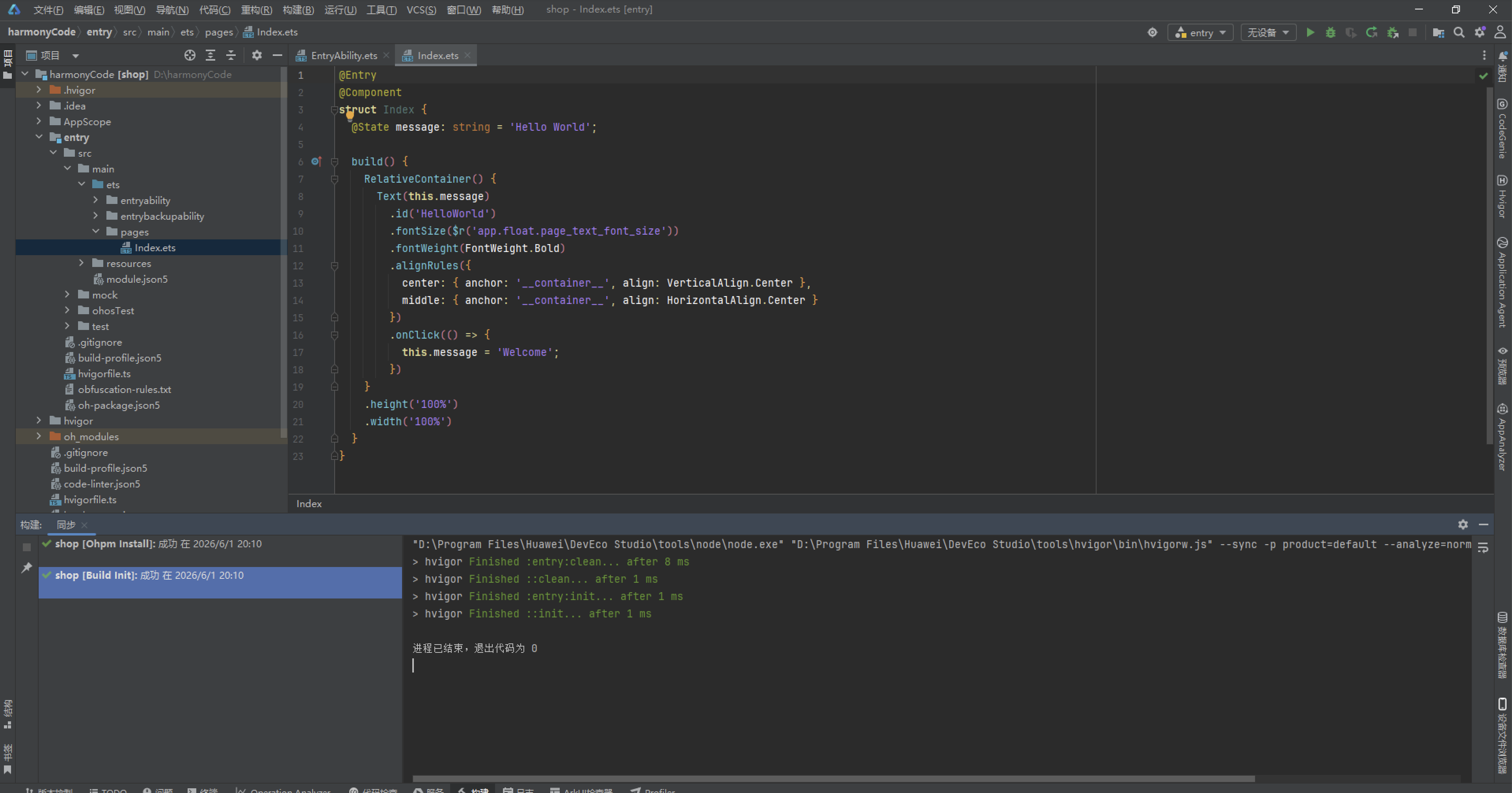
完整代码:
// ============================================================
// 主题:暖灰白 #F5F1EC × 香槟金 #C9A46C × 静谧蓝 #7FA8C9
// 6 Tab 单排:首页 / 服务 / 纪念品 / 云纪念 / 守护 / 我的
// ============================================================
// ---------- 接口定义 ----------
interface PetMemPalette {
bg: string
primary: string
primarySoft: string
secondary: string
secondarySoft: string
card: string
text: string
textSub: string
textLight: string
chip: string
line: string
danger: string
dangerSoft: string
success: string
successSoft: string
warn: string
warnSoft: string
white: string
}
interface GradientPalette {
deep: string
mid: string
soft: string
overlay: string
blue: string
blueSoft: string
}
interface HomePack {
id: number
title: string
desc: string
price: number
tag: string
icon: string
hot: boolean
gStart: string
gEnd: string
}
interface CeremonyService {
id: number
name: string
intro: string
cremation: string
ashHandle: string
duration: string
price: number
status: string
tag: string
booked: boolean
}
interface KeepsakeItem {
id: number
name: string
kind: string
material: string
price: number
originPrice: number
custom: string
days: number
sales: number
badge: string
icon: string
gStart: string
gEnd: string
}
interface MemoryPost {
id: number
petName: string
avatar: string
city: string
content: string
photos: string[]
time: string
likes: number
tag: string
isPublic: boolean
}
interface AnnivItem {
id: number
name: string
date: string
kind: string
freq: string
way: string
daysLeft: number
emoji: string
note: string
}
interface OrderRec {
id: number
service: string
petName: string
amount: number
status: string
created: string
city: string
slot: string
pay: string
}
interface FavItem {
id: number
title: string
kind: string
price: number
icon: string
added: string
shop: string
gStart: string
gEnd: string
}
// ---------- 调色板 ----------
const PAL: PetMemPalette = {
bg: '#F5F1EC',
primary: '#C9A46C',
primarySoft: '#F3E7D3',
secondary: '#7FA8C9',
secondarySoft: '#E4EEF6',
card: '#FFFFFF',
text: '#3A3A3A',
textSub: '#8C8C8C',
textLight: '#BFBFBF',
chip: '#F7F4EF',
line: '#EEEEEE',
danger: '#D96C5F',
dangerSoft: '#FAE7E4',
success: '#7BAE7F',
successSoft: '#E7F2E8',
warn: '#E0A458',
warnSoft: '#FAF0DF',
white: '#FFFFFF'
}
const GRAD: GradientPalette = {
deep: '#C9A46C',
mid: '#E3CDA4',
soft: '#F5EFE4',
overlay: 'rgba(201,164,108,0.16)',
blue: '#7FA8C9',
blueSoft: '#DCE9F3'
}
// ---------- 选项常量 ----------
const PET_TYPES: string[] = ['狗狗', '猫咪', '兔子', '仓鼠', '鸟类', '水族', '爬宠', '其他']
const FORM_TYPES: string[] = ['简约告别', '温馨追思', '庄重仪式', '家庭式告别', '祈福送别']
const ASH_MODES: string[] = ['骨灰盒安葬', '骨灰晶石', '树葬', '花坛葬', '机构寄存', '带回自留']
const TIME_SLOTS: string[] = ['09:00-11:00', '11:00-13:00', '13:00-15:00', '15:00-17:00', '17:00-19:00']
const MATERIALS: string[] = ['胡桃实木', '白瓷', '琉璃', '黄铜', '亚克力', '天然玉石']
const FREQS: string[] = ['每年一次', '每半年', '每季度', '每月', '仅一次']
const REMIND_WAYS: string[] = ['App 推送', '短信提醒', '微信服务号', '电话提醒']
const POST_TAGS: string[] = ['温暖回忆', '告别时刻', '治愈日常', '思念信箱', '成长记录', '彩虹桥']
const KIND_CHIPS: string[] = ['全部', '骨灰盒', '纪念项链', '纪念相框', '爪印泥', '生命晶石']
const CITIES: string[] = ['北京', '上海', '广州', '深圳', '杭州', '成都', '武汉', '南京']
// ---------- 写死数据 ----------
const HOME_PACKS: HomePack[] = [
{ id: 1, title: '温馨告别仪式', desc: '独立告别厅 · 鲜花布置 · 主理人送别', price: 1280, tag: '热销', icon: '🕯️', hot: true, gStart: '#C9A46C', gEnd: '#F3E7D3' },
{ id: 2, title: '一对一火化', desc: '全程可视 · 单独火化 · 骨灰纯净', price: 680, tag: '安心', icon: '🔥', hot: true, gStart: '#E0A458', gEnd: '#FAF0DF' },
{ id: 3, title: '纪念爪印套餐', desc: '立体爪印模 · 手工打磨 · 永久留存', price: 258, tag: '推荐', icon: '🐾', hot: false, gStart: '#7FA8C9', gEnd: '#E4EEF6' },
{ id: 4, title: '骨灰晶石定制', desc: '高温晶石化 · 一宠一炉 · 可做吊坠', price: 899, tag: '精致', icon: '💎', hot: true, gStart: '#B58AB4', gEnd: '#F0E4EF' },
{ id: 5, title: '云纪念空间', desc: '永久云主页 · 回忆相册 · 亲友留言', price: 99, tag: '治愈', icon: '☁️', hot: false, gStart: '#8FB8A2', gEnd: '#E5F1EA' },
{ id: 6, title: '周年守护提醒', desc: '忌日提醒 · 代献花 · 追思代祭扫', price: 199, tag: '贴心', icon: '🕊️', hot: false, gStart: '#C9A46C', gEnd: '#F5EFE4' }
]
const SERVICES: CeremonyService[] = [
{ id: 1, name: '温馨告别仪式(基础)', intro: '小告别厅 + 标准鲜花布置 + 主理人主持送别',
cremation: '单独火化', ashHandle: '骨灰盒安葬', duration: '60 分钟', price: 1280, status: '可预约', tag: '热销', booked: false },
{ id: 2, name: '庄重告别仪式(尊享)', intro: '大告别厅 + 主题花艺 + 追思影相循环放映',
cremation: '单独火化', ashHandle: '骨灰晶石', duration: '120 分钟', price: 2680, status: '可预约', tag: '尊享', booked: false },
{ id: 3, name: '家庭式告别(上门)', intro: '入户布置小型告别角 + 全家送别引导陪伴',
cremation: '单独火化', ashHandle: '带回自留', duration: '90 分钟', price: 1880, status: '紧张', tag: '上门', booked: false },
{ id: 4, name: '猫咪专属告别礼', intro: '猫咪主题布景 + 猫薄荷安神 + 温柔怀抱送别',
cremation: '单独火化', ashHandle: '树葬', duration: '60 分钟', price: 1080, status: '可预约', tag: '猫咪', booked: false },
{ id: 5, name: '小型宠告别(兔鼠类)', intro: '迷你告别亭 + 干花小礼 + 集体温情送别',
cremation: '集体火化', ashHandle: '花坛葬', duration: '30 分钟', price: 380, status: '可预约', tag: '小型宠', booked: false },
{ id: 6, name: '祈福送别仪式', intro: '诵经祈福 + 长明灯 + 放生鱼鸟功德回向',
cremation: '单独火化', ashHandle: '机构寄存', duration: '80 分钟', price: 1580, status: '可预约', tag: '祈福', booked: false },
{ id: 7, name: '深夜告别通道', intro: '24 小时响应 + 深夜专车接体 + 静谧送别',
cremation: '单独火化', ashHandle: '骨灰盒安葬', duration: '45 分钟', price: 1680, status: '紧张', tag: '24h', booked: false },
{ id: 8, name: '骨灰晶石化服务', intro: '一宠一炉高温晶石化 + 晶石分级挑选',
cremation: '晶石化', ashHandle: '骨灰晶石', duration: '15 个工作日', price: 899, status: '可预约', tag: '晶石', booked: true },
{ id: 9, name: '纪念爪印采集', intro: '无酸立体爪印模 + 手工打磨修边上色',
cremation: '无需火化', ashHandle: '爪印泥留存', duration: '40 分钟', price: 258, status: '可预约', tag: '爪印', booked: false },
{ id: 10, name: '周年追思代祭扫', intro: '代献花 + 代诵读思念信 + 全程影像回传',
cremation: '无需火化', ashHandle: '墓园代祭', duration: '20 分钟', price: 199, status: '可预约', tag: '代祭', booked: true },
{ id: 11, name: '水化安息服务', intro: '碱性水解环保处理 + 骨粉可养花纪念',
cremation: '水化安息', ashHandle: '花坛葬', duration: '预约制', price: 1180, status: '已约满', tag: '环保', booked: false },
{ id: 12, name: '彩虹桥送别礼盒', intro: '小箱告别 + 棉窝安睡 + 手写纪念卡',
cremation: '集体火化', ashHandle: '花坛葬', duration: '30 分钟', price: 520, status: '可预约', tag: '礼盒', booked: false }
]
const KEEPSAKES: KeepsakeItem[] = [
{ id: 1, name: '云朵安眠骨灰盒(小号)', kind: '骨灰盒', material: '胡桃实木', price: 468, originPrice: 618,
custom: '可刻名字与日期', days: 7, sales: 1286, badge: '热销', icon: '⚰️', gStart: '#C9A46C', gEnd: '#F3E7D3' },
{ id: 2, name: '星河琉璃骨灰盒', kind: '骨灰盒', material: '琉璃', price: 899, originPrice: 1180,
custom: '可封存毛发', days: 15, sales: 532, badge: '匠心', icon: '🌟', gStart: '#7FA8C9', gEnd: '#DCE9F3' },
{ id: 3, name: '小屋原木骨灰盒', kind: '骨灰盒', material: '胡桃实木', price: 528, originPrice: 688,
custom: '可放照片', days: 10, sales: 964, badge: '推荐', icon: '🏡', gStart: '#E0A458', gEnd: '#FAF0DF' },
{ id: 4, name: '月光白瓷骨灰盒', kind: '骨灰盒', material: '白瓷', price: 618, originPrice: 799,
custom: '可定制釉色', days: 12, sales: 743, badge: '典雅', icon: '🌙', gStart: '#8C9BB5', gEnd: '#E3E8F0' },
{ id: 5, name: '怀抱骨灰晶石吊坠', kind: '纪念项链', material: '天然玉石', price: 399, originPrice: 528,
custom: '内嵌晶石', days: 9, sales: 2103, badge: '人气', icon: '📿', gStart: '#B58AB4', gEnd: '#F0E4EF' },
{ id: 6, name: '爪印微雕银吊坠', kind: '纪念项链', material: '黄铜', price: 299, originPrice: 399,
custom: '微雕爪印', days: 8, sales: 1856, badge: '定制', icon: '🐾', gStart: '#C9A46C', gEnd: '#F5EFE4' },
{ id: 7, name: '毛发烧制琉璃吊坠', kind: '纪念项链', material: '琉璃', price: 358, originPrice: 458,
custom: '毛发入琉璃', days: 14, sales: 1109, badge: '匠作', icon: '💎', gStart: '#7FA8C9', gEnd: '#E4EEF6' },
{ id: 8, name: '名字缩写黄铜吊牌', kind: '纪念项链', material: '黄铜', price: 168, originPrice: 238,
custom: '刻名与日期', days: 5, sales: 2678, badge: '轻奢', icon: '🔖', gStart: '#E0A458', gEnd: '#FAF0DF' },
{ id: 9, name: '彩虹桥木制相框', kind: '纪念相框', material: '胡桃实木', price: 128, originPrice: 188,
custom: '可放 6 寸照片', days: 4, sales: 3421, badge: '热销', icon: '🖼️', gStart: '#8FB8A2', gEnd: '#E5F1EA' },
{ id: 10, name: '云端亚克力灯箱相框', kind: '纪念相框', material: '亚克力', price: 198, originPrice: 268,
custom: '夜光雕刻', days: 6, sales: 1567, badge: '氛围', icon: '💡', gStart: '#C9A46C', gEnd: '#F3E7D3' },
{ id: 11, name: '双格瓷白纪念相框', kind: '纪念相框', material: '白瓷', price: 228, originPrice: 298,
custom: '照片 + 爪印', days: 7, sales: 876, badge: '精致', icon: '⛩️', gStart: '#8C9BB5', gEnd: '#E3E8F0' },
{ id: 12, name: '立体爪印泥礼盒(金)', kind: '爪印泥', material: '亚克力', price: 158, originPrice: 218,
custom: '含金色颜料', days: 3, sales: 2985, badge: '人气', icon: '🐾', gStart: '#E0A458', gEnd: '#FAF0DF' },
{ id: 13, name: '纪念爪印相框套装', kind: '爪印泥', material: '胡桃实木', price: 268, originPrice: 358,
custom: '爪印 + 照片', days: 6, sales: 1342, badge: '套装', icon: '🐾', gStart: '#C9A46C', gEnd: '#F5EFE4' },
{ id: 14, name: '生命晶石单颗定制', kind: '生命晶石', material: '天然玉石', price: 899, originPrice: 1099,
custom: '一宠一炉', days: 15, sales: 689, badge: '高级', icon: '💠', gStart: '#B58AB4', gEnd: '#F0E4EF' },
{ id: 15, name: '生命晶石手链定制', kind: '生命晶石', material: '琉璃', price: 658, originPrice: 828,
custom: '可串多颗', days: 12, sales: 445, badge: '私享', icon: '✨', gStart: '#7FA8C9', gEnd: '#E4EEF6' },
{ id: 16, name: '安睡棉窝纪念摆件', kind: '骨灰盒', material: '白瓷', price: 388, originPrice: 488,
custom: '可绣名字', days: 8, sales: 662, badge: '治愈', icon: '🛏️', gStart: '#8FB8A2', gEnd: '#E5F1EA' }
]
const POSTS: MemoryPost[] = [
{ id: 1, petName: '豆豆', avatar: '🐶', city: '北京', content: '豆豆离开的第 365 天,阳台的小垫子我一直没舍得收。今天阳光很好,像它趴在我脚边的每个午后。',
photos: ['🌞', '🪴', '🧺'], time: '10 分钟前', likes: 328, tag: '思念信箱', isPublic: true },
{ id: 2, petName: '年糕', avatar: '🐱', city: '上海', content: '今天整理相册,翻到年糕第一次钻纸箱的照片,那时候它才两个月大。谢谢你陪我八年。',
photos: ['📦', '📸'], time: '32 分钟前', likes: 512, tag: '成长记录', isPublic: true },
{ id: 3, petName: '雪球', avatar: '🐹', city: '杭州', content: '雪球的爪印泥做好了,小小的两枚,摆在书桌上就像它还在跑轮上撒欢。',
photos: ['🐾', '✨'], time: '1 小时前', likes: 217, tag: '治愈日常', isPublic: true },
{ id: 4, petName: '煤球', avatar: '🐈⬛', city: '成都', content: '给煤球办完告别仪式那天,主理人说它是只幸福的猫。我想是的,它被爱包围了一生。',
photos: ['🕯️', '🌷', '🌈'], time: '2 小时前', likes: 896, tag: '告别时刻', isPublic: true },
{ id: 5, petName: '大白', avatar: '🕊️', city: '广州', content: '大白的生命晶石今天到手了,浅浅的蓝色,像它的眼睛。从此我把它戴在心口。',
photos: ['💎', '📿'], time: '3 小时前', likes: 643, tag: '彩虹桥', isPublic: true },
{ id: 6, petName: '麻团', avatar: '🐕', city: '深圳', content: '小区的三角梅又开了,麻团最爱的花。给它云纪念主页换上了新封面,欢迎大家来看看它。',
photos: ['🌸', '🌳'], time: '5 小时前', likes: 429, tag: '温暖回忆', isPublic: true },
{ id: 7, petName: '布丁', avatar: '🐰', city: '南京', content: '布丁走后我养成了存兔粮小票的习惯,今天终于把最后一袋捐给了流浪动物救助站,延续它的温柔。',
photos: ['🧾', '💚'], time: '7 小时前', likes: 758, tag: '温暖回忆', isPublic: true },
{ id: 8, petName: '饺子', avatar: '🐈', city: '武汉', content: '第一次参与云纪念的线上追思会,很多陌生人给饺子点了蜡烛。原来告别也可以这么温柔。',
photos: ['🕯️', '📱'], time: '9 小时前', likes: 502, tag: '告别时刻', isPublic: true },
{ id: 9, petName: '糯米', avatar: '🐩', city: '上海', content: '糯米的纪念相框到了,选了它歪头的照片。工匠还附了一张手写卡片,写着"它一直在"。',
photos: ['🖼️', '💌'], time: '12 小时前', likes: 386, tag: '治愈日常', isPublic: false },
{ id: 10, petName: '可乐', avatar: '🐕🦺', city: '北京', content: '可乐离开第 100 天,我们全家去树葬区看它。小树苗抽新芽了,爸爸说这就是生命的接力。',
photos: ['🌱', '👨👩👧'], time: '昨天 18:20', likes: 1123, tag: '彩虹桥', isPublic: true },
{ id: 11, petName: '汤圆', avatar: '🐱', city: '杭州', content: '把汤圆最爱的逗猫棒做成了标本框,每次看到都像它还在扑腾。想念是具体的,也是温暖的。',
photos: ['🪶', '🖼️'], time: '昨天 21:05', likes: 677, tag: '思念信箱', isPublic: true },
{ id: 12, petName: '皮蛋', avatar: '🐢', city: '广州', content: '皮蛋陪了我十六年,从高中到工作。云纪念里建了它的时光轴,每一格都是我们一起的岁月。',
photos: ['⏳', '📷', '🌿'], time: '前天 09:41', likes: 944, tag: '成长记录', isPublic: false }
]
const ANNIVS: AnnivItem[] = [
{ id: 1, name: '豆豆忌日', date: '09-12', kind: '忌日', freq: '每年一次', way: 'App 推送', daysLeft: 17, emoji: '🌹', note: '去海边撒一把它爱的零食' },
{ id: 2, name: '年糕生日', date: '04-03', kind: '生日', freq: '每年一次', way: '短信提醒', daysLeft: 221, emoji: '🎂', note: '做一碗它最爱的鸡肉粥' },
{ id: 3, name: '煤球告别礼一周年', date: '08-30', kind: '忌日', freq: '每年一次', way: '微信服务号', daysLeft: 4, emoji: '🕯️', note: '云纪念点 100 支蜡烛' },
{ id: 4, name: '大白晶石到手日', date: '10-01', kind: '纪念日', freq: '每年一次', way: 'App 推送', daysLeft: 36, emoji: '💎', note: '擦拭晶石,换新挂绳' },
{ id: 5, name: '麻团到家纪念日', date: '03-18', kind: '纪念日', freq: '每年一次', way: '短信提醒', daysLeft: 204, emoji: '🏡', note: '重看第一天回家的视频' },
{ id: 6, name: '可乐树葬探望日', date: '每季度末', kind: '探望', freq: '每季度', way: '电话提醒', daysLeft: 12, emoji: '🌳', note: '带一壶水浇小树苗' },
{ id: 7, name: '布丁爱心日', date: '每月 15 日', kind: '公益', freq: '每月', way: 'App 推送', daysLeft: 8, emoji: '💚', note: '给流浪动物捐一袋粮' },
{ id: 8, name: '全家云追思会', date: '12-20', kind: '追思', freq: '每年一次', way: '微信服务号', daysLeft: 116, emoji: '☁️', note: '邀请亲友线上留言' }
]
const ORDERS: OrderRec[] = [
{ id: 1, service: '温馨告别仪式(基础)', petName: '年糕', amount: 1280, status: '已完成', created: '2026-08-01', city: '上海', slot: '09:00-11:00', pay: '微信支付' },
{ id: 2, service: '骨灰晶石化服务', petName: '年糕', amount: 899, status: '已完成', created: '2026-08-01', city: '上海', slot: '—', pay: '微信支付' },
{ id: 3, service: '纪念爪印采集', petName: '年糕', amount: 258, status: '进行中', created: '2026-08-02', city: '上海', slot: '15:00-17:00', pay: '支付宝' },
{ id: 4, service: '猫咪专属告别礼', petName: '汤圆', amount: 1080, status: '待服务', created: '2026-08-18', city: '杭州', slot: '11:00-13:00', pay: '微信支付' },
{ id: 5, service: '云纪念空间(年)', petName: '豆豆', amount: 99, status: '已完成', created: '2026-07-11', city: '北京', slot: '—', pay: '微信支付' },
{ id: 6, service: '周年追思代祭扫', petName: '可乐', amount: 199, status: '待服务', created: '2026-08-20', city: '北京', slot: '17:00-19:00', pay: '云闪付' }
]
const FAVS: FavItem[] = [
{ id: 1, title: '云朵安眠骨灰盒(小号)', kind: '骨灰盒', price: 468, icon: '⚰️', added: '08-12', shop: '忆念手作馆', gStart: '#C9A46C', gEnd: '#F3E7D3' },
{ id: 2, title: '怀抱骨灰晶石吊坠', kind: '纪念项链', price: 399, icon: '📿', added: '08-15', shop: '星语晶石坊', gStart: '#B58AB4', gEnd: '#F0E4EF' },
{ id: 3, title: '彩虹桥木制相框', kind: '纪念相框', price: 128, icon: '🖼️', added: '08-21', shop: '拾光木艺', gStart: '#8FB8A2', gEnd: '#E5F1EA' },
{ id: 4, title: '立体爪印泥礼盒(金)', kind: '爪印泥', price: 158, icon: '🐾', added: '08-24', shop: '掌心印记', gStart: '#E0A458', gEnd: '#FAF0DF' }
]
// ---------- 全局纯函数 ----------
function priceFmt(n: number): string {
if (n % 1 === 0) {
return '¥' + n
}
return '¥' + n.toFixed(2)
}
function statusColor(s: string): string {
if (s === '可预约' || s === '已完成') {
return PAL.success
}
if (s === '紧张' || s === '进行中' || s === '待服务') {
return PAL.warn
}
return PAL.danger
}
function svcOf(id: number): CeremonyService {
let i: number = 0
while (i < SERVICES.length) {
if (SERVICES[i].id === id) {
return SERVICES[i]
}
i = i + 1
}
return SERVICES[0]
}
function keepsakeOf(id: number): KeepsakeItem {
let i: number = 0
while (i < KEEPSAKES.length) {
if (KEEPSAKES[i].id === id) {
return KEEPSAKES[i]
}
i = i + 1
}
return KEEPSAKES[0]
}
function postOf(id: number): MemoryPost {
let i: number = 0
while (i < POSTS.length) {
if (POSTS[i].id === id) {
return POSTS[i]
}
i = i + 1
}
return POSTS[0]
}
function annivOf(id: number): AnnivItem {
let i: number = 0
while (i < ANNIVS.length) {
if (ANNIVS[i].id === id) {
return ANNIVS[i]
}
i = i + 1
}
return ANNIVS[0]
}
function orderOf(id: number): OrderRec {
let i: number = 0
while (i < ORDERS.length) {
if (ORDERS[i].id === id) {
return ORDERS[i]
}
i = i + 1
}
return ORDERS[0]
}
function keepsakesOf(kind: string, col: number): KeepsakeItem[] {
let out: KeepsakeItem[] = []
let i: number = 0
let hit: number = 0
while (i < KEEPSAKES.length) {
if (kind === '全部' || KEEPSAKES[i].kind === kind) {
if (hit % 2 === col) {
out.push(KEEPSAKES[i])
}
hit = hit + 1
}
i = i + 1
}
return out
}
function isLikedOn(ids: number[], id: number): boolean {
let i: number = 0
while (i < ids.length) {
if (ids[i] === id) {
return true
}
i = i + 1
}
return false
}
function likedNum(base: number, ids: number[], id: number): number {
if (isLikedOn(ids, id)) {
return base + 1
}
return base
}
function toggleLiked(ids: number[], id: number): number[] {
let out: number[] = []
let found: boolean = false
let i: number = 0
while (i < ids.length) {
if (ids[i] !== id) {
out.push(ids[i])
} else {
found = true
}
i = i + 1
}
if (!found) {
out.push(id)
}
return out
}
function cartSum(price: number, qty: number): string {
return '合计 ' + priceFmt(price * qty)
}
function discountOf(p: number, o: number): string {
if (o <= 0 || o <= p) {
return ''
}
return (Math.round(p / o * 100) / 10).toFixed(1).replace('.0', '') + ' 折'
}
function dayTagOf(d: number): string {
if (d <= 0) {
return '就在今天'
}
return '还有 ' + d + ' 天'
}
function kindColor(k: string): string {
if (k === '忌日') {
return PAL.danger
}
if (k === '生日') {
return PAL.primary
}
if (k === '探望' || k === '公益') {
return PAL.success
}
return PAL.secondary
}
function progressOf(v: number): string {
return v + '%'
}
function annivStatTotal(): number {
return ANNIVS.length
}
function annivStatSoon(): number {
let n: number = 0
let i: number = 0
while (i < ANNIVS.length) {
if (ANNIVS[i].daysLeft <= 30) {
n = n + 1
}
i = i + 1
}
return n
}
function annivStatMonth(): number {
let n: number = 0
let i: number = 0
while (i < ANNIVS.length) {
if (ANNIVS[i].daysLeft <= 90) {
n = n + 1
}
i = i + 1
}
return n
}
function soonPercent(): number {
return Math.round(annivStatSoon() / annivStatTotal() * 100)
}
function monthPercent(): number {
return Math.round(annivStatMonth() / annivStatTotal() * 100)
}
function servicePercent(): number {
let n: number = 0
let i: number = 0
while (i < SERVICES.length) {
if (SERVICES[i].status !== '已约满') {
n = n + 1
}
i = i + 1
}
return Math.round(n / SERVICES.length * 100)
}
// ---------- Tab 枚举 ----------
enum Tab {
HOME = 0,
SERVICE = 1,
KEEPSAKE = 2,
CLOUD = 3,
GUARD = 4,
MINE = 5
}
// ---------- 主入口 ----------
@Entry
@Component
struct Index {
@State activeTab: number = Tab.HOME
@Builder tabItem(tab: number, icon: string, label: string) {
Column({ space: 2 }) {
Text(icon).fontSize(20).fontColor(this.activeTab === tab ? PAL.primary : PAL.textSub)
Text(label).fontSize(10).fontColor(this.activeTab === tab ? PAL.primary : PAL.textSub)
Column().width(16).height(3).borderRadius(2).backgroundColor(this.activeTab === tab ? PAL.primary : '#00000000')
}.layoutWeight(1).alignItems(HorizontalAlign.Center).padding({ top: 6, bottom: 6 }).onClick(() => {
this.activeTab = tab
})
}
@Builder headerBar() {
Column() {
Row({ space: 12 }) {
Column() {
Text('猫星人宠物纪念').fontSize(19).fontWeight(FontWeight.Bold).fontColor('#FFFFFF')
Text('温柔告别 · 让爱延续').fontSize(10).fontColor('#F5EFE4').margin({ top: 2 })
}.alignItems(HorizontalAlign.Start).layoutWeight(1)
Column({ space: 2 }) {
Text('📷').fontSize(20)
Text('扫一扫').fontSize(9).fontColor('#F5EFE4')
}.alignItems(HorizontalAlign.Center).onClick(() => {
})
Column({ space: 2 }) {
Stack({ alignContent: Alignment.TopEnd }) {
Text('🔔').fontSize(20)
Text('3').fontSize(8).fontColor('#FFFFFF').backgroundColor('#FF5A4E').borderRadius(8).padding(3).margin(2)
}
Text('消息').fontSize(9).fontColor('#F5EFE4')
}.alignItems(HorizontalAlign.Center).onClick(() => {
})
}.width('100%')
Row({ space: 8 }) {
Text('🔍').fontSize(14)
Text('骨灰盒 / 告别仪式 / 爪印泥').fontSize(12).fontColor('#F5EFE4').layoutWeight(1)
Text('🎤').fontSize(14)
}.width('100%').height(32).backgroundColor('rgba(255,255,255,0.28)').borderRadius(16).padding({ left: 12, right: 12 }).margin({ top: 10 })
Row({ space: 6 }) {
Text('👑').fontSize(13)
Text('会员专区').fontSize(11).fontWeight(FontWeight.Bold).fontColor('#7A5A2E')
Text('专享 9 折 · 每年免费代祭一次').fontSize(10).fontColor('#9B7B4A').layoutWeight(1)
Text('立即查看 ›').fontSize(10).fontColor('#7A5A2E')
}.width('100%').height(34).linearGradient({ angle: 90, colors: [['#F7EAD2', 0], ['#EDD9B4', 1]] }).borderRadius(17).padding({ left: 12, right: 12 }).margin({ top: 8 })
}.width('100%').padding({ left: 14, right: 14, top: 12, bottom: 10 }).linearGradient({ angle: 135, colors: [['#C9A46C', 0], ['#B98F52', 1]] })
}
build() {
Column() {
this.headerBar()
Stack() {
if (this.activeTab === Tab.HOME) {
HomeTab()
} else if (this.activeTab === Tab.SERVICE) {
ServiceTab()
} else if (this.activeTab === Tab.KEEPSAKE) {
KeepsakeTab()
} else if (this.activeTab === Tab.CLOUD) {
CloudTab()
} else if (this.activeTab === Tab.GUARD) {
GuardTab()
} else {
MineTab()
}
}.layoutWeight(1).width('100%')
Divider().color(PAL.line).strokeWidth(1)
Row() {
this.tabItem(Tab.HOME, '🏠', '首页')
this.tabItem(Tab.SERVICE, '🕯️', '服务')
this.tabItem(Tab.KEEPSAKE, '🎁', '纪念品')
this.tabItem(Tab.CLOUD, '☁️', '云纪念')
this.tabItem(Tab.GUARD, '⏰', '守护')
this.tabItem(Tab.MINE, '👤', '我的')
}.width('100%').backgroundColor(PAL.card).padding({ left: 4, right: 4 })
}.width('100%').height('100%').backgroundColor(PAL.bg)
}
}
// ---------- 首页 Tab ----------
const HOME_REMIND_IDS: number[] = [3, 6, 7, 1, 4, 8]
function homeFeatured(): KeepsakeItem[] {
return [KEEPSAKES[0], KEEPSAKES[4], KEEPSAKES[8], KEEPSAKES[11], KEEPSAKES[13]]
}
@Component
struct HomeTab {
@State showQuick: boolean = false
@State quickPet: string = ''
@State quickPhone: string = ''
@State quickCityIdx: number = 0
@State quickMsg: string = ''
@State remindIdx: number = 0
@Builder modalOverlay(onClose: () => void) {
Column().width('100%').height('100%').backgroundColor('rgba(0,0,0,0.5)').onClick(onClose)
}
@Builder sectionTitle(title: string, more: string) {
Row({ space: 6 }) {
Column().width(4).height(16).borderRadius(2).backgroundColor(PAL.primary)
Text(title).fontSize(15).fontWeight(FontWeight.Bold).fontColor(PAL.text).layoutWeight(1)
Text(more).fontSize(11).fontColor(PAL.textSub)
}.width('100%').margin({ top: 18, bottom: 10 })
}
@Builder bannerCard() {
Column({ space: 12 }) {
Row({ space: 12 }) {
Text('🕊️').fontSize(38)
Column({ space: 4 }) {
Text('温柔告别,好好说再见').fontSize(17).fontWeight(FontWeight.Bold).fontColor('#FFFFFF')
Text('一对一主理人全程陪伴 · 郑重的仪式感').fontSize(11).fontColor('#F5EFE4')
}.alignItems(HorizontalAlign.Start).layoutWeight(1)
Text('了解 ›').fontSize(11).fontColor('#FFFFFF').padding({ left: 10, right: 10, top: 6, bottom: 6 }).backgroundColor('rgba(255,255,255,0.25)').borderRadius(12).onClick(() => {
this.showQuick = true
})
}.width('100%')
Row({ space: 0 }) {
Column({ space: 2 }) {
Text('12 万+').fontSize(15).fontWeight(FontWeight.Bold).fontColor('#FFFFFF')
Text('家庭的选择').fontSize(9).fontColor('#F5EFE4')
}.layoutWeight(1).alignItems(HorizontalAlign.Center)
Column({ space: 2 }) {
Text('4.9 分').fontSize(15).fontWeight(FontWeight.Bold).fontColor('#FFFFFF')
Text('温暖评价').fontSize(9).fontColor('#F5EFE4')
}.layoutWeight(1).alignItems(HorizontalAlign.Center)
Column({ space: 2 }) {
Text('365 天').fontSize(15).fontWeight(FontWeight.Bold).fontColor('#FFFFFF')
Text('守护陪伴').fontSize(9).fontColor('#F5EFE4')
}.layoutWeight(1).alignItems(HorizontalAlign.Center)
}.width('100%')
}.width('100%').padding(16).borderRadius(16).linearGradient({ angle: 135, colors: [['#C9A46C', 0], ['#7FA8C9', 1]] })
.shadow({ radius: 10, color: 'rgba(201,164,108,0.28)', offsetX: 0, offsetY: 4 })
}
@Builder packCard(pack: HomePack) {
Column({ space: 6 }) {
Column() {
Text(pack.icon).fontSize(26)
}.width('100%').height(62).justifyContent(FlexAlign.Center).linearGradient({ angle: 135, colors: [[pack.gStart, 0], [pack.gEnd, 1]] }).borderRadius({ topLeft: 12, topRight: 12 })
Column({ space: 3 }) {
Text(pack.title).fontSize(12).fontWeight(FontWeight.Bold).fontColor(PAL.text).maxLines(1).textOverflow({ overflow: TextOverflow.Ellipsis })
Text(pack.desc).fontSize(9).fontColor(PAL.textSub).maxLines(2).textOverflow({ overflow: TextOverflow.Ellipsis })
Row({ space: 4 }) {
Text(priceFmt(pack.price)).fontSize(13).fontWeight(FontWeight.Bold).fontColor(PAL.primary)
Text(pack.tag).fontSize(8).fontColor(PAL.primary).backgroundColor(PAL.primarySoft).borderRadius(6).padding({ left: 5, right: 5, top: 2, bottom: 2 })
}.width('100%')
}.alignItems(HorizontalAlign.Start).padding({ left: 8, right: 8, bottom: 8 })
}.width(124).backgroundColor(PAL.card).borderRadius(12).shadow({ radius: 6, color: 'rgba(58,58,58,0.06)', offsetX: 0, offsetY: 2 }).onClick(() => {
this.showQuick = true
})
}
@Builder featuredRow(item: KeepsakeItem) {
Row({ space: 10 }) {
Column() {
Text(item.icon).fontSize(26)
}.width(64).height(64).justifyContent(FlexAlign.Center).linearGradient({ angle: 135, colors: [[item.gStart, 0], [item.gEnd, 1]] }).borderRadius(12)
Column({ space: 4 }) {
Text(item.name).fontSize(13).fontWeight(FontWeight.Bold).fontColor(PAL.text).maxLines(1).textOverflow({ overflow: TextOverflow.Ellipsis })
Text(item.custom + ' · ' + item.material + ' · ' + item.days + ' 天工期').fontSize(10).fontColor(PAL.textSub)
Row({ space: 6 }) {
Text(priceFmt(item.price)).fontSize(14).fontWeight(FontWeight.Bold).fontColor(PAL.primary)
Text(priceFmt(item.originPrice)).fontSize(10).fontColor(PAL.textLight).decoration({ type: TextDecorationType.LineThrough })
Text('已售 ' + item.sales).fontSize(9).fontColor(PAL.textSub).layoutWeight(1)
Text('去定制').fontSize(11).fontColor('#FFFFFF').backgroundColor(PAL.primary).borderRadius(12).padding({ left: 12, right: 12, top: 5, bottom: 5 }).onClick(() => {
this.showQuick = true
})
}.width('100%').alignItems(VerticalAlign.Center)
}.alignItems(HorizontalAlign.Start).layoutWeight(1)
}.width('100%').padding(10).backgroundColor(PAL.card).borderRadius(12).shadow({ radius: 6, color: 'rgba(58,58,58,0.06)', offsetX: 0, offsetY: 2 })
}
@Builder quickModal() {
this.modalOverlay(() => {
this.showQuick = false
})
Column({ space: 10 }) {
Text('快速预约咨询').fontSize(16).fontWeight(FontWeight.Bold).fontColor(PAL.text)
Text('留下信息,纪念顾问将在 10 分钟内回电').fontSize(11).fontColor(PAL.textSub)
TextInput({ text: this.quickPet, placeholder: '宠物名字(如:年糕)' }).height(40).fontSize(12).backgroundColor(PAL.chip).borderRadius(10).padding({ left: 12, right: 12 }).onChange((value: string) => {
this.quickPet = value
})
TextInput({ text: this.quickPhone, placeholder: '联系电话' }).height(40).fontSize(12).type(InputType.PhoneNumber).backgroundColor(PAL.chip).borderRadius(10).padding({ left: 12, right: 12 })
.onChange((value: string) => {
this.quickPhone = value
})
Scroll() {
Row({ space: 8 }) {
ForEach(CITIES, (city: string) => {
Text(city).fontSize(11).fontColor(this.quickCityIdx === CITIES.indexOf(city) ? '#FFFFFF' : PAL.textSub).backgroundColor(this.quickCityIdx === CITIES.indexOf(city) ? PAL.primary : PAL.chip)
.borderRadius(12).padding({ left: 12, right: 12, top: 6, bottom: 6 }).onClick(() => {
this.quickCityIdx = CITIES.indexOf(city)
})
}, (city: string) => city)
}.padding({ left: 8, right: 8 })
}.scrollable(ScrollDirection.Horizontal).scrollBar(BarState.Off).height(36)
TextArea({ text: this.quickMsg, placeholder: '想对纪念顾问说些什么…' }).height(80).fontSize(12).backgroundColor(PAL.chip).borderRadius(10).padding(12).onChange((value: string) => {
this.quickMsg = value
})
Row({ space: 10 }) {
Text('取消').fontSize(13).fontColor(PAL.textSub).layoutWeight(1).textAlign(TextAlign.Center).height(38).backgroundColor(PAL.chip).borderRadius(19).onClick(() => {
this.showQuick = false
})
Text('提交预约').fontSize(13).fontColor('#FFFFFF').layoutWeight(1).textAlign(TextAlign.Center).height(38).backgroundColor(PAL.primary).borderRadius(19).onClick(() => {
this.showQuick = false
})
}.width('100%').margin({ top: 4 })
}.width('80%').padding(16).backgroundColor(PAL.card).borderRadius(16).shadow({ radius: 20, color: 'rgba(0,0,0,0.15)', offsetX: 0, offsetY: 8 }).position({ x: '10%', y: '18%' }).zIndex(999)
}
build() {
Stack() {
Scroll() {
Column({ space: 10 }) {
this.bannerCard()
this.sectionTitle('服务套餐', '全部服务 ›')
Scroll() {
Row({ space: 10 }) {
ForEach(HOME_PACKS, (pack: HomePack) => {
this.packCard(pack)
}, (pack: HomePack) => pack.id.toString())
}.padding({ left: 8, right: 8 })
}.scrollable(ScrollDirection.Horizontal).scrollBar(BarState.Off).height(190)
Row({ space: 8 }) {
Text('⏰').fontSize(18)
Column({ space: 2 }) {
Text('最近纪念日:' + annivOf(HOME_REMIND_IDS[this.remindIdx]).name).fontSize(12).fontWeight(FontWeight.Bold).fontColor(PAL.text).maxLines(1).textOverflow({ overflow: TextOverflow.Ellipsis })
Text(dayTagOf(annivOf(HOME_REMIND_IDS[this.remindIdx]).daysLeft) + ' · ' + annivOf(HOME_REMIND_IDS[this.remindIdx]).note).fontSize(10).fontColor(PAL.textSub).maxLines(1)
.textOverflow({ overflow: TextOverflow.Ellipsis })
}.alignItems(HorizontalAlign.Start).layoutWeight(1)
Text('换一个 ›').fontSize(11).fontColor(PAL.secondary).padding({ left: 8, right: 8, top: 5, bottom: 5 }).backgroundColor(PAL.secondarySoft).borderRadius(12).onClick(() => {
this.remindIdx = (this.remindIdx + 1) % HOME_REMIND_IDS.length
})
}.width('100%').padding(10).backgroundColor(PAL.secondarySoft).borderRadius(12)
this.sectionTitle('精选纪念品', '进入纪念品专区 ›')
ForEach(homeFeatured(), (item: KeepsakeItem) => {
this.featuredRow(item)
}, (item: KeepsakeItem) => item.id.toString())
Text('有疑问?点此快速预约咨询,顾问 10 分钟回电').fontSize(12).fontColor(PAL.primary).width('100%').textAlign(TextAlign.Center).height(40).backgroundColor(PAL.primarySoft).borderRadius(20)
.margin({ top: 6, bottom: 16 }).onClick(() => {
this.showQuick = true
})
}.padding({ left: 12, right: 12, top: 12 }).width('100%')
}.scrollBar(BarState.Off).width('100%').height('100%')
if (this.showQuick) {
this.quickModal()
}
}.width('100%').height('100%')
}
}
// ---------- 服务 Tab ----------
function serviceOpenCount(): number {
let n: number = 0
let i: number = 0
while (i < SERVICES.length) {
if (SERVICES[i].status !== '已约满') {
n = n + 1
}
11.6 可优化方向
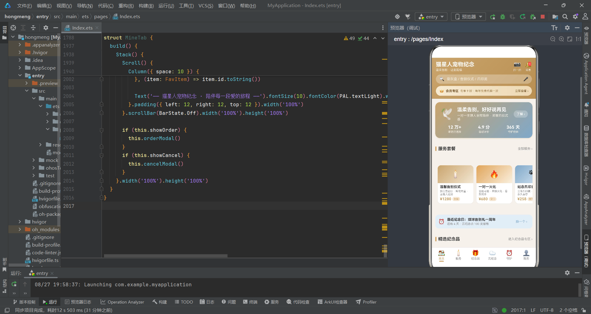
尽管整体实现已经相当完善,但从工程化的角度来看,仍有一些可以优化的方向:
列表性能优化:对于长列表,可以考虑使用 List 组件代替 Scroll + Column + ForEach 的组合。List 组件内置了虚拟滚动机制,在大数据量下性能更优。
状态管理优化:对于跨组件共享的状态(如用户信息、购物车数据),可以引入 @Provide/@Consume 或全局状态管理方案,避免通过多层参数传递数据。
组件拆分粒度:一些复杂的弹窗(如服务预约弹窗)内部包含大量表单项,可以考虑进一步拆分为更小的子组件,提升代码的可读性和可测试性。
数据持久化:当前所有数据都是内存中的常量,用户操作不会真正保存。在真实项目中,需要结合本地存储或后端服务实现数据的持久化。
表单验证:当前的表单输入缺少验证逻辑。在提交时应该对必填项、格式(如手机号)等进行校验,并给出友好的错误提示。

作为“人工智能6S店”的官方数字引擎,为AI开发者与企业提供一个覆盖软硬件全栈、一站式门户。
更多推荐

 7
7 0
0- 0


 已为社区贡献111条内容

所有评论(0)