
鸿蒙 ArkTS 工厂班组排班站深度解析:从工业数据建模到声明式 UI 的全栈工程实践
引言:鸿蒙开发背景与 ArkTS 语言生态
鸿蒙操作系统(HarmonyOS)是华为面向万物互联时代打造的分布式操作系统,其核心竞争力在于"一次开发,多端部署"的跨设备能力。在鸿蒙的应用开发体系中,ArkTS 是官方推荐的核心开发语言,它在 TypeScript 的基础上做了深度扩展与约束优化。ArkTS 保留了 TypeScript 的静态类型系统、面向对象特性、泛型能力,同时针对声明式 UI 编程范式引入了一系列装饰器语法,如 @Component、@Entry、@State、@Builder、@Prop、@Link 等。这些装饰器让开发者能够用极其精炼的语法来描述组件结构、状态管理与 UI 渲染逻辑,从而大幅降低跨端界面开发的心智负担。在本文所分析的工厂班组排班站应用中,ArkTS 的这些特性得到了充分且系统的运用,从数据接口定义到组件状态管理,从弹窗交互到列表渲染,涵盖了鸿蒙应用开发的方方面面。
ArkTS 的类型系统继承了 TypeScript 的严谨性,并在此基础上做了更严格的约束。例如,ArkTS 不支持 any 类型的隐式使用,要求所有变量在声明时必须明确类型;它对 interface 的使用也有更严格的规定,不允许在接口中定义方法实现,只能定义纯数据契约。这种强类型约束在工业级应用中尤为重要——工厂排班系统涉及班次、打卡、换班、班组排名等多种业务实体,每个实体都有复杂的字段结构,如果没有严格的类型检查,很容易在数据传递过程中出现类型不匹配的问题。在本应用中,开发者为每一种业务实体都定义了对应的 interface,从 FeedItem 到 MyItem,每个字段都有明确的类型标注,这正是 ArkTS 强类型编程哲学的典型体现。
声明式 UI 范式是 ArkUI 框架的灵魂所在。与传统的命令式 UI 编程不同,声明式 UI 的核心思想是"描述界面应该是什么样子,而不是告诉系统怎么去构建界面"。开发者在 build() 方法中通过链式调用声明组件树的结构与样式,框架则负责在状态变化时自动对比新旧视图树、计算最小差异并高效更新真实界面。这种模式让 UI 永远是状态的函数映射——只要状态正确,界面就一定正确,从根本上消灭了命令式编程中状态与界面不同步的经典难题。在本应用中,每一个 Tab 页面的切换、每一个弹窗的显示与隐藏、每一次列表数据的增删改,都通过 @State 装饰的状态变量驱动,当用户执行操作修改状态后,框架自动完成界面的局部刷新,整个过程无需开发者手动操作 DOM 或调用刷新方法。
ArkUI 组件体系是鸿蒙应用开发的基石。它提供了从基础容器组件(Column、Row、Stack、Flex)到功能组件(Text、Image、TextInput、TextArea、Scroll、Progress、Divider、Toggle)的完整组件库,每个组件都支持丰富的链式属性设置——从尺寸控制(width、height、layoutWeight)到间距管理(padding、margin),从视觉装饰(borderRadius、border、backgroundColor、linearGradient)到交互响应(onClick、onChange),从动画效果(animation、scale)到滚动控制(scrollable、scrollBar)。这些组件通过组合与嵌套,可以搭建出极其复杂的界面结构。本文分析的工厂班组排班站应用正是一个典型的多页面、多弹窗、多状态管理的综合案例,涵盖了六大 Tab 页面和十七个弹窗交互,是学习 ArkUI 完整组件体系与状态管理的绝佳素材。
一、数据建模:六大数据接口的架构设计
1.1 接口定义的工程意义
在任何前端应用中,数据建模都是最基础也是最关键的一环。本应用在文件最顶部定义了六个 interface,分别对应六种核心业务实体。接口在 ArkTS 中是一种纯类型契约,它不产生运行时代码,只用于编译期的类型检查。定义接口的好处在于:第一,让数据结构成为团队共识,任何开发者一看接口就知道某个实体有哪些字段、每个字段的类型是什么;第二,让 IDE 的智能提示更加精准,在编写代码时可以自动补全字段名和类型;第三,让 TypeScript 编译器能够在编译期捕获字段拼写错误和类型不匹配问题,将潜在 bug 扼杀在摇篮中。在工厂排班这样的工业场景中,数据实体之间往往存在复杂的关联关系,如果没有严格的接口定义,很容易在组件间传递数据时出现字段缺失或类型错误的问题。
1.2 FeedItem:班组动态实体
interface FeedItem {
  id: number
  name: string
  avatar: string
  time: string
  content: string
  likes: number
  comments: number
}
FeedItem 是班组动态这一核心业务实体的类型定义,对应首页工友圈的信息流。它包含七个字段:id 是唯一标识符,类型为 number,用于在列表渲染时生成唯一键值;name 是发布者姓名,如"冲压车间老周";avatar 是头像图标,这里用 emoji 字符串如"⚙️"充当头像,省去了图片资源的加载开销;time 是发布时间,用字符串格式如"10分钟前"存储;content 是动态正文内容;likes 是点赞数;comments 是评论数。这七个字段涵盖了社交动态的基本信息维度,是一个典型的信息流数据结构。
技术要点: 在 ArkTS 中,
interface的字段之间使用换行分隔,每个字段都需显式声明类型,且不支持可选字段标记?。与 TypeScript 的interface不同,ArkTS 对接口的使用有更严格的约束,比如不允许在接口中定义方法实现,只能定义纯数据契约。这种设计促使开发者将数据与行为分离——数据用interface描述,行为用函数封装,有利于代码的解耦与单元测试。
1.3 ShiftItem:班次排班实体
interface ShiftItem {
  id: number
  name: string
  kind: string
  hours: number
  heat: number
  level: number
  state: number
}
ShiftItem 描述的是一个班次排班的完整元数据。与 FeedItem 相比,它的字段更加面向工业场景:kind 表示工序分类,如"冲压"“装配”“焊接”“注塑"等;hours 是班时长度,以小时为单位的数值;heat 是热度指数,用于表征该班次的紧迫程度或关注度;level 是优先级层级,用数字 1、2、3 表示;state 是班次状态,用数字 0 表示"排班中”、1 表示"已封班"。值得注意的是,本应用在状态表示上统一使用数字类型而非字符串枚举,这是一种有意为之的设计选择——数字在比较运算时效率更高,在条件渲染时也更容易使用三目运算符进行分支判断,同时配合专门的 shiftStateText 和 shiftStateColor 工具函数来将数字状态映射为人类可读的文本与颜色。
1.4 ClockItem、SwapItem、CrewItem、MyItem
interface ClockItem {
  id: number
  name: string
  title: string
  fans: number
  watch: number
  state: number
}

interface SwapItem {
  id: number
  name: string
  teacher: string
  lessons: number
  quota: number
  state: number
}

interface CrewItem {
  id: number
  name: string
  field: string
  honor: number
  quota: number
  state: number
}

interface MyItem {
  id: number
  name: string
  tag: string
  time: string
}
这四个接口分别描述了巡检打卡、换班申请、班组挑战和用户收藏四种实体。值得注意的几个设计细节:ClockItem 中的 fans 和 watch 字段都是 number 类型,watch 字段用于存储围观人次(可能达到数十万),在后续的工具函数中会做"万"单位的格式化转换;SwapItem 的 teacher 字段用 "老周 ⇄ 老范" 这种格式记录换班双方,lessons 记录涉及班次数,quota 记录待确认人数;CrewItem 的 field 记录考核维度如"人均产出"“直通率”,honor 是荣誉分,quota 是剩余挑战名额;MyItem 的结构最为简洁,只有 name、tag、time 三个业务字段,用于收藏列表的展示。
技术要点: 本应用中
ClockItem、SwapItem、CrewItem三个实体都包含state字段且统一使用number类型(0/1)表示状态。这种"数字编码状态"的设计模式在工业系统中非常常见,它的优势在于:状态值占用的存储空间极小,网络传输效率高,比较运算速度快,且方便与后端数据库的整型字段直接映射。缺点是可读性较差,因此需要配合clockStateText、swapStateText等工具函数来做展示层的文本转换。
1.5 数据建模流程图
下面用流程图来展示从业务需求到界面渲染的完整数据流转过程:
这个流程图清晰地展示了数据从业务需求出发,经过接口定义、常量初始化、状态接收、属性传递、UI 渲染、用户交互、状态修改到界面刷新的完整闭环。每一步都对应着代码中的具体实现,理解这个流程是掌握 ArkTS 应用开发的关键。
二、静态数据与工具函数的工程化设计
2.1 常量数据数组:模拟后端数据源
const FEEDS: FeedItem[] = [
  { id: 1, name: '冲压车间老周', avatar: '⚙️', time: '10分钟前', content: '三号线换模只用了 18 分钟,班组 Wiki 已更新换模流程图,新来的兄弟照着做,别再单手拆螺栓了!', likes: 423, comments: 67 },
  { id: 2, name: '装配班长小郑', avatar: '🔩', time: '32分钟前', content: '本周装配直通率 98.6%,比上周涨了 0.4 个点,班组奖励奶茶已申请,下周一发放在车间门口。', likes: 386, comments: 52 },
  { id: 3, name: '质检一姐阿芳', avatar: '🔍', time: '1小时前', content: '发现一批外壳螺纹偏移 0.02mm,已拦截隔离,大家今天装这批件之前先看首检单,别装一半才发现。', likes: 458, comments: 81 },
  { id: 4, name: '电工大刘', avatar: '⚡', time: '2小时前', content: '二车间照明改造完成,全部换成 LED 工矿灯,车间亮度提升 40%,夜班的兄弟眼睛终于不酸了。', likes: 342, comments: 45 },
  { id: 5, name: '仓储管家芳姐', avatar: '📦', time: '4小时前', content: 'A 区货架完成了第三次目视化改造,每层贴了对应的库位码,找料时间从 8 分钟降到 2 分钟。', likes: 311, comments: 38 },
  { id: 6, name: '焊工阿强', avatar: '🔥', time: '6小时前', content: '氩弧焊立焊一次成型心得:电流 120A、角度 75 度、走枪匀速,这三个参数调好,鱼纹想不好看都难。', likes: 475, comments: 72 },
  { id: 7, name: '维修组老范', avatar: '🔧', time: '昨天', content: '注塑机报警代码 E-07 排查口诀:先看料筒温度,再查液压油位,最后看滤网,90% 的问题出在滤网。', likes: 367, comments: 59 },
  { id: 8, name: '安环专员小敏', avatar: '🦺', time: '昨天', content: '本月安全生产 200 天达成!劳保穿戴抽检合格率 100%,下周三全员消防演练,请各班组排好班。', likes: 512, comments: 88 }
]
FEEDS 是一个 FeedItem[] 类型的常量数组,包含 8 条班组动态数据。这些数据用 const 关键字声明为不可变常量,作为应用的初始数据源。在实际生产环境中,这些数据通常通过 HTTP 请求从后端服务器获取,但在本应用中使用写死的静态数据来模拟后端返回,这在原型开发和功能演示阶段是非常常见的做法。每条数据都严格遵循 FeedItem 接口的字段定义,字段值的类型与接口声明完全匹配,这就是强类型编程的好处——编译器会在编译阶段检查每一行数据是否符合接口契约。
技术要点: 在 ArkTS 中,
const声明的数组虽然变量本身不可重新赋值,但数组内部的元素仍然可以通过splice、push等方法修改。在本应用中,FEEDS常量被赋值给@State feeds状态变量后,用户可以通过"发布动态"功能在数组头部插入新数据,也可以通过其他操作修改数组内容。const的作用仅是防止变量名被重新指向另一个数组引用,而非冻结数组内容。
类似地,SHIFTS、CLOCKS、SWAPS、CREWS、MYS 五个常量数组分别存储了班次、打卡、换班、班组和收藏的初始数据。每个数组都有 8 条数据,覆盖了不同工序、不同状态的典型场景。此外,还有两个辅助常量:
const HEAT: number[] = [6, 9, 8, 7, 10, 9, 11, 8]

const CATS: string[] = ['全部', '冲压', '装配', '焊接', '注塑', '质检']
HEAT 数组存储了本周 8 天的出勤热度值,用于首页的柱状图渲染。CATS 数组定义了工序分类标签,在多个 Tab 页面中复用,用于横向滚动的标签选择器。
2.2 状态文本与颜色映射函数
function shiftStateText(s: number): string {
  if (s === 0) {
    return '排班中'
  }
  return '已封班'
}

function shiftStateColor(s: number): string {
  if (s === 0) {
    return '#3B82F6'
  }
  return '#64748B'
}
这是一组状态映射函数的典型代表。shiftStateText 函数接收一个数字状态码,返回对应的中文字本描述;shiftStateColor 函数接收同样的状态码,返回对应的十六进制颜色值。这种"一个函数负责文本、一个函数负责颜色"的设计模式在本应用中被大量使用,类似的还有 clockStateText/clockStateColor、swapStateText/swapStateColor、crewStateText/crewStateColor 等。
这种设计的好处在于将状态码到展示层的映射逻辑集中管理。如果将来需要修改某个状态的显示文本或颜色,只需修改一个函数即可,所有使用该函数的组件都会自动生效。如果不做这种封装,而是每个组件内部都写一遍 if (s === 0) return '排班中' else return '已封班' 的判断逻辑,就会导致大量重复代码,维护成本极高。这也是 DRY 原则(Don’t Repeat Yourself)在 UI 开发中的典型应用。
技术要点: 在 ArkTS 中,顶层函数(不在任何类或结构体内部的函数)可以像普通 TypeScript 函数一样定义。这些函数是纯函数,不依赖任何组件状态,可以在任何组件中直接调用。与组件内部的
@Builder方法不同,顶层函数不参与组件的渲染生命周期,每次调用都会立即返回结果,适合做数据转换和格式化处理。
2.3 趋势与播放量格式化函数
function playsText(p: number): string {
  if (p >= 10000) {
    return (p / 10000).toFixed(1) + '万'
  }
  return p.toString()
}

function trendText(t: number): string {
  if (t >= 0) {
    return '↑' + t + '%'
  }
  return '↓' + (-t) + '%'
}

function trendColor(t: number): string {
  if (t >= 0) {
    return '#22C55E'
  }
  return '#F87171'
}
playsText 函数处理大数字的展示格式化问题。当播放量或围观人次超过一万时,将数字除以一万并保留一位小数,加上"万"后缀,如"82.0万";不足一万时直接转为字符串显示。这是中文互联网产品中非常通用的数字格式化方案,几乎所有社交类应用都会用到类似的逻辑。
heatBar 函数则是一个尺寸计算工具,将热度值映射为柱状图的高度:
function heatBar(v: number): string {
  return (12 + v * 4) + 'vp'
}
它接收一个热度数值,返回一个带 vp 单位的字符串作为柱状图的高度。vp 是鸿蒙系统中的虚拟像素单位,它会根据屏幕密度自动缩放,保证在不同分辨率的设备上显示一致的视觉效果。这里用 12 + v * 4 的公式计算高度,基础高度为 12vp,每增加一个热度值增加 4vp,这样热度值越大柱子越高,视觉上直观反映出出勤热度的高低。
2.4 数据构建工厂函数
function buildFeed(id: number, name: string, avatar: string, content: string): FeedItem {
  return { id: id, name: name, avatar: avatar, time: '刚刚', content: content, likes: 0, comments: 0 }
}

function buildMy(id: number, name: string, tag: string): MyItem {
  return { id: id, name: name, tag: tag, time: '收藏于今天' }
}

function buildShift(id: number, name: string, kind: string, hours: number): ShiftItem {
  return { id: id, name: name, kind: kind, hours: hours, heat: 60, level: 1, state: 0 }
}

function buildClock(id: number, name: string, title: string): ClockItem {
  return { id: id, name: name, title: title, fans: 100, watch: 5000, state: 0 }
}

function buildSwap(id: number, name: string, teacher: string): SwapItem {
  return { id: id, name: name, teacher: teacher, lessons: 2, quota: 2, state: 0 }
}

function buildCrew(id: number, name: string, field: string): CrewItem {
  return { id: id, name: name, field: field, honor: 85, quota: 5, state: 0 }
}
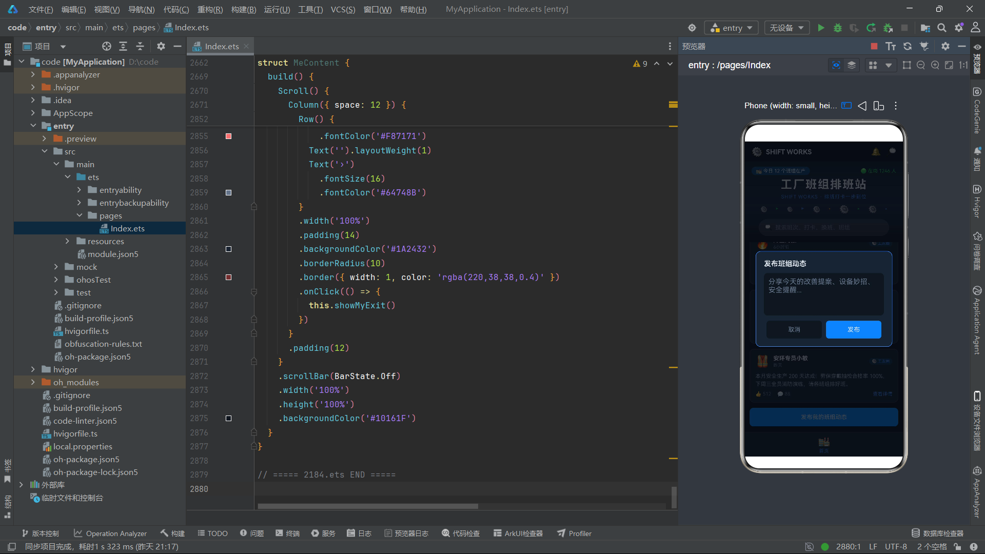
这六个函数是数据构建工厂,用于在用户交互时快速创建新的数据对象。每个函数接收必要的业务参数,自动填充默认值,返回一个完整的接口实例。例如 buildFeed 接收 id、name、avatar、content 四个参数,自动将 time 设为"刚刚"、likes 和 comments 设为 0,因为新发布的动态还没有人点赞和评论。
技术要点: 工厂函数模式在面向对象编程中非常经典,它的核心思想是将对象的创建过程封装在函数内部,调用者只需提供必要的参数,无需关心对象的完整结构。在本应用中,当用户点击"发布班组动态"按钮后,
buildFeed函数被调用来构造一个新的FeedItem对象,然后通过数组展开运算符[buildFeed(...), ...this.feeds]将新动态插入到列表头部,实现"最新内容置顶"的社交信息流效果。
2.5 换班投票的纯函数式状态更新
function buildSwapVote(cur: SwapItem): SwapItem {
  if (cur.quota > 0) {
    const left: number = cur.quota - 1
    return {
      id: cur.id, name: cur.name, teacher: cur.teacher, lessons: cur.lessons,
      quota: left, state: left === 0 ? 1 : cur.state
    }
  }
  return cur
}
buildSwapVote 是一个特别值得分析的函数,它实现了"换班确认投票"的核心业务逻辑。这个函数接收当前的 SwapItem 对象,返回一个新的 SwapItem 对象。如果待确认人数 quota 大于 0,则将 quota 减一;如果减一后 quota 变为 0,则将状态 state 改为 1(已通过),否则保持原状态不变。如果 quota 已经为 0,则直接返回原对象不做任何修改。
这个函数体现了函数式编程中"不可变数据"的设计理念——它不修改传入的对象,而是返回一个全新的对象。这种做法的好处是:第一,避免了副作用,调用者可以放心地传入原始数据而不必担心被意外修改;第二,方便调试和测试,因为每次调用都是纯函数,相同的输入一定产生相同的输出;第三,配合 ArkUI 的状态管理系统,返回新对象可以触发框架的差异检测机制,自动刷新受影响的界面区域。
三、主入口组件 Index 的状态管理与布局架构
3.1 @Entry 与 @Component 装饰器
@Entry
@Component
struct Index {
  // ...
}
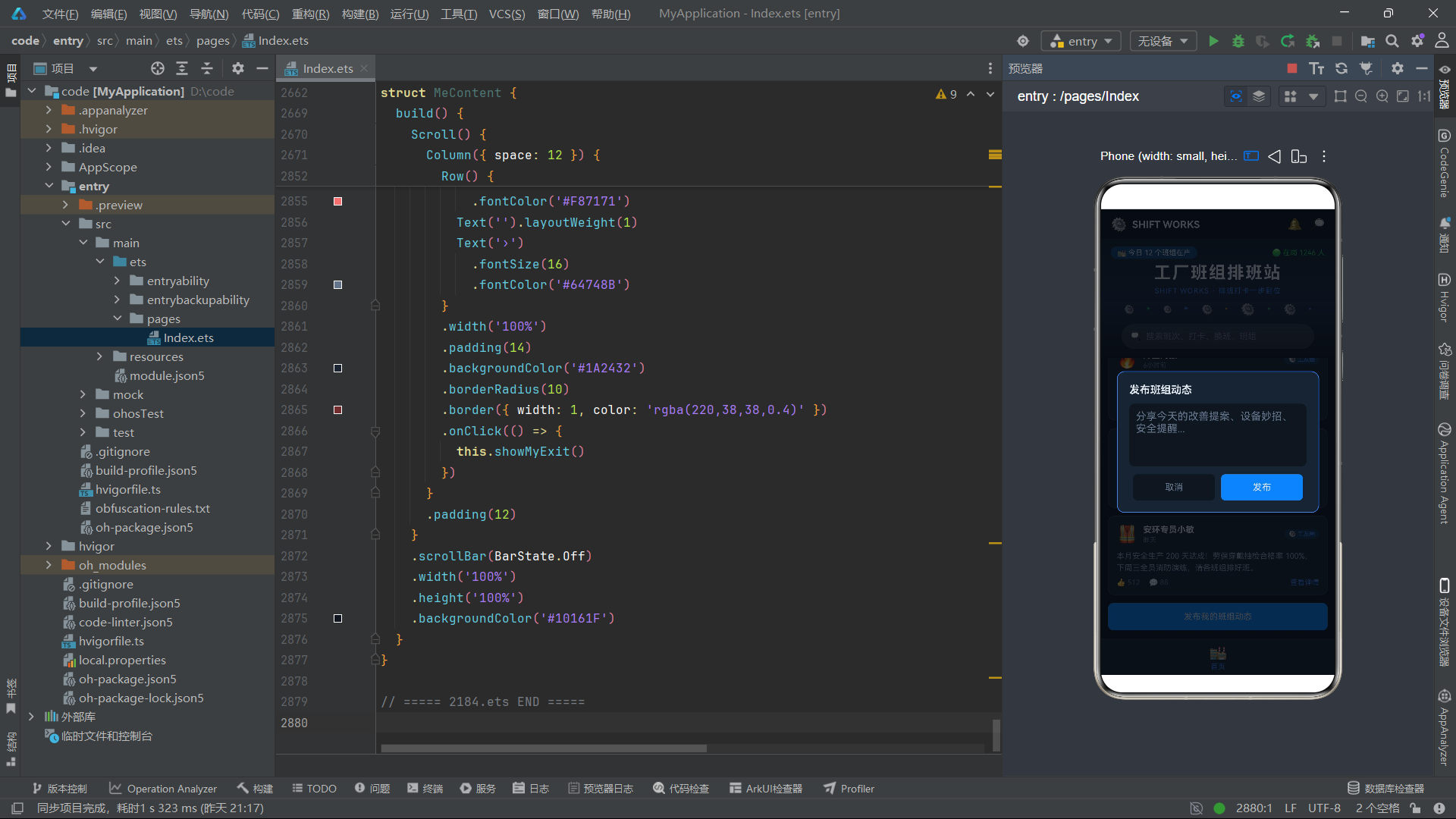
这是整个应用的根组件声明。@Entry 装饰器标记 Index 为页面的入口组件,表示这个组件是页面渲染的起点,一个页面只能有一个 @Entry 组件。@Component 装饰器标记 Index 为一个自定义组件,使其可以使用 build() 方法来声明 UI 结构。这两个装饰器的组合是鸿蒙 ArkTS 页面开发的最基本模板——每个页面都由一个 @Entry @Component 修饰的 struct 来承载。
技术要点:
@Component装饰器的作用是告诉 ArkUI 编译器:这个struct是一个可复用的 UI 组件,需要被编译为可渲染的组件树。被@Component修饰的struct必须实现build()方法,在其中声明组件的 UI 结构。@Entry则额外标记该组件为页面入口,框架会自动将它注册到路由系统中,作为页面的根节点进行渲染。没有被@Entry修饰的@Component只能作为子组件被其他组件引用,不能独立作为页面存在。
3.2 @State 状态变量体系
@State currentTab: number = 0
@State catSel: number = 0
@State feeds: FeedItem[] = FEEDS
@State shifts: ShiftItem[] = SHIFTS
@State clocks: ClockItem[] = CLOCKS
@State swaps: SwapItem[] = SWAPS
@State crews: CrewItem[] = CREWS
@State mys: MyItem[] = MYS
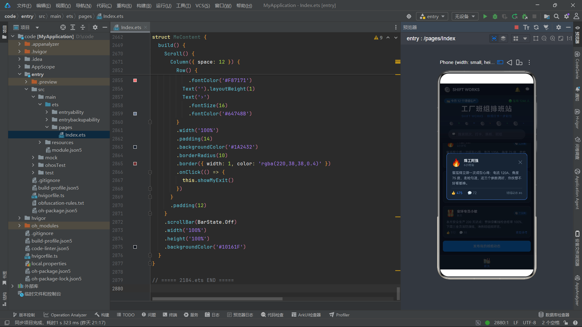
这八行代码声明了组件的核心数据状态。@State 是 ArkTS 中最重要的状态管理装饰器,它标记的变量具有响应式特性——当变量值发生变化时,框架会自动检测变化并刷新引用了该变量的 UI 区域。currentTab 记录当前选中的 Tab 索引,初始值为 0(首页);catSel 记录工序分类标签的选中索引;feeds、shifts、clocks、swaps、crews、mys 分别存储六大数据列表,初始值来自前面定义的常量数组。
技术要点:
@State装饰器只能用于组件内部的状态管理,被它修饰的变量是组件私有的,外部无法直接访问。当@State变量被修改时,框架会对新旧值进行深度比较,只更新真正发生变化的 UI 区域,而不是整体重新渲染。这种细粒度的更新机制是 ArkUI 高性能渲染的关键所在。对于数组类型的状态,框架会监听数组的splice、push、pop等修改操作,以及通过数组展开创建新数组的赋值操作,确保任何数据变化都能被正确捕获。
紧接着是大量的弹窗状态变量:
@State showFeedDetail: boolean = false
@State pickedFeed: FeedItem = FEEDS[0]
@State showFeedAdd: boolean = false
@State newFeedContent: string = ''
@State showShiftDetail: boolean = false
@State pickedShift: ShiftItem = SHIFTS[0]
@State showShiftEdit: boolean = false
@State newShiftName: string = ''
@State newShiftHours: string = ''
@State showClockRule: boolean = false
@State showClockDetail: boolean = false
@State pickedClock: ClockItem = CLOCKS[0]
@State showClockAdd: boolean = false
@State newClockTitle: string = ''
@State showSwapDetail: boolean = false
@State pickedSwap: SwapItem = SWAPS[0]
@State showSwapVote: boolean = false
@State showCrewRule: boolean = false
@State showCrewDetail: boolean = false
@State pickedCrew: CrewItem = CREWS[0]
@State showCrewSign: boolean = false
@State showCrewQuit: boolean = false
@State showMyRemove: boolean = false
@State pickedMy: MyItem = MYS[0]
@State showMyName: boolean = false
@State newName: string = ''
@State showMyCache: boolean = false
@State showMyExit: boolean = false
这一大段状态变量虽然看起来冗长,但其设计模式非常规整:每个弹窗都由一对变量控制——一个 boolean 类型的 show* 变量控制弹窗的显示与隐藏,一个对应实体类型的 picked* 变量存储用户选中的数据项。例如 showFeedDetail 控制动弹详情弹窗是否显示,pickedFeed 存储用户点击的那条动态数据。此外,还有一些 new* 变量用于存储用户在输入框中输入的内容,如 newFeedContent、newShiftName、newShiftHours 等。这种"一个布尔值控制显隐 + 一个数据项存储选中内容"的模式在本应用中被系统地运用到了所有 17 个弹窗上,形成了一套统一的弹窗管理范式。
3.3 @Builder tabItem:底部导航项的声明式构建
@Builder
tabItem(icon: string, label: string, tab: number) {
  Column({ space: 3 }) {
    Text(icon)
      .fontSize(20)
    Text(label)
      .fontSize(10)
      .fontColor(this.currentTab === tab ? '#3B82F6' : '#64748B')
  }
  .width('100%')
  .height('100%')
  .justifyContent(FlexAlign.Center)
  .onClick(() => {
    this.currentTab = tab
  })
  .scale(this.currentTab === tab ? { x: 1.12, y: 1.12 } : { x: 1, y: 1 })
  .animation({ duration: 200, curve: Curve.EaseOut })
}
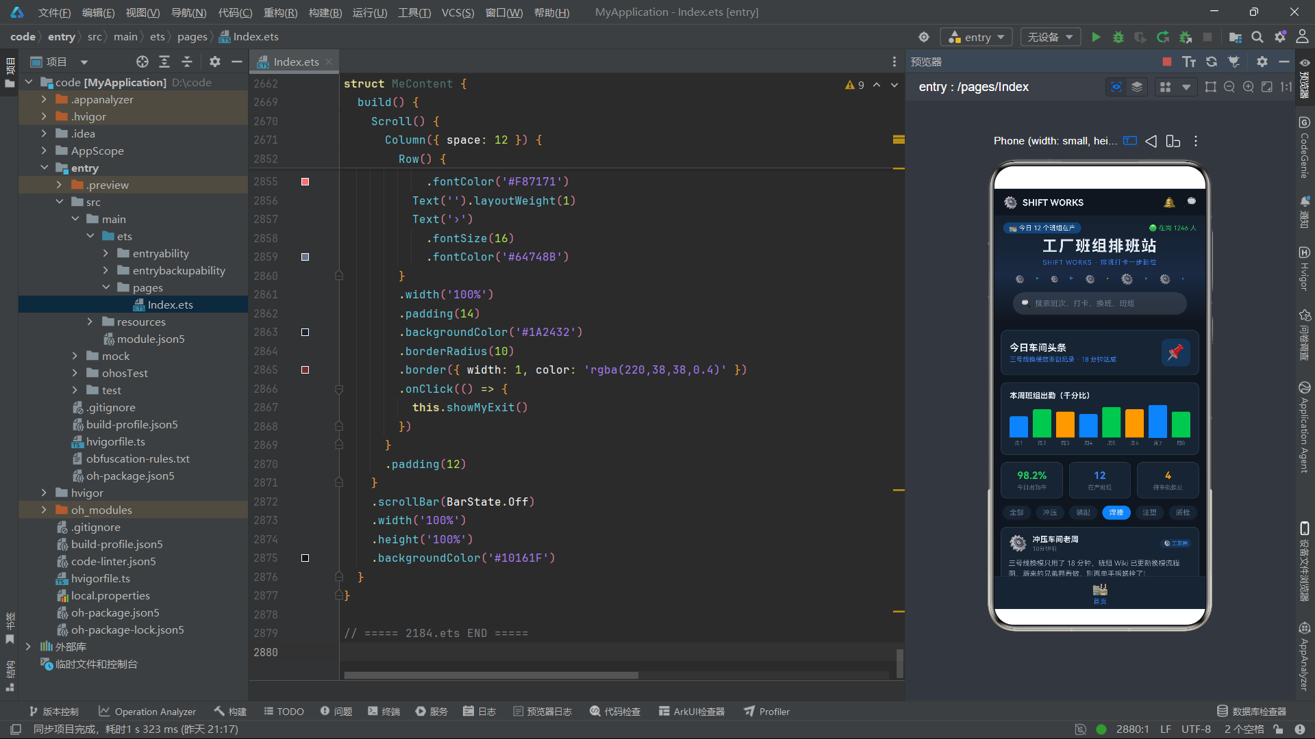
@Builder 是 ArkTS 中的一个重要装饰器,用于声明可复用的 UI 构建方法。与普通方法不同,@Builder 方法返回的是一段 UI 结构描述,可以在 build() 方法中像组件一样被调用。tabItem 方法接收三个参数:icon 是图标 emoji 字符串,label 是文字标签,tab 是该导航项对应的 Tab 索引值。
这个方法的 UI 结构很清晰:一个 Column 容器垂直排列图标和文字,space: 3 设置子元素间距为 3vp。Text(icon) 显示图标,字体大小 20vp;Text(label) 显示文字,字体大小 10vp,颜色根据当前选中的 Tab 动态变化——选中时为钢蓝色 #3B82F6,未选中时为灰色 #64748B。
技术要点:
Column是 ArkUI 中的垂直容器组件,它将子元素从上到下垂直排列。space参数设置子元素之间的间距。justifyContent(FlexAlign.Center)让子元素在主轴(垂直方向)上居中对齐。Column是 ArkUI 三大基础容器之一,与Row(水平容器)和Stack(层叠容器)共同构成了声明式 UI 布局的核心工具。
最精妙的部分是 .scale() 和 .animation() 的配合使用。当某个 Tab 被选中时,它的缩放比例从 1 变为 1.12(放大 12%),未选中的 Tab 保持原始大小。.animation() 方法为这个缩放变化添加了 200 毫秒的缓出动画效果,使得 Tab 切换时有一个平滑的放大/缩小过渡,而不是突兀的跳变。这种微交互设计能显著提升用户的操作反馈感。
技术要点:
animation是 ArkUI 的属性动画 API。duration参数指定动画时长(毫秒),curve参数指定动画曲线类型。Curve.EaseOut表示缓出曲线,动画开始时快速变化,接近终点时逐渐减速,模拟物理世界中物体减速停止的自然效果。ArkUI 还提供了Curve.EaseIn(缓入)、Curve.EaseInOut(缓入缓出)、Curve.Linear(线性)等多种预设曲线。需要注意的是,animation方法必须放在会变化的属性(如scale)之后,它作用于前面声明的所有可动画属性。
3.4 build() 方法的 Stack 层叠架构
build() {
  Stack() {
    Column() {
      // ===== 头部:工业钢蓝横幅 =====
      Column() {
        Row() {
          Text('⚙️')
            .fontSize(20)
          Text('SHIFT WORKS')
            .fontSize(15)
            .fontWeight(FontWeight.Bold)
            .fontColor('#E2E8F0')
            .margin({ left: 8 })
          Text('').layoutWeight(1)
          Text('🔔')
            .fontSize(18)
          Text('🔎')
            .fontSize(18)
            .margin({ left: 12 })
        }
        .width('100%')
        .padding({ left: 16, right: 16, top: 12, bottom: 10 })

        // 钢蓝横幅
        Column({ space: 6 }) {
          Row() {
            Text('🏭 今日 12 个班组在产')
              .fontSize(11)
              .fontColor('#E2E8F0')
              .backgroundColor('rgba(59,130,246,0.35)')
              .borderRadius(20)
              .padding({ left: 10, right: 10, top: 3, bottom: 3 })
            Text('').layoutWeight(1)
            Text('🟢 在岗 1246 人')
              .fontSize(11)
              .fontColor('#22C55E')
          }
          .width('100%')

          Text('工厂班组排班站')
            .fontSize(26)
            .fontWeight(FontWeight.Bold)
            .fontColor('#E2E8F0')
            .letterSpacing(2)
          Text('SHIFT WORKS · 排班打卡一步到位')
            .fontSize(11)
            .fontColor('#3B82F6')
            .letterSpacing(1)
          // ... 更多头部内容
        }
        .width('100%')
        .padding({ left: 16, right: 16, top: 12, bottom: 14 })
        .linearGradient({
          angle: 180,
          colors: [['#16202E', 0.0], ['#1A2A42', 0.55], ['#10161F', 1.0]]
        })
      }
      .width('100%')
      .backgroundColor('#10161F')
build() 方法是整个组件的核心,它声明了页面的完整 UI 结构。最外层使用 Stack 容器,这是 ArkUI 的层叠布局容器——它将子元素像图层一样堆叠,后声明的子元素覆盖在先声明的子元素之上。本应用利用 Stack 的层叠特性来实现弹窗效果:底层是页面的正常内容(头部 + 内容区 + 底部导航),上层是各种弹窗覆盖层,当某个弹窗的 show* 状态为 true 时,对应的弹窗层就会显示在内容之上。
Stack 内部的 Column 将页面分为三个垂直区域:头部横幅、内容区、底部 Tab 栏。头部区域是一个深色背景的 Column,内部嵌套了多行 Row 和 Text,构建出工业风格的导航栏。其中 linearGradient 方法定义了一个从上到下的线性渐变背景,从深蓝灰 #16202E 渐变到更深的 #10161F,营造出钢铁工业的冷峻视觉氛围。
技术要点:
Stack是 ArkUI 的层叠布局容器,子元素默认居中对齐堆叠。它的alignContent参数可以调整子元素的对齐方式。Stack的典型应用场景包括:弹窗/遮罩层覆盖在内容之上、图片上叠加文字标签、按钮上叠加加载动画等。在本应用中,Stack完美地解决了"页面内容与弹窗共存"的问题——弹窗作为Stack的后声明子元素,自然覆盖在页面内容之上,且通过半透明背景实现遮罩效果。
技术要点:
linearGradient是 ArkUI 的线性渐变背景 API。angle参数指定渐变方向的角度(0 度为从下到上,90 度为从左到右,180 度为从上到下);colors参数是一个数组,每个元素是[颜色值, 停止位置]的元组,停止位置是 0.0 到 1.0 之间的浮点数,表示该颜色在渐变路径上的位置。通过多个颜色停止点的组合,可以创建出非常丰富的渐变效果。
3.5 内容区的条件渲染与子组件通信
// ===== 内容区 =====
Column() {
  if (this.currentTab === 0) {
    HomeContent({
      feeds: this.feeds,
      heat: HEAT,
      catSelLink: $catSel,
      showFeedDetail: (item: FeedItem) => {
        this.pickedFeed = item
        this.showFeedDetail = true
      },
      showFeedAdd: () => {
        this.showFeedAdd = true
      }
    })
  }
  if (this.currentTab === 1) {
    ShiftContent({
      shifts: this.shifts,
      sel: this.catSel,
      showShiftDetail: (item: ShiftItem) => {
        this.pickedShift = item
        this.showShiftDetail = true
      },
      showShiftEdit: (item: ShiftItem) => {
        this.pickedShift = item
        this.newShiftName = item.name
        this.newShiftHours = item.hours.toString()
        this.showShiftEdit = true
      }
    })
  }
  // ... 其他 Tab 的条件渲染
}
.width('100%')
.layoutWeight(1)
内容区是页面的主体部分,通过 if (this.currentTab === N) 的条件判断来决定显示哪个 Tab 的内容。当 currentTab 的值改变时,框架会自动卸载旧的 Tab 内容组件,加载新的 Tab 内容组件,这就是声明式 UI 中条件渲染的典型应用。
每个 Tab 内容组件的调用都包含了丰富的参数传递。以 HomeContent 为例,它接收四种类型的参数:feeds 是数据数组,通过值传递将首页动态数据传给子组件;heat 是出勤热度数组;catSelLink: $catSel 使用 $ 语法进行双向绑定传递,子组件可以反向修改父组件的 catSel 状态;showFeedDetail 和 showFeedAdd 是回调函数,子组件通过调用这些函数将用户交互事件传递回父组件。
技术要点:
$变量名语法是 ArkTS 中的双向绑定语法,用于将父组件的@State变量以@Link方式传递给子组件。与普通的值传递(@Prop)不同,@Link传递的是变量的引用,子组件对@Link变量的修改会直接反映到父组件的@State变量上。这种双向数据流在需要父子组件同步状态的场景中非常有用,如本例中的分类标签选中索引catSel需要在父组件和子组件之间保持同步。
技术要点: 回调函数传递是 ArkTS 中"子到父通信"的标准模式。由于 ArkTS 的数据流是单向的(父到子通过属性传递),子组件无法直接修改父组件的状态。当子组件需要通知父组件发生了某个事件时,通过调用父组件传入的回调函数来实现。在本例中,当用户在
HomeContent中点击某条动态时,子组件调用showFeedDetail(item)回调,父组件在回调中设置pickedFeed = item和showFeedDetail = true,从而触发详情弹窗的显示。
3.6 底部 Tab 栏与弹窗层
// ===== 底部 tab 栏 =====
Row() {
  this.tabItem('🏭', '首页', 0)
  this.tabItem('📋', '排班', 1)
  this.tabItem('⏱️', '打卡', 2)
  this.tabItem('🔁', '换班', 3)
  this.tabItem('🏆', '班组榜', 4)
  this.tabItem('👷', '我的', 5)
}
.width('100%')
.height(56)
.backgroundColor('#1A2432')
.border({ width: { top: 1 }, color: '#2A3A4E' })
底部 Tab 栏使用 Row 水平容器排列六个导航项,每个导航项通过调用前面定义的 @Builder tabItem 方法来构建。Row 容器设置了 56vp 的固定高度和深色背景,顶部有 1vp 的边框线作为分隔。六个导航项分别是首页(🏭)、排班(📋)、打卡(⏱️)、换班(🔁)、班组榜(🏆)和我的(👷),每个项都有对应的 emoji 图标和中文标签。
技术要点:
Row是 ArkUI 的水平容器组件,它将子元素从左到右水平排列。与Column类似,Row也支持space参数设置子元素间距,支持justifyContent设置主轴对齐方式,支持alignItems设置交叉轴对齐方式。在本例中,六个tabItem通过layoutWeight自动等分Row的宽度,实现了底部导航栏的经典布局。
弹窗层是 Stack 容器中位于内容层之上的覆盖层,通过一系列 if 条件判断来控制显示:
// ===== 弹窗层 =====
if (this.showFeedDetail) {
  this.feedDetailOverlay(this.pickedFeed, () => {
    this.showFeedDetail = false
  })
}
if (this.showFeedAdd) {
  this.feedAddOverlay(() => {
    this.showFeedAdd = false
  })
}
if (this.showShiftDetail) {
  this.shiftDetailOverlay(this.pickedShift, () => {
    this.showShiftDetail = false
  })
}
// ... 更多弹窗条件渲染
每个弹窗都由一个 @Builder 方法构建,接收选中的数据项和一个关闭回调函数。当 show* 状态变量为 true 时,对应的弹窗 @Builder 被调用并渲染到 Stack 的上层,覆盖在页面内容之上。关闭回调函数将 show* 设为 false,弹窗就会被框架自动卸载。这种"状态驱动弹窗显隐"的模式是 ArkUI 中实现弹窗的标准做法,简洁而高效。
四、弹窗系统的深度解析
4.1 弹窗架构概览
本应用共实现了 17 个弹窗,涵盖了动态详情、发布动态、班次详情、班次编辑、打卡规则、巡检详情、补卡申请、换班详情、换班确认、班组规则、班组详情、挑战报名、撤销挑战、收藏移除、修改昵称、清除缓存和退出登录等场景。所有弹窗都遵循统一的架构模式:半透明遮罩层 + 居中卡片容器 + 业务内容 + 操作按钮。下面选取几个代表性弹窗进行深入分析。
4.2 动态详情弹窗
@Builder
feedDetailOverlay(item: FeedItem, onClose: () => void) {
  Column() {
    Column({ space: 10 }) {
      Row() {
        Text(item.avatar)
          .fontSize(30)
        Column({ space: 2 }) {
          Text(item.name)
            .fontSize(14)
            .fontWeight(FontWeight.Bold)
            .fontColor('#E2E8F0')
          Text(item.time)
            .fontSize(11)
            .fontColor('#64748B')
        }
        .alignItems(HorizontalAlign.Start)
        .margin({ left: 10 })
        Text('').layoutWeight(1)
        Text('✕')
          .fontSize(18)
          .fontColor('#64748B')
          .onClick(() => {
            onClose()
          })
      }
      .width('100%')

      Text(item.content)
        .fontSize(13)
        .fontColor('#94A3B8')
        .lineHeight(20)

      Divider()
        .strokeWidth(0.5)
        .color('#2A3A4E')

      Row() {
        Text('👍 ' + item.likes)
          .fontSize(13)
          .fontColor('#3B82F6')
        Text('💬 ' + item.comments)
          .fontSize(13)
          .fontColor('#64748B')
          .margin({ left: 20 })
        Text('').layoutWeight(1)
        Text('班组动态 #' + item.id)
          .fontSize(11)
          .fontColor('#64748B')
      }
      .width('100%')
    }
    .width('86%')
    .padding(18)
    .backgroundColor('#1A2432')
    .borderRadius(12)
    .border({ width: 1, color: '#3B82F6' })
  }
  .width('100%')
  .height('100%')
  .backgroundColor('rgba(5,8,13,0.72)')
  .justifyContent(FlexAlign.Center)
  .onClick(() => {
    onClose()
  })
}
这个弹窗的 UI 结构分为两层:外层 Column 是全屏遮罩层,设置 100% 宽高和半透明背景色 rgba(5,8,13,0.72),justifyContent(FlexAlign.Center) 让内层卡片在垂直方向居中显示;内层 Column 是弹窗卡片,宽度为屏幕的 86%,内边距 18vp,深色面板背景,12vp 圆角,1vp 钢蓝色边框。
卡片内容从上到下依次为:用户信息行(头像 + 名称 + 时间 + 关闭按钮)、动态正文(带行高设置)、分割线、互动数据行(点赞数 + 评论数 + 动态编号)。关闭逻辑有两处入口:右上角的"✕"按钮和外层遮罩的点击事件都调用 onClose() 回调,这种"点击遮罩关闭"的交互方式符合用户的操作直觉。
技术要点:
Divider是 ArkUI 的分割线组件,用于在内容之间添加视觉分隔。strokeWidth设置线的粗细,color设置线的颜色。在本例中使用了 0.5vp 的细线和深灰色,营造出低调的分隔效果。Divider默认占满父容器宽度,是一个轻量级的视觉装饰组件。
技术要点:
layoutWeight是 ArkUI 的弹性权重属性,用于在Row或Column中分配剩余空间。Text('').layoutWeight(1)是一个非常实用的技巧——创建一个空文本组件并赋予它 1 的权重,它就会自动占据父容器中剩余的所有空间,将其他元素推到两侧。这种"弹簧占位"模式在本应用的 UI 布局中被大量使用,用于实现左右分布、两端对齐等布局效果。
4.3 发布动态弹窗与 TextArea 输入
@Builder
feedAddOverlay(onClose: () => void) {
  Column() {
    Column({ space: 12 }) {
      Text('发布班组动态')
        .fontSize(16)
        .fontWeight(FontWeight.Bold)
        .fontColor('#E2E8F0')
        .width('100%')

      TextArea({ text: this.newFeedContent, placeholder: '分享今天的改善提案、设备妙招、安全提醒...' })
        .height(96)
        .fontSize(13)
        .fontColor('#E2E8F0')
        .placeholderColor('#64748B')
        .backgroundColor('#10161F')
        .borderRadius(8)
        .padding(10)
        .onChange((v: string) => {
          this.newFeedContent = v
        })

      Row({ space: 10 }) {
        Text('取消')
          .fontSize(14)
          .fontColor('#64748B')
          .textAlign(TextAlign.Center)
          .width('46%')
          .height(40)
          .backgroundColor('#10161F')
          .borderRadius(6)
          .onClick(() => {
            onClose()
          })
        Text('发布')
          .fontSize(14)
          .fontColor('#E2E8F0')
          .textAlign(TextAlign.Center)
          .width('46%')
          .height(40)
          .backgroundColor('#3B82F6')
          .borderRadius(6)
          .onClick(() => {
            if (this.newFeedContent.length > 0) {
              this.feeds = [buildFeed(this.feeds.length + 1, '我', '👷', this.newFeedContent), ...this.feeds]
              this.newFeedContent = ''
            }
            onClose()
          })
      }
      .width('100%')
      .justifyContent(FlexAlign.Center)
    }
    .width('86%')
    .padding(18)
    .backgroundColor('#1A2432')
    .borderRadius(12)
    .border({ width: 1, color: '#3B82F6' })
  }
  .width('100%')
  .height('100%')
  .backgroundColor('rgba(5,8,13,0.72)')
  .justifyContent(FlexAlign.Center)
  .onClick(() => {
    onClose()
  })
}
发布动态弹窗的核心是 TextArea 多行文本输入组件。TextArea 接收一个配置对象,text 参数绑定当前输入内容(通过 this.newFeedContent 状态变量),placeholder 参数设置占位提示文本。onChange 回调在用户输入时被触发,参数 v 是最新的输入内容,回调中将其赋值给 this.newFeedContent 状态变量,实现输入内容的响应式管理。
"发布"按钮的点击事件包含了完整的业务逻辑:首先检查输入内容是否为空(this.newFeedContent.length > 0),如果非空则调用 buildFeed 工厂函数创建新的 FeedItem 对象,通过数组展开 [buildFeed(...), ...this.feeds] 将新动态插入到列表头部,然后清空输入内容,最后关闭弹窗。这里使用数组展开创建新数组而非直接 unshift 操作,是为了让 ArkUI 框架能正确检测到数组引用的变化,从而触发列表的重新渲染。
技术要点:
TextArea是 ArkUI 的多行文本输入组件,与TextInput(单行输入框)不同,它支持多行文本编辑,适合输入较长的内容如动态正文、评论、备注等。placeholder参数在输入框为空时显示灰色提示文字,引导用户输入。placeholderColor可以自定义占位文字的颜色。onChange是最常用的输入回调,每次用户输入都会触发。
4.4 班次编辑弹窗与 TextInput
@Builder
shiftEditOverlay(item: ShiftItem, onClose: () => void) {
  Column() {
    Column({ space: 12 }) {
      Text('编辑班次信息')
        .fontSize(16)
        .fontWeight(FontWeight.Bold)
        .fontColor('#E2E8F0')
        .width('100%')

      Column({ space: 4 }) {
        Text('班次名称')
          .fontSize(12)
          .fontColor('#64748B')
          .width('100%')
        TextInput({ text: this.newShiftName, placeholder: '输入班次名称' })
          .height(40)
          .fontSize(13)
          .fontColor('#E2E8F0')
          .placeholderColor('#64748B')
          .backgroundColor('#10161F')
          .borderRadius(6)
          .padding({ left: 10, right: 10 })
          .onChange((v: string) => {
            this.newShiftName = v
          })
      }
      .width('100%')

      Column({ space: 4 }) {
        Text('班时长度(小时)')
          .fontSize(12)
          .fontColor('#64748B')
          .width('100%')
        TextInput({ text: this.newShiftHours, placeholder: '输入班时小时数' })
          .height(40)
          .fontSize(13)
          .fontColor('#E2E8F0')
          .placeholderColor('#64748B')
          .backgroundColor('#10161F')
          .borderRadius(6)
          .padding({ left: 10, right: 10 })
          .onChange((v: string) => {
            this.newShiftHours = v
          })
      }
      .width('100%')

      Row({ space: 10 }) {
        Text('取消')
          .fontSize(14)
          .fontColor('#64748B')
          .textAlign(TextAlign.Center)
          .width('46%')
          .height(40)
          .backgroundColor('#10161F')
          .borderRadius(6)
          .onClick(() => {
            onClose()
          })
        Text('保存')
          .fontSize(14)
          .fontColor('#E2E8F0')
          .textAlign(TextAlign.Center)
          .width('46%')
          .height(40)
          .backgroundColor('#22C55E')
          .borderRadius(6)
          .onClick(() => {
            const h: number = parseInt(this.newShiftHours)
            if (this.newShiftName.length > 0 && h > 0) {
              const idx: number = this.shifts.findIndex((s: ShiftItem) => s.id === item.id)
              if (idx >= 0) {
                this.shifts.splice(idx, 1, {
                  id: item.id, name: this.newShiftName, kind: item.kind,
                  hours: h, heat: item.heat, level: item.level, state: item.state
                })
              }
            }
            onClose()
          })
      }
      .width('100%')
      .justifyContent(FlexAlign.Center)
    }
    .width('86%')
    .padding(18)
    .backgroundColor('#1A2432')
    .borderRadius(12)
    .border({ width: 1, color: '#22C55E' })
  }
  .width('100%')
  .height('100%')
  .backgroundColor('rgba(5,8,13,0.72)')
  .justifyContent(FlexAlign.Center)
  .onClick(() => {
    onClose()
  })
}
班次编辑弹窗展示了表单编辑的完整流程。两个 TextInput 单行输入框分别用于输入班次名称和班时长度。每个输入框都用 Column 包裹,上方是标签文字,下方是输入框,形成"label + input"的表单布局。注意 this.newShiftName 和 this.newShiftHours 在弹窗打开前就已经被父组件赋了初值——在内容区调用 ShiftContent 时,showShiftEdit 回调中执行了 this.newShiftName = item.name 和 this.newShiftHours = item.hours.toString(),将选中班次的当前数据预填到输入框中,这就是"编辑模式"的实现。
保存按钮的点击事件包含了数据更新的核心逻辑。首先用 parseInt 将字符串形式的班时转换为数字,然后校验名称非空且数字大于 0。校验通过后,使用 findIndex 在数组中找到目标班次的索引位置,再用 splice 方法替换该位置的元素为新对象。新对象保留了原有的 kind、heat、level、state 字段,只更新了 name 和 hours,实现了"部分更新"的效果。
技术要点:
TextInput是 ArkUI 的单行文本输入组件,适用于输入短文本如名称、数字、搜索关键词等。与TextArea相比,TextInput只支持单行显示,不包含换行功能。在本例中,班时长度使用TextInput而非数值选择器,是因为TextInput更灵活——它通过onChange获取字符串输入,再在保存时用parseInt转换为数字,同时可以做大于 0 的校验,确保数据的有效性。
技术要点:
splice是 JavaScript/TypeScript 数组的原生方法,array.splice(index, deleteCount, ...items)可以在指定位置删除指定数量的元素并插入新元素。在本例中this.shifts.splice(idx, 1, {...})表示在idx位置删除 1 个元素并插入一个新对象,实现"原地替换"。ArkUI 框架会监听@State数组的splice操作,自动触发列表的局部更新。
4.5 弹窗交互流程图
这个流程图完整展示了从用户点击到弹窗关闭的全流程,涵盖了查看详情、编辑、新增、删除四种操作类型的处理路径。每种路径都经历了"设置选中数据 -> 设置显示状态 -> 弹窗渲染 -> 用户操作 -> 数据更新 -> 关闭弹窗 -> 界面刷新"的标准流程,体现了本应用弹窗系统的高度一致性和工程化水准。
五、首页内容组件 HomeContent 的全面解析
5.1 组件声明与数据接收
@Component
struct HomeContent {
  @Prop feeds: FeedItem[]
  @Prop heat: number[]
  @Link catSelLink: number
  showFeedDetail: (item: FeedItem) => void = (item: FeedItem) => {}
  showFeedAdd: () => void = () => {}

  build() {
    // ...
  }
}
HomeContent 是首页的内容组件,使用 @Component 装饰器声明为自定义组件。它接收四种类型的数据:@Prop feeds 是动态列表数据,通过值传递从父组件接收,子组件内部对 feeds 的修改不会影响父组件;@Prop heat 是出勤热度数组;@Link catSelLink 是分类选中索引,通过双向绑定与父组件的 catSel 状态同步;showFeedDetail 和 showFeedAdd 是两个回调函数,默认值为空函数,在父组件调用 HomeContent 时被覆盖为实际的业务回调。
技术要点:
@Prop和@Link是 ArkTS 中父子组件数据传递的两种核心装饰器。@Prop实现单向数据流——父组件的数据变化会同步到子组件,但子组件不能反向修改父组件的数据。@Link实现双向数据流——父子组件共享同一个数据引用,任一方修改都会同步到另一方。选择哪种装饰器取决于业务需求:如果子组件只需要"读取"数据,用@Prop;如果子组件需要"读写"数据,用@Link。在本例中,feeds和heat只需要展示不需要修改,用@Prop;catSelLink需要在子组件中点击分类标签时修改,用@Link。
5.2 Scroll 滚动容器与车间头条
build() {
  Scroll() {
    Column({ space: 12 }) {
      // 车间头条横幅
      Row() {
        Column({ space: 4 }) {
          Text('今日车间头条')
            .fontSize(16)
            .fontWeight(FontWeight.Bold)
            .fontColor('#E2E8F0')
          Text('三号线换模效率创纪录 · 18 分钟达成')
            .fontSize(11)
            .fontColor('#3B82F6')
        }
        .alignItems(HorizontalAlign.Start)
        .layoutWeight(1)
        Text('📌')
          .fontSize(26)
          .backgroundColor('rgba(59,130,246,0.18)')
          .borderRadius(10)
          .padding(8)
      }
      .width('100%')
      .padding(14)
      .backgroundColor('#1A2432')
      .borderRadius(10)
      .border({ width: 1, color: '#2A3A4E' })
build() 方法最外层是 Scroll 滚动容器,它包裹了首页的所有内容。Scroll 是 ArkUI 的滚动容器组件,当内容超出可视区域时,用户可以通过上下滑动来浏览全部内容。scrollBar(BarState.Off) 设置滚动条为隐藏状态,让界面更加干净。Scroll 内部是一个 Column 垂直容器,space: 12 设置子元素间距为 12vp。
车间头条横幅是一个 Row 水平容器,左侧是标题和副标题的 Column,右侧是一个图钉 emoji 图标。layoutWeight(1) 让左侧 Column 占据剩余空间,将图标推到右侧。横幅有深色面板背景、圆角和边框,形成卡片式的视觉容器。
技术要点:
Scroll是 ArkUI 的滚动容器组件,它让超出视口的内容可以通过手势滑动来浏览。scrollable(ScrollDirection.Vertical)设置垂直滚动方向(默认值),scrollBar(BarState.Off)隐藏滚动条。Scroll只能包含一个直接子元素,通常在里面放一个Column或Column来承载多个内容块。在本应用中,所有 Tab 页面的内容都包裹在Scroll中,确保长内容列表可以正常滚动浏览。
5.3 ForEach 列表渲染与出勤柱状图
// 本周出勤柱状图
Column({ space: 8 }) {
  Text('本周班组出勤(千分比)')
    .fontSize(13)
    .fontWeight(FontWeight.Bold)
    .fontColor('#E2E8F0')
    .width('100%')
  Row({ space: 8 }) {
    ForEach(this.heat, (v: number, i: number) => {
      Column({ space: 4 }) {
        Column()
          .width('100%')
          .height(heatBar(v))
          .backgroundColor(i % 3 === 0 ? '#3B82F6' : (i % 3 === 1 ? '#22C55E' : '#F59E0B'))
          .borderRadius({ topLeft: 3, topRight: 3 })
          .justifyContent(FlexAlign.End)
        Text('周' + (i + 1))
          .fontSize(9)
          .fontColor('#64748B')
      }
      .layoutWeight(1)
    }, (v: number, i: number) => 'h' + i)
  }
  .width('100%')
  .alignItems(VerticalAlign.Bottom)
  .height(70)
}
.width('100%')
.padding(14)
.backgroundColor('#1A2432')
.borderRadius(10)
.border({ width: 1, color: '#2A3A4E' })
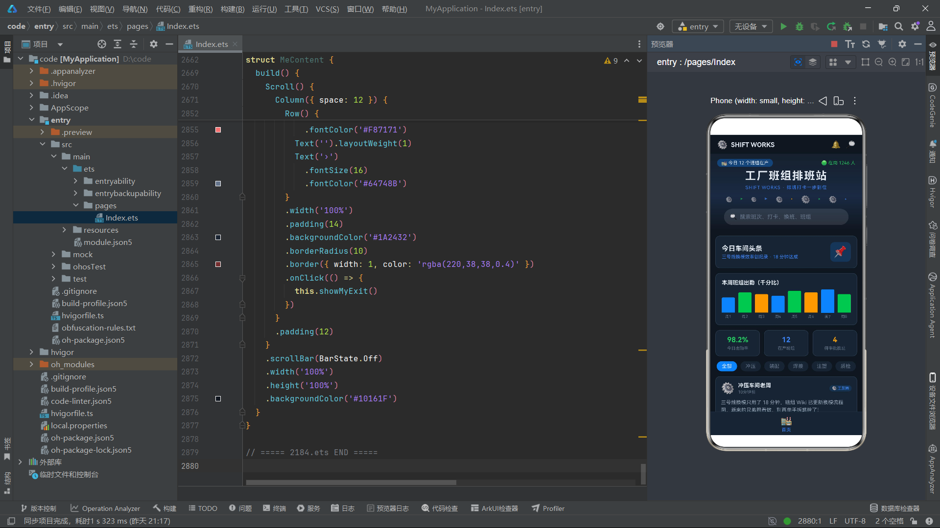
这是一个用纯 ArkUI 组件手绘的柱状图,没有使用任何图表库。ForEach 遍历 this.heat 数组(包含 8 个数值),为每个数值渲染一个柱子。每个柱子是一个 Column 容器,内部包含一个作为柱体的空 Column 和一个作为标签的 Text。柱体的高度通过 heatBar(v) 函数计算,颜色根据索引 i 对 3 取余来循环切换钢蓝、信号绿和警示橙三种颜色,形成视觉上的区分。borderRadius({ topLeft: 3, topRight: 3 }) 只设置顶部圆角,让柱子顶部呈现圆滑的视觉效果。
Row 容器设置了 alignItems(VerticalAlign.Bottom),让所有柱子底部对齐,height(70) 固定图表区域高度。每个柱子通过 layoutWeight(1) 等分宽度,形成均匀分布的柱状图效果。柱子下方的 Text('周' + (i + 1)) 显示"周1"到"周8"的标签。
技术要点:
ForEach是 ArkUI 的列表渲染组件,它接收三个参数:数据数组、子项渲染函数、键值生成函数。ForEach(arr, (item, index) => { /* UI */ }, (item, index) => key)的第三个参数是键值生成函数,返回一个唯一字符串作为列表项的标识。键值的作用是帮助框架在数据变化时高效地计算差异——通过比较新旧键值列表,框架可以精确知道哪些项被添加、删除或移动,从而只更新真正变化的列表项,避免全量重新渲染。在本例中,键值'h' + i使用索引生成唯一标识。
技术要点:
borderRadius可以接受数字(四个角统一圆角)或对象(分别设置四个角的圆角)。borderRadius({ topLeft: 3, topRight: 3 })只设置左上和右上圆角,适用于柱状图柱体顶部圆滑的效果。这种细粒度的圆角控制让开发者可以精确调整 UI 的视觉细节。
5.4 速览三格与 layoutWeight 权重分配
// 速览 3 格
Row({ space: 10 }) {
  Column({ space: 4 }) {
    Text('98.2%')
      .fontSize(17)
      .fontWeight(FontWeight.Bold)
      .fontColor('#22C55E')
    Text('今日出勤率')
      .fontSize(10)
      .fontColor('#64748B')
  }
  .layoutWeight(1)
  .padding({ top: 12, bottom: 12 })
  .backgroundColor('#1A2432')
  .borderRadius(10)
  .border({ width: 1, color: '#2A3A4E' })
  .alignItems(HorizontalAlign.Center)

  Column({ space: 4 }) {
    Text('12')
      .fontSize(17)
      .fontWeight(FontWeight.Bold)
      .fontColor('#3B82F6')
    Text('在产班组')
      .fontSize(10)
      .fontColor('#64748B')
  }
  .layoutWeight(1)
  .padding({ top: 12, bottom: 12 })
  .backgroundColor('#1A2432')
  .borderRadius(10)
  .border({ width: 1, color: '#2A3A4E' })
  .alignItems(HorizontalAlign.Center)

  Column({ space: 4 }) {
    Text('4')
      .fontSize(17)
      .fontWeight(FontWeight.Bold)
      .fontColor('#F59E0B')
    Text('待审批换班')
      .fontSize(10)
      .fontColor('#64748B')
  }
  .layoutWeight(1)
  .padding({ top: 12, bottom: 12 })
  .backgroundColor('#1A2432')
  .borderRadius(10)
  .border({ width: 1, color: '#2A3A4E' })
  .alignItems(HorizontalAlign.Center)
}
.width('100%')
速览三格是一个 Row 容器内放三个等宽的 Column 卡片,每个卡片显示一个关键指标。三个 Column 都设置了 layoutWeight(1),它们会平分 Row 的可用宽度,形成三等分布局。Row({ space: 10 }) 设置卡片间距为 10vp。
三个指标分别是今日出勤率 98.2%(绿色)、在产班组 12 个(蓝色)、待审批换班 4 条(橙色),每个指标用不同颜色区分,让用户一眼就能获取关键数据。每个卡片内部的 Column({ space: 4 }) 垂直排列大号数字和小号标签,alignItems(HorizontalAlign.Center) 让内容水平居中。
技术要点:
layoutWeight是 ArkUI 弹性布局的核心属性。当一个容器(Row或Column)中有多个子元素设置了layoutWeight时,容器会先分配固定尺寸的子元素,然后将剩余空间按layoutWeight的比例分配给设置了权重的子元素。例如三个layoutWeight(1)的子元素会各占 1/3,两个layoutWeight(1)加一个layoutWeight(2)则分别占 1/4、1/4、2/4。这种弹性分配机制让 UI 能够自动适配不同屏幕宽度,是实现响应式布局的重要工具。
5.5 横向滚动标签栏与 ScrollDirection
// 工种标签
Scroll() {
  Row({ space: 8 }) {
    ForEach(CATS, (c: string, i: number) => {
      Text(c)
        .fontSize(12)
        .fontColor(this.catSelLink === i ? '#E2E8F0' : '#64748B')
        .backgroundColor(this.catSelLink === i ? '#3B82F6' : '#1A2432')
        .borderRadius(14)
        .padding({ left: 12, right: 12, top: 5, bottom: 5 })
        .onClick(() => {
          this.catSelLink = i
        })
    }, (c: string) => c)
  }
  .padding({ left: 2, right: 2 })
}
.scrollable(ScrollDirection.Horizontal)
.width('100%')
.scrollBar(BarState.Off)
这是一个横向滚动的分类标签栏。外层 Scroll 设置 scrollable(ScrollDirection.Horizontal) 为水平滚动方向,内部 Row 水平排列所有标签。ForEach 遍历 CATS 数组(‘全部’、‘冲压’、‘装配’、‘焊接’、‘注塑’、‘质检’),为每个分类渲染一个 Text 标签。
标签的样式根据选中状态动态变化:选中时文字为浅色 #E2E8F0、背景为钢蓝色 #3B82F6;未选中时文字为灰色 #64748B、背景为深色面板色 #1A2432。点击标签时执行 this.catSelLink = i,由于 catSelLink 是 @Link 双向绑定变量,这个修改会同步到父组件的 catSel 状态,实现父子组件的分类选择同步。
技术要点:
ScrollDirection.Horizontal让Scroll容器支持水平滚动。与垂直滚动不同,水平滚动需要将内部内容放在Row中而非Column中。scrollBar(BarState.Off)隐藏滚动条,因为标签栏的滚动条会影响视觉整洁度。横向滚动标签栏是移动应用中非常常见的 UI 模式,用于分类筛选、频道切换、标签选择等场景。
5.6 动态信息流的 ForEach 渲染
// 8 条动态
ForEach(this.feeds, (f: FeedItem) => {
  Column({ space: 8 }) {
    Row() {
      Text(f.avatar)
        .fontSize(26)
      Column({ space: 2 }) {
        Text(f.name)
          .fontSize(13)
          .fontWeight(FontWeight.Bold)
          .fontColor('#E2E8F0')
        Text(f.time)
          .fontSize(10)
          .fontColor('#64748B')
      }
      .alignItems(HorizontalAlign.Start)
      .margin({ left: 8 })
      Text('').layoutWeight(1)
      Text('⚙️ 工友圈')
        .fontSize(9)
        .fontColor('#3B82F6')
        .backgroundColor('rgba(59,130,246,0.15)')
        .borderRadius(8)
        .padding({ left: 6, right: 6, top: 2, bottom: 2 })
    }
    .width('100%')

    Text(f.content)
      .fontSize(12)
      .fontColor('#94A3B8')
      .lineHeight(18)
      .maxLines(2)
      .textOverflow({ overflow: TextOverflow.Ellipsis })
      .width('100%')
      .onClick(() => {
        this.showFeedDetail(f)
      })

    Row() {
      Text('👍 ' + f.likes)
        .fontSize(11)
        .fontColor('#64748B')
      Text('💬 ' + f.comments)
        .fontSize(11)
        .fontColor('#64748B')
        .margin({ left: 14 })
      Text('').layoutWeight(1)
      Text('查看详情')
        .fontSize(11)
        .fontColor('#3B82F6')
        .onClick(() => {
          this.showFeedDetail(f)
        })
    }
    .width('100%')
  }
  .width('100%')
  .padding(12)
  .backgroundColor('#1A2432')
  .borderRadius(10)
  .border({ width: 1, color: '#2A3A4E' })
}, (f: FeedItem) => 'f' + f.id)
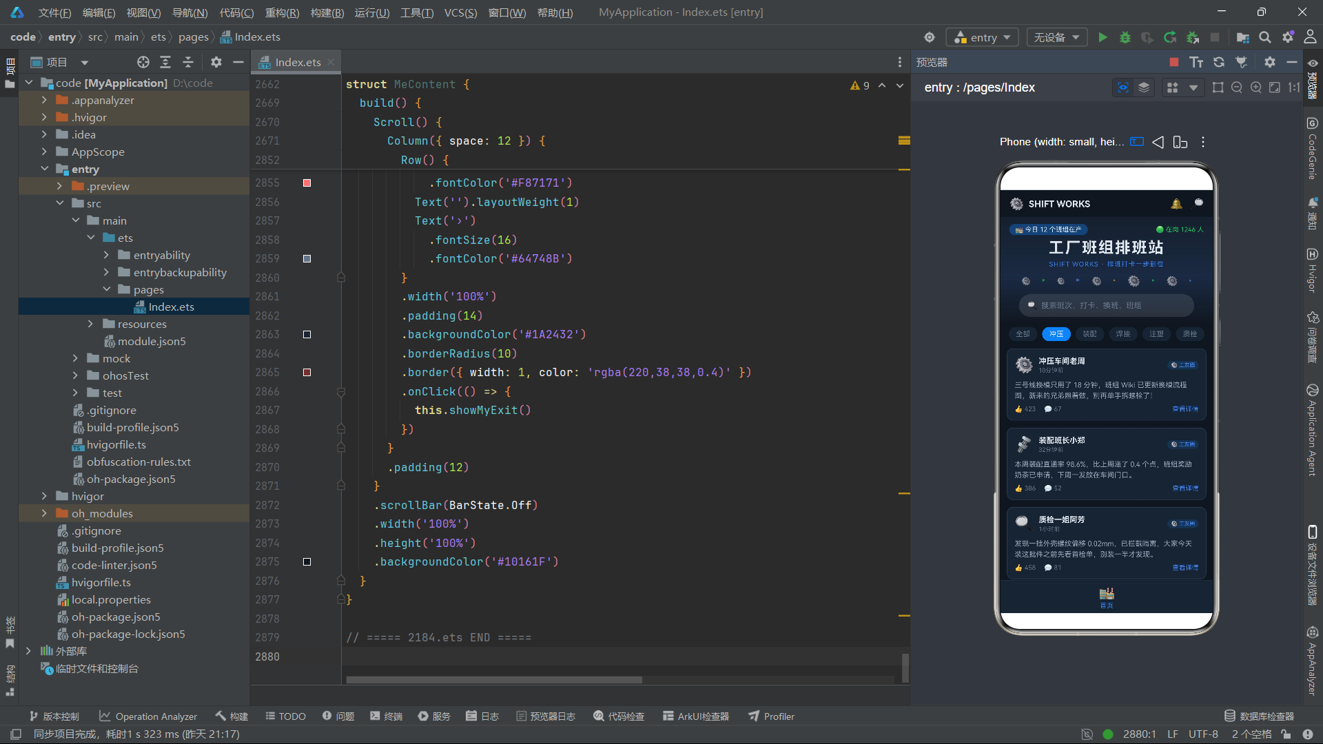
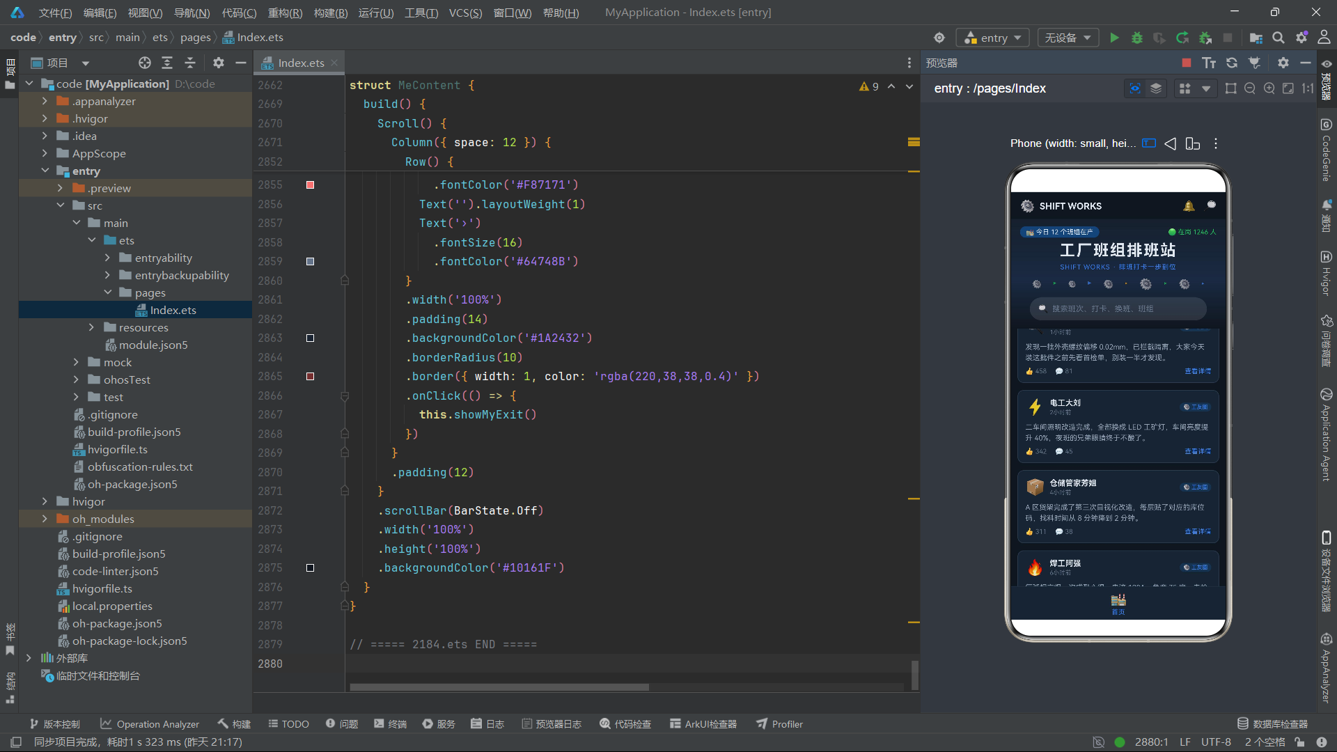
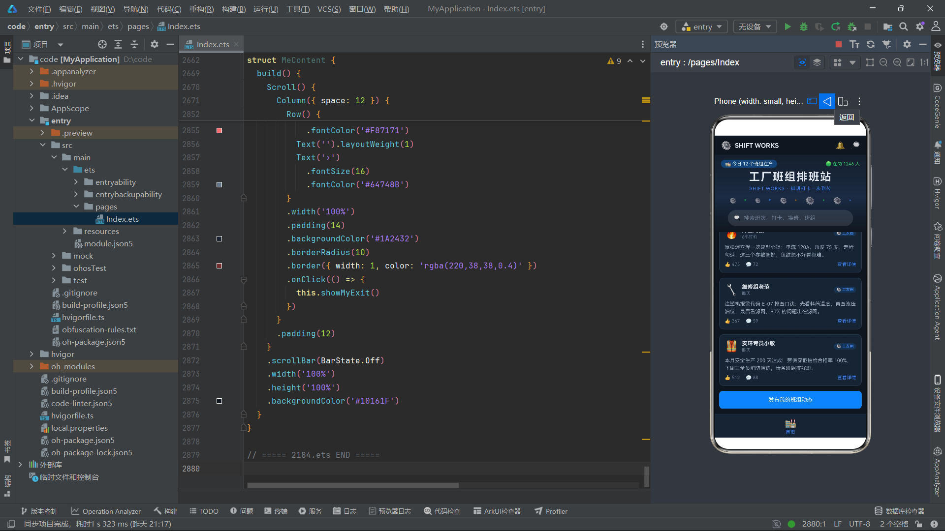
这是首页信息流的核心渲染逻辑。ForEach 遍历 this.feeds 数组,为每条动态渲染一个卡片。每个卡片内部结构清晰:顶部用户信息行(头像 + 名称 + 时间 + 来源标签)、中间动态正文(带省略号截断)、底部互动数据行(点赞 + 评论 + 查看详情链接)。
特别值得关注的是正文文本的 maxLines(2) 和 textOverflow({ overflow: TextOverflow.Ellipsis }) 两个属性。maxLines(2) 限制文本最多显示 2 行,textOverflow 设置超出部分显示省略号"…"。这种处理方式在信息流列表中非常常见——长文本不全部展示,只显示前两行,用户点击"查看详情"后在弹窗中阅读全文。这样既保证了列表的信息密度,又避免了单条动态过长导致列表难以浏览的问题。
技术要点:
maxLines设置文本的最大行数,超出部分根据textOverflow的设置进行处理。TextOverflow.Ellipsis表示用省略号"…"表示被截断的内容。这是移动端列表设计中的标准做法,可以有效控制列表项的高度,保持视觉上的一致性。lineHeight设置文本的行高,本例中 18vp 的行高让 12vp 字号的文字有足够的呼吸空间,提升阅读舒适度。
六、排班内容组件 ShiftContent 的双列卡片布局
6.1 组件声明与分类标签
@Component
struct ShiftContent {
  @Prop shifts: ShiftItem[]
  @State sel: number = 0
  showShiftDetail: (item: ShiftItem) => void = (item: ShiftItem) => {}
  showShiftEdit: (item: ShiftItem) => void = (item: ShiftItem) => {}

  build() {
    Scroll() {
      Column({ space: 12 }) {
        // 工序分类横滑
        Scroll() {
          Row({ space: 8 }) {
            ForEach(CATS, (c: string, i: number) => {
              Text(c)
                .fontSize(12)
                .fontColor(this.sel === i ? '#E2E8F0' : '#64748B')
                .backgroundColor(this.sel === i ? '#3B82F6' : '#1A2432')
                .borderRadius(14)
                .padding({ left: 14, right: 14, top: 6, bottom: 6 })
                .onClick(() => {
                  this.sel = i
                })
            }, (c: string) => 'c' + c)
          }
          .padding({ left: 2, right: 2 })
        }
        .scrollable(ScrollDirection.Horizontal)
        .width('100%')
        .scrollBar(BarState.Off)
ShiftContent 与 HomeContent 的声明方式类似,但有一个重要区别:ShiftContent 使用 @State sel: number = 0 而非 @Link 来管理局部分类标签的选中状态。这意味着 ShiftContent 的分类选择是组件内部的状态,不需要同步到父组件。这种设计选择体现了"状态就近管理"的原则——如果一个状态只在本组件内部使用,就不需要提升到父组件,避免不必要的状态传递和全局刷新。
分类标签的渲染逻辑与首页类似,但这里使用了 'c' + c 作为键值(用分类名称而非索引),确保标签的稳定性更好。
6.2 双列班次卡片的嵌套 ForEach
// 双列班次卡片 10 个(5 行)
ForEach([0, 2, 4, 6, 8], (r: number) => {
  Row({ space: 10 }) {
    ForEach([0, 1], (c: number) => {
      if (r + c < this.shifts.length) {
        Column({ space: 8 }) {
          Row() {
            Text(this.shifts[r + c].kind)
              .fontSize(10)
              .fontColor('#3B82F6')
              .backgroundColor('rgba(59,130,246,0.18)')
              .borderRadius(8)
              .padding({ left: 8, right: 8, top: 3, bottom: 3 })
            Text('').layoutWeight(1)
            Text(shiftStateText(this.shifts[r + c].state))
              .fontSize(10)
              .fontColor(shiftStateColor(this.shifts[r + c].state))
          }
          .width('100%')

          Text(this.shifts[r + c].name)
            .fontSize(13)
            .fontWeight(FontWeight.Bold)
            .fontColor('#E2E8F0')
            .maxLines(1)
            .textOverflow({ overflow: TextOverflow.Ellipsis })
            .width('100%')

          Row() {
            Text('⏱ ' + this.shifts[r + c].hours + 'h')
              .fontSize(11)
              .fontColor('#F59E0B')
            Text('').layoutWeight(1)
            Text('🔥 ' + this.shifts[r + c].heat)
              .fontSize(11)
              .fontColor('#22C55E')
          }
          .width('100%')

          Row({ space: 8 }) {
            Text('详情')
              .fontSize(11)
              .fontColor('#3B82F6')
              .textAlign(TextAlign.Center)
              .layoutWeight(1)
              .height(28)
              .backgroundColor('rgba(59,130,246,0.15)')
              .borderRadius(5)
              .onClick(() => {
                this.showShiftDetail(this.shifts[r + c])
              })
            Text('编辑')
              .fontSize(11)
              .fontColor('#22C55E')
              .textAlign(TextAlign.Center)
              .layoutWeight(1)
              .height(28)
              .backgroundColor('rgba(34,197,94,0.15)')
              .borderRadius(5)
              .onClick(() => {
                this.showShiftEdit(this.shifts[r + c])
              })
          }
          .width('100%')
        }
        .layoutWeight(1)
        .padding(12)
        .backgroundColor('#1A2432')
        .borderRadius(10)
        .border({ width: 1, color: '#2A3A4E' })
      }
    }, (c: number) => 'col' + r + '-' + c)
  }
  .width('100%')
}, (r: number) => 'row' + r)
这是本应用中最精妙的布局技巧之一——用两个嵌套的 ForEach 实现双列网格布局。外层 ForEach 遍历行索引数组 [0, 2, 4, 6, 8](步长为 2,因为每行放 2 个卡片),内层 ForEach 遍历列索引数组 [0, 1]。对于每个位置,通过 r + c 计算出在 shifts 数组中的实际索引,取出对应的班次数据进行渲染。if (r + c < this.shifts.length) 的边界检查确保当数据数量为奇数时不会越界访问。
每个班次卡片内部包含四个区域:顶部状态行(工序标签 + 状态文本)、班次名称行、参数行(班时 + 热度)、底部操作按钮行(详情 + 编辑)。两个按钮都设置了 layoutWeight(1),等分卡片宽度,形成左右对称的操作区域。
技术要点: 嵌套
ForEach是实现网格布局的经典技巧。ArkUI 虽然提供了Grid网格容器组件,但在某些场景下使用嵌套ForEach+Row/Column的方式更加灵活——可以精确控制每行的列数、行间距、列间距,还可以在每行中混合不同类型的卡片。本例的双列布局是这种技巧的典型应用,10 个班次卡片被组织成 5 行 2 列的网格,既美观又信息密集。
七、打卡内容组件 ClockContent 的巡检动态
7.1 三指标横幅
@Component
struct ClockContent {
  @Prop clocks: ClockItem[]
  showClockRule: () => void = () => {}
  showClockDetail: (item: ClockItem) => void = (item: ClockItem) => {}
  showClockAdd: () => void = () => {}

  build() {
    Scroll() {
      Column({ space: 12 }) {
        // 3 指标横幅
        Row({ space: 10 }) {
          Column({ space: 3 }) {
            Text('07:58')
              .fontSize(16)
              .fontWeight(FontWeight.Bold)
              .fontColor('#22C55E')
            Text('今日上岗打卡')
              .fontSize(9)
              .fontColor('#64748B')
          }
          .layoutWeight(1)
          .padding({ top: 10, bottom: 10 })
          .backgroundColor('rgba(34,197,94,0.12)')
          .borderRadius(10)
          .alignItems(HorizontalAlign.Center)

          Column({ space: 3 }) {
            Text('19:02')
              .fontSize(16)
              .fontWeight(FontWeight.Bold)
              .fontColor('#3B82F6')
            Text('昨日离岗打卡')
              .fontSize(9)
              .fontColor('#64748B')
          }
          .layoutWeight(1)
          .padding({ top: 10, bottom: 10 })
          .backgroundColor('rgba(59,130,246,0.12)')
          .borderRadius(10)
          .alignItems(HorizontalAlign.Center)

          Column({ space: 3 }) {
            Text('200 天')
              .fontSize(16)
              .fontWeight(FontWeight.Bold)
              .fontColor('#F59E0B')
            Text('连续全勤')
              .fontSize(9)
              .fontColor('#64748B')
          }
          .layoutWeight(1)
          .padding({ top: 10, bottom: 10 })
          .backgroundColor('rgba(245,158,11,0.12)')
          .borderRadius(10)
          .alignItems(HorizontalAlign.Center)
        }
        .width('100%')
打卡页面的顶部是三个指标卡片,分别显示今日上岗打卡时间(07:58,绿色)、昨日离岗打卡时间(19:02,蓝色)和连续全勤天数(200 天,橙色)。与首页速览三格不同的是,这里的每个卡片背景使用了对应颜色的半透明色(如 rgba(34,197,94,0.12)),让卡片有一种色彩染色的视觉效果,比纯色面板背景更加生动。
7.2 巡检打卡列表
ForEach(this.clocks, (c: ClockItem, i: number) => {
  Row() {
    Column({ space: 4 }) {
      Row({ space: 6 }) {
        Text('NO.' + (i + 1))
          .fontSize(10)
          .fontWeight(FontWeight.Bold)
          .fontColor('#F59E0B')
        Text(c.name)
          .fontSize(13)
          .fontWeight(FontWeight.Bold)
          .fontColor('#E2E8F0')
      }
      Text(c.title)
        .fontSize(11)
        .fontColor('#94A3B8')
      Row({ space: 10 }) {
        Text('👥 ' + c.fans + ' 粉丝')
          .fontSize(10)
          .fontColor('#64748B')
        Text('👁 ' + playsText(c.watch))
          .fontSize(10)
          .fontColor('#64748B')
        Text(clockStateText(c.state))
          .fontSize(10)
          .fontColor(clockStateColor(c.state))
      }
    }
    .alignItems(HorizontalAlign.Start)
    .layoutWeight(1)

    Text('详情')
      .fontSize(11)
      .fontColor('#E2E8F0')
      .textAlign(TextAlign.Center)
      .width(52)
      .height(28)
      .backgroundColor('#3B82F6')
      .borderRadius(5)
      .onClick(() => {
        this.showClockDetail(c)
      })
  }
  .width('100%')
  .padding(12)
  .backgroundColor('#1A2432')
  .borderRadius(10)
  .border({ width: 1, color: '#2A3A4E' })
}, (c: ClockItem) => 'c' + c.id)
巡检打卡列表的每张卡片是一个 Row,左侧是信息区(序号 + 名称 + 标题 + 粉丝/围观/状态),右侧是详情按钮。ForEach 的渲染函数中使用了第二个参数 i(索引),通过 'NO.' + (i + 1) 显示排名编号。围观人次通过 playsText(c.watch) 函数进行格式化,超过一万时自动转换为"万"单位。
技术要点:
ForEach的渲染函数支持两个参数:(item, index)。第一个参数是数据项,第二个参数是索引。索引在需要显示序号、做隔行变色、根据位置做条件判断时非常有用。在本例中,索引被用来生成"NO.1""NO.2"这样的排名编号,让巡检打卡动态有一种排行榜的视觉效果。
八、换班内容组件 SwapContent 的进度条与状态流
8.1 换班审批横幅
@Component
struct SwapContent {
  @Prop swaps: SwapItem[]
  showSwapDetail: (item: SwapItem) => void = (item: SwapItem) => {}
  showSwapVote: (item: SwapItem) => void = (item: SwapItem) => {}

  build() {
    Scroll() {
      Column({ space: 12 }) {
        // 换班审批横幅
        Row() {
          Column({ space: 4 }) {
            Text('换班审批池')
              .fontSize(16)
              .fontWeight(FontWeight.Bold)
              .fontColor('#E2E8F0')
            Text('双方确认 + 班组长复核,三步生效')
              .fontSize(10)
              .fontColor('#F59E0B')
          }
          .alignItems(HorizontalAlign.Start)
          .layoutWeight(1)
          Text('🔁')
            .fontSize(28)
            .backgroundColor('rgba(245,158,11,0.15)')
            .borderRadius(12)
            .padding(8)
        }
        .width('100%')
        .padding(14)
        .backgroundColor('#1A2432')
        .borderRadius(10)
        .border({ width: 1, color: '#F59E0B' })
换班页面的顶部横幅使用橙色边框和橙色半透明背景来突出换班审批的"待处理"属性。横幅左侧是标题和说明文字,右侧是一个循环箭头 emoji 图标,放在橙色半透明圆形背景中,呼应"换班"的循环语义。
8.2 确认进度条的手工绘制
ForEach(this.swaps, (s: SwapItem) => {
  Column({ space: 8 }) {
    Row() {
      Text(s.name)
        .fontSize(13)
        .fontWeight(FontWeight.Bold)
        .fontColor('#E2E8F0')
      Text('').layoutWeight(1)
      Text(swapStateText(s.state))
        .fontSize(10)
        .fontColor(swapStateColor(s.state))
        .backgroundColor(s.state === 0 ? 'rgba(245,158,11,0.15)' : 'rgba(100,116,139,0.15)')
        .borderRadius(8)
        .padding({ left: 8, right: 8, top: 2, bottom: 2 })
    }
    .width('100%')

    Row() {
      Text('换班双方:' + s.teacher)
        .fontSize(11)
        .fontColor('#94A3B8')
      Text('').layoutWeight(1)
      Text('涉及 ' + s.lessons + ' 班次')
        .fontSize(11)
        .fontColor('#3B82F6')
    }
    .width('100%')

    // 确认进度条
    Row() {
      Column() {
        Row() {
          Text(s.quota + ' 人待确认')
            .fontSize(9)
            .fontColor('#F59E0B')
          Text('').layoutWeight(1)
        }
        .width('100%')
        Row() {
          Row()
            .width(s.quota === 0 ? '100%' : '60%')
            .height(5)
            .backgroundColor(s.quota === 0 ? '#22C55E' : '#F59E0B')
            .borderRadius(3)
          Text('').layoutWeight(1)
        }
        .width('100%')
        .height(5)
        .backgroundColor('#10161F')
        .borderRadius(3)
      }
      .layoutWeight(1)
    }
    .width('100%')

    Row({ space: 8 }) {
      Text('查看详情')
        .fontSize(11)
        .fontColor('#E2E8F0')
        .textAlign(TextAlign.Center)
        .layoutWeight(1)
        .height(30)
        .backgroundColor('#2A3A4E')
        .borderRadius(5)
        .onClick(() => {
          this.showSwapDetail(s)
        })
      Text(s.quota > 0 ? '确认通过' : '已完成')
        .fontSize(11)
        .fontColor(s.quota > 0 ? '#E2E8F0' : '#64748B')
        .textAlign(TextAlign.Center)
        .layoutWeight(1)
        .height(30)
        .backgroundColor(s.quota > 0 ? '#22C55E' : '#1A2432')
        .borderRadius(5)
        .onClick(() => {
          if (s.quota > 0) {
            this.showSwapVote(s)
          }
        })
    }
    .width('100%')
  }
  .width('100%')
  .padding(12)
  .backgroundColor('#1A2432')
  .borderRadius(10)
  .border({ width: 1, color: '#2A3A4E' })
}, (s: SwapItem) => 's' + s.id)
换班卡片中最有特色的部分是手工绘制的确认进度条。进度条的绘制原理是:外层 Row 作为轨道容器,设置 5vp 高度、深色背景和圆角;内部一个 Row 作为进度填充条,宽度根据 quota 值动态变化——当 quota 为 0(全部确认完毕)时宽度为 100%、颜色为绿色;当 quota 大于 0(还有待确认)时宽度为 60%、颜色为橙色。通过 Text('').layoutWeight(1) 占据剩余空间,让进度条在轨道中左对齐。
底部按钮区域根据 quota 值动态显示不同文本和样式:当 quota > 0 时显示"确认通过"(绿色可点击),点击后弹出确认弹窗;当 quota === 0 时显示"已完成"(灰色不可点击)。这种基于数据状态的动态 UI 切换是声明式 UI 的核心优势。
技术要点: 本应用中进度条没有使用 ArkUI 的
Progress组件,而是用Row容器嵌套手工绘制。这种做法虽然代码量更多,但灵活性更高——可以自由控制进度条的颜色、圆角、动画效果。在实际项目中,如果进度条样式简单,推荐使用Progress组件;如果需要自定义视觉效果,可以参考本应用的手工绘制方式。
九、班组榜内容组件 CrewContent 的排名展示
9.1 名次徽章与 ForEach 索引运用
@Component
struct CrewContent {
  @Prop crews: CrewItem[]
  showCrewRule: () => void = () => {}
  showCrewDetail: (item: CrewItem) => void = (item: CrewItem) => {}
  showCrewSign: (item: CrewItem) => void = (item: CrewItem) => {}
  showCrewQuit: (item: CrewItem) => void = (item: CrewItem) => {}

  build() {
    Scroll() {
      Column({ space: 12 }) {
        // 榜首横幅
        Row() {
          Column({ space: 4 }) {
            Text('🏅 班组挑战榜')
              .fontSize(16)
              .fontWeight(FontWeight.Bold)
              .fontColor('#E2E8F0')
            Text('周结算 · 安全一票否决')
              .fontSize(10)
              .fontColor('#F59E0B')
          }
          .alignItems(HorizontalAlign.Start)
          .layoutWeight(1)
          Text('📊 规则')
            .fontSize(11)
            .fontColor('#3B82F6')
            .backgroundColor('rgba(59,130,246,0.15)')
            .borderRadius(8)
            .padding({ left: 10, right: 10, top: 5, bottom: 5 })
            .onClick(() => {
              this.showCrewRule()
            })
        }
        .width('100%')
        .padding(14)
        .backgroundColor('#1A2432')
        .borderRadius(10)
        .border({ width: 1, color: '#F59E0B' })

        ForEach(this.crews, (c: CrewItem, i: number) => {
          Row() {
            // 名次徽章
            Column() {
              Text(i === 0 ? '🥇' : (i === 1 ? '🥈' : (i === 2 ? '🥉' : (i + 1).toString())))
                .fontSize(i < 3 ? 22 : 14)
                .fontWeight(FontWeight.Bold)
                .fontColor(i < 3 ? '#F59E0B' : '#64748B')
            }
            .width(38)
            .height(38)
            .backgroundColor(i < 3 ? 'rgba(245,158,11,0.15)' : '#10161F')
            .borderRadius(19)
            .justifyContent(FlexAlign.Center)

            Column({ space: 3 }) {
              Text(c.name)
                .fontSize(13)
                .fontWeight(FontWeight.Bold)
                .fontColor('#E2E8F0')
              Text(c.field + ' · 荣誉分 ' + c.honor)
                .fontSize(10)
                .fontColor('#94A3B8')
              Text(crewStateText(c.state))
                .fontSize(10)
                .fontColor(crewStateColor(c.state))
            }
            .alignItems(HorizontalAlign.Start)
            .layoutWeight(1)
            .margin({ left: 10 })

            Column({ space: 5 }) {
              Text(c.quota > 0 ? '挑战' : '已满')
                .fontSize(11)
                .fontColor(c.quota > 0 ? '#E2E8F0' : '#64748B')
                .textAlign(TextAlign.Center)
                .width(56)
                .height(26)
                .backgroundColor(c.quota > 0 ? '#3B82F6' : '#2A3A4E')
                .borderRadius(5)
                .onClick(() => {
                  this.showCrewSign(c)
                })
              Text('详情')
                .fontSize(10)
                .fontColor('#3B82F6')
                .textAlign(TextAlign.Center)
                .width(56)
                .height(22)
                .backgroundColor('rgba(59,130,246,0.12)')
                .borderRadius(5)
                .onClick(() => {
                  this.showCrewDetail(c)
                })
            }
          }
          .width('100%')
          .padding(12)
          .backgroundColor('#1A2432')
          .borderRadius(10)
          .border({ width: 1, color: i < 3 ? 'rgba(245,158,11,0.5)' : '#2A3A4E' })
          .onClick(() => {
            this.showCrewDetail(c)
          })
        }, (c: CrewItem) => 'cr' + c.id)
班组榜的核心亮点是名次徽章的动态渲染。ForEach 的渲染函数使用索引 i 来判断名次:第 0 名显示金牌 emoji"🥇"(字号 22vp,橙色背景),第 1 名显示银牌"🥈",第 2 名显示铜牌"🥉",第 3 名及以后显示数字编号(字号 14vp,深色背景)。徽章是一个 38x38vp 的圆形容器(borderRadius(19) 实现圆形),前三名的背景为橙色半透明色,其余为深色。
每张卡片的边框颜色也根据名次动态变化:前三名使用橙色半透明边框 rgba(245,158,11,0.5),其余使用灰色边框 #2A3A4E。这种视觉差异化让前三名在列表中更加突出,符合排行榜的视觉层级需求。
技术要点:
borderRadius(19)设置为元素宽高的一半时,正方形容器会变成圆形。38vp 宽高的容器设置 19vp 圆角即为完美圆形。这种"圆形头像/徽章"的技巧在移动 UI 开发中极为常用。配合justifyContent(FlexAlign.Center)让内部内容在圆形中居中显示。
十、我的内容组件 MeContent 的设置项
10.1 工牌档案卡与四宫格
@Component
struct MeContent {
  @Prop mys: MyItem[]
  showMyRemove: (item: MyItem) => void = (item: MyItem) => {}
  showMyName: () => void = () => {}
  showMyCache: () => void = () => {}
  showMyExit: () => void = () => {}

  build() {
    Scroll() {
      Column({ space: 12 }) {
        // 工牌档案卡
        Row() {
          Text('👷')
            .fontSize(40)
            .backgroundColor('rgba(59,130,246,0.15)')
            .borderRadius(24)
            .padding(8)
          Column({ space: 4 }) {
            Text('张师傅 · 冲压甲班')
              .fontSize(16)
              .fontWeight(FontWeight.Bold)
              .fontColor('#E2E8F0')
            Text('工号 SH-08821 · 八级技工')
              .fontSize(11)
              .fontColor('#64748B')
            Row({ space: 6 }) {
              Text('连续全勤 200 天')
                .fontSize(9)
                .fontColor('#22C55E')
                .backgroundColor('rgba(34,197,94,0.15)')
                .borderRadius(8)
                .padding({ left: 8, right: 8, top: 2, bottom: 2 })
              Text('改善之星')
                .fontSize(9)
                .fontColor('#F59E0B')
                .backgroundColor('rgba(245,158,11,0.15)')
                .borderRadius(8)
                .padding({ left: 8, right: 8, top: 2, bottom: 2 })
            }
          }
          .alignItems(HorizontalAlign.Start)
          .layoutWeight(1)
          .margin({ left: 12 })
        }
        .width('100%')
        .padding(16)
        .backgroundColor('#1A2432')
        .borderRadius(12)
        .border({ width: 1, color: '#3B82F6' })
我的页面顶部是工牌档案卡,展示用户的头像、姓名、工号、技能等级和荣誉标签。头像使用 40vp 字号的 emoji"👷",放在蓝色半透明圆形背景中(borderRadius(24) 对应 padding 后的圆形效果)。右侧的用户信息区使用 Column 垂直排列三行内容:姓名行、工号行、荣誉标签行。两个荣誉标签"连续全勤 200 天"和"改善之星"使用不同颜色的半透明背景,形成视觉区分。
10.2 设置项列表与箭头指示器
// 设置项
Row() {
  Text('✏️ 修改工牌昵称')
    .fontSize(13)
    .fontColor('#E2E8F0')
  Text('').layoutWeight(1)
  Text('›')
    .fontSize(16)
    .fontColor('#64748B')
}
.width('100%')
.padding(14)
.backgroundColor('#1A2432')
.borderRadius(10)
.border({ width: 1, color: '#2A3A4E' })
.onClick(() => {
  this.showMyName()
})

Row() {
  Text('🗑 清除巡检缓存')
    .fontSize(13)
    .fontColor('#E2E8F0')
  Text('').layoutWeight(1)
  Text('156MB ›')
    .fontSize(11)
    .fontColor('#64748B')
}
.width('100%')
.padding(14)
.backgroundColor('#1A2432')
.borderRadius(10)
.border({ width: 1, color: '#2A3A4E' })
.onClick(() => {
  this.showMyCache()
})

Row() {
  Text('🚪 退出工牌登录')
    .fontSize(13)
    .fontColor('#F87171')
  Text('').layoutWeight(1)
  Text('›')
    .fontSize(16)
    .fontColor('#64748B')
}
.width('100%')
.padding(14)
.backgroundColor('#1A2432')
.borderRadius(10)
.border({ width: 1, color: 'rgba(220,38,38,0.4)' })
.onClick(() => {
  this.showMyExit()
})
设置项列表使用标准的"左图标+文字 + 右箭头/数值"布局模式。每个设置项是一个 Row,左侧是 emoji 图标加文字说明,中间用 Text('').layoutWeight(1) 弹簧占位推到右侧,右侧是箭头符号"›“或附加信息(如"156MB ›”)。点击整个 Row 触发对应的弹窗回调。
值得注意的是"退出工牌登录"这一项的视觉处理:文字颜色为红色 #F87171,边框为红色半透明色 rgba(220,38,38,0.4),与其他设置项的白色文字和灰色边框形成鲜明对比。这种"危险操作用红色"的设计规范在几乎所有应用中都通用——删除、退出、撤销等不可逆操作使用红色警示色,提醒用户谨慎操作。
技术要点: 在 ArkUI 中,
Text组件不仅可以显示普通文字,还可以显示 emoji 表情符号和特殊 Unicode 字符。本应用大量使用 emoji 作为图标替代方案(如"⚙️"“🔩”"🔍"等),这种做法的好处是无需引入图标库或图片资源,代码简洁且跨平台兼容性好。缺点是 emoji 的渲染效果在不同设备上可能略有差异,且无法像矢量图标那样自由调整颜色和粗细。在生产级应用中,建议使用Image组件加载 SVG 图标或使用fontIcon方案。
十一、核心概念与技术要点对比表
下表对本应用中涉及的各类数据结构、组件、状态变量、装饰器等进行全面对比:
| 类别 | 名称 | 作用 | 使用场景 | 特点/备注 |
|---|---|---|---|---|
| 装饰器 | @Entry | 标记页面入口组件 | 每个页面的根组件 | 一个页面只能有一个 |
| 装饰器 | @Component | 声明自定义组件 | 所有自定义组件 | 必须实现 build 方法 |
| 装饰器 | @State | 管理组件内部响应式状态 | 需要触发 UI 刷新的变量 | 变化时自动更新界面 |
| 装饰器 | @Prop | 父到子单向数据传递 | 子组件只读父组件数据 | 不可反向修改 |
| 装饰器 | @Link | 父子双向数据绑定 | 需要父子同步的状态 | 使用 $ 语法传递 |
| 装饰器 | @Builder | 声明可复用 UI 构建方法 | 弹窗、列表项等重复 UI | 可带参数,可在组件内调用 |
| 容器组件 | Column | 垂直布局容器 | 纵向排列子元素 | space 设置间距 |
| 容器组件 | Row | 水平布局容器 | 横向排列子元素 | space 设置间距 |
| 容器组件 | Stack | 层叠布局容器 | 弹窗覆盖、图层叠加 | 后声明元素在上层 |
| 容器组件 | Scroll | 滚动容器 | 长内容滚动浏览 | 支持垂直和水平滚动 |
| 容器组件 | Flex | 弹性布局容器 | 复杂自适应布局 | 比 Row/Column 更灵活 |
| 功能组件 | Text | 文本显示 | 标题、标签、正文 | 支持字体样式链式设置 |
| 功能组件 | TextInput | 单行输入框 | 表单输入 | onChange 回调 |
| 功能组件 | TextArea | 多行输入框 | 长文本输入 | 支持多行换行 |
| 功能组件 | Divider | 分割线 | 内容分隔 | strokeWidth 设置粗细 |
| 功能组件 | Progress | 进度条 | 加载/完成度展示 | 本应用手工绘制替代 |
| 功能组件 | Toggle | 开关组件 | 布尔值切换 | 本应用未使用 |
| 功能组件 | Image | 图片组件 | 显示图片资源 | 本应用用 emoji 替代 |
| 列表渲染 | ForEach | 列表循环渲染 | 动态列表、网格 | 需提供键值生成函数 |
| 布局属性 | layoutWeight | 弹性权重分配 | 等分布局、弹簧占位 | 按比例分配剩余空间 |
| 布局属性 | justifyContent | 主轴对齐方式 | 居中、两端对齐 | FlexAlign.Center 等 |
| 布局属性 | alignItems | 交叉轴对齐方式 | 左对齐、居中 | HorizontalAlign/VerticalAlign |
| 布局属性 | zIndex | 层级控制 | 控制堆叠顺序 | 本应用通过 Stack 实现 |
| 布局属性 | position | 绝对定位 | 精确定位元素 | 本应用未使用 |
| 视觉属性 | borderRadius | 圆角设置 | 卡片圆角、圆形头像 | 支持对象式分角设置 |
| 视觉属性 | linearGradient | 线性渐变背景 | 头部横幅渐变 | angle + colors 配置 |
| 视觉属性 | opacity | 透明度 | 装饰性半透明效果 | 0.0 到 1.0 |
| 动画属性 | animation | 属性动画 | Tab 切换缩放动画 | duration + curve 配置 |
| 动画属性 | scale | 缩放变换 | 选中态放大效果 | x/y 轴分别缩放 |
| 交互属性 | onClick | 点击事件 | 按钮点击、卡片点击 | 接收箭头函数回调 |
| 交互属性 | onChange | 输入变化回调 | 输入框内容监听 | 参数为最新值 |
| 文本属性 | maxLines | 最大行数 | 文本截断控制 | 配合 textOverflow 使用 |
| 文本属性 | textOverflow | 溢出处理 | 省略号显示 | Ellipsis 枚举值 |
| 文本属性 | letterSpacing | 字间距 | 标题视觉优化 | 数值单位 vp |
| 文本属性 | lineHeight | 行高 | 多行文本阅读优化 | 数值单位 vp |
| 状态管理 | @State 数组 | 响应式数组 | 动态列表数据 | splice/展开触发刷新 |
| 数据传递 | 回调函数 | 子到父通信 | 子组件通知父组件事件 | 箭头函数传递 |
| 工具函数 | 状态映射函数 | 数字到文本/颜色 | state 0/1 转中文描述 | 集中管理映射逻辑 |
| 工厂函数 | buildX 系列 | 创建数据对象 | 新增动态/班次等 | 自动填充默认值 |
| 纯函数 | buildSwapVote | 不可变状态更新 | 换班投票逻辑 | 返回新对象不修改原对象 |
十二、总结
本文对一款鸿蒙 ArkTS 工厂班组排班站应用进行了从数据建模到 UI 渲染的全栈深度解析。通过逐段代码剖析,我们看到了 ArkTS 语言在工业级应用开发中的完整能力图谱——从 interface 接口定义的强类型数据建模,到 @State/@Prop/@Link 装饰器体系的状态管理,从 @Builder 方法的 UI 复用,到 ForEach 的列表渲染,从 Stack 层叠布局的弹窗系统,到 Scroll 容器的滚动交互,每一个技术点都在实际业务场景中得到了充分运用。
从架构设计角度看,本应用采用了"主入口组件 + 六大内容子组件 + 十七个弹窗 Builder"的三层架构。主入口组件 Index 负责全局状态管理、Tab 切换路由和弹窗调度;六大内容子组件(HomeContent、ShiftContent、ClockContent、SwapContent、CrewContent、MeContent)各自独立管理自己 Tab 页面的 UI 渲染和局部分类状态;十七个 @Builder 弹窗方法统一挂在主入口组件上,通过状态变量控制显隐。这种架构既保证了组件的职责单一性,又通过回调函数和 @Link 双向绑定实现了组件间的灵活通信。整个应用的代码组织清晰、模块划分明确,是一个值得学习的工程化范例。
从状态管理的角度看,本应用展示了 ArkTS 响应式状态系统的完整用法。@State 用于组件内部的私有状态,如 currentTab 控制 Tab 切换、showFeedDetail 控制弹窗显隐;@Prop 用于父到子的单向数据传递,如 feeds 数组从 Index 传递到 HomeContent;@Link 用于父子双向同步,如 catSelLink 在 Index 和 HomeContent 之间同步分类选中状态。三种装饰器的合理搭配,使得数据流方向清晰可追溯——父组件是数据的"源头",子组件通过 @Prop 接收只读数据或通过 @Link 获得读写权限,需要通知父组件时通过回调函数上报事件。这种"单向数据流 + 事件回调"的架构模式,是前端状态管理的经典最佳实践。
从 UI 布局的角度看,本应用充分展示了 ArkUI 组件体系的强大表现力。Column 和 Row 作为基础布局容器,通过 space、layoutWeight、justifyContent、alignItems 等属性的灵活组合,实现了从简单的垂直/水平排列到复杂的三等分卡片、双列网格、进度条、柱状图等各种布局效果。Stack 层叠容器优雅地解决了弹窗覆盖的问题——弹窗作为 Stack 的后声明子元素,自然覆盖在页面内容之上,配合半透明背景实现遮罩效果。Scroll 滚动容器保证了长内容列表的可浏览性。ForEach 列表渲染通过键值生成函数实现了高效的差量更新。这些组件和属性的配合使用,几乎覆盖了移动端 UI 布局的所有常见需求。
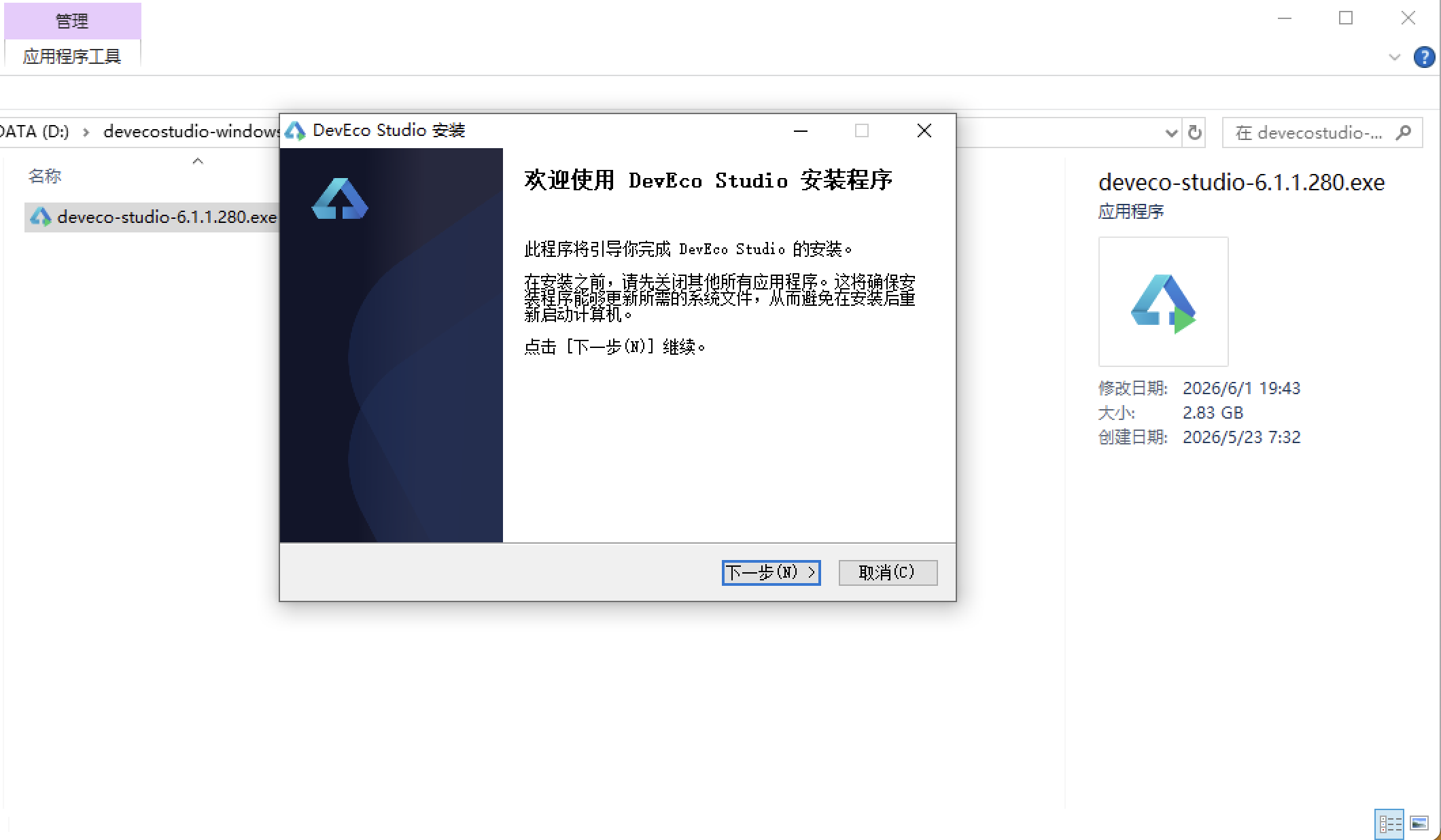
安装DevEco Studio程序
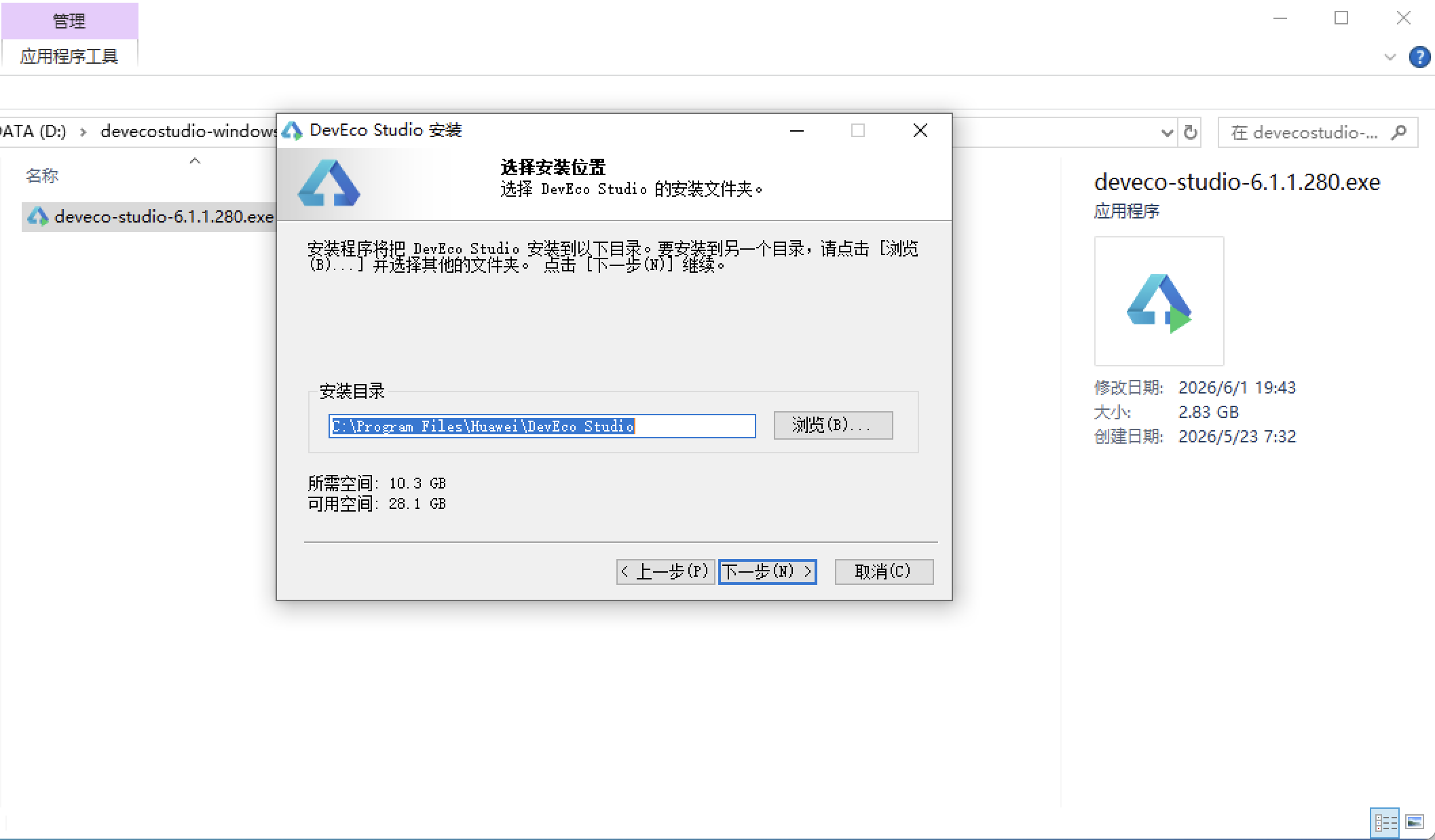
选择目标安装目录:
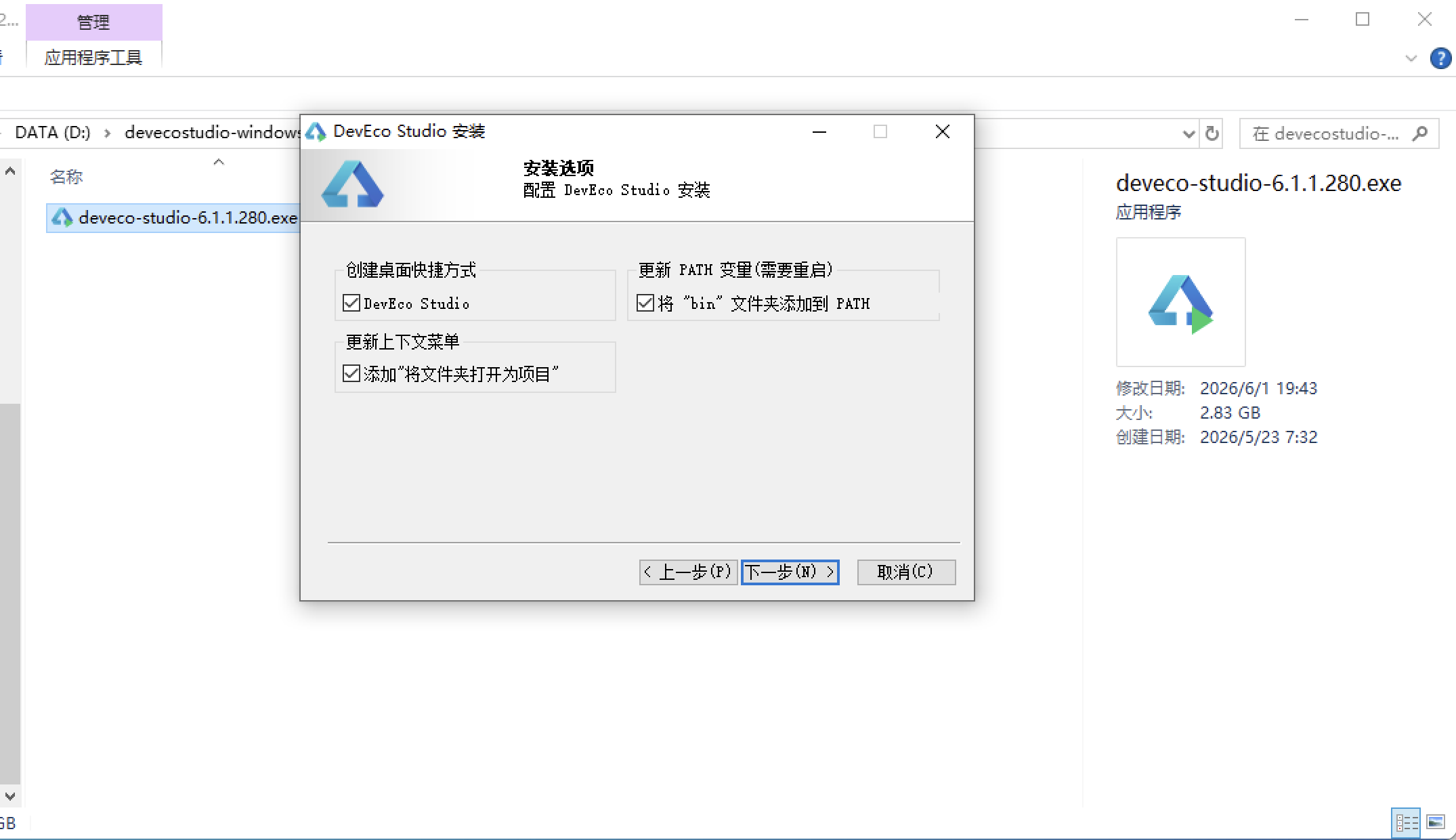
设置环境变量,但是需要重启一下:
新建一个空白模板:
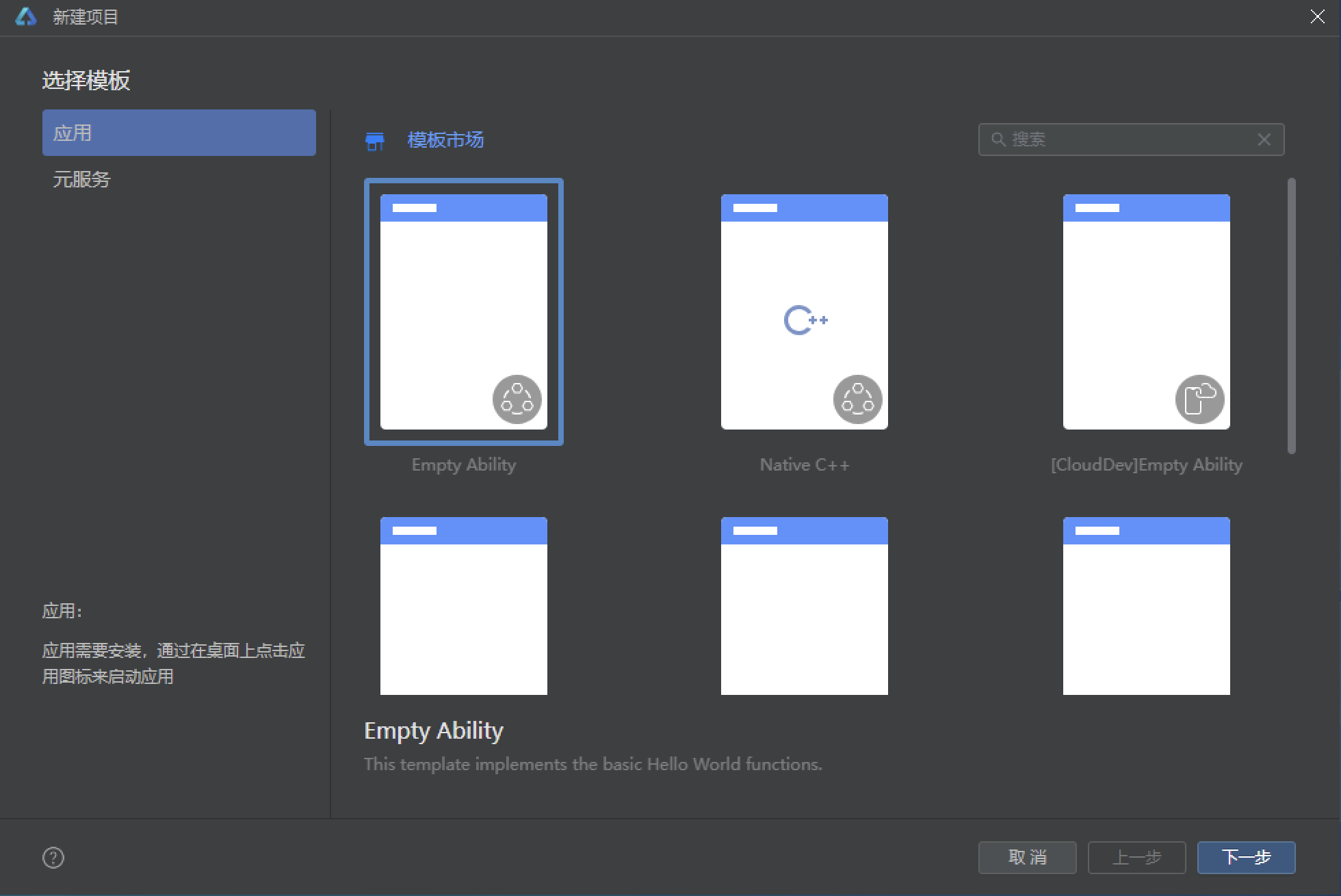
设置API为24的模板项目: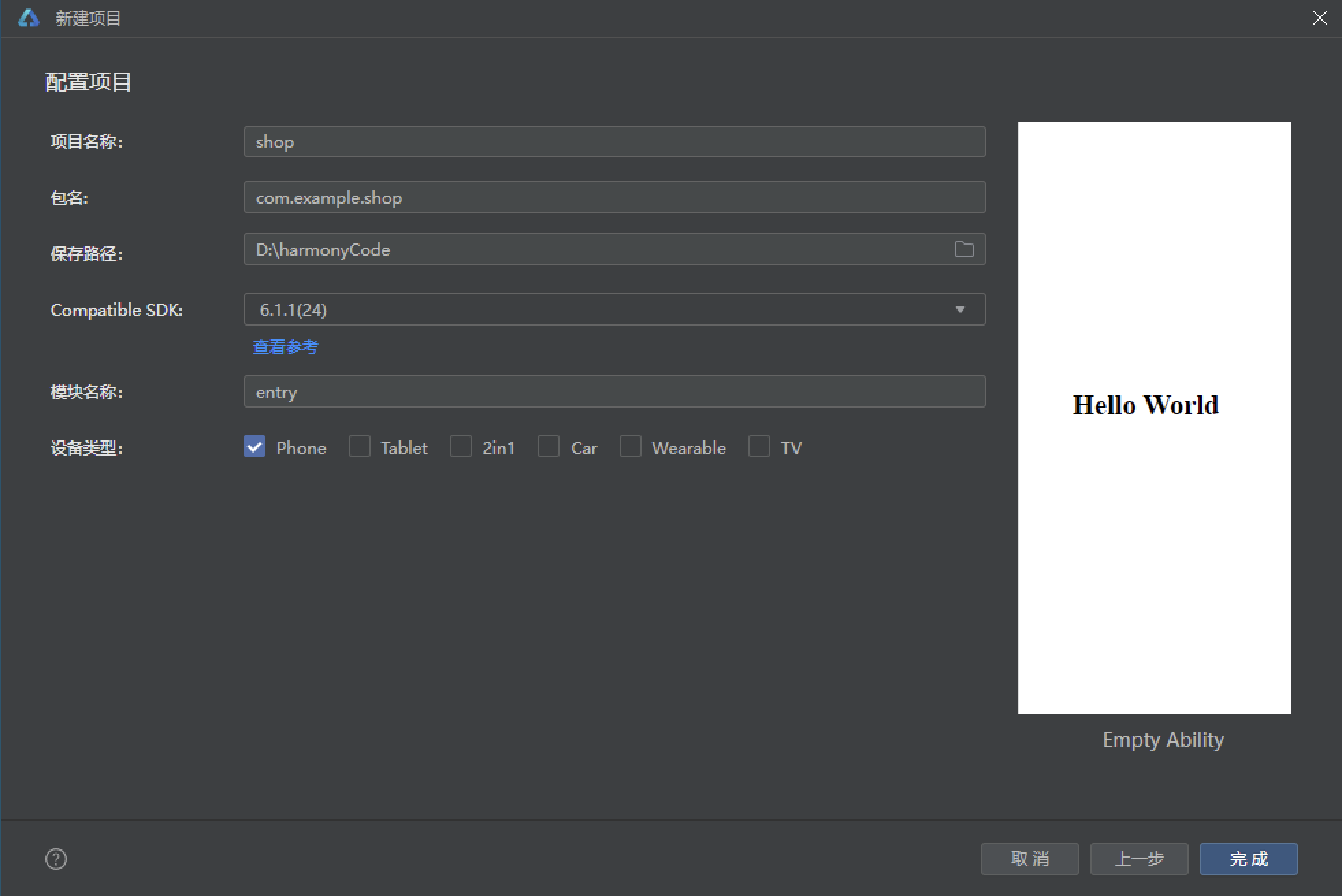
初始化项目,自动下载相关依赖:
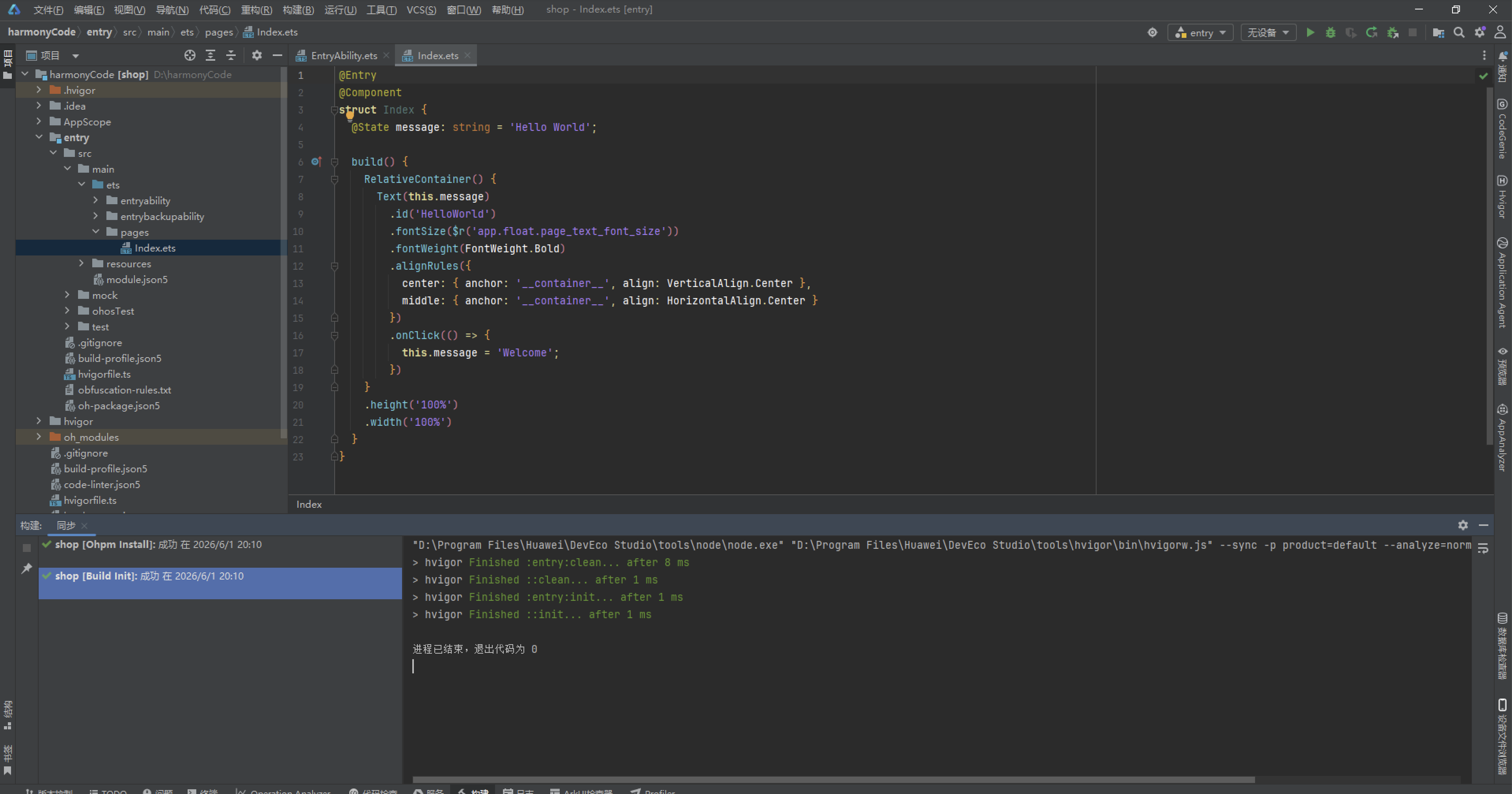
完整代码:
// 工业蓝灰风:bg #10161F / 面板 #1A2432 / 钢蓝 #3B82F6 / 信号绿 #22C55E / 警示橙 #F59E0B / 灯白 #E2E8F0
interface FeedItem {
id: number
name: string
avatar: string
time: string
content: string
likes: number
comments: number
}
interface ShiftItem {
id: number
name: string
kind: string
hours: number
heat: number
level: number
state: number
}
interface ClockItem {
id: number
name: string
title: string
fans: number
watch: number
state: number
}
interface SwapItem {
id: number
name: string
teacher: string
lessons: number
quota: number
state: number
}
interface CrewItem {
id: number
name: string
field: string
honor: number
quota: number
state: number
}
interface MyItem {
id: number
name: string
tag: string
time: string
}
const FEEDS: FeedItem[] = [
{ id: 1, name: '冲压车间老周', avatar: '⚙️', time: '10分钟前', content: '三号线换模只用了 18 分钟,班组 Wiki 已更新换模流程图,新来的兄弟照着做,别再单手拆螺栓了!', likes: 423, comments: 67 },
{ id: 2, name: '装配班长小郑', avatar: '🔩', time: '32分钟前', content: '本周装配直通率 98.6%,比上周涨了 0.4 个点,班组奖励奶茶已申请,下周一发放在车间门口。', likes: 386, comments: 52 },
{ id: 3, name: '质检一姐阿芳', avatar: '🔍', time: '1小时前', content: '发现一批外壳螺纹偏移 0.02mm,已拦截隔离,大家今天装这批件之前先看首检单,别装一半才发现。', likes: 458, comments: 81 },
{ id: 4, name: '电工大刘', avatar: '⚡', time: '2小时前', content: '二车间照明改造完成,全部换成 LED 工矿灯,车间亮度提升 40%,夜班的兄弟眼睛终于不酸了。', likes: 342, comments: 45 },
{ id: 5, name: '仓储管家芳姐', avatar: '📦', time: '4小时前', content: 'A 区货架完成了第三次目视化改造,每层贴了对应的库位码,找料时间从 8 分钟降到 2 分钟。', likes: 311, comments: 38 },
{ id: 6, name: '焊工阿强', avatar: '🔥', time: '6小时前', content: '氩弧焊立焊一次成型心得:电流 120A、角度 75 度、走枪匀速,这三个参数调好,鱼纹想不好看都难。', likes: 475, comments: 72 },
{ id: 7, name: '维修组老范', avatar: '🔧', time: '昨天', content: '注塑机报警代码 E-07 排查口诀:先看料筒温度,再查液压油位,最后看滤网,90% 的问题出在滤网。', likes: 367, comments: 59 },
{ id: 8, name: '安环专员小敏', avatar: '🦺', time: '昨天', content: '本月安全生产 200 天达成!劳保穿戴抽检合格率 100%,下周三全员消防演练,请各班组排好班。', likes: 512, comments: 88 }
]
const SHIFTS: ShiftItem[] = [
{ id: 1, name: '冲压甲班白班', kind: '冲压', hours: 8, heat: 98, level: 1, state: 0 },
{ id: 2, name: '装配乙班中班', kind: '装配', hours: 8, heat: 95, level: 2, state: 0 },
{ id: 3, name: '焊接丙班夜班', kind: '焊接', hours: 10, heat: 93, level: 2, state: 0 },
{ id: 4, name: '注塑甲班白班', kind: '注塑', hours: 8, heat: 91, level: 1, state: 0 },
{ id: 5, name: '质检巡检班', kind: '质检', hours: 8, heat: 89, level: 1, state: 0 },
{ id: 6, name: '喷涂乙班夜班', kind: '喷涂', hours: 9, heat: 96, level: 3, state: 0 },
{ id: 7, name: '维修待命班', kind: '维修', hours: 12, heat: 88, level: 3, state: 0 },
{ id: 8, name: '包装甲班白班', kind: '包装', hours: 8, heat: 90, level: 1, state: 0 },
{ id: 9, name: '仓储收发货班', kind: '仓储', hours: 8, heat: 87, level: 2, state: 0 },
{ id: 10, name: 'SMT 贴片夜班', kind: 'SMT', hours: 10, heat: 92, level: 2, state: 0 }
]
const CLOCKS: ClockItem[] = [
{ id: 1, name: '冲压车间老周', title: '三号线设备巡检直播中', fans: 3200, watch: 820000, state: 0 },
{ id: 2, name: '装配班长小郑', title: '装配节拍改善实录', fans: 2100, watch: 660000, state: 0 },
{ id: 3, name: '焊工阿强', title: '氩弧焊立焊手法演示', fans: 1800, watch: 540000, state: 0 },
{ id: 4, name: '质检一姐阿芳', title: '首检流程在线答疑', fans: 1400, watch: 430000, state: 0 },
{ id: 5, name: '电工大刘', title: '电路故障排查专场', fans: 2600, watch: 710000, state: 0 },
{ id: 6, name: '维修组老范', title: '注塑机维修教学回放', fans: 950, watch: 320000, state: 1 },
{ id: 7, name: '仓储管家芳姐', title: '库位目视化管理回放', fans: 760, watch: 280000, state: 1 },
{ id: 8, name: '安环专员小敏', title: '消防演练示范直播', fans: 1100, watch: 370000, state: 0 }
]
const SWAPS: SwapItem[] = [
{ id: 1, name: '换班申请 #2201', teacher: '老周 ⇄ 老范', lessons: 3, quota: 2, state: 0 },
{ id: 2, name: '换班申请 #2202', teacher: '阿强 ⇄ 大刘', lessons: 4, quota: 1, state: 0 },
{ id: 3, name: '换班申请 #2203', teacher: '阿芳 ⇄ 小敏', lessons: 2, quota: 0, state: 1 },
{ id: 4, name: '换班申请 #2204', teacher: '小郑 ⇄ 阿龙', lessons: 3, quota: 3, state: 0 },
{ id: 5, name: '换班申请 #2205', teacher: '芳姐 ⇄ 小何', lessons: 4, quota: 2, state: 0 },
{ id: 6, name: '换班申请 #2206', teacher: '老范 ⇄ 老周', lessons: 5, quota: 0, state: 1 },
{ id: 7, name: '换班申请 #2207', teacher: '大刘 ⇄ 阿强', lessons: 2, quota: 4, state: 0 },
{ id: 8, name: '换班申请 #2208', teacher: '小敏 ⇄ 阿芳', lessons: 3, quota: 2, state: 0 }
]
const CREWS: CrewItem[] = [
{ id: 1, name: '冲压甲班', field: '人均产出', honor: 98, quota: 6, state: 0 },
{ id: 2, name: '装配乙班', field: '直通率', honor: 96, quota: 8, state: 0 },
{ id: 3, name: '焊接丙班', field: '焊缝合格', honor: 95, quota: 0, state: 1 },
{ id: 4, name: '注塑甲班', field: '稳定运转', honor: 93, quota: 5, state: 0 },
{ id: 5, name: 'SMT 夜班', field: '贴片精度', honor: 92, quota: 7, state: 0 },
{ id: 6, name: '喷涂乙班', field: '膜厚控制', honor: 90, quota: 0, state: 1 },
{ id: 7, name: '包装甲班', field: '出货准时', honor: 89, quota: 9, state: 0 },
{ id: 8, name: '维修组', field: '响应速度', honor: 94, quota: 4, state: 0 }
]
const MYS: MyItem[] = [
{ id: 1, name: '三号线换模流程图', tag: '冲压', time: '收藏于 08-25' },
{ id: 2, name: '氩弧焊立焊参数表', tag: '焊接', time: '收藏于 08-23' },
{ id: 3, name: 'E-07 报警排查口诀', tag: '维修', time: '收藏于 08-20' },
{ id: 4, name: '库位目视化管理图', tag: '仓储', time: '收藏于 08-17' },
{ id: 5, name: '首检单填写规范', tag: '质检', time: '收藏于 08-14' },
{ id: 6, name: '劳保穿戴标准图解', tag: '安环', time: '收藏于 08-11' },
{ id: 7, name: 'LED 工矿灯清单', tag: '电工', time: '收藏于 08-08' },
{ id: 8, name: '消防演练排班表', tag: '安环', time: '收藏于 08-05' }
]
const HEAT: number[] = [6, 9, 8, 7, 10, 9, 11, 8]
const CATS: string[] = ['全部', '冲压', '装配', '焊接', '注塑', '质检']
function heatBar(v: number): string {
return (12 + v * 4) + 'vp'
}
function playsText(p: number): string {
if (p >= 10000) {
return (p / 10000).toFixed(1) + '万'
}
return p.toString()
}
function shiftStateText(s: number): string {
if (s === 0) {
return '排班中'
}
return '已封班'
}
function shiftStateColor(s: number): string {
if (s === 0) {
return '#3B82F6'
}
return '#64748B'
}
function clockStateText(s: number): string {
if (s === 0) {
return '巡检中'
}
return '已结束'
}
function clockStateColor(s: number): string {
if (s === 0) {
return '#22C55E'
}
return '#64748B'
}
function swapStateText(s: number): string {
if (s === 0) {
return '待审批'
}
return '已通过'
}
function swapStateColor(s: number): string {
if (s === 0) {
return '#F59E0B'
}
return '#64748B'
}
function crewStateText(s: number): string {
if (s === 0) {
return '可挑战'
}
return '已满员'
}
function crewStateColor(s: number): string {
if (s === 0) {
return '#3B82F6'
}
return '#64748B'
}
function trendText(t: number): string {
if (t >= 0) {
return '↑' + t + '%'
}
return '↓' + (-t) + '%'
}
function trendColor(t: number): string {
if (t >= 0) {
return '#22C55E'
}
return '#F87171'
}
function buildFeed(id: number, name: string, avatar: string, content: string): FeedItem {
return { id: id, name: name, avatar: avatar, time: '刚刚', content: content, likes: 0, comments: 0 }
}
function buildMy(id: number, name: string, tag: string): MyItem {
return { id: id, name: name, tag: tag, time: '收藏于今天' }
}
function buildShift(id: number, name: string, kind: string, hours: number): ShiftItem {
return { id: id, name: name, kind: kind, hours: hours, heat: 60, level: 1, state: 0 }
}
function buildClock(id: number, name: string, title: string): ClockItem {
return { id: id, name: name, title: title, fans: 100, watch: 5000, state: 0 }
}
function buildSwap(id: number, name: string, teacher: string): SwapItem {
return { id: id, name: name, teacher: teacher, lessons: 2, quota: 2, state: 0 }
}
function buildCrew(id: number, name: string, field: string): CrewItem {
return { id: id, name: name, field: field, honor: 85, quota: 5, state: 0 }
}
function buildSwapVote(cur: SwapItem): SwapItem {
if (cur.quota > 0) {
const left: number = cur.quota - 1
return {
id: cur.id, name: cur.name, teacher: cur.teacher, lessons: cur.lessons,
quota: left, state: left === 0 ? 1 : cur.state
}
}
return cur
}
@Entry
@Component
struct Index {
@State currentTab: number = 0
@State catSel: number = 0
@State feeds: FeedItem[] = FEEDS
@State shifts: ShiftItem[] = SHIFTS
@State clocks: ClockItem[] = CLOCKS
@State swaps: SwapItem[] = SWAPS
@State crews: CrewItem[] = CREWS
@State mys: MyItem[] = MYS
@State showFeedDetail: boolean = false
@State pickedFeed: FeedItem = FEEDS[0]
@State showFeedAdd: boolean = false
@State newFeedContent: string = ''
@State showShiftDetail: boolean = false
@State pickedShift: ShiftItem = SHIFTS[0]
@State showShiftEdit: boolean = false
@State newShiftName: string = ''
@State newShiftHours: string = ''
@State showClockRule: boolean = false
@State showClockDetail: boolean = false
@State pickedClock: ClockItem = CLOCKS[0]
@State showClockAdd: boolean = false
@State newClockTitle: string = ''
@State showSwapDetail: boolean = false
@State pickedSwap: SwapItem = SWAPS[0]
@State showSwapVote: boolean = false
@State showCrewRule: boolean = false
@State showCrewDetail: boolean = false
@State pickedCrew: CrewItem = CREWS[0]
@State showCrewSign: boolean = false
@State showCrewQuit: boolean = false
@State showMyRemove: boolean = false
@State pickedMy: MyItem = MYS[0]
@State showMyName: boolean = false
@State newName: string = ''
@State showMyCache: boolean = false
@State showMyExit: boolean = false
@Builder
tabItem(icon: string, label: string, tab: number) {
Column({ space: 3 }) {
Text(icon)
.fontSize(20)
Text(label)
.fontSize(10)
.fontColor(this.currentTab === tab ? '#3B82F6' : '#64748B')
}
.width('100%')
.height('100%')
.justifyContent(FlexAlign.Center)
.onClick(() => {
this.currentTab = tab
})
.scale(this.currentTab === tab ? { x: 1.12, y: 1.12 } : { x: 1, y: 1 })
.animation({ duration: 200, curve: Curve.EaseOut })
}
build() {
Stack() {
Column() {
// ===== 头部:工业钢蓝横幅 =====
Column() {
Row() {
Text('⚙️')
.fontSize(20)
Text('SHIFT WORKS')
.fontSize(15)
.fontWeight(FontWeight.Bold)
.fontColor('#E2E8F0')
.margin({ left: 8 })
Text('').layoutWeight(1)
Text('🔔')
.fontSize(18)
Text('🔎')
.fontSize(18)
.margin({ left: 12 })
}
.width('100%')
.padding({ left: 16, right: 16, top: 12, bottom: 10 })
// 钢蓝横幅
Column({ space: 6 }) {
Row() {
Text('🏭 今日 12 个班组在产')
.fontSize(11)
.fontColor('#E2E8F0')
.backgroundColor('rgba(59,130,246,0.35)')
.borderRadius(20)
.padding({ left: 10, right: 10, top: 3, bottom: 3 })
Text('').layoutWeight(1)
Text('🟢 在岗 1246 人')
.fontSize(11)
.fontColor('#22C55E')
}
.width('100%')
Text('工厂班组排班站')
.fontSize(26)
.fontWeight(FontWeight.Bold)
.fontColor('#E2E8F0')
.letterSpacing(2)
Text('SHIFT WORKS · 排班打卡一步到位')
.fontSize(11)
.fontColor('#3B82F6')
.letterSpacing(1)
// 齿轮符号带
Row() {
ForEach([13, 17, 11, 19, 14, 12, 18, 15, 16, 13], (s: number, i: number) => {
Text(i % 2 === 0 ? '⚙' : '▸')
.fontSize(s)
.fontColor(i % 3 === 0 ? '#3B82F6' : (i % 3 === 1 ? '#22C55E' : '#F59E0B'))
.opacity(0.7)
}, (s: number, i: number) => 'gear' + i)
}
.width('100%')
.justifyContent(FlexAlign.SpaceBetween)
.padding({ left: 20, right: 20 })
// 搜索胶囊
Row() {
Text('🔍')
.fontSize(14)
Text('搜索班次、打卡、换班、班组')
.fontSize(13)
.fontColor('#64748B')
.margin({ left: 6 })
}
.width('90%')
.height(38)
.backgroundColor('rgba(226,232,240,0.12)')
.borderRadius(19)
.padding({ left: 14 })
.alignItems(VerticalAlign.Center)
}
.width('100%')
.padding({ left: 16, right: 16, top: 12, bottom: 14 })
.linearGradient({
angle: 180,
colors: [['#16202E', 0.0], ['#1A2A42', 0.55], ['#10161F', 1.0]]
})
}
.width('100%')
.backgroundColor('#10161F')
// ===== 内容区 =====
Column() {
if (this.currentTab === 0) {
HomeContent({
feeds: this.feeds,
heat: HEAT,
catSelLink: $catSel,
showFeedDetail: (item: FeedItem) => {
this.pickedFeed = item
this.showFeedDetail = true
},
showFeedAdd: () => {
this.showFeedAdd = true
}
})
}
if (this.currentTab === 1) {
ShiftContent({
shifts: this.shifts,
sel: this.catSel,
showShiftDetail: (item: ShiftItem) => {
this.pickedShift = item
this.showShiftDetail = true
},
showShiftEdit: (item: ShiftItem) => {
this.pickedShift = item
this.newShiftName = item.name
this.newShiftHours = item.hours.toString()
this.showShiftEdit = true
}
})
}
if (this.currentTab === 2) {
ClockContent({
clocks: this.clocks,
showClockRule: () => {
this.showClockRule = true
},
showClockDetail: (item: ClockItem) => {
this.pickedClock = item
this.showClockDetail = true
},
showClockAdd: () => {
this.showClockAdd = true
}
})
}
if (this.currentTab === 3) {
SwapContent({
swaps: this.swaps,
showSwapDetail: (item: SwapItem) => {
this.pickedSwap = item
this.showSwapDetail = true
},
showSwapVote: (item: SwapItem) => {
this.pickedSwap = item
this.showSwapVote = true
}
})
}
if (this.currentTab === 4) {
CrewContent({
crews: this.crews,
showCrewRule: () => {
this.showCrewRule = true
},
showCrewDetail: (item: CrewItem) => {
this.pickedCrew = item
this.showCrewDetail = true
},
showCrewSign: (item: CrewItem) => {
this.pickedCrew = item
this.showCrewSign = true
},
showCrewQuit: (item: CrewItem) => {
this.pickedCrew = item
this.showCrewQuit = true
}
})
}
if (this.currentTab === 5) {
MeContent({
mys: this.mys,
showMyRemove: (item: MyItem) => {
this.pickedMy = item
this.showMyRemove = true
},
showMyName: () => {
this.showMyName = true
},
showMyCache: () => {
this.showMyCache = true
},
showMyExit: () => {
this.showMyExit = true
}
})
}
}
.width('100%')
.layoutWeight(1)
// ===== 底部 tab 栏 =====
Row() {
this.tabItem('🏭', '首页', 0)
this.tabItem('📋', '排班', 1)
this.tabItem('⏱️', '打卡', 2)
this.tabItem('🔁', '换班', 3)
this.tabItem('🏆', '班组榜', 4)
this.tabItem('👷', '我的', 5)
}
.width('100%')
.height(56)
.backgroundColor('#1A2432')
.border({ width: { top: 1 }, color: '#2A3A4E' })
}
.width('100%')
.height('100%')
// ===== 弹窗层 =====
if (this.showFeedDetail) {
this.feedDetailOverlay(this.pickedFeed, () => {
this.showFeedDetail = false
})
}
if (this.showFeedAdd) {
this.feedAddOverlay(() => {
this.showFeedAdd = false
})
}
if (this.showShiftDetail) {
this.shiftDetailOverlay(this.pickedShift, () => {
this.showShiftDetail = false
})
}
if (this.showShiftEdit) {
this.shiftEditOverlay(this.pickedShift, () => {
this.showShiftEdit = false
})
}
if (this.showClockRule) {
this.clockRuleOverlay(() => {
this.showClockRule = false
})
}
if (this.showClockDetail) {
this.clockDetailOverlay(this.pickedClock, () => {
this.showClockDetail = false
})
}
if (this.showClockAdd) {
this.clockAddOverlay(() => {
this.showClockAdd = false
})
}
if (this.showSwapDetail) {
this.swapDetailOverlay(this.pickedSwap, () => {
this.showSwapDetail = false
})
}
if (this.showSwapVote) {
this.swapVoteOverlay(this.pickedSwap, () => {
this.showSwapVote = false
})
}
if (this.showCrewRule) {
this.crewRuleOverlay(() => {
this.showCrewRule = false
})
}
if (this.showCrewDetail) {
this.crewDetailOverlay(this.pickedCrew, () => {
this.showCrewDetail = false
})
}
if (this.showCrewSign) {
this.crewSignOverlay(this.pickedCrew, () => {
this.showCrewSign = false
})
}
if (this.showCrewQuit) {
this.crewQuitOverlay(this.pickedCrew, () => {
this.showCrewQuit = false
})
}
if (this.showMyRemove) {
this.myRemoveOverlay(this.pickedMy, () => {
this.showMyRemove = false
})
}
if (this.showMyName) {
this.myNameOverlay(() => {
this.showMyName = false
})
}
if (this.showMyCache) {
this.myCacheOverlay(() => {
this.showMyCache = false
})
}
if (this.showMyExit) {
this.myExitOverlay(() => {
this.showMyExit = false
})
}
}
.width('100%')
.height('100%')
.backgroundColor('#10161F')
}
// ===== 弹窗 1:动态详情 =====
@Builder
feedDetailOverlay(item: FeedItem, onClose: () => void) {
Column() {
Column({ space: 10 }) {
Row() {
Text(item.avatar)
.fontSize(30)
Column({ space: 2 }) {
Text(item.name)
.fontSize(14)
.fontWeight(FontWeight.Bold)
.fontColor('#E2E8F0')
Text(item.time)
.fontSize(11)
.fontColor('#64748B')
}
.alignItems(HorizontalAlign.Start)
.margin({ left: 10 })
Text('').layoutWeight(1)
Text('✕')
.fontSize(18)
.fontColor('#64748B')
.onClick(() => {
onClose()
})
}
.width('100%')
Text(item.content)
.fontSize(13)
.fontColor('#94A3B8')
.lineHeight(20)
Divider()
.strokeWidth(0.5)
.color('#2A3A4E')
Row() {
Text('👍 ' + item.likes)
.fontSize(13)
.fontColor('#3B82F6')
Text('💬 ' + item.comments)
.fontSize(13)
.fontColor('#64748B')
.margin({ left: 20 })
Text('').layoutWeight(1)
Text('班组动态 #' + item.id)
.fontSize(11)
.fontColor('#64748B')
}
.width('100%')
}
.width('86%')
.padding(18)
.backgroundColor('#1A2432')
.borderRadius(12)
.border({ width: 1, color: '#3B82F6' })
}
.width('100%')
.height('100%')
.backgroundColor('rgba(5,8,13,0.72)')
.justifyContent(FlexAlign.Center)
.onClick(() => {
onClose()
})
}
// ===== 弹窗 2:发布动态新增 =====
@Builder
feedAddOverlay(onClose: () => void) {
Column() {
Column({ space: 12 }) {
Text('发布班组动态')
.fontSize(16)
.fontWeight(FontWeight.Bold)
.fontColor('#E2E8F0')
.width('100%')
TextArea({ text: this.newFeedContent, placeholder: '分享今天的改善提案、设备妙招、安全提醒...' })
.height(96)
.fontSize(13)
.fontColor('#E2E8F0')
.placeholderColor('#64748B')
.backgroundColor('#10161F')
.borderRadius(8)
.padding(10)
.onChange((v: string) => {
this.newFeedContent = v
})
Row({ space: 10 }) {
Text('取消')
.fontSize(14)
.fontColor('#64748B')
.textAlign(TextAlign.Center)
.width('46%')
.height(40)
.backgroundColor('#10161F')
.borderRadius(6)
.onClick(() => {
onClose()
})
Text('发布')
.fontSize(14)
.fontColor('#E2E8F0')
.textAlign(TextAlign.Center)
.width('46%')
.height(40)
.backgroundColor('#3B82F6')
.borderRadius(6)
.onClick(() => {
if (this.newFeedContent.length > 0) {
this.feeds = [buildFeed(this.feeds.length + 1, '我', '👷', this.newFeedContent), ...this.feeds]
this.newFeedContent = ''
}
onClose()
})
}
.width('100%')
.justifyContent(FlexAlign.Center)
}
.width('86%')
.padding(18)
.backgroundColor('#1A2432')
.borderRadius(12)
.border({ width: 1, color: '#3B82F6' })
}
.width('100%')
.height('100%')
.backgroundColor('rgba(5,8,13,0.72)')
.justifyContent(FlexAlign.Center)
.onClick(() => {
onClose()
})
}
// ===== 弹窗 3:班次详情 =====
@Builder
shiftDetailOverlay(item: ShiftItem, onClose: () => void) {
Column() {
Column({ space: 10 }) {
Text('班次详情')
.fontSize(16)
.fontWeight(FontWeight.Bold)
.fontColor('#E2E8F0')
.width('100%')
Divider()
.strokeWidth(0.5)
.color('#2A3A4E')
Row() {
Text('班次名称')
.fontSize(13)
.fontColor('#64748B')
Text('').layoutWeight(1)
Text(item.name)
.fontSize(13)
.fontColor('#E2E8F0')
}
.width('100%')
Row() {
Text('所属工序')
.fontSize(13)
.fontColor('#64748B')
Text('').layoutWeight(1)
Text(item.kind)
.fontSize(13)
.fontColor('#22C55E')
}
.width('100%')
Row() {
Text('班时长度')
.fontSize(13)
.fontColor('#64748B')
Text('').layoutWeight(1)
Text(item.hours + ' 小时')
.fontSize(13)
.fontColor('#F59E0B')
}
.width('100%')
Row() {
Text('热度指数')
.fontSize(13)
.fontColor('#64748B')
Text('').layoutWeight(1)
Text(item.heat + ' 分')
.fontSize(13)
.fontColor('#3B82F6')
}
.width('100%')
Row() {
Text('当前状态')
.fontSize(13)
.fontColor('#64748B')
Text('').layoutWeight(1)
Text(shiftStateText(item.state))
.fontSize(13)
.fontColor(shiftStateColor(item.state))
}
.width('100%')
Text('知道了')
.fontSize(14)
.fontColor('#E2E8F0')
.textAlign(TextAlign.Center)
.width('100%')
.height(40)
.backgroundColor('#3B82F6')
.borderRadius(6)
.onClick(() => {
onClose()
})
}
.width('86%')
.padding(18)
.backgroundColor('#1A2432')
.borderRadius(12)
.border({ width: 1, color: '#3B82F6' })
}
.width('100%')
.height('100%')
.backgroundColor('rgba(5,8,13,0.72)')
.justifyContent(FlexAlign.Center)
.onClick(() => {
onClose()
})
}
// ===== 弹窗 4:班次信息编辑 =====
@Builder
shiftEditOverlay(item: ShiftItem, onClose: () => void) {
Column() {
Column({ space: 12 }) {
Text('编辑班次信息')
.fontSize(16)
.fontWeight(FontWeight.Bold)
.fontColor('#E2E8F0')
.width('100%')
Column({ space: 4 }) {
Text('班次名称')
.fontSize(12)
.fontColor('#64748B')
.width('100%')
TextInput({ text: this.newShiftName, placeholder: '输入班次名称' })
.height(40)
.fontSize(13)
.fontColor('#E2E8F0')
.placeholderColor('#64748B')
.backgroundColor('#10161F')
.borderRadius(6)
.padding({ left: 10, right: 10 })
.onChange((v: string) => {
this.newShiftName = v
})
}
.width('100%')
Column({ space: 4 }) {
Text('班时长度(小时)')
.fontSize(12)
.fontColor('#64748B')
.width('100%')
TextInput({ text: this.newShiftHours, placeholder: '输入班时小时数' })
.height(40)
.fontSize(13)
.fontColor('#E2E8F0')
.placeholderColor('#64748B')
.backgroundColor('#10161F')
.borderRadius(6)
.padding({ left: 10, right: 10 })
.onChange((v: string) => {
this.newShiftHours = v
})
}
.width('100%')
Row({ space: 10 }) {
Text('取消')
.fontSize(14)
.fontColor('#64748B')
.textAlign(TextAlign.Center)
.width('46%')
.height(40)
.backgroundColor('#10161F')
.borderRadius(6)
.onClick(() => {
onClose()
})
Text('保存')
.fontSize(14)
.fontColor('#E2E8F0')
.textAlign(TextAlign.Center)
.width('46%')
.height(40)
.backgroundColor('#22C55E')
.borderRadius(6)
.onClick(() => {
const h: number = parseInt(this.newShiftHours)
if (this.newShiftName.length > 0 && h > 0) {
const idx: number = this.shifts.findIndex((s: ShiftItem) => s.id === item.id)
if (idx >= 0) {
this.shifts.splice(idx, 1, {
id: item.id, name: this.newShiftName, kind: item.kind,
hours: h, heat: item.heat, level: item.level, state: item.state
})
}
}
onClose()
})
}
.width('100%')
.justifyContent(FlexAlign.Center)
}
.width('86%')
.padding(18)
.backgroundColor('#1A2432')
.borderRadius(12)
.border({ width: 1, color: '#22C55E' })
}
.width('100%')
.height('100%')
.backgroundColor('rgba(5,8,13,0.72)')
.justifyContent(FlexAlign.Center)
.onClick(() => {
onClose()
})
}
// ===== 弹窗 5:打卡规则 =====
@Builder
clockRuleOverlay(onClose: () => void) {
Column() {
Column({ space: 10 }) {
Text('打卡与巡检规则')
.fontSize(16)
.fontWeight(FontWeight.Bold)
.fontColor('#E2E8F0')
.width('100%')
Divider()
.strokeWidth(0.5)
.color('#2A3A4E')
Text('1. 白班 07:30 前打卡上岗,夜班 19:30 前打卡上岗,迟到 10 分钟内记提醒一次。')
.fontSize(12)
.fontColor('#94A3B8')
.lineHeight(18)
.width('100%')
Text('2. 巡检打卡需在指定工位扫码完成,每个巡检点间隔不小于 40 分钟。')
.fontSize(12)
.fontColor('#94A3B8')
.lineHeight(18)
.width('100%')
Text('3. 漏卡可发起补卡申请,每月补卡次数不超过 3 次,需班组长线上确认。')
.fontSize(12)
.fontColor('#94A3B8')
.lineHeight(18)
.width('100%')
Text('4. 连续 30 天全勤,额外发放全勤奖 300 元并入班组积分。')
.fontSize(12)
.fontColor('#94A3B8')
.lineHeight(18)
.width('100%')
Text('知道了')
.fontSize(14)
.fontColor('#E2E8F0')
.textAlign(TextAlign.Center)
.width('100%')
.height(40)
.backgroundColor('#3B82F6')
.borderRadius(6)
.onClick(() => {
onClose()
})
}
.width('86%')
.padding(18)
.backgroundColor('#1A2432')
.borderRadius(12)
.border({ width: 1, color: '#F59E0B' })
}
.width('100%')
.height('100%')
.backgroundColor('rgba(5,8,13,0.72)')
.justifyContent(FlexAlign.Center)
.onClick(() => {
onClose()
})
}
// ===== 弹窗 6:巡检打卡详情 =====
@Builder
clockDetailOverlay(item: ClockItem, onClose: () => void) {
Column() {
Column({ space: 10 }) {
Row() {
Text('🦺')
.fontSize(30)
Column({ space: 2 }) {
Text(item.name)
.fontSize(14)
.fontWeight(FontWeight.Bold)
.fontColor('#E2E8F0')
Text(item.title)
.fontSize(11)
.fontColor('#64748B')
}
.alignItems(HorizontalAlign.Start)
.margin({ left: 10 })
Text('').layoutWeight(1)
Text('✕')
.fontSize(18)
.fontColor('#64748B')
.onClick(() => {
onClose()
})
}
.width('100%')
Row() {
Text('围观工友')
.fontSize(13)
.fontColor('#64748B')
Text('').layoutWeight(1)
Text(playsText(item.watch) + ' 人次')
.fontSize(13)
.fontColor('#F59E0B')
}
.width('100%')
Row() {
Text('在岗粉丝')
.fontSize(13)
.fontColor('#64748B')
Text('').layoutWeight(1)
Text(item.fans + ' 人')
.fontSize(13)
.fontColor('#3B82F6')
}
.width('100%')
Row() {
Text('状态')
.fontSize(13)
.fontColor('#64748B')
Text('').layoutWeight(1)
Text(clockStateText(item.state))
.fontSize(13)
.fontColor(clockStateColor(item.state))
}
.width('100%')
Text(item.state === 0 ? '进入围观' : '看回放')
.fontSize(14)
.fontColor('#E2E8F0')
.textAlign(TextAlign.Center)
.width('100%')
.height(40)
.backgroundColor('#22C55E')
.borderRadius(6)
.onClick(() => {
onClose()
})
}
.width('86%')
.padding(18)
.backgroundColor('#1A2432')
.borderRadius(12)
.border({ width: 1, color: '#22C55E' })
}
.width('100%')
.height('100%')
.backgroundColor('rgba(5,8,13,0.72)')
.justifyContent(FlexAlign.Center)
.onClick(() => {
onClose()
})
}
// ===== 弹窗 7:补卡申请新增 =====
@Builder
clockAddOverlay(onClose: () => void) {
Column() {
Column({ space: 12 }) {
Text('发起补卡申请')
.fontSize(16)
.fontWeight(FontWeight.Bold)
.fontColor('#E2E8F0')
.width('100%')
Column({ space: 4 }) {
Text('补卡事由')
.fontSize(12)
.fontColor('#64748B')
.width('100%')
TextInput({ text: this.newClockTitle, placeholder: '如:门禁故障、出差外勤...' })
.height(40)
.fontSize(13)
.fontColor('#E2E8F0')
.placeholderColor('#64748B')
.backgroundColor('#10161F')
.borderRadius(6)
.padding({ left: 10, right: 10 })
.onChange((v: string) => {
this.newClockTitle = v
})
}
.width('100%')
Text('本月剩余补卡次数:2 次')
.fontSize(11)
.fontColor('#F59E0B')
.width('100%')
Row({ space: 10 }) {
Text('取消')
.fontSize(14)
.fontColor('#64748B')
.textAlign(TextAlign.Center)
.width('46%')
.height(40)
.backgroundColor('#10161F')
.borderRadius(6)
.onClick(() => {
onClose()
})
Text('提交申请')
.fontSize(14)
.fontColor('#E2E8F0')
.textAlign(TextAlign.Center)
.width('46%')
.height(40)
.backgroundColor('#3B82F6')
.borderRadius(6)
.onClick(() => {
if (this.newClockTitle.length > 0) {
this.clocks = [buildClock(this.clocks.length + 1, '我', this.newClockTitle), ...this.clocks]
this.newClockTitle = ''
}
onClose()
})
}
.width('100%')
.justifyContent(FlexAlign.Center)
}
.width('86%')
.padding(18)
.backgroundColor('#1A2432')
.borderRadius(12)
.border({ width: 1, color: '#3B82F6' })
}
.width('100%')
.height('100%')
.backgroundColor('rgba(5,8,13,0.72)')
.justifyContent(FlexAlign.Center)
.onClick(() => {
onClose()
})
}
// ===== 弹窗 8:换班详情 =====
@Builder
swapDetailOverlay(item: SwapItem, onClose: () => void) {
Column() {
Column({ space: 10 }) {
Text('换班申请详情')
.fontSize(16)
.fontWeight(FontWeight.Bold)
.fontColor('#E2E8F0')
.width('100%')
Divider()
.strokeWidth(0.5)
.color('#2A3A4E')
Row() {
Text('申请单号')
.fontSize(13)
.fontColor('#64748B')
Text('').layoutWeight(1)
Text(item.name)
.fontSize(13)
.fontColor('#E2E8F0')
}
.width('100%')
Row() {
Text('换班双方')
.fontSize(13)
.fontColor('#64748B')
Text('').layoutWeight(1)
Text(item.teacher)
.fontSize(13)
.fontColor('#22C55E')
}
.width('100%')
Row() {
Text('涉及班次')
.fontSize(13)
.fontColor('#64748B')
Text('').layoutWeight(1)
Text(item.lessons + ' 个班次')
.fontSize(13)
.fontColor('#F59E0B')
}
.width('100%')
Row() {
Text('待确认人数')
.fontSize(13)
.fontColor('#64748B')
Text('').layoutWeight(1)
Text(item.quota + ' 人')
.fontSize(13)
.fontColor('#3B82F6')
}
.width('100%')
Row() {
Text('状态')
.fontSize(13)
.fontColor('#64748B')
Text('').layoutWeight(1)
Text(swapStateText(item.state))
.fontSize(13)
.fontColor(swapStateColor(item.state))
}
.width('100%')
Text('知道了')
.fontSize(14)
.fontColor('#E2E8F0')
.textAlign(TextAlign.Center)
.width('100%')
.height(40)
.backgroundColor('#F59E0B')
.borderRadius(6)
.onClick(() => {
onClose()
})
}
.width('86%')
.padding(18)
.backgroundColor('#1A2432')
.borderRadius(12)
.border({ width: 1, color: '#F59E0B' })
}
.width('100%')
.height('100%')
.backgroundColor('rgba(5,8,13,0.72)')
.justifyContent(FlexAlign.Center)
.onClick(() => {
onClose()
})
}
// ===== 弹窗 9:换班确认投票 =====
@Builder
swapVoteOverlay(item: SwapItem, onClose: () => void) {
Column() {
Column({ space: 12 }) {
Text('确认换班')
.fontSize(16)
.fontWeight(FontWeight.Bold)
.fontColor('#E2E8F0')
.width('100%')
Text('双方确认通过后,系统将自动调整排班表并通知车间主任备案,确认后不可撤回。')
.fontSize(12)
.fontColor('#94A3B8')
.lineHeight(18)
.width('100%')
Row() {
Text('待确认')
.fontSize(13)
.fontColor('#64748B')
Text('').layoutWeight(1)
Text(item.quota + ' 人')
.fontSize(13)
.fontColor('#F59E0B')
}
.width('100%')
Row({ space: 10 }) {
Text('取消')
.fontSize(14)
.fontColor('#64748B')
.textAlign(TextAlign.Center)
.width('46%')
.height(40)
.backgroundColor('#10161F')
.borderRadius(6)
.onClick(() => {
onClose()
})
Text('确认通过')
.fontSize(14)
.fontColor('#E2E8F0')
.textAlign(TextAlign.Center)
.width('46%')
.height(40)
.backgroundColor('#22C55E')
.borderRadius(6)
.onClick(() => {
const idx: number = this.swaps.findIndex((s: SwapItem) => s.id === item.id)
if (idx >= 0) {
this.swaps.splice(idx, 1, buildSwapVote(this.swaps[idx]))
}
onClose()
})
}
.width('100%')
.justifyContent(FlexAlign.Center)
}
.width('86%')
.padding(18)
.backgroundColor('#1A2432')
.borderRadius(12)
.border({ width: 1, color: '#22C55E' })
}
.width('100%')
.height('100%')
.backgroundColor('rgba(5,8,13,0.72)')
.justifyContent(FlexAlign.Center)
.onClick(() => {
onClose()
})
}
// ===== 弹窗 10:班组榜规则 =====
@Builder
crewRuleOverlay(onClose: () => void) {
Column() {
Column({ space: 10 }) {
Text('班组挑战榜规则')
.fontSize(16)
.fontWeight(FontWeight.Bold)
.fontColor('#E2E8F0')
.width('100%')
Divider()
.strokeWidth(0.5)
.color('#2A3A4E')
Text('1. 榜单按周结算,考核维度:人均产出、直通率、安全记录、改善提案四项加权。')
.fontSize(12)
.fontColor('#94A3B8')
.lineHeight(18)
.width('100%')
Text('2. 冠军班组奖励团建基金 2000 元,班组长记 A 档绩效。')
.fontSize(12)
.fontColor('#94A3B8')
.lineHeight(18)
.width('100%')
Text('3. 跨班组挑战需双方班组长发起,厂部主管见证,挑战名额有限。')
.fontSize(12)
.fontColor('#94A3B8')
.lineHeight(18)
.width('100%')
Text('4. 安全事故一票否决,当周榜单成绩清零。')
.fontSize(12)
.fontColor('#94A3B8')
.lineHeight(18)
.width('100%')
Text('知道了')
.fontSize(14)
.fontColor('#E2E8F0')
.textAlign(TextAlign.Center)
.width('100%')
.height(40)
.backgroundColor('#3B82F6')
.borderRadius(6)
.onClick(() => {
onClose()
})
}
.width('86%')
.padding(18)
.backgroundColor('#1A2432')
.borderRadius(12)
.border({ width: 1, color: '#F59E0B' })
}
.width('100%')
.height('100%')
.backgroundColor('rgba(5,8,13,0.72)')
.justifyContent(FlexAlign.Center)
.onClick(() => {
onClose()
})
}
// ===== 弹窗 11:班组详情 =====
@Builder
crewDetailOverlay(item: CrewItem, onClose: () => void) {
Column() {
Column({ space: 10 }) {
Row() {
Text('🏆')
.fontSize(28)
Column({ space: 2 }) {
Text(item.name)
.fontSize(15)
.fontWeight(FontWeight.Bold)
.fontColor('#E2E8F0')
Text('考核维度:' + item.field)
.fontSize(11)
.fontColor('#64748B')
}
.alignItems(HorizontalAlign.Start)
.margin({ left: 10 })
Text('').layoutWeight(1)
Text('✕')
.fontSize(18)
.fontColor('#64748B')
.onClick(() => {
onClose()
})
}
.width('100%')
)
.onClick(() => {
this.showMyExit()
})
}
.padding(12)
}
.scrollBar(BarState.Off)
.width('100%')
.height('100%')
.backgroundColor('#10161F')
}
}
// ===== 2184.ets END =====
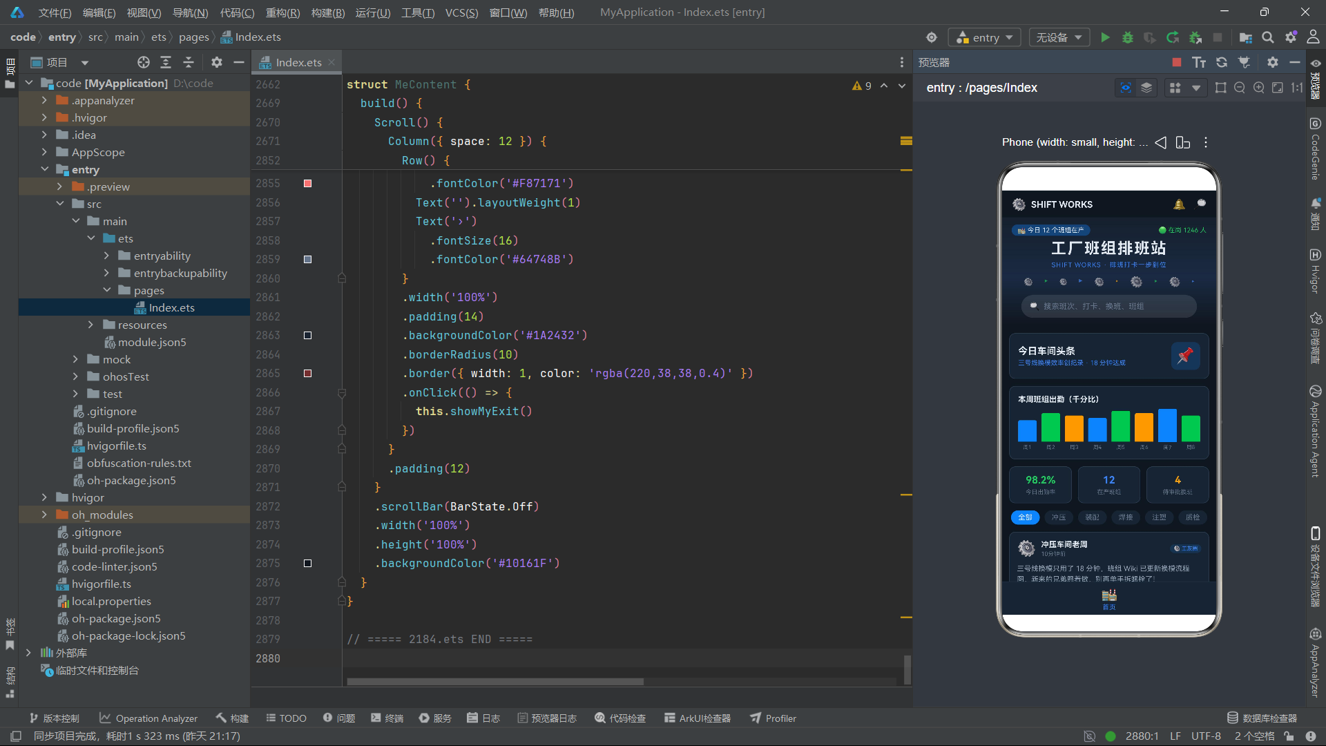
从交互设计的角度看,本应用的 17 个弹窗构成了一个完整的交互系统。每个弹窗都遵循"遮罩层 + 居中卡片 + 业务内容 + 操作按钮"的统一模板,保证了视觉和交互的一致性。弹窗的显示完全由 @State 布尔变量驱动,关闭通过回调函数实现,数据更新通过 splice 或数组展开完成。这种"状态驱动 UI"的范式,让开发者只需关注"状态是什么",框架自动处理"界面怎么变",大幅降低了 UI 同步的复杂度。此外,Tab 切换的缩放动画、列表项的省略号截断、按钮的动态禁用、进度条的颜色切换等微交互细节,都体现了对用户体验的精心打磨。
从工程化实践的角度看,本应用在代码组织上有许多值得借鉴的地方。工具函数的集中管理(状态映射函数、格式化函数、工厂函数)避免了代码重复,体现了 DRY 原则;回调函数的默认值设计(= () => {})保证了子组件在独立测试时不会因缺少回调而报错;纯函数式更新(如 buildSwapVote 返回新对象而非修改原对象)提升了代码的可预测性和可测试性;emoji 作为图标的轻量方案省去了图片资源管理成本;常量数据数组模拟后端数据源的方式适合原型快速迭代。这些工程化细节虽然不是什么高深的技术,但正是这些细节的积累,决定了一个应用代码的质量和可维护性。

作为“人工智能6S店”的官方数字引擎,为AI开发者与企业提供一个覆盖软硬件全栈、一站式门户。
更多推荐
 0
0 0
0- 0


 已为社区贡献57条内容

所有评论(0)