
HarmonyOS 6.1 实战:严格的类型约束创建一个 DrinkItem 对象但忘了写 note 字段,ArkTS 编译器会直接标记错误
ArkUI 声明式 UI 范式与组件体系
ArkUI 组件体系是鸿蒙声明式开发的核心基石。该体系提供了丰富的内置组件,从基础的文本(Text)、图片(Image)、按钮(Button),到复杂的容器组件如线性布局(Column/Row)、层叠布局(Stack)、弹性布局(Flex)、滚动容器(Scroll)等。每个组件都通过链式调用的方式设置属性和事件,形成一种流畅的、可读性极强的 DSL(领域特定语言)风格。例如 Text('hello').fontSize(14).fontColor('#333').fontWeight(FontWeight.Bold) 这样一行代码就完成了一个加粗的、指定字号和颜色的文本组件声明。
ArkUI 还提供了强大的状态管理机制。通过 @State、@Prop、@Link、@Provide/@Consume、@Observed/@ObjectLink 等一系列装饰器,开发者可以精确地定义状态的归属和流动方向。当被装饰的状态变量发生变化时,框架会自动触发关联的 UI 组件重新渲染,整个过程无需手动调用刷新方法。这种"数据驱动视图"的设计思想,使得状态与界面始终保持同步,从根本上杜绝了传统开发中"数据改了但忘了更新界面"这类常见 Bug。
ArkUI 的装饰器体系是其声明式范式的灵魂所在。@Entry 标记入口组件,@Component 声明自定义组件,@Builder 定义可复用的 UI 构建片段,@BuilderParam 实现 UI 的参数化传递。这些装饰器各司其职,共同构建出一套既灵活又严谨的组件化开发模型。通过组件的嵌套组合,开发者可以像搭积木一样构建出任意复杂的界面结构,同时保持代码的清晰和可维护性。
鸿蒙开发背景与 ArkTS 语言概述
鸿蒙操作系统(HarmonyOS)作为华为推出的面向万物互联时代的分布式操作系统,自诞生以来便致力于打破设备壁垒,实现跨终端的无缝协同体验。在鸿蒙生态中,应用开发框架 ArkUI 提供了一套完整的声明式 UI 开发范式,开发者只需通过简洁的描述性语法来声明界面结构,框架便会自动完成界面的渲染、更新与差分对比。ArkTS 是在 TypeScript 基础上扩展而来的编程语言,它在保留了 TypeScript 静态类型检查优势的同时,引入了一系列面向声明式 UI 的语法特性和编译期优化。ArkTS 严格限制了动态类型操作,要求所有变量、参数、返回值都必须有明确的类型标注,这种设计在编译期就能捕获大量潜在的类型错误,大幅提升了代码的健壮性和可维护性。
在传统的命令式 UI 开发模式中,开发者需要手动创建视图对象、设置属性、添加到父视图、在数据变化时手动触发刷新,整个过程繁琐且容易出错。而 ArkTS 的声明式范式彻底改变了这一局面:开发者只需在 build() 方法中描述"界面应该长什么样",至于"如何把界面渲染出来""数据变了之后界面怎么更新"这些底层逻辑全部由框架自动接管。这种范式转变不仅大幅降低了 UI 代码的复杂度,还让开发者能够将注意力集中在业务逻辑本身,而非繁琐的视图操作细节上。
一、数据结构定义:类型安全的数据建模
在 ArkTS 中,interface 是定义数据结构的主要手段。与 TypeScript 中的 interface 不同,ArkTS 的 interface 在编译后会被擦除,但在编译期提供了严格的类型检查。让我们先来看本应用中定义的六个核心数据接口。
interface FeedItem {
  id: number
  title: string
  time: string
  tag: string
  text: string
}

interface DrinkItem {
  id: number
  name: string
  kind: string
  price: number
  sales: number
  state: string
  cover: string
  note: string
}

interface SingerItem {
  id: number
  name: string
  style: string
  hot: number
  state: string
  note: string
}
以上代码定义了 FeedItem(餐车动态项)、DrinkItem(饮品项)和 SingerItem(驻唱乐手项)三个数据接口。每一个接口都明确声明了所有字段的类型:id 是 number 类型用于唯一标识,title、name、time 等是 string 类型用于文本展示,price、sales、hot 是 number 类型用于数值计算和展示。
在 ArkTS 中,interface 中的每个字段都必须显式标注类型,不能使用
any或省略类型标注。这是 ArkTS 与普通 TypeScript 的重要区别之一——ArkTS 从语言层面杜绝了弱类型编程,确保在编译期就能发现类型不匹配的问题。
这种严格的类型约束带来了显著的好处:当开发者在构建数据对象时,如果遗漏了某个字段或类型写错,编译器会立刻报错。例如,如果尝试创建一个 DrinkItem 对象但忘了写 note 字段,ArkTS 编译器会直接标记错误,而不是等到运行时才发现界面缺了一块文字。这种"编译期防御"大大减少了运行时缺陷的发生率。
interface EventItem {
  id: number
  name: string
  date: string
  quota: number
  cover: string
  note: string
}

interface CardItem {
  id: number
  name: string
  level: string
  price: number
  stock: number
  cover: string
  note: string
}

interface MyItem {
  id: number
  name: string
  kind: string
  date: string
  note: string
}
继续看 EventItem(活动项)、CardItem(会员卡项)和 MyItem(我的收藏项)三个接口。EventItem 包含 quota(名额)字段用于控制报名人数上限,CardItem 包含 level(等级)和 stock(库存)字段用于会员卡的级别与余量管理,MyItem 则用 kind 字段区分收藏类型(饮品、驻唱、活动、会员等)。
ArkTS 的 interface 不支持合并声明(declaration merging),也不支持可选属性(
?修饰符)。这意味着所有字段都是必填的,这一设计强制开发者在创建数据对象时必须完整填充所有字段,避免了"某个字段为 undefined 导致界面渲染异常"的常见问题。
从架构设计角度看,这六个接口完整覆盖了应用的核心业务域:动态信息流(Feed)、饮品菜单(Drink)、驻唱人员(Singer)、活动管理(Event)、会员体系(Card)、用户收藏(My)。每个接口的字段设计都紧贴业务需求,既不过度设计也不遗漏关键信息,体现了良好的领域建模意识。
二、静态数据初始化:写死数据的应用模拟
在真实项目中,数据通常来自网络请求或本地数据库。但在本应用中,为了演示完整的 UI 交互流程,所有数据都采用了前端写死的常量数组。这种方式在原型开发和技术验证阶段非常常见。
const FEEDS: FeedItem[] = [
  { id: 1, title: '今日特调「蓝调美式」上市', time: '今天 09:00', tag: '新品', text: '用爵士乐灵感调配的蓝调美式,深烘豆配海盐奶盖,边听歌边喝超带感。' },
  { id: 2, title: '周六驻唱夜·民谣专场', time: '昨天 23:00', tag: '演出', text: '本周六晚 8 点民谣专场,驻唱阿木将带来一个半小时的经典弹唱。' },
  { id: 3, title: '餐车换新涂装啦', time: '昨天 18:00', tag: '动态', text: '复古红白条纹新涂装完成,夜晚灯牌亮起,整条街最亮的仔。' },
  { id: 4, title: '点歌系统升级', time: '前天 21:00', tag: '功能', text: '现在可以通过小程序实时点歌,驻唱现场弹唱你的心头好。' },
  { id: 5, title: '深夜咖啡半价活动', time: '前天 15:00', tag: '活动', text: '每晚 22 点后美式咖啡半价,加班人的深夜加油站。' },
  { id: 6, title: '街头音乐快闪预告', time: '3 天前', tag: '演出', text: '下周三下午 5 点,餐车将联合三位街头音乐人带来快闪演出。' },
  { id: 7, title: '周边马克杯补货', time: '4 天前', tag: '上新', text: '印有餐车 LOGO 的陶瓷马克杯补货到仓,会员积分可兑换。' },
  { id: 8, title: '征集最想听的歌单', time: '5 天前', tag: '互动', text: '评论区留言最想在餐车听到的歌,点赞最高的下周六安排!' }
]
FEEDS 常量数组定义了 8 条餐车动态数据,每条数据严格遵守 FeedItem 接口的字段约束。注意这里使用了 const 关键字声明,并显式标注了 FeedItem[] 类型。在 ArkTS 中,const 声明的常量数组虽然不能被重新赋值为另一个数组,但数组内部的元素仍然可以被修改(如 push、splice 等操作)。不过由于这里的 FEEDS 是全局常量,后续会通过 @State 赋值给组件内部的状态变量来管理数据的变更。
在 ArkTS 中,
const声明的是"不可重新赋值的绑定",而非"不可变数据"。如果需要真正的不可变数据,可以使用readonly修饰符或 Object.freeze。但在实际开发中,状态数据通常需要可变,因此const数组配合后续的状态管理是常见模式。
const MENUS: DrinkItem[] = [
  { id: 1, name: '蓝调美式', kind: '咖啡', price: 18, sales: 320, state: 'on', cover: '☕', note: '深烘豆配海盐奶盖,灵感来自爵士蓝调,回味悠长。' },
  { id: 2, name: '摇滚拿铁', kind: '咖啡', price: 22, sales: 280, state: 'on', cover: '🥤', note: '双份浓缩打底,摇滚般浓烈,加冰更带劲。' },
  { id: 3, name: '民谣燕麦奶', kind: '咖啡', price: 24, sales: 260, state: 'on', cover: '🌾', note: '燕麦奶与浅烘豆的温柔组合,像民谣一样治愈。' },
  { id: 4, name: '电音气泡水', kind: '饮品', price: 15, sales: 410, state: 'on', cover: '⚡', note: '青柠薄荷气泡水,喝一口像被电到一样清爽。' },
  { id: 5, name: '说唱柠檬茶', kind: '饮品', price: 16, sales: 350, state: 'on', cover: '🍋', note: '手打柠檬茶,茶底够浓,像说唱一样带态度。' },
  { id: 6, name: '情歌热可可', kind: '热饮', price: 19, sales: 190, state: 'on', cover: '🍫', note: '比利时黑巧热可可,甜度像情歌一样刚好。' },
  { id: 7, name: '蓝调蜂蜜柚子', kind: '热饮', price: 20, sales: 150, state: 'sold', cover: '🍯', note: '蜂蜜柚子茶,暖暖的像蓝调萨克斯,今日已售罄。' },
  { id: 8, name: '旋律甜点拼盘', kind: '甜点', price: 28, sales: 120, state: 'on', cover: '🍰', note: '芝士蛋糕配曲奇,甜点与音乐都要刚刚好。' },
  { id: 9, name: '贝斯手布朗尼', kind: '甜点', price: 16, sales: 200, state: 'on', cover: '🍩', note: '浓郁布朗尼,厚实低沉的甜,致敬贝斯手。' },
  { id: 10, name: '音浪冰淇淋', kind: '甜品', price: 14, sales: 260, state: 'on', cover: '🍦', note: '香草冰淇淋淋焦糖,音浪般一波波涌上舌尖。' }
]
MENUS 数组定义了 10 款饮品,涵盖了咖啡、饮品、热饮、甜点、甜品等分类。每款饮品的 state 字段使用 'on'(在售)或 'sold'(售罄)两个字符串值来表示上架状态,cover 字段使用 emoji 字符作为封面图标,这是在没有图片资源的情况下一种巧妙的视觉替代方案。
在 ArkTS 中,字符串字面量类型的联合(如
'on' | 'sold')虽然不能直接在 interface 中声明(因为 ArkTS 的 interface 不支持联合类型字段),但通过约定好的字符串值配合工具函数的分支处理,同样能达到类型安全的效果。关键是确保所有使用该字段的地方都遵循相同的字符串约定。
除了 FEEDS 和 MENUS,应用还定义了 SINGERS(8 位驻唱乐手)、EVENTS(8 场活动)、CARDS(5 种会员卡)、MYS(8 条收藏记录)和 HEAT(8 周热度数据)等静态数据。其中 HEAT 是一个简单的 number[] 数组:
const HEAT: number[] = [58, 72, 66, 84, 75, 90, 80, 87]
这组数据代表连续 8 周的点歌热度值,将在首页的柱状图中被渲染成可视化的热度趋势。使用简单数值数组来承载图表数据是一种轻量的做法,在数据量不大时完全可以胜任,无需引入复杂的图表库。
三、工具函数:业务逻辑的纯函数封装
工具函数是应用中处理业务逻辑的核心模块。在 ArkTS 中,顶层函数(不属于任何 class 或 struct 的函数)可以独立存在,被任意组件调用。这些函数通常是纯函数——输入相同就输出相同,不产生副作用,非常易于测试和复用。
function heatBar(v: number): number {
  return Math.floor(28 + v * 0.85)
}

function playsText(v: number): string {
  if (v >= 10000) {
    return (v / 10000).toFixed(1) + ' 万'
  }
  return v.toString()
}
heatBar 函数将热度数值(0~100 范围)映射为柱状图高度(28~113 像素范围),使用 Math.floor 确保返回整数。这种线性映射函数在数据可视化中非常常见——将原始数据值域映射到 UI 可接受的像素值域。playsText 函数则是播放/销量数值的格式化工具:超过 1 万时显示为"X.X 万"的中文习惯格式,否则直接显示数字。
纯函数是函数式编程的核心概念。在 ArkTS 开发中,尽量将数据处理逻辑提取为顶层纯函数,而非在组件内部用方法实现,有两点好处:一是纯函数不依赖组件的
this上下文,更容易在不同组件间复用;二是纯函数不产生副作用,不会意外修改组件状态,降低了状态管理的复杂度。
function menuStateText(s: string): string {
  if (s === 'on') {
    return '在售'
  }
  return '售罄'
}

function menuStateColor(s: string): string {
  if (s === 'on') {
    return '#FBBF24'
  }
  return '#8A8A96'
}

function singerStateText(s: string): string {
  if (s === 'free') {
    return '可邀约'
  }
  return '已排期'
}

function singerStateColor(s: string): string {
  if (s === 'free') {
    return '#FBBF24'
  }
  return '#E11D48'
}
这组函数是状态到展示文案和颜色的映射器。menuStateText 和 menuStateColor 分别处理饮品的在售/售罄状态,singerStateText 和 singerStateColor 分别处理乐手的可邀约/已排期状态。这种将状态字符串映射为展示文案和颜色的做法在 UI 开发中极为普遍,它将业务状态与展示表现解耦——如果后续要修改售罄状态的颜色,只需改一个函数即可,所有引用该函数的地方自动生效。
将"状态码 -> 展示文案/颜色"的映射逻辑集中在工具函数中,遵循了 DRY(Don’t Repeat Yourself)原则。如果不这样做,而是在每个组件的 build() 中都写一遍 if-else 分支,一旦需求变更(比如"售罄"改成"缺货"),就需要修改散落在各处的多个代码片段,极易遗漏和出错。
function trendText(t: string): string {
  if (t === 'up') {
    return '↑ 热卖'
  }
  if (t === 'down') {
    return '↓ 降温'
  }
  return '→ 平稳'
}

function trendColor(t: string): string {
  if (t === 'up') {
    return '#FBBF24'
  }
  if (t === 'down') {
    return '#E11D48'
  }
  return '#9A9178'
}
trendText 和 trendColor 处理趋势状态(上升/下降/平稳)的展示映射。注意这两个函数处理的是三态而非二态,使用了连续的 if-if-return 结构。在 ArkTS 中不支持 switch 语句对字符串的匹配(这是与传统 TypeScript 的区别之一),因此 if-else 链是处理多分支字符串逻辑的标准方式。
function buildFeed(id: number, title: string): FeedItem {
  return { id: id, title: title, time: '刚刚', tag: '动态', text: '这是一条刚刚发布的餐车动态,欢迎各位乐迷围观互动。' }
}

function buildMy(id: number, name: string, kind: string): MyItem {
  return { id: id, name: name, kind: kind, date: '08-28', note: '刚刚收藏' }
}

function buildMenu(id: number, name: string): DrinkItem {
  return { id: id, name: name, kind: '饮品', price: 18, sales: 0, state: 'on', cover: '🥤', note: '这是一款刚刚上新的饮品,欢迎到餐车品尝。' }
}
这三个函数是数据构建器(Builder Pattern 的函数式实现)。buildFeed 根据传入的 id 和 title 创建一条完整的 FeedItem 对象,其余字段使用默认值填充。buildMy 和 buildMenu 同理。这种工厂函数模式在需要动态创建数据对象时非常有用——比如用户点击"发布动态"按钮时,调用 buildFeed 即可生成一条新动态数据并插入到列表中。
工厂函数模式在 ArkTS 中尤为重要,因为 ArkTS 不支持类的构造函数重载,也不支持默认参数。通过工厂函数,可以为接口对象提供合理的默认值,简化调用方的代码。调用者只需传入核心字段(如 id 和 name),其余字段由工厂函数统一填充,保证了数据的一致性。
四、主入口组件:六 Tab 架构与底部导航栏
主入口组件是整个应用的根组件,由 @Entry 和 @Component 两个装饰器共同标记。@Entry 表示该组件是页面的入口,编译器会为它生成页面注册代码;@Component 表示这是一个自定义组件,可以被其他组件引用或作为页面使用。
@Entry
@Component
struct Index {
  @State currentTab: number = 0
  @State feeds: FeedItem[] = FEEDS
  @State menus: DrinkItem[] = MENUS
  @State singers: SingerItem[] = SINGERS
  @State events: EventItem[] = EVENTS
  @State cards: CardItem[] = CARDS
  @State mys: MyItem[] = MYS
在 Index 组件中,定义了 7 个 @State 状态变量。currentTab 初始值为 0,用于记录当前选中的 Tab 索引。其余 6 个变量分别对应六大业务模块的数据集合,初始值引用了前文定义的全局常量数组。
@State装饰器是 ArkUI 状态管理体系中最基础的一环。被@State装饰的变量具有"可观察性"——当变量的值发生变化时(赋了新值或数组/对象的内部结构被修改),框架会自动重新执行build()方法中依赖该变量的 UI 片段,实现界面更新。这种"数据变化 -> 自动重渲染"的机制,是声明式 UI 的核心。
需要注意的是,ArkTS 中 @State 变量虽然可以引用全局常量数组作为初始值,但一旦赋值完成,组件内部维护的就不再是全局常量本身的引用——框架会对其进行观察。当组件内部通过 unshift、splice 等操作修改数组时,框架能检测到变化并触发更新。
  @Builder
  tabItem(icon: string, label: string, tab: number) {
    Column({ space: 3 }) {
      Text(icon)
        .fontSize(22)
        .opacity(this.currentTab === tab ? 1 : 0.55)
        .scale({ x: this.currentTab === tab ? 1.12 : 1, y: this.currentTab === tab ? 1.12 : 1 })
      Text(label)
        .fontSize(11)
        .fontColor(this.currentTab === tab ? '#FBBF24' : '#9A8B7C')
        .fontWeight(this.currentTab === tab ? FontWeight.Bold : FontWeight.Normal)
    }
    .width('16.6%')
    .height(58)
    .justifyContent(FlexAlign.Center)
    .animation({ duration: 200, curve: Curve.EaseOut })
    .onClick(() => {
      this.currentTab = tab
    })
  }
@Builder 装饰器定义了一个名为 tabItem 的可复用 UI 构建方法。它接收三个参数:icon(图标 emoji)、label(文字标签)和 tab(Tab 索引)。方法体内部使用 Column 容器组件垂直排列图标和文字,并根据 this.currentTab === tab 的判断结果动态设置透明度、缩放比例、字体颜色和粗细。
@Builder装饰器是 ArkUI 中实现 UI 复用的关键手段。与直接在build()中写重复代码不同,@Builder方法可以像函数一样被调用传参,同时保持对组件this上下文(包括@State变量)的访问能力。这使得@Builder既能复用 UI 结构,又能灵活地与组件状态交互。
这段代码中的动画属性 .animation({ duration: 200, curve: Curve.EaseOut }) 是一个重要的技术细节。它声明了当前组件的属性变化将以 200 毫秒、EaseOut 缓动曲线进行过渡。这意味着当用户切换 Tab 时,图标和文字的透明度变化、缩放变化不会瞬间跳变,而是平滑过渡——当前选中的 Tab 图标会缓慢放大并提亮,未选中的 Tab 则缓慢缩小并变暗。
  build() {
    Column() {
      // 餐车雨棚头部(无动画)
      Column() {
        Row() {
          Text('🚚')
            .fontSize(14)
          Text('MUSIC CAFÉ')
            .fontSize(17)
            .fontColor('#FDF6E3')
            .fontWeight(FontWeight.Bold)
            .letterSpacing(2)
            .backgroundColor('#E11D48')
            .borderRadius(4)
            .padding({ left: 10, right: 10, top: 4, bottom: 4 })
          Text('● 营业中')
            .fontSize(11)
            .fontColor('#101014')
            .backgroundColor('#FBBF24')
            .borderRadius(10)
            .padding({ left: 8, right: 8, top: 2, bottom: 2 })
        }
        .width('100%')
        .justifyContent(FlexAlign.SpaceBetween)
        Row() {
          ForEach(['#E11D48', '#FDF6E3', '#E11D48', '#FDF6E3', '#E11D48', '#FDF6E3', '#E11D48', '#FDF6E3'], (c: string, index: number) => {
            Row()
              .width('12.5%')
              .height(8)
              .backgroundColor(c)
          }, (c: string, index: number) => 'stripe' + index.toString())
        }
        .width('100%')
        .margin({ top: 6 })
      }
      .width('100%')
      .padding({ left: 16, right: 16, top: 12, bottom: 8 })
      .backgroundColor('#261109')
      .border({ width: { bottom: 3 }, color: '#E11D48' })
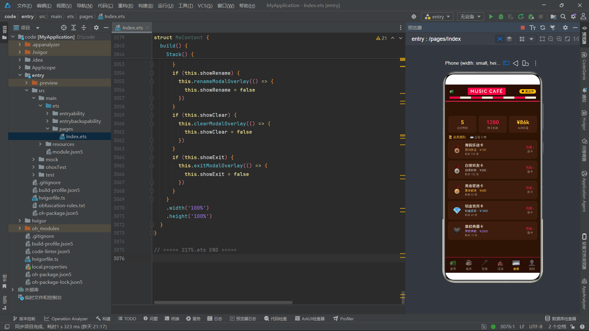
build() 方法是每个 @Component 必须实现的方法,它返回组件的 UI 结构。根容器使用 Column,内部依次排列头部区域、内容区域和底部导航栏。
头部区域是一个嵌套的 Column,包含两行 Row。第一行是标题行,使用 justifyContent(FlexAlign.SpaceBetween) 让"餐车图标"“品牌名称”"营业状态"三部分均匀分布到两端。第二行使用 ForEach 渲染 8 个等宽色块,形成复古红白条纹的"雨棚"视觉效果。
ForEach是 ArkUI 中用于列表渲染的核心组件。它接收三个参数:数据源数组、item 生成函数、key 生成函数。key 生成函数为每个列表项提供唯一标识,框架在数据变化时通过 key 进行差分对比(Diff),只更新变化的项而非全部重绘。这里使用'stripe' + index.toString()作为 key,确保每个条纹色块有稳定的标识。
FlexAlign.SpaceBetween是 Flex 布局的对齐方式之一,它将子元素在主轴方向均匀分布,首尾元素紧贴容器边缘,中间元素间距相等。常见的 FlexAlign 值还有Start(起始对齐)、Center(居中)、End(末尾对齐)、SpaceAround(等距环绕)等。
      // 内容区
      Stack() {
        if (this.currentTab === 0) {
          HomeContent({ feeds: this.feeds, menus: this.menus, mys: this.mys })
        }
        if (this.currentTab === 1) {
          MenuContent({ menus: this.menus, mys: this.mys })
        }
        if (this.currentTab === 2) {
          SingerContent({ singers: this.singers, mys: this.mys })
        }
        if (this.currentTab === 3) {
          EventContent({ events: this.events, mys: this.mys })
        }
        if (this.currentTab === 4) {
          CardContent({ cards: this.cards, mys: this.mys })
        }
        if (this.currentTab === 5) {
          MeContent({ mys: this.mys, menus: this.menus, events: this.events })
        }
      }
      .layoutWeight(1)
      .width('100%')
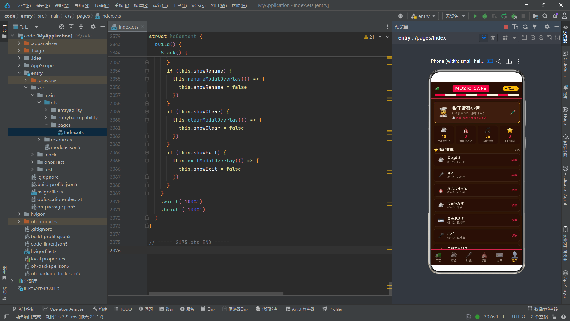
内容区域使用 Stack 层叠布局容器包裹。Stack 的子元素会按声明顺序依次叠加,后声明的在上方。但在这里,由于使用了 if 条件判断,每次只有一个子组件会被渲染到 Stack 中,因此不会出现层叠遮挡的问题。
Stack是 ArkUI 的层叠布局容器,子元素默认以中心点对齐方式叠加。它常用于实现弹窗遮罩层(底层半透明遮罩 + 上层弹窗卡片)、图片叠字等场景。在本例中,Stack被巧妙地用作条件渲染的容器——虽然语义上子元素是叠加的,但由于 if 条件确保同一时刻只渲染一个子组件,因此实际效果更接近"单页面切换"。
layoutWeight(1) 是一个关键属性。它告诉父容器(Column):当前组件应当占据剩余空间的所有权重。由于头部和底部导航栏的高度是固定的,内容区域通过 layoutWeight(1) 自动撑满中间剩余的全部空间。这种权重分配机制与 Android 的 layout_weight 概念一致,是实现自适应布局的常用手段。
      // 底部 Tab 单排
      Row() {
        this.tabItem('🚚', '首页', 0)
        this.tabItem('☕', '菜单', 1)
        this.tabItem('🎤', '驻唱', 2)
        this.tabItem('🎪', '活动', 3)
        this.tabItem('💳', '会员', 4)
        this.tabItem('👤', '我的', 5)
      }
      .width('100%')
      .backgroundColor('#261109')
      .border({ width: { top: 1 }, color: '#E11D48' })
    }
    .width('100%')
    .height('100%')
    .backgroundColor('#2A1508')
  }
}
底部导航栏使用 Row 水平排列 6 个 tabItem。每个 tabItem 宽度为 16.6%(约 1/6),6 个刚好填满一行。Row 的背景色为深棕 #261109,顶部边框为复古红 #E11D48,与整体的美式复古餐车视觉风格保持一致。
在 ArkUI 中,调用
@Builder方法使用this.methodName(params)语法。与普通方法调用不同,@Builder方法的返回值是一个 UI 片段而非数据值,编译器会将其内联展开为实际的组件树。因此this.tabItem('🚚', '首页', 0)在编译后会展开为完整的 Column-Text-Text 组件结构。
五、首页内容组件:横幅、柱状图、速览与动态列表
首页是用户进入应用后看到的第一屏,它需要在一屏内呈现尽可能多有价值的信息,引导用户深入了解各个功能模块。
@Component
struct HomeContent {
  @Link feeds: FeedItem[]
  @Link menus: DrinkItem[]
  @Link mys: MyItem[]
  @State showDetail: boolean = false
  @State picked: FeedItem = FEEDS[0]
  @State showSong: boolean = false
  @State songName: string = ''
  @State songMsg: string = ''
  @State tip: string = ''
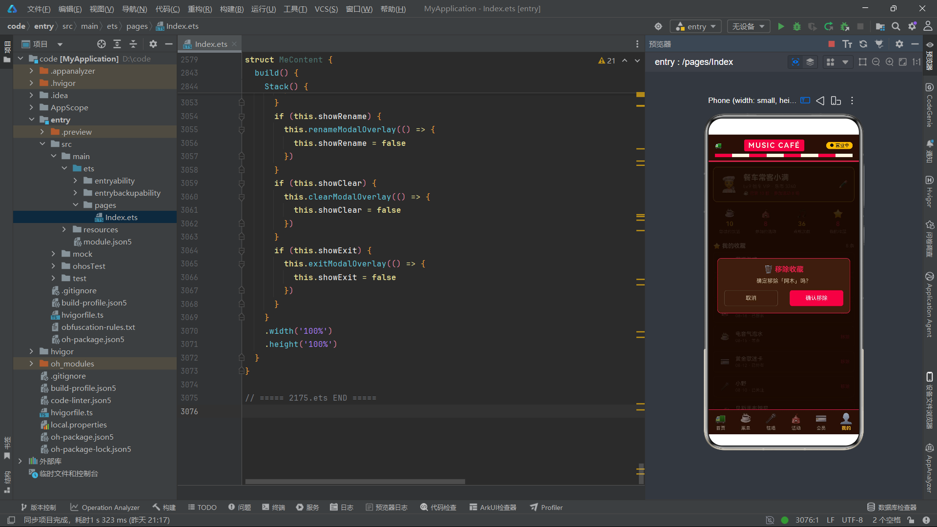
HomeContent 组件使用了 @Link 装饰器来接收父组件传递的 feeds、menus 和 mys 数据。
@Link装饰器建立了父子组件之间的双向数据绑定。与@Prop(单向传递,子组件只能读取不能修改)不同,@Link允许子组件直接修改父组件的数据源。当子组件通过this.mys.unshift(...)向收藏列表添加数据时,父组件Index中的mys状态变量也会同步更新,所有引用mys的组件都会收到更新通知。这种双向同步机制是多 Tab 页面数据共享的关键。
组件还定义了多个 @State 变量:showDetail 控制动态详情弹窗的显示,picked 记录当前选中的动态项,showSong 控制点歌弹窗的显示,songName 和 songMsg 分别绑定点歌表单中的歌曲名称和留言输入框,tip 存储操作提示信息。
  @Builder
  detailModalOverlay(onClose: () => void) {
    Column() {
      Column() {
        Row() {
          Text('📄 动态详情')
            .fontSize(17)
            .fontColor('#FDF6E3')
            .fontWeight(FontWeight.Bold)
          Text('✕')
            .fontSize(16)
            .fontColor('#9A8B7C')
            .onClick(() => {
              onClose()
            })
        }
        .width('100%')
        .justifyContent(FlexAlign.SpaceBetween)
        .margin({ bottom: 12 })
        Row() {
          Text('#' + this.picked.tag)
            .fontSize(11)
            .fontColor('#261109')
            .backgroundColor('#FBBF24')
            .borderRadius(3)
            .padding({ left: 6, right: 6, top: 2, bottom: 2 })
          Text(this.picked.time)
            .fontSize(11)
            .fontColor('#9A8B7C')
        }
        .width('100%')
        .margin({ bottom: 10 })
        Text(this.picked.title)
          .fontSize(16)
          .fontColor('#F3ECDD')
          .fontWeight(FontWeight.Medium)
          .width('100%')
          .margin({ bottom: 8 })
        Text(this.picked.text)
          .fontSize(13)
          .fontColor('#C8B79F')
          .width('100%')
          .lineHeight(20)
detailModalOverlay 是动态详情弹窗的 @Builder 方法。它接收一个 onClose 回调函数作为参数,这种"回调参数"模式是 ArkUI 中处理弹窗关闭的标准做法——父组件在调用 @Builder 方法时传入一个箭头函数,弹窗内部的关闭按钮调用该函数即可通知父组件关闭弹窗。
弹窗的结构分为两层 Column:外层 Column 撑满全屏,设置半透明深色背景作为遮罩层;内层 Column 宽度为 88%,设置圆角和边框作为弹窗卡片。这种"全屏遮罩 + 居中卡片"的双层结构是模态弹窗的经典布局模式。
在 ArkUI 中,模态弹窗通常通过
Stack层叠布局实现:底层是页面内容,顶层是弹窗遮罩。通过if (this.showDetail)条件判断控制弹窗的渲染与移除。当showDetail为true时弹窗出现在Stack顶层,为false时弹窗从组件树中移除。这种条件渲染方式比传统的visibility属性控制更高效,因为不渲染的组件不占用布局计算资源。
弹窗内部依次展示标签(#tag)、时间、标题和正文。lineHeight(20) 设置了正文的行高为 20vp(虚拟像素),确保多行文字有舒适的阅读间距。在 ArkUI 中,行高的单位是 vp(virtual pixel),它是一种与设备无关的长度单位,会根据屏幕密度自动缩放。
        Row() {
          Text('👍 点赞')
            .fontSize(12)
            .fontColor('#FBBF24')
            .textAlign(TextAlign.Center)
            .width('45%')
            .height(36)
            .border({ width: 1, color: '#FBBF24' })
            .borderRadius(6)
            .onClick(() => {
              this.tip = '👍 已点赞,感谢支持'
              onClose()
            })
          Text('🎵 点歌')
            .fontSize(12)
            .fontColor('#FDF6E3')
            .textAlign(TextAlign.Center)
            .width('45%')
            .height(36)
            .backgroundColor('#E11D48')
            .borderRadius(6)
            .onClick(() => {
              onClose()
              this.showSong = true
            })
        }
        .width('100%')
        .justifyContent(FlexAlign.SpaceBetween)
        .margin({ top: 12 })
弹窗底部是两个操作按钮:点赞和点歌。这里使用 Text 组件配合样式来模拟按钮效果——设置了固定宽度(45%)、高度(36vp)、圆角(6vp)和边框,并绑定了 onClick 事件。这种做法在 ArkUI 中非常常见,因为 Text 组件比 Button 组件在样式定制上更加灵活。
在 ArkUI 中,按钮效果可以通过多种方式实现:直接使用
Button组件、用Text配合onClick和样式属性、或者使用@Builder封装自定义按钮组件。选择哪种方式取决于设计需求——如果需要高度自定义的视觉效果,Text+ 样式的方式最为灵活;如果需要标准 Material Design 按钮,直接使用Button组件更方便。
点歌按钮的点击逻辑值得注意:先调用 onClose() 关闭详情弹窗,然后设置 this.showSong = true 打开点歌弹窗。这种"先关后开"的顺序确保了同一时刻只有一个弹窗显示,避免了弹窗叠加遮盖的问题。
  @Builder
  songModalOverlay(onClose: () => void) {
    Column() {
      Column() {
        Row() {
          Text('🎵 给餐车点首歌')
            .fontSize(17)
            .fontColor('#FDF6E3')
            .fontWeight(FontWeight.Bold)
          Text('✕')
            .fontSize(16)
            .fontColor('#9A8B7C')
            .onClick(() => {
              onClose()
            })
        }
        .width('100%')
        .justifyContent(FlexAlign.SpaceBetween)
        .margin({ bottom: 12 })
        Text('歌曲名称')
          .fontSize(12)
          .fontColor('#9A8B7C')
          .width('100%')
        TextInput({ placeholder: '例如:成都', text: this.songName })
          .width('100%')
          .height(40)
          .backgroundColor('#261109')
          .fontColor('#F3ECDD')
          .placeholderColor('#6E5A48')
          .borderRadius(6)
          .margin({ top: 4, bottom: 10 })
          .onChange((v: string) => {
            this.songName = v
          })
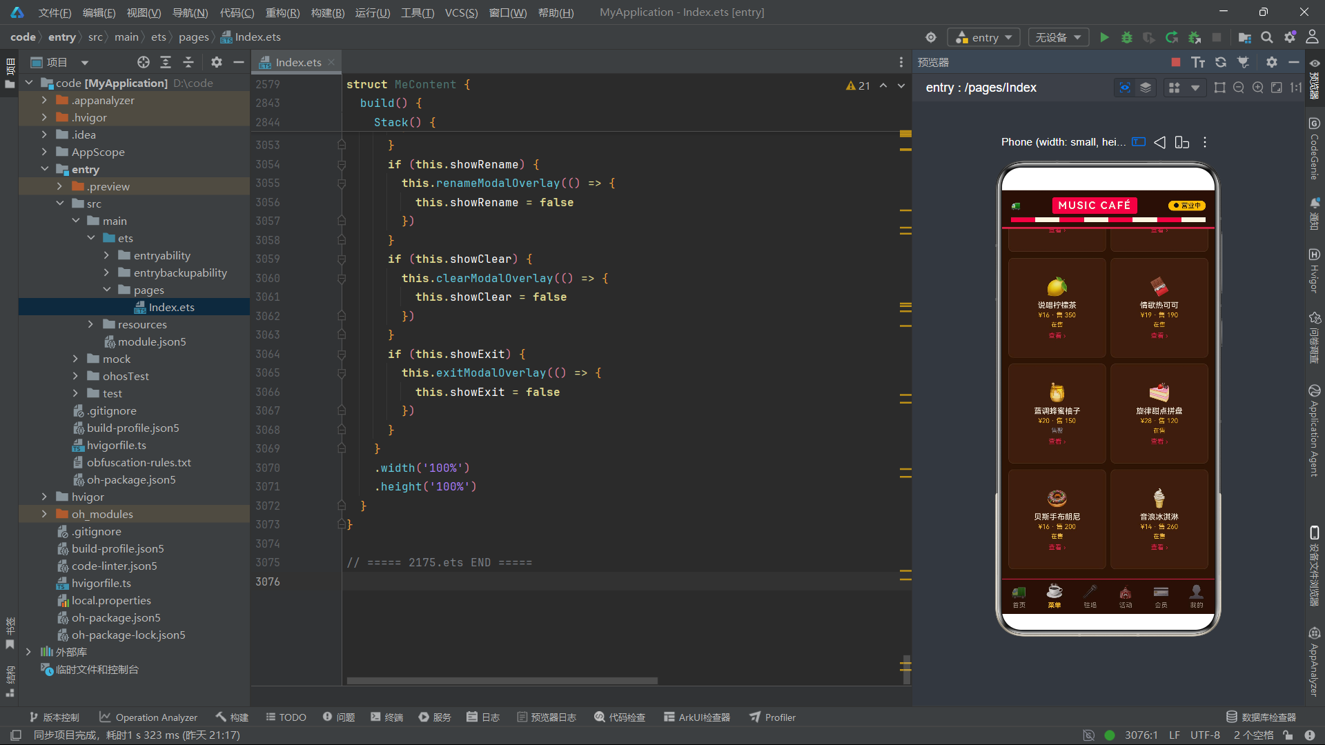
songModalOverlay 是点歌弹窗的 @Builder 方法。其中使用了 TextInput 组件作为文本输入框。
TextInput是 ArkUI 的核心输入组件,支持多种输入类型(普通文本、数字、密码等)。它通过placeholder属性设置占位提示文字,text属性绑定输入值,onChange事件回调实时获取用户输入。在本例中,text绑定到this.songName状态变量,onChange中将新值赋回给this.songName,形成了完整的数据双向绑定。当用户输入文字时,songName实时更新;当弹窗关闭并重置songName = ''时,输入框内容也会同步清空。
        Row() {
          Text('取消')
            .fontSize(13)
            .fontColor('#C8B79F')
            .textAlign(TextAlign.Center)
            .width('45%')
            .height(38)
            .border({ width: 1, color: '#5A4432' })
            .borderRadius(6)
            .onClick(() => {
              onClose()
            })
          Text('提交点歌')
            .fontSize(13)
            .fontColor('#261109')
            .textAlign(TextAlign.Center)
            .width('45%')
            .height(38)
            .backgroundColor('#FBBF24')
            .borderRadius(6)
            .onClick(() => {
              if (this.songName.length > 0) {
                this.tip = '🎵 已点播《' + this.songName + '》,驻唱稍后安排'
              } else {
                this.tip = '⚠️ 请先填写歌曲名称'
              }
              this.songName = ''
              this.songMsg = ''
              onClose()
            })
        }
        .width('100%')
        .justifyContent(FlexAlign.SpaceBetween)
      }
提交点歌按钮的点击逻辑包含了表单验证:如果 songName 非空则提示点播成功并显示歌曲名,否则提示需要填写歌曲名称。提交后清空 songName 和 songMsg,然后关闭弹窗。这种"验证 -> 处理 -> 清理 -> 关闭"的四步流程是表单提交的标准模式。
  build() {
    Stack() {
      Column() {
        Scroll() {
          Column() {
            // 餐车横幅
            Row() {
              Column({ space: 6 }) {
                Text('MUSIC CAFÉ')
                  .fontSize(20)
                  .fontColor('#261109')
                  .fontWeight(FontWeight.Bold)
                  .letterSpacing(2)
                Text('咖啡 · 音乐 · 街头故事')
                  .fontSize(11)
                  .fontColor('#261109')
                  .opacity(0.75)
              }
              .alignItems(HorizontalAlign.Start)
              Column({ space: 4 }) {
                Text('● 营业中')
                  .fontSize(11)
                  .fontColor('#261109')
                  .backgroundColor('#FDF6E3')
                  .borderRadius(10)
                  .padding({ left: 8, right: 8, top: 2, bottom: 2 })
                Text('07:00-24:00')
                  .fontSize(10)
                  .fontColor('#261109')
                  .opacity(0.7)
              }
            }
            .width('100%')
            .justifyContent(FlexAlign.SpaceBetween)
            .padding(16)
            .backgroundColor('#FBBF24')
            .borderRadius(10)
            .margin({ top: 12 })
首页 build() 方法的根容器是 Stack,内层是 Column 包裹 Scroll 滚动容器。Scroll 确保内容超出屏幕时可以上下滚动浏览。Scroll 内部的 Column 是实际内容容器。
横幅区域使用 Row 水平排列两列信息:左侧是品牌名和副标题,右侧是营业状态和营业时间。整个横幅背景为暖黄 #FBBF24,文字为深棕 #261109,营造醒目的复古灯牌效果。
Column({ space: 6 })中的space参数设置子元素之间的间距为 6vp。这是Column和Row组件的构造参数,用于快速设置统一的子元素间距,比给每个子元素单独设置margin更加简洁。alignItems(HorizontalAlign.Start)则设置子元素在交叉轴(水平方向)左对齐。
            // 周热度柱状图
            Row() {
              Text('📊 本周点歌热度')
                .fontSize(14)
                .fontColor('#F3ECDD')
                .fontWeight(FontWeight.Bold)
              Text('近 8 期')
                .fontSize(11)
                .fontColor('#9A8B7C')
            }
            .width('100%')
            .justifyContent(FlexAlign.SpaceBetween)
            .margin({ top: 14, bottom: 6 })
            Row({ space: 5 }) {
              ForEach(HEAT, (v: number, index: number) => {
                Column() {
                  Text(v.toString())
                    .fontSize(9)
                    .fontColor('#FBBF24')
                  Row()
                    .width(16)
                    .height(heatBar(v))
                    .backgroundColor(index % 2 === 0 ? '#E11D48' : '#FBBF24')
                    .borderRadius(2)
                  Text('周' + (index + 1).toString())
                    .fontSize(9)
                    .fontColor('#9A8B7C')
                }
                .width('11%')
              }, (v: number, index: number) => 'h' + index.toString())
            }
            .width('100%')
            .height(120)
            .alignItems(VerticalAlign.Bottom)
            .justifyContent(FlexAlign.SpaceBetween)
            .padding(8)
            .backgroundColor('#3A1F10')
            .borderRadius(8)
            .border({ width: 1, color: '#4A2C18' })
柱状图区域是首页的视觉亮点之一。它使用 ForEach 遍历 HEAT 数组,为每个数值渲染一个 Column,内含数值文字、柱状条(Row 组件设置宽高和背景色)和周次标签。柱状条的高度通过 heatBar(v) 函数计算,颜色根据奇偶索引交替使用复古红和暖黄。
这里使用
Row组件作为"柱状条"是一种巧妙的技巧——Row本质上是一个容器组件,但通过设置width和height并赋予背景色,它就变成了一根纯色矩形条。配合borderRadius(2)圆角,视觉上就是一根柱状图柱子。这种"容器组件当矩形用"的做法在 ArkUI 开发中非常普遍,因为 ArkUI 没有提供专门的"矩形"或"Shape"组件(虽然可以通过Shape组件绘制,但过于复杂)。
整个柱状图容器设置了 alignItems(VerticalAlign.Bottom),确保所有柱子底部对齐——这是柱状图的标准对齐方式。justifyContent(FlexAlign.SpaceBetween) 让 8 根柱子在水平方向均匀分布。
            // 精选速览
            Row({ space: 8 }) {
              Column({ space: 4 }) {
                Text('☕')
                  .fontSize(22)
                Text('饮品')
                  .fontSize(11)
                  .fontColor('#F3ECDD')
                Text(this.menus.length.toString() + ' 款在售')
                  .fontSize(9)
                  .fontColor('#9A8B7C')
              }
              .layoutWeight(1)
              .height(80)
              .justifyContent(FlexAlign.Center)
              .backgroundColor('#3A1F10')
              .borderRadius(8)
              .onClick(() => {
                this.tip = '☕ 菜单共 ' + this.menus.length.toString() + ' 款,欢迎点单'
              })
              Column({ space: 4 }) {
                Text('🎤')
                  .fontSize(22)
                Text('驻唱')
                  .fontSize(11)
                  .fontColor('#F3ECDD')
                Text('可邀约 ×5')
                  .fontSize(9)
                  .fontColor('#9A8B7C')
              }
              .layoutWeight(1)
              .height(80)
              .justifyContent(FlexAlign.Center)
              .backgroundColor('#3A1F10')
              .borderRadius(8)
              .onClick(() => {
                this.tip = '🎤 当前有 5 位驻唱可邀约'
              })
              Column({ space: 4 }) {
                Text('🎪')
                  .fontSize(22)
                Text('活动')
                  .fontSize(11)
                  .fontColor('#F3ECDD')
                Text('近期 8 场')
                  .fontSize(9)
                  .fontColor('#9A8B7C')
              }
              .layoutWeight(1)
              .height(80)
              .justifyContent(FlexAlign.Center)
              .backgroundColor('#3A1F10')
              .borderRadius(8)
              .onClick(() => {
                this.tip = '🎪 近期有 8 场演出活动可报名'
              })
            }
            .width('100%')
            .margin({ top: 12 })
精选速览区域使用 Row 水平排列三个等宽的统计卡片。每个卡片通过 layoutWeight(1) 获得等分的宽度,内部用 Column 垂直排列图标、分类名和统计数字。点击卡片会设置 this.tip 显示提示信息。
layoutWeight(1)在这里的用法值得深入理解。三个Column各自设置了layoutWeight(1),意味着它们在父Row中平分剩余空间。如果某个卡片设置了layoutWeight(2),它将获得其他卡片两倍的宽度。layoutWeight与百分比宽度width('33.3%')的区别在于:layoutWeight是动态的,会根据父容器实际剩余空间计算;而百分比是基于父容器总宽度的固定比例。在有margin或padding的场景下,两者结果可能不同。
            // 动态列表
            ForEach(this.feeds, (item: FeedItem, index: number) => {
              Row() {
                Column({ space: 4 }) {
                  Text(item.title)
                    .fontSize(14)
                    .fontColor('#F3ECDD')
                    .fontWeight(FontWeight.Medium)
                    .width('100%')
                    .maxLines(1)
                    .textOverflow({ overflow: TextOverflow.Ellipsis })
                  Text(item.time + ' · ' + item.tag)
                    .fontSize(11)
                    .fontColor('#9A8B7C')
                    .width('100%')
                }
                .layoutWeight(1)
                .alignItems(HorizontalAlign.Start)
                Text('详情 ›')
                  .fontSize(12)
                  .fontColor('#FBBF24')
                  .onClick(() => {
                    this.picked = item
                    this.showDetail = true
                  })
              }
              .width('100%')
              .padding(12)
              .backgroundColor('#3A1F10')
              .borderRadius(8)
              .border({ width: 1, color: '#452712' })
              .margin({ bottom: 8 })
            }, (item: FeedItem, index: number) => 'feed' + item.id.toString())
动态列表使用 ForEach 渲染 this.feeds 数组中的每条动态。每个列表项是一个 Row,左侧是标题和时间信息(使用 Column 垂直排列,并通过 layoutWeight(1) 撑满剩余空间),右侧是"详情"链接文字。
maxLines(1)配合textOverflow({ overflow: TextOverflow.Ellipsis })是 ArkUI 中处理文本溢出的标准方案。maxLines(1)限制文本最多显示 1 行,textOverflow设置溢出时的处理方式为省略号(Ellipsis)。这样当标题过长时,会在末尾显示"…"而非自动换行,保持了列表项的高度一致性。
点击"详情"链接时,将当前 item 赋值给 this.picked,并设置 this.showDetail = true 触发详情弹窗显示。ForEach 的 key 生成器使用 'feed' + item.id.toString(),确保每条动态有唯一标识,在数组增删时能正确进行差分更新。
            if (this.tip.length > 0) {
              Text(this.tip)
                .fontSize(12)
                .fontColor('#FDE68A')
                .width('100%')
                .padding(8)
                .backgroundColor('#3A2A10')
                .borderRadius(6)
                .margin({ bottom: 8 })
            }
在列表底部,通过条件判断 this.tip.length > 0 决定是否显示提示信息条。当 tip 为空字符串时不渲染该组件,当有内容时显示一个带背景色的提示条。这种条件渲染方式在 ArkUI 中非常常见,通过简单的 if 判断即可控制组件的显示与隐藏。
六、菜单页组件:分类筛选、双列卡片与编辑弹窗
菜单页是应用的核心功能页之一,提供了饮品的分类筛选、双列展示、详情查看、销量排行和调价编辑等功能。
@Component
struct MenuContent {
  @Link menus: DrinkItem[]
  @Link mys: MyItem[]
  @State pickKind: string = '全部'
  @State showDetail: boolean = false
  @State picked: DrinkItem = MENUS[0]
  @State showRank: boolean = false
  @State showEdit: boolean = false
  @State editPrice: string = ''
  @State editSales: string = ''
  @State tip: string = ''
MenuContent 组件定义了多个状态变量。pickKind 记录当前选中的分类(初始为"全部"),showDetail/showRank/showEdit 分别控制三个弹窗的显示,editPrice 和 editSales 绑定编辑弹窗中的价格和销量输入框。
  @Builder
  detailModalOverlay(onClose: () => void) {
    Column() {
      Column() {
        // ... 标题栏省略 ...
        Row() {
          Text(this.picked.cover)
            .fontSize(34)
          Column({ space: 4 }) {
            Text(this.picked.name)
              .fontSize(17)
              .fontColor('#F3ECDD')
              .fontWeight(FontWeight.Bold)
            Text(this.picked.kind + ' · 已售 ' + playsText(this.picked.sales) + ' 份')
              .fontSize(11)
              .fontColor('#9A8B7C')
          }
          .alignItems(HorizontalAlign.Start)
          .layoutWeight(1)
          .margin({ left: 10 })
          Text(menuStateText(this.picked.state))
            .fontSize(11)
            .fontColor(menuStateColor(this.picked.state))
            .border({ width: 1, color: menuStateColor(this.picked.state) })
            .borderRadius(10)
            .padding({ left: 8, right: 8, top: 2, bottom: 2 })
        }
        .width('100%')
        .padding(12)
        .backgroundColor('#261109')
        .borderRadius(8)
        .margin({ bottom: 10 })
饮品详情弹窗的头部使用了 Row 水平排列封面图标、名称信息和状态标签。状态标签的文字和颜色都通过工具函数 menuStateText 和 menuStateColor 动态获取,实现了"在售"显示金色、"售罄"显示灰色的差异化效果。
在 ArkUI 中,动态样式(根据数据状态改变颜色、字号等)是通过在属性方法中传入条件表达式实现的。例如
.fontColor(menuStateColor(this.picked.state))中,menuStateColor是一个返回颜色字符串的函数,当state变化时,函数返回值随之变化,fontColor属性也会自动更新。这种"函数调用作为属性值"的模式是 ArkUI 实现动态样式的核心手段。
        Text('¥' + this.picked.price.toString() + ' · 会员再享 9 折')
          .fontSize(20)
          .fontColor('#FBBF24')
          .fontWeight(FontWeight.Bold)
          .width('100%')
          .margin({ bottom: 6 })
        Row() {
          Text('🔥 销量热度')
            .fontSize(12)
            .fontColor('#9A8B7C')
          Text(this.picked.sales.toString() + ' 份')
            .fontSize(12)
            .fontColor('#E11D48')
        }
        .width('100%')
        .justifyContent(FlexAlign.SpaceBetween)
        .margin({ bottom: 4 })
        Row()
          .width('100%')
          .height(8)
          .backgroundColor('#4A2C18')
          .borderRadius(4)
        Row()
          .width((this.picked.sales / 500 * 100).toString() + '%')
          .height(8)
          .backgroundColor('#E11D48')
          .borderRadius(4)
          .offset({ x: 0, y: -8 })
这里实现了一个进度条效果,使用了两层 Row 叠加:底层是满宽的灰色背景条,上层是按销量比例计算宽度的红色填充条。上层的 offset({ x: 0, y: -8 }) 将其向上偏移 8vp(与背景条等高),使其覆盖在背景条上方。
offset属性用于设置组件相对于自身位置的偏移量,它不会影响其他组件的布局位置(不像margin会推开相邻组件),因此适合用于"叠加覆盖"效果。在本例中,进度填充条通过offset向上偏移,叠加在背景条上方,形成了进度条的视觉效果。这与 CSS 中的position: relative+top的效果类似。
        Row() {
          Text('收藏')
            .fontSize(13)
            .fontColor('#C8B79F')
            .textAlign(TextAlign.Center)
            .width('45%')
            .height(38)
            .border({ width: 1, color: '#5A4432' })
            .borderRadius(6)
            .onClick(() => {
              const nextId = this.mys.length + 1
              this.mys.unshift(buildMy(nextId, this.picked.name, this.picked.kind))
              this.tip = '⭐ 饮品已加入收藏'
              onClose()
            })
          Text('调价上新')
            .fontSize(13)
            .fontColor('#261109')
            .textAlign(TextAlign.Center)
            .width('45%')
            .height(38)
            .backgroundColor('#FBBF24')
            .borderRadius(6)
            .onClick(() => {
              this.editPrice = this.picked.price.toString()
              this.editSales = this.picked.sales.toString()
              onClose()
              this.showEdit = true
            })
        }
        .width('100%')
        .justifyContent(FlexAlign.SpaceBetween)
收藏按钮的点击逻辑值得深入分析:首先计算 nextId = this.mys.length + 1 作为新收藏项的 ID,然后调用 buildMy(nextId, this.picked.name, this.picked.kind) 构建一个完整的 MyItem 对象,通过 this.mys.unshift(...) 将其插入到收藏列表的头部。由于 mys 是 @Link 变量,这个修改会同步到父组件 Index 的 mys 状态,其他引用了 mys 的组件(如"我的"页面)也会收到更新通知。
unshift是 JavaScript/ArkTS 数组的原生方法,用于在数组头部插入元素。在 ArkUI 中,修改@State或@Link数组的方法包括push、pop、shift、unshift、splice、sort等。框架会监听这些方法的调用,自动触发依赖该数组的 UI 重新渲染。需要注意的是,直接通过索引赋值(如arr[0] = newValue)在 ArkUI 中不会触发更新,必须使用splice或整体赋值的方式。
  @Builder
  rankModalOverlay(onClose: () => void) {
    Column() {
      Column() {
        Row() {
          Text('🏆 本周销量榜')
            .fontSize(17)
            .fontColor('#FDF6E3')
            .fontWeight(FontWeight.Bold)
          Text('✕')
            .fontSize(16)
            .fontColor('#9A8B7C')
            .onClick(() => {
              onClose()
            })
        }
        .width('100%')
        .justifyContent(FlexAlign.SpaceBetween)
        .margin({ bottom: 12 })
        ForEach([0, 1, 2, 3, 4], (i: number, index: number) => {
          Row() {
            Text(index === 0 ? '🥇' : (index === 1 ? '🥈' : (index === 2 ? '🥉' : (index + 1).toString() + '. ')))
              .fontSize(16)
              .width(30)
              .fontColor(index < 3 ? '#FBBF24' : '#9A8B7C')
            Text(this.menus[i].cover)
              .fontSize(18)
            Text(this.menus[i].name)
              .fontSize(13)
              .fontColor('#F3ECDD')
              .layoutWeight(1)
              .margin({ left: 6 })
            Text(this.menus[i].sales.toString() + ' 份')
              .fontSize(12)
              .fontColor('#E11D48')
          }
          .width('100%')
          .padding(10)
          .backgroundColor('#261109')
          .borderRadius(8)
          .margin({ bottom: 6 })
        }, (i: number, index: number) => 'rk' + i.toString())
销量榜弹窗使用 ForEach 遍历索引数组 [0, 1, 2, 3, 4],展示 this.menus 数组前 5 项的排名信息。排名图标使用嵌套三元表达式:第 1 名显示金牌 emoji,第 2 名银牌,第 3 名铜牌,其余显示数字序号。
嵌套三元表达式
a ? b : (c ? d : (e ? f : g))在 ArkTS 中是合法的,但由于可读性较差,在复杂分支场景下建议使用工具函数替代。本例中只有 3 层嵌套,尚可接受;如果超过 3 层,应当提取为独立的函数。
  @Builder
  editModalOverlay(onClose: () => void) {
    Column() {
      Column() {
        Row() {
          Text('💲 上新调价')
            .fontSize(17)
            .fontColor('#FDF6E3')
            .fontWeight(FontWeight.Bold)
          Text('✕')
            .fontSize(16)
            .fontColor('#9A8B7C')
            .onClick(() => {
              onClose()
            })
        }
        .width('100%')
        .justifyContent(FlexAlign.SpaceBetween)
        .margin({ bottom: 12 })
        Text('调整对象:' + this.picked.name)
          .fontSize(12)
          .fontColor('#E11D48')
          .width('100%')
          .margin({ bottom: 10 })
        Text('新售价(元)')
          .fontSize(12)
          .fontColor('#9A8B7C')
          .width('100%')
        TextInput({ placeholder: '输入价格', text: this.editPrice })
          .type(InputType.Number)
          .width('100%')
          .height(40)
          .backgroundColor('#261109')
          .fontColor('#F3ECDD')
          .placeholderColor('#6E5A48')
          .borderRadius(6)
          .margin({ top: 4, bottom: 10 })
          .onChange((v: string) => {
            this.editPrice = v
          })
编辑弹窗中使用了 TextInput 的 .type(InputType.Number) 属性,将输入框限制为数字键盘输入。这是移动端表单优化的常见做法——当用户需要输入价格时,弹出数字键盘而非全键盘,提升输入效率。
InputType枚举定义了输入框的类型,常见的有Normal(普通文本)、Number(数字)、Password(密码)、PhoneNumber(电话号码)、InputType不仅影响键盘布局,还可能触发浏览器的自动填充和输入验证功能。
          Text('保存调价')
            .fontSize(13)
            .fontColor('#261109')
            .textAlign(TextAlign.Center)
            .width('45%')
            .height(38)
            .backgroundColor('#E11D48')
            .borderRadius(6)
            .onClick(() => {
              const newPrice = Number(this.editPrice)
              const newSales = Number(this.editSales)
              if (newPrice > 0 && newSales >= 0) {
                const idx = this.menus.indexOf(this.picked)
                if (idx >= 0) {
                  this.menus.splice(idx, 1, buildMenuEdit(this.picked, newPrice, newSales))
                }
                this.tip = '✅ 已更新售价 ¥' + newPrice.toString() + ' · 销量 ' + newSales.toString() + ' 份'
              } else {
                this.tip = '⚠️ 价格需大于 0,销量不能为负'
              }
              onClose()
            })
保存调价按钮的逻辑包含了输入验证和数组更新两个步骤。首先通过 Number() 将输入的字符串转换为数值,然后验证价格大于 0 且销量不小于 0。验证通过后,使用 this.menus.indexOf(this.picked) 找到当前饮品在数组中的索引,再通过 splice(idx, 1, newItem) 用新数据替换旧数据。
splice是数组方法中功能最强大的一个:splice(start, deleteCount, ...items)从start索引开始删除deleteCount个元素,并在同一位置插入items。当deleteCount为 1 且items有一个元素时,效果就是"替换"。ArkUI 框架会检测到splice调用并触发@Link/@State数组的更新通知。
  build() {
    Stack() {
      Column() {
        Scroll() {
          Column() {
            // 分类横滑
            Scroll() {
              Row({ space: 8 }) {
                ForEach(['全部', '咖啡', '饮品', '热饮', '甜点', '甜品'], (k: string, index: number) => {
                  Text(k)
                    .fontSize(12)
                    .fontColor(this.pickKind === k ? '#261109' : '#C8B79F')
                    .backgroundColor(this.pickKind === k ? '#FBBF24' : '#3A1F10')
                    .borderRadius(14)
                    .padding({ left: 14, right: 14, top: 6, bottom: 6 })
                    .onClick(() => {
                      this.pickKind = k
                      this.tip = '🔍 已筛选:' + k
                    })
                }, (k: string, index: number) => 'k' + index.toString())
              }
              .padding({ right: 12 })
            }
            .scrollable(ScrollDirection.Horizontal)
            .scrollBar(BarState.Off)
            .width('100%')
            .margin({ top: 12 })
分类筛选区域使用了一个横向滚动的 Scroll 容器,内部是 Row 水平排列的 6 个分类标签。
scrollable(ScrollDirection.Horizontal)设置Scroll组件为水平滚动方向。scrollBar(BarState.Off)隐藏滚动条,因为分类标签本身已经提供了视觉指引,不需要额外的滚动条干扰。水平滚动Scroll在移动端 UI 中非常常见,如标签栏、图片轮播、分类筛选等场景都需要横向滚动支持。
每个分类标签的样式根据 this.pickKind === k 的判断结果动态切换:选中时显示金色背景配深色文字,未选中时显示深色背景配浅色文字。borderRadius(14) 配合 padding 形成了药丸形标签的视觉效果。
            // 饮品双列卡片
            ForEach([0, 2, 4, 6, 8], (i: number, index: number) => {
              Row({ space: 8 }) {
                Column() {
                  Text(this.menus[i].cover)
                    .fontSize(30)
                  Text(this.menus[i].name)
                    .fontSize(13)
                    .fontColor('#F3ECDD')
                    .fontWeight(FontWeight.Medium)
                    .maxLines(1)
                    .textOverflow({ overflow: TextOverflow.Ellipsis })
                    .margin({ top: 6 })
                  Text('¥' + this.menus[i].price.toString() + ' · 售 ' + this.menus[i].sales.toString())
                    .fontSize(11)
                    .fontColor('#FBBF24')
                    .margin({ top: 2 })
                  Text(menuStateText(this.menus[i].state))
                    .fontSize(10)
                    .fontColor(menuStateColor(this.menus[i].state))
                    .margin({ top: 4 })
                  Text('查看 ›')
                    .fontSize(11)
                    .fontColor('#E11D48')
                    .margin({ top: 6 })
                    .onClick(() => {
                      this.picked = this.menus[i]
                      this.showDetail = true
                    })
                }
                .layoutWeight(1)
                .alignItems(HorizontalAlign.Center)
                .height(168)
                .justifyContent(FlexAlign.Center)
                .backgroundColor('#3A1F10')
                .borderRadius(8)
                .border({ width: 1, color: '#4A2C18' })
                .padding(8)
                Column() {
                  Text(this.menus[i + 1].cover)
                    .fontSize(30)
                  // ... 同上结构的第二列卡片 ...
                }
                .layoutWeight(1)
                .alignItems(HorizontalAlign.Center)
                .height(168)
                .justifyContent(FlexAlign.Center)
                .backgroundColor('#3A1F10')
                .borderRadius(8)
                .border({ width: 1, color: '#4A2C18' })
                .padding(8)
              }
              .width('100%')
              .margin({ top: 10 })
            }, (i: number, index: number) => 'row' + i.toString())
双列卡片布局是菜单页的展示核心。这里使用了一个巧妙的技巧:ForEach 遍历的是索引数组 [0, 2, 4, 6, 8](即偶数索引),每次迭代渲染一个 Row,其中包含两个 Column 分别对应 this.menus[i] 和 this.menus[i + 1]。这样 10 个饮品就被分成 5 行 2 列展示。
这种"步进 2 索引"的双列布局技巧在 ArkUI 开发中很实用。虽然 ArkUI 提供了
Grid网格组件可以更方便地实现多列布局,但使用ForEach+Row+ 双Column的方式更灵活——可以自由控制每行的间距、每列的样式,甚至实现某些列跨行等不规则布局。当然,对于规则网格,Grid组件是更简洁的选择。
每个卡片设置了固定的 height(168) 和 layoutWeight(1) 宽度,内部使用 justifyContent(FlexAlign.Center) 让内容垂直居中。alignItems(HorizontalAlign.Center) 让子元素水平居中对齐。这些对齐属性的组合确保了卡片内的图标、文字等信息整齐排列。
七、驻唱页组件:指标横幅、乐手列表与邀约弹窗
驻唱页展示餐车签约的驻唱乐手信息,提供乐手详情查看和邀约演出功能。
@Component
struct SingerContent {
  @Link singers: SingerItem[]
  @Link mys: MyItem[]
  @State showDetail: boolean = false
  @State picked: SingerItem = SINGERS[0]
  @State showInvite: boolean = false
  @State inviteName: string = ''
  @State inviteDate: string = '周六晚场'
  @State tip: string = ''
SingerContent 组件的状态变量定义与前几个组件结构类似。特别值得注意的是 inviteDate 的初始值为 '周六晚场',这是邀约弹窗中场次选择的默认值。邀约弹窗提供"周六晚场"和"周日下午场"两个选项供用户选择。
  @Builder
  detailModalOverlay(onClose: () => void) {
    Column() {
      Column() {
        // ... 标题栏 ...
        Row() {
          Text('🎶')
            .fontSize(32)
          Column({ space: 4 }) {
            Text(this.picked.name)
              .fontSize(18)
              .fontColor('#F3ECDD')
              .fontWeight(FontWeight.Bold)
            Text(this.picked.style + ' 风格')
              .fontSize(12)
              .fontColor('#9A8B7C')
          }
          .alignItems(HorizontalAlign.Start)
          .layoutWeight(1)
          .margin({ left: 10 })
          Text(singerStateText(this.picked.state))
            .fontSize(11)
            .fontColor(singerStateColor(this.picked.state))
            .border({ width: 1, color: singerStateColor(this.picked.state) })
            .borderRadius(10)
            .padding({ left: 8, right: 8, top: 2, bottom: 2 })
        }
        .width('100%')
        .padding(12)
        .backgroundColor('#261109')
        .borderRadius(8)
        .margin({ bottom: 10 })
        Text('人气热度')
          .fontSize(12)
          .fontColor('#9A8B7C')
          .width('100%')
          .margin({ bottom: 4 })
        Row() {
          Text('🔥')
            .fontSize(12)
          Row()
            .layoutWeight(1)
            .height(8)
            .backgroundColor('#4A2C18')
            .borderRadius(4)
            .margin({ left: 6 })
        }
        .width('100%')
        .margin({ bottom: 4 })
        Row() {
          Text('🔥')
            .fontSize(12)
          Row()
            .layoutWeight(1)
            .height(8)
            .backgroundColor('#E11D48')
            .borderRadius(4)
            .margin({ left: 6 })
        }
        .width('100%')
        .offset({ y: -12 })
驻唱详情弹窗中实现了一个进度条效果,但采用了与菜单页不同的方式。这里使用了两层 Row 叠加:底层是灰色背景条(#4A2C18),上层是红色填充条(#E11D48),通过 offset({ y: -12 }) 将上层向上偏移 12vp,使其覆盖在底层条上方。
注意这里的
offset只设置了y值(垂直偏移),x默认为 0。offset接收一个{ x?: number, y?: number }对象参数,分别表示水平和垂直方向的偏移量。正值表示向右/向下,负值表示向左/向上。在本例中y: -12将红色填充条向上移动 12vp,恰好覆盖在底层灰色条(高度 8vp + margin 4vp = 12vp 间距)的位置上。
  @Builder
  inviteModalOverlay(onClose: () => void) {
    Column() {
      Column() {
        // ... 标题栏 ...
        Text('邀约对象:' + this.picked.name + '(' + this.picked.style + ')')
          .fontSize(12)
          .fontColor('#E11D48')
          .width('100%')
          .margin({ bottom: 10 })
        Text('你的姓名')
          .fontSize(12)
          .fontColor('#9A8B7C')
          .width('100%')
        TextInput({ placeholder: '请输入姓名', text: this.inviteName })
          .width('100%')
          .height(40)
          .backgroundColor('#261109')
          .fontColor('#F3ECDD')
          .placeholderColor('#6E5A48')
          .borderRadius(6)
          .margin({ top: 4, bottom: 10 })
          .onChange((v: string) => {
            this.inviteName = v
          })
        Text('选择场次')
          .fontSize(12)
          .fontColor('#9A8B7C')
          .width('100%')
          .margin({ bottom: 6 })
        Row({ space: 8 }) {
          Text('周六晚场')
            .fontSize(12)
            .fontColor(this.inviteDate === '周六晚场' ? '#261109' : '#C8B79F')
            .textAlign(TextAlign.Center)
            .layoutWeight(1)
            .height(34)
            .backgroundColor(this.inviteDate === '周六晚场' ? '#FBBF24' : '#261109')
            .borderRadius(6)
            .onClick(() => {
              this.inviteDate = '周六晚场'
            })
          Text('周日下午场')
            .fontSize(12)
            .fontColor(this.inviteDate === '周日下午场' ? '#261109' : '#C8B79F')
            .textAlign(TextAlign.Center)
            .layoutWeight(1)
            .height(34)
            .backgroundColor(this.inviteDate === '周日下午场' ? '#FBBF24' : '#261109')
            .borderRadius(6)
            .onClick(() => {
              this.inviteDate = '周日下午场'
            })
        }
        .width('100%')
        .margin({ bottom: 14 })
邀约弹窗中的场次选择使用了一组互斥的标签按钮。两个标签通过 layoutWeight(1) 等分宽度,各自绑定了 onClick 事件来设置 this.inviteDate。当 inviteDate 等于某个标签的值时,该标签显示金色背景配深色文字(选中态),另一个则显示深色背景配浅色文字(未选中态)。
这种"二选一"的标签选择器是表单中常见的交互模式,相当于 HTML 中的 radio button(单选按钮)。在 ArkUI 中,虽然也提供了
Radio组件,但使用Text+ 条件样式的自定义方案在视觉效果上更加灵活,可以完全融入应用的设计风格。
  build() {
    Stack() {
      Column() {
        Scroll() {
          Column() {
            // 3 指标横幅
            Row({ space: 8 }) {
              Column({ space: 4 }) {
                Text(this.singers.length.toString())
                  .fontSize(20)
                  .fontColor('#FBBF24')
                  .fontWeight(FontWeight.Bold)
                Text('签约驻唱')
                  .fontSize(10)
                  .fontColor('#9A8B7C')
              }
              .layoutWeight(1)
              .height(64)
              .justifyContent(FlexAlign.Center)
              .backgroundColor('#3A1F10')
              .borderRadius(8)
              Column({ space: 4 }) {
                Text('5')
                  .fontSize(20)
                  .fontColor('#E11D48')
                  .fontWeight(FontWeight.Bold)
                Text('可邀约')
                  .fontSize(10)
                  .fontColor('#9A8B7C')
              }
              .layoutWeight(1)
              .height(64)
              .justifyContent(FlexAlign.Center)
              .backgroundColor('#3A1F10')
              .borderRadius(8)
              Column({ space: 4 }) {
                Text('3')
                  .fontSize(20)
                  .fontColor('#FBBF24')
                  .fontWeight(FontWeight.Bold)
                Text('已排期')
                  .fontSize(10)
                  .fontColor('#9A8B7C')
              }
              .layoutWeight(1)
              .height(64)
              .justifyContent(FlexAlign.Center)
              .backgroundColor('#3A1F10')
              .borderRadius(8)
            }
            .width('100%')
            .margin({ top: 12 })
驻唱页顶部是三个等宽的指标卡片,分别显示签约驻唱总数、可邀约数和已排期数。每个卡片使用 layoutWeight(1) 等分宽度,内部用 Column 垂直排列数值和标签文字。数值使用大号字体(20vp)和粗体强调,标签使用小号字体(10vp)和浅色弱化。
这种"指标横幅"模式在数据看板类应用中极为常见。它通过大字号数值 + 小字号标签的组合,让用户一眼就能获取关键数据。使用
layoutWeight(1)而非固定宽度的好处是:无论屏幕多宽,三个卡片始终等分排列,自适应不同设备尺寸。
            ForEach(this.singers, (item: SingerItem, index: number) => {
              Row() {
                Text(item.style === '民谣' ? '🎸' : (item.style === '爵士' ? '🎷' : (item.style === '摇滚' ? '🎸' : '🎤')))
                  .fontSize(22)
                  .width(40)
                  .textAlign(TextAlign.Center)
                Column({ space: 3 }) {
                  Text(item.name)
                    .fontSize(14)
                    .fontColor('#F3ECDD')
                    .fontWeight(FontWeight.Medium)
                    .width('100%')
                  Text(item.style + ' · 🔥 ' + item.hot.toString())
                    .fontSize(11)
                    .fontColor('#9A8B7C')
                    .width('100%')
                }
                .layoutWeight(1)
                .alignItems(HorizontalAlign.Start)
                .margin({ left: 8 })
                Column({ space: 2 }) {
                  Text(singerStateText(item.state))
                    .fontSize(10)
                    .fontColor(singerStateColor(item.state))
                  Text('邀约 ›')
                    .fontSize(12)
                    .fontColor('#E11D48')
                    .onClick(() => {
                      this.picked = item
                      this.showDetail = true
                    })
                }
              }
              .width('100%')
              .padding(10)
              .backgroundColor('#3A1F10')
              .borderRadius(8)
              .border({ width: 1, color: '#452712' })
              .margin({ bottom: 8 })
            }, (item: SingerItem, index: number) => 'singer' + item.id.toString())
驻唱列表使用 ForEach 渲染所有乐手信息。每个列表项是一个 Row,从左到右依次排列:风格图标、乐手信息(名称 + 风格热度)、状态和操作入口。风格图标使用嵌套三元表达式根据 item.style 选择对应的 emoji——民谣和摇滚用吉他 emoji、爵士用萨克斯 emoji、其余用麦克风 emoji。
ForEach的 key 生成器使用'singer' + item.id.toString(),以乐手的id作为唯一标识。这在数据更新时非常重要——如果列表重新排序或插入新乐手,框架通过 key 值判断哪些项是新增的、哪些是移除的、哪些只是位置变化,从而进行最小化的 DOM 操作。如果 key 使用 index(索引),在列表头部插入元素时会导致所有项被重新渲染,性能较差。
八、活动页组件:活动横幅、列表与报名弹窗
活动页展示餐车的演出活动安排,提供活动详情查看和报名功能。
function buildEventSign(src: EventItem, quota: number): EventItem {
  return { id: src.id, name: src.name, date: src.date, quota: quota, cover: src.cover, note: src.note }
}
buildEventSign 是一个工厂函数,用于在用户报名后创建一个更新了名额(quota)的 EventItem 副本。它保留了原始活动的所有字段,只替换了 quota 值为报名后的剩余名额。这种"不可变更新"(immutable update)模式在状态管理中非常重要——它创建了一个新对象而非修改原对象,使得框架能够更高效地检测到变化。
@Component
struct EventContent {
  @Link events: EventItem[]
  @Link mys: MyItem[]
  @State showDetail: boolean = false
  @State picked: EventItem = EVENTS[0]
  @State showSign: boolean = false
  @State signName: string = ''
  @State signNum: number = 1
  @State tip: string = ''
EventContent 组件的 signNum 状态变量初始值为 1,用于记录报名人数。报名弹窗中的步进器(减号/加号按钮)会修改这个值,范围限制在 1 到活动剩余名额之间。
  @Builder
  signModalOverlay(onClose: () => void) {
    Column() {
      Column() {
        // ... 标题栏和活动名称 ...
        Text('报名人数')
          .fontSize(12)
          .fontColor('#9A8B7C')
          .width('100%')
          .margin({ bottom: 6 })
        Row() {
          Text('−')
            .fontSize(18)
            .fontColor('#F3ECDD')
            .textAlign(TextAlign.Center)
            .width(40)
            .height(36)
            .backgroundColor('#261109')
            .borderRadius(6)
            .onClick(() => {
              if (this.signNum > 1) {
                this.signNum = this.signNum - 1
              }
            })
          Text(this.signNum.toString() + ' 人')
            .fontSize(14)
            .fontColor('#F3ECDD')
            .textAlign(TextAlign.Center)
            .layoutWeight(1)
            .height(36)
            .backgroundColor('#3A1F10')
            .borderRadius(6)
          Text('+')
            .fontSize(18)
            .fontColor('#F3ECDD')
            .textAlign(TextAlign.Center)
            .width(40)
            .height(36)
            .backgroundColor('#261109')
            .borderRadius(6)
            .onClick(() => {
              if (this.signNum < this.picked.quota) {
                this.signNum = this.signNum + 1
              }
            })
        }
        .width('100%')
        .margin({ bottom: 14 })
报名弹窗中实现了一个步进器(Stepper)组件,使用三个 Text 水平排列:左侧减号按钮、中间数值显示、右侧加号按钮。减号按钮的点击逻辑中限制了 signNum > 1 的条件,确保最少报名 1 人;加号按钮限制了 signNum < this.picked.quota 的条件,确保报名人数不超过剩余名额。
步进器(Stepper)是电商和票务类应用中常见的交互组件,用于让用户在指定范围内调整数值。虽然 ArkUI 没有内置的 Stepper 组件,但通过
Row+ 三个Text+onClick的组合可以轻松实现。关键是在增减时设置合理的边界条件,防止数值越界。
          Text('确认报名')
            .fontSize(13)
            .fontColor('#261109')
            .textAlign(TextAlign.Center)
            .width('45%')
            .height(38)
            .backgroundColor('#FBBF24')
            .borderRadius(6)
            .onClick(() => {
              if (this.signName.length > 0) {
                if (this.picked.quota >= this.signNum) {
                  const newQuota = this.picked.quota - this.signNum
                  const idx = this.events.indexOf(this.picked)
                  if (idx >= 0) {
                    this.events.splice(idx, 1, buildEventSign(this.picked, newQuota))
                  }
                  this.tip = '✅ 报名成功 ' + this.signNum.toString() + ' 人,剩余 ' + newQuota.toString() + ' 席'
                } else {
                  this.tip = '⚠️ 名额不足'
                }
              } else {
                this.tip = '⚠️ 请先填写姓名'
              }
              this.signName = ''
              onClose()
            })
确认报名按钮的逻辑包含了多层验证:首先验证姓名是否填写,然后验证名额是否充足。验证通过后,计算剩余名额 newQuota = this.picked.quota - this.signNum,通过 indexOf 找到当前活动在数组中的索引,使用 splice 替换为更新后的活动对象,最后显示成功提示。
这种多层验证逻辑体现了良好的防御性编程思想。每一层验证都有对应的错误提示,让用户清楚知道哪一步出了问题。如果将所有验证合并为一个条件,用户可能只看到"报名失败"而不知道具体原因,体验较差。
  build() {
    Stack() {
      Column() {
        Scroll() {
          Column() {
            // 活动横幅
            Row() {
              Column({ space: 4 }) {
                Text('下个活动')
                  .fontSize(10)
                  .fontColor('#261109')
                  .opacity(0.75)
                Text('周六民谣专场')
                  .fontSize(18)
                  .fontColor('#261109')
                  .fontWeight(FontWeight.Bold)
                Text('08-29 20:00 · 还剩 60 席')
                  .fontSize(10)
                  .fontColor('#261109')
                  .opacity(0.75)
              }
              .alignItems(HorizontalAlign.Start)
              Text('🎸')
                .fontSize(30)
            }
            .width('100%')
            .justifyContent(FlexAlign.SpaceBetween)
            .padding(14)
            .backgroundColor('#E11D48')
            .borderRadius(10)
            .margin({ top: 12 })
活动横幅使用复古红 #E11D48 作为背景色,文字为深棕色 #261109,形成醒目的视觉对比。横幅左侧展示"下个活动"的信息(标签、名称、时间),右侧是一个大号吉他 emoji 作为装饰。justifyContent(FlexAlign.SpaceBetween) 让左右两部分分别贴近容器两端。
            ForEach(this.events, (item: EventItem, index: number) => {
              Row() {
                Text(item.cover)
                  .fontSize(26)
                  .width(44)
                  .textAlign(TextAlign.Center)
                Column({ space: 3 }) {
                  Text(item.name)
                    .fontSize(14)
                    .fontColor('#F3ECDD')
                    .fontWeight(FontWeight.Medium)
                    .width('100%')
                    .maxLines(1)
                    .textOverflow({ overflow: TextOverflow.Ellipsis })
                  Text(item.date)
                    .fontSize(11)
                    .fontColor('#9A8B7C')
                    .width('100%')
                  Text('剩余 ' + item.quota.toString() + ' 席')
                    .fontSize(10)
                    .fontColor(item.quota > 0 ? '#FBBF24' : '#E11D48')
                    .width('100%')
                }
                .layoutWeight(1)
                .alignItems(HorizontalAlign.Start)
                .margin({ left: 8 })
                Text('报名 ›')
                  .fontSize(12)
                  .fontColor('#E11D48')
                  .onClick(() => {
                    this.picked = item
                    this.showDetail = true
                  })
              }
              .width('100%')
              .padding(10)
              .backgroundColor('#3A1F10')
              .borderRadius(8)
              .border({ width: 1, color: '#452712' })
              .margin({ bottom: 8 })
            }, (item: EventItem, index: number) => 'event' + item.id.toString())
活动列表的结构与驻唱列表类似,每个列表项包含封面 emoji、活动信息(名称、日期、剩余名额)和操作入口。剩余名额的颜色通过三元表达式动态设置:有剩余时显示金色 #FBBF24,无剩余时显示红色 #E11D48,让用户一眼就能判断是否还能报名。
九、会员页组件:等级体系、充值步进与退卡处理
会员页是应用中弹窗最多的页面之一,包含会员规则、卡片详情、充值步进和退卡确认四个弹窗。
function cardLevelText(l: string): string {
  if (l === 'Lv.1') {
    return '青铜乐迷'
  }
  if (l === 'Lv.2') {
    return '白银听友'
  }
  if (l === 'Lv.3') {
    return '黄金歌迷'
  }
  if (l === 'Lv.4') {
    return '铂金贵宾'
  }
  return '黑胶典藏'
}

function cardLevelColor(l: string): string {
  if (l === 'Lv.1') {
    return '#CD9B5A'
  }
  if (l === 'Lv.2') {
    return '#C0C0C0'
  }
  if (l === 'Lv.3') {
    return '#FBBF24'
  }
  if (l === 'Lv.4') {
    return '#7DD3FC'
  }
  return '#A78BFA'
}
cardLevelText 和 cardLevelColor 是会员等级的展示映射函数。cardLevelText 将等级编码(Lv.1 到 Lv.5)映射为中文等级名称(青铜乐迷到黑胶典藏),cardLevelColor 将等级映射为对应的颜色——青铜用铜色、白银用银色、黄金用金色、铂金用浅蓝、黑胶用紫色。这种颜色语义化设计让用户能直观地通过颜色判断会员等级。
在 UI 设计中,颜色语义化是一种重要的信息传达手段。青铜-白银-黄金-铂金-黑胶的等级体系借鉴了游戏行业的常见分级方式,配合对应的颜色,用户无需阅读文字就能凭颜色直觉判断等级高低。这在会员卡列表中尤其有效——五种颜色的卡片排列在一起,等级层次一目了然。
@Component
struct CardContent {
  @Link cards: CardItem[]
  @Link mys: MyItem[]
  @State showRule: boolean = false
  @State showDetail: boolean = false
  @State picked: CardItem = CARDS[0]
  @State showCharge: boolean = false
  @State chargeVal: number = 100
  @State showDel: boolean = false
  @State tip: string = ''
CardContent 组件管理了四个弹窗的显示状态和充值步进值。chargeVal 初始值为 100,是充值步进器的当前金额值,步进幅度为 100(每次点击加或减 100 元),范围限制在 100 到 2000 之间。
  @Builder
  chargeModalOverlay(onClose: () => void) {
    Column() {
      Column() {
        // ... 标题栏 ...
        Text('充值卡种:' + this.picked.name + '(' + this.picked.level + ')')
          .fontSize(14)
          .fontColor('#F3ECDD')
          .fontWeight(FontWeight.Medium)
          .width('100%')
          .margin({ bottom: 10 })
        Text('充值金额(元)')
          .fontSize(12)
          .fontColor('#9A8B7C')
          .width('100%')
          .margin({ bottom: 6 })
        Row() {
          Text('−')
            .fontSize(18)
            .fontColor('#F3ECDD')
            .textAlign(TextAlign.Center)
            .width(40)
            .height(36)
            .backgroundColor('#261109')
            .borderRadius(6)
            .onClick(() => {
              if (this.chargeVal > 100) {
                this.chargeVal = this.chargeVal - 100
              }
            })
          Text('¥' + this.chargeVal.toString())
            .fontSize(15)
            .fontColor('#FBBF24')
            .textAlign(TextAlign.Center)
            .layoutWeight(1)
            .height(36)
            .backgroundColor('#3A1F10')
            .borderRadius(6)
          Text('+')
            .fontSize(18)
            .fontColor('#F3ECDD')
            .textAlign(TextAlign.Center)
            .width(40)
            .height(36)
            .backgroundColor('#261109')
            .borderRadius(6)
            .onClick(() => {
              if (this.chargeVal < 2000) {
                this.chargeVal = this.chargeVal + 100
              }
            })
        }
        .width('100%')
        .margin({ bottom: 6 })
        Text('预计到账 ' + (this.chargeVal * 10).toString() + ' 乐币 · 赠送点歌券 ' + Math.floor(this.chargeVal / 100 * 3).toString() + ' 张')
          .fontSize(11)
          .fontColor('#9A8B7C')
          .width('100%')
          .margin({ bottom: 14 })
充值弹窗中的步进器结构与活动报名的步进器类似,但步进幅度为 100(元),范围 100~2000。步进器下方有一行实时计算的文案:预计到账乐币(充值额 x10)和赠送点歌券数量(充值额/100*3 取整)。当用户点击加减按钮时,chargeVal 变化,这行文案会自动更新——这就是声明式 UI 的"数据驱动视图"优势。
Math.floor(this.chargeVal / 100 * 3)是点歌券数量的计算公式:每充值 100 元赠送 3 张点歌券。Math.floor确保结果是整数。由于chargeVal的步进幅度就是 100,实际计算结果总是整数,但加上Math.floor是一种防御性编程的好习惯——如果后续步进幅度改为 50 或允许自由输入,也不会出现小数。
  @Builder
  delModalOverlay(onClose: () => void) {
    Column() {
      Column() {
        Text('⚠️ 退卡确认')
          .fontSize(17)
          .fontColor('#E11D48')
          .fontWeight(FontWeight.Bold)
          .width('100%')
          .textAlign(TextAlign.Center)
          .margin({ bottom: 10 })
        Text('确定要退掉「' + this.picked.name + '」吗?余额将原路退回。')
          .fontSize(13)
          .fontColor('#C8B79F')
          .width('100%')
          .textAlign(TextAlign.Center)
          .margin({ bottom: 14 })
        Row() {
          Text('再想想')
            .fontSize(13)
            .fontColor('#C8B79F')
            .textAlign(TextAlign.Center)
            .width('45%')
            .height(38)
            .border({ width: 1, color: '#5A4432' })
            .borderRadius(6)
            .onClick(() => {
              onClose()
            })
          Text('确认退卡')
            .fontSize(13)
            .fontColor('#FFFFFF')
            .textAlign(TextAlign.Center)
            .width('45%')
            .height(38)
            .backgroundColor('#E11D48')
            .borderRadius(6)
            .onClick(() => {
              const idx = this.cards.findIndex((c: CardItem) => c.id === this.picked.id)
              if (idx >= 0) {
                this.cards.splice(idx, 1)
                this.tip = '🗑️ 已退卡,余额将在 3 个工作日内到账'
              }
              onClose()
            })
        }
        .width('100%')
        .justifyContent(FlexAlign.SpaceBetween)
退卡确认弹窗是一个典型的"危险操作确认"对话框。标题使用红色 #E11D48 配合警告 emoji,确认按钮同样使用红色背景,视觉上传达"此操作不可撤销"的警示感。这种设计模式在所有涉及删除、退卡、退出等不可逆操作的场景中都是最佳实践。
退卡逻辑中使用了
findIndex而非indexOf来查找目标卡片的索引。findIndex接收一个回调函数,通过自定义条件(c.id === this.picked.id)来定位元素。相比indexOf使用严格相等(===)比较整个对象,findIndex更灵活——即使picked对象与数组中的对象不是同一引用(例如经过了数据替换),只要id相同就能找到。这在状态管理中更安全可靠。
确认退卡的点击逻辑中,先通过 findIndex 找到要退的卡片索引,再通过 splice(idx, 1) 从数组中删除该项(splice 的第二个参数为 1,表示删除一个元素,不插入新元素)。删除后设置提示信息并关闭弹窗。
十、我的页组件:档案卡、四宫格统计与设置入口
"我的"页面是用户个人信息和设置的中心,包含用户档案卡、统计数据四宫格、收藏列表和系统功能入口。
@Component
struct MeContent {
  @Link mys: MyItem[]
  @Link menus: DrinkItem[]
  @Link events: EventItem[]
  @State nickname: string = '餐车常客小满'
  @State showDelMy: boolean = false
  @State pickedMy: MyItem = MYS[0]
  @State showRename: boolean = false
  @State renameVal: string = ''
  @State showClear: boolean = false
  @State showExit: boolean = false
  @State tip: string = ''
MeContent 组件定义了 8 个状态变量,管理了昵称、收藏移除、改名、清缓存和退出共 4 个弹窗的状态。nickname 初始值为"餐车常客小满",是用户昵称的展示和修改目标。
  @Builder
  delMyModalOverlay(onClose: () => void) {
    Column() {
      Column() {
        Text('🗑️ 移除收藏')
          .fontSize(17)
          .fontColor('#E11D48')
          .fontWeight(FontWeight.Bold)
          .width('100%')
          .textAlign(TextAlign.Center)
          .margin({ bottom: 10 })
        Text('确定移除「' + this.pickedMy.name + '」吗?')
          .fontSize(13)
          .fontColor('#C8B79F')
          .width('100%')
          .textAlign(TextAlign.Center)
          .margin({ bottom: 14 })
        Row() {
          Text('取消')
            // ... 取消按钮 ...
          Text('确认移除')
            .fontSize(13)
            .fontColor('#FFFFFF')
            .textAlign(TextAlign.Center)
            .width('45%')
            .height(38)
            .backgroundColor('#E11D48')
            .borderRadius(6)
            .onClick(() => {
              const idx = this.mys.indexOf(this.pickedMy)
              if (idx >= 0) {
                this.mys.splice(idx, 1)
                this.tip = '🗑️ 收藏已移除'
              }
              onClose()
            })
        }
        .width('100%')
        .justifyContent(FlexAlign.SpaceBetween)
移除收藏弹窗的结构与退卡弹窗一致——都是警告标题 + 确认文案 + 取消/确认按钮的组合。移除逻辑使用 indexOf 查找收藏项索引后 splice 删除。这里使用 indexOf 而非 findIndex 是因为 pickedMy 是直接从 this.mys 数组中取出的引用,indexOf 通过引用相等性就能找到正确位置。
  @Builder
  renameModalOverlay(onClose: () => void) {
    Column() {
      Column() {
        Row() {
          Text('✏️ 修改昵称')
            .fontSize(17)
            .fontColor('#FDF6E3')
            .fontWeight(FontWeight.Bold)
          Text('✕')
            .fontSize(16)
            .fontColor('#9A8B7C')
            .onClick(() => {
              onClose()
            })
        }
        .width('100%')
        .justifyContent(FlexAlign.SpaceBetween)
        .margin({ bottom: 12 })
        TextInput({ placeholder: '输入新昵称', text: this.renameVal })
          .width('100%')
          .height(40)
          .backgroundColor('#261109')
          .fontColor('#F3ECDD')
          .placeholderColor('#6E5A48')
          .borderRadius(6)
          .margin({ bottom: 14 })
          .onChange((v: string) => {
            this.renameVal = v
          })
        Row() {
          Text('取消')
            // ... 取消按钮 ...
          Text('保存昵称')
            .fontSize(13)
            .fontColor('#261109')
            .textAlign(TextAlign.Center)
            .width('45%')
            .height(38)
            .backgroundColor('#FBBF24')
            .borderRadius(6)
            .onClick(() => {
              if (this.renameVal.length > 0) {
                this.nickname = this.renameVal
                this.tip = '✅ 昵称已更新为 ' + this.nickname
              } else {
                this.tip = '⚠️ 昵称不能为空'
              }
              this.renameVal = ''
              onClose()
            })
        }
        .width('100%')
        .justifyContent(FlexAlign.SpaceBetween)
修改昵称弹窗包含一个 TextInput 输入框和保存按钮。保存逻辑验证昵称非空后,将 this.renameVal 赋值给 this.nickname。由于 nickname 是 @State 变量,赋值后界面中所有显示昵称的地方都会自动更新——档案卡中的昵称文字会立刻变为新值。
这里体现了
@State的核心价值:nickname的变化会自动触发依赖它的 UI 片段重新渲染。开发者无需手动调用"更新界面"的方法,只需修改变量值,框架自动完成剩余工作。这种"数据即界面"的设计哲学是声明式 UI 的精髓所在。
  @Builder
  clearModalOverlay(onClose: () => void) {
    Column() {
      Column() {
        Text('🧹 清空缓存')
          .fontSize(17)
          .fontColor('#FBBF24')
          .fontWeight(FontWeight.Bold)
          .width('100%')
          .textAlign(TextAlign.Center)
          .margin({ bottom: 10 })
        Text('将清除 88MB 本地缓存数据,是否继续?')
          .fontSize(13)
          .fontColor('#C8B79F')
          .width('100%')
          .textAlign(TextAlign.Center)
          .margin({ bottom: 14 })
        Row() {
          Text('暂不')
            // ... 暂不按钮 ...
          Text('立即清空')
            .fontSize(13)
            .fontColor('#261109')
            .textAlign(TextAlign.Center)
            .width('45%')
            .height(38)
            .backgroundColor('#FBBF24')
            .borderRadius(6)
            .onClick(() => {
              this.tip = '🧹 缓存已清空(88MB 释放)'
              onClose()
            })
        }
        .width('100%')
        .justifyContent(FlexAlign.SpaceBetween)
清缓存弹窗和退出登录弹窗的结构高度相似——都是居中标题 + 描述文案 + 两个按钮的组合。清缓存弹窗的确认按钮使用金色 #FBBF24 背景(非危险操作),而退卡和移除收藏弹窗的确认按钮使用红色 #E11D48 背景(危险操作),颜色差异帮助用户快速区分操作的风险等级。
在 UI 设计中,按钮颜色是传达操作风险等级的重要手段。红色通常用于"危险"或"不可逆"操作(删除、退出、退卡),金色/蓝色通常用于"正常"操作(保存、确认、清空)。这种颜色约定让用户在不仔细阅读文字的情况下,也能通过颜色直觉判断操作性质。
build() {
Stack() {
Column() {
Scroll() {
Column() {
// 档案卡
Row() {
Text('🧑🍳')
.fontSize(36)
Column({ space: 4 }) {
Text(this.nickname)
.fontSize(18)
.fontColor('#F3ECDD')
.fontWeight(FontWeight.Bold)
Text('Lv.9 餐车 VIP · 乐币 3260')
.fontSize(11)
.fontColor('#9A8B7C')
Text('☕ 已尝 ' + this.menus.length.toString() + ' 款 · 参加活动 ' + this.events.length.toString() + ' 场')
.fontSize(10)
.fontColor('#E11D48')
}
.alignItems(HorizontalAlign.Start)
.layoutWeight(1)
.margin({ left: 12 })
Text('✏️')
.fontSize(18)
.onClick(() => {
this.showRename = true
})
}
.width('100%')
.padding(14)
.backgroundColor('#3A1F10')
.borderRadius(10)
.border({ width: 1, color: '#FBBF24' })
.margin({ top: 12 })
档案卡区域使用 Row 水平排列用户头像 emoji、昵称信息列和编辑按钮。头像使用大号 emoji(36vp),右侧通过 Column 垂直排列昵称、等级信息和消费统计。编辑按钮(铅笔 emoji)绑定 onClick 打开修改昵称弹窗。
注意档案卡中的消费统计
'☕ 已尝 ' + this.menus.length.toString() + ' 款 · 参加活动 ' + this.events.length.toString() + ' 场'动态引用了this.menus和this.events数组的长度。由于这两个数组是通过@Link从父组件共享的,当用户在其他 Tab 页添加新饮品或报名新活动时,这些数据变化会同步到这里,档案卡上的统计数字会自动更新。这是@Link双向绑定在跨页面数据同步中的实际应用。
            // 四宫格
            Row({ space: 8 }) {
              Column({ space: 4 }) {
                Text('☕')
                  .fontSize(20)
                Text(this.menus.length.toString())
                  .fontSize(15)
                  .fontColor('#FBBF24')
                  .fontWeight(FontWeight.Bold)
                Text('尝过的饮品')
                  .fontSize(10)
                  .fontColor('#9A8B7C')
              }
              .layoutWeight(1)
              .height(72)
              .justifyContent(FlexAlign.Center)
              .backgroundColor('#261109')
              .borderRadius(8)
              Column({ space: 4 }) {
                Text('🎪')
                  .fontSize(20)
                Text(this.events.length.toString())
                  .fontSize(15)
                  .fontColor('#E11D48')
                  .fontWeight(FontWeight.Bold)
                Text('参加的活动')
                  .fontSize(10)
                  .fontColor('#9A8B7C')
              }
              .layoutWeight(1)
              .height(72)
              .justifyContent(FlexAlign.Center)
              .backgroundColor('#261109')
              .borderRadius(8)
              Column({ space: 4 }) {
                Text('🎵')
                  .fontSize(20)
                Text('36')
                  .fontSize(15)
                  .fontColor('#FBBF24')
                  .fontWeight(FontWeight.Bold)
                Text('点歌次数')
                  .fontSize(10)
                  .fontColor('#9A8B7C')
              }
              .layoutWeight(1)
              .height(72)
              .justifyContent(FlexAlign.Center)
              .backgroundColor('#261109')
              .borderRadius(8)
              Column({ space: 4 }) {
                Text('⭐')
                  .fontSize(20)
                Text(this.mys.length.toString())
                  .fontSize(15)
                  .fontColor('#E11D48')
                  .fontWeight(FontWeight.Bold)
                Text('我的收藏')
                  .fontSize(10)
                  .fontColor('#9A8B7C')
              }
              .layoutWeight(1)
              .height(72)
              .justifyContent(FlexAlign.Center)
              .backgroundColor('#261109')
              .borderRadius(8)
            }
            .width('100%')
            .margin({ top: 10 })
四宫格统计区域使用 Row 水平排列四个等宽的统计卡片,分别展示尝过的饮品数、参加的活动数、点歌次数和收藏数。每个卡片通过 layoutWeight(1) 等分宽度,内部用 Column 垂直排列 emoji 图标、数值和标签文字。其中三个数值(饮品数、活动数、收藏数)是通过 @Link 数组的 .length 动态计算的,只有"点歌次数"是写死的 36。
四宫格布局是移动端"个人中心"页面的经典设计模式。四个等宽卡片在一行排列,每个卡片包含"图标 + 数值 + 标签"三行信息,结构简洁信息密度高。使用
layoutWeight(1)而非百分比宽度的好处是:卡片间距由Row({ space: 8 })的space参数统一控制,无需手动计算每个卡片的实际宽度。
            // 收藏列表
            ForEach(this.mys, (item: MyItem, index: number) => {
              Row() {
                Text(item.kind === '饮品' ? '☕' : (item.kind === '甜点' ? '🍰' : (item.kind === '驻唱' ? '🎤' : (item.kind === '活动' ? '🎪' : '💳'))))
                  .fontSize(18)
                  .width(34)
                  .textAlign(TextAlign.Center)
                Column({ space: 2 }) {
                  Text(item.name)
                    .fontSize(13)
                    .fontColor('#F3ECDD')
                    .width('100%')
                    .maxLines(1)
                    .textOverflow({ overflow: TextOverflow.Ellipsis })
                  Text(item.date + ' · ' + item.note)
                    .fontSize(10)
                    .fontColor('#9A8B7C')
                    .width('100%')
                }
                .layoutWeight(1)
                .alignItems(HorizontalAlign.Start)
                .margin({ left: 8 })
                Text('移除')
                  .fontSize(11)
                  .fontColor('#E11D48')
                  .onClick(() => {
                    this.pickedMy = item
                    this.showDelMy = true
                  })
              }
              .width('100%')
              .padding(10)
              .backgroundColor('#261109')
              .borderRadius(8)
              .border({ width: 1, color: '#3A2414' })
              .margin({ bottom: 8 })
            }, (item: MyItem, index: number) => 'my' + item.id.toString())
收藏列表使用 ForEach 渲染所有收藏项。每个列表项左侧的图标通过 4 层嵌套三元表达式根据 item.kind 选择对应的 emoji。这种多级嵌套虽然功能正确,但可读性不佳——在实际项目中,可以将其提取为一个名为 kindIcon 的工具函数来改善。
在 ArkTS 中,三元表达式可以任意嵌套,但建议控制在 3 层以内以保持可读性。超过 3 层时,应提取为独立的工具函数。例如
kindIcon(kind: string): string函数内部使用 if-else 链返回对应的 emoji,调用处只需Text(kindIcon(item.kind)),既清晰又易于维护。
点击"移除"按钮时,将当前 item 赋值给 this.pickedMy,然后设置 this.showDelMy = true 打开移除确认弹窗。用户确认后,弹窗内部的 onClick 逻辑会通过 indexOf + splice 从 this.mys 数组中删除该项。由于 mys 是 @Link 变量,删除操作会同步到父组件,其他引用了 mys 的组件(如首页的精选速览中的"我的收藏"数量)也会自动更新。
            // 功能入口
            Row({ space: 8 }) {
              Text('🧹 清空缓存')
                .fontSize(12)
                .fontColor('#FBBF24')
                .textAlign(TextAlign.Center)
                .layoutWeight(1)
                .height(40)
                .backgroundColor('#3A1F10')
                .borderRadius(8)
                .onClick(() => {
                  this.showClear = true
                })
              Text('🚪 退出登录')
                .fontSize(12)
                .fontColor('#E11D48')
                .textAlign(TextAlign.Center)
                .layoutWeight(1)
                .height(40)
                .backgroundColor('#3A1F10')
                .borderRadius(8)
                .onClick(() => {
                  this.showExit = true
                })
            }
            .width('100%')
            .margin({ bottom: 16 })
页面底部是两个功能入口按钮:清空缓存和退出登录。两个按钮使用不同的文字颜色(金色和红色)来区分操作性质——清缓存是安全操作用金色,退出是不可逆操作用红色。按钮背景色统一为深棕 #3A1F10,保持视觉一致性。
应用整体架构流程
下面通过两个 Mermaid 流程图来展示应用的整体架构和页面切换流程。
流程图一:应用组件架构
流程图二:数据流向与状态管理
核心技术要素对比表
下表对本应用中涉及的各类数据结构、组件、状态变量、装饰器等技术要素进行系统性对比:
| 技术要素 | 类别 | 用途/作用 | 本应用中的使用场景 | 关键特性 |
|---|---|---|---|---|
| FeedItem | interface | 餐车动态数据结构 | 首页动态列表、详情弹窗展示 | 5 个字段:id/title/time/tag/text |
| DrinkItem | interface | 饮品菜单数据结构 | 菜单页卡片、详情、销量榜、编辑弹窗 | 8 个字段:含 price/sales/state |
| SingerItem | interface | 驻唱乐手数据结构 | 驻唱页列表、详情弹窗、邀约弹窗 | 5 个字段:含 style/hot/state |
| EventItem | interface | 活动数据结构 | 活动页列表、详情弹窗、报名弹窗 | 6 个字段:含 quota 名额字段 |
| CardItem | interface | 会员卡数据结构 | 会员页列表、详情、充值、退卡弹窗 | 7 个字段:含 level/stock |
| MyItem | interface | 用户收藏数据结构 | 我的页收藏列表、移除弹窗 | 5 个字段:含 kind 分类 |
| @Entry | 装饰器 | 标记页面入口组件 | Index 组件的唯一入口标记 | 每个 .ets 文件只能有一个 @Entry |
| @Component | 装饰器 | 声明自定义组件 | Index 及 6 个子组件均使用 | 可被其他组件引用或作为页面 |
| @State | 状态装饰器 | 组件内部可观察状态 | currentTab、showDetail、tip 等变量 | 值变化时自动触发 UI 重渲染 |
| @Link | 状态装饰器 | 父子组件双向绑定 | feeds、menus、singers 等共享数据 | 子组件修改同步到父组件 |
| @Builder | UI装饰器 | 定义可复用 UI 片段 | tabItem、各弹窗 overlay 方法 | 支持参数传递,访问组件 this |
| Column | 容器组件 | 垂直线性布局 | 几乎所有弹窗卡片、列表项信息列 | space 参数设置子元素间距 |
| Row | 容器组件 | 水平线性布局 | 按钮行、横幅、柱状图、列表项 | 支持 FlexAlign 对齐方式 |
| Stack | 容器组件 | 层叠布局 | 内容区条件渲染容器、弹窗遮罩层 | 子元素按声明顺序叠加 |
| Scroll | 容器组件 | 滚动容器 | 所有页面的内容滚动区 | 支持水平/垂直滚动方向 |
| ForEach | 渲染组件 | 列表循环渲染 | 动态列表、柱状图、分类标签等 | 需提供 key 生成函数 |
| Text | 基础组件 | 文本展示 | 标题、正文、按钮文字 | 支持 maxLines/textOverflow |
| TextInput | 基础组件 | 文本输入 | 点歌、邀约、报名、改名表单 | 支持 InputType 类型设置 |
| layoutWeight | 布局属性 | 权重分配 | 指标卡片、列表项内容区、按钮 | 取剩余空间的比例 |
| justifyContent | 布局属性 | 主轴对齐 | SpaceBetween/Center/Start 等 | 控制子元素主轴分布 |
| alignItems | 布局属性 | 交叉轴对齐 | HorizontalAlign.Start/Center | 控制子元素交叉轴位置 |
| offset | 定位属性 | 相对偏移 | 进度条叠加覆盖效果 | 不影响其他组件布局 |
| animation | 动画属性 | 属性变化过渡 | Tab 切换的缩放和透明度动画 | duration + curve 参数 |
| .onClick | 事件属性 | 点击事件绑定 | 所有按钮和可交互元素 | 接收箭头函数回调 |
| .onChange | 事件属性 | 输入变化回调 | TextInput 的实时输入监听 | 参数为当前输入值 |
| borderRadius | 样式属性 | 圆角设置 | 卡片、弹窗、按钮的圆角 | 数值越大圆角越圆 |
| backgroundColor | 样式属性 | 背景色设置 | 几乎所有可见组件 | 支持十六进制和 rgba 颜色 |
| maxLines | 文本属性 | 最大行数限制 | 列表项标题防换行 | 配合 textOverflow 使用 |
| textOverflow | 文本属性 | 溢出处理 | 标题过长时显示省略号 | Ellipsis 省略号模式 |
| scrollable | 滚动属性 | 滚动方向设置 | 分类标签横向滚动 | Horizontal/Vertical |
| scrollBar | 滚动属性 | 滚动条显隐 | 隐藏分类标签的滚动条 | Off/Auto/On |
总结与技术回顾
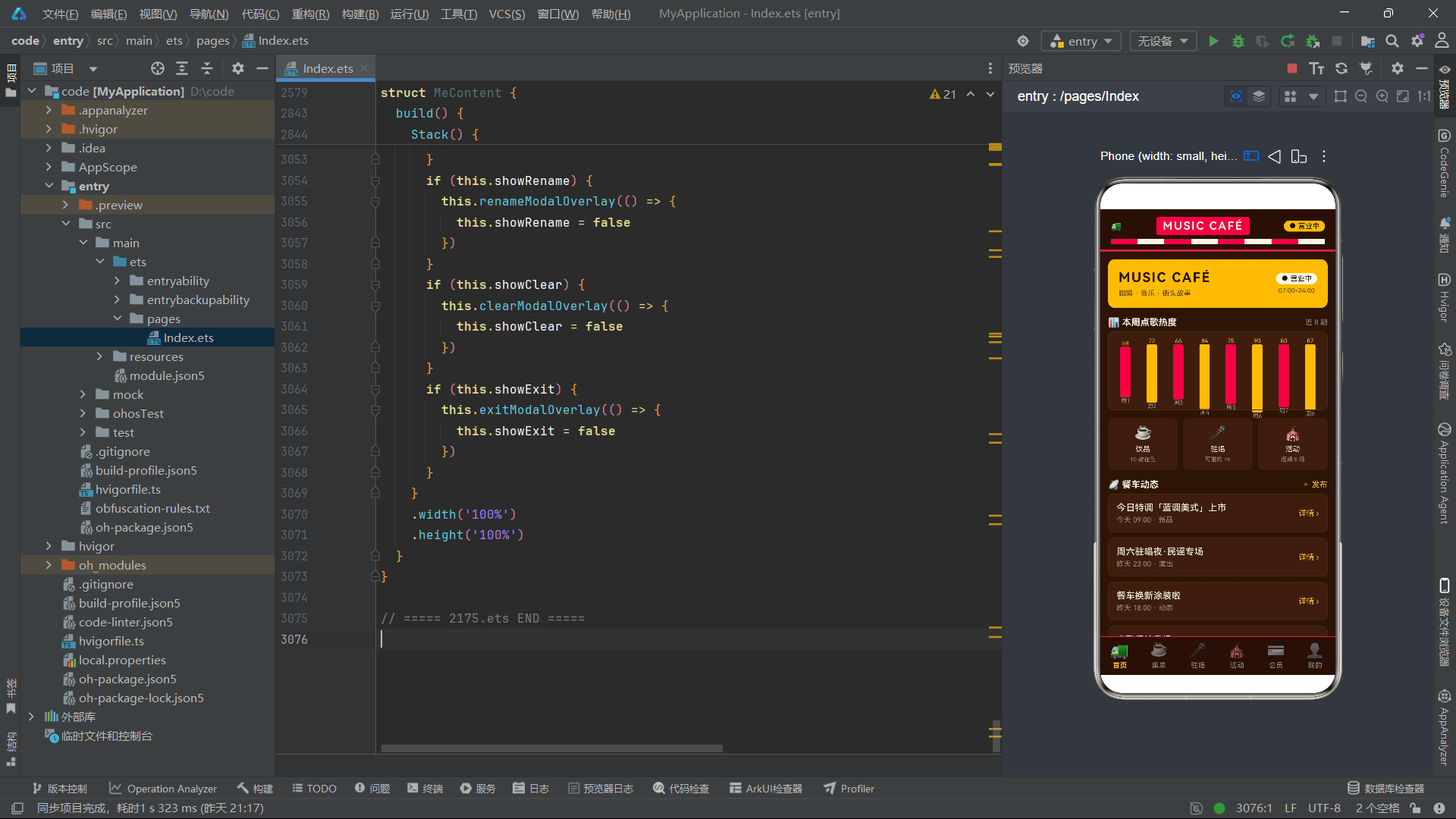
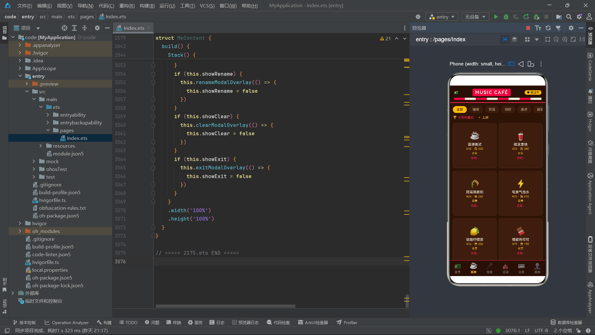
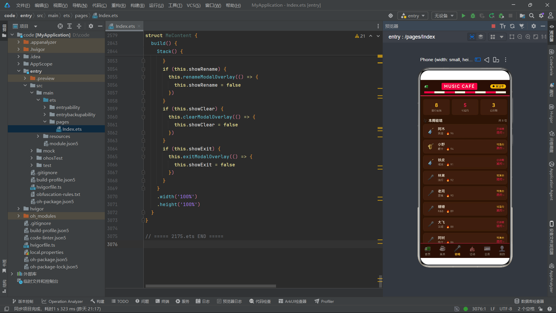
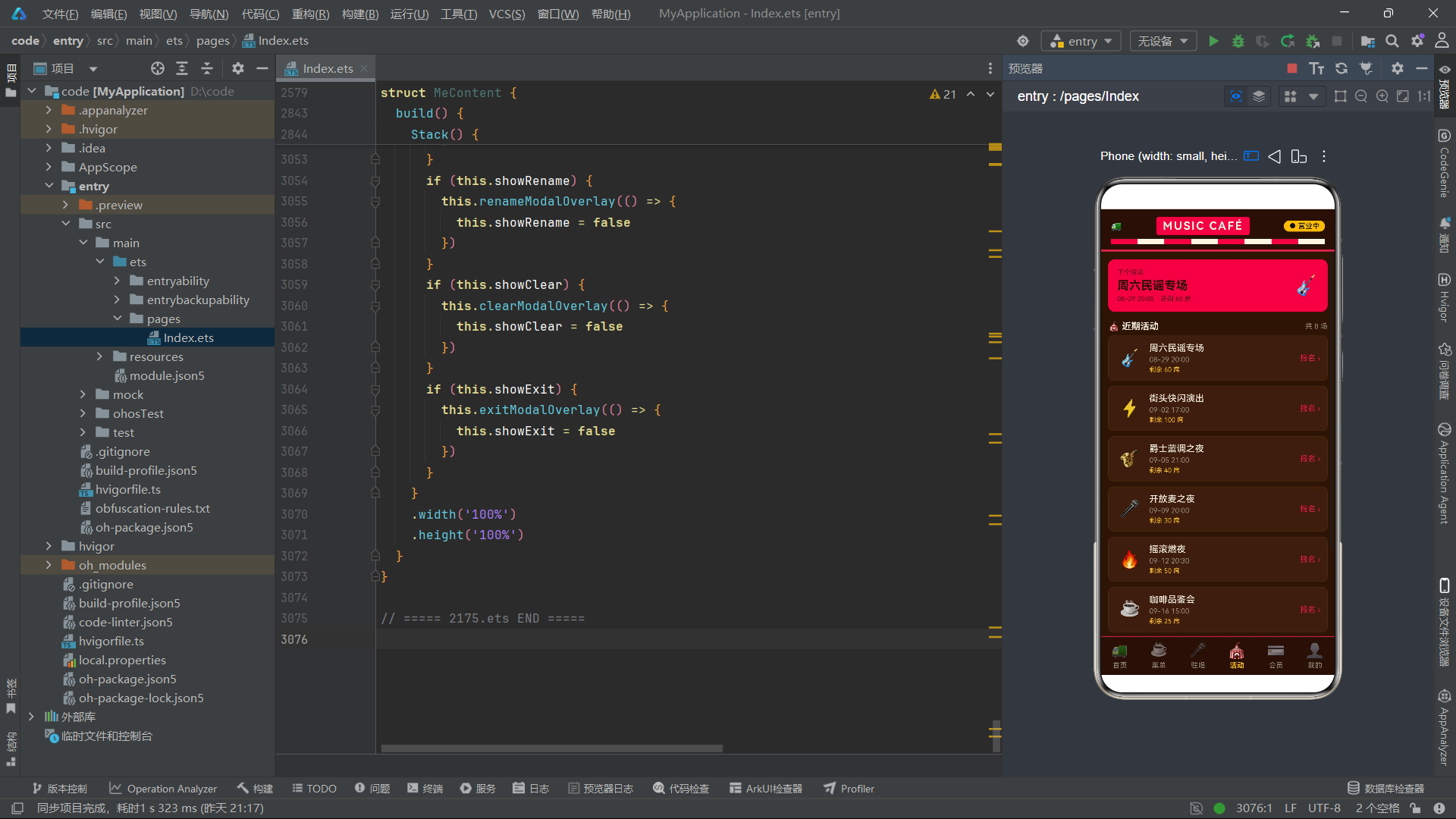
本文深入解析了一个基于鸿蒙 ArkTS 声明式 UI 框架构建的音乐咖啡餐车应用。该应用以美式复古餐车为主题,通过焦糖棕、复古红、奶油白、暖黄灯牌四种核心色调,营造出了浓郁的街头音乐餐车氛围。整个应用采用 6 Tab 架构(首页、菜单、驻唱、活动、会员、我的),配合 16 个弹窗交互,完整覆盖了餐车动态浏览、饮品菜单管理、驻唱乐手邀约、活动报名、会员卡充值退卡、个人收藏管理等全部业务场景。
从代码架构角度看,本应用采用了"单文件多组件"的组织方式,所有组件、数据结构、工具函数都定义在同一个 .ets 文件中。这种组织方式在中小型应用中是合理的选择——所有代码集中管理,便于快速查找和修改,编译器也无需处理跨文件的依赖关系。应用通过 6 个 interface 定义了严格的数据模型,配合 6 个全局常量数组和 1 个热度数组提供初始数据,再通过一系列工具函数处理状态映射、数据格式化和对象构建等业务逻辑。这种"数据建模 -> 静态数据 -> 工具函数 -> 组件渲染"的分层设计,使得各层职责清晰,代码可读性和可维护性都得到了保障。
在状态管理方面,本应用充分运用了 ArkUI 的装饰器体系。@Entry + @Component 标记入口组件,@State 管理组件内部的可观察状态(如弹窗显隐、选中项、输入值等),@Link 建立父子组件之间的双向数据通道,@Builder 封装可复用的 UI 片段。特别值得强调的是 @Link 的使用——通过将 feeds、menus、singers、events、cards、mys 六大数据集合以 @Link 方式从 Index 父组件传递到各子组件,实现了跨 Tab 的数据共享。当用户在菜单页收藏一款饮品时,"我的"页面的收藏列表会自动新增该项;当用户在活动页报名后,首页横幅和"我的"页面的统计数字都会同步更新。这种"单一数据源 + 双向绑定"的架构,从根本上保证了各页面间数据的一致性。
在 UI 布局方面,本应用全面运用了 ArkUI 的容器组件体系。Column 和 Row 作为最基础的线性布局容器,承担了几乎所有的页面结构搭建工作;Stack 层叠布局被巧妙地用于条件渲染容器和弹窗遮罩层;Scroll 滚动容器确保长内容可以上下或左右滚动浏览;ForEach 负责所有列表和循环渲染场景。在布局属性上,layoutWeight 实现了弹性的权重分配,让卡片和列表项能自适应屏幕宽度;justifyContent 和 alignItems 的组合精确控制了子元素在主轴和交叉轴方向的对齐方式;offset 用于进度条的叠加覆盖效果;borderRadius、backgroundColor、border、padding、margin 等样式属性共同塑造了复古餐车的视觉风格。
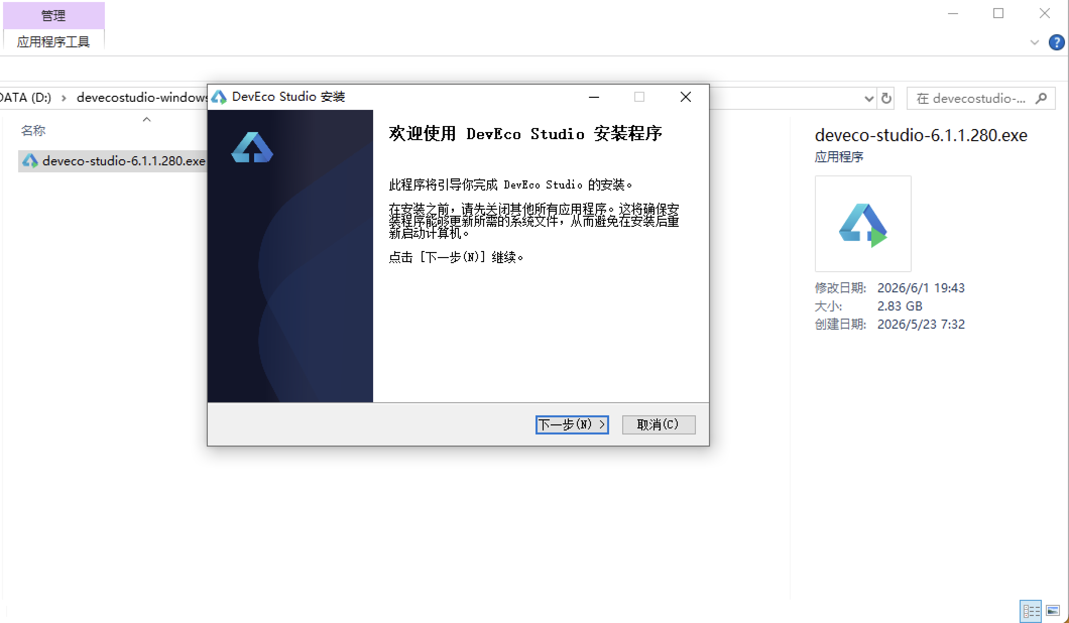
安装DevEco Studio程序
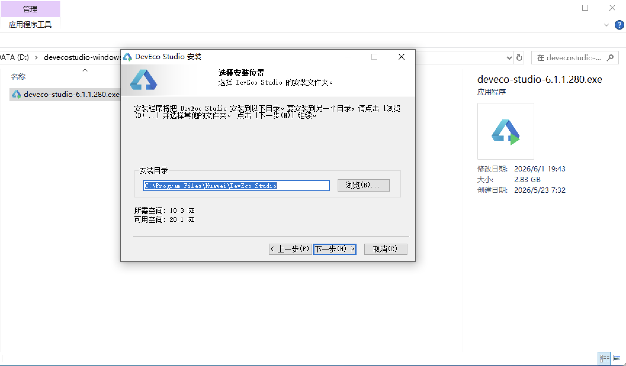
选择目标安装目录:
设置环境变量,但是需要重启一下:
  }
}
.width('100%')
.height('100%')
}
}
// ===== 2175.ets END =====
---
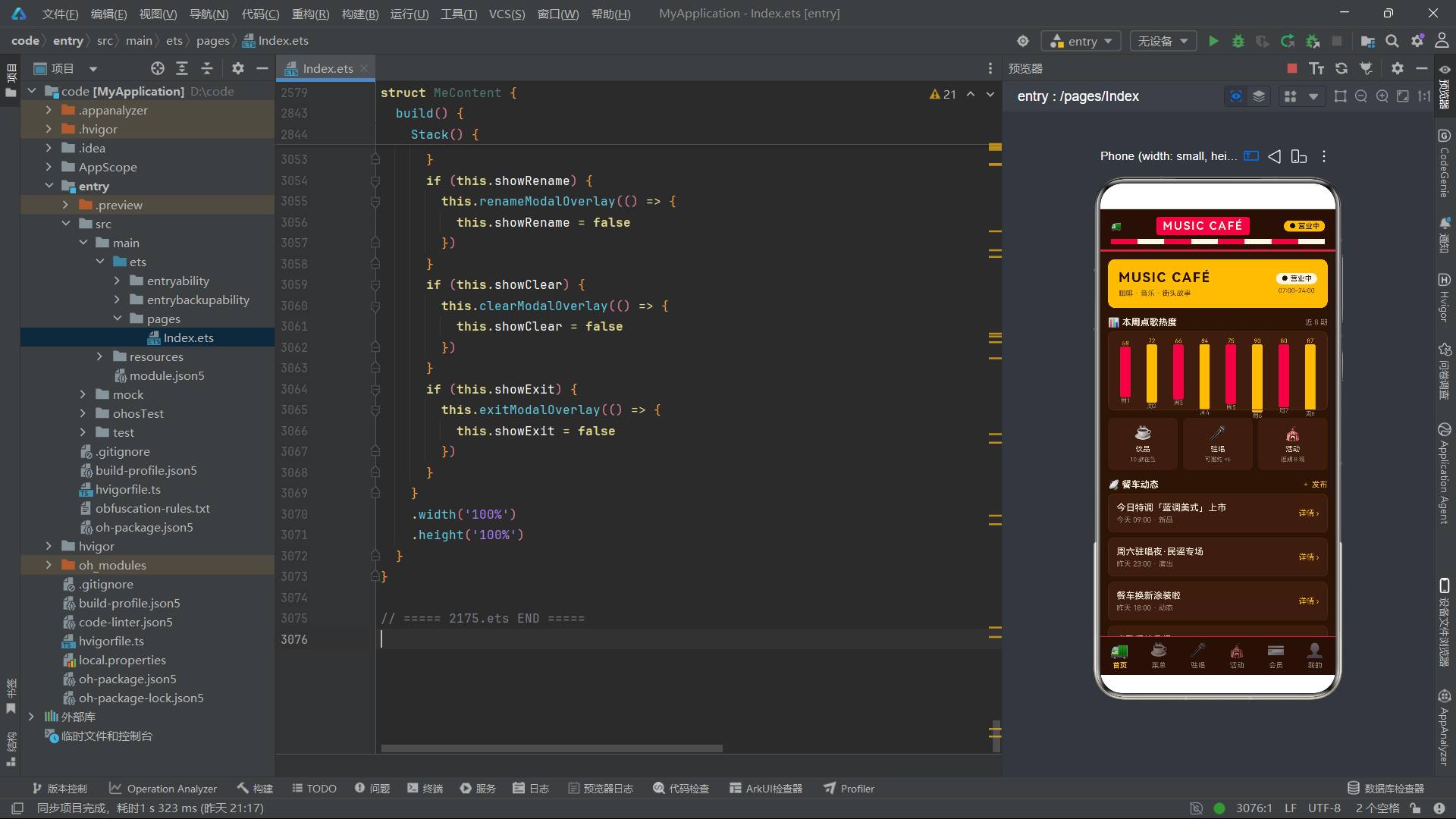
在交互设计方面,本应用实现了 16 个弹窗,涵盖了"查看详情"(动态详情、饮品详情、驻唱详情、活动详情、会员卡详情)、"新增操作"(点歌新增、邀请新增、报名新增)、"编辑操作"(调价上新、修改昵称)、"删除确认"(退卡、移除收藏)、"系统操作"(清缓存、退出登录)和"信息展示"(销量榜、会员规则)六大类交互模式。所有弹窗都采用统一的结构模板:全屏半透明遮罩 + 居中卡片容器 + 标题栏 + 内容区 + 底部按钮栏。这种模板化的弹窗设计不仅保证了视觉一致性,也大幅降低了开发和维护成本——修改弹窗的视觉风格只需调整模板,16 个弹窗同时生效。弹窗的显隐通过 `@State` 布尔变量配合 `if` 条件渲染控制,关闭操作通过 `@Builder` 方法接收的 `onClose` 回调函数实现,形成了一套简洁而完整的弹窗管理机制。
总而言之,本应用代码展现了鸿蒙 ArkTS 声明式 UI 开发的核心范式和最佳实践。从严格类型安全的 interface 数据建模,到纯函数化的工具函数封装,从装饰器驱动的状态管理体系,到容器组件组合的布局架构,再到模板化的弹窗交互设计,每一个层面都体现了声明式 UI "数据驱动视图"的设计哲学。对于希望深入学习鸿蒙应用开发的工程师来说,本应用的代码是一个极具参考价值的实践样本——它不依赖任何第三方库,仅使用 ArkUI 框架内置的组件和属性,就构建出了一个功能完整、交互丰富、视觉统一的多页面应用。这种"纯框架"的实现方式,最能体现开发者对 ArkUI 组件体系和状态管理机制的掌握深度,也为进一步学习更复杂的鸿蒙应用开发奠定了坚实的基础。

作为“人工智能6S店”的官方数字引擎,为AI开发者与企业提供一个覆盖软硬件全栈、一站式门户。
更多推荐

 16
16 0
0- 0


 已为社区贡献57条内容

所有评论(0)