
基于HarmonyOS API 24的QQ装扮主题屋应用开发实战——HarmonyOS 6.1.1与HarmonyOS ArkTS API 24深度解析
技术引言
HarmonyOS 6.1.1作为华为鸿蒙操作系统的最新演进版本,搭载了HarmonyOS ArkTS API 24这一成熟的声明式UI开发框架。ArkTS在TypeScript基础上进行了鸿蒙化扩展,提供了@Entry、@Builder、@State、@Observed等装饰器语法,让开发者能够以声明式的方式构建高性能的跨设备应用界面。本文以一个"QQ装扮·主题屋"个性装扮商店演示页面为例,深入剖析基于HarmonyOS API 24的完整应用开发流程。该应用集成了底部四Tab导航、顶部六Tab分类切换、主题卡片横滑浏览、聊天气泡实时预览、钻石粒子动效、月度下载量柱状图、盲盒抽盒弹窗、搭配编辑表单、删除确认弹窗以及装扮详情大卡等十余种交互形态,全面覆盖了HarmonyOS ArkTS API 24在状态管理、列表渲染、弹窗交互、动画效果和数据驱动UI等方面的核心技术能力,是学习鸿蒙原生开发的极佳实践案例。
一、整体架构概览
在深入逐段代码之前,我们先从架构层面理解这个应用的整体设计思路。该应用采用单页面多Tab的架构模式,通过@State状态变量驱动界面切换,所有UI通过@Builder方法模块化拆分,实现了高内聚低耦合的组件化开发。
如上图所示,整个应用的架构清晰分明。最外层的@Entry结构体作为应用入口,统领全局状态与UI构建。状态管理层负责维护当前选中的Tab、弹窗显示状态、粒子动画数据等核心状态。UI构建层通过Stack容器实现了三层叠加:主布局层负责常规内容展示,粒子层实现钻石飘浮特效,条件弹窗层负责各类交互弹窗的渲染。
主布局内部通过Column实现了垂直排列的四大区域:渐变头部、顶部Tab栏、可滚动内容区和底部Tab栏。内容区根据currentBottomTab的值动态路由到四个主内容构建器,而商店内容进一步根据currentTopTab路由到六个子内容构建器。这种分层路由的设计使得代码结构清晰、扩展性极强。
二、逐段代码深度分析
代码段1:颜色调色板接口与全局颜色常量
interface ColorPalette {
  rose: string;
  roseDeep: string;
  violet: string;
  violetLight: string;
  bg: string;
  cardBg: string;
  textPrimary: string;
  textSecondary: string;
  textHint: string;
  white: string;
  gold: string;
  border: string;
  danger: string;
  success: string;
}

const COLORS: ColorPalette = {
  rose: '#E91E63',
  roseDeep: '#AD1457',
  violet: '#7C4DFF',
  violetLight: '#EDE7F6',
  bg: '#FAF0F6',
  cardBg: '#FFFFFF',
  textPrimary: '#4A2B3F',
  textSecondary: '#9C7386',
  textHint: '#C9AAB9',
  white: '#FFFFFF',
  gold: '#FFB300',
  border: '#F3DCE8',
  danger: '#EF5350',
  success: '#66BB6A'
};
应用的第一层基础设施是颜色系统的定义。这里首先声明了一个ColorPalette接口,它规范了整个应用所需的14种颜色字段。通过接口约束,确保了颜色常量对象的类型安全,任何遗漏或拼写错误都会在编译期被ArkTS编译器捕获。
COLORS常量对象是这个"梦幻少女风"主题的色彩灵魂。主色调采用玫红(#E91E63)与紫罗兰(#7C4DFF)的搭配,这两种高饱和度色彩贯穿于渐变背景、按钮、高亮文字等核心视觉元素中。深玫红(#AD1457)用于标题强调文字,浅紫罗兰(#EDE7F6)作为柔和的背景填充色。
背景色选用了一个极浅的粉色(#FAF0F6),营造出温馨少女感的底色氛围。文字采用三级灰度体系:主文字色(#4A2B3F)是一种偏暖的深棕紫色,次级文字(#9C7386)为灰粉色,提示文字(#C9AAB9)为浅灰粉色,形成了清晰的视觉层级。
功能性颜色方面,金色(#FFB300)用于VIP标识和稀有物品提示,危险色(#EF5350)用于删除操作和警告提示,成功色(#66BB6A)用于免费标签和完成状态。这种集中式颜色管理的好处是:当需要切换主题或适配暗色模式时,只需修改这一个常量对象即可全局生效。
代码段2:Tab项接口与导航标签常量
interface TabItem {
  label: string;
  icon: string;
}

const BOTTOM_TABS: TabItem[] = [
  { label: '商店', icon: '🛍' },
  { label: '搭配', icon: '👗' },
  { label: '抽盒', icon: '🎁' },
  { label: '我的', icon: '🎀' }
];

const TOP_TABS: TabItem[] = [
  { label: '主题', icon: '🎨' },
  { label: '气泡', icon: '💭' },
  { label: '挂件', icon: '🎐' },
  { label: '字体', icon: '🔤' },
  { label: '背景', icon: '🖼' },
  { label: '装扮秀', icon: '✨' }
];
TabItem接口定义了导航标签的数据结构,包含label(文字标签)和icon(图标)两个字段。这种简单的数据结构是鸿蒙ArkTS中典型的配置驱动UI模式:将UI所需的静态数据抽象为数据集合,然后在ForEach循环中动态渲染。
底部Tab栏定义了四个主导航入口:商店、搭配、抽盒、我的。这四个Tab构成了应用的核心导航架构,每个Tab对应一个独立的功能模块。商店是浏览和购买装扮的主入口,搭配是管理已收藏装扮组合的区域,抽盒提供了盲盒抽取的趣味玩法,我的则展示个人信息和已购装扮列表。
顶部Tab栏定义了六个商品分类:主题、气泡、挂件、字体、背景、装扮秀。这六个分类仅在商店Tab下展示,用于进一步细分装扮商品类型。主题是完整的聊天界面皮肤,气泡是聊天气泡的样式,挂件是头像周围的装饰物,字体是聊天文字的字体风格,背景是聊天窗口的背景图,装扮秀则是用户搭配投稿的展示流。
使用Emoji作为图标是一个巧妙的选择。在HarmonyOS ArkTS API 24中,Emoji字符可以通过Text组件直接渲染,无需引入额外的图片资源或图标字体库,大大减小了应用包体积。同时Emoji自带色彩和风格,与"梦幻少女风"的整体调性高度契合。
代码段3:月度下载量数据与柱状图数据源
const MONTHS: string[] = ['3月', '4月', '5月', '6月', '7月', '8月'];
const DOWNLOAD_VALUES: number[] = [8200, 12100, 9600, 15800, 13400, 19200];
这两行常量定义了月度下载量柱状图所需的数据源。MONTHS数组存储了六个月份标签,DOWNLOAD_VALUES数组存储了对应月份的下载量数值。两个数组通过索引一一对应,形成了一种并行数组的映射关系。
从数据趋势来看,下载量从3月的8200次逐步攀升至8月的19200次,呈现出明显的增长态势。这种数据设计有意识地模拟了真实应用中装扮商店的热度变化:随着夏季到来和暑假期间用户活跃度提升,装扮下载量逐月攀升,8月达到峰值。
在后续的柱状图渲染中,DOWNLOAD_VALUES中的原始数值会通过downloadBarHeight()函数转换为柱状图的高度(以vp为单位),通过downloadBarColor()函数根据数值区间映射为不同的颜色。这种将原始数据与渲染逻辑分离的设计模式,使得数据变更时无需修改渲染代码,只需更新数据源即可。
并行数组的方式虽然简洁,但在更复杂的场景中也可以考虑使用对象数组(如{month: '3月', value: 8200})来替代,以增强数据的内聚性和可维护性。在本应用中,由于数据量小且结构简单,并行数组是足够且高效的方案。
代码段4:@Observed可观察数据模型ThemeItem
@Observed
class ThemeItem {
  id: number;
  name: string;
  designer: string;
  category: string;
  price: string;
  downloads: number;
  isVip: boolean;
  gradientFrom: string;
  gradientTo: string;
  desc: string;

  constructor(id: number, name: string, designer: string, category: string, price: string,
    downloads: number, isVip: boolean, gradientFrom: string, gradientTo: string, desc: string) {
    this.id = id;
    this.name = name;
    this.designer = designer;
    this.category = category;
    this.price = price;
    this.downloads = downloads;
    this.isVip = isVip;
    this.gradientFrom = gradientFrom;
    this.gradientTo = gradientTo;
    this.desc = desc;
  }
}
ThemeItem是整个应用最核心的数据模型,它使用@Observed装饰器标记为可观察类。在HarmonyOS ArkTS API 24中,@Observed装饰器用于声明一个可被UI层观察的类,当该类的实例属性发生变化时,绑定到该实例的UI组件会自动重新渲染,实现数据驱动UI的响应式更新。
ThemeItem包含10个属性字段。id是唯一标识符,用于ForEach的键值生成。name是装扮名称,如"星河入梦"、"樱花信笺"等富有诗意的名字。designer记录设计师或工作室名称。category标识装扮类别(主题、气泡、挂件、字体、背景)。price以字符串形式存储价格(“免费”、“¥6”、“VIP”),使用字符串而非数字是为了兼容多种价格表达形式。
downloads记录下载使用次数,用于排序和热度展示。isVip是布尔型标记,标识该装扮是否为VIP专属。gradientFrom和gradientTo是一对渐变色值,用于渲染主题卡片的线性渐变背景。desc是装扮的文字描述。
构造函数采用全参数初始化模式,确保每个ThemeItem实例在创建时都拥有完整的属性值。这种设计虽然参数较多,但保证了数据完整性,避免了可选属性带来的空值检查负担。在实际企业级开发中,也可以考虑使用Builder模式或对象字面量来简化实例创建过程。
代码段5:主题数据工厂函数buildThemes
function buildThemes(): ThemeItem[] {
  return [
    new ThemeItem(1, '星河入梦', '月色设计所', '主题', '免费', 19200, false, '#3A1C71', '#D76D77', '紫色星云渐变,附赠流星划过特效'),
    new ThemeItem(2, '樱花信笺', '春日工作室', '主题', '¥6', 15800, false, '#FF9A9E', '#FECFEF', '粉色樱花瓣飘落,少女心满分'),
    new ThemeItem(3, '午夜电台', '深夜灵感组', '主题', 'VIP', 13400, true, '#141E30', '#243B55', '深夜蓝调,适合夜猫子聊天'),
    new ThemeItem(4, '薄荷汽水', '气泡实验室', '气泡', '免费', 12100, false, '#00C9A7', '#92FE9D', '气泡自带汽水冒泡音效'),
    new ThemeItem(5, '云朵软糖', '棉花糖制贩', '气泡', '¥3', 9600, false, '#F6D365', '#FDA085', '咬一口会抖动的软糖气泡'),
    new ThemeItem(6, '星轨信使', '天文社', '挂件', '¥8', 8800, false, '#5B86E5', '#36D1DC', '头像旁环绕小行星轨迹'),
    new ThemeItem(7, '奶茶挂件', '快乐肥宅组', '挂件', '免费', 8200, false, '#D1913C', '#FFD194', '三分糖去冰,挂在头像上'),
    new ThemeItem(8, '手写体·屿', '字库坊', '字体', '¥5', 7400, false, '#654EA3', '#EAAFC8', '温柔手写体,适合长文案'),
    new ThemeItem(9, '像素冒险', '街机怀旧屋', '字体', 'VIP', 6800, true, '#FC466B', '#3F5EFB', '8-bit像素风,游戏迷必备'),
    new ThemeItem(10, '莫奈花园', '美术馆联名', '背景', '¥12', 5900, false, '#D4FC79', '#96E6A1', '印象派睡莲,聊天背景首选'),
    new ThemeItem(11, '落日飞车', '公路电影组', '背景', '¥6', 5200, false, '#FF9966', '#FF5E62', '落日公路,永远的浪漫'),
    new ThemeItem(12, '猫爪键盘', '猫奴联盟', '主题', '¥4', 4800, false, '#F093FB', '#F5576C', '每次打字都踩出小猫爪印'),
    new ThemeItem(13, '青柠气泡', '气泡实验室', '气泡', '免费', 4300, false, '#A8FF78', '#78ffd6', '清爽青柠,夏日限定回归'),
    new ThemeItem(14, '古风·墨竹', '竹里馆', '主题', '¥6', 3900, false, '#134E5E', '#71B280', '水墨竹影,文人雅士之选'),
    new ThemeItem(15, '月光海浪', '海边合作社', '背景', 'VIP', 3600, true, '#2E3192', '#1BFFFF', '月色下的海浪轻轻拍岸')
  ];
}
buildThemes()是一个工厂函数,负责创建并返回15个ThemeItem实例。之所以使用函数而非直接定义常量数组,是因为ThemeItem实例需要通过构造函数创建,使用函数封装可以保持代码的整洁性和可复用性。
这15个主题数据覆盖了全部五个装扮类别。主题类有5个(星河入梦、樱花信笺、午夜电台、猫爪键盘、古风墨竹),气泡类有3个(薄荷汽水、云朵软糖、青柠气泡),挂件类有2个(星轨信使、奶茶挂件),字体类有2个(手写体屿、像素冒险),背景类有3个(莫奈花园、落日飞车、月光海浪)。
每个主题的渐变色搭配都经过精心设计。例如"星河入梦"使用深紫色到粉红色的渐变(#3A1C71到#D76D77),营造出星云的神秘感;"樱花信笺"使用粉色渐变(#FF9A9E到#FECFEF),呼应樱花的柔美;"午夜电台"使用深蓝渐变(#141E30到#243B55),传递深夜电台的沉稳氛围。
价格策略也体现了商业化设计:免费装扮用于吸引用户和降低门槛,付费装扮(¥3-¥12)覆盖不同消费层次,VIP专属装扮则激励用户开通会员。下载量从19200到3600递减,模拟了真实的热度分布。最终通过const THEMES: ThemeItem[] = buildThemes()将数据固化为主题列表常量。
代码段6:聊天气泡消息数据模型
interface BubbleMsg {
  id: number;
  sender: string;
  avatar: string;
  content: string;
  time: string;
  isMine: boolean;
}

const CHAT_MSGS: BubbleMsg[] = [
  { id: 1, sender: '小鹿', avatar: '🦌', content: '你新换的这个气泡也太好看了吧!', time: '20:01', isMine: false },
  { id: 2, sender: '我', avatar: '🎀', content: '嘿嘿,云朵软糖,咬一口会抖的那种', time: '20:02', isMine: true },
  { id: 3, sender: '小鹿', avatar: '🦌', content: '多少钱呀?我也要去买!', time: '20:02', isMine: false },
  { id: 4, sender: '我', avatar: '🎀', content: '才3块钱,学生党友好~', time: '20:03', isMine: true },
  { id: 5, sender: '小鹿', avatar: '🦌', content: '冲了!配上星轨挂件绝美', time: '20:05', isMine: false },
  { id: 6, sender: '我', avatar: '🎀', content: '晚上一起去装扮秀投稿吧', time: '20:06', isMine: true },
  { id: 7, sender: '小鹿', avatar: '🦌', content: '好啊好啊,我用樱花信笺主题', time: '20:06', isMine: false },
  { id: 8, sender: '我', avatar: '🎀', content: '那我配午夜电台,暗黑+粉嫩反差感', time: '20:08', isMine: true }
];
BubbleMsg接口定义了聊天气泡消息的数据结构。与ThemeItem不同,这里使用了普通接口而非@Observed类,因为聊天消息数据是静态展示的,不需要响应式更新。
id字段用于ForEach的键值标识。sender是发送者名称。avatar使用Emoji作为头像(小鹿用🦌,自己用🎀),与Tab图标的设计理念一致。content是消息正文内容。time是消息发送时间,格式为HH:MM。isMine是最关键的布尔标记,它决定了气泡的左右位置和颜色风格:自己的消息靠右显示并使用玫紫渐变背景,对方的消息靠左显示并使用白色背景。
这8条消息构成了一段完整的对话场景:从好友"小鹿"夸赞新气泡开始,聊到价格、购买、搭配建议,最后约定一起去装扮秀投稿。这段对话自然地串联起了气泡装扮的展示效果,用户可以在真实的聊天上下文中预览气泡样式,比单独展示气泡效果更加直观和有代入感。
数据中巧妙地融入了多个装扮产品的提及——"云朵软糖"气泡、“星轨挂件”、"樱花信笺"主题、"午夜电台"主题——形成了一个产品种草到购买的完整叙事链路。这种将商品展示融入使用场景的数据设计,在真实电商应用中是非常常见的转化策略。
代码段7:搭配投稿与盲盒系列数据
interface OutfitPost {
  id: number;
  author: string;
  avatar: string;
  title: string;
  usedThemes: string;
  likes: number;
  scene: string;
}

const OUTFIT_POSTS: OutfitPost[] = [
  { id: 1, author: '月光奏鸣曲', avatar: '🌙', title: '深夜聊天氛围感套装', usedThemes: '午夜电台+星轨信使+手写体', likes: 3284, scene: '夜聊' },
  { id: 2, author: '桃桃乌龙', avatar: '🍑', title: '春日野餐少女风', usedThemes: '樱花信笺+云朵软糖+奶茶挂件', likes: 2876, scene: '约会' },
  { id: 3, author: '像素骑士', avatar: '🕹', title: '复古游戏厅全套', usedThemes: '像素冒险+落日飞车背景', likes: 2453, scene: '游戏' },
  { id: 4, author: '南山采菊', avatar: '🌿', title: '竹林听雨文人装', usedThemes: '古风墨竹+手写体屿', likes: 1987, scene: '阅读' },
  { id: 5, author: '深海不蓝', avatar: '🌊', title: '海边度假风', usedThemes: '月光海浪+薄荷汽水', likes: 1755, scene: '旅行' },
  { id: 6, author: '肥宅快乐兽', avatar: '🐱', title: '猫咪周边大满贯', usedThemes: '猫爪键盘+奶茶挂件', likes: 1620, scene: '日常' },
  { id: 7, author: '星河滚烫', avatar: '⭐', title: '宇宙浪漫终极版', usedThemes: '星河入梦+星轨信使+像素冒险', likes: 1544, scene: '夜聊' }
];

interface BlindBoxSeries {
  id: number;
  name: string;
  icon: string;
  price: string;
  count: string;
  rare: string;
}

const BOX_SERIES: BlindBoxSeries[] = [
  { id: 1, name: '星梦奇缘系列', icon: '🌟', price: '12钻/次', count: '8款', rare: '隐藏款为流星眼' },
  { id: 2, name: '甜品派对系列', icon: '🍰', price: '10钻/次', count: '6款', rare: '隐藏款为熔岩蛋糕' },
  { id: 3, name: '机械之心系列', icon: '⚙️', price: '15钻/次', count: '10款', rare: '隐藏款为黄金齿轮' }
];
这里定义了两个重要的数据接口和数据集合。OutfitPost是搭配投稿的数据模型,记录了用户分享的装扮组合方案。每条投稿包含作者昵称、头像、方案标题、使用的装扮组合、点赞数和适用场景。7条投稿数据覆盖了夜聊、约会、游戏、阅读、旅行、日常等多种场景,展示了装扮搭配在不同生活场景中的适用性。
OUTFIT_POSTS数据有一个巧妙的设计——它同时被用于多个UI区域:装扮秀展示流、搭配管理列表、欧皇榜排名。在搭配列表中只取前5条(idx < 5),在欧皇榜中也取前5条但以不同方式展示。这种一数据多用途的策略减少了数据冗余。
BlindBoxSeries是盲盒系列的数据模型,包含系列名称、图标、单次抽取价格、款数和隐藏款描述。三个系列分别定位不同的审美方向:星梦奇缘走浪漫梦幻风,甜品派对走可爱治愈风,机械之心走硬核科技风。隐藏款的设计(流星眼、熔岩蛋糕、黄金齿轮)增加了抽取的期待感和稀有度。价格以钻石为单位,与头部显示的钻石余额形成呼应。
代码段8:粒子系统数据模型与初始化
interface ParticleItem {
  id: number;
  x: number;
  y: number;
  size: number;
  opacity: number;
  icon: string;
}

const PARTICLE_ICONS: string[] = ['💎', '✨', '🎀', '❀', '✧'];

function buildParticles(): ParticleItem[] {
  const arr: ParticleItem[] = [];
  for (let i = 0; i < 13; i++) {
    arr.push({
      id: i,
      x: (i * 51) % 335 + 10,
      y: 130 + (i * 89) % 470,
      size: 8 + (i * 6) % 10,
      opacity: 0.2 + (i % 3) * 0.1,
      opacity: 0.2 + (i % 3) * 0.1,
      icon: PARTICLE_ICONS[i % PARTICLE_ICONS.length]
    });
  }
  return arr;
}
ParticleItem接口定义了单个粒子的数据结构。x和y是粒子在屏幕上的坐标位置,size是粒子的字体大小(决定了粒子的视觉尺寸),opacity是透明度(控制粒子的可见程度),icon是粒子的Emoji图标。
PARTICLE_ICONS数组定义了5种粒子图标:钻石、闪光、蝴蝶结、花朵、星号。这些图标都是小巧精致的装饰性符号,与"梦幻少女风"的整体调性一致。
buildParticles()函数通过循环创建13个粒子实例。坐标计算使用了取模运算来分散粒子位置:x坐标通过(i * 51) % 335 + 10计算,使得粒子在水平方向上均匀但非规则地分布;y坐标通过130 + (i * 89) % 470计算,使粒子在垂直方向上散布在130到600的范围内。
粒子大小通过8 + (i * 6) % 10计算,范围在8到17之间,形成大小不一的视觉层次。透明度通过0.2 + (i % 3) * 0.1计算,取值为0.2、0.3或0.4,制造出远近虚实的景深效果。每个粒子的图标通过PARTICLE_ICONS[i % PARTICLE_ICONS.length]循环取值,确保5种图标在13个粒子中均匀分布。
这种基于数学运算的初始化方式虽然看起来有些"魔法数字",但实际上是一种轻量级的伪随机分布方案。相比使用Math.random(),这种方式在每次应用启动时产生相同的粒子布局,保证了视觉效果的确定性。粒子数据最终通过@State particles: ParticleItem[] = buildParticles()绑定到组件状态,驱动后续的动画更新。
代码段9:粒子漂移动画函数
function driftParticles(list: ParticleItem[]): ParticleItem[] {
  const next: ParticleItem[] = [];
  for (let i = 0; i < list.length; i++) {
    const p = list[i];
    const ny = p.y - 4;
    next.push({
      id: p.id,
      x: p.x + Math.cos(p.id + p.y / 42) * 1.6,
      y: ny < 105 ? 630 : ny,
      size: p.size,
      opacity: p.opacity,
      icon: p.icon
    });
  }
  return next;
}
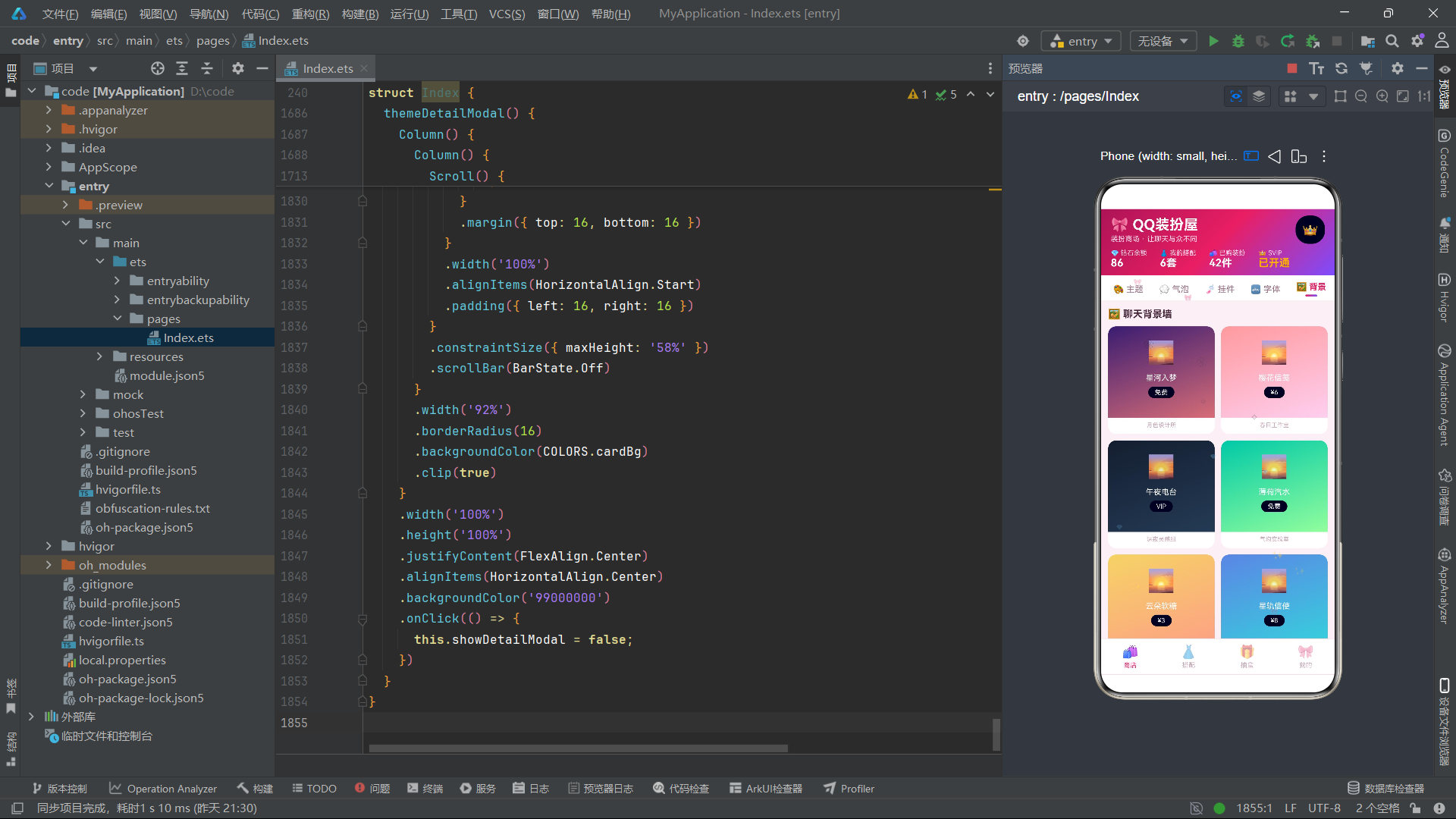
driftParticles()函数是粒子动画的核心逻辑,它接收当前的粒子数组,计算并返回下一帧的粒子数组。这种不可变数据更新的方式是ArkTS状态管理的最佳实践:每次都创建新的数组对象而非修改原数组,确保@State能够正确检测到变化并触发UI重新渲染。
每个粒子的运动逻辑包含两个维度。垂直方向上,y坐标每次减少4vp,即粒子向上移动。当y值低于105时(即粒子飘出顶部可视区域),将其重置为630(底部位置),形成粒子从下到上循环飘动的效果。这种循环处理使得粒子动画可以无限运行而不出现粒子消失的情况。
水平方向上,x坐标通过p.x + Math.cos(p.id + p.y / 42) * 1.6计算偏移量。这里使用了余弦函数,以粒子的id和y坐标的组合作为相位输入,产生一个在-1.6到1.6之间波动的水平偏移值。不同粒子由于id不同,其水平摆动的相位也不同,形成了各粒子独立摆动的自然效果。这种基于三角函数的摆动模拟了空气中轻质物体(如花瓣、星屑)受气流影响的飘动轨迹。
size、opacity和icon在动画过程中保持不变,只有位置在持续更新。这是一种合理的性能优化策略:如果每帧都重新计算所有属性,会增加不必要的计算开销。在HarmonyOS ArkTS API 24中,ForEach的键值生成器(key generator)使用了p.id.toString() + '_' + p.y.toFixed(0),使得只有y坐标变化的粒子才会触发对应UI组件的更新,进一步优化了渲染性能。
代码段10:柱状图与价格辅助函数
function downloadBarHeight(v: number): string {
  return (v / 160).toFixed(0) + 'vp';
}

function downloadBarColor(v: number): string {
  if (v > 15000) {
    return COLORS.rose;
  }
  if (v > 9000) {
    return COLORS.violet;
  }
  return COLORS.gold;
}

function priceColor(price: string): string {
  if (price === '免费') {
    return COLORS.success;
  }
  if (price === 'VIP') {
    return COLORS.gold;
  }
  return COLORS.rose;
}
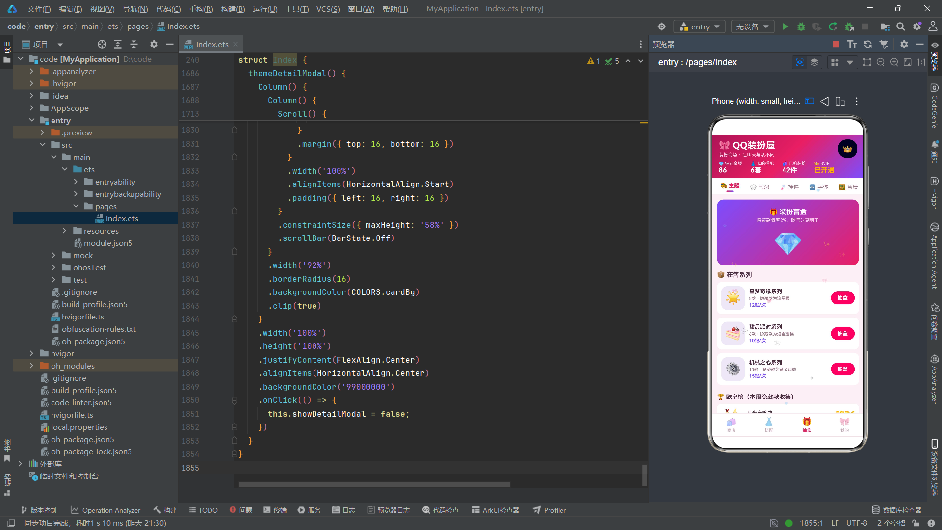
这三个辅助函数分别服务于柱状图渲染和价格标签着色,体现了ArkTS中将渲染逻辑封装为纯函数的良好实践。
downloadBarHeight()将下载量数值转换为柱状图高度。除以160的基数意味着16000次下载对应100vp的高度,最大值19200次对应120vp。使用toFixed(0)取整后拼接vp单位字符串返回。这种线性映射简单直观,适用于数据范围相对固定的场景。
downloadBarColor()根据下载量区间返回不同颜色:超过15000次使用玫红色(高热度),超过9000次使用紫罗兰色(中等热度),其余使用金色(常规热度)。这种三色分级策略让用户可以直观地通过颜色判断装扮的热门程度,是一个优秀的视觉编码设计。
priceColor()根据价格字符串返回对应颜色:免费装扮使用绿色(友好可获取),VIP专属使用金色(尊贵稀有),付费装扮使用玫红色(品牌主色调)。这种颜色语义化设计使得用户在浏览商品列表时,可以快速识别不同价格类型的装扮,降低了认知成本。
这三个函数都是纯函数(pure function),即输入相同则输出相同,不依赖外部状态也不产生副作用。纯函数在ArkTS中具有天然的渲染优化优势:框架可以在适当的时候缓存函数返回值,避免重复计算。
代码段11:@Entry组件状态变量定义
@Entry
struct Index {
  @State currentBottomTab: number = 0;
  @State currentTopTab: number = 0;
  @State showBoxModal: boolean = false;
  @State showOutfitModal: boolean = false;
  @State showDeleteModal: boolean = false;
  @State showDetailModal: boolean = false;
  @State selectedTheme: ThemeItem | null = null;
  @State particles: ParticleItem[] = buildParticles();
  @State boxSeriesIdx: number = 0;
  @State boxTimes: number = 0;
  @State outfitName: string = '';
  @State outfitScene: number = 0;
  @State outfitPublic: boolean = true;
  private timerId: number = -1;
@Entry装饰器标记Index为应用的入口组件,HarmonyOS框架会自动将其挂载到窗口上。struct关键字定义了一个结构体组件,这是ArkTS中特有的组件声明方式,区别于传统面向对象的class组件。
@State装饰器是ArkTS状态管理的基础。被@State修饰的变量在发生变化时,会自动触发引用该变量的UI组件重新渲染。这里定义了12个状态变量,涵盖了应用运行所需的全部可变状态。
导航状态方面,currentBottomTab和currentTopTab分别控制底部和顶部Tab的选中索引。初始值均为0,即默认显示商店Tab下的主题分类。
弹窗状态方面,showBoxModal、showOutfitModal、showDeleteModal、showDetailModal四个布尔变量分别控制四种弹窗的显示与隐藏。这种独立的弹窗状态设计使得多个弹窗可以灵活组合,例如从详情弹窗跳转到删除弹窗时,只需设置showDetailModal = false; showDeleteModal = true即可实现切换。
selectedTheme使用联合类型ThemeItem | null,初始为null,在用户点击某个主题卡片时被赋值为对应的ThemeItem实例,供详情弹窗渲染使用。particles直接调用buildParticles()初始化粒子数组。
盲盒弹窗状态包括boxSeriesIdx(选中的系列索引)和boxTimes(抽取次数选项索引)。搭配编辑弹窗状态包括outfitName(方案名称文本)、outfitScene(场景选择索引)和outfitPublic(是否公开的开关)。
timerId是一个private变量,不使用@State修饰,因为它不参与UI渲染,仅用于内部定时器ID的存储和清理。
代码段12:组件生命周期方法
  aboutToAppear() {
    this.timerId = setInterval(() => {
      this.particles = driftParticles(this.particles);
    }, 130);
  }

  aboutToDisappear() {
    if (this.timerId >= 0) {
      clearInterval(this.timerId);
    }
  }
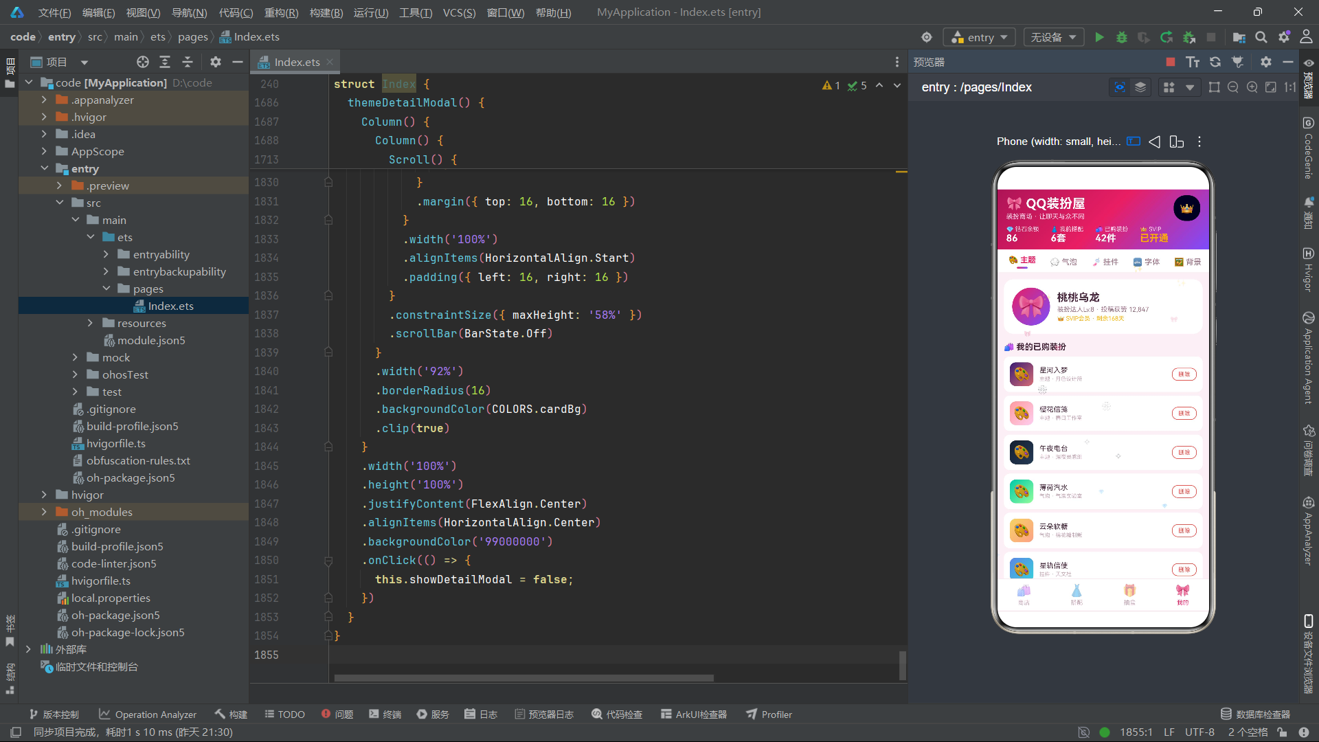
aboutToAppear()和aboutToDisappear()是ArkTS组件生命周期的两个核心回调方法。aboutToAppear在组件创建后、UI渲染前被调用,适合进行数据初始化和资源准备工作。aboutToDisappear在组件销毁前被调用,适合进行资源释放和清理工作。
在aboutToAppear中,通过setInterval创建了一个间隔130毫秒的定时器。每次定时器触发时,调用driftParticles()函数计算粒子数组的下一帧状态,并将结果赋值给this.particles。由于particles被@State修饰,赋值操作会触发ArkTS的响应式系统,自动重新渲染粒子层的UI组件。130毫秒的间隔约等于7.5fps的更新频率,虽然低于60fps的流畅标准,但对于轻量级的粒子飘浮效果而言已经足够自然,同时大大降低了CPU和GPU的渲染负担。
定时器ID被保存到this.timerId中,以便后续清理。这种保存定时器ID的模式是JavaScript/TypeScript中的标准做法,在ArkTS中同样适用。
在aboutToDisappear中,通过判断this.timerId >= 0确认定时器存在后,调用clearInterval清除定时器。这一步至关重要:如果不在组件销毁时清除定时器,定时器会继续在后台运行,持续触发不存在的组件状态更新,导致内存泄漏和性能下降。
这种"创建-使用-销毁"的生命周期管理范式,是HarmonyOS ArkTS API 24中处理定时动画的标准模式。需要注意的是,ArkTS还提供了Animator、animateTo等更高级的动画API,但对于这种简单的粒子系统,setInterval配合@State更新是最直接有效的方案。
代码段13:主构建方法build的Stack架构
  build() {
    Stack() {
      Column() {
        this.headerBuilder()
        this.topTabsBuilder()
        Scroll() {
          Column() {
            if (this.currentBottomTab === 0) {
              this.storeContent()
            } else if (this.currentBottomTab === 1) {
              this.outfitContent()
            } else if (this.currentBottomTab === 2) {
              this.boxContent()
            } else {
              this.mineContent()
            }
          }
          .width('100%')
          .alignItems(HorizontalAlign.Start)
        }
        .layoutWeight(1)
        .scrollable(ScrollDirection.Vertical)
        .scrollBar(BarState.Off)
        this.bottomTabs()
      }
      .width('100%')
      .height('100%')
      .backgroundColor(COLORS.bg)

      ForEach(this.particles, (p: ParticleItem) => {
        Text(p.icon)
          .fontSize(p.size)
          .opacity(p.opacity)
          .position({ x: p.x, y: p.y })
      }, (p: ParticleItem) => p.id.toString() + '_' + p.y.toFixed(0))

      if (this.showBoxModal) {
        this.blindBoxModal()
      }
      if (this.showOutfitModal) {
        this.outfitEditModal()
      }
      if (this.showDeleteModal) {
        this.deleteThemeModal()
      }
      if (this.showDetailModal) {
        this.themeDetailModal()
      }
    }
    .width('100%')
    .height('100%')
  }
build()方法是ArkTS组件的核心,它以声明式语法定义了组件的UI结构。整个布局以Stack作为根容器,Stack是一种层叠布局容器,其子元素会按照声明顺序从底层到顶层依次叠加。
Stack内部分为三大层次。第一层是主内容Column,它从上到下排列了四个区域:通过this.headerBuilder()调用的渐变头部、通过this.topTabsBuilder()调用的顶部Tab栏、可垂直滚动的Scroll内容区、以及通过this.bottomTabs()调用的底部Tab栏。
Scroll组件内部嵌套了一个Column容器,根据currentBottomTab的值条件渲染四个内容构建器之一。if-else条件分支是ArkTS中实现动态路由的常用方式。layoutWeight(1)使Scroll占据剩余空间,scrollBar(BarState.Off)隐藏滚动条以保持视觉简洁。
第二层是粒子飘浮层。通过ForEach遍历this.particles数组,为每个粒子渲染一个Text组件。.position({ x: p.x, y: p.y })使用绝对定位将粒子放置在指定坐标。键值生成器(p) => p.id.toString() + '_' + p.y.toFixed(0)是一个性能优化设计:只有当粒子的id或y坐标的整数部分发生变化时,ArkTS才会重新渲染该粒子对应的UI组件。
第三层是弹窗层。四个if条件分别检查四种弹窗状态变量,当某个状态为true时渲染对应的弹窗构建器。弹窗层位于Stack的最顶层,确保弹窗覆盖在所有内容之上。由于使用了独立的布尔状态变量,多个弹窗理论上可以同时显示,但在实际交互中通过合理的切换逻辑确保同一时间只显示一个弹窗。
代码段14:渐变头部构建器headerBuilder
  @Builder
  headerBuilder() {
    Column() {
      Row() {
        Column() {
          Text('🎀 QQ装扮屋')
            .fontSize(22)
            .fontWeight(FontWeight.Bold)
            .fontColor(COLORS.white)
          Text('装扮商场 · 让聊天与众不同')
            .fontSize(11)
            .fontColor('#FFD9E8')
            .margin({ top: 2 })
        }
        .alignItems(HorizontalAlign.Start)

        Column() {
          Text('👑')
            .fontSize(20)
        }
        .padding(10)
        .borderRadius(20)
        .backgroundColor('33FFFFFF')
      }
      .width('100%')
      .justifyContent(FlexAlign.SpaceBetween)
      .padding({ left: 16, right: 16, top: 10, bottom: 8 })

      Row() {
        Column() {
          Text('💎 钻石余额')
            .fontSize(10)
            .fontColor('#FFD9E8')
          Text('86')
            .fontSize(16)
            .fontWeight(FontWeight.Bold)
            .fontColor(COLORS.white)
        }
        .alignItems(HorizontalAlign.Start)
        // ... 其余三列:搭配、已购、SVIP
      }
      .width('100%')
      .padding({ left: 16, right: 16, bottom: 10 })
    }
    .width('100%')
    .linearGradient({
      angle: 135,
      colors: [['#AD1457', 0], ['#E91E63', 0.5], ['#7C4DFF', 1]]
    })
  }
@Builder装饰器用于声明一个UI构建方法,它可以将复杂的UI结构封装为可复用的代码块。headerBuilder()负责渲染应用的顶部头部区域,这是一个视觉信息密度极高的组件。
头部分为两行。第一行是一个Row,使用justifyContent(FlexAlign.SpaceBetween)实现两端对齐。左侧是应用标题"🎀 QQ装扮屋"和副标题"装扮商场·让聊天与众不同",字号22的粗体白色标题配合字号11的浅粉色副标题,形成了主次分明的视觉层次。右侧是一个半透明背景的VIP皇冠图标按钮,使用'33FFFFFF'作为背景色(ARGB格式的半透明白色),borderRadius(20)配合padding(10)形成圆形按钮效果。
第二行是一个包含四列统计信息的Row:钻石余额(86)、我的搭配(6套)、已购装扮(42件)、SVIP会员(已开通)。每列都采用小标签+大数值的双行布局,标签使用10号浅粉色字体,数值使用16号白色粗体字体。SVIP列的数值使用金色,与其他三列形成区分。
最关键的是整个头部Column的.linearGradient()属性,它定义了一个135度角的线性渐变,从深玫红(#AD1457)经主玫红(#E91E63)过渡到紫罗兰(#7C4DFF),颜色数组中的数值0、0.5、1分别表示渐变位置。这个三色渐变是整个应用"玫红+紫罗兰"主题的视觉基调,在后续的按钮、弹窗头部等处反复出现,形成了统一的品牌视觉语言。
代码段15:顶部Tab栏构建器topTabsBuilder
  @Builder
  topTabsBuilder() {
    Scroll() {
      Row() {
        ForEach(TOP_TABS, (t: TabItem, idx: number) => {
          Column() {
            Text(t.icon + ' ' + t.label)
              .fontSize(13)
              .fontWeight(this.currentTopTab === idx ? FontWeight.Bold : FontWeight.Normal)
              .fontColor(this.currentTopTab === idx ? COLORS.rose : COLORS.textSecondary)
            if (this.currentTopTab === idx) {
              Text('')
                .width(18)
                .height(3)
                .borderRadius(2)
                .linearGradient({
                  angle: 90,
                  colors: [['#E91E63', 0], ['#7C4DFF', 1]]
                })
                .margin({ top: 4 })
            }
          }
          .padding({ left: 12, right: 12, top: 10, bottom: 6 })
          .onClick(() => {
            this.currentTopTab = idx;
          })
        }, (t: TabItem) => t.label)
      }
      .padding({ left: 8, right: 8 })
    }
    .scrollable(ScrollDirection.Horizontal)
    .scrollBar(BarState.Off)
    .width('100%')
    .backgroundColor(COLORS.cardBg)
  }
topTabsBuilder()构建了顶部水平滚动的分类Tab栏。外层使用Scroll组件并设置scrollable(ScrollDirection.Horizontal)实现水平滚动,这解决了六个Tab标签在小屏幕设备上可能无法全部显示的问题。scrollBar(BarState.Off)隐藏了水平滚动条,保持UI的简洁性。
ForEach遍历TOP_TABS数组,为每个Tab渲染一个Column。每个Tab项包含图标和文字的组合(如"🎨 主题"),通过Text(t.icon + ' ' + t.label)将图标和文字拼接为单个文本节点。当选中状态this.currentTopTab === idx为true时,字体加粗并使用玫红色;未选中时使用常规字重和次级文字色。这种通过条件表达式动态切换样式属性的方式是ArkTS声明式UI的典型用法。
选中状态下还会渲染一个渐变下划线指示器:一个宽度18vp、高度3vp的圆角矩形,应用90度角的线性渐变(从玫红到紫罗兰)。这个下划线通过if (this.currentTopTab === idx)条件控制渲染,仅在当前选中的Tab下方出现。
onClick事件处理器将this.currentTopTab设置为被点击Tab的索引。由于currentTopTab是@State变量,赋值后ArkTS会自动重新渲染顶部Tab栏和商店内容区,实现Tab切换的即时响应。键值生成器使用t.label(Tab文字标签)作为唯一标识,由于Tab标签是静态不变的,这种键值方案是可靠的。
整个Tab栏的背景色为白色(COLORS.cardBg),与头部渐变和内容区的粉色背景形成视觉分割,明确了导航区域的边界。
代码段16:商店内容路由与主题商店展示
  @Builder
  storeContent() {
    Column() {
      if (this.currentTopTab === 0) {
        this.themeStoreContent()
      } else if (this.currentTopTab === 1) {
        this.bubblePreviewContent()
      } else if (this.currentTopTab === 2) {
        this.pendantGridContent()
      } else if (this.currentTopTab === 3) {
        this.fontListContent()
      } else if (this.currentTopTab === 4) {
        this.bgWallContent()
      } else {
        this.showWallContent()
      }
    }
    .width('100%')
    .padding(12)
    .alignItems(HorizontalAlign.Start)
  }
storeContent()是商店Tab的内容路由器,根据currentTopTab的值将渲染分发到六个子内容构建器。这种二级路由设计实现了功能的模块化拆分:每个子构建器负责一个独立的商品分类展示,互不干扰。当用户切换顶部Tab时,ArkTS自动卸载前一个构建器渲染的内容并加载新构建器的内容。
  @Builder
  themeStoreContent() {
    Column() {
      Text('🔥 本周爆款主题')
        .fontSize(15)
        .fontWeight(FontWeight.Bold)
        .fontColor(COLORS.textPrimary)
        .margin({ bottom: 8 })

      Scroll() {
        Row() {
          ForEach(THEMES, (t: ThemeItem) => {
            Column() {
              Column() {
                Text('✨')
                  .fontSize(34)
                  .margin({ top: 18 })
                Text(t.name)
                  .fontSize(14)
                  .fontWeight(FontWeight.Bold)
                  .fontColor(COLORS.white)
                  .margin({ top: 10 })
                Text(t.designer)
                  .fontSize(10)
                  .fontColor('#FFFFFFCC')
                  .margin({ top: 4 })
                Text(t.price)
                  .fontSize(11)
                  .fontWeight(FontWeight.Bold)
                  .fontColor(COLORS.white)
                  .padding({ left: 12, right: 12, top: 4, bottom: 4 })
                  .borderRadius(12)
                  .backgroundColor('33FFFFFF')
                  .margin({ top: 10, bottom: 18 })
              }
              .width(150)
              .alignItems(HorizontalAlign.Center)
              .linearGradient({
                angle: 160,
                colors: [[t.gradientFrom, 0], [t.gradientTo, 1]]
              })
            }
            .borderRadius(16)
            .margin({ right: 12 })
            .onClick(() => {
              this.selectedTheme = t;
              this.showDetailModal = true;
            })
          }, (t: ThemeItem) => t.id.toString())
        }
      }
      .scrollable(ScrollDirection.Horizontal)
      .scrollBar(BarState.Off)
      .width('100%')
themeStoreContent()是主题分类的内容构建器,包含了三大区块。第一区块是"本周爆款主题"横滑卡片轮播。通过Scroll配合Row实现水平滚动,ForEach遍历15个主题数据渲染主题大卡片。每张卡片使用主题自身的渐变色(t.gradientFrom到t.gradientTo)作为背景,160度角的线性渐变使色彩过渡自然流畅。
卡片内部从上到下依次展示:闪光图标(✨,34号字)、主题名称(14号粗体白字)、设计师名称(10号半透明白字)、价格标签(11号白字配半透明背景的圆角标签)。卡片宽度固定为150vp,圆角16vp。点击卡片时,将当前主题赋值给selectedTheme并打开详情弹窗。
键值生成器使用t.id.toString(),确保每个主题卡片有唯一的渲染标识。当主题数据更新时,ArkTS通过id匹配复用已有的UI组件,避免全量重建,提升了列表滚动性能。
代码段17:月度下载量柱状图渲染
      Column() {
        Text('📈 热门装扮月下载量')
          .fontSize(13)
          .fontWeight(FontWeight.Bold)
          .fontColor(COLORS.textPrimary)
        Row() {
          ForEach(MONTHS, (m: string, idx: number) => {
            Column() {
              Text((DOWNLOAD_VALUES[idx] / 1000).toFixed(1) + 'k')
                .fontSize(8)
                .fontColor(COLORS.textSecondary)
              Column() {
                Text('')
                  .width('100%')
                  .height(1)
              }
              .width(20)
              .height(downloadBarHeight(DOWNLOAD_VALUES[idx]))
              .borderRadius({ topLeft: 4, topRight: 4 })
              .backgroundColor(downloadBarColor(DOWNLOAD_VALUES[idx]))
              Text(m)
                .fontSize(9)
                .fontColor(COLORS.textSecondary)
                .margin({ top: 4 })
            }
            .margin({ left: 12, right: 12 })
            .alignItems(HorizontalAlign.Center)
          }, (m: string) => m)
        }
        .width('100%')
        .justifyContent(FlexAlign.Center)
        .alignItems(VerticalAlign.Bottom)
      }
      .width('100%')
      .padding(14)
      .borderRadius(16)
      .backgroundColor(COLORS.cardBg)
      .alignItems(HorizontalAlign.Start)
      .margin({ top: 12 })
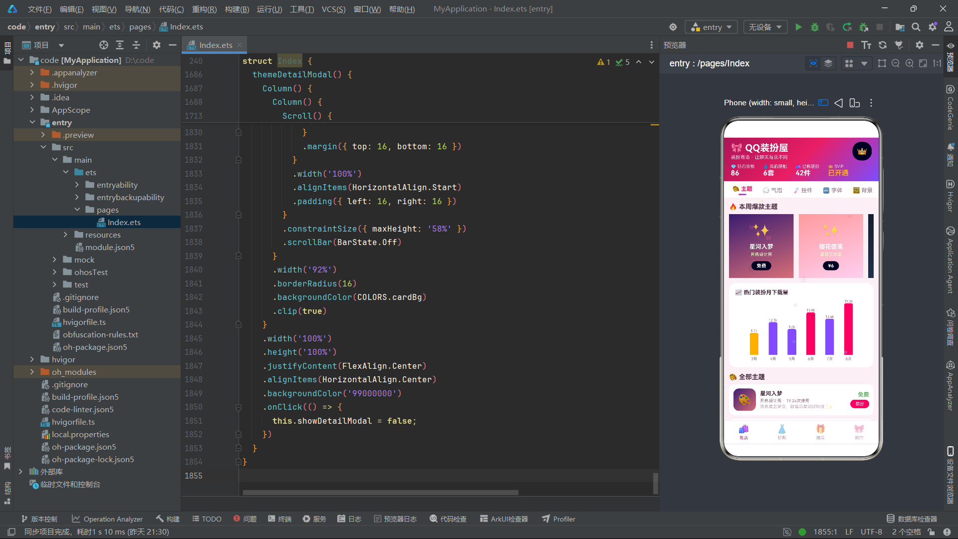
这是主题商店的第二区块——月度下载量柱状图。整个图表被包裹在一个白色背景圆角卡片中,使用padding(14)和borderRadius(16)营造卡片悬浮感。
图表的构建思路是用ArkTS的基础组件手工搭建柱状图,而非依赖第三方图表库。外层Row使用justifyContent(FlexAlign.Center)使柱子居中排列,alignItems(VerticalAlign.Bottom)确保所有柱子底部对齐,这是柱状图正确的视觉基准。
每个柱子由ForEach遍历MONTHS数组生成。每根柱子是一个Column,从上到下包含三部分:数值标签(如"8.2k",通过DOWNLOAD_VALUES[idx] / 1000转换为千次单位并保留一位小数)、柱体本身、月份标签。
柱体是一个宽20vp的Column,高度通过downloadBarHeight(DOWNLOAD_VALUES[idx])动态计算。柱体顶部两角设置为4vp圆角(borderRadius({ topLeft: 4, topRight: 4 })),背景色通过downloadBarColor()根据数值区间动态分配玫红、紫罗兰或金色。柱体内部嵌入了一个高度为1vp的Text('')作为顶部装饰线。
这种纯ArkTS原生方式构建的柱状图虽然功能简单,但胜在轻量、无依赖、完全可控。在需要复杂交互(如点击柱子查看详情、动画过渡)时,可以进一步在此基础上扩展。
代码段18:聊天气泡实时预览
  @Builder
  bubblePreviewContent() {
    Column() {
      Column() {
        Text('💭 气泡效果实时预览')
          .fontSize(14)
          .fontWeight(FontWeight.Bold)
          .fontColor(COLORS.textPrimary)
        Text('与「小鹿」的聊天')
          .fontSize(10)
          .fontColor(COLORS.textSecondary)
          .margin({ top: 4 })
      }
      .width('100%')
      .alignItems(HorizontalAlign.Start)
      .margin({ bottom: 10 })

      ForEach(CHAT_MSGS, (m: BubbleMsg) => {
        Column() {
          if (m.isMine) {
            Row() {
              Column() {
                Text(m.content)
                  .fontSize(13)
                  .fontColor(COLORS.white)
                  .padding({ left: 14, right: 14, top: 10, bottom: 10 })
                  .borderRadius({
                    topLeft: 18, topRight: 18, bottomLeft: 18, bottomRight: 4
                  })
                  .linearGradient({
                    angle: 135,
                    colors: [['#E91E63', 0], ['#7C4DFF', 1]]
                  })
                Text(m.time)
                  .fontSize(8)
                  .fontColor(COLORS.textHint)
                  .margin({ top: 3 })
              }
              .alignItems(HorizontalAlign.End)
              .margin({ right: 8 })
              Text(m.avatar)
                .fontSize(24)
                .width(38)
                .height(38)
                .textAlign(TextAlign.Center)
                .borderRadius(19)
                .backgroundColor(COLORS.violetLight)
            }
            .width('100%')
            .justifyContent(FlexAlign.End)
          } else {
            Row() {
              Text(m.avatar)
                .fontSize(24)
                .width(38)
                .height(38)
                .textAlign(TextAlign.Center)
                .borderRadius(19)
                .backgroundColor(COLORS.border)
              Column() {
                Text(m.content)
                  .fontSize(13)
                  .fontColor(COLORS.textPrimary)
                  .padding({ left: 14, right: 14, top: 10, bottom: 10 })
                  .borderRadius({
                    topLeft: 18, topRight: 18, bottomLeft: 4, bottomRight: 18
                  })
                  .backgroundColor(COLORS.cardBg)
                Text(m.time)
                  .fontSize(8)
                  .fontColor(COLORS.textHint)
                  .margin({ top: 3 })
              }
              .alignItems(HorizontalAlign.Start)
              .margin({ left: 8 })
            }
            .width('100%')
            .justifyContent(FlexAlign.Start)
          }
        }
        .width('100%')
        .margin({ bottom: 10 })
      }, (m: BubbleMsg) => m.id.toString())
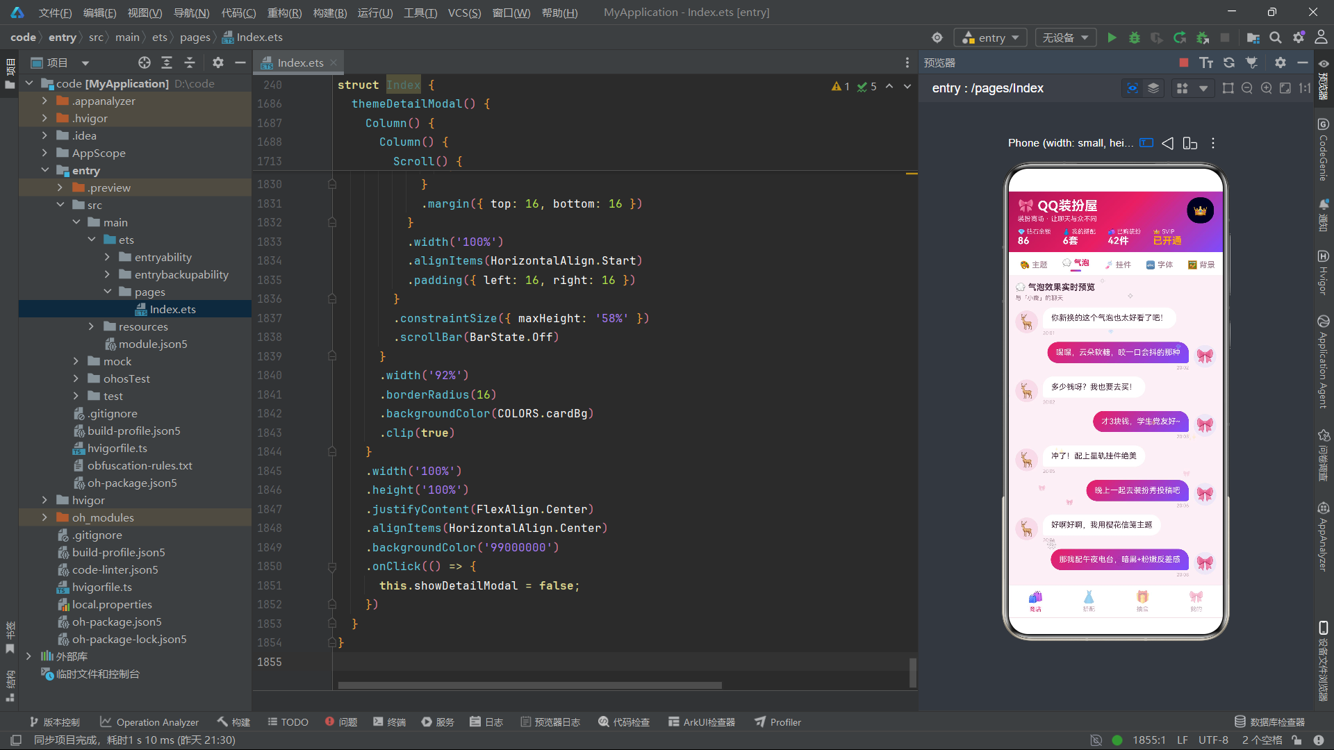
bubblePreviewContent()构建了气泡分类下的聊天预览界面,这是一个极具沉浸感的商品展示方式——将气泡装扮放在真实的聊天上下文中展示,让用户直观感受装扮效果。
ForEach遍历CHAT_MSGS数组,每条消息通过m.isMine判断渲染方向。自己的消息(isMine: true)使用Row配合justifyContent(FlexAlign.End)靠右排列,气泡使用玫红到紫罗兰的渐变背景,圆角设置中bottomRight: 4(右下角小圆角)形成"气泡尾巴"指向右侧头像的效果。对方的消息靠左排列,气泡使用白色背景,bottomLeft: 4形成左下角的小尾巴。
头像使用38x38vp的圆形容器,内部放置24号Emoji。自己的头像背景为浅紫罗兰色,对方的头像背景为边框色,通过颜色区分双方身份。时间标签使用8号提示色文字,位于气泡下方。
气泡的圆角设计是聊天界面的视觉核心。通过borderRadius的四个方向独立设置,实现了聊天软件中常见的"气泡尾巴"效果:发送方气泡的右下角较小(4vp),接收方气泡的左下角较小(4vp),其余三角为18vp的大圆角。这种设计在视觉上引导用户的视线从气泡指向头像,增强了对话的方向感和归属感。
底部还提供了两个操作按钮:购买气泡和抽盒试手气,点击分别打开详情弹窗和盲盒弹窗,形成了从预览到购买的转化链路。
代码段19:挂件网格与字体列表
  @Builder
  pendantGridContent() {
    Column() {
      Text('🎐 头像挂件 · 挂上就是氛围感')
        .fontSize(15)
        .fontWeight(FontWeight.Bold)
        .fontColor(COLORS.textPrimary)
        .margin({ bottom: 10 })

      Grid() {
        ForEach(['⭐', '🌙', '🍰', '⚙️', '🌸', '🎵', '☕', '🐱', '💎', '🍂', '🔥', '❄️'], (icon: string, idx: number) => {
          GridItem() {
            Column() {
              Stack() {
                Text('🎀')
                  .fontSize(38)
                  .width(64)
                  .height(64)
                  .textAlign(TextAlign.Center)
                  .borderRadius(32)
                  .backgroundColor(COLORS.violetLight)
                Text(icon)
                  .fontSize(16)
                  .position({ x: 44, y: 44 })
              }
              .width(64)
              .height(64)
              Text('挂件' + (idx + 1))
                .fontSize(10)
                .fontColor(COLORS.textPrimary)
                .margin({ top: 6 })
              Text(idx % 3 === 0 ? '免费' : '¥' + (idx + 2))
                .fontSize(10)
                .fontColor(idx % 3 === 0 ? COLORS.success : COLORS.rose)
                .margin({ top: 2 })
            }
            .width('100%')
            .padding({ top: 12, bottom: 10 })
            .borderRadius(12)
            .backgroundColor(COLORS.cardBg)
            .alignItems(HorizontalAlign.Center)
            .onClick(() => {
              this.selectedTheme = THEMES[idx % THEMES.length];
              this.showDetailModal = true;
            })
          }
        }, (icon: string) => icon)
      }
      .columnsTemplate('1fr 1fr 1fr')
      .rowsGap(10)
      .columnsGap(10)
      .height(640)
    }
    .width('100%')
    .alignItems(HorizontalAlign.Start)
  }
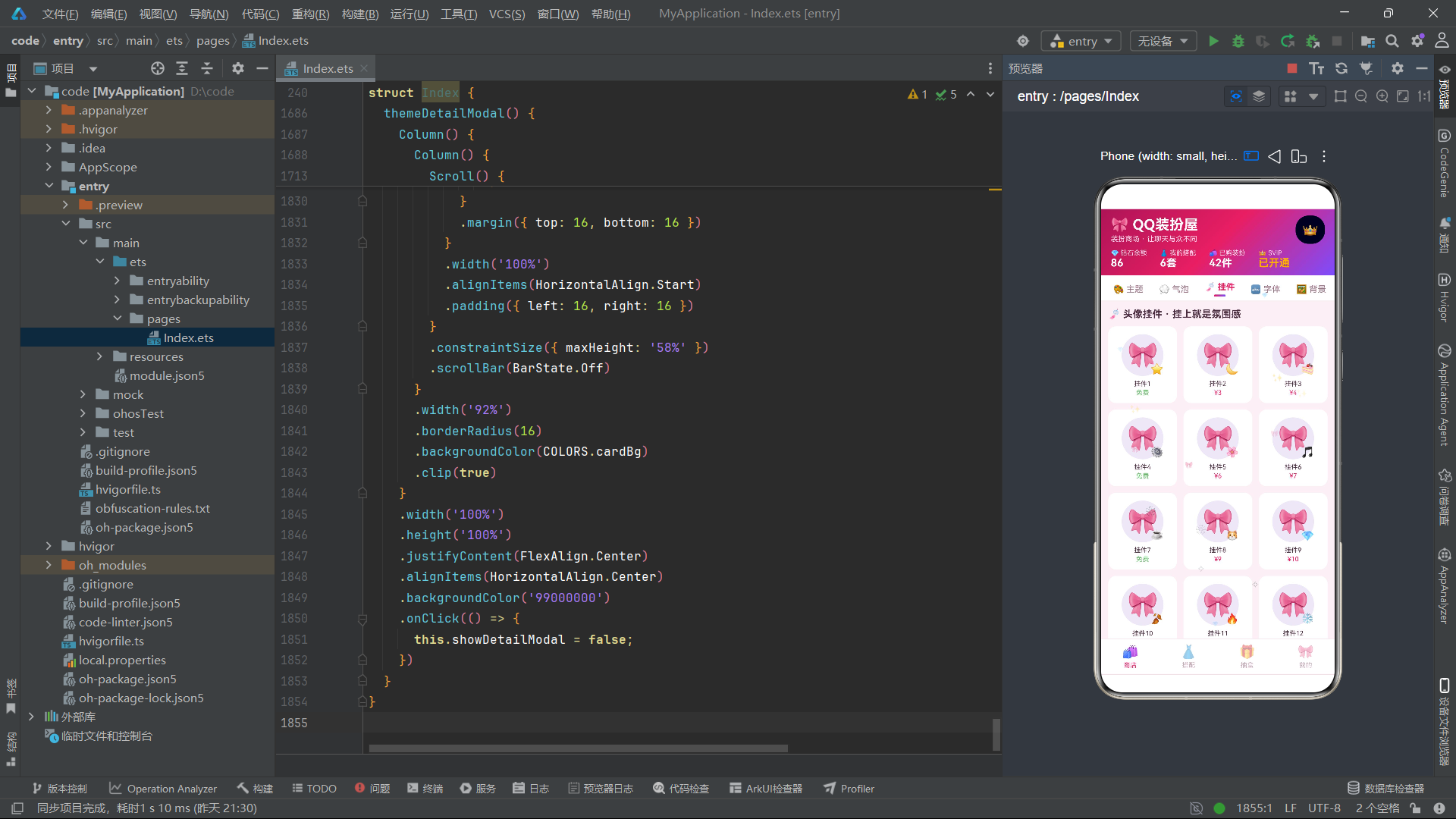
pendantGridContent()构建了挂件分类的网格展示。使用Grid组件配合columnsTemplate('1fr 1fr 1fr')实现三列等宽网格布局,rowsGap(10)和columnsGap(10)设置行列间距。Grid固定高度为640vp,容纳4行挂件卡片。
每个GridItem内部使用Stack实现头像和挂件的层叠效果:底层是64x64vp的圆形头像(🎀Emoji配浅紫罗兰背景),上层通过.position({ x: 44, y: 44 })将挂件图标定位到头像右下角,模拟"挂在头像上"的视觉效果。挂件名称通过'挂件' + (idx + 1)生成,价格通过idx % 3 === 0判断——每三个挂件中第一个为免费,其余为付费,付费价格随索引递增。点击挂件卡片时,通过THEMES[idx % THEMES.length]循环引用主题数据并打开详情弹窗。
  @Builder
  fontListContent() {
    Column() {
      Text('🔤 聊天字体 · 每款都有性格')
        .fontSize(15)
        .fontWeight(FontWeight.Bold)
        .fontColor(COLORS.textPrimary)
        .margin({ bottom: 10 })

      ForEach(THEMES, (t: ThemeItem, idx: number) => {
        if (idx < 8) {
          Column() {
            Row() {
              Text(t.name)
                .fontSize(15)
                .fontWeight(FontWeight.Bold)
                .fontColor(COLORS.textPrimary)
                .layoutWeight(1)
              Text(t.price)
                .fontSize(12)
                .fontWeight(FontWeight.Bold)
                .fontColor(priceColor(t.price))
            }
            .width('100%')
            Text('「今天的晚霞很温柔,想分享给你。」')
              .fontSize(13)
              .fontColor(COLORS.textSecondary)
              .margin({ top: 6 })
            Text(t.designer + ' · ' + (t.downloads / 1000).toFixed(1) + 'k人在用')
              .fontSize(9)
              .fontColor(COLORS.textHint)
              .margin({ top: 4 })
          }
          .width('100%')
          .padding(12)
          .borderRadius(12)
          .backgroundColor(COLORS.cardBg)
          .border({
            width: 1,
            color: idx % 2 === 0 ? COLORS.border : COLORS.violetLight
          })
          .margin({ bottom: 8 })
          .onClick(() => {
            this.selectedTheme = t;
            this.showDetailModal = true;
          })
        }
      }, (t: ThemeItem) => t.id.toString())
    }
    .width('100%')
    .alignItems(HorizontalAlign.Start)
  }
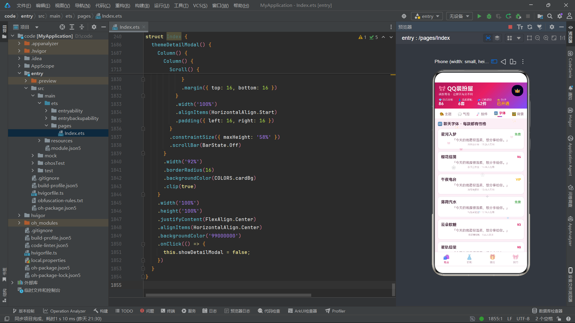
fontListContent()构建了字体分类的列表展示。通过ForEach遍历THEMES数组但使用if (idx < 8)限制只显示前8个主题作为字体展示项。每个字体卡片采用三行布局:第一行是字体名称和价格(使用layoutWeight(1)使名称占据剩余空间),第二行是固定的预览语句"「今天的晚霞很温柔,想分享给你。」",第三行是设计师和使用人数信息。
卡片的边框颜色通过idx % 2 === 0交替使用边框色和浅紫罗兰色,形成奇偶交替的视觉节奏感。这种细微的设计变化避免了列表项千篇一律的单调感。
代码段20:背景壁纸与装扮秀展示流
  @Builder
  bgWallContent() {
    Column() {
      Text('🖼 聊天背景墙')
        .fontSize(15)
        .fontWeight(FontWeight.Bold)
        .fontColor(COLORS.textPrimary)
        .margin({ bottom: 10 })

      Flex({ wrap: FlexWrap.Wrap, justifyContent: FlexAlign.SpaceBetween }) {
        ForEach(THEMES, (t: ThemeItem) => {
          Column() {
            Column() {
              Text('🌅')
                .fontSize(34)
                .margin({ top: 20 })
              Text(t.name)
                .fontSize(12)
                .fontColor(COLORS.white)
                .margin({ top: 12 })
              Text(t.price)
                .fontSize(10)
                .fontColor(COLORS.white)
                .padding({ left: 10, right: 10, top: 3, bottom: 3 })
                .borderRadius(10)
                .backgroundColor('33FFFFFF')
                .margin({ top: 6, bottom: 20 })
            }
            .width('100%')
            .height(140)
            .borderRadius({ topLeft: 12, topRight: 12 })
            .alignItems(HorizontalAlign.Center)
            .linearGradient({
              angle: 160,
              colors: [[t.gradientFrom, 0], [t.gradientTo, 1]]
            })
            Text(t.designer)
              .fontSize(9)
              .fontColor(COLORS.textHint)
              .margin({ top: 6, bottom: 8 })
          }
          .width('48.5%')
          .borderRadius(12)
          .backgroundColor(COLORS.cardBg)
          .margin({ bottom: 10 })
          .onClick(() => {
            this.selectedTheme = t;
            this.showDetailModal = true;
          })
        }, (t: ThemeItem) => t.id.toString())
      }
      .width('100%')
    }
    .width('100%')
    .alignItems(HorizontalAlign.Start)
  }
bgWallContent()构建了背景分类的双列壁纸布局。与挂件网格使用Grid不同,这里使用了Flex组件配合wrap: FlexWrap.Wrap实现自动换行的双列布局。justifyContent: FlexAlign.SpaceBetween使两张卡片之间自动分配间距。每张壁纸卡片宽度设为48.5%,确保两列排列时留有适当间距。
每张壁纸卡片的上半部分是140vp高的渐变预览区,使用主题自身的渐变色作为背景,顶部两角为12vp圆角。预览区内从上到下展示日落图标、主题名称和价格标签。下半部分是白色背景的设计师名称。整个卡片通过外层borderRadius(12)统一圆角,顶部两角的圆角设置在渐变区域上(borderRadius({ topLeft: 12, topRight: 12 })),底部两角由外层Column的borderRadius(12)控制。
  @Builder
  showWallContent() {
    Column() {
      Row() {
        Text('✨ 装扮秀 · 本周精选')
          .fontSize(15)
          .fontWeight(FontWeight.Bold)
          .fontColor(COLORS.textPrimary)
          .layoutWeight(1)
        Text('投稿')
          .fontSize(12)
          .fontColor(COLORS.white)
          .padding({ left: 14, right: 14, top: 6, bottom: 6 })
          .borderRadius(16)
          .backgroundColor(COLORS.rose)
          .onClick(() => {
            this.showOutfitModal = true;
          })
      }
      .width('100%')
      .margin({ bottom: 10 })

      ForEach(OUTFIT_POSTS, (p: OutfitPost) => {
        Column() {
          Row() {
            Text(p.avatar)
              .fontSize(26)
              .width(44)
              .height(44)
              .textAlign(TextAlign.Center)
              .borderRadius(22)
              .backgroundColor(COLORS.violetLight)
            Column() {
              Text(p.author)
                .fontSize(13)
                .fontWeight(FontWeight.Bold)
                .fontColor(COLORS.textPrimary)
              Text(p.scene + '场景 · ' + p.likes + '人喜欢')
                .fontSize(10)
                .fontColor(COLORS.textSecondary)
                .margin({ top: 3 })
            }
            .alignItems(HorizontalAlign.Start)
            .layoutWeight(1)
            .margin({ left: 10 })
            Text('❤')
              .fontSize(18)
              .fontColor(COLORS.rose)
          }
          .width('100%%')

          Column() {
            Text('"' + p.title + '"')
              .fontSize(14)
              .fontWeight(FontWeight.Bold)
              .fontColor(COLORS.roseDeep)
            Text('使用装扮:' + p.usedThemes)
              .fontSize(11)
              .fontColor(COLORS.textSecondary)
              .margin({ top: 6 })
          }
          .width('100%')
          .padding(12)
          .borderRadius(12)
          .backgroundColor(COLORS.violetLight)
          .alignItems(HorizontalAlign.Start)
          .margin({ top: 10 })
        }
        .width('100%')
        .padding(12)
        .borderRadius(14)
        .backgroundColor(COLORS.cardBg)
        .margin({ bottom: 10 })
        .onClick(() => {
          this.showOutfitModal = true;
        })
      }, (p: OutfitPost) => p.id.toString())
    }
    .width('100%')
    .alignItems(HorizontalAlign.Start)
  }
showWallContent()构建了装扮秀分类的投稿展示流。顶部行包含标题和"投稿"按钮,点击按钮打开搭配编辑弹窗。ForEach遍历OUTFIT_POSTS渲染7条投稿卡片。
每张投稿卡片分为两个区域:上方是作者信息行(头像、昵称、场景和点赞数、爱心图标),下方是浅紫罗兰背景的内容区域,展示方案标题和使用的装扮组合。点击投稿卡片也会打开搭配编辑弹窗,实现了从浏览到编辑的快捷入口。
代码段21:搭配管理列表
  @Builder
  outfitContent() {
    Column() {
      Column() {
        Text('👗 我的搭配方案')
          .fontSize(15)
          .fontWeight(FontWeight.Bold)
          .fontColor(COLORS.textPrimary)
        Text('一键切换整套装扮,方便又好看')
          .fontSize(10)
          .fontColor(COLORS.textSecondary)
          .margin({ top: 3 })
      }
      .width('100%')
      .alignItems(HorizontalAlign.Start)
      .margin({ bottom: 10 })

      ForEach(OUTFIT_POSTS, (p: OutfitPost, idx: number) => {
        if (idx < 5) {
          Row() {
            Column() {
              Text(p.avatar)
                .fontSize(26)
            }
            .width(52)
            .height(52)
            .borderRadius(13)
            .backgroundColor(COLORS.violetLight)
            .justifyContent(FlexAlign.Center)

            Column() {
              Text(p.title)
                .fontSize(13)
                .fontWeight(FontWeight.Bold)
                .fontColor(COLORS.textPrimary)
              Text(p.usedThemes)
                .fontSize(10)
                .fontColor(COLORS.textSecondary)
                .maxLines(1)
                .textOverflow({ overflow: TextOverflow.Ellipsis })
                .margin({ top: 3 })
              Text(idx === 0 ? '✓ 使用中' : '未启用')
                .fontSize(9)
                .fontColor(idx === 0 ? COLORS.success : COLORS.textHint)
                .margin({ top: 3 })
            }
            .alignItems(HorizontalAlign.Start)
            .layoutWeight(1)
            .margin({ left: 10 })

            Column() {
              Text('编辑')
                .fontSize(10)
                .fontColor(COLORS.white)
                .padding({ left: 10, right: 10, top: 4, bottom: 4 })
                .borderRadius(10)
                .backgroundColor(COLORS.violet)
                .onClick(() => {
                  this.outfitName = p.title;
                  this.showOutfitModal = true;
                })
              Text('删除')
                .fontSize(10)
                .fontColor(COLORS.danger)
                .padding({ left: 10, right: 10, top: 4, bottom: 4 })
                .borderRadius(10)
                .border({ width: 1, color: COLORS.danger })
                .margin({ top: 6 })
                .onClick(() => {
                  this.selectedTheme = THEMES[0];
                  this.showDeleteModal = true;
                })
            }
            .alignItems(HorizontalAlign.End)
          }
          .width('100%')
          .padding(10)
          .borderRadius(12)
          .backgroundColor(COLORS.cardBg)
          .margin({ bottom: 8 })
        }
      }, (p: OutfitPost) => p.id.toString())

      Text('➕ 创建新搭配')
        .fontSize(13)
        .fontWeight(FontWeight.Bold)
        .fontColor(COLORS.white)
        .padding({ left: 20, right: 20, top: 10, bottom: 10 })
        .borderRadius(20)
        .backgroundColor(COLORS.rose)
        .margin({ top: 6 })
        .alignSelf(ItemAlign.Center)
        .onClick(() => {
          this.outfitName = '';
          this.showOutfitModal = true;
        })
    }
    .width('100%')
    .padding(12)
    .alignItems(HorizontalAlign.Start)
  }
outfitContent()构建了"搭配"Tab的内容,展示用户已保存的装扮搭配方案列表。使用ForEach遍历OUTFIT_POSTS但限制idx < 5只显示前5条。
每条搭配方案采用三段式Row布局:左侧是52x52vp的圆形头像区域,中间是方案信息列(标题、使用的装扮、使用状态),右侧是操作按钮列(编辑、删除)。
中间信息列使用了maxLines(1)和textOverflow({ overflow: TextOverflow.Ellipsis })来处理长文本溢出——当使用的装扮组合名称过长时,自动截断并显示省略号。这是ArkTS中处理文本溢出的标准方式。
状态标签通过idx === 0判断:第一条显示"✓ 使用中"(绿色成功色),其余显示"未启用"(灰色提示色),模拟了当前正在使用的搭配方案。
右侧操作按钮的设计体现了CRUD的完整性。编辑按钮使用紫罗兰色实心背景,点击时将方案标题赋值给outfitName并打开编辑弹窗。删除按钮使用红色边框样式(与编辑按钮形成视觉区分),点击时打开删除确认弹窗。底部还有一个"创建新搭配"按钮,使用alignSelf(ItemAlign.Center)居中显示,点击时清空outfitName并打开编辑弹窗(新增模式)。
代码段22:盲盒抽取内容区
  @Builder
  boxContent() {
    Column() {
      Column() {
        Text('🎁 装扮盲盒')
          .fontSize(16)
          .fontWeight(FontWeight.Bold)
          .fontColor(COLORS.white)
        Text('隐藏款概率2%,欧气时刻到了')
          .fontSize(11)
          .fontColor('#FFD9E8')
          .margin({ top: 4 })
        Text('💎')
          .fontSize(56)
          .margin({ top: 14 })
      }
      .width('100%')
      .padding({ top: 20, bottom: 20 })
      .borderRadius(16)
      .linearGradient({
        angle: 135,
        colors: [['#7C4DFF', 0], ['#E91E63', 1]]
      })
      .alignItems(HorizontalAlign.Center)

      Text('📦 在售系列')
        .fontSize(15)
        .fontWeight(FontWeight.Bold)
        .fontColor(COLORS.textPrimary)
        .margin({ top: 14, bottom: 8 })

      ForEach(BOX_SERIES, (b: BlindBoxSeries) => {
        Row() {
          Column() {
            Text(b.icon)
              .fontSize(30)
          }
          .width(56)
          .height(56)
          .borderRadius(14)
          .backgroundColor(COLORS.violetLight)
          .justifyContent(FlexAlign.Center)

          Column() {
            Text(b.name)
              .fontSize(13)
              .fontWeight(FontWeight.Bold)
              .fontColor(COLORS.textPrimary)
            Text(b.count + ' · ' + b.rare)
              .fontSize(10)
              .fontColor(COLORS.textSecondary)
              .margin({ top: 3 })
            Text(b.price)
              .fontSize(11)
              .fontWeight(FontWeight.Bold)
              .fontColor(COLORS.violet)
              .margin({ top: 3 })
          }
          .alignItems(HorizontalAlign.Start)
          .layoutWeight(1)
          .margin({ left: 10 })

          Text('抽盒')
            .fontSize(12)
            .fontWeight(FontWeight.Bold)
            .fontColor(COLORS.white)
            .padding({ left: 16, right: 16, top: 8, bottom: 8 })
            .borderRadius(16)
            .backgroundColor(COLORS.rose)
            .onClick(() => {
              this.boxSeriesIdx = b.id - 1;
              this.showBoxModal = true;
            })
        }
        .width('100%')
        .padding(10)
        .borderRadius(12)
        .backgroundColor(COLORS.cardBg)
        .margin({ bottom: 8 })
      }, (b: BlindBoxSeries) => b.id.toString())
boxContent()构建了"抽盒"Tab的内容,是盲盒抽取功能的主界面。顶部是一个紫红渐变的横幅区域,展示"🎁 装扮盲盒"标题、隐藏款概率提示(2%)和一个56号字的大钻石图标,通过渐变背景和渐变文字颜色营造出盲盒的神秘感和吸引力。
中部是"在售系列"列表,ForEach遍历BOX_SERIES渲染三个盲盒系列卡片。每张卡片采用三段式Row布局:左侧是56x56vp的圆角图标区域,中间是系列信息(名称、款数和隐藏款描述、价格),右侧是"抽盒"按钮。点击抽盒按钮时,通过this.boxSeriesIdx = b.id - 1记录选中的系列索引(转换为0基索引),然后打开盲盒确认弹窗。
      Text('🏆 欧皇榜(本周隐藏款收集)')
        .fontSize(14)
        .fontWeight(FontWeight.Bold)
        .fontColor(COLORS.textPrimary)
        .margin({ top: 12, bottom: 8 })

      ForEach(OUTFIT_POSTS, (p: OutfitPost, idx: number) => {
        if (idx < 5) {
          Row() {
            Text(idx === 0 ? '🥇' : (idx === 1 ? '🥈' : (idx === 2 ? '🥉' : (idx + 1).toString())))
              .fontSize(idx < 3 ? 16 : 13)
              .width(28)
              .textAlign(TextAlign.Center)
            Text(p.avatar)
              .fontSize(20)
            Text(p.author)
              .fontSize(12)
              .fontColor(COLORS.textPrimary)
              .layoutWeight(1)
              .margin({ left: 8 })
            Text('隐藏款x' + (5 - idx))
              .fontSize(11)
              .fontWeight(FontWeight.Bold)
              .fontColor(COLORS.gold)
          }
          .width('100%')
          .padding(10)
          .borderRadius(10)
          .backgroundColor(COLORS.cardBg)
          .margin({ bottom: 6 })
        }
      }, (p: OutfitPost) => p.id.toString())
    }
    .width('100%')
    .padding(12)
    .alignItems(HorizontalAlign.Start)
  }
底部是"欧皇榜"排名列表,复用OUTFIT_POSTS数据但以排名形式展示。前三名使用奖牌Emoji(🥇🥈🥉)作为排名标识,字号16;第四名及以后使用数字编号,字号13。每行显示头像、作者名和隐藏款收集数量('隐藏款x' + (5 - idx),排名第一收集5个,递减)。
代码段23:个人中心内容区
  @Builder
  mineContent() {
    Column() {
      Column() {
        Row() {
          Text('🎀')
            .fontSize(38)
            .width(64)
            .height(64)
            .textAlign(TextAlign.Center)
            .borderRadius(32)
            .linearGradient({
              angle: 135,
              colors: [['#E91E63', 0], ['#7C4DFF', 1]]
            })
          Column() {
            Text('桃桃乌龙')
              .fontSize(18)
              .fontWeight(FontWeight.Bold)
              .fontColor(COLORS.textPrimary)
            Text('装扮达人Lv.8 · 投稿获赞 12,847')
              .fontSize(11)
              .fontColor(COLORS.textSecondary)
              .margin({ top: 3 })
            Text('👑 SVIP会员 · 剩余168天')
              .fontSize(10)
              .fontColor(COLORS.gold)
              .margin({ top: 3 })
          }
          .alignItems(HorizontalAlign.Start)
          .layoutWeight(1)
          .margin({ left: 12 })
        }
        .width('100%')
      }
      .width('100%')
      .padding(14)
      .borderRadius(16)
      .backgroundColor(COLORS.cardBg)
      .alignItems(HorizontalAlign.Start)

      Text('🛍 我的已购装扮')
        .fontSize(14)
        .fontWeight(FontWeight.Bold)
        .fontColor(COLORS.textPrimary)
        .margin({ top: 14, bottom: 8 })

      ForEach(THEMES, (t: ThemeItem, idx: number) => {
        if (idx < 8) {
          Row() {
            Column() {
              Text('🎨')
                .fontSize(22)
            }
            .width(40)
            .height(40)
            .borderRadius(10)
            .linearGradient({
              angle: 135,
              colors: [[t.gradientFrom, 0], [t.gradientTo, 1]]
            })
            .justifyContent(FlexAlign.Center)

            Column() {
              Text(t.name)
                .fontSize(12)
                .fontColor(COLORS.textPrimary)
              Text(t.category + ' · ' + t.designer)
                .fontSize(9)
                .fontColor(COLORS.textHint)
                .margin({ top: 2 })
            }
            .alignItems(HorizontalAlign.Start)
            .layoutWeight(1)
            .margin({ left: 10 })

            Text('删除')
              .fontSize(10)
              .fontColor(COLORS.danger)
              .padding({ left: 10, right: 10, top: 4, bottom: 4 })
              .borderRadius(10)
              .border({ width: 1, color: COLORS.danger })
              .onClick(() => {
                this.selectedTheme = t;
                this.showDeleteModal = true;
              })
          }
          .width('100%')
          .padding(10)
          .borderRadius(10)
          .backgroundColor(COLORS.cardBg)
          .margin({ bottom: 6 })
        }
      }, (t: ThemeItem) => t.id.toString())

      Text('🎁 兑换码')
        .fontSize(13)
        .fontWeight(FontWeight.Bold)
        .fontColor(COLORS.white)
        .padding({ left: 20, right: 20, top: 10, bottom: 10 })
        .borderRadius(20)
        .backgroundColor(COLORS.violet)
        .margin({ top: 10 })
        .alignSelf(ItemAlign.Center)
    }
    .width('100%')
    .padding(12)
    .alignItems(HorizontalAlign.Start)
  }
mineContent()构建了"我的"Tab的内容,分为三个区域。顶部是用户信息卡片:64x64vp的圆形头像使用玫红紫罗兰渐变背景,右侧显示用户昵称"桃桃乌龙"、装扮等级和投稿获赞数、SVIP会员状态和剩余天数。
中部是已购装扮列表,复用THEMES数据但限制idx < 8只显示前8项。每项采用紧凑的Row布局:40x40vp的渐变色标图标、装扮名称和分类信息、删除按钮。删除按钮的点击逻辑与搭配列表中的删除一致,设置selectedTheme并打开删除弹窗。
底部是一个居中显示的"兑换码"按钮,使用紫罗兰色背景,模拟兑换码输入入口。alignSelf(ItemAlign.Center)使按钮在Column中水平居中,这是ArkTS中控制单个子元素对齐方式的属性。
代码段24:底部Tab导航栏
  @Builder
  bottomTabs() {
    Row() {
      ForEach(BOTTOM_TABS, (t: TabItem, idx: number) => {
        Column() {
          Text(t.icon)
            .fontSize(20)
            .opacity(this.currentBottomTab === idx ? 1 : 0.45)
          Text(t.label)
            .fontSize(10)
            .fontColor(this.currentBottomTab === idx ? COLORS.rose : COLORS.textHint)
            .margin({ top: 3 })
        }
        .layoutWeight(1)
        .padding({ top: 8, bottom: 8 })
        .onClick(() => {
          this.currentBottomTab = idx;
          this.currentTopTab = 0;
        })
      }, (t: TabItem) => t.label)
    }
    .width('100%')
    .backgroundColor(COLORS.cardBg)
    .border({ width: 1, color: COLORS.border })
  }
bottomTabs()构建了应用底部的四Tab导航栏。外层Row使用白色背景和顶部1vp的边框线,与上方内容区形成视觉分割。
ForEach遍历BOTTOM_TABS渲染四个Tab项。每个Tab项是一个Column,包含图标(20号字)和文字标签(10号字),通过layoutWeight(1)等分宽度。选中状态的视觉反馈通过两个维度实现:图标透明度(选中为1,未选中为0.45,形成明暗对比)和文字颜色(选中为玫红色,未选中为提示色)。
onClick事件处理器同时更新两个状态:this.currentBottomTab = idx切换底部Tab,this.currentTopTab = 0重置顶部Tab到第一个分类。这种联动设计确保了用户切换底部Tab时,商店分类始终从第一个开始,避免出现"切换到搭配Tab后顶部Tab仍显示装扮秀"的不一致状态。
键值生成器使用t.label(Tab文字标签),由于底部Tab的标签是固定不变的,这种键值方案是稳定可靠的。
代码段25:四种弹窗组件(盲盒确认/搭配编辑/删除确认/装扮详情)
  @Builder
  blindBoxModal() {
    Column() {
      Column() {
        Column() {
          Text('🎁 盲盒抽取确认')
            .fontSize(17)
            .fontWeight(FontWeight.Bold)
            .fontColor(COLORS.white)
          Text('愿欧气与你同在')
            .fontSize(11)
            .fontColor('#FFD9E8')
            .margin({ top: 4 })
        }
        .width('100%')
        .padding(16)
        .alignItems(HorizontalAlign.Start)
        .linearGradient({
          angle: 135,
          colors: [['#7C4DFF', 0], ['#E91E63', 1]]
        })

        Column() {
          Text(BOX_SERIES[this.boxSeriesIdx].icon + ' ' + BOX_SERIES[this.boxSeriesIdx].name)
            .fontSize(15)
            .fontWeight(FontWeight.Bold)
            .fontColor(COLORS.textPrimary)
            .margin({ top: 14 })
          // ... 系列信息展示

          Text('抽取次数')
            .fontSize(12)
            .fontColor(COLORS.textSecondary)
            .margin({ top: 14 })
          Row() {
            ForEach(['单抽', '五连抽', '十连抽'], (t: string, idx: number) => {
              Column() {
                Text(t)
                  .fontSize(13)
                  .fontWeight(FontWeight.Bold)
                  .fontColor(this.boxTimes === idx ? COLORS.white : COLORS.textPrimary)
                Text((idx + 1) * 10 + '钻')
                  .fontSize(9)
                  .fontColor(this.boxTimes === idx ? COLORS.white : COLORS.textSecondary)
                  .margin({ top: 2 })
              }
              .layoutWeight(1)
              .padding({ top: 10, bottom: 10 })
              .borderRadius(12)
              .border({
                width: this.boxTimes === idx ? 0 : 1,
                color: COLORS.border
              })
              .backgroundColor(this.boxTimes === idx ? COLORS.rose : COLORS.cardBg)
              .margin({ left: 4, right: 4 })
              .onClick(() => {
                this.boxTimes = idx;
              })
            }, (t: string) => t)
          }
          .width('100%')
          .margin({ top: 6 })
        }
        .width('100%')
        .alignItems(HorizontalAlign.Start)
        .padding({ left: 16, right: 16 })

        Row() {
          Text('取消')
            .fontSize(14)
            .fontColor(COLORS.textSecondary)
            .layoutWeight(1)
            .textAlign(TextAlign.Center)
            .padding({ top: 12, bottom: 12 })
            .onClick(() => { this.showBoxModal = false; })
          Text('立即抽取')
            .fontSize(14)
            .fontWeight(FontWeight.Bold)
            .fontColor(COLORS.white)
            .layoutWeight(1)
            .textAlign(TextAlign.Center)
            .padding({ top: 12, bottom: 12 })
            .linearGradient({ angle: 90, colors: [['#7C4DFF', 0], ['#E91E63', 1]] })
            .onClick(() => { this.showBoxModal = false; })
        }
        .width('100%')
        .border({ width: 1, color: COLORS.border })
      }
      .width('90%')
      .borderRadius(16)
      .backgroundColor(COLORS.cardBg)
      .clip(true)
    }
    .width('100%')
    .height('100%')
    .justifyContent(FlexAlign.Center)
    .alignItems(HorizontalAlign.Center)
    .backgroundColor('99000000')
    .onClick(() => { this.showBoxModal = false; })
  }
blindBoxModal()是盲盒抽取确认弹窗,采用居中弹窗+半透明遮罩的经典模式。最外层Column占据全屏,背景色为99000000(60%透明度的黑色遮罩),justifyContent(FlexAlign.Center)和alignItems(HorizontalAlign.Center)使弹窗内容居中显示。点击遮罩区域关闭弹窗。
弹窗卡片宽度为90%,使用borderRadius(16)圆角和.clip(true)裁剪(确保渐变头部不超出圆角边界)。卡片分为三段:紫红渐变头部(标题和副标题)、白色内容区(系列信息、抽取次数选择器)、底部按钮行(取消和立即抽取)。
抽取次数选择器使用ForEach渲染三个选项(单抽10钻、五连抽20钻、十连抽30钻),通过this.boxTimes === idx条件判断选中状态:选中时背景为玫红色、文字为白色、无边框;未选中时背景为白色、文字为深色、有边框。点击选项更新boxTimes状态。
  @Builder
  outfitEditModal() {
    Column() {
      Column() {
        Text('👗 编辑搭配方案')
          .fontSize(16)
          .fontWeight(FontWeight.Bold)
          .fontColor(COLORS.textPrimary)
        Text('给这套穿搭起个名字吧')
          .fontSize(11)
          .fontColor(COLORS.textSecondary)
          .margin({ top: 4 })

        Column() {
          Text('搭配名称')
            .fontSize(12)
            .fontColor(COLORS.rose)
            .alignSelf(ItemAlign.Start)
          TextInput({ placeholder: '例如:深夜聊天氛围感', text: this.outfitName })
            .fontSize(13)
            .fontColor(COLORS.textPrimary)
            .placeholderColor(COLORS.textHint)
            .backgroundColor(COLORS.bg)
            .borderRadius(8)
            .height(40)
            .margin({ top: 6 })
            .onChange((v: string) => {
              this.outfitName = v;
            })
        }
        .width('100%')
        .alignItems(HorizontalAlign.Start)
        .margin({ top: 16 })

        // 场景选择和公开开关...

        Row() {
          Text('删除方案')
            .fontSize(13)
            .fontColor(COLORS.danger)
            .padding({ left: 16, right: 16, top: 10, bottom: 10 })
            .borderRadius(18)
            .border({ width: 1, color: COLORS.danger })
            .onClick(() => {
              this.showOutfitModal = false;
              this.showDeleteModal = true;
            })
          Text('保存方案')
            .fontSize(13)
            .fontWeight(FontWeight.Bold)
            .fontColor(COLORS.white)
            .padding({ left: 20, right: 20, top: 10, bottom: 10 })
            .borderRadius(18)
            .backgroundColor(COLORS.rose)
            .margin({ left: 10 })
            .onClick(() => {
              this.showOutfitModal = false;
            })
        }
        .margin({ top: 18, bottom: 16 })
      }
      .width('86%')
      .padding(18)
      .borderRadius(16)
      .backgroundColor(COLORS.cardBg)
      .border({ width: 1, color: COLORS.violetLight })
    }
    .width('100%')
    .height('100%')
    .justifyContent(FlexAlign.Center)
    .alignItems(HorizontalAlign.Center)
    .backgroundColor('99000000')
    .onClick(() => { this.showOutfitModal = false; })
  }
outfitEditModal()是搭配方案编辑弹窗,是一个包含表单输入的交互弹窗。弹窗卡片宽度86%,带有浅紫罗兰色边框。内部包含标题、TextInput文本输入框(搭配名称)、场景选择标签组(日常/约会/夜聊/游戏)、公开开关,以及底部的删除和保存按钮。
TextInput组件是ArkTS的表单输入组件,通过text: this.outfitName实现双向绑定——初始化时显示已有的方案名称,onChange回调中通过this.outfitName = v将用户输入同步到状态变量。这种模式使得弹窗在编辑和新增两种模式间无缝切换:编辑时outfitName已有值,新增时outfitName为空字符串。
底部按钮区域的"删除方案"按钮实现了弹窗链式跳转:先关闭编辑弹窗(this.showOutfitModal = false),再打开删除弹窗(this.showDeleteModal = true),形成了一个弹窗到弹窗的流转链路。
删除确认弹窗与装扮详情弹窗(弹窗组件续)
  @Builder
  deleteThemeModal() {
    Column() {
      Column() {
        Text('💔')
          .fontSize(36)
        Text('确定删除这套装扮吗?')
          .fontSize(15)
          .fontWeight(FontWeight.Bold)
          .fontColor(COLORS.textPrimary)
          .margin({ top: 8 })
        Text('删除后如需再次使用要重新获取哦')
          .fontSize(11)
          .fontColor(COLORS.textSecondary)
          .margin({ top: 6 })

        Row() {
          Text('留着')
            .fontSize(13)
            .fontColor(COLORS.textSecondary)
            .layoutWeight(1)
            .textAlign(TextAlign.Center)
            .padding({ top: 10, bottom: 10 })
            .borderRadius(20)
            .backgroundColor(COLORS.bg)
          Text('删除')
            .fontSize(13)
            .fontWeight(FontWeight.Bold)
            .fontColor(COLORS.white)
            .layoutWeight(1)
            .textAlign(TextAlign.Center)
            .padding({ top: 10, bottom: 10 })
            .borderRadius(20)
            .backgroundColor(COLORS.danger)
            .margin({ left: 10 })
            .onClick(() => { this.showDeleteModal = false; })
        }
        .width('100%')
        .margin({ top: 18 })
      }
      .width('76%')
      .padding(20)
      .borderRadius(16)
      .backgroundColor(COLORS.cardBg)
      .alignItems(HorizontalAlign.Center)
    }
    .width('100%')
    .height('100%')
    .justifyContent(FlexAlign.Center)
    .alignItems(HorizontalAlign.Center)
    .backgroundColor('99000000')
    .onClick(() => { this.showDeleteModal = false; })
  }
deleteThemeModal()是删除确认弹窗,采用居中小卡片的设计模式。弹窗卡片宽度仅为76%(比其他弹窗更窄),通过较小的尺寸传达"这是一个需要谨慎确认的操作"的视觉暗示。卡片内容简洁:一个36号字的心碎Emoji、确认问题标题、说明文字,以及"留着"和"删除"两个按钮。"留着"按钮使用粉色背景(弱操作),"删除"按钮使用红色背景(强操作且危险),通过颜色明暗对比引导用户倾向选择保留。
  @Builder
  themeDetailModal() {
    Column() {
      Column() {
        Column() {
          Row() {
            Text('🎨 装扮详情')
              .fontSize(16)
              .fontWeight(FontWeight.Bold)
              .fontColor(COLORS.white)
            Text('✕')
              .fontSize(16)
              .fontColor('#FFFFFFCC')
              .padding({ left: 8, right: 8, top: 2, bottom: 2 })
              .onClick(() => { this.showDetailModal = false; })
          }
          .width('100%')
          .justifyContent(FlexAlign.SpaceBetween)
        }
        .width('100%')
        .padding({ left: 16, right: 16, top: 14, bottom: 14 })
        .linearGradient({
          angle: 135,
          colors: [[this.selectedTheme!.gradientFrom, 0], [this.selectedTheme!.gradientTo, 1]]
        })

        Scroll() {
          Column() {
            Column() {
              Text('✨')
                .fontSize(48)
                .margin({ top: 14 })
              Text(this.selectedTheme!.name)
                .fontSize(16)
                .fontWeight(FontWeight.Bold)
                .fontColor(COLORS.textPrimary)
                .margin({ top: 8 })
              // ... 更多详情信息、评价、操作按钮
            }
            .width('100%')
            .alignItems(HorizontalAlign.Center)

            Row() {
              Column() {
                Text(this.selectedTheme!.price)
                  .fontSize(17)
                  .fontWeight(FontWeight.Bold)
                  .fontColor(priceColor(this.selectedTheme!.price))
                Text('价格')
                  .fontSize(10)
                  .fontColor(COLORS.textSecondary)
                  .margin({ top: 2 })
              }
              .layoutWeight(1)
              // ... 使用人数、权限信息
            }
            .width('100%')
            .padding(14)
            .borderRadius(12)
            .backgroundColor(COLORS.violetLight)

            Text('💬 用户评价')
              .fontSize(13)
              .fontWeight(FontWeight.Bold)
              .fontColor(COLORS.textPrimary)
              .margin({ top: 14 })

            ForEach(['🎀 桃桃乌龙:超好看!朋友都来问链接~', '🌙 月光奏鸣曲:搭配暗色系主题绝了', '🕹 像素骑士:性价比很高,推荐入手'], (c: string) => {
              Text(c)
                .fontSize(11)
                .fontColor(COLORS.textSecondary)
                .padding(10)
                .borderRadius(10)
                .backgroundColor(COLORS.bg)
                .width('100%')
                .margin({ top: 6 })
            }, (c: string) => c)

            Row() {
              Text('🗑 删除')
                .fontSize(13)
                .fontColor(COLORS.danger)
                .borderRadius(18)
                .border({ width: 1, color: COLORS.danger })
                .onClick(() => {
                  this.showDetailModal = false;
                  this.showDeleteModal = true;
                })
              Text('⭐ 收藏')
                .fontSize(13)
                .fontColor(COLORS.violet)
                .borderRadius(18)
                .backgroundColor(COLORS.violetLight)
                .margin({ left: 10 })
              Text('立即装扮')
                .fontSize(13)
                .fontWeight(FontWeight.Bold)
                .fontColor(COLORS.white)
                .borderRadius(18)
                .linearGradient({ angle: 90, colors: [['#E91E63', 0], ['#7C4DFF', 1]] })
                .margin({ left: 10 })
            }
            .margin({ top: 16, bottom: 16 })
          }
          .width('100%')
          .alignItems(HorizontalAlign.Start)
          .padding({ left: 16, right: 16 })
        }
        .constraintSize({ maxHeight: '58%' })
        .scrollBar(BarState.Off)
      }
      .width('92%')
      .borderRadius(16)
      .backgroundColor(COLORS.cardBg)
      .clip(true)
    }
    .width('100%')
    .height('100%')
    .justifyContent(FlexAlign.Center)
    .alignItems(HorizontalAlign.Center)
    .backgroundColor('99000000')
    .onClick(() => { this.showDetailModal = false; })
  }
themeDetailModal()是装扮详情弹窗,是四个弹窗中结构最复杂的一个。弹窗卡片宽度92%,分为固定的渐变头部和可滚动的详情内容两部分。
头部使用当前选中主题的渐变色(this.selectedTheme!.gradientFrom到this.selectedTheme!.gradientTo),通过非空断言操作符!访问selectedTheme的可选属性。头部包含标题和关闭按钮(✕),使用justifyContent(FlexAlign.SpaceBetween)两端对齐。
内容区使用Scroll组件包裹,constraintSize({ maxHeight: '58%' })限制最大高度为屏幕的58%,当内容超出时可以垂直滚动。内容包括:主题预览区(大图标、名称、分类和设计师、描述)、三列统计信息(价格、使用人数、权限,使用浅紫罗兰背景卡片)、用户评价列表(ForEach渲染三条评论)、底部操作按钮行(删除、收藏、立即装扮)。
底部三个按钮通过不同的视觉样式传达不同的操作权重:删除使用红色边框(危险但弱操作),收藏使用浅紫罗兰背景(辅助操作),立即装扮使用玫紫渐变背景(主要操作),引导用户优先点击"立即装扮"。
三、组件生命周期与数据流分析
理解整个应用的数据流向和组件生命周期是掌握HarmonyOS ArkTS API 24开发的关键。下面通过流程图详细分析。
上图展示了三条核心流程的运作方式。
在生命周期流程中,aboutToAppear是组件创建后的第一个回调,在此注册粒子动画定时器。随后build方法执行首次渲染,将静态数据和初始状态渲染为UI。此后应用进入交互循环:用户操作触发State更新,ArkTS响应式系统检测到变化后重新执行受影响的build部分,更新UI。当组件被销毁时(如用户退出应用或导航到其他页面),aboutToDisappear回调清除定时器,防止内存泄漏。
在数据流中,静态数据(COLORS、THEMES、CHAT_MSGS等常量)在应用启动时就已就绪,build方法读取这些数据渲染初始UI。用户交互(点击Tab、点击卡片、输入文本等)产生事件,事件处理器更新@State变量,ArkTS检测到状态变化后自动触发UI更新。这种"数据驱动UI"的模式是声明式框架的核心思想。
在粒子动画循环中,定时器每130毫秒触发一次driftParticles函数,该函数接收当前粒子数组并返回全新的粒子数组(不可变更新)。ArkTS检测到particles状态变化后,通过ForEach的键值生成器(p.id.toString() + '_' + p.y.toFixed(0))比较新旧粒子,仅重新渲染y坐标整数部分发生变化的粒子对应的UI组件,优化了渲染性能。
四、弹窗交互流转分析
应用中的四个弹窗之间存在复杂的跳转关系,下图展示了完整的弹窗交互流转。
从上图可以看出弹窗的流转关系。装扮详情弹窗和搭配编辑弹窗是两个"枢纽弹窗"——它们既可以被主界面直接触发,也可以跳转到删除确认弹窗。盲盒确认弹窗和删除确认弹窗是"终端弹窗"——它们只能返回主界面,不会跳转到其他弹窗。
这种弹窗流转设计遵循了"操作链路最短"原则:从详情页到删除只需一步跳转,无需返回主界面再找到删除入口。弹窗之间的跳转通过"先关闭当前弹窗、再打开目标弹窗"的两步操作实现,确保同一时间只有一个弹窗处于显示状态。
五、对比分析
表格1:四种弹窗设计方案对比
| 弹窗类型 | 触发方式 | 卡片宽度 | 头部样式 | 主要功能 | 关闭方式 | 操作按钮数 |
|---|---|---|---|---|---|---|
| 装扮详情弹窗 | 点击主题卡片/挂件/字体/背景 | 92% | 动态渐变(跟随主题色) | 展示装扮详细信息、用户评价、操作入口 | 关闭按钮/遮罩点击 | 3个(删除/收藏/装扮) |
| 盲盒确认弹窗 | 点击抽盒按钮 | 90% | 固定紫红渐变 | 确认抽取次数和消耗 | 取消按钮/遮罩点击 | 2个(取消/抽取) |
| 搭配编辑弹窗 | 点击编辑/投稿/创建 | 86% | 无渐变(纯文字标题) | 编辑搭配名称、场景、公开设置 | 遮罩点击 | 2个(删除/保存) |
| 删除确认弹窗 | 点击删除按钮/从其他弹窗跳转 | 76% | 无渐变(Emoji+文字) | 确认删除操作 | 留着按钮/遮罩点击 | 2个(留着/删除) |
从上表可以看出,四个弹窗在卡片宽度上呈现递减趋势:详情弹窗最宽(92%)因为需要展示最多信息,删除弹窗最窄(76%)因为只是一个简单的确认操作。头部样式方面,详情弹窗和盲盒弹窗使用渐变头部营造视觉冲击力,编辑弹窗使用纯文字标题强调功能性,删除弹窗使用Emoji+文字传达情感暗示。
表格2:六大商店分类内容布局对比
| 分类名称 | 布局组件 | 数据源 | 展示数量 | 核心交互 | 特色功能 |
|---|---|---|---|---|---|
| 主题 | Scroll横滑+ForEach列表+Column图表 | THEMES(15项) | 全部15项 | 点击打开详情弹窗 | 月度下载量柱状图 |
| 气泡 | ForEach列表 | CHAT_MSGS(8项) | 全部8项 | 购买/抽盒按钮跳转 | 真实聊天场景预览 |
| 挂件 | Grid三列网格 | Emoji数组(12项) | 全部12项 | 点击打开详情弹窗 | Stack层叠头像挂件预览 |
| 字体 | ForEach列表 | THEMES前8项 | 8项 | 点击打开详情弹窗 | 固定预览语句展示 |
| 背景 | Flex双列瀑布流 | THEMES(15项) | 全部15项 | 点击打开详情弹窗 | 渐变色壁纸预览 |
| 装扮秀 | ForEach列表 | OUTFIT_POSTS(7项) | 全部7项 | 点击打开编辑弹窗 | 搭配方案投稿展示流 |
上表展示了六个商店分类在布局方式、数据来源和展示数量上的差异。主题分类最为复杂,集成了横滑卡片、柱状图和列表三种布局。气泡分类使用独特的聊天场景预览。挂件分类使用Grid三列网格。字体和背景分类复用THEMES数据但以不同方式展示。装扮秀分类使用独立的OUTFIT_POSTS数据,展示用户生成内容(UGC)。
表格3:ArkTS核心装饰器与组件对比
| 装饰器/组件 | 作用 | 使用场景 | 本应用中的使用 |
|---|---|---|---|
| @Entry | 标记入口组件 | 应用根组件 | Index结构体 |
| @State | 响应式状态变量 | 需要驱动UI更新的变量 | currentBottomTab、particles等12个 |
| @Observed | 可观察类标记 | 自定义数据模型类 | ThemeItem类 |
| @Builder | UI构建方法 | 可复用的UI代码块 | headerBuilder等20+个构建方法 |
| ForEach | 列表渲染 | 遍历数组渲染列表项 | 主题列表、消息列表、粒子等 |
| Stack | 层叠布局 | 多层叠加的UI结构 | 根容器(主内容+粒子+弹窗) |
| Scroll | 滚动容器 | 超出屏幕的可滚动内容 | 内容区、顶部Tab栏、详情弹窗 |
| Grid | 网格布局 | 等宽多列网格展示 | 挂件网格 |
| TextInput | 文本输入 | 表单输入 | 搭配编辑弹窗的名称输入 |
上表总结了本应用使用的ArkTS核心装饰器和组件。@State是最常用的装饰器,管理着12个响应式状态变量。@Builder用于将20多个UI构建方法模块化拆分。ForEach在10多处列表渲染中使用,是处理动态列表的核心组件。Stack、Scroll、Grid等布局组件各司其职,共同构建了应用的多层次布局体系。
安装DevEco Studio程序
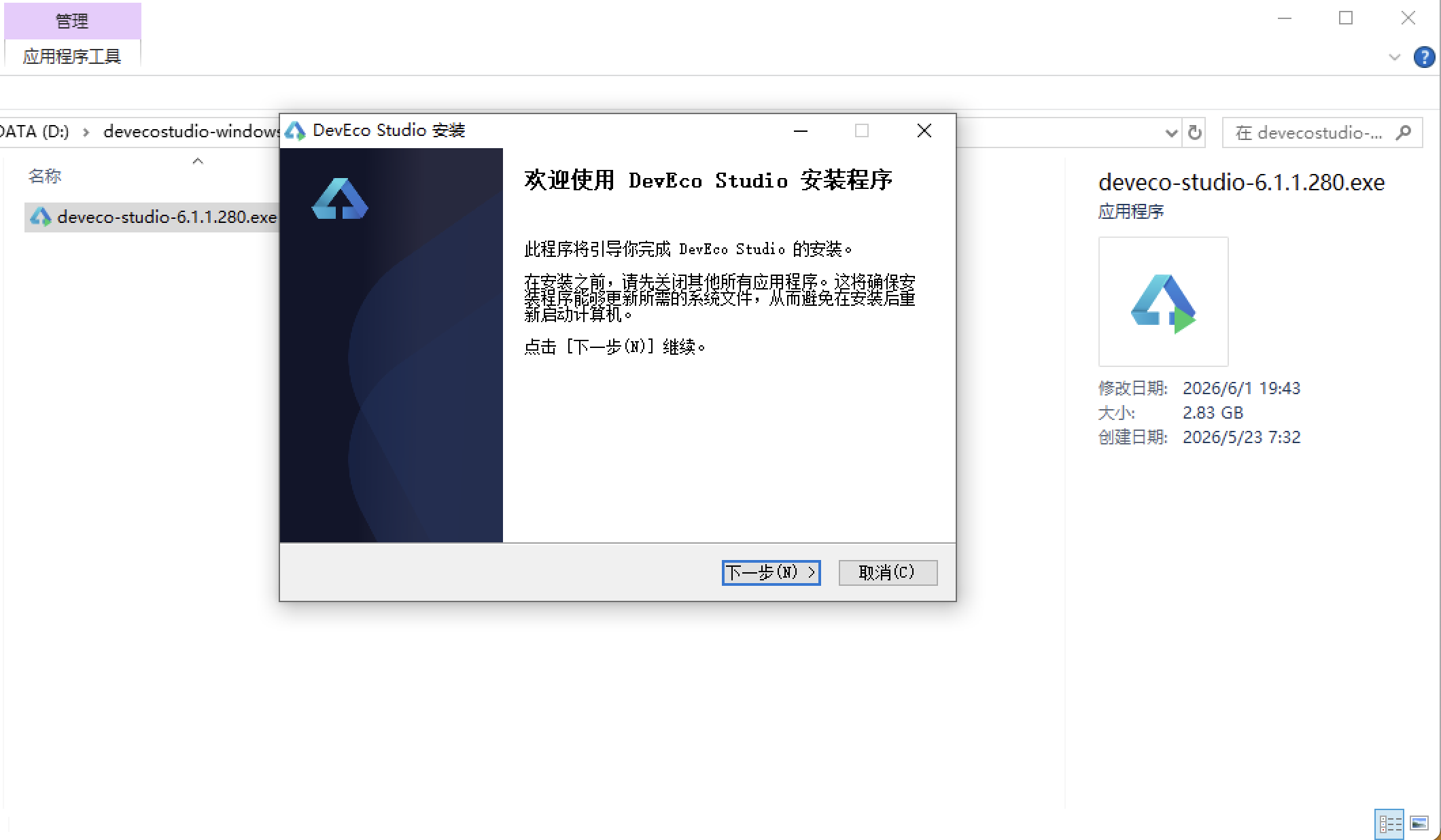
选择目标安装目录:
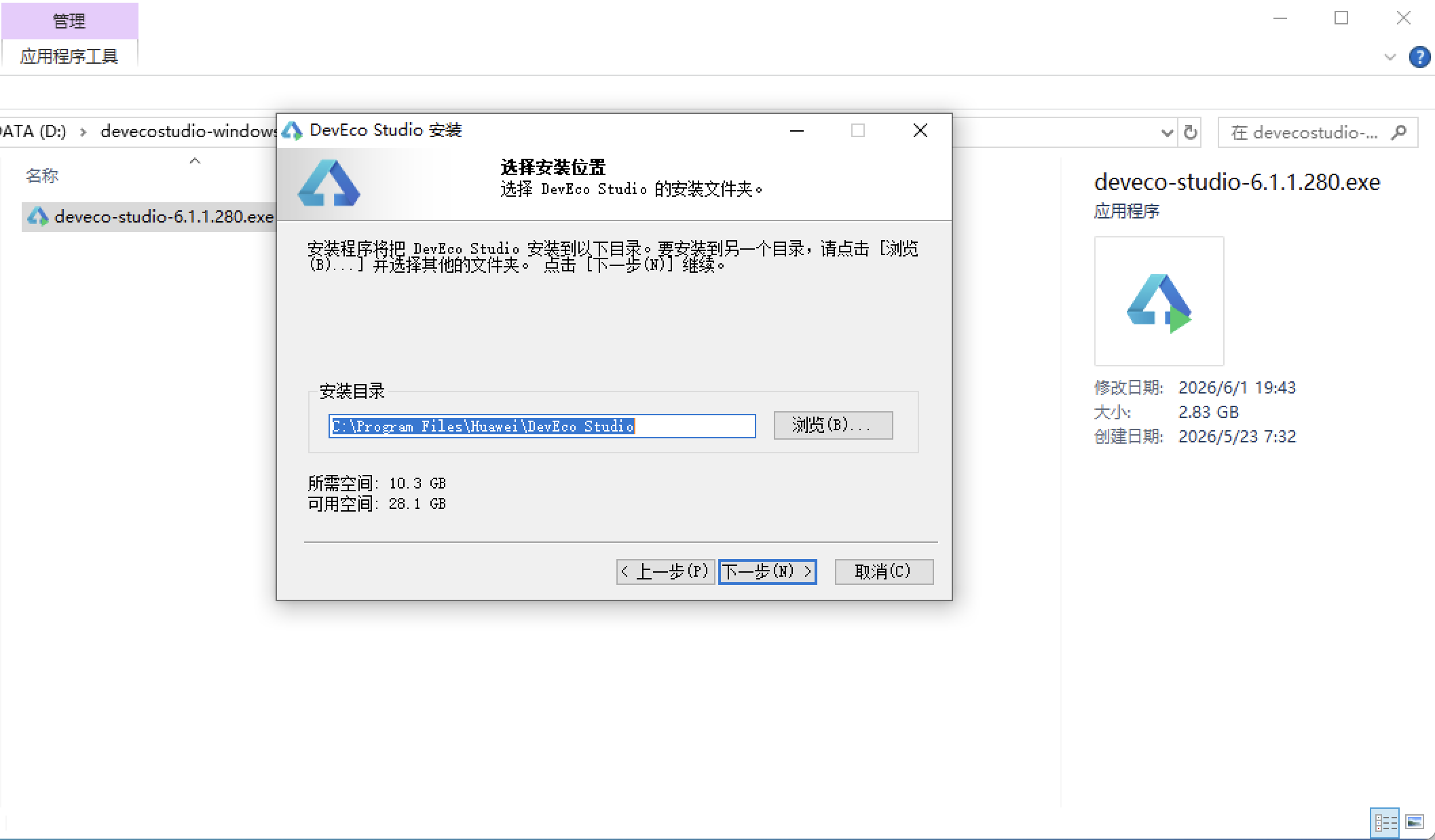
设置环境变量,但是需要重启一下:
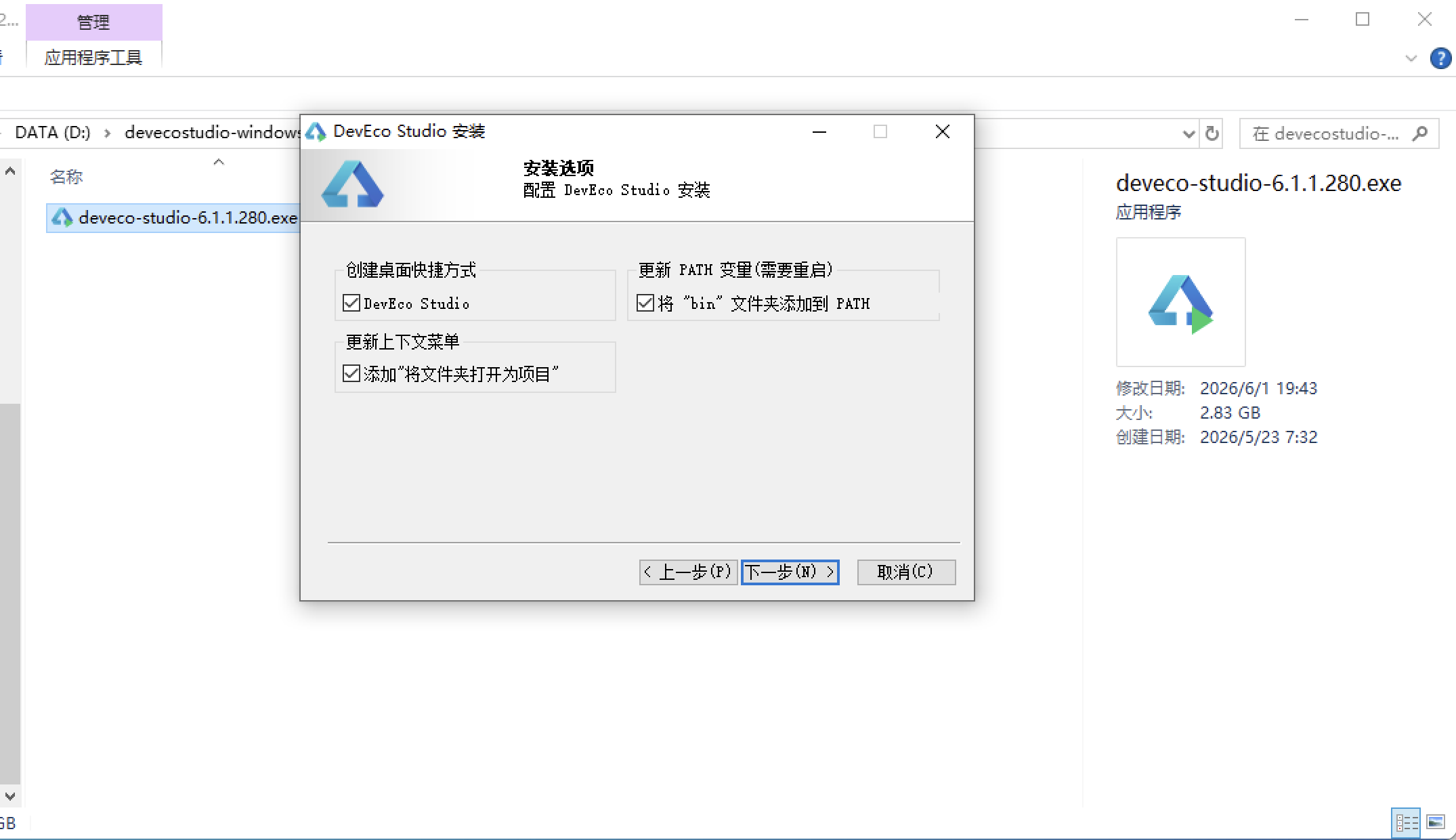
新建一个空白模板:
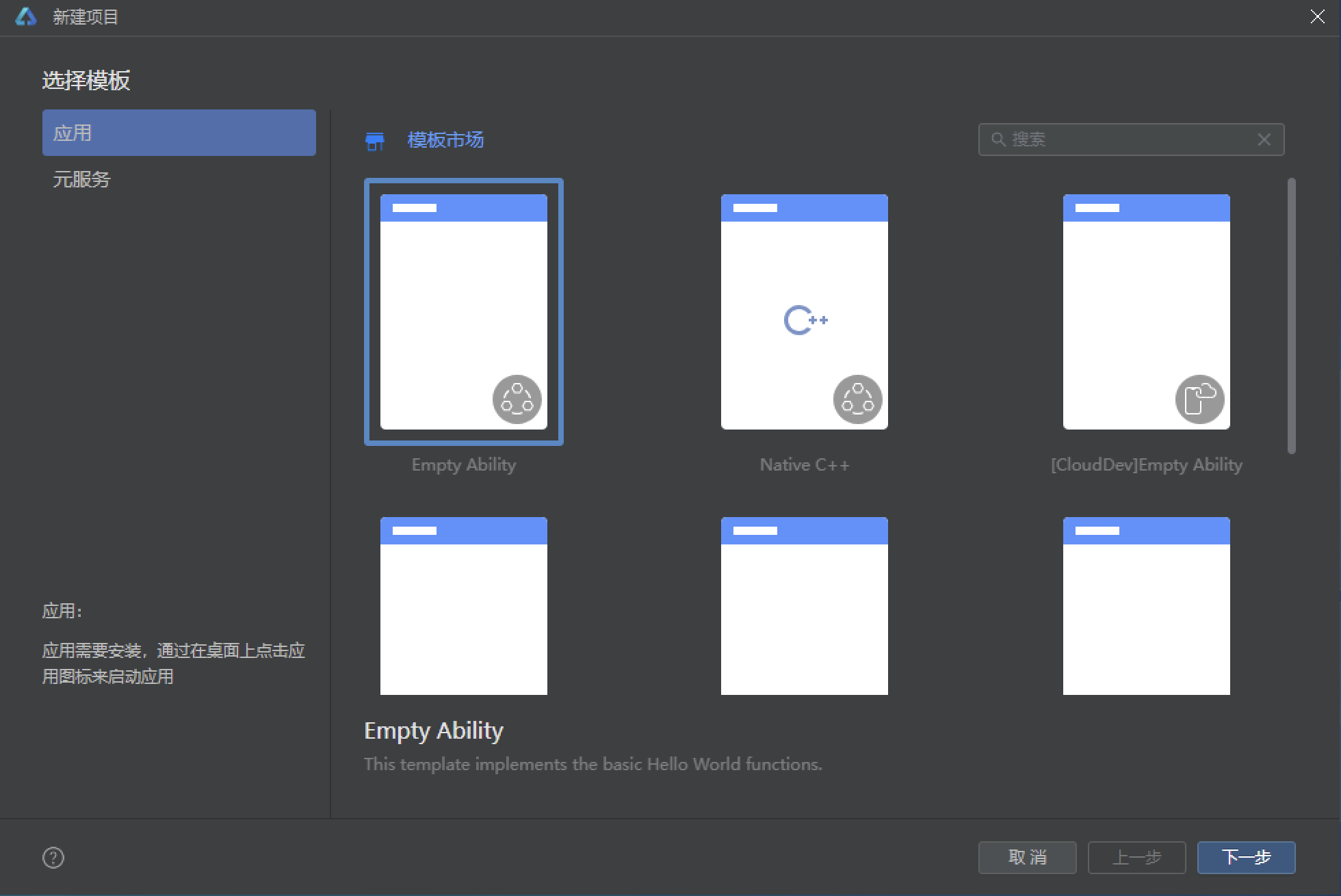
设置API为24的模板项目: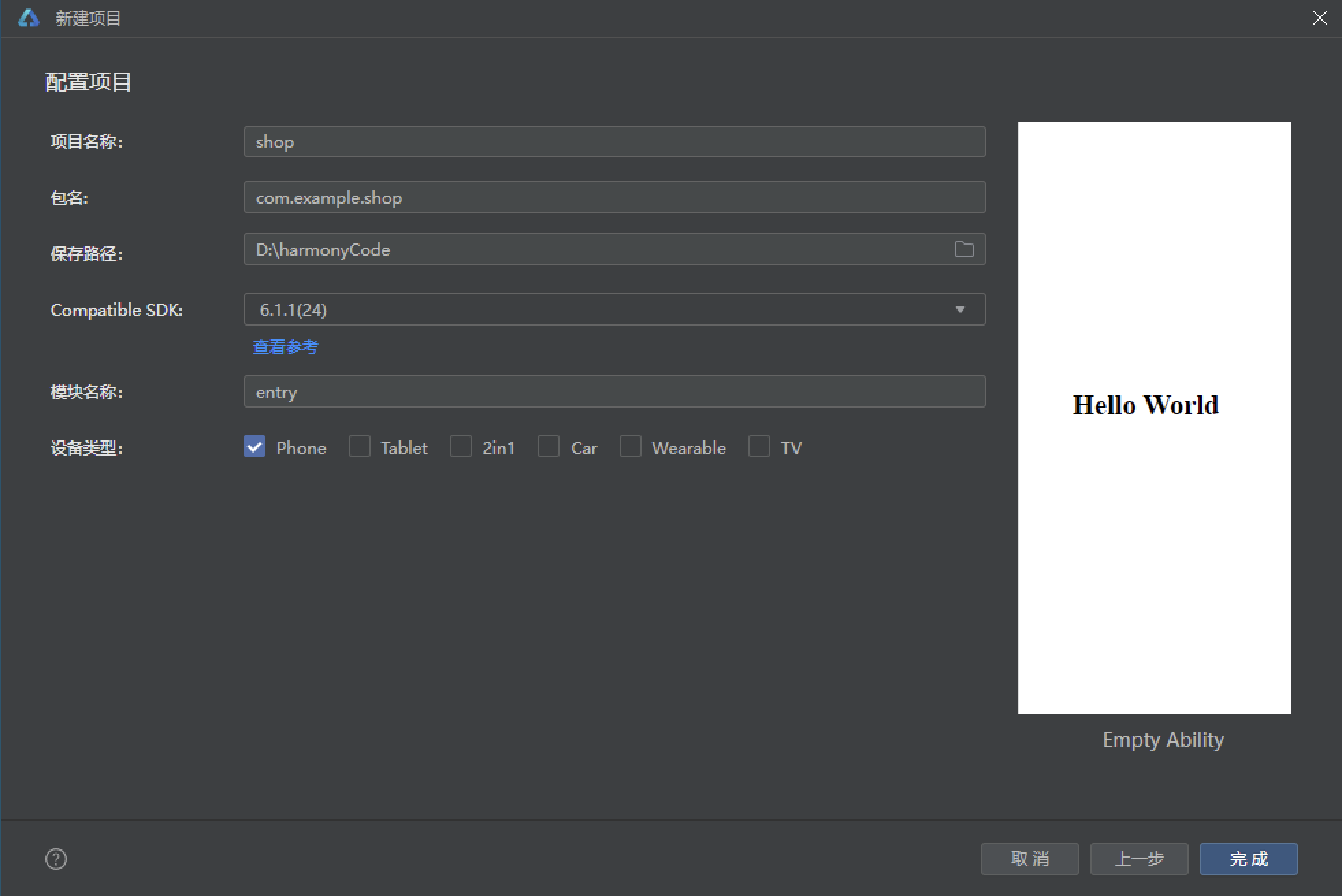
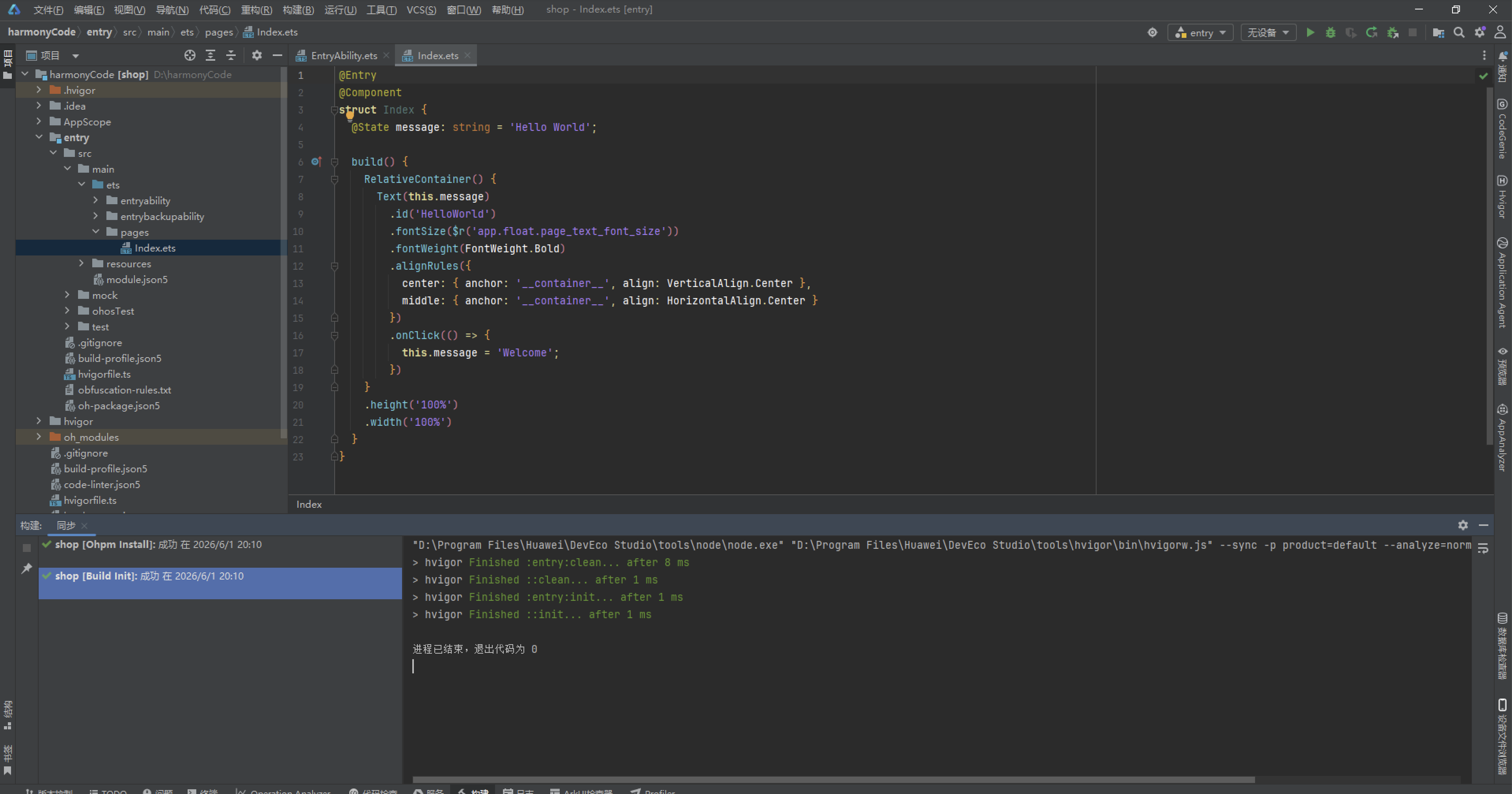
初始化项目,自动下载相关依赖:
完整代码:
// ============================================================
// 风格:玫红 + 紫罗兰 · 梦幻少女风
// 底部4tab:商店 / 搭配 / 抽盒 / 我的
// 顶部6tab:主题 / 气泡 / 挂件 / 字体 / 背景 / 装扮秀
// 弹框:抽盒确认(新增) / 搭配编辑(编辑) / 删除已购(删除) / 装扮详情
// 特效:钻石粒子 + 月度下载量柱状图 + 气泡预览
// ============================================================
interface ColorPalette {
rose: string;
roseDeep: string;
violet: string;
violetLight: string;
bg: string;
cardBg: string;
textPrimary: string;
textSecondary: string;
textHint: string;
white: string;
gold: string;
border: string;
danger: string;
success: string;
}
const COLORS: ColorPalette = {
rose: '#E91E63',
roseDeep: '#AD1457',
violet: '#7C4DFF',
violetLight: '#EDE7F6',
bg: '#FAF0F6',
cardBg: '#FFFFFF',
textPrimary: '#4A2B3F',
textSecondary: '#9C7386',
textHint: '#C9AAB9',
white: '#FFFFFF',
gold: '#FFB300',
border: '#F3DCE8',
danger: '#EF5350',
success: '#66BB6A'
};
interface TabItem {
label: string;
icon: string;
}
const BOTTOM_TABS: TabItem[] = [
{ label: '商店', icon: '🛍' },
{ label: '搭配', icon: '👗' },
{ label: '抽盒', icon: '🎁' },
{ label: '我的', icon: '🎀' }
];
const TOP_TABS: TabItem[] = [
{ label: '主题', icon: '🎨' },
{ label: '气泡', icon: '💭' },
{ label: '挂件', icon: '🎐' },
{ label: '字体', icon: '🔤' },
{ label: '背景', icon: '🖼' },
{ label: '装扮秀', icon: '✨' }
];
const MONTHS: string[] = ['3月', '4月', '5月', '6月', '7月', '8月'];
const DOWNLOAD_VALUES: number[] = [8200, 12100, 9600, 15800, 13400, 19200];
@Observed
class ThemeItem {
id: number;
name: string;
designer: string;
category: string;
price: string;
downloads: number;
isVip: boolean;
gradientFrom: string;
gradientTo: string;
desc: string;
constructor(id: number, name: string, designer: string, category: string, price: string,
downloads: number, isVip: boolean, gradientFrom: string, gradientTo: string, desc: string) {
this.id = id;
this.name = name;
this.designer = designer;
this.category = category;
this.price = price;
this.downloads = downloads;
this.isVip = isVip;
this.gradientFrom = gradientFrom;
this.gradientTo = gradientTo;
this.desc = desc;
}
}
function buildThemes(): ThemeItem[] {
return [
new ThemeItem(1, '星河入梦', '月色设计所', '主题', '免费', 19200, false, '#3A1C71', '#D76D77', '紫色星云渐变,附赠流星划过特效'),
new ThemeItem(2, '樱花信笺', '春日工作室', '主题', '¥6', 15800, false, '#FF9A9E', '#FECFEF', '粉色樱花瓣飘落,少女心满分'),
new ThemeItem(3, '午夜电台', '深夜灵感组', '主题', 'VIP', 13400, true, '#141E30', '#243B55', '深夜蓝调,适合夜猫子聊天'),
new ThemeItem(4, '薄荷汽水', '气泡实验室', '气泡', '免费', 12100, false, '#00C9A7', '#92FE9D', '气泡自带汽水冒泡音效'),
new ThemeItem(5, '云朵软糖', '棉花糖制贩', '气泡', '¥3', 9600, false, '#F6D365', '#FDA085', '咬一口会抖动的软糖气泡'),
new ThemeItem(6, '星轨信使', '天文社', '挂件', '¥8', 8800, false, '#5B86E5', '#36D1DC', '头像旁环绕小行星轨迹'),
new ThemeItem(7, '奶茶挂件', '快乐肥宅组', '挂件', '免费', 8200, false, '#D1913C', '#FFD194', '三分糖去冰,挂在头像上'),
new ThemeItem(8, '手写体·屿', '字库坊', '字体', '¥5', 7400, false, '#654EA3', '#EAAFC8', '温柔手写体,适合长文案'),
new ThemeItem(9, '像素冒险', '街机怀旧屋', '字体', 'VIP', 6800, true, '#FC466B', '#3F5EFB', '8-bit像素风,游戏迷必备'),
new ThemeItem(10, '莫奈花园', '美术馆联名', '背景', '¥12', 5900, false, '#D4FC79', '#96E6A1', '印象派睡莲,聊天背景首选'),
new ThemeItem(11, '落日飞车', '公路电影组', '背景', '¥6', 5200, false, '#FF9966', '#FF5E62', '落日公路,永远的浪漫'),
new ThemeItem(12, '猫爪键盘', '猫奴联盟', '主题', '¥4', 4800, false, '#F093FB', '#F5576C', '每次打字都踩出小猫爪印'),
new ThemeItem(13, '青柠气泡', '气泡实验室', '气泡', '免费', 4300, false, '#A8FF78', '#78ffd6', '清爽青柠,夏日限定回归'),
new ThemeItem(14, '古风·墨竹', '竹里馆', '主题', '¥6', 3900, false, '#134E5E', '#71B280', '水墨竹影,文人雅士之选'),
new ThemeItem(15, '月光海浪', '海边合作社', '背景', 'VIP', 3600, true, '#2E3192', '#1BFFFF', '月色下的海浪轻轻拍岸')
];
}
const THEMES: ThemeItem[] = buildThemes();
interface BubbleMsg {
id: number;
sender: string;
avatar: string;
content: string;
time: string;
isMine: boolean;
}
const CHAT_MSGS: BubbleMsg[] = [
{ id: 1, sender: '小鹿', avatar: '🦌', content: '你新换的这个气泡也太好看了吧!', time: '20:01', isMine: false },
{ id: 2, sender: '我', avatar: '🎀', content: '嘿嘿,云朵软糖,咬一口会抖的那种', time: '20:02', isMine: true },
{ id: 3, sender: '小鹿', avatar: '🦌', content: '多少钱呀?我也要去买!', time: '20:02', isMine: false },
{ id: 4, sender: '我', avatar: '🎀', content: '才3块钱,学生党友好~', time: '20:03', isMine: true },
{ id: 5, sender: '小鹿', avatar: '🦌', content: '冲了!配上星轨挂件绝美', time: '20:05', isMine: false },
{ id: 6, sender: '我', avatar: '🎀', content: '晚上一起去装扮秀投稿吧', time: '20:06', isMine: true },
{ id: 7, sender: '小鹿', avatar: '🦌', content: '好啊好啊,我用樱花信笺主题', time: '20:06', isMine: false },
{ id: 8, sender: '我', avatar: '🎀', content: '那我配午夜电台,暗黑+粉嫩反差感', time: '20:08', isMine: true }
];
interface OutfitPost {
id: number;
author: string;
avatar: string;
title: string;
usedThemes: string;
likes: number;
scene: string;
}
const OUTFIT_POSTS: OutfitPost[] = [
{ id: 1, author: '月光奏鸣曲', avatar: '🌙', title: '深夜聊天氛围感套装', usedThemes: '午夜电台+星轨信使+手写体', likes: 3284, scene: '夜聊' },
{ id: 2, author: '桃桃乌龙', avatar: '🍑', title: '春日野餐少女风', usedThemes: '樱花信笺+云朵软糖+奶茶挂件', likes: 2876, scene: '约会' },
{ id: 3, author: '像素骑士', avatar: '🕹', title: '复古游戏厅全套', usedThemes: '像素冒险+落日飞车背景', likes: 2453, scene: '游戏' },
{ id: 4, author: '南山采菊', avatar: '🌿', title: '竹林听雨文人装', usedThemes: '古风墨竹+手写体屿', likes: 1987, scene: '阅读' },
{ id: 5, author: '深海不蓝', avatar: '🌊', title: '海边度假风', usedThemes: '月光海浪+薄荷汽水', likes: 1755, scene: '旅行' },
{ id: 6, author: '肥宅快乐兽', avatar: '🐱', title: '猫咪周边大满贯', usedThemes: '猫爪键盘+奶茶挂件', likes: 1620, scene: '日常' },
{ id: 7, author: '星河滚烫', avatar: '⭐', title: '宇宙浪漫终极版', usedThemes: '星河入梦+星轨信使+像素冒险', likes: 1544, scene: '夜聊' }
];
interface BlindBoxSeries {
id: number;
name: string;
icon: string;
price: string;
count: string;
rare: string;
}
const BOX_SERIES: BlindBoxSeries[] = [
{ id: 1, name: '星梦奇缘系列', icon: '🌟', price: '12钻/次', count: '8款', rare: '隐藏款为流星眼' },
{ id: 2, name: '甜品派对系列', icon: '🍰', price: '10钻/次', count: '6款', rare: '隐藏款为熔岩蛋糕' },
{ id: 3, name: '机械之心系列', icon: '⚙️', price: '15钻/次', count: '10款', rare: '隐藏款为黄金齿轮' }
];
interface ParticleItem {
id: number;
x: number;
y: number;
size: number;
opacity: number;
icon: string;
}
const PARTICLE_ICONS: string[] = ['💎', '✨', '🎀', '❀', '✧'];
function buildParticles(): ParticleItem[] {
const arr: ParticleItem[] = [];
for (let i = 0; i < 13; i++) {
arr.push({
id: i,
x: (i * 51) % 335 + 10,
y: 130 + (i * 89) % 470,
size: 8 + (i * 6) % 10,
opacity: 0.2 + (i % 3) * 0.1,
icon: PARTICLE_ICONS[i % PARTICLE_ICONS.length]
});
}
return arr;
}
function driftParticles(list: ParticleItem[]): ParticleItem[] {
const next: ParticleItem[] = [];
for (let i = 0; i < list.length; i++) {
const p = list[i];
const ny = p.y - 4;
next.push({
id: p.id,
x: p.x + Math.cos(p.id + p.y / 42) * 1.6,
y: ny < 105 ? 630 : ny,
size: p.size,
opacity: p.opacity,
icon: p.icon
});
}
return next;
}
function downloadBarHeight(v: number): string {
return (v / 160).toFixed(0) + 'vp';
}
function downloadBarColor(v: number): string {
if (v > 15000) {
return COLORS.rose;
}
if (v > 9000) {
return COLORS.violet;
}
return COLORS.gold;
}
function priceColor(price: string): string {
if (price === '免费') {
return COLORS.success;
}
if (price === 'VIP') {
return COLORS.gold;
}
return COLORS.rose;
}
@Entry
struct Index {
@State currentBottomTab: number = 0;
@State currentTopTab: number = 0;
@State showBoxModal: boolean = false;
@State showOutfitModal: boolean = false;
@State showDeleteModal: boolean = false;
@State showDetailModal: boolean = false;
@State selectedTheme: ThemeItem | null = null;
@State particles: ParticleItem[] = buildParticles();
@State boxSeriesIdx: number = 0;
@State boxTimes: number = 0;
@State outfitName: string = '';
@State outfitScene: number = 0;
@State outfitPublic: boolean = true;
private timerId: number = -1;
aboutToAppear() {
this.timerId = setInterval(() => {
this.particles = driftParticles(this.particles);
}, 130);
}
aboutToDisappear() {
if (this.timerId >= 0) {
clearInterval(this.timerId);
}
}
build() {
Stack() {
Column() {
this.headerBuilder()
this.topTabsBuilder()
Scroll() {
Column() {
if (this.currentBottomTab === 0) {
this.storeContent()
} else if (this.currentBottomTab === 1) {
this.outfitContent()
} else if (this.currentBottomTab === 2) {
this.boxContent()
} else {
this.mineContent()
}
}
.width('100%')
.alignItems(HorizontalAlign.Start)
}
.layoutWeight(1)
.scrollable(ScrollDirection.Vertical)
.scrollBar(BarState.Off)
this.bottomTabs()
}
.width('100%')
.height('100%')
.backgroundColor(COLORS.bg)
ForEach(this.particles, (p: ParticleItem) => {
Text(p.icon)
.fontSize(p.size)
.opacity(p.opacity)
.position({ x: p.x, y: p.y })
}, (p: ParticleItem) => p.id.toString() + '_' + p.y.toFixed(0))
if (this.showBoxModal) {
this.blindBoxModal()
}
if (this.showOutfitModal) {
this.outfitEditModal()
}
if (this.showDeleteModal) {
this.deleteThemeModal()
}
if (this.showDetailModal) {
this.themeDetailModal()
}
}
.width('100%')
.height('100%')
}
// ---------- 头部(梦幻渐变横幅,无动画) ----------
@Builder
headerBuilder() {
Column() {
Row() {
Column() {
Text('🎀 QQ装扮屋')
.fontSize(22)
.fontWeight(FontWeight.Bold)
.fontColor(COLORS.white)
Text('装扮商场 · 让聊天与众不同')
.fontSize(11)
.fontColor('#FFD9E8')
.margin({ top: 2 })
}
.alignItems(HorizontalAlign.Start)
Column() {
Text('👑')
.fontSize(20)
}
.padding(10)
.borderRadius(20)
.backgroundColor('33FFFFFF')
}
.width('100%')
.justifyContent(FlexAlign.SpaceBetween)
.padding({ left: 16, right: 16, top: 10, bottom: 8 })
Row() {
Column() {
Text('💎 钻石余额')
.fontSize(10)
.fontColor('#FFD9E8')
Text('86')
.fontSize(16)
.fontWeight(FontWeight.Bold)
.fontColor(COLORS.white)
}
.alignItems(HorizontalAlign.Start)
Column() {
Text('👗 我的搭配')
.fontSize(10)
.fontColor('#FFD9E8')
Text('6套')
.fontSize(16)
.fontWeight(FontWeight.Bold)
.fontColor(COLORS.white)
}
.alignItems(HorizontalAlign.Start)
.margin({ left: 20 })
Column() {
Text('🛍 已购装扮')
.fontSize(10)
.fontColor('#FFD9E8')
Text('42件')
.fontSize(16)
.fontWeight(FontWeight.Bold)
.fontColor(COLORS.white)
}
.alignItems(HorizontalAlign.Start)
.margin({ left: 20 })
Column() {
Text('👑 SVIP')
.fontSize(10)
.fontColor('#FFD9E8')
Text('已开通')
.fontSize(16)
.fontWeight(FontWeight.Bold)
.fontColor(COLORS.gold)
}
.alignItems(HorizontalAlign.Start)
.margin({ left: 20 })
}
.width('100%')
.padding({ left: 16, right: 16, bottom: 10 })
}
.width('100%')
.linearGradient({
angle: 135,
colors: [['#AD1457', 0], ['#E91E63', 0.5], ['#7C4DFF', 1]]
})
}
// ---------- 顶部tab(渐变下划线单排) ----------
@Builder
topTabsBuilder() {
Scroll() {
Row() {
ForEach(TOP_TABS, (t: TabItem, idx: number) => {
Column() {
Text(t.icon + ' ' + t.label)
.fontSize(13)
.fontWeight(this.currentTopTab === idx ? FontWeight.Bold : FontWeight.Normal)
.fontColor(this.currentTopTab === idx ? COLORS.rose : COLORS.textSecondary)
if (this.currentTopTab === idx) {
Text('')
.width(18)
.height(3)
.borderRadius(2)
.linearGradient({
angle: 90,
colors: [['#E91E63', 0], ['#7C4DFF', 1]]
})
.margin({ top: 4 })
}
}
.padding({ left: 12, right: 12, top: 10, bottom: 6 })
.onClick(() => {
this.currentTopTab = idx;
})
}, (t: TabItem) => t.label)
}
.padding({ left: 8, right: 8 })
}
.scrollable(ScrollDirection.Horizontal)
.scrollBar(BarState.Off)
.width('100%')
.backgroundColor(COLORS.cardBg)
}
// ---------- 商店tab内容 ----------
@Builder
storeContent() {
Column() {
if (this.currentTopTab === 0) {
this.themeStoreContent()
} else if (this.currentTopTab === 1) {
this.bubblePreviewContent()
} else if (this.currentTopTab === 2) {
this.pendantGridContent()
} else if (this.currentTopTab === 3) {
this.fontListContent()
} else if (this.currentTopTab === 4) {
this.bgWallContent()
} else {
this.showWallContent()
}
}
.width('100%')
.padding(12)
.alignItems(HorizontalAlign.Start)
}
// 主题tab:大卡横滑 + 下载量柱状图 + 列表
@Builder
themeStoreContent() {
Column() {
Text('🔥 本周爆款主题')
.fontSize(15)
.fontWeight(FontWeight.Bold)
.fontColor(COLORS.textPrimary)
.margin({ bottom: 8 })
Scroll() {
Row() {
ForEach(THEMES, (t: ThemeItem) => {
Column() {
Column() {
Text('✨')
.fontSize(34)
.margin({ top: 18 })
Text(t.name)
.fontSize(14)
.fontWeight(FontWeight.Bold)
.fontColor(COLORS.white)
.margin({ top: 10 })
Text(t.designer)
.fontSize(10)
.fontColor('#FFFFFFCC')
.margin({ top: 4 })
Text(t.price)
.fontSize(11)
.fontWeight(FontWeight.Bold)
.fontColor(COLORS.white)
.padding({ left: 12, right: 12, top: 4, bottom: 4 })
.borderRadius(12)
.backgroundColor('33FFFFFF')
.margin({ top: 10, bottom: 18 })
}
.width(150)
.alignItems(HorizontalAlign.Center)
.linearGradient({
angle: 160,
colors: [[t.gradientFrom, 0], [t.gradientTo, 1]]
})
}
.borderRadius(16)
.margin({ right: 12 })
.onClick(() => {
this.selectedTheme = t;
this.showDetailModal = true;
})
}, (t: ThemeItem) => t.id.toString())
}
}
.scrollable(ScrollDirection.Horizontal)
.scrollBar(BarState.Off)
.width('100%')
Column() {
Text('📈 热门装扮月下载量')
.fontSize(13)
.fontWeight(FontWeight.Bold)
.fontColor(COLORS.textPrimary)
Row() {
ForEach(MONTHS, (m: string, idx: number) => {
Column() {
Text((DOWNLOAD_VALUES[idx] / 1000).toFixed(1) + 'k')
.fontSize(8)
.fontColor(COLORS.textSecondary)
Column() {
Text('')
.width('100%')
.height(1)
}
.width(20)
.height(downloadBarHeight(DOWNLOAD_VALUES[idx]))
.borderRadius({ topLeft: 4, topRight: 4 })
.backgroundColor(downloadBarColor(DOWNLOAD_VALUES[idx]))
Text(m)
.fontSize(9)
.fontColor(COLORS.textSecondary)
.margin({ top: 4 })
}
.margin({ left: 12, right: 12 })
.alignItems(HorizontalAlign.Center)
}, (m: string) => m)
}
.width('100%')
.justifyContent(FlexAlign.Center)
.alignItems(VerticalAlign.Bottom)
.padding({ top: 8 })
}
.width('100%')
.padding(14)
.borderRadius(16)
.backgroundColor(COLORS.cardBg)
.alignItems(HorizontalAlign.Start)
.margin({ top: 12 })
Text('🎨 全部主题')
.fontSize(15)
.fontWeight(FontWeight.Bold)
.fontColor(COLORS.textPrimary)
.margin({ top: 14, bottom: 8 })
ForEach(THEMES, (t: ThemeItem) => {
Row() {
Column() {
Text('🎨')
.fontSize(24)
}
.width(52)
.height(52)
.borderRadius(13)
.linearGradient({
angle: 135,
colors: [[t.gradientFrom, 0], [t.gradientTo, 1]]
})
.justifyContent(FlexAlign.Center)
Column() {
Row() {
Text(t.name)
.fontSize(13)
.fontWeight(FontWeight.Bold)
.fontColor(COLORS.textPrimary)
if (t.isVip) {
Text('VIP')
.fontSize(9)
.fontColor(COLORS.white)
.padding({ left: 6, right: 6, top: 1, bottom: 1 })
.borderRadius(6)
.backgroundColor(COLORS.gold)
.margin({ left: 6 })
}
}
Text(t.designer + ' · ' + (t.downloads / 1000).toFixed(1) + 'k次使用')
.fontSize(10)
.fontColor(COLORS.textSecondary)
.margin({ top: 3 })
Text(t.desc)
.fontSize(10)
.fontColor(COLORS.textHint)
.maxLines(1)
.textOverflow({ overflow: TextOverflow.Ellipsis })
.margin({ top: 2 })
}
.alignItems(HorizontalAlign.Start)
.layoutWeight(1)
.margin({ left: 10 })
Column() {
Text(t.price)
.fontSize(13)
.fontWeight(FontWeight.Bold)
.fontColor(priceColor(t.price))
Text('装扮')
.fontSize(10)
.fontColor(COLORS.white)
.padding({ left: 12, right: 12, top: 4, bottom: 4 })
.borderRadius(12)
.backgroundColor(COLORS.rose)
.margin({ top: 4 })
}
.alignItems(HorizontalAlign.End)
}
.width('100%')
.padding(10)
.borderRadius(12)
.backgroundColor(COLORS.cardBg)
.margin({ bottom: 8 })
.onClick(() => {
this.selectedTheme = t;
this.showDetailModal = true;
})
}, (t: ThemeItem) => t.id.toString())
}
.width('100%')
.alignItems(HorizontalAlign.Start)
}
// 气泡tab:聊天气泡预览
@Builder
bubblePreviewContent() {
Column() {
Column() {
Text('💭 气泡效果实时预览')
.fontSize(14)
.fontWeight(FontWeight.Bold)
.fontColor(COLORS.textPrimary)
Text('与「小鹿」的聊天')
.fontSize(10)
.fontColor(COLORS.textSecondary)
.margin({ top: 4 })
}
.width('100%')
.alignItems(HorizontalAlign.Start)
.margin({ bottom: 10 })
ForEach(CHAT_MSGS, (m: BubbleMsg) => {
Column() {
if (m.isMine) {
Row() {
Column() {
Text(m.content)
.fontSize(13)
.fontColor(COLORS.white)
.padding({ left: 14, right: 14, top: 10, bottom: 10 })
.borderRadius({
topLeft: 18,
topRight: 18,
bottomLeft: 18,
bottomRight: 4
})
.linearGradient({
angle: 135,
colors: [['#E91E63', 0], ['#7C4DFF', 1]]
})
Text(m.time)
.fontSize(8)
.fontColor(COLORS.textHint)
.margin({ top: 3 })
}
.alignItems(HorizontalAlign.End)
.margin({ right: 8 })
Text(m.avatar)
.fontSize(24)
.width(38)
.height(38)
.textAlign(TextAlign.Center)
.borderRadius(19)
.backgroundColor(COLORS.violetLight)
}
.width('100%')
.justifyContent(FlexAlign.End)
} else {
Row() {
Text(m.avatar)
.fontSize(24)
.width(38)
.height(38)
.textAlign(TextAlign.Center)
.borderRadius(19)
.backgroundColor(COLORS.border)
Column() {
Text(m.content)
.fontSize(13)
.fontColor(COLORS.textPrimary)
.padding({ left: 14, right: 14, top: 10, bottom: 10 })
.borderRadius({
topLeft: 18,
topRight: 18,
bottomLeft: 4,
bottomRight: 18
})
.backgroundColor(COLORS.cardBg)
Text(m.time)
.fontSize(8)
.fontColor(COLORS.textHint)
.margin({ top: 3 })
}
.alignItems(HorizontalAlign.Start)
.margin({ left: 8 })
}
.width('100%')
.justifyContent(FlexAlign.Start)
}
}
.width('100%')
.margin({ bottom: 10 })
}, (m: BubbleMsg) => m.id.toString())
Row() {
Text('🛍 购买「云朵软糖」气泡')
.fontSize(13)
.fontWeight(FontWeight.Bold)
.fontColor(COLORS.white)
.padding({ left: 20, right: 20, top: 10, bottom: 10 })
.borderRadius(20)
.backgroundColor(COLORS.rose)
.onClick(() => {
this.selectedTheme = THEMES[4];
this.showDetailModal = true;
})
Text('🎁 试试手气抽一套')
.fontSize(13)
.fontColor(COLORS.violet)
.padding({ left: 20, right: 20, top: 10, bottom: 10 })
.borderRadius(20)
.border({ width: 1, color: COLORS.violet })
.margin({ left: 10 })
.onClick(() => {
this.showBoxModal = true;
})
}
.width('100%')
.justifyContent(FlexAlign.Center)
}
.width('92%')
.borderRadius(16)
.backgroundColor(COLORS.cardBg)
.clip(true)
}
.width('100%')
.height('100%')
.justifyContent(FlexAlign.Center)
.alignItems(HorizontalAlign.Center)
.backgroundColor('99000000')
.onClick(() => {
this.showDetailModal = false;
})
}
}
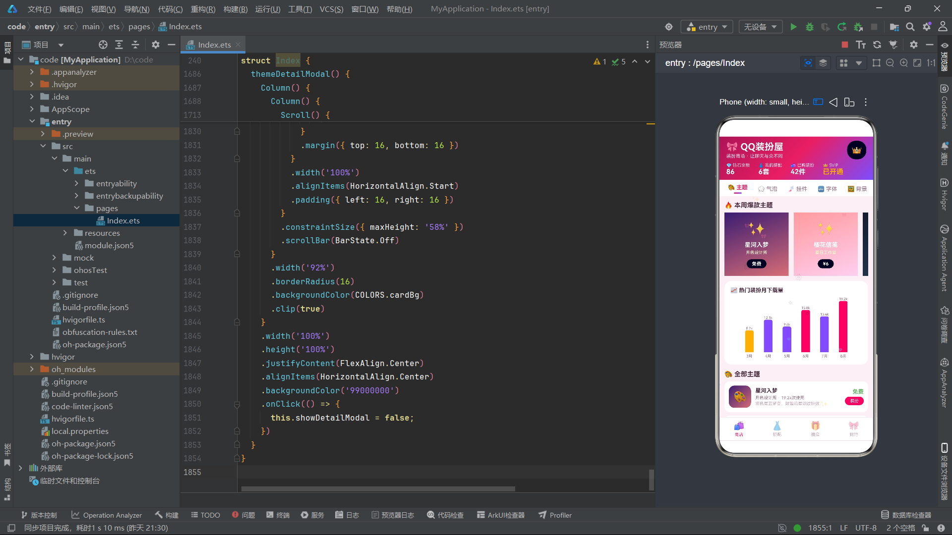
六、总结
本文以"QQ装扮·主题屋"个性装扮商店为案例,深入剖析了基于HarmonyOS API 24的完整应用开发实践。通过25个代码段的逐行分析,我们全面覆盖了ArkTS声明式UI开发的核心技术要点。
在架构设计层面,应用采用Stack层叠布局实现了三层架构:主内容层负责常规UI展示、粒子层负责动画特效渲染、条件弹窗层负责交互弹窗的动态显示。这种分层设计使得各功能模块高内聚低耦合,便于独立开发和维护。
在状态管理层面,应用使用了12个@State变量管理导航状态、弹窗状态、表单数据和动画数据。@Observed装饰的ThemeItem类实现了数据模型的可观察化,当主题属性变化时自动触发UI更新。粒子动画通过setInterval配合@State数组的不可变更新实现,每130毫秒计算一次粒子新位置并整体替换数组,ArkTS的ForEach键值优化确保了只有位置变化的粒子才触发UI重渲染。
在UI构建层面,@Builder装饰器将复杂的UI拆分为20多个可复用的构建方法,涵盖了头部、Tab栏、六大商店分类、四大Tab内容、四种弹窗等所有UI模块。ForEach在列表渲染中广泛使用,通过键值生成器实现高效的Diff算法。linearGradient属性在多处使用,构建了从头部到按钮的统一渐变视觉语言。
在交互设计层面,四个弹窗通过布尔状态变量独立控制,支持弹窗间的链式跳转。TextInput组件实现了表单双向绑定,onClick事件处理贯穿所有可交互元素。底部Tab和顶部Tab的联动更新确保了状态一致性。
在性能优化层面,柱状图和粒子系统采用纯ArkTS原生方式构建,避免了第三方库依赖。Scroll组件的scrollBar(BarState.Off)和clip(true)等属性优化了视觉表现。ForEach的键值生成器精心设计,确保最小化UI重渲染范围。定时器在aboutToDisappear中被正确清理,防止了内存泄漏。
HarmonyOS 6.1.1搭载的ArkTS API 24提供了成熟完善的声明式UI开发能力,@Entry、@State、@Builder、@Observed等装饰器语法使得开发者能够以简洁直观的方式构建复杂应用。本案例展示了从数据建模、状态管理、UI构建到交互设计的完整开发流程,是学习鸿蒙原生应用开发的优质实践参考。随着鸿蒙生态的持续发展和API的不断完善,ArkTS声明式开发范式将在更多场景中发挥其高效、灵活、可维护的优势。

作为“人工智能6S店”的官方数字引擎,为AI开发者与企业提供一个覆盖软硬件全栈、一站式门户。
更多推荐

 0
0 0
0- 0


 已为社区贡献32条内容

所有评论(0)