
鸿蒙ArkTS社区活动编排板:岗位编排卡片与输入实现
·
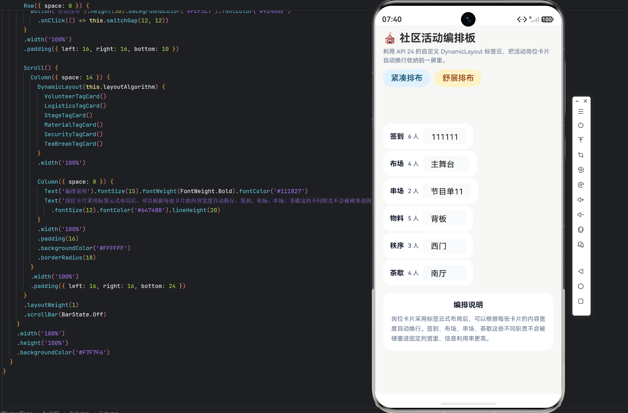
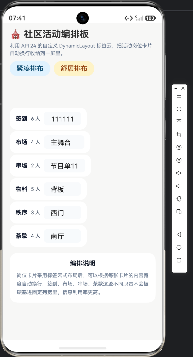
实例:社区活动编排板|技术:ComponentV2、Row 卡片、TextInput、间距切换按钮
一、本篇范围
本篇只看岗位标签卡与间距切换。每张卡的宽度不固定,输入框又会改变内容长度,这正好可以验证标签云布局是否真的按子节点尺寸换行。
二、标签卡组一:签到与布场
@ComponentV2
struct VolunteerTagCard {
  @Local label: string = '签到';
  @Local count: number = 6;
  @Local note: string = '东门';

  build() {
    Row({ space: 8 }) {
      Text(this.label).fontSize(14).fontWeight(FontWeight.Bold).fontColor('#0F172A')
      Text(`${Math.round(this.count)} 人`).fontSize(12).fontColor('#334155')
      TextInput({ text: this.note, placeholder: '区域' })
        .width(88)
        .height(32)
        .backgroundColor('#F8FAFC')
        .borderRadius(8)
        .onChange((value: string) => this.note = value)
    }
    .padding({ left: 14, right: 14, top: 10, bottom: 10 })
    .backgroundColor('#FFFFFF')
    .borderRadius(16)
  }
}

@ComponentV2
struct LogisticsTagCard {
  @Local label: string = '布场';
  @Local count: number = 4;
  @Local note: string = '主舞台';

  build() {
    Row({ space: 8 }) {
      Text(this.label).fontSize(14).fontWeight(FontWeight.Bold).fontColor('#0F172A')
      Text(`${Math.round(this.count)} 人`).fontSize(12).fontColor('#334155')
      TextInput({ text: this.note, placeholder: '区域' })
        .width(96)
        .height(32)
        .backgroundColor('#F8FAFC')
        .borderRadius(8)
        .onChange((value: string) => this.note = value)
    }
    .padding({ left: 14, right: 14, top: 10, bottom: 10 })
    .backgroundColor('#FFFFFF')
    .borderRadius(16)
  }
}
这组卡片负责入口签到与布场岗位。它们结构相近,但输入框宽度不同,正好用来验证标签云算法是否真的按子节点测量尺寸换行。
三、标签卡组二:串场与物料
@ComponentV2
struct StageTagCard {
  @Local label: string = '串场';
  @Local count: number = 2;
  @Local note: string = '节目单';

  build() {
    Row({ space: 8 }) {
      Text(this.label).fontSize(14).fontWeight(FontWeight.Bold).fontColor('#0F172A')
      Text(`${Math.round(this.count)} 人`).fontSize(12).fontColor('#334155')
      TextInput({ text: this.note, placeholder: '重点' })
        .width(98)
        .height(32)
        .backgroundColor('#F8FAFC')
        .borderRadius(8)
        .onChange((value: string) => this.note = value)
    }
    .padding({ left: 14, right: 14, top: 10, bottom: 10 })
    .backgroundColor('#FFFFFF')
    .borderRadius(16)
  }
}

@ComponentV2
struct MaterialTagCard {
  @Local label: string = '物料';
  @Local count: number = 5;
  @Local note: string = '背板';

  build() {
    Row({ space: 8 }) {
      Text(this.label).fontSize(14).fontWeight(FontWeight.Bold).fontColor('#0F172A')
      Text(`${Math.round(this.count)} 人`).fontSize(12).fontColor('#334155')
      TextInput({ text: this.note, placeholder: '重点' })
        .width(88)
        .height(32)
        .backgroundColor('#F8FAFC')
        .borderRadius(8)
        .onChange((value: string) => this.note = value)
    }
    .padding({ left: 14, right: 14, top: 10, bottom: 10 })
    .backgroundColor('#FFFFFF')
    .borderRadius(16)
  }
}
第二组卡片把岗位描述换成了节目单和物料重点,但代码结构依然保持短标签 + 数量 + 输入框的模式。这样做的好处是:页面可统一排版,算法只关心每张卡的真实宽度。
四、标签卡组三:秩序与茶歇
@ComponentV2
struct SecurityTagCard {
  @Local label: string = '秩序';
  @Local count: number = 3;
  @Local note: string = '西门';

  build() {
    Row({ space: 8 }) {
      Text(this.label).fontSize(14).fontWeight(FontWeight.Bold).fontColor('#0F172A')
      Text(`${Math.round(this.count)} 人`).fontSize(12).fontColor('#334155')
      TextInput({ text: this.note, placeholder: '区域' })
        .width(88)
        .height(32)
        .backgroundColor('#F8FAFC')
        .borderRadius(8)
        .onChange((value: string) => this.note = value)
    }
    .padding({ left: 14, right: 14, top: 10, bottom: 10 })
    .backgroundColor('#FFFFFF')
    .borderRadius(16)
  }
}

@ComponentV2
struct TeaBreakTagCard {
  @Local label: string = '茶歇';
  @Local count: number = 4;
  @Local note: string = '南厅';

  build() {
    Row({ space: 8 }) {
      Text(this.label).fontSize(14).fontWeight(FontWeight.Bold).fontColor('#0F172A')
      Text(`${Math.round(this.count)} 人`).fontSize(12).fontColor('#334155')
      TextInput({ text: this.note, placeholder: '区域' })
        .width(88)
        .height(32)
        .backgroundColor('#F8FAFC')
        .borderRadius(8)
        .onChange((value: string) => this.note = value)
    }
    .padding({ left: 14, right: 14, top: 10, bottom: 10 })
    .backgroundColor('#FFFFFF')
    .borderRadius(16)
  }
}
最后一组卡片继续维持相同结构。对于标签云页面来说,技术重点不是某一张卡多复杂,而是所有卡共享相同的宽度测量规则,所以文章要把整组卡片完整展示出来。
五、页面控制区:紧凑与舒展排布
Row({ space: 8 }) {
        Button('紧凑排布').height(36).backgroundColor('#E0F2FE').fontColor('#0C4A6E')
          .onClick(() => this.switchGap(8, 8))
        Button('舒展排布').height(36).backgroundColor('#FEF3C7').fontColor('#92400E')
          .onClick(() => this.switchGap(12, 12))
      }
      .width('100%')
      .padding({ left: 16, right: 16, bottom: 10 })

      Scroll() {
        Column({ space: 14 }) {
          DynamicLayout(this.layoutAlgorithm) {
            VolunteerTagCard()
            LogisticsTagCard()
            StageTagCard()
            MaterialTagCard()
            SecurityTagCard()
            TeaBreakTagCard()
          }
          .width('100%')

          Column({ space: 8 }) {
            Text('编排说明').fontSize(15).fontWeight(FontWeight.Bold).fontColor('#111827')
            Text('岗位卡片采用标签云式布局后,可以根据每张卡片的内容宽度自动换行。签到、布场、串场、茶歇这些不同职责不会被硬塞进固定列宽里,信息利用率更高。')
              .fontSize(12).fontColor('#64748B').lineHeight(20)
          }
          .width('100%')
          .padding(16)
          .backgroundColor('#FFFFFF')
          .borderRadius(18)
        }
        .width('100%')
        .padding({ left: 16, right: 16, bottom: 24 })
      }
按钮区只改 horizontalGap 和 verticalGap,DynamicLayout 下面的卡片集合不变。这就是这一页的技术重点:同一组岗位卡,通过布局参数变化适配不同信息密度。
六、卡片绑定对照表
| 卡片或区域 | 主要控件 | 状态字段 | 页面作用 |
|---|---|---|---|
| 签到 | Text / TextInput | label / count / note | 签到岗位与区域 |
| 布场 | Text / TextInput | label / count / note | 舞台布场岗位 |
| 串场 | Text / TextInput | label / count / note | 节目串场岗位 |
| 物料 | Text / TextInput | label / count / note | 物料准备岗位 |
| 秩序 | Text / TextInput | label / count / note | 秩序维护岗位 |
| 茶歇 | Text / TextInput | label / count / note | 茶歇区域岗位 |
七、本篇小结
第二篇把六张岗位卡完整展开,目的是让标签云算法面对真实的可变宽度组件,而不是只服务静态标签。

作为“人工智能6S店”的官方数字引擎,为AI开发者与企业提供一个覆盖软硬件全栈、一站式门户。
更多推荐
 6
6 0
0- 0


 已为社区贡献30条内容

所有评论(0)