
一屏看穿收支:ArkUI 仪表盘布局让鸿蒙记账页面像驾驶舱
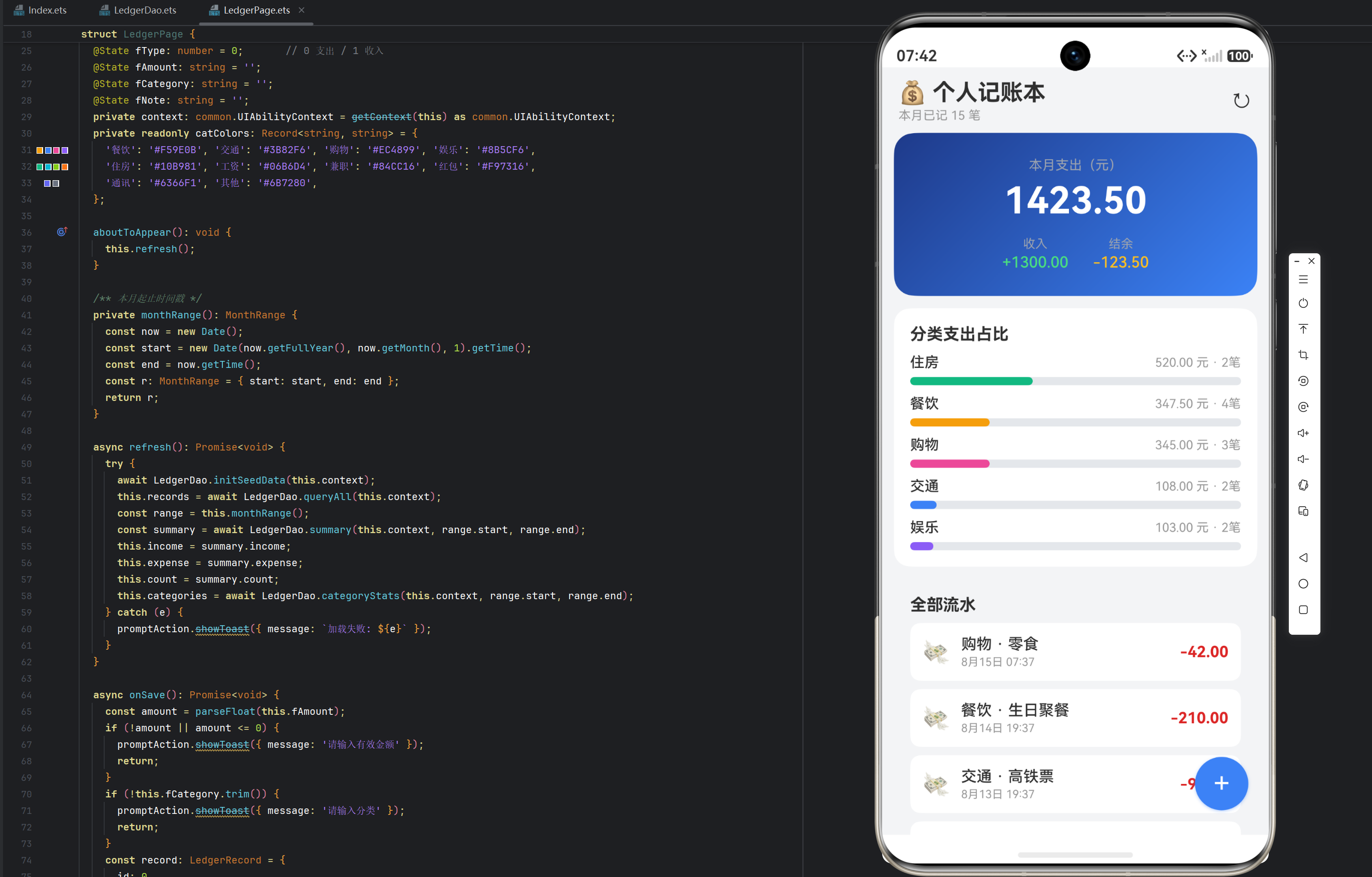
实例:个人记账本(Ledger)|风格:仪表盘式
一、设计理念:为什么记账 App 需要仪表盘
打开一个记账应用,用户的第一诉求往往不是「记一笔」,而是「看一眼」——我这个月到底花了多少钱?钱都花在哪儿了?结余还有多少?这三个问题的答案决定了用户对这款 App 的第一印象。如果打开首页是空荡荡的流水列表,用户需要自己滚动、自己心算,体验就大打折扣。
因此,我们在 xiangcejihe 项目中把「仪表盘式」作为实例 3 的页面风格:把最重要的汇总数据放在视觉中心,用大数字、进度条、占比条这些可视化元素让用户一眼看穿收支全貌,流水列表则退居其次,作为可下钻的明细层。这个设计思路在金融类 App、驾驶舱类管理后台中非常常见,是一种被反复验证的生产级布局模式。
整个页面的信息架构遵循「总-分-细」三层漏斗:
- 总(仪表盘):本月支出、本月收入、结余三大数字,一屏装下;
- 分(分类占比):支出按分类拆解,进度条直观展示资金流向;
- 细(流水列表):逐笔明细,支持删除,是数据层的原始来源。
页面滚动方向自上而下,重要度递减,符合 F 型视觉动线。下面我们逐块拆解这个页面是怎么用 ArkUI 声明式语法搭出来的。
二、页面骨架:Stack + Column + Scroll 的三层结构
先看页面的整体骨架。我们采用 Stack(栈容器)作为根节点——因为右下角要挂一个悬浮按钮,悬浮按钮必须脱离文档流叠在列表之上,Stack 的 alignContent: Alignment.BottomEnd 正好让子组件贴右下角:
build() {
  Stack({ alignContent: Alignment.BottomEnd }) {
    Column() {
      // ===== 标题栏 =====
      // ===== 仪表盘 =====
      // ===== 分类占比 =====
      // ===== 流水列表 =====
    }
    .width('100%').height('100%').backgroundColor('#F3F4F6')

    // ===== 悬浮记一笔按钮 =====
    Text('+')
      .width(52).height(52).borderRadius(26)
      .backgroundColor('#3B82F6').fontColor(Color.White).fontSize(28)
      .textAlign(TextAlign.Center)
      .margin({ right: 20, bottom: 24 })
      .shadow({ radius: 8, color: 'rgba(59,130,246,0.4)', offsetY: 3 })
      .onClick(() => { ... })
  }
  .width('100%').height('100%')
}
Stack 的妙用:Stack 是一个叠放容器,后声明的子组件叠在先声明的上面。我们把悬浮按钮放在 Stack 内、Column 之后,按钮就自然悬浮在页面右下角,且不占 Column 的布局空间。margin({ right: 20, bottom: 24 }) 让按钮与屏幕边缘保持呼吸感,shadow 投影让它看起来有「浮起来」的立体感。
Column 内部又套了一层 Scroll,因为内容(仪表盘 + 分类 + 列表)总高度可能超过屏幕,需要可滚动:
Column() {
  // 标题栏
  Row() { ... }
  // 可滚动内容区
  Scroll() {
    Column() {
      // 仪表盘、分类占比、流水列表依次排列
    }
  }
  .width('100%').layoutWeight(1).scrollBar(BarState.Off)
}
layoutWeight(1) 是 ArkUI 的弹性布局属性——它让 Scroll 占据 Column 中除标题栏外的所有剩余高度。scrollBar(BarState.Off) 隐藏滚动条,视觉更干净。
三、标题栏:信息层级的第一层
标题栏虽然简单,但承载着页面身份和刷新入口:
Row() {
  Column() {
    Text('💰 个人记账本').fontSize(22).fontWeight(FontWeight.Bold)
    Text(`本月已记 ${this.count} 笔`).fontSize(12).fontColor('#999999').margin({ top: 2 })
  }.alignItems(HorizontalAlign.Start).layoutWeight(1)
  Text('↻').fontSize(22).onClick(() => this.refresh())
}.width('100%').padding({ left: 16, right: 16, top: 12 })
两个细节值得学习:
- 副标题使用动态数据:
本月已记 ${this.count} 笔直接绑定@State count,每次刷新数据库后自动更新。这让标题栏不再是死文字,而是一个「活的」信息位。 - 右侧 ↻ 刷新按钮:
Text('↻')用字符画图标,省去一张图片资源。.onClick(() => this.refresh())一键重新查询全部数据。生产环境更推荐用系统图标组件,但文本符号在 Demo 阶段零成本、零依赖,是可取的快速方案。
四、收支仪表盘:大数字 + 渐变背景 + 双态统计
仪表盘是页面的视觉核心。我们用了一个深蓝渐变卡片,让大数字在深色背景上格外醒目:
Column() {
  Text('本月支出(元)').fontSize(13).fontColor('#9CA3AF')
  Text(this.expense.toFixed(2))
    .fontSize(36).fontWeight(FontWeight.Bold).fontColor(Color.White).margin({ top: 6 })
  Row({ space: 24 }) {
    Column() {
      Text('收入').fontSize(12).fontColor('#9CA3AF')
      Text(`+${this.income.toFixed(2)}`).fontSize(15).fontWeight(FontWeight.Medium)
        .fontColor('#4ADE80').margin({ top: 2 })
    }
    Column() {
      Text('结余').fontSize(12).fontColor('#9CA3AF')
      Text((this.income - this.expense).toFixed(2)).fontSize(15).fontWeight(FontWeight.Medium)
        .fontColor('#FBBF24').margin({ top: 2 })
    }
  }.margin({ top: 14 })
}
.width('94%').padding({ top: 24, bottom: 24 })
.borderRadius(20)
.linearGradient({ angle: 135, colors: [['#1E3A8A', 0], ['#3B82F6', 1]] })
.margin({ top: 10 })
布局拆解:
- 主数字
36fp超大字号:本月支出放在最显眼位置,这是用户最关心的数字; - 收入 / 结余副卡:横向排列,绿色表示收入、琥珀色表示结余,色彩语义明确;
- 渐变背景:
linearGradient({ angle: 135, colors: [['#1E3A8A', 0], ['#3B82F6', 1]] })从深蓝渐变到亮蓝,135 度对角渐变让卡片有「驾驶舱仪表」的科技感。渐变数组是「颜色 + 位置」的二元组,0和1表示从起点到终点。
这三个数字全部来自 3-3 文章将详细讲解的 summary() 聚合 SQL,一个查询同时返回 income、expense、count 三个值,页面只做展示不做计算。
五、分类占比:GROUP BY 结果的可视化
分类占比区把「钱花到哪里去了」用进度条直观呈现。每一行是一个分类:左侧分类名 + 金额笔数,右侧按占比拉伸的彩色进度条:
Column() {
  Text('分类支出占比').fontSize(16).fontWeight(FontWeight.Bold)
  if (this.categories.length === 0) {
    Text('本月暂无支出').fontSize(13).fontColor('#999999').margin({ top: 16, bottom: 16 })
  } else {
    ForEach(this.categories, (c: CategoryStat) => {
      Column() {
        Row() {
          Text(`${c.category}`).fontSize(14).fontWeight(FontWeight.Medium)
          Text(`${c.amount.toFixed(2)} 元 · ${c.count}笔`).fontSize(12).fontColor('#999999')
        }.width('100%').justifyContent(FlexAlign.SpaceBetween)
        Row() {
          Row() {
            Row().width('100%').height(8).borderRadius(4)
              .backgroundColor(this.catColors[c.category] ?? '#6B7280')
          }
          .width(`${this.expense > 0 ? Math.round(c.amount / this.expense * 100) : 0}%`)
          .height(8).borderRadius(4)
        }
        .width('100%').height(8).borderRadius(4).backgroundColor('#E5E7EB').margin({ top: 6 })
      }.margin({ top: 10 })
    }, (c: CategoryStat) => `${c.category}-${c.amount}`)
  }
}
.width('94%').padding(16).backgroundColor(Color.White).borderRadius(16).margin({ top: 12 })
.alignItems(HorizontalAlign.Start)
技术要点:
- 空态处理:
if (this.categories.length === 0)时显示「本月暂无支出」占位,避免空白卡片。生产级页面必须考虑空数据场景。 - 进度条双层结构:外层 Row 是灰色轨道(
#E5E7EB),内层 Row 按百分比拉伸并着色。width('${xx}%')用字符串百分比动态控制宽度,这是 ArkUI 中实现进度条的常用手法。 - 占比计算在 UI 层:
Math.round(c.amount / this.expense * 100)算出分类占本月总支出比例。注意我们只用支出(type=0)做分母,因为收入不参与「钱花到哪」的统计。 - 分类色板映射:
this.catColors[c.category] ?? '#6B7280'——catColors 是一个Record<string, string>颜色字典,餐饮橙、交通蓝、购物粉等;未收录的分类用灰色兜底。颜色字典放在页面私有字段里,便于统一管理。
数据来源说明:this.categories 直接来自 3-3 文章讲的 categoryStats()——GROUP BY category 后按金额降序返回,所以进度条天然「大头在上」,视觉上越靠上的条越长,形成「钱都花在哪」的第一印象。
六、流水列表:每笔账的明细展示
列表区展示全部流水(时间倒序),每行是一个「图标 + 分类备注 + 金额」的横向卡片:
Column() {
  Text('全部流水').fontSize(16).fontWeight(FontWeight.Bold)
  ForEach(this.records, (r: LedgerRecord) => {
    Row({ space: 10 }) {
      Text(r.type === 1 ? '💰' : '💸').fontSize(22)
      Column({ space: 2 }) {
        Text(`${r.category}${r.note ? ' · ' + r.note : ''}`).fontSize(15).fontWeight(FontWeight.Medium)
        Text(this.fmtTime(r.tradeTime)).fontSize(11).fontColor('#999999')
      }.alignItems(HorizontalAlign.Start).layoutWeight(1)
      Text(`${r.type === 1 ? '+' : '-'}${r.amount.toFixed(2)}`)
        .fontSize(15).fontWeight(FontWeight.Bold)
        .fontColor(r.type === 1 ? '#059669' : '#DC2626')
    }
    .width('100%').padding(12)
    .backgroundColor(Color.White).borderRadius(10).margin({ top: 8 })
    .onClick(() => this.onDelete(r.id))
  }, (r: LedgerRecord) => `${r.id}-${r.tradeTime}`)
}
.width('94%').padding(16).margin({ top: 12, bottom: 90 })
.alignItems(HorizontalAlign.Start)
设计细节:
- 类型图标:收入
💰、支出💸,emoji 零成本表达语义; - 金额色彩编码:收入绿色
+、支出红色-,这是财务类应用最基础的视觉惯例; - 时间格式化:
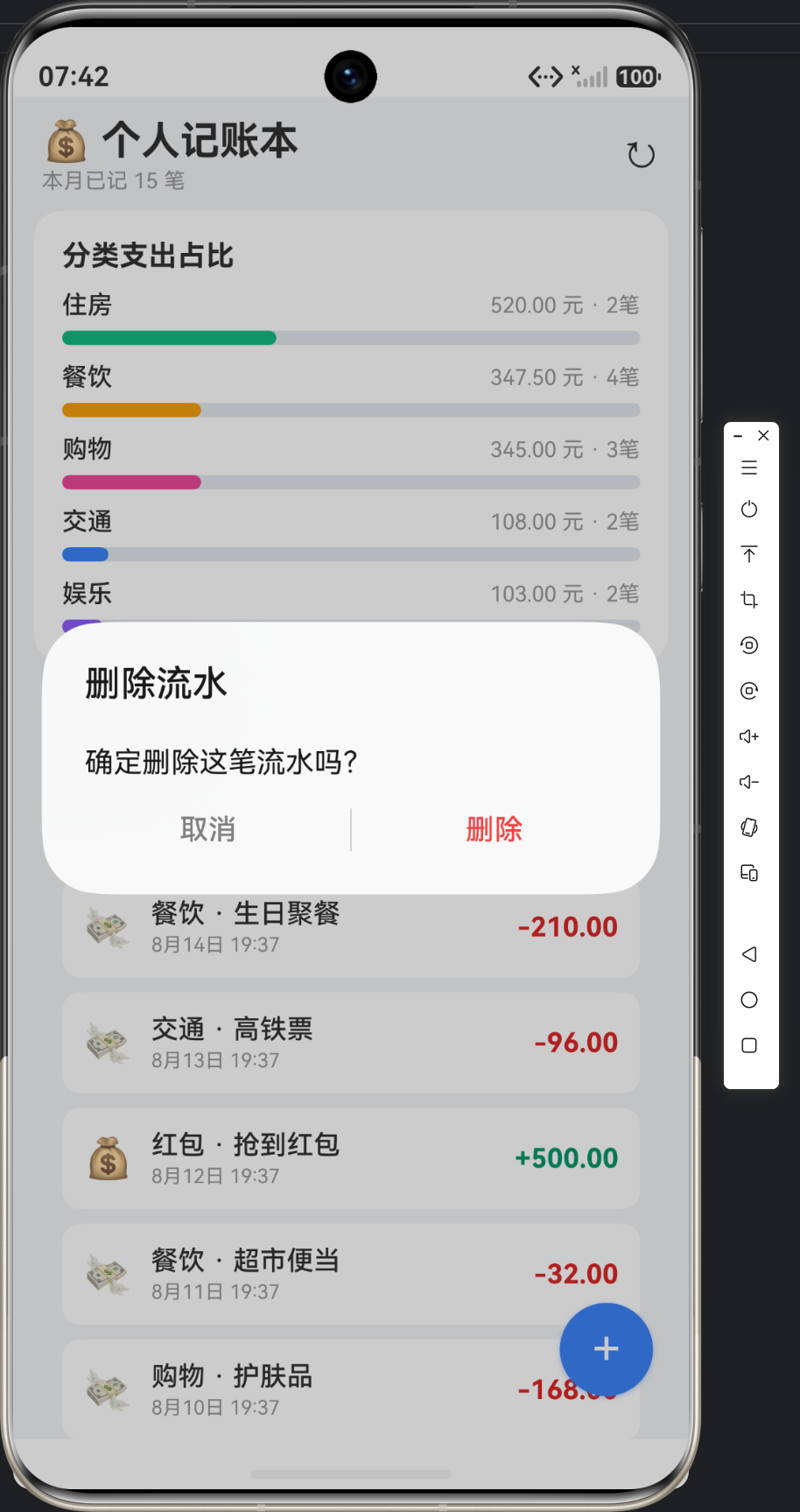
fmtTime()把毫秒时间戳格式化成「6月15日 14:30」,比原始时间戳友好得多; - 删除交互:点击整行弹出确认对话框删除(
onDelete),而不是用复杂的手势,降低 Demo 复杂度但保留核心能力; margin({ bottom: 90 }):给列表底部留出悬浮按钮的高度空间,避免最后一条记录被按钮遮挡。这是 Stack 悬浮布局的经典配套处理。
七、记一笔弹窗:表单状态管理
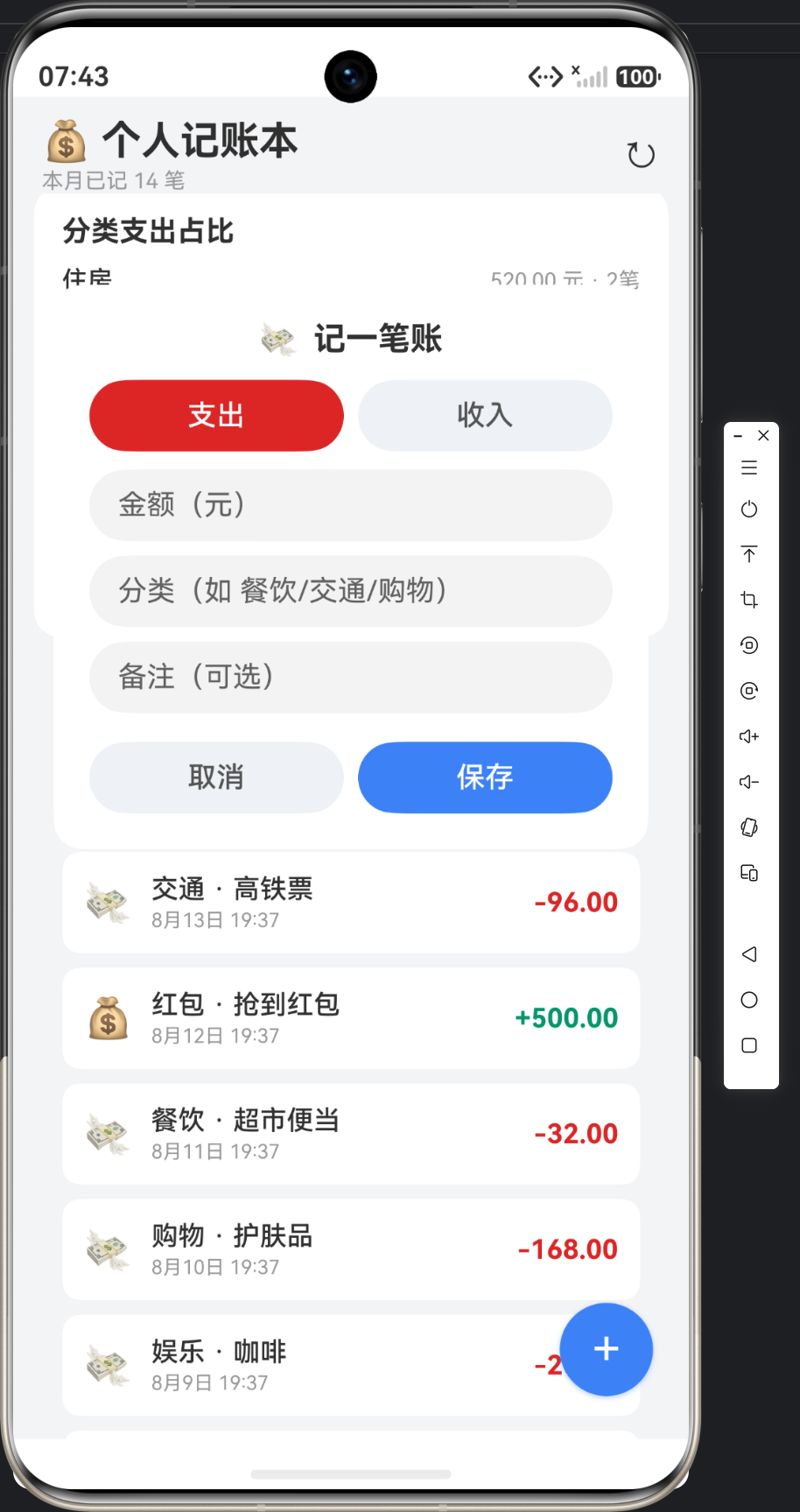
点击悬浮按钮弹出记账表单。表单用 if (this.formVisible) 条件渲染,字段用 @State 双向绑定:
if (this.formVisible) {
  Column() {
    Row({ space: 8 }) {
      Text('💸').fontSize(18)
      Text('记一笔账').fontSize(18).fontWeight(FontWeight.Bold)
    }
    Row({ space: 8 }) {
      Button('支出').layoutWeight(1)
        .backgroundColor(this.fType === 0 ? '#DC2626' : '#EEF2F7')
        .fontColor(this.fType === 0 ? Color.White : '#555555')
        .onClick(() => this.fType = 0)
      Button('收入').layoutWeight(1)
        .backgroundColor(this.fType === 1 ? '#059669' : '#EEF2F7')
        .fontColor(this.fType === 1 ? Color.White : '#555555')
        .onClick(() => this.fType = 1)
    }.margin({ top: 12 })
    TextInput({ placeholder: '金额(元)', text: this.fAmount }).type(InputType.Number)
      .margin({ top: 10 }).onChange((v: string) => this.fAmount = v)
    TextInput({ placeholder: '分类(如 餐饮/交通/购物)', text: this.fCategory })
      .margin({ top: 8 }).onChange((v: string) => this.fCategory = v)
    TextInput({ placeholder: '备注(可选)', text: this.fNote })
      .margin({ top: 8 }).onChange((v: string) => this.fNote = v)
    Row({ space: 8 }) {
      Button('取消').layoutWeight(1).backgroundColor('#EEF2F7').fontColor('#555555')
        .onClick(() => this.formVisible = false)
      Button('保存').layoutWeight(1).backgroundColor('#3B82F6')
        .onClick(() => this.onSave())
    }.margin({ top: 16 })
  }
  .padding(20).borderRadius(16).backgroundColor(Color.White).width('88%')
  .position({ x: '6%', y: '14%' })
}
表单的技术要点:
- 类型切换按钮:支出/收入两个按钮通过
this.fType决定高亮色,是一个典型的「互斥选择」模式。按钮文字、背景、字体颜色都随状态三元切换。 InputType.Number:金额输入框限制为数字键盘,减少误输入。.position({ x: '6%', y: '14%' }):弹窗用百分比定位悬浮在页面中上部,比 Dialog 组件更轻量、可控(Dialog 需要CustomDialogController样板代码)。- 保存逻辑:
onSave()校验金额 > 0 和分类非空后,组装LedgerRecord对象调用LedgerDao.insert(),成功后关闭弹窗、清空表单、刷新列表——这三步是「写操作后刷新」的标准流程。
八、页面状态与刷新机制
整个页面围绕 refresh() 一个方法驱动,这是理解页面数据流的关键:
async refresh(): Promise<void> {
  try {
    await LedgerDao.initSeedData(this.context);
    this.records = await LedgerDao.queryAll(this.context);
    const range = this.monthRange();
    const summary = await LedgerDao.summary(this.context, range.start, range.end);
    this.income = summary.income;
    this.expense = summary.expense;
    this.count = summary.count;
    this.categories = await LedgerDao.categoryStats(this.context, range.start, range.end);
  } catch (e) {
    promptAction.showToast({ message: `加载失败: ${e}` });
  }
}
刷新流程包含四个步骤,各自独立、顺序清晰:
| 步骤 | 方法 | 作用 |
|---|---|---|
| 1 | initSeedData() |
首启时填充 30 条种子流水(详见 3-4 文章) |
| 2 | queryAll() |
拉取全部流水填充列表 |
| 3 | summary() |
区间汇总:收入/支出/笔数 |
| 4 | categoryStats() |
分类占比数据 |
monthRange() 计算本月起止时间戳:
private monthRange(): MonthRange {
  const now = new Date();
  const start = new Date(now.getFullYear(), now.getMonth(), 1).getTime();
  const end = now.getTime();
  const r: MonthRange = { start: start, end: end };
  return r;
}
new Date(now.getFullYear(), now.getMonth(), 1) 巧妙构造「本月 1 号 00:00」,end 取当前时刻,构成一个左闭右闭的完整本月区间。注意 MonthRange 是一个显式 interface({ start: number; end: number }),因为 ArkTS 禁止内联对象字面量类型(arkts-no-obj-literals-as-types),这是我们踩过的坑。
九、UI 风格要素一览
| 风格项 | 取值 | 说明 |
|---|---|---|
| 页面背景 | #F3F4F6 浅冷灰 |
衬托白色卡片 |
| 仪表盘背景 | 深蓝渐变 #1E3A8A → #3B82F6 |
驾驶舱质感 |
| 主色 | #3B82F6 蓝 |
按钮/悬浮钮/标题 |
| 支出色 | #DC2626 红 |
负向语义 |
| 收入色 | #059669 绿 |
正向语义 |
| 卡片 | 白底 + borderRadius(16) |
现代圆角 |
| 标题 | 22fp Bold | 一级信息 |
十、文章小结
本篇文章完成了实例 3 的 UI 层:Stack 悬浮布局 + 深蓝渐变仪表盘 + 分类占比进度条 + 流水列表 + 表单弹窗。页面所有展示数据都来自两条聚合 SQL(summary 与 categoryStats),刷新即重查,是一个典型的「聚合报表 + 明细列表」生产页面。
下一篇文章(3-3)将深入数据层,讲解 SUM/CASE WHEN、GROUP BY、strftime 这三把聚合 SQL 的利器是如何在 ArkTS 里落地的——那里才是这个实例真正的技术含金量所在。

作为“人工智能6S店”的官方数字引擎,为AI开发者与企业提供一个覆盖软硬件全栈、一站式门户。
更多推荐
 0
0 0
0- 0


 已为社区贡献42条内容

所有评论(0)