
【HarmonyOS】时间管理类APP:一套代码,三种形态
本系列基于我们自己开发的一款 HarmonyOS 原生时间管理应用,目前已经适配了手机、平板和鸿蒙电脑三种设备形态。这一篇组要是从整体来讲讲,我们怎么通过一套代码实现在多端上运行
一、多端适配
如果你把这款APP分别安装到鸿蒙手机、鸿蒙平板和鸿蒙电脑上,会发现它仿佛"会变形":
- 在手机上,它是经典的底部五 Tab 布局,热力图、时间轴、分析、洞察、我的依次排开;
- 在平板上,仍然是底部 Tab,但内容更舒展;
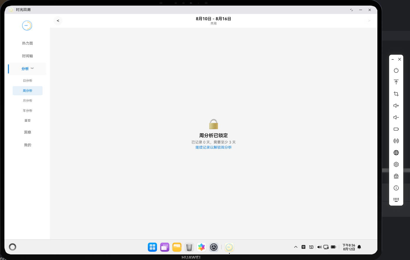
- 在鸿蒙电脑上,底部 Tab 消失了,取而代之的是左侧常驻的侧边导航栏,"分析"还展开了日/周/月/年/重塑的子菜单。
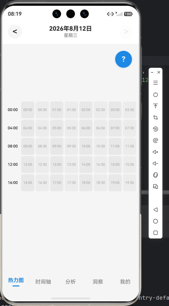
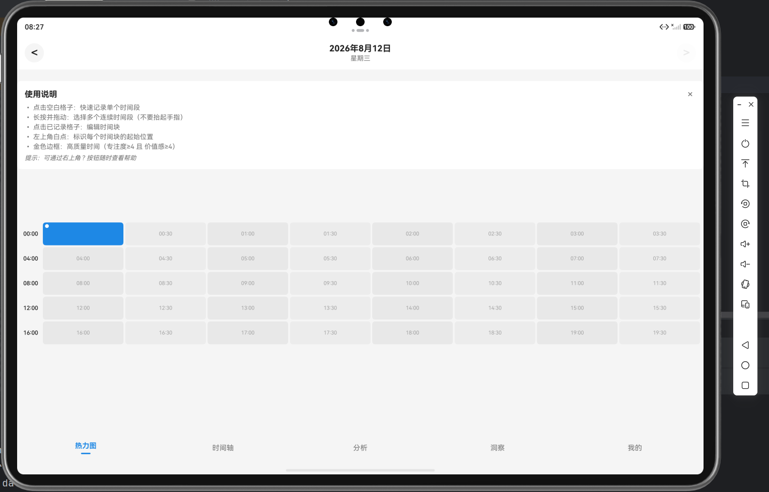
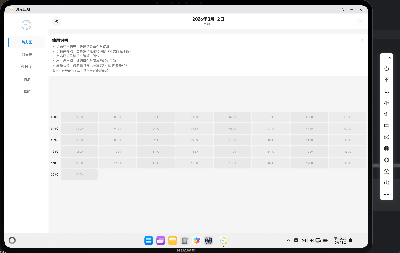
三种形态背后,是同一套 ArkTS 源码。这听起来很神奇,其实只需要做好"设备声明、设备识别、布局分流"这条链路打通了。下面逐段拆开看。
二、在 module.json5 里配置好三端
多端适配的第一步,不是写代码,而是告诉系统这个应用愿意出现在哪些设备上。这件事在 entry/src/main/module.json5 里完成:
{
  "module": {
    "name": "entry",
    "type": "entry",
    "description": "$string:module_desc",
    "mainElement": "EntryAbility",
    "deviceTypes": [
      "phone",
      "tablet",
      "2in1"
    ],
    "deliveryWithInstall": true,
    "installationFree": false,
    "pages": "$profile:main_pages",
    ...
  }
}
关键字段是 deviceTypes。它列出了三种设备类型:phone(手机)、tablet(平板)、2in1(二合一,也就是鸿蒙电脑形态)。只有在这里声明了的设备,应用才会在对应的应用市场分发(虽然即使你只勾选了phone,但是应用时长依然会给平板设备进行兼容分发)、才会在对应设备上正常安装运行。
这一行看似不起眼,却是整条多端链路的入口。漏掉它,后面再多的断点代码都无从谈起——因为应用根本不会出现在那种设备上。
三、逻辑与 UI 解耦
声明完三端之后,真正的问题是:业务逻辑要不要写三遍? 答案当然是不写。
关键点在于:数据层和业务逻辑层对设备形态一无所知。无论跑在哪种设备上,时间块的增删改查、统计计算等功能,走的都是同一条路径、同一套逻辑。
以 DatabaseManager 为例,它的初始化只关心 context 和数据库配置,完全不涉及"现在是什么设备":
// 数据库管理器
import relationalStore from '@ohos.data.relationalStore'
import { AppConstants } from '../constants/AppConstants'
import { ErrorCode, AppError, ResultSuccess, ResultFailure, Result } from '../model/Types'

export class DatabaseManager {
  private static instance: DatabaseManager | null = null
  private store: relationalStore.RdbStore | null = null
  private context: Context | null = null

  private constructor() {
  }

  // 获取单例实例
  static getInstance(): DatabaseManager {
    if (DatabaseManager.instance === null) {
      DatabaseManager.instance = new DatabaseManager()
    }
    return DatabaseManager.instance
  }

  // 初始化数据库
  async initialize(context: Context): Promise<Result<void, AppError>> {
    try {
      this.context = context

      const config: relationalStore.StoreConfig = {
        name: AppConstants.DB_NAME,
        securityLevel: relationalStore.SecurityLevel.S1
      }

      this.store = await relationalStore.getRdbStore(context, config)

      // 创建表
      const createTablesResult = await this.createTables()
      if (!createTablesResult.success) {
        return createTablesResult
      }

      // 初始化预设活动标签
      const initTagsResult = await this.initializePresetTags()
      if (!initTagsResult.success) {
        return initTagsResult
      }

      return new ResultSuccess<void>(undefined)
    } catch (error) {
      const err = error as Error
      return new ResultFailure<AppError>(
        new AppError(ErrorCode.DATABASE_ERROR, `数据库初始化失败: ${err.message}`)
      )
    }
  }
  ...
}
这份代码在手机、平板、电脑上执行的结果完全一致。这是"一套代码三端跑"的底层前提:如果业务逻辑本身是设备无关的,那么剩下的多端差异,就只剩 UI 这一层的"壳"需要处理。
四、设备识别
数据层统一了,UI 层要"分流",首先得知道当前跑在什么设备上。这件事由 entry/src/main/ets/utils/BreakpointUtils.ets 里的 getDeviceType() 完成:
import { deviceInfo } from '@kit.BasicServicesKit';

export type DeviceType = 'phone' | 'tablet' | '2in1' | 'unknown';

export function getDeviceType(): DeviceType {
  const rawType: string = deviceInfo.deviceType;
  switch (rawType) {
    case 'phone':
      return 'phone';
    case 'tablet':
      return 'tablet';
    case '2in1':
      return '2in1';
    default:
      return 'unknown';
  }
}

export function isPhoneDevice(): boolean {
  return getDeviceType() === 'phone';
}

export function isTabletDevice(): boolean {
  return getDeviceType() === 'tablet';
}

export function is2In1Device(): boolean {
  return getDeviceType() === '2in1';
}
它读取的是 @kit.BasicServicesKit 里 deviceInfo.deviceType 这个系统级字段,返回 'phone'、'tablet'、'2in1' 之一。注意这里用的是设备类型而不是屏幕宽度——一个平板横屏再宽,它依然是 tablet,不会变成 2in1。这种区分很重要:它决定的不是"布局宽多少",而是"交互范式是什么"(后面会看到,2in1 有悬停、键盘提示,而平板没有)。
五、布局分流
有了设备识别,MainPage 就能在构建 UI 时做分流。这是整个多端架构最核心的一处代码,来自 entry/src/main/ets/pages/MainPage.ets:
@Entry
@Component
struct MainPage {
  @State currentTabIndex: number = 0
  @State isInitialized: boolean = false
  @State initError: string = ''
  @State is2In1: boolean = false
  @State analysisExpanded: boolean = false // 分析菜单是否展开
  @State analysisSubTab: number = 0 // 分析子菜单选中索引
  @State fontScale: number = 1.0 // 字体缩放系数
  ...

  async aboutToAppear(): Promise<void> {
    try {
      this.context = getContext(this) as common.UIAbilityContext
      this.is2In1 = is2In1Device()
      this.fontScale = getFontScale()
      ...
      await this.initializeApp()
    } catch (error) {
      const err = error as Error
      this.initError = `初始化错误: ${err.message}`
    }
  }
  ...
  build() {
    Column() {
      if (!this.isInitialized) {
        // 加载中或错误状态
        ...
      } else if (this.is2In1) {
        // 2in1 设备 - 侧边导航布局
        Row() {
          // 左侧导航栏
          Column() {
            // Logo
            Row() {
              Image($r('app.media.foreground'))
                .height(56)
                .objectFit(ImageFit.Contain)
            }
            .width('100%')
            .height(70)
            .justifyContent(FlexAlign.Center)
            .margin({ bottom: 16 })

            this.SideNavBuilder('热力图', '', 0)
            this.SideNavBuilder('时间轴', '', 1)
            this.SideNavBuilder('分析', '', 2)
            this.SideNavBuilder('洞察', '', 3)
            this.SideNavBuilder('我的', '', 4)

            Blank()
          }
          .width(200)
          .height('100%')
          .backgroundColor($r('app.color.card_background'))
          .padding({ left: 16, right: 16, top: 16, bottom: 16 })
          .alignItems(HorizontalAlign.Center)
          .shadow({
            radius: 8,
            color: $r('app.color.shadow_color'),
            offsetX: 2,
            offsetY: 0
          })

          // 右侧内容区域
          Column() {
            this.CurrentPageContent()
          }
          .layoutWeight(1)
          .height('100%')
          .backgroundColor($r('app.color.background_color'))
          .justifyContent(FlexAlign.Start)
          .alignItems(HorizontalAlign.Start)
        }
        .width('100%')
        .height('100%')
      } else {
        // 手机/平板 - 底部导航布局
        Tabs({ index: this.currentTabIndex }) {
          TabContent() {
            HeatmapPage()
          }
          .tabBar(this.TabBarBuilder('热力图', '', 0))

          TabContent() {
            TimelinePage()
          }
          .tabBar(this.TabBarBuilder('时间轴', '', 1))

          TabContent() {
            AnalysisPage()
          }
          .tabBar(this.TabBarBuilder('分析', '', 2))

          TabContent() {
            InsightsPage()
          }
          .tabBar(this.TabBarBuilder('洞察', '', 3))

          TabContent() {
            ProfilePage()
          }
          .tabBar(this.TabBarBuilder('我的', '', 4))
        }
        .barPosition(BarPosition.End)
        .barMode(BarMode.Fixed)
        .barHeight(56)
        .animationDuration(300)
        .onChange((index: number) => {
          this.currentTabIndex = index
          ...
        })
        .backgroundColor($r('app.color.background_color'))
      }
    }
    .width('100%')
    .height('100%')
  }
}
整个分流的"心脏"就是 build() 里这一句判断:
} else if (this.is2In1) {
  // 2in1 设备 - 侧边导航布局
  ...
} else {
  // 手机/平板 - 底部导航布局
  ...
}
而 this.is2In1 的值,是在 aboutToAppear 生命周期里一次性确定的:
this.is2In1 = is2In1Device()
this.fontScale = getFontScale()
这里有一个值得注意的设计取舍:手机和平板共用底部 Tab 布局,只有 2in1 走侧边栏。为什么?因为手机和平板的交互范式类似,底部 Tab 在两端都成立;而 2in1 是键鼠交互、宽屏,侧边栏才能填满横向空间。
换句话说,这个 if 区分的不是"屏幕大小",而是"交互范式"。大小交给断点系统去处理(那是本系列第二篇的内容),范式交给设备类型来决定。两者分工明确,互不越界。
六、入口只有一个:EntryAbility
最后补一个容易被忽略的细节——三端共用同一个入口。entry/src/main/ets/entryability/EntryAbility.ets 里:
onWindowStageCreate(windowStage: window.WindowStage): void {
  // Main window is created, set main page for this ability
  hilog.info(DOMAIN, 'testTag', '%{public}s', 'Ability onWindowStageCreate');

  windowStage.loadContent('pages/MainPage', (err) => {
    if (err.code) {
      hilog.error(DOMAIN, 'testTag', 'Failed to load the content. Cause: %{public}s', JSON.stringify(err));
      return;
    }
    hilog.info(DOMAIN, 'testTag', 'Succeeded in loading the content.');
  });
}
无论哪种设备,加载的都是 pages/MainPage 这一个页面。三端的差异,全部推迟到 MainPage 内部去处理。
七、小结
一套代码跑出三种形态,拆开看其实就是三件事:
module.json5声明deviceTypes;- 让业务逻辑与设备类型无关;
MainPage用is2In1Device()分流布局:一个if切出底部 Tab 与侧边栏两种范式。
下一篇,我们会讲一讲 BreakpointUtils.ets,看断点系统是如何用 mediaquery 把"屏幕变宽"这件事变成可监听、可响应的。

作为“人工智能6S店”的官方数字引擎,为AI开发者与企业提供一个覆盖软硬件全栈、一站式门户。
更多推荐
 5
5 0
0- 0


 已为社区贡献1条内容

所有评论(0)