
状态管理服务层驱动下的插槽(Slot)机制深度实现
文章目录

每日一句正能量
不急不躁、七分踔厉稳步前行,三分安然静待花开。
该努力时全力以赴,行动上不松懈。该等待时沉得住气,心态上不焦虑。不留余地地努力,会透支自己;全然放手地等待,会荒废时光。七三开,刚刚好。人生不是百米冲刺,而是一场马拉松。过犹不及,全力狂奔容易后劲不足;全然“躺平”又会错过风景。七分的努力,是保持进取的韧性;三分的安然,是给生活留白的智慧。就像弓弦,拉得太满易断,留有余地,箭才能飞得更远。
摘要
在 HarmonyOS ArkUI 的组件化开发体系中,插槽(Slot)机制是实现高复用、低耦合自定义组件的核心能力。本文从状态管理服务层的视角出发,深入剖析 @BuilderParam 装饰器的技术原理,系统讲解单插槽、多插槽、参数化插槽及条件插槽的实现方式,并结合 AppStorage、LocalStorage、@Provide/@Consume 等状态管理工具,构建一套完整的状态驱动型动态插槽组件系统。通过实战案例与性能优化策略,帮助开发者掌握在企业级鸿蒙应用中灵活运用插槽机制的关键技术。
一、插槽机制的技术背景与核心价值
1.1 为什么需要插槽机制
在传统的 UI 开发中,组件一旦封装完成,其内部结构便相对固定。当多个页面需要使用同一组件框架但内容各不相同时,开发者往往面临两种选择:要么为每个场景单独封装组件(导致代码冗余),要么通过大量条件判断在组件内部硬编码(导致维护困难)。
HarmonyOS ArkUI 引入的插槽机制,通过 @BuilderParam 装饰器完美解决了这一痛点。它允许子组件在特定位置预留"内容接口",由父组件动态注入 UI 构建逻辑,实现"结构复用、内容定制"的组件化设计范式。
1.2 插槽机制的核心价值
| 维度 | 传统方式 | 插槽机制 |
|---|---|---|
| 复用性 | 低,需为不同场景复制组件 | 高,同一组件适配多种内容 |
| 耦合度 | 高,子组件内部硬编码业务逻辑 | 低,子组件只定义结构约束 |
| 扩展性 | 差,修改组件源码才能适配新场景 | 优,通过插槽参数即可扩展 |
| 维护成本 | 高,散落的相似组件难以统一管理 | 低,统一组件基座 + 差异化插槽 |
插槽机制严格遵循开闭原则:组件对扩展开放(可通过插槽添加新内容),对修改关闭(无需修改子组件源码即可适配新场景)。
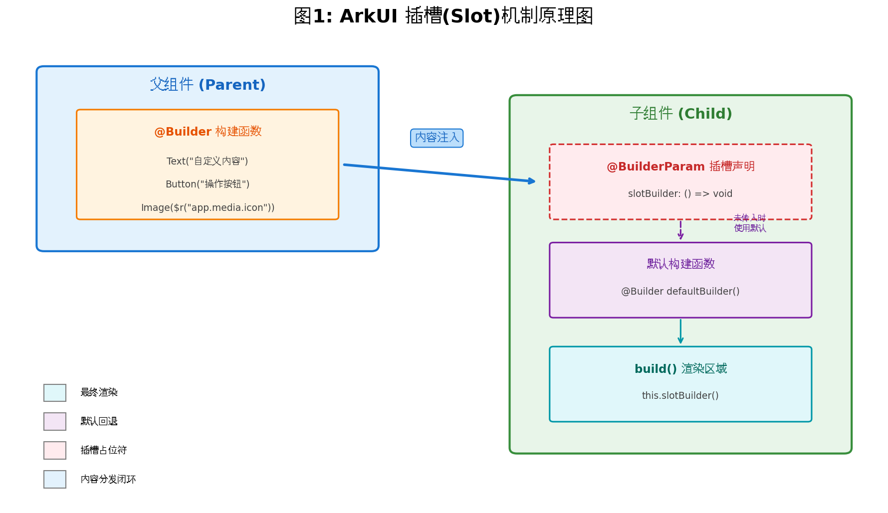
二、@BuilderParam 装饰器原理剖析
2.1 技术原理拆解
组件插槽的工作流程可分为三个紧密衔接的环节,形成完整的内容分发闭环:
① 插槽定义:子组件预留"内容接口"
子组件通过 @BuilderParam 装饰器声明一个或多个插槽,本质是定义"可接收 UI 渲染逻辑的函数接口"。例如,卡片组件可声明 header、content、footer 等插槽,明确各区域的布局约束(如内边距、背景色),但不指定具体内容。
② 内容注入:父组件动态填充内容
父组件在使用子组件时,通过传入 @Builder 装饰的函数或匿名函数,向插槽注入具体内容(文本、图片、按钮等任意 UI 元素)。注入的内容需遵守子组件的布局约束,但可完全自定义内部结构。
③ 渲染融合:子组件整合通用与个性化内容
子组件在渲染时,将父组件注入的内容填充到对应插槽位置,最终呈现"通用结构(子组件定义)+ 个性化内容(父组件注入)"的完整界面。
2.2 基础单插槽实现
// 子组件:定义单插槽
@Component
struct SlotCard {
  // 声明插槽,提供默认构建函数作为回退
  @Builder
  defaultContent() {
    Text('暂无内容,请传入自定义插槽')
      .fontSize(14)
      .fontColor('#999')
      .margin(20)
  }

  @BuilderParam contentBuilder: () => void = this.defaultContent

  build() {
    Column() {
      // 标题区域(固定结构)
      Row() {
        Text('智能卡片')
          .fontSize(18)
          .fontWeight(FontWeight.Bold)
          .fontColor('#333')
        Text('更多')
          .fontSize(14)
          .fontColor('#666')
      }
      .width('100%')
      .justifyContent(FlexAlign.SpaceBetween)
      .padding({ left: 16, right: 16, top: 12, bottom: 12 })

      // 插槽区域(动态内容)
      this.contentBuilder()
    }
    .width('100%')
    .backgroundColor(Color.White)
    .borderRadius(12)
    .shadow({ radius: 8, color: 'rgba(0,0,0,0.08)' })
    .margin({ left: 16, right: 16, bottom: 12 })
  }
}

// 父组件:使用插槽注入内容
@Entry
@Component
struct Index {
  @Builder
  myCustomContent() {
    Column({ space: 8 }) {
      Image($r('app.media.demo_image'))
        .width('100%')
        .height(120)
        .objectFit(ImageFit.Cover)
        .borderRadius(8)
      Text('HarmonyOS 插槽机制实战')
        .fontSize(16)
        .fontColor('#333')
        .maxLines(2)
        .textOverflow({ overflow: TextOverflow.Ellipsis })
      Row() {
        Text('阅读量 1.2k')
          .fontSize(12)
          .fontColor('#999')
        Button('查看详情')
          .fontSize(12)
          .height(28)
          .backgroundColor('#1976D2')
      }
      .width('100%')
      .justifyContent(FlexAlign.SpaceBetween)
    }
    .padding(16)
  }

  build() {
    Column() {
      // 使用默认插槽
      SlotCard()

      // 注入自定义内容
      SlotCard({ contentBuilder: this.myCustomContent })

      // 使用尾随闭包语法(更简洁)
      SlotCard() {
        Text('通过尾随闭包传入的简洁内容')
          .fontSize(14)
          .fontColor('#1976D2')
          .padding(20)
      }
    }
    .width('100%')
    .height('100%')
    .backgroundColor('#F5F5F5')
    .padding({ top: 20 })
  }
}
关键注意点:当组件仅声明一个
@BuilderParam且不依赖其他参数时,可以使用尾随闭包语法直接传入内容,代码更加简洁优雅。但若传入空大括号{},会替代默认内容显示空白,而非使用默认构建函数。
三、状态管理服务层与插槽的深度融合
3.1 状态管理层的角色定位
在 HarmonyOS 应用架构中,状态管理服务层负责维护应用运行时的数据状态,并通过响应式机制驱动 UI 自动刷新。当插槽机制与状态管理服务层结合时,可以实现数据驱动的动态插槽内容切换,这是构建复杂企业级应用的关键能力。
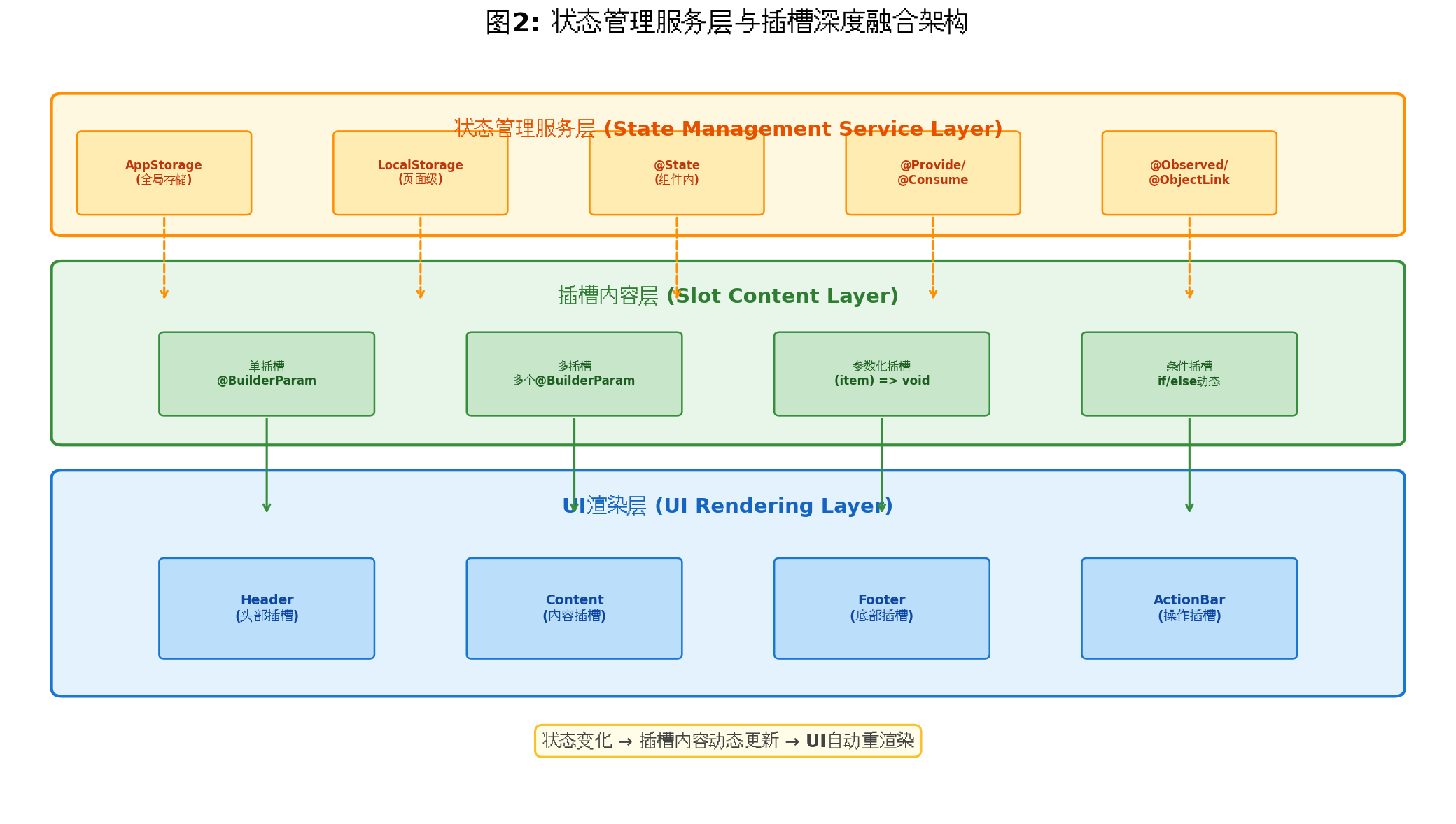
3.2 状态驱动插槽的核心模式
状态管理服务层为插槽机制提供了三种核心驱动模式:
模式一:组件内状态驱动(@State)
组件内部的状态变量变化时,插槽内容可以根据状态值动态调整。适用于表单状态切换、页面模式转换等场景。
模式二:跨组件状态共享(@Provide/@Consume)
通过跨层级的状态注入,深层嵌套的插槽组件可以访问全局主题、用户权限等状态,实现主题化插槽内容。
模式三:全局/页面级存储(AppStorage/LocalStorage)
将业务数据存储在全局或页面级存储中,插槽构建函数读取存储数据并渲染,实现数据与视图的彻底解耦。
3.3 状态管理装饰器与插槽的协同关系
| 装饰器 | 作用域 | 与插槽结合的典型场景 |
|---|---|---|
@State | 组件内部 | 插槽内容根据组件内部模式切换 |
@Prop | 父子单向 | 父组件向插槽传递只读配置数据 |
@Link | 父子双向 | 插槽内修改状态同步影响父组件 |
@Provide/@Consume | 跨层级 | 全局主题/语言驱动插槽样式变化 |
@Observed/@ObjectLink | 嵌套对象 | 插槽内展示复杂数据模型的深层属性 |
@Watch | 状态监听 | 状态变化时执行插槽内容预加载逻辑 |
四、实战:构建状态驱动的动态插槽组件系统
4.1 需求场景分析
假设我们需要构建一个智能工作台面板组件,该组件在不同业务场景下需要展示不同的内容:
- 数据概览模式:展示统计图表与关键指标
- 任务列表模式:展示待办事项与操作按钮
- 消息通知模式:展示系统消息与快捷回复
三种模式由父组件通过状态控制,子组件通过插槽机制接收对应的 UI 构建逻辑。
4.2 多插槽组件封装
// components/SmartWorkPanel.ets
import { AppStorageV2 } from '@kit.ArkUI'

// 定义面板数据模型
@Observed
class PanelData {
  title: string = ''
  mode: PanelMode = PanelMode.OVERVIEW
  updateTime: string = ''
}

enum PanelMode {
  OVERVIEW,   // 数据概览
  TASK_LIST,  // 任务列表
  MESSAGE     // 消息通知
}

@Component
export struct SmartWorkPanel {
  // 接收外部传入的面板数据
  @Prop panelData: PanelData

  // 定义三个插槽:头部、内容、底部操作
  @Builder
  defaultHeader() {
    Row() {
      Text(this.panelData.title)
        .fontSize(18)
        .fontWeight(FontWeight.Bold)
        .fontColor('#212121')
      Text(this.panelData.updateTime)
        .fontSize(12)
        .fontColor('#9E9E9E')
    }
    .width('100%')
    .justifyContent(FlexAlign.SpaceBetween)
    .padding({ left: 16, right: 16, top: 14, bottom: 14 })
  }

  @Builder
  defaultContent() {
    Column() {
      Text('当前模式暂无内容展示')
        .fontSize(14)
        .fontColor('#BDBDBD')
        .margin(30)
    }
    .width('100%')
    .height(200)
    .justifyContent(FlexAlign.Center)
  }

  @Builder
  defaultFooter() {
    Row() {
      Button('刷新数据')
        .fontSize(13)
        .height(32)
        .backgroundColor('#E0E0E0')
        .fontColor('#616161')
    }
    .width('100%')
    .justifyContent(FlexAlign.End)
    .padding({ left: 16, right: 16, bottom: 12 })
  }

  @BuilderParam headerBuilder: () => void = this.defaultHeader
  @BuilderParam contentBuilder: () => void = this.defaultContent
  @BuilderParam footerBuilder: () => void = this.defaultFooter

  build() {
    Column() {
      // 头部插槽区域
      this.headerBuilder()

      // 分隔线
      Divider()
        .strokeWidth(0.5)
        .color('#E0E0E0')
        .margin({ left: 16, right: 16 })

      // 内容插槽区域
      this.contentBuilder()

      // 底部插槽区域
      this.footerBuilder()
    }
    .width('100%')
    .backgroundColor(Color.White)
    .borderRadius(16)
    .shadow({ radius: 10, color: 'rgba(0,0,0,0.06)', offsetX: 0, offsetY: 4 })
    .margin({ left: 16, right: 16, bottom: 16 })
  }
}
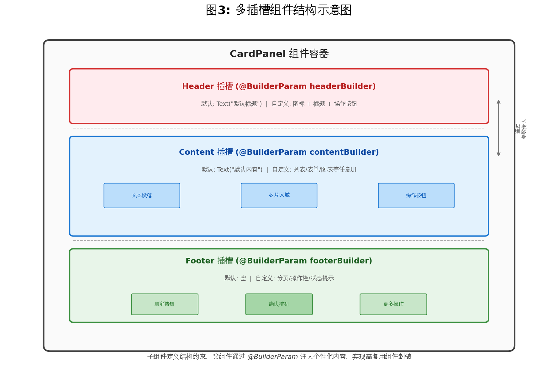
4.3 状态驱动的插槽内容动态切换
// pages/WorkBenchPage.ets
import { SmartWorkPanel, PanelData, PanelMode } from '../components/SmartWorkPanel'

@Entry
@Component
struct WorkBenchPage {
  // 页面级状态:控制当前面板模式
  @State currentMode: PanelMode = PanelMode.OVERVIEW

  // 模拟数据存储
  @State overviewData: Array<{ label: string; value: string; trend: string }> = [
    { label: '日活跃用户', value: '12,580', trend: '+12.5%' },
    { label: '订单转化率', value: '68.2%', trend: '+3.1%' },
    { label: '平均响应时长', value: '245ms', trend: '-8.3%' },
  ]

  @State taskList: Array<{ id: number; title: string; priority: string; done: boolean }> = [
    { id: 1, title: '审核用户反馈', priority: '高', done: false },
    { id: 2, title: '更新应用配置', priority: '中', done: true },
    { id: 3, title: '性能优化分析', priority: '高', done: false },
  ]

  @State messages: Array<{ id: number; content: string; time: string; read: boolean }> = [
    { id: 1, content: '系统将于今晚 02:00 进行例行维护', time: '10:30', read: false },
    { id: 2, content: '您的应用已通过审核', time: '09:15', read: true },
  ]

  // 模式切换控制
  private switchMode(mode: PanelMode) {
    this.currentMode = mode
  }

  // ========== 插槽构建函数 ==========

  // 数据概览模式 - 头部
  @Builder
  overviewHeader() {
    Row() {
      Column({ space: 2 }) {
        Text('数据概览')
          .fontSize(18)
          .fontWeight(FontWeight.Bold)
          .fontColor('#212121')
        Text('实时更新')
          .fontSize(11)
          .fontColor('#4CAF50')
      }
      .alignItems(HorizontalAlign.Start)

      Row({ space: 6 }) {
        Text('●')
          .fontSize(8)
          .fontColor('#4CAF50')
        Text('在线')
          .fontSize(12)
          .fontColor('#4CAF50')
      }
    }
    .width('100%')
    .justifyContent(FlexAlign.SpaceBetween)
    .padding({ left: 16, right: 16, top: 14, bottom: 14 })
  }

  // 数据概览模式 - 内容
  @Builder
  overviewContent() {
    Column({ space: 12 }) {
      ForEach(this.overviewData, (item, index) => {
        Row() {
          Column({ space: 4 }) {
            Text(item.label)
              .fontSize(13)
              .fontColor('#757575')
            Text(item.value)
              .fontSize(22)
              .fontWeight(FontWeight.Bold)
              .fontColor('#212121')
          }
          .alignItems(HorizontalAlign.Start)
          .layoutWeight(1)

          Text(item.trend)
            .fontSize(13)
            .fontColor(item.trend.startsWith('+') ? '#4CAF50' : '#F44336')
            .backgroundColor(item.trend.startsWith('+') ? '#E8F5E9' : '#FFEBEE')
            .padding({ left: 8, right: 8, top: 4, bottom: 4 })
            .borderRadius(6)
        }
        .width('100%')
        .padding(12)
        .backgroundColor(index % 2 === 0 ? '#FAFAFA' : Color.White)
        .borderRadius(8)
      })
    }
    .padding(16)
  }

  // 任务列表模式 - 内容
  @Builder
  taskContent() {
    List({ space: 8 }) {
      ForEach(this.taskList, (item) => {
        ListItem() {
          Row() {
            Checkbox()
              .select(item.done)
              .onChange((value) => {
                item.done = value
              })
            Text(item.title)
              .fontSize(14)
              .fontColor(item.done ? '#BDBDBD' : '#212121')
              .decoration({ type: item.done ? TextDecorationType.LineThrough : TextDecorationType.None })
              .layoutWeight(1)
              .margin({ left: 8 })

            Text(item.priority)
              .fontSize(11)
              .fontColor(item.priority === '高' ? '#F44336' : '#FF9800')
              .backgroundColor(item.priority === '高' ? '#FFEBEE' : '#FFF3E0')
              .padding({ left: 6, right: 6, top: 2, bottom: 2 })
              .borderRadius(4)
          }
          .width('100%')
          .padding(12)
          .backgroundColor('#FAFAFA')
          .borderRadius(8)
        }
      })
    }
    .padding(16)
    .height(220)
  }

  // 消息通知模式 - 内容
  @Builder
  messageContent() {
    Column({ space: 10 }) {
      ForEach(this.messages, (item) => {
        Row() {
          Column({ space: 4 }) {
            Text(item.content)
              .fontSize(14)
              .fontColor(item.read ? '#9E9E9E' : '#212121')
              .maxLines(2)
              .textOverflow({ overflow: TextOverflow.Ellipsis })
              .layoutWeight(1)
            Text(item.time)
              .fontSize(11)
              .fontColor('#BDBDBD')
          }
          .alignItems(HorizontalAlign.Start)
          .layoutWeight(1)

          if (!item.read) {
            Circle({ width: 8, height: 8 })
              .fill('#F44336')
              .margin({ left: 8 })
          }
        }
        .width('100%')
        .padding(12)
        .backgroundColor(item.read ? Color.White : '#E3F2FD')
        .borderRadius(8)
        .onClick(() => {
          item.read = true
        })
      })
    }
    .padding(16)
  }

  // 通用底部操作栏
  @Builder
  actionFooter() {
    Row({ space: 10 }) {
      Button('数据概览')
        .fontSize(12)
        .height(30)
        .backgroundColor(this.currentMode === PanelMode.OVERVIEW ? '#1976D2' : '#E0E0E0')
        .fontColor(this.currentMode === PanelMode.OVERVIEW ? Color.White : '#616161')
        .onClick(() => this.switchMode(PanelMode.OVERVIEW))

      Button('任务列表')
        .fontSize(12)
        .height(30)
        .backgroundColor(this.currentMode === PanelMode.TASK_LIST ? '#1976D2' : '#E0E0E0')
        .fontColor(this.currentMode === PanelMode.TASK_LIST ? Color.White : '#616161')
        .onClick(() => this.switchMode(PanelMode.TASK_LIST))

      Button('消息通知')
        .fontSize(12)
        .height(30)
        .backgroundColor(this.currentMode === PanelMode.MESSAGE ? '#1976D2' : '#E0E0E0')
        .fontColor(this.currentMode === PanelMode.MESSAGE ? Color.White : '#616161')
        .onClick(() => this.switchMode(PanelMode.MESSAGE))
    }
    .width('100%')
    .justifyContent(FlexAlign.Center)
    .padding({ left: 16, right: 16, bottom: 12 })
  }

  build() {
    Column() {
      Text('智能工作台')
        .fontSize(24)
        .fontWeight(FontWeight.Bold)
        .fontColor('#212121')
        .margin({ top: 20, bottom: 20 })

      // 根据当前模式动态选择插槽内容
      SmartWorkPanel({
        panelData: new PanelData({
          title: '工作台面板',
          mode: this.currentMode,
          updateTime: new Date().toLocaleTimeString()
        }),
        headerBuilder: this.currentMode === PanelMode.OVERVIEW ? this.overviewHeader : undefined,
        contentBuilder: this.getContentBuilder(),
        footerBuilder: this.actionFooter
      })
    }
    .width('100%')
    .height('100%')
    .backgroundColor('#F5F5F5')
  }

  // 根据模式返回对应的内容构建函数
  private getContentBuilder(): () => void {
    switch (this.currentMode) {
      case PanelMode.OVERVIEW:
        return this.overviewContent
      case PanelMode.TASK_LIST:
        return this.taskContent
      case PanelMode.MESSAGE:
        return this.messageContent
      default:
        return this.overviewContent
    }
  }
}
4.4 带参数的插槽:实现内容与数据的联动
子组件可通过向插槽函数传递参数(如数据项、状态值),让父组件根据参数动态生成内容,实现"数据驱动的个性化展示"。
// 带参数的插槽组件
@Component
struct DataDrivenSlot {
  // 列表数据源
  @Prop dataSource: Array<Record<string, any>>

  // 参数化插槽:接收数据项和索引
  @Builder
  defaultItemBuilder(item: Record<string, any>, index: number) {
    Text(`默认渲染: ${JSON.stringify(item)}`)
      .fontSize(14)
      .padding(10)
  }

  @BuilderParam itemBuilder: (item: Record<string, any>, index: number) => void = this.defaultItemBuilder

  build() {
    List({ space: 8 }) {
      ForEach(this.dataSource, (item, index) => {
        ListItem() {
          // 向插槽传递数据和索引
          this.itemBuilder(item, index)
        }
      })
    }
    .padding(12)
  }
}

// 父组件使用
@Entry
@Component
struct ParamSlotDemo {
  private users = [
    { name: '张三', role: '管理员', status: '在线' },
    { name: '李四', role: '开发者', status: '离线' },
    { name: '王五', role: '测试', status: '忙碌' },
  ]

  @Builder
  userCardBuilder(item: Record<string, any>, index: number) {
    Row() {
      Column({ space: 2 }) {
        Text(item.name as string)
          .fontSize(15)
          .fontWeight(FontWeight.Medium)
          .fontColor('#212121')
        Text(item.role as string)
          .fontSize(12)
          .fontColor('#757575')
      }
      .alignItems(HorizontalAlign.Start)
      .layoutWeight(1)

      Row() {
        Circle({ width: 6, height: 6 })
          .fill(this.getStatusColor(item.status as string))
        Text(item.status as string)
          .fontSize(12)
          .fontColor(this.getStatusColor(item.status as string))
          .margin({ left: 4 })
      }
    }
    .width('100%')
    .padding(12)
    .backgroundColor(index % 2 === 0 ? '#FAFAFA' : Color.White)
    .borderRadius(8)
  }

  private getStatusColor(status: string): ResourceColor {
    switch (status) {
      case '在线': return '#4CAF50'
      case '忙碌': return '#FF9800'
      case '离线': return '#9E9E9E'
      default: return '#9E9E9E'
    }
  }

  build() {
    Column() {
      Text('用户状态列表')
        .fontSize(18)
        .fontWeight(FontWeight.Bold)
        .margin(16)

      DataDrivenSlot({
        dataSource: this.users,
        itemBuilder: this.userCardBuilder
      })
    }
    .width('100%')
    .height('100%')
    .backgroundColor('#F5F5F5')
  }
}
五、进阶技巧与性能优化
5.1 条件插槽与动态切换
在实际业务中,插槽的显示往往依赖于特定条件。通过状态变量控制插槽的渲染,可以实现更精细的 UI 控制:
@Component
struct ConditionalSlotPanel {
  @State isExpanded: boolean = false
  @State hasPermission: boolean = false

  @Builder
  defaultActionSlot() {
    EmptyView() // 空视图占位
  }

  @BuilderParam actionSlot: () => void = this.defaultActionSlot

  build() {
    Column() {
      // 基础内容始终显示
      Text('基础信息区域')
        .fontSize(16)
        .padding(16)

      // 条件插槽:仅当展开时显示
      if (this.isExpanded) {
        this.actionSlot()
      }

      // 权限控制插槽
      if (this.hasPermission) {
        Button('管理员操作')
          .fontSize(13)
          .backgroundColor('#F44336')
          .margin(16)
      }
    }
    .width('100%')
    .backgroundColor(Color.White)
    .borderRadius(12)
  }
}
5.2 插槽性能优化策略
插槽机制虽然强大,但在高频率状态更新场景下需要注意性能问题:
① 避免在插槽中创建大量临时对象
插槽构建函数在每次状态更新时可能重新执行,应避免在 @Builder 函数内部创建大量临时对象或执行复杂计算。
② 精准控制状态作用域
插槽内使用的状态变量应尽量限制在最小作用域内,避免无关状态变化触发插槽全局重渲染。
③ 使用 @Require 强制约束插槽传入
对于必须传入插槽的组件,可以使用 @Require 修饰符强制父组件传入,避免运行时空指针异常。
@Component
struct RequiredSlotComponent {
  @Require
  @BuilderParam contentBuilder: () => void

  build() {
    Column() {
      this.contentBuilder()
    }
  }
}
5.3 插槽与状态管理的最佳实践
| 实践原则 | 具体说明 |
|---|---|
| 单一职责 | 每个插槽只负责一块独立的内容区域 |
| 默认回退 | 始终为插槽提供默认构建函数,增强组件健壮性 |
| 状态最小化 | 插槽内部避免维护独立状态,优先通过参数接收 |
| 类型安全 | 使用 TypeScript 严格类型定义插槽函数签名 |
| 文档注释 | 为每个插槽添加 JSDoc 注释,说明预期内容和约束条件 |
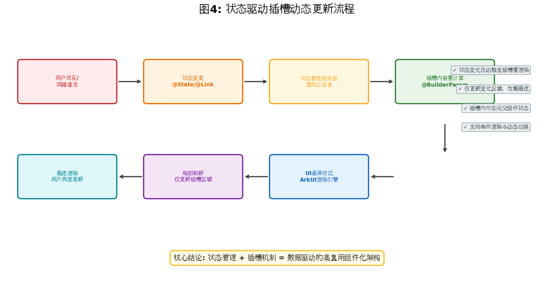
六、总结
本文从状态管理服务层的视角,系统阐述了 HarmonyOS ArkUI 中插槽(Slot)机制的实现原理与实战应用。通过 @BuilderParam 装饰器,开发者可以在子组件中声明灵活的 UI 内容接口,由父组件通过 @Builder 函数动态注入个性化内容。当插槽机制与 @State、@Link、@Provide/@Consume、AppStorage 等状态管理工具深度融合时,可以构建出数据驱动、高度复用、低耦合的企业级组件系统。
插槽机制不仅是组件化开发的利器,更是实现"开闭原则"设计思想的具体实践。掌握状态管理与插槽机制的协同使用,是每一位 HarmonyOS 开发者迈向高级工程师的必经之路。
转载自:https://blog.csdn.net/u014727709/article/details/163540718
欢迎 👍点赞✍评论⭐收藏,欢迎指正

作为“人工智能6S店”的官方数字引擎,为AI开发者与企业提供一个覆盖软硬件全栈、一站式门户。
更多推荐

 2
2 0
0- 0


 已为社区贡献160条内容

所有评论(0)