
复古理发店移动应用架构全解析:基于HarmonyOS ArkTS API 24声明式 UI 与状态驱动的工程实践,“胖模型 + 轻组件“的设计让数据集中管控、变更可追溯,避免了分散状态导致的同步难题
引言
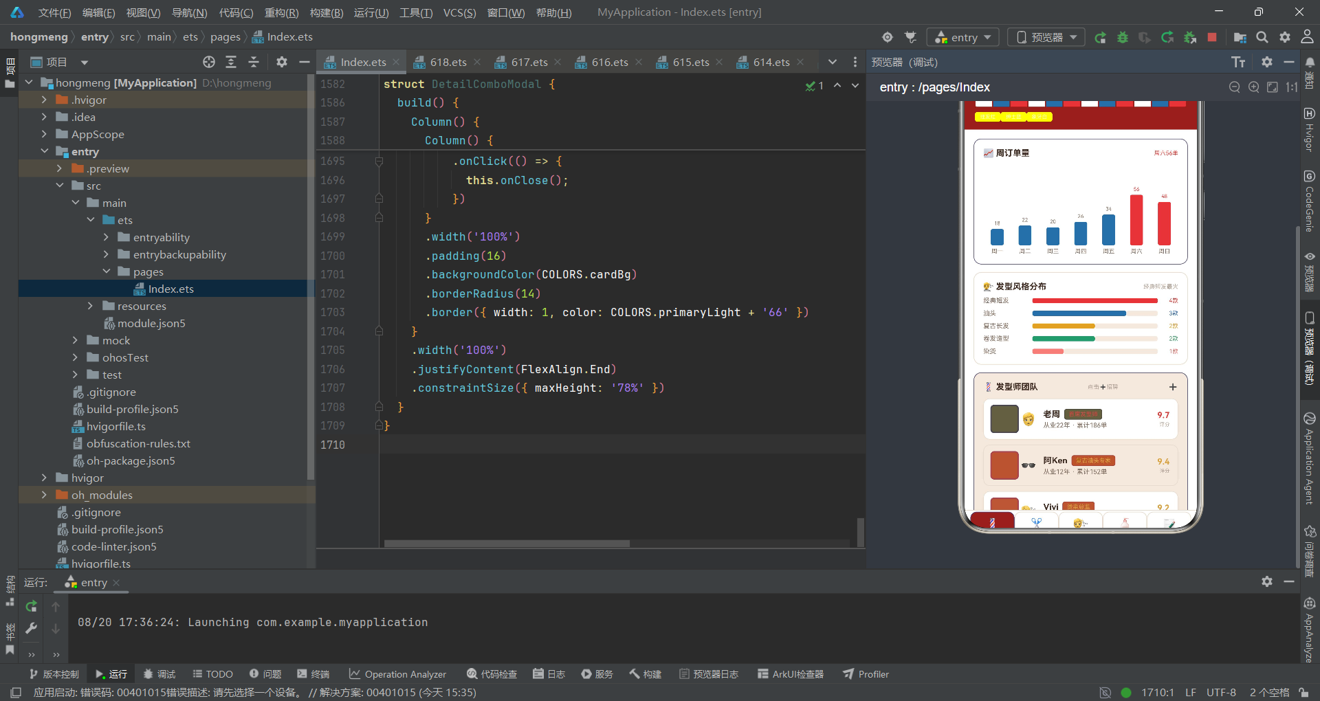
在移动互联网深入日常生活的今天,线下传统服务业的数字化转型正成为新的增长焦点。理发店作为典型的高频本地生活服务场景,承载着预约排班、技师管理、价目展示、套餐营销、商品零售与口碑运营等多重业务诉求。本文将以一款"复古理发店"主题的移动端管理应用为研究对象,深度剖析其从色彩体系、数据建模到组件化渲染的完整工程实现。这款应用并非简单的信息陈列页,而是一个集数据看板、运营管理、交互弹窗于一体的复合型业务前端,覆盖了发型师团队、发型价目、服务套餐、护理产品、顾客评价五大业务域。
该应用基于声明式 UI 框架构建,采用了基于 struct 组件、@State/@Prop/@ObjectLink 装饰器与 @Builder 构建器的状态管理范式。声明式 UI 的核心理念在于"状态即视图"——开发者只需描述界面在某一状态下的样貌,框架负责在状态变化时高效地执行差分更新,将 DOM 树的变更降至最小粒度。这种范式相比传统命令式编程大幅降低了状态同步的心智负担,使开发者能够将注意力聚焦于业务逻辑而非视图操纵细节。本应用充分践行了这一理念:所有的界面切换、弹窗显隐、动画触发均由 @State 状态变量驱动,渲染逻辑与状态变更彻底解耦。
在技术选型上,应用采用了纯前端渲染策略,所有业务数据以 @Observed 类作为可观察容器内嵌于组件树中,通过 @ObjectLink 在子组件间建立响应式引用。这种"胖模型 + 轻组件"的设计让数据集中管控、变更可追溯,避免了分散状态导致的同步难题。应用没有引入网络请求层或持久化存储,而是以静态数据集模拟真实业务场景,这一选择使应用可独立运行、便于演示与教学复盘,同时也为后续接入真实接口预留了清晰的替换边界——只需替换 BarberData 的数据源即可对接后端。
色彩体系是本应用的灵魂所在。设计者精心调配了一套以"理发红 + 绅士蓝 + 象牙白"为核心的复古调色板,主色 #D64541 是一种低饱和度的胭脂红,既传达出理发店经典红白蓝旋转灯柱的视觉记忆,又避免了高饱和红色带来的廉价感与视觉疲劳。辅助色 #3B6EA5 的绅士蓝与之形成冷暖对比,烘托出老派绅士俱乐部的沉稳格调。背景采用 #FAF6F0 的米白底色与 #F3E9DE 的卡片交替色,模拟泛黄老照片的纸质质感。整套色彩通过 BarberPalette 接口进行类型约束,确保每个色值都有语义化命名,杜绝魔法数字散落于业务代码之中。
组件化策略方面,应用遵循"单一职责 + 组合优先"的原则。主入口 BarberApp 仅承担状态编排与页面路由,将五大业务页面的渲染职责委托给 BarberContent、HairContent、ComboContent、ProductContent、ReviewContent 五个内容组件。这些内容组件再进一步拆分出 BarberTag 等原子级展示组件,以及 AddBarberModal、EditHairModal、DeleteProductModal、DetailComboModal 四个弹窗组件。这种分层使组件粒度从粗到细形成清晰的金字塔结构,既保证了复用性,又控制了单组件复杂度,让每一层都可在不影响其他层的前提下独立演进与测试。
逐段代码分析
一、色彩体系设计
代码段 1:调色板接口定义
interface BarberPalette {
  primary: string;
  primaryLight: string;
  primaryDark: string;
  accent: string;
  accentLight: string;
  bg: string;
  cardBg: string;
  cardAlt: string;
  textPrimary: string;
  textSecondary: string;
  textHint: string;
  border: string;
  line: string;
  success: string;
  warning: string;
  danger: string;
  white: string;
  barberRed: string;
  barberBlue: string;
}
这段代码定义了一个名为 BarberPalette 的接口,它将应用所需的全部色彩抽象为 20 个语义化字段。接口本身不产生任何运行时开销,其价值在于为后续的常量对象提供编译期类型校验。通过将颜色字段命名为 primary、accent、success 等语义化名称而非 red1、blue2 这类无意义编号,设计者在代码层面建立了色彩的语言体系。
每个字段都对应一个明确的视觉角色:primary 系列用于品牌主色调与强调操作,accent 系列用于次要操作与信息标注,textPrimary 到 textHint 构成三级文字层级,success/warning/danger 承担语义状态色。特别值得注意的是 barberRed 与 barberBlue 两个字段,它们直接呼应了理发店旋转灯柱的经典配色,是主题概念在代码层的具象化锚点。
这种"接口先行、实现后置"的做法遵循了依赖倒置原则。任何消费色彩的组件都只依赖 BarberPalette 的抽象契约,而非具体的十六进制值。当未来需要切换主题色方案(例如推出夜间模式或节日限定皮肤)时,只需替换实现该接口的对象,无需改动任何组件代码,体现了开闭原则的工程价值。
代码段 2:色彩常量实现
const COLORS: BarberPalette = {
  primary: '#D64541',
  primaryLight: '#E8837C',
  primaryDark: '#8E2A22',
  accent: '#3B6EA5',
  accentLight: '#B7D4E8',
  bg: '#FAF6F0',
  cardBg: '#FFFFFF',
  cardAlt: '#F3E9DE',
  textPrimary: '#3D2B22',
  textSecondary: '#7D6A5D',
  textHint: '#B3A396',
  border: '#EADFD2',
  line: '#E8DCCE',
  success: '#4C9A6E',
  warning: '#D9A441',
  danger: '#D64541',
  white: '#FFFFFF',
  barberRed: '#D64541',
  barberBlue: '#3B6EA5'
};
COLORS 常量是 BarberPalette 接口的具体实现,它将抽象的色彩契约落地为一组精心调配的十六进制色值。主色 #D64541 是一种偏暖的胭脂红,饱和度适中,既能吸引视觉焦点又不会刺眼,适合作为品牌色与主要 CTA 按钮的底色。深色变体 #8E2A22 进一步压低明度,用于头部导航栏背景,营造厚重复古的氛围。
辅助色 #3B6EA5 是标准的绅士蓝,冷暖属性与主色形成互补,在信息标注、数据图表中与红色形成清晰的视觉区分。背景层采用 #FAF6F0 暖米白与 #F3E9DE 卡其色交替,模拟老照片的泛黄质感,这是复古主题的关键视觉锚点。文字层级 #3D2B22、#7D6A5D、#B3A396 均为暖灰调,与冷色调文字相比更契合整体复古调性,避免了冷灰与暖背景的割裂感。
语义色 success #4C9A6E、warning #D9A441、danger #D64541 分别对应库存充足、试用期警告、危险操作等业务语义。值得注意的是 danger 与 primary 共用同一色值,这在此应用语境中是合理的——理发店的主色本身就是红色,而红色天然具有警示属性,复用同一色值既保持品牌统一又减少调色板膨胀。这种"克制而自洽"的配色策略体现了设计者对色彩语义的深刻理解。
代码段 3:标签页枚举
enum BarberTab {
  BARBER = 0,
  HAIR = 1,
  COMBO = 2,
  PRODUCT = 3,
  REVIEW = 4
}
BarberTab 是一个数值枚举,将应用的五个主标签页编码为 0 到 4 的整数。使用枚举而非魔法数字(如直接写 if (curTab === 0))带来了显著的代码可读性提升。当后续维护者在条件分支中看到 BarberTab.HAIR 时,能立即理解这是"发型"页,而 1 则毫无语义信息。
枚举的顺序也隐含了业务优先级:发型师团队排在首位,因为人是服务业的核心资产;发型价目紧随其后,是消费者最关心的决策信息;套餐、产品依次递进,最后是评价作为信任背书。这种排列遵循了"先看人、再看服务、最后看口碑"的自然浏览动线。显式赋值(= 0 到 = 4)虽然在不写也会自动递增的情况下略显冗余,但它消除了枚举序号的隐式依赖,使得未来即使插入或重排成员也能保持映射稳定。
二、元数据与配置常量
代码段 4:标签元数据接口与列表
interface TabMeta {
  key: string;
  icon: string;
  label: string;
  color: string;
}

const TAB_LIST: TabMeta[] = [
  { key: 'barber', icon: '💈', label: '发型师', color: '#D64541' },
  { key: 'hair', icon: '✂️', label: '发型', color: '#3B6EA5' },
  { key: 'combo', icon: '💇', label: '套餐', color: '#D9A441' },
  { key: 'product', icon: '🧴', label: '产品', color: '#4C9A6E' },
  { key: 'review', icon: '📝', label: '评价', color: '#8E2A22' }
];
TabMeta 接口将单个标签页所需的全部信息——唯一标识 key、图标 emoji、中文标签 label、主题色 color——打包为一个紧凑的结构体。TAB_LIST 数组则将五个标签的元数据集中配置,形成"数据驱动渲染"的基础:底部标签栏的 ForEach 直接遍历此数组即可渲染出五个标签按钮,无需为每个标签编写重复的结构代码。
这种"配置即代码"的模式是声明式 UI 的精髓。当需要新增一个标签页时,只需在数组中追加一项元数据,渲染逻辑自动适配,无需修改 ForEach 循环体。每个标签携带独立的 color 字段,使被选中标签的边框色能与业务主题联动——发型师标签选中时呈现红色边框,产品标签则呈现绿色边框,增强了视觉与语义的关联性。icon 采用 emoji 而非图标字体或图片资源,是因为 emoji 跨平台兼容、零体积开销,且自带彩色渲染,契合复古手作风格的亲和气质。
代码段 5:条纹列数组
const STRIPE_COL: number[] = [0, 1, 2, 3, 4, 5, 6, 7, 8, 9, 10, 11];
STRIPE_COL 是一个简单的 0 到 11 整数数组,看似不起眼,却在头部装饰条纹的渲染中扮演关键角色。理发店标志性的旋转灯柱由红白蓝三色螺旋条纹构成,这里用 12 个元素的数组配合 c % 3 取模运算来生成红、白、蓝循环交替的竖条纹。
之所以不直接在 ForEach 中用 new Array(12),是因为声明式框架的 ForEach 通常要求可迭代的显式数据源,且需要稳定的键值生成器。一个预定义的常量数组既满足了迭代需求,又通过显式列举元素保证了可读性。这种"以数据结构描述视觉规律"的做法,把条纹的排列规则从硬编码的重复 UI 节点中抽离出来,使条纹数量、颜色循环周期都可在一处配置中调整,体现了数据与表现分离的设计哲学。
三、业务数据模型接口
代码段 6:发型师数据结构
interface BarberItem {
  name: string;
  title: string;
  years: number;
  rating: number;
  orders: number;
  emoji: string;
}
BarberItem 接口定义了发型师实体在应用中的数据契约。六个字段覆盖了发型师展示所需的全部维度:name 是身份标识,title 是职称头衔,years 表征从业经验,rating 是综合评分,orders 是累计接单量,emoji 则是头像的轻量化替代。
字段类型选择体现了务实考量。years 和 orders 使用 number 而非 string,使得后续可以做数值比较(如 b.years > 10)和数值计算(如柱状图高度映射)。rating 使用 number 保留小数精度(9.7 而非 10),比整数评分更细腻。emoji 作为头像方案是本应用的标志性取舍:相比加载网络图片或本地资源,emoji 内置于字体、零网络开销、即时渲染,且自带场景语义(🧔 胡须暗示资深,🐱 猫脸暗示年轻活泼),在保证轻量的同时传递了人物性格。这种"够用就好"的字段策略避免了过度建模,每个字段都在渲染逻辑中被实际消费。
代码段 7:发型数据结构
interface HairItem {
  name: string;
  gender: string;
  price: number;
  duration: number;
  rating: number;
  emoji: string;
}
HairItem 接口描述发型价目条目。相比 BarberItem,它引入了 gender(性别适用)、price(价格)、duration(服务时长)三个业务专属字段。gender 使用字符串而非布尔或枚举,是因为发型可适用"男士"“女士”"中性"三类,字符串天然支持第三种情况。
price 和 duration 均为数值,便于在渲染时做阈值判断(如 h.price >= 200 高价发型用红色高亮)和文案拼接。duration 以分钟为单位,直接参与服务时长展示与套餐总时长的潜在计算。rating 字段复用 BarberItem 的设计,保证评分体系的统一性。这种"字段即业务语言"的建模方式,让数据结构本身成为业务规格的文档,开发者读接口即可理解发型条目包含哪些维度。
代码段 8:套餐数据结构
interface ComboItem {
  name: string;
  price: number;
  duration: number;
  services: string;
  discount: number;
  emoji: string;
}
ComboItem 接口定义服务套餐。与单次发型不同,套餐的核心价值在于组合优惠,因此引入了 services(包含服务描述)和 discount(折扣)两个字段。services 使用自由文本字符串(如"理发+洗头"),而非结构化的服务数组,是考虑到套餐组合的灵活性与展示的简洁性。
discount 存储的是折扣值(如 8 表示 8 折),而非折扣率(0.8)。这一选择契合中文语境下"8 折"的表达习惯,渲染时直接拼接 c.discount + '折' 即可,避免了格式转换。price 与 duration 同发型条目保持类型一致,确保跨数据集的数值操作可复用。emoji 在套餐中承担类别图标作用(💈 基础理发、🎨 烫染、👰 新娘造型),使消费者扫一眼即可识别套餐属性。
代码段 9:产品数据结构
interface ProductItem {
  name: string;
  type: string;
  price: number;
  sales: number;
  stock: number;
  emoji: string;
}
ProductItem 接口建模护理产品零售条目。type 字段(造型/护理/工具)是该数据结构的业务分类轴,它驱动了渲染时的颜色编码——不同类型用不同色系标注,形成视觉分类导航。sales 和 stock 是两个运营关键指标:sales 用于销量排行与热度展示,stock 用于库存预警。
stock > 30 的阈值判断直接驱动"充足/告急"的状态色切换,将库存数据转化为可操作的管理信号。这种在数据模型层预留决策字段的设计,使前端不仅是展示层,更成为运营决策的辅助工具。price 作为数值参与 ¥ + price 的拼接。值得注意的是本应用的产品数据与 ProductTopMeta(销量 TOP6)分属两个数据集——前者是完整产品列表,后者是统计快照,体现了"明细数据与聚合数据分离"的建模原则。
代码段 10:评价数据结构
interface ReviewItem {
  name: string;
  score: number;
  date: string;
  content: string;
  tag: string;
  emoji: string;
}
ReviewItem 接口定义顾客评价条目。score 使用 number(1-5)而非星级字符串,是因为渲染时需要 Math.round(r.score) 来动态生成对应数量的 ⭐ 字符,数值类型使这一计算成为可能。date 存储为 ‘08-15’ 这样的短日期字符串,契合评价列表的轻量展示需求,省略了年份与时间,聚焦于"近期"这一信息维度。
tag 字段(如"手艺精湛"“排队较长”)是评价的语义提炼,它不仅作为标签展示,更作为色彩编码的依据——通过 getTagColor 函数将不同标签映射到不同语义色,使消费者能从色彩快速判断评价的倾向性。content 字段是自由文本,lineHeight 设为 18 以保证多行评价的阅读舒适度。emoji 与评价者关联,增添了人格化的视觉趣味。
代码段 11:统计元数据接口群
interface WeekMeta {
  day: string;
  value: number;
}

interface HairMeta {
  name: string;
  count: number;
  color: string;
}

interface BarberHotMeta {
  name: string;
  orders: number;
  color: string;
}

interface ProductTopMeta {
  name: string;
  sales: number;
  color: string;
}
这一组接口定义了四种用于统计图表的轻量元数据结构。它们与上述业务实体接口的区别在于:业务实体描述"是什么"(一个发型师的完整属性),而统计元数据描述"有多少"(某发型师接了多少单)。这种区分体现了数据建模中对"实体数据"与"指标数据"的分离意识。
WeekMeta 用于周订单量柱状图,day 为横轴标签,value 为柱高数据。HairMeta、BarberHotMeta、ProductTopMeta 三个接口结构高度相似,均包含 name(名称)、数值字段(count/orders/sales)和 color(柱体颜色)。color 内嵌于数据结构而非由渲染层统一分配,使每根柱子可携带独立的视觉标识,增强了图表的色彩丰富度。这种"数据自带视觉属性"的做法在小型图表中简单高效,但当图表复杂度提升时,可考虑将颜色映射逻辑抽离为独立的策略函数以降低耦合。
四、统计快照常量
代码段 12:周订单量数据
const WEEK_ORDER: WeekMeta[] = [
  { day: '周一', value: 18 },
  { day: '周二', value: 22 },
  { day: '周三', value: 20 },
  { day: '周四', value: 26 },
  { day: '周五', value: 34 },
  { day: '周六', value: 56 },
  { day: '周日', value: 48 }
];
WEEK_ORDER 常量存储一周七天的订单量快照。数据呈现出典型的服务业波动规律:工作日平稳在 18-26 单区间,周五开始攀升至 34 单,周六达到峰值 56 单,周日略有回落但仍维持在 48 单的高位。这组数据虽是静态模拟,却真实反映了理发店以周末为核心的客流分布特征。
这组数据在渲染时通过 w.value * 1.4 的比例映射转化为柱状图高度,并以 w.value >= 45 为阈值将高订单日染成主色红、低订单日染成辅助蓝。这种"阈值变色"设计使周末高峰一眼可辨,将枯燥的数字转化为直观的视觉信号。数据与渲染的解耦体现在:若未来接入真实订单接口返回动态数据,只需替换此常量为状态变量,柱状图渲染逻辑无需任何改动,展示了良好的可演进性。
代码段 13:发型风格分布数据
const HAIR_SHARE: HairMeta[] = [
  { name: '经典短发', count: 4, color: '#D64541' },
  { name: '油头', count: 3, color: '#3B6EA5' },
  { name: '复古长发', count: 2, color: '#D9A441' },
  { name: '卷发造型', count: 2, color: '#4C9A6E' },
  { name: '染烫', count: 1, color: '#E8837C' }
];
HAIR_SHARE 常量描述发型风格的款数分布。count 字段表示该风格下拥有的发型款式数量(而非订单量),它反映了店铺的服务结构侧重——经典短发款式最多(4 款),说明这是基础高频服务;染烫款式最少(1 款),属于增值长尾服务。这种结构数据帮助经营者审视自身服务矩阵的均衡度。
渲染时采用横向进度条样式,以 n.count / 4 作为已填充段的比例、1 - n.count / 4 作为剩余段,双 Row 拼接出占比条。4 作为分母是数据中的最大值,保证了最长条刚好填满。这种"以最大值为基准归一化"的简单算法虽不如标准百分比精确,但在小数据集的视觉对比中直观有效。每项携带独立 color,使五根条各具色彩,避免了单色长条的单调感。
代码段 14:发型师热度榜数据
const BARBER_HOT: BarberHotMeta[] = [
  { name: '老周', orders: 186, color: '#D64541' },
  { name: '阿Ken', orders: 152, color: '#3B6EA5' },
  { name: 'Vivi', orders: 134, color: '#D9A441' },
  { name: '大伟', orders: 118, color: '#4C9A6E' },
  { name: '阿豪', orders: 96, color: '#E8837C' },
  { name: '小茜', orders: 82, color: '#B7D4E8' }
];
BARBER_HOT 常量是发型师接单量的热度排行。六位发型师按 orders 降序排列,老周以 186 单稳居榜首,与 BarberItem 数据中的 186 完全一致——这说明两份数据存在业务关联:热度榜是明细数据的排序快照。这种"明细 + 快照"的双数据集模式,避免了在渲染排行榜时对完整列表反复排序的性能开销。
渲染进度条时以 h.orders / 190 为填充比例,190 略高于最大值 186,使榜首条接近填满但保留少许留白,视觉上更舒适。前三名的序号用主色高亮,契合"前三甲"的竞技心理暗示。颜色从主色红渐变到淡蓝 #B7D4E8,暗示热度递减,形成自然的视觉梯度。这种"颜色编码热度等级"的设计,让排行榜不仅是数字对比,更是一场色彩渐弱的视觉叙事。
代码段 15:产品销量 TOP6 数据
const PRODUCT_TOP: ProductTopMeta[] = [
  { name: '发油经典款', sales: 420, color: '#D64541' },
  { name: '复古发蜡', sales: 356, color: '#3B6EA5' },
  { name: '修面膏', sales: 288, color: '#D9A441' },
  { name: '头油喷雾', sales: 240, color: '#4C9A6E' },
  { name: '复古梳', sales: 198, color: '#E8837C' },
  { name: '须后水', sales: 166, color: '#B7D4E8' }
];
PRODUCT_TOP 常量是产品销量的前六名快照。发油经典款以 420 件遥遥领先,这与 ProductItem 明细数据中的 sales: 420 一致,再次印证了快照与明细的关联。这组数据帮助经营者识别畅销品,为备货与陈列决策提供依据。
渲染时以 p.sales / 420 为填充比例,分母直接取最大值,使榜首条恰好填满。与 BARBER_HOT 用 190 略超最大值的做法不同,这里用精确最大值,是因为产品销量差距更大(420 vs 166),精确归一化能更显著地体现差距。前三名同样用主色高亮序号。这组数据与 ProductContent 中的完整产品列表形成互补:TOP6 聚焦头部、全列表覆盖长尾,共同构成产品的全景视图。
五、@Observed 可观察数据容器
代码段 16:BarberData 类声明与发型师列表
@Observed
export class BarberData {
barbers: BarberItem[] = [
{ name: '老周', title: '首席发型师', years: 22, rating: 9.7, orders: 186, emoji: '🧔' },
{ name: '阿Ken', title: '复古油头专家', years: 12, rating: 9.4, orders: 152, emoji: '🕶️' },
{ name: 'Vivi', title: '烫染总监', years: 10, rating: 9.2, orders: 134, emoji: '💇♀️' },
{ name: '大伟', title: '修面大师', years: 15, rating: 9.5, orders: 118, emoji: '🪒' },
{ name: '阿豪', title: '造型师', years: 6, rating: 8.9, orders: 96, emoji: '✂️' },
{ name: '小茜', title: '助理造型师', years: 3, rating: 8.6, orders: 82, emoji: '🌸' }
];
@Observed 装饰器是状态管理框架的关键注解,它将 BarberData 类标记为"可观察对象"。这意味着该类实例的属性变更会被框架自动追踪,并通过 @ObjectLink 在消费组件中触发响应式更新。export 关键字使该类可被其他模块引用,保证了数据模型的可复用性。
barbers 数组承载了 12 位发型师的完整信息(此处展示前 6 位)。数据按 rating 与 orders 的综合实力编排:老周作为首席发型师,22 年从业、9.7 评分、186 单,三项指标均居首位,是店铺的招牌手艺人。每位发型师的 emoji 都经过语义匹配——🧔 胡须象征资深老练、🕶️ 墨镜呼应油头复古调性、🌸 樱花暗示女性助理的柔美。这种人物形象与业务特质的对应,使数据本身具备了叙事能力。
代码段 17:BarberData 发型列表
  hairs: HairItem[] = [
    { name: '经典平头', gender: '男士', price: 68, duration: 40, rating: 9.4, emoji: '💇' },
    { name: '复古油头', gender: '男士', price: 88, duration: 50, rating: 9.6, emoji: '🕶️' },
    { name: '侧分绅士头', gender: '男士', price: 98, duration: 55, rating: 9.3, emoji: '🎩' },
    { name: '圆寸', gender: '男士', price: 58, duration: 30, rating: 9.0, emoji: '🪬' },
    { name: '复古长发', gender: '女士', price: 168, duration: 90, rating: 9.2, emoji: '💃' },
    { name: '港风卷发', gender: '女士', price: 228, duration: 120, rating: 9.1, emoji: '🌊' }
  ];
hairs 数组存储发型价目条目(此处展示前 6 项)。数据呈现了价格与服务时长正相关的基本规律:58 元的圆寸只需 30 分钟,而 228 元的港风卷发需 120 分钟。gender 字段的分布也体现了店铺定位——前四款均为男士发型(平头、油头、绅士头、圆寸),呼应了"复古理发店"以男士复古造型为核心的品牌定位。
rating 的细微差异(9.0 到 9.6)提供了消费者选择参考:复古油头评分最高(9.6),是招牌发型。emoji 的选择极具巧思——🎩 礼帽直接呼应"绅士头"的命名,🌊 海浪暗示卷发的流动感。这些视觉符号降低了信息理解门槛,消费者扫一眼 emoji 即可获得发型风格的直观印象。将此类业务数据集中存储于 @Observed 类中,而非分散在各组件 @State 中,保证了数据源的单一性与变更的可追溯性。
代码段 18:BarberData 套餐列表
  combos: ComboItem[] = [
    { name: '经典男士理发', price: 88, duration: 50, services: '理发+洗头', discount: 8, emoji: '💈' },
    { name: '油头造型套餐', price: 128, duration: 60, services: '理发+油头造型', discount: 8, emoji: '🕶️' },
    { name: '尊享修面', price: 68, duration: 40, services: '热敷+修面', discount: 9, emoji: '🪒' },
    { name: '烫染护理套餐', price: 398, duration: 180, services: '烫发+染发+护理', discount: 7, emoji: '🎨' },
    { name: '复古大背头', price: 108, duration: 55, services: '理发+大背头造型', discount: 8, emoji: '🦁' }
  ];
combos 数组定义了服务套餐(此处展示前 5 项)。套餐设计遵循了"基础引流 + 进阶利润 + 高端增值"的三层结构:68 元的尊享修面是低价引流款,88-128 元区间是主力利润款,398 元的烫染护理是高端增值款。discount 从 9 折到 7 折递进,套餐总价越高折扣力度越大,激励消费者向高客单价迁移。
services 字段用加号连接的短语描述包含项目,如"理发+洗头"“烫发+染发+护理”。这种扁平的文本表达比结构化的服务 ID 数组更利于直接展示,消费者无需二次解析即可理解套餐内容。duration 中的 999 是一个哨兵值,用于"理发月卡"与"白金年卡"这类非单次服务——999 分钟表示"不适用单次时长"的特殊语义,是一个简单而有效的约定。
代码段 19:BarberData 产品列表
  products: ProductItem[] = [
    { name: '发油经典款', type: '造型', price: 68, sales: 420, stock: 88, emoji: '🧴' },
    { name: '复古发蜡', type: '造型', price: 58, sales: 356, stock: 72, emoji: '🫙' },
    { name: '修面膏', type: '护理', price: 45, sales: 288, stock: 60, emoji: '🧼' },
    { name: '头油喷雾', type: '造型', price: 52, sales: 240, stock: 46, emoji: '💨' },
    { name: '复古梳', type: '工具', price: 35, sales: 198, stock: 90, emoji: '🪮' }
  ];
products 数组存储护理产品零售条目(此处展示前 5 项)。type 字段将产品分为"造型"“护理”"工具"三大类,这种分类直接驱动渲染层的颜色编码——造型类用红色、护理类用蓝色、工具类用绿色,形成颜色与类别的稳定映射,降低消费者的认知成本。
stock 字段是运营管理的关键。数据中既有库存充足的发油(88 件)也有库存偏低的产品,渲染时以 30 为阈值切换"充足/告急"状态色。这种将库存数据转化为可视化预警的设计,使产品列表不仅是消费者购物入口,更成为经营者补货决策的看板。sales 字段则与 PRODUCT_TOP 快照呼应,明细与聚合相互印证,保证了数据一致性。
代码段 20:BarberData 评价列表
  reviews: ReviewItem[] = [
    { name: '阿Ken粉', score: 5, date: '08-15', content: '油头造型太正了,老周的手艺名不虚传!', tag: '手艺精湛', emoji: '🕶️' },
    { name: '大背头', score: 5, date: '08-14', content: '复古大背头做完精神焕发,回头率超高。', tag: '造型满意', emoji: '🦁' },
    { name: 'Momo', score: 4, date: '08-13', content: 'Vivi烫的港风卷很好看,就是坐得久了点。', tag: '等待较长', emoji: '🐱' },
    { name: '老陈粉', score: 5, date: '08-12', content: '修面体验一流,热毛巾敷脸太享受了。', tag: '体验极佳', emoji: '🪞' }
  ];
}
reviews 数组是顾客评价数据(此处展示前 4 项,类定义闭合)。评价按日期降序排列,最新的 08-15 排在首位,符合"最新优先"的信息消费习惯。score 分布在 3 到 5 分,以好评为主,夹杂少量中评(如"排队较长"3 分),这种真实的分布比全好评更具可信度。
tag 字段是对评价内容的语义提炼,如"手艺精湛"“等待较长”。这些标签并非由算法自动生成,而是人工标注的结果,因此精度高且贴合业务语境。getTagColor 函数将这些标签映射为不同语义色——正面标签用红蓝绿、负面标签用深红,使消费者通过颜色即可快速扫描评价的情感倾向。content 字段是自由文本,lineHeight 18 保证可读性。将评价数据纳入 @Observed 容器,为未来实现"评价提交后实时刷新列表"的交互预留了响应式更新通路。
六、颜色策略工具函数
代码段 21:性别颜色映射
function getGenderColor(gender: string): string {
  if (gender === '男士') {
    return '#3B6EA5';
  } else if (gender === '女士') {
    return '#D64541';
  }
  return '#D9A441';
}
getGenderColor 函数将性别字符串映射为颜色值:男士映射为蓝色、女士映射为红色、中性映射为黄色。这种映射遵循了色彩心理学的传统约定——蓝色偏冷理性常关联男性,红色偏暖感性常关联女性,黄色作为中性过渡色。函数采用 if-else 链而非 switch 或对象查表,在小规模分支下可读性最佳。
函数返回的是十六进制色值字符串而非 COLORS 常量的引用,这在色彩体系解耦上略有遗憾——理论上应返回 COLORS.accent 等语义引用。但考虑到这些颜色与 COLORS 中的值一致,且函数封装已提供了语义层,直接返回字面量在小型应用中是可接受的取舍。该函数被 HairContent 组件调用,用于发型条目的性别标签与头像背景色编码,使消费者能从颜色快速识别发型适用性别。
代码段 22:产品类型颜色映射
function getTypeColor(type: string): string {
  if (type === '造型') {
    return '#D64541';
  } else if (type === '护理') {
    return '#3B6EA5';
  }
  return '#4C9A6E';
}
getTypeColor 函数将产品类型映射为颜色:造型用红色、护理用蓝色、工具用绿色。与 getGenderColor 的颜色映射不同,这里"造型"用红色而非"造型"对应某一性别——颜色语义随业务上下文重新定义,红色在性别语境表女士、在产品语境表造型,体现了颜色复用的灵活性。
"工具"作为兜底分支返回绿色(success 色),暗示工具类产品是基础辅助性质,与造型(主推)、护理(增值)形成层级区分。这种颜色编码使产品列表在视觉上自然分群,消费者无需逐条阅读文字即可识别产品类别。函数的无副作用特性(纯函数)使其可被任意组件安全调用,且结果可缓存,在产品列表频繁渲染时不会产生性能负担。
代码段 23:评分颜色映射
function getRatingColor(rating: number): string {
  if (rating >= 9.5) {
    return '#D64541';
  } else if (rating >= 9.0) {
    return '#D9A441';
  }
  return '#3B6EA5';
}
getRatingColor 函数将评分数值分段映射为颜色:9.5 及以上用红色(卓越)、9.0 及以上用黄色(优秀)、9.0 以下用蓝色(良好)。这种三级色彩分层将连续的评分数值离散化为三个可视觉感知的等级,比单纯数字更直观。
阈值 9.5 和 9.0 的选择有业务依据:本应用发型师评分普遍在 8.2-9.7 区间,9.5 作为"卓越"门槛恰好筛选出老周(9.7)、大伟(9.5)、老陈(9.6)等顶尖手艺人,9.0 作为"优秀"门槛区分中坚力量。函数不仅用于发型师评分色,也用于头像背景与标签色,使评分信息在卡片的多个视觉元素中一致性呈现。这种"一函数多处复用"的策略保证了视觉语言的一致性,避免了散落的硬编码导致的风格漂移。
代码段 24:评价标签颜色映射
function getTagColor(tag: string): string {
  if (tag === '手艺精湛' || tag === '体验极佳' || tag === '氛围满分') {
    return '#D64541';
  } else if (tag === '造型满意' || tag === '商品满意') {
    return '#3B6EA5';
  } else if (tag === '服务贴心') {
    return '#D9A441';
  } else if (tag === '排队较长' || tag === '等待较长') {
    return '#8E2A22';
  }
  return '#4C9A6E';
}
getTagColor 函数是四个颜色映射中最复杂的一个,它将评价标签按情感倾向分组映射为不同颜色。“手艺精湛”“体验极佳”"氛围满分"等强正面标签用主色红,“造型满意”"商品满意"等一般正面标签用蓝色,"服务贴心"用黄色,“排队较长”"等待较长"等负面标签用深红 #8E2A22。
这种分组映射的精妙之处在于:负面标签用深红而非通常的灰色或黑色,是因为深红是 primaryDark 色,在视觉上既传达"警示"又保持与品牌色系的统一。兜底分支返回绿色,用于未匹配的标签(如"价格实惠"),赋予中性偏正面的色彩。函数的分支虽多但结构清晰,每个分支对应一个情感类别,使颜色成为评价情感的视觉语言。这种将业务语义编码为色彩的设计,是数据可视化在前端列表场景的轻量实践。
七、主入口组件状态层
代码段 25:BarberApp 状态声明
@Entry
@Component
struct BarberApp {
  @State curTab: number = 0;
  @State data: BarberData = new BarberData();
  @State showAddBarber: boolean = false;
  @State showEditHair: boolean = false;
  @State showDeleteProduct: boolean = false;
  @State showDetail: boolean = false;
  @State delProductName: string = '';
  @State detailComboName: string = '';
  @State poleSpin: boolean = false;
  @State scissorCut: boolean = false;
@Entry 标注 BarberApp 为应用入口组件,@Component 声明其为自定义组件。十个 @State 变量构成了应用的状态中枢。curTab 控制当前激活的标签页,data 是全局共享的 BarberData 可观察实例——所有内容子组件通过 @ObjectLink 引用同一实例,保证数据一致性。
四个 show* 布尔变量分别控制四个弹窗的显隐,这是声明式 UI 处理模态对话框的标准模式:状态驱动渲染而非命令式调用。两个 *Name 字符串变量作为弹窗的参数载体——delProductName 携带待删除产品名、detailComboName 携带待查看套餐名,使弹窗能展示上下文相关的内容。两个布尔变量 poleSpin 和 scissorCut 控制头部图标动画,将交互动画也纳入状态管理。这种"一切皆状态"的设计,使应用的任何视觉变化都可追溯到一个状态变量,调试与推理清晰有序。
代码段 26:模态遮罩构建器
  @Builder modalOverlay(onClose: () => void) {
    Column() {
      Text('')
        .width(0)
        .height(0)
        .opacity(0)
      Button('')
        .width(1)
        .height(1)
        .opacity(0)
        .onClick(() => {
          onClose();
        })
    }
    .width(1)
    .height(1)
  }
@Builder 装饰器定义了一个可复用的 UI 片段构建函数。modalOverlay 看似奇怪——它创建了一个几乎不可见(宽高 1、opacity 0)的元素,仅内含一个透明按钮用于点击关闭。这是一个"占位遮罩"的实现,用于在弹窗下方捕获点击以触发关闭回调。
这种极简遮罩的设计体现了工程上的务实考量。完整的模态遮罩通常需要半透明黑色背景覆盖全屏,但本应用选择了更轻量的方案——让弹窗组件自身处理布局与背景,遮罩仅作为点击捕获层。onClose 作为回调参数传入,遵循了依赖注入原则,使遮罩与具体业务解耦。@Builder 的复用性在此体现:若有多个弹窗都需要遮罩点击关闭,可共享此构建器。虽然当前应用各弹窗已内建关闭逻辑,此构建器仍为未来扩展预留了工具。
八、主入口组件渲染层
代码段 27:头部品牌标题
  build() {
    Column() {
      Column() {
        Column() {
          Row() {
            Column() {
              Text('💈 复古理发店')
                .fontSize(20)
                .fontWeight(FontWeight.Bold)
                .fontColor(COLORS.white)
              Text('Retro Barbershop · 老派手艺')
                .fontSize(10)
                .fontColor('#FFFFFFCC')
                .margin({ top: 3 })
            }
            .alignItems(HorizontalAlign.Start)
            .layoutWeight(1)
build 方法是组件的渲染入口。头部区域采用多层 Column 嵌套,最内层 Column 承载品牌标题。主标题"💈 复古理发店"以 20 号粗体白色字呈现,emoji 前缀强化品牌识别。副标题"Retro Barbershop · 老派手艺"以 10 号半透明白色(#FFFFFFCC,CC 即 80% 不透明度)作为补充说明,中英双语设计兼顾国际化与复古格调。
layoutWeight(1) 使标题列占据剩余空间,将右侧图标挤向行末。alignItems(HorizontalAlign.Start) 使文字左对齐。这种"主标题 + 副标题"的双行品牌区是导航头的经典布局,主标题传递品牌名,副标题传递品牌定位。颜色使用 COLORS.white 而非字面量,保持了与色彩体系的一致引用。半透明白色用十六进制字面量而非 COLORS 引用,是因为这种叠加透明色属于一次性场景色,不值得为它在调色板中新增字段,体现了配置粒度的权衡。
代码段 28:头部交互图标
            Row() {
              Text('💈')
                .fontSize(20)
                .onClick(() => {
                  this.poleSpin = !this.poleSpin;
                })
                .rotate({ angle: this.poleSpin ? 360 : 0 })
                .animation({ duration: 1000, curve: Curve.Linear })
              Text('✂️')
                .fontSize(18)
                .margin({ left: 10 })
                .onClick(() => {
                  this.scissorCut = !this.scissorCut;
                })
                .rotate({ angle: this.scissorCut ? -25 : 15 })
                .animation({ duration: 300, curve: Curve.EaseInOut })
              Text('🪒')
                .fontSize(16)
                .margin({ left: 6 })
            }
            .padding({ left: 10, right: 10, top: 6, bottom: 6 })
            .backgroundColor('#FFFFFF26')
            .borderRadius(8)
            .border({ width: 1, color: '#FFFFFF40' })
头部右侧的 Row 容纳三个交互图标:💈 灯柱、✂️ 剪刀、🪒 剃须刀。前两个图标绑定了点击事件与旋转动画,点击灯柱触发 360 度匀速旋转(模拟理发店灯柱的旋转),点击剪刀触发 -25 到 15 度的摆动(模拟剪刀开合)。动画通过 @State 变量驱动:poleSpin 和 scissorCut 的布尔翻转引发 rotate angle 的变化,animation 修饰器自动插值过渡。
这种"状态 + animation"的动画模式是声明式 UI 的典型范式。开发者只需声明终态(angle: 360)与动画参数(duration: 1000, curve: Linear),框架自动处理帧插值。灯柱用 Linear 曲线(匀速)契合旋转的物理特性,剪刀用 EaseInOut 曲线(先慢后快再慢)契合开合的节奏感。容器使用半透明白底 #FFFFFF26(约 15% 不透明度)与半透明边框,形成悬浮于深色头部之上的胶囊按钮组,视觉层次清晰。这种将品牌符号转化为可玩交互的设计,增添了应用的趣味性。
代码段 29:头部条纹行 A
          Column() {
            Row() {
              ForEach(STRIPE_COL, (c: number) => {
                Column()
                  .layoutWeight(1)
                  .height(14)
                  .backgroundColor(c % 3 === 0 ? COLORS.barberRed : c % 3 === 1 ? COLORS.white : COLORS.barberBlue)
                  .margin({ left: 1, right: 1 })
              }, (c: number) => 'stripeA' + c)
            }
            .width('100%')
            .height(14)
            .borderRadius(4)
            .clip(true)
头部下方的 Column 包含两行条纹装饰,这是对理发店旋转灯柱的静态致敬。第一行条纹通过 ForEach 遍历 STRIPE_COL 的 12 个元素,每个 Column 以 layoutWeight(1) 等宽排列,高度 14。颜色按 c % 3 取模循环:余数 0 为红、余数 1 为白、余数 2 为蓝,形成红白蓝三色交替的竖条纹。
borderRadius(4) 为整行设置圆角,clip(true) 关键——它裁剪超出圆角范围的子元素,使两端条纹的直角被圆角"切割",形成圆角条纹效果。若无 clip(true),子 Column 的直角会突破容器的圆角边界,破坏视觉一致性。键值生成器 'stripeA' + c 为每个元素提供唯一键,保证 ForEach 在数据变化时能精确 diff。这种以数学取模驱动视觉循环的模式,是"数据描述规律"的典型实践。
代码段 30:头部条纹行 B
            Row() {
              ForEach(STRIPE_COL, (c: number) => {
                Column()
                  .layoutWeight(1)
                  .height(10)
                  .backgroundColor(c % 3 === 2 ? COLORS.barberRed : c % 3 === 0 ? COLORS.white : COLORS.barberBlue)
                  .margin({ left: 1, right: 1 })
              }, (c: number) => 'stripeB' + c)
            }
            .width('100%')
            .height(10)
            .margin({ top: 3 })
            .borderRadius(4)
            .clip(true)
          }
          .width('100%')
          .margin({ top: 10 })
第二行条纹与第一行结构相同,但颜色循环模式不同:c % 3 === 2 为红、c % 3 === 0 为白、其余为蓝。这使第二行的颜色相位与第一行错开——当第一行某位置是红色时,第二行同位置是蓝色,形成交错对角的效果,模拟灯柱螺旋条纹的视觉错觉。
高度从 14 降为 10,margin top 3 与第一行留出间隙。两行条纹合在一起,配合圆角与裁剪,呈现出精致的"微型灯柱"装饰条。键值 'stripeB' + c 与第一行的 'stripeA' 区分,保证两组 ForEach 的元素不冲突。这种用纯 UI 元素拼装出品牌符号的手法,避免了引入图片资源,保持了应用的轻量与自包含。整个条纹装饰是复古主题的点睛之笔,将理发店的核心视觉符号嵌入界面骨架。
代码段 31:头部色彩标签
          Row() {
            Text('理发红')
              .fontSize(8)
              .fontColor('#FFFFFFCC')
              .padding({ left: 8, right: 8, top: 3, bottom: 3 })
              .backgroundColor('#FFFFFF2E')
              .borderRadius(4)
            Text('绅士蓝')
              .fontSize(8)
              .fontColor('#FFFFFFCC')
              .padding({ left: 8, right: 8, top: 3, bottom: 3 })
              .backgroundColor('#FFFFFF2E')
              .borderRadius(4)
            Text('象牙白')
              .fontSize(8)
              .fontColor('#FFFFFFCC')
              .padding({ left: 8, right: 8, top: 3, bottom: 3 })
              .backgroundColor('#FFFFFF2E')
              .borderRadius(4)
          }
          .width('100%')
          .margin({ top: 8 })
        }
        .width('100%')
        .padding({ left: 16, right: 16, top: 12, bottom: 12 })
        .backgroundColor(COLORS.primaryDark)
条纹下方是一组色彩标签:“理发红”“绅士蓝”“象牙白”。这三个标签以 8 号字、半透明白字、半透明白底的胶囊样式排列,是对品牌三色体系的文字注解。它们既是色彩说明,也是设计美学的自我陈述——向用户传达这套配色的语义命名。
标签的背景色 #FFFFFF2E(约 18% 不透明度白)与字色 #FFFFFFCC(80% 不透明度白)的组合,在深红底色上形成柔和的半透明胶囊。整个头部区域以 COLORS.primaryDark(#8E2A22 深红)为背景,padding 16/12 留出内边距。头部三段式结构——品牌标题、条纹装饰、色彩标签——共同构建了一个信息密度高但层次分明的导航头,既承载品牌识别,又通过条纹与色彩标签传递设计理念,是"导航即设计展示"的范例。
代码段 32:标签页内容切换
        if (this.curTab === BarberTab.BARBER) {
          BarberContent({ data: this.data, onAdd: () => {
            this.showAddBarber = true;
          } })
        } else if (this.curTab === BarberTab.HAIR) {
          HairContent({ data: this.data, onEdit: () => {
            this.showEditHair = true;
          } })
        } else if (this.curTab === BarberTab.COMBO) {
          ComboContent({ data: this.data, onDetail: (n: string) => {
            this.detailComboName = n;
            this.showDetail = true;
          } })
        } else if (this.curTab === BarberTab.PRODUCT) {
          ProductContent({ data: this.data, onDel: (n: string) => {
            this.delProductName = n;
            this.showDeleteProduct = true;
          } })
        } else {
          ReviewContent({ data: this.data })
        }
这段 if-else 链构成了页面路由的核心逻辑,根据 curTab 状态值渲染对应的内容组件。每个内容组件接收 data: this.data 作为数据源——注意传递的是 @State 持有的 BarberData 实例引用,子组件以 @ObjectLink 接收后与父组件共享同一可观察对象,实现了数据的单向流动与双向响应。
回调函数的设计尤为精妙。BarberContent 的 onAdd 回调将 showAddBarber 置 true 以打开"招聘发型师"弹窗;ProductContent 的 onDel 回调接收产品名 n 赋值给 delProductName 并打开删除确认弹窗;ComboContent 的 onDetail 回调同理处理套餐详情。这种"子组件触发事件 + 父组件管理状态"的模式,是声明式 UI 中父子通信的标准范式——子组件不直接操控弹窗(因为它无权访问父组件的状态),而是通过回调将控制权交还父组件,由父组件统一编排。这种控制反转保证了状态变更的单一入口,降低了调试复杂度。
代码段 33:底部标签栏
      Row() {
        ForEach(TAB_LIST, (t: TabMeta) => {
          Column() {
            Text(t.icon)
              .fontSize(19)
            Text(t.label)
              .fontSize(10)
              .fontColor(this.curTab === TAB_LIST.indexOf(t) ? COLORS.white : COLORS.textHint)
              .fontWeight(this.curTab === TAB_LIST.indexOf(t) ? FontWeight.Bold : FontWeight.Normal)
              .margin({ top: 2 })
          }
          .layoutWeight(1)
          .justifyContent(FlexAlign.Center)
          .padding({ top: 8, bottom: 8 })
          .backgroundColor(this.curTab === TAB_LIST.indexOf(t) ? COLORS.primaryDark : COLORS.cardBg)
          .borderRadius(10)
          .border(this.curTab === TAB_LIST.indexOf(t) ? { width: 1, color: t.color + '88' } : { width: 1, color: COLORS.line })
          .onClick(() => {
            this.curTab = TAB_LIST.indexOf(t);
          })
        }, (t: TabMeta) => t.key)
      }
      .width('100%')
      .height(60)
      .padding({ left: 8, right: 8 })
      .backgroundColor(COLORS.cardBg)
      .border({ width: 1, color: COLORS.line })
底部标签栏通过 ForEach 遍历 TAB_LIST 渲染五个标签按钮,是"数据驱动渲染"的典范。每个标签是一个 Column,包含 emoji 图标(19 号字)与中文标签(10 号字)。选中态通过 this.curTab === TAB_LIST.indexOf(t) 判断,选中时标签字色变白加粗、背景变为深红、边框色用该标签自带的 color 加 88 透明度(约 53%),形成与标签主题色联动的选中高亮。
indexOf(t) 用于获取当前标签在数组中的索引以与 curTab 比较,这虽有效率开销(线性查找),但在五元素的小数组中可忽略。onClick 将 curTab 更新为该标签索引,触发整个条件渲染链重新评估,切换到对应内容页。边框使用三元运算动态切换选中与未选中的样式。整个标签栏固定高度 60、白底、顶部 1px 边框,与上方内容区形成清晰的视觉分割。这种配置驱动的标签栏,新增或调整标签只需修改 TAB_LIST 数组,渲染逻辑零改动,体现了开闭原则。
代码段 34:弹窗条件渲染
      if (this.showAddBarber) {
        AddBarberModal({
          onClose: () => {
            this.showAddBarber = false;
          }
        })
      }
      if (this.showEditHair) {
        EditHairModal({
          onClose: () => {
            this.showEditHair = false;
          }
        })
      }
      if (this.showDeleteProduct) {
        DeleteProductModal({
          title: this.delProductName, onClose: () => {
            this.showDeleteProduct = false;
          }
        })
      }
      if (this.showDetail) {
        DetailComboModal({
          name: this.detailComboName, onClose: () => {
            this.showDetail = false;
          }
        })
      }
四个独立的 if 语句分别控制四个弹窗的渲染。这种"状态为真则渲染、为假则移除"的模式,是声明式 UI 处理模态对话框的标准做法——弹窗的存在性本身由状态决定,无需命令式的 show/hide 调用。当 showAddBarber 从 false 变为 true,框架自动将 AddBarberModal 插入组件树;反向变化时自动移除。
每个弹窗组件接收一个 onClose 回调,回调内将对应状态置 false,形成"打开-关闭"的完整循环。DeleteProductModal 与 DetailComboModal 额外接收 title/name 参数,这些参数在打开前由内容组件的回调赋值(如 delProductName),保证了弹窗展示的内容与触发上下文一致。四个弹窗使用独立状态而非单一 curModal 枚举,是因为它们可能需要独立控制(虽然当前为互斥),且独立状态使逻辑更清晰——每个弹窗的开关各自闭环,互不干扰。这种"一弹窗一状态"的设计在弹窗数量可控时是清晰且可维护的。
九、公共标签组件
代码段 35:BarberTag 组件
@Component
struct BarberTag {
  @Prop text: string;
  @Prop color: string;

  build() {
    Text(this.text)
      .fontSize(9)
      .fontColor(this.color)
      .padding({ left: 6, right: 6, top: 2, bottom: 2 })
      .backgroundColor(this.color + '1F')
      .borderRadius(4)
      .border({ width: 1, color: this.color + '40' })
  }
}
BarberTag 是应用中最细粒度的原子组件,它渲染一个小型标签胶囊。@Prop 装饰器声明 text 与 color 为父组件单向传递的只读属性——@Prop 与 @State 的区别在于 @Prop 的变更不回传父组件,适合纯展示型子组件。BarberTag 被发型师卡片、发型卡片、套餐卡片、产品卡片、评价卡片等几乎所有列表项复用,是复用率最高的组件。
标签的视觉设计极具巧思:字色用全色 color,背景用 color + ‘1F’(约 12% 不透明度),边框用 color + ‘40’(约 25% 不透明度)。同一颜色通过透明度叠加产生三种层次——实色字、淡底、中淡边框——形成柔和而精致的胶囊效果。这种"单色三透明度"的技法避免了引入新颜色,保持了色彩体系的纯粹性。fontSize 9 保证标签紧凑不抢主信息风头。BarberTag 的存在使所有标签的视觉风格统一,若需全局调整标签样式,只需改此一处。
十、发型师内容页
代码段 36:BarberContent 周订单卡片
@Component
struct BarberContent {
  @ObjectLink data: BarberData;
  onAdd: () => void = () => {};

  build() {
    Scroll() {
      Column() {
        Column() {
          Row() {
            Text('📈 周订单量')
              .fontSize(13)
              .fontWeight(FontWeight.Bold)
              .fontColor(COLORS.textPrimary)
            Text('周六56单')
              .fontSize(9)
              .fontColor(COLORS.danger)
              .margin({ left: 8 })
          }
          .width('100%')
          .justifyContent(FlexAlign.SpaceBetween)
BarberContent 是发型师页的内容组件。@ObjectLink data: BarberData 建立了对父组件 BarberData 实例的响应式引用——当 BarberData 的 barbers 数组变化时,此组件自动刷新。onAdd 回调默认为空函数,由父组件注入实际逻辑,这种"默认空实现 + 外部注入"的模式使组件可独立测试(不传回调也不报错)。
build 方法以 Scroll 包裹 Column,保证内容超出屏幕时可滚动。第一个卡片是"周订单量"数据看板,标题行用 SpaceBetween 布局将标题与峰值标注("周六56单"红色)分置两端,一眼传递"本周峰值在周六"的核心信息。danger 红色用于峰值标注,既是警示色也是品牌色,在此语境双义合一。Scroll + constraintSize maxHeight 的组合是长列表场景的标准容器配置。
代码段 37:周订单柱状图
          Row() {
            ForEach(WEEK_ORDER, (w: WeekMeta) => {
              Column() {
                Text(w.value + '')
                  .fontSize(8)
                  .fontColor(w.value >= 45 ? COLORS.primary : COLORS.textSecondary)
                Column()
                  .width(20)
                  .height(w.value * 1.4)
                  .backgroundColor(w.value >= 45 ? COLORS.primary : COLORS.accent)
                  .borderRadius(3)
                  .margin({ top: 4 })
                Text(w.day)
                  .fontSize(9)
                  .fontColor(COLORS.textSecondary)
                  .margin({ top: 4 })
              }
              .layoutWeight(1)
              .alignItems(HorizontalAlign.Center)
            }, (w: WeekMeta) => w.day)
          }
          .width('100%')
          .height(140)
          .alignItems(VerticalAlign.Bottom)
柱状图通过 ForEach 遍历 WEEK_ORDER 渲染七根柱子,每根柱子是一个 Column:顶部数值标签、中部柱体、底部日期标签。柱高 w.value * 1.4 将订单量按 1.4 倍系数映射为像素高度——56 单对应 78.4 像素,在 140 高度的容器中占比合理。1.4 倍系数是经验调参的结果,保证最高柱不溢出且最低柱(18 单对应 25.2 像素)仍清晰可见。
w.value >= 45 的阈值使周末高峰柱(56、48)染为主色红,工作日柱染为辅助蓝,形成"红蓝对比"的视觉信号。Row 容器 alignItems(VerticalAlign.Bottom) 使所有柱子底部对齐,模拟传统柱状图的基准线。每根柱子 layoutWeight(1) 等宽分布,日期标签居中。这是一个完全用基础 UI 元素(Column、Text)拼装的纯 CSS 柱状图,无需引入图表库,体现了声明式 UI 的灵活性与轻量性。键值用 w.day 保证唯一性。
代码段 38:发型风格分布卡片
        Column() {
          Row() {
            Text('💇 发型风格分布')
              .fontSize(13)
              .fontWeight(FontWeight.Bold)
              .fontColor(COLORS.textPrimary)
            Text('经典短发最火')
              .fontSize(9)
              .fontColor(COLORS.textHint)
              .margin({ left: 8 })
          }
          .width('100%')
          .justifyContent(FlexAlign.SpaceBetween)
          ForEach(HAIR_SHARE, (n: HairMeta) => {
            Row() {
              Text(n.name)
                .fontSize(10)
                .fontColor(COLORS.textSecondary)
                .width(76)
              Row() {
                Row()
                  .layoutWeight(n.count / 4)
                  .height(8)
                  .backgroundColor(n.color)
                  .borderRadius(3)
                Row()
                  .layoutWeight(1 - n.count / 4)
                  .height(8)
                  .backgroundColor(COLORS.cardAlt)
                  .borderRadius(3)
              }
              .layoutWeight(1)
              .height(8)
              Text(n.count + '款')
                .fontSize(9)
                .fontColor(n.color)
                .width(32)
                .textAlign(TextAlign.End)
            }
            .width('100%')
            .margin({ top: 8 })
          }, (n: HairMeta) => n.name)
        }
发型风格分布卡片采用横向进度条样式。每行包含:左侧发型名(固定宽 76)、中部进度条(layoutWeight 占满剩余)、右侧款数(固定宽 32 右对齐)。进度条由两个 Row 拼接——已填充段 layoutWeight 为 n.count / 4,未填充段 layoutWeight 为 1 - n.count / 4,两者共享同一 Row 的权重空间,按比例分配宽度。
4 作为分母是 HAIR_SHARE 中 count 的最大值(经典短发 4 款),使最长条恰好填满。这种"双 Row 权重拼接"的进度条实现,是声明式 UI 中用布局权重模拟百分比条的经典技巧——无需计算像素宽度,框架自动按权重分配空间。每项的 color 内嵌于数据(n.color),使五根条各具色彩。cardAlt 米色作为未填充段背景,与白底卡片形成柔和对比。右侧款数标签用 n.color 染色,与进度条颜色呼应,形成"条-数"色彩关联。
代码段 39:发型师团队卡片头部
        Column() {
          Row() {
            Text('💈 发型师团队')
              .fontSize(13)
              .fontWeight(FontWeight.Bold)
              .fontColor(COLORS.textPrimary)
            Text('点击➕招聘')
              .fontSize(9)
              .fontColor(COLORS.textHint)
              .margin({ left: 8 })
            Text('➕')
              .fontSize(13)
              .margin({ left: 8 })
              .onClick(() => {
                this.onAdd();
              })
          }
          .width('100%')
          .justifyContent(FlexAlign.SpaceBetween)
          .margin({ bottom: 10 })
发型师团队卡片的头部行包含标题、操作提示与招聘按钮。SpaceBetween 布局使标题靠左、➕ 按钮靠右,"点击➕招聘"提示夹在中间,形成"标题-提示-按钮"的自然阅读顺序。➕ 按钮的 onClick 调用 this.onAdd(),触发父组件打开招聘弹窗。
这种"提示 + 按钮"的组合设计降低了用户的学习成本——新用户看到➕图标可能不知其用途,旁边的"点击➕招聘"文字明确告知操作结果。按钮无背景无边框,以纯文字 emoji 呈现,视觉上轻量不干扰标题。fontSize 13 与标题一致但无加粗,作为次级操作不抢主信息风头。这种将交互入口嵌入卡片头部的设计,使每个业务卡片自带操作入口,无需额外的操作栏,节省了垂直空间。
代码段 40:发型师列表项
          ForEach(this.data.barbers, (b: BarberItem, i: number) => {
            Row() {
              Column()
                .width(44)
                .height(44)
                .justifyContent(FlexAlign.Center)
                .backgroundColor(getRatingColor(b.rating) + '22')
                .borderRadius(6)
                .border({ width: 2, color: getRatingColor(b.rating) + '55' })
              Text(b.emoji)
                .fontSize(19)
                .width(30)
                .textAlign(TextAlign.Center)
              Column() {
                Row() {
                  Text(b.name)
                    .fontSize(13)
                    .fontWeight(FontWeight.Bold)
                    .fontColor(COLORS.textPrimary)
                  BarberTag({ text: b.title, color: getRatingColor(b.rating) })
                    .margin({ left: 6 })
                }
                .width('100%')
                Text('从业' + b.years + '年 · 累计' + b.orders + '单')
                  .fontSize(10)
                  .fontColor(COLORS.textSecondary)
                  .margin({ top: 3 })
              }
              .layoutWeight(1)
              .alignItems(HorizontalAlign.Start)
              .padding({ left: 8 })
              Column() {
                Text(b.rating + '')
                  .fontSize(13)
                  .fontWeight(FontWeight.Bold)
                  .fontColor(getRatingColor(b.rating))
                Text('评分')
                  .fontSize(8)
                  .fontColor(COLORS.textHint)
                  .margin({ top: 2 })
              }
              .alignItems(HorizontalAlign.End)
            }
            .width('100%')
            .padding({ left: 10, right: 12, top: 9, bottom: 9 })
            .backgroundColor(i % 2 === 0 ? COLORS.cardBg : COLORS.cardAlt)
            .borderRadius(10)
            .border({ width: 1, color: COLORS.line })
            .margin({ bottom: 8 })
          }, (b: BarberItem, i: number) => b.name + i)
发型师列表项是应用中信息密度最高的卡片之一。每行采用三段式布局:左侧 44x44 头像框(带评分色背景与边框)、中部信息区(姓名 + 职称标签 + 从业信息)、右侧评分区。头像框的背景色与边框色均由 getRatingColor(b.rating) 派生,加 22 与 55 透明度形成柔和的评分色光晕,使头像框颜色直接反映技师等级。
BarberTag 标签的 color 也用 getRatingColor,使职称标签与头像框色彩一致,形成"评分色"的视觉主题。右侧评分数字用全色 getRatingColor 突出显示。i % 2 === 0 的奇偶交替背景(cardBg 白与 cardAlt 米)是斑马线列表的经典设计,在长列表中帮助视线定位行。键值 b.name + i 防止同名技师(如多个"老周")的键冲突。这种将评分信息渗透到头像、标签、数字三个视觉层的设计,使评分成为卡片的视觉主线,突出了"以手艺论英雄"的理发店价值观。
代码段 41:BarberContent 卡片容器收尾
        }
        .width('100%')
        .padding(14)
        .backgroundColor(COLORS.cardAlt)
        .borderRadius(12)
        .border({ width: 1, color: COLORS.primary + '66' })
        .margin({ top: 12 })
      }
      .width('100%')
      .padding(14)
    }
    .width('100%')
    .constraintSize({ maxHeight: '100%' })
  }
}
这段是 BarberContent 三层容器的收尾配置。最内层 Column(发型师团队卡片)以 cardAlt 米色为底、12 圆角、primary 红加 66 透明度的边框,margin top 12 与上方风格分布卡片留隙。中层 Column 统一 padding 14 作为内容区与 Scroll 的间距。最外层 Scroll 设 constraintSize maxHeight 100%,约束其最大高度不超过父容器,保证滚动区不溢出底部标签栏。
三张卡片——周订单量、发型风格分布、发型师团队——依次排列,各自带 12 的 margin top 形成垂直间距。卡片的边框色各异:周订单用 primary、风格分布用 line、团队用 primary,通过边框色的细微差异区分卡片层级。Scroll 容器是移动端长内容的标准承载方式,constraintSize 的使用避免了内容过长将底部标签栏推出可视区。整个 BarberContent 组件结构清晰:Scroll → Column → 三个卡片 Column,体现了"容器 → 布局 → 内容"的分层思维。
十一、发型内容页
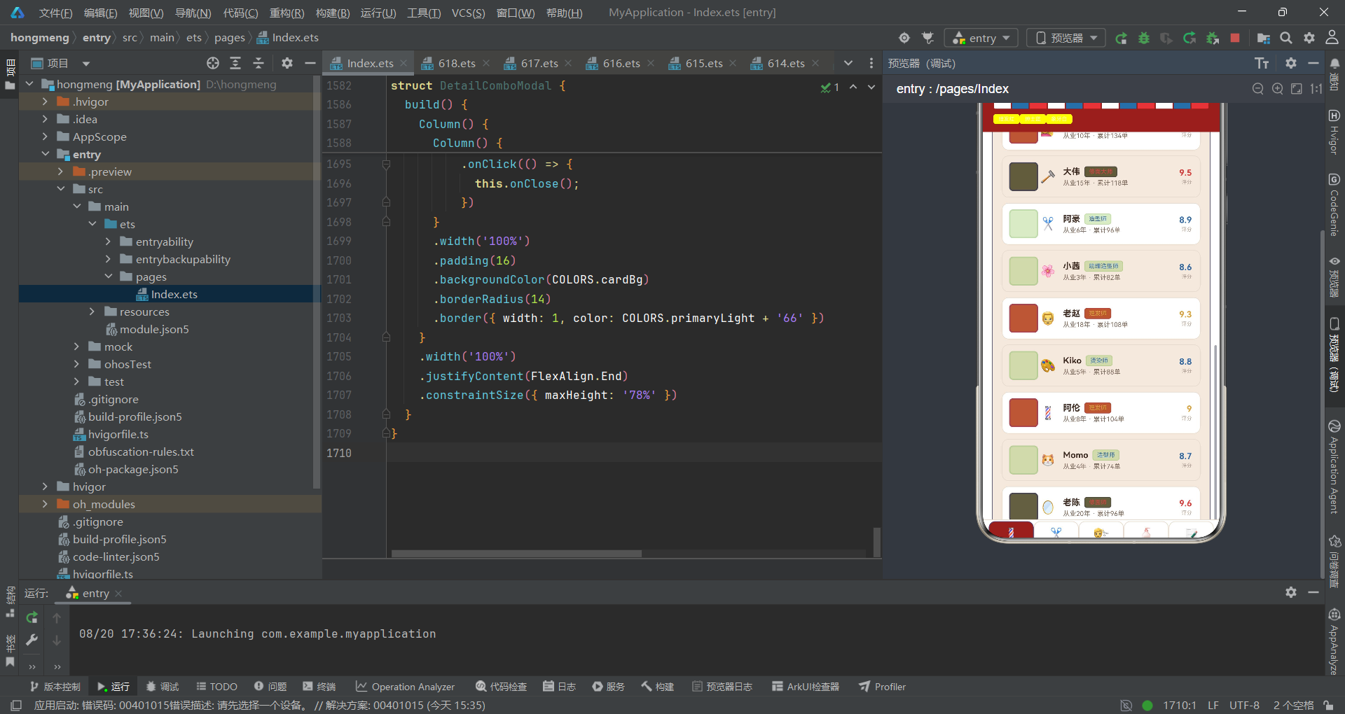
代码段 42:HairContent 热度榜卡片
@Component
struct HairContent {
  @ObjectLink data: BarberData;
  onEdit: () => void = () => {};

  build() {
    Scroll() {
      Column() {
        Column() {
          Row() {
            Text('🏆 技师热度榜')
              .fontSize(13)
              .fontWeight(FontWeight.Bold)
              .fontColor(COLORS.textPrimary)
            Text('老周稳居第一')
              .fontSize(9)
              .fontColor(COLORS.accent)
              .margin({ left: 8 })
          }
          .width('100%')
          .justifyContent(FlexAlign.SpaceBetween)
          .margin({ bottom: 10 })
          ForEach(BARBER_HOT, (h: BarberHotMeta, i: number) => {
            Row() {
              Text((i + 1) + '')
                .fontSize(11)
                .fontWeight(FontWeight.Bold)
                .fontColor(i < 3 ? COLORS.primary : COLORS.textHint)
                .width(22)
              Text(h.name)
                .fontSize(10)
                .fontColor(COLORS.textSecondary)
                .width(44)
              Row() {
                Row()
                  .layoutWeight(h.orders / 190)
                  .height(8)
                  .backgroundColor(h.color)
                  .borderRadius(3)
                Row()
                  .layoutWeight(1 - h.orders / 190)
                  .height(8)
                  .backgroundColor(COLORS.cardAlt)
                  .borderRadius(3)
              }
              .layoutWeight(1)
              .height(8)
              Text(h.orders + '单')
                .fontSize(9)
                .fontColor(h.color)
                .textAlign(TextAlign.End)
                .width(40)
            }
            .width('100%')
            .margin({ top: 7 })
          }, (h: BarberHotMeta, i: number) => h.name + i)
        }
HairContent 的第一张卡片是技师热度榜,遍历 BARBER_HOT 常量渲染六行排行。每行四段:序号(前三名红色加粗、后三名灰色)、姓名、进度条、单数。序号的 i < 3 判断使前三甲视觉突出,契合竞技排名的心理预期。进度条与发型风格分布的进度条技术一致——双 Row 权重拼接,分母 190 略超最大值 186 使榜首条接近填满但留白。
每行的 color 由数据自带(h.color),从红渐变到淡蓝,形成热度递减的色彩梯度。单数标签的 textAlign End 使数字右对齐,与进度条末端对齐,视觉整齐。这张卡片与 BarberContent 的发型师团队卡片形成互补——团队卡片展示完整信息,热度榜聚焦订单量排名,两者从不同维度呈现技师实力。accent 蓝色的"老周稳居第一"提示传递了榜单结论,降低用户的信息加工成本。
代码段 43:发型价目表头部
        Column() {
          Row() {
            Text('✂️ 发型价目表')
              .fontSize(13)
              .fontWeight(FontWeight.Bold)
              .fontColor(COLORS.textPrimary)
            Text('点击✏️调整')
              .fontSize(9)
              .fontColor(COLORS.textHint)
              .margin({ left: 8 })
            Text('✏️')
              .fontSize(13)
              .margin({ left: 8 })
              .onClick(() => {
                this.onEdit();
              })
          }
          .width('100%')
          .justifyContent(FlexAlign.SpaceBetween)
          .margin({ bottom: 10 })
发型价目表卡片头部与发型师团队卡片头部结构一致:标题 + 操作提示 + 编辑按钮。✏️ 按钮的 onClick 调用 onEdit 打开编辑弹窗,使经营者可直接调整发型价格。这种"每个业务卡片自带管理入口"的设计,将消费视角与管理视角融合在同一界面,经营者与消费者看到的是同一套数据的不同操作权限。
“点击✏️调整"的提示文案精准描述了操作结果——不是模糊的"编辑”,而是具体的"调整"(价格与时长),降低了用户的认知门槛。SpaceBetween 布局使标题与编辑按钮分置两端,提示文案在中间过渡。✏️ emoji 以 13 号字呈现,与标题同字号但不加粗,作为次级操作入口。这种将管理功能轻量化嵌入展示界面的做法,避免了独立管理后台的跳转成本,适合小型店铺的轻量运营需求。
代码段 44:发型价目表列表项
          ForEach(this.data.hairs, (h: HairItem, i: number) => {
            Row() {
              Column()
                .width(40)
                .height(40)
                .justifyContent(FlexAlign.Center)
                .backgroundColor(getGenderColor(h.gender) + '22')
                .borderRadius(6)
              Text(h.emoji)
                .fontSize(18)
                .width(28)
                .textAlign(TextAlign.Center)
              Column() {
                Row() {
                  Text(h.name)
                    .fontSize(13)
                    .fontWeight(FontWeight.Bold)
                    .fontColor(COLORS.textPrimary)
                  BarberTag({ text: h.gender, color: getGenderColor(h.gender) })
                    .margin({ left: 6 })
                }
                .width('100%')
                Text(h.duration + '分钟 · 评分' + h.rating)
                  .fontSize(10)
                  .fontColor(COLORS.textSecondary)
                  .margin({ top: 3 })
              }
              .layoutWeight(1)
              .alignItems(HorizontalAlign.Start)
              .padding({ left: 8 })
              Column() {
                Text('¥' + h.price)
                  .fontSize(14)
                  .fontWeight(FontWeight.Bold)
                  .fontColor(h.price >= 200 ? COLORS.primary : COLORS.accent)
                Text('起')
                  .fontSize(8)
                  .fontColor(COLORS.textHint)
                  .margin({ top: 2 })
              }
              .alignItems(HorizontalAlign.End)
            }
            .width('100%')
            .padding({ left: 10, right: 12, top: 9, bottom: 9 })
            .backgroundColor(i % 2 === 0 ? COLORS.cardBg : COLORS.cardAlt)
            .borderRadius(10)
            .border({ width: 1, color: COLORS.line })
            .margin({ bottom: 8 })
          }, (h: HairItem, i: number) => h.name + i)
发型列表项与发型师列表项结构高度同构——三段式布局、头像框 + 信息区 + 价格区——这种结构复用降低了用户的学习成本,浏览过发型师卡片后能本能地理解发型卡片。头像框背景色由 getGenderColor 派生,使性别信息渗透到头像层。BarberTag 显示性别标签,颜色与头像框一致。
价格区的 h.price >= 200 ? COLORS.primary : COLORS.accent 是关键的业务逻辑:高价发型(200 元以上)用红色强调,低价发型用蓝色,通过颜色传达价格区间。"起"字后缀表示该价格为起步价,具体费用视复杂度而定,是服务业价目表的标准表达。duration + ‘分钟’ 与 评分 拼接为副信息行,将服务时长与质量评价合并展示。斑马线背景与圆角边框的配置与发型师列表完全一致,保证了全应用列表项的视觉统一性。这种跨卡片的样式一致性,是组件化设计在视觉层面的体现。
代码段 45:HairContent 容器收尾
        }
        .width('100%')
        .padding(14)
        .backgroundColor(COLORS.cardAlt)
        .borderRadius(12)
        .border({ width: 1, color: COLORS.line })
        .margin({ top: 12 })
      }
      .width('100%')
      .padding(14)
    }
    .width('100%')
    .constraintSize({ maxHeight: '100%' })
  }
}
HairContent 的容器收尾与 BarberContent 同构。价目表卡片以 cardAlt 米色为底、line 边框,margin top 12 与热度榜卡片留隙。两张卡片——热度榜与价目表——共同构成发型页的内容。热度榜卡片边框用 accent 蓝(COLORS.accent + '66'),价目表卡片边框用 line,通过边框色区分卡片的业务归属。
Scroll + Column + constraintSize 的容器策略与所有内容组件一致,保证了全应用五个内容页的滚动行为统一。HairContent 与 BarberContent 的结构同构性提示了一个潜在的重构方向:可提取一个通用的 ContentCard 包装组件,接收标题、提示、操作按钮与子内容作为参数,进一步减少重复代码。当前未做此抽象是合理的——五张卡片的头部与内容差异尚不足以支撑抽象的收益,过早抽象会增加间接层与理解成本。
十二、套餐内容页
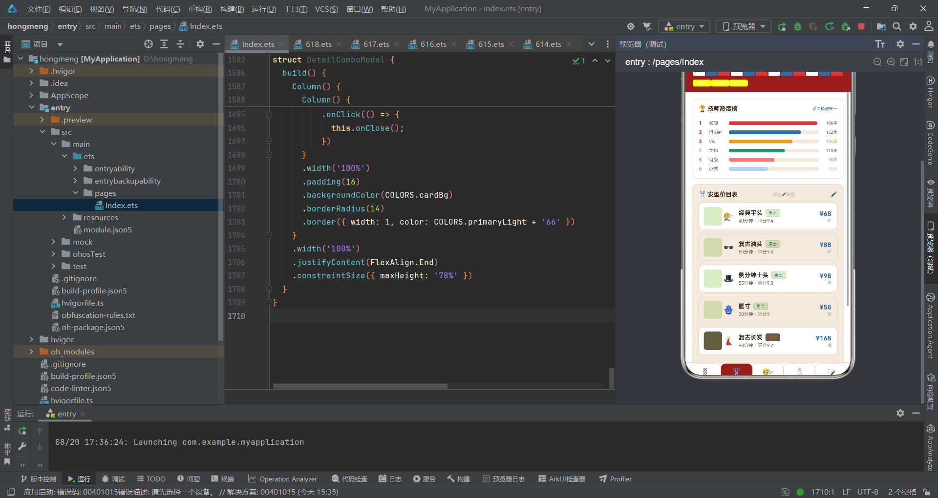
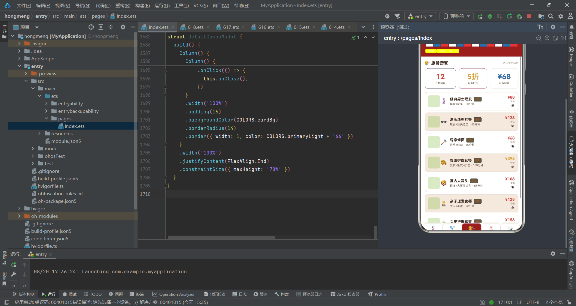
代码段 46:ComboContent 头部与统计行
@Component
struct ComboContent {
  @ObjectLink data: BarberData;
  onDetail: (n: string) => void = () => {};

  build() {
    Scroll() {
      Column() {
        Row() {
          Text('💇 服务套餐')
            .fontSize(15)
            .fontWeight(FontWeight.Bold)
            .fontColor(COLORS.textPrimary)
          Text('点击查看详情')
            .fontSize(9)
            .fontColor(COLORS.textHint)
            .margin({ left: 8 })
        }
        .width('100%')
        .justifyContent(FlexAlign.SpaceBetween)
        .margin({ bottom: 10 })

        Row() {
          Column() {
            Text('12')
              .fontSize(26)
              .fontWeight(FontWeight.Bold)
              .fontColor(COLORS.primary)
            Text('在售套餐')
              .fontSize(9)
              .fontColor(COLORS.textSecondary)
              .margin({ top: 2 })
          }
          .layoutWeight(1)
          .alignItems(HorizontalAlign.Center)
          .padding({ top: 14, bottom: 14 })
          .backgroundColor(COLORS.cardBg)
          .borderRadius(12)
          .border({ width: 1, color: COLORS.primary + '66' })
          Column() {
            Text('5折')
              .fontSize(26)
              .fontWeight(FontWeight.Bold)
              .fontColor(COLORS.warning)
            Text('最低折扣')
              .fontSize(9)
              .fontColor(COLORS.textSecondary)
              .margin({ top: 2 })
          }
          .layoutWeight(1)
          .alignItems(HorizontalAlign.Center)
          .padding({ top: 14, bottom: 14 })
          .backgroundColor(COLORS.cardBg)
          .borderRadius(12)
          .border({ width: 1, color: COLORS.warning + '66' })
          .margin({ left: 10 })
          Column() {
            Text('¥68')
              .fontSize(26)
              .fontWeight(FontWeight.Bold)
              .fontColor(COLORS.accent)
            Text('最低套餐')
              .fontSize(9)
              .fontColor(COLORS.textSecondary)
              .margin({ top: 2 })
          }
          .layoutWeight(1)
          .alignItems(HorizontalAlign.Center)
          .padding({ top: 14, bottom: 14 })
          .backgroundColor(COLORS.cardBg)
          .borderRadius(12)
          .border({ width: 1, color: COLORS.accent + '66' })
          .margin({ left: 10 })
        }
        .width('100%')
        .margin({ bottom: 12 })
ComboContent 的头部包含页面标题与一个三列统计行。统计行展示三个关键指标:在售套餐数(12)、最低折扣(5 折)、最低套餐价(¥68)。每个统计块用 26 号粗体大数字 + 9 号标签的双层结构,数字用不同语义色(primary 红、warning 黄、accent 蓝)区分指标类型,边框色与数字色联动。
这种"数字 + 标签 + 语义色"的统计看板是运营仪表盘的经典设计。三块等宽(layoutWeight 1)分布,margin left 10 留隙,padding 14 上下留白,形成紧凑而清晰的三宫格。统计行将套餐页的核心经营数据前置展示,经营者在浏览详细列表前即可把握全局。这种"先概览后明细"的信息架构,契合人类从宏观到微观的认知习惯。值得注意的是三个数字是硬编码字面量而非从 data 派生,这是因为它们是聚合统计值,在静态数据场景下直接写入比动态计算更清晰。
代码段 47:套餐列表项
        ForEach(this.data.combos, (c: ComboItem, i: number) => {
          Row() {
            Column()
              .width(42)
              .height(42)
              .justifyContent(FlexAlign.Center)
              .backgroundColor(COLORS.barberBlue + '22')
              .borderRadius(6)
            Text(c.emoji)
              .fontSize(18)
              .width(28)
              .textAlign(TextAlign.Center)
            Column() {
              Row() {
                Text(c.name)
                  .fontSize(13)
                  .fontWeight(FontWeight.Bold)
                  .fontColor(COLORS.textPrimary)
                BarberTag({ text: c.discount + '折', color: COLORS.danger })
                  .margin({ left: 6 })
              }
              .width('100%')
              Text(c.services + ' · ' + c.duration + '分钟')
                .fontSize(10)
                .fontColor(COLORS.textSecondary)
                .margin({ top: 3 })
            }
            .layoutWeight(1)
            .alignItems(HorizontalAlign.Start)
            .padding({ left: 8 })
            Column() {
              Text('¥' + c.price)
                .fontSize(14)
                .fontWeight(FontWeight.Bold)
              .fontColor(c.price >= 300 ? COLORS.warning : COLORS.primary)
              Text('详情')
                .fontSize(8)
                .fontColor(COLORS.textHint)
                .margin({ top: 2 })
              Text('👁️')
                .fontSize(12)
                .margin({ top: 3 })
                .onClick(() => {
                  this.onDetail(c.name);
                })
            }
            .alignItems(HorizontalAlign.End)
          }
          .width('100%')
          .padding({ left: 10, right: 12, top: 9, bottom: 9 })
          .backgroundColor(i % 2 === 0 ? COLORS.cardBg : COLORS.cardAlt)
          .borderRadius(10)
          .border({ width: 1, color: COLORS.line })
          .margin({ bottom: 8 })
        }, (c: ComboItem, i: number) => c.name + i)
套餐列表项采用与发型师、发型列表同构的三段式布局,但右侧区域有所不同——价格下方多了"详情"文字与👁️眼睛图标。discount 折扣标签用 danger 红色强调优惠力度,c.discount + '折' 直接拼接中文表达。价格区 c.price >= 300 ? warning : primary 使高价套餐(如 588 新娘造型)用黄色警示,低价套餐用红色吸引,通过颜色传达价格区间。
👁️ 图标的 onClick 调用 this.onDetail(c.name),将套餐名传递给父组件打开详情弹窗。这种"列表项内嵌详情入口"的设计,使用户无需跳转页面即可查看套餐详情,降低了操作层级。头像框统一用 barberBlue 蓝色背景,呼应套餐页的辅助色主题。services 字段拼接 duration 形成"理发+洗头 · 50分钟"的副信息,将服务内容与时长合并展示。整个列表项的信息层次清晰:图标-名称-折扣-内容-价格-详情,从左到右递进,符合从身份到细节的阅读逻辑。
十三、产品内容页
代码段 48:ProductContent 销量 TOP6
@Component
struct ProductContent {
  @ObjectLink data: BarberData;
  onDel: (n: string) => void = () => {};

  build() {
    Scroll() {
      Column() {
        Column() {
          Row() {
            Text('🧴 产品销量TOP6')
              .fontSize(13)
              .fontWeight(FontWeight.Bold)
              .fontColor(COLORS.textPrimary)
            Text('发油夺冠')
              .fontSize(9)
              .fontColor(COLORS.accent)
              .margin({ left: 8 })
          }
          .width('100%')
          .justifyContent(FlexAlign.SpaceBetween)
          .margin({ bottom: 10 })
          ForEach(PRODUCT_TOP, (p: ProductTopMeta, i: number) => {
            Row() {
              Text((i + 1) + '')
                .fontSize(11)
                .fontWeight(FontWeight.Bold)
                .fontColor(i < 3 ? COLORS.primary : COLORS.textHint)
                .width(22)
              Text(p.name)
                .fontSize(10)
                .fontColor(COLORS.textSecondary)
                .width(80)
              Row() {
                Row()
                  .layoutWeight(p.sales / 420)
                  .height(8)
                  .backgroundColor(p.color)
                  .borderRadius(3)
                Row()
                  .layoutWeight(1 - p.sales / 420)
                  .height(8)
                  .backgroundColor(COLORS.cardAlt)
                  .borderRadius(3)
              }
              .layoutWeight(1)
              .height(8)
              Text(p.sales + '件')
                .fontSize(9)
                .fontColor(p.color)
                .width(44)
                .textAlign(TextAlign.End)
            }
            .width('100%')
            .margin({ top: 7 })
          }, (p: ProductTopMeta, i: number) => p.name + i)
        }
ProductContent 的第一张卡片是产品销量 TOP6 排行榜,遍历 PRODUCT_TOP 常量渲染六行。结构与 HairContent 的技师热度榜高度同构——序号 + 名称 + 进度条 + 数量——这种排行榜模板的复用保证了全应用排名类视图的视觉统一。分母 420 是榜首销量,使第一名条恰好填满,其余按比例递减。
前三名序号用 primary 红色,后三名用 textHint 灰色,与热度榜的排名色逻辑一致。产品名固定宽 80,比热度榜的姓名宽(44),因为产品名更长(如"发油经典款")。进度条 color 由数据自带,从红渐变到淡蓝,与热度榜的色彩梯度策略一致。这张卡片边框用 success 绿(COLORS.success + '66'),与产品页的"绿色"主题色呼应——产品页的辅助色是绿色(getTypeColor 工具类返回绿色),通过边框色建立页面主题色的一致性。
代码段 49:产品列表头部与项
        Column() {
          Row() {
            Text('🛒 护理产品')
              .fontSize(13)
              .fontWeight(FontWeight.Bold)
              .fontColor(COLORS.textPrimary)
            Text('点击🗑️下架')
              .fontSize(9)
              .fontColor(COLORS.textHint)
              .margin({ left: 8 })
          }
          .width('100%')
          .justifyContent(FlexAlign.SpaceBetween)
          .margin({ bottom: 10 })
          ForEach(this.data.products, (p: ProductItem, i: number) => {
            Row() {
              Column()
                .width(40)
                .height(40)
                .justifyContent(FlexAlign.Center)
                .backgroundColor(getTypeColor(p.type) + '22')
                .borderRadius(6)
              Text(p.emoji)
                .fontSize(18)
                .width(28)
                .textAlign(TextAlign.Center)
              Column() {
                Row() {
                  Text(p.name)
                    .fontSize(13)
                    .fontWeight(FontWeight.Bold)
                    .fontColor(COLORS.textPrimary)
                  BarberTag({ text: p.type, color: getTypeColor(p.type) })
                    .margin({ left: 6 })
                }
                .width('100%')
                Text('¥' + p.price + ' · 已售' + p.sales + '件')
                  .fontSize(10)
                  .fontColor(COLORS.textSecondary)
                  .margin({ top: 3 })
              }
              .layoutWeight(1)
              .alignItems(HorizontalAlign.Start)
              .padding({ left: 8 })
              Column() {
                Text(p.stock > 30 ? '充足' : '告急')
                  .fontSize(10)
                  .fontWeight(FontWeight.Bold)
                  .fontColor(p.stock > 30 ? COLORS.success : COLORS.danger)
                Text('库存' + p.stock)
                  .fontSize(8)
                  .fontColor(COLORS.textHint)
                  .margin({ top: 2 })
                Text('🗑️')
                  .fontSize(12)
                  .margin({ top: 4 })
                  .onClick(() => {
                    this.onDel(p.name);
                  })
              }
              .alignItems(HorizontalAlign.End)
            }
            .width('100%')
            .padding({ left: 10, right: 12, top: 9, bottom: 9 })
            .backgroundColor(i % 2 === 0 ? COLORS.cardBg : COLORS.cardAlt)
            .borderRadius(10)
            .border({ width: 1, color: COLORS.line })
            .margin({ bottom: 8 })
          }, (p: ProductItem, i: number) => p.name + i)
产品列表项是全应用信息维度最丰富的列表项之一。右侧区域不再只是价格,而是库存状态 + 库存数 + 下架按钮的三层信息。p.stock > 30 ? '充足' : '告急' 将库存数值转化为语义标签,配合 success/danger 颜色形成红绿预警——这是将数据转化为运营决策信号的关键设计。🗑️ 下架按钮的 onClick 调用 onDel 传递产品名,打开删除确认弹窗。
头像框背景色由 getTypeColor 派生,使产品类型(造型/护理/工具)的颜色编码渗透到头像层。BarberTag 显示类型标签,颜色与头像框一致。副信息行将价格与销量合并展示(“¥68 · 已售420件”),让消费者与经营者在同一视图中获得所需信息。这种"消费视角 + 运营视角"信息融合的设计,使产品列表既是消费者购物入口,又是经营者库存看板,一卡两用,最大化了信息密度与界面效率。
代码段 50:ProductContent 容器收尾
        }
        .width('100%')
        .padding(14)
        .backgroundColor(COLORS.cardAlt)
        .borderRadius(12)
        .border({ width: 1, color: COLORS.line })
        .margin({ top: 12 })
      }
      .width('100%')
      .padding(14)
    }
    .width('100%')
    .constraintSize({ maxHeight: '100%' })
  }
}
ProductContent 容器收尾与其他内容组件同构。护理产品卡片以 cardAlt 米色底、line 边框。两张卡片——销量 TOP6 与护理产品列表——共同构成产品页。TOP6 卡片边框用 success 绿,呼应产品页绿色主题;护理产品卡片边框用 line,保持中性。
这种"页面有主题色、卡片边框呼应主题色"的设计,使每个标签页在视觉上有独特的色彩身份——发型师页红、发型页蓝、套餐页黄、产品页绿、评价页深红。这些主题色来自 TAB_LIST 中每个标签的 color 字段,虽然卡片边框色当前是硬编码而非从 TAB_LIST 派生,但色彩呼应的意图清晰。未来可重构为从当前标签的 color 动态生成边框色,进一步强化主题色的一致性。constraintSize maxHeight 100% 的滚动约束策略在所有内容页统一使用,保证了底部标签栏始终可见。
十四、评价内容页
代码段 51:ReviewContent 评价列表
@Component
struct ReviewContent {
  @ObjectLink data: BarberData;

  build() {
    Scroll() {
      Column() {
        Row() {
          Text('📝 顾客评价')
            .fontSize(15)
            .fontWeight(FontWeight.Bold)
            .fontColor(COLORS.textPrimary)
          Text('平均4.6分 · 共12条')
            .fontSize(9)
            .fontColor(COLORS.textHint)
            .margin({ left: 8 })
        }
        .width('100%')
        .justifyContent(FlexAlign.SpaceBetween)
        .margin({ bottom: 10 })

        ForEach(this.data.reviews, (r: ReviewItem, i: number) => {
          Column() {
            Row() {
              Column()
                .width(36)
                .height(36)
                .justifyContent(FlexAlign.Center)
                .backgroundColor(getTagColor(r.tag) + '22')
                .borderRadius(6)
              Text(r.emoji)
                .fontSize(15)
                .width(26)
                .textAlign(TextAlign.Center)
              Column() {
                Text(r.name)
                  .fontSize(12)
                  .fontWeight(FontWeight.Bold)
                  .fontColor(COLORS.textPrimary)
                Text('⭐'.repeat(Math.round(r.score)) + ' · ' + r.date)
                  .fontSize(9)
                  .fontColor(COLORS.warning)
                  .margin({ top: 2 })
              }
              .layoutWeight(1)
              .alignItems(HorizontalAlign.Start)
              .padding({ left: 8 })
              BarberTag({ text: r.tag, color: getTagColor(r.tag) })
            }
            .width('100%')
            Text(r.content)
              .fontSize(11)
              .fontColor(COLORS.textSecondary)
              .lineHeight(18)
              .width('100%')
              .margin({ top: 8 })
          }
          .width('100%')
          .padding(12)
          .backgroundColor(i % 2 === 0 ? COLORS.cardBg : COLORS.cardAlt)
          .borderRadius(12)
          .border({ width: 1, color: COLORS.line })
          .alignItems(HorizontalAlign.Start)
          .margin({ bottom: 8 })
          }, (r: ReviewItem, i: number) => r.name + i)
      }
      .width('100%')
      .padding(14)
    }
    .width('100%')
    .constraintSize({ maxHeight: '100%' })
  }
}
ReviewContent 是唯一不含操作回调的内容组件——它纯展示评价,无编辑/删除入口,反映了评价数据的只读性质。头部行展示"平均4.6分 · 共12条"的聚合信息,让消费者在浏览明细前把握整体口碑。评价项采用上下两段布局:上段是头像+昵称+星级+日期+标签的横向信息行,下段是评价正文。
星级通过 '⭐'.repeat(Math.round(r.score)) 动态生成——score 5 生成五颗星,score 4 生成四颗星,这种将数值转化为视觉符号的做法比纯数字更直观。warning 黄色用于星级,呼应"金光闪闪"的星级色彩心理。头像框背景色由 getTagColor 派生,使评价标签的情感色渗透到头像层。content 正文 lineHeight 18 保证多行文本的阅读舒适度。Column 的 alignItems(Start) 使正文左对齐。评价项用 12 号 padding 与 12 圆角,比列表项的 10 圆角略大,因为评价项是独立的"故事卡"而非列表行,更大的圆角增强了卡片的独立性。ReviewContent 虽无操作回调,但 @ObjectLink 仍保证了对 BarberData.reviews 的响应式引用,为未来"提交评价后实时刷新"预留了通路。
十五、弹窗组件——招聘发型师
代码段 52:AddBarberModal 头部
@Component
struct AddBarberModal {
  onClose: () => void = () => {};

  build() {
    Column() {
      Column() {
        Row() {
          Text('💈')
            .fontSize(26)
          Column() {
            Text('招聘发型师')
              .fontSize(16)
              .fontWeight(FontWeight.Bold)
              .fontColor(COLORS.textPrimary)
            Text('录入新成员资料')
              .fontSize(10)
              .fontColor(COLORS.textHint)
              .margin({ top: 2 })
          }
          .alignItems(HorizontalAlign.Start)
          .margin({ left: 10 })
          .layoutWeight(1)
          Text('✕')
            .fontSize(16)
            .fontColor(COLORS.textHint)
            .onClick(() => {
              this.onClose();
            })
        }
        .width('100%')
AddBarberModal 是"招聘发型师"弹窗组件。它不使用 @State,仅通过 onClose 回调与父组件通信——这种"无状态纯回调"的弹窗是轻量级模态的标准实现。头部行采用三段式:左侧大号 💈 图标(26 号字)、中部标题+副标题列、右侧✕关闭按钮。layoutWeight(1) 使标题列占据中间空间,✕ 按钮固定在行末。
"招聘发型师"主标题 + "录入新成员资料"副标题的双行设计,明确告知用户此弹窗的用途。✕ 关闭按钮的 onClick 调用 onClose,使弹窗消失。弹窗未自带遮罩层(无半透明黑色背景),而是直接以白色卡片呈现于底部——justifyContent(End) 使卡片贴底,constraintSize maxHeight 78% 限制弹窗高度不超过屏幕的 78%,顶部留出 22% 的空间让用户感知到弹窗是"从底部弹出"的,而非全屏覆盖。这种底部弹窗(bottom sheet)模式是移动端表单类弹窗的推荐交互,符合拇指操作 ergonomics。
代码段 53:AddBarberModal 表单行
        Row() {
          Text('姓名')
            .fontSize(11)
            .fontColor(COLORS.textSecondary)
            .width(70)
          Text('阿杰 · 理发师')
            .fontSize(12)
            .fontColor(COLORS.textPrimary)
            .layoutWeight(1)
        }
        .width('100%')
        .padding(12)
        .backgroundColor(COLORS.cardAlt)
        .borderRadius(10)
        .margin({ top: 14 })

        Row() {
          Text('擅长方向')
            .fontSize(11)
            .fontColor(COLORS.textSecondary)
            .width(70)
          Text('油头 · 圆寸 · 修面')
            .fontSize(12)
            .fontColor(COLORS.accent)
            .layoutWeight(1)
        }
        .width('100%')
        .padding(12)
        .backgroundColor(COLORS.cardAlt)
        .borderRadius(10)
        .margin({ top: 8 })
AddBarberModal 的表单由四行信息组成,每行采用"标签 + 值"的两列布局:左侧标签固定宽 70、灰色 11 号字;右侧值 layoutWeight(1) 占满剩余、12 号字。值文本的颜色根据业务语义变化——"阿杰 · 理发师"用 textPrimary 主文字色,"油头 · 圆寸 · 修面"用 accent 蓝色(擅长方向的强调色)。每行用 cardAlt 米色背景、10 圆角、padding 12 形成独立的表单胶囊块。
值得注意的是,这些表单值是静态文本而非可编辑输入框——这说明当前弹窗是展示型原型,展示招聘表单的字段结构而非接收真实输入。这种"表单即文档"的设计在原型阶段有其价值:它让经营者在提交真实数据前先确认表单的字段结构。后续接入真实输入时,只需将 Text 替换为 TextInput 组件即可,字段布局无需调整。margin top 14 用于首行(与头部留隙),8 用于后续行(行间紧凑),形成了表单的节奏感。
代码段 54:AddBarberModal 按钮区
        Text('✅ 新发型师需提交从业资质与作品集,试剪通过后正式排班。')
          .fontSize(10)
          .fontColor(COLORS.textHint)
          .width('100%')
          .margin({ top: 14 })

        Row() {
          Text('取消')
            .fontSize(13)
            .fontColor(COLORS.textSecondary)
            .layoutWeight(1)
            .textAlign(TextAlign.Center)
            .padding({ top: 11, bottom: 11 })
            .backgroundColor(COLORS.cardAlt)
            .borderRadius(10)
            .onClick(() => {
              this.onClose();
            })
          Text('确认入职')
            .fontSize(13)
            .fontWeight(FontWeight.Bold)
            .fontColor(COLORS.white)
            .layoutWeight(1)
            .textAlign(TextAlign.Center)
            .padding({ top: 11, bottom: 11 })
            .margin({ left: 10 })
            .backgroundColor(COLORS.primary)
            .borderRadius(10)
            .onClick(() => {
              this.onClose();
            })
        }
        .width('100%')
        .margin({ top: 16 })
按钮区上方有一条提示文本"✅ 新发型师需提交从业资质与作品集,试剪通过后正式排班",用 textHint 灰色 10 号字呈现,作为业务流程的补充说明。这种在操作按钮前嵌入流程提示的做法,降低了误操作风险——用户在点击确认前能读到入职的附加条件。
按钮区采用双按钮布局:左侧"取消"用 cardAlt 米底灰字、右侧"确认入职"用 primary 红底白字加粗。两按钮 layoutWeight(1) 等宽,margin left 10 留隙。textAlign Center 使文字居中,padding 11 保证按钮高度。这种"次级操作 + 主操作"的双按钮配色是弹窗的标准范式——次级操作低视觉权重、主操作高视觉权重,引导用户优先选择主操作。两个按钮的 onClick 都调用 onClose,因为在原型阶段取消与确认都仅关闭弹窗;真实实现时确认按钮应额外触发数据提交逻辑。整个弹窗的视觉风格——白底卡片、米色表单块、红蓝按钮——与主应用的色彩体系完全一致,保证了弹窗与主页面的视觉统一性。
十六、弹窗组件——编辑发型
代码段 55:EditHairModal 头部与表单
@Component
struct EditHairModal {
  onClose: () => void = () => {};

  build() {
    Column() {
      Column() {
        Row() {
          Text('✂️')
            .fontSize(26)
          Column() {
            Text('编辑发型价目')
              .fontSize(16)
              .fontWeight(FontWeight.Bold)
              .fontColor(COLORS.textPrimary)
            Text('调整价格与时长')
              .fontSize(10)
              .fontColor(COLORS.textHint)
              .margin({ top: 2 })
          }
          .alignItems(HorizontalAlign.Start)
          .margin({ left: 10 })
          .layoutWeight(1)
          Text('✕')
            .fontSize(16)
            .fontColor(COLORS.textHint)
            .onClick(() => {
              this.onClose();
            })
        }
        .width('100%')

        Row() {
          Text('发型名称')
            .fontSize(11)
            .fontColor(COLORS.textSecondary)
            .width(70)
          Text('复古油头 · 男士')
            .fontSize(12)
            .fontColor(COLORS.textPrimary)
            .layoutWeight(1)
        }
        .width('100%')
        .padding(12)
        .backgroundColor(COLORS.cardAlt)
        .borderRadius(10)
        .margin({ top: 14 })
EditHairModal 是"编辑发型价目"弹窗,结构与 AddBarberModal 高度同构——头部三段式 + 表单行 + 按钮。这种结构复用不仅体现在代码模式上,也体现在用户体验上:用户学会操作一个弹窗后,能本能地操作其他弹窗。✂️ 图标(26 号字)与"编辑发型价目"标题搭配,副标题"调整价格与时长"明确告知编辑范围。
表单首行"发型名称: 复古油头 · 男士"展示被编辑的对象身份,使经营者确认操作的是正确的发型。后续行展示"价格调整 ¥88 → ¥98"(用 warning 黄色强调涨价)、“服务时长 50→60 分钟”、“调价说明 含造型定型喷雾”(用 success 绿色表示增值)。这种"字段名 + 变更值 + 语义色"的表单设计,将价格调整的前后对比与原因一目了然地呈现。→ 箭头符号直观表达"从…变为…"的变更语义,比"原价88 现价98"更简洁。整个弹窗是展示型原型,值文本为静态而非可输入,但字段结构清晰,为后续接入真实编辑输入奠定了布局基础。
代码段 56:EditHairModal 变更表单与按钮
        Row() {
          Text('价格调整')
            .fontSize(11)
            .fontColor(COLORS.textSecondary)
            .width(70)
          Text('¥88 → ¥98')
            .fontSize(12)
            .fontColor(COLORS.warning)
            .layoutWeight(1)
        }
        .width('100%')
        .padding(12)
        .backgroundColor(COLORS.cardAlt)
        .borderRadius(10)
        .margin({ top: 8 })

        Row() {
          Text('服务时长')
            .fontSize(11)
            .fontColor(COLORS.textSecondary)
            .width(70)
          Text('50分钟 → 60分钟')
            .fontSize(12)
            .fontColor(COLORS.textPrimary)
            .layoutWeight(1)
        }
        .width('100%')
        .padding(12)
        .backgroundColor(COLORS.cardAlt)
        .borderRadius(10)
        .margin({ top: 8 })

        Row() {
          Text('调价说明')
            .fontSize(11)
            .fontColor(COLORS.textSecondary)
            .width(70)
          Text('含造型定型喷雾')
            .fontSize(12)
            .fontColor(COLORS.success)
            .layoutWeight(1)
        }
        .width('100%')
        .padding(12)
        .backgroundColor(COLORS.cardAlt)
        .borderRadius(10)
        .margin({ top: 8 })

        Text('⚠️ 调价后同步更新小程序与价目表海报,会员价按85折计算。')
          .fontSize(10)
          .fontColor(COLORS.textHint)
          .width('100%')
          .margin({ top: 14 })

        Row() {
          Text('取消')
            .fontSize(13)
            .fontColor(COLORS.textSecondary)
            .layoutWeight(1)
            .textAlign(TextAlign.Center)
            .padding({ top: 11, bottom: 11 })
            .backgroundColor(COLORS.cardAlt)
            .borderRadius(10)
            .onClick(() => {
              this.onClose();
            })
          Text('保存修改')
            .fontSize(13)
            .fontWeight(FontWeight.Bold)
            .fontColor(COLORS.white)
            .layoutWeight(1)
            .textAlign(TextAlign.Center)
            .padding({ top: 11, bottom: 11 })
            .margin({ left: 10 })
            .backgroundColor(COLORS.accent)
            .borderRadius(10)
            .onClick(() => {
              this.onClose();
            })
        }
        .width('100%')
        .margin({ top: 16 })
EditHairModal 的变更表单行展示了调价的关键信息:价格从¥88涨到¥98(warning 黄色警示)、时长从50增至60分钟、"含造型定型喷雾"作为调价理由(success 绿色表示增值)。提示文本"⚠️ 调价后同步更新小程序与价目表海报,会员价按85折计算"用 textHint 灰色呈现,传达调价的联动影响——这是将业务规则嵌入 UI 的做法,让经营者在操作时意识到变更的连锁后果。
按钮区的"保存修改"按钮用 accent 蓝色(而非 primary 红色),与 AddBarberModal 的红色"确认入职"形成色彩区分。这种主操作按钮的色彩差异化设计,使不同弹窗的主操作有独特的视觉身份——招聘用红(人事热情)、编辑用蓝(理性修改)、删除用红(警示)。两个按钮的 onClick 均调用 onClose,与原型阶段的设计一致。整个 EditHairModal 与 AddBarberModal 的结构同构性,再次印证了弹窗模板的可复用性——未来可提取一个 BaseModal 组件,接收标题、图标、表单配置、按钮配置作为参数,统一渲染。
十七、弹窗组件——删除产品确认
代码段 57:DeleteProductModal
@Component
struct DeleteProductModal {
  @Prop title: string;
  onClose: () => void = () => {};

  build() {
    Column() {
      Column() {
        Column() {
          Text('🗑️')
            .fontSize(34)
          Text('确认下架产品')
            .fontSize(16)
            .fontWeight(FontWeight.Bold)
            .fontColor(COLORS.textPrimary)
            .margin({ top: 10 })
          Text('「' + this.title + '」将从货架移除,会员积分兑换不受影响。')
            .fontSize(11)
            .fontColor(COLORS.textSecondary)
            .textAlign(TextAlign.Center)
            .width('100%')
            .margin({ top: 8 })
        }
        .width('100%')
        .alignItems(HorizontalAlign.Center)

        Row() {
          Text('取消')
            .fontSize(13)
            .fontColor(COLORS.textSecondary)
            .layoutWeight(1)
            .textAlign(TextAlign.Center)
            .padding({ top: 11, bottom: 11 })
            .backgroundColor(COLORS.cardAlt)
            .borderRadius(10)
            .onClick(() => {
              this.onClose();
            })
          Text('确认下架')
            .fontSize(13)
            .fontWeight(FontWeight.Bold)
            .fontColor(COLORS.white)
            .layoutWeight(1)
            .textAlign(TextAlign.Center)
            .padding({ top: 11, bottom: 11 })
            .margin({ left: 10 })
            .backgroundColor(COLORS.danger)
            .borderRadius(10)
            .onClick(() => {
              this.onClose();
            })
        }
        .width('100%')
        .margin({ top: 16 })
      }
      .width('100%')
      .padding(16)
      .backgroundColor(COLORS.cardBg)
      .borderRadius(14)
      .border({ width: 1, color: COLORS.danger + '66' })
    }
    .width('100%')
    .justifyContent(FlexAlign.End)
    .constraintSize({ maxHeight: '78%' })
  }
}
DeleteProductModal 是删除确认弹窗,与前两个弹窗的结构显著不同——它采用居中堆叠的提示型布局而非列表型表单。@Prop title: string 接收待删除产品名,这是 @Prop 而非 @ObjectLink,因为 title 是简单字符串值,只需单向传递无需响应式。大号🗑️图标(34 号字)+ "确认下架产品"标题 + 说明文本构成三层提示,说明文本动态拼接 this.title,使弹窗内容与触发上下文精确对应。
说明文本"「发油经典款」将从货架移除,会员积分兑换不受影响"不仅说明操作后果,还补充了"积分兑换不受影响"的业务规则,缓解用户对连带影响的担忧。这种在确认弹窗中补充业务规则的做法,体现了对用户心理的细致体察。按钮区"确认下架"用 danger 红色(与 primary 同色值),强化删除操作的警示性。整个弹窗以 danger 红 66 透明度边框环绕,从边框色到按钮色统一传递"危险操作"的视觉信号。这种"确认弹窗"是防误操作设计的标准组件,通过二次确认降低数据丢失风险。
十八、弹窗组件——套餐详情
代码段 58:DetailComboModal 头部与价格行
@Component
struct DetailComboModal {
  @Prop name: string;
  onClose: () => void = () => {};

  build() {
    Column() {
      Column() {
        Row() {
          Text('💇')
            .fontSize(26)
          Column() {
            Text('套餐详情')
              .fontSize(16)
              .fontWeight(FontWeight.Bold)
              .fontColor(COLORS.textPrimary)
            Text('套餐「' + this.name + '」')
              .fontSize(10)
              .fontColor(COLORS.textHint)
              .margin({ top: 2 })
          }
          .alignItems(HorizontalAlign.Start)
          .margin({ left: 10 })
          .layoutWeight(1)
          Text('✕')
            .fontSize(16)
            .fontColor(COLORS.textHint)
            .onClick(() => {
              this.onClose();
            })
        }
        .width('100%')

        Row() {
          Text('套餐价格')
            .fontSize(11)
            .fontColor(COLORS.textSecondary)
            .width(70)
          Text('¥128 · 折后¥102')
            .fontSize(12)
            .fontColor(COLORS.primary)
            .layoutWeight(1)
        }
        .width('100%')
        .padding(12)
        .backgroundColor(COLORS.cardAlt)
        .borderRadius(10)
        .margin({ top: 14 })
DetailComboModal 是套餐详情弹窗,@Prop name 接收套餐名。头部副标题动态拼接 this.name,使弹窗标题与触发套餐一致。首行表单展示"套餐价格: ¥128 · 折后¥102",用 primary 红色强调价格,同时展示原价与折后价,让消费者直观感受优惠力度。
这种"原价 · 折后价"的双价格展示是套餐营销的标准手法——折后价用红色吸引,原价作为参照锚点。¥102 的计算(128 × 0.8 = 102.4 取整)体现了 8 折的业务规则。整个弹窗是列表型表单,与 AddBarberModal、EditHairModal 同构,但内容是只读详情而非可编辑字段。弹窗边框用 primaryLight 红(COLORS.primaryLight + '66'),比 DeleteProductModal 的 danger 边框柔和,因为详情弹窗不含危险操作。这种通过边框色区分弹窗性质(信息 vs 危险)的设计,使用户在弹窗弹出的瞬间即可从边框色感知操作性质。
代码段 59:DetailComboModal 详情行与说明
        Row() {
          Text('包含服务')
            .fontSize(11)
            .fontColor(COLORS.textSecondary)
            .width(70)
          Text('理发+油头造型+定型')
            .fontSize(12)
            .fontColor(COLORS.textPrimary)
            .layoutWeight(1)
        }
        .width('100%')
        .padding(12)
        .backgroundColor(COLORS.cardAlt)
        .borderRadius(10)
        .margin({ top: 8 })

        Row() {
          Text('适用人群')
            .fontSize(11)
            .fontColor(COLORS.textSecondary)
            .width(70)
          Text('男士 · 中短发皆可')
            .fontSize(12)
            .fontColor(COLORS.warning)
            .layoutWeight(1)
        }
        .width('100%')
        .padding(12)
        .backgroundColor(COLORS.cardAlt)
        .borderRadius(10)
        .margin({ top: 8 })

        Column() {
          Text('服务说明')
            .fontSize(11)
            .fontColor(COLORS.textSecondary)
          Text('本套餐由资深发型师操作,含洗剪吹与油头造型教学,全程约60分钟。如选择烫染项目需另行补差。')
            .fontSize(12)
            .fontColor(COLORS.textPrimary)
            .lineHeight(20)
            .margin({ top: 8 })
        }
        .width('100%')
        .padding(12)
        .backgroundColor(COLORS.cardAlt)
        .borderRadius(10)
        .alignItems(HorizontalAlign.Start)
        .margin({ top: 8 })

        Text('💈 到店出示订单可免费享热毛巾服务。')
          .fontSize(10)
          .fontColor(COLORS.textHint)
          .width('100%')
          .margin({ top: 14 })

        Text('知道了')
          .fontSize(13)
          .fontWeight(FontWeight.Bold)
          .fontColor(COLORS.white)
          .width('100%')
          .textAlign(TextAlign.Center)
          .padding({ top: 11, bottom: 11 })
          .backgroundColor(COLORS.primary)
          .borderRadius(10)
          .margin({ top: 16 })
          .onClick(() => {
            this.onClose();
          })
DetailComboModal 的详情行依次展示包含服务、适用人群、服务说明。包含服务用 textPrimary 主文字色、适用人群用 warning 黄色(限制性条件的警示色)、服务说明用 Column 包裹多行文本,lineHeight 20 保证长文本的可读性。这种按字段语义分配颜色的策略,使消费者能从颜色快速识别哪些是服务内容、哪些是适用限制。
提示文本"💈 到店出示订单可免费享热毛巾服务"用 textHint 灰色呈现,作为增值福利的补充说明。按钮区只有一个"知道了"按钮(primary 红底白字),而非双按钮——因为详情弹窗是纯信息展示,无取消需求,单一确认按钮即可。这种"信息弹窗用单按钮、操作弹窗用双按钮"的设计规范,使用户从按钮数量即可感知弹窗的性质。整个 DetailComboModal 的字段结构(价格、服务、人群、说明、福利)为套餐提供了全方位的信息展示,帮助消费者在购买前充分了解套餐内容,降低购买后的预期落差。
十九、组件关系与数据流总览
状态中枢"] --> B{@State curTab} -----------------------^ Expecting 'AMP', 'COLON', 'PIPE', 'TESTSTR', 'DOWN', 'DEFAULT', 'NUM', 'COMMA', 'NODE_STRING', 'BRKT', 'MINUS', 'MULT', 'UNICODE_TEXT', got 'LINK_ID'
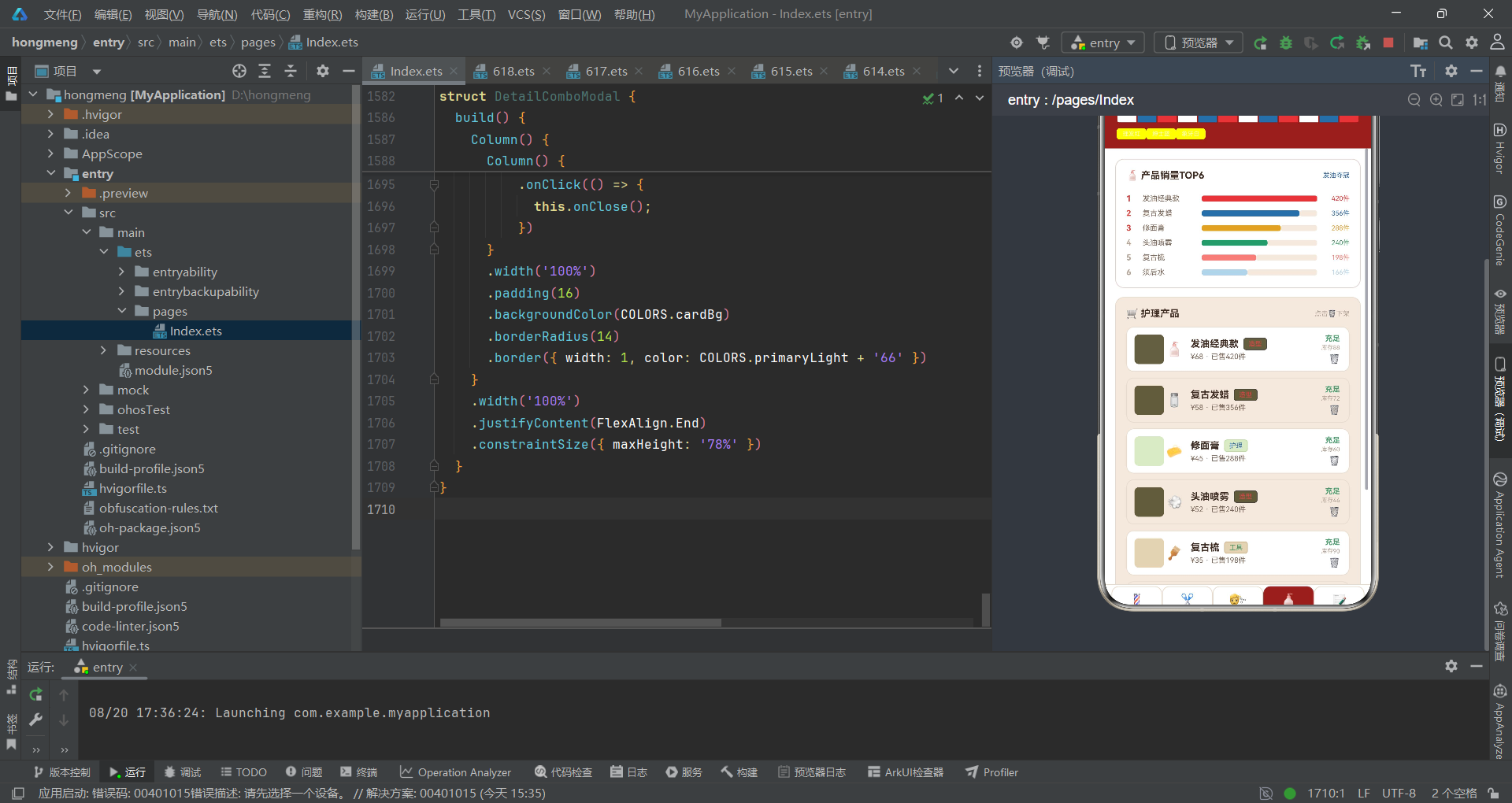
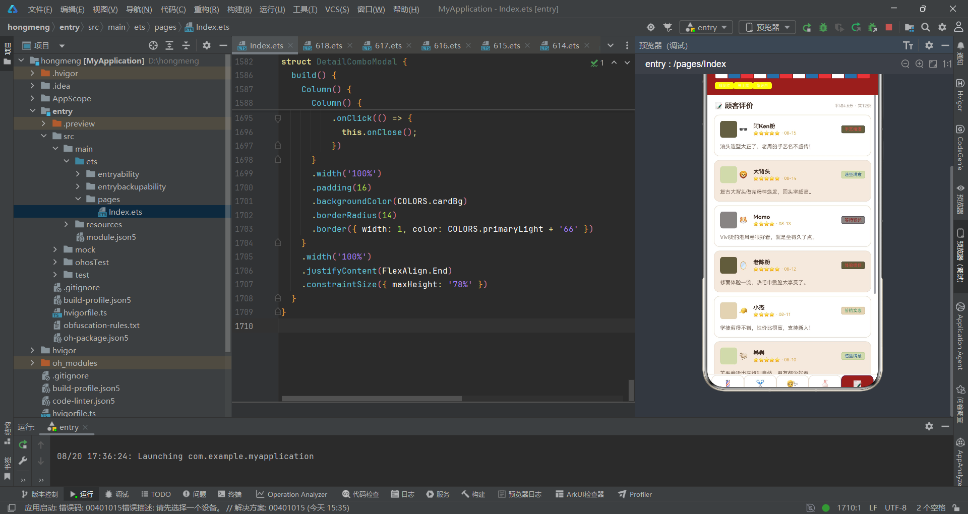
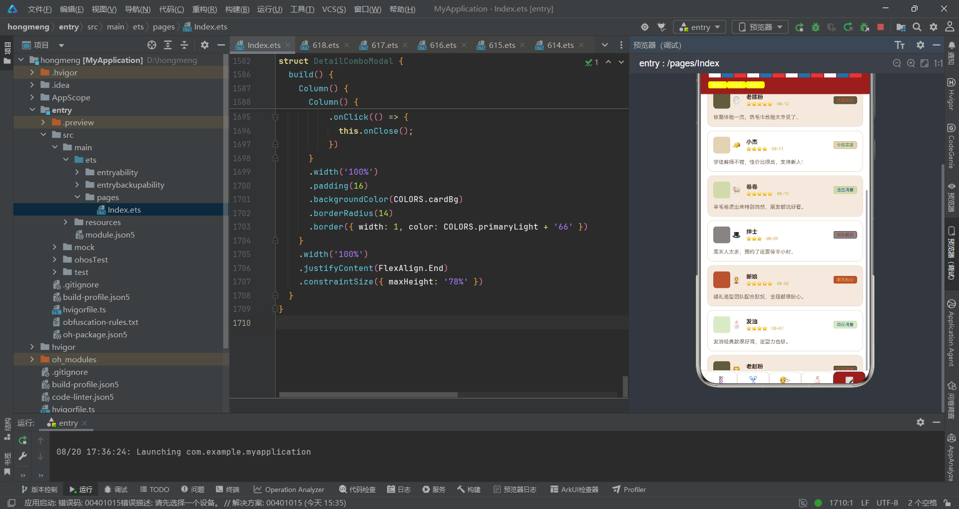
上图展示了应用的完整组件树与数据流向。BarberApp 作为根组件持有全部 @State,通过 @ObjectLink 将 BarberData 单向传递给五个内容组件。内容组件通过回调函数将用户操作事件回传给根组件,根组件再通过 show* 状态变量控制弹窗的显隐。BarberTag 作为原子组件被所有列表项复用。这种"根组件管状态、内容组件管渲染、弹窗组件管交互"的分层,形成了清晰的责任边界。
二十、状态管理与弹窗控制流
上图以招聘与下架两个典型流程为例,展示了"用户操作 → 内容组件回调 → 根组件状态变更 → 弹窗渲染 → 弹窗关闭回调 → 状态重置"的完整闭环。这一闭环是声明式 UI 状态驱动交互的精髓:开发者无需命令式地调用 show/hide,只需变更状态变量,框架自动处理组件树的增删与界面的更新。
二十一、色彩体系语义映射图
上图展示了色彩体系如何通过工具函数映射到业务语义。同一颜色在不同业务语境承担不同语义角色——primary 红既是品牌色、又是高评分色、又是正面评价色,这种"一色多义"的复用策略在小型应用中保持了色彩体系的精简与自洽。
技术对比总表
| 技术要点 | 实现方式 | 优势 | 适用场景 |
|---|---|---|---|
| 色彩体系 | BarberPalette 接口 + COLORS 常量 + 工具函数映射 | 语义化命名、全局一致、易于主题切换 | 需要统一视觉语言的中小型应用 |
| 状态容器 | @Observed class BarberData 集中持有全部业务数据 | 数据源单一、变更可追溯、子组件共享 | 数据结构稳定、跨组件共享的中型应用 |
| 响应式引用 | @ObjectLink 在内容子组件中引用根组件数据实例 | 自动刷新、零同步代码、引用共享 | 父子组件共享同一可观察对象的场景 |
| 单向属性 | @Prop 传递弹窗参数(title/name) | 只读安全、轻量、避免子组件误改父状态 | 纯展示型子组件接收简单值 |
| 页面路由 | if-else 链 + curTab @State 枚举切换 | 简单直观、无路由库依赖、状态可追溯 | 标签页数量固定(5个以内)的应用 |
| 弹窗控制 | show* 布尔 @State + if 条件渲染 | 声明式显隐、无命令式调用、自动增删组件树 | 弹窗数量可控(10个以内)的应用 |
| 父子通信 | 子组件回调注入 + 父组件管理状态 | 控制反转、状态单一入口、子组件无状态依赖 | 需要子组件触发父组件操作的场景 |
| 列表渲染 | ForEach + 数据驱动 + 键值生成器 | 自动 diff、高效更新、配置即渲染 | 任意可迭代数据源的列表展示 |
| 柱状图 | 纯 UI 元素 Column + height 数值映射 | 无图表库依赖、轻量、高度定制 | 数据量小(10项以内)的简单图表 |
| 进度条 | 双 Row layoutWeight 权重拼接 | 无需计算像素、自动比例分配、响应式 | 占比类数据的横向可视化 |
| 原子组件 | @Component struct BarberTag 复用 | 统一风格、一处修改全局生效、降低重复 | 被多处复用的细粒度展示单元 |
| 斑马线列表 | i % 2 === 0 三元运算交替背景色 | 视觉行区分、实现极简、无性能损耗 | 长列表需辅助视线定位的场景 |
| 语义色编码 | 工具函数按业务阈值返回不同色值 | 信息可视化、降低认知成本、色彩即语言 | 需按数值/类别区分视觉强调的场景 |
| 动画交互 | @State 布尔翻转 + animation 修饰器自动插值 | 声明式动画、无需手动控制帧、自然过渡 | 简单的状态切换类交互动画 |
| 底部弹窗 | justifyContent End + constraintSize 78% | 拇指友好、非全屏覆盖、层次清晰 | 表单类与确认类模态对话框 |
| emoji 图标 | Text 组件直接渲染 emoji 字符 | 零资源开销、跨平台、自带彩色与语义 | 轻量原型与无需品牌定制的图标场景 |
| 阈值变色 | 数值比较三元运算切换颜色 | 业务规则即视觉、一眼可辨关键信息 | 库存预警、评分分级、价格区间标注 |
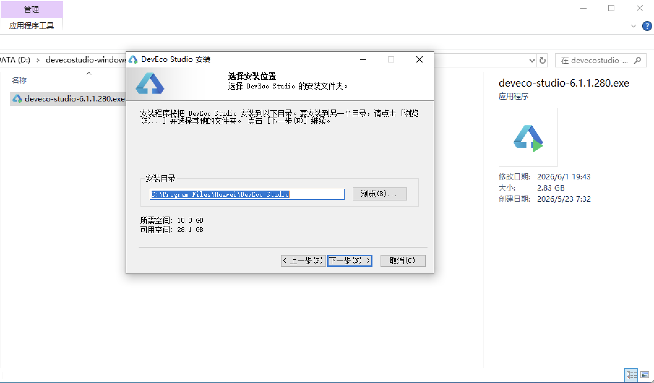
安装DevEco Studio程序
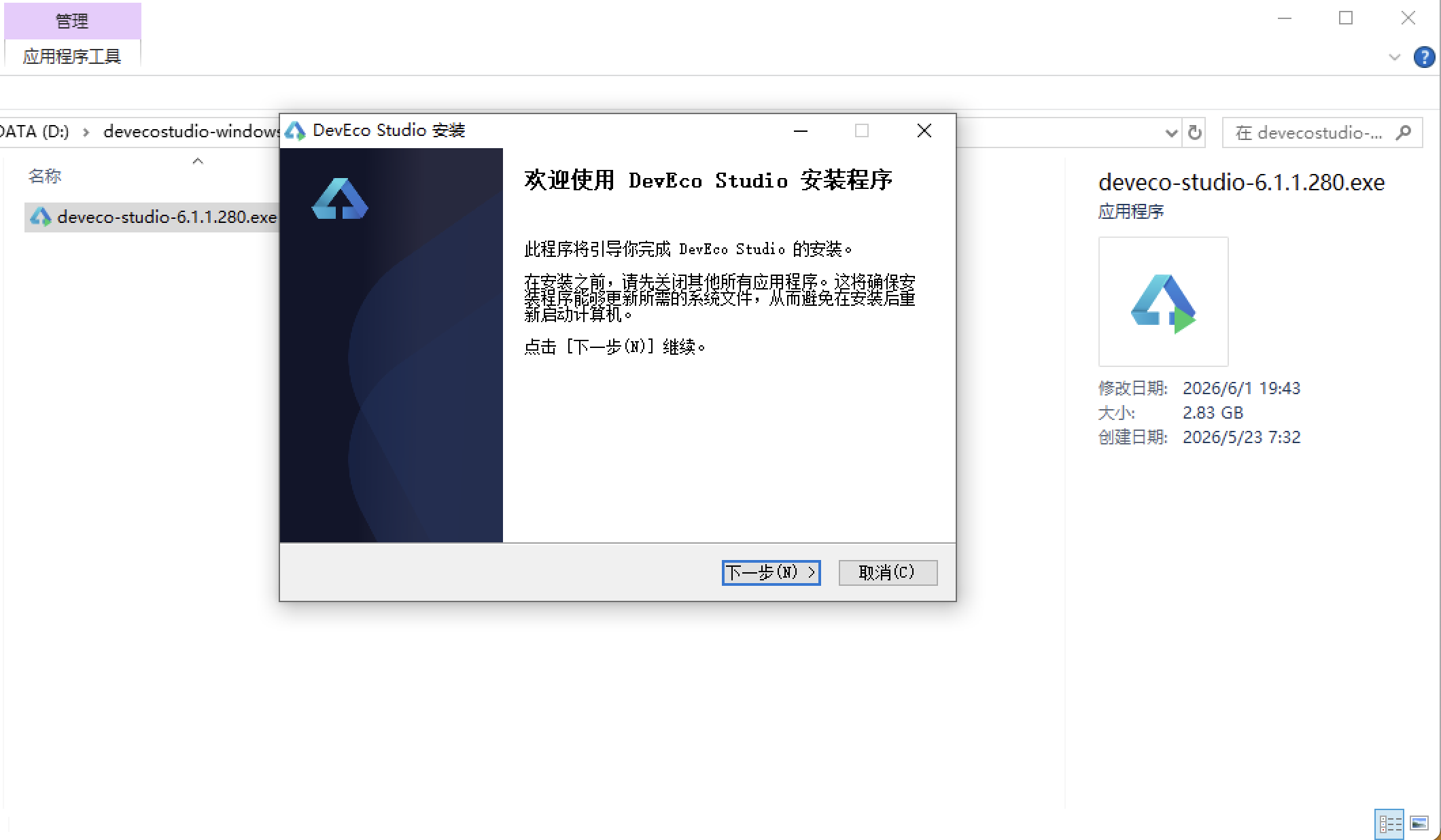
选择目标安装目录:
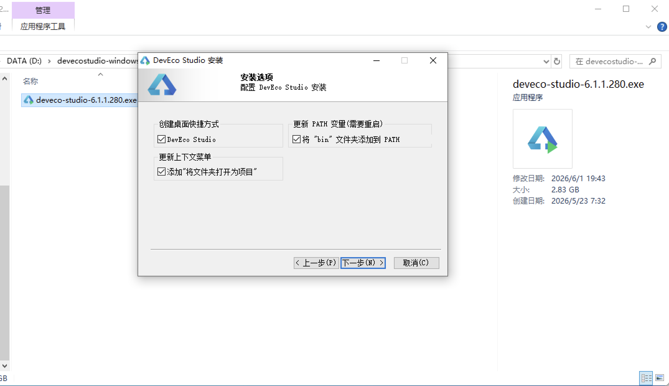
设置环境变量,但是需要重启一下:
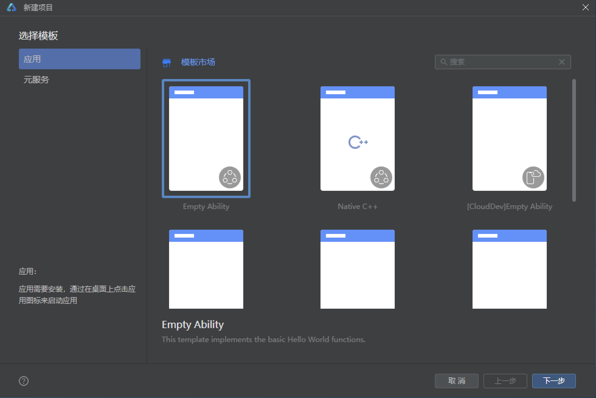
新建一个空白模板:
设置API为24的模板项目: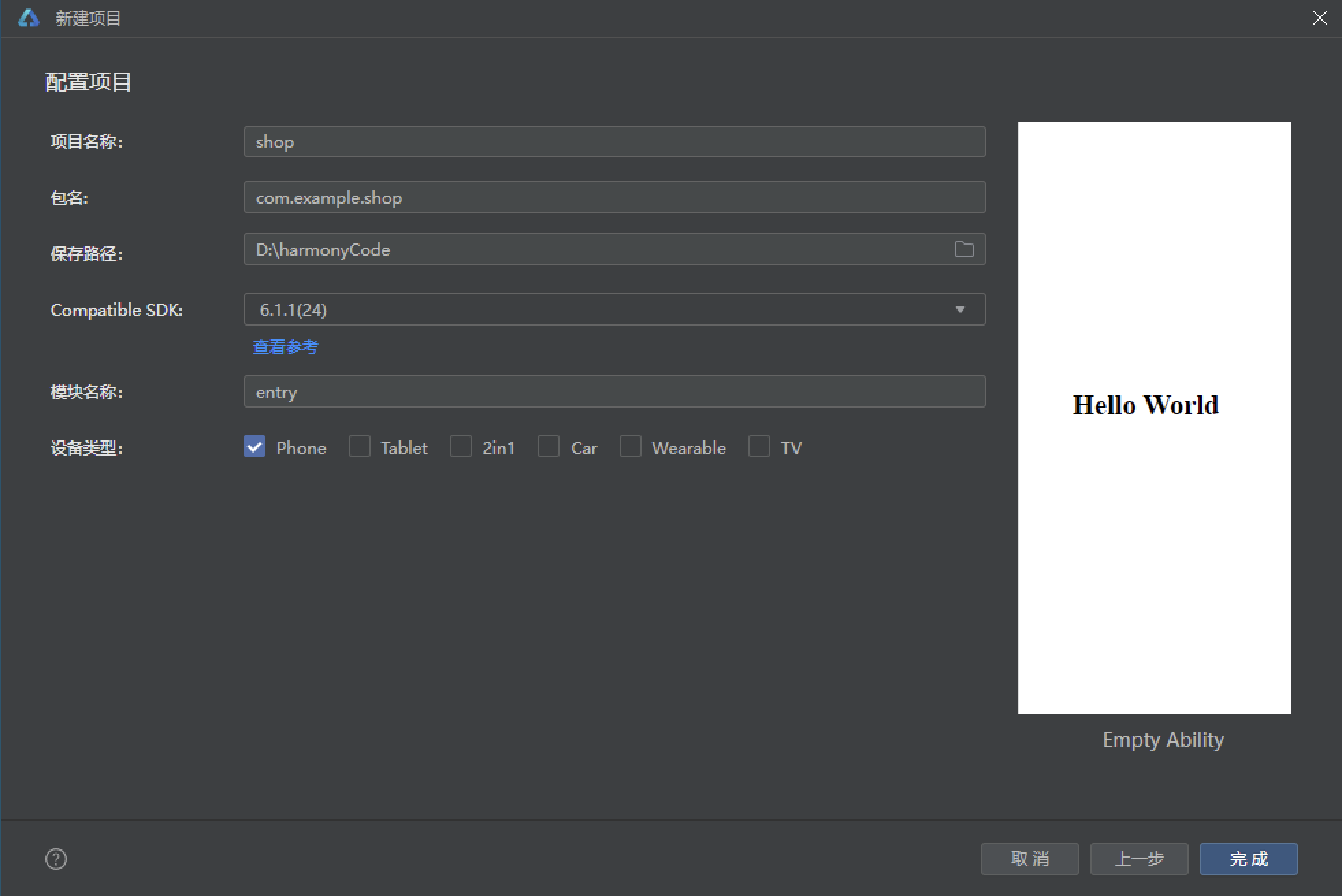
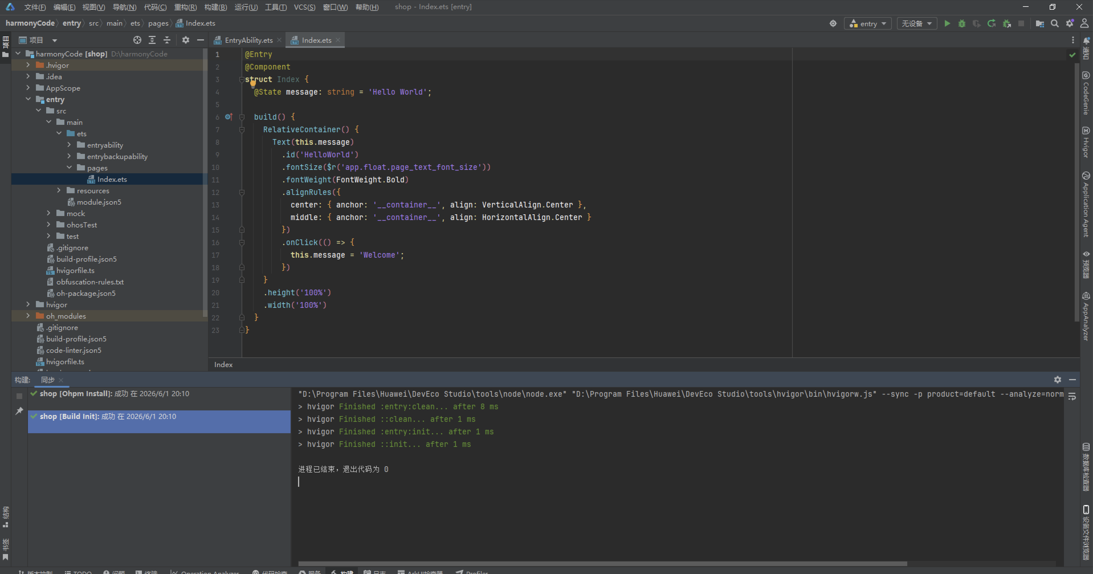
初始化项目,自动下载相关依赖:
完整代码:
interface BarberPalette {
primary: string;
primaryLight: string;
primaryDark: string;
accent: string;
accentLight: string;
bg: string;
cardBg: string;
cardAlt: string;
textPrimary: string;
textSecondary: string;
textHint: string;
border: string;
line: string;
success: string;
warning: string;
danger: string;
white: string;
barberRed: string;
barberBlue: string;
}
const COLORS: BarberPalette = {
primary: '#D64541',
primaryLight: '#E8837C',
primaryDark: '#8E2A22',
accent: '#3B6EA5',
accentLight: '#B7D4E8',
bg: '#FAF6F0',
cardBg: '#FFFFFF',
cardAlt: '#F3E9DE',
textPrimary: '#3D2B22',
textSecondary: '#7D6A5D',
textHint: '#B3A396',
border: '#EADFD2',
line: '#E8DCCE',
success: '#4C9A6E',
warning: '#D9A441',
danger: '#D64541',
white: '#FFFFFF',
barberRed: '#D64541',
barberBlue: '#3B6EA5'
};
enum BarberTab {
BARBER = 0,
HAIR = 1,
COMBO = 2,
PRODUCT = 3,
REVIEW = 4
}
interface TabMeta {
key: string;
icon: string;
label: string;
color: string;
}
const TAB_LIST: TabMeta[] = [
{ key: 'barber', icon: '💈', label: '发型师', color: '#D64541' },
{ key: 'hair', icon: '✂️', label: '发型', color: '#3B6EA5' },
{ key: 'combo', icon: '💇', label: '套餐', color: '#D9A441' },
{ key: 'product', icon: '🧴', label: '产品', color: '#4C9A6E' },
{ key: 'review', icon: '📝', label: '评价', color: '#8E2A22' }
];
const STRIPE_COL: number[] = [0, 1, 2, 3, 4, 5, 6, 7, 8, 9, 10, 11];
interface BarberItem {
name: string;
title: string;
years: number;
rating: number;
orders: number;
emoji: string;
}
interface HairItem {
name: string;
gender: string;
price: number;
duration: number;
rating: number;
emoji: string;
}
interface ComboItem {
name: string;
price: number;
duration: number;
services: string;
discount: number;
emoji: string;
}
interface ProductItem {
name: string;
type: string;
price: number;
sales: number;
stock: number;
emoji: string;
}
interface ReviewItem {
name: string;
score: number;
date: string;
content: string;
tag: string;
emoji: string;
}
interface WeekMeta {
day: string;
value: number;
}
interface HairMeta {
name: string;
count: number;
color: string;
}
interface BarberHotMeta {
name: string;
orders: number;
color: string;
}
interface ProductTopMeta {
name: string;
sales: number;
color: string;
}
const WEEK_ORDER: WeekMeta[] = [
{ day: '周一', value: 18 },
{ day: '周二', value: 22 },
{ day: '周三', value: 20 },
{ day: '周四', value: 26 },
{ day: '周五', value: 34 },
{ day: '周六', value: 56 },
{ day: '周日', value: 48 }
];
const HAIR_SHARE: HairMeta[] = [
{ name: '经典短发', count: 4, color: '#D64541' },
{ name: '油头', count: 3, color: '#3B6EA5' },
{ name: '复古长发', count: 2, color: '#D9A441' },
{ name: '卷发造型', count: 2, color: '#4C9A6E' },
{ name: '染烫', count: 1, color: '#E8837C' }
];
const BARBER_HOT: BarberHotMeta[] = [
{ name: '老周', orders: 186, color: '#D64541' },
{ name: '阿Ken', orders: 152, color: '#3B6EA5' },
{ name: 'Vivi', orders: 134, color: '#D9A441' },
{ name: '大伟', orders: 118, color: '#4C9A6E' },
{ name: '阿豪', orders: 96, color: '#E8837C' },
{ name: '小茜', orders: 82, color: '#B7D4E8' }
];
const PRODUCT_TOP: ProductTopMeta[] = [
{ name: '发油经典款', sales: 420, color: '#D64541' },
{ name: '复古发蜡', sales: 356, color: '#3B6EA5' },
{ name: '修面膏', sales: 288, color: '#D9A441' },
{ name: '头油喷雾', sales: 240, color: '#4C9A6E' },
{ name: '复古梳', sales: 198, color: '#E8837C' },
{ name: '须后水', sales: 166, color: '#B7D4E8' }
];
@Observed
export class BarberData {
barbers: BarberItem[] = [
{ name: '老周', title: '首席发型师', years: 22, rating: 9.7, orders: 186, emoji: '🧔' },
{ name: '阿Ken', title: '复古油头专家', years: 12, rating: 9.4, orders: 152, emoji: '🕶️' },
{ name: 'Vivi', title: '烫染总监', years: 10, rating: 9.2, orders: 134, emoji: '💇♀️' },
{ name: '大伟', title: '修面大师', years: 15, rating: 9.5, orders: 118, emoji: '🪒' },
{ name: '阿豪', title: '造型师', years: 6, rating: 8.9, orders: 96, emoji: '✂️' },
{ name: '小茜', title: '助理造型师', years: 3, rating: 8.6, orders: 82, emoji: '🌸' },
{ name: '老赵', title: '理发师', years: 18, rating: 9.3, orders: 108, emoji: '👴' },
{ name: 'Kiko', title: '烫染师', years: 5, rating: 8.8, orders: 88, emoji: '🎨' },
{ name: '阿伦', title: '理发师', years: 8, rating: 9.0, orders: 104, emoji: '💈' },
{ name: 'Momo', title: '造型师', years: 4, rating: 8.7, orders: 74, emoji: '🐱' },
{ name: '老陈', title: '修面师', years: 20, rating: 9.6, orders: 96, emoji: '🪞' },
{ name: '小杰', title: '学徒', years: 1, rating: 8.2, orders: 42, emoji: '🧢' }
];
hairs: HairItem[] = [
{ name: '经典平头', gender: '男士', price: 68, duration: 40, rating: 9.4, emoji: '💇' },
{ name: '复古油头', gender: '男士', price: 88, duration: 50, rating: 9.6, emoji: '🕶️' },
{ name: '侧分绅士头', gender: '男士', price: 98, duration: 55, rating: 9.3, emoji: '🎩' },
{ name: '圆寸', gender: '男士', price: 58, duration: 30, rating: 9.0, emoji: '🪬' },
{ name: '复古长发', gender: '女士', price: 168, duration: 90, rating: 9.2, emoji: '💃' },
{ name: '港风卷发', gender: '女士', price: 228, duration: 120, rating: 9.1, emoji: '🌊' },
{ name: '短烫发', gender: '女士', price: 198, duration: 100, rating: 8.9, emoji: '🎀' },
{ name: '羊毛卷', gender: '女士', price: 258, duration: 130, rating: 9.0, emoji: '🐑' },
{ name: '大背头', gender: '男士', price: 78, duration: 45, rating: 9.2, emoji: '🦁' },
{ name: '复古齐肩', gender: '女士', price: 148, duration: 80, rating: 8.8, emoji: '🌸' },
{ name: '纹身理发', gender: '男士', price: 128, duration: 70, rating: 9.5, emoji: '🎯' },
{ name: '英伦短发', gender: '中性', price: 88, duration: 50, rating: 8.9, emoji: '🇬🇧' }
];
combos: ComboItem[] = [
{ name: '经典男士理发', price: 88, duration: 50, services: '理发+洗头', discount: 8, emoji: '💈' },
{ name: '油头造型套餐', price: 128, duration: 60, services: '理发+油头造型', discount: 8, emoji: '🕶️' },
{ name: '尊享修面', price: 68, duration: 40, services: '热敷+修面', discount: 9, emoji: '🪒' },
{ name: '烫染护理套餐', price: 398, duration: 180, services: '烫发+染发+护理', discount: 7, emoji: '🎨' },
{ name: '复古大背头', price: 108, duration: 55, services: '理发+大背头造型', discount: 8, emoji: '🦁' },
{ name: '亲子理发套餐', price: 128, duration: 70, services: '大人+小孩', discount: 8, emoji: '👨👦' },
{ name: '头皮护理套餐', price: 158, duration: 60, services: '深层清洁+护理', discount: 8, emoji: '🧖' },
{ name: '新娘造型套餐', price: 588, duration: 240, services: '洗剪吹+盘发+化妆', discount: 7, emoji: '👰' },
{ name: '男士修容套餐', price: 98, duration: 50, services: '理发+修眉+修面', discount: 8, emoji: '🧑' },
{ name: '染发套餐', price: 298, duration: 150, services: '染发+护理', discount: 7, emoji: '🌈' },
{ name: '理发月卡', price: 399, duration: 999, services: '每月4次理发', discount: 6, emoji: '📅' },
{ name: '白金年卡', price: 3688, duration: 999, services: '全年不限次', discount: 5, emoji: '👑' }
];
products: ProductItem[] = [
{ name: '发油经典款', type: '造型', price: 68, sales: 420, stock: 88, emoji: '🧴' },
{ name: '复古发蜡', type: '造型', price: 58, sales: 356, stock: 72, emoji: '🫙' },
{ name: '修面膏', type: '护理', price: 45, sales: 288, stock: 60, emoji: '🧼' },
{ name: '头油喷雾', type: '造型', price: 52, sales: 240, stock: 46, emoji: '💨' },
{ name: '复古梳', type: '工具', price: 35, sales: 198, stock: 90, emoji: '🪮' },
{ name: '须后水', type: '护理', price: 88, sales: 166, stock: 34, emoji: '🍾' },
{ name: '发胶定型', type: '造型', price: 48, sales: 310, stock: 66, emoji: '🧴' },
{ name: '洗发水', type: '护理', price: 98, sales: 220, stock: 40, emoji: '🛁' },
{ name: '护发素', type: '护理', price: 78, sales: 188, stock: 38, emoji: '💧' },
{ name: '剃须刀', type: '工具', price: 128, sales: 142, stock: 24, emoji: '🪒' },
{ name: '理发围布', type: '工具', price: 39, sales: 96, stock: 50, emoji: '🦺' },
{ name: '吹风机', type: '工具', price: 199, sales: 84, stock: 16, emoji: '💨' }
];
reviews: ReviewItem[] = [
{ name: '阿Ken粉', score: 5, date: '08-15', content: '油头造型太正了,老周的手艺名不虚传!', tag: '手艺精湛', emoji: '🕶️' },
{ name: '大背头', score: 5, date: '08-14', content: '复古大背头做完精神焕发,回头率超高。', tag: '造型满意', emoji: '🦁' },
{ name: 'Momo', score: 4, date: '08-13', content: 'Vivi烫的港风卷很好看,就是坐得久了点。', tag: '等待较长', emoji: '🐱' },
{ name: '老陈粉', score: 5, date: '08-12', content: '修面体验一流,热毛巾敷脸太享受了。', tag: '体验极佳', emoji: '🪞' },
{ name: '小杰', score: 4, date: '08-11', content: '学徒剪得不错,性价比很高,支持新人!', tag: '价格实惠', emoji: '🧢' },
{ name: '卷卷', score: 5, date: '08-10', content: '羊毛卷烫出来特别自然,朋友都说好看。', tag: '造型满意', emoji: '🐑' },
{ name: '绅士', score: 3, date: '08-09', content: '周末人太多,预约了还要等半小时。', tag: '排队较长', emoji: '🎩' },
{ name: '新娘', score: 5, date: '08-08', content: '婚礼造型团队配合默契,全程都很贴心。', tag: '服务贴心', emoji: '👰' },
{ name: '发油', score: 4, date: '08-07', content: '发油经典款很好闻,定型力也够。', tag: '商品满意', emoji: '🧴' },
{ name: '老赵粉', score: 5, date: '08-06', content: '老赵剪了几十年了,闭着眼睛都知道怎么剪。', tag: '手艺精湛', emoji: '👴' },
{ name: '油头', score: 5, date: '08-05', content: '复古氛围拉满,理发店装潢拍照超出片。', tag: '氛围满分', emoji: '📷' },
{ name: '光头', score: 4, date: '08-04', content: '圆寸剃得很干净利落,下次还来。', tag: '造型满意', emoji: '🪬' }
];
}
function getGenderColor(gender: string): string {
if (gender === '男士') {
return '#3B6EA5';
} else if (gender === '女士') {
return '#D64541';
}
return '#D9A441';
}
function getTypeColor(type: string): string {
if (type === '造型') {
return '#D64541';
} else if (type === '护理') {
return '#3B6EA5';
}
return '#4C9A6E';
}
function getRatingColor(rating: number): string {
if (rating >= 9.5) {
return '#D64541';
} else if (rating >= 9.0) {
return '#D9A441';
}
return '#3B6EA5';
}
function getTagColor(tag: string): string {
if (tag === '手艺精湛' || tag === '体验极佳' || tag === '氛围满分') {
return '#D64541';
} else if (tag === '造型满意' || tag === '商品满意') {
return '#3B6EA5';
} else if (tag === '服务贴心') {
return '#D9A441';
} else if (tag === '排队较长' || tag === '等待较长') {
return '#8E2A22';
}
return '#4C9A6E';
}
@Entry
@Component
struct BarberApp {
@State curTab: number = 0;
@State data: BarberData = new BarberData();
@State showAddBarber: boolean = false;
@State showEditHair: boolean = false;
@State showDeleteProduct: boolean = false;
@State showDetail: boolean = false;
@State delProductName: string = '';
@State detailComboName: string = '';
@State poleSpin: boolean = false;
@State scissorCut: boolean = false;
@Builder modalOverlay(onClose: () => void) {
Column() {
Text('')
.width(0)
.height(0)
.opacity(0)
Button('')
.width(1)
.height(1)
.opacity(0)
.onClick(() => {
onClose();
})
}
.width(1)
.height(1)
}
build() {
Column() {
Column() {
Column() {
Row() {
Column() {
Text('💈 复古理发店')
.fontSize(20)
.fontWeight(FontWeight.Bold)
.fontColor(COLORS.white)
Text('Retro Barbershop · 老派手艺')
.fontSize(10)
.fontColor('#FFFFFFCC')
.margin({ top: 3 })
}
.alignItems(HorizontalAlign.Start)
.layoutWeight(1)
Row() {
Text('💈')
.fontSize(20)
.onClick(() => {
this.poleSpin = !this.poleSpin;
})
.rotate({ angle: this.poleSpin ? 360 : 0 })
.animation({ duration: 1000, curve: Curve.Linear })
Text('✂️')
.fontSize(18)
.margin({ left: 10 })
.onClick(() => {
this.scissorCut = !this.scissorCut;
})
.rotate({ angle: this.scissorCut ? -25 : 15 })
.animation({ duration: 300, curve: Curve.EaseInOut })
Text('🪒')
.fontSize(16)
.margin({ left: 6 })
}
.padding({ left: 10, right: 10, top: 6, bottom: 6 })
.backgroundColor('#FFFFFF26')
.borderRadius(8)
.border({ width: 1, color: '#FFFFFF40' })
}
.width('100%')
Column() {
Row() {
ForEach(STRIPE_COL, (c: number) => {
Column()
.layoutWeight(1)
.height(14)
.backgroundColor(c % 3 === 0 ? COLORS.barberRed : c % 3 === 1 ? COLORS.white : COLORS.barberBlue)
.margin({ left: 1, right: 1 })
}, (c: number) => 'stripeA' + c)
}
.width('100%')
.height(14)
.borderRadius(4)
.clip(true)
Row() {
ForEach(STRIPE_COL, (c: number) => {
Column()
.layoutWeight(1)
.height(10)
.backgroundColor(c % 3 === 2 ? COLORS.barberRed : c % 3 === 0 ? COLORS.white : COLORS.barberBlue)
.margin({ left: 1, right: 1 })
}, (c: number) => 'stripeB' + c)
}
.width('100%')
.height(10)
.margin({ top: 3 })
.borderRadius(4)
.clip(true)
}
.width('100%')
.margin({ top: 10 })
Row() {
Text('理发红')
.fontSize(8)
.fontColor('#FFFFFFCC')
.padding({ left: 8, right: 8, top: 3, bottom: 3 })
.backgroundColor('#FFFFFF2E')
.borderRadius(4)
Text('绅士蓝')
.fontSize(8)
.fontColor('#FFFFFFCC')
.padding({ left: 8, right: 8, top: 3, bottom: 3 })
.backgroundColor('#FFFFFF2E')
.borderRadius(4)
Text('象牙白')
.fontSize(8)
.fontColor('#FFFFFFCC')
.padding({ left: 8, right: 8, top: 3, bottom: 3 })
.backgroundColor('#FFFFFF2E')
.borderRadius(4)
}
.width('100%')
.margin({ top: 8 })
}
.width('100%')
.padding({ left: 16, right: 16, top: 12, bottom: 12 })
.backgroundColor(COLORS.primaryDark)
if (this.curTab === BarberTab.BARBER) {
BarberContent({ data: this.data, onAdd: () => {
this.showAddBarber = true;
} })
} else if (this.curTab === BarberTab.HAIR) {
HairContent({ data: this.data, onEdit: () => {
this.showEditHair = true;
} })
} else if (this.curTab === BarberTab.COMBO) {
ComboContent({ data: this.data, onDetail: (n: string) => {
this.detailComboName = n;
this.showDetail = true;
} })
} else if (this.curTab === BarberTab.PRODUCT) {
ProductContent({ data: this.data, onDel: (n: string) => {
this.delProductName = n;
this.showDeleteProduct = true;
} })
} else {
ReviewContent({ data: this.data })
}
}
.width('100%')
.height('100%')
Row() {
ForEach(TAB_LIST, (t: TabMeta) => {
Column() {
Text(t.icon)
.fontSize(19)
Text(t.label)
.fontSize(10)
.fontColor(this.curTab === TAB_LIST.indexOf(t) ? COLORS.white : COLORS.textHint)
.fontWeight(this.curTab === TAB_LIST.indexOf(t) ? FontWeight.Bold : FontWeight.Normal)
.margin({ top: 2 })
}
.layoutWeight(1)
.justifyContent(FlexAlign.Center)
.padding({ top: 8, bottom: 8 })
.backgroundColor(this.curTab === TAB_LIST.indexOf(t) ? COLORS.primaryDark : COLORS.cardBg)
.borderRadius(10)
.border(this.curTab === TAB_LIST.indexOf(t) ? { width: 1, color: t.color + '88' } : { width: 1, color: COLORS.line })
.onClick(() => {
this.curTab = TAB_LIST.indexOf(t);
})
}, (t: TabMeta) => t.key)
}
.width('100%')
.height(60)
.padding({ left: 8, right: 8 })
.backgroundColor(COLORS.cardBg)
.border({ width: 1, color: COLORS.line })
if (this.showAddBarber) {
AddBarberModal({
onClose: () => {
this.showAddBarber = false;
}
})
}
if (this.showEditHair) {
EditHairModal({
onClose: () => {
this.showEditHair = false;
}
})
}
if (this.showDeleteProduct) {
DeleteProductModal({
title: this.delProductName, onClose: () => {
this.showDeleteProduct = false;
}
})
}
if (this.showDetail) {
DetailComboModal({
name: this.detailComboName, onClose: () => {
this.showDetail = false;
}
})
}
}
}
}
@Component
struct BarberTag {
@Prop text: string;
@Prop color: string;
build() {
Text(this.text)
.fontSize(9)
.fontColor(this.color)
.padding({ left: 6, right: 6, top: 2, bottom: 2 })
.backgroundColor(this.color + '1F')
.borderRadius(4)
.border({ width: 1, color: this.color + '40' })
}
}
@Component
struct BarberContent {
@ObjectLink data: BarberData;
onAdd: () => void = () => {};
build() {
Scroll() {
Column() {
Column() {
Row() {
Text('📈 周订单量')
.fontSize(13)
.fontWeight(FontWeight.Bold)
.fontColor(COLORS.textPrimary)
Text('周六56单')
.fontSize(9)
.fontColor(COLORS.danger)
.margin({ left: 8 })
}
.width('100%')
.justifyContent(FlexAlign.SpaceBetween)
Row() {
ForEach(WEEK_ORDER, (w: WeekMeta) => {
Column() {
Text(w.value + '')
.fontSize(8)
.fontColor(w.value >= 45 ? COLORS.primary : COLORS.textSecondary)
Column()
.width(20)
.height(w.value * 1.4)
.backgroundColor(w.value >= 45 ? COLORS.primary : COLORS.accent)
.borderRadius(3)
.margin({ top: 4 })
Text(w.day)
.fontSize(9)
.fontColor(COLORS.textSecondary)
.margin({ top: 4 })
}
.layoutWeight(1)
.alignItems(HorizontalAlign.Center)
}, (w: WeekMeta) => w.day)
}
.width('100%')
.height(140)
.alignItems(VerticalAlign.Bottom)
.margin({ top: 10 })
}
.width('100%')
.padding(14)
.backgroundColor(COLORS.cardBg)
.borderRadius(12)
.border({ width: 1, color: COLORS.primary + '66' })
Column() {
Row() {
Text('💇 发型风格分布')
.fontSize(13)
.fontWeight(FontWeight.Bold)
.fontColor(COLORS.textPrimary)
Text('经典短发最火')
.fontSize(9)
.fontColor(COLORS.textHint)
.margin({ left: 8 })
}
.width('100%')
.justifyContent(FlexAlign.SpaceBetween)
ForEach(HAIR_SHARE, (n: HairMeta) => {
Row() {
Text(n.name)
.fontSize(10)
.fontColor(COLORS.textSecondary)
.width(76)
Row() {
Row()
.layoutWeight(n.count / 4)
.height(8)
.backgroundColor(n.color)
.borderRadius(3)
Row()
.layoutWeight(1 - n.count / 4)
.height(8)
.backgroundColor(COLORS.cardAlt)
.borderRadius(3)
}
.layoutWeight(1)
.height(8)
Text(n.count + '款')
.fontSize(9)
.fontColor(n.color)
.width(32)
.textAlign(TextAlign.End)
}
.width('100%')
.margin({ top: 8 })
}, (n: HairMeta) => n.name)
}
.width('100%')
.padding(14)
.backgroundColor(COLORS.cardBg)
.borderRadius(12)
.border({ width: 1, color: COLORS.line })
.margin({ top: 12 })
Column() {
Row() {
Text('💈 发型师团队')
.fontSize(13)
.fontWeight(FontWeight.Bold)
.fontColor(COLORS.textPrimary)
Text('点击➕招聘')
.fontSize(9)
.fontColor(COLORS.textHint)
.margin({ left: 8 })
Text('➕')
.fontSize(13)
.margin({ left: 8 })
.onClick(() => {
this.onAdd();
})
}
.width('100%')
.justifyContent(FlexAlign.SpaceBetween)
.margin({ bottom: 10 })
ForEach(this.data.barbers, (b: BarberItem, i: number) => {
Row() {
Column()
.width(44)
.height(44)
.justifyContent(FlexAlign.Center)
.backgroundColor(getRatingColor(b.rating) + '22')
.borderRadius(6)
.border({ width: 2, color: getRatingColor(b.rating) + '55' })
Text(b.emoji)
.fontSize(19)
.width(30)
.textAlign(TextAlign.Center)
Column() {
Row() {
Text(b.name)
.fontSize(13)
.fontWeight(FontWeight.Bold)
.fontColor(COLORS.textPrimary)
BarberTag({ text: b.title, color: getRatingColor(b.rating) })
.margin({ left: 6 })
}
.width('100%')
Text('从业' + b.years + '年 · 累计' + b.orders + '单')
.fontSize(10)
.fontColor(COLORS.textSecondary)
.margin({ top: 3 })
}
.layoutWeight(1)
.alignItems(HorizontalAlign.Start)
.padding({ left: 8 })
Column() {
Text(b.rating + '')
.fontSize(13)
.fontWeight(FontWeight.Bold)
.fontColor(getRatingColor(b.rating))
Text('评分')
.fontSize(8)
.fontColor(COLORS.textHint)
.margin({ top: 2 })
}
.alignItems(HorizontalAlign.End)
}
.width('100%')
.padding({ left: 10, right: 12, top: 9, bottom: 9 })
.backgroundColor(i % 2 === 0 ? COLORS.cardBg : COLORS.cardAlt)
.borderRadius(10)
.border({ width: 1, color: COLORS.line })
.margin({ bottom: 8 })
}, (b: BarberItem, i: number) => b.name + i)
}
.width('100%')
.padding(14)
.backgroundColor(COLORS.cardAlt)
.borderRadius(12)
.border({ width: 1, color: COLORS.primary + '66' })
.margin({ top: 12 })
}
.width('100%')
.padding(14)
}
.width('100%')
.constraintSize({ maxHeight: '100%' })
}
}
@Component
struct HairContent {
@ObjectLink data: BarberData;
onEdit: () => void = () => {};
build() {
Scroll() {
Column() {
Column() {
Row() {
Text('🏆 技师热度榜')
.fontSize(13)
.fontWeight(FontWeight.Bold)
.fontColor(COLORS.textPrimary)
Text('老周稳居第一')
.fontSize(9)
.fontColor(COLORS.accent)
.margin({ left: 8 })
}
.width('100%')
.justifyContent(FlexAlign.SpaceBetween)
.margin({ bottom: 10 })
ForEach(BARBER_HOT, (h: BarberHotMeta, i: number) => {
Row() {
Text((i + 1) + '')
.fontSize(11)
.fontWeight(FontWeight.Bold)
.fontColor(i < 3 ? COLORS.primary : COLORS.textHint)
.width(22)
Text(h.name)
.fontSize(10)
.fontColor(COLORS.textSecondary)
.width(44)
Row() {
Row()
.layoutWeight(h.orders / 190)
.height(8)
.backgroundColor(h.color)
.borderRadius(3)
Row()
.layoutWeight(1 - h.orders / 190)
.height(8)
.backgroundColor(COLORS.cardAlt)
.borderRadius(3)
}
.layoutWeight(1)
.height(8)
Text(h.orders + '单')
.fontSize(9)
.fontColor(h.color)
.width(40)
.textAlign(TextAlign.End)
}
.width('100%')
.margin({ top: 7 })
}, (h: BarberHotMeta, i: number) => h.name + i)
}
.width('100%')
.padding(14)
.backgroundColor(COLORS.cardBg)
.borderRadius(12)
.border({ width: 1, color: COLORS.accent + '66' })
Column() {
Row() {
Text('✂️ 发型价目表')
.fontSize(13)
.fontWeight(FontWeight.Bold)
.fontColor(COLORS.textPrimary)
Text('点击✏️调整')
.fontSize(9)
.fontColor(COLORS.textHint)
.margin({ left: 8 })
Text('✏️')
.fontSize(13)
.margin({ left: 8 })
.onClick(() => {
this.onEdit();
})
}
.width('100%')
.justifyContent(FlexAlign.SpaceBetween)
.margin({ bottom: 10 })
ForEach(this.data.hairs, (h: HairItem, i: number) => {
Row() {
Column()
.width(40)
.height(40)
.justifyContent(FlexAlign.Center)
.backgroundColor(getGenderColor(h.gender) + '22')
.borderRadius(6)
Text(h.emoji)
.fontSize(18)
.width(28)
.textAlign(TextAlign.Center)
Column() {
Row() {
Text(h.name)
.fontSize(13)
.fontWeight(FontWeight.Bold)
.fontColor(COLORS.textPrimary)
BarberTag({ text: h.gender, color: getGenderColor(h.gender) })
.margin({ left: 6 })
}
.width('100%')
Text(h.duration + '分钟 · 评分' + h.rating)
.fontSize(10)
.fontColor(COLORS.textSecondary)
.margin({ top: 3 })
}
.layoutWeight(1)
.alignItems(HorizontalAlign.Start)
.padding({ left: 8 })
Column() {
Text('¥' + h.price)
.fontSize(14)
.fontWeight(FontWeight.Bold)
.fontColor(h.price >= 200 ? COLORS.primary : COLORS.accent)
Text('起')
.fontSize(8)
.fontColor(COLORS.textHint)
.margin({ top: 2 })
}
.alignItems(HorizontalAlign.End)
}
.width('100%')
.padding({ left: 10, right: 12, top: 9, bottom: 9 })
.backgroundColor(i % 2 === 0 ? COLORS.cardBg : COLORS.cardAlt)
.borderRadius(10)
.border({ width: 1, color: COLORS.line })
.margin({ bottom: 8 })
}, (h: HairItem, i: number) => h.name + i)
}
.width('100%')
.padding(14)
.backgroundColor(COLORS.cardAlt)
.borderRadius(12)
.border({ width: 1, color: COLORS.line })
.margin({ top: 12 })
}
.width('100%')
.padding(14)
}
.width('100%')
.constraintSize({ maxHeight: '100%' })
}
}
@Component
struct ComboContent {
@ObjectLink data: BarberData;
onDetail: (n: string) => void = () => {};
build() {
Scroll() {
Column() {
Row() {
Text('💇 服务套餐')
.fontSize(15)
.fontWeight(FontWeight.Bold)
.fontColor(COLORS.textPrimary)
Text('点击查看详情')
.fontSize(9)
.fontColor(COLORS.textHint)
.margin({ left: 8 })
}
.width('100%')
.justifyContent(FlexAlign.SpaceBetween)
.margin({ bottom: 10 })
Row() {
Column() {
Text('12')
.fontSize(26)
.fontWeight(FontWeight.Bold)
.fontColor(COLORS.primary)
Text('在售套餐')
.fontSize(9)
.fontColor(COLORS.textSecondary)
.margin({ top: 2 })
}
.layoutWeight(1)
.alignItems(HorizontalAlign.Center)
.padding({ top: 14, bottom: 14 })
.backgroundColor(COLORS.cardBg)
.borderRadius(12)
.border({ width: 1, color: COLORS.primary + '66' })
Column() {
Text('5折')
.fontSize(26)
.fontWeight(FontWeight.Bold)
.fontColor(COLORS.warning)
Text('最低折扣')
.fontSize(9)
.fontColor(COLORS.textSecondary)
.margin({ top: 2 })
}
.layoutWeight(1)
.alignItems(HorizontalAlign.Center)
.padding({ top: 14, bottom: 14 })
.backgroundColor(COLORS.cardBg)
.borderRadius(12)
.border({ width: 1, color: COLORS.warning + '66' })
.margin({ left: 10 })
Column() {
Text('¥68')
.fontSize(26)
.fontWeight(FontWeight.Bold)
.fontColor(COLORS.accent)
Text('最低套餐')
.fontSize(9)
.fontColor(COLORS.textSecondary)
.margin({ top: 2 })
}
.layoutWeight(1)
.alignItems(HorizontalAlign.Center)
.padding({ top: 14, bottom: 14 })
.backgroundColor(COLORS.cardBg)
.borderRadius(12)
.border({ width: 1, color: COLORS.accent + '66' })
.margin({ left: 10 })
}
.width('100%')
.margin({ bottom: 12 })
ForEach(this.data.combos, (c: ComboItem, i: number) => {
Row() {
Column()
.width(42)
.height(42)
.justifyContent(FlexAlign.Center)
.backgroundColor(COLORS.barberBlue + '22')
.borderRadius(6)
Text(c.emoji)
.fontSize(18)
.width(28)
.textAlign(TextAlign.Center)
Column() {
Row() {
Text(c.name)
.fontSize(13)
.fontWeight(FontWeight.Bold)
.fontColor(COLORS.textPrimary)
BarberTag({ text: c.discount + '折', color: COLORS.danger })
.margin({ left: 6 })
}
.width('100%')
Text(c.services + ' · ' + c.duration + '分钟')
.fontSize(10)
.fontColor(COLORS.textSecondary)
.margin({ top: 3 })
}
.layoutWeight(1)
.alignItems(HorizontalAlign.Start)
.padding({ left: 8 })
Column() {
Text('¥' + c.price)
.fontSize(14)
.fontWeight(FontWeight.Bold)
.fontColor(c.price >= 300 ? COLORS.warning : COLORS.primary)
Text('详情')
.fontSize(8)
.fontColor(COLORS.textHint)
.margin({ top: 2 })
Text('👁️')
.fontSize(12)
.margin({ top: 3 })
.onClick(() => {
this.onDetail(c.name);
})
}
.alignItems(HorizontalAlign.End)
}
.width('100%')
.padding({ left: 10, right: 12, top: 9, bottom: 9 })
.backgroundColor(i % 2 === 0 ? COLORS.cardBg : COLORS.cardAlt)
.borderRadius(10)
.border({ width: 1, color: COLORS.line })
.margin({ bottom: 8 })
}, (c: ComboItem, i: number) => c.name + i)
}
.width('100%')
.padding(14)
}
.width('100%')
.constraintSize({ maxHeight: '100%' })
}
}
@Component
struct ProductContent {
@ObjectLink data: BarberData;
onDel: (n: string) => void = () => {};
build() {
Scroll() {
Column() {
Column() {
Row() {
Text('🧴 产品销量TOP6')
.fontSize(13)
.fontWeight(FontWeight.Bold)
.fontColor(COLORS.textPrimary)
Text('发油夺冠')
.fontSize(9)
.fontColor(COLORS.accent)
.margin({ left: 8 })
}
.width('100%')
.justifyContent(FlexAlign.SpaceBetween)
.margin({ bottom: 10 })
ForEach(PRODUCT_TOP, (p: ProductTopMeta, i: number) => {
Row() {
Text((i + 1) + '')
.fontSize(11)
.fontWeight(FontWeight.Bold)
.fontColor(i < 3 ? COLORS.primary : COLORS.textHint)
.width(22)
Text(p.name)
.fontSize(10)
.fontColor(COLORS.textSecondary)
.width(80)
Row() {
Row()
.layoutWeight(p.sales / 420)
.height(8)
.backgroundColor(p.color)
.borderRadius(3)
Row()
.layoutWeight(1 - p.sales / 420)
.height(8)
.backgroundColor(COLORS.cardAlt)
.borderRadius(3)
}
.layoutWeight(1)
.height(8)
Text(p.sales + '件')
.fontSize(9)
.fontColor(p.color)
.width(44)
.textAlign(TextAlign.End)
}
.width('100%')
.margin({ top: 7 })
}, (p: ProductTopMeta, i: number) => p.name + i)
}
.width('100%')
.padding(14)
.backgroundColor(COLORS.cardBg)
.borderRadius(12)
.border({ width: 1, color: COLORS.success + '66' })
Column() {
Row() {
Text('🛒 护理产品')
.fontSize(13)
.fontWeight(FontWeight.Bold)
.fontColor(COLORS.textPrimary)
Text('点击🗑️下架')
.fontSize(9)
.fontColor(COLORS.textHint)
.margin({ left: 8 })
}
.width('100%')
.justifyContent(FlexAlign.SpaceBetween)
.margin({ bottom: 10 })
ForEach(this.data.products, (p: ProductItem, i: number) => {
Row() {
Column()
.width(40)
.height(40)
.justifyContent(FlexAlign.Center)
.backgroundColor(getTypeColor(p.type) + '22')
.borderRadius(6)
Text(p.emoji)
.fontSize(18)
.width(28)
.textAlign(TextAlign.Center)
Column() {
Row() {
Text(p.name)
.fontSize(13)
.fontWeight(FontWeight.Bold)
.fontColor(COLORS.textPrimary)
BarberTag({ text: p.type, color: getTypeColor(p.type) })
.margin({ left: 6 })
}
.width('100%')
Text('¥' + p.price + ' · 已售' + p.sales + '件')
.fontSize(10)
.fontColor(COLORS.textSecondary)
.margin({ top: 3 })
}
.layoutWeight(1)
.alignItems(HorizontalAlign.Start)
.padding({ left: 8 })
Column() {
Text(p.stock > 30 ? '充足' : '告急')
.fontSize(10)
.fontWeight(FontWeight.Bold)
.fontColor(p.stock > 30 ? COLORS.success : COLORS.danger)
Text('库存' + p.stock)
.fontSize(8)
.fontColor(COLORS.textHint)
.margin({ top: 2 })
Text('🗑️')
.fontSize(12)
.margin({ top: 4 })
.onClick(() => {
this.onDel(p.name);
})
}
.alignItems(HorizontalAlign.End)
}
.width('100%')
.padding({ left: 10, right: 12, top: 9, bottom: 9 })
.backgroundColor(i % 2 === 0 ? COLORS.cardBg : COLORS.cardAlt)
.borderRadius(10)
.border({ width: 1, color: COLORS.line })
.margin({ bottom: 8 })
}, (p: ProductItem, i: number) => p.name + i)
}
.width('100%')
.padding(14)
.backgroundColor(COLORS.cardAlt)
.borderRadius(12)
.border({ width: 1, color: COLORS.line })
.margin({ top: 12 })
}
.width('100%')
.padding(14)
}
.width('100%')
.constraintSize({ maxHeight: '100%' })
}
}
@Component
struct ReviewContent {
@ObjectLink data: BarberData;
build() {
Scroll() {
Column() {
Row() {
Text('📝 顾客评价')
.fontSize(15)
.fontWeight(FontWeight.Bold)
.fontColor(COLORS.textPrimary)
Text('平均4.6分 · 共12条')
.fontSize(9)
.fontColor(COLORS.textHint)
.margin({ left: 8 })
}
.width('100%')
.justifyContent(FlexAlign.SpaceBetween)
.margin({ bottom: 10 })
ForEach(this.data.reviews, (r: ReviewItem, i: number) => {
Column() {
Row() {
Column()
.width(36)
.height(36)
.justifyContent(FlexAlign.Center)
.backgroundColor(getTagColor(r.tag) + '22')
.borderRadius(6)
Text(r.emoji)
.fontSize(15)
.width(26)
.textAlign(TextAlign.Center)
Column() {
Text(r.name)
.fontSize(12)
.fontWeight(FontWeight.Bold)
.fontColor(COLORS.textPrimary)
Text('⭐'.repeat(Math.round(r.score)) + ' · ' + r.date)
.fontSize(9)
.fontColor(COLORS.warning)
.margin({ top: 2 })
}
.layoutWeight(1)
.alignItems(HorizontalAlign.Start)
.padding({ left: 8 })
BarberTag({ text: r.tag, color: getTagColor(r.tag) })
}
.width('100%')
Text(r.content)
.fontSize(11)
.fontColor(COLORS.textSecondary)
.lineHeight(18)
.width('100%')
.margin({ top: 8 })
}
.width('100%')
.padding(12)
.backgroundColor(i % 2 === 0 ? COLORS.cardBg : COLORS.cardAlt)
.borderRadius(12)
.border({ width: 1, color: COLORS.line })
.alignItems(HorizontalAlign.Start)
.margin({ bottom: 8 })
}, (r: ReviewItem, i: number) => r.name + i)
}
.width('100%')
.padding(14)
}
.width('100%')
.constraintSize({ maxHeight: '100%' })
}
}
@Component
struct AddBarberModal {
onClose: () => void = () => {};
build() {
Column() {
Column() {
Row() {
Text('💈')
.fontSize(26)
Column() {
Text('招聘发型师')
.fontSize(16)
.fontWeight(FontWeight.Bold)
.fontColor(COLORS.textPrimary)
Text('录入新成员资料')
.fontSize(10)
.fontColor(COLORS.textHint)
.margin({ top: 2 })
}
.alignItems(HorizontalAlign.Start)
.margin({ left: 10 })
.layoutWeight(1)
Text('✕')
.fontSize(16)
.fontColor(COLORS.textHint)
.onClick(() => {
this.onClose();
})
}
.width('100%')
Row() {
Text('姓名')
.fontSize(11)
.fontColor(COLORS.textSecondary)
.width(70)
Text('阿杰 · 理发师')
.fontSize(12)
.fontColor(COLORS.textPrimary)
.layoutWeight(1)
}
.width('100%')
.padding(12)
.backgroundColor(COLORS.cardAlt)
.borderRadius(10)
.margin({ top: 14 })
Row() {
Text('擅长方向')
.fontSize(11)
.fontColor(COLORS.textSecondary)
.width(70)
Text('油头 · 圆寸 · 修面')
.fontSize(12)
.fontColor(COLORS.accent)
.layoutWeight(1)
}
.width('100%')
.padding(12)
.backgroundColor(COLORS.cardAlt)
.borderRadius(10)
.margin({ top: 8 })
Row() {
Text('从业年限')
.fontSize(11)
.fontColor(COLORS.textSecondary)
.width(70)
Text('5年 · 原XX造型师')
.fontSize(12)
.fontColor(COLORS.textPrimary)
.layoutWeight(1)
}
.width('100%')
.padding(12)
.backgroundColor(COLORS.cardAlt)
.borderRadius(10)
.margin({ top: 8 })
Row() {
Text('入职时间')
.fontSize(11)
.fontColor(COLORS.textSecondary)
.width(70)
Text('2026-09-01 · 试用期1月')
.fontSize(12)
.fontColor(COLORS.warning)
.layoutWeight(1)
}
.width('100%')
.padding(12)
.backgroundColor(COLORS.cardAlt)
.borderRadius(10)
.margin({ top: 8 })
Text('✅ 新发型师需提交从业资质与作品集,试剪通过后正式排班。')
.fontSize(10)
.fontColor(COLORS.textHint)
.width('100%')
.margin({ top: 14 })
Row() {
Text('取消')
.fontSize(13)
.fontColor(COLORS.textSecondary)
.layoutWeight(1)
.textAlign(TextAlign.Center)
.padding({ top: 11, bottom: 11 })
.backgroundColor(COLORS.cardAlt)
.borderRadius(10)
.onClick(() => {
this.onClose();
})
Text('确认入职')
.fontSize(13)
.fontWeight(FontWeight.Bold)
.fontColor(COLORS.white)
.layoutWeight(1)
.textAlign(TextAlign.Center)
.padding({ top: 11, bottom: 11 })
.margin({ left: 10 })
.backgroundColor(COLORS.primary)
.borderRadius(10)
.onClick(() => {
this.onClose();
})
}
.width('100%')
.margin({ top: 16 })
}
.width('100%')
.padding(16)
.backgroundColor(COLORS.cardBg)
.borderRadius(14)
.border({ width: 1, color: COLORS.primary + '66' })
}
.width('100%')
.justifyContent(FlexAlign.End)
.constraintSize({ maxHeight: '78%' })
}
}
@Component
struct EditHairModal {
onClose: () => void = () => {};
build() {
Column() {
Column() {
Row() {
Text('✂️')
.fontSize(26)
Column() {
Text('编辑发型价目')
.fontSize(16)
.fontWeight(FontWeight.Bold)
.fontColor(COLORS.textPrimary)
Text('调整价格与时长')
.fontSize(10)
.fontColor(COLORS.textHint)
.margin({ top: 2 })
}
.alignItems(HorizontalAlign.Start)
.margin({ left: 10 })
.layoutWeight(1)
Text('✕')
.fontSize(16)
.fontColor(COLORS.textHint)
.onClick(() => {
this.onClose();
})
}
.width('100%')
Row() {
Text('发型名称')
.fontSize(11)
.fontColor(COLORS.textSecondary)
.width(70)
Text('复古油头 · 男士')
.fontSize(12)
.fontColor(COLORS.textPrimary)
.layoutWeight(1)
}
.width('100%')
.padding(12)
.backgroundColor(COLORS.cardAlt)
.borderRadius(10)
.margin({ top: 14 })
Row() {
Text('价格调整')
.fontSize(11)
.fontColor(COLORS.textSecondary)
.width(70)
Text('¥88 → ¥98')
.fontSize(12)
.fontColor(COLORS.warning)
.layoutWeight(1)
}
.width('100%')
.padding(12)
.backgroundColor(COLORS.cardAlt)
.borderRadius(10)
.margin({ top: 8 })
Row() {
Text('服务时长')
.fontSize(11)
.fontColor(COLORS.textSecondary)
.width(70)
Text('50分钟 → 60分钟')
.fontSize(12)
.fontColor(COLORS.textPrimary)
.layoutWeight(1)
}
.width('100%')
.padding(12)
.backgroundColor(COLORS.cardAlt)
.borderRadius(10)
.margin({ top: 8 })
Row() {
Text('调价说明')
.fontSize(11)
.fontColor(COLORS.textSecondary)
.width(70)
Text('含造型定型喷雾')
.fontSize(12)
.fontColor(COLORS.success)
.layoutWeight(1)
}
.width('100%')
.padding(12)
.backgroundColor(COLORS.cardAlt)
.borderRadius(10)
.margin({ top: 8 })
Text('⚠️ 调价后同步更新小程序与价目表海报,会员价按85折计算。')
.fontSize(10)
.fontColor(COLORS.textHint)
.width('100%')
.margin({ top: 14 })
Row() {
Text('取消')
.fontSize(13)
.fontColor(COLORS.textSecondary)
.layoutWeight(1)
.textAlign(TextAlign.Center)
.padding({ top: 11, bottom: 11 })
.backgroundColor(COLORS.cardAlt)
.borderRadius(10)
.onClick(() => {
this.onClose();
})
Text('保存修改')
.fontSize(13)
.fontWeight(FontWeight.Bold)
.fontColor(COLORS.white)
.layoutWeight(1)
.textAlign(TextAlign.Center)
.padding({ top: 11, bottom: 11 })
.margin({ left: 10 })
.backgroundColor(COLORS.accent)
.borderRadius(10)
.onClick(() => {
this.onClose();
})
}
.width('100%')
.margin({ top: 16 })
}
.width('100%')
.padding(16)
.backgroundColor(COLORS.cardBg)
.borderRadius(14)
.border({ width: 1, color: COLORS.accent + '66' })
}
.width('100%')
.justifyContent(FlexAlign.End)
.constraintSize({ maxHeight: '78%' })
}
}
@Component
struct DeleteProductModal {
@Prop title: string;
onClose: () => void = () => {};
build() {
Column() {
Column() {
Column() {
Text('🗑️')
.fontSize(34)
Text('确认下架产品')
.fontSize(16)
.fontWeight(FontWeight.Bold)
.fontColor(COLORS.textPrimary)
.margin({ top: 10 })
Text('「' + this.title + '」将从货架移除,会员积分兑换不受影响。')
.fontSize(11)
.fontColor(COLORS.textSecondary)
.textAlign(TextAlign.Center)
.width('100%')
.margin({ top: 8 })
}
.width('100%')
.alignItems(HorizontalAlign.Center)
Row() {
Text('取消')
.fontSize(13)
.fontColor(COLORS.textSecondary)
.layoutWeight(1)
.textAlign(TextAlign.Center)
.padding({ top: 11, bottom: 11 })
.backgroundColor(COLORS.cardAlt)
.borderRadius(10)
.onClick(() => {
this.onClose();
})
Text('确认下架')
.fontSize(13)
.fontWeight(FontWeight.Bold)
.fontColor(COLORS.white)
.layoutWeight(1)
.textAlign(TextAlign.Center)
.padding({ top: 11, bottom: 11 })
.margin({ left: 10 })
.backgroundColor(COLORS.danger)
.borderRadius(10)
.onClick(() => {
this.onClose();
})
}
.width('100%')
.margin({ top: 16 })
}
.width('100%')
.padding(16)
.backgroundColor(COLORS.cardBg)
.borderRadius(14)
.border({ width: 1, color: COLORS.danger + '66' })
}
.width('100%')
.justifyContent(FlexAlign.End)
.constraintSize({ maxHeight: '78%' })
}
}
@Component
struct DetailComboModal {
@Prop name: string;
onClose: () => void = () => {};
build() {
Column() {
Column() {
Row() {
Text('💇')
.fontSize(26)
Column() {
Text('套餐详情')
.fontSize(16)
.fontWeight(FontWeight.Bold)
.fontColor(COLORS.textPrimary)
Text('套餐「' + this.name + '」')
.fontSize(10)
.fontColor(COLORS.textHint)
.margin({ top: 2 })
}
.alignItems(HorizontalAlign.Start)
.margin({ left: 10 })
.layoutWeight(1)
Text('✕')
.fontSize(16)
.fontColor(COLORS.textHint)
.onClick(() => {
this.onClose();
})
}
.width('100%')
Row() {
Text('套餐价格')
.fontSize(11)
.fontColor(COLORS.textSecondary)
.width(70)
Text('¥128 · 折后¥102')
.fontSize(12)
.fontColor(COLORS.primary)
.layoutWeight(1)
}
.width('100%')
.padding(12)
.backgroundColor(COLORS.cardAlt)
.borderRadius(10)
.margin({ top: 14 })
Row() {
Text('包含服务')
.fontSize(11)
.fontColor(COLORS.textSecondary)
.width(70)
Text('理发+油头造型+定型')
.fontSize(12)
.fontColor(COLORS.textPrimary)
.layoutWeight(1)
}
.width('100%')
.padding(12)
.backgroundColor(COLORS.cardAlt)
.borderRadius(10)
.margin({ top: 8 })
Row() {
Text('适用人群')
.fontSize(11)
.fontColor(COLORS.textSecondary)
.width(70)
Text('男士 · 中短发皆可')
.fontSize(12)
.fontColor(COLORS.warning)
.layoutWeight(1)
}
.width('100%')
.padding(12)
.backgroundColor(COLORS.cardAlt)
.borderRadius(10)
.margin({ top: 8 })
Column() {
Text('服务说明')
.fontSize(11)
.fontColor(COLORS.textSecondary)
Text('本套餐由资深发型师操作,含洗剪吹与油头造型教学,全程约60分钟。如选择烫染项目需另行补差。')
.fontSize(12)
.fontColor(COLORS.textPrimary)
.lineHeight(20)
.margin({ top: 8 })
}
.width('100%')
.padding(12)
.backgroundColor(COLORS.cardAlt)
.borderRadius(10)
.alignItems(HorizontalAlign.Start)
.margin({ top: 8 })
Text('💈 到店出示订单可免费享热毛巾服务。')
.fontSize(10)
.fontColor(COLORS.textHint)
.width('100%')
.margin({ top: 14 })
Text('知道了')
.fontSize(13)
.fontWeight(FontWeight.Bold)
.fontColor(COLORS.white)
.width('100%')
.textAlign(TextAlign.Center)
.padding({ top: 11, bottom: 11 })
.backgroundColor(COLORS.primary)
.borderRadius(10)
.margin({ top: 16 })
.onClick(() => {
this.onClose();
})
}
.width('100%')
.padding(16)
.backgroundColor(COLORS.cardBg)
.borderRadius(14)
.border({ width: 1, color: COLORS.primaryLight + '66' })
}
.width('100%')
.justifyContent(FlexAlign.End)
.constraintSize({ maxHeight: '78%' })
}
}
结尾总结
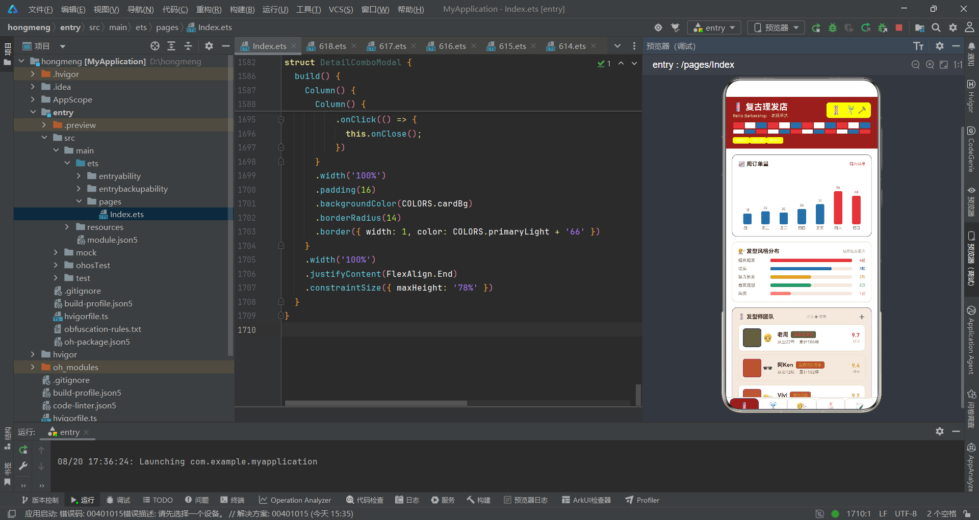
回顾这款复古理发店应用的完整源码,我们可以从多个维度提炼其架构设计的核心要点。
色彩工程维度,应用构建了一套以 BarberPalette 接口为契约、COLORS 常量为实现的语义化色彩体系。20 个色彩字段覆盖了品牌主色、辅助色、文字三级层级、语义状态色与主题专属色,每个字段都有语义化命名而非无意义编号。四个工具函数(getGenderColor、getTypeColor、getRatingColor、getTagColor)将业务语义映射为色彩,使颜色成为信息的视觉语言。特别值得称道的是"单色三透明度"的标签技法——同一颜色通过 1F、40、全色三个透明度叠加产生字、底、边三层,既精致又保持了色彩纯粹性。这种色彩工程的价值在于:全局风格调整只需改一处常量,视觉语言在所有组件中一致性呈现。
状态管理维度,应用践行了"状态即视图"的声明式范式。@Observed BarberData 作为可观察数据容器,通过 @ObjectLink 在五个内容组件间建立响应式引用,保证了数据源单一性与变更可追溯。十个 @State 变量构成根组件的状态中枢,分别管理标签页切换、弹窗显隐、动画触发与参数传递。弹窗控制采用"状态为真则渲染"的模式,四个 show* 布尔变量各自闭环地控制一个弹窗的开关。父子通信遵循"子组件回调 + 父组件管状态"的标准范式,子组件不直接操控弹窗,而是通过回调将控制权交还父组件,保证了状态变更的单一入口。这种设计使应用的任何视觉变化都可追溯到一个状态变量,调试与推理清晰有序。
组件化维度,应用遵循"单一职责 + 组合优先"的原则,形成了金字塔式的组件层次。根组件 BarberApp 仅承担状态编排与路由,委托五个内容组件渲染业务页面,内容组件再拆分出 BarberTag 原子组件与四个弹窗组件。这种分层使组件粒度从粗到细清晰可控,每层可独立演进。列表项卡片的"三段式布局"(头像框 + 信息区 + 操作区)在发型师、发型、套餐、产品四个列表中高度同构,复用率极高,降低了用户学习成本与代码维护成本。BarberTag 作为复用率最高的原子组件,统一了全应用标签的视觉风格。
数据建模维度,应用区分了"业务实体数据"与"统计指标数据"两类。BarberItem、HairItem、ComboItem、ProductItem、ReviewItem 描述实体的完整属性,WeekMeta、HairMeta、BarberHotMeta、ProductTopMeta 描述聚合统计快照。明细数据集中于 @Observed 类,统计快照以独立常量存在,两者通过数值一致相互印证。emoji 作为头像与图标的轻量化方案,零网络开销、即时渲染、自带场景语义,是移动端轻量应用的明智取舍。套餐 duration 中的 999 哨兵值、discount 的中文折扣表达(8 而非 0.8),体现了对业务语境的贴合。
交互设计维度,应用将消费视角与管理视角融合在同一界面。每个业务卡片自带操作入口(➕招聘、✏️编辑、🗑️下架、👁️详情),经营者无需跳转独立后台即可在浏览中执行管理操作。弹窗采用底部弹出(bottom sheet)模式,constraintSize 78% 高度限制使弹窗从底部弹出而非全屏覆盖,契合拇指操作 ergonomics。删除确认弹窗的二次确认机制、编辑弹窗的变更前后对比展示、详情弹窗的全字段信息呈现,都体现了对用户心理与操作安全的细致体察。头部旋转灯柱与剪刀摆动动画,将品牌符号转化为可玩交互,增添了应用的趣味性。
可演进性维度,应用虽以静态数据运行,但为真实业务接入预留了清晰边界。@Observed + @ObjectLink 的响应式通路使"数据接口替换 → 界面自动刷新"成为可能;内容组件的回调注入机制使"回调内接入真实接口"无需改动子组件;@Prop 弹窗参数为真实输入控件替换预留了布局结构。这种"原型即生产预备"的架构姿态,使应用可平滑地从演示原型演进为真实业务系统。

作为“人工智能6S店”的官方数字引擎,为AI开发者与企业提供一个覆盖软硬件全栈、一站式门户。
更多推荐

 1
1 0
0- 0


 已为社区贡献88条内容

所有评论(0)