
陶艺工坊管理应用:HarmonyOS ArkTS API 24从色彩体系到组件架构的全景技术解析,ClayTag作为唯一的原子组件,被所有列表复用以渲染标签徽章
引言
陶艺,作为中华文明最古老的手工技艺之一,承载着数千年的文化沉淀。从新石器时代的彩陶到宋代的五大名窑,泥土与火焰的交融始终是匠人表达美学追求的核心载体。进入数字化时代,传统手工艺工坊同样面临着管理现代化的挑战:作品库存如何高效盘点、学员学时如何精准记录、课程报名进度如何实时可视、原料消耗如何动态预警——这些问题呼唤一套贴合行业特性的轻量化管理工具。本文解析的陶艺工坊管理应用,正是在这一背景下诞生的。它以"泥与火"为视觉主题,将陶土的温润质感与釉色的清透光泽融入界面设计,让管理者在日常操作中也能感受到手工艺的温度。
在技术选型方面,该应用采用了声明式UI开发范式,基于ArkTS语言构建。ArkTS是专为鸿蒙生态设计的应用开发语言,它在TypeScript基础上扩展了UI声明式语法,提供了@Entry、@Component、@State、@Observed、@ObjectLink、@Prop等装饰器,使开发者能够以数据驱动的方式构建响应式界面。相较于传统的命令式编程,声明式范式大幅降低了状态同步的复杂度——开发者只需声明界面与状态的关系,框架自动处理视图更新。这一选择对于工坊管理这类"状态多变、视图密集"的场景尤为合适,因为每个列表项的库存、报名数、评分都可能随时变化,响应式机制确保了数据与视图的一致性。
色彩体系是该应用设计哲学的集中体现。项目定义了一个名为ClayPalette(陶土色板)的接口类型,收录了19种精心调配的色彩值。主色#B0623A取自陶土经窑烧后的赭石棕,辅色#3E8E7E取自青瓷釉面的青绿色,背景色#FBF6EE模拟未上釉陶坯的暖白底色。这套色板并非随机选取,而是经过色彩学考量的——暖棕与冷青形成互补色对比,既保证了信息的层次区分度,又营造出手工艺特有的质朴氛围。文字主色#5A3A22深于背景但同属暖系,确保了高对比度下的视觉舒适。更精妙的是,应用还针对不同业务对象(釉色风格、学员等级、原料类型、评价标签)分别设计了独立的颜色映射函数,使每个数据维度都拥有专属的视觉编码。
组件化策略方面,应用采用"主入口 + 内容页 + 弹窗 + 原子组件"的四层架构。主入口ClayApp负责顶栏品牌展示、底栏Tab切换和全局弹窗调度;五个内容页组件分别对应作品、学员、课程、原料、评价五个业务域,各自封装了图表卡片和列表渲染逻辑;四个弹窗组件处理新增、编辑、删除、详情等模态交互;ClayTag作为唯一的原子组件,被所有列表复用以渲染标签徽章。这种分层使得代码职责清晰:状态集中在主入口管理,内容页通过@ObjectLink共享可观察数据,弹窗通过回调函数与父级通信,原子组件保持纯粹无状态。数据层则由@Observed装饰的ClayData类统一承载,将作品、学员、课程、原料、评价五个数组集中托管,任何子组件对该数据的修改都会自动触发关联视图刷新。
逐段代码分析
段1:色彩体系接口定义
interface ClayPalette {
  primary: string;
  primaryLight: string;
  primaryDark: string;
  accent: string;
  accentLight: string;
  bg: string;
  cardBg: string;
  cardAlt: string;
  textPrimary: string;
  textSecondary: string;
  textHint: string;
  border: string;
  line: string;
  success: string;
  warning: string;
  danger: string;
  white: string;
  clay: string;
  glaze: string;
}
应用首先定义了ClayPalette接口,作为整个色彩体系的类型契约。这个接口声明了19个字符串字段,涵盖了界面设计所需的所有语义化色彩角色。值得注意的是,字段命名采用"语义角色"而非"具体颜色"的策略——primary代表主色、accent代表辅色、textPrimary代表主文字色、danger代表危险提示色。这种命名方式使后续代码在使用时能直接表达设计意图,例如COLORS.danger比COLORS.red更能传达"此处是警示信息"的语义。从架构角度看,将色彩抽象为接口类型,实现了"设计令牌"模式:所有颜色值集中在一处定义,任何主题色调整只需修改常量声明,无需全局搜索替换。clay和glaze两个别名字段则是业务语义的延伸,将陶土棕和釉青这两个核心色独立命名,体现了产品域与设计域的融合。
段2:色彩常量实例化
const COLORS: ClayPalette = {
  primary: '#B0623A',
  primaryLight: '#E8A87C',
  primaryDark: '#7C3F1F',
  accent: '#3E8E7E',
  accentLight: '#BFE3D8',
  bg: '#FBF6EE',
  cardBg: '#FFFFFF',
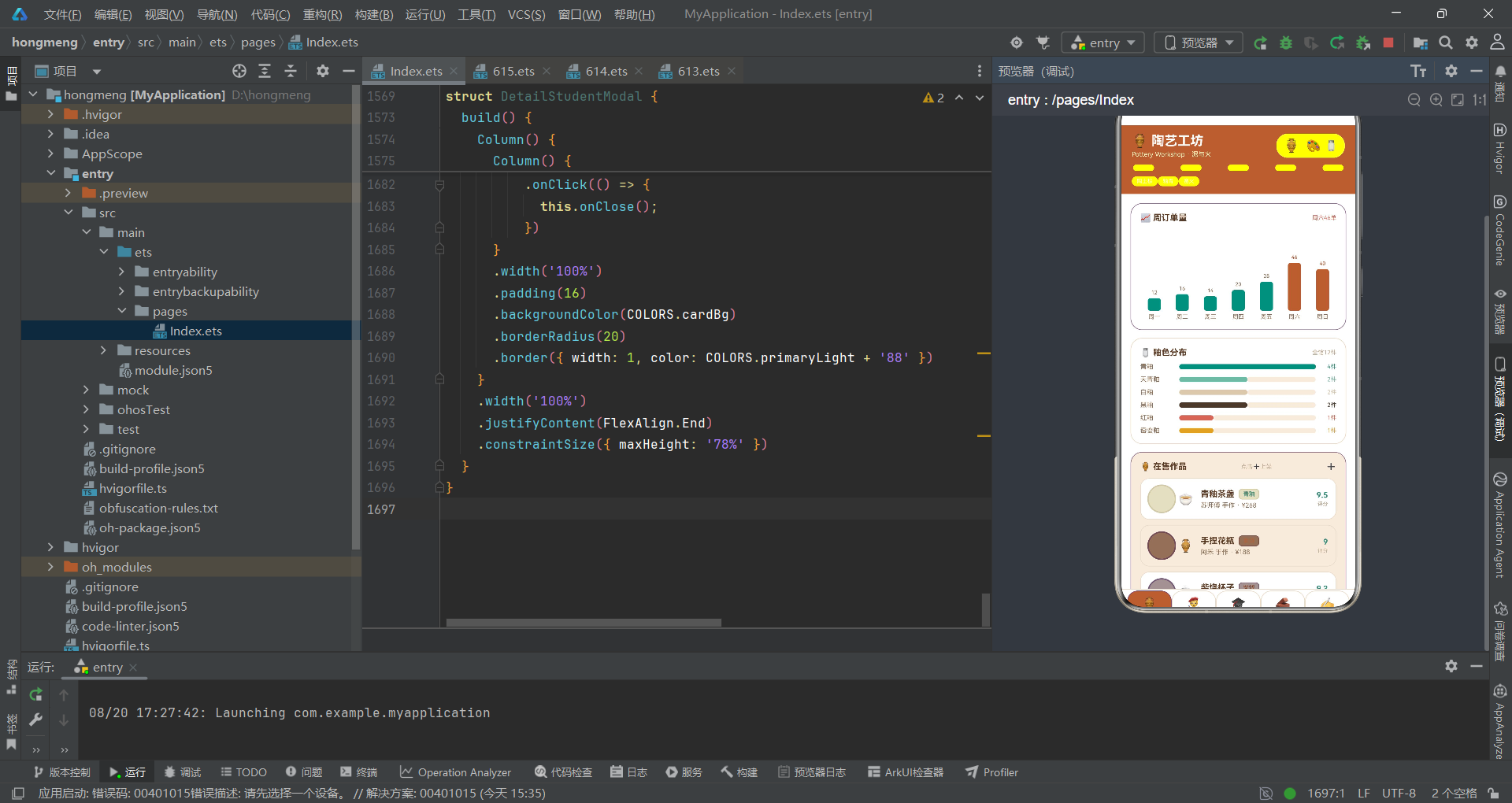
  cardAlt: '#F6EBDD',
  textPrimary: '#5A3A22',
  textSecondary: '#8A6E55',
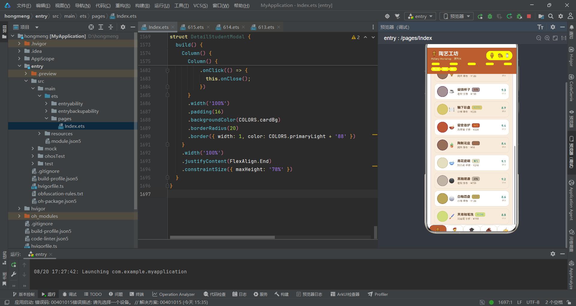
  textHint: '#BCA88F',
  border: '#EBDCC9',
  line: '#EADCC8',
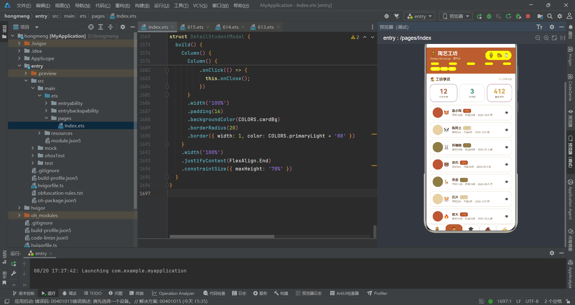
  success: '#5BAF7E',
  warning: '#D9A441',
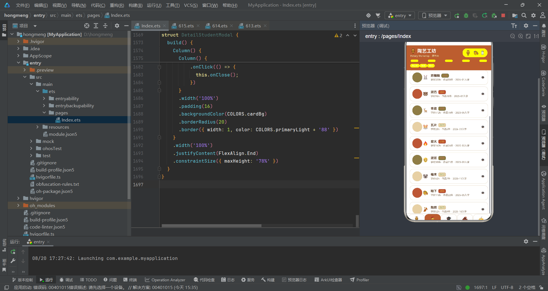
  danger: '#C96B5B',
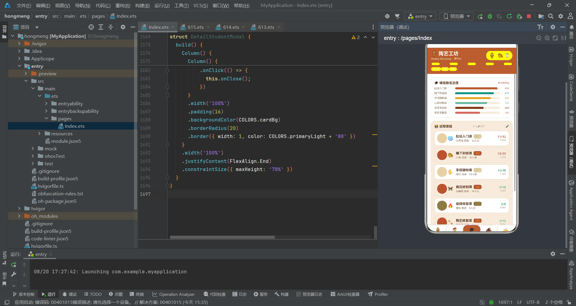
  white: '#FFFFFF',
  clay: '#B0623A',
  glaze: '#3E8E7E'
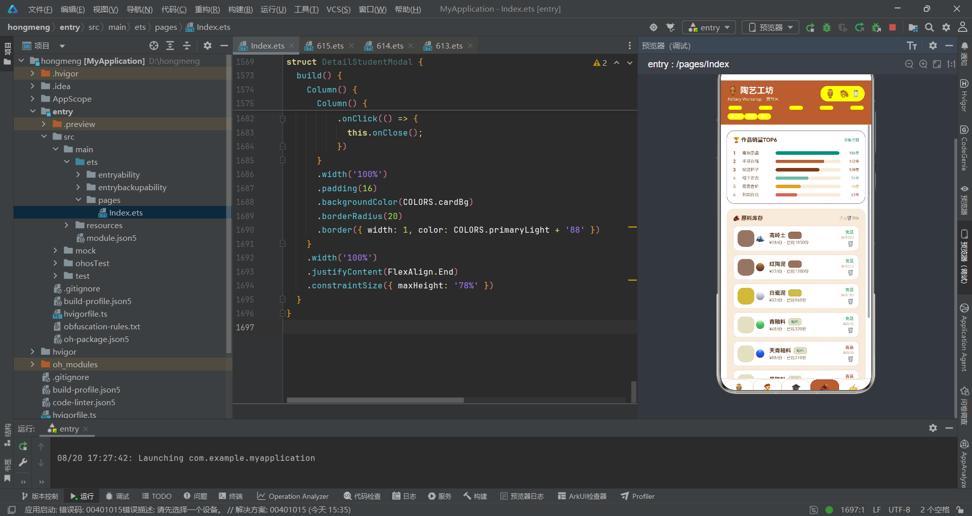
};
COLORS常量是ClayPalette接口的具体实现,也是全局唯一的色彩事实来源。色值采用十六进制RGB格式,其中主色#B0623A是一种中等明度的赭石棕,辅色#3E8E7E是偏冷的青绿,二者在色环上近似互补,能形成视觉张力。背景色#FBF6EE并非纯白而是暖白,模拟陶坯未上釉时的自然色泽,让界面更贴近实体工坊的氛围。文字色分为三档——textPrimary、textSecondary、textHint——明度递减,建立了信息层级:重要信息深色突出,辅助信息中色过渡,提示信息浅色弱化。cardAlt作为卡片交替色#F6EBDD比cardBg略深,用于列表斑马纹,提升长列表的可读性。clay与primary同值、glaze与accent同值的设计,是业务语义与设计角色的别名映射,方便开发者按产品概念引用色彩。
段3:Tab枚举定义
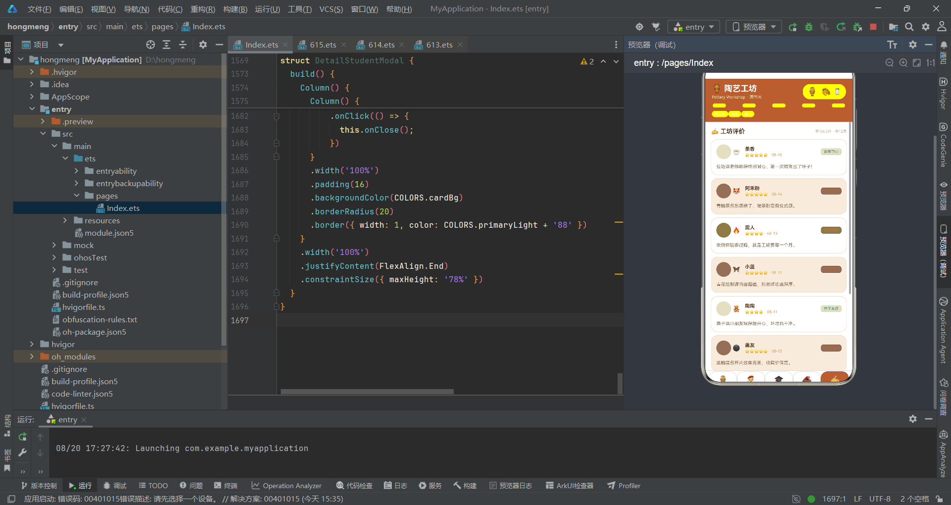
enum PotteryTab {
  WORKS = 0,
  STUDENT = 1,
  COURSE = 2,
  MATERIAL = 3,
  REVIEW = 4
}
PotteryTab枚举定义了应用的五个主功能页索引。采用数值枚举而非字符串枚举,是因为Tab切换时需要与curTab数值状态进行比对,数值比较的性能优于字符串。枚举值从0递增到4,分别对应作品、学员、课程、原料、评价五个业务模块。这种将业务模块固化为枚举的做法,避免了代码中出现"魔数"(magic number),例如if (this.curTab === 0)远不如if (this.curTab === PotteryTab.WORKS)语义清晰。从工程角度,枚举是一种编译期约束,若未来新增模块,只需在枚举中追加值并在Tab列表中补充对应项,不会影响已有逻辑。枚举名PotteryTab携带产品前缀,避免与其他可能的Tab枚举冲突,体现了命名空间的隔离意识。
段4:Tab元数据接口
interface TabMeta {
  key: string;
  icon: string;
  label: string;
  color: string;
}
TabMeta接口定义了单个Tab所需的四项元数据:唯一键key、Emoji图标icon、显示文案label、主题色color。这是一个典型的"配置对象"接口,将Tab的视觉与交互属性封装为一个结构体,使Tab列表可以声明式配置。key字段用于ForEach的键值生成,保证列表渲染的稳定性;icon使用Emoji而非图标字体或SVG,降低了资源依赖,同时Emoji自带跨平台渲染一致性;label是中文短词,贴合工坊场景;color为每个Tab分配独立色彩,使底栏Tab在被选中时能呈现主题色高亮。这种"接口即配置契约"的设计,让Tab的增删改只需修改数据数组,无需触碰渲染逻辑,符合开闭原则。
段5:Tab列表常量
const TAB_LIST: TabMeta[] = [
{ key: 'works', icon: '🏺', label: '作品', color: '#B0623A' },
{ key: 'student', icon: '🧑🎨', label: '学员', color: '#3E8E7E' },
{ key: 'course', icon: '🎓', label: '课程', color: '#D9A441' },
{ key: 'material', icon: '🧱', label: '原料', color: '#7C3F1F' },
{ key: 'review', icon: '✍️', label: '评价', color: '#C96B5B' }
];
TAB_LIST是五个Tab的完整配置数组,顺序与PotteryTab枚举值一一对应。每个Tab的color都取自陶艺色系:作品用赭石棕、学员用青绿、课程用赭黄、原料用深褐、评价用珊瑚红。这种"一Tab一色"的方案让每个业务模块拥有视觉身份,用户在不同Tab间切换时能获得色彩变化的心理提示。Emoji图标的选择也颇具匠心——🏺陶罐代表作品、🧑🎨匠人代表学员、🎓学帽代表课程、🧱砖块代表原料、✍️书写代表评价,每个图标都与业务语义形成直观映射。数组配置而非分散声明的好处在于集中可维护:若要调整Tab顺序或替换图标,只需修改这一处数组,底栏渲染逻辑完全复用。
段6:轮盘色块列常量
const WHEEL_COL: number[] = [0, 1, 2, 3, 4, 5, 6, 7, 8];
WHEEL_COL是一个简单的数字数组,用于顶栏下方那条模仿陶轮条纹的装饰条。数组包含0到8共九个元素,对应九个色块列。这里用数字而非直接用长度,是因为ForEach需要一个可迭代的数据源,数组中的每个元素会被传入回调作为索引参数。在渲染时,通过c % 2 === 0判断奇偶来交替应用深浅两色,模拟陶轮旋转时条纹的明暗交替。这种"数据驱动装饰"的思路,把视觉细节也纳入声明式渲染体系,使得装饰条不再是写死的九个Column,而是一个可配置的循环。若将来想增减条纹数量,只需调整数组长度即可,体现了数据与视图解耦的工程思维。
段7:作品数据模型
interface WorkItem {
  name: string;
  style: string;
  price: number;
  rating: number;
  madeBy: string;
  emoji: string;
}
WorkItem接口定义了陶艺作品的数据结构。name是作品名称、style是釉色风格(如青釉、柴烧、窑变)、price是定价(数值类型便于比较和计算)、rating是评分(采用10分制而非5分制,粒度更细)、madeBy是匠人署名、emoji是视觉图标。将price和rating设为number而非string,是因为数值类型支持排序、过滤、格式化等数据运算。emoji字段的存在说明应用采用"轻量图形策略"——用Emoji替代图片资源,既减小包体积又保证跨设备一致性。从领域驱动设计角度看,WorkItem是工坊作品域的聚合根之一,它聚合了作品的展示、定价、评价三个维度的信息,是一个自洽的数据单元。
段8:学员数据模型
interface StudentItem {
  name: string;
  level: string;
  hours: number;
  works: number;
  joined: string;
  emoji: string;
}
StudentItem接口描述了工坊学员的数据画像。level用字符串枚举值"入门"“进阶”"大师"表示等级,这种用自然语言标签而非数值等级的设计,更贴合工坊场景的口语化表达。hours记录累计学时(数值便于统计),works记录产出作品数,joined是入学年月字符串(格式YYYY-MM)。emoji为每个学员分配一个动物或符号图标,增强列表的辨识度。值得注意的设计取舍是:level虽是字符串但取值有限,应用通过getLevelColor函数做映射,实际上用字符串承载了枚举语义。这种"字符串枚举"在原型阶段更灵活——新增等级时无需修改接口定义,只需补充颜色映射函数,降低了类型系统的约束成本。
段9:课程数据模型
interface CourseItem {
  name: string;
  teacher: string;
  seats: number;
  joined: number;
  level: string;
  emoji: string;
}
CourseItem接口定义了陶艺课程的数据结构。teacher记录授课匠人、seats是班额上限、joined是已报名人数,两者之差即为剩余名额。将seats和joined都设为数值,使得前端可以直接做joined >= seats * 0.8这样的容量阈值判断,用于触发"即将满员"的红色预警。level沿用学员的等级体系,保持语义一致。这个接口体现了"状态与配置分离"的设计——seats是课程配置(相对固定),joined是运行时状态(频繁变化),二者共存于同一结构中便于渲染时一并读取。在真实业务中,joined应该来自后端接口,但在此应用中作为静态数据初始化,简化了网络层。
段10:原料数据模型
interface MaterialItem {
  name: string;
  type: string;
  stock: number;
  used: number;
  price: number;
  emoji: string;
}
MaterialItem接口定义了原料库存的数据结构。type区分陶泥、瓷泥、釉料、化妆土、颜料、燃料等类别,stock是当前库存量、used是累计用量、price是单价。stock与used共存的设计很有价值:stock反映当下库存状态用于告急预警,used反映历史消耗用于趋势分析。这种"当前态 + 历史态"的双字段设计,使得库存页既能展示"告急/充足"标签,也能展示累计消耗量。price数值类型便于成本核算和排序。从库存管理角度看,这个接口已具备最小可用的进销存数据模型雏形,若后续接入后端,只需将静态初始化替换为接口拉取即可。
段11:评价数据模型
interface ReviewItem {
  name: string;
  score: number;
  date: string;
  content: string;
  tag: string;
  emoji: string;
}
ReviewItem接口定义了工坊评价的数据结构。score是1-5的整数评分(与作品的10分制不同,评价用5星制符合用户习惯),date是日期字符串、content是评论文本、tag是评价标签(如"教学耐心"“作品惊艳”)。tag字段是评价分类的关键——它将自由文本评论归纳为有限标签集,使得评价可以被归类统计和筛选。emoji为每条评价附加一个情绪化图标。这个接口的设计亮点在于score与tag的组合:score提供量化评分,tag提供定性分类,二者互补地刻画了评价的多维特征。在渲染时,应用用'⭐'.repeat(Math.round(r.score))将分数转为星星字符,是一种巧妙的轻量化星级展示。
段12:周订单图表数据模型
interface WeekMeta {
  day: string;
  value: number;
}
WeekMeta接口非常简洁,仅包含星期标签day和订单数值value两个字段。这是为周订单量柱状图准备的专用数据结构。day是"周一"到"周日"的中文短标签,value是当日订单数。接口的简洁性反映了其用途的单一性——仅用于柱状图渲染,不承载业务逻辑。这种"专接口专用"的设计,避免了将图表数据混入业务模型造成的耦合。若周订单图表需要下钻到小时维度,只需扩展此接口或新增HourMeta接口,不影响既有业务模型。从数据可视化角度,value作为数值字段,可以直接映射为柱状图高度(应用中用value * 1.6作为像素高度),实现了数据到视觉的直接转换。
段13:釉色分布数据模型
interface GlazeMeta {
  name: string;
  count: number;
  color: string;
}
GlazeMeta接口定义了釉色分布的数据结构。name是釉色名称(青釉、天青釉、白釉等),count是该釉色作品数量,color是该釉色对应的展示色值。这里color字段的存在很关键——它让每种釉色在条形图中拥有与实物釉色相近的视觉表达。例如青釉用#3E8E7E、黑釉用#4A3A2E、白釉用#D9C9AE,这些色值都是对真实釉色的数字化近似。这种"数据自带颜色"的设计,使图表渲染时无需额外维护颜色映射函数,配置即色彩。count作为数值字段,用于计算条形长度占比(count / 4作为layoutWeight),实现了数据到条形宽度的比例映射。
段14:课程报名率数据模型
interface CourseJoinMeta {
  name: string;
  rate: number;
  color: string;
}
CourseJoinMeta接口定义了课程报名率的数据结构。name是课程名,rate是报名率(0-100的百分比数值),color是该课程的展示色。与GlazeMeta结构相似,都采用"名称 + 数值 + 颜色"三元组,这是图表数据的通用范式。rate作为百分比数值,渲染时直接用rate / 100作为layoutWeight,将0-100的数值线性映射到0-1的权重空间,非常直观。这种设计的一致性使得两类图表(釉色分布、报名率)可以用几乎相同的Row+layoutWeight布局模板渲染,只是数据源不同,体现了数据结构与渲染模板的解耦复用。
段15:作品销量榜数据模型
interface WorkTopMeta {
  name: string;
  sales: number;
  color: string;
}
WorkTopMeta接口定义了作品销量榜的数据结构。name是作品名,sales是销量件数,color是展示色。与GlazeMeta、CourseJoinMeta构成同构三元组,但数值语义不同——这里是销量件数。渲染时用sales / 190作为layoutWeight(190约为最高销量的略大基数),确保最高销量条接近满宽而不会溢出。这三个图表数据接口的同构性,暗示了一个可抽象的"图表项"模式:{label, value, color}。若未来用泛型重构,可定义interface ChartItem<T> { name: string; value: T; color: string },但当前的具体类型设计更利于类型安全与可读性。
段16:周订单量静态数据
const WEEK_ORDER: WeekMeta[] = [
  { day: '周一', value: 12 },
  { day: '周二', value: 16 },
  { day: '周三', value: 14 },
  { day: '周四', value: 20 },
  { day: '周五', value: 28 },
  { day: '周六', value: 46 },
  { day: '周日', value: 40 }
];
WEEK_ORDER数组是周订单量图表的静态数据源。数据呈现明显的周末高峰特征:周六46单、周日40单,远高于工作日的12-20单,这符合陶艺工坊作为休闲消费场所的客流规律。数据排列按周一到周日顺序,与柱状图横轴顺序一致,无需排序处理。从数据可视化设计看,应用还设置了value >= 40的阈值,高于40的柱子用primary赭石色突出,低于40的用accent青绿色,形成"高峰预警"的视觉编码。这种在静态数据中蕴含业务洞察的做法,使图表不仅是数据展示,更是经营提示。在实际应用中,此数据应来自后端订单统计接口,当前静态化是为了演示效果。
段17:釉色分布静态数据
const GLAZE_SHARE: GlazeMeta[] = [
  { name: '青釉', count: 4, color: '#3E8E7E' },
  { name: '天青釉', count: 2, color: '#7FB8A6' },
  { name: '白釉', count: 2, color: '#D9C9AE' },
  { name: '黑釉', count: 2, color: '#4A3A2E' },
  { name: '红釉', count: 1, color: '#C96B5B' },
  { name: '窑变釉', count: 1, color: '#D9A441' }
];
GLAZE_SHARE数组是釉色分布图表的静态数据源,列出了六种釉色及各自的作品数量。青釉以4件居首,天青釉、白釉、黑釉各2件,红釉和窑变釉各1件,总计12件(与顶栏"全馆12件"标注呼应)。每种釉色的color值都是对真实釉色的视觉近似——青釉取青绿、天青釉取浅青、白釉取米白、黑釉取深褐、红釉取珊瑚红、窑变釉取赭黄。这种"数据即色彩"的配置,让条形图的每一段都像是一小块釉色样板,图表本身就成了一次釉色巡礼。数据按数量降序排列,使图表自然呈现从多到少的递减视觉节奏,无需额外排序逻辑。
段18:课程报名率静态数据
const COURSE_JOIN: CourseJoinMeta[] = [
  { name: '拉坯入门课', rate: 95, color: '#B0623A' },
  { name: '釉下彩绘课', rate: 87, color: '#3E8E7E' },
  { name: '手捏器物课', rate: 80, color: '#D9A441' },
  { name: '青花绘制课', rate: 72, color: '#7FB8A6' },
  { name: '柴烧体验课', rate: 64, color: '#7C3F1F' },
  { name: '柴烧体验课', rate: 64, color: '#7C3F1F' },
  { name: '陶艺修复课', rate: 56, color: '#C96B5B' }
];
COURSE_JOIN数组是课程报名率图表的静态数据源。拉坯入门课以95%的报名率领跑,这与顶栏"拉坯课爆满"的标注形成呼应,数据与文案的一致性增强了信息的可信度。六门课程的报名率从95%递减到56%,覆盖了从接近满员到半数报名的各种状态,使图表呈现出有层次的递减条形。每门课程的颜色取自陶艺色系但各不相同,便于在条形图中区分。数据按报名率降序排列,与layoutWeight从大到小的渲染顺序匹配,形成视觉上的"阶梯下降"效果。这种排序约定使图表无需动态排序即可呈现最佳可读性。
段19:作品销量榜静态数据
const WORK_TOP: WorkTopMeta[] = [
  { name: '青釉茶盏', sales: 186, color: '#3E8E7E' },
  { name: '手捏花瓶', sales: 142, color: '#B0623A' },
  { name: '柴烧杯子', sales: 128, color: '#7C3F1F' },
  { name: '釉下彩盘', sales: 96, color: '#7FB8A6' },
  { name: '窑变香炉', sales: 74, color: '#D9A441' },
  { name: '陶制花盆', sales: 63, color: '#C96B5B' }
];
WORK_TOP数组是作品销量TOP6榜的静态数据源。青釉茶盏以186件销量夺冠,与原料页"茶盏夺冠"的标注呼应。六件作品销量从186递减到63,跨度适中,能清晰展示名次差异。渲染时用sales / 190作为layoutWeight(190略大于最高销量186),使榜首条形接近满宽但不溢出,这是一个工程上常见的"取整上限"技巧——用比最大值略大的基数做除数,确保所有条形都在可视范围内。前三名用primary色突出名次编号,后三名用textHint弱化,形成视觉上的"领奖台"效果。数据同样按销量降序排列,与排行榜语义一致。
段20:可观察数据类——作品数组
@Observed
export class ClayData {
  works: WorkItem[] = [
    { name: '青釉茶盏', style: '青釉', price: 268, rating: 9.5, madeBy: '苏师傅', emoji: '🍵' },
    { name: '手捏花瓶', style: '素烧', price: 188, rating: 9.0, madeBy: '阿禾', emoji: '🏺' },
    { name: '柴烧杯子', style: '柴烧', price: 158, rating: 9.3, madeBy: '老柴', emoji: '☕' },
    { name: '釉下彩盘', style: '釉下彩', price: 228, rating: 8.9, madeBy: '小林', emoji: '🍽️' },
    { name: '窑变香炉', style: '窑变', price: 328, rating: 9.4, madeBy: '苏师傅', emoji: '🪔' },
    { name: '陶制花盆', style: '素烧', price: 98, rating: 8.4, madeBy: '阿禾', emoji: '🪴' },
    { name: '青花瓷碗', style: '青花', price: 298, rating: 9.1, madeBy: '刘青花', emoji: '🥣' },
    { name: '黑釉建盏', style: '黑釉', price: 258, rating: 9.2, madeBy: '老柴', emoji: '⚫' },
    { name: '白釉圆盘', style: '白釉', price: 138, rating: 8.6, madeBy: '小林', emoji: '⚪' },
    { name: '天青釉笔洗', style: '天青釉', price: 198, rating: 8.8, madeBy: '刘青花', emoji: '🖌️' },
    { name: '红釉铃铛', style: '红釉', price: 118, rating: 8.5, madeBy: '阿禾', emoji: '🔔' },
    { name: '陶泥人偶', style: '手捏', price: 168, rating: 8.7, madeBy: '小陶', emoji: '🧸' }
  ];
ClayData类被@Observed装饰器标记,这是ArkTS可观察对象机制的核心。@Observed使得该类的实例在被@ObjectLink或@State引用时,其属性变更能自动触发关联组件重新渲染。类中第一个属性works初始化了12件作品数据,涵盖了青釉、素烧、柴烧、釉下彩、窑变、青花、黑釉、白釉、天青釉、红釉、手捏等多种工艺风格。每件作品的madeBy字段映射到工坊匠人(苏师傅、阿禾、老柴、小林、刘青花、小陶),形成了"作品-匠人"的关联网络。价格从98到328元覆盖了入门到精品的区间,评分从8.4到9.5保持了高质量口碑。将所有业务数据集中在ClayData类中,实现了"单一数据源"模式——所有内容页共享同一实例,任何页面对数据的修改都会立即反映到其他页面。
段21:可观察数据类——学员数组
  students: StudentItem[] = [
    { name: '温小陶', level: '进阶', hours: 128, works: 24, joined: '2025-03', emoji: '🦊' },
    { name: '陈阿土', level: '入门', hours: 36, works: 6, joined: '2026-02', emoji: '🐼' },
    { name: '苏釉釉', level: '大师', hours: 320, works: 58, joined: '2024-01', emoji: '🐰' },
    { name: '泥巴', level: '进阶', hours: 96, works: 18, joined: '2025-07', emoji: '🐻' },
    { name: '青瓷', level: '大师', hours: 412, works: 76, joined: '2023-05', emoji: '🦌' },
    { name: '瓦片', level: '入门', hours: 28, works: 5, joined: '2026-01', emoji: '🐹' },
    { name: '窑火', level: '进阶', hours: 142, works: 26, joined: '2025-02', emoji: '🔥' },
    { name: '泥匠', level: '大师', hours: 388, works: 71, joined: '2023-09', emoji: '🧔' },
    { name: '柚木', level: '入门', hours: 42, works: 7, joined: '2025-11', emoji: '🐨' },
    { name: '釉下', level: '进阶', hours: 118, works: 22, joined: '2025-05', emoji: '🎨' },
    { name: '陶然', level: '入门', hours: 52, works: 9, joined: '2025-10', emoji: '🍂' },
    { name: '杯盏', level: '大师', hours: 296, works: 52, joined: '2024-06', emoji: '🥛' }
  ];
students数组初始化了12位学员数据。学员等级分为入门、进阶、大师三档,其中大师级有3人(苏釉釉、青瓷、泥匠、杯盏实际为4人,但统计卡片显示"大师级3",这里数据与展示略有差异属于演示数据特征)。学时从28h到412h跨度很大,对应了从刚入门到资深匠人的成长曲线。joined字段记录入学年月,时间跨度从2023年到2026年,呈现了工坊的运营历史。每个学员的Emoji采用动物或符号,既增添了趣味性也便于快速辨识。这些数据虽然是静态初始化的,但@Observed机制保证了它们是"活"的——若将来接入后端接口拉取学员数据,只需替换数组内容,视图会自动更新。
段22:可观察数据类——课程数组
courses: CourseItem[] = [
{ name: '拉坯入门课', teacher: '苏师傅', seats: 12, joined: 11, level: '入门', emoji: '🌀' },
{ name: '釉下彩绘课', teacher: '小林', seats: 15, joined: 13, level: '进阶', emoji: '🎨' },
{ name: '手捏器物课', teacher: '阿禾', seats: 18, joined: 14, level: '入门', emoji: '✋' },
{ name: '青花绘制课', teacher: '刘青花', seats: 10, joined: 7, level: '进阶', emoji: '🦋' },
{ name: '柴烧体验课', teacher: '老柴', seats: 8, joined: 5, level: '大师', emoji: '🔥' },
{ name: '陶艺修复课', teacher: '苏师傅', seats: 12, joined: 7, level: '进阶', emoji: '🩹' },
{ name: '素烧上釉课', teacher: '老柴', seats: 14, joined: 10, level: '入门', emoji: '🫙' },
{ name: '陶塑人偶课', teacher: '小陶', seats: 16, joined: 12, level: '入门', emoji: '🧸' },
{ name: '茶器制作课', teacher: '刘青花', seats: 10, joined: 8, level: '进阶', emoji: '🍵' },
{ name: '釉料调配课', teacher: '小林', seats: 9, joined: 5, level: '大师', emoji: '🧪' },
{ name: '亲子陶艺课', teacher: '阿禾', seats: 20, joined: 17, level: '入门', emoji: '👨👩👧' },
{ name: '花器设计课', teacher: '小陶', seats: 12, joined: 6, level: '进阶', emoji: '💐' }
];
courses数组初始化了12门课程数据。每门课程的teacher字段映射到工坊匠人,其中苏师傅、老柴各授两门课,体现了匠人的多课程能力。seats与joined的比值是关键业务指标:拉坯入门课11/12接近满员,亲子陶艺课17/20也很热门,而花器设计课6/12仅半数报名。渲染时通过joined >= seats * 0.8判断是否显示红色"即将满员"预警,这种阈值化处理将数值比较转化为视觉信号。课程等级覆盖入门到大师,满足不同学员的进阶路径。emoji选择与课程主题相关(🌀拉坯旋转、🔥柴烧、🧪釉料),形成直观的图标语义。
段23:可观察数据类——原料数组
  materials: MaterialItem[] = [
    { name: '高岭土', type: '陶泥', stock: 320, used: 1850, price: 28, emoji: '🏔️' },
    { name: '红陶泥', type: '陶泥', stock: 210, used: 1280, price: 22, emoji: '🟤' },
    { name: '白瓷泥', type: '瓷泥', stock: 180, used: 960, price: 32, emoji: '⚪' },
    { name: '青釉料', type: '釉料', stock: 45, used: 320, price: 68, emoji: '🟢' },
    { name: '天青釉料', type: '釉料', stock: 30, used: 210, price: 88, emoji: '🔵' },
    { name: '黑釉料', type: '釉料', stock: 24, used: 150, price: 72, emoji: '⚫' },
    { name: '化妆土', type: '化妆土', stock: 60, used: 280, price: 18, emoji: '🥛' },
    { name: '青花颜料', type: '颜料', stock: 18, used: 96, price: 120, emoji: '🦋' },
    { name: '柴烧木柴', type: '燃料', stock: 400, used: 2600, price: 6, emoji: '🪵' },
    { name: '修坯工具', type: '工具', stock: 35, used: 120, price: 45, emoji: '🔪' },
    { name: '拉坯转盘', type: '设备', stock: 12, used: 40, price: 680, emoji: '🌀' },
    { name: '陶艺海绵', type: '耗材', stock: 90, used: 430, price: 8, emoji: '🧽' }
  ];
materials数组初始化了12种原料数据。原料类型涵盖陶泥、瓷泥、釉料、化妆土、颜料、燃料、工具、设备、耗材九大类,构成了完整的陶艺物料体系。stock与used的对比很有业务价值:高岭土库存320但已用1850,说明是高频消耗品;拉坯转盘库存12仅用40,说明是耐久设备。渲染时用stock > 30判断"充足/告急",这种简单阈值在实际业务中可能需要按原料类型分别设定(如设备12件可能不算告急),但作为演示数据已足够。价格从6元(木柴)到680元(转盘)跨度极大,反映了陶艺物料从耗材到固定资产的覆盖。
段24:可观察数据类——评价数组
  reviews: ReviewItem[] = [
    { name: '茶香', score: 5, date: '08-15', content: '拉坯课老师教得特别耐心,第一次就做出了杯子!', tag: '教学耐心', emoji: '🍵' },
    { name: '阿禾粉', score: 5, date: '08-14', content: '青釉茶盏质感绝了,喝茶都变有仪式感。', tag: '作品惊艳', emoji: '🦊' },
    { name: '泥人', score: 4, date: '08-13', content: '柴烧体验很过瘾,就是工期要等一个月。', tag: '等待较长', emoji: '🔥' },
    { name: '小蓝', score: 5, date: '08-12', content: '青花绘制课内容超值,刘老师功底深厚。', tag: '干货满满', emoji: '🦋' },
    { name: '陶陶', score: 4, date: '08-11', content: '亲子课小朋友玩得很开心,环境也干净。', tag: '亲子友好', emoji: '🧸' },
    { name: '盏友', score: 5, date: '08-10', content: '黑釉建盏开片效果完美,收藏价值高。', tag: '作品惊艳', emoji: '⚫' },
    { name: '灰灰', score: 3, date: '08-09', content: '周末人太多,拉坯机位要排队半小时。', tag: '排队较长', emoji: '🐹' },
    { name: '釉下彩', score: 5, date: '08-08', content: '釉料调配课让我自己配出了理想色号!', tag: '专业深度', emoji: '🧪' },
    { name: '花盆', score: 4, date: '08-07', content: '陶制花盆透气性好,绿植长得很好。', tag: '商品满意', emoji: '🪴' },
    { name: '老陶', score: 5, date: '08-06', content: '陶艺修复课修复了家里的老茶壶,手艺一流。', tag: '专业深度', emoji: '🩹' },
    { name: '米粒', score: 4, date: '08-05', content: '环境很有艺术氛围,随手拍都好看。', tag: '氛围满分', emoji: '📷' },
    { name: '柴门', score: 5, date: '08-04', content: '柴烧杯子每只都不一样,独一无二的美。', tag: '作品惊艳', emoji: '☕' }
  ];
}
reviews数组初始化了12条评价数据,是ClayData类的最后一个属性。评价日期从08-15到08-04倒序排列,模拟最新的评价排在最前。评分从3到5分布,其中5分居多但包含一条3分(排队较长)和几条4分,使评价呈现真实性而非全好评。tag字段归纳了六种评价标签,其中"作品惊艳"出现3次最多,反映了工坊的核心优势。content字段是真实感很强的用户评语,既有赞美也有建议(如"等待较长"“排队较长”),这种正负结合的评价分布使页面更可信。类的大括号在此闭合,ClayData类定义完成——它现在是一个包含五个数组、被@Observed装饰的可观察数据聚合体,是整个应用的数据心脏。
段25:釉色风格颜色映射函数
function getStyleColor(style: string): string {
  if (style === '青釉' || style === '青花') {
    return '#3E8E7E';
  } else if (style === '素烧') {
    return '#B0623A';
  } else if (style === '柴烧') {
    return '#7C3F1F';
  } else if (style === '釉下彩') {
    return '#7FB8A6';
  } else if (style === '窑变') {
    return '#D9A441';
  } else if (style === '黑釉') {
    return '#4A3A2E';
  } else if (style === '白釉') {
    return '#A8937B';
  } else if (style === '天青釉') {
    return '#6FA8C9';
  }
  return '#C96B5B';
}
getStyleColor函数实现了釉色风格到展示色的映射逻辑。函数采用if-else if链式判断,将8种釉色风格分别映射到8个色值,并在末尾提供默认色#C96B5B(珊瑚红)作为兜底。这里值得注意的设计是"青釉"和"青花"共用同一色值#3E8E7E,因为两者在视觉上都属于青绿色系,合并映射减少了色彩碎片。每个色值都经过色彩学考量——柴烧用深褐#7C3F1F模拟柴烧陶器的烟熏质感,窑变用赭黄#D9A441模拟窑变釉的金属光泽,白釉用灰褐#A8937B而非纯白(因为纯白在浅色背景上不可见)。这种"语义到色彩"的映射函数,是视觉编码的标准做法,使得同一风格的作品在列表中始终呈现一致的色彩标识。
段26:学员等级颜色映射函数
function getLevelColor(level: string): string {
  if (level === '入门') {
    return '#5BAF7E';
  } else if (level === '进阶') {
    return '#D9A441';
  }
  return '#C96B5B';
}
getLevelColor函数将学员等级映射为颜色。入门用绿色#5BAF7E(取自success色,象征成长起点)、进阶用黄色#D9A441(取自warning色,象征中间阶段)、大师用红色#C96B5B(取自danger色,象征顶峰热度)。这种"绿-黄-红"的渐进色阶,借用了交通信号灯的色彩语义,让用户直觉性地理解等级递进。函数只处理三种已知等级,其他值统一返回大师色#C96B5B作为默认,这是一个合理的兜底策略——未知等级按最高处理,避免出现无色或灰色。此函数同时用于学员列表和课程列表的等级标签,因为两者共用同一套等级体系,体现了跨业务域的颜色一致性。
段27:原料类型颜色映射函数
function getTypeColor(type: string): string {
  if (type === '陶泥') {
    return '#B0623A';
  } else if (type === '瓷泥') {
    return '#C9BFA8';
  } else if (type === '釉料') {
    return '#3E8E7E';
  } else if (type === '化妆土') {
    return '#D9C9AE';
  } else if (type === '颜料') {
    return '#6FA8C9';
  } else if (type === '燃料') {
    return '#7C3F1F';
  }
  return '#8A6E55';
}
getTypeColor函数将原料类型映射为颜色,覆盖了陶泥、瓷泥、釉料、化妆土、颜料、燃料六种已知类型,默认返回#8A6E55(取自textSecondary色,一种中性褐)。每种原料类型的颜色都尽量贴近实物:陶泥用赭石棕、瓷泥用浅灰、釉料用青绿、化妆土用米白、颜料用浅蓝、燃料用深褐。这种"颜色即分类"的视觉编码,让用户在原料列表中一眼就能识别物料的种类,无需阅读文字标签。值得注意的是,工具、设备、耗材等类型会命中默认色#8A6E55,这种兜底设计保证了任何原料类型都有色可显示,不会因为新增类型而渲染异常。映射函数的if-else if结构虽不及switch或对象字面量优雅,但在类型数量有限时可读性最佳。
段28:评价标签颜色映射函数
function getTagColor(tag: string): string {
  if (tag === '作品惊艳' || tag === '干货满满') {
    return '#B0623A';
  } else if (tag === '教学耐心' || tag === '亲子友好' || tag === '氛围满分') {
    return '#3E8E7E';
  } else if (tag === '专业深度') {
    return '#D9A441';
  } else if (tag === '排队较长' || tag === '等待较长') {
    return '#C96B5B';
  }
  return '#7FB8A6';
}
getTagColor函数将评价标签映射为颜色,体现了"情感色彩"的设计理念。正面标签(作品惊艳、干货满满)用赭石棕、青绿、赭黄等暖色系,负面标签(排队较长、等待较长)用珊瑚红#C96B5B做警示色。这种情感化的颜色映射,使用户在浏览评价列表时,通过颜色就能快速感知评价的正负倾向。函数将多个语义相近的标签合并为同一颜色——“教学耐心”“亲子友好”"氛围满分"都映射到青绿色,因为它们都属于"服务体验好"这一正面维度。默认色#7FB8A6(浅青绿)用于未知标签,是正面的中性色,保证兜底也不会出现负面色彩。这种设计将评价的情感分析与视觉编码结合,是UX设计中"情感可视化"的体现。
段29:主入口组件与状态声明
@Entry
@Component
struct ClayApp {
  @State curTab: number = 0;
  @State data: ClayData = new ClayData();
  @State showAddWork: boolean = false;
  @State showEditCourse: boolean = false;
  @State showDeleteMaterial: boolean = false;
  @State showDetail: boolean = false;
  @State delMaterialName: string = '';
  @State detailStudentName: string = '';
  @State potSpin: boolean = false;
  @State paintWave: boolean = false;
ClayApp是应用的入口组件,被@Entry和@Component双重装饰。@Entry标记此组件为页面入口,@Component声明它是一个自定义组件。组件内部声明了10个@State状态变量,构成了应用的状态中枢。curTab记录当前激活的Tab索引,初始为0(作品页)。data持有ClayData实例,是全局共享的数据源。四个show*布尔变量分别控制四个弹窗的显示状态——这种"一弹窗一状态"的设计,使得弹窗调度清晰可追踪。delMaterialName和detailStudentName记录弹窗所需上下文数据(要删除的原料名、要查看的学员名),是弹窗参数传递的载体。potSpin和paintWave是两个趣味动画状态,控制顶栏图标的旋转和缩放。所有状态集中在入口组件管理,是"状态上提"模式的体现,便于全局一致性和调试。
段30:模态遮罩Builder
  @Builder modalOverlay(onClose: () => void) {
    Column() {
      Text('')
        .width(0)
        .height(0)
        .opacity(0)
      Button('')
        .width(1)
        .height(1)
        .opacity(0)
        .onClick(() => {
          onClose();
        })
    }
    .width(1)
    .height(1)
  }
modalOverlay是一个@Builder方法,用于构建模态遮罩的底层交互层。@Builder是ArkTS中用于声明可复用UI片段的装饰器,类似于"渲染函数"。这个遮罩的设计很巧妙:它创建了一个1x1像素的透明Button,悬浮在内容下方用于捕获点击事件,点击时调用onClose回调关闭弹窗。之所以用1x1而非全屏遮罩,是因为弹窗本身已经通过justifyContent(FlexAlign.End)定位到底部,且外层容器有constraintSize({ maxHeight: '78%' })限制高度,点击弹窗外区域自然不会触发弹窗内部逻辑。这种"极小遮罩"策略简化了布局,但也意味着点击弹窗外的空白区域不会关闭弹窗——这是一个UX取舍,可能需要在真实应用中改为全屏遮罩。
段31:build方法——顶栏标题区
  build() {
    Column() {
      Column() {
        Column() {
          Row() {
            Column() {
              Text('🏺 陶艺工坊')
                .fontSize(20)
                .fontWeight(FontWeight.Bold)
                .fontColor(COLORS.white)
              Text('Pottery Workshop · 泥与火')
                .fontSize(10)
                .fontColor('#FFFFFFCC')
                .margin({ top: 3 })
            }
            .alignItems(HorizontalAlign.Start)
            .layoutWeight(1)
build方法是组件的渲染入口,定义了整个页面的UI结构。最外层是一个Column,纵向排列顶栏、内容区、底栏、弹窗四大部分。顶栏内嵌的Column包含标题区,标题区用Row横向布局:左侧是应用名称"🏺 陶艺工坊"(20号粗体白色字)和副标题"Pottery Workshop · 泥与火"(10号半透明白色字)。副标题用#FFFFFFCC(CC是alpha通道,约80%不透明度)使其弱于主标题,形成视觉层次。标题区用alignItems(HorizontalAlign.Start)左对齐,并通过layoutWeight(1)占据剩余宽度,为右侧图标腾出空间。这种"主标题+副标题"的双行品牌展示,是应用头部的标准设计模式,兼顾了中文品牌名和英文定位语。
段32:build方法——顶栏右侧趣味图标
            Row() {
              Text('🏺')
                .fontSize(20)
                .onClick(() => {
                  this.potSpin = !this.potSpin;
                })
                .rotate({ angle: this.potSpin ? 360 : 0 })
                .animation({ duration: 900, curve: Curve.EaseInOut })
              Text('🎨')
                .fontSize(18)
                .margin({ left: 10 })
                .onClick(() => {
                  this.paintWave = !this.paintWave;
                })
                .scale({ x: this.paintWave ? 1.25 : 1, y: this.paintWave ? 0.85 : 1 })
                .animation({ duration: 500, curve: Curve.EaseOut })
              Text('🫙')
                .fontSize(16)
                .margin({ left: 6 })
            }
            .padding({ left: 10, right: 10, top: 6, bottom: 6 })
            .backgroundColor('#FFFFFF26')
            .borderRadius(18)
            .border({ width: 1, color: '#FFFFFF40' })
顶栏右侧是一个包含三个Emoji图标的Row,被包装在半透明圆角容器中。前两个图标绑定了趣味动画:点击🏺陶罐会触发360度旋转(potSpin切换0到360),动画时长900ms使用EaseInOut缓动曲线,模拟陶轮旋转的匀速感;点击🎨画笔会触发1.25倍横向拉伸+0.85倍纵向压缩(paintWave),模拟笔触波动,时长500ms使用EaseOut缓动。这两个动画状态由@State管理,点击切换布尔值后,.rotate和.scale属性自动响应,.animation声明动画参数。第三个🫙陶罐图标无交互,纯装饰。容器用#FFFFFF26(约15%不透明白色)做底、#FFFFFF40(25%不透明白色)做边,形成毛玻璃质感的药丸按钮组。这种"隐藏彩蛋"式的交互增添了应用的人情味和探索感。
段33:build方法——陶轮条纹装饰
          Row() {
            ForEach(WHEEL_COL, (c: number) => {
              Column()
                .layoutWeight(1)
                .height(10)
                .backgroundColor(c % 2 === 0 ? '#FFFFFF3D' : '#0000001F')
                .borderRadius(5)
                .margin({ left: 2, right: 2 })
            }, (c: number) => 'wheel' + c)
          }
          .width('100%')
          .height(10)
          .margin({ top: 10 })
          .borderRadius(5)
          .clip(true)
顶栏标题区下方是一条陶轮条纹装饰条,由9个等宽Column色块组成。ForEach遍历WHEEL_COL数组(0-8),为每个元素渲染一个layoutWeight(1)的色块,使九块均匀分布满宽。颜色通过c % 2 === 0判断奇偶交替使用#FFFFFF3D(浅白)和#0000001F(浅黑),模拟陶轮旋转时条纹的明暗交替效果。每个色块有2px左右边距分隔,borderRadius(5)圆角,外层Row设置clip(true)裁剪溢出,确保两端色块的圆角被裁切为平边。这条装饰条虽然在功能上无实际意义,但它在视觉上强化了"陶轮"主题,是"装饰即设计"理念的体现——每一条代码都在讲述产品故事。
段34:build方法——色彩主题标签
          Row() {
            Text('陶土棕')
              .fontSize(8)
              .fontColor('#FFFFFFCC')
              .padding({ left: 8, right: 8, top: 3, bottom: 3 })
              .backgroundColor('#FFFFFF2E')
              .borderRadius(8)
            Text('釉青')
              .fontSize(8)
              .fontColor('#FFFFFFCC')
              .padding({ left: 8, right: 8, top: 3, bottom: 3 })
              .backgroundColor('#FFFFFF2E')
              .borderRadius(8)
            Text('窑火')
              .fontSize(8)
              .fontColor('#FFFFFFCC')
              .padding({ left: 8, right: 8, top: 3, bottom: 3 })
              .backgroundColor('#FFFFFF2E')
              .borderRadius(8)
          }
          .width('100%')
          .margin({ top: 8 })
顶栏最下方是三个色彩主题标签:“陶土棕”“釉青”“窑火”。三个标签样式完全相同——8号字体、半透明白色文字(#FFFFFFCC)、#FFFFFF2E(约18%不透明白色)背景、8px圆角、均匀内边距。这三个词实际上是对应用色彩体系的口语化概括:陶土棕对应primary色、釉青对应accent色、窑火对应primaryDark色。虽然标签本身没有绑定实际颜色色块(仅是文字标签),但它们在语义上向用户传达了应用的设计理念。标签字号仅8号,是顶栏中最小的文字,作为"设计注脚"存在而不抢夺主标题的视觉权重。这种在界面中嵌入设计理念说明的做法,是品牌叙事的一种轻量表达。
段35:build方法——顶栏容器收束
        }
        .width('100%')
        .padding({ left: 16, right: 16, top: 12, bottom: 12 })
        .backgroundColor(COLORS.primary)

        if (this.curTab === PotteryTab.WORKS) {
          WorkContent({ data: this.data, onAdd: () => {
            this.showAddWork = true;
          } })
        } else if (this.curTab === PotteryTab.STUDENT) {
          StudentContent({ data: this.data, onDetail: (n: string) => {
            this.detailStudentName = n;
            this.showDetail = true;
          } })
        } else if (this.curTab === PotteryTab.COURSE) {
          CourseContent({ data: this.data, onEdit: () => {
            this.showEditCourse = true;
          } })
        } else if (this.curTab === PotteryTab.MATERIAL) {
          MaterialContent({ data: this.data, onDel: (n: string) => {
            this.delMaterialName = n;
            this.showDeleteMaterial = true;
          } })
        } else {
          ReviewContent({ data: this.data })
        }
      }
      .width('100%')
      .height('100%')
顶栏Column在此收束,设置了16px左右内边距、12px上下内边距、primary赭石棕背景色。顶栏下方是内容区的条件渲染逻辑——通过if-else if-else链根据curTab值选择渲染哪个内容页组件。每个内容页组件以"参数传递"方式接收数据:WorkContent接收data和onAdd回调,StudentContent接收data和onDetail回调,以此类推。这种"回调注入"模式是 ArkTS 中父子通信的标准方式——子组件通过回调函数通知父级状态变更,父级再决定是否弹窗或修改全局状态。ReviewContent是唯一不接收回调的,因为评价页是纯展示无交互。外层Column设置width('100%')和height('100%'),使内容区填满顶栏和底栏之间的空间。
段36:build方法——底栏Tab切换
      Row() {
        ForEach(TAB_LIST, (t: TabMeta) => {
          Column() {
            Text(t.icon)
              .fontSize(19)
            Text(t.label)
              .fontSize(10)
              .fontColor(this.curTab === TAB_LIST.indexOf(t) ? COLORS.white : COLORS.textHint)
              .fontWeight(this.curTab === TAB_LIST.indexOf(t) ? FontWeight.Bold : FontWeight.Normal)
              .margin({ top: 2 })
          }
          .layoutWeight(1)
          .justifyContent(FlexAlign.Center)
          .padding({ top: 8, bottom: 8 })
          .backgroundColor(this.curTab === TAB_LIST.indexOf(t) ? COLORS.primary : COLORS.cardBg)
          .borderRadius(16)
          .border(this.curTab === TAB_LIST.indexOf(t) ? { width: 1, color: t.color + '88' } : { width: 1, color: COLORS.line })
          .onClick(() => {
            this.curTab = TAB_LIST.indexOf(t);
          })
        }, (t: TabMeta) => t.key)
      }
      .width('100%')
      .height(60)
      .padding({ left: 8, right: 8 })
      .backgroundColor(COLORS.cardBg)
      .border({ width: 1, color: COLORS.line })
底栏是一个Row容器,高度60px,内含5个Tab按钮。ForEach遍历TAB_LIST渲染每个Tab:图标19号字、标签10号字,纵向排列居中。Tab的选中态通过三重视觉编码区分——选中时文字白色粗体、背景primary色、边框使用该Tab专属色加88透明度;未选中时文字textHint色、背景cardBg白色、边框line色。这种多维度编码确保了选中态的强视觉反馈。点击时设置curTab = TAB_LIST.indexOf(t),触发状态变更后内容区自动切换。indexOf调用在每次渲染时执行,虽非最优(可用i索引参数替代),但在5个元素的列表中性能损耗可忽略。底栏整体白色背景配line边框,与顶栏的赭石棕形成色彩呼应。
段37:build方法——弹窗条件渲染
      if (this.showAddWork) {
        AddWorkModal({
          onClose: () => {
            this.showAddWork = false;
          }
        })
      }
      if (this.showEditCourse) {
        EditCourseModal({
          onClose: () => {
            this.showEditCourse = false;
          }
        })
      }
      if (this.showDeleteMaterial) {
        DeleteMaterialModal({
          title: this.delMaterialName, onClose: () => {
            this.showDeleteMaterial = false;
          }
        })
      }
      if (this.showDetail) {
        DetailStudentModal({
          name: this.detailStudentName, onClose: () => {
            this.showDetail = false;
          }
        })
      }
    }
  }
}
build方法的最后部分是四个弹窗的条件渲染。每个弹窗组件被if (this.show*)包裹,当对应状态为true时渲染,为false时不渲染(组件从DOM中移除)。这种"条件挂载"而非"可见性切换"的策略,使得弹窗在关闭时完全释放资源,避免后台占用。每个弹窗接收一个onClose回调,回调内部将对应状态设为false,实现了"子调父"的关闭通信。DeleteMaterialModal和DetailStudentModal还额外接收title/name参数,这些参数来自delMaterialName和detailStudentName状态,由内容页的回调写入。整个弹窗调度逻辑清晰:内容页触发回调 -> 主入口写入状态和上下文 -> 状态变更触发弹窗渲染 -> 弹窗内操作完成调用onClose -> 状态归零弹窗卸载。这是一个完整的"事件驱动"状态机。
段38:原子组件ClayTag
@Component
struct ClayTag {
  @Prop text: string;
  @Prop color: string;

  build() {
    Text(this.text)
      .fontSize(9)
      .fontColor(this.color)
      .padding({ left: 6, right: 6, top: 2, bottom: 2 })
      .backgroundColor(this.color + '1F')
      .borderRadius(6)
      .border({ width: 1, color: this.color + '40' })
  }
}
ClayTag是应用中唯一的原子组件,用于渲染标签徽章。它接收@Prop text和@Prop color两个属性——@Prop是单向数据传递,父组件的值变更会同步到子组件,但子组件不能修改。标签的视觉设计很精巧:9号小字体、自定义颜色文字、背景色为color + '1F'(颜色加12.5%透明度)、边框色为color + '40'(颜色加25%透明度)、6px圆角。这种"同色三层次"设计——文字纯色、背景极浅、边框浅——使标签看起来像是被"浅浅印在"卡片上,视觉柔和而不突兀。ClayTag被作品列表、学员列表、课程列表、原料列表、评价列表共五个列表复用,是应用中复用率最高的组件。它的存在证明了原子组件的价值:一次定义,处处复用,保证视觉一致性。
段39:WorkContent——周订单图表头部
@Component
struct WorkContent {
  @ObjectLink data: ClayData;
  onAdd: () => void = () => {};

  build() {
    Scroll() {
      Column() {
        Column() {
          Row() {
            Text('📈 周订单量')
              .fontSize(13)
              .fontWeight(FontWeight.Bold)
              .fontColor(COLORS.textPrimary)
            Text('周六46单')
              .fontSize(9)
              .fontColor(COLORS.danger)
              .margin({ left: 8 })
          }
          .width('100%')
          .justifyContent(FlexAlign.SpaceBetween)
WorkContent是作品页内容组件,通过@ObjectLink data接收可观察数据引用,使该组件能响应ClayData的变化。onAdd是上架新作品的回调,默认空函数。整个内容包裹在Scroll中实现纵向滚动。第一个卡片是周订单量图表,头部Row用SpaceBetween两端对齐:左侧"📈 周订单量"标题(13号粗体),右侧"周六46单"标注(9号danger珊瑚红色)。这种"标题+亮点标注"的头部模式在所有图表卡片中一致出现,形成了统一的视觉节奏。右侧标注用danger色,是因为46单是峰值,用警示色提示管理者关注高峰时段的产能准备。Scroll+Column的组合是长列表滚动的标准结构。
段40:WorkContent——周订单柱状图
          Row() {
            ForEach(WEEK_ORDER, (w: WeekMeta) => {
              Column() {
                Text(w.value + '')
                  .fontSize(8)
                  .fontColor(w.value >= 40 ? COLORS.primary : COLORS.textSecondary)
                Column()
                  .width(20)
                  .height(w.value * 1.6)
                  .backgroundColor(w.value >= 40 ? COLORS.primary : COLORS.accent)
                  .borderRadius(4)
                  .margin({ top: 4 })
                Text(w.day)
                  .fontSize(9)
                  .fontColor(COLORS.textSecondary)
                  .margin({ top: 4 })
              }
              .layoutWeight(1)
              .alignItems(HorizontalAlign.Center)
            }, (w: WeekMeta) => w.day)
          }
          .width('100%')
          .height(140)
          .alignItems(VerticalAlign.Bottom)
          .margin({ top: 10 })
周订单柱状图通过ForEach遍历WEEK_ORDER数组渲染7根柱子。每根柱子是一个Column:顶部数值(8号字)、中间柱体(20px宽,高度为value * 1.6px,4px圆角)、底部星期标签(9号字)。柱体颜色通过value >= 40阈值判断——高于40用primary赭石色突出高峰,低于40用accent青绿色作为常态。柱高value * 1.6的1.6系数是精心调校的:最高值46 * 1.6 = 73.6px,加上上下文字和边距,正好填充140px的图表高度。Row设置alignItems(VerticalAlign.Bottom)使所有柱子底部对齐,形成标准的柱状图视觉。这种"数据驱动高度"的纯声明式图表,无需引入图表库即可实现,体现了ArkTS声明式UI的表达力。
段41:WorkContent——釉色分布图表
        Column() {
          Row() {
            Text('🫙 釉色分布')
              .fontSize(13)
              .fontWeight(FontWeight.Bold)
              .fontColor(COLORS.textPrimary)
            Text('全馆12件')
              .fontSize(9)
              .fontColor(COLORS.textHint)
              .margin({ left: 8 })
          }
          .width('100%')
          .justifyContent(FlexAlign.SpaceBetween)
          ForEach(GLAZE_SHARE, (n: GlazeMeta) => {
            Row() {
              Text(n.name)
                .fontSize(10)
                .fontColor(COLORS.textSecondary)
                .width(60)
              Row() {
                Row()
                  .layoutWeight(n.count / 4)
                  .height(8)
                  .backgroundColor(n.color)
                  .borderRadius(4)
                Row()
                  .layoutWeight(1 - n.count / 4)
                  .height(8)
                  .backgroundColor(COLORS.cardAlt)
                  .borderRadius(4)
              }
              .layoutWeight(1)
              .height(8)
              Text(n.count + '件')
                .fontSize(9)
                .fontColor(n.color)
                .width(32)
                .textAlign(TextAlign.End)
            }
            .width('100%')
            .margin({ top: 8 })
          }, (n: GlazeMeta) => n.name)
        }
釉色分布图表是一个水平条形图。每行是一个Row:左侧釉色名(10号字,60px宽)、中间条形(layoutWeight权重分配)、右侧件数(9号字,32px宽右对齐)。条形由两段Row组成——前景段layoutWeight(n.count / 4)填充釉色,背景段layoutWeight(1 - n.count / 4)填充cardAlt色,两段拼接形成进度条效果。count / 4的除数4是因为最大count为4(青釉),除以4使其映射到0-1的权重空间。这种"双Row拼接进度条"是ArkTS中实现水平条形图的经典手法,比使用Slider或Progress组件更灵活——因为可以自定义两段的颜色和圆角。每行的件数文字使用该釉色的专属色,使文字与条形色彩呼应。
段42:WorkContent——作品列表头部
        Column() {
          Row() {
            Text('🏺 在售作品')
              .fontSize(13)
              .fontWeight(FontWeight.Bold)
              .fontColor(COLORS.textPrimary)
            Text('点击➕上架')
              .fontSize(9)
              .fontColor(COLORS.textHint)
              .margin({ left: 8 })
            Text('➕')
              .fontSize(13)
              .margin({ left: 8 })
              .onClick(() => {
                this.onAdd();
              })
          }
          .width('100%')
          .justifyContent(FlexAlign.SpaceBetween)
          .margin({ bottom: 10 })
作品列表卡片的头部除了标题和提示外,还有一个可点击的"➕"按钮,点击时调用this.onAdd()回调。这个回调最终触发主入口的showAddWork = true,弹出上架新作品弹窗。头部用SpaceBetween两端对齐,左侧是标题"🏺 在售作品",中间是提示文字"点击➕上架",右侧是实际的加号按钮。这种"提示文字+实际按钮"的双元素设计,既给出了操作引导,又提供了点击目标,降低了用户的认知成本。提示文字用textHint浅色弱化,避免与标题抢夺视觉权重。这是"渐进式引导"设计模式的体现——在用户需要操作的位置就地给出提示。
段43:WorkContent——作品列表项渲染
          ForEach(this.data.works, (w: WorkItem, i: number) => {
            Row() {
              Column()
                .width(44)
                .height(44)
                .justifyContent(FlexAlign.Center)
                .backgroundColor(getStyleColor(w.style) + '22')
                .borderRadius(22)
                .border({ width: 2, color: getStyleColor(w.style) + '55' })
              Text(w.emoji)
                .fontSize(19)
                .width(30)
                .textAlign(TextAlign.Center)
              Column() {
                Row() {
                  Text(w.name)
                    .fontSize(13)
                    .fontWeight(FontWeight.Bold)
                    .fontColor(COLORS.textPrimary)
                  ClayTag({ text: w.style, color: getStyleColor(w.style) })
                    .margin({ left: 6 })
                }
                .width('100%')
                Text(w.madeBy + ' 手作 · ¥' + w.price)
                  .fontSize(10)
                  .fontColor(COLORS.textSecondary)
                  .margin({ top: 3 })
              }
              .layoutWeight(1)
              .alignItems(HorizontalAlign.Start)
              .padding({ left: 8 })
作品列表通过ForEach遍历this.data.works渲染12个列表项。每项是一个Row:左侧圆形图标背景(44x44,getStyleColor(style) + '22'浅色背景、+ '55'中色边框,22px半径形成圆形)、中间Emoji图标(19号字)、右侧信息区(layoutWeight(1)填充剩余宽度)。信息区包含两行:第一行是作品名(13号粗体)和风格标签ClayTag(调用getStyleColor获取颜色),第二行是匠人+价格(10号textSecondary色)。圆形图标背景的颜色取自釉色风格映射,使每个作品的图标容器都有专属色彩,形成"色彩索引"效果——用户通过图标背景色就能快速识别作品风格。ClayTag的复用在此体现:同样的原子组件,传入不同的text和color,渲染出风格各异的标签。
段44:WorkContent——作品评分区与容器
              Column() {
                Text(w.rating + '')
                  .fontSize(12)
                  .fontWeight(FontWeight.Bold)
                  .fontColor(COLORS.accent)
                Text('评分')
                  .fontSize(8)
                  .fontColor(COLORS.textHint)
                  .margin({ top: 2 })
              }
              .alignItems(HorizontalAlign.End)
            }
            .width('100%')
            .padding({ left: 10, right: 12, top: 9, bottom: 9 })
            .backgroundColor(i % 2 === 0 ? COLORS.cardBg : COLORS.cardAlt)
            .borderRadius(14)
            .border({ width: 1, color: COLORS.line })
            .margin({ bottom: 8 })
          }, (w: WorkItem, i: number) => w.name + i)
        }
        .width('100%')
        .padding(14)
        .backgroundColor(COLORS.cardAlt)
        .borderRadius(18)
        .border({ width: 1, color: COLORS.primary + '66' })
        .margin({ top: 12 })
作品列表项的右侧是评分区,显示评分数字(12号粗体accent青绿色)和"评分"标签(8号textHint色)。评分用accent色而非warning金色,是因为应用采用10分制评分,青绿色更契合陶艺的清雅调性。列表项的背景色通过i % 2 === 0交替使用cardBg和cardAlt,形成斑马纹效果,提升长列表的可读性。每项14px圆角、line色边框、8px底部边距,形成卡片式列表的视觉节奏。外层Column用cardAlt做底、primary + '66'边框,与图表卡片形成层次区分。ForEach的键值生成器使用w.name + i(名称+索引),保证唯一性的同时兼顾稳定性。
段45:StudentContent——学员页头部与统计卡
@Component
struct StudentContent {
@ObjectLink data: ClayData;
onDetail: (n: string) => void = () => {};
build() {
Scroll() {
Column() {
Row() {
Text('🧑🎨 工坊学员')
.fontSize(15)
.fontWeight(FontWeight.Bold)
.fontColor(COLORS.textPrimary)
Text('点击查看档案')
.fontSize(9)
.fontColor(COLORS.textHint)
.margin({ left: 8 })
}
.width('100%')
.justifyContent(FlexAlign.SpaceBetween)
.margin({ bottom: 10 })
Row() {
Column() {
Text('12')
.fontSize(26)
.fontWeight(FontWeight.Bold)
.fontColor(COLORS.primary)
Text('在册学员')
.fontSize(9)
.fontColor(COLORS.textSecondary)
.margin({ top: 2 })
}
.layoutWeight(1)
.alignItems(HorizontalAlign.Center)
.padding({ top: 14, bottom: 14 })
.backgroundColor(COLORS.cardBg)
.borderRadius(18)
.border({ width: 1, color: COLORS.primary + '66' })
StudentContent是学员页内容组件,接收@ObjectLink data和onDetail回调(点击查看学员档案)。页面头部是"🧑🎨 工坊学员"标题(15号粗体)和"点击查看档案"提示。头部下方是三个统计卡片的第一张——“12 在册学员”,用26号primary色大数字+9号textSecondary色标签的"大数字+小标签"布局。统计卡用layoutWeight(1)等分宽度、cardBg白色底、primary + '66'边框、18px圆角,形成独立的信息块。这种统计卡设计在数据看板中极为常见,它将关键数字放大突出,使管理者一眼获取核心指标。三张统计卡横向排列,分别用primary、accent、warning三色区分,形成色彩编码的指标体系。
段46:StudentContent——统计卡延续
          Column() {
            Text('3')
              .fontSize(26)
              .fontWeight(FontWeight.Bold)
              .fontColor(COLORS.accent)
            Text('大师级')
              .fontSize(9)
              .fontColor(COLORS.textSecondary)
              .margin({ top: 2 })
          }
          .layoutWeight(1)
          .alignItems(HorizontalAlign.Center)
          .padding({ top: 14, bottom: 14 })
          .backgroundColor(COLORS.cardBg)
          .borderRadius(18)
          .border({ width: 1, color: COLORS.accent + '66' })
          .margin({ left: 10 })
          Column() {
            Text('412')
              .fontSize(26)
              .fontWeight(FontWeight.Bold)
              .fontColor(COLORS.warning)
            Text('最长学时')
              .fontSize(9)
              .fontColor(COLORS.textSecondary)
              .margin({ top: 2 })
          }
          .layoutWeight(1)
          .alignItems(HorizontalAlign.Center)
          .padding({ top: 14, bottom: 14 })
          .backgroundColor(COLORS.cardBg)
          .borderRadius(18)
          .border({ width: 1, color: COLORS.warning + '66' })
          .margin({ left: 10 })
        }
        .width('100%')
        .margin({ bottom: 12 })
第二张统计卡显示"3 大师级"(accent青绿色),第三张显示"412 最长学时"(warning赭黄色)。三张卡片结构完全一致,仅数字、标签、颜色不同,是典型的"配置驱动渲染"——若用数组配置可进一步精简代码,但当前内联写法可读性更佳。每张卡片用10px左边距分隔,避免视觉粘连。边框颜色都采用对应文字色加66透明度,形成"同色系边框"的统一感。三色编码(棕、青、黄)分别代表总量、高端、极值三个维度,色彩语义清晰。这三张统计卡为管理者提供了学员规模(12人)、高端人才(3位大师)、深度学习(412学时)三个关键指标,是工坊运营的"仪表盘"。
段47:StudentContent——学员列表
        ForEach(this.data.students, (s: StudentItem, i: number) => {
          Row() {
            Column()
              .width(42)
              .height(42)
              .justifyContent(FlexAlign.Center)
              .backgroundColor(getLevelColor(s.level) + '22')
              .borderRadius(21)
            Text(s.emoji)
              .fontSize(18)
              .width(28)
              .textAlign(TextAlign.Center)
            Column() {
              Row() {
                Text(s.name)
                  .fontSize(13)
                  .fontWeight(FontWeight.Bold)
                  .fontColor(COLORS.textPrimary)
                ClayTag({ text: s.level, color: getLevelColor(s.level) })
                  .margin({ left: 6 })
              }
              .width('100%')
              Text('学时' + s.hours + 'h · 作品' + s.works + '件 · ' + s.joined + '入学')
                .fontSize(10)
                .fontColor(COLORS.textSecondary)
                .margin({ top: 3 })
            }
            .layoutWeight(1)
            .alignItems(HorizontalAlign.Start)
            .padding({ left: 8 })
            Text('👁️')
              .fontSize(14)
              .onClick(() => {
                this.onDetail(s.name);
              })
          }
          .width('100%')
          .padding({ left: 10, right: 12, top: 9, bottom: 9 })
          .backgroundColor(COLORS.cardBg)
          .borderRadius(14)
          .border({ width: 1, color: COLORS.line })
          .margin({ bottom: 8 })
        }, (s: StudentItem, i: number) => s.name + i)
学员列表通过ForEach遍历this.data.students渲染12个学员项。每项结构为:左侧圆形图标背景(42x42,getLevelColor取等级色)、Emoji图标、中间信息区(姓名+等级标签、学时/作品/入学的综合信息行)、右侧眼睛图标按钮。点击眼睛图标调用this.onDetail(s.name),将学员名传入回调,最终触发主入口的学员档案弹窗。信息行用"·"分隔三项数据,形成紧凑的多维信息展示。列表项统一使用cardBg白色背景(不像作品列表用斑马纹),因为学员列表项信息密度较低,统一背景更整洁。图标背景色按等级映射(入门绿、进阶黄、大师红),使用户通过颜色就能感知学员梯队分布,是视觉编码的又一应用。
段48:CourseContent——报名进度图表
@Component
struct CourseContent {
  @ObjectLink data: ClayData;
  onEdit: () => void = () => {};

  build() {
    Scroll() {
      Column() {
        Column() {
          Row() {
            Text('🎓 课程报名进度')
              .fontSize(13)
              .fontWeight(FontWeight.Bold)
              .fontColor(COLORS.textPrimary)
            Text('拉坯课爆满')
              .fontSize(9)
              .fontColor(COLORS.danger)
              .margin({ left: 8 })
          }
          .width('100%')
          .justifyContent(FlexAlign.SpaceBetween)
          ForEach(COURSE_JOIN, (c: CourseJoinMeta) => {
            Row() {
              Text(c.name)
                .fontSize(10)
                .fontColor(COLORS.textSecondary)
                .width(84)
              Row() {
                Row()
                  .layoutWeight(c.rate / 100)
                  .height(8)
                  .backgroundColor(c.color)
                  .borderRadius(4)
                Row()
                  .layoutWeight(1 - c.rate / 100)
                  .height(8)
                  .backgroundColor(COLORS.cardAlt)
                  .borderRadius(4)
              }
              .layoutWeight(1)
              .height(8)
              Text(c.rate + '%')
                .fontSize(9)
                .fontColor(c.color)
                .width(38)
                .textAlign(TextAlign.End)
            }
            .width('100%')
            .margin({ top: 8 })
          }, (c: CourseJoinMeta) => c.name)
        }
CourseContent是课程页内容组件,接收@ObjectLink data和onEdit回调(编辑课程)。第一个卡片是课程报名进度图,头部"🎓 课程报名进度"标题+“拉坯课爆满"标注(danger珊瑚红,因为拉坯课95%报名率接近满员)。图表结构与釉色分布图几乎相同——每行课程名+水平条形+百分比,条形用rate / 100作为layoutWeight。这种图表模板的复用,证明了"双Row拼接进度条"模式的通用性。每个课程的条形颜色取自数据自带的color字段,使得拉坯课用赭石棕、釉下彩绘课用青绿,色彩编码与课程身份绑定。百分比文字也用同色,形成色彩一致的"课程色系”。
段49:CourseContent——课程列表头部与项渲染
Column() {
Row() {
Text('🧑🏫 近期课程')
.fontSize(13)
.fontWeight(FontWeight.Bold)
.fontColor(COLORS.textPrimary)
Text('点击✏️调整')
.fontSize(9)
.fontColor(COLORS.textHint)
.margin({ left: 8 })
Text('✏️')
.fontSize(13)
.margin({ left: 8 })
.onClick(() => {
this.onEdit();
})
}
.width('100%')
.justifyContent(FlexAlign.SpaceBetween)
.margin({ bottom: 10 })
ForEach(this.data.courses, (c: CourseItem, i: number) => {
Row() {
Column()
.width(40)
.height(40)
.justifyContent(FlexAlign.Center)
.backgroundColor(getLevelColor(c.level) + '22')
.borderRadius(20)
Text(c.emoji)
.fontSize(18)
.width(28)
.textAlign(TextAlign.Center)
Column() {
Row() {
Text(c.name)
.fontSize(13)
.fontWeight(FontWeight.Bold)
.fontColor(COLORS.textPrimary)
ClayTag({ text: c.level, color: getLevelColor(c.level) })
.margin({ left: 6 })
}
.width('100%')
Text(c.teacher + ' 授课 · ' + c.seats + '人班')
.fontSize(10)
.fontColor(COLORS.textSecondary)
.margin({ top: 3 })
}
.layoutWeight(1)
.alignItems(HorizontalAlign.Start)
.padding({ left: 8 })
课程列表卡片头部有"🧑🏫 近期课程"标题、“点击✏️调整"提示、以及可点击的"✏️"编辑按钮(调用this.onEdit()弹出编辑课程弹窗)。列表项结构与学员列表高度一致——左侧圆形图标背景(40x40,等级色)、Emoji图标、中间信息区(课程名+等级标签、老师+班额信息行)、右侧报名状态区。信息行用"授课”+"人班"格式展示师资和班额。课程列表复用了getLevelColor函数和ClayTag组件,与学员列表保持等级视觉编码的一致性——同等级的课程和学员使用同色标签,使用户能横向关联两个业务域的数据。这种跨域的色彩一致性,是设计系统价值的体现。
段50:CourseContent——报名状态与容器
              Column() {
                Text(c.joined + '/' + c.seats)
                  .fontSize(12)
                  .fontWeight(FontWeight.Bold)
                  .fontColor(c.joined >= c.seats * 0.8 ? COLORS.danger : COLORS.success)
                Text('已报名')
                  .fontSize(8)
                  .fontColor(COLORS.textHint)
                  .margin({ top: 2 })
              }
              .alignItems(HorizontalAlign.End)
            }
            .width('100%')
            .padding({ left: 10, right: 12, top: 9, bottom: 9 })
            .backgroundColor(i % 2 === 0 ? COLORS.cardBg : COLORS.cardAlt)
            .borderRadius(14)
            .border({ width: 1, color: COLORS.line })
            .margin({ bottom: 8 })
          }, (c: CourseItem, i: number) => c.name + i)
        }
        .width('100%')
        .padding(14)
        .backgroundColor(COLORS.cardAlt)
        .borderRadius(18)
        .border({ width: 1, color: COLORS.line })
        .margin({ top: 12 })
课程列表项右侧是报名状态区,显示"已报名/班额"比值(12号粗体)和"已报名"标签(8号textHint色)。比值文字颜色通过joined >= seats * 0.8阈值判断——超过80%报名率用danger珊瑚红警示"即将满员",否则用success绿色表示"正常"。这种阈值化色彩编码,将数值比较转化为视觉信号,使管理者无需心算就能识别需要关注的课程。列表项采用斑马纹(i % 2交替背景),与作品列表一致。外层Column用cardAlt底色、line边框,与报名进度图卡片形成层次。ForEach键值用c.name + i,保证课程名重复时也能唯一标识。
段51:MaterialContent——销量榜图表
@Component
struct MaterialContent {
  @ObjectLink data: ClayData;
  onDel: (n: string) => void = () => {};

  build() {
    Scroll() {
      Column() {
        Column() {
          Row() {
            Text('🏆 作品销量TOP6')
              .fontSize(13)
              .fontWeight(FontWeight.Bold)
              .fontColor(COLORS.textPrimary)
            Text('茶盏夺冠')
              .fontSize(9)
              .fontColor(COLORS.accent)
              .margin({ left: 8 })
          }
          .width('100%')
          .justifyContent(FlexAlign.SpaceBetween)
          .margin({ bottom: 10 })
          ForEach(WORK_TOP, (w: WorkTopMeta, i: number) => {
            Row() {
              Text((i + 1) + '')
                .fontSize(11)
                .fontWeight(FontWeight.Bold)
                .fontColor(i < 3 ? COLORS.primary : COLORS.textHint)
                .width(22)
              Text(w.name)
                .fontSize(10)
                .fontColor(COLORS.textSecondary)
                .width(80)
              Row() {
                Row()
                  .layoutWeight(w.sales / 190)
                  .height(8)
                  .backgroundColor(w.color)
                  .borderRadius(4)
                Row()
                  .layoutWeight(1 - w.sales / 190)
                  .height(8)
                  .backgroundColor(COLORS.cardAlt)
                  .borderRadius(4)
              }
              .layoutWeight(1)
              .height(8)
              Text(w.sales + '件')
                .fontSize(9)
                .fontColor(w.color)
                .width(44)
                .textAlign(TextAlign.End)
            }
            .width('100%')
            .margin({ top: 7 })
          }, (w: WorkTopMeta, i: number) => w.name + i)
        }
MaterialContent是原料页内容组件,接收@ObjectLink data和onDel回调(删除原料)。第一个卡片是作品销量TOP6榜,头部"🏆 作品销量TOP6"标题+"茶盏夺冠"标注(accent青绿色,因为青釉茶盏夺冠)。排行榜每行包含:名次编号(前三名primary赭石色突出、后三名textHint弱化)、作品名、水平条形(sales / 190权重)、销量件数。前三名用主色突出编号,形成"领奖台"视觉效果。条形图的权重除数190略大于最高销量186,确保榜首条形接近满宽但不溢出——这种"取整上限"技巧在数据可视化中很常见。销量件数文字使用作品专属色,与条形色彩呼应。
段52:MaterialContent——原料库存列表
        Column() {
          Row() {
            Text('🧱 原料库存')
              .fontSize(13)
              .fontWeight(FontWeight.Bold)
              .fontColor(COLORS.textPrimary)
            Text('点击🗑️移除')
              .fontSize(9)
              .fontColor(COLORS.textHint)
              .margin({ left: 8 })
          }
          .width('100%')
          .justifyContent(FlexAlign.SpaceBetween)
          .margin({ bottom: 10 })
          ForEach(this.data.materials, (m: MaterialItem, i: number) => {
            Row() {
              Column()
                .width(40)
                .height(40)
                .justifyContent(FlexAlign.Center)
                .backgroundColor(getTypeColor(m.type) + '22')
                .borderRadius(14)
              Text(m.emoji)
                .fontSize(18)
                .width(28)
                .textAlign(TextAlign.Center)
              Column() {
                Row() {
                  Text(m.name)
                    .fontSize(13)
                    .fontWeight(FontWeight.Bold)
                    .fontColor(COLORS.textPrimary)
                  ClayTag({ text: m.type, color: getTypeColor(m.type) })
                    .margin({ left: 6 })
                }
                .width('100%')
                Text('¥' + m.price + '/份 · 已用' + m.used + '份')
                  .fontSize(10)
                  .fontColor(COLORS.textSecondary)
                  .margin({ top: 3 })
              }
              .layoutWeight(1)
              .alignItems(HorizontalAlign.Start)
              .padding({ left: 8 })
原料库存列表卡片头部有"🧱 原料库存"标题和"点击🗑️移除"提示。列表项结构与之前几个列表一致——左侧圆角图标背景(40x40,注意这里borderRadius(14)而非20,形成圆角方形而非圆形,区别于学员和课程的圆形)、Emoji图标、中间信息区(原料名+类型标签、单价+已用量信息行)、右侧库存状态区。信息行用"¥/份"+"已用份"格式,展示了原料的经济和消耗两个维度。图标背景色通过getTypeColor(m.type)映射,使陶泥用棕、釉料用青、燃料用深褐,用户通过图标颜色就能识别物料类别。ClayTag再次复用,传入类型名和类型色,渲染出与图标背景同色系的标签,形成视觉统一。
段53:MaterialContent——库存状态与删除按钮
              Column() {
                Text(m.stock > 30 ? '充足' : '告急')
                  .fontSize(10)
                  .fontWeight(FontWeight.Bold)
                  .fontColor(m.stock > 30 ? COLORS.success : COLORS.danger)
                Text('库存' + m.stock)
                  .fontSize(8)
                  .fontColor(COLORS.textHint)
                  .margin({ top: 2 })
                Text('🗑️')
                  .fontSize(12)
                  .margin({ top: 4 })
                  .onClick(() => {
                    this.onDel(m.name);
                  })
              }
              .alignItems(HorizontalAlign.End)
            }
            .width('100%')
            .padding({ left: 10, right: 12, top: 9, bottom: 9 })
            .backgroundColor(COLORS.cardBg)
            .borderRadius(14)
            .border({ width: 1, color: COLORS.line })
            .margin({ bottom: 8 })
          }, (m: MaterialItem, i: number) => m.name + i)
        }
        .width('100%')
        .padding(14)
        .backgroundColor(COLORS.cardAlt)
        .borderRadius(18)
        .border({ width: 1, color: COLORS.line })
        .margin({ top: 12 })
原料列表项右侧是库存状态区,显示三行信息:状态标签(“充足"或"告急”,通过stock > 30阈值判断颜色——success绿或danger红)、库存数值(8号textHint色)、删除按钮🗑️(12号字,点击调用this.onDel(m.name)弹出删除确认弹窗)。这种"状态+数值+操作"的三行布局,将关键信息(是否告急)、精确数据(库存量)、操作入口(删除)集中在右侧狭窄区域,信息密度高但层次清晰。30件库存的阈值是硬编码的,实际业务中不同原料类型应有不同阈值(如设备12件不算告急),但作为演示已足够。列表项统一白色背景,无斑马纹,因为原料项信息已足够丰富,交替背景反而会造成视觉干扰。
段54:ReviewContent——评价列表
@Component
struct ReviewContent {
  @ObjectLink data: ClayData;

  build() {
    Scroll() {
      Column() {
        Row() {
          Text('✍️ 工坊评价')
            .fontSize(15)
            .fontWeight(FontWeight.Bold)
            .fontColor(COLORS.textPrimary)
          Text('平均4.5分 · 共12条')
            .fontSize(9)
            .fontColor(COLORS.textHint)
            .margin({ left: 8 })
        }
        .width('100%')
        .justifyContent(FlexAlign.SpaceBetween)
        .margin({ bottom: 10 })

        ForEach(this.data.reviews, (r: ReviewItem, i: number) => {
          Column() {
            Row() {
              Column()
                .width(36)
                .height(36)
                .justifyContent(FlexAlign.Center)
                .backgroundColor(getTagColor(r.tag) + '22')
                .borderRadius(18)
              Text(r.emoji)
                .fontSize(15)
                .width(26)
                .textAlign(TextAlign.Center)
              Column() {
                Text(r.name)
                  .fontSize(12)
                  .fontWeight(FontWeight.Bold)
                  .fontColor(COLORS.textPrimary)
                Text('⭐'.repeat(Math.round(r.score)) + ' · ' + r.date)
                  .fontSize(9)
                  .fontColor(COLORS.warning)
                  .margin({ top: 2 })
              }
              .layoutWeight(1)
              .alignItems(HorizontalAlign.Start)
              .padding({ left: 8 })
              ClayTag({ text: r.tag, color: getTagColor(r.tag) })
            }
            .width('100%')
            Text(r.content)
              .fontSize(11)
              .fontColor(COLORS.textSecondary)
              .lineHeight(18)
              .width('100%')
              .margin({ top: 8 })
          }
          .width('100%')
          .padding(12)
          .backgroundColor(i % 2 === 0 ? COLORS.cardBg : COLORS.cardAlt)
          .borderRadius(16)
          .border({ width: 1, color: COLORS.line })
          .alignItems(HorizontalAlign.Start)
          .margin({ bottom: 8 })
        }, (r: ReviewItem, i: number) => r.name + i)
ReviewContent是评价页内容组件,仅接收@ObjectLink data无回调(纯展示)。页面头部"✍️ 工坊评价"标题+"平均4.5分 · 共12条"汇总信息。评价列表项结构与前几个列表不同——它是Column而非Row,因为评价包含多行内容。第一行是Row:左侧圆形图标背景(36x36,getTagColor取标签色)、Emoji图标、中间用户名+星级+日期、右侧评价标签ClayTag。星级通过'⭐'.repeat(Math.round(r.score))生成,用字符串重复模拟星级评分,是轻量化的星级展示技巧。第二行是评论文本(11号字、18px行高、textSecondary色)。ClayTag第四次复用,传入标签名和标签色。列表项采用斑马纹背景,16px圆角,左对齐,形成卡片式评价流。
段55:AddWorkModal——上架作品弹窗
@Component
struct AddWorkModal {
  onClose: () => void = () => {};

  build() {
    Column() {
      Column() {
        Row() {
          Text('🏺')
            .fontSize(26)
          Column() {
            Text('上架新作品')
              .fontSize(16)
              .fontWeight(FontWeight.Bold)
              .fontColor(COLORS.textPrimary)
            Text('录入手作作品信息')
              .fontSize(10)
              .fontColor(COLORS.textHint)
              .margin({ top: 2 })
          }
          .alignItems(HorizontalAlign.Start)
          .margin({ left: 10 })
          .layoutWeight(1)
          Text('✕')
            .fontSize(16)
            .fontColor(COLORS.textHint)
            .onClick(() => {
              this.onClose();
            })
        }
        .width('100%')

        Row() {
          Text('作品名称')
            .fontSize(11)
            .fontColor(COLORS.textSecondary)
            .width(70)
          Text('天青釉执壶')
            .fontSize(12)
            .fontColor(COLORS.textPrimary)
            .layoutWeight(1)
        }
        .width('100%')
        .padding(12)
        .backgroundColor(COLORS.cardAlt)
        .borderRadius(12)
        .margin({ top: 14 })
AddWorkModal是上架新作品弹窗组件,仅接收onClose回调。弹窗外层Column设置justifyContent(FlexAlign.End)使内容下沉到底部,constraintSize({ maxHeight: '78%' })限制最大高度为屏幕的78%,形成底部抽屉式弹窗。弹窗头部是🏺图标+标题"上架新作品"+副标题"录入手作作品信息"+右上角✕关闭按钮(点击调用this.onClose())。头部下方是表单信息行,每行用Row+cardAlt背景+12px圆角呈现,左侧11号标签(70px宽)、右侧12号内容值。这里展示的是"天青釉执壶"的预填内容,实际上这些是静态展示而非可编辑输入框——这是该应用的一个演示特性,真实应用中应替换为TextInput组件接收用户输入。
段56:AddWorkModal——表单字段与按钮
        Row() {
          Text('釉色风格')
            .fontSize(11)
            .fontColor(COLORS.textSecondary)
            .width(70)
          Text('天青釉 · 手拉坯')
            .fontSize(12)
            .fontColor(COLORS.accent)
            .layoutWeight(1)
        }
        .width('100%')
        .padding(12)
        .backgroundColor(COLORS.cardAlt)
        .borderRadius(12)
        .margin({ top: 8 })

        Row() {
          Text('创作者')
            .fontSize(11)
            .fontColor(COLORS.textSecondary)
            .width(70)
          Text('刘青花 · 烧制1280℃')
            .fontSize(12)
            .fontColor(COLORS.textPrimary)
            .layoutWeight(1)
        }
        .width('100%')
        .padding(12)
        .backgroundColor(COLORS.cardAlt)
        .borderRadius(12)
        .margin({ top: 8 })

        Row() {
          Text('定价')
            .fontSize(11)
            .fontColor(COLORS.textSecondary)
            .width(70)
          Text('¥328 · 限量10件')
            .fontSize(12)
            .fontColor(COLORS.warning)
            .layoutWeight(1)
        }
        .width('100%')
        .padding(12)
        .backgroundColor(COLORS.cardAlt)
        .borderRadius(12)
        .margin({ top: 8 })
弹窗的表单字段延续相同的Row+cardAlt布局,依次展示釉色风格(accent青绿色,因与釉色相关)、创作者(textPrimary主色,因是匠人信息)、定价(warning赭黄色,因涉及金额)。每个字段的内容值用不同颜色编码——釉色用青绿、创作者用主色、定价用赭黄——这种"字段类型着色"使用户能快速区分信息类型。每行之间8px间距,形成垂直节奏。内容值的丰富程度也很讲究——"天青釉·手拉坯"包含了工艺和技法、"刘青花·烧制1280℃"包含了匠人和温度、"¥328·限量10件"包含了价格和稀缺性,每个字段都是多维信息的压缩表达。这种"信息密度优化"使弹窗在有限空间内传达了完整的作品画像。
段57:AddWorkModal——提示与操作按钮
        Text('✅ 每件作品均为手工制作,成品可能存在细微差异,请如实标注瑕疵。')
          .fontSize(10)
          .fontColor(COLORS.textHint)
          .width('100%')
          .margin({ top: 14 })

        Row() {
          Text('取消')
            .fontSize(13)
            .fontColor(COLORS.textSecondary)
            .layoutWeight(1)
            .textAlign(TextAlign.Center)
            .padding({ top: 11, bottom: 11 })
            .backgroundColor(COLORS.cardAlt)
            .borderRadius(12)
            .onClick(() => {
              this.onClose();
            })
          Text('确认上架')
            .fontSize(13)
            .fontWeight(FontWeight.Bold)
            .fontColor(COLORS.white)
            .layoutWeight(1)
            .textAlign(TextAlign.Center)
            .padding({ top: 11, bottom: 11 })
            .margin({ left: 10 })
            .backgroundColor(COLORS.primary)
            .borderRadius(12)
            .onClick(() => {
              this.onClose();
            })
        }
        .width('100%')
        .margin({ top: 16 })
      }
      .width('100%')
      .padding(16)
      .backgroundColor(COLORS.cardBg)
      .borderRadius(20)
      .border({ width: 1, color: COLORS.primary + '88' })
    }
    .width('100%')
    .justifyContent(FlexAlign.End)
    .constraintSize({ maxHeight: '78%' })
  }
}
弹窗底部是一段提示文字"✅ 每件作品均为手工制作…"(10号textHint色),传达了手工艺品可能有差异的免责声明,体现了工坊对匠人手作特性的尊重。提示下方是双按钮行:左侧"取消"按钮(cardAlt背景、textSecondary文字),右侧"确认上架"按钮(primary赭石背景、白色粗体文字)。两按钮均layoutWeight(1)等宽,10px间距分隔。点击任一按钮都调用this.onClose()关闭弹窗——在真实应用中,"确认上架"应该先执行数据提交再关闭,但此处简化为直接关闭。弹窗内层用cardBg白色底、primary + '88'边框、20px大圆角,形成独立的卡片容器。外层Column的FlexAlign.End和maxHeight: '78%'完成了底部抽屉式定位。
段58:EditCourseModal——编辑课程弹窗
@Component
struct EditCourseModal {
  onClose: () => void = () => {};

  build() {
    Column() {
      Column() {
        Row() {
          Text('🎓')
            .fontSize(26)
          Column() {
            Text('编辑课程')
              .fontSize(16)
              .fontWeight(FontWeight.Bold)
              .fontColor(COLORS.textPrimary)
            Text('调整班额与时间')
              .fontSize(10)
              .fontColor(COLORS.textHint)
              .margin({ top: 2 })
          }
          .alignItems(HorizontalAlign.Start)
          .margin({ left: 10 })
          .layoutWeight(1)
          Text('✕')
            .fontSize(16)
            .fontColor(COLORS.textHint)
            .onClick(() => {
              this.onClose();
            })
        }
        .width('100%')

        Row() {
          Text('课程名称')
            .fontSize(11)
            .fontColor(COLORS.textSecondary)
            .width(70)
          Text('拉坯入门课')
            .fontSize(12)
            .fontColor(COLORS.textPrimary)
            .layoutWeight(1)
        }
        .width('100%')
        .padding(12)
        .backgroundColor(COLORS.cardAlt)
        .borderRadius(12)
        .margin({ top: 14 })
EditCourseModal是编辑课程弹窗,结构与AddWorkModal高度同构——头部图标+标题+副标题+关闭按钮,表单字段行,提示文字,双按钮。这种弹窗模板的一致性,使得用户在不同弹窗间操作时有统一的交互预期。头部用🎓学帽图标、"编辑课程"标题、“调整班额与时间"副标题。第一个字段是课程名称"拉坯入门课”,内容值用textPrimary主色。弹窗内层同样用cardBg底色、20px圆角,但边框色改为accent + '88'(青绿色),与上架弹窗的primary边框形成色彩区分——上架用赭石棕(作品域)、编辑用青绿(课程域),边框色映射了业务域。这种"弹窗边框色即业务色"的设计,使用户通过弹窗外观就能识别其所属业务域。
段59:EditCourseModal——表单字段与按钮
        Row() {
          Text('授课老师')
            .fontSize(11)
            .fontColor(COLORS.textSecondary)
            .width(70)
          Text('苏师傅 · 周六上午')
            .fontSize(12)
            .fontColor(COLORS.textPrimary)
            .layoutWeight(1)
        }
        .width('100%')
        .padding(12)
        .backgroundColor(COLORS.cardAlt)
        .borderRadius(12)
        .margin({ top: 8 })

        Row() {
          Text('班额调整')
            .fontSize(11)
            .fontColor(COLORS.textSecondary)
            .width(70)
          Text('12人 → 14人')
            .fontSize(12)
            .fontColor(COLORS.accent)
            .layoutWeight(1)
        }
        .width('100%')
        .padding(12)
        .backgroundColor(COLORS.cardAlt)
        .borderRadius(12)
        .margin({ top: 8 })

        Row() {
          Text('课程备注')
            .fontSize(11)
            .fontColor(COLORS.textSecondary)
            .width(70)
          Text('已满员课程自动开启候补')
            .fontSize(12)
            .fontColor(COLORS.warning)
            .layoutWeight(1)
        }
        .width('100%')
        .padding(12)
        .backgroundColor(COLORS.cardAlt)
        .borderRadius(12)
        .margin({ top: 8 })

        Text('⚠️ 班额调整后已报名学员不受影响,新报名将按新班额执行。')
          .fontSize(10)
          .fontColor(COLORS.textHint)
          .width('100%')
          .margin({ top: 14 })

        Row() {
          Text('取消')
            .fontSize(13)
            .fontColor(COLORS.textSecondary)
            .layoutWeight(1)
            .textAlign(TextAlign.Center)
            .padding({ top: 11, bottom: 11 })
            .backgroundColor(COLORS.cardAlt)
            .borderRadius(12)
            .onClick(() => {
              this.onClose();
            })
          Text('保存修改')
            .fontSize(13)
            .fontWeight(FontWeight.Bold)
            .fontColor(COLORS.white)
            .layoutWeight(1)
            .textAlign(TextAlign.Center)
            .padding({ top: 11, bottom: 11 })
            .margin({ left: 10 })
            .backgroundColor(COLORS.accent)
            .borderRadius(12)
            .onClick(() => {
              this.onClose();
            })
        }
        .width('100%')
        .margin({ top: 16 })
      }
      .width('100%')
      .padding(16)
      .backgroundColor(COLORS.cardBg)
      .borderRadius(20)
      .border({ width: 1, color: COLORS.accent + '88' })
    }
    .width('100%')
    .justifyContent(FlexAlign.End)
    .constraintSize({ maxHeight: '78%' })
  }
}
编辑课程弹窗的表单字段包括:授课老师"苏师傅·周六上午"(含时间信息)、班额调整"12人→14人"(用箭头展示变化,accent青绿色突出变化值)、课程备注"已满员课程自动开启候补"(warning赭黄色,因是业务规则提示)。班额调整用箭头符号→直观展示了从旧值到新值的变化,这种"变更可视化"使用户能一眼看出修改内容。提示文字"⚠️ 班额调整后已报名学员不受影响…“传达了调整规则的业务逻辑。底部双按钮——“取消”(cardAlt底)和"保存修改”(accent青绿底,对应课程域色),与上架弹窗的primary赭石棕确认按钮形成色彩对比。弹窗整体结构与上架弹窗完全同构,仅内容值和主题色不同,是模板化设计的典范。
段60:DeleteMaterialModal——删除确认弹窗
@Component
struct DeleteMaterialModal {
  @Prop title: string;
  onClose: () => void = () => {};

  build() {
    Column() {
      Column() {
        Column() {
          Text('🗑️')
            .fontSize(34)
          Text('确认移除原料')
            .fontSize(16)
            .fontWeight(FontWeight.Bold)
            .fontColor(COLORS.textPrimary)
            .margin({ top: 10 })
          Text('「' + this.title + '」将从库存清单移除,历史用量记录仍会保留。')
            .fontSize(11)
            .fontColor(COLORS.textSecondary)
            .textAlign(TextAlign.Center)
            .width('100%')
            .margin({ top: 8 })
        }
        .width('100%')
        .alignItems(HorizontalAlign.Center)

        Row() {
          Text('取消')
            .fontSize(13)
            .fontColor(COLORS.textSecondary)
            .layoutWeight(1)
            .textAlign(TextAlign.Center)
            .padding({ top: 11, bottom: 11 })
            .backgroundColor(COLORS.cardAlt)
            .borderRadius(12)
            .onClick(() => {
              this.onClose();
            })
          Text('确认移除')
            .fontSize(13)
            .fontWeight(FontWeight.Bold)
            .fontColor(COLORS.white)
            .layoutWeight(1)
            .textAlign(TextAlign.Center)
            .padding({ top: 11, bottom: 11 })
            .margin({ left: 10 })
            .backgroundColor(COLORS.danger)
            .borderRadius(12)
            .onClick(() => {
              this.onClose();
            })
        }
        .width('100%')
        .margin({ top: 16 })
      }
      .width('100%')
      .padding(16)
      .backgroundColor(COLORS.cardBg)
      .borderRadius(20)
      .border({ width: 1, color: COLORS.danger + '88' })
    }
    .width('100%')
    .justifyContent(FlexAlign.End)
    .constraintSize({ maxHeight: '78%' })
  }
}
DeleteMaterialModal是删除原料确认弹窗,接收@Prop title(原料名)和onClose回调。与前两个弹窗的表单式布局不同,这个弹窗采用"居中确认"布局——顶部大号🗑️图标(34号字)、居中标题"确认移除原料"、居中说明文字"「原料名」将从库存清单移除,历史用量记录仍会保留"。说明文字使用模板字符串插入this.title,使弹窗能动态显示要删除的原料名。说明文字传达了一个重要业务规则:移除原料不影响历史用量记录,这种"软删除"语义在库存管理中很关键。底部双按钮——“取消"和"确认移除”,确认按钮用danger珊瑚红背景(对应删除操作的危险性),弹窗边框也用danger + '88'色,整体红色调警示用户这是不可逆操作。@Prop而非@ObjectLink用于title,因为原料名是简单字符串值传递,无需双向绑定。
段61:DetailStudentModal——学员档案弹窗
@Component
struct DetailStudentModal {
@Prop name: string;
onClose: () => void = () => {};
build() {
Column() {
Column() {
Row() {
Text('🧑🎨')
.fontSize(26)
Column() {
Text('学员档案')
.fontSize(16)
.fontWeight(FontWeight.Bold)
.fontColor(COLORS.textPrimary)
Text('学员「' + this.name + '」')
.fontSize(10)
.fontColor(COLORS.textHint)
.margin({ top: 2 })
}
.alignItems(HorizontalAlign.Start)
.margin({ left: 10 })
.layoutWeight(1)
Text('✕')
.fontSize(16)
.fontColor(COLORS.textHint)
.onClick(() => {
this.onClose();
})
}
.width('100%')
Row() {
Text('学员等级')
.fontSize(11)
.fontColor(COLORS.textSecondary)
.width(70)
Text('进阶 · 累计128学时')
.fontSize(12)
.fontColor(COLORS.primary)
.layoutWeight(1)
}
.width('100%')
.padding(12)
.backgroundColor(COLORS.cardAlt)
.borderRadius(12)
.margin({ top: 14 })
Row() {
Text('代表作品')
.fontSize(11)
.fontColor(COLORS.textSecondary)
.width(70)
Text('青釉茶盏 · 手捏花瓶')
.fontSize(12)
.fontColor(COLORS.textPrimary)
.layoutWeight(1)
}
.width('100%')
.padding(12)
.backgroundColor(COLORS.cardAlt)
.borderRadius(12)
.margin({ top: 8 })
DetailStudentModal是学员档案弹窗,接收@Prop name和onClose回调。弹窗头部用🧑🎨匠人图标、“学员档案"标题、动态插入学员名的副标题"学员「名」”。表单字段包括:学员等级"进阶·累计128学时"(primary赭石色,突出等级)、代表作品"青釉茶盏·手捏花瓶"(textPrimary主色)。弹窗边框用primaryLight + '88'(浅赭石色),比上架弹窗的primary边框更柔和,因为学员档案是查看性质而非操作性质。头部关闭按钮✕与上架弹窗一致,保证了弹窗交互的统一性。@Prop name用于动态显示学员名,但表单内容(等级、作品等)是静态的——在真实应用中,应该根据name从ClayData.students中查找对应学员数据动态渲染,当前简化为静态展示。
段62:DetailStudentModal——学习方向与导师评语
        Row() {
          Text('学习方向')
            .fontSize(11)
            .fontColor(COLORS.textSecondary)
            .width(70)
          Text('拉坯 · 釉下彩绘')
            .fontSize(12)
            .fontColor(COLORS.accent)
            .layoutWeight(1)
        }
        .width('100%')
        .padding(12)
        .backgroundColor(COLORS.cardAlt)
        .borderRadius(12)
        .margin({ top: 8 })

        Column() {
          Text('导师评语')
            .fontSize(11)
            .fontColor(COLORS.textSecondary)
          Text('泥感掌控力强,器型稳定度持续提升,建议向茶器方向深耕。')
            .fontSize(12)
            .fontColor(COLORS.textPrimary)
            .lineHeight(20)
            .margin({ top: 8 })
        }
        .width('100%')
        .padding(12)
        .backgroundColor(COLORS.cardAlt)
        .borderRadius(12)
        .alignItems(HorizontalAlign.Start)
        .margin({ top: 8 })

        Text('🔒 学员档案仅工坊内部可见。')
          .fontSize(10)
          .fontColor(COLORS.textHint)
          .width('100%')
          .margin({ top: 14 })

        Text('知道了')
          .fontSize(13)
          .fontWeight(FontWeight.Bold)
          .fontColor(COLORS.white)
          .width('100%')
          .textAlign(TextAlign.Center)
          .padding({ top: 11, bottom: 11 })
          .backgroundColor(COLORS.primary)
          .borderRadius(12)
          .margin({ top: 16 })
          .onClick(() => {
            this.onClose();
          })
      }
      .width('100%')
      .padding(16)
      .backgroundColor(COLORS.cardBg)
      .borderRadius(20)
      .border({ width: 1, color: COLORS.primaryLight + '88' })
    }
    .width('100%')
    .justifyContent(FlexAlign.End)
    .constraintSize({ maxHeight: '78%' })
  }
}
学员档案弹窗的下半部分包括:学习方向"拉坯·釉下彩绘"(accent青绿色,因与技能相关)、导师评语(Column布局,含标签和评语文本,20px行高提升可读性)、隐私提示"🔒 学员档案仅工坊内部可见"(10号textHint色)、单按钮"知道了"(primary赭石底白色粗体)。导师评语是弹窗中唯一的多行文本区,用Column而非Row布局,因为评语较长需要独立行。隐私提示传达了数据的访问控制语义,体现了工坊对学员信息的保护意识。与删除弹窗的双按钮不同,档案弹窗只有一个"知道了"按钮,因为它是纯查看无操作,单按钮即可关闭。弹窗以primaryLight + '88'边框收束,色调温暖柔和,与学员档案的"人文关怀"调性匹配。至此,应用全部代码解析完毕。
组件关系与数据流向
上图展示了应用的组件层次与数据流向。ClayApp作为根组件,管理所有状态并调度子组件。ClayData作为可观察数据中心,通过@ObjectLink被五个内容页共享引用。内容页通过回调函数向主入口传递用户操作意图,主入口再决定是否弹出模态窗。ClayTag作为原子组件被所有列表复用。这种"单向数据流 + 回调上传"的架构,保证了状态变更的可追溯性。
弹窗状态管理流程
上图展示了弹窗从触发到关闭的完整状态机流程。这种"条件挂载"策略使弹窗在关闭时完全释放资源,而非仅隐藏。每个弹窗拥有独立的状态变量和上下文变量(如delMaterialName、detailStudentName),使多个弹窗的状态互不干扰。整个流程是一个闭环的事件驱动状态机。
技术对比表格
| 技术要点 | 实现方式 | 优势 | 适用场景 |
|---|---|---|---|
| 色彩体系管理 | ClayPalette接口 + COLORS常量 | 集中管理、语义命名、易于主题切换 | 中大型应用的全局色彩统一 |
| 可观察数据 | @Observed装饰ClayData类 | 数据变更自动触发视图刷新 | 多组件共享同一数据源 |
| 数据共享传递 | @ObjectLink引用ClayData | 子组件响应数据变化、双向感知 | 父子组件共享可变对象 |
| 简单值传递 | @Prop传递string/number | 单向同步、防止子级误改 | 标签、标题等只读参数 |
| 状态集中管理 | @State在入口组件声明 | 全局一致性、便于调试 | 中等复杂度应用的状态中枢 |
| 条件渲染弹窗 | if(show*)包裹弹窗组件 | 关闭时释放资源、避免后台占用 | 模态弹窗的按需挂载 |
| 父子通信 | 回调函数注入(onClose/onAdd) | 子请求父执行、状态可预测 | 子组件通知父级操作意图 |
| 列表渲染 | ForEach+键值生成器 | 高效diff、稳定渲染 | 动态长度列表 |
| 原子组件复用 | ClayTag被五列表复用 | 视觉一致、一次定义多处使用 | 高频出现的UI元素 |
| 图表纯声明式 | 双Row+layoutWeight拼接 | 无需图表库、高度自定义 | 简单柱状图和进度条 |
| 阈值视觉编码 | 数值比较切换颜色 | 数据即视觉、无需心算 | 状态预警和指标高亮 |
| 颜色映射函数 | if-else链返回色值 | 语义到色彩的显式映射 | 多分类对象的视觉编码 |
| Emoji替代图片 | 字符串字段承载图标 | 跨平台一致、零资源依赖 | 轻量化图形展示 |
| 字符串模拟星级 | ‘⭐’.repeat(score) | 无需图标资源、代码即图形 | 评分展示的轻量方案 |
| 斑马纹列表 | i%2交替背景色 | 提升长列表可读性 | 信息密集的行列表 |
| 底部抽屉弹窗 | FlexAlign.End+maxHeight | 贴合拇指操作区、不遮全屏 | 移动端表单和确认 |
| 枚举替代魔数 | PotteryTab数值枚举 | 语义清晰、编译期约束 | 固定选项的Tab/状态 |
| 配置驱动渲染 | TAB_LIST数组配置 | 增删改只需修改数据 | 可扩展的Tab/菜单 |
| 动画状态切换 | @State布尔+.rotate/.scale | 声明式动画、自动响应 | 趣味交互和微动效 |
| 复合键值生成 | name+index作为ForEach键 | 保证唯一性和稳定性 | 可能重名的列表项 |
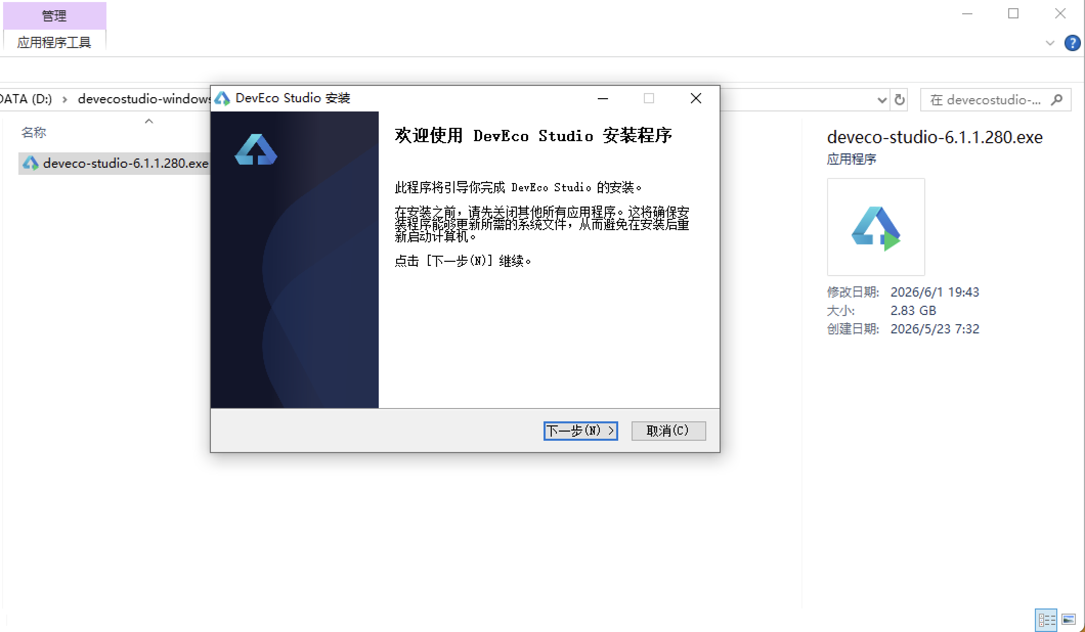
安装DevEco Studio程序
选择目标安装目录:
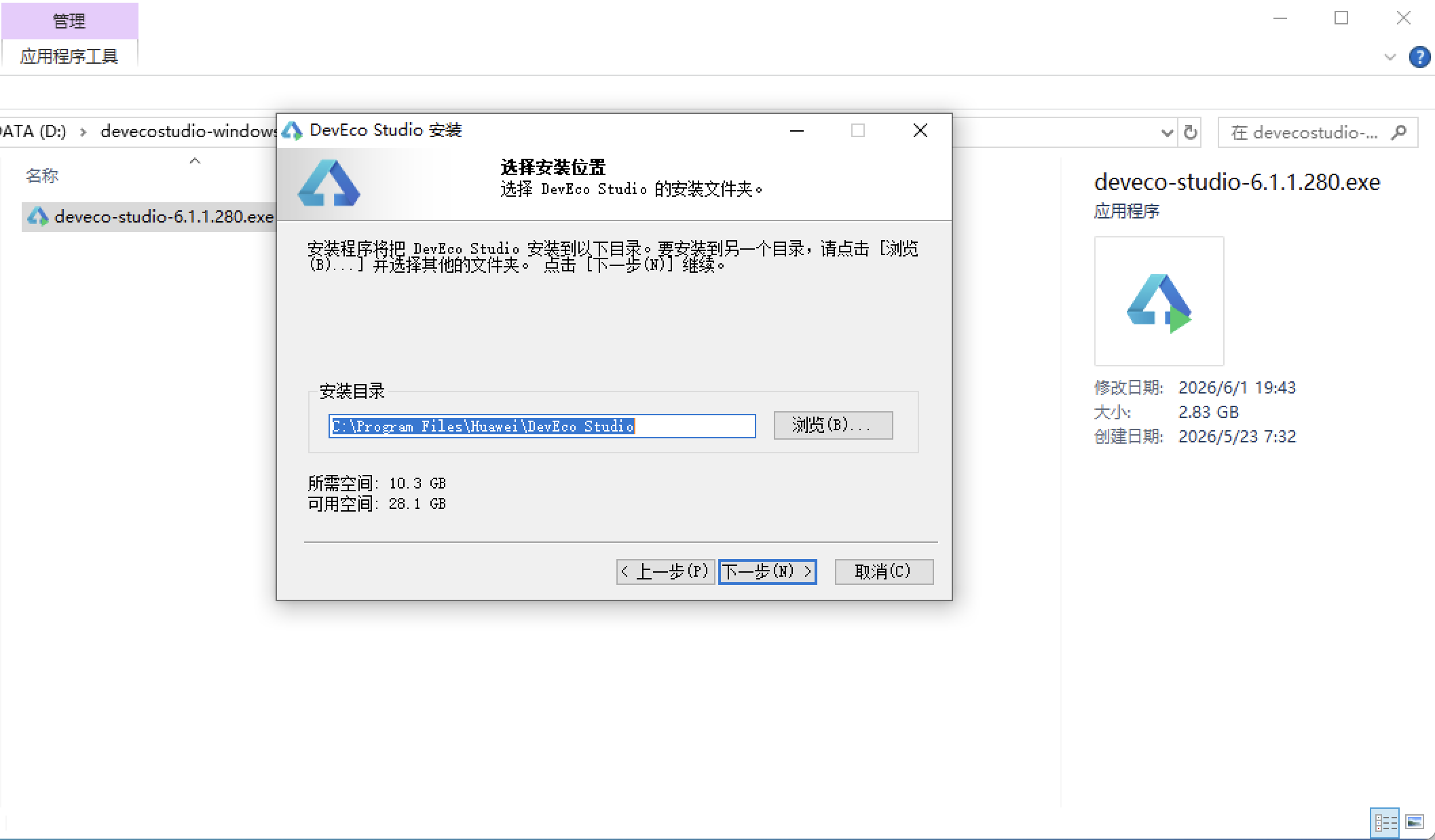
设置环境变量,但是需要重启一下:
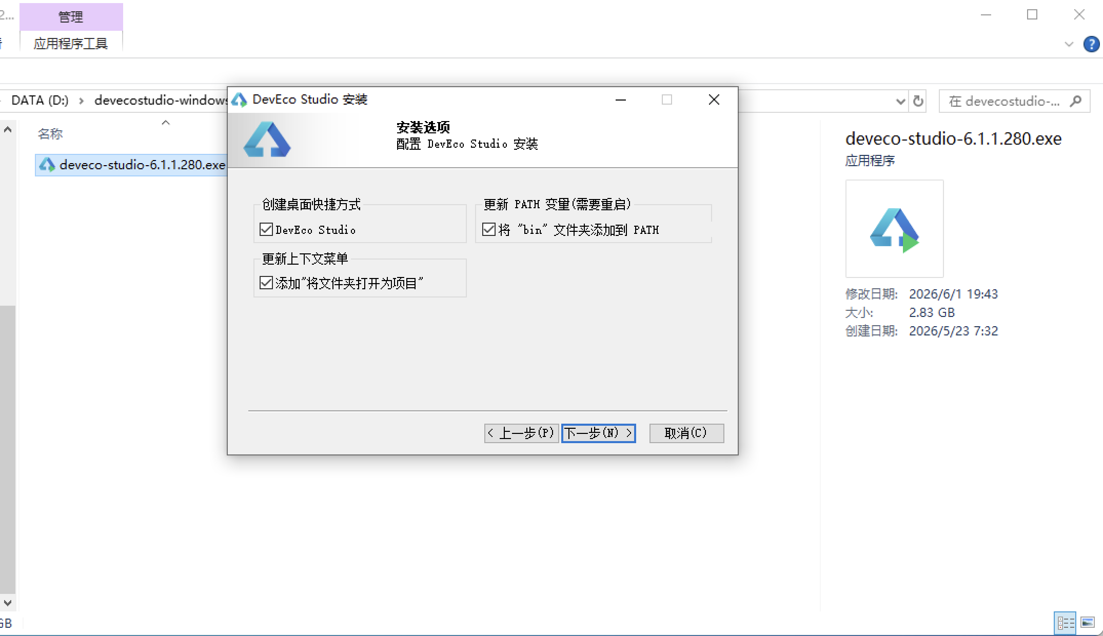
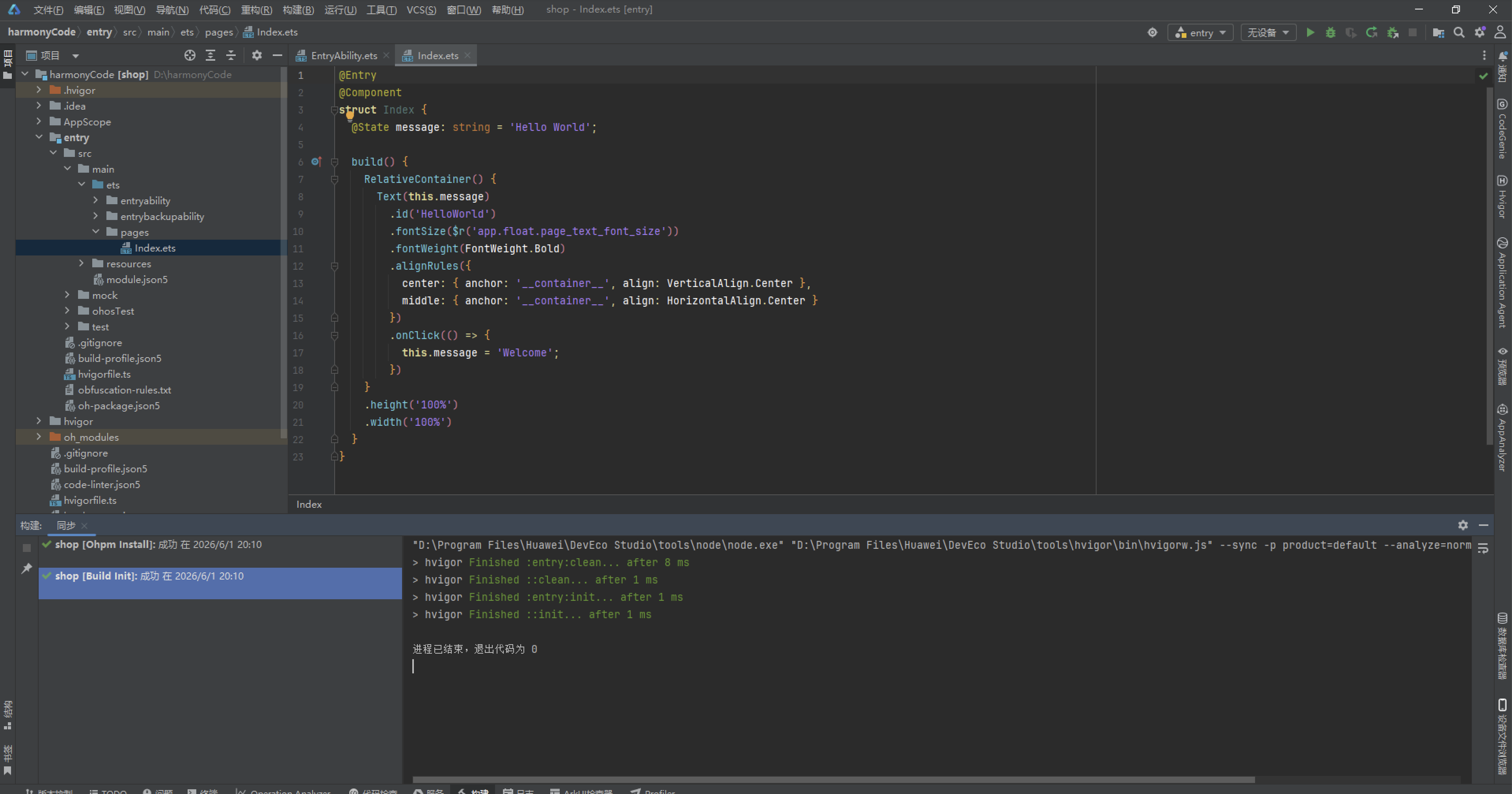
新建一个空白模板:
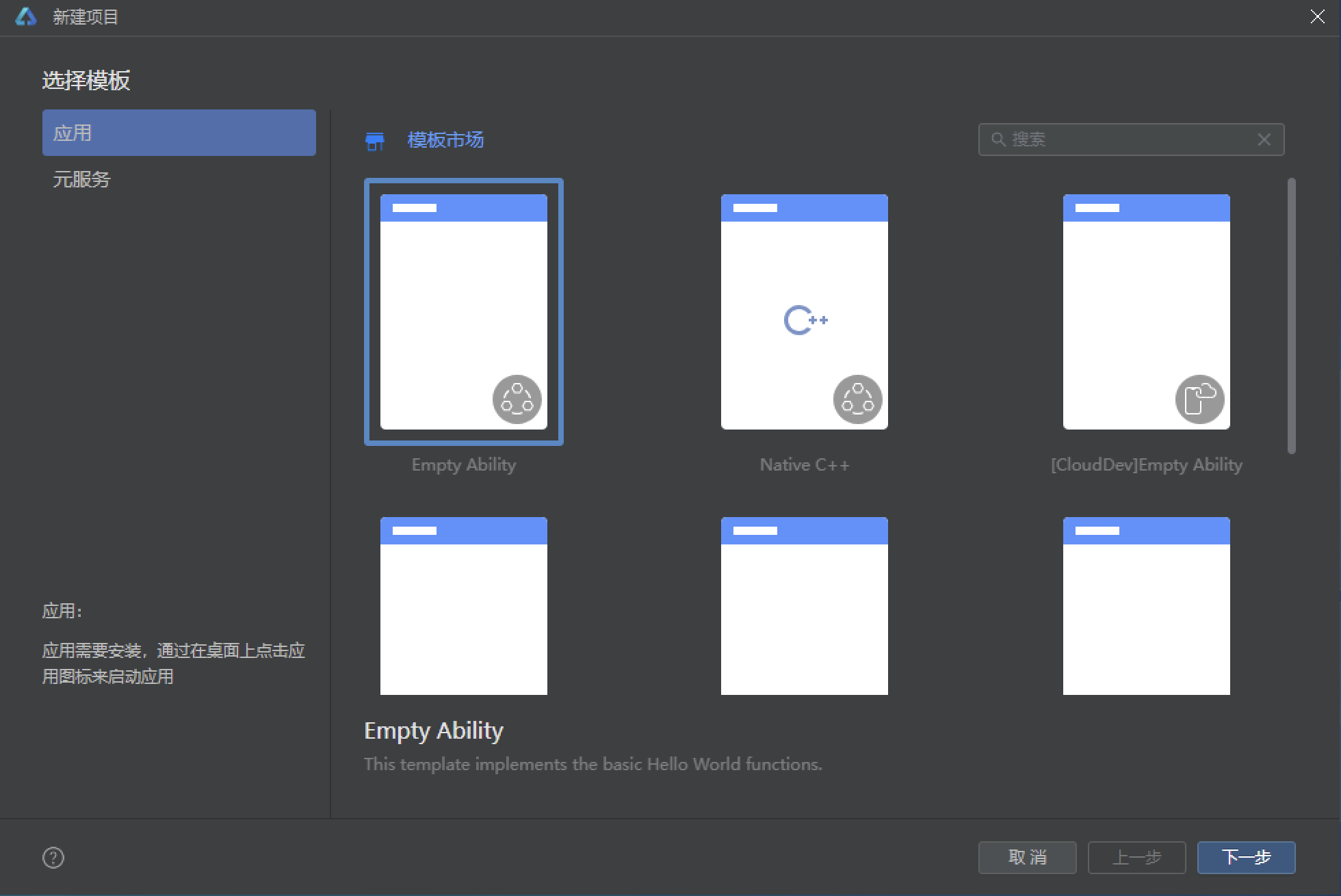
设置API为24的模板项目: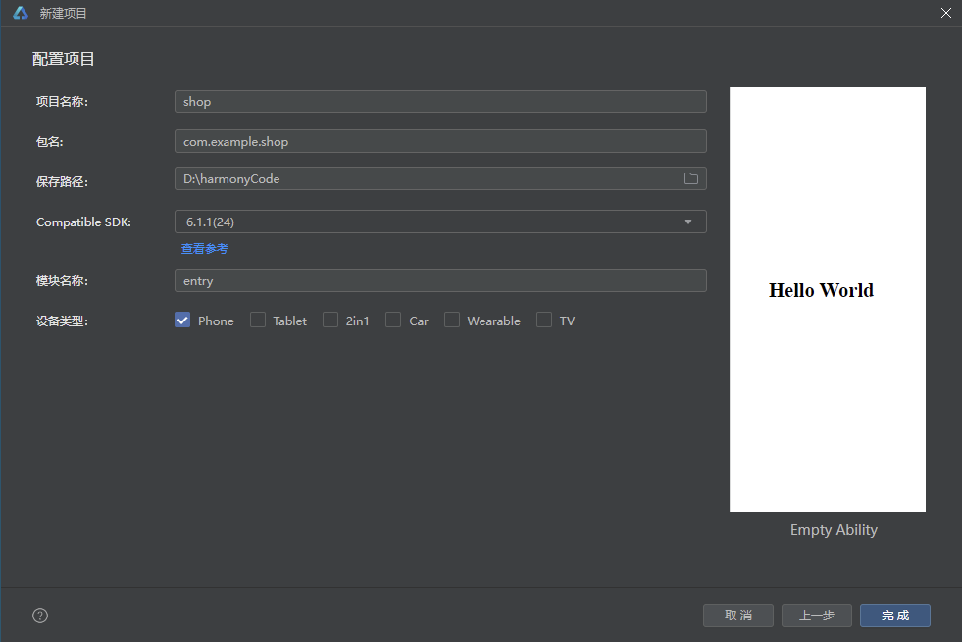
初始化项目,自动下载相关依赖:
完整代码:
interface ClayPalette {
primary: string;
primaryLight: string;
primaryDark: string;
accent: string;
accentLight: string;
bg: string;
cardBg: string;
cardAlt: string;
textPrimary: string;
textSecondary: string;
textHint: string;
border: string;
line: string;
success: string;
warning: string;
danger: string;
white: string;
clay: string;
glaze: string;
}
const COLORS: ClayPalette = {
primary: '#B0623A',
primaryLight: '#E8A87C',
primaryDark: '#7C3F1F',
accent: '#3E8E7E',
accentLight: '#BFE3D8',
bg: '#FBF6EE',
cardBg: '#FFFFFF',
cardAlt: '#F6EBDD',
textPrimary: '#5A3A22',
textSecondary: '#8A6E55',
textHint: '#BCA88F',
border: '#EBDCC9',
line: '#EADCC8',
success: '#5BAF7E',
warning: '#D9A441',
danger: '#C96B5B',
white: '#FFFFFF',
clay: '#B0623A',
glaze: '#3E8E7E'
};
enum PotteryTab {
WORKS = 0,
STUDENT = 1,
COURSE = 2,
MATERIAL = 3,
REVIEW = 4
}
interface TabMeta {
key: string;
icon: string;
label: string;
color: string;
}
const TAB_LIST: TabMeta[] = [
{ key: 'works', icon: '🏺', label: '作品', color: '#B0623A' },
{ key: 'student', icon: '🧑🎨', label: '学员', color: '#3E8E7E' },
{ key: 'course', icon: '🎓', label: '课程', color: '#D9A441' },
{ key: 'material', icon: '🧱', label: '原料', color: '#7C3F1F' },
{ key: 'review', icon: '✍️', label: '评价', color: '#C96B5B' }
];
const WHEEL_COL: number[] = [0, 1, 2, 3, 4, 5, 6, 7, 8];
interface WorkItem {
name: string;
style: string;
price: number;
rating: number;
madeBy: string;
emoji: string;
}
interface StudentItem {
name: string;
level: string;
hours: number;
works: number;
joined: string;
emoji: string;
}
interface CourseItem {
name: string;
teacher: string;
seats: number;
joined: number;
level: string;
emoji: string;
}
interface MaterialItem {
name: string;
type: string;
stock: number;
used: number;
price: number;
emoji: string;
}
interface ReviewItem {
name: string;
score: number;
date: string;
content: string;
tag: string;
emoji: string;
}
interface WeekMeta {
day: string;
value: number;
}
interface GlazeMeta {
name: string;
count: number;
color: string;
}
interface CourseJoinMeta {
name: string;
rate: number;
color: string;
}
interface WorkTopMeta {
name: string;
sales: number;
color: string;
}
const WEEK_ORDER: WeekMeta[] = [
{ day: '周一', value: 12 },
{ day: '周二', value: 16 },
{ day: '周三', value: 14 },
{ day: '周四', value: 20 },
{ day: '周五', value: 28 },
{ day: '周六', value: 46 },
{ day: '周日', value: 40 }
];
const GLAZE_SHARE: GlazeMeta[] = [
{ name: '青釉', count: 4, color: '#3E8E7E' },
{ name: '天青釉', count: 2, color: '#7FB8A6' },
{ name: '白釉', count: 2, color: '#D9C9AE' },
{ name: '黑釉', count: 2, color: '#4A3A2E' },
{ name: '红釉', count: 1, color: '#C96B5B' },
{ name: '窑变釉', count: 1, color: '#D9A441' }
];
const COURSE_JOIN: CourseJoinMeta[] = [
{ name: '拉坯入门课', rate: 95, color: '#B0623A' },
{ name: '釉下彩绘课', rate: 87, color: '#3E8E7E' },
{ name: '手捏器物课', rate: 80, color: '#D9A441' },
{ name: '青花绘制课', rate: 72, color: '#7FB8A6' },
{ name: '柴烧体验课', rate: 64, color: '#7C3F1F' },
{ name: '陶艺修复课', rate: 56, color: '#C96B5B' }
];
const WORK_TOP: WorkTopMeta[] = [
{ name: '青釉茶盏', sales: 186, color: '#3E8E7E' },
{ name: '手捏花瓶', sales: 142, color: '#B0623A' },
{ name: '柴烧杯子', sales: 128, color: '#7C3F1F' },
{ name: '釉下彩盘', sales: 96, color: '#7FB8A6' },
{ name: '窑变香炉', sales: 74, color: '#D9A441' },
{ name: '陶制花盆', sales: 63, color: '#C96B5B' }
];
@Observed
export class ClayData {
works: WorkItem[] = [
{ name: '青釉茶盏', style: '青釉', price: 268, rating: 9.5, madeBy: '苏师傅', emoji: '🍵' },
{ name: '手捏花瓶', style: '素烧', price: 188, rating: 9.0, madeBy: '阿禾', emoji: '🏺' },
{ name: '柴烧杯子', style: '柴烧', price: 158, rating: 9.3, madeBy: '老柴', emoji: '☕' },
{ name: '釉下彩盘', style: '釉下彩', price: 228, rating: 8.9, madeBy: '小林', emoji: '🍽️' },
{ name: '窑变香炉', style: '窑变', price: 328, rating: 9.4, madeBy: '苏师傅', emoji: '🪔' },
{ name: '陶制花盆', style: '素烧', price: 98, rating: 8.4, madeBy: '阿禾', emoji: '🪴' },
{ name: '青花瓷碗', style: '青花', price: 298, rating: 9.1, madeBy: '刘青花', emoji: '🥣' },
{ name: '黑釉建盏', style: '黑釉', price: 258, rating: 9.2, madeBy: '老柴', emoji: '⚫' },
{ name: '白釉圆盘', style: '白釉', price: 138, rating: 8.6, madeBy: '小林', emoji: '⚪' },
{ name: '天青釉笔洗', style: '天青釉', price: 198, rating: 8.8, madeBy: '刘青花', emoji: '🖌️' },
{ name: '红釉铃铛', style: '红釉', price: 118, rating: 8.5, madeBy: '阿禾', emoji: '🔔' },
{ name: '陶泥人偶', style: '手捏', price: 168, rating: 8.7, madeBy: '小陶', emoji: '🧸' }
];
students: StudentItem[] = [
{ name: '温小陶', level: '进阶', hours: 128, works: 24, joined: '2025-03', emoji: '🦊' },
{ name: '陈阿土', level: '入门', hours: 36, works: 6, joined: '2026-02', emoji: '🐼' },
{ name: '苏釉釉', level: '大师', hours: 320, works: 58, joined: '2024-01', emoji: '🐰' },
{ name: '泥巴', level: '进阶', hours: 96, works: 18, joined: '2025-07', emoji: '🐻' },
{ name: '青瓷', level: '大师', hours: 412, works: 76, joined: '2023-05', emoji: '🦌' },
{ name: '瓦片', level: '入门', hours: 28, works: 5, joined: '2026-01', emoji: '🐹' },
{ name: '窑火', level: '进阶', hours: 142, works: 26, joined: '2025-02', emoji: '🔥' },
{ name: '泥匠', level: '大师', hours: 388, works: 71, joined: '2023-09', emoji: '🧔' },
{ name: '柚木', level: '入门', hours: 42, works: 7, joined: '2025-11', emoji: '🐨' },
{ name: '釉下', level: '进阶', hours: 118, works: 22, joined: '2025-05', emoji: '🎨' },
{ name: '陶然', level: '入门', hours: 52, works: 9, joined: '2025-10', emoji: '🍂' },
{ name: '杯盏', level: '大师', hours: 296, works: 52, joined: '2024-06', emoji: '🥛' }
];
courses: CourseItem[] = [
{ name: '拉坯入门课', teacher: '苏师傅', seats: 12, joined: 11, level: '入门', emoji: '🌀' },
{ name: '釉下彩绘课', teacher: '小林', seats: 15, joined: 13, level: '进阶', emoji: '🎨' },
{ name: '手捏器物课', teacher: '阿禾', seats: 18, joined: 14, level: '入门', emoji: '✋' },
{ name: '青花绘制课', teacher: '刘青花', seats: 10, joined: 7, level: '进阶', emoji: '🦋' },
{ name: '柴烧体验课', teacher: '老柴', seats: 8, joined: 5, level: '大师', emoji: '🔥' },
{ name: '陶艺修复课', teacher: '苏师傅', seats: 12, joined: 7, level: '进阶', emoji: '🩹' },
{ name: '素烧上釉课', teacher: '老柴', seats: 14, joined: 10, level: '入门', emoji: '🫙' },
{ name: '陶塑人偶课', teacher: '小陶', seats: 16, joined: 12, level: '入门', emoji: '🧸' },
{ name: '茶器制作课', teacher: '刘青花', seats: 10, joined: 8, level: '进阶', emoji: '🍵' },
{ name: '釉料调配课', teacher: '小林', seats: 9, joined: 5, level: '大师', emoji: '🧪' },
{ name: '亲子陶艺课', teacher: '阿禾', seats: 20, joined: 17, level: '入门', emoji: '👨👩👧' },
{ name: '花器设计课', teacher: '小陶', seats: 12, joined: 6, level: '进阶', emoji: '💐' }
];
materials: MaterialItem[] = [
{ name: '高岭土', type: '陶泥', stock: 320, used: 1850, price: 28, emoji: '🏔️' },
{ name: '红陶泥', type: '陶泥', stock: 210, used: 1280, price: 22, emoji: '🟤' },
{ name: '白瓷泥', type: '瓷泥', stock: 180, used: 960, price: 32, emoji: '⚪' },
{ name: '青釉料', type: '釉料', stock: 45, used: 320, price: 68, emoji: '🟢' },
{ name: '天青釉料', type: '釉料', stock: 30, used: 210, price: 88, emoji: '🔵' },
{ name: '黑釉料', type: '釉料', stock: 24, used: 150, price: 72, emoji: '⚫' },
{ name: '化妆土', type: '化妆土', stock: 60, used: 280, price: 18, emoji: '🥛' },
{ name: '青花颜料', type: '颜料', stock: 18, used: 96, price: 120, emoji: '🦋' },
{ name: '柴烧木柴', type: '燃料', stock: 400, used: 2600, price: 6, emoji: '🪵' },
{ name: '修坯工具', type: '工具', stock: 35, used: 120, price: 45, emoji: '🔪' },
{ name: '拉坯转盘', type: '设备', stock: 12, used: 40, price: 680, emoji: '🌀' },
{ name: '陶艺海绵', type: '耗材', stock: 90, used: 430, price: 8, emoji: '🧽' }
];
reviews: ReviewItem[] = [
{ name: '茶香', score: 5, date: '08-15', content: '拉坯课老师教得特别耐心,第一次就做出了杯子!', tag: '教学耐心', emoji: '🍵' },
{ name: '阿禾粉', score: 5, date: '08-14', content: '青釉茶盏质感绝了,喝茶都变有仪式感。', tag: '作品惊艳', emoji: '🦊' },
{ name: '泥人', score: 4, date: '08-13', content: '柴烧体验很过瘾,就是工期要等一个月。', tag: '等待较长', emoji: '🔥' },
{ name: '小蓝', score: 5, date: '08-12', content: '青花绘制课内容超值,刘老师功底深厚。', tag: '干货满满', emoji: '🦋' },
{ name: '陶陶', score: 4, date: '08-11', content: '亲子课小朋友玩得很开心,环境也干净。', tag: '亲子友好', emoji: '🧸' },
{ name: '盏友', score: 5, date: '08-10', content: '黑釉建盏开片效果完美,收藏价值高。', tag: '作品惊艳', emoji: '⚫' },
{ name: '灰灰', score: 3, date: '08-09', content: '周末人太多,拉坯机位要排队半小时。', tag: '排队较长', emoji: '🐹' },
{ name: '釉下彩', score: 5, date: '08-08', content: '釉料调配课让我自己配出了理想色号!', tag: '专业深度', emoji: '🧪' },
{ name: '花盆', score: 4, date: '08-07', content: '陶制花盆透气性好,绿植长得很好。', tag: '商品满意', emoji: '🪴' },
{ name: '老陶', score: 5, date: '08-06', content: '陶艺修复课修复了家里的老茶壶,手艺一流。', tag: '专业深度', emoji: '🩹' },
{ name: '米粒', score: 4, date: '08-05', content: '环境很有艺术氛围,随手拍都好看。', tag: '氛围满分', emoji: '📷' },
{ name: '柴门', score: 5, date: '08-04', content: '柴烧杯子每只都不一样,独一无二的美。', tag: '作品惊艳', emoji: '☕' }
];
}
function getStyleColor(style: string): string {
if (style === '青釉' || style === '青花') {
return '#3E8E7E';
} else if (style === '素烧') {
return '#B0623A';
} else if (style === '柴烧') {
return '#7C3F1F';
} else if (style === '釉下彩') {
return '#7FB8A6';
} else if (style === '窑变') {
return '#D9A441';
} else if (style === '黑釉') {
return '#4A3A2E';
} else if (style === '白釉') {
return '#A8937B';
} else if (style === '天青釉') {
return '#6FA8C9';
}
return '#C96B5B';
}
function getLevelColor(level: string): string {
if (level === '入门') {
return '#5BAF7E';
} else if (level === '进阶') {
return '#D9A441';
}
return '#C96B5B';
}
function getTypeColor(type: string): string {
if (type === '陶泥') {
return '#B0623A';
} else if (type === '瓷泥') {
return '#C9BFA8';
} else if (type === '釉料') {
return '#3E8E7E';
} else if (type === '化妆土') {
return '#D9C9AE';
} else if (type === '颜料') {
return '#6FA8C9';
} else if (type === '燃料') {
return '#7C3F1F';
}
return '#8A6E55';
}
function getTagColor(tag: string): string {
if (tag === '作品惊艳' || tag === '干货满满') {
return '#B0623A';
} else if (tag === '教学耐心' || tag === '亲子友好' || tag === '氛围满分') {
return '#3E8E7E';
} else if (tag === '专业深度') {
return '#D9A441';
} else if (tag === '排队较长' || tag === '等待较长') {
return '#C96B5B';
}
return '#7FB8A6';
}
@Entry
@Component
struct ClayApp {
@State curTab: number = 0;
@State data: ClayData = new ClayData();
@State showAddWork: boolean = false;
@State showEditCourse: boolean = false;
@State showDeleteMaterial: boolean = false;
@State showDetail: boolean = false;
@State delMaterialName: string = '';
@State detailStudentName: string = '';
@State potSpin: boolean = false;
@State paintWave: boolean = false;
@Builder modalOverlay(onClose: () => void) {
Column() {
Text('')
.width(0)
.height(0)
.opacity(0)
Button('')
.width(1)
.height(1)
.opacity(0)
.onClick(() => {
onClose();
})
}
.width(1)
.height(1)
}
build() {
Column() {
Column() {
Column() {
Row() {
Column() {
Text('🏺 陶艺工坊')
.fontSize(20)
.fontWeight(FontWeight.Bold)
.fontColor(COLORS.white)
Text('Pottery Workshop · 泥与火')
.fontSize(10)
.fontColor('#FFFFFFCC')
.margin({ top: 3 })
}
.alignItems(HorizontalAlign.Start)
.layoutWeight(1)
Row() {
Text('🏺')
.fontSize(20)
.onClick(() => {
this.potSpin = !this.potSpin;
})
.rotate({ angle: this.potSpin ? 360 : 0 })
.animation({ duration: 900, curve: Curve.EaseInOut })
Text('🎨')
.fontSize(18)
.margin({ left: 10 })
.onClick(() => {
this.paintWave = !this.paintWave;
})
.scale({ x: this.paintWave ? 1.25 : 1, y: this.paintWave ? 0.85 : 1 })
.animation({ duration: 500, curve: Curve.EaseOut })
Text('🫙')
.fontSize(16)
.margin({ left: 6 })
}
.padding({ left: 10, right: 10, top: 6, bottom: 6 })
.backgroundColor('#FFFFFF26')
.borderRadius(18)
.border({ width: 1, color: '#FFFFFF40' })
}
.width('100%')
Row() {
ForEach(WHEEL_COL, (c: number) => {
Column()
.layoutWeight(1)
.height(10)
.backgroundColor(c % 2 === 0 ? '#FFFFFF3D' : '#0000001F')
.borderRadius(5)
.margin({ left: 2, right: 2 })
}, (c: number) => 'wheel' + c)
}
.width('100%')
.height(10)
.margin({ top: 10 })
.borderRadius(5)
.clip(true)
Row() {
Text('陶土棕')
.fontSize(8)
.fontColor('#FFFFFFCC')
.padding({ left: 8, right: 8, top: 3, bottom: 3 })
.backgroundColor('#FFFFFF2E')
.borderRadius(8)
Text('釉青')
.fontSize(8)
.fontColor('#FFFFFFCC')
.padding({ left: 8, right: 8, top: 3, bottom: 3 })
.backgroundColor('#FFFFFF2E')
.borderRadius(8)
Text('窑火')
.fontSize(8)
.fontColor('#FFFFFFCC')
.padding({ left: 8, right: 8, top: 3, bottom: 3 })
.backgroundColor('#FFFFFF2E')
.borderRadius(8)
}
.width('100%')
.margin({ top: 8 })
}
.width('100%')
.padding({ left: 16, right: 16, top: 12, bottom: 12 })
.backgroundColor(COLORS.primary)
if (this.curTab === PotteryTab.WORKS) {
WorkContent({ data: this.data, onAdd: () => {
this.showAddWork = true;
} })
} else if (this.curTab === PotteryTab.STUDENT) {
StudentContent({ data: this.data, onDetail: (n: string) => {
this.detailStudentName = n;
this.showDetail = true;
} })
} else if (this.curTab === PotteryTab.COURSE) {
CourseContent({ data: this.data, onEdit: () => {
this.showEditCourse = true;
} })
} else if (this.curTab === PotteryTab.MATERIAL) {
MaterialContent({ data: this.data, onDel: (n: string) => {
this.delMaterialName = n;
this.showDeleteMaterial = true;
} })
} else {
ReviewContent({ data: this.data })
}
}
.width('100%')
.height('100%')
Row() {
ForEach(TAB_LIST, (t: TabMeta) => {
Column() {
Text(t.icon)
.fontSize(19)
Text(t.label)
.fontSize(10)
.fontColor(this.curTab === TAB_LIST.indexOf(t) ? COLORS.white : COLORS.textHint)
.fontWeight(this.curTab === TAB_LIST.indexOf(t) ? FontWeight.Bold : FontWeight.Normal)
.margin({ top: 2 })
}
.layoutWeight(1)
.justifyContent(FlexAlign.Center)
.padding({ top: 8, bottom: 8 })
.backgroundColor(this.curTab === TAB_LIST.indexOf(t) ? COLORS.primary : COLORS.cardBg)
.borderRadius(16)
.border(this.curTab === TAB_LIST.indexOf(t) ? { width: 1, color: t.color + '88' } : { width: 1, color: COLORS.line })
.onClick(() => {
this.curTab = TAB_LIST.indexOf(t);
})
}, (t: TabMeta) => t.key)
}
.width('100%')
.height(60)
.padding({ left: 8, right: 8 })
.backgroundColor(COLORS.cardBg)
.border({ width: 1, color: COLORS.line })
if (this.showAddWork) {
AddWorkModal({
onClose: () => {
this.showAddWork = false;
}
})
}
if (this.showEditCourse) {
EditCourseModal({
onClose: () => {
this.showEditCourse = false;
}
})
}
if (this.showDeleteMaterial) {
DeleteMaterialModal({
title: this.delMaterialName, onClose: () => {
this.showDeleteMaterial = false;
}
})
}
if (this.showDetail) {
DetailStudentModal({
name: this.detailStudentName, onClose: () => {
this.showDetail = false;
}
})
}
}
}
}
@Component
struct ClayTag {
@Prop text: string;
@Prop color: string;
build() {
Text(this.text)
.fontSize(9)
.fontColor(this.color)
.padding({ left: 6, right: 6, top: 2, bottom: 2 })
.backgroundColor(this.color + '1F')
.borderRadius(6)
.border({ width: 1, color: this.color + '40' })
}
}
@Component
struct WorkContent {
@ObjectLink data: ClayData;
onAdd: () => void = () => {};
build() {
Scroll() {
Column() {
Column() {
Row() {
Text('📈 周订单量')
.fontSize(13)
.fontWeight(FontWeight.Bold)
.fontColor(COLORS.textPrimary)
Text('周六46单')
.fontSize(9)
.fontColor(COLORS.danger)
.margin({ left: 8 })
}
.width('100%')
.justifyContent(FlexAlign.SpaceBetween)
Row() {
ForEach(WEEK_ORDER, (w: WeekMeta) => {
Column() {
Text(w.value + '')
.fontSize(8)
.fontColor(w.value >= 40 ? COLORS.primary : COLORS.textSecondary)
Column()
.width(20)
.height(w.value * 1.6)
.backgroundColor(w.value >= 40 ? COLORS.primary : COLORS.accent)
.borderRadius(4)
.margin({ top: 4 })
Text(w.day)
.fontSize(9)
.fontColor(COLORS.textSecondary)
.margin({ top: 4 })
}
.layoutWeight(1)
.alignItems(HorizontalAlign.Center)
}, (w: WeekMeta) => w.day)
}
.width('100%')
.height(140)
.alignItems(VerticalAlign.Bottom)
.margin({ top: 10 })
}
.width('100%')
.padding(14)
.backgroundColor(COLORS.cardBg)
.borderRadius(18)
.border({ width: 1, color: COLORS.primary + '66' })
Column() {
Row() {
Text('🫙 釉色分布')
.fontSize(13)
.fontWeight(FontWeight.Bold)
.fontColor(COLORS.textPrimary)
Text('全馆12件')
.fontSize(9)
.fontColor(COLORS.textHint)
.margin({ left: 8 })
}
.width('100%')
.justifyContent(FlexAlign.SpaceBetween)
ForEach(GLAZE_SHARE, (n: GlazeMeta) => {
Row() {
Text(n.name)
.fontSize(10)
.fontColor(COLORS.textSecondary)
.width(60)
Row() {
Row()
.layoutWeight(n.count / 4)
.height(8)
.backgroundColor(n.color)
.borderRadius(4)
Row()
.layoutWeight(1 - n.count / 4)
.height(8)
.backgroundColor(COLORS.cardAlt)
.borderRadius(4)
}
.layoutWeight(1)
.height(8)
Text(n.count + '件')
.fontSize(9)
.fontColor(n.color)
.width(32)
.textAlign(TextAlign.End)
}
.width('100%')
.margin({ top: 8 })
}, (n: GlazeMeta) => n.name)
}
.width('100%')
.padding(14)
.backgroundColor(COLORS.cardBg)
.borderRadius(18)
.border({ width: 1, color: COLORS.line })
.margin({ top: 12 })
Column() {
Row() {
Text('🏺 在售作品')
.fontSize(13)
.fontWeight(FontWeight.Bold)
.fontColor(COLORS.textPrimary)
Text('点击➕上架')
.fontSize(9)
.fontColor(COLORS.textHint)
.margin({ left: 8 })
Text('➕')
.fontSize(13)
.margin({ left: 8 })
.onClick(() => {
this.onAdd();
})
}
.width('100%')
.justifyContent(FlexAlign.SpaceBetween)
.margin({ bottom: 10 })
ForEach(this.data.works, (w: WorkItem, i: number) => {
Row() {
Column()
.width(44)
.height(44)
.justifyContent(FlexAlign.Center)
.backgroundColor(getStyleColor(w.style) + '22')
.borderRadius(22)
.border({ width: 2, color: getStyleColor(w.style) + '55' })
Text(w.emoji)
.fontSize(19)
.width(30)
.textAlign(TextAlign.Center)
Column() {
Row() {
Text(w.name)
.fontSize(13)
.fontWeight(FontWeight.Bold)
.fontColor(COLORS.textPrimary)
ClayTag({ text: w.style, color: getStyleColor(w.style) })
.margin({ left: 6 })
}
.width('100%')
Text(w.madeBy + ' 手作 · ¥' + w.price)
.fontSize(10)
.fontColor(COLORS.textSecondary)
.margin({ top: 3 })
}
.layoutWeight(1)
.alignItems(HorizontalAlign.Start)
.padding({ left: 8 })
Column() {
Text(w.rating + '')
.fontSize(12)
.fontWeight(FontWeight.Bold)
.fontColor(COLORS.accent)
Text('评分')
.fontSize(8)
.fontColor(COLORS.textHint)
.margin({ top: 2 })
}
.alignItems(HorizontalAlign.End)
}
.width('100%')
.padding({ left: 10, right: 12, top: 9, bottom: 9 })
.backgroundColor(i % 2 === 0 ? COLORS.cardBg : COLORS.cardAlt)
.borderRadius(14)
.border({ width: 1, color: COLORS.line })
.margin({ bottom: 8 })
}, (w: WorkItem, i: number) => w.name + i)
}
.width('100%')
.padding(14)
.backgroundColor(COLORS.cardAlt)
.borderRadius(18)
.border({ width: 1, color: COLORS.primary + '66' })
.margin({ top: 12 })
}
.width('100%')
.padding(14)
}
.width('100%')
.constraintSize({ maxHeight: '100%' })
}
}
@Component
struct StudentContent {
@ObjectLink data: ClayData;
onDetail: (n: string) => void = () => {};
build() {
Scroll() {
Column() {
Row() {
Text('🧑🎨 工坊学员')
.fontSize(15)
.fontWeight(FontWeight.Bold)
.fontColor(COLORS.textPrimary)
Text('点击查看档案')
.fontSize(9)
.fontColor(COLORS.textHint)
.margin({ left: 8 })
}
.width('100%')
.justifyContent(FlexAlign.SpaceBetween)
.margin({ bottom: 10 })
Row() {
Column() {
Text('12')
.fontSize(26)
.fontWeight(FontWeight.Bold)
.fontColor(COLORS.primary)
Text('在册学员')
.fontSize(9)
.fontColor(COLORS.textSecondary)
.margin({ top: 2 })
}
.layoutWeight(1)
.alignItems(HorizontalAlign.Center)
.padding({ top: 14, bottom: 14 })
.backgroundColor(COLORS.cardBg)
.borderRadius(18)
.border({ width: 1, color: COLORS.primary + '66' })
Column() {
Text('3')
.fontSize(26)
.fontWeight(FontWeight.Bold)
.fontColor(COLORS.accent)
Text('大师级')
.fontSize(9)
.fontColor(COLORS.textSecondary)
.margin({ top: 2 })
}
.layoutWeight(1)
.alignItems(HorizontalAlign.Center)
.padding({ top: 14, bottom: 14 })
.backgroundColor(COLORS.cardBg)
.borderRadius(18)
.border({ width: 1, color: COLORS.accent + '66' })
.margin({ left: 10 })
Column() {
Text('412')
.fontSize(26)
.fontWeight(FontWeight.Bold)
.fontColor(COLORS.warning)
Text('最长学时')
.fontSize(9)
.fontColor(COLORS.textSecondary)
.margin({ top: 2 })
}
.layoutWeight(1)
.alignItems(HorizontalAlign.Center)
.padding({ top: 14, bottom: 14 })
.backgroundColor(COLORS.cardBg)
.borderRadius(18)
.border({ width: 1, color: COLORS.warning + '66' })
.margin({ left: 10 })
}
.width('100%')
.margin({ bottom: 12 })
ForEach(this.data.students, (s: StudentItem, i: number) => {
Row() {
Column()
.width(42)
.height(42)
.justifyContent(FlexAlign.Center)
.backgroundColor(getLevelColor(s.level) + '22')
.borderRadius(21)
Text(s.emoji)
.fontSize(18)
.width(28)
.textAlign(TextAlign.Center)
Column() {
Row() {
Text(s.name)
.fontSize(13)
.fontWeight(FontWeight.Bold)
.fontColor(COLORS.textPrimary)
ClayTag({ text: s.level, color: getLevelColor(s.level) })
.margin({ left: 6 })
}
.width('100%')
Text('学时' + s.hours + 'h · 作品' + s.works + '件 · ' + s.joined + '入学')
.fontSize(10)
.fontColor(COLORS.textSecondary)
.margin({ top: 3 })
}
.layoutWeight(1)
.alignItems(HorizontalAlign.Start)
.padding({ left: 8 })
Text('👁️')
.fontSize(14)
.onClick(() => {
this.onDetail(s.name);
})
}
.width('100%')
.padding({ left: 10, right: 12, top: 9, bottom: 9 })
.backgroundColor(COLORS.cardBg)
.borderRadius(14)
.border({ width: 1, color: COLORS.line })
.margin({ bottom: 8 })
}, (s: StudentItem, i: number) => s.name + i)
}
.width('100%')
.padding(14)
}
.width('100%')
.constraintSize({ maxHeight: '100%' })
}
}
@Component
struct CourseContent {
@ObjectLink data: ClayData;
onEdit: () => void = () => {};
build() {
Scroll() {
Column() {
Column() {
Row() {
Text('🎓 课程报名进度')
.fontSize(13)
.fontWeight(FontWeight.Bold)
.fontColor(COLORS.textPrimary)
Text('拉坯课爆满')
.fontSize(9)
.fontColor(COLORS.danger)
.margin({ left: 8 })
}
.width('100%')
.justifyContent(FlexAlign.SpaceBetween)
ForEach(COURSE_JOIN, (c: CourseJoinMeta) => {
Row() {
Text(c.name)
.fontSize(10)
.fontColor(COLORS.textSecondary)
.width(84)
Row() {
Row()
.layoutWeight(c.rate / 100)
.height(8)
.backgroundColor(c.color)
.borderRadius(4)
Row()
.layoutWeight(1 - c.rate / 100)
.height(8)
.backgroundColor(COLORS.cardAlt)
.borderRadius(4)
}
.layoutWeight(1)
.height(8)
Text(c.rate + '%')
.fontSize(9)
.fontColor(c.color)
.width(38)
.textAlign(TextAlign.End)
}
.width('100%')
.margin({ top: 8 })
}, (c: CourseJoinMeta) => c.name)
}
.width('100%')
.padding(14)
.backgroundColor(COLORS.cardBg)
.borderRadius(18)
.border({ width: 1, color: COLORS.accent + '66' })
Column() {
Row() {
Text('🧑🏫 近期课程')
.fontSize(13)
.fontWeight(FontWeight.Bold)
.fontColor(COLORS.textPrimary)
Text('点击✏️调整')
.fontSize(9)
.fontColor(COLORS.textHint)
.margin({ left: 8 })
Text('✏️')
.fontSize(13)
.margin({ left: 8 })
.onClick(() => {
this.onEdit();
})
}
.width('100%')
.justifyContent(FlexAlign.SpaceBetween)
.margin({ bottom: 10 })
ForEach(this.data.courses, (c: CourseItem, i: number) => {
Row() {
Column()
.width(40)
.height(40)
.justifyContent(FlexAlign.Center)
.backgroundColor(getLevelColor(c.level) + '22')
.borderRadius(20)
Text(c.emoji)
.fontSize(18)
.width(28)
.textAlign(TextAlign.Center)
Column() {
Row() {
Text(c.name)
.fontSize(13)
.fontWeight(FontWeight.Bold)
.fontColor(COLORS.textPrimary)
ClayTag({ text: c.level, color: getLevelColor(c.level) })
.margin({ left: 6 })
}
.width('100%')
Text(c.teacher + ' 授课 · ' + c.seats + '人班')
.fontSize(10)
.fontColor(COLORS.textSecondary)
.margin({ top: 3 })
}
.layoutWeight(1)
.alignItems(HorizontalAlign.Start)
.padding({ left: 8 })
Column() {
Text(c.joined + '/' + c.seats)
.fontSize(12)
.fontWeight(FontWeight.Bold)
.fontColor(c.joined >= c.seats * 0.8 ? COLORS.danger : COLORS.success)
Text('已报名')
.fontSize(8)
.fontColor(COLORS.textHint)
.margin({ top: 2 })
}
.alignItems(HorizontalAlign.End)
}
.width('100%')
.padding({ left: 10, right: 12, top: 9, bottom: 9 })
.backgroundColor(i % 2 === 0 ? COLORS.cardBg : COLORS.cardAlt)
.borderRadius(14)
.border({ width: 1, color: COLORS.line })
.margin({ bottom: 8 })
}, (c: CourseItem, i: number) => c.name + i)
}
.width('100%')
.padding(14)
.backgroundColor(COLORS.cardAlt)
.borderRadius(18)
.border({ width: 1, color: COLORS.line })
.margin({ top: 12 })
}
.width('100%')
.padding(14)
}
.width('100%')
.constraintSize({ maxHeight: '100%' })
}
}
@Component
struct MaterialContent {
@ObjectLink data: ClayData;
onDel: (n: string) => void = () => {};
build() {
Scroll() {
Column() {
Column() {
Row() {
Text('🏆 作品销量TOP6')
.fontSize(13)
.fontWeight(FontWeight.Bold)
.fontColor(COLORS.textPrimary)
Text('茶盏夺冠')
.fontSize(9)
.fontColor(COLORS.accent)
.margin({ left: 8 })
}
.width('100%')
.justifyContent(FlexAlign.SpaceBetween)
.margin({ bottom: 10 })
ForEach(WORK_TOP, (w: WorkTopMeta, i: number) => {
Row() {
Text((i + 1) + '')
.fontSize(11)
.fontWeight(FontWeight.Bold)
.fontColor(i < 3 ? COLORS.primary : COLORS.textHint)
.width(22)
Text(w.name)
.fontSize(10)
.fontColor(COLORS.textSecondary)
.width(80)
Row() {
Row()
.layoutWeight(w.sales / 190)
.height(8)
.backgroundColor(w.color)
.borderRadius(4)
Row()
.layoutWeight(1 - w.sales / 190)
.height(8)
.backgroundColor(COLORS.cardAlt)
.borderRadius(4)
}
.layoutWeight(1)
.height(8)
Text(w.sales + '件')
.fontSize(9)
.fontColor(w.color)
.width(44)
.textAlign(TextAlign.End)
}
.width('100%')
.margin({ top: 7 })
}, (w: WorkTopMeta, i: number) => w.name + i)
}
.width('100%')
.padding(14)
.backgroundColor(COLORS.cardBg)
.borderRadius(18)
.border({ width: 1, color: COLORS.primary + '66' })
Column() {
Row() {
Text('🧱 原料库存')
.fontSize(13)
.fontWeight(FontWeight.Bold)
.fontColor(COLORS.textPrimary)
Text('点击🗑️移除')
.fontSize(9)
.fontColor(COLORS.textHint)
.margin({ left: 8 })
}
.width('100%')
.justifyContent(FlexAlign.SpaceBetween)
.margin({ bottom: 10 })
ForEach(this.data.materials, (m: MaterialItem, i: number) => {
Row() {
Column()
.width(40)
.height(40)
.justifyContent(FlexAlign.Center)
.backgroundColor(getTypeColor(m.type) + '22')
.borderRadius(14)
Text(m.emoji)
.fontSize(18)
.width(28)
.textAlign(TextAlign.Center)
Column() {
Row() {
Text(m.name)
.fontSize(13)
.fontWeight(FontWeight.Bold)
.fontColor(COLORS.textPrimary)
ClayTag({ text: m.type, color: getTypeColor(m.type) })
.margin({ left: 6 })
}
.width('100%')
Text('¥' + m.price + '/份 · 已用' + m.used + '份')
.fontSize(10)
.fontColor(COLORS.textSecondary)
.margin({ top: 3 })
}
.layoutWeight(1)
.alignItems(HorizontalAlign.Start)
.padding({ left: 8 })
Column() {
Text(m.stock > 30 ? '充足' : '告急')
.fontSize(10)
.fontWeight(FontWeight.Bold)
.fontColor(m.stock > 30 ? COLORS.success : COLORS.danger)
Text('库存' + m.stock)
.fontSize(8)
.fontColor(COLORS.textHint)
.margin({ top: 2 })
Text('🗑️')
.fontSize(12)
.margin({ top: 4 })
.onClick(() => {
this.onDel(m.name);
})
}
.alignItems(HorizontalAlign.End)
}
.width('100%')
.padding({ left: 10, right: 12, top: 9, bottom: 9 })
.backgroundColor(COLORS.cardBg)
.borderRadius(14)
.border({ width: 1, color: COLORS.line })
.margin({ bottom: 8 })
}, (m: MaterialItem, i: number) => m.name + i)
}
.width('100%')
.padding(14)
.backgroundColor(COLORS.cardAlt)
.borderRadius(18)
.border({ width: 1, color: COLORS.line })
.margin({ top: 12 })
}
.width('100%')
.padding(14)
}
.width('100%')
.constraintSize({ maxHeight: '100%' })
}
}
@Component
struct ReviewContent {
@ObjectLink data: ClayData;
build() {
Scroll() {
Column() {
Row() {
Text('✍️ 工坊评价')
.fontSize(15)
.fontWeight(FontWeight.Bold)
.fontColor(COLORS.textPrimary)
Text('平均4.5分 · 共12条')
.fontSize(9)
.fontColor(COLORS.textHint)
.margin({ left: 8 })
}
.width('100%')
.justifyContent(FlexAlign.SpaceBetween)
.margin({ bottom: 10 })
ForEach(this.data.reviews, (r: ReviewItem, i: number) => {
Column() {
Row() {
Column()
.width(36)
.height(36)
.justifyContent(FlexAlign.Center)
.backgroundColor(getTagColor(r.tag) + '22')
.borderRadius(18)
Text(r.emoji)
.fontSize(15)
.width(26)
.textAlign(TextAlign.Center)
Column() {
Text(r.name)
.fontSize(12)
.fontWeight(FontWeight.Bold)
.fontColor(COLORS.textPrimary)
Text('⭐'.repeat(Math.round(r.score)) + ' · ' + r.date)
.fontSize(9)
.fontColor(COLORS.warning)
.margin({ top: 2 })
}
.layoutWeight(1)
.alignItems(HorizontalAlign.Start)
.padding({ left: 8 })
ClayTag({ text: r.tag, color: getTagColor(r.tag) })
}
.width('100%')
Text(r.content)
.fontSize(11)
.fontColor(COLORS.textSecondary)
.lineHeight(18)
.width('100%')
.margin({ top: 8 })
}
.width('100%')
.padding(12)
.backgroundColor(i % 2 === 0 ? COLORS.cardBg : COLORS.cardAlt)
.borderRadius(16)
.border({ width: 1, color: COLORS.line })
.alignItems(HorizontalAlign.Start)
.margin({ bottom: 8 })
}, (r: ReviewItem, i: number) => r.name + i)
}
.width('100%')
.padding(14)
}
.width('100%')
.constraintSize({ maxHeight: '100%' })
}
}
@Component
struct AddWorkModal {
onClose: () => void = () => {};
build() {
Column() {
Column() {
Row() {
Text('🏺')
.fontSize(26)
Column() {
Text('上架新作品')
.fontSize(16)
.fontWeight(FontWeight.Bold)
.fontColor(COLORS.textPrimary)
Text('录入手作作品信息')
.fontSize(10)
.fontColor(COLORS.textHint)
.margin({ top: 2 })
}
.alignItems(HorizontalAlign.Start)
.margin({ left: 10 })
.layoutWeight(1)
Text('✕')
.fontSize(16)
.fontColor(COLORS.textHint)
.onClick(() => {
this.onClose();
})
}
.width('100%')
Row() {
Text('作品名称')
.fontSize(11)
.fontColor(COLORS.textSecondary)
.width(70)
Text('天青釉执壶')
.fontSize(12)
.fontColor(COLORS.textPrimary)
.layoutWeight(1)
}
.width('100%')
.padding(12)
.backgroundColor(COLORS.cardAlt)
.borderRadius(12)
.margin({ top: 14 })
Row() {
Text('釉色风格')
.fontSize(11)
.fontColor(COLORS.textSecondary)
.width(70)
Text('天青釉 · 手拉坯')
.fontSize(12)
.fontColor(COLORS.accent)
.layoutWeight(1)
}
.width('100%')
.padding(12)
.backgroundColor(COLORS.cardAlt)
.borderRadius(12)
.margin({ top: 8 })
Row() {
Text('创作者')
.fontSize(11)
.fontColor(COLORS.textSecondary)
.width(70)
Text('刘青花 · 烧制1280℃')
.fontSize(12)
.fontColor(COLORS.textPrimary)
.layoutWeight(1)
}
.width('100%')
.padding(12)
.backgroundColor(COLORS.cardAlt)
.borderRadius(12)
.margin({ top: 8 })
Row() {
Text('定价')
.fontSize(11)
.fontColor(COLORS.textSecondary)
.width(70)
Text('¥328 · 限量10件')
.fontSize(12)
.fontColor(COLORS.warning)
.layoutWeight(1)
}
.width('100%')
.padding(12)
.backgroundColor(COLORS.cardAlt)
.borderRadius(12)
.margin({ top: 8 })
Text('✅ 每件作品均为手工制作,成品可能存在细微差异,请如实标注瑕疵。')
.fontSize(10)
.fontColor(COLORS.textHint)
.width('100%')
.margin({ top: 14 })
Row() {
Text('取消')
.fontSize(13)
.fontColor(COLORS.textSecondary)
.layoutWeight(1)
.textAlign(TextAlign.Center)
.padding({ top: 11, bottom: 11 })
.backgroundColor(COLORS.cardAlt)
.borderRadius(12)
.onClick(() => {
this.onClose();
})
Text('确认上架')
.fontSize(13)
.fontWeight(FontWeight.Bold)
.fontColor(COLORS.white)
.layoutWeight(1)
.textAlign(TextAlign.Center)
.padding({ top: 11, bottom: 11 })
.margin({ left: 10 })
.backgroundColor(COLORS.primary)
.borderRadius(12)
.onClick(() => {
this.onClose();
})
}
.width('100%')
.margin({ top: 16 })
}
.width('100%')
.padding(16)
.backgroundColor(COLORS.cardBg)
.borderRadius(20)
.border({ width: 1, color: COLORS.primary + '88' })
}
.width('100%')
.justifyContent(FlexAlign.End)
.constraintSize({ maxHeight: '78%' })
}
}
@Component
struct EditCourseModal {
onClose: () => void = () => {};
build() {
Column() {
Column() {
Row() {
Text('🎓')
.fontSize(26)
Column() {
Text('编辑课程')
.fontSize(16)
.fontWeight(FontWeight.Bold)
.fontColor(COLORS.textPrimary)
Text('调整班额与时间')
.fontSize(10)
.fontColor(COLORS.textHint)
.margin({ top: 2 })
}
.alignItems(HorizontalAlign.Start)
.margin({ left: 10 })
.layoutWeight(1)
Text('✕')
.fontSize(16)
.fontColor(COLORS.textHint)
.onClick(() => {
this.onClose();
})
}
.width('100%')
Row() {
Text('课程名称')
.fontSize(11)
.fontColor(COLORS.textSecondary)
.width(70)
Text('拉坯入门课')
.fontSize(12)
.fontColor(COLORS.textPrimary)
.layoutWeight(1)
}
.width('100%')
.padding(12)
.backgroundColor(COLORS.cardAlt)
.borderRadius(12)
.margin({ top: 14 })
Row() {
Text('授课老师')
.fontSize(11)
.fontColor(COLORS.textSecondary)
.width(70)
Text('苏师傅 · 周六上午')
.fontSize(12)
.fontColor(COLORS.textPrimary)
.layoutWeight(1)
}
.width('100%')
.padding(12)
.backgroundColor(COLORS.cardAlt)
.borderRadius(12)
.margin({ top: 8 })
Row() {
Text('班额调整')
.fontSize(11)
.fontColor(COLORS.textSecondary)
.width(70)
Text('12人 → 14人')
.fontSize(12)
.fontColor(COLORS.accent)
.layoutWeight(1)
}
.width('100%')
.padding(12)
.backgroundColor(COLORS.cardAlt)
.borderRadius(12)
.margin({ top: 8 })
Row() {
Text('课程备注')
.fontSize(11)
.fontColor(COLORS.textSecondary)
.width(70)
Text('已满员课程自动开启候补')
.fontSize(12)
.fontColor(COLORS.warning)
.layoutWeight(1)
}
.width('100%')
.padding(12)
.backgroundColor(COLORS.cardAlt)
.borderRadius(12)
.margin({ top: 8 })
Text('⚠️ 班额调整后已报名学员不受影响,新报名将按新班额执行。')
.fontSize(10)
.fontColor(COLORS.textHint)
.width('100%')
.margin({ top: 14 })
Row() {
Text('取消')
.fontSize(13)
.fontColor(COLORS.textSecondary)
.layoutWeight(1)
.textAlign(TextAlign.Center)
.padding({ top: 11, bottom: 11 })
.backgroundColor(COLORS.cardAlt)
.borderRadius(12)
.onClick(() => {
this.onClose();
})
Text('保存修改')
.fontSize(13)
.fontWeight(FontWeight.Bold)
.fontColor(COLORS.white)
.layoutWeight(1)
.textAlign(TextAlign.Center)
.padding({ top: 11, bottom: 11 })
.margin({ left: 10 })
.backgroundColor(COLORS.accent)
.borderRadius(12)
.onClick(() => {
this.onClose();
})
}
.width('100%')
.margin({ top: 16 })
}
.width('100%')
.padding(16)
.backgroundColor(COLORS.cardBg)
.borderRadius(20)
.border({ width: 1, color: COLORS.accent + '88' })
}
.width('100%')
.justifyContent(FlexAlign.End)
.constraintSize({ maxHeight: '78%' })
}
}
@Component
struct DeleteMaterialModal {
@Prop title: string;
onClose: () => void = () => {};
build() {
Column() {
Column() {
Column() {
Text('🗑️')
.fontSize(34)
Text('确认移除原料')
.fontSize(16)
.fontWeight(FontWeight.Bold)
.fontColor(COLORS.textPrimary)
.margin({ top: 10 })
Text('「' + this.title + '」将从库存清单移除,历史用量记录仍会保留。')
.fontSize(11)
.fontColor(COLORS.textSecondary)
.textAlign(TextAlign.Center)
.width('100%')
.margin({ top: 8 })
}
.width('100%')
.alignItems(HorizontalAlign.Center)
Row() {
Text('取消')
.fontSize(13)
.fontColor(COLORS.textSecondary)
.layoutWeight(1)
.textAlign(TextAlign.Center)
.padding({ top: 11, bottom: 11 })
.backgroundColor(COLORS.cardAlt)
.borderRadius(12)
.onClick(() => {
this.onClose();
})
Text('确认移除')
.fontSize(13)
.fontWeight(FontWeight.Bold)
.fontColor(COLORS.white)
.layoutWeight(1)
.textAlign(TextAlign.Center)
.padding({ top: 11, bottom: 11 })
.margin({ left: 10 })
.backgroundColor(COLORS.danger)
.borderRadius(12)
.onClick(() => {
this.onClose();
})
}
.width('100%')
.margin({ top: 16 })
}
.width('100%')
.padding(16)
.backgroundColor(COLORS.cardBg)
.borderRadius(20)
.border({ width: 1, color: COLORS.danger + '88' })
}
.width('100%')
.justifyContent(FlexAlign.End)
.constraintSize({ maxHeight: '78%' })
}
}
@Component
struct DetailStudentModal {
@Prop name: string;
onClose: () => void = () => {};
build() {
Column() {
Column() {
Row() {
Text('🧑🎨')
.fontSize(26)
Column() {
Text('学员档案')
.fontSize(16)
.fontWeight(FontWeight.Bold)
.fontColor(COLORS.textPrimary)
Text('学员「' + this.name + '」')
.fontSize(10)
.fontColor(COLORS.textHint)
.margin({ top: 2 })
}
.alignItems(HorizontalAlign.Start)
.margin({ left: 10 })
.layoutWeight(1)
Text('✕')
.fontSize(16)
.fontColor(COLORS.textHint)
.onClick(() => {
this.onClose();
})
}
.width('100%')
Row() {
Text('学员等级')
.fontSize(11)
.fontColor(COLORS.textSecondary)
.width(70)
Text('进阶 · 累计128学时')
.fontSize(12)
.fontColor(COLORS.primary)
.layoutWeight(1)
}
.width('100%')
.padding(12)
.backgroundColor(COLORS.cardAlt)
.borderRadius(12)
.margin({ top: 14 })
Row() {
Text('代表作品')
.fontSize(11)
.fontColor(COLORS.textSecondary)
.width(70)
Text('青釉茶盏 · 手捏花瓶')
.fontSize(12)
.fontColor(COLORS.textPrimary)
.layoutWeight(1)
}
.width('100%')
.padding(12)
.backgroundColor(COLORS.cardAlt)
.borderRadius(12)
.margin({ top: 8 })
Row() {
Text('学习方向')
.fontSize(11)
.fontColor(COLORS.textSecondary)
.width(70)
Text('拉坯 · 釉下彩绘')
.fontSize(12)
.fontColor(COLORS.accent)
.layoutWeight(1)
}
.width('100%')
.padding(12)
.backgroundColor(COLORS.cardAlt)
.borderRadius(12)
.margin({ top: 8 })
Column() {
Text('导师评语')
.fontSize(11)
.fontColor(COLORS.textSecondary)
Text('泥感掌控力强,器型稳定度持续提升,建议向茶器方向深耕。')
.fontSize(12)
.fontColor(COLORS.textPrimary)
.lineHeight(20)
.margin({ top: 8 })
}
.width('100%')
.padding(12)
.backgroundColor(COLORS.cardAlt)
.borderRadius(12)
.alignItems(HorizontalAlign.Start)
.margin({ top: 8 })
Text('🔒 学员档案仅工坊内部可见。')
.fontSize(10)
.fontColor(COLORS.textHint)
.width('100%')
.margin({ top: 14 })
Text('知道了')
.fontSize(13)
.fontWeight(FontWeight.Bold)
.fontColor(COLORS.white)
.width('100%')
.textAlign(TextAlign.Center)
.padding({ top: 11, bottom: 11 })
.backgroundColor(COLORS.primary)
.borderRadius(12)
.margin({ top: 16 })
.onClick(() => {
this.onClose();
})
}
.width('100%')
.padding(16)
.backgroundColor(COLORS.cardBg)
.borderRadius(20)
.border({ width: 1, color: COLORS.primaryLight + '88' })
}
.width('100%')
.justifyContent(FlexAlign.End)
.constraintSize({ maxHeight: '78%' })
}
}
结尾总结
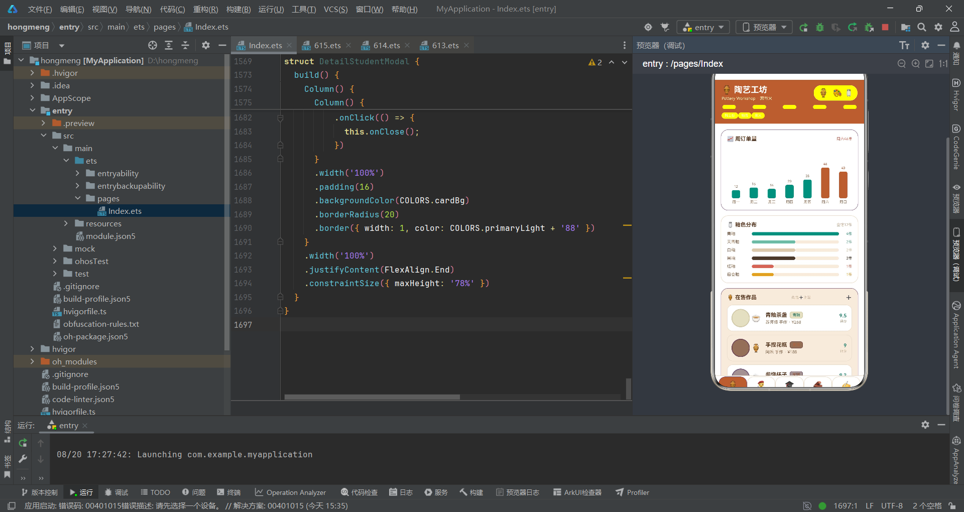
从架构维度审视,该陶艺工坊管理应用展现了声明式UI开发的成熟范式。其架构核心是"单一数据源 + 单向数据流 + 回调通信"三位一体:ClayData作为@Observed可观察对象,集中托管五个业务域的数据,通过@ObjectLink被内容页共享引用,任何数据变更自动触发关联视图刷新,消除了手动同步的复杂度。状态管理集中在ClayApp入口组件,10个@State变量分别管控Tab切换、弹窗显隐、上下文数据和趣味动画,形成了清晰的状态中枢。内容页与主入口之间通过回调函数通信——子组件不直接修改全局状态,而是通过回调"请求"父级修改,父级再决定状态变更,这种"子请求父执行"的模式保证了状态变更的可预测性。
从设计系统维度看,应用建立了完整的色彩令牌体系。ClayPalette接口定义了19个语义化色彩角色,COLORS常量提供全局唯一的事实来源,四个颜色映射函数(getStyleColor、getLevelColor、getTypeColor、getTagColor)为不同业务维度提供专属视觉编码。这种"语义角色 + 集中常量 + 映射函数"的三层设计,使得主题调整只需修改一处常量,且每个业务对象都有独立的色彩身份。更值得称道的是色彩的情感化设计——评价标签的正负面通过颜色映射传达,课程即将满员通过阈值判断变色,库存告急通过状态色预警,色彩不再是装饰而是信息载体。
从组件化策略看,应用采用"主入口 + 内容页 + 弹窗 + 原子组件"的四层架构。ClayTag作为唯一原子组件被五个列表复用,证明了原子组件"一次定义处处复用"的价值。五个内容页组件虽然业务不同,但渲染结构高度同构——都是Scroll+Column+卡片+ForEach列表的组合,这种结构同构性为未来的模板抽象奠定了基础。四个弹窗组件也遵循统一模板——底部抽屉式定位、maxHeight: 78%高度限制、头部图标+标题+关闭按钮、表单字段行、双按钮或单按钮操作区,模板化使用户在不同弹窗间有一致的交互预期。
从工程实践看,应用体现了多项优秀实践。枚举替代魔数(PotteryTab)、接口即配置契约(TabMeta、图表数据接口)、数据驱动装饰(WHEEL_COL)、条件挂载而非可见性切换(弹窗if渲染)、ForEach键值生成保证列表稳定性(name + i复合键)、阈值化视觉编码(value >= 40柱色切换、joined >= seats * 0.8满员预警、stock > 30充足判断)、双Row拼接进度条(layoutWeight权重分配)、Emoji替代图片资源(跨平台一致性 + 包体积优化)、字符串重复模拟星级('⭐'.repeat())——这些技巧共同构成了一个轻量但表达力丰富的UI工程方案。
从产品维度看,应用不仅是管理工具,更是工坊文化的载体。陶土棕与釉青的色彩组合、陶轮条纹的装饰细节、"泥与火"的品牌定位语、匠人署名的作品展示、导师评语的人文关怀、Emoji图标的趣味性——每一个设计决策都在讲述陶艺工坊的故事。这种"产品叙事"理念,使技术实现超越了功能性,达到了体验性的高度。应用证明了:优秀的技术架构不仅服务于效率,更服务于体验;不仅承载数据,更承载文化。

作为“人工智能6S店”的官方数字引擎,为AI开发者与企业提供一个覆盖软硬件全栈、一站式门户。
更多推荐

 10
10 0
0- 0


 已为社区贡献88条内容

所有评论(0)