
基于HarmonyOS API 24动漫二次元App深度技术解析:弹窗交互采用bindSheet 底部抽屉和 modalOverlay 遮罩层相结合的方式,支持新增追番、编辑角色、删除评论等操作场景
一、引言:二次元爱好者的追番圣地
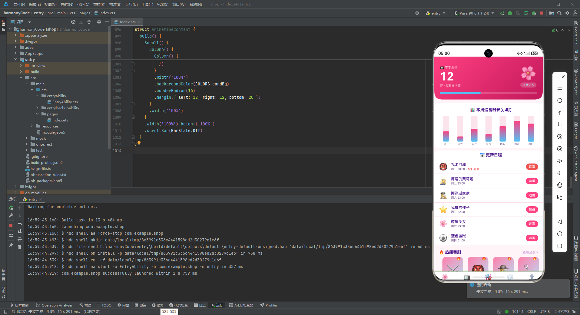
在动漫文化蓬勃发展的今天,二次元爱好者们需要一款集追番管理、角色收藏、弹幕社区、声优资讯、周边购物于一体的综合性动漫应用。这款动漫二次元 App 正是为满足广大动漫迷的需求而精心打造的一站式追番平台。应用以樱花粉为主色调,搭配天空蓝作为强调色,整体视觉风格甜美浪漫,充满二次元的梦幻气息和少女心。
从业务功能维度来看,这款 App 构建了一个完整的二次元生态系统:首页模块以追番进度大数字头卡为核心,展示本周追番时长统计和更新日程,热播番剧横滑展示让用户快速浏览最新番剧;追番页面提供完整的番剧列表,支持按类型筛选,每部番剧都有进度条显示观看进度;角色页面是角色图鉴,展示 12 位人气动漫角色,包含所属番剧、角色定位、收藏状态等信息;社区页面汇聚了热门弹幕评论和声优资讯,是二次元同好们交流互动的阵地;我的页面则是个人中心,展示追番数据、周边商城和功能菜单。
技术实现上,该应用基于 HarmonyOS ArkTS 声明式UI框架开发,采用组件化和配置化的设计思想。底部 Tab 导航包含首页、追番、角色、社区、我的五个模块,通过 @State 状态变量和枚举类型实现页面切换。弹窗交互采用 bindSheet 底部抽屉和 modalOverlay 遮罩层相结合的方式,支持新增追番、编辑角色、删除评论等操作场景。首页的追番进度大数字头卡、渐变柱状图、热播番剧封面卡片等 UI 元素设计精美,充满二次元的治愈美感。
数据层设计方面,应用定义了 9 个 TypeScript 接口,从颜色调色板到番剧、角色、评论、声优、周边、日程等业务实体,每个接口字段设计精审,类型约束严格。Mock 数据层提供了丰富的模拟数据,包含 12 部番剧、12 位角色、10 条评论、8 位声优、8 件周边、6 个更新日程和 6 个菜单项,数据量充足,覆盖场景全面。
本文将从架构设计、数据模型、颜色系统、状态管理、组件实现等多个维度,对这款动漫二次元 App 进行全方位的深度技术解析,带领读者深入理解 ArkTS 声明式UI开发的精髓和二次元应用的设计哲学。
二、整体架构流程图
下面的架构图展示了 App 的整体分层结构,从入口组件到数据层,各模块协作有序、职责分明。
让我们再通过数据流图来看社区页面的交互流程:
三、颜色与主题系统详解
3.1 颜色调色板接口设计
颜色是二次元风格 App 的灵魂。该应用通过 AnimeColorPalette 接口定义了完整的颜色系统,特别增加了 pink(樱花粉)字段,强化了二次元少女风的视觉特色。
interface AnimeColorPalette {
  primary: string
  primaryLight: string
  primaryDark: string
  accent: string
  accentLight: string
  pink: string
  bg: string
  cardBg: string
  textPrimary: string
  textSecondary: string
  textHint: string
  border: string
  success: string
  warning: string
  danger: string
  white: string
}
接口包含 16 个颜色字段,构成了完整的色彩体系:
主色系:primary(樱花粉主色)、primaryLight(浅粉)、primaryDark(深粉),三个层次的粉色构成主色调的明暗变化。
辅助色系:accent(天空蓝)、accentLight(浅蓝),粉蓝搭配是二次元风格的经典配色,甜美清新。
樱花粉色:pink 作为第三种粉色调,专门用于输入框背景、标签背景等需要柔和粉色的场景,比主色更浅更淡。
背景/卡片色:bg(粉白色背景)、cardBg(纯白卡片),粉嫩的背景营造出浪漫的氛围。
文字色系:textPrimary(深紫文字)、textSecondary(紫灰文字)、textHint(淡紫提示),三级文字全部带有紫色调,与粉色背景和谐搭配。
功能色系:success(薄荷绿)、warning(橙黄)、danger(珊瑚红),色调都偏柔和,与整体甜美的风格统一。
3.2 配色方案的设计理念
const COLORS: AnimeColorPalette = {
  primary: '#FF4081',
  primaryLight: '#FF80AB',
  primaryDark: '#C2185B',
  accent: '#4FC3F7',
  accentLight: '#B3E5FC',
  pink: '#FCE4EC',
  bg: '#FFF5F8',
  cardBg: '#FFFFFF',
  textPrimary: '#4A148C',
  textSecondary: '#7B5A8E',
  textHint: '#CE93D8',
  border: '#F8BBD0',
  success: '#66BB6A',
  warning: '#FFA726',
  danger: '#EF5350',
  white: '#FFFFFF'
}
配色方案以樱花粉 #FF4081 为主色调,传递出甜美、浪漫、可爱的二次元气息。天空蓝 #4FC3F7 作为辅助色,与粉色形成冷暖对比,增添了清新和活力的感觉。
背景色使用极浅的粉色 #FFF5F8,几乎是白色但带有微妙的粉色调,让整个应用沉浸在樱花般的氛围中。输入框和标签的背景使用更浅的樱花粉色 #FCE4EC,既与背景区分,又保持柔和的视觉感受。
文字颜色采用紫色系而非传统的灰色系,是二次元风格的标志性设计。深紫色 #4A148C 的主文字在粉色背景上具有良好的对比度,同时紫色与粉色的搭配充满梦幻感,完美契合二次元的美学调性。
边框色使用淡粉色 #F8BBD0,与粉色背景协调统一,分隔线不会显得生硬突兀。功能色也都选择了柔和的色调:薄荷绿、橙黄、珊瑚红,都不是特别鲜艳刺眼的颜色,与整体甜美的风格保持一致。
应用大量使用 linearGradient 线性渐变来增强视觉效果。粉蓝渐变是最常见的组合,从樱花粉到天空蓝的过渡,如同樱花盛开在蓝天下,浪漫至极。头卡、封面卡片、角色头像等多处都运用了渐变效果,营造出梦幻唯美的氛围。
3.3 常量配置方式
颜色常量采用"接口定义 + 常量对象"的经典模式,这种模式的优势:
- 类型安全:TypeScript 编译器检查颜色字段的完整性和正确性
- 易于维护:所有颜色集中管理,修改主题只需调整常量赋值
- 语义化访问:COLORS.primary、COLORS.accent 等名称表达用途,提高代码可读性
- 扩展性强:新增颜色只需在接口和常量中各加一行
四、数据模型层深度解析
数据模型是应用业务逻辑的骨架。该应用定义了 9 个核心数据接口,每个接口的设计都体现了对二次元业务场景的深入理解。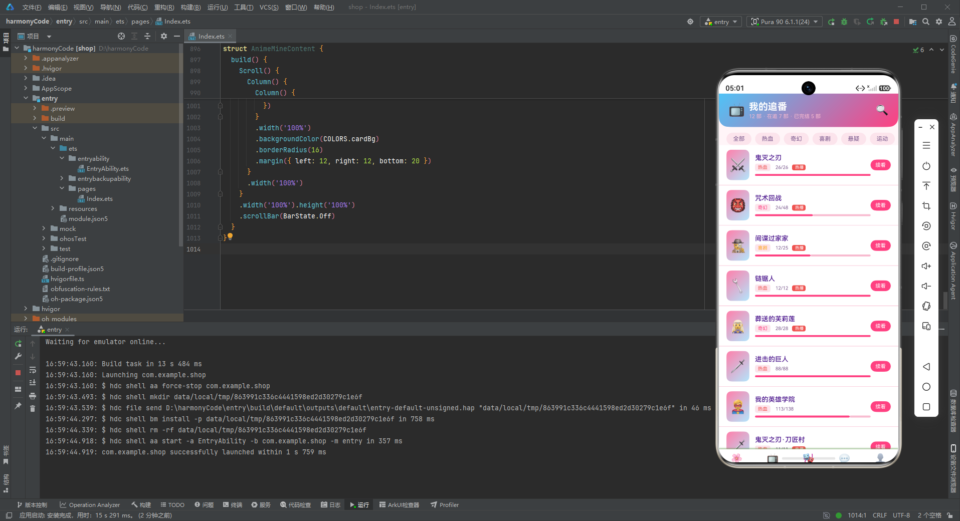
4.1 TabMeta - Tab导航元数据
interface TabMeta {
  title: string
  icon: string
}
TabMeta 定义了底部导航项的结构,包含标题和图标两个字段。使用 emoji 作为图标在二次元应用中尤为合适,因为表情符号本身就具有可爱、生动的特点,与二次元风格高度契合。🌸、📺、🎭、💬、👤 这些表情图标直观地表达了各 Tab 的功能。
4.2 AnimeMeta - 番剧数据模型
interface AnimeMeta {
  name: string
  emoji: string
  genre: string
  episode: number
  total: number
  isHot: boolean
}
AnimeMeta 是番剧实体的核心模型,包含六个字段:
name:番剧名称,唯一标识emoji:番剧封面图标genre:番剧类型(热血、奇幻、喜剧、悬疑等)episode:已观看集数(number类型),支持进度计算total:总集数(number类型),支持进度百分比计算isHot:是否热播,控制热播标签
这个模型的设计非常精妙。episode 和 total 两个 number 字段使得观看进度可以动态计算:episode / total * 100%。这种数据设计为进度条的渲染提供了直接的数据支持,无需额外的转换计算。
4.3 CharMeta - 角色数据模型
interface CharMeta {
  name: string
  emoji: string
  anime: string
  role: string
  isFav: boolean
  isNew: boolean
}
CharMeta 角色模型描述动漫角色信息:
name:角色名称emoji:角色头像图标anime:所属番剧,建立角色与番剧的关联role:角色定位(主角、配角、反派、导师等)isFav:是否收藏,布尔类型isNew:是否新角色,控制新标签显示
角色模型通过 anime 字段与番剧模型建立关联,形成了"番剧 → 角色"的一对多关系。role 字段描述角色在故事中的定位,增加了角色图鉴的信息丰富度。isFav 字段支持收藏功能,isNew 字段用于新角色的发现引导。
4.4 CommentMeta - 评论数据模型
interface CommentMeta {
  user: string
  avatar: string
  content: string
  time: string
  likes: number
  isTop: boolean
}
CommentMeta 评论模型是社区模块的核心:
user:用户名avatar:用户头像(emoji)content:评论内容time:发布时间likes:点赞数(number类型)isTop:是否置顶
评论模型的设计包含了社区评论的所有核心要素。isTop 字段支持置顶评论功能,在 UI 上以红色"置顶"标签突出显示。likes 使用 number 类型,便于排序和数字格式化。
4.5 SeiyuuMeta - 声优数据模型
interface SeiyuuMeta {
  name: string
  emoji: string
  work: string
  isHot: boolean
}
SeiyuuMeta 声优模型展示配音演员信息:
name:声优姓名emoji:声优图标work:代表作品/配音角色isHot:是否热门
声优是二次元文化的重要组成部分,专门的声优模块体现了对二次元文化的深度理解。work 字段显示声优的代表角色,让粉丝快速识别。
4.6 WeekWatchMeta - 周追番时长模型
interface WeekWatchMeta {
  label: string
  value: number
}
WeekWatchMeta 是柱状图的数据模型,用于展示每周各天的追番时长。label 为星期标签,value 为对应的小时数。简洁的模型设计具有良好的通用性。
4.7 MerchMeta - 周边商城模型
interface MerchMeta {
  name: string
  emoji: string
  price: number
  isHot: boolean
}
MerchMeta 周边商品模型包含名称、图标、价格和热门标记四个字段。价格使用 number 类型,便于数值格式化和计算。热门商品通过火焰图标标记,引导用户消费。
4.8 ScheduleMeta - 更新日程模型
interface ScheduleMeta {
  name: string
  emoji: string
  day: string
  time: string
  isToday: boolean
}
ScheduleMeta 更新日程模型描述番剧的更新时间安排:
name:番剧名称emoji:番剧图标day:更新星期time:更新时间isToday:是否今天更新
这个模型是追番功能的核心辅助功能,帮助用户了解每周番剧的更新时间。isToday 字段特别标记今天更新的番剧,在 UI 上以红色"今日更新"标签突出显示,引导用户及时观看。
4.9 MenuMeta - 功能菜单模型
interface MenuMeta {
  icon: string
  name: string
  sub: string
}
MenuMeta 菜单模型用于"我的"页面的功能列表。每个菜单项有图标、名称和副标题三个字段。副标题展示菜单项的概要信息,如"最近观看 50 集"、"年费会员"等,让用户一目了然。
五、配置常量层分析
5.1 TAB_CONFIG 导航配置
const TAB_CONFIG: Record<string, TabMeta> = {
  'HOME': { title: '首页', icon: '🌸' },
  'ANIME': { title: '追番', icon: '📺' },
  'CHAR': { title: '角色', icon: '🎭' },
  'COMM': { title: '社区', icon: '💬' },
  'MINE': { title: '我的', icon: '👤' }
}
Tab 导航配置使用 Record<string, TabMeta> 类型,五个 Tab 分别对应首页、追番、角色、社区、我的五个功能模块。樱花图标 🌸 作为首页图标,完美契合二次元的主题风格。
配置驱动的导航设计使得导航栏的修改变得简单:更换图标或修改标题只需调整配置数据,无需改动组件代码。配合 AnimeTab 枚举类型使用,形成完整的类型安全导航系统。
5.2 业务数据常量的设计模式
应用定义了 8 组业务数据常量,每组常量都是对应接口类型的数组。这种数据组织方式具有以下特点:
数据丰富:每组数据包含 6-12 条记录,数量充足,确保列表展示饱满。
场景覆盖:数据设计覆盖了各种状态组合。例如角色列表中,有主角也有配角,有反派也有导师,有已收藏也有未收藏,有新角色也有旧角色,各种 UI 状态都能得到展示验证。
命名规范:常量名采用大写下划线命名法,如 ANIME_LIST、CHAR_LIST,与变量区分清晰。
类型严格:每个常量明确声明类型,TypeScript 编译时检查数据结构是否符合接口定义。
六、Mock数据层分析
6.1 数据设计思路
Mock 数据层的设计充分体现了对二次元文化的深刻理解,每一组数据都精心挑选,充满动漫迷熟悉的元素。
番剧数据的真实性:番剧列表中的 12 部作品都是二次元爱好者耳熟能详的热门番剧,从鬼灭之刃、咒术回战到间谍过家家、链锯人,涵盖了热血、奇幻、喜剧、悬疑等多种类型。每部番剧的集数数据也与实际情况大致吻合,如鬼灭之刃 26 集、进击的巨人 88 集等,让数据具有真实感。
角色数据的代表性:角色列表中的 12 位角色都是各自作品中的高人气角色,炭治郎、五条悟、阿尼亚、电次、芙莉莲……每位角色都有大量粉丝。角色的定位(主角、配角、反派、导师)也与原作设定一致,体现了对动漫文化的尊重。
评论数据的趣味性:评论列表的内容充满二次元梗和粉丝用语,如"wakuwaku"、“老师永远滴神”、“玛奇玛我老婆"等,生动还原了弹幕社区的讨论氛围。用户名也都是典型的二次元昵称,如"樱花飞舞”、“五条悟老婆”、"声控党"等,代入感极强。
6.2 特色数据结构分析
以番剧数据为例:
const ANIME_LIST: AnimeMeta[] = [
  { name: '鬼灭之刃', emoji: '⚔️', genre: '热血', episode: 26, total: 26, isHot: true },
  { name: '咒术回战', emoji: '👹', genre: '奇幻', episode: 24, total: 48, isHot: true },
  { name: '间谍过家家', emoji: '🕵️', genre: '喜剧', episode: 12, total: 25, isHot: true },
  // ...
]
番剧数据的设计亮点:
episode和total两个字段支持进度条动态计算- 已完结番剧(episode == total)和连载中番剧(episode < total)都有数据
- 类型字段涵盖热血、奇幻、喜剧、悬疑、运动、推理等多种类型
- 热门标签 isHot 标记热播番剧
再看更新日程数据:
const SCHEDULE_LIST: ScheduleMeta[] = [
{ name: '咒术回战', emoji: '👹', day: '周一', time: '00:00', isToday: true },
{ name: '葬送的芙莉莲', emoji: '🧝♀️', day: '周五', time: '23:00', isToday: false },
// ...
]
更新日程数据模拟了真实的番剧更新时间安排,不同番剧在不同星期的不同时间更新。isToday: true 标记今天更新的番剧,在 UI 上突出显示,帮助用户不错过更新。
七、主入口组件逐段分析
7.1 状态管理设计
@Entry
@Component
struct AnimeApp {
  @State activeTab: AnimeTab = AnimeTab.HOME
主入口组件 AnimeApp 使用 @Entry 和 @Component 装饰器标记。状态管理使用一个 @State 装饰的 activeTab 变量来跟踪当前激活的 Tab,默认值为首页。
@State 装饰器是 ArkTS 响应式编程的基础,它将变量标记为响应式状态。当状态值改变时,所有依赖该状态的 UI 元素会自动重新渲染。这种声明式的状态驱动模式是 ArkTS 的核心思想,开发者只需关注状态的变化,UI 更新由框架自动处理。
使用枚举类型 AnimeTab 作为状态变量的类型,带来了多重好处:
- 编译时类型检查,避免非法值
- IDE 智能提示和自动补全
- 代码可读性高,枚举成员名即文档
- 重构安全,编译器能追踪枚举的使用位置
7.2 @Builder 自定义构建器设计
应用定义了两个核心的 @Builder 构建函数,分别负责内容区域和导航项的构建。
contentArea 内容切换器
@Builder contentArea() {
  Column() {
    if (this.activeTab === AnimeTab.HOME) {
      AnimeHomeContent()
    } else if (this.activeTab === AnimeTab.ANIME) {
      AnimeListContent()
    } else if (this.activeTab === AnimeTab.CHAR) {
      AnimeCharContent()
    } else if (this.activeTab === AnimeTab.COMM) {
      AnimeCommContent()
    } else if (this.activeTab === AnimeTab.MINE) {
      AnimeMineContent()
    }
  }
  .width('100%')
}
contentArea 构建器根据当前激活的 Tab 选择性渲染对应页面。使用 if-else 条件链实现,每个页面对应一个独立的 @Component 组件。
这种条件渲染模式的优势:
- 逻辑清晰:Tab 与页面的对应关系一目了然
- 组件独立:每个页面组件独立封装,互不影响
- 按需加载:只有当前页面被渲染,节省内存
- 易于扩展:新增页面只需添加一个 else if 分支
tabItem 导航项构建器
@Builder tabItem(icon: string, label: string, tab: AnimeTab) {
  Column() {
    Text(icon).fontSize(20)
    Text(label).fontSize(10)
      .fontColor(this.activeTab === tab ? COLORS.primary : COLORS.textHint)
      .fontWeight(this.activeTab === tab ? FontWeight.Bold : FontWeight.Normal)
      .margin({ top: 2 })
  }
  .layoutWeight(1)
  .onClick(() => { this.activeTab = tab })
}
tabItem 构建器创建单个导航项,接收图标、标签和对应 Tab 枚举值三个参数。
选中状态的视觉表现通过三元表达式动态计算:
- 激活态:樱花粉色(COLORS.primary)+ 粗体
- 未激活态:淡紫色(COLORS.textHint)+ 常规字重
.layoutWeight(1) 确保每个导航项在 Row 中均匀分布。.onClick 绑定点击事件,更新 activeTab 状态触发页面切换。
7.3 build 方法整体布局
build() {
  Column() {
    this.contentArea()
    Row() {
      this.tabItem(TAB_CONFIG.HOME.icon, TAB_CONFIG.HOME.title, AnimeTab.HOME)
      this.tabItem(TAB_CONFIG.ANIME.icon, TAB_CONFIG.ANIME.title, AnimeTab.ANIME)
      this.tabItem(TAB_CONFIG.CHAR.icon, TAB_CONFIG.CHAR.title, AnimeTab.CHAR)
      this.tabItem(TAB_CONFIG.COMM.icon, TAB_CONFIG.COMM.title, AnimeTab.COMM)
      this.tabItem(TAB_CONFIG.MINE.icon, TAB_CONFIG.MINE.title, AnimeTab.MINE)
    }
    .width('100%')
    .padding({ top: 8, bottom: 8 })
    .backgroundColor(COLORS.white)
    .shadow({ radius: 10, color: '#FF408126', offsetY: -2 })
  }
  .width('100%').height('100%')
  .backgroundColor(COLORS.bg)
}
整体布局采用垂直 Column 结构,上方是自适应高度的内容区域,下方是固定高度的底部导航栏。
底部导航栏的设计细节:
- 白色背景,简洁干净
- 粉色半透明顶部阴影(
#FF408126),与主色调呼应 - 上下各 8vp 内边距,保证点击区域舒适
- 阴影向上偏移 2vp,只显示顶部阴影
最外层背景使用粉白色 COLORS.bg,营造出甜美的二次元氛围。
八、各页面组件逐段代码分析
8.1 首页组件 AnimeHomeContent
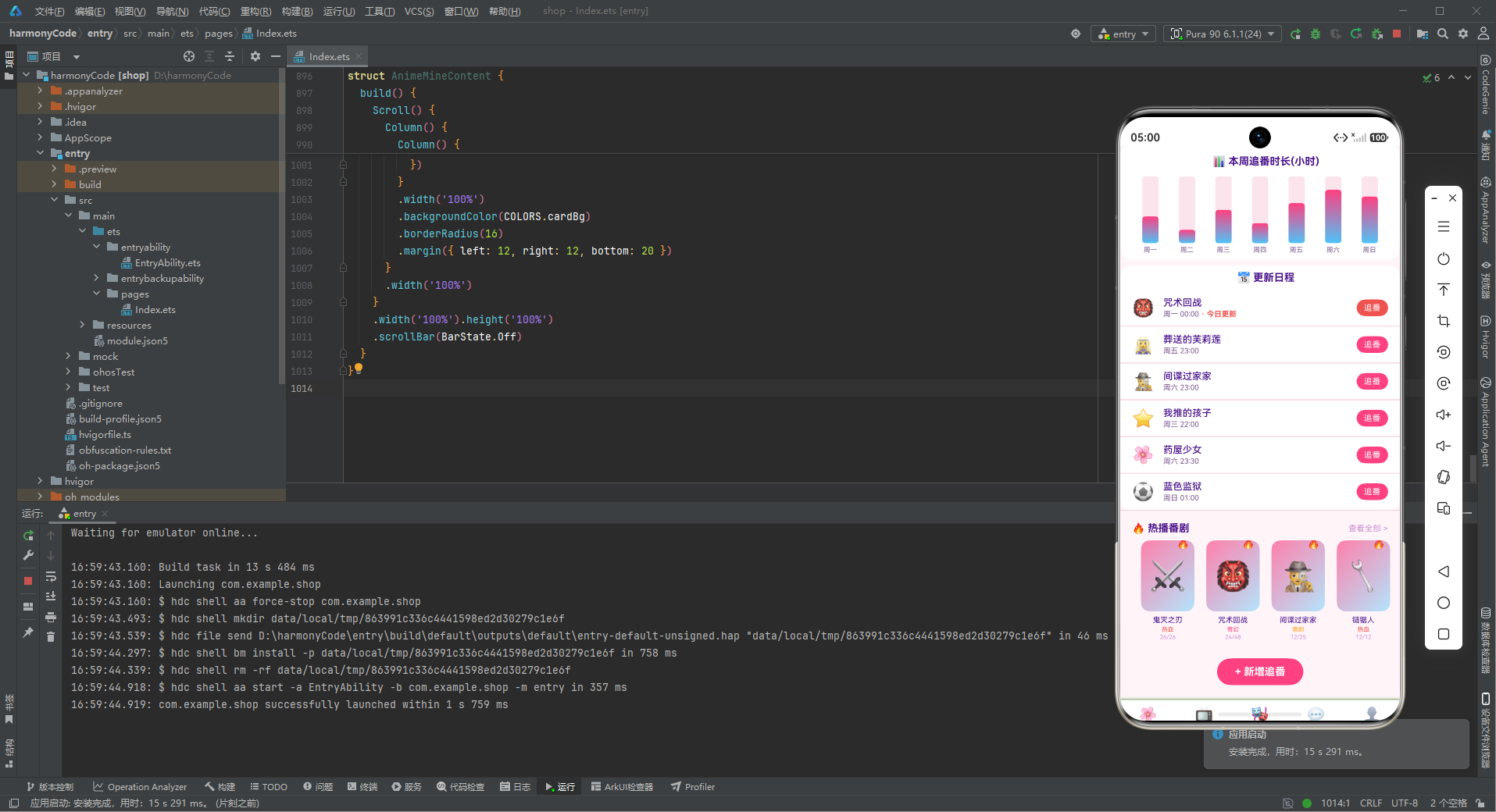
首页是应用的核心展示页面,包含追番进度头卡、周追番时长柱状图、更新日程、热播番剧横滑和新增追番按钮五个模块。
状态定义
@Component
struct AnimeHomeContent {
  @State showAddAnimeModal: boolean = false
  @State animeName: string = ''
  @State animeGenre: string = ''
首页组件定义了三个状态变量:showAddAnimeModal 控制新增追番弹窗的显示,animeName 和 animeGenre 分别存储弹窗表单中输入的番剧名称和类型。
弹窗表单数据由页面组件持有,@Builder 构建函数通过闭包访问这些状态变量。这是组件内弹窗的标准实现模式。
modalOverlay 遮罩层
@Builder modalOverlay(onClose: () => void) {
  Column()
    .width('100%').height('100%')
    .backgroundColor('rgba(0,0,0,0.55)')
    .onClick(onClose)
}
遮罩层构建器创建一个全屏半透明黑色遮罩,点击遮罩触发传入的关闭回调。遮罩透明度 0.55 是一个经过优化的值,既能突出弹窗,又不会完全遮挡背景内容。
addAnimeModal 新增追番弹窗
@Builder addAnimeModal() {
  Stack() {
    this.modalOverlay(() => { this.showAddAnimeModal = false })
    Column() {
      Row() {
        Text('🌸 新增追番').fontSize(18).fontWeight(FontWeight.Bold).fontColor(COLORS.textPrimary)
        Column().layoutWeight(1)
        Text('✕').fontSize(18).fontColor(COLORS.textHint).onClick(() => { this.showAddAnimeModal = false })
      }
      .width('100%').padding({ left: 20, right: 20, top: 18, bottom: 12 })
      Divider().color(COLORS.border)
      Column() {
        Text('番剧名称').fontSize(12).fontColor(COLORS.textSecondary).margin({ top: 12, left: 20 })
        TextInput({ placeholder: '如 鬼灭之刃' })
          .placeholderColor(COLORS.textHint).fontSize(14).width('90%')
          .backgroundColor(COLORS.pink).borderRadius(8)
          .margin({ left: 20, right: 20, top: 4 })
          .onChange((v: string) => { this.animeName = v })
        Text('番剧类型').fontSize(12).fontColor(COLORS.textSecondary).margin({ top: 14, left: 20 })
        TextInput({ placeholder: '如 热血' })
          .placeholderColor(COLORS.textHint).fontSize(14).width('90%')
          .backgroundColor(COLORS.pink).borderRadius(8)
          .margin({ left: 20, right: 20, top: 4 })
          .onChange((v: string) => { this.animeGenre = v })
        Row() {
          Text('取消').fontSize(14).fontColor(COLORS.textSecondary)
            .layoutWeight(1).textAlign(TextAlign.Center)
            .padding({ top: 10, bottom: 10 })
            .backgroundColor(COLORS.pink).borderRadius(8)
            .onClick(() => { this.showAddAnimeModal = false })
          Column().width(12)
          Text('添加').fontSize(14).fontColor(COLORS.white)
            .layoutWeight(1).textAlign(TextAlign.Center)
            .padding({ top: 10, bottom: 10 })
            .backgroundColor(COLORS.primary).borderRadius(8)
            .onClick(() => { this.showAddAnimeModal = false })
        }
        .margin({ left: 20, right: 20, top: 20, bottom: 20 })
      }
      .constraintSize({ maxHeight: '70%' })
    }
    .width('88%')
    .backgroundColor(COLORS.cardBg).borderRadius(16)
  }
  .width('100%').height('100%')
}
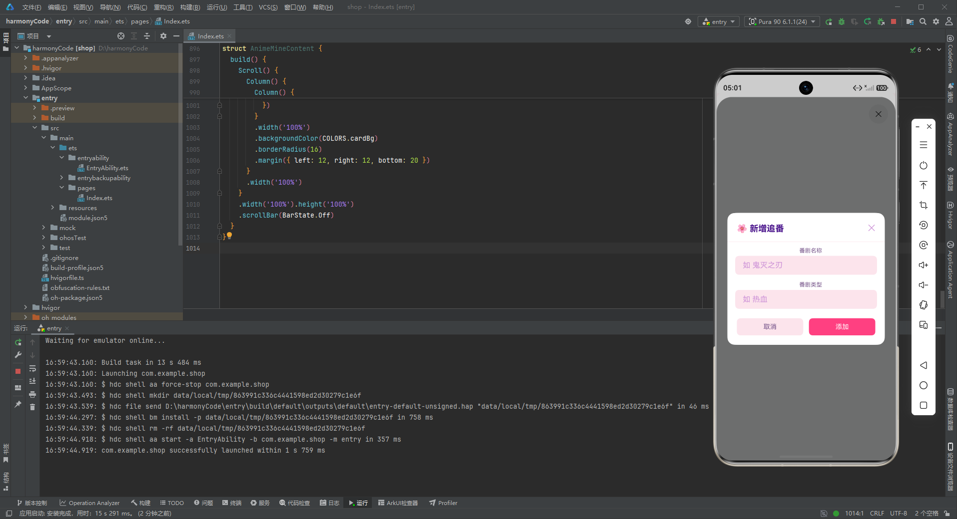
新增追番弹窗采用 Stack 堆叠布局,底层遮罩 + 上层内容卡片。弹窗宽度为屏幕的 88%,圆角 16vp。
与其他应用不同的是,二次元 App 的输入框背景使用樱花粉色 COLORS.pink 而非普通的灰色,这是一个重要的设计细节——即使是输入框这样的基础组件,也要融入主题风格。粉色背景的输入框在白色卡片上显得格外柔美可爱,完美契合二次元的甜美风格。
取消按钮的背景也使用粉色,与输入框背景保持一致。添加按钮使用樱花粉色主色,白色文字,突出主要操作。
追番进度大数字头卡
Column() {
  Row() {
    Column() {
      Text('📺 本季追番').fontSize(11).fontColor('#F8BBD0')
      Text('12').fontSize(40).fontWeight(FontWeight.Bold).fontColor(COLORS.white)
        .margin({ top: 2 })
      Text('部 · 已看完 5 部').fontSize(10).fontColor('#F8BBD0').margin({ top: 2 })
    }
    .alignItems(HorizontalAlign.Start).layoutWeight(1)
    Column() {
      Text('🌸').fontSize(48)
      Text('追番达人').fontSize(10).fontColor(COLORS.accentLight)
        .backgroundColor('rgba(255,255,255,0.2)')
        .borderRadius(12)
        .padding({ left: 8, right: 8, top: 3, bottom: 3 })
        .margin({ top: 4 })
    }
    .alignItems(HorizontalAlign.Center)
  }
  .width('100%')
  .padding({ left: 20, right: 20, top: 30, bottom: 16 })
  // 进度条
  Row() {
    Column().width('42%').height(6).borderRadius(3)
      .backgroundColor(COLORS.accent)
    Column().layoutWeight(1).height(6).borderRadius(3)
      .backgroundColor('rgba(255,255,255,0.2)')
  }
  .width('90%').margin({ bottom: 20 })
}
.width('100%')
.linearGradient({ angle: 135, colors: [[COLORS.primary, 0.0], [COLORS.primaryDark, 1.0]] })
.borderRadius({ bottomLeft: 24, bottomRight: 24 })
首页头卡是整个应用的视觉焦点,采用粉到深粉的渐变背景。头卡内容分为上下两部分:
上部信息区:
- 左侧:追番数量大数字"12",使用 40fp 超大号白色粗体,视觉冲击力极强
- 右侧:樱花图标 48fp + "追番达人"标签(半透明白色背景胶囊)
下部进度条:
- 已完成部分:天空蓝色,宽度 42%
- 未完成部分:半透明白色,占据剩余空间
- 圆角 3vp,圆润柔和
进度条直观地展示了追番完成度,天空蓝的已完成部分在粉色背景上形成鲜明对比,清晰易读。
头卡底部使用 24vp 的大圆角,形成流畅的曲线过渡,增加了柔美感和可爱感。
周追番时长柱状图
Column() {
  Text('📊 本周追番时长(小时)').fontSize(14).fontWeight(FontWeight.Bold)
    .fontColor(COLORS.textPrimary).margin({ left: 16, top: 16 })
  Row() {
    ForEach(WEEK_WATCH, (w: WeekWatchMeta) => {
      Column() {
        Stack({ alignContent: Alignment.Bottom }) {
          Column().width(22).height(90)
            .backgroundColor(COLORS.pink)
            .borderRadius(4)
          Column().width(22).height(Number(w.value) * 9)
            .linearGradient({ angle: 0, colors: [[COLORS.accent, 0.0], [COLORS.primary, 1.0]] })
            .borderRadius(4)
        }
        .width(22).height(90)
        Text(w.label).fontSize(9).fontColor(COLORS.textSecondary)
          .margin({ top: 4 })
      }
      .alignItems(HorizontalAlign.Center)
      .layoutWeight(1)
    })
  }
  .width('100%')
  .padding({ left: 16, right: 16, top: 12, bottom: 8 })
}
.width('100%')
.backgroundColor(COLORS.cardBg)
.borderRadius(16)
.margin({ left: 12, right: 12, top: 12 })
周追番时长柱状图是二次元风格数据可视化的精美范例。实现要点:
粉蓝渐变柱:数据柱使用天空蓝到樱花粉的垂直渐变(angle: 0 从上到下),顶部是清新的天蓝色,底部是甜美的樱花粉,色彩过渡自然梦幻。
粉色背景柱:底层背景柱使用樱花粉色 COLORS.pink 而非普通灰色,与整体粉色主题协调统一。
底部对齐:通过 Stack({ alignContent: Alignment.Bottom }) 确保数据柱从底部向上生长。
等分布局:每个柱子容器使用 .layoutWeight(1),在 Row 中均匀分布。
柱子宽度为 22vp,背景柱高度 90vp,数据柱高度为 value × 9。系数 9 是根据设计稿视觉比例确定的,确保数据柱在合理范围内变化。
更新日程列表
Column() {
  Text('📅 更新日程').fontSize(14).fontWeight(FontWeight.Bold)
    .fontColor(COLORS.textPrimary).margin({ left: 16, top: 8, bottom: 8 })
  ForEach(SCHEDULE_LIST, (s: ScheduleMeta) => {
    Row() {
      Text(s.emoji).fontSize(24).margin({ right: 12 })
      Column() {
        Text(s.name).fontSize(13).fontColor(COLORS.textPrimary).fontWeight(FontWeight.Medium)
        Row() {
          Text(s.day + ' ' + s.time).fontSize(10).fontColor(COLORS.textSecondary)
          if (s.isToday) {
            Text(' · 今日更新').fontSize(10).fontColor(COLORS.danger).fontWeight(FontWeight.Bold)
          }
        }
        .margin({ top: 2 })
      }
      .alignItems(HorizontalAlign.Start).layoutWeight(1)
      Text('追番').fontSize(11).fontColor(COLORS.white)
        .backgroundColor(s.isToday ? COLORS.danger : COLORS.primary)
        .borderRadius(12)
        .padding({ left: 10, right: 10, top: 5, bottom: 5 })
    }
    .width('100%')
    .padding({ left: 16, right: 16, top: 10, bottom: 10 })
    .border({ width: { bottom: 1 }, color: COLORS.border })
  })
}
.width('100%')
.backgroundColor(COLORS.cardBg)
.borderRadius(16)
.margin({ left: 12, right: 12, top: 8 })
更新日程模块展示本周番剧的更新时间安排,是追番类应用的核心功能之一。
每项日程的布局:左侧图标 + 中间信息 + 右侧追番按钮。
中间信息包含两行:
- 番剧名称(加粗中等字重)
- 更新时间 + 今日更新标签(如果 isToday 为 true)
右侧按钮的样式根据 isToday 动态变化:
- 今日更新:珊瑚红色背景 + 白色"追番"文字(强调立即观看)
- 非今日更新:樱花粉色背景 + 白色"追番"文字(常规操作)
今日更新的番剧同时在文字标签和按钮上都有视觉强调,确保用户不会错过当天更新的番剧。
热播番剧横滑
Row() {
  Text('🔥 热播番剧').fontSize(14).fontWeight(FontWeight.Bold)
    .fontColor(COLORS.textPrimary).layoutWeight(1)
  Text('查看全部 >').fontSize(11).fontColor(COLORS.textHint)
}
.width('100%')
.padding({ left: 16, right: 16, top: 16 })
Scroll() {
  Row() {
    ForEach(ANIME_LIST, (a: AnimeMeta) => {
      Column() {
        Stack() {
          Column().width(72).height(96).borderRadius(12)
            .linearGradient({ angle: 135, colors: [[COLORS.primaryLight, 0.0], [COLORS.accentLight, 1.0]] })
          Text(a.emoji).fontSize(40)
          if (a.isHot) {
            Text('🔥').fontSize(14).position({ x: 48, y: -4 })
          }
        }
        .width(72).height(96)
        Text(a.name).fontSize(10).fontColor(COLORS.textPrimary)
          .margin({ top: 6 }).maxLines(1).textOverflow({ overflow: TextOverflow.Ellipsis })
        Text(a.genre).fontSize(8).fontColor(getGenreColor(a.genre))
          .margin({ top: 2 })
        Text(a.episode + '/' + a.total).fontSize(8).fontColor(COLORS.textHint)
          .margin({ top: 1 })
      }
      .width(80)
      .margin({ left: 8 })
      .alignItems(HorizontalAlign.Center)
    })
  }
  .padding({ left: 16, right: 16 })
}
.scrollable(ScrollDirection.Horizontal)
.scrollBar(BarState.Off)
.width('100%')
.margin({ top: 8, bottom: 8 })
热播番剧模块采用封面卡片式横滑布局,这是视频类应用的经典展示方式。
每个番剧卡片的设计非常精致:
封面区(72 × 96vp 的竖版卡片):
- 粉蓝渐变背景:从浅粉到浅蓝的 135 度渐变,模拟动漫海报的梦幻感
- 40fp 大号 emoji 图标作为封面图
- 热门火焰角标:绝对定位在右上角
信息区:
- 番剧名称:10fp 主色文字,单行省略
- 类型标签:8fp 类型色文字
- 集数进度:8fp 提示色文字,格式为 “当前/总集”
番剧封面使用竖版比例(3:4),符合动漫海报的常见比例。渐变封面色彩柔和甜美,完美展现二次元的梦幻美学。
8.2 追番列表页面组件 AnimeListContent
追番页面是番剧管理的核心页面,包含头卡、类型筛选和番剧列表三个模块。
追番列表头卡
Column() {
  Row() {
    Text('📺').fontSize(28).margin({ right: 8 })
    Column() {
      Text('我的追番').fontSize(20).fontWeight(FontWeight.Bold).fontColor(COLORS.white)
      Text('12 部 · 在追 7 部 · 已完结 5 部').fontSize(11).fontColor('#F8BBD0').margin({ top: 2 })
    }
    .alignItems(HorizontalAlign.Start).layoutWeight(1)
    Text('🔍').fontSize(22).fontColor(COLORS.white)
  }
  .width('100%').padding({ left: 20, right: 20, top: 16, bottom: 16 })
}
.width('100%')
.linearGradient({ angle: 135, colors: [[COLORS.accent, 0.0], [COLORS.primary, 1.0]] })
.borderRadius({ bottomLeft: 20, bottomRight: 20 })
追番页面头卡采用天空蓝到樱花粉的渐变(从左到右 135 度方向),与首页头卡的纯粉色渐变形成区分。头卡横向布局:左侧是大电视图标 + 标题文字,右侧是搜索图标。
标题下方的统计信息"12 部 · 在追 7 部 · 已完结 5 部",用简洁的语言概括了追番状态,让用户一目了然。
类型筛选标签
Scroll() {
  Row() {
    ForEach(['全部', '热血', '奇幻', '喜剧', '悬疑', '运动', '推理'], (t: string) => {
      Text(t).fontSize(12).fontColor(COLORS.textSecondary)
        .backgroundColor(COLORS.pink)
        .borderRadius(16)
        .padding({ left: 14, right: 14, top: 6, bottom: 6 })
        .margin({ left: 8 })
    })
  }
  .padding({ left: 8, right: 8 })
}
.scrollable(ScrollDirection.Horizontal)
.scrollBar(BarState.Off)
.width('100%')
.margin({ top: 12 })
类型筛选标签栏支持按番剧类型筛选。标签使用樱花粉色背景 COLORS.pink,圆角 16vp 的胶囊形状,粉紫色文字。粉色的标签在粉白色背景上显得柔美可爱,完美契合二次元风格。
标签栏支持水平滚动,当类型数量超出屏幕宽度时可以左右滑动查看。隐藏滚动条的设计让界面更加简洁干净。
番剧列表
ForEach(ANIME_LIST, (a: AnimeMeta) => {
  Row() {
    Stack() {
      Column().width(48).height(64).borderRadius(10)
        .linearGradient({ angle: 135, colors: [[COLORS.primaryLight, 0.0], [COLORS.accentLight, 1.0]] })
      Text(a.emoji).fontSize(28)
    }
    .width(48).height(64).margin({ right: 12 })
    Column() {
      Text(a.name).fontSize(14).fontColor(COLORS.textPrimary).fontWeight(FontWeight.Medium)
      Row() {
        Text(a.genre).fontSize(10).fontColor(getGenreColor(a.genre))
          .backgroundColor(COLORS.pink).borderRadius(4)
          .padding({ left: 6, right: 6, top: 2, bottom: 2 })
        Text(' ' + a.episode + '/' + a.total).fontSize(10).fontColor(COLORS.textSecondary)
          .margin({ left: 8 })
        if (a.isHot) {
          Text(' 热播').fontSize(9).fontColor(COLORS.white)
            .backgroundColor(COLORS.danger).borderRadius(4)
            .padding({ left: 4, right: 4, top: 1, bottom: 1 })
            .margin({ left: 8 })
        }
      }
      .margin({ top: 4 })
      // 进度条
      Row() {
        Column().width(Number(a.episode / a.total * 100) + '%').height(4).borderRadius(2)
          .backgroundColor(COLORS.primary)
        Column().layoutWeight(1).height(4).borderRadius(2)
          .backgroundColor(COLORS.border)
      }
      .width('100%').margin({ top: 6 })
    }
    .alignItems(HorizontalAlign.Start).layoutWeight(1)
    Text('续看').fontSize(11).fontColor(COLORS.white)
      .backgroundColor(COLORS.primary).borderRadius(12)
      .padding({ left: 10, right: 10, top: 5, bottom: 5 })
  }
  .width('100%')
  .padding({ left: 16, right: 16, top: 10, bottom: 10 })
  .backgroundColor(COLORS.cardBg)
  .border({ width: { bottom: 1 }, color: COLORS.border })
})
追番列表是页面的主体内容,每行展示一部番剧的详细信息。布局为三列:左侧封面、中间信息、右侧续看按钮。
中间信息区域包含三部分:
- 番剧名称(14fp 中等字重)
- 标签行:类型标签 + 集数进度 + 热播标签
- 进度条:动态计算的观看进度条
进度条是这个列表的特色功能,通过 Number(a.episode / a.total * 100) + '%' 动态计算已观看进度的宽度,粉色填充 + 淡粉色底色,直观展示观看进度。这种数据驱动的进度条实现简洁高效,无需额外的组件库。
右侧"续看"按钮使用樱花粉色背景白色文字,引导用户继续观看。按钮圆角 12vp,小巧精致。
8.3 角色页面组件 AnimeCharContent
角色页面是角色图鉴的展示页面,二次元用户对角色收藏有着极高的热情。
角色墙头卡
Stack() {
  Column()
    .width('100%').height(130)
    .linearGradient({ angle: 135, colors: [[COLORS.primary, 0.0], [COLORS.accent, 1.0]] })
    .borderRadius({ bottomLeft: 24, bottomRight: 24 })
  Column() {
    Text('🎭 角色图鉴').fontSize(18).fontWeight(FontWeight.Bold).fontColor(COLORS.white)
    Text('12 位角色 · 已收藏 6 位').fontSize(11).fontColor('#F8BBD0').margin({ top: 4 })
  }
  .alignItems(HorizontalAlign.Center)
  .padding({ top: 30 })
}
.width('100%').height(130)
角色页面头卡采用粉蓝渐变背景,居中显示角色图鉴标题和收藏统计。头卡高度 130vp,比其他页面的头卡稍矮,留出更多空间给角色卡片展示。
粉蓝渐变的配色方案在角色页面得到延续,保持了整体设计语言的一致性。
角色双列卡片
Text('全部角色').fontSize(14).fontWeight(FontWeight.Bold)
  .fontColor(COLORS.textPrimary)
  .margin({ left: 16, top: 16, bottom: 8 })
Flex({ wrap: FlexWrap.Wrap, justifyContent: FlexAlign.SpaceBetween }) {
  ForEach(CHAR_LIST, (c: CharMeta) => {
    Column() {
      Stack() {
        Column().width(64).height(64).borderRadius(16)
          .linearGradient({ angle: 135, colors: [[COLORS.primaryLight, 0.0], [COLORS.accentLight, 1.0]] })
        Text(c.emoji).fontSize(36)
        if (c.isNew) {
          Text('NEW').fontSize(7).fontColor(COLORS.white)
            .backgroundColor(COLORS.danger)
            .borderRadius(4)
            .padding({ left: 3, right: 3, top: 1, bottom: 1 })
            .position({ x: 40, y: -2 })
        }
        if (c.isFav) {
          Text('❤️').fontSize(14).position({ x: 40, y: 42 })
        }
      }
      .width(64).height(64)
      Text(c.name).fontSize(12).fontColor(COLORS.textPrimary)
        .fontWeight(FontWeight.Medium).margin({ top: 8 })
      Text(c.anime).fontSize(9).fontColor(COLORS.textSecondary).margin({ top: 2 })
      Text(c.role).fontSize(9)
        .fontColor(getGenreColor(c.role === '主角' ? '热血' : '奇幻'))
        .margin({ top: 2 })
      Text('编辑').fontSize(10).fontColor(COLORS.primary)
        .border({ width: 1, color: COLORS.primary }).borderRadius(10)
        .padding({ left: 12, right: 12, top: 3, bottom: 3 })
        .margin({ top: 6 })
        .onClick(() => {
          this.selectedChar = c.name
          this.showEditCharModal = true
        })
    }
    .width('48%')
    .padding({ top: 14, bottom: 14 })
    .backgroundColor(COLORS.cardBg)
    .borderRadius(14)
    .margin({ bottom: 8 })
    .alignItems(HorizontalAlign.Center)
  })
}
.width('92%')
.margin({ left: 16, right: 16, bottom: 20 })
角色图鉴使用双列网格布局展示角色卡片,每个卡片宽度 48%。卡片内容丰富,包含以下元素:
角色头像(64 × 64vp 圆角方形):
- 粉蓝渐变背景,与整体风格统一
- 36fp 大号角色表情图标
- NEW 标签:新角色的标记,红色背景白色文字,绝对定位在右上角
- ❤️ 收藏标记:已收藏角色在右下角显示爱心图标
角色信息(居中对齐):
- 角色名称(12fp 中等字重)
- 所属番剧(9fp 灰色文字)
- 角色定位(9fp 彩色文字,通过 getGenreColor 映射颜色)
编辑按钮:描边按钮样式,粉色边框 + 粉色文字,点击后弹出编辑角色弹窗。
角色卡片的设计信息密度适中,视觉层次清晰。爱心收藏标记是二次元应用的常见交互,满足了粉丝"推"角色的情感需求。
8.4 社区页面组件 AnimeCommContent
社区页面是二次元用户交流互动的场所,包含热门评论和声优资讯两个模块。
弹幕社区头卡
Column() {
  Row() {
    Text('💬').fontSize(28).margin({ right: 8 })
    Column() {
      Text('弹幕社区').fontSize(20).fontWeight(FontWeight.Bold).fontColor(COLORS.white)
      Text('今日 1,280 条弹幕 · 热议 56 条').fontSize(11).fontColor('#F8BBD0').margin({ top: 2 })
    }
    .alignItems(HorizontalAlign.Start).layoutWeight(1)
    Text('✏️').fontSize(22).fontColor(COLORS.white)
  }
  .width('100%').padding({ left: 20, right: 20, top: 16, bottom: 16 })
}
.width('100%')
.linearGradient({ angle: 135, colors: [[COLORS.accent, 0.0], [COLORS.primary, 1.0]] })
.borderRadius({ bottomLeft: 20, bottomRight: 20 })
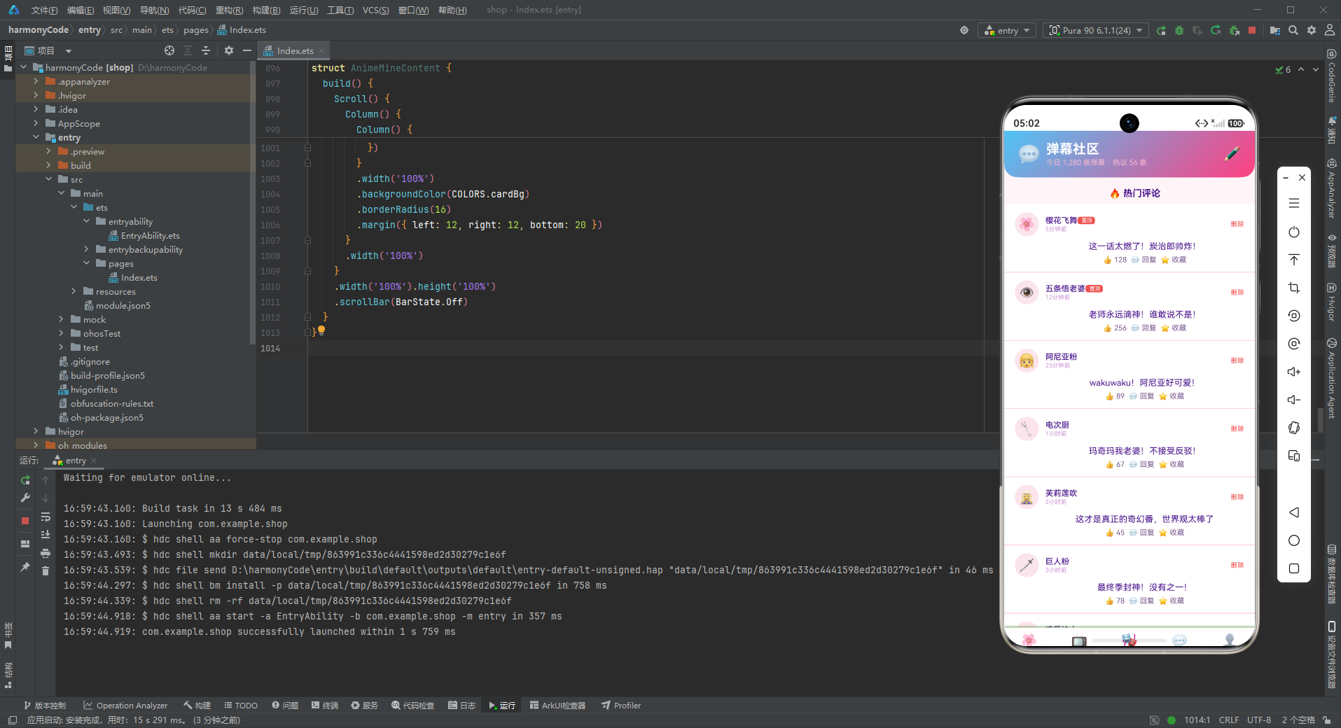
社区页面头卡采用青紫渐变背景,左侧是对话框图标 + 标题 + 弹幕统计,右侧是发帖/评论按钮。"今日 1,280 条弹幕 · 热议 56 条"的数据展示了社区的活跃度,吸引用户参与讨论。
热门评论列表
Text('🔥 热门评论').fontSize(14).fontWeight(FontWeight.Bold)
  .fontColor(COLORS.textPrimary)
  .margin({ left: 16, top: 16, bottom: 8 })
ForEach(COMMENT_LIST, (c: CommentMeta) => {
  Column() {
    Row() {
      Stack() {
        Column().width(36).height(36).borderRadius(18)
          .backgroundColor(COLORS.pink)
        Text(c.avatar).fontSize(20)
      }
      .width(36).height(36).margin({ right: 10 })
      Column() {
        Row() {
          Text(c.user).fontSize(12).fontColor(COLORS.textPrimary).fontWeight(FontWeight.Medium)
          if (c.isTop) {
            Text(' 置顶').fontSize(8).fontColor(COLORS.white)
              .backgroundColor(COLORS.danger).borderRadius(4)
              .padding({ left: 4, right: 4, top: 1, bottom: 1 })
          }
        }
        Text(c.time).fontSize(9).fontColor(COLORS.textHint).margin({ top: 1 })
      }
      .alignItems(HorizontalAlign.Start).layoutWeight(1)
      Text('删除').fontSize(10).fontColor(COLORS.danger)
        .onClick(() => {
          this.selectedUser = c.user
          this.showDeleteModal = true
        })
    }
    Text(c.content).fontSize(13).fontColor(COLORS.textPrimary)
      .margin({ top: 8, left: 46 })
    Row() {
      Text('👍 ' + c.likes).fontSize(11).fontColor(COLORS.textSecondary)
      Text('  💬 回复').fontSize(11).fontColor(COLORS.textSecondary)
      Text('  ⭐ 收藏').fontSize(11).fontColor(COLORS.textSecondary)
    }
    .margin({ top: 6, left: 46 })
  }
  .width('100%')
  .padding({ left: 16, right: 16, top: 12, bottom: 12 })
  .backgroundColor(COLORS.cardBg)
  .border({ width: { bottom: 1 }, color: COLORS.border })
})
热门评论列表是社区页面的核心内容。每条评论的结构包含:
顶部行:
- 用户头像(36vp 圆形,粉色背景 + emoji)
- 用户信息区:用户名 + 置顶标签(如果 isTop 为 true)+ 发布时间
- 删除按钮(红色文字)
评论内容:
- 评论文字,左边距 46vp,与头像右侧对齐
底部操作栏:
- 点赞数、回复、收藏三个操作
- 左边距同样为 46vp,保持内容对齐
置顶评论使用红色"置顶"标签标记,优先显示在列表顶部。这种设计符合社区产品的信息优先级规律——重要的内容需要突出展示。
用户头像使用粉色圆形背景,既可爱又符合整体粉色主题。评论内容的缩进布局(左边距 46vp)让评论结构清晰易读。
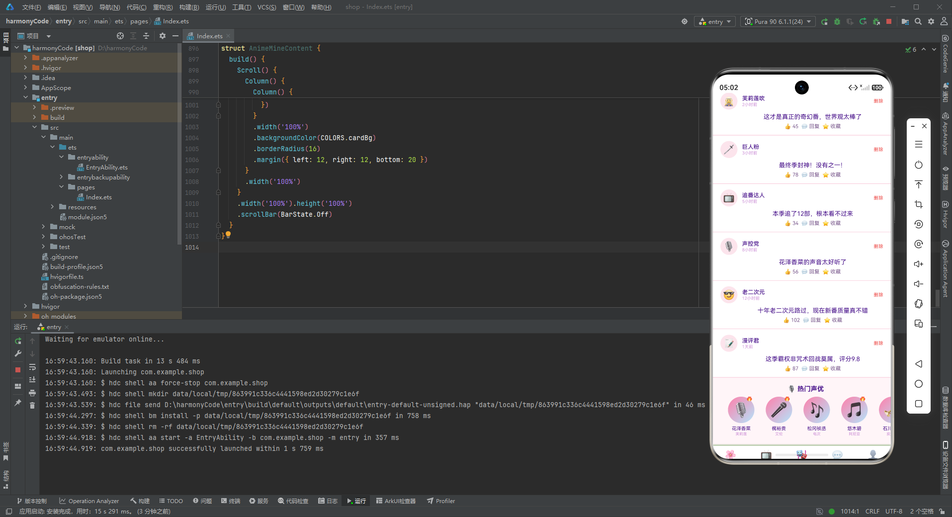
声优横滑
Text('🎙️ 热门声优').fontSize(14).fontWeight(FontWeight.Bold)
  .fontColor(COLORS.textPrimary)
  .margin({ left: 16, top: 16, bottom: 8 })
Scroll() {
  Row() {
    ForEach(SEIYUU_LIST, (s: SeiyuuMeta) => {
      Column() {
        Stack() {
          Column().width(56).height(56).borderRadius(28)
            .linearGradient({ angle: 135, colors: [[COLORS.primaryLight, 0.0], [COLORS.accentLight, 1.0]] })
          Text(s.emoji).fontSize(30)
          if (s.isHot) {
            Text('🔥').fontSize(12).position({ x: 38, y: -4 })
          }
        }
        .width(56).height(56)
        Text(s.name).fontSize(10).fontColor(COLORS.textPrimary)
          .margin({ top: 6 }).maxLines(1)
        Text(s.work).fontSize(8).fontColor(COLORS.textHint).margin({ top: 1 })
      }
      .width(72)
      .margin({ left: 8 })
      .alignItems(HorizontalAlign.Center)
    })
  }
  .padding({ left: 16, right: 16 })
}
.scrollable(ScrollDirection.Horizontal)
.scrollBar(BarState.Off)
.width('100%')
.margin({ bottom: 20 })
热门声优模块是二次元社区的特色功能,声优(配音演员)是动漫文化的重要组成部分。
每个声优卡片的设计:
- 圆形头像(56vp 直径),粉蓝渐变背景
- 30fp 图标表情
- 热门火焰角标(绝对定位右上角)
- 声优姓名(10fp 文字,单行省略)
- 代表作品/配音角色(8fp 提示色文字)
声优头像使用圆形渐变背景,与角色卡片的方形头像形成区分,增加视觉多样性。
8.5 我的页面组件 AnimeMineContent
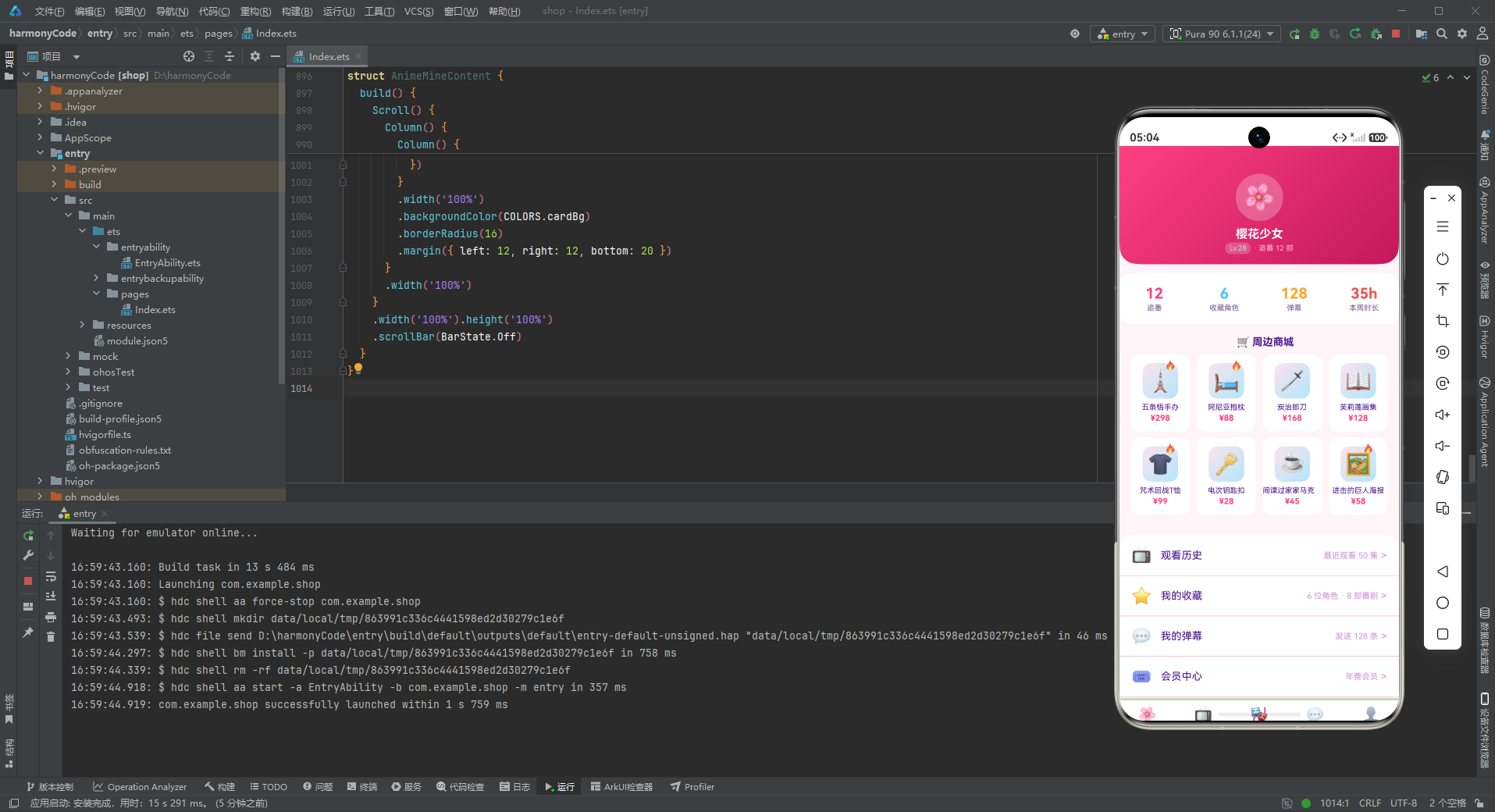
我的页面是用户的个人中心,包含个人头卡、追番数据、周边商城和功能菜单。
个人头卡
Stack() {
  Column()
    .width('100%').height(160)
    .linearGradient({ angle: 135, colors: [[COLORS.primary, 0.0], [COLORS.primaryDark, 1.0]] })
    .borderRadius({ bottomLeft: 24, bottomRight: 24 })
  Column() {
    Stack() {
      Column().width(64).height(64).borderRadius(32)
        .backgroundColor('rgba(255,255,255,0.25)')
      Text('🌸').fontSize(36)
    }
    .width(64).height(64)
    Text('樱花少女').fontSize(16).fontWeight(FontWeight.Bold)
      .fontColor(COLORS.white).margin({ top: 8 })
    Row() {
      Text('Lv.28').fontSize(10).fontColor(COLORS.accentLight)
        .backgroundColor('rgba(255,255,255,0.2)')
        .borderRadius(8).padding({ left: 6, right: 6, top: 2, bottom: 2 })
      Text(' · 追番 12 部').fontSize(10).fontColor('#F8BBD0')
    }
    .margin({ top: 2 })
  }
  .alignItems(HorizontalAlign.Center)
  .padding({ top: 24 })
}
.width('100%').height(160)
我的页面头卡采用粉色渐变背景,内容居中显示。头像是 64vp 的圆形,半透明白色边框 + 樱花 emoji,甜美可爱。
下方显示用户昵称"樱花少女"和等级信息。等级使用天蓝色文字 + 半透明白色背景的胶囊标签,与粉色背景形成对比,突出等级信息。
个人数据面板
Row() {
  Column() {
    Text('12').fontSize(20).fontWeight(FontWeight.Bold).fontColor(COLORS.primary)
    Text('追番').fontSize(10).fontColor(COLORS.textSecondary).margin({ top: 2 })
  }
  .layoutWeight(1).alignItems(HorizontalAlign.Center)
  Column() {
    Text('6').fontSize(20).fontWeight(FontWeight.Bold).fontColor(COLORS.accent)
    Text('收藏角色').fontSize(10).fontColor(COLORS.textSecondary).margin({ top: 2 })
  }
  .layoutWeight(1).alignItems(HorizontalAlign.Center)
  Column() {
    Text('128').fontSize(20).fontWeight(FontWeight.Bold).fontColor(COLORS.warning)
    Text('弹幕').fontSize(10).fontColor(COLORS.textSecondary).margin({ top: 2 })
  }
  .layoutWeight(1).alignItems(HorizontalAlign.Center)
  Column() {
    Text('35h').fontSize(20).fontWeight(FontWeight.Bold).fontColor(COLORS.danger)
    Text('本周时长').fontSize(10).fontColor(COLORS.textSecondary).margin({ top: 2 })
  }
  .layoutWeight(1).alignItems(HorizontalAlign.Center)
}
.width('100%')
.padding({ top: 16, bottom: 16 })
.backgroundColor(COLORS.cardBg)
.margin({ left: 12, right: 12, top: 12 })
.borderRadius(16)
个人数据面板使用四列等分布局,展示四项核心数据:追番数、收藏角色数、弹幕数、本周时长。每项数据使用彩色大号数字 + 灰色小号标签的组合。
四个数据分别使用不同的颜色:
- 追番:樱花粉色(主色)
- 收藏角色:天空蓝色(辅助色)
- 弹幕:橙黄色(警告色)
- 本周时长:珊瑚红色(危险色)
四种颜色区分四个数据维度,既美观又便于快速识别。彩色数据面板的设计增加了页面的活力和趣味性。
周边商城网格
Text('🛒 周边商城').fontSize(14).fontWeight(FontWeight.Bold)
  .fontColor(COLORS.textPrimary)
  .margin({ left: 16, top: 16, bottom: 8 })
Flex({ wrap: FlexWrap.Wrap, justifyContent: FlexAlign.SpaceBetween }) {
  ForEach(MERCH_LIST, (m: MerchMeta) => {
    Column() {
      Stack() {
        Column().width(48).height(48).borderRadius(12)
          .linearGradient({ angle: 135, colors: [[COLORS.pink, 0.0], [COLORS.accentLight, 1.0]] })
        Text(m.emoji).fontSize(28)
        if (m.isHot) {
          Text('🔥').fontSize(12).position({ x: 30, y: -4 })
        }
      }
      .width(48).height(48)
      Text(m.name).fontSize(10).fontColor(COLORS.textPrimary)
        .margin({ top: 6 }).maxLines(1)
      Text('¥' + m.price).fontSize(11).fontColor(COLORS.primary)
        .fontWeight(FontWeight.Bold).margin({ top: 2 })
    }
    .width('23%')
    .padding({ top: 12, bottom: 12 })
    .backgroundColor(COLORS.cardBg)
    .borderRadius(12)
    .margin({ bottom: 8 })
    .alignItems(HorizontalAlign.Center)
  })
}
.width('92%')
.margin({ left: 16, right: 16, bottom: 20 })
周边商城使用 4 列网格布局展示商品,每个商品卡片宽度 23%。商品图标使用粉蓝渐变的方形背景,与番剧封面和角色头像的设计语言保持一致。
价格使用樱花粉色加粗显示,突出价格信息。热门商品用火焰图标标记,引导用户关注畅销周边。
周边商城是二次元应用的重要变现渠道,精美的商品展示和醒目的价格设计有助于提升转化率。
功能菜单列表
Column() {
  ForEach(MENU_LIST, (m: MenuMeta) => {
    Row() {
      Text(m.icon).fontSize(22).margin({ right: 12 })
      Text(m.name).fontSize(14).fontColor(COLORS.textPrimary).layoutWeight(1)
      Text(m.sub).fontSize(11).fontColor(COLORS.textHint)
      Text(' >').fontSize(14).fontColor(COLORS.textHint)
    }
    .width('100%')
    .padding({ left: 16, right: 16, top: 14, bottom: 14 })
    .border({ width: { bottom: 1 }, color: COLORS.border })
  })
}
.width('100%')
.backgroundColor(COLORS.cardBg)
.borderRadius(16)
.margin({ left: 12, right: 12, bottom: 20 })
功能菜单使用标准的列表布局,每行包含图标、名称、副标题和右箭头。菜单项之间使用粉色边框线分隔。
副标题展示菜单项的概要信息,如"最近观看 50 集"、"年费会员"等。这种设计让用户在进入详情页之前就能了解关键信息,提升了使用效率。
九、弹窗组件详解
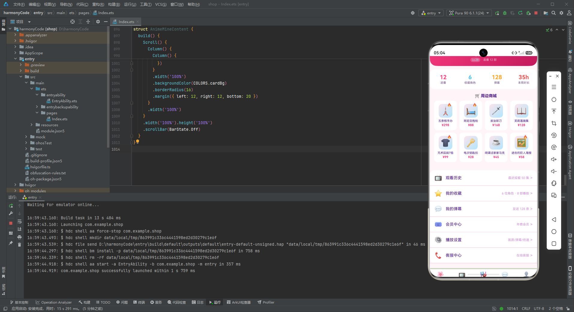
9.1 bindSheet 底部抽屉与 modalOverlay 的结合
动漫 App 采用 bindSheet 底部抽屉方式展示弹窗,同时弹窗内部仍使用 modalOverlay 遮罩层结构。这种设计虽然在底部抽屉中叠加遮罩层看似多余,但保持了弹窗组件的结构一致性,便于代码复用。
bindSheet 的使用方式:
.bindSheet(this.showAddAnimeModal, this.addAnimeModal(), {
  height: SheetSize.LARGE,
})
底部抽屉相比居中弹窗的优势:
- 手势自然:下滑关闭符合移动端用户习惯
- 可拖拽:支持上下拖拽调整高度
- 半屏展示:不会完全遮挡下方内容
- 符合规范:符合 HarmonyOS 的设计规范
9.2 编辑角色弹窗设计
编辑角色弹窗是表单类弹窗的代表,包含角色标签、角色简介等多个输入字段。
@Builder editCharModal() {
  Stack() {
    this.modalOverlay(() => { this.showEditCharModal = false })
    Column() {
      Row() {
        Text('✏️ 编辑角色').fontSize(18).fontWeight(FontWeight.Bold).fontColor(COLORS.textPrimary)
        Column().layoutWeight(1)
        Text('✕').fontSize(18).fontColor(COLORS.textHint).onClick(() => { this.showEditCharModal = false })
      }
      .width('100%').padding({ left: 20, right: 20, top: 18, bottom: 12 })
      Divider().color(COLORS.border)
      Column() {
        Text('角色名称').fontSize(12).fontColor(COLORS.textSecondary).margin({ top: 12, left: 20 })
        Text(this.selectedChar).fontSize(14).fontColor(COLORS.textPrimary)
          .margin({ left: 20, top: 4 })
        Text('角色标签').fontSize(12).fontColor(COLORS.textSecondary).margin({ top: 14, left: 20 })
        TextInput({ placeholder: '如 热血/正义/强大' })
          .placeholderColor(COLORS.textHint).fontSize(14).width('90%')
          .backgroundColor(COLORS.pink).borderRadius(8)
          .margin({ left: 20, right: 20, top: 4 })
        Text('角色简介').fontSize(12).fontColor(COLORS.textSecondary).margin({ top: 14, left: 20 })
        TextInput({ placeholder: '输入角色简介' })
          .placeholderColor(COLORS.textHint).fontSize(14).width('90%')
          .backgroundColor(COLORS.pink).borderRadius(8)
          .margin({ left: 20, right: 20, top: 4 })
        Row() {
          Text('取消').fontSize(14).fontColor(COLORS.textSecondary)
            .layoutWeight(1).textAlign(TextAlign.Center)
            .padding({ top: 10, bottom: 10 })
            .backgroundColor(COLORS.pink).borderRadius(8)
            .onClick(() => { this.showEditCharModal = false })
          Column().width(12)
          Text('保存').fontSize(14).fontColor(COLORS.white)
            .layoutWeight(1).textAlign(TextAlign.Center)
            .padding({ top: 10, bottom: 10 })
            .backgroundColor(COLORS.primary).borderRadius(8)
            .onClick(() => { this.showEditCharModal = false })
        }
        .margin({ left: 20, right: 20, top: 20, bottom: 20 })
      }
      .constraintSize({ maxHeight: '70%' })
    }
    .width('88%')
    .backgroundColor(COLORS.cardBg).borderRadius(16)
  }
  .width('100%').height('100%')
}
编辑角色弹窗的结构与新增追番弹窗类似,但字段更多。除了输入字段外,还显示了当前角色名称作为上下文信息,确保用户知道正在编辑哪个角色。
输入框的粉色背景是二次元 App 的设计特色,与整体粉色主题完美融合。取消按钮也使用粉色背景,形成统一的视觉语言。
9.3 删除评论确认弹窗
删除评论弹窗是危险操作的二次确认对话框:
@Builder deleteCommentModal() {
  Stack() {
    this.modalOverlay(() => { this.showDeleteModal = false })
    Column() {
      Text('⚠️ 删除评论').fontSize(18).fontWeight(FontWeight.Bold)
        .fontColor(COLORS.textPrimary)
        .margin({ top: 24 })
      Text('确定要删除「' + this.selectedUser + '」的评论吗?')
        .fontSize(13).fontColor(COLORS.textSecondary)
        .textAlign(TextAlign.Center)
        .margin({ left: 20, right: 20, top: 12 })
      Row() {
        Text('取消').fontSize(14).fontColor(COLORS.textSecondary)
          .layoutWeight(1).textAlign(TextAlign.Center)
          .padding({ top: 10, bottom: 10 })
          .backgroundColor(COLORS.pink).borderRadius(8)
          .onClick(() => { this.showDeleteModal = false })
        Column().width(12)
        Text('删除').fontSize(14).fontColor(COLORS.white)
          .layoutWeight(1).textAlign(TextAlign.Center)
          .padding({ top: 10, bottom: 10 })
          .backgroundColor(COLORS.danger).borderRadius(8)
          .onClick(() => { this.showDeleteModal = false })
      }
      .margin({ left: 20, right: 20, top: 24, bottom: 24 })
    }
    .width('80%')
    .backgroundColor(COLORS.cardBg).borderRadius(16)
  }
  .width('100%').height('100%')
}
删除确认弹窗的设计体现了良好的安全交互实践:
- 警告图标:⚠️ 图标增强危险感知
- 明确提示:显示要删除的评论作者用户名,让用户确认操作对象
- 居中文字:提示文字居中,增强警示效果
- 危险按钮:删除按钮使用珊瑚红色背景,视觉冲击力强
- 取消按钮:粉色背景的取消按钮,与整体风格统一
- 较窄宽度:80% 屏幕宽度,比表单弹窗更窄
这些设计细节共同确保了删除操作的安全性,防止用户误删评论。
十、核心UI组件分析
10.1 追番进度头卡
首页头卡的追番进度设计是应用的标志性元素,大数字 + 进度条的组合直观展示了追番状态。
核心实现要点:
// 大数字
Text('12').fontSize(40).fontWeight(FontWeight.Bold).fontColor(COLORS.white)

// 进度条
Row() {
  Column().width('42%').height(6).borderRadius(3)
    .backgroundColor(COLORS.accent)
  Column().layoutWeight(1).height(6).borderRadius(3)
    .backgroundColor('rgba(255,255,255,0.2)')
}
进度条使用两个 Column 实现,左侧蓝色 Column 宽度为百分比(42%),右侧半透明白色 Column 占据剩余空间。这种方式比使用单个进度条组件更灵活,可以自定义前后两段的颜色和样式。
大数字 40fp 的字号在移动端非常醒目,配合"本季追番"的小标题和"部 · 已看完 5 部"的辅助信息,形成了清晰的视觉层次。
10.2 番剧封面卡片
热播番剧的封面卡片设计精美,是二次元视觉风格的集中体现:
Stack() {
  Column().width(72).height(96).borderRadius(12)
    .linearGradient({ angle: 135, colors: [[COLORS.primaryLight, 0.0], [COLORS.accentLight, 1.0]] })
  Text(a.emoji).fontSize(40)
  if (a.isHot) {
    Text('🔥').fontSize(14).position({ x: 48, y: -4 })
  }
}
封面卡片使用 3:4 的竖版比例(72 × 96vp),符合动漫海报的常见比例。粉蓝渐变背景从浅粉到浅蓝,色彩柔和梦幻,完美契合二次元的甜美风格。
40fp 的大号 emoji 图标作为封面图,虽然简单但效果出色。在真实项目中,可以替换为实际的海报图片组件,而布局结构保持不变。
热门火焰角标使用 .position() 绝对定位,精确控制在右上角。这种角标定位方式在电商类和内容类应用中非常常见。
10.3 进度条组件
追番列表中的进度条组件是数据驱动 UI 的典范:
Row() {
  Column().width(Number(a.episode / a.total * 100) + '%').height(4).borderRadius(2)
    .backgroundColor(COLORS.primary)
  Column().layoutWeight(1).height(4).borderRadius(2)
    .backgroundColor(COLORS.border)
}
进度条的实现方式非常巧妙:
- 计算百分比:
episode / total * 100得到已观看的百分比 - 动态宽度:已完成部分使用百分比宽度(如 “50%”)
- 剩余空间:未完成部分使用
.layoutWeight(1)占据剩余空间 - 圆润边角:圆角 2vp,柔和美观
这种纯声明式的进度条实现无需引入任何第三方组件库,性能好、定制性强,是 ArkTS 开发的推荐做法。
10.4 角色双列卡片
角色页面的双列卡片设计信息丰富、布局美观:
Stack() {
  Column().width(64).height(64).borderRadius(16)
    .linearGradient({ angle: 135, colors: [[COLORS.primaryLight, 0.0], [COLORS.accentLight, 1.0]] })
  Text(c.emoji).fontSize(36)
  if (c.isNew) {
    Text('NEW').fontSize(7).fontColor(COLORS.white)
      .backgroundColor(COLORS.danger)
      .borderRadius(4)
      .padding({ left: 3, right: 3, top: 1, bottom: 1 })
      .position({ x: 40, y: -2 })
  }
  if (c.isFav) {
    Text('❤️').fontSize(14).position({ x: 40, y: 42 })
  }
}
角色头像上叠加了两个状态标记:
- NEW 标签:新角色标记,红色背景白色文字,右上角
- ❤️ 爱心:收藏标记,右下角
两个角标使用不同的位置(右上和右下),互不干扰。这种多状态标记的设计在信息密度较高的卡片中非常实用。
粉蓝渐变的方形头像、可爱的爱心收藏标记、NEW 新角色标签……这些细节共同营造了二次元角色图鉴的梦幻氛围。
十一、技术亮点总结表格
| 功能模块 | 技术实现方式 | 设计模式 | 代码量估计 | 复用性 |
|---|---|---|---|---|
| 底部Tab导航 | @State + 枚举 + @Builder tabItem | 状态驱动渲染 | 约60行 | 高 |
| 页面切换 | if-else 条件渲染 | 策略模式 | 约20行 | 高 |
| 底部抽屉弹窗 | bindSheet + modalOverlay | 抽屉模式 | 约70行/个 | 中 |
| 追番进度头卡 | 大数字 + Row进度条 + 渐变背景 | 数据可视化 | 约55行 | 中 |
| 渐变柱状图 | Stack堆叠 + 粉蓝linearGradient + ForEach | 数据驱动视图 | 约45行 | 高 |
| 番剧封面卡片 | 渐变背景 + 绝对定位角标 + 3:4比例 | 卡片模式 | 约30行 | 高 |
| 番剧进度条 | 动态百分比宽度 + 双Column | 数据驱动UI | 约10行 | 高 |
| 角色双列卡片 | Flex wrap + 多状态角标 + 收藏心 | 网格布局 | 约50行 | 高 |
| 类型配色系统 | getGenreColor函数 | 策略函数模式 | 约12行 | 高 |
| 颜色主题 | 16色 + 粉蓝多组渐变 + 粉色输入框 | 主题系统 | 约35行 | 高 |
| 评论列表 | 头像 + 置顶标签 + 缩进内容 + 操作栏 | 社区模式 | 约45行 | 中 |
| 声优横滑 | 圆形渐变头像 + 代表作 | 横向滚动模式 | 约35行 | 中 |
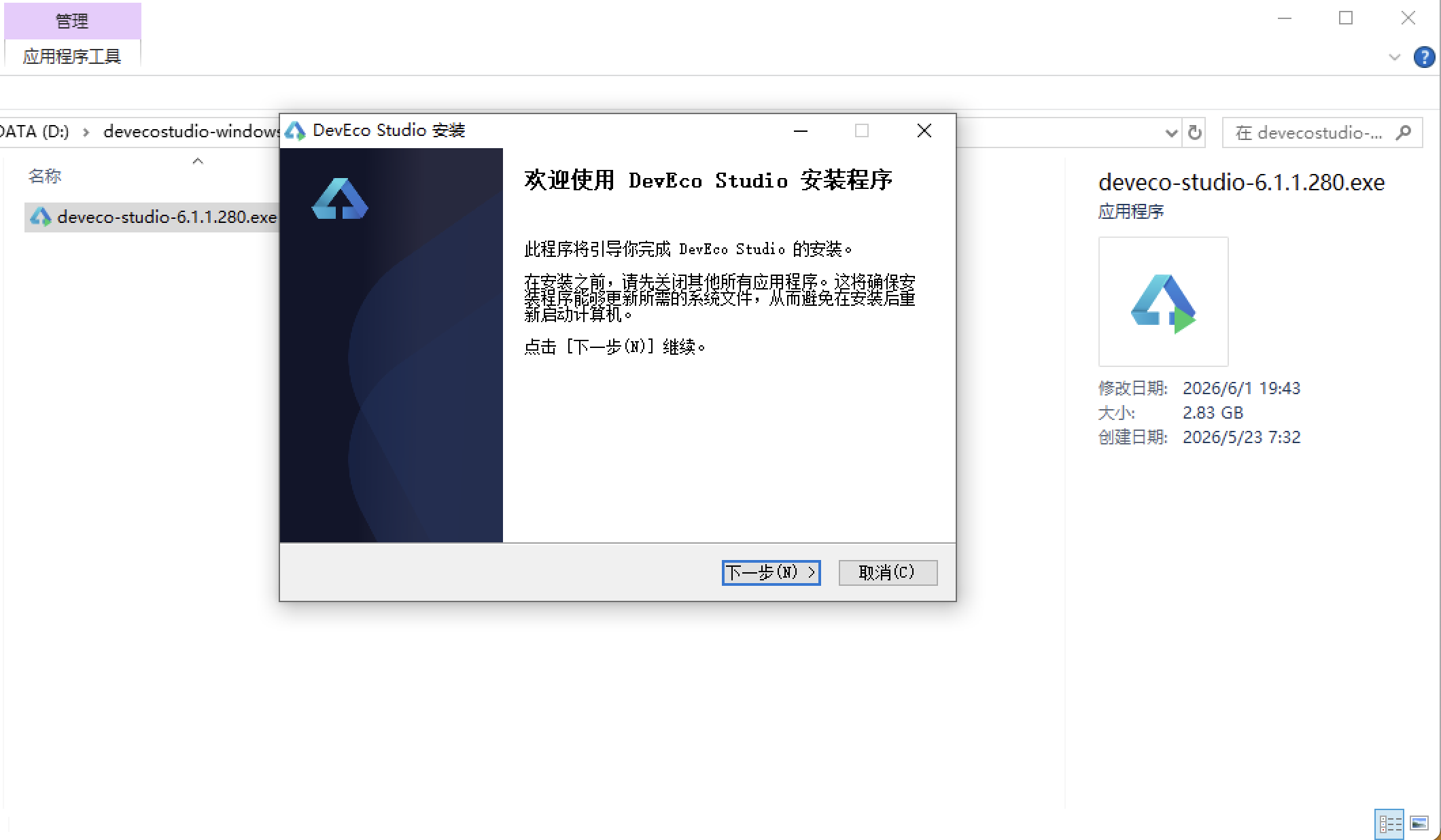
安装DevEco Studio程序
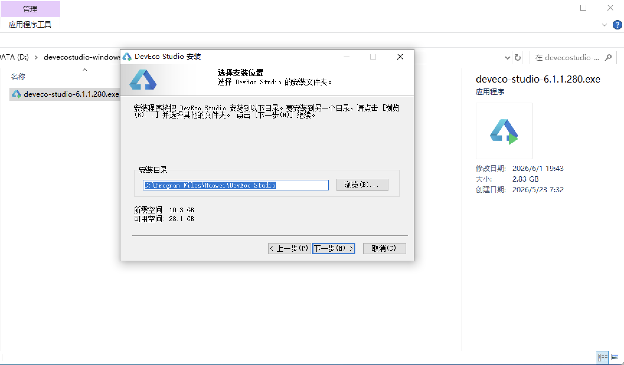
选择目标安装目录:
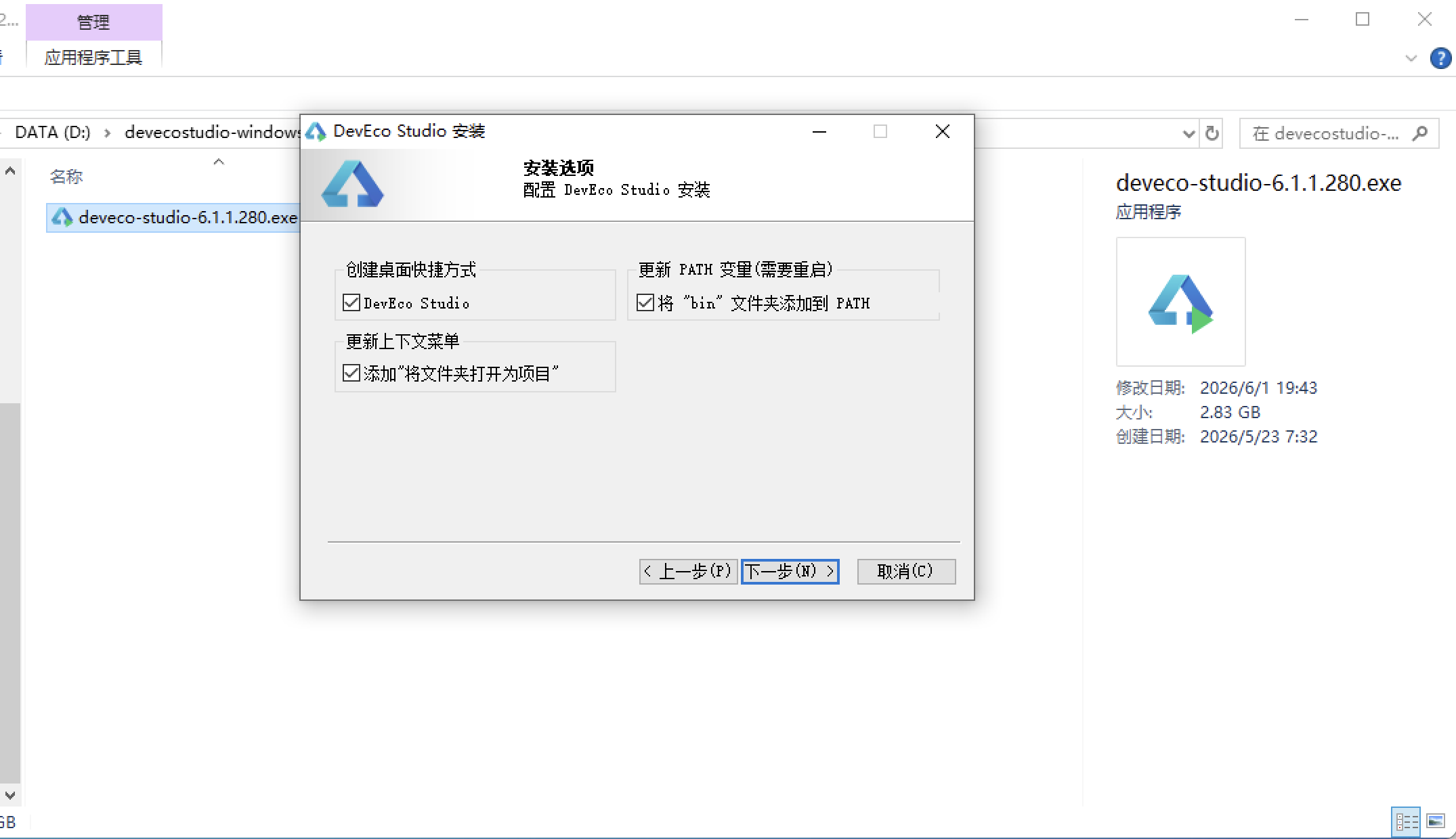
设置环境变量,但是需要重启一下:
新建一个空白模板:
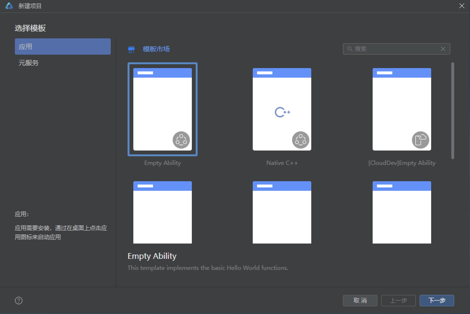
设置API为24的模板项目: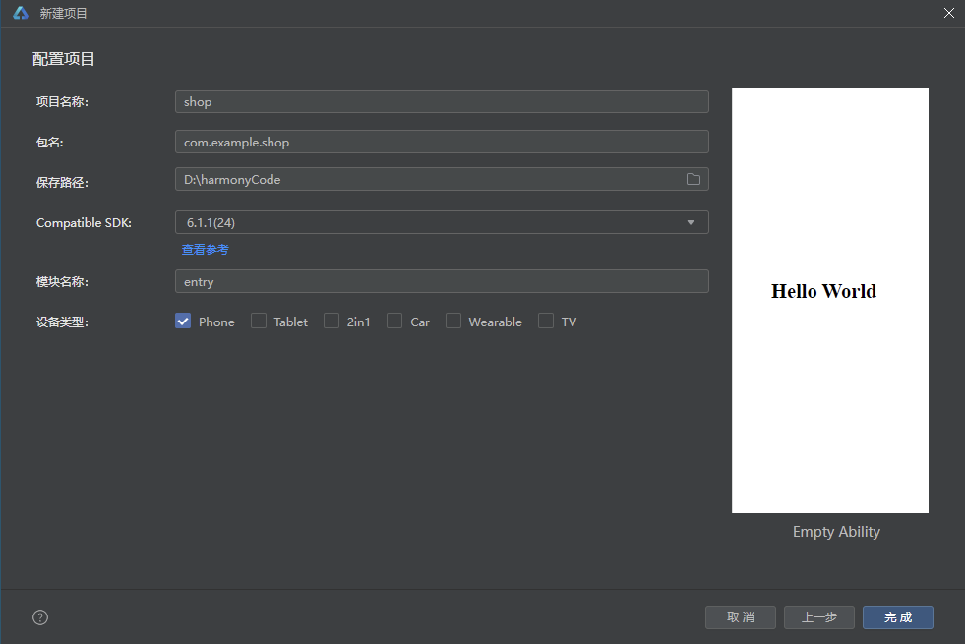
初始化项目,自动下载相关依赖:
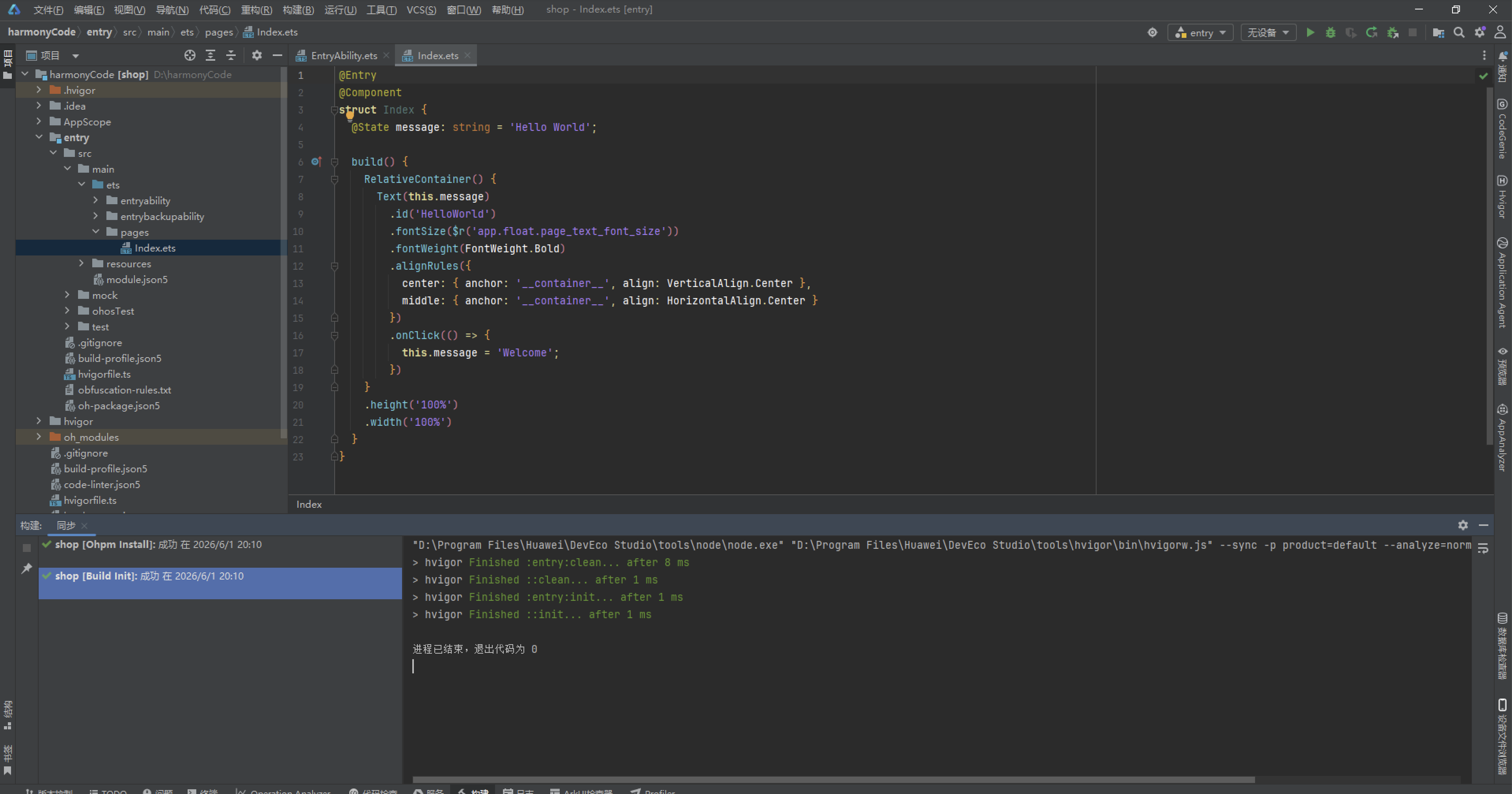
完整代码:
// ============================================================
// 530.ets 动漫二次元 APP — AnimeApp
// 主色调: 樱花粉 #FF4081 + 天空蓝 #4FC3F7
// 布局: 追番进度大数字+进度条头卡 + 周追番柱状图 + 热播番剧横滑
// + 角色双列卡 + 弹幕热评列表 + 声优横滑 + 周边商城 + 我的
// 弹窗: 新增追番 / 编辑角色 / 删除评论 (全部 modalOverlay)
// ============================================================
interface AnimeColorPalette {
primary: string
primaryLight: string
primaryDark: string
accent: string
accentLight: string
pink: string
bg: string
cardBg: string
textPrimary: string
textSecondary: string
textHint: string
border: string
success: string
warning: string
danger: string
white: string
}
interface TabMeta {
title: string
icon: string
}
interface AnimeMeta {
name: string
emoji: string
genre: string
episode: number
total: number
isHot: boolean
}
interface CharMeta {
name: string
emoji: string
anime: string
role: string
isFav: boolean
isNew: boolean
}
interface CommentMeta {
user: string
avatar: string
content: string
time: string
likes: number
isTop: boolean
}
interface SeiyuuMeta {
name: string
emoji: string
work: string
isHot: boolean
}
interface WeekWatchMeta {
label: string
value: number
}
interface MerchMeta {
name: string
emoji: string
price: number
isHot: boolean
}
interface ScheduleMeta {
name: string
emoji: string
day: string
time: string
isToday: boolean
}
interface MenuMeta {
icon: string
name: string
sub: string
}
const COLORS: AnimeColorPalette = {
primary: '#FF4081',
primaryLight: '#FF80AB',
primaryDark: '#C2185B',
accent: '#4FC3F7',
accentLight: '#B3E5FC',
pink: '#FCE4EC',
bg: '#FFF5F8',
cardBg: '#FFFFFF',
textPrimary: '#4A148C',
textSecondary: '#7B5A8E',
textHint: '#CE93D8',
border: '#F8BBD0',
success: '#66BB6A',
warning: '#FFA726',
danger: '#EF5350',
white: '#FFFFFF'
}
const TAB_CONFIG: Record<string, TabMeta> = {
'HOME': { title: '首页', icon: '🌸' },
'ANIME': { title: '追番', icon: '📺' },
'CHAR': { title: '角色', icon: '🎭' },
'COMM': { title: '社区', icon: '💬' },
'MINE': { title: '我的', icon: '👤' }
}
const ANIME_LIST: AnimeMeta[] = [
{ name: '鬼灭之刃', emoji: '⚔️', genre: '热血', episode: 26, total: 26, isHot: true },
{ name: '咒术回战', emoji: '👹', genre: '奇幻', episode: 24, total: 48, isHot: true },
{ name: '间谍过家家', emoji: '🕵️', genre: '喜剧', episode: 12, total: 25, isHot: true },
{ name: '链锯人', emoji: '🔧', genre: '热血', episode: 12, total: 12, isHot: true },
{ name: '葬送的芙莉莲', emoji: '🧝♀️', genre: '奇幻', episode: 28, total: 28, isHot: true },
{ name: '进击的巨人', emoji: '🗡️', genre: '热血', episode: 88, total: 88, isHot: false },
{ name: '我的英雄学院', emoji: '🦸', genre: '热血', episode: 113, total: 138, isHot: false },
{ name: '鬼灭之刃·刀匠村', emoji: '🗡️', genre: '热血', episode: 11, total: 11, isHot: true },
{ name: '药屋少女', emoji: '🌸', genre: '推理', episode: 24, total: 24, isHot: false },
{ name: '我推的孩子', emoji: '⭐', genre: '悬疑', episode: 11, total: 24, isHot: true },
{ name: '蓝色监狱', emoji: '⚽', genre: '运动', episode: 24, total: 24, isHot: false },
{ name: '电锯人番外', emoji: '🪚', genre: '热血', episode: 4, total: 12, isHot: false }
]
const CHAR_LIST: CharMeta[] = [
{ name: '炭治郎', emoji: '🗡️', anime: '鬼灭之刃', role: '主角', isFav: true, isNew: false },
{ name: '五条悟', emoji: '👁️', anime: '咒术回战', role: '导师', isFav: true, isNew: true },
{ name: '阿尼亚', emoji: '👧', anime: '间谍过家家', role: '配角', isFav: true, isNew: true },
{ name: '电次', emoji: '🔧', anime: '链锯人', role: '主角', isFav: false, isNew: true },
{ name: '芙莉莲', emoji: '🧝♀️', anime: '葬送的芙莉莲', role: '主角', isFav: true, isNew: false },
{ name: '艾伦', emoji: '🗡️', anime: '进击的巨人', role: '主角', isFav: false, isNew: false },
{ name: '绿谷出久', emoji: '🦸', anime: '我的英雄学院', role: '主角', isFav: false, isNew: false },
{ name: '善逸', emoji: '⚡', anime: '鬼灭之刃', role: '配角', isFav: true, isNew: false },
{ name: '夏油杰', emoji: '🌀', anime: '咒术回战', role: '反派', isFav: false, isNew: true },
{ name: '约尔', emoji: '🌸', anime: '间谍过家家', role: '主角', isFav: true, isNew: false },
{ name: '帕瓦', emoji: '🐱', anime: '链锯人', role: '配角', isFav: false, isNew: false },
{ name: '菲伦', emoji: '📖', anime: '葬送的芙莉莲', role: '配角', isFav: true, isNew: true }
]
const COMMENT_LIST: CommentMeta[] = [
{ user: '樱花飞舞', avatar: '🌸', content: '这一话太燃了!炭治郎帅炸!', time: '5分钟前', likes: 128, isTop: true },
{ user: '五条悟老婆', avatar: '👁️', content: '老师永远滴神!谁敢说不是!', time: '12分钟前', likes: 256, isTop: true },
{ user: '阿尼亚粉', avatar: '👧', content: 'wakuwaku!阿尼亚好可爱!', time: '23分钟前', likes: 89, isTop: false },
{ user: '电次厨', avatar: '🔧', content: '玛奇玛我老婆!不接受反驳!', time: '1小时前', likes: 67, isTop: false },
{ user: '芙莉莲吹', avatar: '🧝♀️', content: '这才是真正的奇幻番,世界观太棒了', time: '2小时前', likes: 45, isTop: false },
{ user: '巨人粉', avatar: '🗡️', content: '最终季封神!没有之一!', time: '3小时前', likes: 78, isTop: false },
{ user: '追番达人', avatar: '📺', content: '本季追了12部,根本看不过来', time: '5小时前', likes: 34, isTop: false },
{ user: '声控党', avatar: '🎙️', content: '花泽香菜的声音太好听了', time: '8小时前', likes: 56, isTop: false },
{ user: '老二次元', avatar: '😎', content: '十年老二次元路过,现在新番质量真不错', time: '12小时前', likes: 102, isTop: false },
{ user: '漫评君', avatar: '📝', content: '这季霸权非咒术回战莫属,评分9.8', time: '1天前', likes: 87, isTop: false }
]
const SEIYUU_LIST: SeiyuuMeta[] = [
{ name: '花泽香菜', emoji: '🎙️', work: '芙莉莲', isHot: true },
{ name: '梶裕贵', emoji: '🎤', work: '艾伦', isHot: true },
{ name: '松冈祯丞', emoji: '🎶', work: '电次', isHot: false },
{ name: '悠木碧', emoji: '🎵', work: '阿尼亚', isHot: true },
{ name: '石川由依', emoji: '🎺', work: '炭治郎', isHot: false },
{ name: '中村悠一', emoji: '🎸', work: '五条悟', isHot: true },
{ name: '樱井孝宏', emoji: '🎻', work: '夏油杰', isHot: false },
{ name: '雨宫天', emoji: '🎹', work: '约尔', isHot: false }
]
const WEEK_WATCH: WeekWatchMeta[] = [
{ label: '周一', value: 4 },
{ label: '周二', value: 2 },
{ label: '周三', value: 5 },
{ label: '周四', value: 3 },
{ label: '周五', value: 6 },
{ label: '周六', value: 8 },
{ label: '周日', value: 7 }
]
const MERCH_LIST: MerchMeta[] = [
{ name: '五条悟手办', emoji: '🗼', price: 298, isHot: true },
{ name: '阿尼亚抱枕', emoji: '🛏️', price: 88, isHot: true },
{ name: '炭治郎刀', emoji: '🗡️', price: 168, isHot: false },
{ name: '芙莉莲画集', emoji: '📖', price: 128, isHot: false },
{ name: '咒术回战T恤', emoji: '👕', price: 99, isHot: true },
{ name: '电次钥匙扣', emoji: '🔑', price: 28, isHot: false },
{ name: '间谍过家家马克杯', emoji: '☕', price: 45, isHot: false },
{ name: '进击的巨人海报', emoji: '🖼️', price: 58, isHot: true }
]
const SCHEDULE_LIST: ScheduleMeta[] = [
{ name: '咒术回战', emoji: '👹', day: '周一', time: '00:00', isToday: true },
{ name: '葬送的芙莉莲', emoji: '🧝♀️', day: '周五', time: '23:00', isToday: false },
{ name: '间谍过家家', emoji: '🕵️', day: '周六', time: '23:00', isToday: false },
{ name: '我推的孩子', emoji: '⭐', day: '周三', time: '22:00', isToday: false },
{ name: '药屋少女', emoji: '🌸', day: '周六', time: '23:30', isToday: false },
{ name: '蓝色监狱', emoji: '⚽', day: '周日', time: '01:00', isToday: false }
]
const MENU_LIST: MenuMeta[] = [
{ icon: '📺', name: '观看历史', sub: '最近观看 50 集' },
{ icon: '⭐', name: '我的收藏', sub: '6 位角色 · 8 部番剧' },
{ icon: '💬', name: '我的弹幕', sub: '发送 128 条' },
{ icon: '🎟️', name: '会员中心', sub: '年费会员' },
{ icon: '⚙️', name: '播放设置', sub: '画质/弹幕/倍速' },
{ icon: '📞', name: '客服中心', sub: '在线客服' }
]
function getGenreColor(genre: string): string {
if (genre === '热血') {
return COLORS.danger
} else if (genre === '奇幻') {
return COLORS.primary
} else if (genre === '喜剧') {
return COLORS.warning
} else if (genre === '悬疑') {
return COLORS.accent
}
return COLORS.textSecondary
}
enum AnimeTab {
HOME,
ANIME,
CHAR,
COMM,
MINE
}
@Entry
@Component
struct AnimeApp {
@State activeTab: AnimeTab = AnimeTab.HOME
@Builder contentArea() {
Column() {
if (this.activeTab === AnimeTab.HOME) {
AnimeHomeContent()
} else if (this.activeTab === AnimeTab.ANIME) {
AnimeListContent()
} else if (this.activeTab === AnimeTab.CHAR) {
AnimeCharContent()
} else if (this.activeTab === AnimeTab.COMM) {
AnimeCommContent()
} else if (this.activeTab === AnimeTab.MINE) {
AnimeMineContent()
}
}
.width('100%')
}
@Builder tabItem(icon: string, label: string, tab: AnimeTab) {
Column() {
Text(icon).fontSize(20)
Text(label).fontSize(10)
.fontColor(this.activeTab === tab ? COLORS.primary : COLORS.textHint)
.fontWeight(this.activeTab === tab ? FontWeight.Bold : FontWeight.Normal)
.margin({ top: 2 })
}
.layoutWeight(1)
.onClick(() => { this.activeTab = tab })
}
build() {
Column() {
this.contentArea()
Row() {
this.tabItem(TAB_CONFIG.HOME.icon, TAB_CONFIG.HOME.title, AnimeTab.HOME)
this.tabItem(TAB_CONFIG.ANIME.icon, TAB_CONFIG.ANIME.title, AnimeTab.ANIME)
this.tabItem(TAB_CONFIG.CHAR.icon, TAB_CONFIG.CHAR.title, AnimeTab.CHAR)
this.tabItem(TAB_CONFIG.COMM.icon, TAB_CONFIG.COMM.title, AnimeTab.COMM)
this.tabItem(TAB_CONFIG.MINE.icon, TAB_CONFIG.MINE.title, AnimeTab.MINE)
}
.width('100%')
.padding({ top: 8, bottom: 8 })
.backgroundColor(COLORS.white)
.shadow({ radius: 10, color: '#FF408126', offsetY: -2 })
}
.width('100%').height('100%')
.backgroundColor(COLORS.bg)
}
}
@Component
struct AnimeHomeContent {
@State showAddAnimeModal: boolean = false
@State animeName: string = ''
@State animeGenre: string = ''
@Builder modalOverlay(onClose: () => void) {
Column()
.width('100%').height('100%')
.backgroundColor('rgba(0,0,0,0.55)')
.onClick(onClose)
}
@Builder addAnimeModal() {
Stack() {
this.modalOverlay(() => { this.showAddAnimeModal = false })
Column() {
Row() {
Text('🌸 新增追番').fontSize(18).fontWeight(FontWeight.Bold).fontColor(COLORS.textPrimary)
Column().layoutWeight(1)
Text('✕').fontSize(18).fontColor(COLORS.textHint).onClick(() => { this.showAddAnimeModal = false })
}
.width('100%').padding({ left: 20, right: 20, top: 18, bottom: 12 })
Divider().color(COLORS.border)
Column() {
Text('番剧名称').fontSize(12).fontColor(COLORS.textSecondary).margin({ top: 12, left: 20 })
TextInput({ placeholder: '如 鬼灭之刃' })
.placeholderColor(COLORS.textHint).fontSize(14).width('90%')
.backgroundColor(COLORS.pink).borderRadius(8)
.margin({ left: 20, right: 20, top: 4 })
.onChange((v: string) => { this.animeName = v })
Text('番剧类型').fontSize(12).fontColor(COLORS.textSecondary).margin({ top: 14, left: 20 })
TextInput({ placeholder: '如 热血' })
.placeholderColor(COLORS.textHint).fontSize(14).width('90%')
.backgroundColor(COLORS.pink).borderRadius(8)
.margin({ left: 20, right: 20, top: 4 })
.onChange((v: string) => { this.animeGenre = v })
Row() {
Text('取消').fontSize(14).fontColor(COLORS.textSecondary)
.layoutWeight(1).textAlign(TextAlign.Center)
.padding({ top: 10, bottom: 10 })
.backgroundColor(COLORS.pink).borderRadius(8)
.onClick(() => { this.showAddAnimeModal = false })
Column().width(12)
Text('添加').fontSize(14).fontColor(COLORS.white)
.layoutWeight(1).textAlign(TextAlign.Center)
.padding({ top: 10, bottom: 10 })
.backgroundColor(COLORS.primary).borderRadius(8)
.onClick(() => { this.showAddAnimeModal = false })
}
.margin({ left: 20, right: 20, top: 20, bottom: 20 })
}
.constraintSize({ maxHeight: '70%' })
}
.width('88%')
.backgroundColor(COLORS.cardBg).borderRadius(16)
}
.width('100%').height('100%')
}
build() {
Scroll() {
Column() {
// 追番进度大数字+进度条头卡
Column() {
Row() {
Column() {
Text('📺 本季追番').fontSize(11).fontColor('#F8BBD0')
Text('12').fontSize(40).fontWeight(FontWeight.Bold).fontColor(COLORS.white)
.margin({ top: 2 })
Text('部 · 已看完 5 部').fontSize(10).fontColor('#F8BBD0').margin({ top: 2 })
}
.alignItems(HorizontalAlign.Start).layoutWeight(1)
Column() {
Text('🌸').fontSize(48)
Text('追番达人').fontSize(10).fontColor(COLORS.accentLight)
.backgroundColor('rgba(255,255,255,0.2)')
.borderRadius(12)
.padding({ left: 8, right: 8, top: 3, bottom: 3 })
.margin({ top: 4 })
}
.alignItems(HorizontalAlign.Center)
}
.width('100%')
.padding({ left: 20, right: 20, top: 30, bottom: 16 })
// 进度条
Row() {
Column().width('42%').height(6).borderRadius(3)
.backgroundColor(COLORS.accent)
Column().layoutWeight(1).height(6).borderRadius(3)
.backgroundColor('rgba(255,255,255,0.2)')
}
.width('90%').margin({ bottom: 20 })
}
.width('100%')
.linearGradient({ angle: 135, colors: [[COLORS.primary, 0.0], [COLORS.primaryDark, 1.0]] })
.borderRadius({ bottomLeft: 24, bottomRight: 24 })
// 周追番时长柱状图
Column() {
Text('📊 本周追番时长(小时)').fontSize(14).fontWeight(FontWeight.Bold)
.fontColor(COLORS.textPrimary).margin({ left: 16, top: 16 })
Row() {
ForEach(WEEK_WATCH, (w: WeekWatchMeta) => {
Column() {
Stack({ alignContent: Alignment.Bottom }) {
Column().width(22).height(90)
.backgroundColor(COLORS.pink)
.borderRadius(4)
Column().width(22).height(Number(w.value) * 9)
.linearGradient({ angle: 0, colors: [[COLORS.accent, 0.0], [COLORS.primary, 1.0]] })
.borderRadius(4)
}
.width(22).height(90)
Text(w.label).fontSize(9).fontColor(COLORS.textSecondary)
.margin({ top: 4 })
}
.alignItems(HorizontalAlign.Center)
.layoutWeight(1)
})
}
.width('100%')
.padding({ left: 16, right: 16, top: 12, bottom: 8 })
}
.width('100%')
.backgroundColor(COLORS.cardBg)
.borderRadius(16)
.margin({ left: 12, right: 12, top: 12 })
// 更新日程
Column() {
Text('📅 更新日程').fontSize(14).fontWeight(FontWeight.Bold)
.fontColor(COLORS.textPrimary).margin({ left: 16, top: 8, bottom: 8 })
ForEach(SCHEDULE_LIST, (s: ScheduleMeta) => {
Row() {
Text(s.emoji).fontSize(24).margin({ right: 12 })
Column() {
Text(s.name).fontSize(13).fontColor(COLORS.textPrimary).fontWeight(FontWeight.Medium)
Row() {
Text(s.day + ' ' + s.time).fontSize(10).fontColor(COLORS.textSecondary)
if (s.isToday) {
Text(' · 今日更新').fontSize(10).fontColor(COLORS.danger).fontWeight(FontWeight.Bold)
}
}
.margin({ top: 2 })
}
.alignItems(HorizontalAlign.Start).layoutWeight(1)
Text('追番').fontSize(11).fontColor(COLORS.white)
.backgroundColor(s.isToday ? COLORS.danger : COLORS.primary)
.borderRadius(12)
.padding({ left: 10, right: 10, top: 5, bottom: 5 })
}
.width('100%')
.padding({ left: 16, right: 16, top: 10, bottom: 10 })
.border({ width: { bottom: 1 }, color: COLORS.border })
})
}
.width('100%')
.backgroundColor(COLORS.cardBg)
.borderRadius(16)
.margin({ left: 12, right: 12, top: 8 })
// 热播番剧横滑
Row() {
Text('🔥 热播番剧').fontSize(14).fontWeight(FontWeight.Bold)
.fontColor(COLORS.textPrimary).layoutWeight(1)
Text('查看全部 >').fontSize(11).fontColor(COLORS.textHint)
}
.width('100%')
.padding({ left: 16, right: 16, top: 16 })
Scroll() {
Row() {
ForEach(ANIME_LIST, (a: AnimeMeta) => {
Column() {
Stack() {
Column().width(72).height(96).borderRadius(12)
.linearGradient({ angle: 135, colors: [[COLORS.primaryLight, 0.0], [COLORS.accentLight, 1.0]] })
Text(a.emoji).fontSize(40)
if (a.isHot) {
Text('🔥').fontSize(14).position({ x: 48, y: -4 })
}
}
.width(72).height(96)
Text(a.name).fontSize(10).fontColor(COLORS.textPrimary)
.margin({ top: 6 }).maxLines(1).textOverflow({ overflow: TextOverflow.Ellipsis })
Text(a.genre).fontSize(8).fontColor(getGenreColor(a.genre))
.margin({ top: 2 })
Text(a.episode + '/' + a.total).fontSize(8).fontColor(COLORS.textHint)
.margin({ top: 1 })
}
.width(80)
.margin({ left: 8 })
.alignItems(HorizontalAlign.Center)
})
}
.padding({ left: 16, right: 16 })
}
.scrollable(ScrollDirection.Horizontal)
.scrollBar(BarState.Off)
.width('100%')
.margin({ top: 8, bottom: 8 })
// 新增按钮
Row() {
Text('+ 新增追番').fontSize(14).fontColor(COLORS.white)
.fontWeight(FontWeight.Bold)
.backgroundColor(COLORS.primary)
.borderRadius(24)
.padding({ left: 24, right: 24, top: 10, bottom: 10 })
}
.width('100%')
.justifyContent(FlexAlign.Center)
.margin({ top: 16, bottom: 20 })
.onClick(() => { this.showAddAnimeModal = true })
}
.width('100%')
}
.width('100%').height('100%')
.scrollBar(BarState.Off)
.bindSheet(this.showAddAnimeModal, this.addAnimeModal(), {
height: SheetSize.LARGE,
})
}
}
@Component
struct AnimeListContent {
build() {
Scroll() {
Column() {
// 追番列表头卡
Column() {
Row() {
Text('📺').fontSize(28).margin({ right: 8 })
Column() {
Text('我的追番').fontSize(20).fontWeight(FontWeight.Bold).fontColor(COLORS.white)
Text('12 部 · 在追 7 部 · 已完结 5 部').fontSize(11).fontColor('#F8BBD0').margin({ top: 2 })
}
.alignItems(HorizontalAlign.Start).layoutWeight(1)
Text('🔍').fontSize(22).fontColor(COLORS.white)
}
.width('100%').padding({ left: 20, right: 20, top: 16, bottom: 16 })
}
.width('100%')
.linearGradient({ angle: 135, colors: [[COLORS.accent, 0.0], [COLORS.primary, 1.0]] })
.borderRadius({ bottomLeft: 20, bottomRight: 20 })
// 类型筛选
Scroll() {
Row() {
ForEach(['全部', '热血', '奇幻', '喜剧', '悬疑', '运动', '推理'], (t: string) => {
Text(t).fontSize(12).fontColor(COLORS.textSecondary)
.backgroundColor(COLORS.pink)
.borderRadius(16)
.padding({ left: 14, right: 14, top: 6, bottom: 6 })
.margin({ left: 8 })
})
}
.padding({ left: 8, right: 8 })
}
.scrollable(ScrollDirection.Horizontal)
.scrollBar(BarState.Off)
.width('100%')
.margin({ top: 12 })
// 番剧列表
ForEach(ANIME_LIST, (a: AnimeMeta) => {
Row() {
Stack() {
Column().width(48).height(64).borderRadius(10)
.linearGradient({ angle: 135, colors: [[COLORS.primaryLight, 0.0], [COLORS.accentLight, 1.0]] })
Text(a.emoji).fontSize(28)
}
.width(48).height(64).margin({ right: 12 })
Column() {
Text(a.name).fontSize(14).fontColor(COLORS.textPrimary).fontWeight(FontWeight.Medium)
Row() {
Text(a.genre).fontSize(10).fontColor(getGenreColor(a.genre))
.backgroundColor(COLORS.pink).borderRadius(4)
.padding({ left: 6, right: 6, top: 2, bottom: 2 })
Text(' ' + a.episode + '/' + a.total).fontSize(10).fontColor(COLORS.textSecondary)
.margin({ left: 8 })
if (a.isHot) {
Text(' 热播').fontSize(9).fontColor(COLORS.white)
.backgroundColor(COLORS.danger).borderRadius(4)
.padding({ left: 4, right: 4, top: 1, bottom: 1 })
.margin({ left: 8 })
}
}
.margin({ top: 4 })
// 进度条
Row() {
Column().width(Number(a.episode / a.total * 100) + '%').height(4).borderRadius(2)
.backgroundColor(COLORS.primary)
Column().layoutWeight(1).height(4).borderRadius(2)
.backgroundColor(COLORS.border)
}
.width('100%').margin({ top: 6 })
}
.alignItems(HorizontalAlign.Start).layoutWeight(1)
Text('续看').fontSize(11).fontColor(COLORS.white)
.backgroundColor(COLORS.primary).borderRadius(12)
.padding({ left: 10, right: 10, top: 5, bottom: 5 })
}
.width('100%')
.padding({ left: 16, right: 16, top: 10, bottom: 10 })
.backgroundColor(COLORS.cardBg)
.border({ width: { bottom: 1 }, color: COLORS.border })
})
}
.width('100%')
}
.width('100%').height('100%')
.scrollBar(BarState.Off)
}
}
@Component
struct AnimeCharContent {
@State showEditCharModal: boolean = false
@State selectedChar: string = ''
@Builder modalOverlay(onClose: () => void) {
Column()
.width('100%').height('100%')
.backgroundColor('rgba(0,0,0,0.55)')
.onClick(onClose)
}
@Builder editCharModal() {
Stack() {
this.modalOverlay(() => { this.showEditCharModal = false })
Column() {
Row() {
Text('✏️ 编辑角色').fontSize(18).fontWeight(FontWeight.Bold).fontColor(COLORS.textPrimary)
Column().layoutWeight(1)
Text('✕').fontSize(18).fontColor(COLORS.textHint).onClick(() => { this.showEditCharModal = false })
}
.width('100%').padding({ left: 20, right: 20, top: 18, bottom: 12 })
Divider().color(COLORS.border)
Column() {
Text('角色名称').fontSize(12).fontColor(COLORS.textSecondary).margin({ top: 12, left: 20 })
Text(this.selectedChar).fontSize(14).fontColor(COLORS.textPrimary)
.margin({ left: 20, top: 4 })
Text('角色标签').fontSize(12).fontColor(COLORS.textSecondary).margin({ top: 14, left: 20 })
TextInput({ placeholder: '如 热血/正义/强大' })
.placeholderColor(COLORS.textHint).fontSize(14).width('90%')
.backgroundColor(COLORS.pink).borderRadius(8)
.margin({ left: 20, right: 20, top: 4 })
Text('角色简介').fontSize(12).fontColor(COLORS.textSecondary).margin({ top: 14, left: 20 })
TextInput({ placeholder: '输入角色简介' })
.placeholderColor(COLORS.textHint).fontSize(14).width('90%')
.backgroundColor(COLORS.pink).borderRadius(8)
.margin({ left: 20, right: 20, top: 4 })
Row() {
Text('取消').fontSize(14).fontColor(COLORS.textSecondary)
.layoutWeight(1).textAlign(TextAlign.Center)
.padding({ top: 10, bottom: 10 })
.backgroundColor(COLORS.pink).borderRadius(8)
.onClick(() => { this.showEditCharModal = false })
Column().width(12)
Text('保存').fontSize(14).fontColor(COLORS.white)
.layoutWeight(1).textAlign(TextAlign.Center)
.padding({ top: 10, bottom: 10 })
.backgroundColor(COLORS.primary).borderRadius(8)
.onClick(() => { this.showEditCharModal = false })
}
.margin({ left: 20, right: 20, top: 20, bottom: 20 })
}
.constraintSize({ maxHeight: '70%' })
}
.width('88%')
.backgroundColor(COLORS.cardBg).borderRadius(16)
}
.width('100%').height('100%')
}
build() {
Scroll() {
Column() {
// 角色墙头卡
Stack() {
Column()
.width('100%').height(130)
.linearGradient({ angle: 135, colors: [[COLORS.primary, 0.0], [COLORS.accent, 1.0]] })
.borderRadius({ bottomLeft: 24, bottomRight: 24 })
Column() {
Text('🎭 角色图鉴').fontSize(18).fontWeight(FontWeight.Bold).fontColor(COLORS.white)
Text('12 位角色 · 已收藏 6 位').fontSize(11).fontColor('#F8BBD0').margin({ top: 4 })
}
.alignItems(HorizontalAlign.Center)
.padding({ top: 30 })
}
.width('100%').height(130)
// 角色双列
Text('全部角色').fontSize(14).fontWeight(FontWeight.Bold)
.fontColor(COLORS.textPrimary)
.margin({ left: 16, top: 16, bottom: 8 })
Flex({ wrap: FlexWrap.Wrap, justifyContent: FlexAlign.SpaceBetween }) {
ForEach(CHAR_LIST, (c: CharMeta) => {
Column() {
Stack() {
Column().width(64).height(64).borderRadius(16)
.linearGradient({ angle: 135, colors: [[COLORS.primaryLight, 0.0], [COLORS.accentLight, 1.0]] })
Text(c.emoji).fontSize(36)
if (c.isNew) {
Text('NEW').fontSize(7).fontColor(COLORS.white)
.backgroundColor(COLORS.danger)
.borderRadius(4)
.padding({ left: 3, right: 3, top: 1, bottom: 1 })
.position({ x: 40, y: -2 })
}
if (c.isFav) {
Text('❤️').fontSize(14).position({ x: 40, y: 42 })
}
}
.width(64).height(64)
Text(c.name).fontSize(12).fontColor(COLORS.textPrimary)
.fontWeight(FontWeight.Medium).margin({ top: 8 })
Text(c.anime).fontSize(9).fontColor(COLORS.textSecondary).margin({ top: 2 })
Text(c.role).fontSize(9)
.fontColor(getGenreColor(c.role === '主角' ? '热血' : '奇幻'))
.margin({ top: 2 })
Text('编辑').fontSize(10).fontColor(COLORS.primary)
.border({ width: 1, color: COLORS.primary }).borderRadius(10)
.padding({ left: 12, right: 12, top: 3, bottom: 3 })
.margin({ top: 6 })
.onClick(() => {
this.selectedChar = c.name
this.showEditCharModal = true
})
}
.width('48%')
.padding({ top: 14, bottom: 14 })
.backgroundColor(COLORS.cardBg)
.borderRadius(14)
.margin({ bottom: 8 })
.alignItems(HorizontalAlign.Center)
})
}
.width('92%')
.margin({ left: 16, right: 16, bottom: 20 })
}
.width('100%')
}
.width('100%').height('100%')
.scrollBar(BarState.Off)
.bindSheet(this.showEditCharModal, this.editCharModal(), {
height: SheetSize.LARGE,
})
}
}
@Component
struct AnimeCommContent {
@State showDeleteModal: boolean = false
@State selectedUser: string = ''
@Builder modalOverlay(onClose: () => void) {
Column()
.width('100%').height('100%')
.backgroundColor('rgba(0,0,0,0.55)')
.onClick(onClose)
}
@Builder deleteCommentModal() {
Stack() {
this.modalOverlay(() => { this.showDeleteModal = false })
Column() {
Text('⚠️ 删除评论').fontSize(18).fontWeight(FontWeight.Bold)
.fontColor(COLORS.textPrimary)
.margin({ top: 24 })
Text('确定要删除「' + this.selectedUser + '」的评论吗?')
.fontSize(13).fontColor(COLORS.textSecondary)
.textAlign(TextAlign.Center)
.margin({ left: 20, right: 20, top: 12 })
Row() {
Text('取消').fontSize(14).fontColor(COLORS.textSecondary)
.layoutWeight(1).textAlign(TextAlign.Center)
.padding({ top: 10, bottom: 10 })
.backgroundColor(COLORS.pink).borderRadius(8)
.onClick(() => { this.showDeleteModal = false })
Column().width(12)
Text('删除').fontSize(14).fontColor(COLORS.white)
.layoutWeight(1).textAlign(TextAlign.Center)
.padding({ top: 10, bottom: 10 })
.backgroundColor(COLORS.danger).borderRadius(8)
.onClick(() => { this.showDeleteModal = false })
}
.margin({ left: 20, right: 20, top: 24, bottom: 24 })
}
.width('80%')
.backgroundColor(COLORS.cardBg).borderRadius(16)
}
.width('100%').height('100%')
}
build() {
Scroll() {
Column() {
// 弹幕社区头卡
Column() {
Row() {
Text('💬').fontSize(28).margin({ right: 8 })
Column() {
Text('弹幕社区').fontSize(20).fontWeight(FontWeight.Bold).fontColor(COLORS.white)
Text('今日 1,280 条弹幕 · 热议 56 条').fontSize(11).fontColor('#F8BBD0').margin({ top: 2 })
}
.alignItems(HorizontalAlign.Start).layoutWeight(1)
Text('✏️').fontSize(22).fontColor(COLORS.white)
}
.width('100%').padding({ left: 20, right: 20, top: 16, bottom: 16 })
}
.width('100%')
.linearGradient({ angle: 135, colors: [[COLORS.accent, 0.0], [COLORS.primary, 1.0]] })
.borderRadius({ bottomLeft: 20, bottomRight: 20 })
// 热门评论列表
Text('🔥 热门评论').fontSize(14).fontWeight(FontWeight.Bold)
.fontColor(COLORS.textPrimary)
.margin({ left: 16, top: 16, bottom: 8 })
ForEach(COMMENT_LIST, (c: CommentMeta) => {
Column() {
Row() {
Stack() {
Column().width(36).height(36).borderRadius(18)
.backgroundColor(COLORS.pink)
Text(c.avatar).fontSize(20)
}
.width(36).height(36).margin({ right: 10 })
Column() {
Row() {
Text(c.user).fontSize(12).fontColor(COLORS.textPrimary).fontWeight(FontWeight.Medium)
if (c.isTop) {
Text(' 置顶').fontSize(8).fontColor(COLORS.white)
.backgroundColor(COLORS.danger).borderRadius(4)
.padding({ left: 4, right: 4, top: 1, bottom: 1 })
}
}
Text(c.time).fontSize(9).fontColor(COLORS.textHint).margin({ top: 1 })
}
.alignItems(HorizontalAlign.Start).layoutWeight(1)
Text('删除').fontSize(10).fontColor(COLORS.danger)
.onClick(() => {
this.selectedUser = c.user
this.showDeleteModal = true
})
}
Text(c.content).fontSize(13).fontColor(COLORS.textPrimary)
.margin({ top: 8, left: 46 })
Row() {
Text('👍 ' + c.likes).fontSize(11).fontColor(COLORS.textSecondary)
Text(' 💬 回复').fontSize(11).fontColor(COLORS.textSecondary)
Text(' ⭐ 收藏').fontSize(11).fontColor(COLORS.textSecondary)
}
.margin({ top: 6, left: 46 })
}
.width('100%')
.padding({ left: 16, right: 16, top: 12, bottom: 12 })
.backgroundColor(COLORS.cardBg)
.border({ width: { bottom: 1 }, color: COLORS.border })
})
// 声优横滑
Text('🎙️ 热门声优').fontSize(14).fontWeight(FontWeight.Bold)
.fontColor(COLORS.textPrimary)
.margin({ left: 16, top: 16, bottom: 8 })
Scroll() {
Row() {
ForEach(SEIYUU_LIST, (s: SeiyuuMeta) => {
Column() {
Stack() {
Column().width(56).height(56).borderRadius(28)
.linearGradient({ angle: 135, colors: [[COLORS.primaryLight, 0.0], [COLORS.accentLight, 1.0]] })
Text(s.emoji).fontSize(30)
if (s.isHot) {
Text('🔥').fontSize(12).position({ x: 38, y: -4 })
}
}
.width(56).height(56)
Text(s.name).fontSize(10).fontColor(COLORS.textPrimary)
.margin({ top: 6 }).maxLines(1)
Text(s.work).fontSize(8).fontColor(COLORS.textHint).margin({ top: 1 })
}
.width(72)
.margin({ left: 8 })
.alignItems(HorizontalAlign.Center)
})
}
.padding({ left: 16, right: 16 })
}
.scrollable(ScrollDirection.Horizontal)
.scrollBar(BarState.Off)
.width('100%')
.margin({ bottom: 20 })
}
.width('100%')
}
.width('100%').height('100%')
.scrollBar(BarState.Off)
.bindSheet(this.showDeleteModal, this.deleteCommentModal(), {
height: SheetSize.LARGE,
})
}
}
@Component
struct AnimeMineContent {
build() {
Scroll() {
Column() {
// 个人头卡
Stack() {
Column()
.width('100%').height(160)
.linearGradient({ angle: 135, colors: [[COLORS.primary, 0.0], [COLORS.primaryDark, 1.0]] })
.borderRadius({ bottomLeft: 24, bottomRight: 24 })
Column() {
Stack() {
Column().width(64).height(64).borderRadius(32)
.backgroundColor('rgba(255,255,255,0.25)')
Text('🌸').fontSize(36)
}
.width(64).height(64)
Text('樱花少女').fontSize(16).fontWeight(FontWeight.Bold)
.fontColor(COLORS.white).margin({ top: 8 })
Row() {
Text('Lv.28').fontSize(10).fontColor(COLORS.accentLight)
.backgroundColor('rgba(255,255,255,0.2)')
.borderRadius(8).padding({ left: 6, right: 6, top: 2, bottom: 2 })
Text(' · 追番 12 部').fontSize(10).fontColor('#F8BBD0')
}
.margin({ top: 2 })
}
.alignItems(HorizontalAlign.Center)
.padding({ top: 24 })
}
.width('100%').height(160)
// 个人数据
Row() {
Column() {
Text('12').fontSize(20).fontWeight(FontWeight.Bold).fontColor(COLORS.primary)
Text('追番').fontSize(10).fontColor(COLORS.textSecondary).margin({ top: 2 })
}
.layoutWeight(1).alignItems(HorizontalAlign.Center)
Column() {
Text('6').fontSize(20).fontWeight(FontWeight.Bold).fontColor(COLORS.accent)
Text('收藏角色').fontSize(10).fontColor(COLORS.textSecondary).margin({ top: 2 })
}
.layoutWeight(1).alignItems(HorizontalAlign.Center)
Column() {
Text('128').fontSize(20).fontWeight(FontWeight.Bold).fontColor(COLORS.warning)
Text('弹幕').fontSize(10).fontColor(COLORS.textSecondary).margin({ top: 2 })
}
.layoutWeight(1).alignItems(HorizontalAlign.Center)
Column() {
Text('35h').fontSize(20).fontWeight(FontWeight.Bold).fontColor(COLORS.danger)
Text('本周时长').fontSize(10).fontColor(COLORS.textSecondary).margin({ top: 2 })
}
.layoutWeight(1).alignItems(HorizontalAlign.Center)
}
.width('100%')
.padding({ top: 16, bottom: 16 })
.backgroundColor(COLORS.cardBg)
.margin({ left: 12, right: 12, top: 12 })
.borderRadius(16)
// 周边商城
Text('🛒 周边商城').fontSize(14).fontWeight(FontWeight.Bold)
.fontColor(COLORS.textPrimary)
.margin({ left: 16, top: 16, bottom: 8 })
Flex({ wrap: FlexWrap.Wrap, justifyContent: FlexAlign.SpaceBetween }) {
ForEach(MERCH_LIST, (m: MerchMeta) => {
Column() {
Stack() {
Column().width(48).height(48).borderRadius(12)
.linearGradient({ angle: 135, colors: [[COLORS.pink, 0.0], [COLORS.accentLight, 1.0]] })
Text(m.emoji).fontSize(28)
if (m.isHot) {
Text('🔥').fontSize(12).position({ x: 30, y: -4 })
}
}
.width(48).height(48)
Text(m.name).fontSize(10).fontColor(COLORS.textPrimary)
.margin({ top: 6 }).maxLines(1)
Text('¥' + m.price).fontSize(11).fontColor(COLORS.primary)
.fontWeight(FontWeight.Bold).margin({ top: 2 })
}
.width('23%')
.padding({ top: 12, bottom: 12 })
.backgroundColor(COLORS.cardBg)
.borderRadius(12)
.margin({ bottom: 8 })
.alignItems(HorizontalAlign.Center)
})
}
.width('92%')
.margin({ left: 16, right: 16, bottom: 20 })
// 功能列表
Column() {
ForEach(MENU_LIST, (m: MenuMeta) => {
Row() {
Text(m.icon).fontSize(22).margin({ right: 12 })
Text(m.name).fontSize(14).fontColor(COLORS.textPrimary).layoutWeight(1)
Text(m.sub).fontSize(11).fontColor(COLORS.textHint)
Text(' >').fontSize(14).fontColor(COLORS.textHint)
}
.width('100%')
.padding({ left: 16, right: 16, top: 14, bottom: 14 })
.border({ width: { bottom: 1 }, color: COLORS.border })
})
}
.width('100%')
.backgroundColor(COLORS.cardBg)
.borderRadius(16)
.margin({ left: 12, right: 12, bottom: 20 })
}
.width('100%')
}
.width('100%').height('100%')
.scrollBar(BarState.Off)
}
}
十二、结尾总结
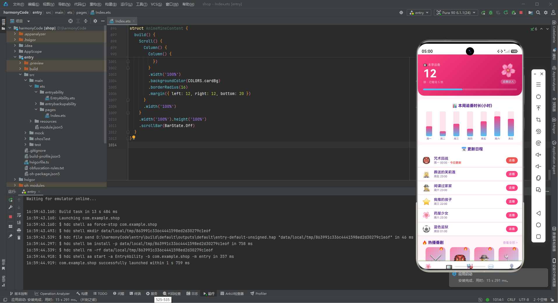
这款动漫二次元 App 是 ArkTS 声明式UI开发与二次元设计美学的完美融合。从粉嫩的樱花粉色调到梦幻的粉蓝渐变,从可爱的角色卡片到甜美的进度条,每一个细节都散发着二次元文化的独特魅力。通过本文的全面解析,我们可以从中汲取丰富的技术营养和设计灵感。
在架构设计层面,应用采用了经典的分层架构:数据模型层定义了 9 个 TypeScript 接口,为整个应用提供了坚实的类型基础;常量配置层集中管理颜色、导航和业务数据,实现了配置与逻辑的分离;工具函数层提供了类型配色函数,统一了视觉规则;组件层包含 5 个页面组件和多个弹窗构建器,每个组件职责明确、封装良好;入口层统筹全局状态和导航切换。这种清晰的分层设计使得代码结构井然有序,便于团队协作和后期维护。
在视觉设计层面,应用构建了一套完整的二次元风格视觉系统。樱花粉与天空蓝的主辅色搭配,营造出甜美浪漫的梦幻氛围;粉色系的输入框、标签、背景等细节设计,让整个应用沉浸在樱花般的柔美中;紫色系的文字颜色而非传统灰色,是二次元风格的标志性设计,既保证了可读性又增添了梦幻感。粉蓝渐变的大量运用(头卡、封面、头像、柱状图等),更是将梦幻唯美的氛围推向了极致。
在组件设计层面,应用充分展示了 ArkTS 声明式UI的强大表达力。@Builder 自定义构建函数抽象可复用的 UI 片段,减少代码冗余;@State 状态管理简洁高效,遵循状态最小化原则;ForEach 列表渲染配合 key 函数实现高性能列表更新;Flex 的 wrap 特性实现灵活的网格布局;bindSheet 底部抽屉提供符合移动端习惯的弹窗交互;.position() 绝对定位实现精美的角标效果。这些技术点的综合运用,构建出了功能丰富、视觉精美的用户界面。

作为“人工智能6S店”的官方数字引擎,为AI开发者与企业提供一个覆盖软硬件全栈、一站式门户。
更多推荐

 6
6 0
0- 0


 已为社区贡献73条内容

所有评论(0)