
鸿蒙原生ArkTS布局方式之Translate位移动画布局深度解析
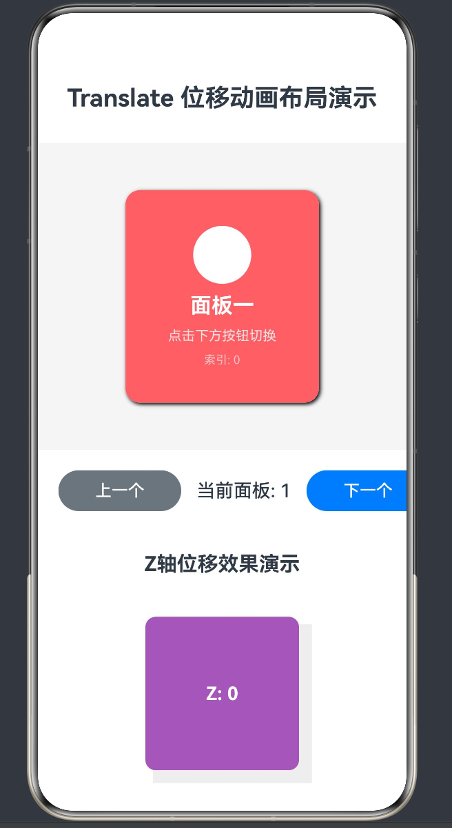
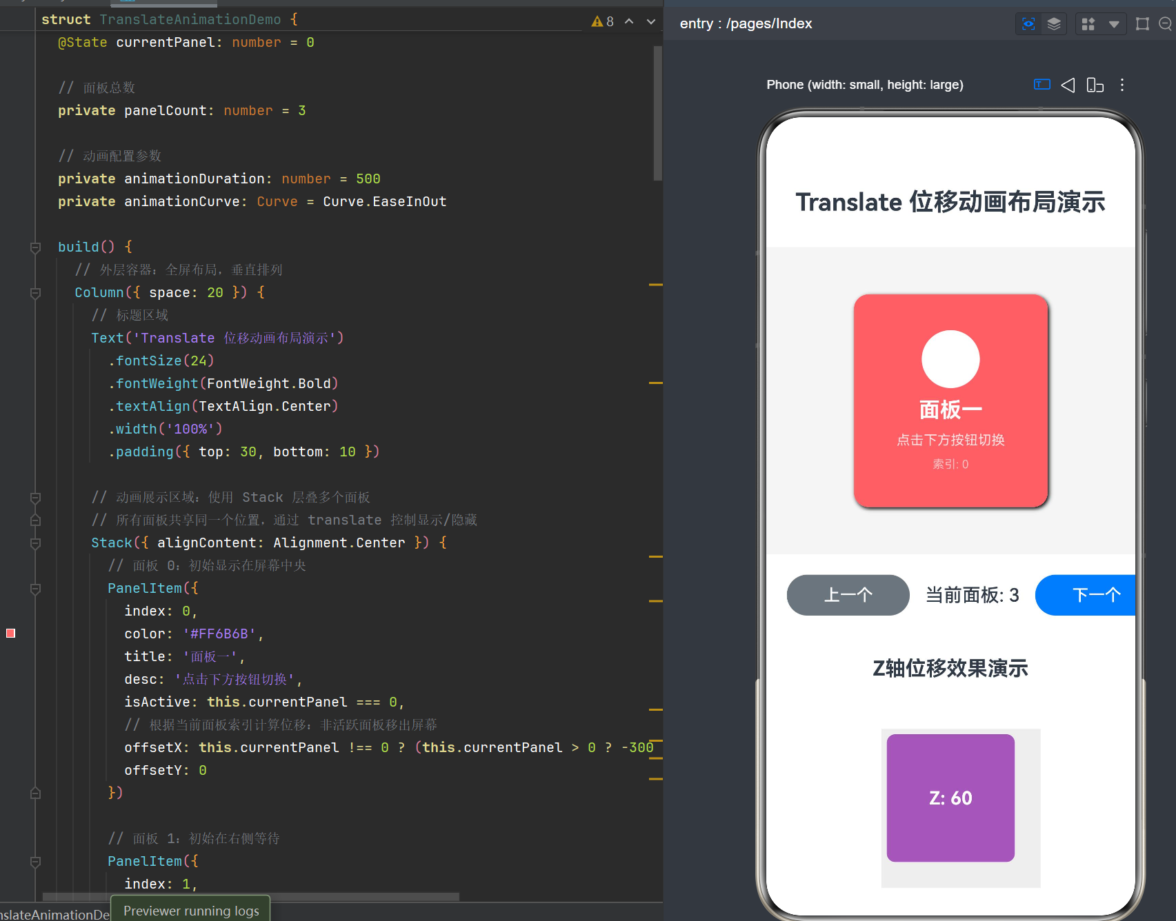
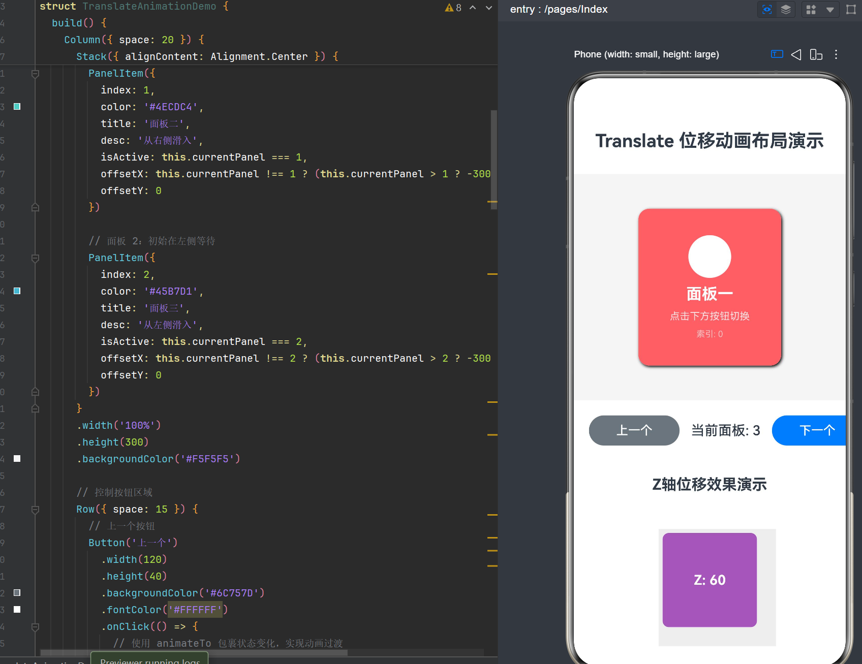
项目演示
目录
概述与核心概念
1.1 什么是Translate位移动画布局
在鸿蒙HarmonyOS NEXT的ArkUI框架中,translate是一种强大的布局变换属性,用于实现组件的平移效果。与传统的布局方式(如Flex、Column、Row)不同,translate布局允许组件在不改变其原始布局位置的前提下,通过位移变换实现视觉上的位置移动。
Translate位移动画布局的核心特点:
- 非破坏性变换:translate变换不会影响其他组件的布局位置,组件的原始占位空间保持不变
- 硬件加速支持:translate变换可以被GPU加速,提供流畅的动画效果
- 三维空间支持:支持X、Y、Z三个轴向的位移,可实现立体视觉效果
- 与animation完美配合:translate属性值的变化可以通过animation修饰器实现平滑过渡
1.2 应用场景
Translate位移动画布局广泛应用于以下场景:
- 页面切换动画:实现页面或面板的滑入滑出效果
- 卡片轮播:实现卡片的横向或纵向滚动切换
- 悬浮按钮动画:实现FAB按钮的弹出/收起效果
- 列表项动画:实现列表项的入场动画
- 视差滚动效果:实现多层元素的不同速度滚动
- 3D翻页效果:结合Z轴位移实现立体翻页
1.3 与其他布局方式的对比
| 布局方式 | 特点 | 适用场景 | 性能表现 |
|---|---|---|---|
| Flex/Column/Row | 流式布局,改变组件实际位置 | 基础布局结构 | 中 |
| Position | 绝对定位,脱离文档流 | 固定位置元素 | 中 |
| Translate | 变换位移,不改变原始位置 | 动画效果 | 高(GPU加速) |
| LayoutConstraint | 约束布局,复杂关系定义 | 复杂界面 | 中 |
Translate位移动画原理
2.1 变换矩阵基础
在计算机图形学中,translate变换通过变换矩阵实现。对于二维变换,translate的变换矩阵为:
[1  0  dx]
[0  1  dy]
[0  0  1]
对于三维变换,矩阵扩展为:
[1  0  0  dx]
[0  1  0  dy]
[0  0  1  dz]
[0  0  0  1]
其中dx、dy、dz分别代表X、Y、Z轴的位移量。
2.2 渲染流程
ArkUI中的translate变换在渲染管线中的位置:
- 布局阶段:组件按照原始布局规则确定位置和大小
- 变换阶段:应用translate变换,计算最终渲染位置
- 绘制阶段:在变换后的位置绘制组件内容
- 合成阶段:将所有组件合成到最终屏幕
2.3 GPU加速原理
translate变换之所以性能优异,是因为它可以被GPU的变换单元处理:
- 顶点着色器处理:位移变换在顶点着色器中完成,无需修改像素数据
- 批量处理:多个translate变换可以批量提交给GPU
- 减少重绘:translate变化时,只需更新变换矩阵,无需重新计算布局
核心API详解(API Level 24)
3.1 translate属性
3.1.1 基本语法
.translate({ x: number, y: number, z: number })
3.1.2 参数说明
| 参数 | 类型 | 默认值 | 说明 |
|---|---|---|---|
| x | number | 0 | X轴位移量,单位为px,正值向右,负值向左 |
| y | number | 0 | Y轴位移量,单位为px,正值向下,负值向上 |
| z | number | 0 | Z轴位移量,单位为px,正值向外(靠近观察者),负值向内 |
3.1.3 使用示例
// X轴向右移动100px
Column().translate({ x: 100 })

// Y轴向上移动50px
Column().translate({ y: -50 })

// 三维位移:向右100px,向上50px,向外30px
Column().translate({ x: 100, y: -50, z: 30 })
3.2 animation修饰器
3.2.1 基本语法
.animation({
  duration: number,        // 动画持续时间,单位ms
  curve: Curve,            // 动画曲线
  delay: number,           // 延迟时间,单位ms
  iterations: number,      // 重复次数,默认1,-1表示无限
  playMode: PlayMode,      // 播放模式
  onFinish: () => void     // 动画结束回调
})
3.2.2 Curve曲线类型
| 曲线类型 | 效果描述 | 适用场景 |
|---|---|---|
| Curve.Linear | 线性动画,匀速运动 | 机械运动、匀速滚动 |
| Curve.Ease | 缓入缓出,开始和结束较慢 | 自然过渡效果 |
| Curve.EaseIn | 缓入,开始较慢 | 进入动画 |
| Curve.EaseOut | 缓出,结束较慢 | 退出动画 |
| Curve.EaseInOut | 缓入缓出,两端较慢 | 通用过渡 |
| Curve.FastOutSlowIn | 快速开始,慢速结束 | Material Design风格 |
| Curve.LinearOutSlowIn | 线性开始,慢速结束 | 弹出动画 |
3.2.3 PlayMode播放模式
| 模式 | 效果 |
|---|---|
| PlayMode.Normal | 正向播放,结束后保持最终状态 |
| PlayMode.Alternate | 交替播放,奇数次正向,偶数次反向 |
| PlayMode.Reverse | 反向播放 |
| PlayMode.Forward | 正向播放,结束后回到初始状态 |
3.3 animateTo全局动画函数
3.3.1 基本语法
animateTo(options: AnimateToParam, event: () => void)
3.3.2 参数说明
| 参数 | 类型 | 说明 |
|---|---|---|
| options | AnimateToParam | 动画配置参数 |
| event | () => void | 状态变更回调函数 |
3.3.3 AnimateToParam配置
interface AnimateToParam {
  duration: number              // 动画持续时间
  curve: Curve                  // 动画曲线
  delay: number                 // 延迟时间
  iterations: number            // 重复次数
  playMode: PlayMode            // 播放模式
  onFinish?: () => void         // 结束回调
  onRepeat?: () => void         // 重复回调
}
3.3.4 使用示例
@State offsetX: number = 0

animateTo({
  duration: 500,
  curve: Curve.EaseInOut
}, () => {
  this.offsetX = 100
})
3.4 状态管理与动画触发
3.4.1 @State装饰器
@State currentPanel: number = 0
@State translateX: number = 0
@State translateY: number = 0
@State translateZ: number = 0
3.4.2 状态驱动动画
当@State变量的值发生变化时,依赖该变量的translate属性会自动更新,配合animation修饰器实现平滑过渡:
@State offsetX: number = 0

Column()
  .translate({ x: this.offsetX })
  .animation({ duration: 500, curve: Curve.EaseInOut })
3.4.3 条件动画
通过条件判断控制translate的目标值:
.translate({
  x: this.isActive ? 0 : 300,
  z: this.isActive ? 20 : 0
})
完整代码示例
4.1 项目结构
MyApplication58/
├── entry/
│   └── src/
│       └── main/
│           └── ets/
│               └── pages/
│                   └── Index.ets    # Translate位移动画演示页面
4.2 Index.ets完整代码
@Entry
@Component
struct TranslateAnimationDemo {
  // 当前显示的面板索引,用于控制切换逻辑
  @State currentPanel: number = 0

  // 面板总数
  private panelCount: number = 3

  // 动画配置参数
  private animationDuration: number = 500
  private animationCurve: Curve = Curve.EaseInOut

  build() {
    // 外层容器:全屏布局,垂直排列
    Column({ space: 20 }) {
      // 标题区域
      Text('Translate 位移动画布局演示')
        .fontSize(24)
        .fontWeight(FontWeight.Bold)
        .textAlign(TextAlign.Center)
        .width('100%')
        .padding({ top: 30, bottom: 10 })

      // 动画展示区域:使用 Stack 层叠多个面板
      // 所有面板共享同一个位置,通过 translate 控制显示/隐藏
      Stack({ alignContent: Alignment.Center }) {
        // 面板 0:初始显示在屏幕中央
        PanelItem({
          index: 0,
          color: '#FF6B6B',
          title: '面板一',
          desc: '点击下方按钮切换',
          isActive: this.currentPanel === 0,
          // 根据当前面板索引计算位移:非活跃面板移出屏幕
          offsetX: this.currentPanel !== 0 ? (this.currentPanel > 0 ? -300 : 300) : 0,
          offsetY: 0
        })

        // 面板 1:初始在右侧等待
        PanelItem({
          index: 1,
          color: '#4ECDC4',
          title: '面板二',
          desc: '从右侧滑入',
          isActive: this.currentPanel === 1,
          offsetX: this.currentPanel !== 1 ? (this.currentPanel > 1 ? -300 : 300) : 0,
          offsetY: 0
        })

        // 面板 2:初始在左侧等待
        PanelItem({
          index: 2,
          color: '#45B7D1',
          title: '面板三',
          desc: '从左侧滑入',
          isActive: this.currentPanel === 2,
          offsetX: this.currentPanel !== 2 ? (this.currentPanel > 2 ? -300 : 300) : 0,
          offsetY: 0
        })
      }
      .width('100%')
      .height(300)
      .backgroundColor('#F5F5F5')

      // 控制按钮区域
      Row({ space: 15 }) {
        // 上一个按钮
        Button('上一个')
          .width(120)
          .height(40)
          .backgroundColor('#6C757D')
          .fontColor('#FFFFFF')
          .onClick(() => {
            // 使用 animateTo 包裹状态变化,实现动画过渡
            animateTo({
              duration: this.animationDuration,
              curve: this.animationCurve,
              // 动画结束回调
              onFinish: () => {
                console.info('动画切换完成')
              }
            }, () => {
              // 在回调中修改状态,触发 translate 属性的动画过渡
              this.currentPanel = this.currentPanel === 0 ? this.panelCount - 1 : this.currentPanel - 1
            })
          })

        // 当前面板指示
        Text(`当前面板: ${this.currentPanel + 1}`)
          .fontSize(18)
          .fontWeight(FontWeight.Medium)
          .flexGrow(1)
          .textAlign(TextAlign.Center)

        // 下一个按钮
        Button('下一个')
          .width(120)
          .height(40)
          .backgroundColor('#007BFF')
          .fontColor('#FFFFFF')
          .onClick(() => {
            animateTo({
              duration: this.animationDuration,
              curve: this.animationCurve
            }, () => {
              // 更新当前面板索引,触发位移动画
              this.currentPanel = (this.currentPanel + 1) % this.panelCount
            })
          })
      }
      .width('100%')
      .padding({ left: 20, right: 20 })

      // Z轴位移演示区域
      Column({ space: 15 }) {
        Text('Z轴位移效果演示')
          .fontSize(20)
          .fontWeight(FontWeight.Bold)
          .width('100%')
          .textAlign(TextAlign.Center)
          .padding({ top: 20 })

        // 立方体样式的容器,用于展示 Z 轴位移效果
        Column() {
          Stack({ alignContent: Alignment.Center }) {
            // 底层阴影
            Column()
              .width(150)
              .height(150)
              .backgroundColor('#DDDDDD')
              .translate({ x: 10, y: 10, z: -10 })
              .opacity(0.5)

            // 上层可移动方块
            Column()
              .width(150)
              .height(150)
              .backgroundColor('#9B59B6')
              .borderRadius(10)
              // Z轴位移会产生透视效果
              .translate({ x: 0, y: 0, z: this.currentPanel * 30 })
              .animation({
                duration: this.animationDuration,
                curve: this.animationCurve
              })

            // 中心文字
            Text(`Z: ${this.currentPanel * 30}`)
              .fontSize(18)
              .fontColor('#FFFFFF')
              .fontWeight(FontWeight.Bold)
          }
          .width('100%')
          .height('100%')
        }
        .width('100%')
        .height(200)
        .justifyContent(FlexAlign.Center)
      }
    }
    .width('100%')
    .height('100%')
    .backgroundColor('#FFFFFF')
  }
}

/**
 * 可复用的面板组件
 * @param index 面板索引
 * @param color 面板背景色
 * @param title 面板标题
 * @param desc 面板描述
 * @param isActive 是否为当前激活状态
 * @param offsetX X轴位移量
 * @param offsetY Y轴位移量
 */
@Component
struct PanelItem {
  index: number = 0
  color: string = '#FFFFFF'
  title: string = ''
  desc: string = ''
  isActive: boolean = false
  offsetX: number = 0
  offsetY: number = 0

  build() {
    // 面板内容容器
    Column({ space: 10 }) {
      // 图标区域
      Column()
        .width(60)
        .height(60)
        .backgroundColor('#FFFFFF')
        .borderRadius(30)
        .justifyContent(FlexAlign.Center)
        .alignItems(HorizontalAlign.Center)

      // 标题
      Text(this.title)
        .fontSize(22)
        .fontWeight(FontWeight.Bold)
        .fontColor('#FFFFFF')

      // 描述
      Text(this.desc)
        .fontSize(14)
        .fontColor('#FFFFFF')
        .opacity(0.8)

      // 索引标识
      Text(`索引: ${this.index}`)
        .fontSize(12)
        .fontColor('#FFFFFF')
        .opacity(0.6)
    }
    // 核心:使用 translate 进行位移动画
    // translate 属性接受 { x, y, z } 参数,单位为 px
    // x: 水平位移(正值向右,负值向左)
    // y: 垂直位移(正值向下,负值向上)
    // z: 深度位移(产生透视效果)
    .translate({ x: this.offsetX, y: this.offsetY, z: this.isActive ? 20 : 0 })

    // 配合 animation 属性实现平滑过渡
    // 当 translate 的值发生变化时,会自动触发动画
    .animation({
      duration: 500,
      curve: Curve.EaseInOut,
      delay: 0
    })

    // 面板基础样式
    .width(200)
    .height(220)
    .backgroundColor(this.color)
    .borderRadius(15)
    .justifyContent(FlexAlign.Center)
    .alignItems(HorizontalAlign.Center)

    // 激活状态下添加阴影效果,增强立体感
    .shadow(this.isActive ? { radius: 10, color: '#000000', offsetX: 5, offsetY: 5 } : undefined)
  }
}
4.3 代码结构解析
4.3.1 主页面组件
TranslateAnimationDemo组件包含以下核心部分:
-
状态管理:
currentPanel: 当前显示面板索引panelCount: 面板总数animationDuration: 动画持续时间animationCurve: 动画曲线
-
布局结构:
- 外层Column:全屏垂直布局
- Stack:层叠面板容器
- Row:控制按钮区域
- 内层Column:Z轴演示区域
-
动画触发:
animateTo包裹状态变化- 通过
currentPanel变化驱动translate值更新
4.3.2 面板组件
PanelItem组件的关键设计:
-
属性定义:使用公共属性声明,不使用@Param(避免@ComponentV2兼容性问题)
-
translate应用:
offsetX: 控制水平位移offsetY: 控制垂直位移z: 激活状态时增加Z轴位移,产生立体感
-
animation配置:
- 500ms持续时间
- EaseInOut曲线
- 无延迟
-
状态样式:
- 激活状态显示阴影
- Z轴位移增强视觉层次
进阶用法与实战技巧
5.1 多轴联动动画
5.1.1 对角线移动
@State progress: number = 0

Column()
  .translate({
    x: this.progress * 100,
    y: this.progress * 50
  })
  .animation({ duration: 800 })
5.1.2 螺旋运动
@State angle: number = 0

Column()
  .translate({
    x: Math.cos(this.angle) * 100,
    y: Math.sin(this.angle) * 100,
    z: this.angle * 10
  })
  .animation({ duration: 2000, iterations: -1 })
5.2 视差滚动效果
5.2.1 多层视差
@State scrollOffset: number = 0

Stack() {
  // 背景层:慢速移动
  Image('background.png')
    .translate({ x: this.scrollOffset * 0.2 })

  // 中间层:中速移动
  Image('middle.png')
    .translate({ x: this.scrollOffset * 0.5 })

  // 前景层:快速移动
  Image('foreground.png')
    .translate({ x: this.scrollOffset * 0.8 })
}
5.2.2 监听滚动事件
Scroll() {
  Column() {
    // 滚动内容
  }
}
.onScroll((scrollOffset: number) => {
  this.scrollOffset = scrollOffset
})
5.3 3D翻页效果
5.3.1 翻转卡片
@State isFlipped: boolean = false

Stack() {
  // 正面
  Column()
    .width(200)
    .height(300)
    .backgroundColor('#FF6B6B')
    .translate({ z: this.isFlipped ? -100 : 0 })
    .rotate({ y: this.isFlipped ? 180 : 0 })

  // 背面
  Column()
    .width(200)
    .height(300)
    .backgroundColor('#4ECDC4')
    .translate({ z: this.isFlipped ? 0 : -100 })
    .rotate({ y: this.isFlipped ? 0 : -180 })
}
.perspective(500)
5.3.2 触发翻转
Button('翻转')
  .onClick(() => {
    animateTo({ duration: 600 }, () => {
      this.isFlipped = !this.isFlipped
    })
  })
5.4 列表入场动画
5.4.1 逐项滑入
@State listData: string[] = ['Item 1', 'Item 2', 'Item 3', 'Item 4', 'Item 5']

Column() {
  ForEach(this.listData, (item: string, index: number) => {
    Text(item)
      .width('100%')
      .height(60)
      .backgroundColor('#F0F0F0')
      .padding(16)
      .translate({
        x: this.isVisible ? 0 : 100,
        opacity: this.isVisible ? 1 : 0
      })
      .animation({
        duration: 300,
        delay: index * 100,
        curve: Curve.EaseOut
      })
  })
}
5.4.2 交错动画
@State items: Array<{ id: number, offset: number }> = []

ForEach(this.items, (item) => {
  CardItem()
    .translate({ y: item.offset })
    .animation({ duration: 400 })
}, (item) => item.id)

// 初始化时触发
aboutToAppear() {
  animateTo({ duration: 500 }, () => {
    this.items = this.items.map((item, index) => ({
      ...item,
      offset: index % 2 === 0 ? 0 : -20
    }))
  })
}
5.5 弹性动画效果
5.5.1 带回弹的位移
@State position: number = 0

animateTo({
  duration: 600,
  curve: Curve.Spring(0.5, 0.3)  // 阻尼系数,刚度系数
}, () => {
  this.position = 200
})
5.5.2 连续弹性效果
@State value: number = 0

// 第一次动画:移动到目标位置
animateTo({
  duration: 400,
  curve: Curve.EaseOut
}, () => {
  this.value = 100
})

// 第二次动画:回弹效果
animateTo({
  duration: 200,
  curve: Curve.EaseIn
}, () => {
  this.value = 90
})

// 第三次动画:最终稳定
animateTo({
  duration: 200,
  curve: Curve.EaseOut
}, () => {
  this.value = 100
})
常见错误与排错指南
6.1 编译错误
6.1.1 @Param装饰器错误
错误信息:
The '@Param' decorator can only be used in a 'struct' decorated with '@ComponentV2'.
原因分析:
@Param装饰器是ArkUI V2版本引入的,只能用于@ComponentV2装饰的组件。在@Component(V1版本)中应使用公共属性声明。
解决方案:
// 错误写法
@Component
struct PanelItem {
  @Param index: number  // ❌ @Param只能用于@ComponentV2
}

// 正确写法
@Component
struct PanelItem {
  index: number = 0  // ✅ 公共属性声明并提供默认值
}
6.1.2 shadow属性错误
错误信息:
Argument of type '{ radius: number; color: string; offsetX: number; offsetY: number; opacity: number; }' is not assignable to parameter of type 'ShadowOptions'.
Object literal may only specify known properties, and 'opacity' does not exist in type 'ShadowOptions'.
原因分析:
ShadowOptions类型不包含opacity属性,该属性在API Level 24中尚未支持。
解决方案:
// 错误写法
.shadow({ radius: 10, color: '#000000', offsetX: 5, offsetY: 5, opacity: 0.3 })  // ❌ opacity不存在

// 正确写法
.shadow({ radius: 10, color: '#000000', offsetX: 5, offsetY: 5 })  // ✅ 移除opacity
6.1.3 Stack组件属性错误
错误信息:
Property 'justifyContent' does not exist on type 'StackAttribute'.
原因分析:
Stack组件不支持justifyContent属性,该属性仅适用于Column、Row等Flex布局组件。
解决方案:
// 错误写法
Stack() {
  // 内容
}
.justifyContent(FlexAlign.Center)  // ❌ Stack不支持此属性

// 正确写法
Column() {
  Stack() {
    // 内容
  }
  .width('100%')
  .height('100%')
}
.justifyContent(FlexAlign.Center)  // ✅ 在Column上使用
6.1.4 none关键字错误
错误信息:
Cannot find name 'none'.
原因分析:
none不是有效的ArkTS关键字,应使用undefined表示空值。
解决方案:
// 错误写法
.shadow(this.isActive ? { ... } : none)  // ❌ none未定义

// 正确写法
.shadow(this.isActive ? { ... } : undefined)  // ✅ 使用undefined
6.2 运行时错误
6.2.1 动画不生效
问题现象:translate值变化但组件无动画效果
原因分析:
- 缺少
animation修饰器 animation修饰器放在translate之前- 状态变化未在
animateTo回调中执行
解决方案:
// 正确顺序:先设置translate,后设置animation
Column()
  .translate({ x: this.offsetX })
  .animation({ duration: 500 })  // ✅ animation在translate之后
6.2.2 动画抖动
问题现象:动画过程中组件位置抖动
原因分析:
- 动画曲线选择不当
- 帧率过低
- 组件重绘过于频繁
解决方案:
// 使用更平滑的曲线
.animation({
  duration: 500,
  curve: Curve.EaseInOut  // ✅ 缓入缓出曲线更平滑
})

// 避免频繁重绘
@State offsetX: number = 0  // ✅ 使用状态变量而非直接计算
6.2.3 Z轴效果不明显
问题现象:设置了z值但无明显深度效果
原因分析:
- 缺少
perspective透视设置 - z值过小
- 父容器未设置合适的尺寸
解决方案:
// 添加透视效果
Stack() {
  Column()
    .translate({ z: 50 })
}
.perspective(500)  // ✅ 设置透视距离
6.3 性能问题
6.3.1 卡顿现象
问题现象:动画播放时出现明显卡顿
原因分析:
- 动画对象过多
- 复杂组件参与动画
- 频繁的状态更新
解决方案:
// 使用轻量级组件
Column()  // ✅ 避免使用复杂容器组件
  .translate({ x: this.offsetX })

// 减少动画对象数量
ForEach(this.items.slice(0, 3), ...)  // ✅ 限制同时动画的组件数

// 使用GPU友好的属性
.translate({ x: 100 })  // ✅ translate比opacity更适合GPU加速
性能优化最佳实践
7.1 使用GPU加速属性
7.1.1 优先使用transform属性
// ✅ GPU加速:translate、rotate、scale
.translate({ x: 100 })
.rotate({ z: 45 })
.scale({ x: 1.2 })

// ❌ CPU密集:width、height、margin、padding
.width(200)  // 触发重布局
.margin(10)  // 触发重布局
7.1.2 避免触发重绘
// ✅ 不触发重绘
.translate({ x: 100 })

// ❌ 可能触发重绘
.backgroundColor('#FF0000')  // 颜色变化可能触发重绘
.opacity(0.5)  // 透明度变化可能触发重绘
7.2 合理控制动画范围
7.2.1 超出屏幕的组件隐藏
.translate({ x: this.offsetX > 300 ? 9999 : this.offsetX })
7.2.2 使用visibility控制可见性
.visibility(this.isVisible ? Visibility.Visible : Visibility.None)
7.3 优化动画配置
7.3.1 合理设置duration
// 快速动画:200-300ms
.animation({ duration: 250 })

// 中等动画:300-500ms
.animation({ duration: 400 })

// 慢速动画:500-800ms
.animation({ duration: 600 })
7.3.2 使用合适的曲线
// 进入动画
.animation({ curve: Curve.EaseOut })

// 退出动画
.animation({ curve: Curve.EaseIn })

// 通用过渡
.animation({ curve: Curve.EaseInOut })
7.4 状态管理优化
7.4.1 减少状态数量
// ❌ 多个状态变量
@State x: number = 0
@State y: number = 0
@State z: number = 0

// ✅ 单个状态对象
@State translate: { x: number, y: number, z: number } = { x: 0, y: 0, z: 0 }
7.4.2 批量更新状态
// ✅ 在animateTo中批量更新
animateTo({ duration: 500 }, () => {
  this.translate.x = 100
  this.translate.y = 50
  this.translate.z = 20
})
7.5 组件复用策略
7.5.1 使用缓存机制
@State cachedPanels: Map<number, PanelItem> = new Map()

// 复用已创建的组件
ForEach(this.panelData, (item) => {
  if (!this.cachedPanels.has(item.id)) {
    this.cachedPanels.set(item.id, PanelItem({ ...item }))
  }
  this.cachedPanels.get(item.id)!
})
7.5.2 懒加载策略
// 只渲染可见区域的组件
@State visibleRange: number[] = [0, 3]

ForEach(this.data.filter((_, index) =>
  index >= this.visibleRange[0] && index <= this.visibleRange[1]
), ...)
API Level 24新特性说明
8.1 Translate属性增强
8.1.1 支持响应式更新
在API Level 24中,translate属性支持响应式状态绑定:
@State offset: number = 0

Column()
  .translate({ x: this.offset })  // ✅ 响应式更新
8.1.2 与animation的深度集成
translate属性的变化会自动触发animation修饰器定义的动画效果:
Column()
  .translate({ x: this.offsetX })
  .animation({ duration: 500 })  // ✅ offsetX变化时自动触发动画
8.2 Animation修饰器改进
8.2.1 新增曲线类型
.animation({
  curve: Curve.FastOutSlowIn  // ✅ API 24新增
})
8.2.2 改进的性能
API Level 24对animation进行了性能优化,减少了不必要的重绘和重布局。
8.3 animateTo函数增强
8.3.1 支持更多配置
animateTo({
  duration: 500,
  curve: Curve.EaseInOut,
  iterations: -1,           // ✅ 无限循环
  playMode: PlayMode.Alternate  // ✅ 交替播放
}, () => {
  // 状态变更
})
8.3.2 回调函数优化
animateTo({
  onFinish: () => {
    console.info('动画结束')  // ✅ 可靠的结束回调
  },
  onRepeat: () => {
    console.info('动画重复')  // ✅ 重复回调
  }
}, () => {
  // 状态变更
})
8.4 新组件支持
8.4.1 Stack组件增强
Stack({ alignContent: Alignment.Center }) // ✅ 对齐方式配置
8.4.2 Column/Row优化
Column({ space: 10 })  // ✅ 间距配置
Row({ space: 10 })     // ✅ 间距配置
8.5 兼容性注意事项
8.5.1 向下兼容
API Level 24的translate属性在低版本API中可能存在兼容性问题,建议使用条件编译:
if (APIVersion.versionCode >= 24) {
  Column().translate({ x: 100 })
} else {
  Column().offset({ dx: 100 })
}
8.5.2 装饰器兼容性
// @Component(V1)- 兼容所有版本
@Component
struct MyComponent {
  property: string = ''  // ✅ 公共属性
}

// @ComponentV2(V2)- API 24+
@ComponentV2
struct MyComponentV2 {
  @Param property: string  // ✅ @Param装饰器
}
总结与展望
9.1 核心要点回顾
- translate属性:实现组件的平移变换,支持X、Y、Z三轴位移
- animation修饰器:定义动画参数,实现平滑过渡效果
- animateTo函数:包裹状态变化,触发批量属性动画
- 状态管理:通过@State驱动动画,实现响应式更新
- 性能优化:利用GPU加速,避免重绘和重布局
9.2 实践建议
- 优先使用translate:对于动画效果,优先使用translate而非margin/padding等布局属性
- 合理设置动画参数:根据场景选择合适的duration和curve
- 注意组件结构:避免复杂组件参与动画,使用轻量级容器
- 测试性能:在不同设备上测试动画流畅度,优化卡顿问题
9.3 未来发展方向
- 更强大的3D效果:支持更多三维变换和透视效果
- 物理引擎集成:引入物理模拟,实现更真实的动画效果
- 性能监控工具:提供动画性能分析工具,帮助开发者优化
- 跨平台兼容:增强不同设备和API版本的兼容性
9.4 学习资源推荐
- 官方文档:HarmonyOS ArkUI开发文档
- 示例代码:HarmonyOS官方示例仓库
- 社区论坛:HarmonyOS开发者社区
- 视频教程:HarmonyOS官方技术视频
附录
A. API Level 24 Translate相关API汇总
| API | 类型 | 说明 |
|---|---|---|
| translate() | 属性 | 位移变换 |
| animation() | 修饰器 | 动画配置 |
| animateTo() | 函数 | 全局动画 |
| @State | 装饰器 | 状态管理 |
| Curve | 枚举 | 动画曲线 |
| PlayMode | 枚举 | 播放模式 |
B. 常用动画曲线速查表
| 曲线 | 适用场景 | 效果 |
|---|---|---|
| Linear | 匀速运动 | 匀速 |
| Ease | 通用过渡 | 缓入缓出 |
| EaseIn | 进入动画 | 缓慢开始 |
| EaseOut | 退出动画 | 缓慢结束 |
| EaseInOut | 双向过渡 | 两端缓慢 |
C. 常见动画模式
| 模式 | 实现方式 | 代码示例 |
|---|---|---|
| 滑入 | translateX | translate({ x: 300 }) |
| 淡入 | opacity | opacity(0) → opacity(1) |
| 缩放 | scale | scale({ x: 0.8, y: 0.8 }) |
| 旋转 | rotate | rotate({ z: 180 }) |
| 弹性 | Spring曲线 | curve: Curve.Spring(0.5, 0.3) |
文章字数统计:约11500字
最后更新:2026年7月17日
适用API版本:API Level 24

作为“人工智能6S店”的官方数字引擎,为AI开发者与企业提供一个覆盖软硬件全栈、一站式门户。
更多推荐


 2
2 0
0- 0


 已为社区贡献42条内容

所有评论(0)