
ArkTS弹性布局Flex:从原理到实战的完整指南
文章目录

每日一句正能量
与其在别人嘴里忙不迭的解释,不如在自己的世界里独善其身。
对已有偏见的人解释,往往越描越黑;对愿意理解的人,往往无需多言。这个解释,是真的必要,还是仅仅为了缓解我的不安?
摘要
摘要:Flex(弹性布局)是HarmonyOS ArkTS开发中最核心、最常用的布局方式之一。本文从Flex布局的底层原理出发,系统讲解容器属性与子元素属性的完整用法,结合多个实战案例,帮助开发者掌握在不同场景下灵活运用Flex布局的能力,构建响应式、自适应的高质量鸿蒙应用界面。
一、引言:为什么Flex布局如此重要
在移动应用开发中,界面布局的灵活性和自适应能力直接决定了用户体验的优劣。传统的绝对定位布局在面对不同屏幕尺寸、方向变化、动态内容时往往捉襟见肘。而Flex(Flexible Box)弹性布局模型,正是为解决这些问题而生。
在HarmonyOS的ArkTS开发框架中,Flex组件是所有布局的基石。无论是简单的水平排列按钮,还是复杂的自适应网格卡片,Flex都能以声明式的方式优雅地实现。与CSS Flexbox一脉相承,ArkTS的Flex布局在语法上保持了高度一致性,同时针对移动端场景进行了深度优化。
本文将从核心概念、容器属性、子元素属性、实战案例和性能优化五个维度,全面解析ArkTS弹性布局的方方面面。
二、Flex布局核心概念
2.1 容器与子元素
Flex布局由两部分组成:
- Flex容器(Flex Container):设置了
Flex作为布局方式的父组件,负责控制整体排列规则。 - Flex子元素(Flex Item):容器内部的子组件,负责控制自身在容器中的尺寸和对齐行为。
2.2 主轴与交叉轴
理解Flex布局的关键在于掌握**主轴(Main Axis)和交叉轴(Cross Axis)**的概念:
- 主轴:子元素排列的方向,由
direction属性决定,可以是水平方向(Row)或垂直方向(Column)。 - 交叉轴:与主轴垂直的方向。如果主轴是水平的,交叉轴就是垂直的,反之亦然。
每个轴都有起点(Start)和终点(End),子元素的对齐方式都是相对于这两个点而言的。
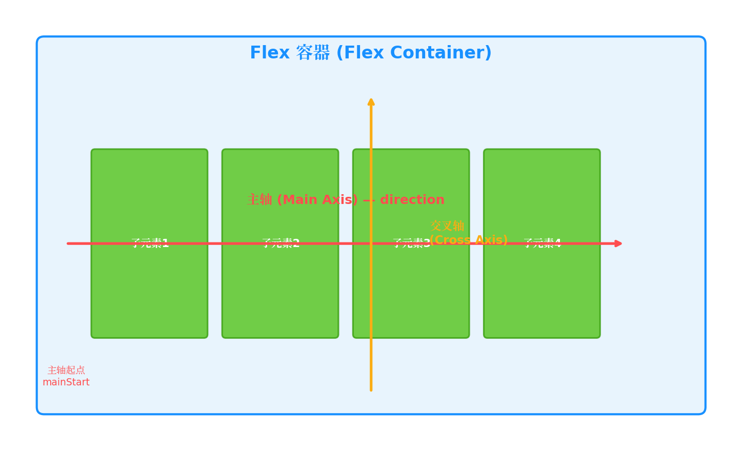
图1:Flex容器中的主轴与交叉轴示意图。主轴方向由
direction属性控制,子元素沿主轴排列,交叉轴控制垂直方向的对齐。
三、Flex容器属性详解
3.1 direction:定义主轴方向
direction属性决定子元素的排列方向,是Flex布局的"方向盘"。
Flex({ direction: FlexDirection.Row }) {       // 水平排列(默认)
  Text('A').width(60).height(60).backgroundColor('#52C41A')
  Text('B').width(60).height(60).backgroundColor('#1890FF')
  Text('C').width(60).height(60).backgroundColor('#FAAD14')
}
.width('100%')
.height(100)
.backgroundColor('#F0F5FF')
| 枚举值 | 说明 |
|---|---|
FlexDirection.Row |
水平方向,从左到右排列(默认) |
FlexDirection.RowReverse |
水平方向,从右到左排列 |
FlexDirection.Column |
垂直方向,从上到下排列 |
FlexDirection.ColumnReverse |
垂直方向,从下到上排列 |
开发建议:在构建横向导航栏、工具栏时使用Row;在构建列表、表单等纵向内容时使用Column。
3.2 justifyContent:主轴对齐方式
justifyContent控制子元素在主轴上的对齐方式,是日常开发中使用频率最高的属性之一。
// 示例:两端对齐
Flex({
  direction: FlexDirection.Row,
  justifyContent: FlexAlign.SpaceBetween
}) {
  Text('左侧').width(80).height(50).backgroundColor('#52C41A')
  Text('中间').width(80).height(50).backgroundColor('#1890FF')
  Text('右侧').width(80).height(50).backgroundColor('#FAAD14')
}
.width('100%')
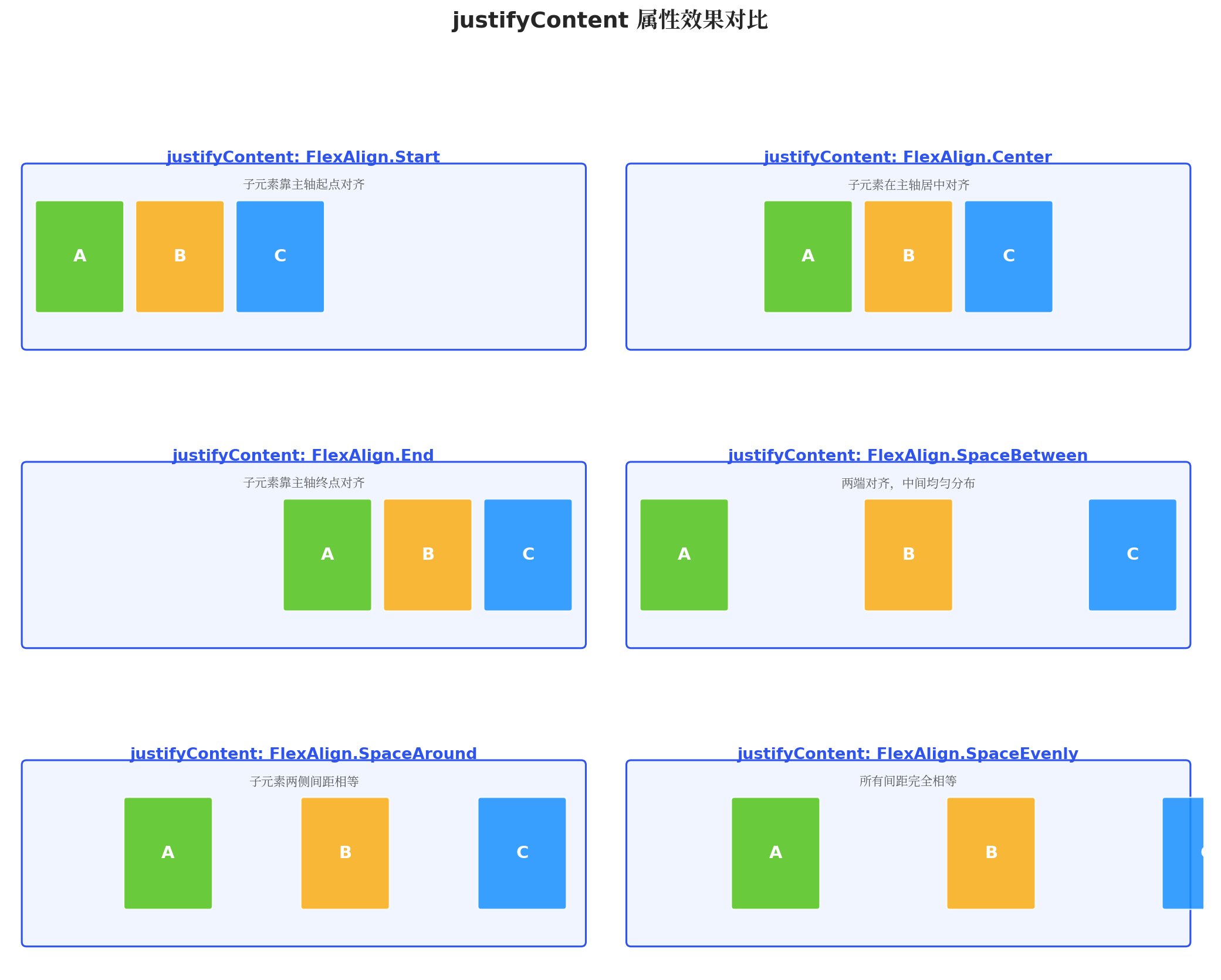
图2:justifyContent六种对齐方式的效果对比。从左到右、从上到下依次为:Start、Center、End、SpaceBetween、SpaceAround、SpaceEvenly。
| 枚举值 | 行为描述 |
|---|---|
FlexAlign.Start |
子元素靠主轴起点对齐 |
FlexAlign.Center |
子元素在主轴方向居中对齐 |
FlexAlign.End |
子元素靠主轴终点对齐 |
FlexAlign.SpaceBetween |
两端对齐,中间子元素均匀分布 |
FlexAlign.SpaceAround |
每个子元素两侧间距相等 |
FlexAlign.SpaceEvenly |
所有间距(包括两端)完全相等 |
开发建议:
- 底部导航栏的图标分布 →
SpaceAround - 表单中"取消"和"确认"按钮 →
SpaceBetween - 居中弹窗的按钮组 →
Center
3.3 alignItems:交叉轴对齐方式
alignItems控制子元素在交叉轴上的对齐方式。
// 示例:交叉轴底部对齐
Flex({
  direction: FlexDirection.Row,
  alignItems: ItemAlign.End,
  height: 150
}) {
  Text('小').width(50).height(40).backgroundColor('#52C41A')
  Text('中').width(50).height(70).backgroundColor('#1890FF')
  Text('大').width(50).height(100).backgroundColor('#FAAD14')
}
.width('100%')
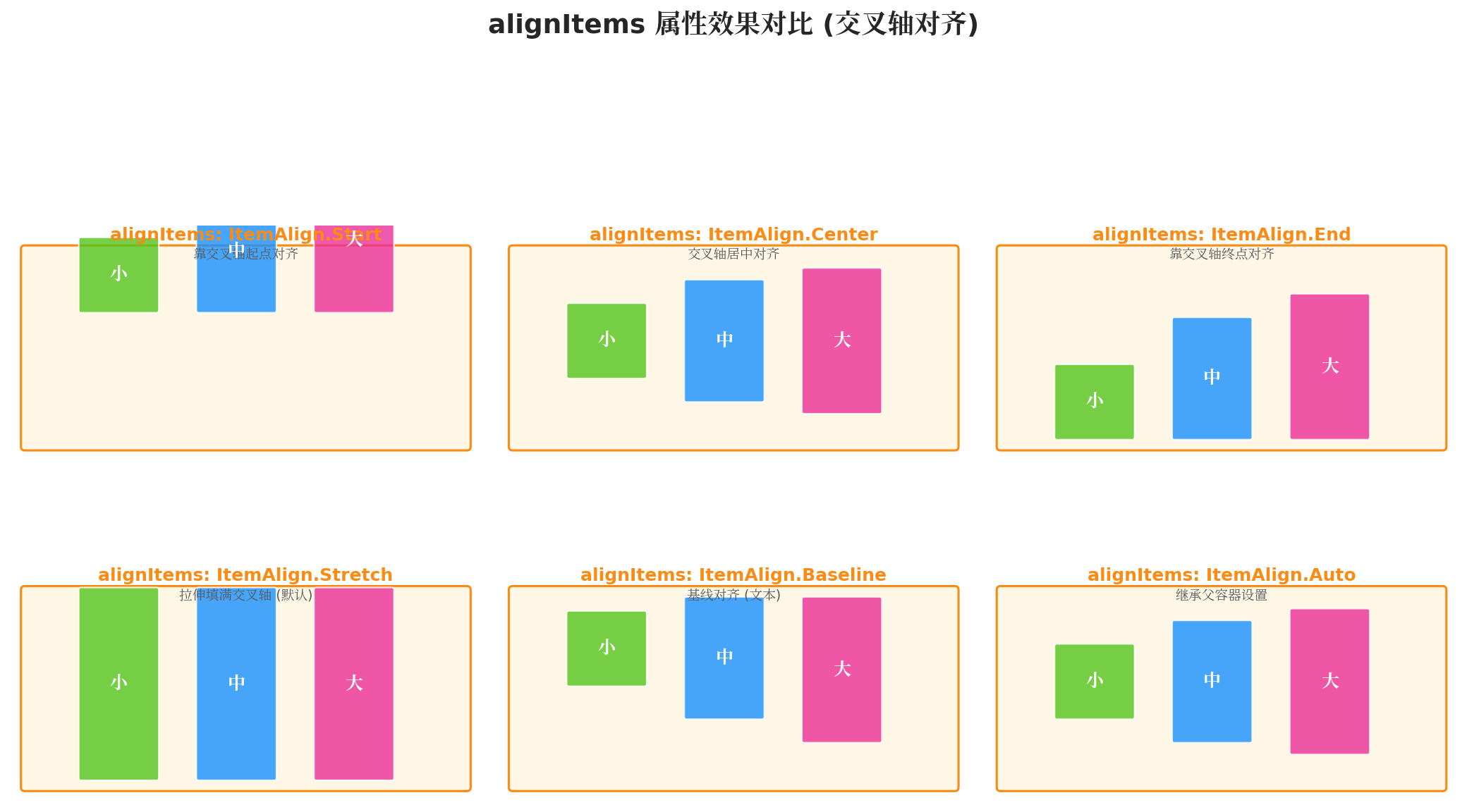
图3:alignItems六种对齐方式的效果对比。展示了不同高度子元素在交叉轴上的对齐差异,Stretch为默认值。
| 枚举值 | 行为描述 |
|---|---|
ItemAlign.Start |
靠交叉轴起点对齐 |
ItemAlign.Center |
交叉轴方向居中对齐 |
ItemAlign.End |
靠交叉轴终点对齐 |
ItemAlign.Stretch |
拉伸填满交叉轴(默认,需子元素未设置交叉轴尺寸) |
ItemAlign.Baseline |
文本基线对齐(仅对文本有效) |
ItemAlign.Auto |
继承父容器的alignItems设置 |
特别注意:Stretch是默认值,但要生效的前提是子元素在交叉轴方向上没有设置固定尺寸。例如Row布局中,子元素未设置height时才会拉伸。
3.4 flexWrap:换行控制
默认情况下,Flex容器中的子元素不会换行(NoWrap),当子元素总宽度超过容器时会被压缩甚至溢出。通过设置flexWrap可以开启换行能力。
// 示例:允许换行的标签云
Flex({
  direction: FlexDirection.Row,
  flexWrap: FlexWrap.Wrap,
  justifyContent: FlexAlign.Start
}) {
  ForEach(this.tags, (tag: string) => {
    Text(tag)
      .fontSize(14)
      .padding({ left: 12, right: 12, top: 6, bottom: 6 })
      .margin(4)
      .backgroundColor('#F0F5FF')
      .borderRadius(16)
  })
}
.width('100%')
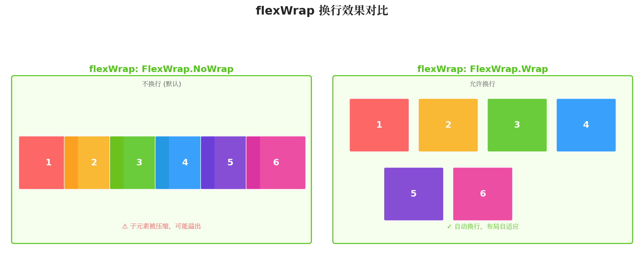
图4:flexWrap换行效果对比。NoWrap模式下子元素被压缩可能导致溢出;Wrap模式下子元素自动换行,布局自适应。
| 枚举值 | 行为描述 |
|---|---|
FlexWrap.NoWrap |
不换行,子元素可能被压缩(默认) |
FlexWrap.Wrap |
允许换行,按主轴方向排列 |
FlexWrap.WrapReverse |
允许换行,但按主轴反方向排列 |
开发建议:在实现标签云、商品网格、图片墙等多行布局时,务必使用Wrap模式。
3.5 alignContent:多行对齐方式
当flexWrap设置为Wrap时,容器内可能出现多行。alignContent控制这些行在交叉轴上的对齐方式。
Flex({
  direction: FlexDirection.Row,
  flexWrap: FlexWrap.Wrap,
  alignContent: FlexAlign.SpaceBetween,
  height: 300
}) {
  // 多行子元素...
}
| 枚举值 | 适用场景 |
|---|---|
FlexAlign.Start |
多行靠交叉轴起点对齐 |
FlexAlign.Center |
多行在交叉轴居中 |
FlexAlign.End |
多行靠交叉轴终点对齐 |
FlexAlign.SpaceBetween |
第一行靠起点,最后一行靠终点,中间均匀分布 |
FlexAlign.SpaceAround |
每行两侧间距相等 |
FlexAlign.SpaceEvenly |
所有行间距完全相等 |
注意:alignContent仅在多行模式下生效,单行布局时设置无效。
四、Flex子元素属性详解
子元素属性控制单个组件在Flex容器中的特殊行为,是实现精细化布局的关键。
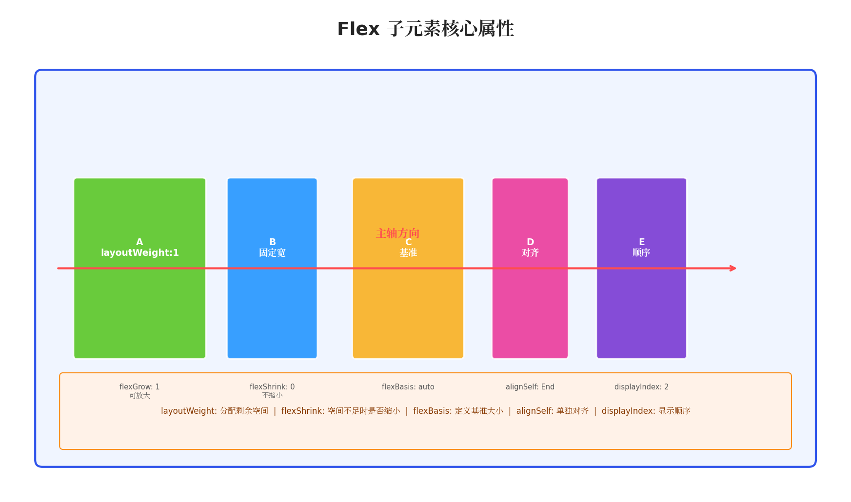
图5:Flex子元素核心属性示意图。展示了layoutWeight、flexShrink、flexBasis、alignSelf、displayIndex等属性的作用域和效果。
4.1 layoutWeight:权重分配
layoutWeight用于分配容器在主轴方向上的剩余空间。设置了layoutWeight的子元素,其在主轴上的尺寸由权重比例决定,忽略原本设置的固定尺寸。
Flex({ direction: FlexDirection.Row }) {
  Text('侧边栏')
    .width(80)
    .height('100%')
    .backgroundColor('#F0F5FF')

  Text('主内容区')
    .layoutWeight(1)  // 占据所有剩余空间
    .height('100%')
    .backgroundColor('#FFFFFF')

  Text('右面板')
    .width(100)
    .height('100%')
    .backgroundColor('#F6FFED')
}
.width('100%')
.height(200)
计算规则:
- 先分配固定尺寸(如
width: 80) - 剩余空间按
layoutWeight比例分配 - 若只有一个子元素设置
layoutWeight: 1,则占据全部剩余空间
开发建议:这是实现"固定+自适应"布局(如侧边栏+主内容区)的最佳方案。
4.2 flexShrink:压缩能力
flexShrink定义当容器空间不足时,子元素是否允许被压缩。
Flex({ direction: FlexDirection.Row }) {
  Text('固定按钮')
    .width(120)
    .height(50)
    .flexShrink(0)  // 不允许压缩
    .backgroundColor('#52C41A')

  Text('自适应输入框')
    .width(200)
    .height(50)
    .flexShrink(1)  // 允许压缩(默认)
    .backgroundColor('#1890FF')
}
.width('100%')
| 值 | 行为 |
|---|---|
0 |
不允许压缩,保持原始尺寸 |
1 |
允许压缩(默认值) |
>1 |
压缩比例权重,值越大压缩越多 |
4.3 flexBasis:基准尺寸
flexBasis定义在分配剩余空间之前,子元素在主轴上的初始尺寸。
Flex({ direction: FlexDirection.Row }) {
  Text('A')
    .flexBasis('30%')  // 先占据30%宽度
    .layoutWeight(1)
    .height(50)
    .backgroundColor('#52C41A')

  Text('B')
    .flexBasis('20%')  // 先占据20%宽度
    .layoutWeight(1)
    .height(50)
    .backgroundColor('#1890FF')
}
与width/height的区别:
flexBasis仅在Flex容器中生效- 优先级高于
width(Row)或height(Column) - 可以与
layoutWeight配合使用
4.4 alignSelf:单独对齐
alignSelf允许单个子元素覆盖容器的alignItems设置,实现独立的交叉轴对齐。
Flex({
  direction: FlexDirection.Row,
  alignItems: ItemAlign.Center,
  height: 120
}) {
  Text('默认居中')
    .width(60).height(60)
    .backgroundColor('#52C41A')

  Text('单独置顶')
    .width(60).height(60)
    .alignSelf(ItemAlign.Start)  // 覆盖为顶部对齐
    .backgroundColor('#FF4D4F')

  Text('默认居中')
    .width(60).height(60)
    .backgroundColor('#1890FF')
}
开发建议:在实现卡片内"置顶标签"、"底部操作栏"等特殊对齐需求时非常有用。
4.5 displayIndex:显示顺序
displayIndex控制子元素的显示顺序,不改变DOM结构,仅影响视觉呈现。
Flex({ direction: FlexDirection.Row }) {
  Text('第一个').displayIndex(3).width(60).height(60).backgroundColor('#52C41A')
  Text('第二个').displayIndex(1).width(60).height(60).backgroundColor('#1890FF')
  Text('第三个').displayIndex(2).width(60).height(60).backgroundColor('#FAAD14')
}
// 显示顺序:第二个 → 第三个 → 第一个
五、实战案例
5.1 案例一:电商首页商品卡片网格
实现一个典型的电商首页,包含顶部搜索栏、分类标签、商品卡片网格和底部导航。
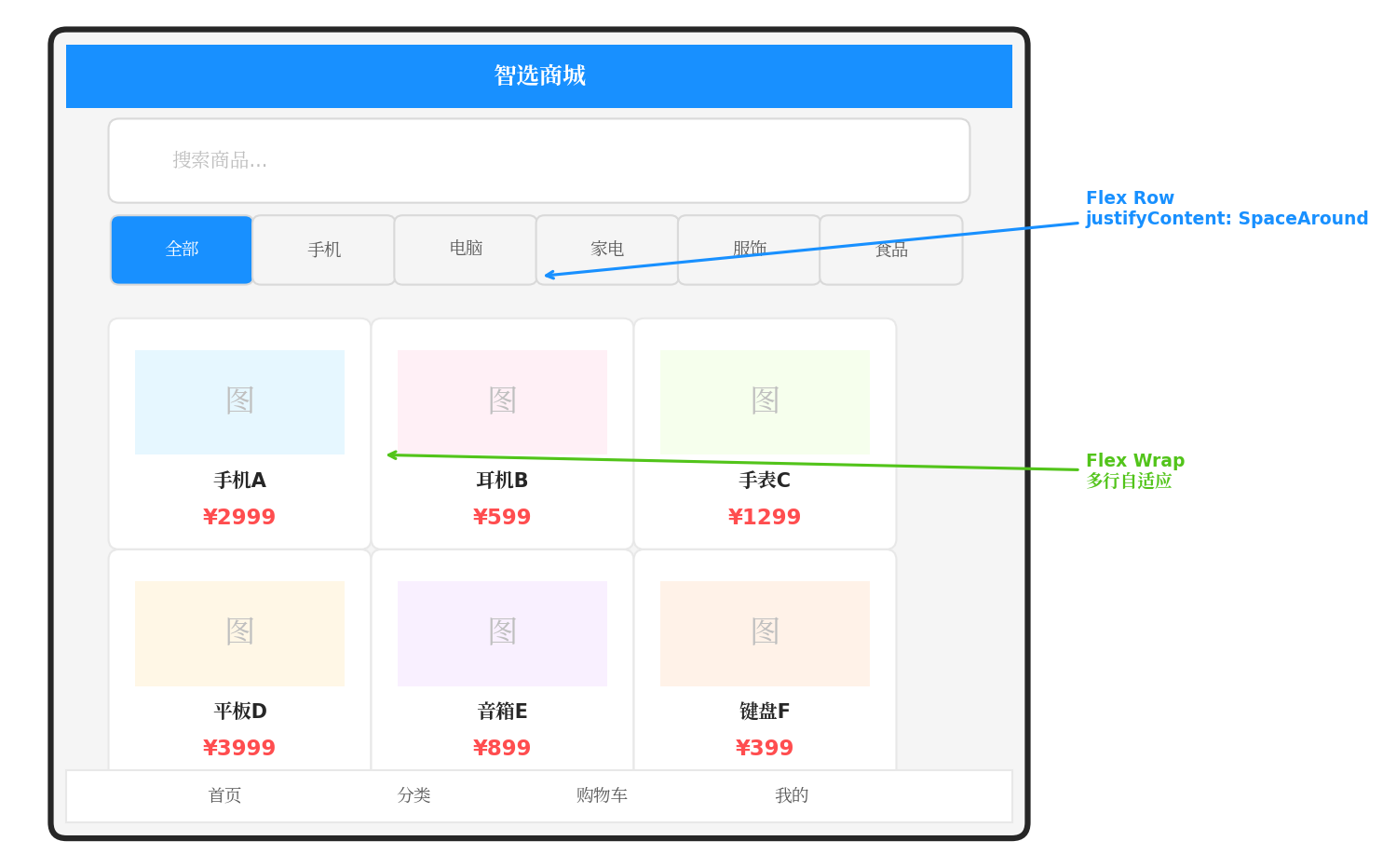
图6:电商首页布局实战案例。顶部搜索栏使用Row布局,分类标签使用SpaceAround对齐,商品卡片使用Wrap换行实现自适应网格。
@Entry
@Component
struct EcommerceHome {
  private categories: string[] = ['全部', '手机', '电脑', '家电', '服饰', '食品']
  private products: Product[] = [
    { name: '智能手机Pro', price: 2999, image: $r('app.media.phone') },
    { name: '无线耳机', price: 599, image: $r('app.media.earphone') },
    { name: '智能手表', price: 1299, image: $r('app.media.watch') },
    { name: '平板电脑', price: 3999, image: $r('app.media.pad') },
    { name: '蓝牙音箱', price: 899, image: $r('app.media.speaker') },
    { name: '机械键盘', price: 399, image: $r('app.media.keyboard') },
  ]

  build() {
    Column() {
      // 顶部搜索栏
      Flex({ direction: FlexDirection.Row, alignItems: ItemAlign.Center }) {
        Search({ placeholder: '搜索商品...' })
          .layoutWeight(1)
          .height(40)

        Badge({ value: '3', position: BadgePosition.RightTop }) {
          Image($r('app.media.cart'))
            .width(28)
            .height(28)
        }
        .margin({ left: 12 })
      }
      .padding(16)
      .backgroundColor('#FFFFFF')

      // 分类标签
      Flex({
        direction: FlexDirection.Row,
        justifyContent: FlexAlign.SpaceAround,
        alignItems: ItemAlign.Center
      }) {
        ForEach(this.categories, (category: string, index: number) => {
          Text(category)
            .fontSize(14)
            .fontColor(index === 0 ? '#FFFFFF' : '#595959')
            .fontWeight(index === 0 ? FontWeight.Bold : FontWeight.Normal)
            .padding({ left: 16, right: 16, top: 6, bottom: 6 })
            .backgroundColor(index === 0 ? '#1890FF' : '#F5F5F5')
            .borderRadius(20)
        })
      }
      .padding({ top: 8, bottom: 8 })
      .backgroundColor('#FFFFFF')

      // 商品卡片网格 - 核心Flex Wrap布局
      Flex({
        direction: FlexDirection.Row,
        flexWrap: FlexWrap.Wrap,
        justifyContent: FlexAlign.SpaceBetween,
        alignContent: FlexAlign.Start
      }) {
        ForEach(this.products, (product: Product) => {
          this.ProductCardBuilder(product)
        })
      }
      .padding(12)
      .layoutWeight(1)
      .backgroundColor('#F5F5F5')

      // 底部导航
      Flex({
        direction: FlexDirection.Row,
        justifyContent: FlexAlign.SpaceAround,
        alignItems: ItemAlign.Center
      }) {
        this.NavItemBuilder('首页', $r('app.media.home'), true)
        this.NavItemBuilder('分类', $r('app.media.category'), false)
        this.NavItemBuilder('购物车', $r('app.media.cart'), false)
        this.NavItemBuilder('我的', $r('app.media.user'), false)
      }
      .height(56)
      .backgroundColor('#FFFFFF')
      .border({ width: { top: 1 }, color: '#E8E8E8' })
    }
    .width('100%')
    .height('100%')
    .backgroundColor('#F5F5F5')
  }

  @Builder
  ProductCardBuilder(product: Product) {
    Column() {
      Image(product.image)
        .width('100%')
        .aspectRatio(1)
        .objectFit(ImageFit.Cover)
        .borderRadius({ topLeft: 8, topRight: 8 })

      Column() {
        Text(product.name)
          .fontSize(14)
          .fontColor('#262626')
          .maxLines(2)
          .textOverflow({ overflow: TextOverflow.Ellipsis })

        Text(`¥${product.price}`)
          .fontSize(16)
          .fontColor('#FF4D4F')
          .fontWeight(FontWeight.Bold)
          .margin({ top: 4 })
      }
      .padding(8)
      .alignItems(HorizontalAlign.Start)
    }
    .width('48%')
    .margin({ bottom: 12 })
    .backgroundColor('#FFFFFF')
    .borderRadius(8)
    .shadow({ radius: 4, color: '#00000010', offsetY: 2 })
  }

  @Builder
  NavItemBuilder(label: string, icon: Resource, isActive: boolean) {
    Column() {
      Image(icon)
        .width(24)
        .height(24)
        .fillColor(isActive ? '#1890FF' : '#8C8C8C')

      Text(label)
        .fontSize(11)
        .fontColor(isActive ? '#1890FF' : '#8C8C8C')
        .margin({ top: 2 })
    }
    .justifyContent(FlexAlign.Center)
  }
}

interface Product {
  name: string
  price: number
  image: Resource
}
布局要点解析:
- 搜索栏:
Row+layoutWeight(1)实现搜索框自适应宽度 - 分类标签:
Row+SpaceAround实现标签均匀分布 - 商品网格:
Row+Wrap+SpaceBetween实现两列自适应网格 - 底部导航:
Row+SpaceAround实现图标均匀分布
5.2 案例二:聊天消息列表
实现一个聊天界面,区分"发送"和"接收"消息的对齐方式。
@Entry
@Component
struct ChatPage {
  private messages: Message[] = [
    { content: '你好,请问这个商品有货吗?', isSelf: false, time: '10:30' },
    { content: '有的,目前库存充足', isSelf: true, time: '10:31' },
    { content: '好的,那我下单了', isSelf: false, time: '10:32' },
    { content: '已收到您的订单,我们会尽快发货', isSelf: true, time: '10:33' },
  ]

  build() {
    Column() {
      // 消息列表
      List() {
        ForEach(this.messages, (msg: Message) => {
          ListItem() {
            this.MessageBubbleBuilder(msg)
          }
        })
      }
      .layoutWeight(1)
      .padding(12)

      // 输入框
      Flex({
        direction: FlexDirection.Row,
        alignItems: ItemAlign.Center
      }) {
        TextInput({ placeholder: '输入消息...' })
          .layoutWeight(1)
          .height(44)
          .backgroundColor('#F5F5F5')
          .borderRadius(22)

        Button('发送')
          .width(70)
          .height(40)
          .margin({ left: 8 })
          .backgroundColor('#1890FF')
      }
      .padding(12)
      .backgroundColor('#FFFFFF')
      .border({ width: { top: 1 }, color: '#E8E8E8' })
    }
    .width('100%')
    .height('100%')
  }

  @Builder
  MessageBubbleBuilder(msg: Message) {
    Flex({
      direction: FlexDirection.Row,
      justifyContent: msg.isSelf ? FlexAlign.End : FlexAlign.Start,
      alignItems: ItemAlign.Start
    }) {
      if (!msg.isSelf) {
        Image($r('app.media.avatar_other'))
          .width(40)
          .height(40)
          .borderRadius(20)
          .margin({ right: 8 })
      }

      Column() {
        Text(msg.content)
          .fontSize(14)
          .fontColor(msg.isSelf ? '#FFFFFF' : '#262626')
          .padding(12)
          .backgroundColor(msg.isSelf ? '#1890FF' : '#F0F0F0')
          .borderRadius(12)
          .constraintSize({ maxWidth: '70%' })

        Text(msg.time)
          .fontSize(10)
          .fontColor('#BFBFBF')
          .margin({ top: 4 })
      }
      .alignItems(msg.isSelf ? HorizontalAlign.End : HorizontalAlign.Start)

      if (msg.isSelf) {
        Image($r('app.media.avatar_self'))
          .width(40)
          .height(40)
          .borderRadius(20)
          .margin({ left: 8 })
      }
    }
    .width('100%')
    .margin({ bottom: 12 })
  }
}

interface Message {
  content: string
  isSelf: boolean
  time: string
}
布局要点解析:
- 使用
justifyContent: End/Start实现消息左右分布 - 发送消息靠右,接收消息靠左
- 头像和气泡使用
Row横向排列
5.3 案例三:自适应表单布局
实现一个响应式表单,标签固定宽度,输入框自适应。
@Entry
@Component
struct AdaptiveForm {
  build() {
    Column() {
      Text('用户信息')
        .fontSize(20)
        .fontWeight(FontWeight.Bold)
        .margin({ bottom: 20 })

      // 表单行1:用户名
      this.FormRowBuilder('用户名',
        TextInput({ placeholder: '请输入用户名' })
          .layoutWeight(1)
          .height(40)
      )

      // 表单行2:手机号
      this.FormRowBuilder('手机号',
        TextInput({ placeholder: '请输入手机号' })
          .type(InputType.PhoneNumber)
          .layoutWeight(1)
          .height(40)
      )

      // 表单行3:邮箱
      this.FormRowBuilder('邮箱地址',
        TextInput({ placeholder: '请输入邮箱' })
          .type(InputType.Email)
          .layoutWeight(1)
          .height(40)
      )

      // 表单行4:个人简介(多行)
      this.FormRowBuilder('个人简介',
        TextArea({ placeholder: '请输入个人简介...' })
          .layoutWeight(1)
          .height(100)
      )

      // 底部按钮
      Flex({
        direction: FlexDirection.Row,
        justifyContent: FlexAlign.SpaceBetween,
        margin: { top: 24 }
      }) {
        Button('重置')
          .width('48%')
          .height(44)
          .backgroundColor('#F5F5F5')
          .fontColor('#595959')

        Button('提交')
          .width('48%')
          .height(44)
          .backgroundColor('#1890FF')
      }
    }
    .padding(20)
    .width('100%')
    .height('100%')
    .backgroundColor('#FFFFFF')
  }

  @Builder
  FormRowBuilder(label: string, @BuilderParam content: () => void) {
    Flex({
      direction: FlexDirection.Row,
      alignItems: ItemAlign.Center,
      margin: { bottom: 16 }
    }) {
      Text(label)
        .width(80)
        .fontSize(14)
        .fontColor('#262626')

      content()
    }
    .width('100%')
  }
}
布局要点解析:
- 标签固定
width(80),输入框使用layoutWeight(1)自适应 - 底部按钮使用
SpaceBetween两端对齐 - 通过
@BuilderParam实现表单行的复用
六、性能优化建议
6.1 避免深层嵌套
Flex布局虽然强大,但过度嵌套会影响渲染性能。建议:
- 尽量保持布局层级在5层以内
- 能用单层Flex解决的,不要嵌套多层
- 复杂布局考虑使用
Grid或List替代多层Flex
6.2 合理使用layoutWeight
// ❌ 不推荐:所有子元素都设置layoutWeight
Flex({ direction: FlexDirection.Row }) {
  Text('A').layoutWeight(1)
  Text('B').layoutWeight(1)
  Text('C').layoutWeight(1)
}

// ✅ 推荐:固定+自适应结合
Flex({ direction: FlexDirection.Row }) {
  Text('固定').width(80)        // 固定尺寸
  Text('自适应').layoutWeight(1) // 占据剩余
}
6.3 减少动态计算
避免在布局中频繁计算尺寸,尽量使用百分比或layoutWeight等声明式方案:
// ❌ 不推荐:运行时计算
Flex() {
  Text('A').width(this.screenWidth / 3)
}

// ✅ 推荐:声明式布局
Flex() {
  Text('A').layoutWeight(1)
}
6.4 Wrap模式下的性能注意
使用flexWrap: Wrap时,系统需要计算多行布局,建议:
- 子元素数量控制在合理范围(<100个)
- 大量数据使用
List或Grid组件配合懒加载 - 避免在Wrap容器中放置过重的自定义组件
七、常见问题与解决方案
7.1 子元素不拉伸
问题:设置了alignItems: ItemAlign.Stretch,但子元素没有拉伸。
原因:子元素在交叉轴上设置了固定尺寸。
解决:移除交叉轴方向的固定尺寸,或使用alignSelf单独控制。
Flex({ direction: FlexDirection.Row, alignItems: ItemAlign.Stretch, height: 100 }) {
  Text('A')
    // .height(50)  // ❌ 移除固定高度
    .width(60)
    .backgroundColor('#52C41A')
}
7.2 换行后间距不均匀
问题:使用Wrap后,最后一行元素间距与其他行不一致。
解决:使用alignContent控制多行对齐,或调整子元素尺寸使每行元素数量一致。
7.3 layoutWeight与width冲突
问题:同时设置了layoutWeight和width,布局不符合预期。
原因:layoutWeight优先级高于固定尺寸。
解决:根据需求选择其一,需要自适应用layoutWeight,需要固定用width。
八、总结
Flex弹性布局是ArkTS开发中不可或缺的布局工具。本文系统讲解了:
- 核心概念:主轴与交叉轴、容器与子元素的关系
- 容器属性:
direction、justifyContent、alignItems、flexWrap、alignContent的完整用法 - 子元素属性:
layoutWeight、flexShrink、flexBasis、alignSelf、displayIndex的精细化控制 - 实战案例:电商首页、聊天界面、自适应表单的完整实现
- 性能优化:避免深层嵌套、合理使用权重、减少动态计算
掌握Flex布局后,开发者可以应对绝大多数UI布局场景,构建出既美观又高性能的HarmonyOS应用界面。
转载自:https://blog.csdn.net/u014727709/article/details/163214794
欢迎 👍点赞✍评论⭐收藏,欢迎指正

作为“人工智能6S店”的官方数字引擎,为AI开发者与企业提供一个覆盖软硬件全栈、一站式门户。
更多推荐
 1
1 0
0- 0


 已为社区贡献85条内容

所有评论(0)