
Stack 对齐:九个位置的对齐控制 —— 鸿蒙 HarmonyOS ArkTS 原生学习指南
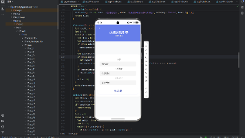
项目演示
引言
在现代UI开发中,布局控制是构建优秀用户界面的基础。鸿蒙 HarmonyOS NEXT 作为新一代智能终端操作系统,提供了强大的 ArkUI 框架,其中 Stack 组件是实现层叠布局和精准对齐的核心组件。
Stack(堆叠)布局是一种基础但至关重要的布局方式,它允许子组件在同一个空间内叠加显示。而对齐控制则是 Stack 布局的灵魂,决定了子组件在容器中的精确位置。ArkUI 提供了九种标准对齐方式,覆盖了二维平面的所有关键位置,为开发者提供了灵活而强大的布局能力。
本文将深入探讨 Stack 组件的对齐机制,详细解析九种对齐方式的原理和应用场景,结合实战代码演示,帮助开发者全面掌握这一核心技术。
第一章:ArkTS 与 ArkUI 基础
1.1 ArkTS 语言概述
ArkTS 是 HarmonyOS NEXT 推出的新一代声明式 UI 开发语言,基于 TypeScript 扩展而来。它保留了 TypeScript 的类型安全特性,同时引入了声明式 UI 范式和丰富的装饰器语法,使开发者能够以更直观、更高效的方式构建 UI 界面。
核心特性:
- 声明式语法:通过描述 UI 的状态和结构来构建界面,而不是通过命令式操作
- 装饰器模式:使用
@Entry、@Component、@State等装饰器来定义组件和管理状态 - 类型安全:继承 TypeScript 的类型系统,提供编译时类型检查
- 响应式更新:状态变化自动触发 UI 更新
1.2 ArkUI 组件框架
ArkUI(Ark User Interface)是 HarmonyOS 的原生 UI 框架,提供了丰富的组件库和布局能力。ArkUI 组件体系分为以下几个层次:
- 基础组件:Text、Image、Button 等最基本的 UI 元素
- 容器组件:Column、Row、Stack、Flex 等用于布局管理的组件
- 高级组件:List、Grid、Tabs、Scroll 等复杂交互组件
1.3 装饰器详解
在编写 ArkTS UI 代码时,我们会频繁使用以下装饰器:
@Entry 装饰器
@Entry 装饰器用于标记一个组件作为应用的入口组件。每个应用至少需要一个入口组件,系统会从该组件开始渲染整个界面。
@Entry
@Component
struct MyPage {
  build() {
    // UI 结构
  }
}
@Component 装饰器
@Component 装饰器用于定义一个可复用的 UI 组件。使用 @Component 装饰的 struct 可以包含自己的状态、属性和方法。
@Component
struct MyComponent {
  @State count: number = 0;

  build() {
    Column() {
      Text(`Count: ${this.count}`)
      Button('Increment')
        .onClick(() => {
          this.count++;
        })
    }
  }
}
@State 装饰器
@State 装饰器用于定义组件的内部状态。当状态值发生变化时,系统会自动触发相关组件的重新渲染。
@State message: string = 'Hello World';
@State isVisible: boolean = true;
@State progress: number = 50;
@Builder 装饰器
@Builder 装饰器用于定义可复用的 UI 片段。它类似于函数,但返回的是 UI 结构而不是值。
@Builder
myBuilder() {
  Text('Reusable UI')
    .fontSize(16)
}
1.4 构建函数 build()
每个组件都必须包含一个 build() 方法,该方法返回组件的 UI 结构。在 build() 方法中,我们使用声明式语法描述 UI 的层次结构。
build() {
  Column() {
    Text('Title')
      .fontSize(24)
    Row() {
      Text('Left')
      Text('Right')
    }
  }
}
第二章:Stack 组件详解
2.1 Stack 组件概念
Stack 组件是 ArkUI 中用于实现层叠布局的容器组件。它允许多个子组件在同一个空间内叠加显示,后面的子组件会覆盖前面的子组件。
核心特点:
- 层叠显示:子组件按照添加顺序依次叠加
- 尺寸自适应:默认情况下,Stack 的尺寸由内容决定
- 对齐控制:通过
alignContent属性控制子组件的对齐方式 - 背景支持:可以设置背景色、背景图片等
2.2 Stack 组件属性
Stack 组件支持以下主要属性:
| 属性名 | 类型 | 默认值 | 说明 |
|---|---|---|---|
| alignContent | Alignment | Alignment.Center | 子组件在 Stack 内的对齐方式 |
| width | Length | - | 容器宽度 |
| height | Length | - | 容器高度 |
| backgroundColor | ResourceColor | - | 背景颜色 |
| backgroundImage | ResourceStr | - | 背景图片 |
| borderRadius | Length | - | 圆角半径 |
| border | BorderOptions | - | 边框设置 |
| padding | Padding | - | 内边距 |
| margin | Margin | - | 外边距 |
2.3 Stack 默认行为
在不设置 alignContent 属性时,Stack 组件有以下默认行为:
- 子组件拉伸:子组件会自动拉伸以填满整个 Stack 容器
- 居中对齐:如果子组件尺寸小于容器,默认居中显示
- 层叠顺序:后添加的子组件显示在前面
Stack() {
  Text('First')
    .backgroundColor(Color.Red)
  Text('Second')
    .backgroundColor(Color.Blue)
}
.width(200)
.height(100)
在上面的例子中,由于没有设置 alignContent,两个 Text 组件都会拉伸填满整个 Stack,最终只能看到蓝色的 “Second”。
2.4 设置 alignContent 后的行为
当设置 alignContent 属性后,Stack 的行为会发生以下变化:
- 子组件保持原始尺寸:子组件不再自动拉伸,而是保持自身的尺寸
- 按指定方式对齐:子组件根据
alignContent的值在容器内对齐 - 支持多个子组件:多个子组件都会按照相同的对齐方式排列
Stack() {
  Text('First')
    .backgroundColor(Color.Red)
    .padding(10)
  Text('Second')
    .backgroundColor(Color.Blue)
    .padding(10)
}
.width(200)
.height(100)
.alignContent(Alignment.TopStart)
在这个例子中,两个 Text 组件都会保持自身尺寸,并在左上角对齐叠加显示。
第三章:Alignment 枚举深度解析
3.1 Alignment 枚举概述
Alignment 是 ArkUI 中用于描述对齐方式的枚举类型,定义了二维平面上的九个标准对齐位置。这些对齐方式不仅适用于 Stack 组件,也适用于其他需要对齐控制的场景。
3.2 九种对齐方式详解
ArkUI 提供的九种对齐方式可以分为三类:
第一类:顶部对齐
3.2.1 Alignment.TopStart
描述:子组件在容器的左上角对齐
适用场景:
- 标题栏左侧的图标
- 卡片左上角的装饰元素
- 需要固定在左上角的操作按钮
代码示例:
Stack() {
  Text('TopStart')
    .backgroundColor('#667eea')
    .textAlign(TextAlign.Center)
    .width(80)
    .height(30)
}
.width(200)
.height(150)
.backgroundColor('#f5f5f5')
.alignContent(Alignment.TopStart)
效果描述:文本标签位于容器的左上角位置,顶部和左侧紧贴容器边缘。
3.2.2 Alignment.Top
描述:子组件在容器的顶部居中对齐
适用场景:
- 页面标题
- 模态框顶部的标题栏
- 卡片顶部的标题区域
代码示例:
Stack() {
  Text('Top')
    .backgroundColor('#667eea')
    .textAlign(TextAlign.Center)
    .width(80)
    .height(30)
}
.width(200)
.height(150)
.backgroundColor('#f5f5f5')
.alignContent(Alignment.Top)
效果描述:文本标签位于容器顶部的水平中心位置,顶部紧贴容器边缘,水平方向居中。
3.2.3 Alignment.TopEnd
描述:子组件在容器的右上角对齐
适用场景:
- 标题栏右侧的操作按钮
- 卡片右上角的关闭按钮
- 需要固定在右上角的通知图标
代码示例:
Stack() {
  Text('TopEnd')
    .backgroundColor('#667eea')
    .textAlign(TextAlign.Center)
    .width(80)
    .height(30)
}
.width(200)
.height(150)
.backgroundColor('#f5f5f5')
.alignContent(Alignment.TopEnd)
效果描述:文本标签位于容器的右上角位置,顶部和右侧紧贴容器边缘。
第二类:中部对齐
3.2.4 Alignment.Start
描述:子组件在容器的左侧垂直居中对齐
适用场景:
- 列表项左侧的图标
- 表单左侧的标签
- 需要垂直居中的侧边栏元素
代码示例:
Stack() {
  Text('Start')
    .backgroundColor('#667eea')
    .textAlign(TextAlign.Center)
    .width(80)
    .height(30)
}
.width(200)
.height(150)
.backgroundColor('#f5f5f5')
.alignContent(Alignment.Start)
效果描述:文本标签位于容器左侧的垂直中心位置,左侧紧贴容器边缘,垂直方向居中。
3.2.5 Alignment.Center
描述:子组件在容器的正中央对齐(水平和垂直都居中)
适用场景:
- 加载中的加载动画
- 空状态提示
- 模态框的内容区域
- 需要突出显示的核心内容
代码示例:
Stack() {
  Text('Center')
    .backgroundColor('#667eea')
    .textAlign(TextAlign.Center)
    .width(80)
    .height(30)
}
.width(200)
.height(150)
.backgroundColor('#f5f5f5')
.alignContent(Alignment.Center)
效果描述:文本标签位于容器的正中央,水平和垂直方向都与容器中心对齐。
3.2.6 Alignment.End
描述:子组件在容器的右侧垂直居中对齐
适用场景:
- 列表项右侧的箭头图标
- 表单右侧的输入框
- 需要垂直居中的右侧操作按钮
代码示例:
Stack() {
  Text('End')
    .backgroundColor('#667eea')
    .textAlign(TextAlign.Center)
    .width(80)
    .height(30)
}
.width(200)
.height(150)
.backgroundColor('#f5f5f5')
.alignContent(Alignment.End)
效果描述:文本标签位于容器右侧的垂直中心位置,右侧紧贴容器边缘,垂直方向居中。
第三类:底部对齐
3.2.7 Alignment.BottomStart
描述:子组件在容器的左下角对齐
适用场景:
- 页面底部的版权信息
- 卡片左下角的标签
- 需要固定在左下角的操作按钮
代码示例:
Stack() {
  Text('BottomStart')
    .backgroundColor('#667eea')
    .textAlign(TextAlign.Center)
    .width(80)
    .height(30)
}
.width(200)
.height(150)
.backgroundColor('#f5f5f5')
.alignContent(Alignment.BottomStart)
效果描述:文本标签位于容器的左下角位置,底部和左侧紧贴容器边缘。
3.2.8 Alignment.Bottom
描述:子组件在容器的底部居中对齐
适用场景:
- 页面底部的导航栏
- 卡片底部的操作按钮组
- 需要固定在底部的提示信息
代码示例:
Stack() {
  Text('Bottom')
    .backgroundColor('#667eea')
    .textAlign(TextAlign.Center)
    .width(80)
    .height(30)
}
.width(200)
.height(150)
.backgroundColor('#f5f5f5')
.alignContent(Alignment.Bottom)
效果描述:文本标签位于容器底部的水平中心位置,底部紧贴容器边缘,水平方向居中。
3.2.9 Alignment.BottomEnd
描述:子组件在容器的右下角对齐
适用场景:
- 页面右下角的浮动按钮
- 卡片右下角的操作按钮
- 需要固定在右下角的状态指示器
代码示例:
Stack() {
  Text('BottomEnd')
    .backgroundColor('#667eea')
    .textAlign(TextAlign.Center)
    .width(80)
    .height(30)
}
.width(200)
.height(150)
.backgroundColor('#f5f5f5')
.alignContent(Alignment.BottomEnd)
效果描述:文本标签位于容器的右下角位置,底部和右侧紧贴容器边缘。
3.3 对齐方式可视化
为了更直观地理解九种对齐方式的位置关系,可以将容器想象成一个 3×3 的网格:
┌─────────────────────┐
│ TopStart │  Top   │ TopEnd │
├─────────────────────┤
│  Start   │ Center │  End   │
├─────────────────────┤
│BottomStart│ Bottom│BottomEnd│
└─────────────────────┘
水平方向(X轴):
- Start:左侧对齐
- Center:水平居中
- End:右侧对齐
垂直方向(Y轴):
- Top:顶部对齐
- Center:垂直居中
- Bottom:底部对齐
组合规则:
- 两个方向的对齐方式组合形成最终位置
- 省略方向时默认为 Center(如 Top 等价于 Top + Center)
第四章:alignContent 属性机制
4.1 alignContent 工作原理
alignContent 属性用于控制 Stack 容器内子组件的对齐方式。其工作原理如下:
- 确定对齐基准:根据 Alignment 的值确定子组件的对齐参考点
- 计算子组件位置:将子组件的对应边缘或中心点与对齐基准点对齐
- 保持子组件尺寸:设置
alignContent后,子组件不再自动拉伸
4.2 alignContent 与其他属性的关系
与 width/height 的关系
- 当 Stack 设置了固定尺寸时,
alignContent控制子组件在该尺寸内的位置 - 当 Stack 未设置尺寸时,Stack 的尺寸由内容决定,
alignContent的效果可能不明显
与 padding 的关系
padding设置的内边距会影响对齐的实际位置- 子组件的对齐是相对于 padding 内部的区域,而不是整个容器
Stack() {
  Text('Padded')
    .backgroundColor('#667eea')
    .width(60)
    .height(20)
}
.width(200)
.height(150)
.padding(20)
.backgroundColor('#f5f5f5')
.alignContent(Alignment.TopStart)
在这个例子中,文本标签会距离容器边缘 20px(padding 的值),而不是紧贴边缘。
与多个子组件的关系
- 当 Stack 包含多个子组件时,所有子组件都会按照
alignContent的值对齐 - 子组件之间仍然保持层叠关系,后添加的子组件显示在前面
Stack() {
  Text('First')
    .backgroundColor(Color.Red)
    .width(60)
    .height(20)
  Text('Second')
    .backgroundColor(Color.Blue)
    .width(60)
    .height(20)
}
.width(200)
.height(150)
.backgroundColor('#f5f5f5')
.alignContent(Alignment.Center)
在这个例子中,两个文本标签都会居中对齐,并且蓝色的 “Second” 会覆盖在红色的 “First” 上面。
4.3 alignContent 的默认值
alignContent 的默认值是 Alignment.Center,这意味着如果不显式设置该属性,子组件会在 Stack 内居中显示。
// 以下两种写法效果相同
Stack() {
  Text('Centered')
}
.width(200)
.height(100)

Stack() {
  Text('Centered')
}
.width(200)
.height(100)
.alignContent(Alignment.Center)
4.4 alignContent 与子组件自身对齐的区别
需要注意的是,alignContent 控制的是子组件相对于 Stack 容器的对齐方式,而不是子组件内部内容的对齐方式。子组件内部内容的对齐需要使用子组件自身的属性,如 textAlign。
Stack() {
  Text('Left-aligned text')
    .textAlign(TextAlign.Start)  // 文本内部左对齐
    .backgroundColor('#667eea')
    .width(100)
    .height(40)
}
.width(200)
.height(150)
.backgroundColor('#f5f5f5')
.alignContent(Alignment.Center)  // 子组件在容器中居中
在这个例子中:
alignContent(Alignment.Center):整个 Text 组件在 Stack 容器中居中textAlign(TextAlign.Start):Text 组件内部的文本左对齐
第五章:实战:九宫格对齐演示
5.1 需求分析
我们需要创建一个演示页面,直观展示 Stack 组件的九种对齐方式。页面应包含:
- 页面标题
- 3×3 的九宫格布局,每个格子展示一种对齐方式
- 每个格子内包含一个 Stack 组件,展示该对齐方式的效果
- 对齐方式名称标签
5.2 完整代码实现
/**
 * Stack 九宫格对齐演示页面
 *
 * 核心技术要点:
 * 1. Stack 组件通过 alignContent 属性控制子元素在容器内的对齐方式
 * 2. ArkUI 提供了九种标准对齐方式,覆盖二维平面的九个位置:
 *    - 水平方向:Start(左)、Center(中)、End(右)
 *    - 垂直方向:Top(上)、Center(中)、Bottom(下)
 *    - 组合:TopStart、Top、TopEnd、Start、Center、End、BottomStart、Bottom、BottomEnd
 * 3. alignContent 属性设置的是子元素相对于 Stack 容器的对齐方式
 * 4. Stack 默认会拉伸子元素填充整个容器,设置 alignContent 后子元素保持自身尺寸
 *
 * 布局结构:
 * - 外层 Column:垂直排列标题和九宫格区域
 * - 三层 Row:每层包含3个 Stack 示例,形成3×3网格
 * - 每个 Stack 内含一个彩色标签,展示该对齐方式的实际效果
 */

@Entry
@Component
struct StackAlignmentDemo {
  @State title: string = 'Stack 九宫格对齐演示';

  build() {
    // 外层垂直布局:标题 + 九宫格区域
    Column() {
      // 页面标题
      Text(this.title)
        .fontSize(24)
        .fontWeight(FontWeight.Bold)
        .margin({ bottom: 20 })
        .textAlign(TextAlign.Center)

      // 九宫格区域:使用 layoutWeight(1) 占据剩余空间,避免高度溢出
      Column({ space: 15 }) {
        // 第一行:顶部对齐(TopStart、Top、TopEnd)
        Row({ space: 15 }) {
          this.createStackItem('TopStart', Alignment.TopStart)
          this.createStackItem('Top', Alignment.Top)
          this.createStackItem('TopEnd', Alignment.TopEnd)
        }
        .justifyContent(FlexAlign.Center)

        // 第二行:中部对齐(Start、Center、End)
        Row({ space: 15 }) {
          this.createStackItem('Start', Alignment.Start)
          this.createStackItem('Center', Alignment.Center)
          this.createStackItem('End', Alignment.End)
        }
        .justifyContent(FlexAlign.Center)

        // 第三行:底部对齐(BottomStart、Bottom、BottomEnd)
        Row({ space: 15 }) {
          this.createStackItem('BottomStart', Alignment.BottomStart)
          this.createStackItem('Bottom', Alignment.Bottom)
          this.createStackItem('BottomEnd', Alignment.BottomEnd)
        }
        .justifyContent(FlexAlign.Center)
      }
      .layoutWeight(1)
      .width('100%')
      .justifyContent(FlexAlign.Center)
    }
    .padding(20)
    .width('100%')
    .height('100%')
    .backgroundColor('#f5f5f5')
  }

  /**
   * 创建单个 Stack 对齐示例项
   * @param name 对齐方式名称,用于标签显示
   * @param alignment 对齐方式枚举值,设置给 Stack.alignContent
   */
  @Builder
  createStackItem(name: string, alignment: Alignment) {
    Column() {
      // Stack 容器:白色背景带边框,尺寸固定为90×90
      Stack() {
        // 子元素:彩色标签,展示当前对齐方式下子元素的位置
        Text(name)
          .fontSize(12)
          .fontColor(Color.White)
          .backgroundColor('#667eea')
          .padding({ left: 8, right: 8, top: 4, bottom: 4 })
          .borderRadius(4)
        // 关键属性:设置子元素在 Stack 内的对齐方式
      }
      .width(90)
      .height(90)
      .backgroundColor('#ffffff')
      .borderRadius(8)
      .border({ width: 1, color: '#e0e0e0' })
      .alignContent(alignment)

      // 对齐方式名称标签,显示在 Stack 下方
      Text(name)
        .fontSize(10)
        .fontColor('#666666')
        .margin({ top: 8 })
    }
    .justifyContent(FlexAlign.Center)
    .alignItems(HorizontalAlign.Center)
  }
}
5.3 代码逐行解析
5.3.1 组件定义与状态
@Entry
@Component
struct StackAlignmentDemo {
  @State title: string = 'Stack 九宫格对齐演示';
@Entry:标记该组件为应用入口@Component:定义一个可复用的 UI 组件@State title:定义页面标题状态,初始值为 “Stack 九宫格对齐演示”
5.3.2 外层布局
build() {
  Column() {
    Text(this.title)
      .fontSize(24)
      .fontWeight(FontWeight.Bold)
      .margin({ bottom: 20 })
      .textAlign(TextAlign.Center)
build():组件的构建方法,返回 UI 结构Column():垂直布局容器Text(this.title):显示页面标题.fontSize(24):设置字体大小为 24.fontWeight(FontWeight.Bold):设置字体加粗.margin({ bottom: 20 }):设置底部外边距为 20.textAlign(TextAlign.Center):文本居中对齐
5.3.3 九宫格区域
Column({ space: 15 }) {
  Row({ space: 15 }) {
    this.createStackItem('TopStart', Alignment.TopStart)
    this.createStackItem('Top', Alignment.Top)
    this.createStackItem('TopEnd', Alignment.TopEnd)
  }
  .justifyContent(FlexAlign.Center)
Column({ space: 15 }):垂直布局,行间距为 15Row({ space: 15 }):水平布局,列间距为 15this.createStackItem(name, alignment):调用 @Builder 方法创建对齐示例.justifyContent(FlexAlign.Center):水平居中对齐
5.3.4 @Builder 方法
@Builder
createStackItem(name: string, alignment: Alignment) {
  Column() {
    Stack() {
      Text(name)
        .fontSize(12)
        .fontColor(Color.White)
        .backgroundColor('#667eea')
        .padding({ left: 8, right: 8, top: 4, bottom: 4 })
        .borderRadius(4)
    }
    .width(90)
    .height(90)
    .backgroundColor('#ffffff')
    .borderRadius(8)
    .border({ width: 1, color: '#e0e0e0' })
    .alignContent(alignment)

    Text(name)
      .fontSize(10)
      .fontColor('#666666')
      .margin({ top: 8 })
  }
  .justifyContent(FlexAlign.Center)
  .alignItems(HorizontalAlign.Center)
}
@Builder:定义可复用的 UI 片段name: string:对齐方式名称参数alignment: Alignment:对齐方式枚举参数Stack():创建 Stack 容器.width(90).height(90):设置 Stack 尺寸为 90×90.backgroundColor('#ffffff'):设置白色背景.border({ width: 1, color: '#e0e0e0' }):设置灰色边框.alignContent(alignment):应用传入的对齐方式- 底部
Text(name):显示对齐方式名称标签
5.4 运行效果
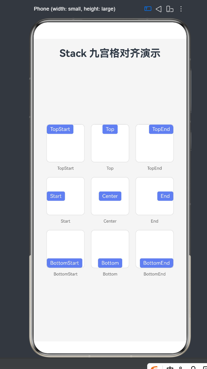
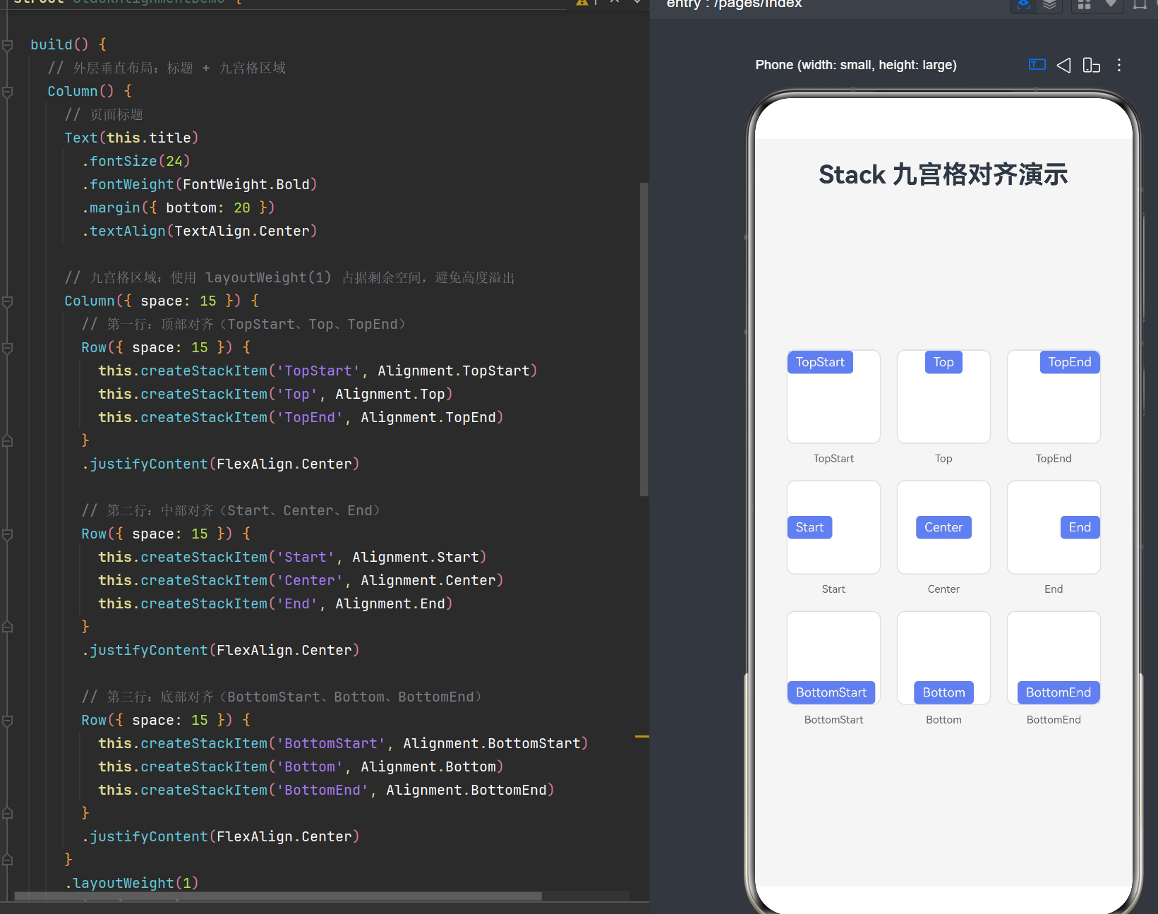
运行该页面后,你将看到一个 3×3 的九宫格布局,每个格子展示一种对齐方式的效果:
- 第一行:左上角、顶部居中、右上角的对齐效果
- 第二行:左侧居中、正中央、右侧居中的对齐效果
- 第三行:左下角、底部居中、右下角的对齐效果
每个格子内的彩色标签会根据对应的对齐方式显示在不同位置,直观展示了 alignContent 属性的作用。
第六章:进阶用法
6.1 嵌套 Stack 布局
在实际开发中,我们经常需要使用嵌套的 Stack 布局来实现复杂的 UI 效果。
6.1.1 多层背景叠加
Stack() {
  // 底层背景
  Text()
    .width('100%')
    .height('100%')
    .backgroundColor('#f0f0f0')

  // 中间层装饰
  Text()
    .width(200)
    .height(150)
    .backgroundColor('#ffffff')
    .borderRadius(12)
    .shadow({ radius: 8, color: '#00000020' })

  // 顶层内容
  Column() {
    Text('Title')
      .fontSize(20)
      .fontWeight(FontWeight.Bold)
    Text('Description')
      .fontSize(14)
      .fontColor('#666666')
  }
}
.width('100%')
.height(200)
.alignContent(Alignment.Center)
效果:实现一个带有背景、卡片和内容的三层叠加效果。
6.1.2 徽章效果
Stack() {
  // 主图标
  Image($r('app.media.icon'))
    .width(48)
    .height(48)

  // 徽章
  Stack() {
    Text('3')
      .fontSize(10)
      .fontColor(Color.White)
  }
  .width(18)
  .height(18)
  .backgroundColor('#ff4d4f')
  .borderRadius(9)
}
.alignContent(Alignment.TopEnd)
效果:实现一个带有角标徽章的图标效果,徽章显示在图标的右上角。
6.2 动态切换对齐方式
我们可以通过状态变量动态控制 alignContent 的值,实现交互效果。
@Entry
@Component
struct DynamicAlignment {
  @State currentAlignment: Alignment = Alignment.Center;

  private alignments: Alignment[] = [
    Alignment.TopStart, Alignment.Top, Alignment.TopEnd,
    Alignment.Start, Alignment.Center, Alignment.End,
    Alignment.BottomStart, Alignment.Bottom, Alignment.BottomEnd
  ];

  private alignmentNames: string[] = [
    'TopStart', 'Top', 'TopEnd',
    'Start', 'Center', 'End',
    'BottomStart', 'Bottom', 'BottomEnd'
  ];

  build() {
    Column() {
      Text('动态对齐演示')
        .fontSize(24)
        .fontWeight(FontWeight.Bold)
        .margin({ bottom: 20 })

      // 演示区域
      Stack() {
        Text(this.getCurrentAlignmentName())
          .fontSize(16)
          .fontColor(Color.White)
          .backgroundColor('#667eea')
          .padding(12)
          .borderRadius(8)
      }
      .width(300)
      .height(200)
      .backgroundColor('#f5f5f5')
      .borderRadius(12)
      .alignContent(this.currentAlignment)
      .margin({ bottom: 20 })

      // 切换按钮
      Flex({ wrap: FlexWrap.Wrap }) {
        ForEach(this.alignments, (alignment: Alignment, index: number) => {
          Button(this.alignmentNames[index])
            .fontSize(12)
            .padding({ left: 12, right: 12, top: 6, bottom: 6 })
            .margin(4)
            .backgroundColor(
              this.currentAlignment === alignment
                ? '#667eea'
                : '#ffffff'
            )
            .fontColor(
              this.currentAlignment === alignment
                ? Color.White
                : '#333333'
            )
            .onClick(() => {
              this.currentAlignment = alignment;
            })
        })
      }
    }
    .padding(20)
    .width('100%')
    .height('100%')
    .backgroundColor('#ffffff')
  }

  getCurrentAlignmentName(): string {
    const index = this.alignments.indexOf(this.currentAlignment);
    return this.alignmentNames[index] || 'Center';
  }
}
效果:点击不同的按钮可以切换演示区域内文本的对齐方式,实时预览各种对齐效果。
6.3 结合动画效果
我们可以将 Stack 对齐与动画结合,实现更丰富的交互体验。
@Entry
@Component
struct AnimatedAlignment {
  @State alignment: Alignment = Alignment.Center;
  @State scale: number = 1;

  build() {
    Column() {
      Stack() {
        Text('动画演示')
          .fontSize(20)
          .fontColor(Color.White)
          .backgroundColor('#667eea')
          .padding(16)
          .borderRadius(12)
          .scale({ x: this.scale, y: this.scale })
          .animation({
            duration: 300,
            curve: Curve.EaseInOut
          })
      }
      .width(300)
      .height(200)
      .backgroundColor('#f5f5f5')
      .borderRadius(12)
      .alignContent(this.alignment)

      Button('切换位置')
        .margin({ top: 20 })
        .onClick(() => {
          this.scale = 0.8;
          setTimeout(() => {
            this.alignment = this.getNextAlignment();
            this.scale = 1;
          }, 150);
        })
    }
    .padding(20)
    .width('100%')
    .height('100%')
    .justifyContent(FlexAlign.Center)
  }

  getNextAlignment(): Alignment {
    const alignments: Alignment[] = [
      Alignment.TopStart, Alignment.Top, Alignment.TopEnd,
      Alignment.Start, Alignment.Center, Alignment.End,
      Alignment.BottomStart, Alignment.Bottom, Alignment.BottomEnd
    ];
    const currentIndex = alignments.indexOf(this.alignment);
    return alignments[(currentIndex + 1) % alignments.length];
  }
}
效果:点击按钮时,文本会先缩小,然后切换到下一个对齐位置,最后恢复原始大小,形成平滑的过渡动画。
6.4 响应式布局
在不同屏幕尺寸下,我们可能需要调整对齐方式以适应不同的布局需求。
@Entry
@Component
struct ResponsiveAlignment {
  @State alignment: Alignment = Alignment.Center;

  build() {
    Column() {
      Stack() {
        Text('响应式布局')
          .fontSize(18)
          .fontColor(Color.White)
          .backgroundColor('#667eea')
          .padding(12)
          .borderRadius(8)
      }
      .width('100%')
      .height(150)
      .backgroundColor('#f5f5f5')
      .alignContent(this.alignment)
    }
    .padding(20)
    .width('100%')
    .height('100%')
    .onAreaChange((oldValue: Area, newValue: Area) => {
      if (newValue.width > 600) {
        this.alignment = Alignment.Center;
      } else if (newValue.width > 400) {
        this.alignment = Alignment.Start;
      } else {
        this.alignment = Alignment.TopStart;
      }
    })
  }
}
效果:根据屏幕宽度自动调整对齐方式:
- 宽屏(>600px):居中对齐
- 中等屏幕(400-600px):左侧居中对齐
- 窄屏(<400px):左上角对齐
第七章:常见陷阱与最佳实践
7.1 常见陷阱
7.1.1 混淆 alignContent 与 justifyContent
alignContent 是 Stack 组件的属性,控制子组件在 Stack 内的对齐方式。justifyContent 是 Row/Column/Flex 组件的属性,控制子组件在主轴方向的排列方式。
错误示例:
Stack() {
  Text('Wrong')
}
.width(200)
.height(100)
.justifyContent(FlexAlign.Center)  // Stack 不支持 justifyContent
正确示例:
Stack() {
  Text('Correct')
}
.width(200)
.height(100)
.alignContent(Alignment.Center)  // 使用 alignContent
7.1.2 忘记设置 Stack 尺寸
如果 Stack 没有设置固定尺寸,其尺寸会由内容决定,此时 alignContent 的效果可能不明显。
错误示例:
Stack() {
  Text('Content')
}
.alignContent(Alignment.TopStart)  // Stack 尺寸由 Text 决定,对齐效果不明显
正确示例:
Stack() {
  Text('Content')
}
.width(200)
.height(150)
.alignContent(Alignment.TopStart)  // 设置固定尺寸后对齐效果明显
7.1.3 多个子组件的层叠顺序
当 Stack 包含多个子组件时,后添加的子组件会显示在前面。如果需要调整层叠顺序,可以使用 zIndex 属性。
Stack() {
  Text('Bottom')
    .width(100)
    .height(50)
    .backgroundColor(Color.Red)
    .zIndex(2)  // 提高层级

  Text('Top')
    .width(80)
    .height(40)
    .backgroundColor(Color.Blue)
    .zIndex(1)  // 降低层级
}
.width(200)
.height(100)
.alignContent(Alignment.Center)
效果:红色的 “Bottom” 会显示在蓝色的 “Top” 上面。
7.1.4 不存在的 Alignment 值
ArkUI 中不存在 Alignment.CenterStart 和 Alignment.CenterEnd 这两个值,使用它们会导致编译错误。
错误示例:
Stack() {
  Text('Error')
}
.width(200)
.height(100)
.alignContent(Alignment.CenterStart)  // 不存在的枚举值
正确示例:
Stack() {
  Text('Correct')
}
.width(200)
.height(100)
.alignContent(Alignment.Start)  // 使用正确的枚举值
7.2 最佳实践
7.2.1 使用 @Builder 复用布局
对于重复的布局结构,使用 @Builder 装饰器进行复用,提高代码的可维护性。
@Builder
badge(text: string) {
  Stack() {
    Text(text)
      .fontSize(10)
      .fontColor(Color.White)
  }
  .width(18)
  .height(18)
  .backgroundColor('#ff4d4f')
  .borderRadius(9)
}

// 使用
Stack() {
  Image($r('app.media.icon'))
    .width(48)
    .height(48)
  this.badge('3')
}
.alignContent(Alignment.TopEnd)
7.2.2 合理使用 padding
使用 padding 可以为对齐的子组件提供适当的间距,避免紧贴边缘。
Stack() {
  Text('Padded')
    .fontSize(16)
    .backgroundColor('#667eea')
    .padding(12)
}
.width(200)
.height(150)
.padding(20)  // 设置内边距
.backgroundColor('#f5f5f5')
.alignContent(Alignment.TopStart)
7.2.3 结合其他布局组件
Stack 经常与 Column、Row、Flex 等布局组件结合使用,实现复杂的 UI 布局。
Column() {
  Row() {
    Stack() {
      Image($r('app.media.avatar'))
        .width(40)
        .height(40)
      this.badge('2')
    }
    .alignContent(Alignment.TopEnd)

    Column() {
      Text('Username')
        .fontSize(16)
        .fontWeight(FontWeight.Bold)
      Text('Last seen: 5 minutes ago')
        .fontSize(12)
        .fontColor('#999999')
    }
    .margin({ left: 12 })

    Text('Message')
      .fontSize(14)
      .fontColor('#666666')
  }
  .width('100%')
  .padding(16)
  .backgroundColor('#ffffff')
}
效果:实现一个聊天列表项,包含头像(带徽章)、用户信息和消息预览。
7.2.4 性能优化
- 避免过度嵌套 Stack 组件,多层嵌套会增加渲染开销
- 对于静态布局,避免使用状态变量控制对齐方式
- 合理设置 Stack 的尺寸,避免不必要的重绘
第八章:API 24 兼容性说明
8.1 API 版本对应关系
HarmonyOS 的 API 版本与系统版本对应关系如下:
| API 版本 | 系统版本 | 说明 |
|---|---|---|
| API 1 | HarmonyOS 1.0 | 初始版本 |
| API 2 | HarmonyOS 2.0 | 基础能力增强 |
| API 3 | HarmonyOS 3.0 | 分布式能力增强 |
| API 4 | HarmonyOS 4.0 | 应用开发框架完善 |
| API 5 | HarmonyOS 5.0 | ArkTS 语言引入 |
| API 6 | HarmonyOS 6.0 | 声明式 UI 框架升级 |
| API 24 | HarmonyOS NEXT | 新一代智能终端操作系统 |
8.2 API 24 新特性
API 24(HarmonyOS NEXT)引入了以下重要特性:
- 声明式 UI 框架升级:更强大的组件系统和布局能力
- ArkTS 语言增强:更完善的类型系统和装饰器语法
- 新的布局组件:增强的 Flex、Grid、RelativeContainer 等
- 性能优化:更好的渲染性能和内存管理
- 多设备适配:更强大的响应式布局能力
8.3 Stack 组件在 API 24 中的变化
在 API 24 中,Stack 组件的核心功能保持稳定,但有以下改进:
- 性能优化:Stack 的渲染性能得到提升,尤其是在包含多个子组件时
- 对齐精度:
alignContent的对齐精度更高,布局更准确 - 嵌套支持:更好地支持多层嵌套的 Stack 布局
- 动画支持:与动画系统的集成更加顺畅
8.4 迁移注意事项
从低版本 API 迁移到 API 24 时,需要注意以下事项:
- Alignment 枚举值:确保使用的是正确的枚举值,避免使用不存在的
Alignment.CenterStart和Alignment.CenterEnd - 组件属性:检查组件属性是否有变更,及时更新代码
- 装饰器语法:确保装饰器的使用符合 API 24 的规范
- 布局行为:测试布局效果,确保在新 API 下表现一致
8.5 项目配置
在项目中配置 API 24 需要修改 build-profile.json5 文件:
{
  "app": {
    "products": [
      {
        "name": "default",
        "targetSdkVersion": "6.1.0(24)",
        "compatibleSdkVersion": "6.1.0(24)",
        "runtimeOS": "HarmonyOS"
      }
    ]
  }
}
targetSdkVersion:目标 SDK 版本,设置为 API 24compatibleSdkVersion:兼容 SDK 版本,设置为 API 24
第九章:实战案例分析
9.1 案例一:卡片布局
@Component
struct CardComponent {
  build() {
    Stack() {
      // 背景层
      Text()
        .width('100%')
        .height('100%')
        .backgroundColor('#ffffff')
        .borderRadius(16)
        .shadow({ radius: 8, color: '#00000010' })

      // 内容层
      Column() {
        Text('卡片标题')
          .fontSize(18)
          .fontWeight(FontWeight.Bold)
          .margin({ bottom: 8 })

        Text('卡片内容描述,这里可以放置详细的说明文字。')
          .fontSize(14)
          .fontColor('#666666')
          .maxLines(2)

        Row() {
          Text('标签1')
            .fontSize(12)
            .padding({ left: 8, right: 8, top: 4, bottom: 4 })
            .backgroundColor('#e6f7ff')
            .fontColor('#1890ff')
            .borderRadius(4)

          Text('标签2')
            .fontSize(12)
            .padding({ left: 8, right: 8, top: 4, bottom: 4 })
            .backgroundColor('#fff7e6')
            .fontColor('#fa8c16')
            .borderRadius(4)
        }
        .margin({ top: 12 })
      }
      .padding(16)
    }
    .width('100%')
    .height(180)
    .alignContent(Alignment.Center)
  }
}
分析:使用 Stack 实现卡片的背景和内容层叠,通过 alignContent(Alignment.Center) 确保内容居中显示。
9.2 案例二:浮动操作按钮
@Component
struct FloatingActionButton {
  build() {
    Stack() {
      // 阴影层
      Text()
        .width(56)
        .height(56)
        .backgroundColor('#667eea')
        .borderRadius(28)
        .shadow({ radius: 12, color: '#667eea40' })

      // 图标层
      Image($r('app.media.add'))
        .width(24)
        .height(24)
        .fillColor(Color.White)
    }
    .width(56)
    .height(56)
    .alignContent(Alignment.Center)
    .onClick(() => {
      // 点击处理逻辑
    })
  }
}

// 使用
Stack() {
  // 页面内容
  Column() {
    Text('页面内容')
  }

  // 浮动按钮
  FloatingActionButton()
}
.width('100%')
.height('100%')
.alignContent(Alignment.BottomEnd)
.padding(20)
分析:使用嵌套 Stack 实现浮动按钮的阴影效果和图标层叠,外层 Stack 使用 alignContent(Alignment.BottomEnd) 将按钮固定在右下角。
9.3 案例三:图片标签
@Component
struct ImageWithLabel {
  build() {
    Stack() {
      // 图片层
      Image($r('app.media.image'))
        .width('100%')
        .height(150)
        .objectFit(ImageFit.Cover)

      // 渐变遮罩层
      LinearGradient({
        direction: GradientDirection.BottomTop,
        colors: [['#00000080', 0.8], ['#00000000', 0]]
      })
        .width('100%')
        .height('100%')

      // 标签层
      Column() {
        Text('图片标题')
          .fontSize(18)
          .fontWeight(FontWeight.Bold)
          .fontColor(Color.White)

        Text('图片描述')
          .fontSize(14)
          .fontColor('#ffffffcc')
      }
    }
    .width('100%')
    .height(150)
    .alignContent(Alignment.BottomStart)
    .padding(16)
  }
}
分析:使用三层 Stack 实现图片、渐变遮罩和文字标签的层叠效果,通过 alignContent(Alignment.BottomStart) 将标签固定在左下角。
总结与展望
Stack 组件的对齐控制是 ArkUI 布局体系中的核心技术之一。通过 alignContent 属性和九种标准对齐方式,开发者可以精确控制子组件在容器内的位置,实现丰富多样的 UI 效果。
本文详细介绍了:
- ArkTS 与 ArkUI 基础:装饰器、构建函数等核心概念
- Stack 组件详解:属性、默认行为、工作原理
- Alignment 枚举深度解析:九种对齐方式的原理和应用场景
- alignContent 属性机制:工作原理、与其他属性的关系
- 实战演示:九宫格对齐演示的完整代码和解析
- 进阶用法:嵌套布局、动态切换、动画效果、响应式布局
- 常见陷阱与最佳实践:避免常见错误,遵循最佳实践
- API 24 兼容性说明:版本对应关系、新特性、迁移注意事项
- 实战案例分析:卡片布局、浮动按钮、图片标签等实际应用
随着 HarmonyOS NEXT 的不断发展,Stack 组件和对齐控制机制也在不断优化。未来,我们可以期待更强大的布局能力、更好的性能表现和更丰富的交互效果。
掌握 Stack 对齐控制技术,将为你的 HarmonyOS 应用开发打下坚实的基础。希望本文能帮助你深入理解并灵活运用这一核心技术,构建出更加精美的用户界面。

作为“人工智能6S店”的官方数字引擎,为AI开发者与企业提供一个覆盖软硬件全栈、一站式门户。
更多推荐
 0
0 0
0- 0


 已为社区贡献37条内容

所有评论(0)