
HarmonyOS开发实战:小分享-TemplateDetailPage模板详情——预览信息标签
·
前言
欢迎加入开源鸿蒙跨平台社区:https://openharmonycrossplatform.csdn.net
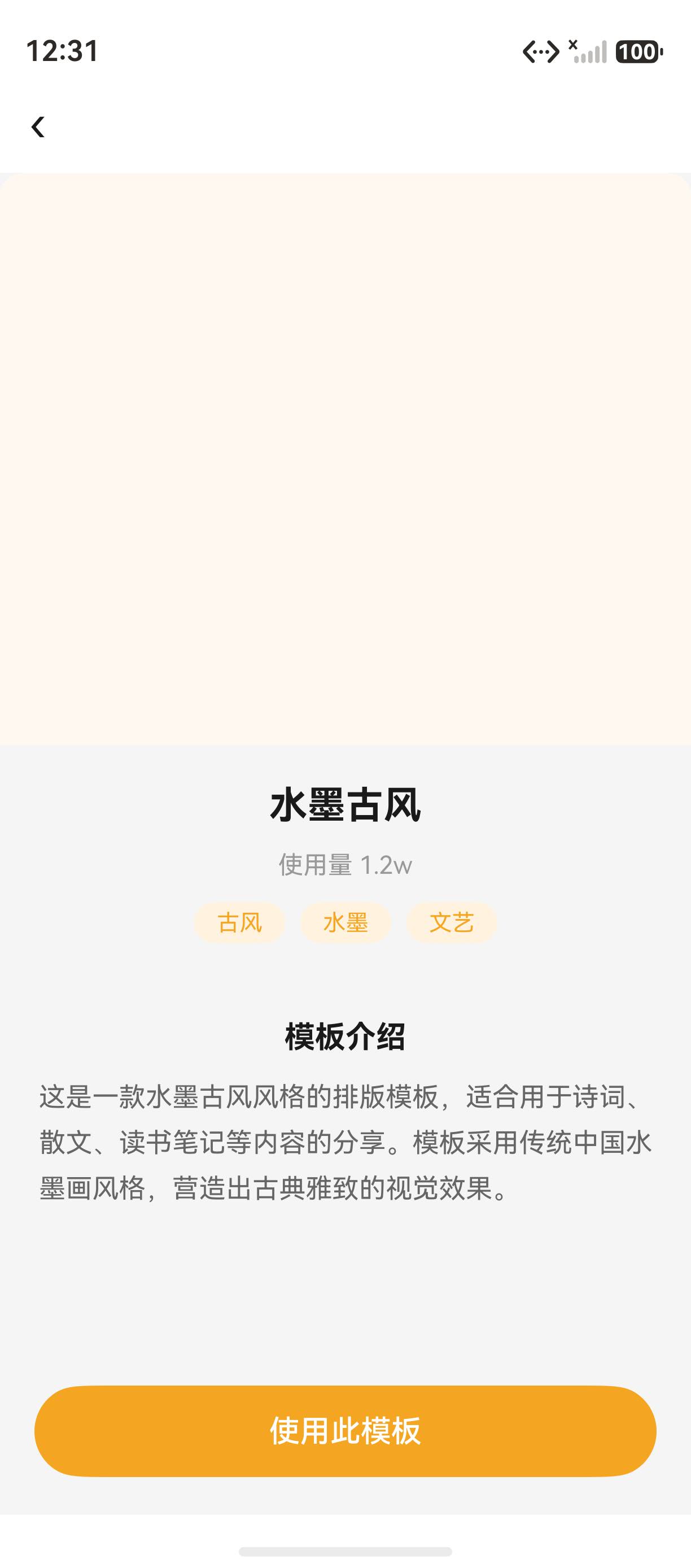
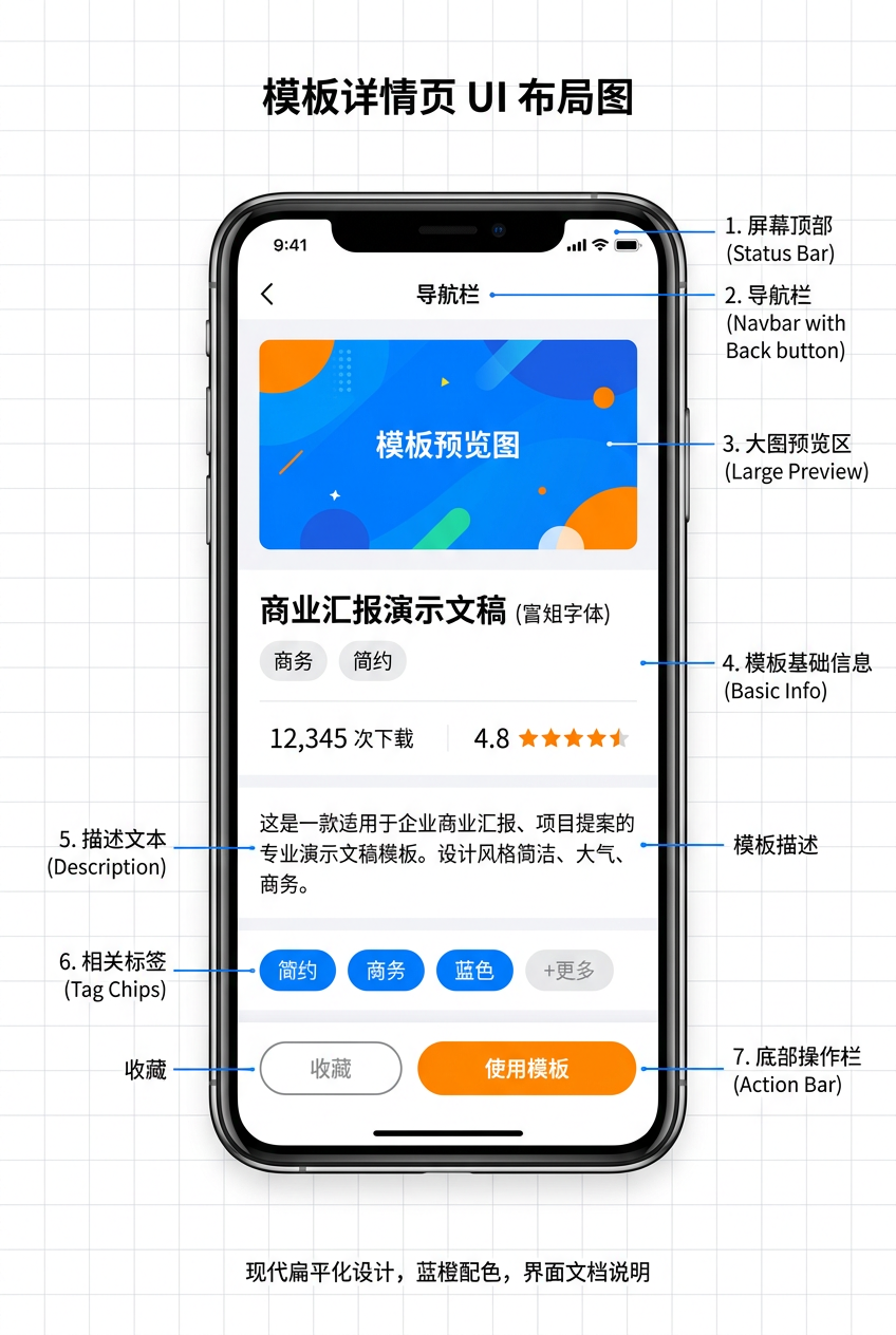
模板详情页 展示模板的完整预览、使用量、标签和描述信息,底部提供「使用此模板」按钮。小分享 App 的 TemplateDetailPage 使用 @Builder 封装标签胶囊、局部圆角、底部固定按钮 等技巧。本篇详细讲解模板详情页的完整实现。详细 API 可参考 HarmonyOS Button 官方文档。
一、TemplateDetailPage 完整代码
1.1 页面完整实现
import router from '@ohos.router';

@Entry
@Component
struct TemplateDetailPage {
  build() {
    Column() {
      this.HeaderBar()
      Scroll() {
        Column({ space: 20 }) {
          this.TemplatePreview()
          this.TemplateInfo()
          this.TemplateDescription()
        }
        .padding({ bottom: 100 })
      }
      .layoutWeight(1)
      this.UseTemplateButton()
    }
    .width('100%').height('100%').backgroundColor('#F5F5F5')
  }
}
1.2 Header 导航栏
Row() {
  Text('‹').fontSize(24).fontColor('#1A1A1A').onClick(() => { router.back() })
  Blank()
}
.width('100%').padding({ left: 16, right: 16, top: 12, bottom: 12 }).backgroundColor(Color.White)
二、局部圆角
2.1 预览区局部圆角
.borderRadius({ topLeft: 12, topRight: 12 })
三、标签胶囊
3.1 @Builder 封装
@Builder Tag(text: string) {
  Text(text).fontSize(12).fontColor('#F5A623')
    .padding({ left: 12, right: 12, top: 4, bottom: 4 })
    .backgroundColor('#FFF3E0').borderRadius(12)
}
3.2 标签调用
Row({ space: 8 }) {
  this.Tag('古风')
  this.Tag('水墨')
  this.Tag('文艺')
}
四、底部固定按钮
4.1 按钮样式
Button('使用此模板')
  .fontSize(16).fontColor(Color.White).backgroundColor('#F5A623')
  .width('90%').height(48).borderRadius(24)
  .margin({ bottom: 20 })
  .onClick(() => { router.back() })
五、页面布局结构
Column (主容器,背景 #F5F5F5)
├─ Row (Header 导航栏,白色背景)
│   ├─ Text('‹') 返回
│   └─ Blank()
├─ Scroll (可滚动内容区) - layoutWeight(1)
│   └─ Column (space: 20, padding bottom: 100)
│       ├─ Column (模板预览区)
│       │   └─ Column (预览图) 100%×300px #FFF8F0
│       ├─ Column (模板信息区)
│       │   ├─ Text('水墨古风') 20px Bold
│       │   ├─ Text('使用量 1.2w') 13px
│       │   └─ Row (标签)
│       │       ├─ Tag('古风')
│       │       ├─ Tag('水墨')
│       │       └─ Tag('文艺')
│       └─ Column (模板介绍区)
│           ├─ Text('模板介绍') 16px Bold
│           └─ Text(描述) 14px 灰色
└─ Button('使用此模板') - 固定在底部
六、模板信息区
6.1 信息布局
Column({ space: 12 }) {
  Text('水墨古风').fontSize(20).fontWeight(FontWeight.Bold).fontColor('#1A1A1A')
  Row({ space: 16 }) {
    Text('使用量 1.2w').fontSize(13).fontColor('#999999')
  }
  Row({ space: 8 }) {
    this.Tag('古风')
    this.Tag('水墨')
    this.Tag('文艺')
  }
}
.width('100%').padding({ left: 16, right: 16, bottom: 20 })
七、模板介绍区
Column({ space: 8 }) {
  Text('模板介绍').fontSize(16).fontWeight(FontWeight.Bold).fontColor('#1A1A1A')
  Text('这是一款水墨古风风格的排版模板...').fontSize(14).fontColor('#666666').lineHeight(24)
}
.width('100%').padding({ left: 16, right: 16 })
八、完整代码文件索引
| 文件路径 | 说明 |
|---|---|
pages/TemplateDetailPage.ets |
模板详情页面 |
九、本文涉及的所有 API
| API/组件 | 用途 | 文档链接 |
|---|---|---|
@Builder |
UI 复用 | Builder Guide |
Button |
按钮组件 | Button |
borderRadius() |
圆角 | BorderRadius |
Scroll |
可滚动容器 | Scroll |
router.back() |
返回 | Router |
Blank() |
空白填充 | Blank |
总结
本文详细讲解了 TemplateDetailPage 模板详情页的实现。核心知识点包括:局部圆角(borderRadius({topLeft, topRight}) 实现顶部圆角)、@Builder 标签胶囊(Tag(text) 封装橙色标签)、底部固定按钮(Button 在 Scroll 之外固定)。这些技术构成了完整的模板详情页面。下一篇我们将深入 FavoritesPage 收藏页的实现。
- FavoritesPage 收藏页
相关资源
- HarmonyOS Button 组件:Button Reference
- HarmonyOS borderRadius:BorderRadius
- HarmonyOS @Builder 装饰器:@Builder Guide
- HarmonyOS Scroll 组件:Scroll Component
- HarmonyOS Router 路由:Router API
- HarmonyOS Blank 组件:Blank Component
- HarmonyOS shadow 属性:Shadow Attribute
- 开源鸿蒙跨平台社区:https://openharmonycrossplatform.csdn.net
相关资源
- HarmonyOS Button 组件:Button Reference
- HarmonyOS borderRadius:BorderRadius
- HarmonyOS @Builder 装饰器:@Builder Guide
- HarmonyOS Scroll 组件:Scroll Component
- HarmonyOS Router 路由:Router API
- HarmonyOS Blank 组件:Blank Component
- HarmonyOS shadow 属性:Shadow Attribute
- 开源鸿蒙跨平台社区:https://openharmonycrossplatform.csdn.net
-
FavoritesPage 收藏页
-
TemplateSelectPage 模板选择页
如果这篇文章对你有帮助,欢迎点赞👍、收藏⭐、关注🔔,你的支持是我持续创作的动力!

作为“人工智能6S店”的官方数字引擎,为AI开发者与企业提供一个覆盖软硬件全栈、一站式门户。
更多推荐

 0
0 0
0- 0


 已为社区贡献4条内容

所有评论(0)