
ThemeProvider主题切换_Flutter在鸿蒙平台实现全局主题切换
作者:付文龙(红目香薰)
仓库地址:https://gitcode.com/feng8403000/FlutterfromBeginnertoAdvancedForHarmonyOS.git
联系邮箱:372699828@qq.com
概述
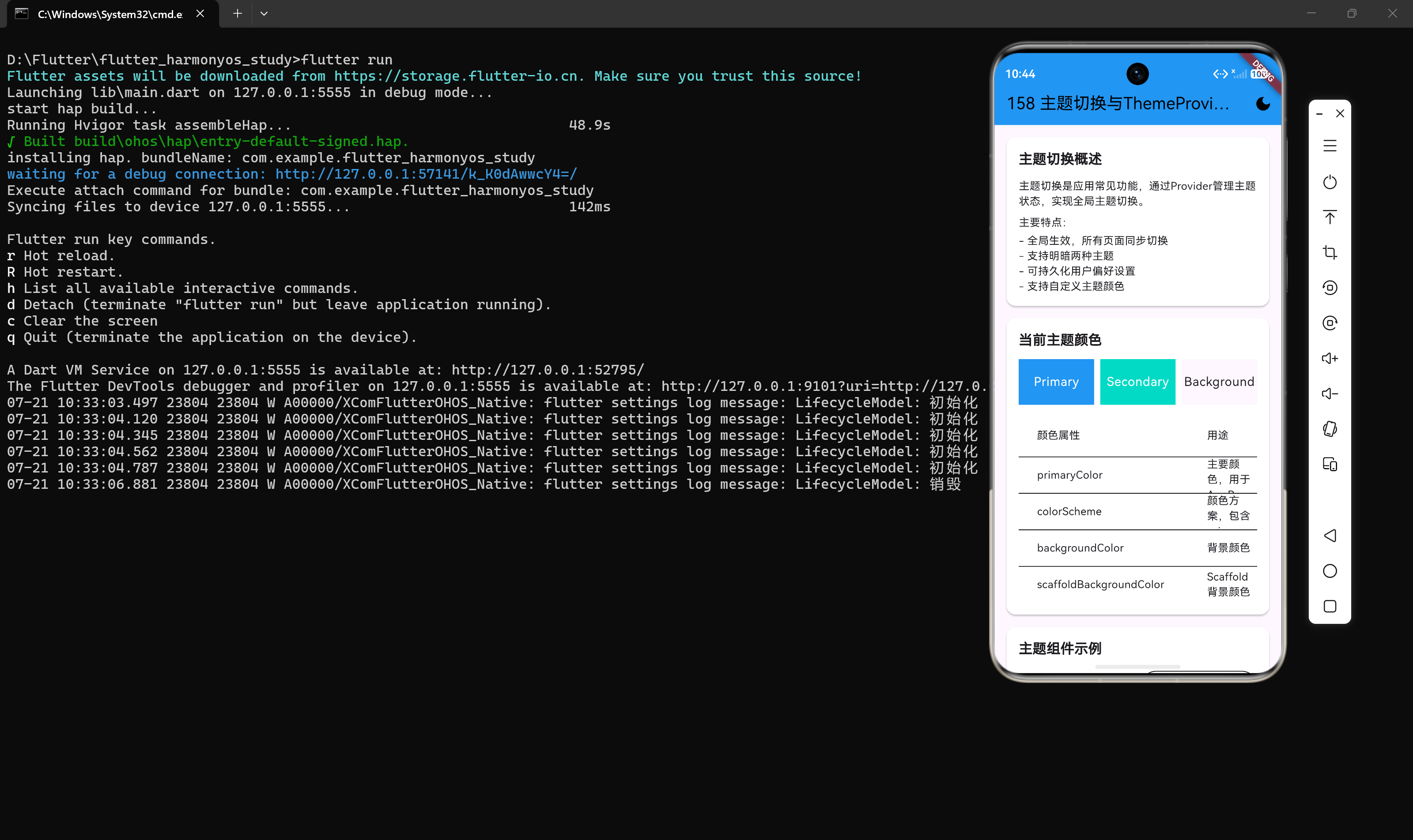
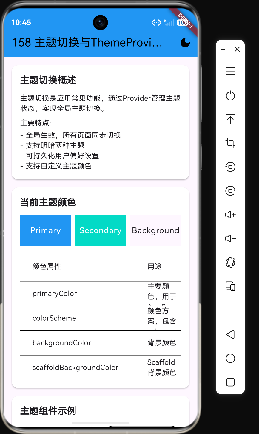
主题切换是现代应用的常见功能,它允许用户在明暗主题之间切换,提升用户体验。在Flutter中,我们可以通过Provider状态管理来实现全局主题切换,使整个应用的UI风格能够动态响应主题变化。
主题切换的意义
- 用户体验提升:用户可以根据自己的喜好选择主题
- 护眼模式:深色主题在夜间使用时更护眼
- 系统适配:可以跟随系统主题自动切换
- 品牌一致性:通过主题统一应用的视觉风格
核心概念
ThemeData
ThemeData是Flutter中定义主题的核心类,它包含了应用的颜色、字体、形状等视觉属性。
ThemeData(
  primaryColor: Colors.blue,
  accentColor: Colors.orange,
  backgroundColor: Colors.white,
  textTheme: TextTheme(
    headline1: TextStyle(fontSize: 24, fontWeight: FontWeight.bold),
    bodyText1: TextStyle(fontSize: 16, color: Colors.grey[800]),
  ),
)
ChangeNotifier
ChangeNotifier是Provider包中的一个简单的状态管理类,当状态变化时通知所有监听器。
Consumer
Consumer是Provider包中用于消费状态的Widget,当状态变化时会自动重建。
实现步骤
第一步:创建ThemeProvider
首先创建一个继承自ChangeNotifier的ThemeProvider类,用于管理主题状态。
import 'package:flutter/material.dart';
import 'package:provider/provider.dart';

enum AppTheme { light, dark }

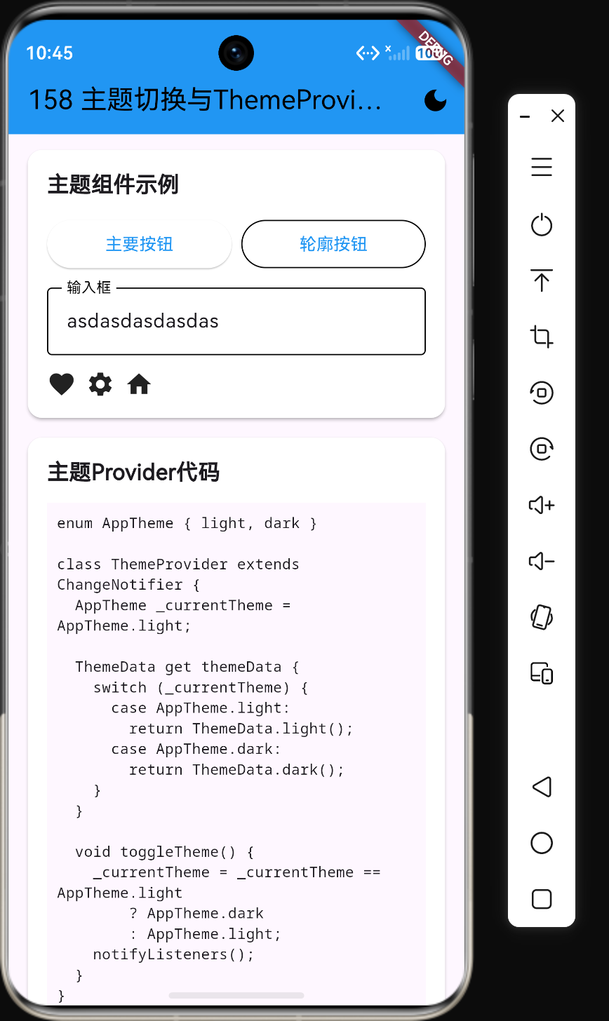
class ThemeProvider extends ChangeNotifier {
  AppTheme _currentTheme = AppTheme.light;

  AppTheme get currentTheme => _currentTheme;

  ThemeData get themeData {
    switch (_currentTheme) {
      case AppTheme.light:
        return ThemeData.light().copyWith(
          primaryColor: Colors.blue,
          colorScheme: const ColorScheme.light(primary: Colors.blue),
        );
      case AppTheme.dark:
        return ThemeData.dark().copyWith(
          primaryColor: Colors.blueAccent,
          colorScheme: const ColorScheme.dark(primary: Colors.blueAccent),
        );
    }
  }

  void toggleTheme() {
    _currentTheme = _currentTheme == AppTheme.light ? AppTheme.dark : AppTheme.light;
    notifyListeners();
  }
}
第二步:在应用入口配置Provider
在应用入口处使用ChangeNotifierProvider提供ThemeProvider实例。
void main() {
  runApp(
    ChangeNotifierProvider(
      create: (context) => ThemeProvider(),
      child: const MyApp(),
    ),
  );
}
第三步:创建响应主题变化的MaterialApp
使用Consumer包裹MaterialApp,使其能够响应主题变化。
class MyApp extends StatelessWidget {
const MyApp({super.key});
Widget build(BuildContext context) {
return Consumer<ThemeProvider>(
builder: (context, themeProvider, child) {
return MaterialApp(
theme: themeProvider.themeData,
home: const HomePage(),
);
},
);
}
}
第四步:创建主题切换按钮
在任何页面中都可以创建主题切换按钮。
class ThemeToggleButton extends StatelessWidget {
const ThemeToggleButton({super.key});
Widget build(BuildContext context) {
return Consumer<ThemeProvider>(
builder: (context, themeProvider, child) {
return IconButton(
icon: Icon(
themeProvider.currentTheme == AppTheme.light
? Icons.dark_mode
: Icons.light_mode,
),
onPressed: () => themeProvider.toggleTheme(),
);
},
);
}
}
自定义主题
创建自定义主题数据
我们可以创建更丰富的自定义主题,包含更多的颜色和样式配置。
class CustomThemes {
  static final lightTheme = ThemeData(
    primaryColor: const Color(0xFF6200EE),
    primaryColorDark: const Color(0xFF3700B3),
    accentColor: const Color(0xFF03DAC6),
    backgroundColor: Colors.white,
    scaffoldBackgroundColor: Colors.grey[50],
    cardColor: Colors.white,
    textTheme: TextTheme(
      headline1: TextStyle(
        fontSize: 24,
        fontWeight: FontWeight.bold,
        color: Colors.grey[800],
      ),
      bodyText1: TextStyle(
        fontSize: 16,
        color: Colors.grey[700],
      ),
      bodyText2: TextStyle(
        fontSize: 14,
        color: Colors.grey[600],
      ),
    ),
    elevatedButtonTheme: ElevatedButtonThemeData(
      style: ElevatedButton.styleFrom(
        primary: const Color(0xFF6200EE),
        shape: RoundedRectangleBorder(
          borderRadius: BorderRadius.circular(8),
        ),
      ),
    ),
    inputDecorationTheme: InputDecorationTheme(
      border: OutlineInputBorder(
        borderRadius: BorderRadius.circular(8),
      ),
      focusedBorder: OutlineInputBorder(
        borderSide: const BorderSide(color: Color(0xFF6200EE)),
        borderRadius: BorderRadius.circular(8),
      ),
    ),
  );

  static final darkTheme = ThemeData(
    primaryColor: const Color(0xFFBB86FC),
    primaryColorDark: const Color(0xFF7C4DFF),
    accentColor: const Color(0xFF03DAC6),
    backgroundColor: Colors.grey[900],
    scaffoldBackgroundColor: Colors.grey[900],
    cardColor: Colors.grey[800],
    textTheme: TextTheme(
      headline1: TextStyle(
        fontSize: 24,
        fontWeight: FontWeight.bold,
        color: Colors.grey[100],
      ),
      bodyText1: TextStyle(
        fontSize: 16,
        color: Colors.grey[200],
      ),
      bodyText2: TextStyle(
        fontSize: 14,
        color: Colors.grey[400],
      ),
    ),
    elevatedButtonTheme: ElevatedButtonThemeData(
      style: ElevatedButton.styleFrom(
        primary: const Color(0xFFBB86FC),
        shape: RoundedRectangleBorder(
          borderRadius: BorderRadius.circular(8),
        ),
      ),
    ),
    inputDecorationTheme: InputDecorationTheme(
      border: OutlineInputBorder(
        borderRadius: BorderRadius.circular(8),
        borderSide: const BorderSide(color: Colors.grey[600]),
      ),
      focusedBorder: OutlineInputBorder(
        borderSide: const BorderSide(color: Color(0xFFBB86FC)),
        borderRadius: BorderRadius.circular(8),
      ),
    ),
  );
}
更新ThemeProvider使用自定义主题
class ThemeProvider extends ChangeNotifier {
  AppTheme _currentTheme = AppTheme.light;

  AppTheme get currentTheme => _currentTheme;

  ThemeData get themeData {
    switch (_currentTheme) {
      case AppTheme.light:
        return CustomThemes.lightTheme;
      case AppTheme.dark:
        return CustomThemes.darkTheme;
    }
  }

  void toggleTheme() {
    _currentTheme = _currentTheme == AppTheme.light ? AppTheme.dark : AppTheme.light;
    notifyListeners();
  }
}
持久化主题设置
使用SharedPreferences保存主题
用户切换主题后,下次打开应用时应该保持上次的选择。我们可以使用shared_preferences包来实现持久化。
import 'package:shared_preferences/shared_preferences.dart';

class ThemeProvider extends ChangeNotifier {
  AppTheme _currentTheme = AppTheme.light;

  ThemeProvider() {
    _loadTheme();
  }

  Future<void> _loadTheme() async {
    final prefs = await SharedPreferences.getInstance();
    final themeIndex = prefs.getInt("themeIndex") ?? 0;
    _currentTheme = AppTheme.values[themeIndex];
    notifyListeners();
  }

  Future<void> toggleTheme() async {
    _currentTheme = _currentTheme == AppTheme.light ? AppTheme.dark : AppTheme.light;
    notifyListeners();
    final prefs = await SharedPreferences.getInstance();
    await prefs.setInt("themeIndex", _currentTheme.index);
  }
}
添加依赖
在pubspec.yaml中添加依赖:
dependencies:
  shared_preferences: ^2.2.2
主题切换动画
添加动画过渡效果
主题切换时添加动画可以提升用户体验。我们可以使用AnimatedSwitcher或AnimatedTheme来实现。
class ThemeTransition extends StatelessWidget {
const ThemeTransition({super.key, required this.child});
final Widget child;
Widget build(BuildContext context) {
return AnimatedSwitcher(
duration: const Duration(milliseconds: 300),
transitionBuilder: (Widget child, Animation<double> animation) {
return FadeTransition(
opacity: animation,
child: child,
);
},
child: child,
);
}
}
使用AnimatedTheme
AnimatedTheme是Flutter提供的专门用于主题切换动画的Widget。
class MyApp extends StatelessWidget {
const MyApp({super.key});
Widget build(BuildContext context) {
return Consumer<ThemeProvider>(
builder: (context, themeProvider, child) {
return AnimatedTheme(
data: themeProvider.themeData,
duration: const Duration(milliseconds: 300),
child: MaterialApp(
theme: themeProvider.themeData,
home: const HomePage(),
),
);
},
);
}
}
响应系统主题
监听系统主题变化
我们可以让应用跟随系统主题自动切换。
import 'package:flutter/services.dart';

class ThemeProvider extends ChangeNotifier {
  AppTheme _currentTheme = AppTheme.light;
  late Brightness _systemBrightness;

  ThemeProvider() {
    _loadTheme();
    _listenToSystemTheme();
  }

  Future<void> _loadTheme() async {
    final prefs = await SharedPreferences.getInstance();
    final themeIndex = prefs.getInt("themeIndex");
    if (themeIndex != null) {
      _currentTheme = AppTheme.values[themeIndex];
    } else {
      _currentTheme = _systemBrightness == Brightness.dark ? AppTheme.dark : AppTheme.light;
    }
    notifyListeners();
  }

  void _listenToSystemTheme() {
    SystemChannels.platform.invokeMethod('SystemNavigator.themeMode').then((value) {
      _systemBrightness = value == 'dark' ? Brightness.dark : Brightness.light;
      if (_currentTheme == AppTheme.light && _systemBrightness == Brightness.dark) {
        _currentTheme = AppTheme.dark;
        notifyListeners();
      } else if (_currentTheme == AppTheme.dark && _systemBrightness == Brightness.light) {
        _currentTheme = AppTheme.light;
        notifyListeners();
      }
    });
  }
}
最佳实践
1. 使用Theme.of(context)获取主题颜色
在Widget中使用Theme.of(context)来获取当前主题的颜色,而不是硬编码颜色值。
Container(
  color: Theme.of(context).primaryColor,
  child: Text(
    'Hello',
    style: TextStyle(color: Theme.of(context).primaryTextTheme.bodyText1?.color),
  ),
)
2. 避免在build方法中创建ThemeData
将主题数据定义为静态常量,避免每次build时都创建新的ThemeData对象。
class CustomThemes {
  static final lightTheme = ThemeData(...);
  static final darkTheme = ThemeData(...);
}
3. 使用Provider.of而不是Consumer
在不需要重建整个Widget树时,使用Provider.of获取状态。
final themeProvider = Provider.of<ThemeProvider>(context, listen: false);
themeProvider.toggleTheme();
4. 主题切换按钮放在AppBar上
将主题切换按钮放在AppBar的actions中,方便用户随时切换。
AppBar(
  title: const Text('应用标题'),
  actions: const [ThemeToggleButton()],
)
5. 提供主题设置页面
在设置页面中提供主题选择,让用户有更明确的控制。
class SettingsPage extends StatelessWidget {
const SettingsPage({super.key});
Widget build(BuildContext context) {
return Consumer<ThemeProvider>(
builder: (context, themeProvider, child) {
return ListTile(
title: const Text('深色主题'),
trailing: Switch(
value: themeProvider.currentTheme == AppTheme.dark,
onChanged: (value) => themeProvider.toggleTheme(),
),
);
},
);
}
}
完整示例
main.dart
import 'package:flutter/material.dart';
import 'package:provider/provider.dart';
import 'package:shared_preferences/shared_preferences.dart';
void main() {
runApp(
ChangeNotifierProvider(
create: (context) => ThemeProvider(),
child: const MyApp(),
),
);
}
class MyApp extends StatelessWidget {
const MyApp({super.key});
Widget build(BuildContext context) {
return Consumer<ThemeProvider>(
builder: (context, themeProvider, child) {
return MaterialApp(
title: '主题切换示例',
theme: themeProvider.themeData,
home: const HomePage(),
);
},
);
}
}
class HomePage extends StatelessWidget {
const HomePage({super.key});
Widget build(BuildContext context) {
return Scaffold(
appBar: AppBar(
title: const Text('主题切换'),
actions: const [ThemeToggleButton()],
),
body: Center(
child: Column(
mainAxisAlignment: MainAxisAlignment.center,
children: [
Text(
'当前主题:${Provider.of<ThemeProvider>(context).currentTheme == AppTheme.light ? '浅色' : '深色'}',
style: Theme.of(context).textTheme.headlineMedium,
),
const SizedBox(height: 20),
ElevatedButton(
onPressed: () => Provider.of<ThemeProvider>(context, listen: false).toggleTheme(),
child: const Text('切换主题'),
),
],
),
),
);
}
}
class ThemeToggleButton extends StatelessWidget {
const ThemeToggleButton({super.key});
Widget build(BuildContext context) {
return Consumer<ThemeProvider>(
builder: (context, themeProvider, child) {
return IconButton(
icon: Icon(
themeProvider.currentTheme == AppTheme.light
? Icons.dark_mode
: Icons.light_mode,
),
onPressed: () => themeProvider.toggleTheme(),
);
},
);
}
}
enum AppTheme { light, dark }
class ThemeProvider extends ChangeNotifier {
AppTheme _currentTheme = AppTheme.light;
ThemeProvider() {
_loadTheme();
}
Future<void> _loadTheme() async {
final prefs = await SharedPreferences.getInstance();
final themeIndex = prefs.getInt("themeIndex") ?? 0;
_currentTheme = AppTheme.values[themeIndex];
notifyListeners();
}
AppTheme get currentTheme => _currentTheme;
ThemeData get themeData {
switch (_currentTheme) {
case AppTheme.light:
return ThemeData.light().copyWith(
primaryColor: Colors.blue,
);
case AppTheme.dark:
return ThemeData.dark().copyWith(
primaryColor: Colors.blueAccent,
);
}
}
Future<void> toggleTheme() async {
_currentTheme = _currentTheme == AppTheme.light ? AppTheme.dark : AppTheme.light;
notifyListeners();
final prefs = await SharedPreferences.getInstance();
await prefs.setInt("themeIndex", _currentTheme.index);
}
}
总结
主题切换是一个提升用户体验的重要功能,通过Provider状态管理可以轻松实现全局主题切换。核心步骤包括:
- 创建ThemeProvider管理主题状态
- 在应用入口配置Provider
- 使用Consumer包裹MaterialApp使其响应主题变化
- 创建主题切换按钮
- 可选:持久化主题设置
- 可选:添加主题切换动画
使用Theme.of(context)获取主题颜色,避免硬编码,是实现主题切换的关键。同时,考虑到用户体验,可以添加动画过渡效果和持久化功能。

作为“人工智能6S店”的官方数字引擎,为AI开发者与企业提供一个覆盖软硬件全栈、一站式门户。
更多推荐


 0
0 0
0- 0


 已为社区贡献134条内容

所有评论(0)