
鸿蒙Flutter 自定义装饰实现:CustomPainter与Decoration详解
·

引言
在Flutter开发中,当内置的装饰组件无法满足需求时,我们可以通过自定义装饰来实现复杂的视觉效果。Flutter提供了两种主要方式来创建自定义装饰:CustomPainter和Decoration接口。本文将详细介绍这两种方式的使用方法和实战案例。
一、自定义装饰概述
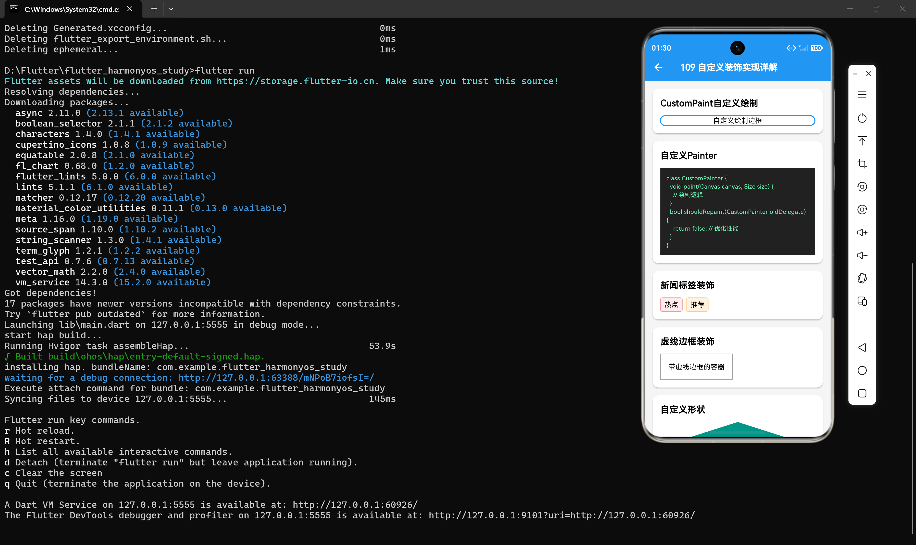
1.1 为什么需要自定义装饰
- 内置装饰无法满足特定设计需求
- 需要实现独特的视觉效果
- 需要复用复杂的装饰逻辑
- 需要实现动画和交互效果
1.2 两种自定义装饰方式
| 方式 | 接口 | 适用场景 | 复杂度 |
|---|---|---|---|
| CustomPainter | CustomPainter | 复杂绘制、动画 | 较高 |
| Decoration | Decoration + BoxPainter | 容器装饰、复用 | 中等 |
1.3 选择建议
- 如果需要复杂的绘制逻辑和动画:使用CustomPainter
- 如果需要作为容器装饰复用:使用Decoration接口
- 如果需要结合其他组件:使用CustomPaint组件
二、CustomPainter基础
2.1 CustomPaint组件
CustomPaint是一个Widget,用于在Canvas上绘制自定义内容:
CustomPaint({
  Key? key,
  this.painter,       // 背景绘制器(在子组件下方绘制)
  this.foregroundPainter, // 前景绘制器(在子组件上方绘制)
  this.size = Size.zero,  // 自定义尺寸
  this.isComplex = false, // 是否复杂绘制(用于优化)
  this.willChange = false, // 是否会变化(用于优化)
  Widget? child,      // 子组件
})
2.2 CustomPainter接口
要创建自定义绘制,需要实现CustomPainter接口:
abstract class CustomPainter extends Listenable {
  // 执行绘制
  void paint(Canvas canvas, Size size);

  // 是否需要重绘
  bool shouldRepaint(covariant CustomPainter oldDelegate);

  // 是否需要重新布局
  bool shouldRebuildSemantics(covariant CustomPainter oldDelegate) => true;
}
2.3 Canvas画布
Canvas提供了丰富的绘制API:
| 方法 | 功能 |
|---|---|
| drawLine | 绘制直线 |
| drawRect | 绘制矩形 |
| drawCircle | 绘制圆形 |
| drawRRect | 绘制圆角矩形 |
| drawPath | 绘制路径 |
| drawImage | 绘制图片 |
| drawText | 绘制文本 |
| drawShadow | 绘制阴影 |
2.4 Paint画笔
Paint用于配置绘制样式:
Paint paint = Paint()
  ..color = Colors.blue       // 颜色
  ..strokeWidth = 2          // 线宽
  ..style = PaintingStyle.stroke // 样式:stroke(描边)或fill(填充)
  ..blendMode = BlendMode.srcOver // 混合模式
  ..isAntiAlias = true;      // 抗锯齿
三、CustomPainter实战
3.1 自定义边框绘制器
class CustomBorderPainter extends CustomPainter {
final Color borderColor;
final double borderWidth;
final double borderRadius;
CustomBorderPainter({
required this.borderColor,
this.borderWidth = 2,
this.borderRadius = 8,
});
void paint(Canvas canvas, Size size) {
Paint paint = Paint()
..color = borderColor
..strokeWidth = borderWidth
..style = PaintingStyle.stroke
..isAntiAlias = true;
RRect rRect = RRect.fromRectAndRadius(
Rect.fromLTWH(0, 0, size.width, size.height),
Radius.circular(borderRadius),
);
canvas.drawRRect(rRect, paint);
}
bool shouldRepaint(CustomBorderPainter oldDelegate) {
return borderColor != oldDelegate.borderColor ||
borderWidth != oldDelegate.borderWidth ||
borderRadius != oldDelegate.borderRadius;
}
}
// 使用自定义边框
CustomPaint(
painter: CustomBorderPainter(
borderColor: Colors.blue,
borderWidth: 2,
borderRadius: 12,
),
child: Container(
width: 200,
height: 100,
alignment: Alignment.center,
child: const Text('自定义边框'),
),
)
3.2 虚线边框绘制器
class DashedBorderPainter extends CustomPainter {
final Color color;
final double dashWidth;
final double dashGap;
final double strokeWidth;
DashedBorderPainter({
required this.color,
this.dashWidth = 4,
this.dashGap = 4,
this.strokeWidth = 1,
});
void paint(Canvas canvas, Size size) {
Paint paint = Paint()
..color = color
..strokeWidth = strokeWidth
..style = PaintingStyle.stroke
..isAntiAlias = true;
Path path = Path();
// 上边
_drawDashedLine(canvas, path, paint, Offset(0, 0), Offset(size.width, 0));
// 右边
_drawDashedLine(canvas, path, paint, Offset(size.width, 0), Offset(size.width, size.height));
// 下边
_drawDashedLine(canvas, path, paint, Offset(size.width, size.height), Offset(0, size.height));
// 左边
_drawDashedLine(canvas, path, paint, Offset(0, size.height), Offset(0, 0));
}
void _drawDashedLine(Canvas canvas, Path path, Paint paint, Offset start, Offset end) {
double dx = end.dx - start.dx;
double dy = end.dy - start.dy;
double distance = sqrt(dx * dx + dy * dy);
double dashCount = distance / (dashWidth + dashGap);
for (int i = 0; i < dashCount; i++) {
double startOffset = i * (dashWidth + dashGap);
double endOffset = startOffset + dashWidth;
if (endOffset > distance) {
endOffset = distance;
}
double t1 = startOffset / distance;
double t2 = endOffset / distance;
Offset point1 = Offset(
start.dx + dx * t1,
start.dy + dy * t1,
);
Offset point2 = Offset(
start.dx + dx * t2,
start.dy + dy * t2,
);
canvas.drawLine(point1, point2, paint);
}
}
bool shouldRepaint(DashedBorderPainter oldDelegate) {
return color != oldDelegate.color ||
dashWidth != oldDelegate.dashWidth ||
dashGap != oldDelegate.dashGap ||
strokeWidth != oldDelegate.strokeWidth;
}
}
// 使用虚线边框
CustomPaint(
painter: DashedBorderPainter(
color: Colors.grey,
dashWidth: 6,
dashGap: 4,
),
child: Container(
width: 200,
height: 100,
alignment: Alignment.center,
child: const Text('虚线边框'),
),
)
3.3 渐变背景绘制器
class GradientBackgroundPainter extends CustomPainter {
final List<Color> colors;
final Alignment begin;
final Alignment end;
GradientBackgroundPainter({
required this.colors,
this.begin = Alignment.topLeft,
this.end = Alignment.bottomRight,
});
void paint(Canvas canvas, Size size) {
Paint paint = Paint()
..shader = LinearGradient(
colors: colors,
begin: begin,
end: end,
).createShader(Rect.fromLTWH(0, 0, size.width, size.height));
canvas.drawRect(Rect.fromLTWH(0, 0, size.width, size.height), paint);
}
bool shouldRepaint(GradientBackgroundPainter oldDelegate) {
return colors != oldDelegate.colors ||
begin != oldDelegate.begin ||
end != oldDelegate.end;
}
}
// 使用渐变背景
CustomPaint(
painter: GradientBackgroundPainter(
colors: [Colors.blue, Colors.purple],
begin: Alignment.topCenter,
end: Alignment.bottomCenter,
),
child: Container(
width: 200,
height: 100,
alignment: Alignment.center,
child: const Text(
'渐变背景',
style: TextStyle(color: Colors.white),
),
),
)
3.4 波浪背景绘制器
class WaveBackgroundPainter extends CustomPainter {
final Color color;
final double waveHeight;
WaveBackgroundPainter({
required this.color,
this.waveHeight = 20,
});
void paint(Canvas canvas, Size size) {
Paint paint = Paint()..color = color;
Path path = Path();
path.moveTo(0, size.height);
double waveWidth = size.width / 4;
for (int i = 0; i <= 4; i++) {
double x = i * waveWidth;
double y = size.height - waveHeight * (i % 2 == 0 ? 1 : 0);
if (i == 0) {
path.lineTo(x, y);
} else {
double controlX = (x + (i - 1) * waveWidth) / 2;
double controlY = size.height - waveHeight * ((i - 1) % 2 == 0 ? 1 : 0);
path.quadraticBezierTo(controlX, controlY, x, y);
}
}
path.lineTo(size.width, 0);
path.lineTo(0, 0);
path.close();
canvas.drawPath(path, paint);
}
bool shouldRepaint(WaveBackgroundPainter oldDelegate) {
return color != oldDelegate.color || waveHeight != oldDelegate.waveHeight;
}
}
// 使用波浪背景
CustomPaint(
painter: WaveBackgroundPainter(
color: Colors.blue,
waveHeight: 15,
),
child: Container(
width: 300,
height: 120,
alignment: Alignment.center,
child: const Text(
'波浪背景',
style: TextStyle(color: Colors.white, fontSize: 18),
),
),
)
四、Decoration接口自定义
4.1 Decoration接口
Decoration是一个抽象类,用于定义装饰:
abstract class Decoration {
  // 创建BoxPainter实例
  BoxPainter createBoxPainter([VoidCallback? onChanged]);

  // 获取装饰的边距
  EdgeInsetsGeometry get padding => EdgeInsets.zero;

  // 是否与另一个装饰相同
  bool debugAssertIsValid() => true;
}
4.2 BoxPainter抽象类
BoxPainter是实际执行绘制的类:
abstract class BoxPainter {
  // 执行绘制
  void paint(Canvas canvas, Offset offset, ImageConfiguration configuration);

  // 处理图片变化
  void dispose() {}
}
4.3 实现自定义Decoration的步骤
- 创建一个继承自Decoration的类
- 实现createBoxPainter方法,返回自定义BoxPainter
- 创建一个继承自BoxPainter的类
- 实现paint方法,执行实际绘制
- 在Container中使用自定义Decoration
五、自定义Decoration实战
5.1 新闻标签装饰
class NewsTagDecoration extends Decoration {
final Color color;
final Color borderColor;
final double borderRadius;
NewsTagDecoration({
required this.color,
required this.borderColor,
this.borderRadius = 4,
});
BoxPainter createBoxPainter([VoidCallback? onChanged]) {
return _NewsTagPainter(color, borderColor, borderRadius);
}
}
class _NewsTagPainter extends BoxPainter {
final Color color;
final Color borderColor;
final double borderRadius;
_NewsTagPainter(this.color, this.borderColor, this.borderRadius);
void paint(Canvas canvas, Offset offset, ImageConfiguration configuration) {
Rect rect = offset & configuration.size!;
RRect rRect = RRect.fromRectAndRadius(rect, Radius.circular(borderRadius));
// 绘制背景
canvas.drawRRect(rRect, Paint()..color = color);
// 绘制边框
canvas.drawRRect(rRect, Paint()
..color = borderColor
..style = PaintingStyle.stroke
..strokeWidth = 1);
}
}
// 使用新闻标签装饰
Container(
padding: const EdgeInsets.symmetric(horizontal: 8, vertical: 4),
decoration: NewsTagDecoration(
color: Colors.red[50]!,
borderColor: Colors.red[200]!,
borderRadius: 4,
),
child: const Text('热点', style: TextStyle(color: Colors.red, fontSize: 12)),
)
5.2 渐变边框装饰
class GradientBorderDecoration extends Decoration {
final List<Color> borderColors;
final double borderWidth;
final double borderRadius;
GradientBorderDecoration({
required this.borderColors,
this.borderWidth = 2,
this.borderRadius = 8,
});
BoxPainter createBoxPainter([VoidCallback? onChanged]) {
return _GradientBorderPainter(borderColors, borderWidth, borderRadius);
}
}
class _GradientBorderPainter extends BoxPainter {
final List<Color> borderColors;
final double borderWidth;
final double borderRadius;
_GradientBorderPainter(this.borderColors, this.borderWidth, this.borderRadius);
void paint(Canvas canvas, Offset offset, ImageConfiguration configuration) {
Rect rect = offset & configuration.size!;
RRect outerRRect = RRect.fromRectAndRadius(rect, Radius.circular(borderRadius));
RRect innerRRect = RRect.fromRectAndRadius(
rect.deflate(borderWidth),
Radius.circular(borderRadius - borderWidth / 2),
);
Paint paint = Paint()
..shader = LinearGradient(colors: borderColors).createShader(rect)
..style = PaintingStyle.stroke
..strokeWidth = borderWidth;
Path path = Path()
..addRRect(outerRRect)
..addRRect(innerRRect);
canvas.drawPath(path, paint);
}
}
// 使用渐变边框装饰
Container(
width: 200,
height: 100,
alignment: Alignment.center,
decoration: GradientBorderDecoration(
borderColors: [Colors.blue, Colors.purple],
borderWidth: 3,
borderRadius: 12,
),
child: const Text('渐变边框'),
)
5.3 虚线边框装饰
class DashedBorderDecoration extends Decoration {
final Color color;
final double dashWidth;
final double dashGap;
final double strokeWidth;
DashedBorderDecoration({
required this.color,
this.dashWidth = 4,
this.dashGap = 4,
this.strokeWidth = 1,
});
BoxPainter createBoxPainter([VoidCallback? onChanged]) {
return _DashedBorderPainter(color, dashWidth, dashGap, strokeWidth);
}
}
class _DashedBorderPainter extends BoxPainter {
final Color color;
final double dashWidth;
final double dashGap;
final double strokeWidth;
_DashedBorderPainter(this.color, this.dashWidth, this.dashGap, this.strokeWidth);
void paint(Canvas canvas, Offset offset, ImageConfiguration configuration) {
Rect rect = offset & configuration.size!;
Paint paint = Paint()
..color = color
..strokeWidth = strokeWidth
..style = PaintingStyle.stroke;
// 绘制四条边的虚线
_drawDashedLine(canvas, paint, rect.topLeft, rect.topRight);
_drawDashedLine(canvas, paint, rect.topRight, rect.bottomRight);
_drawDashedLine(canvas, paint, rect.bottomRight, rect.bottomLeft);
_drawDashedLine(canvas, paint, rect.bottomLeft, rect.topLeft);
}
void _drawDashedLine(Canvas canvas, Paint paint, Offset start, Offset end) {
double dx = end.dx - start.dx;
double dy = end.dy - start.dy;
double distance = sqrt(dx * dx + dy * dy);
double dashCount = distance / (dashWidth + dashGap);
for (int i = 0; i < dashCount; i++) {
double startOffset = i * (dashWidth + dashGap);
double endOffset = startOffset + dashWidth;
if (endOffset > distance) {
endOffset = distance;
}
double t1 = startOffset / distance;
double t2 = endOffset / distance;
canvas.drawLine(
Offset(start.dx + dx * t1, start.dy + dy * t1),
Offset(start.dx + dx * t2, start.dy + dy * t2),
paint,
);
}
}
}
// 使用虚线边框装饰
Container(
width: 200,
height: 100,
alignment: Alignment.center,
decoration: DashedBorderDecoration(
color: Colors.grey,
dashWidth: 6,
dashGap: 4,
strokeWidth: 1,
),
child: const Text('虚线边框'),
)
5.4 多重边框装饰
class MultiBorderDecoration extends Decoration {
final List<Color> borderColors;
final List<double> borderWidths;
final double borderRadius;
MultiBorderDecoration({
required this.borderColors,
required this.borderWidths,
this.borderRadius = 8,
});
BoxPainter createBoxPainter([VoidCallback? onChanged]) {
return _MultiBorderPainter(borderColors, borderWidths, borderRadius);
}
}
class _MultiBorderPainter extends BoxPainter {
final List<Color> borderColors;
final List<double> borderWidths;
final double borderRadius;
_MultiBorderPainter(this.borderColors, this.borderWidths, this.borderRadius);
void paint(Canvas canvas, Offset offset, ImageConfiguration configuration) {
Rect rect = offset & configuration.size!;
double totalWidth = borderWidths.reduce((a, b) => a + b);
Rect currentRect = rect;
for (int i = 0; i < borderColors.length && i < borderWidths.length; i++) {
RRect rRect = RRect.fromRectAndRadius(
currentRect,
Radius.circular(borderRadius - totalWidth / 2),
);
canvas.drawRRect(rRect, Paint()
..color = borderColors[i]
..style = PaintingStyle.stroke
..strokeWidth = borderWidths[i]);
currentRect = currentRect.deflate(borderWidths[i]);
totalWidth -= borderWidths[i];
}
}
}
// 使用多重边框装饰
Container(
width: 200,
height: 100,
alignment: Alignment.center,
decoration: MultiBorderDecoration(
borderColors: [Colors.blue, Colors.purple, Colors.red],
borderWidths: [3, 2, 1],
borderRadius: 12,
),
child: const Text('多重边框'),
)
六、CustomPaint与Decoration对比
6.1 功能对比
| 特性 | CustomPaint | Decoration |
|---|---|---|
| 绘制位置 | 可以在子组件上方或下方 | 只能在子组件下方 |
| 尺寸控制 | 需要手动设置size | 自动适应容器尺寸 |
| 复用性 | 需要包装为Widget | 可以直接在Container中使用 |
| 动画支持 | 容易实现 | 需要结合AnimatedContainer |
| 性能优化 | isComplex、willChange | 由框架自动处理 |
6.2 适用场景
// ✅ 需要复杂绘制和动画:使用CustomPaint
CustomPaint(
  painter: ComplexAnimationPainter(),
  child: ...
)

// ✅ 作为容器装饰复用:使用Decoration
Container(
  decoration: MyCustomDecoration(),
  child: ...
)

// ✅ 前景绘制:使用foregroundPainter
CustomPaint(
  foregroundPainter: OverlayPainter(),
  child: ...
)
七、自定义装饰动画
7.1 CustomPainter动画
class AnimatedWavePainter extends CustomPainter {
final Color color;
final double progress;
AnimatedWavePainter({
required this.color,
required this.progress,
});
void paint(Canvas canvas, Size size) {
Paint paint = Paint()..color = color;
Path path = Path();
path.moveTo(0, size.height);
double waveWidth = size.width / 4;
double waveHeight = 20 * progress;
for (int i = 0; i <= 4; i++) {
double x = i * waveWidth;
double y = size.height - waveHeight * (i % 2 == 0 ? 1 : 0);
if (i == 0) {
path.lineTo(x, y);
} else {
double controlX = (x + (i - 1) * waveWidth) / 2;
double controlY = size.height - waveHeight * ((i - 1) % 2 == 0 ? 1 : 0);
path.quadraticBezierTo(controlX, controlY, x, y);
}
}
path.lineTo(size.width, 0);
path.lineTo(0, 0);
path.close();
canvas.drawPath(path, paint);
}
bool shouldRepaint(AnimatedWavePainter oldDelegate) {
return color != oldDelegate.color || progress != oldDelegate.progress;
}
}
// 使用动画
class WaveAnimationPage extends StatefulWidget {
const WaveAnimationPage({super.key});
State<WaveAnimationPage> createState() => _WaveAnimationPageState();
}
class _WaveAnimationPageState extends State<WaveAnimationPage>
with SingleTickerProviderStateMixin {
late AnimationController _controller;
late Animation<double> _animation;
void initState() {
super.initState();
_controller = AnimationController(
duration: const Duration(seconds: 2),
vsync: this,
)..repeat(reverse: true);
_animation = Tween<double>(begin: 0.3, end: 1).animate(_controller);
}
void dispose() {
_controller.dispose();
super.dispose();
}
Widget build(BuildContext context) {
return Scaffold(
body: Center(
child: AnimatedBuilder(
animation: _animation,
builder: (context, child) {
return CustomPaint(
size: const Size(300, 150),
painter: AnimatedWavePainter(
color: Colors.blue,
progress: _animation.value,
),
child: const Center(
child: Text('波浪动画', style: TextStyle(color: Colors.white)),
),
);
},
),
),
);
}
}
7.2 Decoration动画
// 使用AnimatedContainer实现装饰动画
AnimatedContainer(
  duration: const Duration(milliseconds: 300),
  width: 200,
  height: 100,
  decoration: NewsTagDecoration(
    color: _isActive ? Colors.blue[100]! : Colors.grey[100]!,
    borderColor: _isActive ? Colors.blue : Colors.grey,
    borderRadius: _isActive ? 12 : 4,
  ),
  child: const Center(child: Text('装饰动画')),
)
八、性能优化建议
8.1 使用shouldRepaint优化
// ✅ 推荐:精确判断是否需要重绘
bool shouldRepaint(CustomBorderPainter oldDelegate) {
return borderColor != oldDelegate.borderColor ||
borderWidth != oldDelegate.borderWidth ||
borderRadius != oldDelegate.borderRadius;
}
// ❌ 不推荐:总是重绘
bool shouldRepaint(CustomBorderPainter oldDelegate) => true;
8.2 使用isComplex和willChange
// 对于复杂绘制,提示框架进行优化
CustomPaint(
  isComplex: true,      // 复杂绘制,启用缓存
  willChange: false,    // 不会频繁变化,启用缓存
  painter: ComplexPainter(),
)
8.3 使用RepaintBoundary
// 隔离重绘区域,避免不必要的重绘
RepaintBoundary(
  child: CustomPaint(
    painter: ComplexPainter(),
  ),
)
8.4 避免在paint方法中创建对象
// ❌ 不推荐:在paint中创建对象
void paint(Canvas canvas, Size size) {
Paint paint = Paint()..color = Colors.blue; // 每次都创建新对象
canvas.drawRect(..., paint);
}
// ✅ 推荐:在构造函数中创建对象
class MyPainter extends CustomPainter {
final Paint _paint;
MyPainter() : _paint = Paint()..color = Colors.blue;
void paint(Canvas canvas, Size size) {
canvas.drawRect(..., _paint); // 复用paint对象
}
}
九、综合实战案例
9.1 自定义进度条
class ProgressBarPainter extends CustomPainter {
final double progress;
final Color backgroundColor;
final Color progressColor;
final double borderRadius;
ProgressBarPainter({
required this.progress,
required this.backgroundColor,
required this.progressColor,
this.borderRadius = 4,
});
void paint(Canvas canvas, Size size) {
// 绘制背景
RRect backgroundRRect = RRect.fromRectAndRadius(
Rect.fromLTWH(0, 0, size.width, size.height),
Radius.circular(borderRadius),
);
canvas.drawRRect(backgroundRRect, Paint()..color = backgroundColor);
// 绘制进度
double progressWidth = size.width * progress;
RRect progressRRect = RRect.fromRectAndRadius(
Rect.fromLTWH(0, 0, progressWidth, size.height),
Radius.circular(borderRadius),
);
canvas.drawRRect(progressRRect, Paint()..color = progressColor);
}
bool shouldRepaint(ProgressBarPainter oldDelegate) {
return progress != oldDelegate.progress ||
backgroundColor != oldDelegate.backgroundColor ||
progressColor != oldDelegate.progressColor;
}
}
// 使用进度条
CustomPaint(
size: const Size(200, 8),
painter: ProgressBarPainter(
progress: 0.7,
backgroundColor: Colors.grey[300]!,
progressColor: Colors.blue,
borderRadius: 4,
),
)
9.2 自定义徽章装饰
class BadgeDecoration extends Decoration {
final int count;
final Color badgeColor;
final Color textColor;
BadgeDecoration({
required this.count,
this.badgeColor = Colors.red,
this.textColor = Colors.white,
});
BoxPainter createBoxPainter([VoidCallback? onChanged]) {
return _BadgePainter(count, badgeColor, textColor);
}
}
class _BadgePainter extends BoxPainter {
final int count;
final Color badgeColor;
final Color textColor;
_BadgePainter(this.count, this.badgeColor, this.textColor);
void paint(Canvas canvas, Offset offset, ImageConfiguration configuration) {
// 绘制徽章背景
double badgeSize = 20;
Offset badgeOffset = Offset(
configuration.size!.width - badgeSize / 2,
-badgeSize / 2,
);
canvas.drawCircle(badgeOffset, badgeSize / 2, Paint()..color = badgeColor);
// 绘制徽章文字
TextPainter textPainter = TextPainter(
text: TextSpan(
text: count > 99 ? '99+' : count.toString(),
style: TextStyle(color: textColor, fontSize: 12, fontWeight: FontWeight.bold),
),
textDirection: TextDirection.ltr,
textAlign: TextAlign.center,
);
textPainter.layout();
textPainter.paint(
canvas,
Offset(
badgeOffset.dx - textPainter.width / 2,
badgeOffset.dy - textPainter.height / 2,
),
);
}
}
// 使用徽章装饰
Container(
width: 40,
height: 40,
decoration: BadgeDecoration(count: 5),
child: const Icon(Icons.notifications),
)
9.3 渐变角标装饰
class CornerDecoration extends Decoration {
final List<Color> colors;
final String text;
final Color textColor;
CornerDecoration({
required this.colors,
required this.text,
this.textColor = Colors.white,
});
BoxPainter createBoxPainter([VoidCallback? onChanged]) {
return _CornerPainter(colors, text, textColor);
}
}
class _CornerPainter extends BoxPainter {
final List<Color> colors;
final String text;
final Color textColor;
_CornerPainter(this.colors, this.text, this.textColor);
void paint(Canvas canvas, Offset offset, ImageConfiguration configuration) {
Size size = configuration.size!;
double triangleSize = 60;
// 绘制三角形背景
Path path = Path()
..moveTo(size.width, 0)
..lineTo(size.width, triangleSize)
..lineTo(size.width - triangleSize, 0)
..close();
Paint paint = Paint()
..shader = LinearGradient(colors: colors).createShader(
Rect.fromLTWH(size.width - triangleSize, 0, triangleSize, triangleSize),
);
canvas.drawPath(path, paint);
// 绘制文字
TextPainter textPainter = TextPainter(
text: TextSpan(
text: text,
style: TextStyle(color: textColor, fontSize: 10, fontWeight: FontWeight.bold),
),
textDirection: TextDirection.ltr,
);
textPainter.layout();
canvas.save();
canvas.rotate(-3.1415926 / 4);
textPainter.paint(
canvas,
Offset(
(size.width - triangleSize / 2) - textPainter.width / 2,
triangleSize / 2 - textPainter.height / 2,
),
);
canvas.restore();
}
}
// 使用角标装饰
Container(
width: 200,
height: 150,
decoration: CornerDecoration(
colors: [Colors.red, Colors.orange],
text: 'HOT',
),
child: const Center(child: Text('商品卡片')),
)
十、关键要点总结
- CustomPainter适合复杂绘制:需要Canvas API实现复杂视觉效果
- Decoration适合容器装饰:可以在Container中直接使用,易于复用
- shouldRepaint是性能关键:正确实现可以避免不必要的重绘
- 避免在paint中创建对象:会导致频繁的内存分配和垃圾回收
- 使用isComplex和willChange优化:提示框架进行缓存
- 动画使用AnimatedBuilder:避免不必要的重建
- RepaintBoundary隔离重绘:提高整体性能
十一、常见问题
11.1 绘制内容不显示
// 检查事项:
// 1. CustomPaint是否设置了size或有child
// 2. 坐标是否在可视范围内
// 3. Paint颜色是否与背景相同

CustomPaint(
  size: const Size(100, 100), // 必须设置尺寸或有child
  painter: MyPainter(),
)
11.2 动画不流畅
// 优化建议:
// 1. 实现shouldRepaint
// 2. 使用AnimatedBuilder
// 3. 避免在paint中做复杂计算
bool shouldRepaint(MyPainter oldDelegate) {
return progress != oldDelegate.progress; // 精确判断
}
11.3 自定义Decoration不生效
// 检查事项:
// 1. 是否实现了createBoxPainter
// 2. BoxPainter的paint方法是否正确
// 3. 是否返回了正确的BoxPainter实例
class MyDecoration extends Decoration {
BoxPainter createBoxPainter([VoidCallback? onChanged]) {
return _MyPainter(); // 必须返回BoxPainter实例
}
}
参考资料
- Flutter官方文档:https://api.flutter.dev/flutter/rendering/CustomPainter-class.html
- CustomPaint文档:https://api.flutter.dev/flutter/widgets/CustomPaint-class.html
- Decoration文档:https://api.flutter.dev/flutter/painting/Decoration-class.html
- BoxPainter文档:https://api.flutter.dev/flutter/painting/BoxPainter-class.html
- Canvas文档:https://api.flutter.dev/flutter/dart-ui/Canvas-class.html

作为“人工智能6S店”的官方数字引擎,为AI开发者与企业提供一个覆盖软硬件全栈、一站式门户。
更多推荐
 1
1 0
0- 0


 已为社区贡献9条内容

所有评论(0)