
鸿蒙 ArkUI 进阶:@Builder 和 @BuilderParam,把重复 UI 抽成「乐高块」的正确姿势
鸿蒙 ArkUI 进阶:@Builder 和 @BuilderParam,把重复 UI 抽成「乐高块」的正确姿势
写在前面
如果你写 ArkUI 写过两个页面以上,大概率遇到过这个场景:
商品列表页有一张商品卡片,订单页也有一张商品卡片,用户中心还有一张。三张卡片长得九成相似,就右下角那个按钮不一样——列表页是「+购物车」,订单页是「立即购买」,用户中心是「详情」。
这时候你的代码通常会有两种走向:
- 复制粘贴派:把卡片代码在三处各贴一份,按钮部分各改各的。一周后设计改了卡片圆角,你改了三遍,漏改一处,被设计当场逮住。
- 过度抽象派:把卡片抽成一个
@Component,按钮行为通过回调函数注入。写完发现 ArkUI 的@Component不支持把方法当参数传,只能套@BuilderParam,然后你开始查文档,查到本文。
本文就讲清楚:ArkUI 里抽 UI 块复用,该用 @Builder,要定制按钮行为就用 @BuilderParam。这两个装饰器是鸿蒙 ArkUI 声明式 UI 的复用基石,搞懂它们你就能像拼乐高一样攒页面。
代码托管在 AtomGit,文末有链接,真机实拍截图作证。
适合人群:写过 ArkUI、被「同一卡片贴三遍」折磨过的同学。 不适合人群:还在学
@State的新手——出门左转看我的入门篇。
一、先讲清楚:@Builder 到底是个啥
一句话:@Builder 是把一段 UI 抽成函数的能力。
你之前写 UI 只能写在 build() 方法里,一旦 UI 长了,build() 就臃肿到没人想看。@Builder 让你把一段 UI 抽出来命名,像调函数一样调它。
最小例子:
@Builder
function PriceTag(price: number) {
  Text(`¥ ${price}`).fontColor('#FF4D4F').fontWeight(FontWeight.Bold)
}

@Entry
@Component
struct Index {
  build() {
    Column() {
      PriceTag(89)    // 像调函数一样调
      PriceTag(129)
    }
  }
}
PriceTag 就是一个 UI 块,你可以在任意 build() 里调它。这比 @Component 轻得多——@Component 要声明 struct、要导出、要管生命周期;@Builder 就是个函数,写完就用。
两种 @Builder 写法
| 写法 | 位置 | 作用域 | 何时用 |
|---|---|---|---|
全局 @Builder function Foo() |
组件外 | 任意页面都能调 | 跨页面复用,放工具文件 |
组件内 @Builder Foo() |
struct 里 | 只本组件能调 | 只本页用,不导出 |
本 demo 两种都演示了,往下看。
二、@BuilderParam:插槽,把按钮行为交给调用方
@Builder 解决了「UI 块复用」,但有个场景它搞不定:UI 块里有一部分想留给调用方决定。
比如商品卡片:标题、价格、标签是固定的(复用),但右下角按钮想由调用方决定(一个要「+购物车」,一个要「立即购买」)。这时候就用 @BuilderParam——它是个插槽。
@Component
export struct ProductCardWithSlot {
  item: Product = new Product()
  // @BuilderParam 插槽:调用方传一段 UI 进来,渲染在右下角
  @BuilderParam actionSlot: () => void = this.defaultAction

  // 默认插槽内容:调用方没传就显示「详情」按钮
  @Builder defaultAction() {
    Button('详情').backgroundColor('#eee').fontColor('#333')
  }

  build() {
    Row({ space: 12 }) {
      Column({ space: 6 }) {
        Text(this.item.name).fontSize(16).fontWeight(FontWeight.Bold)
        Text(`¥ ${this.item.price}`).fontColor('#FF4D4F')
        Text(this.item.tag).fontSize(11).fontColor('#888')
      }
      .alignItems(HorizontalAlign.Start).layoutWeight(1)
      // 插槽渲染:调用方传什么按钮,这里就显示什么
      this.actionSlot()
    }
    .padding(14).backgroundColor('#fff').borderRadius(10)
  }
}
调用方用的时候:
ProductCardWithSlot({
  item: p,
  actionSlot: this.addToCartBtn   // 传「+购物车」builder 进来
})
actionSlot 接收的是一个 @Builder 函数,渲染时 this.actionSlot() 就把它插进去。如果调用方没传,用默认的 defaultAction 显示「详情」按钮。
一个新手必踩的坑
@BuilderParam 的类型必须是 () => void(无参函数)。很多人第一次写,传的 builder 带参数:
// ❌ 错:builder 带参,类型不匹配
@Builder addToCartBtn(item: Product) { ... }
ProductCardWithSlot({ actionSlot: this.addToCartBtn })   // 编译报错

// ✅ 对:builder 无参,要操作的数据通过组件属性访问
@Builder addToCartBtn() { ... }
为啥?因为 @BuilderParam 是「插槽」,它只负责「渲染什么 UI」,不负责「传什么数据」。数据要通过组件的属性(item: Product)传,插槽只管 UI。这个边界要划清。
三、动手:一个商品列表的三种复用姿势
demo 做了三件事,对应三种复用模式:
- 全局
@Builder:抽ProductCard成全局函数,任意页面能调 - 组件 +
@BuilderParam插槽:ProductCardWithSlot组件,按钮行为由调用方定制 - 本页面内
@Builder:只在本页用的轻量 builder,不导出
3.1 数据模型
class Product {
  name: string = ''
  price: number = 0
  tag: string = ''
  Product() {}
  set(name: string, price: number, tag: string): Product {
    this.name = name
    this.price = price
    this.tag = tag
    return this
  }
}
这里用 class + 工厂方法 set,而不是 interface 字面量。原因是 ForEach 在给子组件传引用时,class 实例的属性改动能触发 @State 重绘,interface 字面量做不到。新手最容易踩的坑之一。
3.2 全局 @Builder:商品卡片
@Builder
function ProductCard(item: Product) {
  Row({ space: 12 }) {
    Column({ space: 6 }) {
      Text(item.name).fontSize(16).fontWeight(FontWeight.Bold).fontColor('#222')
      Text(`¥ ${item.price}`).fontSize(14).fontColor('#FF4D4F').fontWeight(FontWeight.Bold)
      Text(item.tag).fontSize(11).fontColor('#888')
    }
    .alignItems(HorizontalAlign.Start).layoutWeight(1)
  }
  .width('100%').padding(14).backgroundColor('#fff').borderRadius(10)
  .margin({ bottom: 8 })
}
这就是个纯 UI 块,没有任何交互逻辑。调它就是 ProductCard(someProduct),返回一段 UI。
3.3 带插槽的组件
@Component
export struct ProductCardWithSlot {
  item: Product = new Product()
  @BuilderParam actionSlot: () => void = this.defaultAction

  @Builder defaultAction() {
    Button('详情').fontSize(12).backgroundColor('#eee').fontColor('#333')
  }

  build() {
    Row({ space: 12 }) {
      Column({ space: 6 }) {
        Text(this.item.name).fontSize(16).fontWeight(FontWeight.Bold).fontColor('#222')
        Text(`¥ ${this.item.price}`).fontSize(14).fontColor('#FF4D4F').fontWeight(FontWeight.Bold)
        Text(this.item.tag).fontSize(11).fontColor('#888')
      }
      .alignItems(HorizontalAlign.Start).layoutWeight(1)
      this.actionSlot()
    }
    .width('100%').padding(14).backgroundColor('#fff').borderRadius(10)
    .margin({ bottom: 8 })
  }
}
3.4 主页面:三种姿势同台展示
@Entry
@Component
struct Index {
  @State products: Product[] = []

  aboutToAppear(): void {
    this.products = [
      new Product().set('鸿蒙开发实战', 89, '畅销'),
      new Product().set('ArkUI 进阶指南', 129, '新书'),
      new Product().set('DevEco Studio 全解', 79, '推荐')
    ]
  }

  // 三种按钮 builder,插槽用
  @Builder addToCartBtn() {
    Button('+ 购物车').fontSize(12).backgroundColor('#007DFF').fontColor('#fff')
  }
  @Builder buyNowBtn() {
    Button('立即购买').fontSize(12).backgroundColor('#FF4D4F').fontColor('#fff')
  }
  @Builder detailBtn() {
    Button('详情').fontSize(12).backgroundColor('#eee').fontColor('#333')
  }

  build() {
    Column({ space: 12 }) {
      Text('@Builder 复用 Demo').fontSize(22).fontWeight(FontWeight.Bold).margin({ top: 16 })

      // 模式 ①:全局 @Builder 直接调(无按钮)
      List({ space: 8 }) {
        ForEach(this.products, (p: Product, idx: number) => {
          ListItem() { ProductCard(p) }
        }, (p: Product, idx: number) => `plain-${idx}`)
      }

      // 模式 ②:组件 + @BuilderParam 插槽(每张卡片按钮行为不同)
      List({ space: 8 }) {
        ForEach(this.products, (p: Product, idx: number) => {
          ListItem() {
            ProductCardWithSlot({
              item: p,
              actionSlot: idx === 0 ? this.addToCartBtn
                : (idx === 1 ? this.buyNowBtn : this.detailBtn)
            })
          }
        }, (p: Product, idx: number) => `slot-${idx}`)
      }

      // 模式 ③:本页面内 @Builder(轻量复用)
      Row({ space: 8 }) {
        this.addToCartBtn()
        this.buyNowBtn()
        this.detailBtn()
      }
    }
    .padding(16).backgroundColor('#F5F6F8').height('100%').width('100%')
  }
}
四、真机实拍:三种复用姿势跑起来长这样
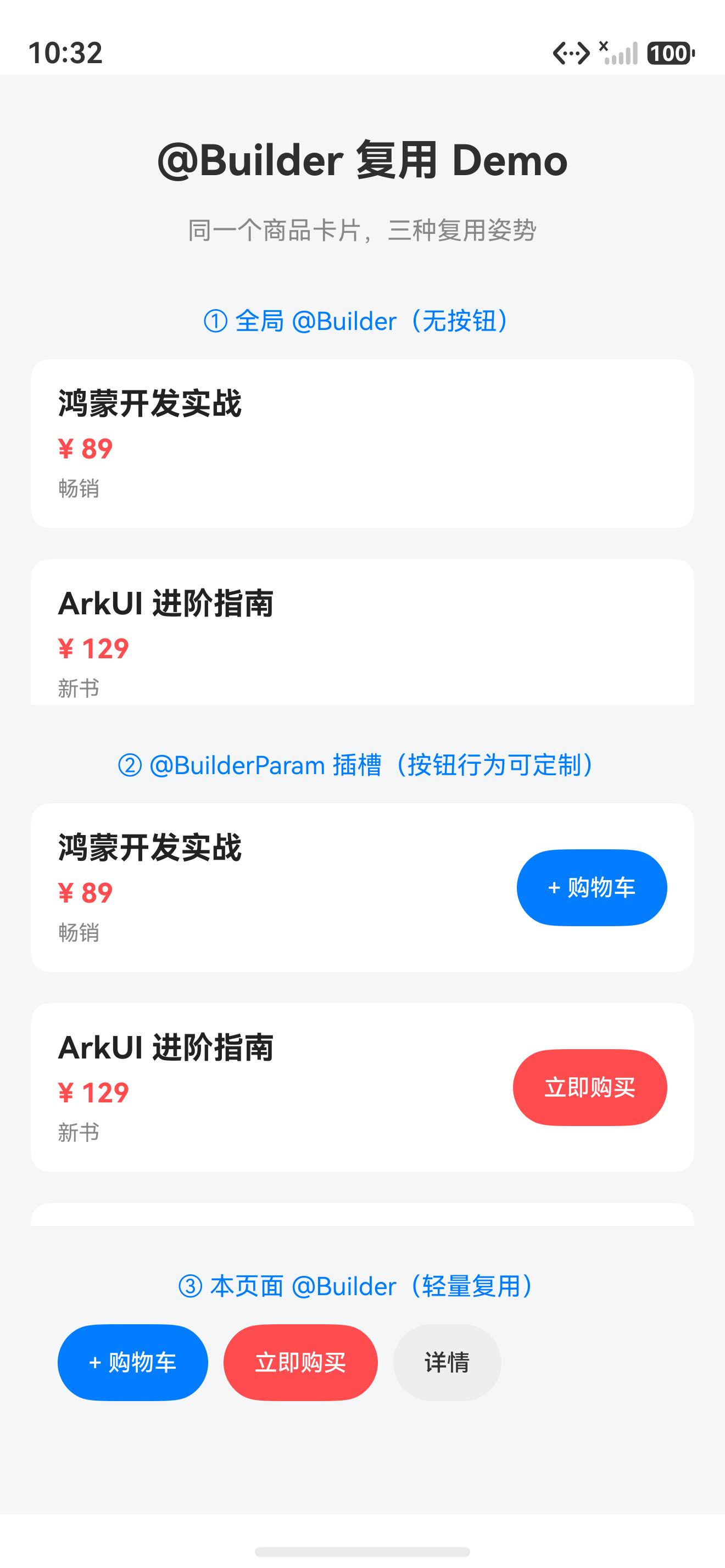
我把这个 demo 装到真机上跑(鸿蒙 6.1.1.125, API 24),下面两张都是真机实拍,没有任何 P 图。
整体效果:三个区块依次展示「全局 Builder」「插槽 Builder」「本页 Builder」三种复用姿势:
第二段插槽列表特写:同一张商品卡片,三种不同按钮行为(购物车/立即购买/详情)共存:
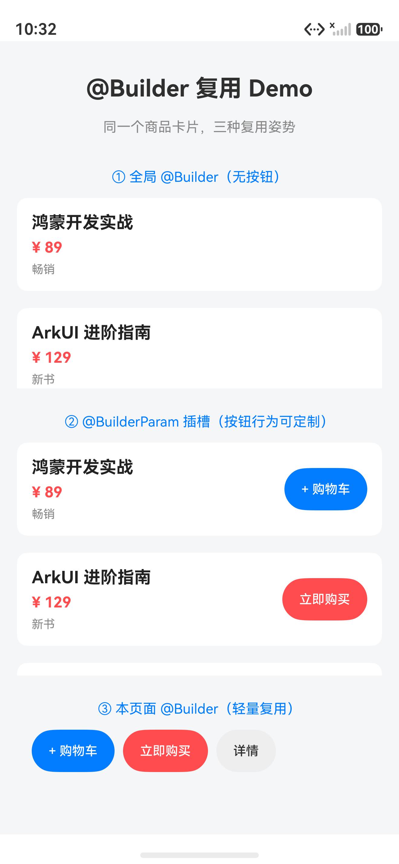
重点看第二张图:三张卡片的标题、价格、标签样式完全一致(复用成功),但右下角按钮分别是「+购物车」「立即购买」「详情」——这就是
@BuilderParam插槽的威力,一份卡片样式,N 种按钮行为。
五、@Builder vs @Component:啥时候用哪个
新手最容易纠结的问题:既然 @Builder 能抽 UI,那还要 @Component 干啥?
答案一句话:@Builder 抽 UI,@Component 抽「UI + 状态 + 生命周期」。
| 维度 | @Builder |
@Component |
|---|---|---|
能有 @State 吗 |
不能 | 能 |
能有生命周期(aboutToAppear 等)吗 |
不能 | 能 |
能被 @BuilderParam 当插槽用吗 |
能(作为插槽内容) | 不能 |
| 调用开销 | 轻(就是个函数) | 重(创建组件实例) |
| 何时用 | 纯 UI 块,无独立状态 | 有独立状态、生命周期 |
一句话决策:不需要独立状态就用 @Builder,需要独立状态就用 @Component。
六、常见坑(都是血泪)
| 坑 | 症状 | 解法 |
|---|---|---|
@BuilderParam builder 带参 |
编译报错「类型不匹配」 | builder 无参,数据通过组件属性传 |
全局 @Builder 写在 struct 里 |
编译报错「只能在组件外声明全局」 | 全局 builder 写在文件顶层,struct 外 |
@Builder 里改 @State |
界面不刷新 | @Builder 不能有 @State,状态归宿主组件管 |
插槽传 undefined |
编译报错 | 传默认 builder 或不传(用 @BuilderParam 的默认值) |
@Builder 当方法调忘写 this. |
运行报错找不到 | 组件内 builder 调用要 this.foo(),全局才能 Foo() |
七、完整代码仓库
本文所有代码都已托管到 AtomGit,欢迎 clone、提 issue、点 star:
🔗 仓库地址:https://atomgit.com/JaneConan/arkui-builder-reuse
仓库包含:
- 完整的「商品卡片三种复用姿势」demo 工程
Index.ets主页面(全局 Builder、插槽组件、本页 Builder 三种模式)Product数据模型 +ProductCardWithSlot带插槽组件- 可直接用 DevEco Studio 打开运行
八、下一步该学什么?
跑通这个 demo 之后,你的 ArkUI 复用就入门了。建议按这个顺序往下:
@Extend:扩展原生组件样式,比给Button套一层样式更优雅@Styles:统一定义一组样式属性,多组件共用@BuilderParam多插槽:一个组件可以开多个插槽(头部 + 尾部 + 侧边)@Link+@Builder组合:父组件状态变,插槽内容跟着变
写在最后
@Builder 和 @BuilderParam 的关系,本质是**「不变的 UI 块」和「可变的插槽」的分离**。这个思想在前端圈叫 slots,在鸿蒙圈叫 @BuilderParam,名字不同灵魂相通。
一旦你开始用插槽思维写 UI,你会发现大部分页面都能拆成「一张骨架 + 几个插槽」。代码量少一半,改动只改一处,设计逮不住你漏改。
代码已经给你了,仓库链接在上面。现在关掉这篇文章,打开 DevEco Studio,把 demo 跑起来,亲手改一个插槽按钮试试。
跑通了,回来评论区打个「1」,我看看有多少人真的动手了。🚀
作者:JaneConan 仓库:https://atomgit.com/JaneConan/arkui-builder-reuse 协议:Apache-2.0,随便用,别告我

作为“人工智能6S店”的官方数字引擎,为AI开发者与企业提供一个覆盖软硬件全栈、一站式门户。
更多推荐


 5
5 0
0- 0


 已为社区贡献12条内容

所有评论(0)