
鸿蒙Flutter 圆角与阴影详解:BorderRadius、BoxShadow及多层阴影效果
·
引言
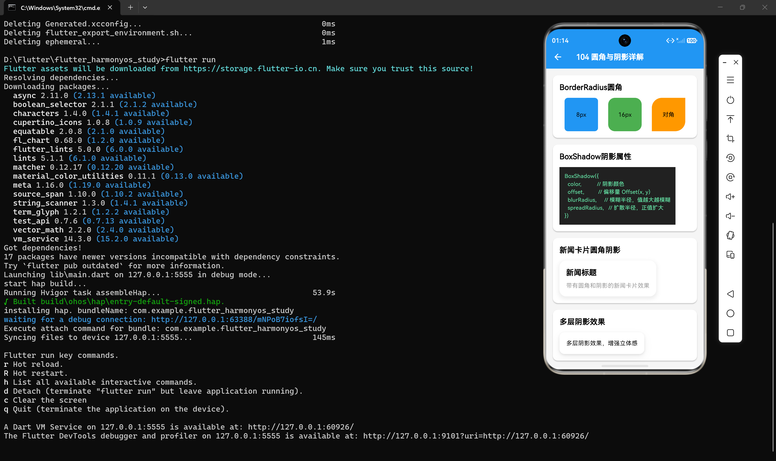
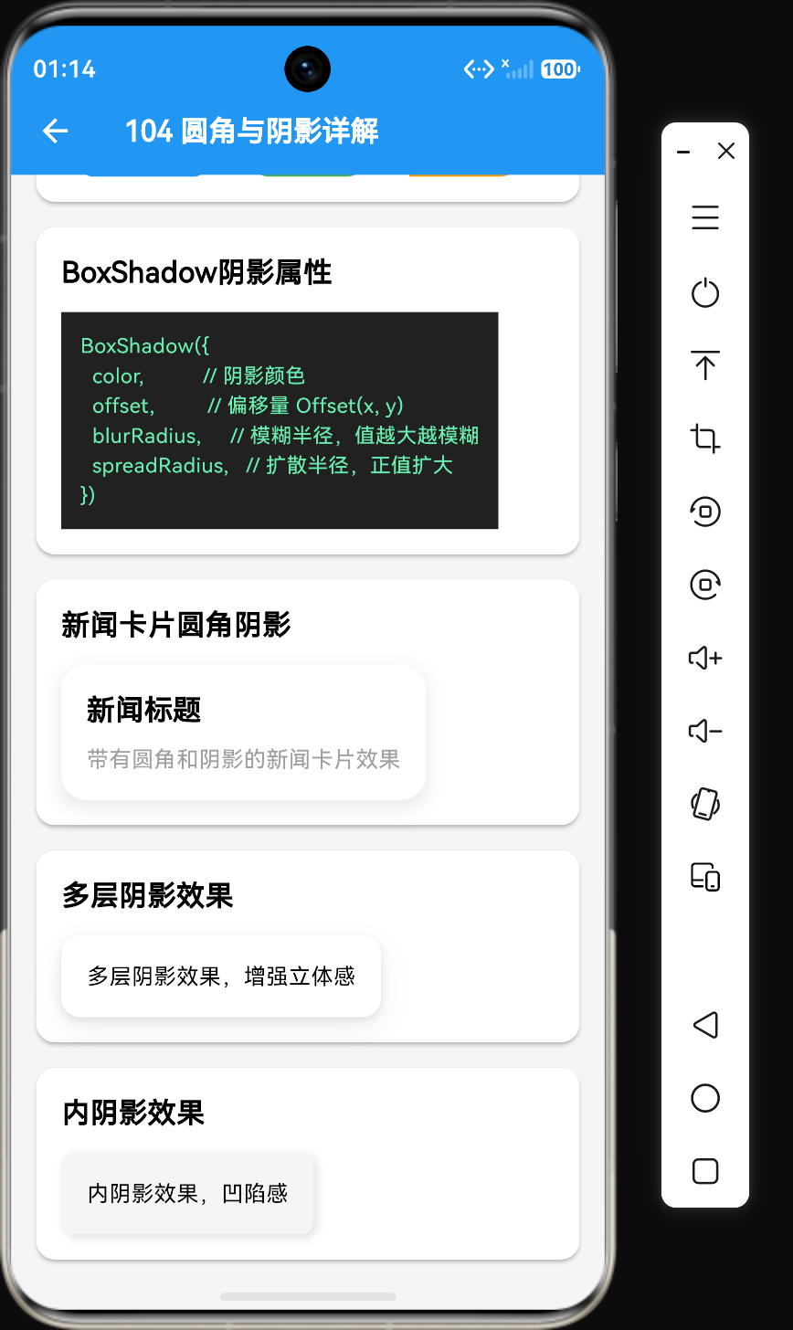
在Flutter开发中,圆角和阴影是提升UI视觉层次的重要手段。合理使用圆角可以使界面更加柔和友好,而阴影则能够营造立体感和深度。本文将详细介绍BorderRadius和BoxShadow的使用方法,以及如何通过多层阴影创建复杂的视觉效果。
一、BorderRadius圆角详解
1.1 基础概念
圆角是指将矩形的角替换为圆弧。在Flutter中,圆角通过BorderRadius类实现,它支持多种圆角设置方式。
1.2 BorderRadius构造函数
// 统一圆角
BorderRadius.circular(double radius)

// 分别设置四个角
BorderRadius.only({
  Radius? topLeft,
  Radius? topRight,
  Radius? bottomLeft,
  Radius? bottomRight,
})

// 对称圆角
BorderRadius.symmetric({
  Radius? horizontal,
  Radius? vertical,
})

// 精确设置每个角
BorderRadius(
  Radius topLeft,
  Radius topRight,
  Radius bottomLeft,
  Radius bottomRight,
)
1.3 圆角设置示例
// 统一圆角
Container(
  width: 80,
  height: 80,
  decoration: BoxDecoration(
    color: Colors.blue,
    borderRadius: BorderRadius.circular(8),
  ),
)

// 对称圆角
Container(
  width: 80,
  height: 80,
  decoration: BoxDecoration(
    color: Colors.green,
    borderRadius: BorderRadius.circular(16),
  ),
)

// 对角圆角
Container(
  width: 80,
  height: 80,
  decoration: BoxDecoration(
    color: Colors.orange,
    borderRadius: BorderRadius.only(
      topLeft: Radius.circular(24),
      bottomRight: Radius.circular(24),
    ),
  ),
)

// 不同圆角
Container(
  width: 80,
  height: 80,
  decoration: BoxDecoration(
    color: Colors.purple,
    borderRadius: BorderRadius.only(
      topLeft: Radius.circular(8),
      topRight: Radius.circular(16),
      bottomLeft: Radius.circular(24),
      bottomRight: Radius.circular(32),
    ),
  ),
)
1.4 Radius类
Radius类定义了单个角的圆角大小:
// 圆形圆角
Radius.circular(8)

// 椭圆圆角(X轴和Y轴不同)
Radius.elliptical(8, 16)
1.5 常见圆角值参考
| 圆角值 | 视觉效果 | 适用场景 |
|---|---|---|
| 4px | 轻微圆角 | 输入框、按钮 |
| 8px | 中等圆角 | 卡片、对话框 |
| 12px | 较大圆角 | 卡片、容器 |
| 16px | 大圆角 | 卡片、弹窗 |
| 24px+ | 超大圆角 | 胶囊按钮、标签 |
二、BoxShadow阴影详解
2.1 构造函数
BoxShadow({
  Color color = const Color(0xFF000000),  // 阴影颜色
  Offset offset = Offset.zero,              // 阴影偏移量
  double blurRadius = 0.0,                  // 模糊半径
  double spreadRadius = 0.0,               // 扩散半径
  BlurStyle blurStyle = BlurStyle.normal,   // 模糊样式
})
2.2 属性说明
| 属性 | 说明 | 默认值 |
|---|---|---|
| color | 阴影颜色,通常使用透明度 | Colors.black |
| offset | 阴影偏移量,(x, y) | Offset(0, 0) |
| blurRadius | 模糊半径,值越大越模糊 | 0.0 |
| spreadRadius | 扩散半径,正值扩大阴影范围,负值缩小 | 0.0 |
| blurStyle | 模糊样式 | BlurStyle.normal |
2.3 基础阴影示例
// 基础阴影
Container(
  padding: EdgeInsets.all(16),
  decoration: BoxDecoration(
    color: Colors.white,
    boxShadow: [
      BoxShadow(
        color: Colors.black.withOpacity(0.2),
        offset: Offset(0, 2),
        blurRadius: 4,
      ),
    ],
  ),
  child: Text('基础阴影效果'),
)

// 带扩散的阴影
Container(
  padding: EdgeInsets.all(16),
  decoration: BoxDecoration(
    color: Colors.white,
    boxShadow: [
      BoxShadow(
        color: Colors.black.withOpacity(0.15),
        offset: Offset(0, 4),
        blurRadius: 8,
        spreadRadius: 2,
      ),
    ],
  ),
  child: Text('带扩散的阴影'),
)
2.4 BlurStyle模糊样式
BlurStyle枚举定义了三种模糊样式:
// 正常模糊(默认)
BoxShadow(blurStyle: BlurStyle.normal)

// 实心模糊(边缘清晰)
BoxShadow(blurStyle: BlurStyle.solid)

// 外模糊(向外扩散)
BoxShadow(blurStyle: BlurStyle.outer)

// 内模糊(向内收缩)
BoxShadow(blurStyle: BlurStyle.inner)
三、新闻卡片圆角阴影实战
3.1 基础新闻卡片
Container(
  padding: EdgeInsets.all(16),
  decoration: BoxDecoration(
    color: Colors.white,
    borderRadius: BorderRadius.circular(16),
    boxShadow: [
      BoxShadow(
        color: Colors.grey.withOpacity(0.2),
        offset: Offset(0, 4),
        blurRadius: 8,
        spreadRadius: 2,
      ),
    ],
  ),
  child: Column(
    crossAxisAlignment: CrossAxisAlignment.start,
    children: [
      Text('新闻标题', style: TextStyle(fontSize: 18, fontWeight: FontWeight.bold)),
      SizedBox(height: 8),
      Text('带有圆角和阴影的新闻卡片效果', style: TextStyle(color: Colors.grey)),
    ],
  ),
)
3.2 悬浮卡片效果
Container(
  padding: EdgeInsets.all(16),
  decoration: BoxDecoration(
    color: Colors.white,
    borderRadius: BorderRadius.circular(16),
    boxShadow: [
      BoxShadow(
        color: Colors.black.withOpacity(0.05),
        offset: Offset(0, 1),
        blurRadius: 2,
        spreadRadius: 1,
      ),
      BoxShadow(
        color: Colors.black.withOpacity(0.08),
        offset: Offset(0, 4),
        blurRadius: 8,
        spreadRadius: 2,
      ),
      BoxShadow(
        color: Colors.black.withOpacity(0.1),
        offset: Offset(0, 12),
        blurRadius: 16,
        spreadRadius: 4,
      ),
    ],
  ),
  child: Column(
    crossAxisAlignment: CrossAxisAlignment.start,
    children: [
      Text('悬浮卡片效果', style: TextStyle(fontSize: 18, fontWeight: FontWeight.bold)),
      SizedBox(height: 8),
      Text('多层阴影营造立体悬浮感', style: TextStyle(color: Colors.grey)),
    ],
  ),
)
四、多层阴影效果
4.1 多层阴影原理
通过添加多个BoxShadow可以实现复杂的阴影效果,每个阴影按照添加顺序依次绘制。
BoxDecoration(
  color: Colors.white,
  boxShadow: [
    BoxShadow(
      color: Colors.black.withOpacity(0.1),
      offset: Offset(0, 2),
      blurRadius: 4,
    ),
    BoxShadow(
      color: Colors.black.withOpacity(0.05),
      offset: Offset(0, 8),
      blurRadius: 16,
    ),
  ],
)
4.2 投影阴影效果
Container(
  padding: EdgeInsets.all(16),
  decoration: BoxDecoration(
    color: Colors.white,
    borderRadius: BorderRadius.circular(12),
    boxShadow: [
      BoxShadow(
        color: Colors.black.withOpacity(0.1),
        offset: Offset(0, 2),
        blurRadius: 4,
      ),
      BoxShadow(
        color: Colors.black.withOpacity(0.05),
        offset: Offset(0, 8),
        blurRadius: 16,
      ),
    ],
  ),
  child: Text('多层阴影效果,增强立体感'),
)
4.3 彩色阴影效果
Container(
  padding: EdgeInsets.all(16),
  decoration: BoxDecoration(
    color: Colors.white,
    borderRadius: BorderRadius.circular(12),
    boxShadow: [
      BoxShadow(color: Colors.blue, blurRadius: 10, offset: Offset(2, 2)),
      BoxShadow(color: Colors.purple, blurRadius: 10, offset: Offset(-2, -2)),
    ],
  ),
  child: Text('彩色阴影效果'),
)
4.4 发光阴影效果
Container(
  padding: EdgeInsets.all(16),
  decoration: BoxDecoration(
    color: Colors.blue,
    borderRadius: BorderRadius.circular(12),
    boxShadow: [
      BoxShadow(
        color: Colors.blue.withOpacity(0.5),
        blurRadius: 20,
        spreadRadius: 5,
      ),
    ],
  ),
  child: Text('发光阴影效果', style: TextStyle(color: Colors.white)),
)
五、内阴影效果
5.1 内阴影实现原理
内阴影通过反向偏移和颜色对比实现凹陷感:
Container(
  padding: EdgeInsets.all(16),
  decoration: BoxDecoration(
    color: Colors.grey[100],
    borderRadius: BorderRadius.circular(8),
    boxShadow: [
      BoxShadow(
        color: Colors.white,
        offset: Offset(-2, -2),
        blurRadius: 4,
      ),
      BoxShadow(
        color: Colors.grey[300]!,
        offset: Offset(2, 2),
        blurRadius: 4,
      ),
    ],
  ),
  child: Text('内阴影效果,凹陷感'),
)
5.2 按钮凹陷效果
Container(
  padding: EdgeInsets.symmetric(horizontal: 24, vertical: 12),
  decoration: BoxDecoration(
    color: Colors.grey[200],
    borderRadius: BorderRadius.circular(8),
    boxShadow: [
      BoxShadow(
        color: Colors.white,
        offset: Offset(-1, -1),
        blurRadius: 2,
      ),
      BoxShadow(
        color: Colors.grey[400]!,
        offset: Offset(1, 1),
        blurRadius: 2,
      ),
    ],
  ),
  child: Text('凹陷按钮'),
)
5.3 凸起效果
Container(
  padding: EdgeInsets.symmetric(horizontal: 24, vertical: 12),
  decoration: BoxDecoration(
    color: Colors.grey[200],
    borderRadius: BorderRadius.circular(8),
    boxShadow: [
      BoxShadow(
        color: Colors.grey[400]!,
        offset: Offset(-1, -1),
        blurRadius: 2,
      ),
      BoxShadow(
        color: Colors.white,
        offset: Offset(1, 1),
        blurRadius: 2,
      ),
    ],
  ),
  child: Text('凸起效果'),
)
六、圆角与阴影的组合技巧
6.1 圆角卡片带阴影
Container(
  margin: EdgeInsets.symmetric(horizontal: 16, vertical: 8),
  padding: EdgeInsets.all(16),
  decoration: BoxDecoration(
    color: Colors.white,
    borderRadius: BorderRadius.circular(12),
    boxShadow: [
      BoxShadow(
        color: Colors.grey.withOpacity(0.2),
        offset: Offset(0, 4),
        blurRadius: 8,
        spreadRadius: 2,
      ),
    ],
  ),
  child: Column(
    crossAxisAlignment: CrossAxisAlignment.start,
    children: [
      Text('新闻标题', style: TextStyle(fontSize: 18, fontWeight: FontWeight.bold)),
      SizedBox(height: 8),
      Text('新闻内容摘要...'),
    ],
  ),
)
6.2 圆角按钮带阴影
Container(
  padding: EdgeInsets.symmetric(horizontal: 32, vertical: 12),
  decoration: BoxDecoration(
    color: Colors.blue,
    borderRadius: BorderRadius.circular(24),
    boxShadow: [
      BoxShadow(
        color: Colors.blue.withOpacity(0.3),
        offset: Offset(0, 4),
        blurRadius: 8,
      ),
    ],
  ),
  child: Text('圆角按钮', style: TextStyle(color: Colors.white)),
)
6.3 圆角图片带阴影
Container(
  margin: EdgeInsets.all(8),
  decoration: BoxDecoration(
    borderRadius: BorderRadius.circular(12),
    boxShadow: [
      BoxShadow(
        color: Colors.black.withOpacity(0.3),
        offset: Offset(0, 4),
        blurRadius: 8,
      ),
    ],
  ),
  child: ClipRRect(
    borderRadius: BorderRadius.circular(12),
    child: Image.network(
      'https://picsum.photos/400/200',
      fit: BoxFit.cover,
    ),
  ),
)
七、性能优化建议
7.1 减少阴影数量
过多的阴影会显著影响性能:
// ❌ 不良示例:过多阴影
BoxDecoration(
  boxShadow: [
    BoxShadow(color: Colors.black, blurRadius: 10),
    BoxShadow(color: Colors.grey, blurRadius: 20),
    BoxShadow(color: Colors.blue, blurRadius: 30),
  ],
)

// ✅ 优化后:控制阴影数量
BoxDecoration(
  boxShadow: [
    BoxShadow(color: Colors.black.withOpacity(0.2), blurRadius: 4),
  ],
)
7.2 降低模糊半径
较大的blurRadius会增加渲染开销:
// ❌ 不良示例:过大的模糊半径
BoxShadow(blurRadius: 30)

// ✅ 优化后:合理的模糊半径
BoxShadow(blurRadius: 8)
7.3 使用透明度
使用透明度代替深色阴影,可以减少视觉突兀感:
// ✅ 推荐
BoxShadow(color: Colors.black.withOpacity(0.15))

// ❌ 不推荐
BoxShadow(color: Colors.grey[400]!)
7.4 使用缓存
将不变的装饰提取为常量:
// 定义常量
const cardDecoration = BoxDecoration(
  color: Colors.white,
  borderRadius: BorderRadius.circular(12),
  boxShadow: [
    BoxShadow(
      color: Colors.black.withOpacity(0.15),
      blurRadius: 8,
      offset: Offset(0, 4),
    ),
  ],
);

// 使用常量
Container(decoration: cardDecoration)
八、响应式圆角与阴影
8.1 根据屏幕尺寸调整
Container(
  decoration: BoxDecoration(
    borderRadius: BorderRadius.circular(
      MediaQuery.of(context).size.width > 600 ? 16 : 12,
    ),
    boxShadow: [
      BoxShadow(
        color: Colors.black.withOpacity(0.15),
        blurRadius: MediaQuery.of(context).size.width > 600 ? 12 : 8,
        offset: Offset(0, 4),
      ),
    ],
  ),
)
8.2 使用LayoutBuilder
LayoutBuilder(
  builder: (context, constraints) {
    double borderRadius = constraints.maxWidth > 600 ? 16 : 12;
    double blurRadius = constraints.maxWidth > 600 ? 12 : 8;

    return Container(
      decoration: BoxDecoration(
        borderRadius: BorderRadius.circular(borderRadius),
        boxShadow: [
          BoxShadow(
            color: Colors.black.withOpacity(0.15),
            blurRadius: blurRadius,
            offset: Offset(0, 4),
          ),
        ],
      ),
    );
  },
)
九、动画效果
9.1 圆角动画
AnimatedContainer(
  duration: Duration(milliseconds: 300),
  padding: EdgeInsets.all(16),
  decoration: BoxDecoration(
    color: Colors.blue,
    borderRadius: _isRounded ? BorderRadius.circular(24) : BorderRadius.circular(4),
  ),
  child: Text('圆角动画', style: TextStyle(color: Colors.white)),
)
9.2 阴影动画
AnimatedContainer(
  duration: Duration(milliseconds: 300),
  padding: EdgeInsets.all(16),
  decoration: BoxDecoration(
    color: Colors.white,
    boxShadow: _isHovered
        ? [
            BoxShadow(
              color: Colors.black.withOpacity(0.2),
              blurRadius: 12,
              offset: Offset(0, 6),
            ),
          ]
        : [
            BoxShadow(
              color: Colors.black.withOpacity(0.1),
              blurRadius: 4,
              offset: Offset(0, 2),
            ),
          ],
  ),
  child: Text('阴影动画'),
)
十、总结
通过本文的学习,我们掌握了圆角和阴影的核心用法:
- BorderRadius:通过circular、only、symmetric等方法设置圆角
- BoxShadow:通过color、offset、blurRadius、spreadRadius控制阴影效果
- 多层阴影:通过多个BoxShadow叠加实现复杂效果
- 内阴影:通过反向偏移和颜色对比实现凹陷感
- 组合技巧:圆角与阴影的搭配使用
- 性能优化:减少阴影数量、降低模糊半径、使用缓存
圆角和阴影是Flutter中实现精美UI效果的重要工具,掌握好它们的使用技巧对于构建高质量的用户界面至关重要。在实际开发中,应根据需求合理组合各种效果,同时注意性能优化。
参考资料
- Flutter官方文档:https://api.flutter.dev/flutter/painting/BorderRadius-class.html
- BoxShadow文档:https://api.flutter.dev/flutter/painting/BoxShadow-class.html
- Radius文档:https://api.flutter.dev/flutter/painting/Radius-class.html

作为“人工智能6S店”的官方数字引擎,为AI开发者与企业提供一个覆盖软硬件全栈、一站式门户。
更多推荐

 9
9 0
0- 0


 已为社区贡献8条内容

所有评论(0)