
鸿蒙 Flutter 渐变效果详解:LinearGradient、RadialGradient、SweepGradient
·
引言
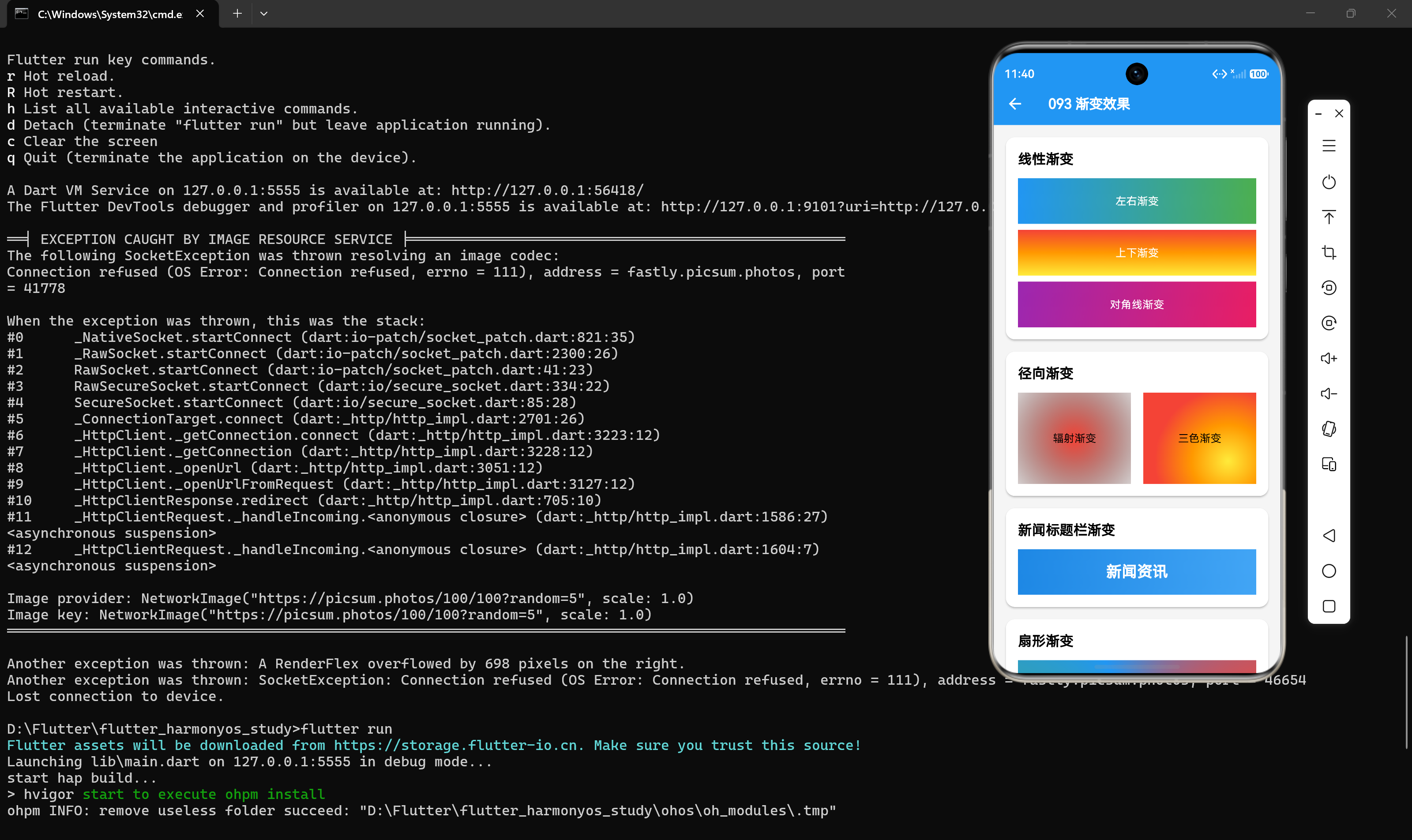
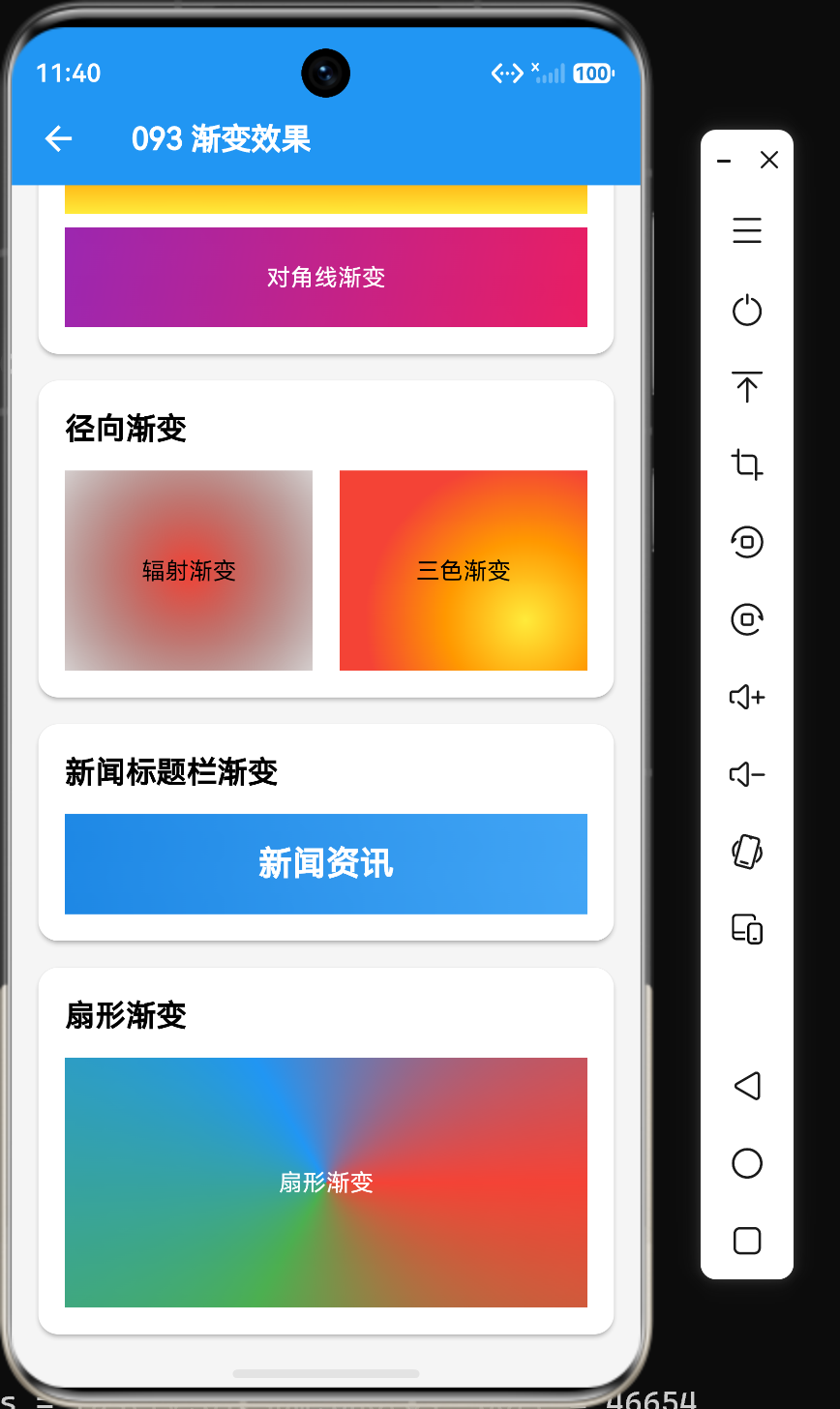
在Flutter开发中,渐变效果是提升UI视觉吸引力的重要手段。Flutter提供了三种渐变类型:LinearGradient(线性渐变)、RadialGradient(径向渐变)和SweepGradient(扇形渐变)。本文将深入解析这三种渐变的核心属性和使用技巧,并通过实际案例展示如何在新闻资讯应用中应用渐变效果。
一、LinearGradient线性渐变
1.1 基础用法
LinearGradient是最常用的渐变类型,沿着一条直线从一个点渐变到另一个点:
BoxDecoration(
  gradient: LinearGradient(
    colors: [Colors.blue, Colors.green],
    begin: Alignment.left,
    end: Alignment.right,
  ),
)
1.2 核心属性
LinearGradient的核心属性:
| 属性 | 类型 | 默认值 | 说明 |
|---|---|---|---|
| colors | List<Color> | - | 颜色列表 |
| begin | Alignment | Alignment.centerLeft | 起始位置 |
| end | Alignment | Alignment.centerRight | 结束位置 |
| stops | List<double>? | null | 颜色停止点 |
| tileMode | TileMode | TileMode.clamp | 平铺模式 |
| transform | GradientTransform? | null | 变换 |
1.3 方向控制
通过begin和end属性控制渐变方向:
// 从左到右
LinearGradient(
  colors: [Colors.blue, Colors.green],
  begin: Alignment.left,
  end: Alignment.right,
)

// 从上到下
LinearGradient(
  colors: [Colors.red, Colors.orange, Colors.yellow],
  begin: Alignment.topCenter,
  end: Alignment.bottomCenter,
)

// 对角线
LinearGradient(
  colors: [Colors.purple, Colors.pink],
  begin: Alignment.topLeft,
  end: Alignment.bottomRight,
)
1.4 颜色停止点
通过stops属性精确控制颜色分布:
LinearGradient(
  colors: [Colors.blue, Colors.white, Colors.blue],
  stops: [0.0, 0.5, 1.0],
)
1.5 新闻标题栏渐变
Container(
  height: 60,
  decoration: BoxDecoration(
    gradient: LinearGradient(
      colors: [Colors.blue.shade600, Colors.blue.shade400],
      begin: Alignment.centerLeft,
      end: Alignment.centerRight,
    ),
  ),
  child: const Center(
    child: Text(
      "新闻资讯",
      style: TextStyle(color: Colors.white, fontSize: 20, fontWeight: FontWeight.bold),
    ),
  ),
)
二、RadialGradient径向渐变
2.1 基础用法
RadialGradient从中心点向外辐射渐变:
BoxDecoration(
  gradient: RadialGradient(
    colors: [Colors.red, Colors.transparent],
    center: Alignment.center,
    radius: 1.0,
  ),
)
2.2 核心属性
RadialGradient的核心属性:
| 属性 | 类型 | 默认值 | 说明 |
|---|---|---|---|
| colors | List<Color> | - | 颜色列表 |
| center | Alignment | Alignment.center | 圆心位置 |
| radius | double | 0.5 | 半径 |
| stops | List<double>? | null | 颜色停止点 |
| focal | Alignment? | null | 焦点位置 |
| focalRadius | double | 0.0 | 焦点半径 |
| tileMode | TileMode | TileMode.clamp | 平铺模式 |
2.3 焦点控制
通过focal属性设置渐变焦点:
RadialGradient(
  colors: [Colors.blue, Colors.green],
  center: Alignment.center,
  radius: 1.0,
  focal: Alignment(0.2, 0.2),
  focalRadius: 0.2,
)
2.4 三色径向渐变
RadialGradient(
  colors: [Colors.yellow, Colors.orange, Colors.red],
  center: Alignment(0.5, 0.5),
  radius: 0.8,
)
2.5 按钮点击效果
Container(
  width: 200,
  height: 200,
  decoration: BoxDecoration(
    gradient: RadialGradient(
      colors: [Colors.blue, Colors.blue.shade200],
      center: Alignment.center,
      radius: 1.0,
    ),
    borderRadius: BorderRadius.circular(20),
  ),
)
三、SweepGradient扇形渐变
3.1 基础用法
SweepGradient从中心向外扇形辐射渐变:
BoxDecoration(
  gradient: SweepGradient(
    colors: [Colors.red, Colors.green, Colors.blue, Colors.red],
    center: Alignment.center,
    startAngle: 0.0,
    endAngle: 2 * 3.1415926,
  ),
)
3.2 核心属性
SweepGradient的核心属性:
| 属性 | 类型 | 默认值 | 说明 |
|---|---|---|---|
| colors | List<Color> | - | 颜色列表 |
| center | Alignment | Alignment.center | 中心位置 |
| startAngle | double | 0.0 | 起始角度(弧度) |
| endAngle | double | 2π | 结束角度(弧度) |
| stops | List<double>? | null | 颜色停止点 |
| transform | GradientTransform? | null | 变换 |
3.3 角度控制
// 半扇形渐变
SweepGradient(
  colors: [Colors.red, Colors.orange, Colors.yellow],
  center: Alignment.center,
  startAngle: 0.0,
  endAngle: 3.1415926,
)
3.4 时钟效果
Container(
  width: 150,
  height: 150,
  decoration: BoxDecoration(
    shape: BoxShape.circle,
    gradient: SweepGradient(
      colors: [
        Colors.red, Colors.orange, Colors.yellow,
        Colors.green, Colors.blue, Colors.purple,
      ],
      center: Alignment.center,
      startAngle: 0.0,
      endAngle: 2 * 3.1415926,
    ),
  ),
)
四、TileMode平铺模式
4.1 TileMode枚举值
| 值 | 说明 |
|---|---|
| clamp | 超出范围使用边缘颜色填充 |
| repeat | 重复渐变 |
| mirror | 镜像重复渐变 |
| decal | 超出范围透明 |
4.2 平铺模式示例
LinearGradient(
  colors: [Colors.blue, Colors.green],
  tileMode: TileMode.repeat,
)
五、渐变与其他装饰组合
5.1 渐变+圆角+阴影
BoxDecoration(
  gradient: LinearGradient(
    colors: [Colors.blue.shade600, Colors.blue.shade400],
  ),
  borderRadius: BorderRadius.circular(12),
  boxShadow: [
    BoxShadow(
      color: Colors.blue.withOpacity(0.3),
      blurRadius: 10,
      offset: Offset(0, 4),
    ),
  ],
)
5.2 渐变遮罩效果
Stack(
  children: [
    Image.network("https://example.com/image.jpg"),
    Container(
      decoration: BoxDecoration(
        gradient: LinearGradient(
          colors: [Colors.transparent, Colors.black.withOpacity(0.7)],
          begin: Alignment.topCenter,
          end: Alignment.bottomCenter,
        ),
      ),
    ),
    Align(
      alignment: Alignment.bottomCenter,
      child: Text("图片标题", style: TextStyle(color: Colors.white)),
    ),
  ],
)
六、新闻卡片渐变实战
6.1 带渐变背景的新闻卡片
Container(
  padding: EdgeInsets.all(16),
  decoration: BoxDecoration(
    gradient: LinearGradient(
      colors: [Colors.blue.shade50, Colors.blue.shade100],
    ),
    borderRadius: BorderRadius.circular(12),
    border: Border.all(color: Colors.blue.shade200),
  ),
  child: Column(
    crossAxisAlignment: CrossAxisAlignment.start,
    children: [
      Text("新闻标题", style: TextStyle(fontSize: 18, fontWeight: FontWeight.bold)),
      SizedBox(height: 8),
      Text("新闻内容描述..."),
    ],
  ),
)
6.2 图片渐变叠加卡片
Container(
  height: 200,
  decoration: BoxDecoration(
    image: DecorationImage(
      image: NetworkImage("https://example.com/news.jpg"),
      fit: BoxFit.cover,
    ),
    borderRadius: BorderRadius.circular(12),
  ),
  child: Container(
    decoration: BoxDecoration(
      gradient: LinearGradient(
        colors: [Colors.transparent, Colors.black.withOpacity(0.7)],
        begin: Alignment.topCenter,
        end: Alignment.bottomCenter,
      ),
    ),
    child: Align(
      alignment: Alignment.bottomLeft,
      child: Padding(
        padding: EdgeInsets.all(16),
        child: Text(
          "新闻标题",
          style: TextStyle(color: Colors.white, fontSize: 18, fontWeight: FontWeight.bold),
        ),
      ),
    ),
  ),
)
七、性能优化建议
7.1 减少颜色数量
// 不良示例:过多颜色
LinearGradient(colors: [Colors.red, Colors.orange, Colors.yellow, Colors.green, Colors.blue])

// 优化后:精简颜色
LinearGradient(colors: [Colors.red, Colors.blue])
7.2 使用const构造函数
// 优化后
const LinearGradient(colors: [Colors.blue, Colors.green])
7.3 避免复杂变换
// 避免不必要的transform
LinearGradient(
  colors: [Colors.blue, Colors.green],
  // transform: ... // 避免不必要的变换
)
八、总结
通过本文的学习,我们掌握了三种渐变效果的核心用法:
- LinearGradient:线性渐变,适用于背景、按钮等场景
- RadialGradient:径向渐变,适用于光晕、按钮点击效果等场景
- SweepGradient:扇形渐变,适用于仪表盘、时钟等场景
渐变效果可以显著提升UI的视觉吸引力,但也要注意性能优化,避免过度使用复杂渐变。在实际开发中,应根据需求选择合适的渐变类型,并合理组合其他装饰效果。
参考资料
- Flutter官方文档:https://api.flutter.dev/flutter/painting/Gradient-class.html
- LinearGradient文档:https://api.flutter.dev/flutter/painting/LinearGradient-class.html
- RadialGradient文档:https://api.flutter.dev/flutter/painting/RadialGradient-class.html
- SweepGradient文档:https://api.flutter.dev/flutter/painting/SweepGradient-class.html

作为“人工智能6S店”的官方数字引擎,为AI开发者与企业提供一个覆盖软硬件全栈、一站式门户。
更多推荐


 5
5 0
0- 0


 已为社区贡献14条内容

所有评论(0)