
鸿蒙原生开发手记:徒步迹 - Toast/Snackbar 提示组件
·
鸿蒙原生开发手记:徒步迹 - Toast/Snackbar 提示组件
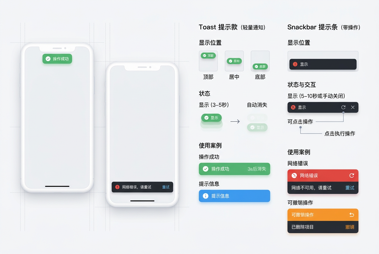
实现轻量级的提示消息组件
前言
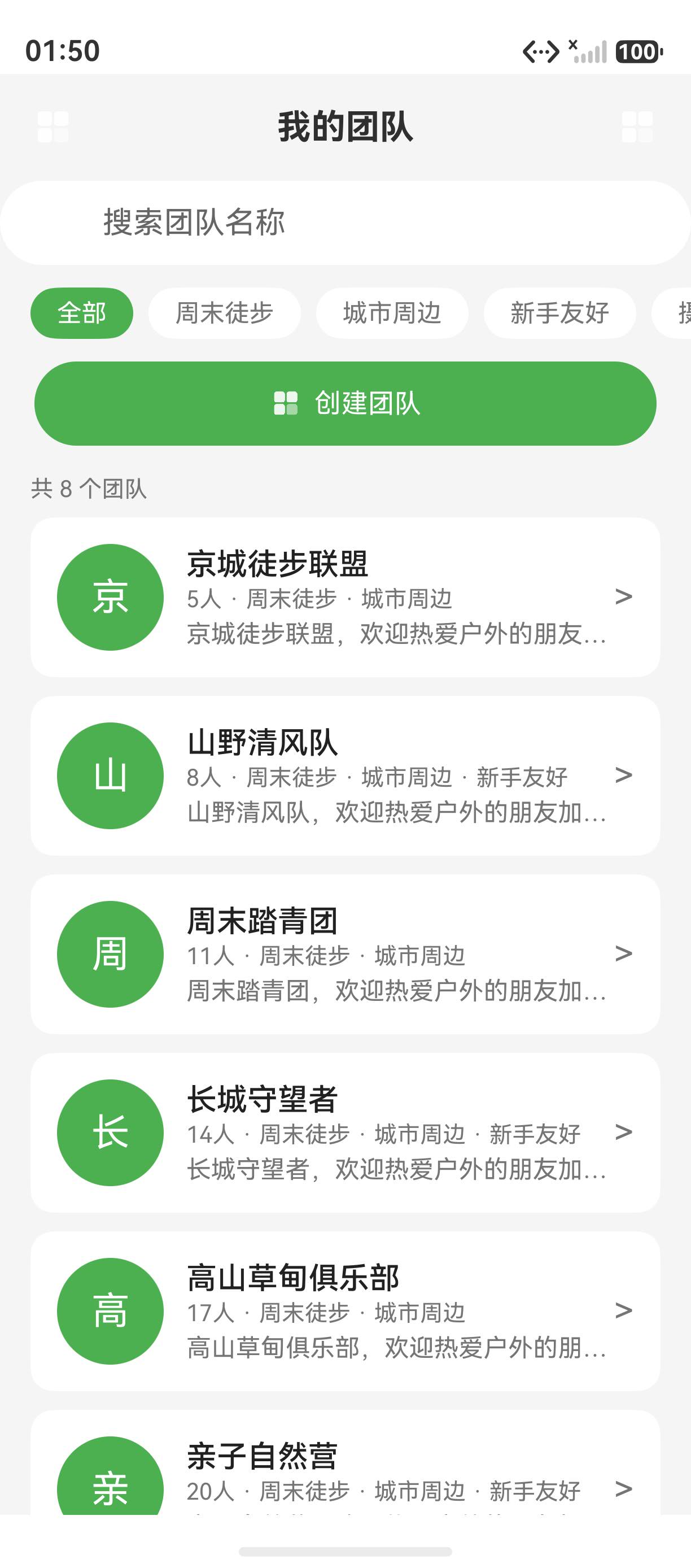
Toast 和 Snackbar 是移动应用中最常用的轻量级提示组件。HarmonyOS 的 promptAction 提供了 showToast 方法,Snackbar 则可以通过自定义组件实现。徒步迹封装了统一的提示组件,用于操作反馈、错误提示等场景。
一、Toast 提示
import { promptAction } from '@kit.ArkUI';

class ToastUtil {
  // 成功提示
  static success(message: string): void {
    promptAction.showToast({
      message: `✅ ${message}`,
      duration: 2000,
    });
  }

  // 错误提示
  static error(message: string): void {
    promptAction.showToast({
      message: `❌ ${message}`,
      duration: 3000,
    });
  }

  // 警告提示
  static warning(message: string): void {
    promptAction.showToast({
      message: `⚠️ ${message}`,
      duration: 2500,
    });
  }

  // 信息提示
  static info(message: string): void {
    promptAction.showToast({
      message: `ℹ️ ${message}`,
      duration: 2000,
    });
  }
}
二、Snackbar 组件
@Component
export struct Snackbar {
  @State message: string = '';
  @State visible: boolean = false;
  @State actionText: string = '';
  private actionCallback: (() => void) | null = null;

  build() {
    Column() {
      if (this.visible) {
        Row() {
          Text(this.message).fontSize(14).fontColor(Color.White)
            .layoutWeight(1);

          if (this.actionText) {
            Text(this.actionText).fontSize(14).fontColor('#4CAF50')
              .fontWeight(FontWeight.Bold).margin({ left: 12 })
              .onClick(() => {
                this.actionCallback?.();
                this.hide();
              });
          }
        }
        .width('90%').padding(16)
        .backgroundColor('#323232').borderRadius(8)
        .position({ bottom: 80 }).alignSelf(ItemAlign.Center)
        .transition({ translate: { y: 100 }, opacity: 0, duration: 300 });
      }
    }
    .width('100%').height('100%');
  }

  show(options: { message: string; actionText?: string; action?: () => void }): void {
    this.message = options.message;
    this.actionText = options.actionText || '';
    this.actionCallback = options.action || null;
    this.visible = true;
    setTimeout(() => this.hide(), 3000);
  }

  hide(): void {
    this.visible = false;
  }
}
三、总结
Toast 和 Snackbar 是移动应用中不可或缺的轻量级提示组件。通过封装统一的提示工具类,徒步迹实现了简洁一致的操作反馈体验。
总结
本文围绕“徒步迹“应用的实际开发场景,系统讲解了相关技术的实现要点。通过代码实战+原理剖析的方式,帮助开发者快速掌握 HarmonyOS NEXT 的核心开发能力。
总结要点
- 理解 HarmonyOS NEXT 应用架构与 Ability 生命周期
- 掌握 ArkUI 声明式 UI 的状态管理与组件化开发
- 熟悉常用 Kit 能力(Map Kit、Location Kit、Camera Kit 等)的接入方式
- 学会性能优化、内存管理、并发编程等进阶技巧
- 具备从 0 到 1 构建完整 HarmonyOS 应用工程的能力
核心特性回顾
- 声明式 UI:ArkUI 提供简洁高效的声明式开发范式
- 状态管理:@State、@Prop、@Link、@Provide、@Consume 等装饰器
- 跨组件通信:通过 Provide/Consume 实现跨层级数据传递
- 原生能力:通过 Kit 接入系统能力(地图、定位、相机等)
- 性能优化:LazyForEach、虚拟列表、Skeleton 骨架屏等
学习建议:技术学习重在实践,建议结合项目源码同步动手操作,遇到问题多查阅HarmonyOS 官方文档。
下一篇预告:鸿蒙原生开发手记:徒步迹 - 持续更新中
如果这篇文章对你有帮助,欢迎点赞👍、收藏⭐、关注🔔,你的支持是我持续创作的动力!
相关资源:
- 开源鸿蒙跨平台社区:https://openharmonycrossplatform.csdn.net
- HarmonyOS 官方文档:https://developer.huawei.com/consumer/cn//
- OpenHarmony 开源项目:https://www.openharmony.cn/
- ArkUI 组件参考:https://developer.huawei.com/consumer/cn/doc/harmonyos-guides/arkts-ui-development
- 徒步迹项目源码:GitHub - hiking-trail-harmonyos
- DevEco Studio 下载:https://developer.huawei.com/consumer/cn/deveco-studio/
- ArkTS 语言指南:https://developer.huawei.com/consumer/cn/doc/harmonyos-guides/arkts-overview
- 系列文章导航:CSDN 博客 - 鸿蒙原生开发手记

作为“人工智能6S店”的官方数字引擎,为AI开发者与企业提供一个覆盖软硬件全栈、一站式门户。
更多推荐

 8
8 0
0- 0


 已为社区贡献14条内容

所有评论(0)