
鸿蒙Flutter 触摸反馈效果:Flutter按钮的交互反馈实现
作者:高红帆(Math_teacher_fan)
仓库地址:https://gitcode.com/feng8403000/FlutterfromBeginnertoAdvancedForHarmonyOS.git
联系邮箱:372699828@qq.com
引言
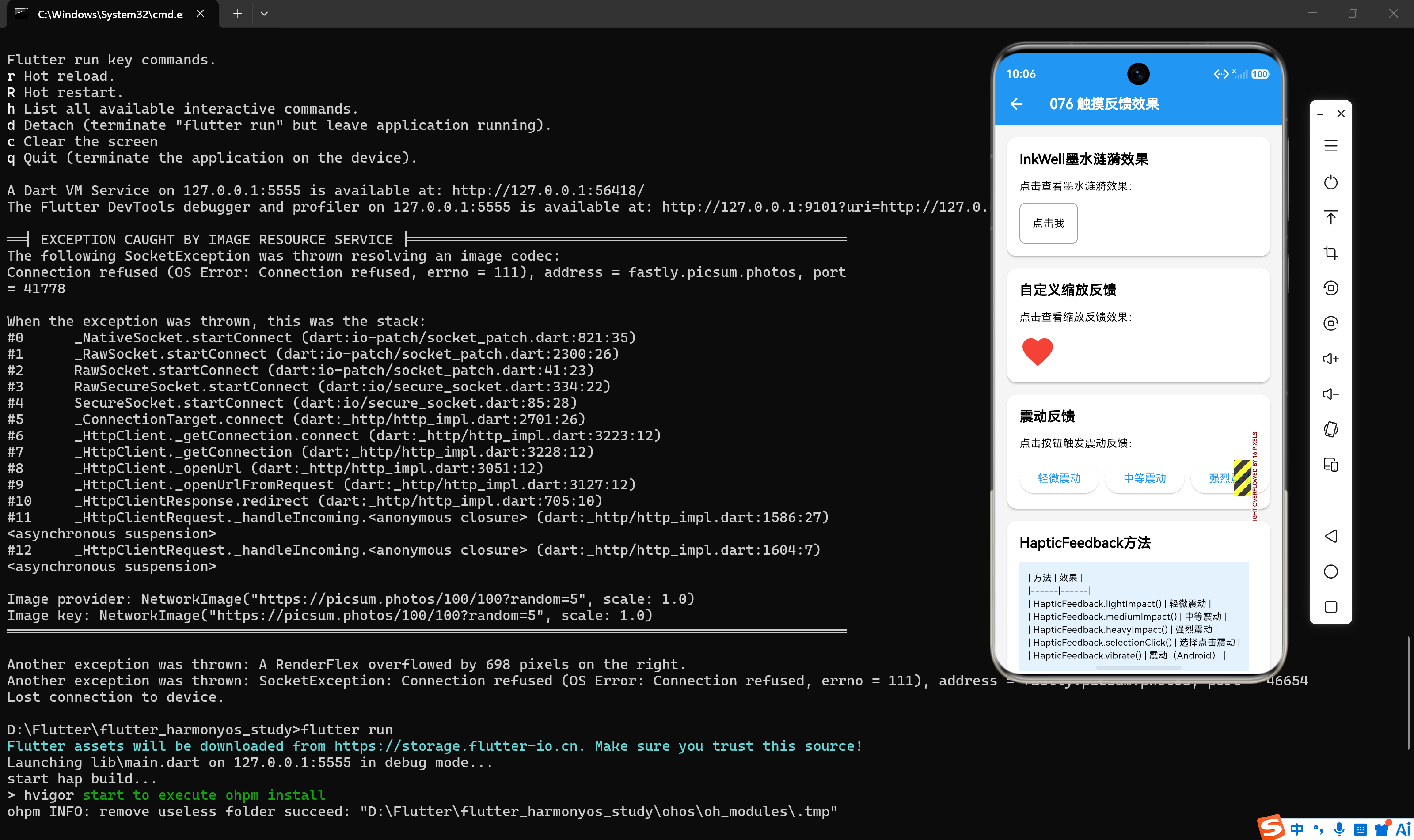
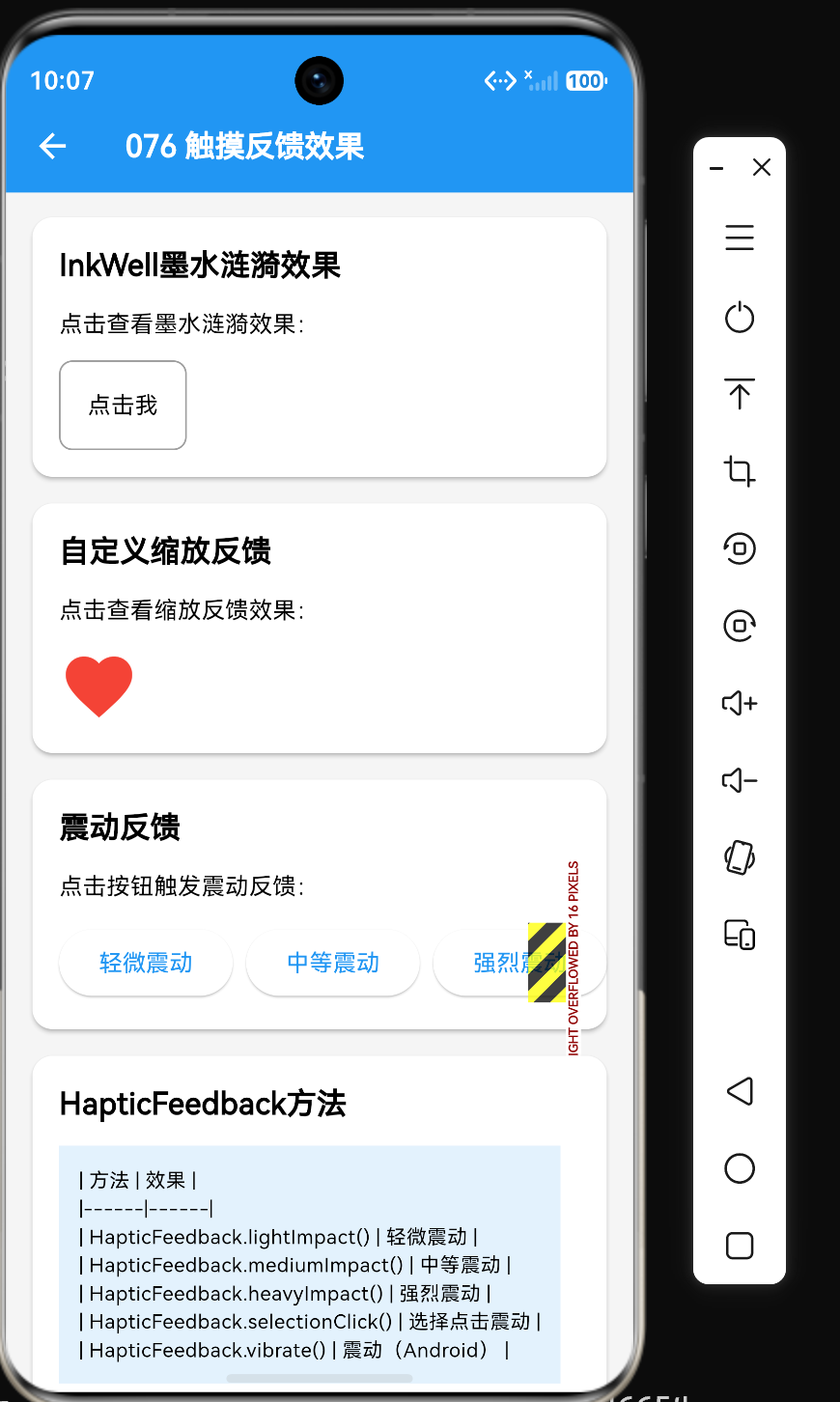
在Flutter应用开发中,触摸反馈效果是提升用户体验的关键因素之一。当用户与应用交互时,及时的视觉反馈和触觉反馈能够让用户感受到操作的有效性和响应性。Flutter提供了多种触摸反馈机制,包括涟漪效果、缩放效果、颜色变化、触觉反馈等。本文将深入探讨如何实现这些触摸反馈效果,并提供完整的代码示例和最佳实践。
一、触摸反馈概述
1.1 触摸反馈的类型
Flutter支持以下类型的触摸反馈:
| 类型 | 说明 | 实现方式 |
|---|---|---|
| 涟漪效果 | Material Design风格的水波纹效果 | InkWell、InkResponse |
| 缩放效果 | 按钮按下时的缩放动画 | AnimatedScale、Transform.scale |
| 颜色变化 | 按钮状态改变时的颜色过渡 | ButtonStyle、MaterialStateProperty |
| 触觉反馈 | 设备振动反馈 | HapticFeedback |
| 阴影变化 | 按钮按下时的阴影变化 | elevation属性 |
1.2 触摸反馈的重要性
良好的触摸反馈能够:
- 增强交互感:让用户感受到操作的响应性
- 提供操作确认:确认用户的操作已被识别
- 引导用户操作:通过视觉变化引导用户正确操作
- 提升用户体验:使应用更加生动和友好
1.3 设计原则
实现触摸反馈时应遵循以下原则:
- 即时反馈:操作后立即显示反馈效果
- 适度反馈:反馈效果不要过于夸张
- 一致性:相同类型的操作使用相同的反馈方式
- 可访问性:支持多种反馈方式,包括视觉和触觉
二、涟漪效果
2.1 InkWell涟漪效果
InkWell是实现Material Design涟漪效果的核心组件:
InkWell(
  onTap: () {},
  splashColor: Colors.blue[300],
  highlightColor: Colors.blue[100],
  borderRadius: BorderRadius.circular(8),
  child: const Padding(
    padding: EdgeInsets.all(16),
    child: Text('涟漪效果'),
  ),
)
2.2 InkWell属性说明
| 属性 | 类型 | 说明 |
|---|---|---|
| splashColor | Color | 涟漪颜色 |
| highlightColor | Color | 高亮颜色 |
| hoverColor | Color | 悬停颜色(桌面端) |
| focusColor | Color | 焦点颜色 |
| radius | double | 涟漪半径 |
| borderRadius | BorderRadius | 圆角半径 |
| enableFeedback | bool | 是否启用触觉反馈 |
2.3 InkResponse涟漪效果
InkResponse提供更灵活的涟漪效果控制:
InkResponse(
  onTap: () {},
  splashColor: Colors.green[300],
  highlightShape: BoxShape.circle,
  containedInkWell: true,
  child: const Icon(Icons.add),
)
2.4 InkResponse属性说明
| 属性 | 类型 | 说明 |
|---|---|---|
| splashColor | Color | 涟漪颜色 |
| highlightColor | Color | 高亮颜色 |
| highlightShape | BoxShape | 高亮形状(circle/rectangle) |
| containedInkWell | bool | 是否限制在子组件范围内 |
| radius | double | 涟漪半径 |
2.5 自定义涟漪效果
class CustomRippleButton extends StatelessWidget {
final String text;
final void Function() onPressed;
const CustomRippleButton({
super.key,
required this.text,
required this.onPressed,
});
Widget build(BuildContext context) {
return Material(
color: Colors.blue,
borderRadius: BorderRadius.circular(8),
child: InkWell(
onTap: onPressed,
splashColor: Colors.white.withOpacity(0.3),
highlightColor: Colors.white.withOpacity(0.2),
borderRadius: BorderRadius.circular(8),
child: Padding(
padding: const EdgeInsets.symmetric(horizontal: 24, vertical: 12),
child: Text(
text,
style: const TextStyle(color: Colors.white),
),
),
),
);
}
}
三、缩放效果
3.1 按压缩放效果
class ScaleButton extends StatefulWidget {
final Widget child;
final void Function() onPressed;
final double scale;
const ScaleButton({
super.key,
required this.child,
required this.onPressed,
this.scale = 0.95,
});
State<ScaleButton> createState() => _ScaleButtonState();
}
class _ScaleButtonState extends State<ScaleButton> {
bool _isPressed = false;
Widget build(BuildContext context) {
return GestureDetector(
onTapDown: (_) => setState(() => _isPressed = true),
onTapUp: (_) {
setState(() => _isPressed = false);
widget.onPressed();
},
onTapCancel: () => setState(() => _isPressed = false),
child: AnimatedScale(
scale: _isPressed ? widget.scale : 1.0,
duration: const Duration(milliseconds: 100),
curve: Curves.easeOut,
child: widget.child,
),
);
}
}
3.2 使用缩放按钮
ScaleButton(
  onPressed: () => print('点击'),
  scale: 0.9,
  child: ElevatedButton(
    onPressed: null,
    child: const Text('缩放按钮'),
  ),
)
3.3 带回弹效果的缩放
class BounceButton extends StatefulWidget {
final Widget child;
final void Function() onPressed;
const BounceButton({
super.key,
required this.child,
required this.onPressed,
});
State<BounceButton> createState() => _BounceButtonState();
}
class _BounceButtonState extends State<BounceButton> {
bool _isPressed = false;
Widget build(BuildContext context) {
return GestureDetector(
onTapDown: (_) => setState(() => _isPressed = true),
onTapUp: (_) {
setState(() => _isPressed = false);
widget.onPressed();
},
onTapCancel: () => setState(() => _isPressed = false),
child: AnimatedScale(
scale: _isPressed ? 0.9 : 1.0,
duration: const Duration(milliseconds: 150),
curve: _isPressed ? Curves.easeIn : Curves.elasticOut,
child: widget.child,
),
);
}
}
四、颜色变化效果
4.1 按钮状态颜色变化
ElevatedButton(
  style: ButtonStyle(
    backgroundColor: MaterialStateProperty.resolveWith((states) {
      if (states.contains(MaterialState.pressed)) {
        return Colors.blue[700];
      }
      if (states.contains(MaterialState.disabled)) {
        return Colors.grey[300];
      }
      return Colors.blue;
    }),
    foregroundColor: MaterialStateProperty.resolveWith((states) {
      if (states.contains(MaterialState.disabled)) {
        return Colors.grey[600];
      }
      return Colors.white;
    }),
  ),
  onPressed: () {},
  child: const Text('颜色变化按钮'),
)
4.2 渐变色按钮状态变化
class GradientStateButton extends StatefulWidget {
final String text;
final void Function() onPressed;
const GradientStateButton({
super.key,
required this.text,
required this.onPressed,
});
State<GradientStateButton> createState() => _GradientStateButtonState();
}
class _GradientStateButtonState extends State<GradientStateButton> {
bool _isPressed = false;
Widget build(BuildContext context) {
return GestureDetector(
onTapDown: (_) => setState(() => _isPressed = true),
onTapUp: (_) {
setState(() => _isPressed = false);
widget.onPressed();
},
onTapCancel: () => setState(() => _isPressed = false),
child: Container(
decoration: BoxDecoration(
gradient: _isPressed
? const LinearGradient(colors: [Colors.blue[700]!, Colors.purple[700]!])
: const LinearGradient(colors: [Colors.blue, Colors.purple]),
borderRadius: BorderRadius.circular(8),
),
padding: const EdgeInsets.symmetric(horizontal: 24, vertical: 12),
child: Text(
widget.text,
style: const TextStyle(color: Colors.white),
),
),
);
}
}
4.3 边框颜色变化
OutlinedButton(
  style: ButtonStyle(
    side: MaterialStateProperty.resolveWith((states) {
      if (states.contains(MaterialState.pressed)) {
        return const BorderSide(color: Colors.blue[700]!, width: 2);
      }
      return const BorderSide(color: Colors.blue, width: 2);
    }),
    foregroundColor: MaterialStateProperty.resolveWith((states) {
      if (states.contains(MaterialState.pressed)) {
        return Colors.blue[700];
      }
      return Colors.blue;
    }),
  ),
  onPressed: () {},
  child: const Text('边框颜色变化'),
)
五、触觉反馈
5.1 HapticFeedback类
Flutter提供HapticFeedback类实现设备振动反馈:
import 'package:flutter/services.dart';

ElevatedButton(
  onPressed: () {
    HapticFeedback.lightImpact();
    print('点击');
  },
  child: const Text('触觉反馈'),
)
5.2 HapticFeedback方法
| 方法 | 说明 |
|---|---|
| HapticFeedback.lightImpact() | 轻微振动 |
| HapticFeedback.mediumImpact() | 中等振动 |
| HapticFeedback.heavyImpact() | 强烈振动 |
| HapticFeedback.vibrate() | 持续振动 |
| HapticFeedback.selectionClick() | 选择点击振动 |
5.3 带触觉反馈的按钮
class HapticButton extends StatelessWidget {
final String text;
final void Function() onPressed;
final HapticFeedbackType feedbackType;
const HapticButton({
super.key,
required this.text,
required this.onPressed,
this.feedbackType = HapticFeedbackType.light,
});
Widget build(BuildContext context) {
return ElevatedButton(
onPressed: () {
_triggerHaptic();
onPressed();
},
child: Text(text),
);
}
void _triggerHaptic() {
switch (feedbackType) {
case HapticFeedbackType.light:
HapticFeedback.lightImpact();
break;
case HapticFeedbackType.medium:
HapticFeedback.mediumImpact();
break;
case HapticFeedbackType.heavy:
HapticFeedback.heavyImpact();
break;
}
}
}
enum HapticFeedbackType { light, medium, heavy }
5.4 使用带触觉反馈的按钮
HapticButton(
  text: '强烈振动',
  onPressed: () => print('点击'),
  feedbackType: HapticFeedbackType.heavy,
)
六、阴影变化效果
6.1 按钮阴影变化
ElevatedButton(
  style: ButtonStyle(
    elevation: MaterialStateProperty.resolveWith((states) {
      if (states.contains(MaterialState.pressed)) {
        return 12.0;
      }
      return 8.0;
    }),
    shadowColor: MaterialStateProperty.resolveWith((states) {
      if (states.contains(MaterialState.pressed)) {
        return Colors.blue[400];
      }
      return Colors.blue[200];
    }),
  ),
  onPressed: () {},
  child: const Text('阴影变化'),
)
6.2 自定义阴影效果
class ShadowButton extends StatefulWidget {
final String text;
final void Function() onPressed;
const ShadowButton({
super.key,
required this.text,
required this.onPressed,
});
State<ShadowButton> createState() => _ShadowButtonState();
}
class _ShadowButtonState extends State<ShadowButton> {
bool _isPressed = false;
Widget build(BuildContext context) {
return GestureDetector(
onTapDown: (_) => setState(() => _isPressed = true),
onTapUp: (_) {
setState(() => _isPressed = false);
widget.onPressed();
},
onTapCancel: () => setState(() => _isPressed = false),
child: AnimatedContainer(
duration: const Duration(milliseconds: 150),
padding: const EdgeInsets.symmetric(horizontal: 24, vertical: 12),
decoration: BoxDecoration(
color: Colors.blue,
borderRadius: BorderRadius.circular(8),
boxShadow: _isPressed
? [
BoxShadow(
color: Colors.blue[300]!,
blurRadius: 15,
offset: const Offset(0, 5),
),
]
: [
BoxShadow(
color: Colors.blue[200]!,
blurRadius: 10,
offset: const Offset(0, 3),
),
],
),
child: Text(
widget.text,
style: const TextStyle(color: Colors.white),
),
),
);
}
}
七、组合反馈效果
7.1 完整的按钮反馈效果
class FullFeedbackButton extends StatefulWidget {
final String text;
final void Function() onPressed;
const FullFeedbackButton({
super.key,
required this.text,
required this.onPressed,
});
State<FullFeedbackButton> createState() => _FullFeedbackButtonState();
}
class _FullFeedbackButtonState extends State<FullFeedbackButton> {
bool _isPressed = false;
Widget build(BuildContext context) {
return GestureDetector(
onTapDown: (_) {
setState(() => _isPressed = true);
HapticFeedback.lightImpact();
},
onTapUp: (_) {
setState(() => _isPressed = false);
widget.onPressed();
},
onTapCancel: () => setState(() => _isPressed = false),
child: AnimatedContainer(
duration: const Duration(milliseconds: 100),
transform: Matrix4.scale(_isPressed ? 0.95 : 1.0),
padding: const EdgeInsets.symmetric(horizontal: 24, vertical: 12),
decoration: BoxDecoration(
color: _isPressed ? Colors.blue[700] : Colors.blue,
borderRadius: BorderRadius.circular(8),
boxShadow: _isPressed
? [
BoxShadow(
color: Colors.blue[300]!,
blurRadius: 15,
offset: const Offset(0, 5),
),
]
: [
BoxShadow(
color: Colors.blue[200]!,
blurRadius: 10,
offset: const Offset(0, 3),
),
],
),
child: Text(
widget.text,
style: const TextStyle(color: Colors.white),
),
),
);
}
}
7.2 使用组合反馈按钮
FullFeedbackButton(
  text: '完整反馈按钮',
  onPressed: () => print('点击'),
)
八、实战示例:待办事项卡片
8.1 完整代码示例
import 'package:flutter/material.dart';
import 'package:flutter/services.dart';
class TodoCard extends StatefulWidget {
final String title;
final bool isCompleted;
final void Function() onToggle;
final void Function() onDelete;
const TodoCard({
super.key,
required this.title,
required this.isCompleted,
required this.onToggle,
required this.onDelete,
});
State<TodoCard> createState() => _TodoCardState();
}
class _TodoCardState extends State<TodoCard> {
bool _isPressed = false;
Widget build(BuildContext context) {
return GestureDetector(
onTapDown: (_) => setState(() => _isPressed = true),
onTapUp: (_) {
setState(() => _isPressed = false);
HapticFeedback.lightImpact();
widget.onToggle();
},
onTapCancel: () => setState(() => _isPressed = false),
child: AnimatedContainer(
duration: const Duration(milliseconds: 100),
transform: Matrix4.scale(_isPressed ? 0.98 : 1.0),
margin: const EdgeInsets.symmetric(horizontal: 16, vertical: 8),
child: Card(
elevation: _isPressed ? 4 : 2,
child: Padding(
padding: const EdgeInsets.all(16),
child: Row(
children: [
Icon(
widget.isCompleted ? Icons.check_circle : Icons.circle_outlined,
color: widget.isCompleted ? Colors.green : Colors.grey,
),
const SizedBox(width: 12),
Expanded(
child: Text(
widget.title,
style: TextStyle(
decoration: widget.isCompleted
? TextDecoration.lineThrough
: TextDecoration.none,
color: widget.isCompleted ? Colors.grey : Colors.black,
),
),
),
GestureDetector(
onTap: () {
HapticFeedback.mediumImpact();
widget.onDelete();
},
child: const Icon(Icons.delete, color: Colors.red),
),
],
),
),
),
),
);
}
}
8.2 使用待办事项卡片
TodoCard(
  title: '完成项目文档',
  isCompleted: false,
  onToggle: () => print('切换状态'),
  onDelete: () => print('删除'),
)
8.3 反馈效果说明
| 操作 | 反馈效果 |
|---|---|
| 点击卡片 | 缩放效果 + 触觉反馈 + 阴影变化 |
| 切换完成状态 | 图标颜色变化 + 文字样式变化 |
| 点击删除图标 | 触觉反馈 |
九、性能优化与最佳实践
9.1 使用AnimatedWidget
class AnimatedButton extends AnimatedWidget {
final void Function() onPressed;
final Widget child;
const AnimatedButton({
super.key,
required Animation<double> animation,
required this.onPressed,
required this.child,
}) : super(listenable: animation);
Widget build(BuildContext context) {
final animation = listenable as Animation<double>;
return GestureDetector(
onTap: onPressed,
child: Transform.scale(
scale: animation.value,
child: child,
),
);
}
}
9.2 避免过度使用反馈效果
// 不推荐:过多的反馈效果
ElevatedButton(
  onPressed: () {
    HapticFeedback.lightImpact();
    HapticFeedback.mediumImpact();
    HapticFeedback.vibrate();
  },
  child: const Text('按钮'),
)

// 推荐:适度的反馈效果
ElevatedButton(
  onPressed: () {
    HapticFeedback.lightImpact();
  },
  child: const Text('按钮'),
)
9.3 合理使用动画时长
AnimatedScale(
  scale: _isPressed ? 0.95 : 1.0,
  duration: const Duration(milliseconds: 100), // 合理的动画时长
  child: const Text('按钮'),
)
9.4 考虑不同设备的反馈能力
// 检查设备是否支持触觉反馈
bool _supportsHaptic = false;

Future<void> _checkHapticSupport() async {
  try {
    await HapticFeedback.lightImpact();
    _supportsHaptic = true;
  } catch (e) {
    _supportsHaptic = false;
  }
}
9.5 使用Theme统一管理反馈样式
Theme(
  data: Theme.of(context).copyWith(
    splashColor: Colors.blue[300],
    highlightColor: Colors.blue[100],
  ),
  child: const MyPage(),
)
十、常见问题与解决方案
10.1 问题1:涟漪效果不显示
问题描述:点击InkWell后没有涟漪效果。
解决方案:确保InkWell在Material组件内部:
// 错误
Container(
  child: InkWell(
    onTap: () {},
    child: const Text('点击'),
  ),
)

// 正确
Material(
  child: InkWell(
    onTap: () {},
    child: const Text('点击'),
  ),
)
10.2 问题2:缩放效果不流畅
问题描述:按钮缩放时出现卡顿或抖动。
解决方案:使用AnimatedScale或AnimatedContainer:
AnimatedScale(
  scale: _isPressed ? 0.95 : 1.0,
  duration: const Duration(milliseconds: 100),
  curve: Curves.easeOut,
  child: const Text('按钮'),
)
10.3 问题3:触觉反馈不工作
问题描述:调用HapticFeedback方法后没有振动。
解决方案:检查设备是否支持振动:
try {
  HapticFeedback.lightImpact();
} catch (e) {
  print('设备不支持触觉反馈');
}
10.4 问题4:反馈效果过于夸张
问题描述:按钮的反馈效果过于明显,影响用户体验。
解决方案:调整反馈参数,使其更加适度:
AnimatedScale(
  scale: _isPressed ? 0.98 : 1.0, // 较小的缩放比例
  duration: const Duration(milliseconds: 100),
  child: const Text('按钮'),
)
10.5 问题5:多个反馈效果冲突
问题描述:同时使用多种反馈效果导致冲突。
解决方案:合理组合反馈效果,避免冲突:
// 推荐:缩放 + 触觉反馈
GestureDetector(
  onTapDown: (_) {
    setState(() => _isPressed = true);
    HapticFeedback.lightImpact();
  },
  onTapUp: (_) {
    setState(() => _isPressed = false);
    onPressed();
  },
  child: AnimatedScale(
    scale: _isPressed ? 0.95 : 1.0,
    duration: const Duration(milliseconds: 100),
    child: const Text('按钮'),
  ),
)
十一、总结
通过本文的学习,我们掌握了以下核心知识点:
- 触摸反馈包括涟漪效果、缩放效果、颜色变化、触觉反馈和阴影变化
- 涟漪效果使用
InkWell或InkResponse实现 - 缩放效果使用
AnimatedScale或AnimatedContainer实现 - 颜色变化使用
ButtonStyle和MaterialStateProperty实现 - 触觉反馈使用
HapticFeedback类实现 - 阴影变化通过
elevation属性或BoxShadow实现 - 组合反馈效果可以提升用户体验
- 性能优化包括使用
AnimatedWidget、合理使用动画时长等 - 最佳实践包括适度反馈、一致性、可访问性等原则
在实际开发中,合理实现触摸反馈效果能够显著提升用户体验。理解各种反馈机制的原理和实现方式,能够帮助我们创建出交互流畅、反馈清晰的应用。
参考资料
- Flutter官方文档:https://docs.flutter.dev/
- Material Design涟漪效果:https://m3.material.io/styles/interaction/states/ripple
- Flutter动画指南:https://docs.flutter.dev/development/ui/animations

作为“人工智能6S店”的官方数字引擎,为AI开发者与企业提供一个覆盖软硬件全栈、一站式门户。
更多推荐



 19
19 0
0- 0


 已为社区贡献96条内容

所有评论(0)