
鸿蒙Flutter 自定义按钮组件:Flutter按钮的封装与复用
·
作者:高红朋(小雨下雨的雨)
仓库地址:https://gitcode.com/feng8403000/FlutterfromBeginnertoAdvancedForHarmonyOS.git
联系邮箱:372699828@qq.com
引言
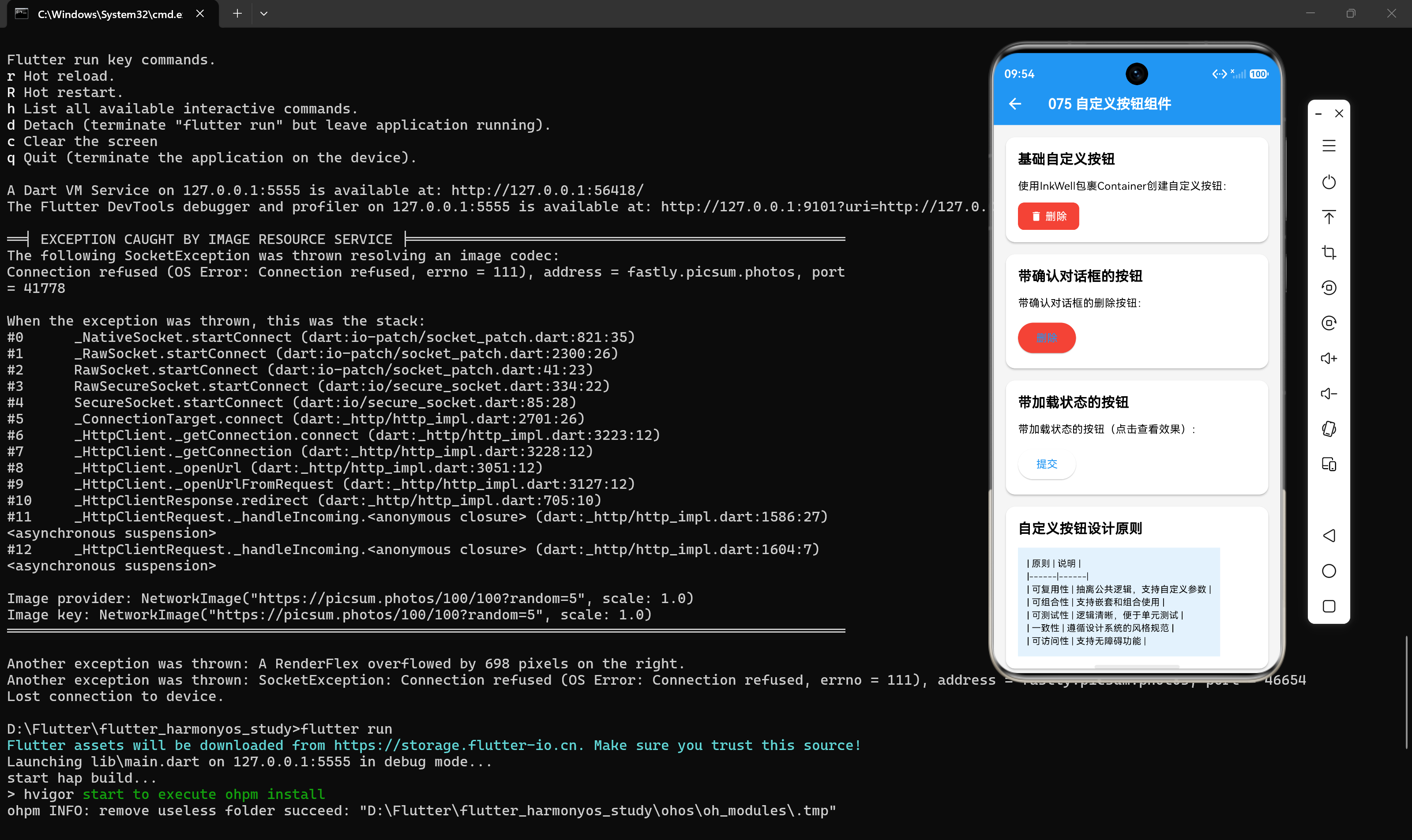
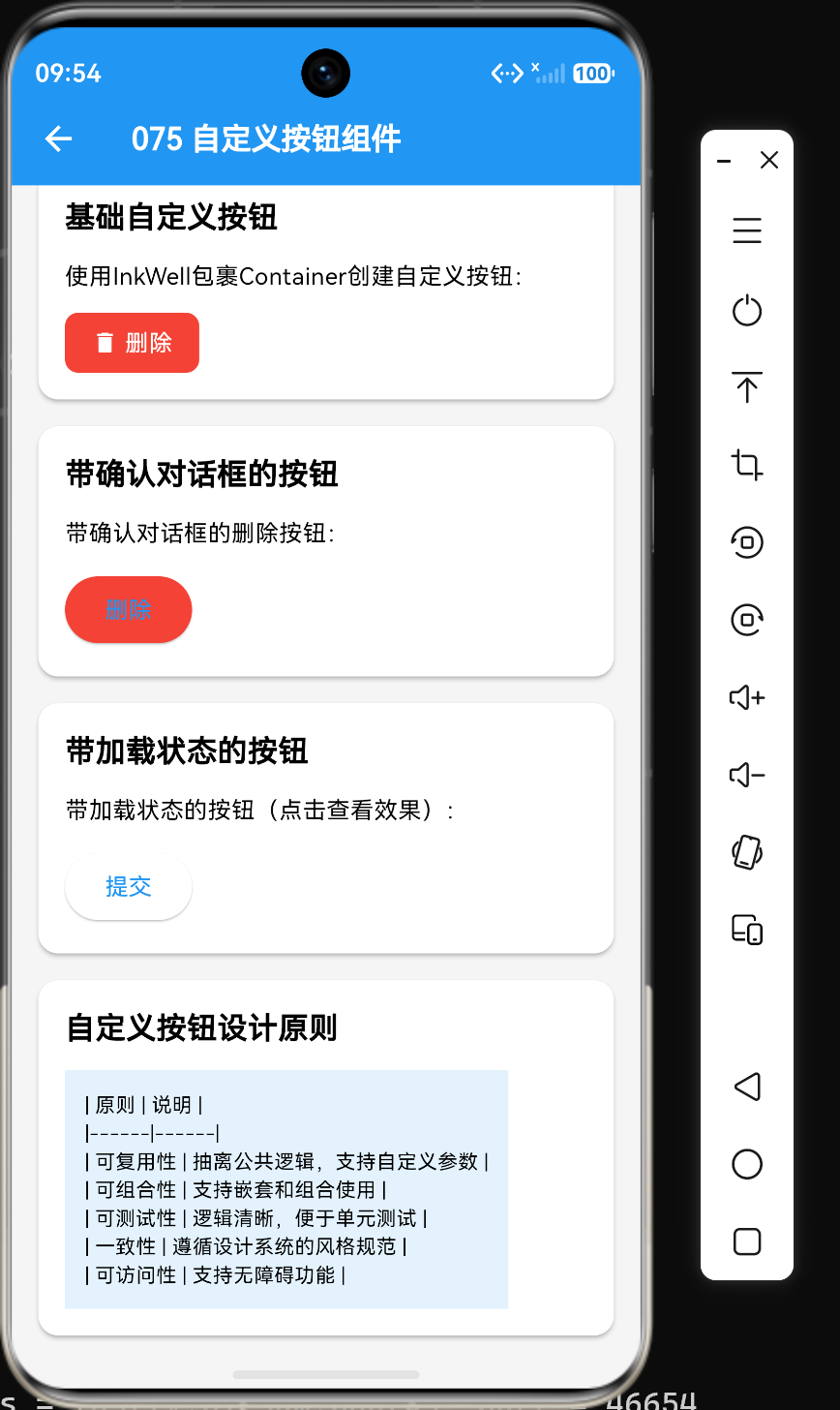
在Flutter应用开发中,按钮是用户交互最核心的组件之一。虽然Flutter提供了丰富的内置按钮组件(如ElevatedButton、TextButton、OutlinedButton),但在实际项目中,我们经常需要创建符合特定设计风格和业务需求的自定义按钮。本文将深入探讨如何封装和复用自定义按钮组件,包括删除按钮、加载按钮、图标按钮等常见场景,并提供完整的代码示例和最佳实践。
一、自定义按钮的必要性
1.1 为什么需要自定义按钮
在以下场景中,自定义按钮是必不可少的:
- 统一设计风格:项目需要特定的颜色、形状、阴影效果
- 复杂交互逻辑:如确认对话框、加载状态、多状态切换
- 复用性:相同样式的按钮在多个页面中使用
- 扩展性:内置按钮无法满足的特殊需求
1.2 自定义按钮的优势
| 优势 | 说明 |
|---|---|
| 代码复用 | 一次封装,多处使用 |
| 统一风格 | 确保应用风格一致 |
| 易于维护 | 修改一处,全局生效 |
| 增强功能 | 添加内置按钮没有的功能 |
1.3 设计原则
创建自定义按钮时应遵循以下原则:
- 单一职责:每个按钮只负责一个主要功能
- 可配置性:通过参数配置样式和行为
- 一致性:与应用整体设计风格保持一致
- 可访问性:支持键盘导航和屏幕阅读器
二、基础自定义按钮
2.1 简单自定义按钮
class CustomButton extends StatelessWidget {
final String text;
final void Function() onPressed;
final Color? backgroundColor;
final Color? textColor;
final double? borderRadius;
const CustomButton({
super.key,
required this.text,
required this.onPressed,
this.backgroundColor,
this.textColor,
this.borderRadius,
});
Widget build(BuildContext context) {
return ElevatedButton(
style: ElevatedButton.styleFrom(
backgroundColor: backgroundColor ?? Theme.of(context).primaryColor,
foregroundColor: textColor ?? Colors.white,
shape: RoundedRectangleBorder(
borderRadius: BorderRadius.circular(borderRadius ?? 8),
),
padding: const EdgeInsets.symmetric(horizontal: 24, vertical: 12),
),
onPressed: onPressed,
child: Text(text),
);
}
}
2.2 使用自定义按钮
CustomButton(
  text: '自定义按钮',
  onPressed: () => print('点击'),
  backgroundColor: Colors.blue,
  textColor: Colors.white,
  borderRadius: 12,
)
2.3 带图标的自定义按钮
class IconButtonWidget extends StatelessWidget {
final String text;
final IconData icon;
final void Function() onPressed;
final Color? color;
const IconButtonWidget({
super.key,
required this.text,
required this.icon,
required this.onPressed,
this.color,
});
Widget build(BuildContext context) {
return ElevatedButton.icon(
style: ElevatedButton.styleFrom(
backgroundColor: color ?? Theme.of(context).primaryColor,
padding: const EdgeInsets.symmetric(horizontal: 20, vertical: 12),
),
icon: Icon(icon),
label: Text(text),
onPressed: onPressed,
);
}
}
三、删除按钮组件
3.1 带确认对话框的删除按钮
class DeleteButton extends StatelessWidget {
final void Function() onDelete;
final String? message;
const DeleteButton({
super.key,
required this.onDelete,
this.message = '确定要删除吗?',
});
Widget build(BuildContext context) {
return TextButton(
style: TextButton.styleFrom(
foregroundColor: Colors.red,
),
onPressed: () {
showDialog(
context: context,
builder: (context) => AlertDialog(
title: const Text('确认删除'),
content: Text(message!),
actions: [
TextButton(
onPressed: () => Navigator.pop(context),
child: const Text('取消'),
),
ElevatedButton(
style: ElevatedButton.styleFrom(
backgroundColor: Colors.red,
),
onPressed: () {
Navigator.pop(context);
onDelete();
},
child: const Text('删除'),
),
],
),
);
},
child: const Row(
mainAxisSize: MainAxisSize.min,
children: [
Icon(Icons.delete),
SizedBox(width: 4),
Text('删除'),
],
),
);
}
}
3.2 使用删除按钮
DeleteButton(
  onDelete: () {
    print('执行删除操作');
  },
  message: '确定要删除这个待办事项吗?',
)
3.3 可定制的删除按钮
class CustomDeleteButton extends StatelessWidget {
final void Function() onDelete;
final String title;
final String message;
final Widget icon;
final Color buttonColor;
const CustomDeleteButton({
super.key,
required this.onDelete,
this.title = '确认删除',
this.message = '确定要删除吗?',
this.icon = const Icon(Icons.delete),
this.buttonColor = Colors.red,
});
Widget build(BuildContext context) {
return TextButton(
style: TextButton.styleFrom(
foregroundColor: buttonColor,
),
onPressed: () {
showDialog(
context: context,
builder: (context) => AlertDialog(
title: Text(title),
content: Text(message),
actions: [
TextButton(
onPressed: () => Navigator.pop(context),
child: const Text('取消'),
),
ElevatedButton(
style: ElevatedButton.styleFrom(
backgroundColor: buttonColor,
),
onPressed: () {
Navigator.pop(context);
onDelete();
},
child: const Text('删除'),
),
],
),
);
},
child: Row(
mainAxisSize: MainAxisSize.min,
children: [
icon,
const SizedBox(width: 4),
const Text('删除'),
],
),
);
}
}
四、加载按钮组件
4.1 基础加载按钮
class LoadingButton extends StatefulWidget {
final Future<void> Function() onPressed;
final String text;
final String loadingText;
const LoadingButton({
super.key,
required this.onPressed,
this.text = '执行操作',
this.loadingText = '处理中...',
});
State<LoadingButton> createState() => _LoadingButtonState();
}
class _LoadingButtonState extends State<LoadingButton> {
bool _isLoading = false;
Future<void> _handlePress() async {
setState(() {
_isLoading = true;
});
try {
await widget.onPressed();
} finally {
setState(() {
_isLoading = false;
});
}
}
Widget build(BuildContext context) {
return ElevatedButton(
onPressed: _isLoading ? null : _handlePress,
child: _isLoading
? Row(
mainAxisSize: MainAxisSize.min,
children: [
const CircularProgressIndicator(size: 16, color: Colors.white),
const SizedBox(width: 8),
Text(widget.loadingText),
],
)
: Text(widget.text),
);
}
}
4.2 使用加载按钮
LoadingButton(
  text: '提交',
  loadingText: '提交中...',
  onPressed: () async {
    await Future.delayed(const Duration(seconds: 2));
    print('提交完成');
  },
)
4.3 带错误处理的加载按钮
class ErrorHandlingButton extends StatefulWidget {
final Future<void> Function() onPressed;
final String text;
const ErrorHandlingButton({
super.key,
required this.onPressed,
this.text = '执行操作',
});
State<ErrorHandlingButton> createState() => _ErrorHandlingButtonState();
}
class _ErrorHandlingButtonState extends State<ErrorHandlingButton> {
bool _isLoading = false;
bool _hasError = false;
Future<void> _handlePress() async {
setState(() {
_isLoading = true;
_hasError = false;
});
try {
await widget.onPressed();
} catch (e) {
setState(() {
_hasError = true;
});
} finally {
setState(() {
_isLoading = false;
});
}
}
Widget build(BuildContext context) {
return ElevatedButton(
onPressed: _isLoading ? null : _handlePress,
style: ElevatedButton.styleFrom(
backgroundColor: _hasError ? Colors.red : null,
),
child: _isLoading
? const CircularProgressIndicator(size: 20)
: _hasError
? const Text('重试')
: Text(widget.text),
);
}
}
五、状态切换按钮组件
5.1 开关按钮
class ToggleSwitchButton extends StatefulWidget {
final bool initialValue;
final void Function(bool) onChanged;
final String onText;
final String offText;
const ToggleSwitchButton({
super.key,
this.initialValue = false,
required this.onChanged,
this.onText = '开启',
this.offText = '关闭',
});
State<ToggleSwitchButton> createState() => _ToggleSwitchButtonState();
}
class _ToggleSwitchButtonState extends State<ToggleSwitchButton> {
late bool _value;
void initState() {
super.initState();
_value = widget.initialValue;
}
void _toggle() {
setState(() {
_value = !_value;
});
widget.onChanged(_value);
}
Widget build(BuildContext context) {
return ElevatedButton(
onPressed: _toggle,
style: ElevatedButton.styleFrom(
backgroundColor: _value ? Colors.green : Colors.grey,
padding: const EdgeInsets.symmetric(horizontal: 24, vertical: 12),
),
child: Text(_value ? widget.onText : widget.offText),
);
}
}
5.2 使用开关按钮
ToggleSwitchButton(
  initialValue: false,
  onChanged: (value) {
    print('开关状态:$value');
  },
  onText: '已开启',
  offText: '已关闭',
)
5.3 多选按钮组
class MultiSelectButtonGroup extends StatefulWidget {
final List<String> options;
final List<bool> initialValues;
final void Function(List<bool>) onChanged;
const MultiSelectButtonGroup({
super.key,
required this.options,
required this.initialValues,
required this.onChanged,
});
State<MultiSelectButtonGroup> createState() => _MultiSelectButtonGroupState();
}
class _MultiSelectButtonGroupState extends State<MultiSelectButtonGroup> {
late List<bool> _selected;
void initState() {
super.initState();
_selected = List.from(widget.initialValues);
}
void _toggle(int index) {
setState(() {
_selected[index] = !_selected[index];
});
widget.onChanged(_selected);
}
Widget build(BuildContext context) {
return Wrap(
spacing: 8,
children: List.generate(widget.options.length, (index) {
return ElevatedButton(
onPressed: () => _toggle(index),
style: ElevatedButton.styleFrom(
backgroundColor: _selected[index] ? Colors.blue : Colors.grey,
padding: const EdgeInsets.symmetric(horizontal: 16, vertical: 8),
),
child: Text(widget.options[index]),
);
}),
);
}
}
六、图标按钮组件
6.1 圆形图标按钮
class CircleIconButton extends StatelessWidget {
final IconData icon;
final void Function() onPressed;
final Color? backgroundColor;
final Color? iconColor;
final double size;
const CircleIconButton({
super.key,
required this.icon,
required this.onPressed,
this.backgroundColor,
this.iconColor,
this.size = 48,
});
Widget build(BuildContext context) {
return SizedBox(
width: size,
height: size,
child: ElevatedButton(
style: ElevatedButton.styleFrom(
backgroundColor: backgroundColor ?? Theme.of(context).primaryColor,
foregroundColor: iconColor ?? Colors.white,
shape: const CircleBorder(),
padding: EdgeInsets.zero,
),
onPressed: onPressed,
child: Icon(icon, size: size * 0.5),
),
);
}
}
6.2 使用圆形图标按钮
CircleIconButton(
  icon: Icons.add,
  onPressed: () => print('添加'),
  backgroundColor: Colors.blue,
  size: 56,
)
6.3 带提示的图标按钮
class TooltipIconButton extends StatelessWidget {
final IconData icon;
final void Function() onPressed;
final String tooltip;
const TooltipIconButton({
super.key,
required this.icon,
required this.onPressed,
required this.tooltip,
});
Widget build(BuildContext context) {
return Tooltip(
message: tooltip,
child: IconButton(
icon: Icon(icon),
onPressed: onPressed,
),
);
}
}
七、按钮组组件
7.1 水平按钮组
class HorizontalButtonGroup extends StatelessWidget {
final List<Widget> buttons;
final MainAxisAlignment alignment;
final double spacing;
const HorizontalButtonGroup({
super.key,
required this.buttons,
this.alignment = MainAxisAlignment.center,
this.spacing = 16,
});
Widget build(BuildContext context) {
return Row(
mainAxisAlignment: alignment,
children: buttons
.expand((button) => [button, SizedBox(width: spacing)])
.toList()
..removeLast(),
);
}
}
7.2 使用水平按钮组
HorizontalButtonGroup(
  buttons: [
    ElevatedButton(onPressed: () {}, child: const Text('确定')),
    TextButton(onPressed: () {}, child: const Text('取消')),
    OutlinedButton(onPressed: () {}, child: const Text('跳过')),
  ],
  alignment: MainAxisAlignment.end,
)
7.3 垂直按钮组
class VerticalButtonGroup extends StatelessWidget {
final List<Widget> buttons;
final CrossAxisAlignment alignment;
final double spacing;
const VerticalButtonGroup({
super.key,
required this.buttons,
this.alignment = CrossAxisAlignment.stretch,
this.spacing = 12,
});
Widget build(BuildContext context) {
return Column(
crossAxisAlignment: alignment,
children: buttons
.expand((button) => [button, SizedBox(height: spacing)])
.toList()
..removeLast(),
);
}
}
八、高级自定义按钮
8.1 渐变色按钮
class GradientButton extends StatelessWidget {
final String text;
final void Function() onPressed;
final Gradient gradient;
final double borderRadius;
const GradientButton({
super.key,
required this.text,
required this.onPressed,
this.gradient = const LinearGradient(
colors: [Colors.blue, Colors.purple],
),
this.borderRadius = 8,
});
Widget build(BuildContext context) {
return Container(
decoration: BoxDecoration(
gradient: gradient,
borderRadius: BorderRadius.circular(borderRadius),
),
child: ElevatedButton(
style: ElevatedButton.styleFrom(
backgroundColor: Colors.transparent,
shadowColor: Colors.transparent,
padding: const EdgeInsets.symmetric(horizontal: 24, vertical: 12),
),
onPressed: onPressed,
child: Text(
text,
style: const TextStyle(color: Colors.white),
),
),
);
}
}
8.2 使用渐变色按钮
GradientButton(
  text: '渐变色按钮',
  onPressed: () => print('点击'),
  gradient: const LinearGradient(
    colors: [Colors.red, Colors.orange],
    begin: Alignment.topLeft,
    end: Alignment.bottomRight,
  ),
)
8.3 带阴影效果的按钮
class ShadowButton extends StatelessWidget {
final String text;
final void Function() onPressed;
final Color color;
final Color shadowColor;
final double elevation;
const ShadowButton({
super.key,
required this.text,
required this.onPressed,
this.color = Colors.blue,
this.shadowColor = Colors.blue,
this.elevation = 8,
});
Widget build(BuildContext context) {
return ElevatedButton(
style: ElevatedButton.styleFrom(
backgroundColor: color,
foregroundColor: Colors.white,
elevation: elevation,
shadowColor: shadowColor,
shape: RoundedRectangleBorder(
borderRadius: BorderRadius.circular(8),
),
padding: const EdgeInsets.symmetric(horizontal: 24, vertical: 12),
),
onPressed: onPressed,
child: Text(text),
);
}
}
8.4 按压缩放按钮
class ScaleButton extends StatefulWidget {
final Widget child;
final void Function() onPressed;
final double scale;
const ScaleButton({
super.key,
required this.child,
required this.onPressed,
this.scale = 0.95,
});
State<ScaleButton> createState() => _ScaleButtonState();
}
class _ScaleButtonState extends State<ScaleButton> {
bool _isPressed = false;
Widget build(BuildContext context) {
return GestureDetector(
onTapDown: (_) => setState(() => _isPressed = true),
onTapUp: (_) {
setState(() => _isPressed = false);
widget.onPressed();
},
onTapCancel: () => setState(() => _isPressed = false),
child: AnimatedScale(
scale: _isPressed ? widget.scale : 1.0,
duration: const Duration(milliseconds: 100),
child: widget.child,
),
);
}
}
8.5 使用按压缩放按钮
ScaleButton(
  onPressed: () => print('点击'),
  child: ElevatedButton(
    onPressed: null,
    child: const Text('缩放按钮'),
  ),
)
九、实战示例:待办事项操作按钮组
9.1 完整代码示例
import 'package:flutter/material.dart';
class TodoActionButtons extends StatelessWidget {
final bool isCompleted;
final void Function() onToggle;
final void Function() onEdit;
final void Function() onDelete;
const TodoActionButtons({
super.key,
required this.isCompleted,
required this.onToggle,
required this.onEdit,
required this.onDelete,
});
Widget build(BuildContext context) {
return HorizontalButtonGroup(
buttons: [
ElevatedButton(
onPressed: onToggle,
style: ElevatedButton.styleFrom(
backgroundColor: isCompleted ? Colors.orange : Colors.green,
),
child: Row(
mainAxisSize: MainAxisSize.min,
children: [
Icon(isCompleted ? Icons.refresh : Icons.check),
const SizedBox(width: 4),
Text(isCompleted ? '重新激活' : '标记完成'),
],
),
),
OutlinedButton(
onPressed: onEdit,
child: Row(
mainAxisSize: MainAxisSize.min,
children: [
const Icon(Icons.edit),
const SizedBox(width: 4),
const Text('编辑'),
],
),
),
DeleteButton(onDelete: onDelete),
],
spacing: 8,
);
}
}
class DeleteButton extends StatelessWidget {
final void Function() onDelete;
const DeleteButton({super.key, required this.onDelete});
Widget build(BuildContext context) {
return TextButton(
style: TextButton.styleFrom(
foregroundColor: Colors.red,
),
onPressed: () {
showDialog(
context: context,
builder: (context) => AlertDialog(
title: const Text('确认删除'),
content: const Text('确定要删除这个待办事项吗?'),
actions: [
TextButton(
onPressed: () => Navigator.pop(context),
child: const Text('取消'),
),
ElevatedButton(
style: ElevatedButton.styleFrom(
backgroundColor: Colors.red,
),
onPressed: () {
Navigator.pop(context);
onDelete();
},
child: const Text('删除'),
),
],
),
);
},
child: const Row(
mainAxisSize: MainAxisSize.min,
children: [
Icon(Icons.delete),
SizedBox(width: 4),
Text('删除'),
],
),
);
}
}
class HorizontalButtonGroup extends StatelessWidget {
final List<Widget> buttons;
final double spacing;
const HorizontalButtonGroup({
super.key,
required this.buttons,
this.spacing = 16,
});
Widget build(BuildContext context) {
return Row(
mainAxisAlignment: MainAxisAlignment.center,
children: buttons
.expand((button) => [button, SizedBox(width: spacing)])
.toList()
..removeLast(),
);
}
}
9.2 使用待办事项操作按钮组
TodoActionButtons(
  isCompleted: false,
  onToggle: () => print('切换完成状态'),
  onEdit: () => print('编辑待办'),
  onDelete: () => print('删除待办'),
)
9.3 组件关系图
TodoActionButtons(按钮组容器)
    ├── ElevatedButton(标记完成/重新激活)
    ├── OutlinedButton(编辑)
    └── DeleteButton(删除,带确认对话框)
十、性能优化与最佳实践
10.1 使用const构造函数
class CustomButton extends StatelessWidget {
final String text;
final void Function() onPressed;
const CustomButton({
super.key,
required this.text,
required this.onPressed,
});
Widget build(BuildContext context) {
return ElevatedButton(
onPressed: onPressed,
child: Text(text),
);
}
}
10.2 提取样式为常量
final ButtonStyle customButtonStyle = ElevatedButton.styleFrom(
  backgroundColor: Colors.blue,
  foregroundColor: Colors.white,
  padding: const EdgeInsets.symmetric(horizontal: 24, vertical: 12),
);

// 使用
ElevatedButton(
  style: customButtonStyle,
  onPressed: () {},
  child: const Text('按钮'),
)
10.3 避免嵌套过多组件
// 不推荐:多层嵌套
Container(
  decoration: BoxDecoration(...),
  child: Material(
    child: InkWell(
      child: Padding(
        padding: const EdgeInsets.all(16),
        child: Text('按钮'),
      ),
    ),
  ),
)

// 推荐:简化结构
ElevatedButton(
  style: ElevatedButton.styleFrom(...),
  onPressed: () {},
  child: const Text('按钮'),
)
10.4 使用Theme统一管理样式
Theme(
  data: Theme.of(context).copyWith(
    elevatedButtonTheme: ElevatedButtonThemeData(
      style: ElevatedButton.styleFrom(
        backgroundColor: Colors.blue,
        foregroundColor: Colors.white,
      ),
    ),
  ),
  child: const MyPage(),
)
10.5 提供充足的点击区域
ElevatedButton(
  style: ElevatedButton.styleFrom(
    minimumSize: const Size(48, 48),
  ),
  onPressed: () {},
  child: const Icon(Icons.add),
)
十一、常见问题与解决方案
11.1 问题1:自定义按钮样式不生效
问题描述:自定义按钮的样式没有正确应用。
解决方案:确保使用styleFrom或ButtonStyle正确设置样式:
// 错误
ElevatedButton(
  onPressed: () {},
  child: const Text('按钮'),
  backgroundColor: Colors.blue, // 不会生效
)

// 正确
ElevatedButton(
  style: ElevatedButton.styleFrom(
    backgroundColor: Colors.blue,
  ),
  onPressed: () {},
  child: const Text('按钮'),
)
11.2 问题2:按钮点击区域过小
问题描述:自定义按钮的点击区域太小。
解决方案:设置minimumSize或添加padding:
ElevatedButton(
  style: ElevatedButton.styleFrom(
    minimumSize: const Size(48, 48),
    padding: const EdgeInsets.symmetric(horizontal: 16, vertical: 12),
  ),
  onPressed: () {},
  child: const Icon(Icons.add),
)
11.3 问题3:按钮状态不更新
问题描述:状态变量改变后,按钮状态没有更新。
解决方案:确保使用setState更新状态:
class StatefulButton extends StatefulWidget {
const StatefulButton({super.key});
State<StatefulButton> createState() => _StatefulButtonState();
}
class _StatefulButtonState extends State<StatefulButton> {
bool _isLoading = false;
void _toggleLoading() {
setState(() {
_isLoading = !_isLoading;
});
}
Widget build(BuildContext context) {
return ElevatedButton(
onPressed: _toggleLoading,
child: Text(_isLoading ? '加载中' : '点击'),
);
}
}
11.4 问题4:自定义按钮不支持禁用状态
问题描述:自定义按钮无法设置禁用状态。
解决方案:支持onPressed为null:
class CustomButton extends StatelessWidget {
final String text;
final void Function()? onPressed;
const CustomButton({
super.key,
required this.text,
this.onPressed,
});
Widget build(BuildContext context) {
return ElevatedButton(
onPressed: onPressed,
child: Text(text),
);
}
}
11.5 问题5:按钮组件过于复杂
问题描述:自定义按钮组件包含太多功能,难以维护。
解决方案:拆分组件,遵循单一职责原则:
// 拆分前:一个组件包含确认对话框和加载状态
class ComplexButton extends StatefulWidget { ... }

// 拆分后:多个组件各司其职
class DeleteButton extends StatelessWidget { ... }
class LoadingButton extends StatefulWidget { ... }
十二、总结
通过本文的学习,我们掌握了以下核心知识点:
- 自定义按钮可以满足特定设计风格和业务需求
- 基础自定义按钮通过封装内置按钮实现
- 删除按钮带有确认对话框,防止误操作
- 加载按钮在异步操作期间显示加载状态
- 状态切换按钮支持开关、多选等交互模式
- 图标按钮提供快捷操作入口
- 按钮组统一管理多个按钮的布局
- 高级自定义按钮包括渐变色、阴影、缩放等效果
- 性能优化包括使用const构造函数、提取样式常量等
- 最佳实践包括单一职责、可配置性、一致性等原则
在实际开发中,合理封装和复用自定义按钮组件,能够提高代码质量和开发效率。理解自定义按钮的设计模式和实现技巧,能够帮助我们创建出符合项目需求的高质量按钮组件。
参考资料
- Flutter官方文档:https://docs.flutter.dev/
- Material Design按钮指南:https://m3.material.io/components/buttons/overview
- Flutter组件封装指南:https://docs.flutter.dev/development/ui/widgets/custom

作为“人工智能6S店”的官方数字引擎,为AI开发者与企业提供一个覆盖软硬件全栈、一站式门户。
更多推荐
 0
0 0
0- 0


 已为社区贡献39条内容

所有评论(0)