
鸿蒙Flutter 按钮状态管理:Flutter按钮的状态切换与动态控制
·
作者:高红朋(小雨下雨的雨)
仓库地址:https://gitcode.com/feng8403000/FlutterfromBeginnertoAdvancedForHarmonyOS.git
联系邮箱:372699828@qq.com
引言
在Flutter应用开发中,按钮状态管理是构建交互界面的核心技能。按钮的状态包括启用、禁用、加载、选中、按下等多种状态,合理管理这些状态能够提升用户体验。本文将深入探讨Flutter按钮状态管理的各种场景,包括禁用状态处理、动态状态切换、异步操作状态、自定义状态样式等,并提供完整的代码示例和最佳实践。
一、按钮状态概述
1.1 按钮的基本状态
Flutter按钮组件支持以下基本状态:
| 状态 | 说明 | 触发条件 |
|---|---|---|
| enabled | 启用状态 | onPressed不为null |
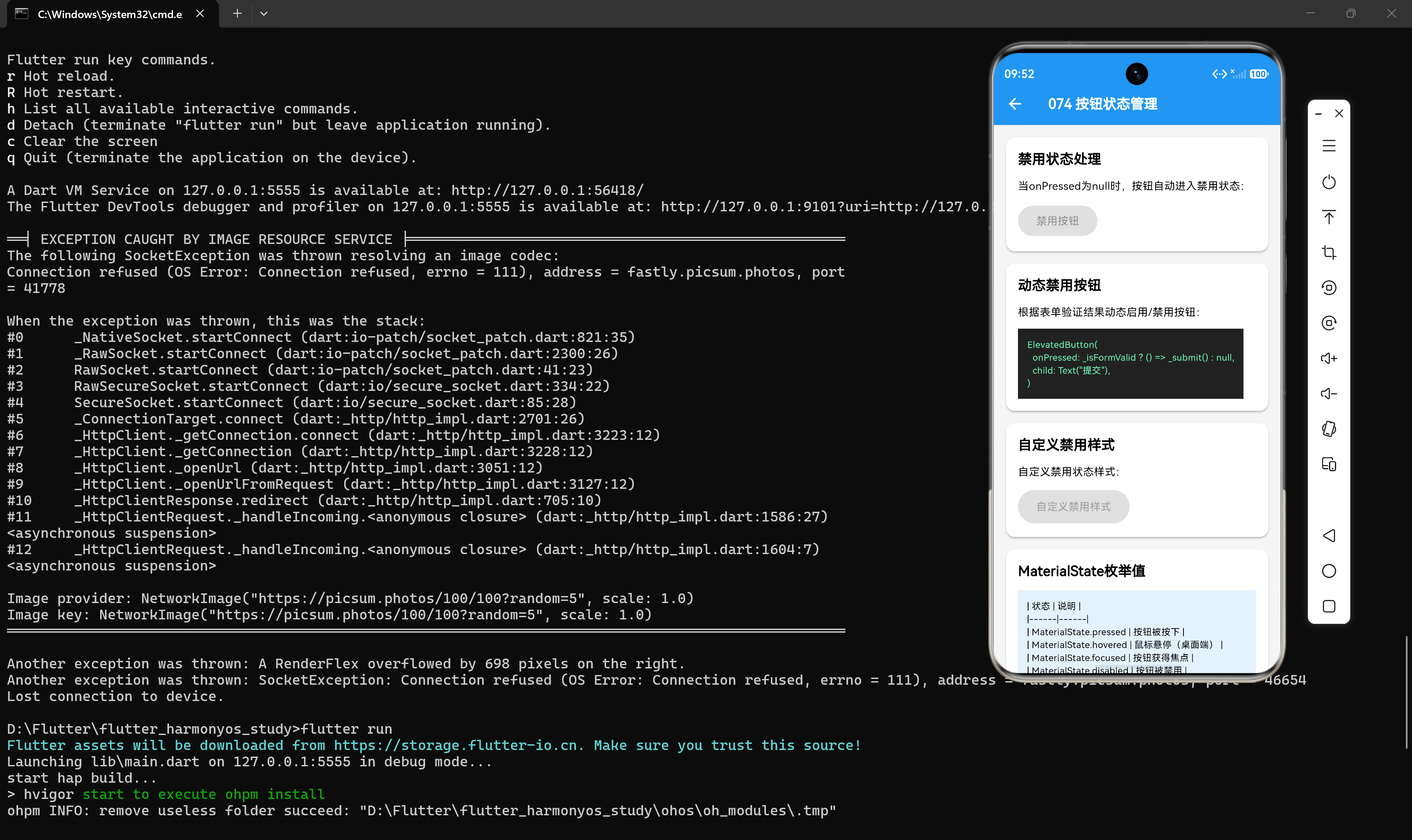
| disabled | 禁用状态 | onPressed为null |
| pressed | 按下状态 | 用户按下按钮 |
| hovered | 悬停状态 | 鼠标悬停在按钮上(桌面端) |
| focused | 焦点状态 | 按钮获得焦点 |
| selected | 选中状态 | 按钮被选中(如ToggleButtons) |
1.2 状态切换流程
初始状态:enabled
    ↓ 用户按下
pressed状态
    ↓ 用户抬起
enabled状态

enabled状态
    ↓ onPressed设为null
disabled状态
    ↓ onPressed设为回调函数
enabled状态
1.3 状态管理的重要性
合理的状态管理能够:
- 防止重复操作(如异步操作期间禁用按钮)
- 提供清晰的视觉反馈
- 引导用户正确操作
- 提升应用的可靠性和用户体验
二、禁用状态处理
2.1 基础禁用状态
ElevatedButton(
  onPressed: null,
  child: const Text('禁用按钮'),
)
当onPressed为null时,按钮自动变为禁用状态,颜色变灰,无法点击。
2.2 条件禁用
class ConditionalButton extends StatefulWidget {
const ConditionalButton({super.key});
State<ConditionalButton> createState() => _ConditionalButtonState();
}
class _ConditionalButtonState extends State<ConditionalButton> {
bool _isValid = false;
void _validateInput(String input) {
setState(() {
_isValid = input.isNotEmpty && input.length >= 3;
});
}
Widget build(BuildContext context) {
return Column(
children: [
TextField(
decoration: const InputDecoration(labelText: '输入内容'),
onChanged: _validateInput,
),
ElevatedButton(
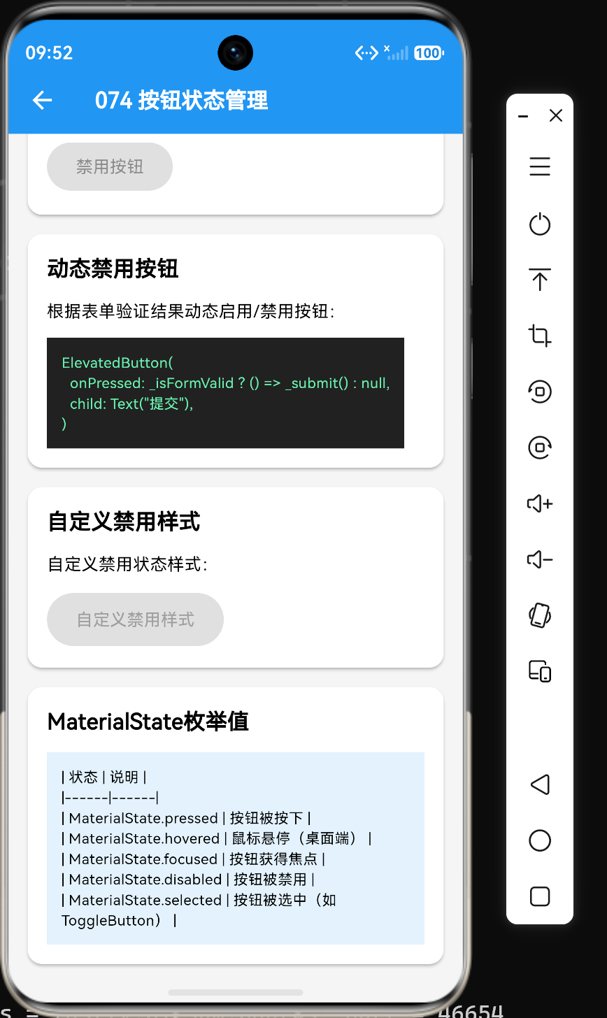
onPressed: _isValid ? () => print('提交') : null,
child: const Text('提交'),
),
],
);
}
}
2.3 禁用状态样式定制
ElevatedButton(
  onPressed: null,
  style: ElevatedButton.styleFrom(
    backgroundColor: Colors.grey[300],
    foregroundColor: Colors.grey[600],
    elevation: 0,
    shape: RoundedRectangleBorder(
      borderRadius: BorderRadius.circular(8),
    ),
  ),
  child: const Text('自定义禁用样式'),
)
2.4 禁用状态的视觉反馈
class DisabledFeedbackButton extends StatelessWidget {
final bool isDisabled;
final void Function() onPressed;
const DisabledFeedbackButton({
super.key,
required this.isDisabled,
required this.onPressed,
});
Widget build(BuildContext context) {
return ElevatedButton(
onPressed: isDisabled ? null : onPressed,
child: isDisabled
? const Row(
mainAxisSize: MainAxisSize.min,
children: [
Icon(Icons.block),
SizedBox(width: 8),
Text('请先完成表单'),
],
)
: const Text('提交'),
);
}
}
三、动态状态切换
3.1 切换按钮状态
class ToggleButton extends StatefulWidget {
const ToggleButton({super.key});
State<ToggleButton> createState() => _ToggleButtonState();
}
class _ToggleButtonState extends State<ToggleButton> {
bool _isEnabled = true;
void _toggleEnabled() {
setState(() {
_isEnabled = !_isEnabled;
});
}
Widget build(BuildContext context) {
return Column(
children: [
ElevatedButton(
onPressed: _isEnabled ? () => print('点击') : null,
child: const Text('动态按钮'),
),
TextButton(
onPressed: _toggleEnabled,
child: Text(_isEnabled ? '禁用按钮' : '启用按钮'),
),
],
);
}
}
3.2 多选按钮状态
class MultiSelectButton extends StatefulWidget {
const MultiSelectButton({super.key});
State<MultiSelectButton> createState() => _MultiSelectButtonState();
}
class _MultiSelectButtonState extends State<MultiSelectButton> {
final List<bool> _selected = [false, false, false];
final List<String> _options = ['选项1', '选项2', '选项3'];
void _toggleSelect(int index) {
setState(() {
_selected[index] = !_selected[index];
});
}
Widget build(BuildContext context) {
return Wrap(
spacing: 8,
children: List.generate(_options.length, (index) {
return ElevatedButton(
onPressed: () => _toggleSelect(index),
style: ElevatedButton.styleFrom(
backgroundColor: _selected[index] ? Colors.blue : Colors.grey,
),
child: Text(_options[index]),
);
}),
);
}
}
3.3 单选按钮状态
class SingleSelectButton extends StatefulWidget {
const SingleSelectButton({super.key});
State<SingleSelectButton> createState() => _SingleSelectButtonState();
}
class _SingleSelectButtonState extends State<SingleSelectButton> {
int? _selectedIndex;
final List<String> _options = ['选项A', '选项B', '选项C'];
void _selectOption(int index) {
setState(() {
_selectedIndex = index;
});
}
Widget build(BuildContext context) {
return Wrap(
spacing: 8,
children: List.generate(_options.length, (index) {
return ElevatedButton(
onPressed: () => _selectOption(index),
style: ElevatedButton.styleFrom(
backgroundColor: _selectedIndex == index ? Colors.blue : Colors.grey,
),
child: Text(_options[index]),
);
}),
);
}
}
四、异步操作状态
4.1 加载状态管理
class LoadingButton extends StatefulWidget {
final Future<void> Function() onPressed;
const LoadingButton({super.key, required this.onPressed});
State<LoadingButton> createState() => _LoadingButtonState();
}
class _LoadingButtonState extends State<LoadingButton> {
bool _isLoading = false;
Future<void> _handlePress() async {
setState(() {
_isLoading = true;
});
try {
await widget.onPressed();
} finally {
setState(() {
_isLoading = false;
});
}
}
Widget build(BuildContext context) {
return ElevatedButton(
onPressed: _isLoading ? null : _handlePress,
child: _isLoading
? const Row(
mainAxisSize: MainAxisSize.min,
children: [
CircularProgressIndicator(size: 16, color: Colors.white),
SizedBox(width: 8),
Text('处理中...'),
],
)
: const Text('执行操作'),
);
}
}
4.2 加载状态与禁用状态组合
class CombinedStateButton extends StatefulWidget {
const CombinedStateButton({super.key});
State<CombinedStateButton> createState() => _CombinedStateButtonState();
}
class _CombinedStateButtonState extends State<CombinedStateButton> {
bool _isLoading = false;
bool _isValid = false;
Future<void> _handleSubmit() async {
setState(() {
_isLoading = true;
});
await Future.delayed(const Duration(seconds: 2));
setState(() {
_isLoading = false;
});
}
Widget build(BuildContext context) {
return Column(
children: [
TextField(
decoration: const InputDecoration(labelText: '输入内容'),
onChanged: (value) {
setState(() {
_isValid = value.isNotEmpty;
});
},
),
ElevatedButton(
onPressed: (!_isLoading && _isValid) ? _handleSubmit : null,
child: _isLoading
? const CircularProgressIndicator(size: 20)
: const Text('提交'),
),
],
);
}
}
4.3 错误状态处理
class ErrorStateButton extends StatefulWidget {
const ErrorStateButton({super.key});
State<ErrorStateButton> createState() => _ErrorStateButtonState();
}
class _ErrorStateButtonState extends State<ErrorStateButton> {
bool _isLoading = false;
bool _hasError = false;
String _errorMessage = '';
Future<void> _handlePress() async {
setState(() {
_isLoading = true;
_hasError = false;
});
try {
await _performOperation();
} catch (e) {
setState(() {
_hasError = true;
_errorMessage = e.toString();
});
} finally {
setState(() {
_isLoading = false;
});
}
}
Future<void> _performOperation() async {
await Future.delayed(const Duration(seconds: 2));
throw Exception('操作失败');
}
Widget build(BuildContext context) {
return Column(
children: [
ElevatedButton(
onPressed: _isLoading ? null : _handlePress,
style: ElevatedButton.styleFrom(
backgroundColor: _hasError ? Colors.red : null,
),
child: _isLoading
? const CircularProgressIndicator(size: 20)
: _hasError
? const Text('重试')
: const Text('执行操作'),
),
if (_hasError)
Text(
_errorMessage,
style: const TextStyle(color: Colors.red),
),
],
);
}
}
五、自定义状态样式
5.1 使用ButtonStyle定制状态样式
ElevatedButton(
  style: ButtonStyle(
    backgroundColor: MaterialStateProperty.resolveWith((states) {
      if (states.contains(MaterialState.pressed)) {
        return Colors.blue[700];
      }
      if (states.contains(MaterialState.disabled)) {
        return Colors.grey[300];
      }
      return Colors.blue;
    }),
    foregroundColor: MaterialStateProperty.resolveWith((states) {
      if (states.contains(MaterialState.disabled)) {
        return Colors.grey[600];
      }
      return Colors.white;
    }),
    elevation: MaterialStateProperty.resolveWith((states) {
      if (states.contains(MaterialState.pressed)) {
        return 12.0;
      }
      return 8.0;
    }),
    padding: MaterialStateProperty.all(
      const EdgeInsets.symmetric(horizontal: 24, vertical: 12),
    ),
    shape: MaterialStateProperty.all(
      RoundedRectangleBorder(borderRadius: BorderRadius.circular(8)),
    ),
  ),
  onPressed: () {},
  child: const Text('自定义状态样式'),
)
5.2 MaterialState的状态类型
| 状态 | 说明 |
|---|---|
| MaterialState.disabled | 禁用状态 |
| MaterialState.pressed | 按压状态 |
| MaterialState.hovered | 悬停状态(桌面端) |
| MaterialState.focused | 焦点状态 |
| MaterialState.selected | 选中状态 |
| MaterialState.dragged | 拖拽状态 |
5.3 使用Theme统一管理状态样式
Theme(
  data: Theme.of(context).copyWith(
    elevatedButtonTheme: ElevatedButtonThemeData(
      style: ButtonStyle(
        backgroundColor: MaterialStateProperty.resolveWith((states) {
          if (states.contains(MaterialState.disabled)) {
            return Colors.grey[300];
          }
          return Colors.blue;
        }),
        foregroundColor: MaterialStateProperty.resolveWith((states) {
          if (states.contains(MaterialState.disabled)) {
            return Colors.grey[600];
          }
          return Colors.white;
        }),
      ),
    ),
  ),
  child: const MyPage(),
)
六、按钮状态管理模式
6.1 组件内状态管理
class SelfManagedButton extends StatefulWidget {
const SelfManagedButton({super.key});
State<SelfManagedButton> createState() => _SelfManagedButtonState();
}
class _SelfManagedButtonState extends State<SelfManagedButton> {
bool _isLoading = false;
bool _isDisabled = false;
Future<void> _handlePress() async {
setState(() {
_isLoading = true;
});
await Future.delayed(const Duration(seconds: 2));
setState(() {
_isLoading = false;
_isDisabled = true;
});
}
Widget build(BuildContext context) {
return ElevatedButton(
onPressed: (!_isLoading && !_isDisabled) ? _handlePress : null,
child: _isLoading
? const CircularProgressIndicator(size: 20)
: _isDisabled
? const Text('已完成')
: const Text('执行操作'),
);
}
}
6.2 父组件状态管理
class ParentManagedButton extends StatelessWidget {
final bool isLoading;
final bool isDisabled;
final void Function() onPressed;
const ParentManagedButton({
super.key,
required this.isLoading,
required this.isDisabled,
required this.onPressed,
});
Widget build(BuildContext context) {
return ElevatedButton(
onPressed: (!isLoading && !isDisabled) ? onPressed : null,
child: isLoading
? const CircularProgressIndicator(size: 20)
: isDisabled
? const Text('已完成')
: const Text('执行操作'),
);
}
}
6.3 使用ValueNotifier管理状态
class ValueNotifierButton extends StatefulWidget {
const ValueNotifierButton({super.key});
State<ValueNotifierButton> createState() => _ValueNotifierButtonState();
}
class _ValueNotifierButtonState extends State<ValueNotifierButton> {
final ValueNotifier<bool> _isLoading = ValueNotifier(false);
Future<void> _handlePress() async {
_isLoading.value = true;
await Future.delayed(const Duration(seconds: 2));
_isLoading.value = false;
}
void dispose() {
_isLoading.dispose();
super.dispose();
}
Widget build(BuildContext context) {
return ValueListenableBuilder<bool>(
valueListenable: _isLoading,
builder: (context, isLoading, child) {
return ElevatedButton(
onPressed: isLoading ? null : _handlePress,
child: isLoading
? const CircularProgressIndicator(size: 20)
: const Text('执行操作'),
);
},
);
}
}
七、实战示例:待办事项表单
7.1 完整代码示例
import 'package:flutter/material.dart';
class TodoForm extends StatefulWidget {
const TodoForm({super.key});
State<TodoForm> createState() => _TodoFormState();
}
class _TodoFormState extends State<TodoForm> {
final TextEditingController _titleController = TextEditingController();
final TextEditingController _descriptionController = TextEditingController();
final List<String> _categories = ['工作', '生活', '学习'];
String? _selectedCategory;
bool _isLoading = false;
bool _hasError = false;
bool get _isFormValid {
  return _titleController.text.trim().isNotEmpty &&
      _selectedCategory != null;
}
Future<void> _submitForm() async {
setState(() {
_isLoading = true;
_hasError = false;
});
try {
await _saveTodo();
if (!mounted) return;
ScaffoldMessenger.of(context).showSnackBar(
const SnackBar(content: Text('待办事项创建成功')),
);
_titleController.clear();
_descriptionController.clear();
setState(() {
_selectedCategory = null;
});
} catch (e) {
setState(() {
_hasError = true;
});
} finally {
setState(() {
_isLoading = false;
});
}
}
Future<void> _saveTodo() async {
await Future.delayed(const Duration(seconds: 2));
}
void dispose() {
_titleController.dispose();
_descriptionController.dispose();
super.dispose();
}
Widget build(BuildContext context) {
return Scaffold(
appBar: AppBar(title: const Text('创建待办事项')),
body: Padding(
padding: const EdgeInsets.all(16),
child: ListView(
children: [
TextField(
controller: _titleController,
decoration: const InputDecoration(
labelText: '标题',
hintText: '输入待办事项标题',
border: OutlineInputBorder(),
),
),
const SizedBox(height: 16),
TextField(
controller: _descriptionController,
decoration: const InputDecoration(
labelText: '描述',
hintText: '输入待办事项描述',
border: OutlineInputBorder(),
),
maxLines: 3,
),
const SizedBox(height: 16),
Column(
crossAxisAlignment: CrossAxisAlignment.start,
children: [
const Text('分类'),
const SizedBox(height: 8),
Wrap(
spacing: 8,
children: _categories.map((category) {
return ChoiceChip(
label: Text(category),
selected: _selectedCategory == category,
onSelected: (selected) {
setState(() {
_selectedCategory = selected ? category : null;
});
},
);
}).toList(),
),
],
),
const SizedBox(height: 24),
_hasError
? const Text(
'创建失败,请重试',
style: TextStyle(color: Colors.red),
)
: const SizedBox(),
ElevatedButton(
onPressed: (!_isLoading && _isFormValid) ? _submitForm : null,
style: ElevatedButton.styleFrom(
padding: const EdgeInsets.symmetric(vertical: 16),
),
child: _isLoading
? const Row(
mainAxisAlignment: MainAxisAlignment.center,
children: [
CircularProgressIndicator(size: 20),
SizedBox(width: 12),
Text('创建中...'),
],
)
: const Text('创建待办事项'),
),
TextButton(
onPressed: () => Navigator.pop(context),
child: const Text('取消'),
),
],
),
),
);
}
}
7.2 代码解析
表单验证:
bool get _isFormValid {
return _titleController.text.trim().isNotEmpty &&
_selectedCategory != null;
}
状态管理:
bool _isLoading = false;
bool _hasError = false;
提交处理:
Future<void> _submitForm() async {
  setState(() {
    _isLoading = true;
    _hasError = false;
  });

  try {
    await _saveTodo();
    if (!mounted) return;
    ScaffoldMessenger.of(context).showSnackBar(
      const SnackBar(content: Text('待办事项创建成功')),
    );
    _titleController.clear();
    _descriptionController.clear();
    setState(() {
      _selectedCategory = null;
    });
  } catch (e) {
    setState(() {
      _hasError = true;
    });
  } finally {
    setState(() {
      _isLoading = false;
    });
  }
}
7.3 状态转换流程
初始状态:enabled
    ↓ 表单验证通过
可点击状态
    ↓ 用户点击
loading状态(禁用)
    ↓ 操作成功
enabled状态(重置表单)
    ↓ 操作失败
error状态(显示错误信息)
    ↓ 用户重试
loading状态(禁用)
八、性能优化与最佳实践
8.1 避免不必要的状态更新
void _updateState(bool newValue) {
  if (newValue != _currentValue) {
    setState(() {
      _currentValue = newValue;
    });
  }
}
8.2 使用const构造函数
const ElevatedButton(
  onPressed: _handleTap,
  child: const Text('静态按钮'),
)
8.3 提取状态样式为常量
final ButtonStyle customButtonStyle = ButtonStyle(
  backgroundColor: MaterialStateProperty.resolveWith((states) {
    if (states.contains(MaterialState.disabled)) {
      return Colors.grey[300];
    }
    return Colors.blue;
  }),
);

// 使用
ElevatedButton(
  style: customButtonStyle,
  onPressed: () {},
  child: const Text('按钮'),
)
8.4 合理管理异步状态
Future<void> _handleAsyncOperation() async {
  setState(() {
    _isLoading = true;
  });

  try {
    await _performOperation();
  } catch (e) {
    setState(() {
      _hasError = true;
    });
  } finally {
    setState(() {
      _isLoading = false;
    });
  }
}
8.5 提供清晰的状态反馈
ElevatedButton(
  onPressed: _isLoading ? null : _handlePress,
  child: _isLoading
      ? const CircularProgressIndicator(size: 20)
      : const Text('执行操作'),
)
九、常见问题与解决方案
9.1 问题1:按钮状态不更新
问题描述:状态变量改变后,按钮状态没有更新。
解决方案:确保使用setState更新状态:
// 错误:直接赋值不会触发UI更新
_isLoading = true;

// 正确:使用setState
setState(() {
  _isLoading = true;
});
9.2 问题2:异步操作完成后状态不更新
问题描述:异步操作完成后,按钮状态没有恢复。
解决方案:在finally块中恢复状态:
Future<void> _handlePress() async {
  setState(() {
    _isLoading = true;
  });

  try {
    await _performOperation();
  } finally {
    setState(() {
      _isLoading = false;
    });
  }
}
9.3 问题3:禁用状态样式不生效
问题描述:自定义的禁用状态样式没有生效。
解决方案:使用ButtonStyle和MaterialStateProperty.resolveWith:
ElevatedButton(
  style: ButtonStyle(
    backgroundColor: MaterialStateProperty.resolveWith((states) {
      if (states.contains(MaterialState.disabled)) {
        return Colors.grey[300];
      }
      return Colors.blue;
    }),
  ),
  onPressed: null,
  child: const Text('禁用按钮'),
)
9.4 问题4:重复点击导致多次操作
问题描述:用户快速点击按钮导致多次触发操作。
解决方案:在操作期间禁用按钮:
ElevatedButton(
  onPressed: _isLoading ? null : _handlePress,
  child: _isLoading
      ? const CircularProgressIndicator(size: 20)
      : const Text('执行操作'),
)
9.5 问题5:状态管理过于复杂
问题描述:组件中有多个状态变量,管理起来很复杂。
解决方案:使用状态管理库或简化状态逻辑:
// 使用枚举管理状态
enum ButtonState { enabled, loading, disabled, error }
class StatefulButton extends StatefulWidget {
const StatefulButton({super.key});
State<StatefulButton> createState() => _StatefulButtonState();
}
class _StatefulButtonState extends State<StatefulButton> {
ButtonState _state = ButtonState.enabled;
void _updateState(ButtonState newState) {
setState(() {
_state = newState;
});
}
Widget build(BuildContext context) {
return ElevatedButton(
onPressed: _state == ButtonState.enabled ? _handlePress : null,
child: _buildChild(),
);
}
Widget _buildChild() {
switch (_state) {
case ButtonState.loading:
return const CircularProgressIndicator(size: 20);
case ButtonState.disabled:
return const Text('已完成');
case ButtonState.error:
return const Text('重试');
default:
return const Text('执行操作');
}
}
}
十、总结
通过本文的学习,我们掌握了以下核心知识点:
- 按钮状态包括启用、禁用、加载、选中、按下等多种状态
- 禁用状态通过设置
onPressed为null实现 - 动态状态切换使用
setState更新状态变量 - 异步操作状态需要管理加载、成功、失败三种状态
- 自定义状态样式使用
ButtonStyle和MaterialStateProperty - 状态管理模式包括组件内管理、父组件管理和ValueNotifier管理
- 表单验证是按钮状态管理的常见场景
- 性能优化包括避免不必要的状态更新和使用const构造函数
在实际开发中,合理管理按钮状态是构建可靠应用的关键。理解状态切换的原理和最佳实践,能够帮助我们创建出交互流畅、反馈清晰的用户界面。
参考资料
- Flutter官方文档:https://docs.flutter.dev/
- Material Design按钮指南:https://m3.material.io/components/buttons/overview
- Flutter状态管理指南:https://docs.flutter.dev/data-and-backend/state-mgmt/intro

作为“人工智能6S店”的官方数字引擎,为AI开发者与企业提供一个覆盖软硬件全栈、一站式门户。
更多推荐


 1
1 0
0- 0


 已为社区贡献39条内容

所有评论(0)