
鸿蒙Flutter MaterialButton系列:ElevatedButton、TextButton、OutlinedButton详解
作者:高红朋(小雨下雨的雨)
仓库地址:https://gitcode.com/feng8403000/FlutterfromBeginnertoAdvancedForHarmonyOS.git
联系邮箱:372699828@qq.com
引言
在Flutter的Material Design组件库中,按钮是用户交互最核心的元素之一。Flutter提供了一系列Material风格的按钮组件,包括ElevatedButton、TextButton和OutlinedButton。这些按钮组件不仅具有美观的默认样式,还提供了丰富的自定义选项和交互反馈。本文将深入探讨这三种按钮的特性、用法和最佳实践。
一、MaterialButton系列概述
1.1 按钮组件家族
Flutter的MaterialButton系列包含三个主要组件:
| 组件 | 样式特点 | 适用场景 |
|---|---|---|
| ElevatedButton | 带有阴影和背景色,悬浮效果 | 主要操作、强调性按钮 |
| TextButton | 只有文字,无背景色 | 次要操作、链接式按钮 |
| OutlinedButton | 带有边框,无填充背景 | 中性操作、表单按钮 |
1.2 设计理念
Material Design按钮设计遵循以下原则:
- 层次分明:通过阴影和颜色区分按钮的重要性
- 交互反馈:点击时有清晰的视觉反馈(涟漪效果、按压效果)
- 响应式:适应不同屏幕尺寸和布局
- 无障碍:支持键盘导航和屏幕阅读器
二、ElevatedButton:悬浮按钮
2.1 ElevatedButton的定义
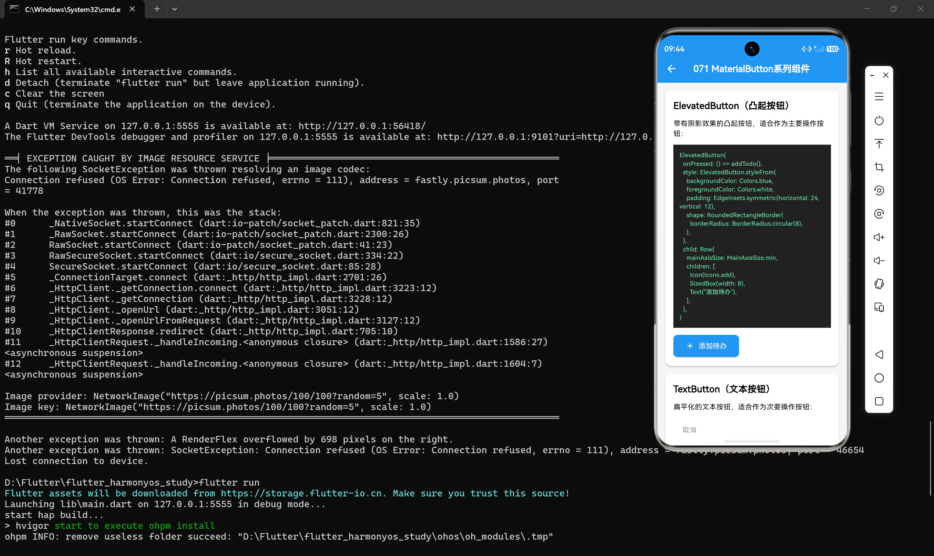
ElevatedButton是一种带有阴影的按钮,默认具有填充背景色。当用户按下时,阴影会变大,产生悬浮效果。
ElevatedButton(
  onPressed: () {
    // 点击事件处理
  },
  child: const Text('添加待办'),
)
2.2 ElevatedButton的核心属性
2.2.1 onPressed和onLongPress
onPressed是按钮点击的回调函数,onLongPress是长按的回调函数:
ElevatedButton(
  onPressed: () {
    print('按钮被点击');
  },
  onLongPress: () {
    print('按钮被长按');
  },
  child: const Text('长按测试'),
)
2.2.2 style属性
style属性用于自定义按钮样式:
ElevatedButton(
  style: ElevatedButton.styleFrom(
    backgroundColor: Colors.blue,
    foregroundColor: Colors.white,
    padding: const EdgeInsets.symmetric(horizontal: 24, vertical: 12),
    textStyle: const TextStyle(fontSize: 18),
    elevation: 8,
    shape: RoundedRectangleBorder(
      borderRadius: BorderRadius.circular(8),
    ),
  ),
  onPressed: () {},
  child: const Text('自定义样式'),
)
styleFrom参数说明:
| 参数 | 类型 | 说明 |
|---|---|---|
| backgroundColor | Color | 按钮背景色 |
| foregroundColor | Color | 文字和图标颜色 |
| padding | EdgeInsets | 内边距 |
| textStyle | TextStyle | 文字样式 |
| elevation | double | 阴影高度 |
| shape | ShapeBorder | 按钮形状 |
| side | BorderSide | 边框样式 |
| minimumSize | Size | 最小尺寸 |
| maximumSize | Size | 最大尺寸 |
2.2.3 child属性
child属性可以是任何Widget,通常是Text或Row:
ElevatedButton(
  onPressed: () {},
  child: const Row(
    mainAxisSize: MainAxisSize.min,
    children: [
      Icon(Icons.add),
      SizedBox(width: 8),
      Text('添加'),
    ],
  ),
)
2.3 ElevatedButton的状态变化
ElevatedButton会根据状态自动改变外观:
ElevatedButton(
  onPressed: null, // 禁用状态
  child: const Text('禁用按钮'),
)
当onPressed为null时,按钮自动变为禁用状态,颜色变灰,无法点击。
2.4 实战示例:待办事项添加按钮
class AddTodoButton extends StatelessWidget {
final void Function(String) onAdd;
const AddTodoButton({super.key, required this.onAdd});
Widget build(BuildContext context) {
return ElevatedButton(
style: ElevatedButton.styleFrom(
backgroundColor: Colors.blue,
foregroundColor: Colors.white,
padding: const EdgeInsets.symmetric(horizontal: 32, vertical: 16),
shape: RoundedRectangleBorder(
borderRadius: BorderRadius.circular(12),
),
),
onPressed: () {
showDialog(
context: context,
builder: (context) => AlertDialog(
title: const Text('添加待办'),
content: TextField(
decoration: const InputDecoration(hintText: '输入待办内容'),
onSubmitted: (value) {
if (value.isNotEmpty) {
onAdd(value);
Navigator.pop(context);
}
},
),
actions: [
TextButton(
onPressed: () => Navigator.pop(context),
child: const Text('取消'),
),
ElevatedButton(
onPressed: () {
// 确认添加
Navigator.pop(context);
},
child: const Text('确认'),
),
],
),
);
},
child: const Row(
mainAxisSize: MainAxisSize.min,
children: [
Icon(Icons.add_circle),
SizedBox(width: 8),
Text('添加新待办'),
],
),
);
}
}
三、TextButton:文字按钮
3.1 TextButton的定义
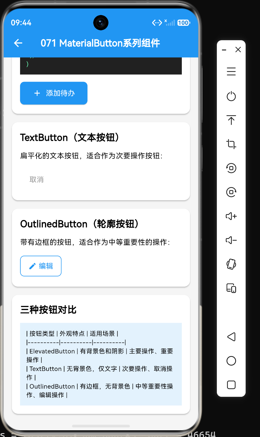
TextButton是一种简洁的文字按钮,没有背景色和阴影,只有文字和涟漪效果。
TextButton(
  onPressed: () {
    // 点击事件处理
  },
  child: const Text('取消'),
)
3.2 TextButton的核心属性
3.2.1 style属性
TextButton的样式定制与ElevatedButton类似:
TextButton(
  style: TextButton.styleFrom(
    foregroundColor: Colors.blue,
    backgroundColor: Colors.blue[50],
    padding: const EdgeInsets.symmetric(horizontal: 20, vertical: 10),
    textStyle: const TextStyle(fontSize: 16),
    shape: RoundedRectangleBorder(
      borderRadius: BorderRadius.circular(6),
    ),
  ),
  onPressed: () {},
  child: const Text('自定义文字按钮'),
)
3.2.2 常见用法
TextButton常用于表单操作、对话框按钮等场景:
Row(
  mainAxisAlignment: MainAxisAlignment.end,
  children: [
    TextButton(
      onPressed: () => Navigator.pop(context),
      child: const Text('取消'),
    ),
    TextButton(
      onPressed: () => _submitForm(),
      child: const Text('确定'),
    ),
  ],
)
3.3 TextButton的禁用状态
TextButton(
  onPressed: null,
  style: TextButton.styleFrom(
    foregroundColor: Colors.grey,
  ),
  child: const Text('禁用状态'),
)
3.4 实战示例:待办事项操作按钮组
class TodoActionButtons extends StatelessWidget {
final bool isCompleted;
final void Function() onToggle;
final void Function() onDelete;
const TodoActionButtons({
super.key,
required this.isCompleted,
required this.onToggle,
required this.onDelete,
});
Widget build(BuildContext context) {
return Row(
gap: 8,
children: [
TextButton(
style: TextButton.styleFrom(
foregroundColor: isCompleted ? Colors.orange : Colors.green,
padding: const EdgeInsets.symmetric(horizontal: 16, vertical: 8),
),
onPressed: onToggle,
child: Row(
mainAxisSize: MainAxisSize.min,
children: [
Icon(isCompleted ? Icons.refresh : Icons.check),
const SizedBox(width: 4),
Text(isCompleted ? '重新激活' : '标记完成'),
],
),
),
TextButton(
style: TextButton.styleFrom(
foregroundColor: Colors.red,
padding: const EdgeInsets.symmetric(horizontal: 16, vertical: 8),
),
onPressed: onDelete,
child: Row(
mainAxisSize: MainAxisSize.min,
children: [
const Icon(Icons.delete),
const SizedBox(width: 4),
const Text('删除'),
],
),
),
],
);
}
}
四、OutlinedButton:边框按钮
4.1 OutlinedButton的定义
OutlinedButton是一种带有边框的按钮,没有填充背景,介于ElevatedButton和TextButton之间。
OutlinedButton(
  onPressed: () {
    // 点击事件处理
  },
  child: const Text('编辑'),
)
4.2 OutlinedButton的核心属性
4.2.1 style属性
OutlinedButton的样式定制重点在于边框:
OutlinedButton(
  style: OutlinedButton.styleFrom(
    foregroundColor: Colors.blue,
    backgroundColor: Colors.transparent,
    side: const BorderSide(color: Colors.blue, width: 2),
    padding: const EdgeInsets.symmetric(horizontal: 24, vertical: 12),
    textStyle: const TextStyle(fontSize: 16),
    shape: RoundedRectangleBorder(
      borderRadius: BorderRadius.circular(8),
    ),
  ),
  onPressed: () {},
  child: const Text('自定义边框按钮'),
)
4.2.2 常见用法
OutlinedButton常用于表单提交、卡片操作等场景:
Card(
  child: Padding(
    padding: const EdgeInsets.all(16),
    child: Column(
      children: [
        const TextField(decoration: InputDecoration(labelText: '待办内容')),
        const SizedBox(height: 16),
        OutlinedButton(
          onPressed: () {},
          child: const Text('保存'),
        ),
      ],
    ),
  ),
)
4.3 OutlinedButton的禁用状态
OutlinedButton(
  onPressed: null,
  style: OutlinedButton.styleFrom(
    side: const BorderSide(color: Colors.grey),
    foregroundColor: Colors.grey,
  ),
  child: const Text('禁用状态'),
)
4.4 实战示例:待办事项编辑按钮
class EditTodoButton extends StatelessWidget {
final void Function() onEdit;
const EditTodoButton({super.key, required this.onEdit});
Widget build(BuildContext context) {
return OutlinedButton(
style: OutlinedButton.styleFrom(
foregroundColor: Colors.blue,
side: const BorderSide(color: Colors.blue),
padding: const EdgeInsets.symmetric(horizontal: 20, vertical: 10),
shape: RoundedRectangleBorder(
borderRadius: BorderRadius.circular(8),
),
),
onPressed: onEdit,
child: const Row(
mainAxisSize: MainAxisSize.min,
children: [
Icon(Icons.edit),
SizedBox(width: 8),
Text('编辑'),
],
),
);
}
}
五、三种按钮的对比与选择
5.1 视觉效果对比
| 属性 | ElevatedButton | TextButton | OutlinedButton |
|---|---|---|---|
| 背景色 | 有填充色 | 无 | 无 |
| 边框 | 无 | 无 | 有 |
| 阴影 | 有 | 无 | 无 |
| 涟漪效果 | 有 | 有 | 有 |
5.2 适用场景对比
ElevatedButton适用场景:
- 主要操作按钮(如"提交"、“确认”)
- 需要强调的操作
- 独立的操作按钮
TextButton适用场景:
- 次要操作(如"取消"、“跳过”)
- 链接式导航
- 表单底部操作组
OutlinedButton适用场景:
- 表单提交按钮
- 卡片内操作
- 中性操作(既不强调也不弱化)
5.3 选择建议
- 页面主操作:使用
ElevatedButton - 页面次要操作:使用
TextButton或OutlinedButton - 表单操作:提交按钮使用
OutlinedButton,取消按钮使用TextButton - 列表项操作:使用
TextButton或IconButton - 对话框操作:确认按钮使用
ElevatedButton,取消按钮使用TextButton
六、按钮样式进阶定制
6.1 使用ButtonStyle定制
ButtonStyle提供更细粒度的样式控制:
ElevatedButton(
  style: ButtonStyle(
    backgroundColor: MaterialStateProperty.resolveWith((states) {
      if (states.contains(MaterialState.pressed)) {
        return Colors.blue[700];
      }
      if (states.contains(MaterialState.disabled)) {
        return Colors.grey[300];
      }
      return Colors.blue;
    }),
    foregroundColor: MaterialStateProperty.resolveWith((states) {
      if (states.contains(MaterialState.disabled)) {
        return Colors.grey[600];
      }
      return Colors.white;
    }),
    elevation: MaterialStateProperty.resolveWith((states) {
      if (states.contains(MaterialState.pressed)) {
        return 12.0;
      }
      return 8.0;
    }),
    padding: MaterialStateProperty.all(
      const EdgeInsets.symmetric(horizontal: 24, vertical: 12),
    ),
    shape: MaterialStateProperty.all(
      RoundedRectangleBorder(borderRadius: BorderRadius.circular(8)),
    ),
  ),
  onPressed: () {},
  child: const Text('高级定制'),
)
6.2 MaterialState的状态类型
MaterialState包含以下状态:
| 状态 | 说明 |
|---|---|
| MaterialState.disabled | 禁用状态 |
| MaterialState.pressed | 按压状态 |
| MaterialState.hovered | 悬停状态(桌面端) |
| MaterialState.focused | 焦点状态 |
| MaterialState.selected | 选中状态 |
| MaterialState.dragged | 拖拽状态 |
6.3 使用Theme统一管理按钮样式
通过Theme组件统一管理按钮样式:
Theme(
  data: Theme.of(context).copyWith(
    elevatedButtonTheme: ElevatedButtonThemeData(
      style: ElevatedButton.styleFrom(
        backgroundColor: Colors.blue,
        foregroundColor: Colors.white,
        padding: const EdgeInsets.symmetric(horizontal: 24, vertical: 12),
      ),
    ),
    textButtonTheme: TextButtonThemeData(
      style: TextButton.styleFrom(
        foregroundColor: Colors.blue,
      ),
    ),
    outlinedButtonTheme: OutlinedButtonThemeData(
      style: OutlinedButton.styleFrom(
        foregroundColor: Colors.blue,
        side: const BorderSide(color: Colors.blue),
      ),
    ),
  ),
  child: const MyPage(),
)
七、按钮交互模式
7.1 按钮组模式
Row(
  mainAxisAlignment: MainAxisAlignment.center,
  children: [
    ElevatedButton(
      onPressed: () {},
      child: const Text('主要操作'),
    ),
    const SizedBox(width: 16),
    OutlinedButton(
      onPressed: () {},
      child: const Text('次要操作'),
    ),
    const SizedBox(width: 16),
    TextButton(
      onPressed: () {},
      child: const Text('链接'),
    ),
  ],
)
7.2 卡片内按钮模式
Card(
  child: Padding(
    padding: const EdgeInsets.all(16),
    child: Column(
      crossAxisAlignment: CrossAxisAlignment.start,
      children: [
        const Text('待办事项标题', style: TextStyle(fontSize: 18)),
        const Text('待办事项描述内容...', style: TextStyle(color: Colors.grey)),
        const SizedBox(height: 16),
        Row(
          mainAxisAlignment: MainAxisAlignment.end,
          children: [
            TextButton(onPressed: () {}, child: const Text('删除')),
            const SizedBox(width: 8),
            OutlinedButton(onPressed: () {}, child: const Text('编辑')),
          ],
        ),
      ],
    ),
  ),
)
7.3 浮动操作按钮模式
FloatingActionButton(
  onPressed: () {},
  child: const Icon(Icons.add),
)
虽然FloatingActionButton不属于MaterialButton系列,但它是Material Design中重要的按钮组件。
八、性能优化与最佳实践
8.1 避免重复创建样式
将样式提取为常量或变量:
final ButtonStyle elevatedButtonStyle = ElevatedButton.styleFrom(
  backgroundColor: Colors.blue,
  foregroundColor: Colors.white,
  padding: const EdgeInsets.symmetric(horizontal: 24, vertical: 12),
);

// 使用
ElevatedButton(
  style: elevatedButtonStyle,
  onPressed: () {},
  child: const Text('按钮'),
)
8.2 使用const构造函数
对于静态按钮,使用const构造函数:
const ElevatedButton(
  onPressed: _handlePressed,
  child: const Text('静态按钮'),
)
8.3 合理使用按钮类型
避免过度使用ElevatedButton,应根据操作的重要性选择合适的按钮类型。
8.4 处理按钮禁用状态
当按钮不可用时,应明确设置onPressed为null,并提供清晰的禁用样式。
8.5 提供充足的点击区域
根据Material Design规范,按钮的最小点击区域应为48x48dp:
ElevatedButton(
  style: ElevatedButton.styleFrom(
    minimumSize: const Size(48, 48),
  ),
  onPressed: () {},
  child: const Icon(Icons.add),
)
九、常见问题与解决方案
9.1 问题1:按钮样式不生效
问题描述:自定义样式没有生效。
解决方案:确保使用styleFrom方法或ButtonStyle正确设置样式:
// 错误
ElevatedButton(
  onPressed: () {},
  child: const Text('按钮'),
  // 直接设置属性不会生效
  backgroundColor: Colors.blue,
)

// 正确
ElevatedButton(
  style: ElevatedButton.styleFrom(
    backgroundColor: Colors.blue,
  ),
  onPressed: () {},
  child: const Text('按钮'),
)
9.2 问题2:按钮点击区域过小
问题描述:按钮图标太小,点击困难。
解决方案:设置minimumSize增加点击区域:
ElevatedButton(
  style: ElevatedButton.styleFrom(
    minimumSize: const Size(56, 56),
  ),
  onPressed: () {},
  child: const Icon(Icons.add, size: 24),
)
9.3 问题3:按钮文字换行
问题描述:长文字按钮导致文字换行。
解决方案:设置textAlign或调整按钮宽度:
ElevatedButton(
  style: ElevatedButton.styleFrom(
    padding: const EdgeInsets.symmetric(horizontal: 16),
  ),
  onPressed: () {},
  child: const Text(
    '这是一个很长的按钮文字',
    textAlign: TextAlign.center,
  ),
)
9.4 问题4:按钮状态切换不流畅
问题描述:按钮状态切换时动画不流畅。
解决方案:使用MaterialStateProperty.resolveWith处理状态:
ElevatedButton(
  style: ButtonStyle(
    backgroundColor: MaterialStateProperty.resolveWith((states) {
      if (states.contains(MaterialState.pressed)) {
        return Colors.blue[700];
      }
      return Colors.blue;
    }),
  ),
  onPressed: () {},
  child: const Text('按钮'),
)
十、总结
通过本文的学习,我们掌握了以下核心知识点:
- ElevatedButton是带有阴影的悬浮按钮,适用于主要操作
- TextButton是简洁的文字按钮,适用于次要操作和链接
- OutlinedButton是带边框的按钮,适用于中性操作和表单
- styleFrom方法提供了便捷的样式定制方式
- ButtonStyle提供了更细粒度的状态样式控制
- MaterialState用于处理按钮的各种状态(按压、禁用、选中等)
在实际开发中,根据操作的重要性和上下文选择合适的按钮类型,可以创建出层次分明、交互清晰的用户界面。合理定制按钮样式,统一设计语言,能够提升应用的整体体验。
参考资料
- Flutter官方文档:https://docs.flutter.dev/
- Material Design按钮指南:https://m3.material.io/components/buttons/overview
- Flutter Widget目录:https://docs.flutter.dev/reference/widgets

作为“人工智能6S店”的官方数字引擎,为AI开发者与企业提供一个覆盖软硬件全栈、一站式门户。
更多推荐
 3
3 0
0- 0


 已为社区贡献39条内容

所有评论(0)