
鸿蒙Flutter Center与Align:组件对齐方式
作者:马振显(YM52e)
仓库地址:https://gitcode.com/feng8403000/FlutterfromBeginnertoAdvancedForHarmonyOS.git
联系邮箱:372699828@qq.com
引言
在Flutter开发中,Center和Align是两个用于控制子组件对齐方式的核心组件。它们能够精确控制子组件在父组件中的位置,是构建精美UI的基础。
对于待办事项应用来说,对齐方式尤为重要。例如,待办项中的复选框需要居中对齐,操作按钮需要右对齐,标题需要左对齐。Center和Align正是实现这些效果的关键组件。
本文将深入探讨Center和Align的各种用法,包括基本属性、对齐位置、自定义对齐方式,并结合待办事项应用的实际场景进行讲解。
一、Center基本概念
1.1 Center的作用
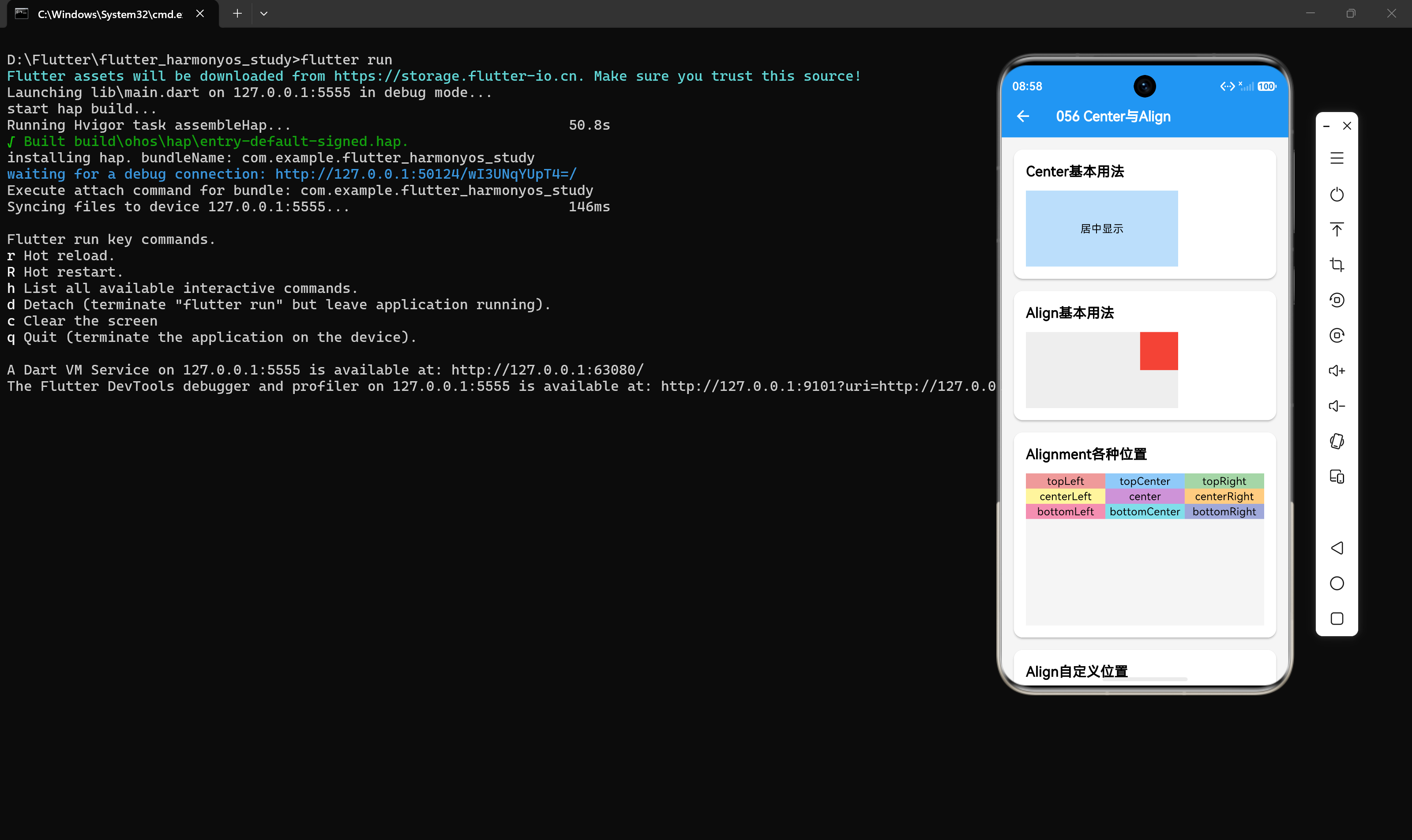
Center组件用于将子组件居中显示在父组件内。它是Flutter中最常用的对齐组件之一,能够让子组件在水平和垂直方向上都居中。
Container(
  width: 200,
  height: 100,
  color: Colors.blue[100],
  child: const Center(child: Text('居中显示')),
)
1.2 Center的工作原理
Center的工作原理很简单:
Center会计算父组件的可用空间- 将子组件放置在父组件的正中心
- 如果子组件的尺寸小于父组件,子组件会保持自身尺寸并居中
- 如果子组件的尺寸大于父组件,子组件会被裁剪
1.3 Center与Container的alignment对比
Center组件等同于使用Container的alignment: Alignment.center:
// 使用Center
Center(child: Text("居中"))

// 使用Container的alignment
Container(
  alignment: Alignment.center,
  child: Text("居中"),
)
两者的效果完全相同,但Center更加简洁明了。
二、Align基本概念
2.1 Align的作用
Align组件用于将子组件对齐到父组件的任意位置。它比Center更加灵活,可以指定任意的对齐位置。
Container(
  width: 200,
  height: 100,
  color: Colors.grey[200],
  child: Align(
    alignment: Alignment.topRight,
    child: Container(width: 50, height: 50, color: Colors.red),
  ),
)
2.2 Align的工作原理
Align的工作原理基于对齐坐标系:
Align使用Alignment来定义对齐位置Alignment使用(-1, -1)到(1, 1)的坐标系统- (-1, -1)表示左上角,(1, 1)表示右下角,(0, 0)表示中心
Align会根据alignment的值计算子组件的位置
三、Alignment对齐位置
3.1 预设对齐位置
Flutter提供了多个预设的对齐位置常量:
| 对齐位置 | 坐标 | 说明 |
|---|---|---|
| Alignment.topLeft | (-1, -1) | 左上角 |
| Alignment.topCenter | (0, -1) | 顶部居中 |
| Alignment.topRight | (1, -1) | 右上角 |
| Alignment.centerLeft | (-1, 0) | 左侧居中 |
| Alignment.center | (0, 0) | 正中心 |
| Alignment.centerRight | (1, 0) | 右侧居中 |
| Alignment.bottomLeft | (-1, 1) | 左下角 |
| Alignment.bottomCenter | (0, 1) | 底部居中 |
| Alignment.bottomRight | (1, 1) | 右下角 |
3.2 使用预设对齐位置
Container(
  height: 200,
  color: Colors.grey[100],
  child: Column(
    children: [
      Row(
        children: [
          Expanded(child: Container(color: Colors.red[200], child: const Center(child: Text('topLeft')))),
          Expanded(child: Container(color: Colors.blue[200], child: const Center(child: Text('topCenter')))),
          Expanded(child: Container(color: Colors.green[200], child: const Center(child: Text('topRight')))),
        ],
      ),
      Row(
        children: [
          Expanded(child: Container(color: Colors.yellow[200], child: const Center(child: Text('centerLeft')))),
          Expanded(child: Container(color: Colors.purple[200], child: const Center(child: Text('center')))),
          Expanded(child: Container(color: Colors.orange[200], child: const Center(child: Text('centerRight')))),
        ],
      ),
      Row(
        children: [
          Expanded(child: Container(color: Colors.pink[200], child: const Center(child: Text('bottomLeft')))),
          Expanded(child: Container(color: Colors.cyan[200], child: const Center(child: Text('bottomCenter')))),
          Expanded(child: Container(color: Colors.indigo[200], child: const Center(child: Text('bottomRight')))),
        ],
      ),
    ],
  ),
)
四、自定义对齐位置
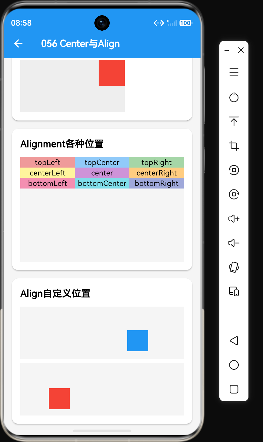
4.1 使用Alignment构造函数
Alignment提供了构造函数,可以指定任意的对齐位置:
Align(
  alignment: const Alignment(0.5, 0.5),
  child: Container(width: 40, height: 40, color: Colors.blue),
)
Alignment(x, y)的参数说明:
- x: 水平方向偏移,-1表示最左,1表示最右
- y: 垂直方向偏移,-1表示最上,1表示最下
4.2 使用FractionalOffset
FractionalOffset是Alignment的子类,使用0到1的坐标系统:
Align(
  alignment: FractionalOffset(0.2, 0.8),
  child: Container(width: 40, height: 40, color: Colors.red),
)
FractionalOffset(x, y)的参数说明:
- x: 水平方向偏移,0表示最左,1表示最右
- y: 垂直方向偏移,0表示最上,1表示最下
4.3 自定义对齐位置示例
Container(
  height: 100,
  color: Colors.grey[100],
  child: Align(
    alignment: const Alignment(0.5, 0.5), // 中心偏右下方
    child: Container(width: 40, height: 40, color: Colors.blue),
  ),
)
五、Center与Align的区别
5.1 核心差异
| 特性 | Center | Align |
|---|---|---|
| 对齐位置 | 只能居中 | 任意位置 |
| alignment属性 | 不支持 | 支持 |
| 灵活性 | 低 | 高 |
| 使用场景 | 简单居中 | 复杂对齐 |
5.2 使用场景对比
// 使用Center:简单居中
Center(child: Text("居中内容"))

// 使用Align:自定义位置
Align(
  alignment: Alignment.topRight,
  child: Text("右上角内容"),
)
六、实际应用:待办事项界面
6.1 待办项布局
Container(
  padding: EdgeInsets.all(12),
  child: Row(
    children: [
      Center(
        child: Checkbox(value: true, onChanged: null),
      ),
      SizedBox(width: 12),
      Expanded(
        child: Column(
          crossAxisAlignment: CrossAxisAlignment.start,
          children: [
            Text("学习Flutter布局"),
            Text("掌握Center和Align组件", style: TextStyle(color: Colors.grey)),
          ],
        ),
      ),
      SizedBox(width: 12),
      Align(
        alignment: Alignment.centerRight,
        child: Icon(Icons.delete),
      ),
    ],
  ),
)
6.2 待办卡片布局
Container(
  width: double.infinity,
  height: 150,
  decoration: BoxDecoration(
    borderRadius: BorderRadius.circular(8),
    image: const DecorationImage(
      image: NetworkImage('https://picsum.photos/400/200'),
      fit: BoxFit.cover,
    ),
  ),
  child: Align(
    alignment: Alignment.bottomLeft,
    child: Container(
      padding: EdgeInsets.all(8),
      color: Colors.black54,
      child: Text('待办标题', style: TextStyle(color: Colors.white)),
    ),
  ),
)
6.3 浮动按钮布局
Container(
  height: 200,
  color: Colors.grey[100],
  child: Stack(
    children: [
      const Center(child: Text('列表内容区域')),
      Align(
        alignment: Alignment.bottomRight,
        child: FloatingActionButton(
          onPressed: () {},
          child: const Icon(Icons.add),
        ),
      ),
    ],
  ),
)
七、Align的widthFactor和heightFactor
7.1 widthFactor属性
widthFactor用于设置子组件宽度相对于父组件的比例:
Align(
  widthFactor: 0.5, // 子组件宽度为父组件的50%
  child: Container(height: 40, color: Colors.red),
)
7.2 heightFactor属性
heightFactor用于设置子组件高度相对于父组件的比例:
Align(
  heightFactor: 0.5, // 子组件高度为父组件的50%
  child: Container(width: 40, color: Colors.blue),
)
7.3 使用widthFactor和heightFactor
Container(
  width: 200,
  height: 100,
  color: Colors.grey[100],
  child: Align(
    widthFactor: 0.5,
    heightFactor: 0.5,
    child: Container(color: Colors.red),
  ),
)
在这个例子中,红色容器的宽度为100(200×0.5),高度为50(100×0.5)。
八、常见问题与解决方案
8.1 问题1:Center没有居中
问题描述:使用Center后,子组件没有居中。
解决方案:确保父组件有足够的空间:
// 错误:父组件没有设置尺寸
Center(child: Text("内容"))

// 正确:父组件有足够空间
Container(
  width: 200,
  height: 100,
  child: Center(child: Text("内容")),
)
8.2 问题2:Align的对齐位置不符合预期
问题描述:设置的alignment位置不符合预期。
解决方案:检查alignment的坐标值:
// Alignment使用-1到1的坐标系统
Align(
  alignment: Alignment(0.5, 0.5), // 中心偏右下
  child: Text("内容"),
)

// FractionalOffset使用0到1的坐标系统
Align(
  alignment: FractionalOffset(0.5, 0.5), // 正中心
  child: Text("内容"),
)
8.3 问题3:子组件被裁剪
问题描述:子组件超出父组件范围被裁剪。
解决方案:使用OverflowBox或调整父组件尺寸:
// 使用OverflowBox
Align(
  alignment: Alignment.topLeft,
  child: OverflowBox(
    minWidth: 0,
    minHeight: 0,
    maxWidth: double.infinity,
    maxHeight: double.infinity,
    child: Container(width: 100, height: 100, color: Colors.red),
  ),
)
8.4 问题4:Center与Align性能对比
问题描述:不知道该使用Center还是Align。
解决方案:Center是Align的特例,两者性能相同,选择更符合语义的即可:
// 简单居中:使用Center更简洁
Center(child: Text("内容"))

// 自定义位置:使用Align
Align(
  alignment: Alignment.topRight,
  child: Text("内容"),
)
九、性能优化建议
9.1 避免不必要的嵌套
// 不推荐:多余的嵌套
Center(
  child: Center(child: Text("内容")),
)

// 推荐:直接使用一层Center
Center(child: Text("内容"))
9.2 使用const构造函数
const Center(child: const Text("内容"))
9.3 优先使用预设对齐位置
使用预设的对齐位置常量比自定义坐标更高效:
// 推荐:使用预设常量
Align(alignment: Alignment.topRight, child: Text("内容"))

// 不推荐:自定义坐标(虽然功能相同)
Align(alignment: const Alignment(1, -1), child: Text("内容"))
十、总结
通过本文的学习,我们掌握了以下核心知识点:
- Center用于将子组件居中显示,是最常用的对齐组件
- Align用于将子组件对齐到任意位置,提供了更大的灵活性
- Alignment使用(-1, -1)到(1, 1)的坐标系统,定义对齐位置
- Flutter提供了多个预设的对齐位置常量,如topLeft、center、bottomRight等
- Align支持widthFactor和heightFactor属性,用于设置子组件尺寸比例
- Center是Align的特例,等同于Align(alignment: Alignment.center)
Center和Align是Flutter布局中非常重要的组件,掌握它们的使用是构建精美UI的关键。在实际开发中,它们常与Container、Row、Column等组件配合使用,构建出各种复杂的布局效果。
参考资料
- Flutter官方文档:https://docs.flutter.dev/
- Center组件API文档:https://api.flutter.dev/flutter/widgets/Center-class.html
- Align组件API文档:https://api.flutter.dev/flutter/widgets/Align-class.html
- Alignment API文档:https://api.flutter.dev/flutter/painting/Alignment-class.html

作为“人工智能6S店”的官方数字引擎,为AI开发者与企业提供一个覆盖软硬件全栈、一站式门户。
更多推荐

 2
2 0
0- 0


 已为社区贡献14条内容

所有评论(0)