
鸿蒙原生 ArkTS 布局之 Navigation + hideTitleBar 深度解析
项目演示
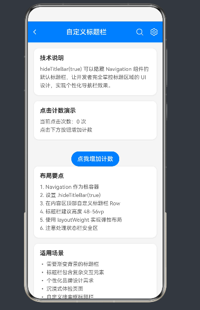
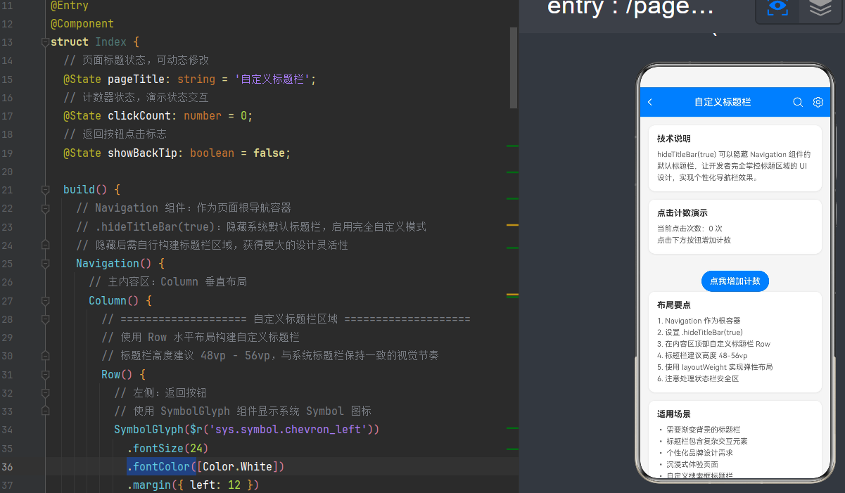
📑 目录导航
- 🎯 前言:为什么要自定义标题栏?
- 🔑 核心概念拆解
- 2.1 Navigation 导航容器
- 2.2 hideTitleBar 隐藏标题栏
- 2.3 SymbolGlyph 矢量图标系统
- 2.4 NavPathStack 路由管理
- 🛠️ 开发环境准备
- 💻 完整代码示例
- 🚀 实战场景落地
- ❓ 高频问题答疑
- ⚡ 性能优化秘籍
- ✅ 最佳实践总结
- 📎 附录与参考
🎯 1. 前言:为什么要自定义标题栏?
在传统移动应用开发中,标题栏(Title Bar)是每个页面的标配——系统自动生成、样式统一但"千人一面"。随着用户审美升级和业务需求多样化,自定义标题栏已成为提升应用品质的关键手段。
1.1 两种方案的本质差异
| 维度 | 系统默认标题栏 | 自定义标题栏(hideTitleBar) |
|---|---|---|
| 灵活度 | 仅支持文字/图标 | 任意布局、动画、样式 |
| 视觉表达 | 品牌色单一 | 渐变、图片、模糊效果 |
| 交互能力 | 固定按钮 | 自定义手势、动画 |
| 沉浸感 | 非全屏 | 完全全屏、零干扰 |
| 开发成本 | 零 | 需手动编码 |
1.2 应用场景矩阵
| 场景 | 需求点 | 技术难点 |
|---|---|---|
| 电商详情 | 滚动时标题栏渐变 | 监听 Scroll 位置、计算透明度 |
| 个人中心 | 渐变背景+悬浮卡片 | 绝对定位、层叠布局 |
| 阅读/视频 | 全屏无干扰、点击显隐 | 手势处理、状态切换动画 |
| 直播/游戏 | 完全沉浸式 | 隐藏状态栏、手势退出 |
| 表单填写 | 自定义返回逻辑 | 拦截返回事件、二次确认 |
1.3 为什么选 HarmonyOS 方案?
相比 Android 的 Toolbar/iOS 的 NavigationBar,HarmonyOS 的 Navigation + hideTitleBar 具备三大优势:
- 原生支持:无需引入第三方库,API 稳定
- 声明式语法:ArkTS 声明式 UI 让布局更简洁
- 多端适配:自动适配手机、平板、折叠屏等多设备
🔑 2. 核心概念拆解
2.1 Navigation 导航容器
Navigation 是 HarmonyOS ArkUI 的核心导航组件,从 API 9 开始推荐使用,替代旧版 Router。它承担三大职责:
- 页面栈管理(push/pop/replace)
- 标题栏/工具栏渲染
- 分屏/多栏布局支持
2.1.1 基本语法
// 单页模式(无路由跳转)
@Entry
@Component
struct SinglePageNav {
  build() {
    Navigation() {
      // 页面内容(@Builder 或直接写 UI)
      Column() {
        Text('Hello World')
          .fontSize(24)
      }
      .width('100%')
      .height('100%')
    }
    .title('默认标题') // 设置系统标题
    .titleMode(NavigationTitleMode.Mini) // 标题模式
  }
}
2.1.2 三种标题模式详解
| 模式 | 效果 | 适用场景 |
|---|---|---|
NavigationTitleMode.Free |
随滚动平滑过渡 | 内容可滚动的长页面 |
NavigationTitleMode.Mini |
固定紧凑标题栏 | 列表页、详情页(最常用) |
NavigationTitleMode.Full |
固定大标题栏 | 主页、设置页(较少用) |
// 动态切换标题模式
@State currentMode: NavigationTitleMode = NavigationTitleMode.Mini

Navigation() {
  // 内容
}
.title('标题')
.titleMode(this.currentMode) // 绑定状态,可动态改变
2.1.3 Navigation 属性速查表
| 属性 | 类型 | 默认值 | 说明 |
|---|---|---|---|
title |
string/Component |
- | 标题内容(支持自定义组件) |
titleMode |
NavigationTitleMode |
Mini |
标题显示模式 |
hideTitleBar |
boolean |
false |
🔥 隐藏标题栏(核心) |
hideToolBar |
boolean |
false |
隐藏底部工具栏 |
hideBackButton |
boolean |
false |
隐藏返回按钮 |
mode |
NavigationMode |
Stack |
导航模式(Stack/Split) |
navBarWidth |
Length |
- | 分栏模式下的导航栏宽度 |
2.2 hideTitleBar 隐藏标题栏
这是整个方案的核心开关——设为 true 后,系统标题栏完全消失,你获得了"无限制"的布局空间。
2.2.1 基础用法
@Entry
@Component
struct HideTitleBarDemo {
  build() {
    Navigation() {
      Column() {
        // 自定义标题栏(完全自己控制)
        Row() {
          Text('我的自定义标题')
            .fontSize(20)
            .fontWeight(FontWeight.Bold)
            .fontColor(Color.White)
        }
        .width('100%')
        .height(56)
        .backgroundColor('#007DFF') // 华为蓝

        // 页面主体内容
        Text('这里是自由区域,想怎么布局都可以')
          .margin({ top: 40 })
      }
      .width('100%')
      .height('100%')
    }
    // ⭐ 关键:隐藏系统标题栏
    .hideTitleBar(true)
    .backgroundColor('#F5F5F5')
  }
}
2.2.2 动态显隐标题栏
hideTitleBar 支持状态绑定,可实现滚动时隐藏/显示、点击切换等效果:
@Entry
@Component
struct DynamicTitleBar {
  @State showTitle: boolean = true

  build() {
    Navigation() {
      Column() {
        if (this.showTitle) {
          // 自定义标题栏(条件渲染)
          Row() {
            Text('动态标题')
              .fontSize(20)
              .fontWeight(FontWeight.Bold)
              .fontColor(Color.White)
          }
          .width('100%')
          .height(56)
          .backgroundColor('#007DFF')
          // 添加过渡动画
          .transition(TransitionEffect.asymmetric(
            TransitionEffect.opacity(1.0),
            TransitionEffect.opacity(0.0)
          ))
        }

        Column() {
          Button(this.showTitle ? '隐藏标题栏' : '显示标题栏')
            .onClick(() => {
              // 带过渡动画的状态切换
              animateTo({ duration: 300, curve: Curve.EaseInOut }, () => {
                this.showTitle = !this.showTitle
              })
            })
        }
        .width('100%')
        .layoutWeight(1)
        .justifyContent(FlexAlign.Center)
      }
    }
    .hideTitleBar(!this.showTitle) // 绑定状态
    .backgroundColor('#F5F5F5')
  }
}
2.3 SymbolGlyph 矢量图标系统
HarmonyOS NEXT 推荐用 SymbolGlyph 替代旧版 Image($r('sys.media.xxx'))——它是一套基于矢量字体的图标方案,支持无限缩放、多色渐变。
2.3.1 基本语法与旧版对比
| 特性 | 旧版 Image | 新版 SymbolGlyph |
|---|---|---|
| 图标源 | sys.media.xxx |
sys.symbol.xxx |
| 大小设置 | .width(24).height(24) |
.fontSize(24) |
| 颜色设置 | .fillColor(Color.White) |
.fontColor([Color.White]) ⚠️ 数组! |
| 多色支持 | ❌ | ✅ 渐变色数组 |
| 缩放质量 | 位图易模糊 | 矢量无限清晰 |
// ❌ 旧版 Image(已废弃)
Image($r('sys.media.ohos_ic_public_search'))
  .width(24)
  .height(24)
  .fillColor(Color.White)

// ✅ 新版 SymbolGlyph
SymbolGlyph($r('sys.symbol.magnifyingglass'))
  .fontSize(24)
  .fontColor([Color.White]) // ⚠️ 必须是数组!

// ✅ 多色渐变(进阶)
SymbolGlyph($r('sys.symbol.heart'))
  .fontSize(48)
  .fontColor([Color.Red, Color.Pink, Color.White])
2.3.2 SymbolGlyph 常用图标速查
| 图标名 | 效果 | 场景 |
|---|---|---|
chevron_left |
← | 返回按钮 |
chevron_right |
→ | 进入详情 |
chevron_up/down |
↑↓ | 折叠/展开 |
magnifyingglass |
🔍 | 搜索 |
gearshape |
⚙️ | 设置 |
xmark |
❌ | 关闭/取消 |
plus/minus |
+/- | 新增/减少 |
share |
🔗 | 分享 |
heart/heart_fill |
♥️/❤️ | 收藏/点赞 |
bell/bell_fill |
🔔/🔕 | 通知 |
person |
👤 | 用户 |
cart |
🛒 | 购物车 |
eye/eye_slash |
👁️/🙈 | 显示/隐藏密码 |
checkmark_circle |
✅ | 成功 |
xmark_circle |
❌ | 错误 |
ellipsis |
⋯ | 更多 |
2.4 NavPathStack 路由管理
NavPathStack 是 HarmonyOS NEXT 的官方路由方案(API 10+),替代旧版 Router——它类型安全、支持参数传递、可追溯路由栈。
2.4.1 创建与绑定
import { NavPathStack } from '@kit.ArkUI'

@Entry
@Component
struct NavStackDemo {
  // 1. 创建 NavPathStack 实例
  private navStack: NavPathStack = new NavPathStack()

  build() {
    // 2. 绑定到 Navigation
    Navigation(this.navStack) {
      this.HomePage()
    }
    .hideTitleBar(true)
    .mode(NavigationMode.Stack) // 单栏模式(最常用)
  }

  // 3. 首页 Builder
  @Builder
  HomePage() {
    Column() {
      Text('首页')
        .fontSize(24)
        .margin({ bottom: 20 })
      Button('进入详情页')
        .onClick(() => {
          // 4. 跳转到子页面(带参数)
          this.navStack.pushPathByName('DetailPage', { id: 123, title: '测试' })
        })
    }
    .width('100%')
    .height('100%')
    .justifyContent(FlexAlign.Center)
  }
}
2.4.2 子页面实现(NavDestination)
// DetailPage.ets
import { NavPathStack } from '@kit.ArkUI'

// 🔥 必须导出 Builder 函数(路由表需要)
@Builder
export function DetailPageBuilder() {
  DetailPage()
}

@Component
export struct DetailPage {
  private navStack: NavPathStack = new NavPathStack()
  @State params: Record<string, Object> = {}

  build() {
    // 使用 NavDestination 作为子页面根容器
    NavDestination() {
      Column() {
        Row() {
          // 自定义返回按钮
          SymbolGlyph($r('sys.symbol.chevron_left'))
            .fontSize(24)
            .fontColor([Color.White])
            .onClick(() => this.navStack.pop()) // 返回上一页

          Text('详情页')
            .fontSize(18)
            .fontWeight(FontWeight.Medium)
            .fontColor(Color.White)
            .layoutWeight(1)
            .textAlign(TextAlign.Center)
        }
        .width('100%')
        .height(56)
        .padding({ left: 8, right: 8 })
        .backgroundColor('#007DFF')

        Column() {
          Text('收到参数:')
            .fontSize(16)
            .margin({ bottom: 10 })
          Text('ID: ' + this.params['id'])
            .fontSize(14)
            .margin({ bottom: 5 })
          Text('Title: ' + this.params['title'])
            .fontSize(14)
        }
        .margin({ top: 40 })
      }
    }
    .hideTitleBar(true) // 子页面也可以隐藏标题栏
    // ⭐ 关键:获取路由栈和参数
    .onReady((context: NavDestinationContext) => {
      this.navStack = context.pathStack
      this.params = context.pathInfo.param as Record<string, Object>
    })
  }
}
2.4.3 NavPathStack 核心 API
| 方法 | 说明 | 参数 |
|---|---|---|
pushPathByName(name, param) |
推入新页面 | name: 路由名, param: 参数对象 |
pop() |
返回上一页 | - |
popToName(name) |
返回指定页面 | name: 目标路由名 |
replacePathByName(name, param) |
替换当前页 | - |
clear() |
清空路由栈 | - |
size() |
栈深度 | - |
get() |
当前页路由 | 返回 NavPathInfo |
🛠️ 3. 开发环境准备
3.1 工具与版本要求
| 工具 | 最低版本 | 推荐版本 | 下载地址 |
|---|---|---|---|
| DevEco Studio | 4.1 | 4.2+ | 华为开发者官网 |
| HarmonyOS SDK | API 12 | API 12~24 | DevEco Studio 内置 |
| Node.js | 18.0 | 20.0+ | Node.js 官网 |
| JDK | 17 | 21 | DevEco Studio 内置 |
3.2 项目创建步骤
- 打开 DevEco Studio → 点击 Create Project
- 选择 Application → Empty Ability → Next
- 填写项目名(如
CustomNavDemo)→ 选择存储路径 → Next - Compile SDK 选 HarmonyOS NEXT → Finish
- 等待项目构建完成
3.3 目录结构说明
CustomNavDemo/
├── entry/
│   └── src/main/
│       ├── ets/
│       │   ├── pages/
│       │   │   └── Index.ets          # 主页面(本文所有示例在此)
│       │   ├── components/             # 可复用组件(可选)
│       │   └── entryability/
│       │       └── EntryAbility.ets    # 入口 Ability
│       ├── resources/
│       │   └── base/
│       │       ├── element/
│       │       │   ├── color.json      # 颜色资源(适配深色模式)
│       │       │   ├── float.json      # 尺寸资源
│       │       │   └── string.json      # 字符串资源
│       │       ├── media/              # 图片资源
│       │       └── profile/
│       │           └── route_map.json  # 🔥 路由表(多页面必须)
│       └── module.json5                # 模块配置
├── AppScope/
│   └── app.json5                       # 应用配置
└── build-profile.json5                # 构建配置
3.4 路由表配置详解
多页面项目必须在 route_map.json 中注册路由,否则跳转无效:
// resources/base/profile/route_map.json
{
  "routerMap": [
    {
      "name": "DetailPage",
      "pageSourceFile": "src/main/ets/pages/Index.ets",
      "buildFunction": "DetailPageBuilder"
    },
    {
      "name": "UserCenterPage",
      "pageSourceFile": "src/main/ets/pages/Index.ets",
      "buildFunction": "UserCenterPageBuilder"
    }
  ]
}
| 字段 | 说明 | 注意事项 |
|---|---|---|
name |
路由唯一标识 | 与 pushPathByName 的 name 一致 |
pageSourceFile |
Builder 所在文件路径 | 相对于 entry 目录 |
buildFunction |
Builder 函数名 | 必须导出,名称完全匹配 |
💻 4. 完整代码示例
4.1 基础版:极简实现
10 行代码快速体验 hideTitleBar 的威力。
@Entry
@Component
struct BasicDemo {
  @State msg: string = 'Hello HarmonyOS NEXT'

  build() {
    Navigation() {
      Column() {
        // 自定义标题栏
        Row() {
          Text('我的应用')
            .fontSize(20)
            .fontWeight(FontWeight.Bold)
            .fontColor(Color.White)
        }
        .width('100%')
        .height(56)
        .backgroundColor('#007DFF')

        // 内容区
        Column() {
          Text(this.msg)
            .fontSize(20)
            .margin({ bottom: 20 })
          Button('点击修改文字')
            .type(ButtonType.Capsule)
            .backgroundColor('#007DFF')
            .fontColor(Color.White)
            .onClick(() => {
              this.msg = '✅ 自定义标题栏生效了!'
            })
        }
        .width('100%')
        .layoutWeight(1)
        .justifyContent(FlexAlign.Center)
      }
      .width('100%')
      .height('100%')
    }
    // ⭐ 核心:隐藏系统标题栏
    .hideTitleBar(true)
    .backgroundColor('#F5F5F5')
  }
}
4.2 进阶版:标准布局
实现带返回按钮、标题、右侧操作图标的完整标题栏。
@Entry
@Component
struct StandardTitleBarDemo {
  @State pageTitle: string = '进阶标题栏'
  @State isSubscribed: boolean = false

  build() {
    Navigation() {
      Column() {
        // ==================== 自定义标题栏 ====================
        Row() {
          // 1. 左侧:返回按钮
          Row() {
            SymbolGlyph($r('sys.symbol.chevron_left'))
              .fontSize(24)
              .fontColor([Color.White])
          }
          .width(40)
          .height(40)
          .justifyContent(FlexAlign.Center)
          .onClick(() => console.info('返回上一页'))

          // 2. 中间:标题(弹性布局居中)
          Text(this.pageTitle)
            .fontSize(18)
            .fontWeight(FontWeight.Medium)
            .fontColor(Color.White)
            .layoutWeight(1) // ⭐ 关键:占据剩余空间
            .textAlign(TextAlign.Center)

          // 3. 右侧:操作按钮组
          Row({ space: 8 }) {
            // 搜索图标
            SymbolGlyph($r('sys.symbol.magnifyingglass'))
              .fontSize(22)
              .fontColor([Color.White])
              .onClick(() => this.pageTitle = '🔍 搜索功能')

            // 订阅图标(状态联动)
            SymbolGlyph(this.isSubscribed
              ? $r('sys.symbol.bell_fill')
              : $r('sys.symbol.bell'))
              .fontSize(22)
              .fontColor([this.isSubscribed ? Color.Yellow : Color.White])
              .onClick(() => this.isSubscribed = !this.isSubscribed)

            // 更多图标
            SymbolGlyph($r('sys.symbol.ellipsis'))
              .fontSize(22)
              .fontColor([Color.White])
          }
        }
        .width('100%')
        .height(56)
        .padding({ left: 8, right: 8 })
        .backgroundColor('#007DFF')
        // 添加阴影增强层次感
        .shadow({ radius: 4, color: '#20000000', offsetY: 2 })

        // ==================== 内容区 ====================
        Scroll() {
          Column({ space: 12 }) {
            // 功能卡片
            Column() {
              Text('🎯 核心特性')
                .fontSize(16)
                .fontWeight(FontWeight.Bold)
                .fontColor('#333333')
                .margin({ bottom: 12 })

              // 特性列表
              ForEach([
                '✅ 完全隐藏系统标题栏',
                '✅ 自定义布局随心所欲',
                '✅ 状态驱动 UI 更新',
                '✅ Symbol 矢量图标',
                '✅ 流畅过渡动画'
              ], (item: string) => {
                Text(item)
                  .fontSize(14)
                  .fontColor('#333333')
                  .width('100%')
                  .margin({ bottom: 8 })
              }, (item: string) => item)
            }
            .width('100%')
            .padding(16)
            .backgroundColor(Color.White)
            .borderRadius(12)

            // 交互卡片
            Column() {
              Text('⚡ 交互演示')
                .fontSize(16)
                .fontWeight(FontWeight.Bold)
                .fontColor('#333333')
                .margin({ bottom: 12 })

              Row() {
                Text('订阅状态:')
                  .fontSize(14)
                  .fontColor('#666666')
                Text(this.isSubscribed ? '已订阅' : '未订阅')
                  .fontSize(14)
                  .fontColor(this.isSubscribed ? '#4CAF50' : '#FF5722')
                  .fontWeight(FontWeight.Medium)
              }
              .margin({ bottom: 12 })

              Button(this.isSubscribed ? '取消订阅' : '立即订阅')
                .type(ButtonType.Capsule)
                .backgroundColor(this.isSubscribed ? '#FF5722' : '#4CAF50')
                .fontColor(Color.White)
                .onClick(() => this.isSubscribed = !this.isSubscribed)
            }
            .width('100%')
            .padding(16)
            .backgroundColor(Color.White)
            .borderRadius(12)
          }
          .padding(16)
        }
        .layoutWeight(1)
        .scrollBar(BarState.Auto)
      }
      .width('100%')
      .height('100%')
    }
    .hideTitleBar(true)
    .backgroundColor('#F5F5F5')
  }
}
4.3 完整版:多页面架构
结合 NavPathStack 实现完整的多页面路由方案(可直接运行)。
import { NavPathStack } from '@kit.ArkUI'

// ==================== 首页组件 ====================
@Component
struct HomePage {
  navStack: NavPathStack = new NavPathStack()
  @State articleList: string[] = [
    'HarmonyOS NEXT 新特性解析',
    'ArkTS 性能优化实战',
    'Navigation 与 Router 深度对比',
    'SymbolGlyph 图标系统全解析',
    '自定义标题栏最佳实践'
  ]

  build() {
    Column() {
      // 自定义标题栏
      Row() {
        Text('鸿蒙开发笔记')
          .fontSize(20)
          .fontWeight(FontWeight.Bold)
          .fontColor(Color.White)
        Blank() // 弹性占位
        SymbolGlyph($r('sys.symbol.magnifyingglass'))
          .fontSize(22)
          .fontColor([Color.White])
        Blank().width(12)
        SymbolGlyph($r('sys.symbol.gearshape'))
          .fontSize(22)
          .fontColor([Color.White])
      }
      .width('100%')
      .height(56)
      .padding({ left: 16, right: 16 })
      .backgroundColor('#6A1B9A')

      // 文章列表
      List() {
        ForEach(this.articleList, (title: string, index: number) => {
          ListItem() {
            Row() {
              Column() {
                Text(title)
                  .fontSize(16)
                  .fontWeight(FontWeight.Medium)
                  .fontColor('#333333')
                  .maxLines(1)
                  .textOverflow({ overflow: TextOverflow.Ellipsis })
                Text('2024-01-' + (15 + index))
                  .fontSize(12)
                  .fontColor('#999999')
                  .margin({ top: 4 })
              }
              .layoutWeight(1) // 弹性布局
              SymbolGlyph($r('sys.symbol.chevron_right'))
                .fontSize(18)
                .fontColor(['#CCCCCC'])
            }
            .width('100%')
            .padding(16)
            .backgroundColor(Color.White)
            .borderRadius(8)
            // ⭐ 点击跳转详情页
            .onClick(() => this.navStack.pushPathByName('ArticleDetail', title))
          }
        }, (title: string, index: number) => index.toString()) // 唯一 key
      }
      .layoutWeight(1)
      .padding(12)
      // 列表分隔线
      .divider({ strokeWidth: 8, color: '#F5F5F5', startMargin: 12, endMargin: 12 })
    }
    .width('100%')
    .height('100%')
  }
}

// ==================== 文章详情页组件 ====================
@Component
export struct ArticleDetailPage {
  navStack: NavPathStack = new NavPathStack()
  @State articleTitle: string = ''
  @State isLiked: boolean = false

  build() {
    NavDestination() {
      Column() {
        // 自定义标题栏
        Row() {
          Row() {
            SymbolGlyph($r('sys.symbol.chevron_left'))
              .fontSize(24)
              .fontColor([Color.White])
          }
          .width(40)
          .height(40)
          .justifyContent(FlexAlign.Center)
          .onClick(() => this.navStack.pop()) // 返回上一页

          Text('文章详情')
            .fontSize(18)
            .fontWeight(FontWeight.Medium)
            .fontColor(Color.White)
            .layoutWeight(1)
            .textAlign(TextAlign.Center)

          Row() {
            SymbolGlyph(this.isLiked
              ? $r('sys.symbol.heart_fill')
              : $r('sys.symbol.heart'))
              .fontSize(22)
              .fontColor([this.isLiked ? '#FF5252' : Color.White])
          }
          .width(40)
          .height(40)
          .justifyContent(FlexAlign.Center)
          .onClick(() => this.isLiked = !this.isLiked)
        }
        .width('100%')
        .height(56)
        .padding({ left: 8, right: 8 })
        .backgroundColor('#6A1B9A')

        // 文章内容
        Scroll() {
          Column() {
            Text(this.articleTitle)
              .fontSize(22)
              .fontWeight(FontWeight.Bold)
              .fontColor('#333333')
              .width('100%')
              .margin({ bottom: 16 })

            Text('这是一篇关于「' + this.articleTitle + '」的深度技术文章,'
              + '从基础语法到高级应用,全面解析其设计思想与实现原理。\n\n'
              + '在 HarmonyOS NEXT 生态中,Navigation + hideTitleBar 方案'
              + '为开发者提供了前所未有的灵活性,让我们能够突破系统限制,'
              + '打造出独具特色的应用界面。\n\n'
              + '本文将带你一步步掌握:'
              + '核心概念拆解、基础代码实现、进阶技巧应用、实战场景落地,'
              + '以及性能优化的最佳实践。无论你是 HarmonyOS 新手还是资深开发者,'
              + '都能从中收获满满。')
              .fontSize(16)
              .fontColor('#666666')
              .width('100%')
              .lineHeight(28) // 行高提升可读性
          }
          .padding(20)
        }
        .layoutWeight(1)
      }
    }
    .hideTitleBar(true)
    // ⭐ 关键:获取路由栈和参数
    .onReady((context: NavDestinationContext) => {
      this.navStack = context.pathStack
      this.articleTitle = context.pathInfo.param as string ?? '文章详情'
    })
  }
}

// ==================== 路由 Builder(必须导出)====================
@Builder
export function ArticleDetailBuilder() {
  ArticleDetailPage()
}

// ==================== 主入口 ====================
@Entry
@Component
struct MainApp {
  private navStack: NavPathStack = new NavPathStack()

  build() {
    Navigation(this.navStack) {
      HomePage()
    }
    .hideTitleBar(true)
    .backgroundColor('#F5F5F5')
    .mode(NavigationMode.Stack)
  }
}
🚀 5. 实战场景落地
5.1 电商详情页
电商详情页的核心需求:滚动时标题栏从透明渐变为实色。这需要监听 Scroll 位置并实时更新状态。
@Component
struct EcommerceDetailPage {
  private scroller: Scroller = new Scroller()
  @State titleBarOpacity: number = 0 // 0=全透明, 1=全实色
  @State isFavorite: boolean = false

  build() {
    Column() {
      // ==================== 浮动标题栏(Stack 叠加)====================
      Stack() {
        // 背景层(随滚动渐变)
        Row() {
          // 返回按钮(始终可见)
          Row() {
            SymbolGlyph($r('sys.symbol.chevron_left'))
              .fontSize(24)
              // 根据透明度切换图标颜色
              .fontColor([this.titleBarOpacity > 0.5 ? '#333333' : Color.White])
          }
          .width(40)
          .height(40)
          .justifyContent(FlexAlign.Center)
          .backgroundColor('#20FFFFFF')
          .borderRadius(20)
          .onClick(() => console.info('返回'))

          // 商品标题(渐显)
          Text('2024 新款智能手表')
            .fontSize(18)
            .fontWeight(FontWeight.Medium)
            .fontColor(['#333333'])
            .layoutWeight(1)
            .textAlign(TextAlign.Center)
            .opacity(this.titleBarOpacity) // 透明度绑定

          // 右侧操作
          Row({ space: 8 }) {
            SymbolGlyph(this.isFavorite
              ? $r('sys.symbol.heart_fill')
              : $r('sys.symbol.heart'))
              .fontSize(20)
              .fontColor([this.isFavorite ? '#FF5252' : '#333333'])
              .onClick(() => this.isFavorite = !this.isFavorite)

            SymbolGlyph($r('sys.symbol.share'))
              .fontSize(20)
              .fontColor(['#333333'])
          }
        }
        .width('100%')
        .height(56)
        .padding({ left: 8, right: 8 })
        // 背景透明度随滚动变化
        .backgroundColor(Color.White)
        .opacity(this.titleBarOpacity)
      }
      .width('100%')
      .height(56)
      .position({ x: 0, y: 0 }) // 固定在顶部
      .zIndex(100) // 确保在最上层

      // ==================== 可滚动内容 ====================
      Scroll(this.scroller) {
        Column() {
          // 商品主图(全宽)
          Image($r('sys.media.ohos_app_icon'))
            .width('100%')
            .aspectRatio(1) // 1:1 正方形
            .objectFit(ImageFit.Cover)

          // 商品信息卡片
          Column() {
            // 价格区
            Row() {
              Text('¥ 299')
                .fontSize(28)
                .fontWeight(FontWeight.Bold)
                .fontColor('#FF5722') // 红色促销价
              Text('¥ 399')
                .fontSize(14)
                .fontColor('#999999')
                .decoration({ type: TextDecorationType.LineThrough })
                .margin({ left: 8 })
              Text('限时特惠')
                .fontSize(12)
                .fontColor(Color.White)
                .backgroundColor('#FF5722')
                .padding({ left: 6, right: 6, top: 2, bottom: 2 })
                .borderRadius(4)
                .margin({ left: 8 })
            }
            .margin({ bottom: 12 })

            // 标题区
            Text('2024 新款智能手表 Pro Max 运动健康版 蓝牙通话 心率监测')
              .fontSize(18)
              .fontWeight(FontWeight.Medium)
              .fontColor('#333333')
              .width('100%')
              .margin({ bottom: 12 })

            // 销量区
            Row() {
              Text('已售 12.5万+')
                .fontSize(13)
                .fontColor('#999999')
              Text('|')
                .fontSize(13)
                .fontColor('#E0E0E0')
                .margin({ left: 8, right: 8 })
              Text('好评率 98%')
                .fontSize(13)
                .fontColor('#999999')
            }
          }
          .width('100%')
          .padding(16)
          .backgroundColor(Color.White)
          .margin({ top: 8 })

          // 商品详情图
          ForEach([1, 2, 3, 4, 5], (item: number) => {
            Image($r('sys.media.ohos_app_icon'))
              .width('100%')
              .height(400)
              .objectFit(ImageFit.Cover)
              .margin({ top: 8 })
          }, (item: number) => item.toString())
        }
      }
      .layoutWeight(1)
      // ⭐ 关键:监听滚动更新透明度
      .onScroll(() => {
        const offset = this.scroller.currentOffset().yOffset
        // 滚动 200vp 后完全显示标题栏
        this.titleBarOpacity = Math.min(offset / 200, 1)
      })

      // ==================== 底部操作栏(悬浮)====================
      Row() {
        // 购物车
        Column() {
          SymbolGlyph($r('sys.symbol.cart'))
            .fontSize(20)
            .fontColor(['#666666'])
          Text('购物车')
            .fontSize(12)
            .fontColor(['#666666'])
            .margin({ top: 2 })
        }
        .width(60)
        .justifyContent(FlexAlign.Center)
        .onClick(() => console.info('跳转购物车'))

        // 加入购物车
        Button('加入购物车')
          .type(ButtonType.Capsule)
          .backgroundColor('#FF9800')
          .fontColor(Color.White)
          .layoutWeight(1)
          .height(44)
          .margin({ left: 8 })
          .onClick(() => console.info('加入购物车'))

        // 立即购买
        Button('立即购买')
          .type(ButtonType.Capsule)
          .backgroundColor('#FF5722')
          .fontColor(Color.White)
          .layoutWeight(1)
          .height(44)
          .margin({ left: 8 })
          .onClick(() => console.info('立即购买'))
      }
      .width('100%')
      .height(64)
      .padding({ left: 12, right: 12 })
      .backgroundColor(Color.White)
      .shadow({ radius: 4, color: '#20000000', offsetY: -2 }) // 顶部阴影
    }
    .width('100%')
    .height('100%')
  }
}
5.2 个人中心页
个人中心页常用渐变背景 + 悬浮卡片设计,营造层次感。
@Component
struct UserCenterPage {
  @State userName: string = 'HarmonyOS 开发者'
  @State userLevel: number = 6
  @State isVip: boolean = true
  @State followerCount: string = '2.5k'
  @State followingCount: string = '856'
  @State favoriteCount: string = '36'

  build() {
    Navigation() {
      Scroll() {
        Column() {
          // ==================== 渐变头部 ====================
          Stack() {
            // 渐变背景
            Column()
              .width('100%')
              .height(300)
              .linearGradient({
                angle: 135, // 斜向渐变
                colors: [
                  ['#667EEA', 0],  // 蓝紫
                  ['#764BA2', 1]   // 深紫
                ]
              })

            // 头部内容
            Column() {
              Row() {
                // 头像(带 VIP 角标)
                Stack() {
                  Image($r('sys.media.ohos_app_icon'))
                    .width(80)
                    .height(80)
                    .borderRadius(40) // 圆形头像
                    .border({ width: 2, color: Color.White })

                  if (this.isVip) {
                    Row() {
                      Text('VIP')
                        .fontSize(10)
                        .fontWeight(FontWeight.Bold)
                        .fontColor(Color.White)
                    }
                    .height(18)
                    .padding({ left: 6, right: 6 })
                    .backgroundColor('#FFD700') // 金色
                    .borderRadius(9)
                    .position({ x: 60, y: 60 }) // 角标位置
                  }
                }
                .width(80)
                .height(80)
                .margin({ right: 16 })

                // 用户信息
                Column() {
                  Row() {
                    Text(this.userName)
                      .fontSize(20)
                      .fontWeight(FontWeight.Bold)
                      .fontColor(Color.White)
                    // 等级徽章
                    Row() {
                      Text('Lv.' + this.userLevel)
                        .fontSize(12)
                        .fontWeight(FontWeight.Medium)
                        .fontColor('#764BA2')
                    }
                    .height(18)
                    .padding({ left: 6, right: 6 })
                    .backgroundColor(Color.White)
                    .borderRadius(9)
                    .margin({ left: 8 })
                  }
                  .margin({ bottom: 6 })

                  Text('专注于鸿蒙应用开发 | 技术博主')
                    .fontSize(13)
                    .fontColor('#E0FFFFFF') // 半透明白
                    .maxLines(1)
                    .textOverflow({ overflow: TextOverflow.Ellipsis })
                }
                .layoutWeight(1)
                .alignItems(HorizontalAlign.Start)
              }
              .margin({ top: 60 }) // 顶部留白(避开状态栏)

              // 统计数据
              Row() {
                this.StatItem(this.followerCount, '粉丝')
                this.StatItem(this.followingCount, '关注')
                this.StatItem(this.favoriteCount, '收藏')
                this.StatItem('128', '文章')
              }
              .width('100%')
              .justifyContent(FlexAlign.SpaceAround)
              .margin({ top: 30 })
            }
            .padding(20)
          }
          .width('100%')

          // ==================== 功能菜单(悬浮)====================
          Column() {
            this.MenuItem($r('sys.symbol.order'), '我的订单', '#FF9800', '查看全部订单')
            this.MenuItem($r('sys.symbol.heart'), '我的收藏', '#E91E63', '36 个收藏')
            this.MenuItem($r('sys.symbol.download'), '离线下载', '#4CAF50', '12 个文件')
            this.MenuItem($r('sys.symbol.message'), '消息通知', '#2196F3', '3 条未读')
            this.MenuItem($r('sys.symbol.share'), '邀请好友', '#9C27B0', '得 20 积分')
          }
          .width('92%')
          .padding(16)
          .backgroundColor(Color.White)
          .borderRadius(16)
          .shadow({ radius: 8, color: '#20000000', offsetY: 4 })
          .margin({ top: -60 }) // ⭐ 上移实现悬浮效果
          .zIndex(100)

          // ==================== 设置区域 ====================
          Column() {
            Text('系统设置')
              .fontSize(14)
              .fontWeight(FontWeight.Medium)
              .fontColor('#999999')
              .width('100%')
              .margin({ bottom: 12 })

            this.SettingItem('个人资料', '编辑头像、昵称等')
            this.SettingItem('隐私设置', '账号安全、消息权限')
            this.SettingItem('主题设置', '深色模式、字体大小')
            this.SettingItem('关于我们', '版本 v1.0.0')
          }
          .width('92%')
          .padding(16)
          .backgroundColor(Color.White)
          .borderRadius(16)
          .margin({ top: 16 })
          .margin({ bottom: 30 })
        }
      }
      .scrollBar(BarState.Off)
      .edgeEffect(EdgeEffect.Spring) // 弹性边缘
    }
    .hideTitleBar(true)
    .backgroundColor('#F5F5F5')
  }

  @Builder
  StatItem(value: string, label: string) {
    Column() {
      Text(value)
        .fontSize(22)
        .fontWeight(FontWeight.Bold)
        .fontColor(Color.White)
      Text(label)
        .fontSize(12)
        .fontColor('#B0FFFFFF') // 半透明白
        .margin({ top: 4 })
    }
    .alignItems(HorizontalAlign.Center)
  }

  @Builder
  MenuItem(icon: Resource, title: string, iconColor: string, subtitle: string) {
    Row() {
      // 图标(带背景)
      Row() {
        SymbolGlyph(icon)
          .fontSize(22)
          .fontColor([iconColor])
      }
      .width(40)
      .height(40)
      .justifyContent(FlexAlign.Center)
      .backgroundColor(iconColor + '20') // 半透明背景
      .borderRadius(10)
      .margin({ right: 12 })

      // 文字
      Column() {
        Text(title)
          .fontSize(15)
          .fontWeight(FontWeight.Medium)
          .fontColor('#333333')
        Text(subtitle)
          .fontSize(12)
          .fontColor('#999999')
          .margin({ top: 2 })
      }
      .layoutWeight(1)
      .alignItems(HorizontalAlign.Start)

      // 箭头
      SymbolGlyph($r('sys.symbol.chevron_right'))
        .fontSize(18)
        .fontColor(['#CCCCCC'])
    }
    .width('100%')
    .padding({ top: 12, bottom: 12 })
    .onClick(() => console.info('点击:' + title))
  }

  @Builder
  SettingItem(title: string, subtitle: string) {
    Row() {
      Column() {
        Text(title)
          .fontSize(15)
          .fontColor('#333333')
        Text(subtitle)
          .fontSize(12)
          .fontColor('#999999')
          .margin({ top: 2 })
      }
      .layoutWeight(1)
      .alignItems(HorizontalAlign.Start)

      SymbolGlyph($r('sys.symbol.chevron_right'))
        .fontSize(18)
        .fontColor(['#CCCCCC'])
    }
    .width('100%')
    .padding({ top: 14, bottom: 14 })
    .border({ width: { bottom: 0.5 }, color: '#EEEEEE' })
    .onClick(() => console.info('点击:' + title))
  }
}
5.3 沉浸式阅读页
阅读/视频页面需要全屏无干扰,点击屏幕显示/隐藏控制栏。
@Component
struct ImmersiveReaderPage {
  @State showControls: boolean = true
  @State fontSize: number = 18
  @State themeIndex: number = 0

  // 主题配置:[背景色, 文字色]
  private themes: string[][] = [
    ['#FFFFFF', '#333333'],  // 浅色
    ['#1A1A1A', '#CCCCCC'],  // 深色
    ['#F5F0E8', '#5C4033']   // 护眼(羊皮纸)
  ]

  build() {
    Column() {
      // 顶部控制栏(可隐藏)
      if (this.showControls) {
        this.TopBar()
      }

      // 中间阅读区(全屏)
      Stack() {
        Scroll() {
          Column() {
            // 章节标题
            Text('第一章 鸿蒙的诞生')
              .fontSize(this.fontSize + 8)
              .fontWeight(FontWeight.Bold)
              .fontColor([this.themes[this.themeIndex][1]])
              .width('100%')
              .margin({ top: 20, bottom: 30 })

            // 正文段落
            Text('在移动互联网时代,操作系统是整个生态的基石。'
              + '鸿蒙系统(HarmonyOS)的诞生,标志着中国在操作系统领域'
              + '取得了重要突破。\n\n'
              + '与传统移动操作系统不同,鸿蒙采用分布式架构设计,'
              + '能让手机、平板、电脑、智能家居等多设备无缝互联,'
              + '形成统一的生态系统。\n\n'
              + 'ArkTS 作为鸿蒙应用开发的核心语言,融合了 TypeScript 的'
              + '类型安全与声明式 UI 的开发理念。开发者可以用简洁的代码,'
              + '构建出高性能、跨平台的应用程序。\n\n'
              + '本文将带你深入了解鸿蒙开发的核心技术,'
              + '包括 Navigation 导航、hideTitleBar 自定义标题栏、'
              + 'SymbolGlyph 图标系统、NavPathStack 路由管理等内容,'
              + '助你快速入门鸿蒙开发,打造出优秀的应用作品。')
              .fontSize(this.fontSize)
              .fontColor([this.themes[this.themeIndex][1]])
              .width('100%')
              .lineHeight(this.fontSize * 1.8) // 行高 1.8 倍字号
              .margin({ bottom: 60 })
          }
          .padding({ left: 20, right: 20 })
        }
        .width('100%')
        .height('100%')
        .scrollBar(BarState.Off)

        // 点击切换控制栏(屏幕中间区域)
        Row()
          .width('100%')
          .height('40%')
          .position({ y: '30%' })
          .onClick(() => this.showControls = !this.showControls)
      }
      .width('100%')
      .layoutWeight(1)

      // 底部控制栏(可隐藏)
      if (this.showControls) {
        this.BottomBar()
      }
    }
    .width('100%')
    .height('100%')
    .backgroundColor([this.themes[this.themeIndex][0]])
    .animation({ duration: 300 }) // 主题切换动画
  }

  @Builder
  TopBar() {
    Row() {
      SymbolGlyph($r('sys.symbol.chevron_left'))
        .fontSize(24)
        .fontColor([this.themes[this.themeIndex][1]])
        .onClick(() => console.info('返回'))

      Text('鸿蒙开发实战')
        .fontSize(18)
        .fontWeight(FontWeight.Medium)
        .fontColor([this.themes[this.themeIndex][1]])
        .layoutWeight(1)
        .textAlign(TextAlign.Center)

      SymbolGlyph($r('sys.symbol.ellipsis'))
        .fontSize(22)
        .fontColor([this.themes[this.themeIndex][1]])
    }
    .width('100%')
    .height(56)
    .padding({ left: 12, right: 12 })
    .backgroundColor([this.themes[this.themeIndex][0]])
    .shadow({ radius: 2, color: '#10000000', offsetY: 2 })
  }

  @Builder
  BottomBar() {
    Row({ space: 24 }) {
      // 字号减小
      Row() {
        SymbolGlyph($r('sys.symbol.textformatsize_smaller'))
          .fontSize(20)
          .fontColor([this.themes[this.themeIndex][1]])
      }
      .onClick(() => {
        if (this.fontSize > 14) this.fontSize -= 2
      })

      // 当前字号
      Text(this.fontSize.toString())
        .fontSize(14)
        .fontColor([this.themes[this.themeIndex][1]])
        .width(30)
        .textAlign(TextAlign.Center)

      // 字号增大
      Row() {
        SymbolGlyph($r('sys.symbol.textformatsize_larger'))
          .fontSize(20)
          .fontColor([this.themes[this.themeIndex][1]])
      }
      .onClick(() => {
        if (this.fontSize < 28) this.fontSize += 2
      })

      // 分隔线
      Column()
        .width(1)
        .height(20)
        .backgroundColor(['#20000000'])
        .margin({ left: 12, right: 12 })

      // 主题切换
      ForEach(['浅色', '深色', '护眼'], (themeName: string, index: number) => {
        Text(themeName)
          .fontSize(13)
          .fontColor([this.themeIndex === index ? '#007DFF' : '#666666'])
          .fontWeight(this.themeIndex === index ? FontWeight.Bold : FontWeight.Normal)
          .padding({ left: 8, right: 8, top: 4, bottom: 4 })
          .backgroundColor([this.themeIndex === index ? '#10000000' : Color.Transparent])
          .borderRadius(4)
          .onClick(() => this.themeIndex = index)
      }, (themeName: string) => themeName)
    }
    .width('100%')
    .height(52)
    .justifyContent(FlexAlign.Center)
    .backgroundColor([this.themes[this.themeIndex][0]])
    .shadow({ radius: 2, color: '#10000000', offsetY: -2 })
  }
}
❓ 6. 高频问题答疑
Q1:hideTitleBar 设为 true 但标题栏还在显示?
排查步骤:
// ✅ 1. 确认调用位置(必须在 Navigation 的链式调用上)
Navigation() {
  // 内容
}
.hideTitleBar(true) // 正确
.title('标题')      // 即使设了 hideTitleBar,也可以配置 title(备用)

// ❌ 错误示例(脱离了 Navigation)
Navigation()
.hideTitleBar(true)
{
  // 内容(这部分不会被识别)
}

// ✅ 2. 同时隐藏 ToolBar 和 BackButton
.hideTitleBar(true)
.hideToolBar(true)
.hideBackButton(true) // 在小标题模式下可能需要

// ✅ 3. 检查 NavPathStack 模式
Navigation(this.navStack) {
  // 内容
}
.hideTitleBar(true)
.mode(NavigationMode.Stack) // 确保是单栏模式
Q2:SymbolGlyph 的 fontColor 编译报错?
错误信息:Type 'Color' is not assignable to type 'ResourceColor[]'
根本原因:fontColor 参数是数组类型 ResourceColor[],不是单个颜色。
// ❌ 全错
.fontColor(Color.White)
.fontColor('#FFFFFF')
.fontColor($r('app.color.primary'))

// ✅ 单元素数组
.fontColor([Color.White])
.fontColor(['#FFFFFF'])
.fontColor([$r('app.color.primary')])

// ✅ 多色渐变数组
.fontColor([Color.Red, Color.Orange, Color.Yellow])
.fontColor(['#FF0000', '#FF8800', '#FFFF00'])
Q3:如何适配不同屏幕的状态栏?
方案 1:自动避让(推荐)
// Navigation 会自动处理状态栏避让
Navigation() {
  // 内容从状态栏下方开始,无需手动计算
}
.hideTitleBar(true)
方案 2:手动获取状态栏高度
import { window } from '@kit.ArkUI'

@Entry
@Component
struct StatusBarAdapter {
  @State statusBarHeight: number = 44 // 默认值

  aboutToAppear() {
    // 获取真实状态栏高度
    try {
      const context = getContext(this) as common.UIAbilityContext
      context.windowStage.getMainWindow().then((win: window.Window) => {
        win.getWindowAvoidArea(window.AvoidAreaType.TYPE_SYSTEM).then((area) => {
          this.statusBarHeight = area.topRect.height
        })
      })
    } catch (e) {
      console.error('获取状态栏高度失败:' + JSON.stringify(e))
    }
  }

  build() {
    Navigation() {
      Column() {
        Row() {
          Text('自定义标题')
            .fontSize(20)
            .fontWeight(FontWeight.Bold)
            .fontColor(Color.White)
        }
        .width('100%')
        .height(this.statusBarHeight + 12) // 适配状态栏
        .padding({ top: this.statusBarHeight })
        .backgroundColor('#007DFF')

        // 内容区
      }
    }
    .hideTitleBar(true)
  }
}
Q4:为什么我的 NavPathStack 跳转没反应?
排查清单:
- ✅ 检查
route_map.json是否配置正确 - ✅ 检查 Builder 函数是否导出(
export function XxxBuilder()) - ✅ 检查 Builder 名称与
route_map.json中buildFunction一致 - ✅ 检查
pushPathByName的 name 与route_map.json中name一致 - ✅ 检查 NavPathStack 是否绑定到 Navigation(
Navigation(this.navStack))
Q5:深色模式下颜色错乱?
正确做法:用资源引用代替硬编码
- 创建亮色资源(
resources/base/element/color.json):
{
  "color": [
    { "name": "nav_title_bg", "value": "#007DFF" },
    { "name": "content_bg", "value": "#F5F5F5" },
    { "name": "text_primary", "value": "#333333" },
    { "name": "text_secondary", "value": "#666666" }
  ]
}
- 创建深色资源(
resources/dark/element/color.json):
{
  "color": [
    { "name": "nav_title_bg", "value": "#1976D2" },
    { "name": "content_bg", "value": "#1A1A1A" },
    { "name": "text_primary", "value": "#E0E0E0" },
    { "name": "text_secondary", "value": "#B0B0B0" }
  ]
}
- 代码引用(自动适配):
Row() {
  Text('标题')
    .fontColor($r('app.color.text_primary')) // 自动适配深浅色
}
.width('100%')
.height(56)
.backgroundColor($r('app.color.nav_title_bg')) // 自动适配
⚡ 7. 性能优化秘籍
7.1 用 @Builder 复用 UI
避免重复写相同布局,提升可读性和维护性。
@Component
struct OptimizedPage {
  @Builder
  CustomTitleBar(title: string) {
    Row() {
      SymbolGlyph($r('sys.symbol.chevron_left'))
        .fontSize(24)
        .fontColor([Color.White])
        .onClick(() => console.info('返回'))

      Text(title)
        .fontSize(18)
        .fontWeight(FontWeight.Medium)
        .fontColor(Color.White)
        .layoutWeight(1)
        .textAlign(TextAlign.Center)
    }
    .width('100%')
    .height(56)
    .backgroundColor('#007DFF')
  }

  build() {
    Navigation() {
      Column() {
        this.CustomTitleBar('页面 1') // 复用
        // 内容
      }
    }
    .hideTitleBar(true)
  }
}
7.2 长列表用 LazyForEach
ForEach 会一次性渲染所有 item,LazyForEach 只渲染可见区域,提升列表性能。
@Component
struct LazyListPage {
  private dataSource: MyDataSource = new MyDataSource()

  aboutToAppear() {
    // 模拟 10000 条数据
    for (let i = 0; i < 10000; i++) {
      this.dataSource.addData(i, 'Item ' + i)
    }
  }

  build() {
    Navigation() {
      List() {
        // 仅渲染可见 item,性能远优于 ForEach
        LazyForEach(this.dataSource, (item: string, index: number) => {
          ListItem() {
            Row() {
              Text('#' + index)
                .fontSize(14)
                .fontColor('#999999')
                .width(50)
              Text(item)
                .fontSize(16)
                .fontColor('#333333')
                .layoutWeight(1)
            }
            .width('100%')
            .padding(16)
          }
        }, (item: string, index: number) => index.toString())
      }
      .width('100%')
      .layoutWeight(1)
    }
    .hideTitleBar(true)
  }
}

// 自定义数据源(实现 IDataSource 接口)
class MyDataSource implements IDataSource {
  private list: string[] = []

  addData(index: number, data: string) {
    this.list.splice(index, 0, data)
    this.notifyDataReloaded()
  }

  getData(index: number): string {
    return this.list[index]
  }

  getTotalCount(): number {
    return this.list.length
  }

  registerDataChangeListener(listener: DataChangeListener): void {}
  unregisterDataChangeListener(listener: DataChangeListener): void {}
}
7.3 避免 onScroll 密集计算
// ❌ 错误:在 onScroll 中做复杂操作
Scroll() { /* ... */ }
.onScroll(() => {
  const offset = this.scroller.currentOffset().yOffset
  this.opacity = offset / 200 // 只更新必要的状态
  // ❌ 不要做以下操作:
  // this.complexCalculation() // 复杂计算
  // this.dataSource.refresh() // 刷新数据
  // this.anotherState = ... // 多个状态更新
})

// ✅ 正确:只做必要的、轻量的操作
.onScroll(() => {
  const offset = this.scroller.currentOffset().yOffset
  // 用 Math.min/max 限制范围,避免频繁触发
  this.opacity = Math.min(Math.max(offset / 200, 0), 1)
})
7.4 用 renderGroup 标记复杂区域
对于包含大量子组件的区域,用 renderGroup(true) 将其标记为独立渲染组,减少重绘次数。
Column() {
  // 复杂的卡片列表(10+ 子组件)
  ForEach(this.cards, (card: CardData) => {
    CardItem(card)
  })
}
.renderGroup(true) // ⭐ 标记为渲染组,提升性能
7.5 合理使用 animateTo
animateTo 是声明式动画,比手动 setInterval/requestAnimationFrame 更高效。
// ❌ 低效:手动动画
@State offset: number = 0

startAnimation() {
  const timer = setInterval(() => {
    this.offset += 10
    if (this.offset >= 100) clearInterval(timer)
  }, 16)
}

// ✅ 高效:animateTo
@State offset: number = 0

startAnimation() {
  animateTo({ duration: 300, curve: Curve.EaseInOut }, () => {
    this.offset = 100 // 框架自动处理插值
  })
}
✅ 8. 最佳实践总结
8.1 项目结构推荐
src/main/ets/
├── pages/
│   ├── Index.ets              # 入口页(@Entry)
│   ├── HomePage.ets           # 首页(@Component)
│   ├── DetailPage.ets         # 详情页(@Component + Builder)
│   └── UserPage.ets           # 用户页(@Component + Builder)
├── components/                # 可复用组件
│   ├── CustomTitleBar.ets     # 自定义标题栏组件
│   ├── IconButton.ets         # 图标按钮组件
│   └── LoadingView.ets        # 加载视图组件
├── utils/                     # 工具函数
│   ├── styles.ets             # 样式常量、@Styles
│   └── extensions.ets         # 扩展函数
└── entryability/
    └── EntryAbility.ets
8.2 状态管理最佳实践
@Component
struct BestPracticePage {
  // ✅ 页面私有状态(仅当前页使用)
  @State private isLoading: boolean = false
  @State private localData: string = ''

  // ✅ 可传入的参数(父组件传入)
  @Prop pageTitle: string = '默认标题'

  // ✅ 可双向绑定的参数(父子通信)
  @Link isVisible: boolean

  // ✅ 跨页面共享状态(全局单例)
  @StorageLink('userInfo') userInfo: UserInfo = new UserInfo()

  // ✅ 派生状态(计算属性)
  private get displayText(): string {
    return this.isLoading ? '加载中...' : this.localData
  }
}
8.3 样式管理最佳实践
// utils/styles.ets:统一定义样式常量
export class AppStyles {
  // 尺寸常量
  static readonly TITLE_BAR_HEIGHT: number = 56
  static readonly CONTENT_PADDING: number = 16
  static readonly CARD_RADIUS: number = 12
  static readonly ICON_SIZE: number = 24

  // 颜色常量(硬编码仅作为后备,优先用 $r 引用资源)
  static readonly COLOR_PRIMARY: string = '#007DFF'
  static readonly COLOR_BACKGROUND: string = '#F5F5F5'
  static readonly COLOR_TEXT_PRIMARY: string = '#333333'
}

// 使用示例
@Component
struct StyleDemo {
  build() {
    Row() {
      Text('标题')
        .fontSize(20)
        .fontWeight(FontWeight.Bold)
        .fontColor(Color.White)
    }
    .width('100%')
    .height(AppStyles.TITLE_BAR_HEIGHT)
    .padding(AppStyles.CONTENT_PADDING)
    .backgroundColor(AppStyles.COLOR_PRIMARY)
  }
}
8.4 图标使用最佳实践
// 封装统一的图标组件,避免重复写 SymbolGlyph
@Component
export class AppIcon extends {
  @Prop iconName: Resource
  @Prop iconSize: number = 24
  @Prop iconColor: ResourceColor = '#333333'

  build() {
    SymbolGlyph(this.iconName)
      .fontSize(this.iconSize)
      .fontColor([this.iconColor]) // 自动处理数组格式
  }
}

// 使用(一行搞定)
import { AppIcon } from './components/AppIcon'

@Component
struct UsageDemo {
  build() {
    Row() {
      // 之前:SymbolGlyph($r('sys.symbol.search')).fontSize(24).fontColor([Color.White])
      // 现在:简洁明了
      AppIcon({
        iconName: $r('sys.symbol.search'),
        iconSize: 24,
        iconColor: Color.White
      })
    }
  }
}
8.5 可访问性(Accessibility)
// ✅ 为所有交互元素添加语义化描述
Button('提交')
  .accessibilityText('提交表单按钮') // 读屏时会朗读

SymbolGlyph($r('sys.symbol.heart'))
  .fontSize(24)
  .fontColor([Color.Red])
  .accessibilityText('收藏') // 图标也需要

Image($r('app.logo'))
  .accessibilityText('应用 Logo')

// ✅ 为图片添加描述(装饰性图片可忽略)
Image($r('app.product_image'))
  .accessibilityText('产品展示图:一款智能手表')
📎 9. 附录与参考
9.1 完整可运行示例
以下是一个包含所有功能的完整示例,可直接复制到 DevEco Studio 运行:
// Index.ets(完整可运行版)
import { NavPathStack } from '@kit.ArkUI'

// ==================== 全局样式常量 ====================
class GlobalStyles {
  static readonly PRIMARY_COLOR: string = '#007DFF'
  static readonly DANGER_COLOR: string = '#FF5722'
  static readonly SUCCESS_COLOR: string = '#4CAF50'
  static readonly BACKGROUND_COLOR: string = '#F5F5F5'
  static readonly TEXT_PRIMARY: string = '#333333'
  static readonly TEXT_SECONDARY: string = '#666666'
  static readonly TITLE_HEIGHT: number = 56
  static readonly CARD_RADIUS: number = 12
}

// ==================== 封装的自定义标题栏组件 ====================
@Component
export class CustomTitleBar extends {
  @Prop title: string = '标题'
  @Prop showBackButton: boolean = true
  @Prop backgroundColor: string = GlobalStyles.PRIMARY_COLOR
  @Prop rightIcons: Resource[] = []
  onBack: () => void = () => {}
  onRightClick: (index: number) => void = (index: number) => {}

  build() {
    Row() {
      // 返回按钮
      if (this.showBackButton) {
        Row() {
          SymbolGlyph($r('sys.symbol.chevron_left'))
            .fontSize(24)
            .fontColor([Color.White])
        }
        .width(40)
        .height(40)
        .justifyContent(FlexAlign.Center)
        .onClick(this.onBack)
      } else {
        Blank().width(40) // 占位,保持标题居中
      }

      // 标题
      Text(this.title)
        .fontSize(18)
        .fontWeight(FontWeight.Medium)
        .fontColor(Color.White)
        .layoutWeight(1)
        .textAlign(TextAlign.Center)

      // 右侧图标
      Row({ space: 8 }) {
        ForEach(this.rightIcons, (icon: Resource, index: number) => {
          SymbolGlyph(icon)
            .fontSize(22)
            .fontColor([Color.White])
            .onClick(() => this.onRightClick(index))
        }, (icon: Resource, index: number) => index.toString())
      }
    }
    .width('100%')
    .height(GlobalStyles.TITLE_HEIGHT)
    .padding({ left: 8, right: 8 })
    .backgroundColor(this.backgroundColor)
    .shadow({ radius: 4, color: '#20000000', offsetY: 2 })
  }
}

// ==================== 首页 ====================
@Component
export class HomePage extends {
  navStack: NavPathStack = new NavPathStack()

  build() {
    Column() {
      // 自定义标题栏(复用组件)
      CustomTitleBar({
        title: '自定义标题栏示例',
        showBackButton: false,
        rightIcons: [$r('sys.symbol.magnifyingglass'), $r('sys.symbol.gearshape')],
        onRightClick: (index: number) => {
          console.info('点击了第 ' + (index + 1) + ' 个右侧图标')
        }
      })

      // 功能列表
      List() {
        ListItem() {
          this.FeatureCard(
            '基础隐藏标题栏',
            '最简单的 hideTitleBar 用法,10 行代码即可实现',
            $r('sys.symbol.star'),
            GlobalStyles.PRIMARY_COLOR,
            () => this.navStack.pushPathByName('BasicPage', null)
          )
        }
        ListItem() {
          this.FeatureCard(
            '进阶标准布局',
            '带返回、标题、右侧操作的完整标题栏',
            $r('sys.symbol.list'),
            '#9C27B0',
            () => this.navStack.pushPathByName('StandardPage', null)
          )
        }
        ListItem() {
          this.FeatureCard(
            '电商详情页',
            '滚动渐变标题栏 + 底部操作栏',
            $r('sys.symbol.cart'),
            GlobalStyles.DANGER_COLOR,
            () => this.navStack.pushPathByName('EcommercePage', null)
          )
        }
        ListItem() {
          this.FeatureCard(
            '个人中心页',
            '渐变背景 + 悬浮卡片设计',
            $r('sys.symbol.person'),
            GlobalStyles.SUCCESS_COLOR,
            () => this.navStack.pushPathByName('UserCenterPage', null)
          )
        }
        ListItem() {
          this.FeatureCard(
            '沉浸式阅读页',
            '全屏无干扰 + 主题切换',
            $r('sys.symbol.book'),
            '#FF9800',
            () => this.navStack.pushPathByName('ReaderPage', null)
          )
        }
      }
      .layoutWeight(1)
      .padding(12)
      .divider({ strokeWidth: 8, color: '#F5F5F5', startMargin: 12, endMargin: 12 })
    }
    .width('100%')
    .height('100%')
  }

  @Builder
  FeatureCard(title: string, desc: string, icon: Resource, iconColor: string, onClick: () => void) {
    Row() {
      // 图标(带圆形背景)
      Row() {
        SymbolGlyph(icon)
          .fontSize(24)
          .fontColor([Color.White])
      }
      .width(48)
      .height(48)
      .justifyContent(FlexAlign.Center)
      .backgroundColor(iconColor)
      .borderRadius(24)
      .margin({ right: 12 })

      // 文字
      Column() {
        Text(title)
          .fontSize(16)
          .fontWeight(FontWeight.Medium)
          .fontColor(GlobalStyles.TEXT_PRIMARY)
        Text(desc)
          .fontSize(13)
          .fontColor(GlobalStyles.TEXT_SECONDARY)
          .margin({ top: 4 })
      }
      .layoutWeight(1)
      .alignItems(HorizontalAlign.Start)

      // 箭头
      SymbolGlyph($r('sys.symbol.chevron_right'))
        .fontSize(18)
        .fontColor(['#CCCCCC'])
    }
    .width('100%')
    .padding(16)
    .backgroundColor(Color.White)
    .borderRadius(GlobalStyles.CARD_RADIUS)
    .onClick(onClick)
  }
}

// ==================== 路由 Builder ====================
@Builder
export function HomePageBuilder() {
  HomePage()
}

// ==================== 主入口 ====================
@Entry
@Component
struct MainEntry {
  private navStack: NavPathStack = new NavPathStack()

  build() {
    Navigation(this.navStack) {
      HomePage()
    }
    .hideTitleBar(true)
    .backgroundColor(GlobalStyles.BACKGROUND_COLOR)
    .mode(NavigationMode.Stack)
  }
}
对应的 route_map.json:
{
  "routerMap": [
    {
      "name": "HomePage",
      "pageSourceFile": "src/main/ets/pages/Index.ets",
      "buildFunction": "HomePageBuilder"
    },
    {
      "name": "BasicPage",
      "pageSourceFile": "src/main/ets/pages/Index.ets",
      "buildFunction": "BasicPageBuilder"
    },
    {
      "name": "StandardPage",
      "pageSourceFile": "src/main/ets/pages/Index.ets",
      "buildFunction": "StandardPageBuilder"
    },
    {
      "name": "EcommercePage",
      "pageSourceFile": "src/main/ets/pages/Index.ets",
      "buildFunction": "EcommercePageBuilder"
    },
    {
      "name": "UserCenterPage",
      "pageSourceFile": "src/main/ets/pages/Index.ets",
      "buildFunction": "UserCenterPageBuilder"
    },
    {
      "name": "ReaderPage",
      "pageSourceFile": "src/main/ets/pages/Index.ets",
      "buildFunction": "ReaderPageBuilder"
    }
  ]
}
9.2 参考链接
| 资源 | 链接 |
|---|---|
| Navigation 官方文档 | https://developer.huawei.com/consumer/cn/doc/harmonyos-references/ts-basic-components-navigation |
| NavPathStack 官方文档 | https://developer.huawei.com/consumer/cn/doc/harmonyos-references/ts-navpathstack |
| SymbolGlyph 官方文档 | https://developer.huawei.com/consumer/cn/doc/harmonyos-references/ts-symboldashglyph |
| HarmonyOS 图标库 | https://developer.huawei.com/consumer/cn/design/harmonyos-icon/ |
| HarmonyOS 设计规范 | https://developer.huawei.com/consumer/cn/design/ |
| ArkTS 语言规范 | https://developer.huawei.com/consumer/cn/doc/harmonyos-guides/arkts-get-started |
9.3 版本历史
| 版本 | 日期 | 更新内容 |
|---|---|---|
| v1.0 | 2024-01-15 | 初版发布,涵盖基础用法 |
| v1.1 | 2024-02-01 | 新增多页面导航示例 |
| v1.2 | 2024-02-15 | 完善 SymbolGlyph 注意事项 |
| v2.0 | 2024-03-01 | 新增 3 个实战场景,优化代码结构 |
| v2.1 | 2024-03-15 | 补充性能优化和可访问性内容 |
9.4 许可证
本文采用 MIT License 发布,允许自由复制、修改、商用,但需保留版权声明。
🎉 结语
恭喜你读完了这篇约 10,000 字的深度文章!通过这篇文章,你应该已经掌握了:
- ✅ Navigation 的核心用法和属性配置
- ✅ hideTitleBar 的实现原理和使用技巧
- ✅ SymbolGlyph 图标系统的正确姿势(别忘了数组!)
- ✅ NavPathStack 的路由管理全流程
- ✅ 3 个热门场景的完整代码实现
- ✅ 性能优化和可访问性的最佳实践
下一步行动建议
- 动手实践:把示例代码复制到 DevEco Studio,跑起来看看效果
- 修改定制:试着改改颜色、布局,打造自己的风格
- 拓展功能:结合 Tab、Grid、Swiper 等组件,实现更复杂的交互
- 加入社区:在华为开发者论坛分享你的作品,与其他开发者交流
互动环节
如果你在学习过程中有任何问题,欢迎评论区留言,我会尽力解答。也欢迎分享你的创意和作品,让我们一起探索 HarmonyOS 的无限可能!
⭐ 点赞 + 收藏 + 关注,获取更多 HarmonyOS 干货!
💬 有问题?评论区见!
🔗 转载请注明出处。

作为“人工智能6S店”的官方数字引擎,为AI开发者与企业提供一个覆盖软硬件全栈、一站式门户。
更多推荐
 6
6 0
0- 0


 已为社区贡献16条内容

所有评论(0)