
HarmonyOS ArkUI Progress 进度条:5 种类型与动画演示
·
系列:鸿蒙 HarmonyOS 6.1 新特性实战 · 第 36 篇
Progress 组件支持 5 种不同的视觉类型,从线形到环形再到胶囊形,配合定时器可实现丝滑的进度动画。本篇完整演示所有类型,并给出通用的进度动画模式和生命周期清理最佳实践。
运行效果
初始状态,展示 5 种进度条类型(进度 0%):
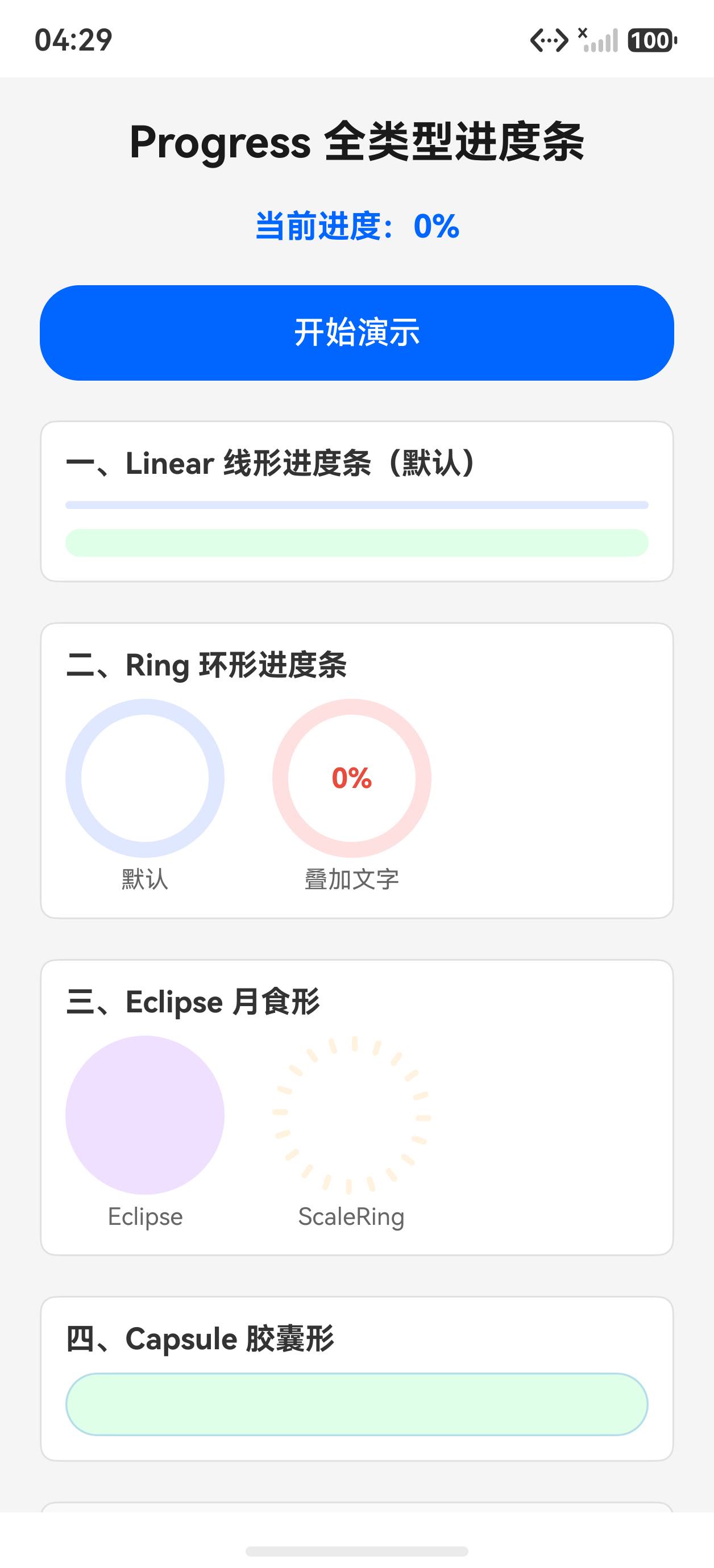
点击“开始演示“后,进度动画进行中:
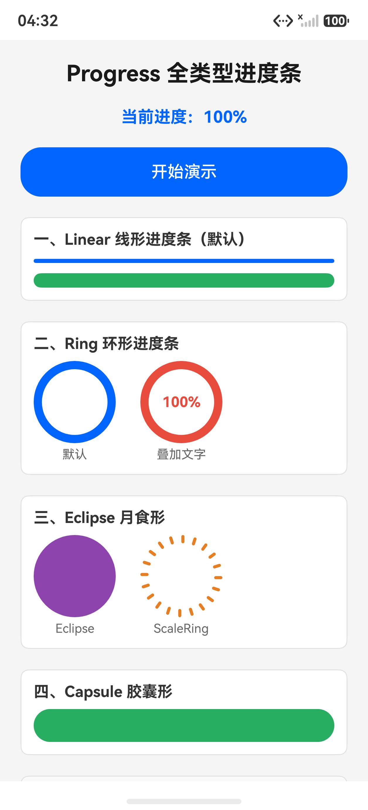
一、Progress 5 种类型
// Linear 线形(最常用,适合页面顶部加载进度)
Progress({ value: 60, total: 100, type: ProgressType.Linear })
  .width('100%').height(8)
  .color('#0066ff').backgroundColor('#e0e8ff')

// Ring 环形(适合圆形 Loading 指示)
Progress({ value: 60, total: 100, type: ProgressType.Ring })
  .width(80).height(80)
  .color('#0066ff').backgroundColor('#e0e8ff')
  .style({ strokeWidth: 8 })

// Eclipse 月食形(视觉特殊,用于特定场景)
Progress({ value: 60, total: 100, type: ProgressType.Eclipse })
  .width(80).height(80)
  .color('#8e44ad').backgroundColor('#f0e0ff')

// ScaleRing 刻度环形(带刻度线,精密进度)
Progress({ value: 60, total: 100, type: ProgressType.ScaleRing })
  .width(80).height(80)
  .color('#e67e22').backgroundColor('#fff3e0')
  .style({ strokeWidth: 8, scaleCount: 20, scaleWidth: 3 })

// Capsule 胶囊形(适合下载进度、文件传输)
Progress({ value: 60, total: 100, type: ProgressType.Capsule })
  .width('100%').height(32)
  .color('#27ae60').backgroundColor('#e0ffe8')
二、Ring + Stack 显示百分比数字
环形进度条中间叠加文字是常见需求,用 Stack 实现:
Stack() {
  Progress({ value: this.progress, total: 100, type: ProgressType.Ring })
    .width(80).height(80)
    .color('#e74c3c').backgroundColor('#ffe0e0')
    .style({ strokeWidth: 8 })
  Text(this.progress.toString() + '%')
    .fontSize(14).fontColor('#e74c3c').fontWeight(FontWeight.Bold)
}
三、进度动画:setInterval + aboutToDisappear
进度动画核心是用 setInterval 定期更新 @State,页面销毁时必须清理定时器:
@State progress: number = 0
@State running: boolean = false
private timer: number = -1

// 必须在 aboutToDisappear 清理定时器
aboutToDisappear(): void {
  if (this.timer >= 0) { clearInterval(this.timer) }
}

startProgress(): void {
  this.progress = 0
  this.running = true
  this.timer = setInterval(() => {
    this.progress += 2
    if (this.progress >= 100) {
      this.progress = 100
      this.running = false
      clearInterval(this.timer)
      this.timer = -1
    }
  }, 60)  // 每 60ms +2%,约 3 秒完成
}
为什么 timer 初始值用 -1? 避免用 0 导致与合法 timer ID 冲突(部分系统会返回 0 作为首个 timer ID),用 -1 作为“未启动“哨兵值更安全。
四、style 属性
.style() 支持的参数因类型而异:
// Linear / Capsule
.style({ strokeWidth: 14, enableSmoothEffect: true })

// Ring
.style({ strokeWidth: 8 })

// ScaleRing
.style({ strokeWidth: 8, scaleCount: 20, scaleWidth: 3 })
enableSmoothEffect: true 开启线形进度条的平滑动效(默认开启)。
完整代码
@Entry
@Component
struct Index {
  @State progress: number = 0
  @State running: boolean = false
  private timer: number = -1

  aboutToDisappear(): void {
    if (this.timer >= 0) { clearInterval(this.timer) }
  }

  startProgress(): void {
    this.progress = 0
    this.running = true
    this.timer = setInterval(() => {
      this.progress += 2
      if (this.progress >= 100) {
        this.progress = 100
        this.running = false
        clearInterval(this.timer)
        this.timer = -1
      }
    }, 60)
  }

  build() {
    Scroll() {
      Column({ space: 20 }) {
        Text('Progress 全类型进度条')
          .fontSize(22).fontWeight(FontWeight.Bold).fontColor('#1a1a1a')

        Text('当前进度:' + this.progress.toString() + '%')
          .fontSize(16).fontColor('#0066ff').fontWeight(FontWeight.Bold)

        Button(this.running ? '进行中...' : '开始演示')
          .width('100%').height(48).backgroundColor(this.running ? '#aaa' : '#0066ff').fontColor('#fff')
          .enabled(!this.running).onClick(() => { this.startProgress() })

        // Linear
        Column({ space: 8 }) {
          Text('一、Linear 线形').fontSize(15).fontWeight(FontWeight.Bold).fontColor('#333')
          Progress({ value: this.progress, total: 100, type: ProgressType.Linear })
            .width('100%').height(8).color('#0066ff').backgroundColor('#e0e8ff')
          Progress({ value: this.progress, total: 100, type: ProgressType.Linear })
            .width('100%').height(14).color('#27ae60').backgroundColor('#e0ffe8')
            .style({ strokeWidth: 14, enableSmoothEffect: true })
        }
        .padding(12).backgroundColor('#fff').borderRadius(8).width('100%')
        .border({ width: 1, color: '#e0e0e0' }).alignItems(HorizontalAlign.Start)

        // Ring
        Column({ space: 8 }) {
          Text('二、Ring 环形').fontSize(15).fontWeight(FontWeight.Bold).fontColor('#333')
          Row({ space: 24 }) {
            Column({ space: 4 }) {
              Progress({ value: this.progress, total: 100, type: ProgressType.Ring })
                .width(80).height(80).color('#0066ff').backgroundColor('#e0e8ff')
                .style({ strokeWidth: 8 })
              Text('默认').fontSize(12).fontColor('#666')
            }
            Column({ space: 4 }) {
              Stack() {
                Progress({ value: this.progress, total: 100, type: ProgressType.Ring })
                  .width(80).height(80).color('#e74c3c').backgroundColor('#ffe0e0')
                  .style({ strokeWidth: 8 })
                Text(this.progress.toString() + '%')
                  .fontSize(14).fontColor('#e74c3c').fontWeight(FontWeight.Bold)
              }
              Text('叠加文字').fontSize(12).fontColor('#666')
            }
          }
        }
        .padding(12).backgroundColor('#fff').borderRadius(8).width('100%')
        .border({ width: 1, color: '#e0e0e0' }).alignItems(HorizontalAlign.Start)

        // Eclipse + ScaleRing
        Column({ space: 8 }) {
          Text('三、Eclipse 月食 / ScaleRing 刻度环').fontSize(15).fontWeight(FontWeight.Bold).fontColor('#333')
          Row({ space: 24 }) {
            Column({ space: 4 }) {
              Progress({ value: this.progress, total: 100, type: ProgressType.Eclipse })
                .width(80).height(80).color('#8e44ad').backgroundColor('#f0e0ff')
              Text('Eclipse').fontSize(12).fontColor('#666')
            }
            Column({ space: 4 }) {
              Progress({ value: this.progress, total: 100, type: ProgressType.ScaleRing })
                .width(80).height(80).color('#e67e22').backgroundColor('#fff3e0')
                .style({ strokeWidth: 8, scaleCount: 20, scaleWidth: 3 })
              Text('ScaleRing').fontSize(12).fontColor('#666')
            }
          }
        }
        .padding(12).backgroundColor('#fff').borderRadius(8).width('100%')
        .border({ width: 1, color: '#e0e0e0' }).alignItems(HorizontalAlign.Start)

        // Capsule
        Column({ space: 8 }) {
          Text('四、Capsule 胶囊形').fontSize(15).fontWeight(FontWeight.Bold).fontColor('#333')
          Progress({ value: this.progress, total: 100, type: ProgressType.Capsule })
            .width('100%').height(32).color('#27ae60').backgroundColor('#e0ffe8')
        }
        .padding(12).backgroundColor('#fff').borderRadius(8).width('100%')
        .border({ width: 1, color: '#e0e0e0' }).alignItems(HorizontalAlign.Start)
      }
      .padding(20).width('100%')
    }
    .width('100%').height('100%').backgroundColor('#f5f5f5')
  }
}
API 速查
| 属性/方法 | 说明 |
|---|---|
Progress({ value, total, type }) |
创建进度条 |
.color('#0066ff') |
进度颜色 |
.backgroundColor('#e0e8ff') |
轨道背景色 |
.style({ strokeWidth, ... }) |
样式配置(按类型不同) |
ProgressType.Linear |
线形 |
ProgressType.Ring |
环形 |
ProgressType.Eclipse |
月食形 |
ProgressType.ScaleRing |
刻度环形 |
ProgressType.Capsule |
胶囊形 |
小结
- Linear 是最通用的:加载进度、下载进度首选,简洁明了
- Ring + Stack = 圆形进度:用 Stack 叠加 Text 显示百分比,是标准做法
- 定时器必须在 aboutToDisappear 清理:否则页面离开后定时器仍在跑,浪费资源可能崩溃
- timer 初始值用 -1 而非 0:0 可能是有效 timer ID,用哨兵值 -1 避免误清理
上一篇:Slider 与 Rating 实战 | 下一篇:DatePicker / TimePicker 日期时间选择器完全指南

作为“人工智能6S店”的官方数字引擎,为AI开发者与企业提供一个覆盖软硬件全栈、一站式门户。
更多推荐

 5
5 0
0- 0


 已为社区贡献11条内容

所有评论(0)