
HarmonyOS ArkUI Button 组件深度解析:类型、状态与自定义样式
·
系列:鸿蒙 HarmonyOS 6.1 新特性实战 · 第 33 篇
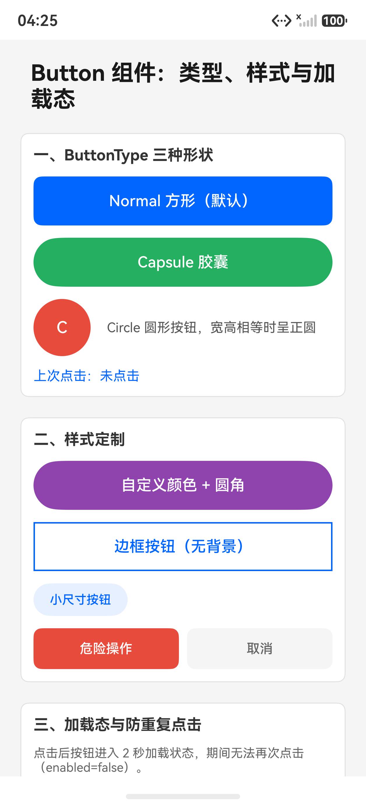
Button 是用户交互的核心入口。ArkUI 的 Button 组件提供了三种内置形状、完整的状态反馈机制、加载状态嵌入和丰富的自定义能力。本篇通过可运行代码系统演示这些特性。
运行效果
初始状态,展示各种 Button 类型:
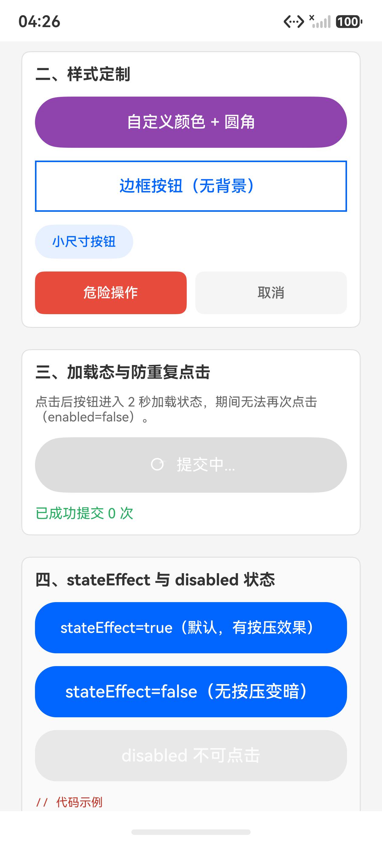
点击触发 Loading 加载状态:
一、ButtonType 三种形状
// Normal:默认直角矩形
Button('确认').type(ButtonType.Normal)

// Capsule:圆角胶囊(推荐,视觉最友好)
Button('提交').type(ButtonType.Capsule)

// Circle:正圆形,常用于浮动按钮
Button('+').type(ButtonType.Circle).width(56).height(56)
注意:ButtonType 不设置时默认为 Capsule。
二、状态反馈:stateEffect
stateEffect 控制按下时是否有高亮反馈(默认开启):
// 开启状态反馈(默认)
Button('有反馈').stateEffect(true)

// 关闭状态反馈
Button('无反馈').stateEffect(false)

// 禁用状态
Button('禁用按钮').enabled(false).opacity(0.4)
禁用按钮要同时设置 enabled(false) 和 opacity() 来提供视觉反馈。
三、内嵌 LoadingProgress 实现加载状态
Button 支持在内部嵌套任意子组件,实现加载按钮效果:
@State isLoading: boolean = false

Button() {
  if (this.isLoading) {
    Row({ space: 8 }) {
      LoadingProgress().width(20).height(20).color('#fff')
      Text('提交中...').fontSize(14).fontColor('#fff')
    }
  } else {
    Text('提交').fontSize(14).fontColor('#fff')
  }
}
.width('100%').height(44)
.backgroundColor(this.isLoading ? '#aaa' : '#0066ff')
.onClick(() => {
  if (!this.isLoading) {
    this.isLoading = true
    setTimeout(() => { this.isLoading = false }, 2000)
  }
})
四、透明/描边自定义样式
通过 .backgroundColor('transparent') 和 .border() 实现描边按钮:
// 描边按钮
Button('查看详情')
  .type(ButtonType.Normal)
  .backgroundColor('transparent')
  .border({ width: 1, color: '#0066ff' })
  .fontColor('#0066ff')
  .borderRadius(8)

// 危险操作按钮
Button('删除').backgroundColor('#e74c3c').fontColor('#fff').borderRadius(8)

// 次要操作按钮(灰色)
Button('取消').backgroundColor('#f5f5f5').fontColor('#666').borderRadius(8)
五、完整代码
@Entry
@Component
struct Index {
  @State isLoading: boolean = false

  build() {
    Scroll() {
      Column({ space: 20 }) {
        Text('Button 组件深度解析')
          .fontSize(22).fontWeight(FontWeight.Bold).fontColor('#1a1a1a')

        // 1. ButtonType 三种形状
        Column({ space: 10 }) {
          Text('一、ButtonType 形状').fontSize(15).fontWeight(FontWeight.Bold).fontColor('#333')
          Row({ space: 12 }) {
            Button('Normal').type(ButtonType.Normal)
              .backgroundColor('#0066ff').fontColor('#fff').borderRadius(4)
            Button('Capsule').type(ButtonType.Capsule)
              .backgroundColor('#0066ff').fontColor('#fff')
            Button('+').type(ButtonType.Circle)
              .width(48).height(48).fontSize(24)
              .backgroundColor('#0066ff').fontColor('#fff')
          }
          .width('100%').justifyContent(FlexAlign.SpaceEvenly)
        }
        .padding(12).backgroundColor('#fff').borderRadius(8).width('100%')
        .border({ width: 1, color: '#e0e0e0' }).alignItems(HorizontalAlign.Start)

        // 2. Loading 状态
        Column({ space: 10 }) {
          Text('二、加载状态').fontSize(15).fontWeight(FontWeight.Bold).fontColor('#333')
          Button() {
            if (this.isLoading) {
              Row({ space: 8 }) {
                LoadingProgress().width(20).height(20).color('#fff')
                Text('提交中...').fontSize(14).fontColor('#fff')
              }
            } else {
              Text('提交').fontSize(14).fontColor('#fff')
            }
          }
          .width('100%').height(44)
          .backgroundColor(this.isLoading ? '#999' : '#0066ff')
          .onClick(() => {
            if (!this.isLoading) {
              this.isLoading = true
              setTimeout(() => { this.isLoading = false }, 2000)
            }
          })
        }
        .padding(12).backgroundColor('#fff').borderRadius(8).width('100%')
        .border({ width: 1, color: '#e0e0e0' }).alignItems(HorizontalAlign.Start)

        // 3. 自定义样式
        Column({ space: 10 }) {
          Text('三、自定义样式').fontSize(15).fontWeight(FontWeight.Bold).fontColor('#333')
          Row({ space: 8 }) {
            Button('描边')
              .type(ButtonType.Normal).borderRadius(8)
              .backgroundColor('transparent')
              .border({ width: 1, color: '#0066ff' })
              .fontColor('#0066ff').layoutWeight(1)
            Button('危险')
              .type(ButtonType.Normal).borderRadius(8)
              .backgroundColor('#e74c3c').fontColor('#fff').layoutWeight(1)
            Button('禁用')
              .type(ButtonType.Normal).borderRadius(8)
              .backgroundColor('#f0f0f0').fontColor('#aaa')
              .enabled(false).layoutWeight(1)
          }
          .width('100%')
        }
        .padding(12).backgroundColor('#fff').borderRadius(8).width('100%')
        .border({ width: 1, color: '#e0e0e0' }).alignItems(HorizontalAlign.Start)

        // 4. stateEffect
        Column({ space: 10 }) {
          Text('四、stateEffect 按压反馈').fontSize(15).fontWeight(FontWeight.Bold).fontColor('#333')
          Row({ space: 12 }) {
            Button('有反馈').stateEffect(true)
              .backgroundColor('#0066ff').fontColor('#fff').layoutWeight(1)
            Button('无反馈').stateEffect(false)
              .backgroundColor('#0066ff').fontColor('#fff').layoutWeight(1)
          }
          .width('100%')
        }
        .padding(12).backgroundColor('#fff').borderRadius(8).width('100%')
        .border({ width: 1, color: '#e0e0e0' }).alignItems(HorizontalAlign.Start)
      }
      .padding(20).width('100%')
    }
    .width('100%').height('100%').backgroundColor('#f5f5f5')
  }
}
API 速查
| 属性/方法 | 说明 |
|---|---|
.type(ButtonType.Capsule) |
形状:Normal / Capsule / Circle |
.stateEffect(true) |
是否显示按压高亮 |
.enabled(false) |
禁用点击 |
Button(){ ... } |
内嵌子组件(图标、Loading等) |
.backgroundColor('transparent') |
透明背景(做描边按钮) |
.border({width, color}) |
描边 |
小结
- Capsule 是默认首选:视觉效果最符合现代 App 规范
- 加载状态靠嵌套:Button 内嵌 LoadingProgress + Text Row 实现,不需要三方库
- 禁用要双重处理:
enabled(false)+ 视觉上降低对比度(opacity或灰色背景) - Circle 用于 FAB:浮动操作按钮场景,配合
position绝对定位
上一篇:Image 组件完全指南 | 下一篇:Checkbox、Radio、Toggle 选择组件实战

作为“人工智能6S店”的官方数字引擎,为AI开发者与企业提供一个覆盖软硬件全栈、一站式门户。
更多推荐

 1
1 0
0- 0


 已为社区贡献6条内容

所有评论(0)