
HarmonyOS ArkUI Image 组件完全指南:objectFit、占位图与加载回调
·
系列:鸿蒙 HarmonyOS 6.1 新特性实战 · 第 32 篇
图片展示是 App 开发中最常见的需求之一。ArkUI 的 Image 组件提供了 6 种缩放模式(objectFit)、骨架屏占位方案和完整的加载回调体系,几乎覆盖所有图片展示场景。本篇用可运行的代码全面演示这些用法。
运行效果
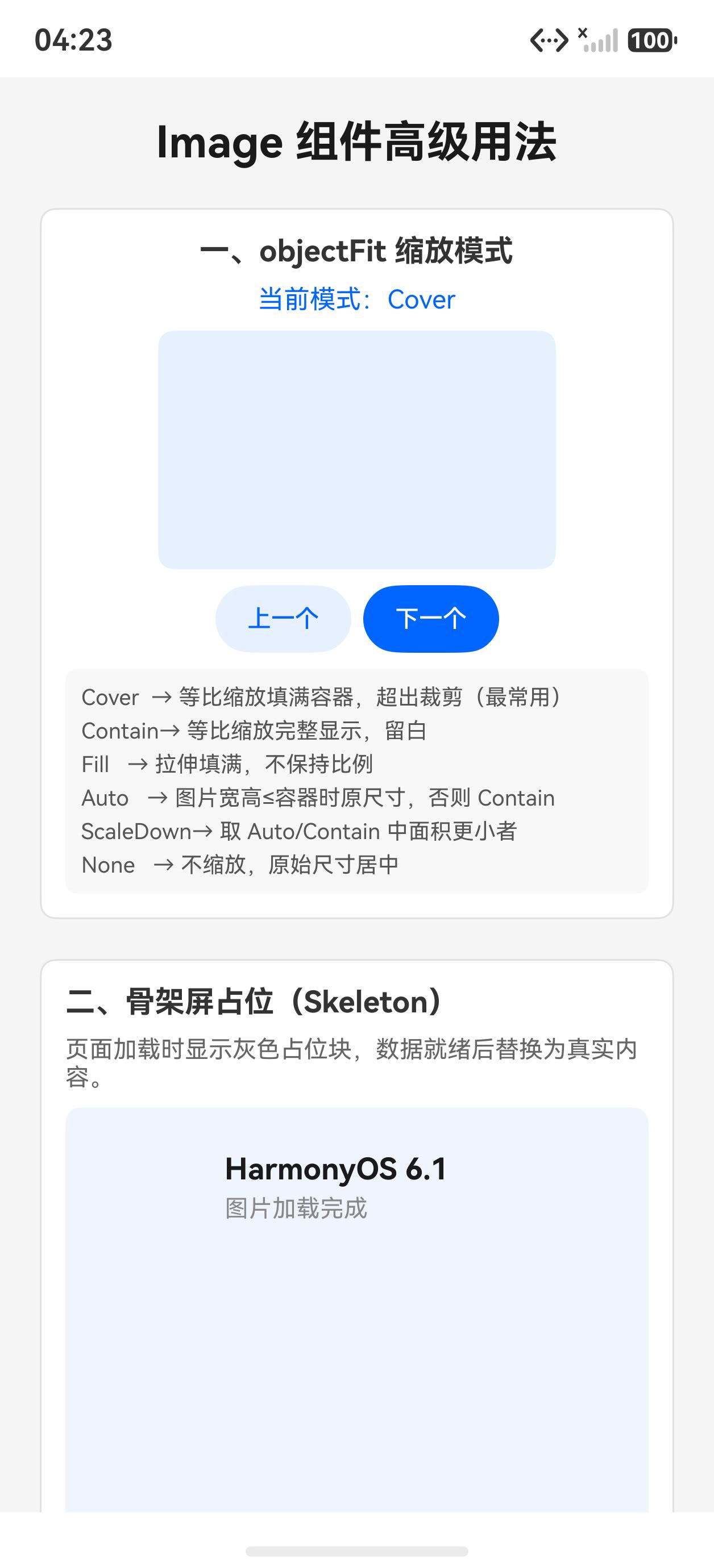
初始状态,展示 Cover 缩放模式:
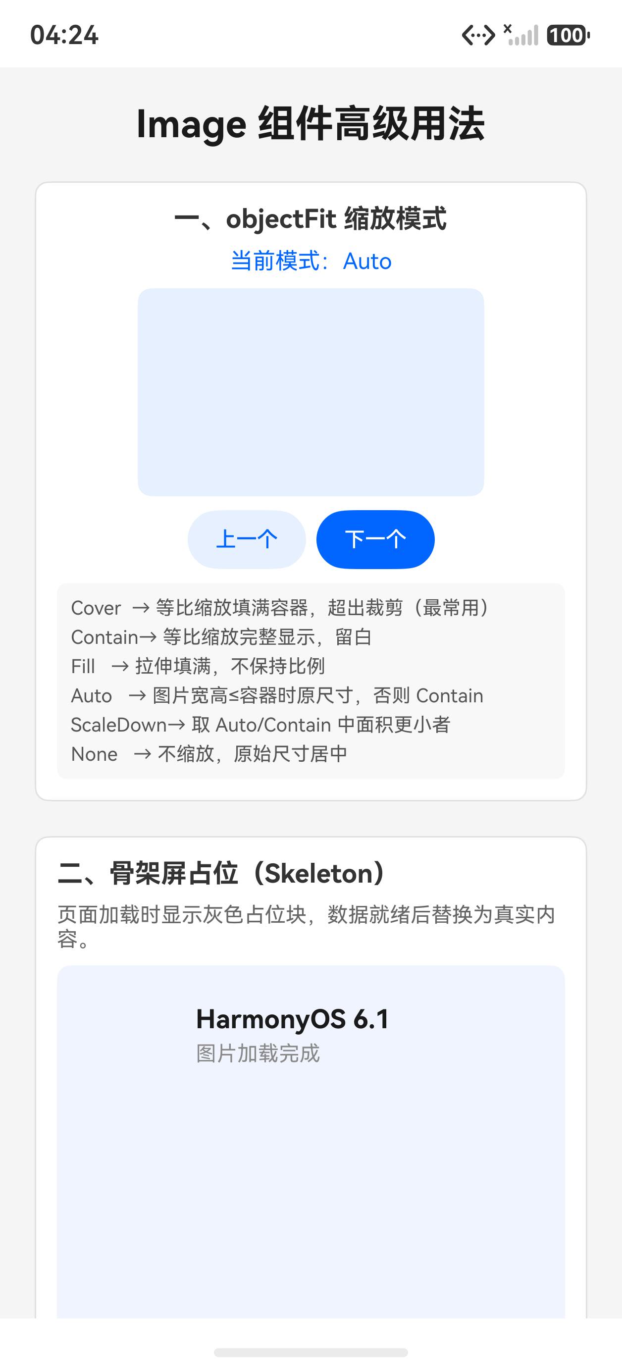
切换到 Fill 完全填充模式:
一、objectFit 6 种缩放模式
objectFit 控制图片在容器内的缩放和对齐方式:
@State fitMode: ImageFit = ImageFit.Cover

Image($r('app.media.startIcon'))
  .width(200).height(150)
  .objectFit(this.fitMode)
  .backgroundColor('#f0f0f0')
6 种模式对比:
| 模式 | 说明 |
|---|---|
ImageFit.Cover |
保持比例,填满容器,超出部分裁剪(最常用) |
ImageFit.Contain |
保持比例,完整显示,容器可能留空 |
ImageFit.Fill |
拉伸填满容器,不保持比例 |
ImageFit.Auto |
保持原始尺寸,超出裁剪 |
ImageFit.ScaleDown |
仅缩小,不放大(取 None 和 Contain 较小者) |
ImageFit.None |
原始尺寸,不缩放 |
const fitModes: ImageFit[] = [
  ImageFit.Cover, ImageFit.Contain, ImageFit.Fill,
  ImageFit.Auto, ImageFit.ScaleDown, ImageFit.None
]
切换模式:
Button('下一个')
  .onClick(() => {
    this.fitIndex = (this.fitIndex + 1) % this.fitModes.length
    this.fitMode = this.fitModes[this.fitIndex]
  })
二、骨架屏占位
图片加载前显示灰色骨架,避免布局抖动:
@State showSkeleton: boolean = true

Stack() {
  // 实际图片
  Image($r('app.media.startIcon'))
    .width('100%').height(200)
    .objectFit(ImageFit.Cover)
    .borderRadius(8)
    .visibility(this.showSkeleton ? Visibility.Hidden : Visibility.Visible)

  // 骨架占位
  Column()
    .width('100%').height(200)
    .backgroundColor('#e8e8e8')
    .borderRadius(8)
    .visibility(this.showSkeleton ? Visibility.Visible : Visibility.Hidden)
}

// 模拟 1.5s 加载完成
.onAppear(() => {
  setTimeout(() => { this.showSkeleton = false }, 1500)
})
三、加载回调:onComplete / onError
@State loadStatus: string = '加载中...'
@State imgWidth: number = 0
@State imgHeight: number = 0

Image($r('app.media.startIcon'))
  .onComplete((event) => {
    if (event) {
      this.imgWidth = event.width
      this.imgHeight = event.height
      this.loadStatus = `加载成功:${event.width}×${event.height}`
    }
  })
  .onError(() => {
    this.loadStatus = '图片加载失败'
  })
onComplete 回调携带图片的实际像素尺寸,可用于计算布局比例。
四、网络图片与缓存
// 网络图片需在 module.json5 申请 ohos.permission.INTERNET
Image('https://example.com/image.jpg')
  .width('100%').height(200)
  .objectFit(ImageFit.Cover)

// 本地资源(推荐)
Image($r('app.media.myImage'))
网络图片默认有缓存,同 URL 第二次加载速度快。
完整代码
@Entry
@Component
struct Index {
  @State fitIndex: number = 0
  @State showSkeleton: boolean = true
  @State loadInfo: string = '等待加载完成'

  private fitModes: ImageFit[] = [
    ImageFit.Cover, ImageFit.Contain, ImageFit.Fill,
    ImageFit.Auto, ImageFit.ScaleDown, ImageFit.None
  ]
  private fitNames: string[] = ['Cover', 'Contain', 'Fill', 'Auto', 'ScaleDown', 'None']

  aboutToAppear(): void {
    setTimeout(() => { this.showSkeleton = false }, 1500)
  }

  build() {
    Scroll() {
      Column({ space: 20 }) {
        Text('Image 组件完全指南').fontSize(22).fontWeight(FontWeight.Bold).fontColor('#1a1a1a')

        // objectFit 演示
        Column({ space: 10 }) {
          Text('一、objectFit 缩放模式').fontSize(15).fontWeight(FontWeight.Bold).fontColor('#333')
          Text('当前:' + this.fitNames[this.fitIndex]).fontSize(14).fontColor('#0066ff')

          Image($r('app.media.startIcon'))
            .width('100%').height(200)
            .objectFit(this.fitModes[this.fitIndex])
            .backgroundColor('#f0f0f0').borderRadius(8)
            .onComplete((event) => {
              if (event) {
                this.loadInfo = `图片尺寸:${event.width} × ${event.height} px`
              }
            })

          Row({ space: 8 }) {
            Button('上一个').fontSize(12).height(36).backgroundColor('#e8f0ff').fontColor('#0066ff')
              .onClick(() => {
                this.fitIndex = (this.fitIndex - 1 + this.fitModes.length) % this.fitModes.length
              })
            Button('下一个').fontSize(12).height(36).backgroundColor('#0066ff').fontColor('#fff')
              .onClick(() => {
                this.fitIndex = (this.fitIndex + 1) % this.fitModes.length
              })
          }

          Text(this.loadInfo).fontSize(12).fontColor('#888')
        }
        .padding(12).backgroundColor('#fff').borderRadius(8).width('100%')
        .border({ width: 1, color: '#e0e0e0' }).alignItems(HorizontalAlign.Start)

        // 骨架屏
        Column({ space: 8 }) {
          Text('二、骨架屏占位').fontSize(15).fontWeight(FontWeight.Bold).fontColor('#333')
          Stack() {
            Image($r('app.media.startIcon'))
              .width('100%').height(150).objectFit(ImageFit.Cover).borderRadius(8)
              .visibility(this.showSkeleton ? Visibility.Hidden : Visibility.Visible)
            Column().width('100%').height(150).backgroundColor('#e8e8e8').borderRadius(8)
              .visibility(this.showSkeleton ? Visibility.Visible : Visibility.Hidden)
          }
          Text(this.showSkeleton ? '加载中(骨架屏显示中)...' : '图片加载完成!')
            .fontSize(13).fontColor(this.showSkeleton ? '#aaa' : '#27ae60')
        }
        .padding(12).backgroundColor('#fff').borderRadius(8).width('100%')
        .border({ width: 1, color: '#e0e0e0' }).alignItems(HorizontalAlign.Start)
      }
      .padding(20).width('100%')
    }
    .width('100%').height('100%').backgroundColor('#f5f5f5')
  }
}
API 速查
| 属性/方法 | 说明 |
|---|---|
.objectFit(ImageFit.Cover) |
缩放模式 |
.borderRadius(8) |
圆角(圆形图:.borderRadius(size/2)) |
.onComplete((event) => {...}) |
加载成功回调,含 width/height |
.onError(() => {...}) |
加载失败回调 |
$r('app.media.xxx') |
引用本地资源 |
小结
- Cover 是首选:绝大多数头图/封面图用 Cover,自动裁剪保持比例
- 骨架屏用 Stack:Stack + Visibility 切换是最简单的骨架方案
- onComplete 获取尺寸:需要动态计算宽高比时利用回调拿实际像素值
- 本地图片用 $r():避免路径错误,构建时自动校验资源存在性
上一篇:Text 组件全解析 | 下一篇:Button 组件深度解析:类型、状态与自定义样式

作为“人工智能6S店”的官方数字引擎,为AI开发者与企业提供一个覆盖软硬件全栈、一站式门户。
更多推荐


 2
2 0
0- 0


 已为社区贡献6条内容

所有评论(0)