
flutter鸿蒙特性展示台:跨端适配策略与鸿蒙特性融合
·
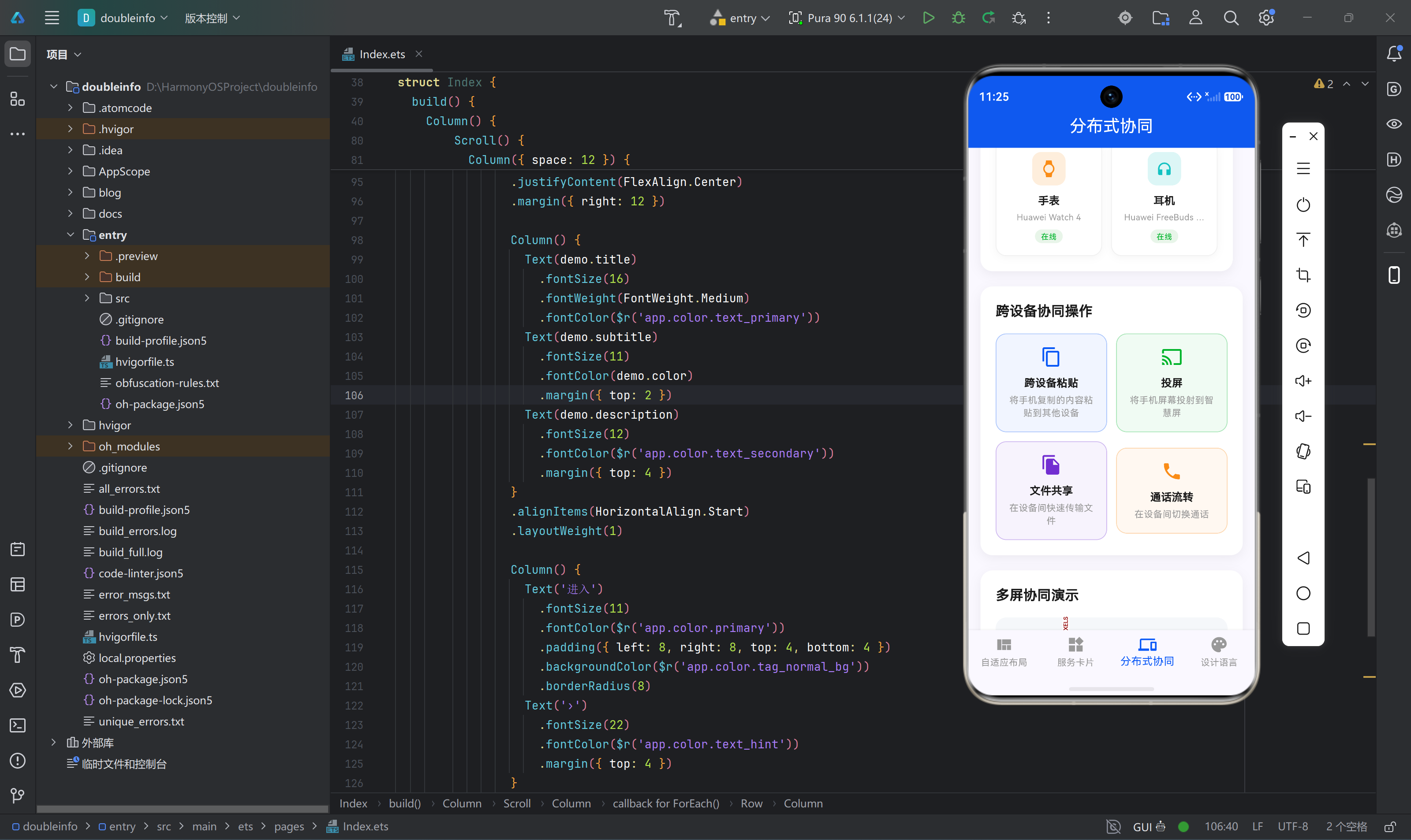
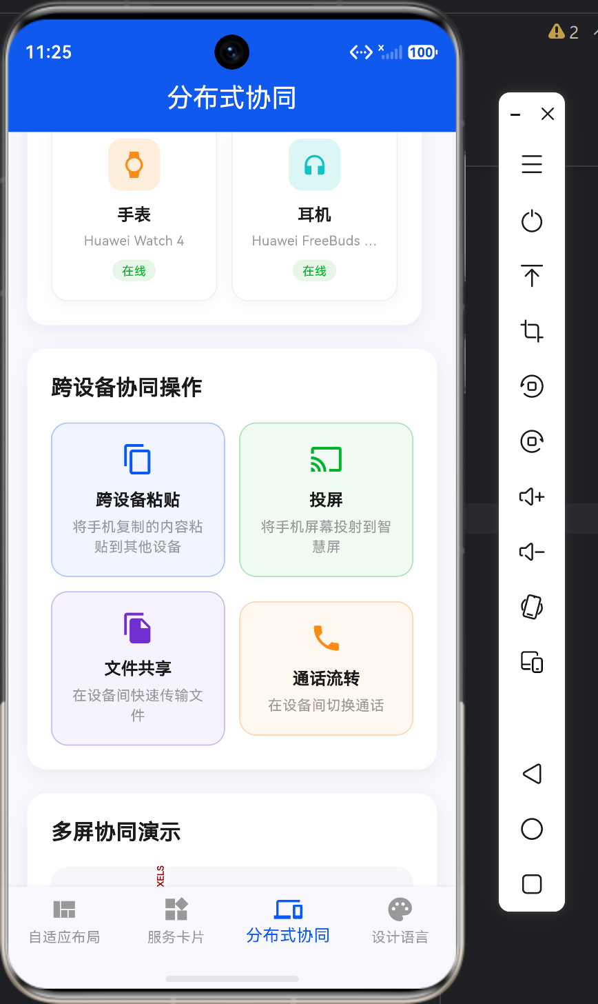
一、项目概述
"鸿蒙特性展示台"是一个基于Flutter的跨平台应用,旨在展示HarmonyOS的核心UI设计特性和交互体验。在本应用中,跨端适配策略扮演着至关重要的角色,它确保应用在不同尺寸、不同类型的鸿蒙设备上都能提供一致且优质的用户体验。
1.1 跨端适配的核心挑战
在开发鸿蒙特性展示台时,我们面临以下核心挑战:
| 挑战 | 描述 | 解决方案 |
|---|---|---|
| 设备多样性 | 手机、折叠屏、平板、智慧屏等多种设备 | 断点设计、响应式布局 |
| 屏幕尺寸差异 | 从360px到3840px不等 | MediaQuery、LayoutBuilder |
| 交互方式不同 | 触摸、鼠标、遥控器等 | 统一交互模型 |
| 性能要求高 | 低端设备到高端设备 | 性能优化策略 |
| 设计语言统一 | 保持HarmonyOS设计语言一致性 | 主题系统、样式规范 |
1.2 应用架构
应用采用经典的Flutter分层架构,跨端适配贯穿于整个UI层:
MaterialApp(全局适配配置)
└── Scaffold
    ├── AppBar(自适应高度)
    ├── Body(页面内容)
    │   ├── AdaptiveLayoutPage(断点布局)
    │   ├── ServiceCardPage(响应式卡片)
    │   ├── DistributedDevicePage(设备协同)
    │   └── DesignLanguagePage(设计规范)
    └── BottomNavigationBar(自适应显示)
二、跨端适配核心策略
2.1 断点设计策略
断点定义:
| 设备类型 | 宽度范围 | 布局策略 | 列数 |
|---|---|---|---|
| 手机 | < 600px | 单列垂直布局 | 2列网格 |
| 折叠屏 | 600px - 840px | 双列混合布局 | 3列网格 |
| 平板 | > 840px | 三列水平布局 | 4列网格 |
核心代码 - 断点判断:
Widget _buildLayoutDemo(BuildContext context) {
  return Container(
    padding: const EdgeInsets.all(20),
    decoration: BoxDecoration(
      color: Colors.white,
      borderRadius: BorderRadius.circular(16),
      boxShadow: [
        BoxShadow(
          color: Colors.black.withValues(alpha: 0.06),
          blurRadius: 12,
          offset: const Offset(0, 4),
        ),
      ],
    ),
    child: Column(
      crossAxisAlignment: CrossAxisAlignment.start,
      children: [
        const Text(
          '自适应布局演示',
          style: TextStyle(
            fontSize: 18,
            fontWeight: FontWeight.w600,
            color: Color(0xFF1A1A1A),
          ),
        ),
        const SizedBox(height: 8),
        const Text(
          '根据屏幕宽度自动切换布局模式',
          style: TextStyle(
            fontSize: 14,
            color: Color(0xFF666666),
          ),
        ),
        const SizedBox(height: 20),
        LayoutBuilder(
          builder: (context, constraints) {
            final maxWidth = constraints.maxWidth;

            if (maxWidth < 600) {
              return _buildPhoneLayout();
            } else if (maxWidth < 840) {
              return _buildFoldableLayout();
            } else {
              return _buildTabletLayout();
            }
          },
        ),
      ],
    ),
  );
}
2.2 响应式布局策略
手机布局:
Widget _buildPhoneLayout() {
  return Column(
    children: [
      _buildLayoutIndicator('手机布局', Colors.blue),
      const SizedBox(height: 16),
      _buildContentCard(Colors.orange, '主内容区'),
      const SizedBox(height: 12),
      Row(
        children: [
          Expanded(
            child: _buildContentCard(Colors.green, '侧边栏A'),
          ),
          const SizedBox(width: 12),
          Expanded(
            child: _buildContentCard(Colors.purple, '侧边栏B'),
          ),
        ],
      ),
    ],
  );
}
折叠屏布局:
Widget _buildFoldableLayout() {
  return Row(
    crossAxisAlignment: CrossAxisAlignment.start,
    children: [
      Expanded(
        flex: 3,
        child: Column(
          children: [
            _buildLayoutIndicator('折叠屏布局', Colors.orange),
            const SizedBox(height: 16),
            _buildContentCard(Colors.blue, '主内容区'),
          ],
        ),
      ),
      const SizedBox(width: 12),
      Expanded(
        flex: 2,
        child: Column(
          children: [
            _buildContentCard(Colors.green, '侧边栏A'),
            const SizedBox(height: 12),
            _buildContentCard(Colors.purple, '侧边栏B'),
          ],
        ),
      ),
    ],
  );
}
平板布局:
Widget _buildTabletLayout() {
  return Row(
    crossAxisAlignment: CrossAxisAlignment.start,
    children: [
      Expanded(
        flex: 1,
        child: Column(
          children: [
            _buildLayoutIndicator('平板布局', Colors.green),
            const SizedBox(height: 16),
            _buildContentCard(Colors.orange, '侧边栏'),
          ],
        ),
      ),
      const SizedBox(width: 12),
      Expanded(
        flex: 4,
        child: _buildContentCard(Colors.blue, '主内容区'),
      ),
      const SizedBox(width: 12),
      Expanded(
        flex: 1,
        child: _buildContentCard(Colors.purple, '操作面板'),
      ),
    ],
  );
}
2.3 响应式网格策略
核心代码 - 商品网格展示:
Widget _buildMultiColumnDemo(BuildContext context) {
  return Container(
    padding: const EdgeInsets.all(20),
    decoration: BoxDecoration(
      color: Colors.white,
      borderRadius: BorderRadius.circular(16),
      boxShadow: [
        BoxShadow(
          color: Colors.black.withValues(alpha: 0.06),
          blurRadius: 12,
          offset: const Offset(0, 4),
        ),
      ],
    ),
    child: Column(
      crossAxisAlignment: CrossAxisAlignment.start,
      children: [
        const Text(
          '商品网格展示',
          style: TextStyle(
            fontSize: 18,
            fontWeight: FontWeight.w600,
            color: Color(0xFF1A1A1A),
          ),
        ),
        const SizedBox(height: 8),
        const Text(
          '根据屏幕宽度自动调整列数',
          style: TextStyle(
            fontSize: 14,
            color: Color(0xFF666666),
          ),
        ),
        const SizedBox(height: 20),
        LayoutBuilder(
          builder: (context, constraints) {
            int crossAxisCount;
            if (constraints.maxWidth < 600) {
              crossAxisCount = 2;
            } else if (constraints.maxWidth < 840) {
              crossAxisCount = 3;
            } else {
              crossAxisCount = 4;
            }

            return GridView.builder(
              shrinkWrap: true,
              physics: const NeverScrollableScrollPhysics(),
              gridDelegate: SliverGridDelegateWithFixedCrossAxisCount(
                crossAxisCount: crossAxisCount,
                crossAxisSpacing: 12,
                mainAxisSpacing: 12,
              ),
              itemCount: 8,
              itemBuilder: (context, index) {
                return _buildProductCard(index);
              },
            );
          },
        ),
      ],
    ),
  );
}
三、鸿蒙特性融合策略
3.1 服务卡片特性融合
常用服务卡片:
Widget _buildCommonServiceCards() {
  return Row(
    children: [
      Expanded(
        child: _buildServiceCard(
          icon: Icons.phone,
          title: '电话',
          subtitle: '最近通话',
          color: const Color(0xFF00B42A),
        ),
      ),
      const SizedBox(width: 12),
      Expanded(
        child: _buildServiceCard(
          icon: Icons.message,
          title: '消息',
          subtitle: '12条未读',
          color: const Color(0xFF0A59F7),
        ),
      ),
      const SizedBox(width: 12),
      Expanded(
        child: _buildServiceCard(
          icon: Icons.camera_alt,
          title: '相机',
          subtitle: '快速拍照',
          color: const Color(0xFF722ED1),
        ),
      ),
      const SizedBox(width: 12),
      Expanded(
        child: _buildServiceCard(
          icon: Icons.music_note,
          title: '音乐',
          subtitle: '正在播放',
          color: const Color(0xFFFA8C16),
        ),
      ),
    ],
  );
}

Widget _buildServiceCard({
  required IconData icon,
  required String title,
  required String subtitle,
  required Color color,
}) {
  return Container(
    padding: const EdgeInsets.all(16),
    decoration: BoxDecoration(
      color: color.withValues(alpha: 0.06),
      borderRadius: BorderRadius.circular(16),
    ),
    child: Column(
      children: [
        Container(
          width: 40,
          height: 40,
          decoration: BoxDecoration(
            color: color.withValues(alpha: 0.15),
            borderRadius: BorderRadius.circular(12),
          ),
          child: Icon(icon, color: color, size: 22),
        ),
        const SizedBox(height: 8),
        Text(title, style: const TextStyle(fontSize: 14, fontWeight: FontWeight.w600, color: Color(0xFF1A1A1A))),
        const SizedBox(height: 4),
        Text(subtitle, style: const TextStyle(fontSize: 11, color: Color(0xFF999999))),
      ],
    ),
  );
}
3.2 分布式设备协同特性融合
设备列表展示:
Widget _buildDeviceList() {
  return Container(
    padding: const EdgeInsets.all(20),
    decoration: BoxDecoration(
      color: Colors.white,
      borderRadius: BorderRadius.circular(16),
      boxShadow: [
        BoxShadow(
          color: Colors.black.withValues(alpha: 0.06),
          blurRadius: 12,
          offset: const Offset(0, 4),
        ),
      ],
    ),
    child: Column(
      crossAxisAlignment: CrossAxisAlignment.start,
      children: [
        const Text(
          '设备列表',
          style: TextStyle(
            fontSize: 18,
            fontWeight: FontWeight.w600,
            color: Color(0xFF1A1A1A),
          ),
        ),
        const SizedBox(height: 16),
        Wrap(
          spacing: 12,
          runSpacing: 12,
          children: _devices.map((device) {
            return _buildDeviceCard(device);
          }).toList(),
        ),
      ],
    ),
  );
}

Widget _buildDeviceCard(DeviceInfo device) {
  final isOnline = device.status == '在线';
  final isSelected = _selectedDevice == device.name;

  return GestureDetector(
    onTap: () {
      if (isOnline) {
        _selectDevice(device.name);
      }
    },
    child: Container(
      width: 140,
      padding: const EdgeInsets.all(16),
      decoration: BoxDecoration(
        color: isSelected
            ? const Color(0xFF0A59F7).withValues(alpha: 0.06)
            : Colors.white,
        borderRadius: BorderRadius.circular(14),
        border: Border.all(
          color: isSelected
              ? const Color(0xFF0A59F7)
              : const Color(0xFFF0F0F0),
          width: 1,
        ),
        boxShadow: [
          BoxShadow(
            color: Colors.black.withValues(alpha: 0.04),
            blurRadius: 8,
            offset: const Offset(0, 2),
          ),
        ],
      ),
      child: Column(
        children: [
          Container(
            width: 44,
            height: 44,
            decoration: BoxDecoration(
              color: isOnline
                  ? device.color.withValues(alpha: 0.15)
                  : const Color(0xFFF0F0F0),
              borderRadius: BorderRadius.circular(12),
            ),
            child: Icon(
              device.icon,
              color: isOnline ? device.color : const Color(0xFFCCCCCC),
              size: 22,
            ),
          ),
          const SizedBox(height: 10),
          Text(
            device.name,
            style: TextStyle(
              fontSize: 14,
              fontWeight: FontWeight.w600,
              color: isOnline ? const Color(0xFF1A1A1A) : const Color(0xFFCCCCCC),
            ),
          ),
          const SizedBox(height: 4),
          Text(
            device.model,
            style: TextStyle(
              fontSize: 11,
              color: isOnline ? const Color(0xFF999999) : const Color(0xFFE0E0E0),
            ),
            maxLines: 1,
            overflow: TextOverflow.ellipsis,
          ),
          const SizedBox(height: 8),
          Container(
            padding: const EdgeInsets.symmetric(horizontal: 8, vertical: 2),
            decoration: BoxDecoration(
              color: isOnline ? const Color(0xFFE8F5E9) : const Color(0xFFF5F5F5),
              borderRadius: BorderRadius.circular(10),
            ),
            child: Text(
              device.status,
              style: TextStyle(
                fontSize: 10,
                fontWeight: FontWeight.w500,
                color: isOnline ? const Color(0xFF00B42A) : const Color(0xFF999999),
              ),
            ),
          ),
        ],
      ),
    ),
  );
}
3.3 设计语言特性融合
颜色系统展示:
Widget _buildColorPalette() {
  return Container(
    padding: const EdgeInsets.all(20),
    decoration: BoxDecoration(
      color: Colors.white,
      borderRadius: BorderRadius.circular(16),
      boxShadow: [
        BoxShadow(
          color: Colors.black.withValues(alpha: 0.06),
          blurRadius: 12,
          offset: const Offset(0, 4),
        ),
      ],
    ),
    child: Column(
      crossAxisAlignment: CrossAxisAlignment.start,
      children: [
        const Text(
          '鸿蒙色彩系统',
          style: TextStyle(
            fontSize: 18,
            fontWeight: FontWeight.w600,
            color: Color(0xFF1A1A1A),
          ),
        ),
        const SizedBox(height: 16),
        _buildColorSection('主色调', [
          const Color(0xFF0A59F7),
          const Color(0xFF4080FF),
          const Color(0xFF69A0FF),
          const Color(0xFF93B5FF),
          const Color(0xFFBED7FF),
        ], ['#0A59F7', '#4080FF', '#69A0FF', '#93B5FF', '#BED7FF']),
        const SizedBox(height: 20),
        _buildColorSection('辅助色', [
          const Color(0xFF00B42A),
          const Color(0xFFFA5151),
          const Color(0xFFFA8C16),
          const Color(0xFF722ED1),
          const Color(0xFF13C2C2),
        ], ['#00B42A', '#FA5151', '#FA8C16', '#722ED1', '#13C2C2']),
        const SizedBox(height: 20),
        _buildColorSection('中性色', [
          const Color(0xFF1A1A1A),
          const Color(0xFF434343),
          const Color(0xFF666666),
          const Color(0xFF999999),
          const Color(0xFFF5F7FA),
        ], ['#1A1A1A', '#434343', '#666666', '#999999', '#F5F7FA']),
      ],
    ),
  );
}
字体规范展示:
Widget _buildTypographyDemo() {
  return Container(
    padding: const EdgeInsets.all(20),
    decoration: BoxDecoration(
      color: Colors.white,
      borderRadius: BorderRadius.circular(16),
      boxShadow: [
        BoxShadow(
          color: Colors.black.withValues(alpha: 0.06),
          blurRadius: 12,
          offset: const Offset(0, 4),
        ),
      ],
    ),
    child: Column(
      crossAxisAlignment: CrossAxisAlignment.start,
      children: [
        const Text(
          '鸿蒙字体规范',
          style: TextStyle(
            fontSize: 18,
            fontWeight: FontWeight.w600,
            color: Color(0xFF1A1A1A),
          ),
        ),
        const SizedBox(height: 16),
        _buildTypographyRow('超大标题', 32, FontWeight.w700),
        _buildTypographyRow('大标题', 28, FontWeight.w600),
        _buildTypographyRow('标题', 24, FontWeight.w600),
        _buildTypographyRow('副标题', 20, FontWeight.w500),
        _buildTypographyRow('正文', 16, FontWeight.w400),
        _buildTypographyRow('正文小', 14, FontWeight.w400),
        _buildTypographyRow('辅助文字', 13, FontWeight.w400),
        _buildTypographyRow('标签', 12, FontWeight.w500),
        _buildTypographyRow('小字', 11, FontWeight.w400),
      ],
    ),
  );
}
四、组件适配策略
4.1 按钮组件适配
核心代码 - 按钮样式:
Widget _buildButtonSection() {
  return Column(
    crossAxisAlignment: CrossAxisAlignment.start,
    children: [
      const Text(
        '按钮样式',
        style: TextStyle(
          fontSize: 14,
          fontWeight: FontWeight.w500,
          color: Color(0xFF434343),
        ),
      ),
      const SizedBox(height: 12),
      Row(
        children: [
          Expanded(
            child: ElevatedButton(
              onPressed: () {},
              style: ElevatedButton.styleFrom(
                backgroundColor: const Color(0xFF0A59F7),
                foregroundColor: Colors.white,
                elevation: 0,
                minimumSize: const Size(double.infinity, 44),
                shape: RoundedRectangleBorder(
                  borderRadius: BorderRadius.circular(12),
                ),
              ),
              child: const Text('主按钮'),
            ),
          ),
          const SizedBox(width: 12),
          Expanded(
            child: ElevatedButton(
              onPressed: () {},
              style: ElevatedButton.styleFrom(
                backgroundColor: const Color(0xFFF5F7FA),
                foregroundColor: const Color(0xFF1A1A1A),
                elevation: 0,
                minimumSize: const Size(double.infinity, 44),
                shape: RoundedRectangleBorder(
                  borderRadius: BorderRadius.circular(12),
                ),
              ),
              child: const Text('次按钮'),
            ),
          ),
          const SizedBox(width: 12),
          Expanded(
            child: OutlinedButton(
              onPressed: () {},
              style: OutlinedButton.styleFrom(
                backgroundColor: Colors.transparent,
                foregroundColor: const Color(0xFF0A59F7),
                side: const BorderSide(
                  color: Color(0xFF0A59F7),
                  width: 1,
                ),
                minimumSize: const Size(double.infinity, 44),
                shape: RoundedRectangleBorder(
                  borderRadius: BorderRadius.circular(12),
                ),
              ),
              child: const Text('描边按钮'),
            ),
          ),
        ],
      ),
    ],
  );
}
4.2 输入框组件适配
核心代码 - 输入框样式:
Widget _buildInputSection() {
  return Column(
    crossAxisAlignment: CrossAxisAlignment.start,
    children: [
      const Text(
        '输入框样式',
        style: TextStyle(
          fontSize: 14,
          fontWeight: FontWeight.w500,
          color: Color(0xFF434343),
        ),
      ),
      const SizedBox(height: 12),
      TextField(
        decoration: InputDecoration(
          hintText: '请输入内容',
          filled: true,
          fillColor: const Color(0xFFF5F7FA),
          border: OutlineInputBorder(
            borderRadius: BorderRadius.circular(12),
            borderSide: BorderSide.none,
          ),
          contentPadding: const EdgeInsets.symmetric(horizontal: 16, vertical: 14),
        ),
      ),
      const SizedBox(height: 8),
      TextField(
        obscureText: true,
        decoration: InputDecoration(
          hintText: '请输入密码',
          filled: true,
          fillColor: const Color(0xFFF5F7FA),
          border: OutlineInputBorder(
            borderRadius: BorderRadius.circular(12),
            borderSide: BorderSide.none,
          ),
          contentPadding: const EdgeInsets.symmetric(horizontal: 16, vertical: 14),
        ),
      ),
    ],
  );
}
4.3 开关组件适配
核心代码 - 开关样式:
Widget _buildSwitchSection() {
  return Column(
    crossAxisAlignment: CrossAxisAlignment.start,
    children: [
      const Text(
        '开关样式',
        style: TextStyle(
          fontSize: 14,
          fontWeight: FontWeight.w500,
          color: Color(0xFF434343),
        ),
      ),
      const SizedBox(height: 12),
      Row(
        children: [
          Expanded(
            child: Row(
              children: [
                const Text(
                  '开启通知',
                  style: TextStyle(
                    fontSize: 15,
                    color: Color(0xFF1A1A1A),
                  ),
                ),
                const Spacer(),
                Switch(
                  value: true,
                  onChanged: (value) {},
                  activeThumbColor: const Color(0xFF0A59F7),
                ),
              ],
            ),
          ),
          const SizedBox(width: 24),
          Expanded(
            child: Row(
              children: [
                const Text(
                  '深色模式',
                  style: TextStyle(
                    fontSize: 15,
                    color: Color(0xFF1A1A1A),
                  ),
                ),
                const Spacer(),
                Switch(
                  value: false,
                  onChanged: (value) {},
                  activeThumbColor: const Color(0xFF0A59F7),
                ),
              ],
            ),
          ),
        ],
      ),
    ],
  );
}
五、性能优化策略
5.1 布局性能优化
避免嵌套过多Container:
// 不好的做法
Container(
  decoration: BoxDecoration(color: Colors.white),
  child: Container(
    decoration: BoxDecoration(borderRadius: BorderRadius.circular(8)),
    child: Container(
      decoration: BoxDecoration(boxShadow: [...]),
      child: const Text('内容'),
    ),
  ),
)

// 好的做法
Container(
  decoration: BoxDecoration(
    color: Colors.white,
    borderRadius: BorderRadius.circular(8),
    boxShadow: [...],
  ),
  child: const Text('内容'),
)
使用const构造函数:
// 不好的做法
Container(
  decoration: BoxDecoration(
    color: Colors.white,
    borderRadius: BorderRadius.circular(16),
  ),
)

// 好的做法
const _cardDecoration = BoxDecoration(
  color: Colors.white,
  borderRadius: BorderRadius.all(Radius.circular(16)),
);

Container(
  decoration: _cardDecoration,
)
5.2 列表性能优化
使用GridView.builder:
GridView.builder(
  shrinkWrap: true,
  physics: const NeverScrollableScrollPhysics(),
  gridDelegate: SliverGridDelegateWithFixedCrossAxisCount(
    crossAxisCount: crossAxisCount,
    crossAxisSpacing: 12,
    mainAxisSpacing: 12,
  ),
  itemCount: 8,
  itemBuilder: (context, index) {
    return _buildProductCard(index);
  },
)
使用shrinkWrap:
// 只渲染可见区域
GridView.builder(
  shrinkWrap: true,
  physics: const NeverScrollableScrollPhysics(),
  // ...
)
5.3 图片性能优化
使用CachedNetworkImage:
// 图片缓存和懒加载
CachedNetworkImage(
  imageUrl: 'https://example.com/image.jpg',
  placeholder: (context, url) => const CircularProgressIndicator(),
  errorWidget: (context, url, error) => const Icon(Icons.error),
  fit: BoxFit.cover,
)
根据像素密度选择图片:
AssetImage getImage(String baseName) {
  final pixelRatio = MediaQuery.of(context).devicePixelRatio;

  if (pixelRatio >= 3.0) {
    return AssetImage('images/${baseName}_3x.png');
  } else if (pixelRatio >= 2.0) {
    return AssetImage('images/${baseName}_2x.png');
  } else {
    return AssetImage('images/${baseName}_1x.png');
  }
}
六、鸿蒙设备特殊适配
6.1 折叠屏适配
核心代码 - 折叠屏检测:
bool _isFoldable() {
  final screenWidth = MediaQuery.of(context).size.width;
  return screenWidth >= 600 && screenWidth < 840;
}

// 根据折叠状态调整布局
Widget build(BuildContext context) {
  if (_isFoldable()) {
    return _buildFoldableLayout();
  } else {
    return _buildNormalLayout();
  }
}
折叠屏布局策略:
Widget _buildFoldableLayout() {
  return Row(
    crossAxisAlignment: CrossAxisAlignment.start,
    children: [
      Expanded(
        flex: 3,
        child: Column(
          children: [
            _buildLayoutIndicator('折叠屏布局', Colors.orange),
            const SizedBox(height: 16),
            _buildContentCard(Colors.blue, '主内容区'),
          ],
        ),
      ),
      const SizedBox(width: 12),
      Expanded(
        flex: 2,
        child: Column(
          children: [
            _buildContentCard(Colors.green, '侧边栏A'),
            const SizedBox(height: 12),
            _buildContentCard(Colors.purple, '侧边栏B'),
          ],
        ),
      ),
    ],
  );
}
6.2 平板适配
平板布局策略:
Widget _buildTabletLayout() {
  return Row(
    crossAxisAlignment: CrossAxisAlignment.start,
    children: [
      Expanded(
        flex: 1,
        child: Column(
          children: [
            _buildLayoutIndicator('平板布局', Colors.green),
            const SizedBox(height: 16),
            _buildContentCard(Colors.orange, '侧边栏'),
          ],
        ),
      ),
      const SizedBox(width: 12),
      Expanded(
        flex: 4,
        child: _buildContentCard(Colors.blue, '主内容区'),
      ),
      const SizedBox(width: 12),
      Expanded(
        flex: 1,
        child: _buildContentCard(Colors.purple, '操作面板'),
      ),
    ],
  );
}
6.3 智慧屏适配
智慧屏布局策略:
Widget _buildSmartScreenLayout() {
  return Container(
    padding: const EdgeInsets.all(40),
    child: Row(
      children: [
        Expanded(
          flex: 1,
          child: Column(
            children: [
              _buildSidebarMenu(),
            ],
          ),
        ),
        const SizedBox(width: 32),
        Expanded(
          flex: 5,
          child: Column(
            children: [
              _buildHeader(),
              const SizedBox(height: 32),
              _buildMainContent(),
            ],
          ),
        ),
        const SizedBox(width: 32),
        Expanded(
          flex: 1,
          child: Column(
            children: [
              _buildInfoPanel(),
            ],
          ),
        ),
      ],
    ),
  );
}
七、跨端适配最佳实践
7.1 创建适配工具类
// 跨端适配工具类
class ResponsiveUtils {
  static const double phoneBreakpoint = 600;
  static const double foldableBreakpoint = 840;
  static const double tabletBreakpoint = 1200;

  static DeviceType getDeviceType(BuildContext context) {
    final screenWidth = MediaQuery.of(context).size.width;

    if (screenWidth < phoneBreakpoint) {
      return DeviceType.phone;
    } else if (screenWidth < foldableBreakpoint) {
      return DeviceType.foldable;
    } else if (screenWidth < tabletBreakpoint) {
      return DeviceType.tablet;
    } else {
      return DeviceType.smartScreen;
    }
  }

  static int getGridColumnCount(BuildContext context) {
    final deviceType = getDeviceType(context);

    switch (deviceType) {
      case DeviceType.phone:
        return 2;
      case DeviceType.foldable:
        return 3;
      case DeviceType.tablet:
        return 4;
      case DeviceType.smartScreen:
        return 6;
    }
  }

  static double getFontScale(BuildContext context) {
    final deviceType = getDeviceType(context);

    switch (deviceType) {
      case DeviceType.phone:
        return 1.0;
      case DeviceType.foldable:
        return 1.1;
      case DeviceType.tablet:
        return 1.2;
      case DeviceType.smartScreen:
        return 1.4;
    }
  }

  static EdgeInsets getPadding(BuildContext context) {
    final deviceType = getDeviceType(context);

    switch (deviceType) {
      case DeviceType.phone:
        return const EdgeInsets.all(16);
      case DeviceType.foldable:
        return const EdgeInsets.all(20);
      case DeviceType.tablet:
        return const EdgeInsets.all(24);
      case DeviceType.smartScreen:
        return const EdgeInsets.all(40);
    }
  }
}

enum DeviceType {
  phone,
  foldable,
  tablet,
  smartScreen,
}
7.2 使用适配工具类
// 在Widget中使用适配工具
Widget build(BuildContext context) {
  final deviceType = ResponsiveUtils.getDeviceType(context);
  final columnCount = ResponsiveUtils.getGridColumnCount(context);
  final fontScale = ResponsiveUtils.getFontScale(context);
  final padding = ResponsiveUtils.getPadding(context);

  return Container(
    padding: padding,
    child: GridView.builder(
      gridDelegate: SliverGridDelegateWithFixedCrossAxisCount(
        crossAxisCount: columnCount,
      ),
      itemBuilder: (context, index) {
        return Text(
          '商品 ${index + 1}',
          style: TextStyle(
            fontSize: 16 * fontScale,
          ),
        );
      },
    ),
  );
}
7.3 创建响应式Widget
// 创建响应式Widget
class ResponsiveWidget extends StatelessWidget {
final Widget phone;
final Widget? foldable;
final Widget? tablet;
final Widget? smartScreen;
const ResponsiveWidget({
super.key,
required this.phone,
this.foldable,
this.tablet,
this.smartScreen,
});
Widget build(BuildContext context) {
final deviceType = ResponsiveUtils.getDeviceType(context);
switch (deviceType) {
case DeviceType.phone:
return phone;
case DeviceType.foldable:
return foldable ?? phone;
case DeviceType.tablet:
return tablet ?? foldable ?? phone;
case DeviceType.smartScreen:
return smartScreen ?? tablet ?? foldable ?? phone;
}
}
}
// 使用响应式Widget
ResponsiveWidget(
phone: _buildPhoneLayout(),
foldable: _buildFoldableLayout(),
tablet: _buildTabletLayout(),
smartScreen: _buildSmartScreenLayout(),
)
八、鸿蒙特性融合最佳实践
8.1 服务卡片设计规范
// 服务卡片设计规范
class ServiceCardDesign {
  // 卡片尺寸规范
  static const double smallCardWidth = 140;
  static const double mediumCardWidth = 200;
  static const double largeCardWidth = 300;

  // 卡片高度规范
  static const double smallCardHeight = 120;
  static const double mediumCardHeight = 160;
  static const double largeCardHeight = 200;

  // 圆角规范
  static const double borderRadius = 16;

  // 阴影规范
  static const BoxShadow shadow = BoxShadow(
    color: Color(0x06000000),
    blurRadius: 12,
    offset: Offset(0, 4),
  );

  // 内边距规范
  static const EdgeInsets padding = EdgeInsets.all(16);
}
8.2 分布式设备协同规范
// 分布式设备协同规范
class DistributedDeviceDesign {
  // 设备卡片尺寸
  static const double deviceCardWidth = 140;
  static const double deviceCardHeight = 180;

  // 选中状态样式
  static const Color selectedBorderColor = Color(0xFF0A59F7);
  static const Color selectedBackgroundColor = Color(0x060A59F7);

  // 在线状态颜色
  static const Color onlineColor = Color(0xFF00B42A);
  static const Color offlineColor = Color(0xFF999999);

  // 图标尺寸
  static const double iconSize = 22;
  static const double iconContainerSize = 44;
}
8.3 设计语言规范
// 设计语言规范
class HarmonyOSDesign {
  // 颜色系统
  static const Color primaryColor = Color(0xFF0A59F7);
  static const Color successColor = Color(0xFF00B42A);
  static const Color dangerColor = Color(0xFFFA5151);
  static const Color warningColor = Color(0xFFFA8C16);

  // 文字颜色
  static const Color textPrimary = Color(0xFF1A1A1A);
  static const Color textSecondary = Color(0xFF434343);
  static const Color textTertiary = Color(0xFF666666);
  static const Color textPlaceholder = Color(0xFF999999);

  // 背景颜色
  static const Color backgroundColor = Color(0xFFF5F7FA);
  static const Color cardBackgroundColor = Colors.white;

  // 字体规范
  static const TextStyle titleStyle = TextStyle(
    fontSize: 18,
    fontWeight: FontWeight.w600,
    color: textPrimary,
  );

  static const TextStyle bodyStyle = TextStyle(
    fontSize: 16,
    fontWeight: FontWeight.w400,
    color: textPrimary,
  );

  static const TextStyle captionStyle = TextStyle(
    fontSize: 14,
    fontWeight: FontWeight.w400,
    color: textTertiary,
  );
}
九、总结
9.1 跨端适配核心要点
- 断点设计:定义手机、折叠屏、平板、智慧屏四个断点
- 响应式布局:根据断点切换不同布局策略
- 响应式网格:根据屏幕宽度自动调整列数
- 组件适配:确保按钮、输入框、开关等组件在不同设备上都能正常工作
- 性能优化:使用懒加载、缓存、const等技术提升性能
9.2 鸿蒙特性融合要点
| 特性 | 融合策略 |
|---|---|
| 服务卡片 | 统一卡片设计规范,支持多种尺寸 |
| 分布式设备协同 | 设备列表展示,状态管理,连接控制 |
| 设计语言 | 颜色系统、字体规范、组件样式 |
| 自适应布局 | 断点设计、响应式布局 |
9.3 最佳实践总结
- 创建适配工具类:封装设备类型检测、网格列数、字体缩放等逻辑
- 创建响应式Widget:根据设备类型显示不同布局
- 定义设计规范:统一颜色、字体、组件样式
- 使用const构造函数:减少Widget重建,提升性能
- 使用懒加载:优化列表和图片性能
9.4 鸿蒙适配要点
| 设备类型 | 宽度范围 | 布局策略 | 列数 |
|---|---|---|---|
| 手机 | < 600px | 单列垂直布局 | 2列 |
| 折叠屏 | 600px - 840px | 双列混合布局 | 3列 |
| 平板 | 840px - 1200px | 三列水平布局 | 4列 |
| 智慧屏 | > 1200px | 多列布局 | 6列 |
通过掌握跨端适配策略和鸿蒙特性融合技术,我们可以在Flutter应用中实现完美的多设备适配,为不同尺寸、不同类型的鸿蒙设备提供一致且优质的用户体验。
十、项目回顾与展望
10.1 项目成果
"鸿蒙特性展示台"项目已经完成了以下核心功能:
- 自适应布局:支持手机、折叠屏、平板三种布局模式
- 服务卡片:实现常用服务卡片、信息展示卡片、交互操作卡片、动态卡片
- 分布式设备协同:设备列表展示、连接状态管理、多屏协同演示
- 设计语言:颜色系统、字体规范、组件样式、阴影与圆角
10.2 技术栈总结
| 技术 | 应用场景 |
|---|---|
| Flutter | 跨平台UI框架 |
| Material Design | UI组件库 |
| MediaQuery | 设备信息获取 |
| LayoutBuilder | 布局约束获取 |
| ThemeData | 全局主题管理 |
| BoxDecoration | 装饰设计 |
10.3 未来展望
- 鸿蒙原生特性集成:集成鸿蒙原生能力,如分布式数据管理、分布式任务调度等
- 服务卡片深度定制:支持更多卡片类型和动态内容
- 性能优化:进一步优化渲染性能和内存使用
- 国际化支持:支持多语言切换
- 深色模式:完善深色模式适配
通过持续迭代和优化,"鸿蒙特性展示台"将成为一个完整的HarmonyOS UI特性展示平台,为开发者提供参考和学习资源。

作为“人工智能6S店”的官方数字引擎,为AI开发者与企业提供一个覆盖软硬件全栈、一站式门户。
更多推荐
 0
0 0
0- 0


 已为社区贡献26条内容

所有评论(0)