
flutter鸿蒙特性展示台:Expanded与Flex灵活布局实战
引言
在 Flutter 布局系统中,Expanded 和 Flex 是实现灵活布局的核心组件。它们能够帮助开发者创建响应式、自适应的用户界面,特别是在需要动态分配可用空间的场景中。在"鸿蒙特性展示台"应用中,我们大量使用了 Expanded 和 Flex 组件来实现各种复杂的布局效果。
本文将深入探讨 Expanded 和 Flex 组件的原理、用法、高级特性以及在实际项目中的应用。我们将通过源码分析和实战案例,帮助读者全面掌握灵活布局的设计与实现技巧,并理解其在鸿蒙特性展示中的设计思想。
一、Flex布局概述
1.1 Flex布局的定义
Flex 是 Flutter 中的一个灵活布局组件,它能够在水平或垂直方向上排列子组件,并根据 flex 属性分配可用空间。Flex 是 Row 和 Column 的父类,Row 相当于 direction: Axis.horizontal 的 Flex,Column 相当于 direction: Axis.vertical 的 Flex。
1.2 Flex与Row/Column的关系
Flex (direction: Axis.horizontal)  →  Row
Flex (direction: Axis.vertical)    →  Column
1.3 Flex组件核心参数
Flex({
  Key? key,
  this.direction = Axis.horizontal,  // 排列方向
  this.mainAxisAlignment = MainAxisAlignment.start,  // 主轴对齐方式
  this.mainAxisSize = MainAxisSize.max,  // 主轴尺寸
  this.crossAxisAlignment = CrossAxisAlignment.center,  // 交叉轴对齐方式
  this.textDirection,  // 文本方向
  this.verticalDirection = VerticalDirection.down,  // 垂直方向
  this.clipBehavior = Clip.none,  // 裁剪行为
  List<Widget> children = const <Widget>[],  // 子组件列表
})
1.4 MainAxisAlignment枚举值
enum MainAxisAlignment {
  start,        // 起始对齐
  end,          // 结束对齐
  center,       // 居中对齐
  spaceBetween, // 两端对齐,间距均匀分布
  spaceAround,  // 间距均匀分布,两端各有一半间距
  spaceEvenly,  // 间距完全均匀分布
}
1.5 CrossAxisAlignment枚举值
enum CrossAxisAlignment {
  start,        // 起始对齐
  end,          // 结束对齐
  center,       // 居中对齐
  stretch,      // 拉伸填充
  baseline,     // 基线对齐
}
二、Expanded组件概述
2.1 Expanded的定义
Expanded 是一个布局组件,它能够让子组件填充 Flex(包括 Row 和 Column)中剩余的可用空间。Expanded 必须作为 Flex 的直接子组件使用。
2.2 Expanded核心参数
const Expanded({
  Key? key,
  this.flex = 1,  // 弹性系数
  required Widget child,  // 子组件
})
2.3 Expanded与Flexible的区别
| 特性 | Expanded | Flexible |
|---|---|---|
| 填充方式 | 强制填充剩余空间 | 可选填充剩余空间 |
| fit参数 | 固定为 FlexFit.tight | 可设置为 FlexFit.loose |
| 适用场景 | 需要填满剩余空间 | 只需获取最小尺寸 |
// Expanded 相当于
Flexible(
  flex: 1,
  fit: FlexFit.tight,
  child: child,
)
2.4 FlexFit枚举值
enum FlexFit {
  tight,   // 强制填充分配的空间
  loose,   // 只占用子组件需要的最小空间
}
三、Flex布局算法
3.1 Flex布局过程
Flex 布局过程可以分为以下几个步骤:
- 测量阶段:遍历所有子组件,计算每个子组件的尺寸
- 空间分配阶段:根据
flex属性分配剩余空间 - 对齐阶段:根据对齐方式调整子组件位置
- 定位阶段:设置每个子组件的最终位置
3.2 Flex布局算法详解
class RenderFlex extends RenderBox {
void performLayout() {
// 获取布局约束
final constraints = this.constraints;
// 初始化布局状态
double totalFlex = 0.0;
double nonFlexSize = 0.0;
// 第一遍:计算非弹性子组件尺寸和总弹性系数
for (final child in children) {
final flex = _getFlex(child);
if (flex > 0) {
totalFlex += flex;
// 弹性子组件使用最小尺寸约束
child.layout(_getMinConstraints(constraints), parentUsesSize: true);
nonFlexSize += _getCrossSize(child);
} else {
// 非弹性子组件使用宽松约束
child.layout(_getLooseConstraints(constraints), parentUsesSize: true);
nonFlexSize += _getMainSize(child);
}
}
// 计算剩余空间
final availableSpace = _getMainMaxExtent(constraints) - nonFlexSize;
final flexSpace = totalFlex > 0 ? availableSpace / totalFlex : 0.0;
// 第二遍:设置弹性子组件尺寸
for (final child in children) {
final flex = _getFlex(child);
if (flex > 0) {
final childSize = flexSpace * flex;
// 设置子组件尺寸
child.layout(_getTightConstraints(childSize), parentUsesSize: true);
}
}
// 设置自身尺寸
size = constraints.constrain(Size(...));
// 定位子组件
_positionChildren();
}
}
3.3 Flex布局流程图
┌─────────────────────────────────────────────────────────────────────┐
│                        performLayout()                             │
└─────────────────────────────────────────────────────────────────────┘
                                    │
                                    ▼
┌─────────────────────────────────────────────────────────────────────┐
│                    1. 获取布局约束 (constraints)                     │
└─────────────────────────────────────────────────────────────────────┘
                                    │
                                    ▼
┌─────────────────────────────────────────────────────────────────────┐
│                    2. 第一遍遍历:计算非弹性尺寸和总弹性系数         │
│  - 弹性子组件 (flex > 0): 累加 flex 值,使用最小约束布局            │
│  - 非弹性子组件 (flex = 0): 累加实际尺寸,使用宽松约束布局          │
└─────────────────────────────────────────────────────────────────────┘
                                    │
                                    ▼
┌─────────────────────────────────────────────────────────────────────┐
│                    3. 计算剩余空间和弹性空间                       │
│  availableSpace = maxExtent - nonFlexSize                          │
│  flexSpace = availableSpace / totalFlex                           │
└─────────────────────────────────────────────────────────────────────┘
                                    │
                                    ▼
┌─────────────────────────────────────────────────────────────────────┐
│                    4. 第二遍遍历:设置弹性子组件尺寸               │
│  childSize = flexSpace * flex                                     │
└─────────────────────────────────────────────────────────────────────┘
                                    │
                                    ▼
┌─────────────────────────────────────────────────────────────────────┐
│                    5. 设置自身尺寸和定位子组件                     │
└─────────────────────────────────────────────────────────────────────┘
四、项目中的Expanded与Flex应用
4.1 自适应布局页面中的Expanded应用
在自适应布局页面中,我们使用 Expanded 实现了设备信息卡片的响应式布局:
Widget _buildDeviceInfoCard(BuildContext context) {
  return Container(
    padding: const EdgeInsets.all(20),
    decoration: BoxDecoration(
      color: Colors.white,
      borderRadius: BorderRadius.circular(16),
      boxShadow: [
        BoxShadow(
          color: Colors.black.withValues(alpha: 0.06),
          blurRadius: 12,
          offset: const Offset(0, 4),
        ),
      ],
    ),
    child: Column(
      crossAxisAlignment: CrossAxisAlignment.start,
      children: [
        Row(
          children: [
            Container(
              width: 48,
              height: 48,
              decoration: BoxDecoration(
                color: const Color(0xFF0A59F7).withValues(alpha: 0.1),
                borderRadius: BorderRadius.circular(12),
              ),
              child: const Icon(
                Icons.smartphone,
                color: Color(0xFF0A59F7),
                size: 28,
              ),
            ),
            const SizedBox(width: 16),
            Expanded(
              child: Column(
                crossAxisAlignment: CrossAxisAlignment.start,
                children: [
                  const Text(
                    '设备信息',
                    style: TextStyle(
                      fontSize: 18,
                      fontWeight: FontWeight.w600,
                      color: Color(0xFF1A1A1A),
                    ),
                  ),
                  const SizedBox(height: 4),
                  Text(
                    deviceType,
                    style: TextStyle(
                      fontSize: 14,
                      color: const Color(0xFF0A59F7),
                      fontWeight: FontWeight.w500,
                    ),
                  ),
                ],
              ),
            ),
          ],
        ),
        const SizedBox(height: 20),
        Row(
          children: [
            Expanded(
              child: _buildInfoItem(
                '屏幕宽度',
                '${screenWidth.toStringAsFixed(1)}px',
              ),
            ),
            const SizedBox(width: 16),
            Expanded(
              child: _buildInfoItem(
                '屏幕高度',
                '${screenHeight.toStringAsFixed(1)}px',
              ),
            ),
          ],
        ),
      ],
    ),
  );
}
4.2 折叠屏布局中的Flex应用
在折叠屏布局中,我们使用 Expanded 的 flex 属性实现了不同比例的布局:
Widget _buildFoldableLayout() {
  return Row(
    crossAxisAlignment: CrossAxisAlignment.start,
    children: [
      Expanded(
        flex: 3,
        child: Column(
          children: [
            _buildLayoutIndicator('折叠屏布局', Colors.orange),
            const SizedBox(height: 16),
            _buildContentCard(Colors.blue, '主内容区'),
          ],
        ),
      ),
      const SizedBox(width: 12),
      Expanded(
        flex: 2,
        child: Column(
          children: [
            _buildContentCard(Colors.green, '侧边栏A'),
            const SizedBox(height: 12),
            _buildContentCard(Colors.purple, '侧边栏B'),
          ],
        ),
      ),
    ],
  );
}
4.3 服务卡片中的Expanded应用
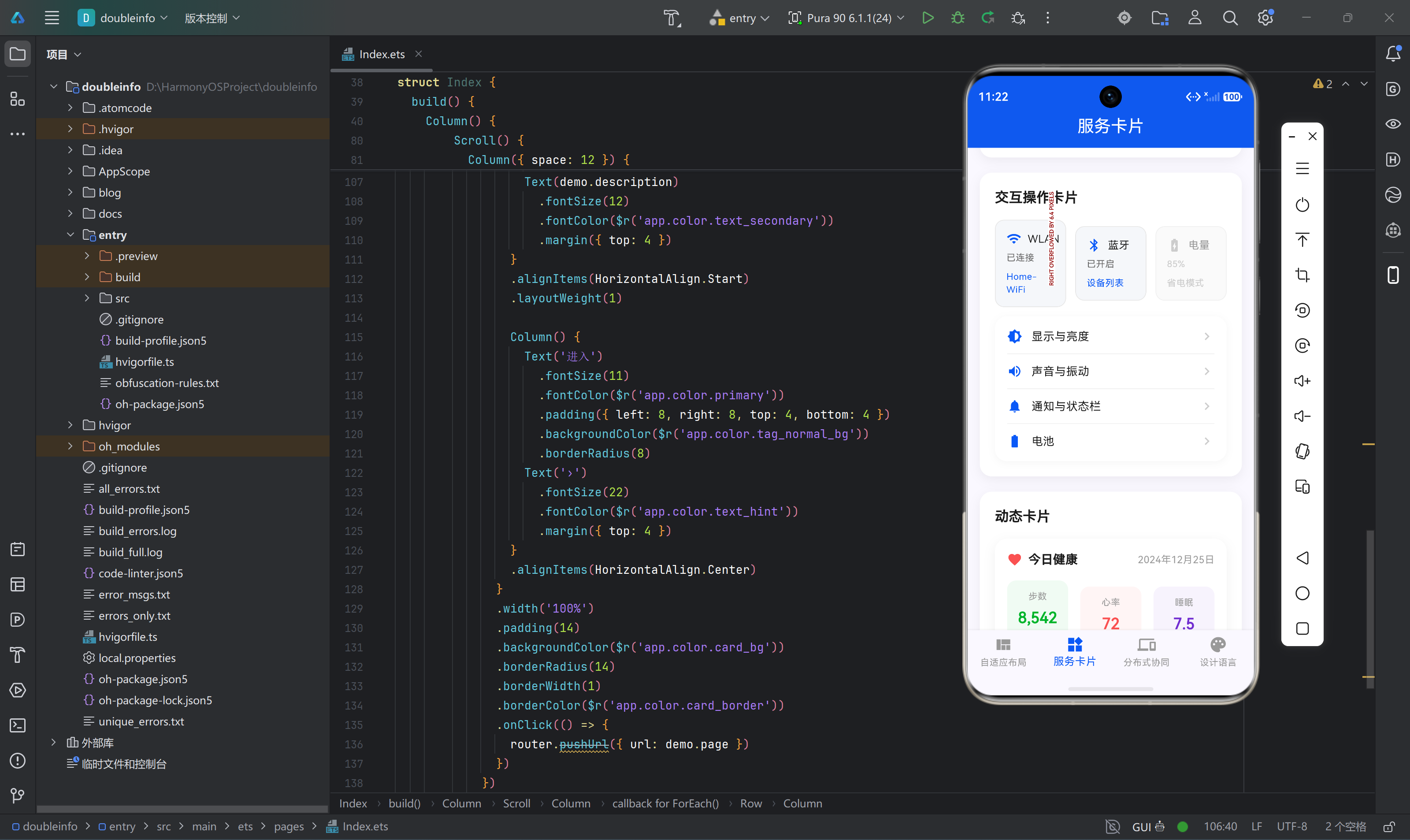
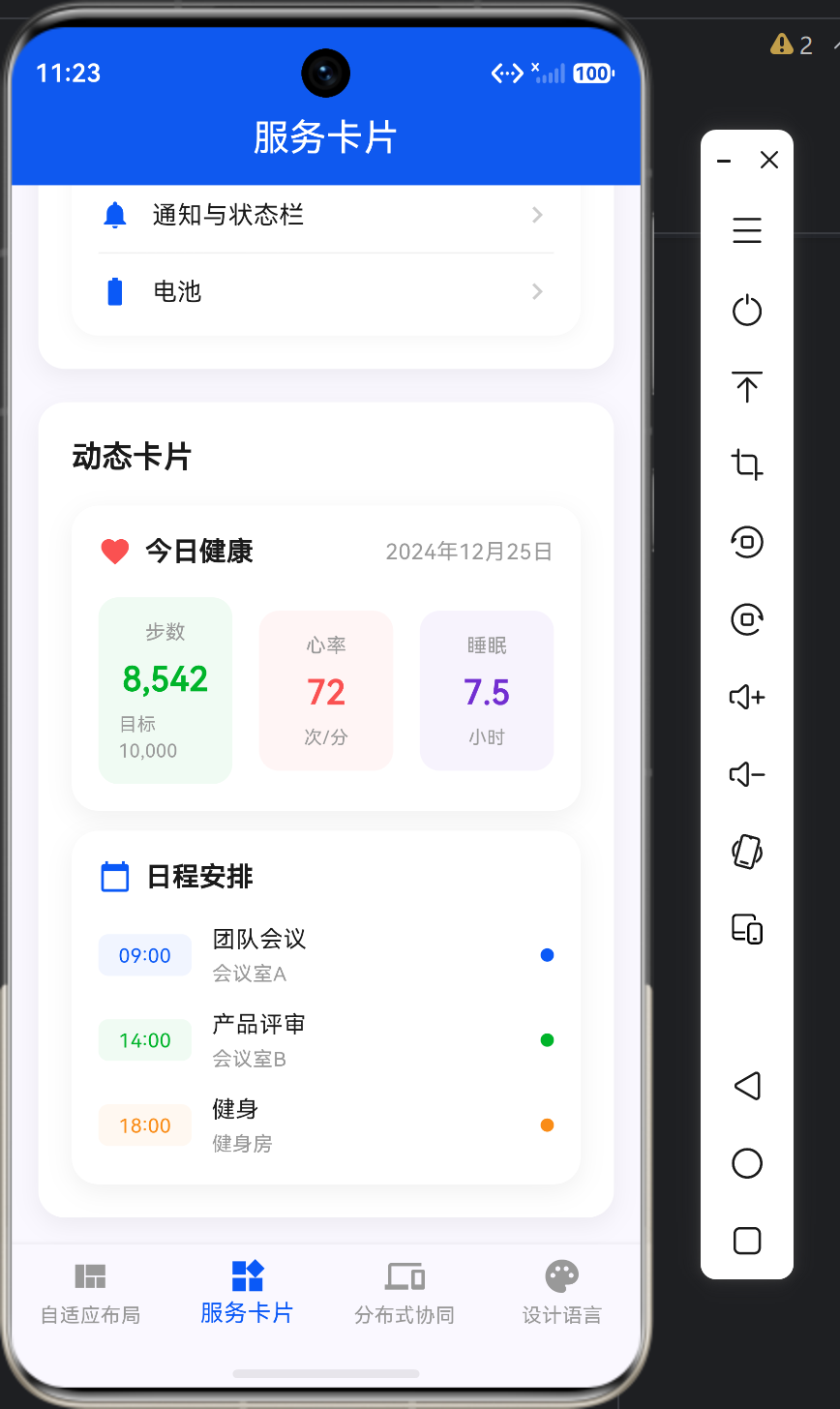
在服务卡片页面中,Expanded 用于实现卡片的等分布局:
Widget _buildCommonServiceCards() {
  return Row(
    children: [
      Expanded(
        child: _buildServiceCard(
          icon: Icons.phone,
          title: '电话',
          subtitle: '最近通话',
          color: const Color(0xFF00B42A),
        ),
      ),
      const SizedBox(width: 12),
      Expanded(
        child: _buildServiceCard(
          icon: Icons.message,
          title: '消息',
          subtitle: '12条未读',
          color: const Color(0xFF0A59F7),
        ),
      ),
      const SizedBox(width: 12),
      Expanded(
        child: _buildServiceCard(
          icon: Icons.camera_alt,
          title: '相机',
          subtitle: '快速拍照',
          color: const Color(0xFF722ED1),
        ),
      ),
      const SizedBox(width: 12),
      Expanded(
        child: _buildServiceCard(
          icon: Icons.music_note,
          title: '音乐',
          subtitle: '正在播放',
          color: const Color(0xFFFA8C16),
        ),
      ),
    ],
  );
}
五、Expanded与Flex高级用法
5.1 不等分Flex布局
Row(
  children: [
    Expanded(
      flex: 2,
      child: Container(color: Colors.red),
    ),
    Expanded(
      flex: 3,
      child: Container(color: Colors.blue),
    ),
    Expanded(
      flex: 1,
      child: Container(color: Colors.green),
    ),
  ],
)
5.2 嵌套Expanded
Column(
  children: [
    Expanded(
      flex: 1,
      child: Row(
        children: [
          Expanded(child: Container(color: Colors.red)),
          Expanded(child: Container(color: Colors.blue)),
        ],
      ),
    ),
    Expanded(
      flex: 2,
      child: Container(color: Colors.green),
    ),
  ],
)
5.3 Expanded与Flexible组合
Row(
  children: [
    Flexible(
      flex: 1,
      fit: FlexFit.loose,
      child: Container(color: Colors.red, width: 50),
    ),
    Expanded(
      flex: 2,
      child: Container(color: Colors.blue),
    ),
  ],
)
5.4 动态Flex布局
class DynamicFlexDemo extends StatefulWidget {
_DynamicFlexDemoState createState() => _DynamicFlexDemoState();
}
class _DynamicFlexDemoState extends State<DynamicFlexDemo> {
int _mainFlex = 2;
int _sidebarFlex = 1;
Widget build(BuildContext context) {
return Row(
children: [
Expanded(
flex: _mainFlex,
child: Container(color: Colors.blue),
),
Expanded(
flex: _sidebarFlex,
child: Container(color: Colors.green),
),
],
);
}
}
5.5 响应式Flex布局
Widget _buildResponsiveLayout(BuildContext context) {
  return LayoutBuilder(
    builder: (context, constraints) {
      if (constraints.maxWidth < 600) {
        // 手机:垂直布局
        return Column(
          children: [
            Expanded(child: Container(color: Colors.blue)),
            Expanded(child: Container(color: Colors.green)),
          ],
        );
      } else {
        // 平板:水平布局
        return Row(
          children: [
            Expanded(flex: 3, child: Container(color: Colors.blue)),
            Expanded(flex: 1, child: Container(color: Colors.green)),
          ],
        );
      }
    },
  );
}
六、Flex布局与状态管理
6.1 使用StatefulWidget管理Flex状态
class FlexibleLayoutPage extends StatefulWidget {
_FlexibleLayoutPageState createState() => _FlexibleLayoutPageState();
}
class _FlexibleLayoutPageState extends State<FlexibleLayoutPage> {
int _selectedIndex = 0;
final List<int> _flexValues = [2, 1, 1];
void _updateFlex(int index, int newValue) {
setState(() {
_flexValues[index] = newValue;
});
}
Widget build(BuildContext context) {
return Row(
children: [
Expanded(
flex: _flexValues[0],
child: GestureDetector(
onTap: () => _updateFlex(0, _flexValues[0] + 1),
child: Container(color: Colors.blue),
),
),
Expanded(
flex: _flexValues[1],
child: GestureDetector(
onTap: () => _updateFlex(1, _flexValues[1] + 1),
child: Container(color: Colors.green),
),
),
Expanded(
flex: _flexValues[2],
child: GestureDetector(
onTap: () => _updateFlex(2, _flexValues[2] + 1),
child: Container(color: Colors.yellow),
),
),
],
);
}
}
6.2 使用ValueNotifier管理Flex状态
class FlexibleLayoutPage extends StatelessWidget {
final ValueNotifier<List<int>> flexValues = ValueNotifier([2, 1, 1]);
Widget build(BuildContext context) {
return ValueListenableBuilder<List<int>>(
valueListenable: flexValues,
builder: (context, values, child) {
return Row(
children: [
Expanded(
flex: values[0],
child: GestureDetector(
onTap: () {
flexValues.value = [values[0] + 1, values[1], values[2]];
},
child: Container(color: Colors.blue),
),
),
Expanded(
flex: values[1],
child: GestureDetector(
onTap: () {
flexValues.value = [values[0], values[1] + 1, values[2]];
},
child: Container(color: Colors.green),
),
),
Expanded(
flex: values[2],
child: GestureDetector(
onTap: () {
flexValues.value = [values[0], values[1], values[2] + 1];
},
child: Container(color: Colors.yellow),
),
),
],
);
},
);
}
}
七、Flex布局性能优化
7.1 避免过度嵌套
// 错误示例:过度嵌套
Row(
  children: [
    Expanded(
      child: Row(
        children: [
          Expanded(child: Container()),
        ],
      ),
    ),
  ],
)

// 正确示例:简化嵌套
Row(
  children: [
    Expanded(child: Container()),
  ],
)
7.2 使用const构造函数
Row(
  children: [
    const Expanded(child: StaticWidget()),
    const Expanded(child: StaticWidget()),
  ],
)
7.3 使用RepaintBoundary
Row(
  children: [
    Expanded(
      child: RepaintBoundary(
        child: ComplexWidget(),
      ),
    ),
    Expanded(
      child: RepaintBoundary(
        child: ComplexWidget(),
      ),
    ),
  ],
)
7.4 合理使用flex值
避免使用过大的 flex 值,这会导致布局计算精度问题:
// 错误示例:flex值过大
Expanded(flex: 1000, child: Container())

// 正确示例:使用合理的flex值
Expanded(flex: 10, child: Container())
八、鸿蒙设计规范中的Flex布局
8.1 间距规范
| 布局类型 | 间距值 | 适用场景 |
|---|---|---|
| 卡片间距 | 12-16px | 服务卡片、设备卡片 |
| 内容间距 | 8-12px | 列表项、按钮组 |
| 边缘间距 | 16px | 页面边缘 |
8.2 布局比例规范
| 布局场景 | 主内容区 | 侧边栏 | 操作面板 |
|---|---|---|---|
| 手机布局 | 100% | 隐藏 | 隐藏 |
| 折叠屏布局 | 60% | 40% | 隐藏 |
| 平板布局 | 67% | 17% | 16% |
8.3 Flex布局最佳实践
- 保持flex值简洁:使用小的整数作为flex值
- 避免嵌套过深:最多嵌套2-3层Flex布局
- 合理使用SizedBox:使用SizedBox设置固定间距
- 响应式设计:根据屏幕尺寸调整布局方向和比例
九、实战案例:自适应布局页面
9.1 页面结构
class AdaptiveLayoutPage extends StatelessWidget {
const AdaptiveLayoutPage({super.key});
Widget build(BuildContext context) {
return SingleChildScrollView(
padding: const EdgeInsets.all(16),
child: Column(
crossAxisAlignment: CrossAxisAlignment.start,
children: [
_buildDeviceInfoCard(context),
const SizedBox(height: 20),
_buildLayoutDemo(context),
const SizedBox(height: 20),
_buildBreakpointInfo(),
const SizedBox(height: 20),
_buildMultiColumnDemo(context),
],
),
);
}
}
9.2 设备信息卡片
Widget _buildDeviceInfoCard(BuildContext context) {
  final screenWidth = MediaQuery.of(context).size.width;
  final screenHeight = MediaQuery.of(context).size.height;
  final devicePixelRatio = MediaQuery.of(context).devicePixelRatio;
  final orientation = MediaQuery.of(context).orientation;

  String deviceType;
  if (screenWidth < 600) {
    deviceType = '手机模式';
  } else if (screenWidth < 840) {
    deviceType = '折叠屏模式';
  } else {
    deviceType = '平板模式';
  }

  return Container(
    padding: const EdgeInsets.all(20),
    decoration: BoxDecoration(
      color: Colors.white,
      borderRadius: BorderRadius.circular(16),
      boxShadow: [
        BoxShadow(
          color: Colors.black.withValues(alpha: 0.06),
          blurRadius: 12,
          offset: const Offset(0, 4),
        ),
      ],
    ),
    child: Column(
      crossAxisAlignment: CrossAxisAlignment.start,
      children: [
        Row(
          children: [
            Container(
              width: 48,
              height: 48,
              decoration: BoxDecoration(
                color: const Color(0xFF0A59F7).withValues(alpha: 0.1),
                borderRadius: BorderRadius.circular(12),
              ),
              child: const Icon(
                Icons.smartphone,
                color: Color(0xFF0A59F7),
                size: 28,
              ),
            ),
            const SizedBox(width: 16),
            Expanded(
              child: Column(
                crossAxisAlignment: CrossAxisAlignment.start,
                children: [
                  const Text(
                    '设备信息',
                    style: TextStyle(
                      fontSize: 18,
                      fontWeight: FontWeight.w600,
                      color: Color(0xFF1A1A1A),
                    ),
                  ),
                  const SizedBox(height: 4),
                  Text(
                    deviceType,
                    style: TextStyle(
                      fontSize: 14,
                      color: const Color(0xFF0A59F7),
                      fontWeight: FontWeight.w500,
                    ),
                  ),
                ],
              ),
            ),
          ],
        ),
        const SizedBox(height: 20),
        Row(
          children: [
            Expanded(
              child: _buildInfoItem(
                '屏幕宽度',
                '${screenWidth.toStringAsFixed(1)}px',
              ),
            ),
            const SizedBox(width: 16),
            Expanded(
              child: _buildInfoItem(
                '屏幕高度',
                '${screenHeight.toStringAsFixed(1)}px',
              ),
            ),
          ],
        ),
        const SizedBox(height: 12),
        Row(
          children: [
            Expanded(
              child: _buildInfoItem(
                '像素密度',
                devicePixelRatio.toStringAsFixed(2),
              ),
            ),
            const SizedBox(width: 16),
            Expanded(
              child: _buildInfoItem(
                '屏幕方向',
                orientation == Orientation.portrait ? '竖屏' : '横屏',
              ),
            ),
          ],
        ),
      ],
    ),
  );
}
9.3 布局演示
Widget _buildLayoutDemo(BuildContext context) {
  return Container(
    padding: const EdgeInsets.all(20),
    decoration: BoxDecoration(
      color: Colors.white,
      borderRadius: BorderRadius.circular(16),
      boxShadow: [
        BoxShadow(
          color: Colors.black.withValues(alpha: 0.06),
          blurRadius: 12,
          offset: const Offset(0, 4),
        ),
      ],
    ),
    child: Column(
      crossAxisAlignment: CrossAxisAlignment.start,
      children: [
        const Text(
          '自适应布局演示',
          style: TextStyle(
            fontSize: 18,
            fontWeight: FontWeight.w600,
            color: Color(0xFF1A1A1A),
          ),
        ),
        const SizedBox(height: 8),
        const Text(
          '根据屏幕宽度自动切换布局模式',
          style: TextStyle(
            fontSize: 14,
            color: Color(0xFF666666),
          ),
        ),
        const SizedBox(height: 20),
        LayoutBuilder(
          builder: (context, constraints) {
            final maxWidth = constraints.maxWidth;

            if (maxWidth < 600) {
              return _buildPhoneLayout();
            } else if (maxWidth < 840) {
              return _buildFoldableLayout();
            } else {
              return _buildTabletLayout();
            }
          },
        ),
      ],
    ),
  );
}
9.4 手机布局
Widget _buildPhoneLayout() {
  return Column(
    children: [
      _buildLayoutIndicator('手机布局', Colors.blue),
      const SizedBox(height: 16),
      _buildContentCard(Colors.orange, '主内容区'),
      const SizedBox(height: 12),
      Row(
        children: [
          Expanded(
            child: _buildContentCard(Colors.green, '侧边栏A'),
          ),
          const SizedBox(width: 12),
          Expanded(
            child: _buildContentCard(Colors.purple, '侧边栏B'),
          ),
        ],
      ),
    ],
  );
}
9.5 折叠屏布局
Widget _buildFoldableLayout() {
  return Row(
    crossAxisAlignment: CrossAxisAlignment.start,
    children: [
      Expanded(
        flex: 3,
        child: Column(
          children: [
            _buildLayoutIndicator('折叠屏布局', Colors.orange),
            const SizedBox(height: 16),
            _buildContentCard(Colors.blue, '主内容区'),
          ],
        ),
      ),
      const SizedBox(width: 12),
      Expanded(
        flex: 2,
        child: Column(
          children: [
            _buildContentCard(Colors.green, '侧边栏A'),
            const SizedBox(height: 12),
            _buildContentCard(Colors.purple, '侧边栏B'),
          ],
        ),
      ),
    ],
  );
}
9.6 平板布局
Widget _buildTabletLayout() {
  return Row(
    crossAxisAlignment: CrossAxisAlignment.start,
    children: [
      Expanded(
        flex: 1,
        child: Column(
          children: [
            _buildLayoutIndicator('平板布局', Colors.green),
            const SizedBox(height: 16),
            _buildContentCard(Colors.orange, '侧边栏'),
          ],
        ),
      ),
      const SizedBox(width: 12),
      Expanded(
        flex: 4,
        child: _buildContentCard(Colors.blue, '主内容区'),
      ),
      const SizedBox(width: 12),
      Expanded(
        flex: 1,
        child: _buildContentCard(Colors.purple, '操作面板'),
      ),
    ],
  );
}
十、常见问题与解决方案
10.1 Expanded不生效
问题描述:Expanded 组件没有按照预期填充剩余空间。
解决方案:
- 确保
Expanded是Flex、Row或Column的直接子组件 - 检查父容器是否有足够的约束
- 确保父容器的
mainAxisSize为MainAxisSize.max
// 错误示例:Expanded不在Flex中
Container(
  child: Expanded(child: Container()),
)

// 正确示例:Expanded在Row中
Row(
  children: [
    Expanded(child: Container()),
  ],
)
10.2 Flex布局溢出
问题描述:Flex布局中的子组件溢出。
解决方案:
- 使用
Expanded或Flexible包裹子组件 - 设置
mainAxisSize: MainAxisSize.min - 使用
SingleChildScrollView包裹
// 错误示例:子组件没有使用Expanded
Row(
  children: [
    Container(width: 300),
    Container(width: 300),
  ],
)

// 正确示例:使用Expanded
Row(
  children: [
    Expanded(child: Container()),
    Expanded(child: Container()),
  ],
)
10.3 Flex布局居中问题
问题描述:Flex布局中的子组件无法居中。
解决方案:
- 使用
mainAxisAlignment: MainAxisAlignment.center - 使用
crossAxisAlignment: CrossAxisAlignment.center - 确保父容器有足够的尺寸
Row(
  mainAxisAlignment: MainAxisAlignment.center,
  crossAxisAlignment: CrossAxisAlignment.center,
  children: [
    Container(width: 100, height: 100),
  ],
)
十一、Expanded与其他布局组件的组合
11.1 Expanded + Wrap组合
Row(
  children: [
    Expanded(
      child: Wrap(
        spacing: 8,
        children: [
          Chip(label: Text('标签1')),
          Chip(label: Text('标签2')),
        ],
      ),
    ),
    IconButton(icon: Icon(Icons.add), onPressed: () {}),
  ],
)
11.2 Expanded + Stack组合
Column(
  children: [
    Expanded(
      child: Stack(
        children: [
          Container(color: Colors.blue),
          Positioned(
            top: 10,
            left: 10,
            child: Text('内容'),
          ),
        ],
      ),
    ),
    Container(height: 50, color: Colors.green),
  ],
)
11.3 Expanded + ListView组合
Column(
  children: [
    Container(height: 50, color: Colors.green),
    Expanded(
      child: ListView.builder(
        itemCount: 100,
        itemBuilder: (context, index) {
          return ListTile(title: Text('Item $index'));
        },
      ),
    ),
  ],
)
十二、总结与扩展
12.1 Expanded与Flex的适用场景
Expanded 和 Flex 适用于以下场景:
- 响应式布局
- 自适应布局
- 动态比例分配
- 卡片网格布局
- 嵌套布局
12.2 Flex布局设计原则
- 保持简洁:避免过度嵌套Flex布局
- 响应式设计:根据屏幕尺寸调整布局
- 合理分配:使用合适的flex值分配空间
- 可维护性:将复杂布局拆分为多个组件
12.3 未来发展方向
随着鸿蒙生态的不断发展,Flex布局在鸿蒙平台上的应用会越来越广泛。未来的发展方向包括:
- 更完善的响应式布局支持
- 更好的鸿蒙设计规范适配
- 更高效的布局算法
- 跨平台布局一致性保障
通过本文的学习,读者应该掌握了 Expanded 和 Flex 组件的核心用法和高级技巧,并了解了其在"鸿蒙特性展示台"应用中的实际应用。希望这些知识能够帮助你在实际项目中更好地使用灵活布局,构建出优秀的用户界面。

作为“人工智能6S店”的官方数字引擎,为AI开发者与企业提供一个覆盖软硬件全栈、一站式门户。
更多推荐
 0
0 0
0- 0


 已为社区贡献26条内容

所有评论(0)