
flutter鸿蒙特性展示台_组件样式与交互设计实战
一、项目概述
1.1 应用背景
在鸿蒙设计语言中,组件样式和交互设计是构建高质量用户界面的核心要素。一个良好的组件样式体系不仅能够提升应用的视觉美观度,还能增强用户体验和操作流畅性。鸿蒙设计语言提供了一套完整的组件样式规范,包括按钮、输入框、开关等常用组件的设计标准。
本文以「鸿蒙特性展示台」应用为例,详细讲解如何使用 Flutter 实现符合鸿蒙设计规范的组件样式,包括按钮样式、输入框样式、开关样式等,并探讨交互设计的最佳实践。
1.2 技术栈
| 技术点 | 说明 |
|---|---|
| ElevatedButton | 提升按钮,用于主要操作 |
| OutlinedButton | 描边按钮,用于次要操作 |
| TextField | 文本输入框,用于用户输入 |
| Switch | 开关组件,用于状态切换 |
| BoxDecoration | 装饰器,用于设置背景、边框等 |
| BorderRadius | 圆角设置,符合鸿蒙设计规范 |
| InputDecoration | 输入框装饰,用于设置提示文字、边框等 |
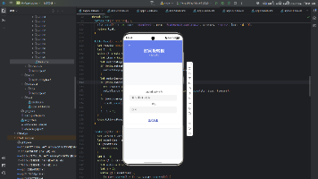
1.3 界面效果
应用的设计语言页面展示了各种组件样式:
┌─────────────────────────────────────────────────────────────────┐
│                        组件样式展示                              │
│                                                                 │
│  ┌───────────────────────────────────────────────────────────┐  │
│  │                    按钮样式                               │  │
│  │  ┌────────────┐  ┌────────────┐  ┌────────────┐          │  │
│  │  │   主按钮   │  │   次按钮   │  │  描边按钮  │          │  │
│  │  │   (蓝色)   │  │  (灰色)    │  │  (蓝色边)  │          │  │
│  │  └────────────┘  └────────────┘  └────────────┘          │  │
│  └───────────────────────────────────────────────────────────┘  │
│                                                                 │
│  ┌───────────────────────────────────────────────────────────┐  │
│  │                    输入框样式                              │  │
│  │  ┌───────────────────────────────────────────────────┐    │  │
│  │  │     请输入内容                                    │    │  │
│  │  └───────────────────────────────────────────────────┘    │  │
│  │  ┌───────────────────────────────────────────────────┐    │  │
│  │  │     请输入密码                                    │    │  │
│  │  └───────────────────────────────────────────────────┘    │  │
│  └───────────────────────────────────────────────────────────┘  │
│                                                                 │
│  ┌───────────────────────────────────────────────────────────┐  │
│  │                    开关样式                              │  │
│  │  ┌─────────────────────┐  ┌─────────────────────┐        │  │
│  │  │ 开启通知  [ ON ]    │  │ 深色模式  [ OFF ]   │        │  │
│  │  └─────────────────────┘  └─────────────────────┘        │  │
│  └───────────────────────────────────────────────────────────┘  │
└─────────────────────────────────────────────────────────────────┘
二、核心代码解析
2.1 DesignLanguagePage 主组件
这是设计语言页面的核心组件,负责组织整个页面的结构:
class DesignLanguagePage extends StatelessWidget {
const DesignLanguagePage({super.key});
Widget build(BuildContext context) {
return SingleChildScrollView(
padding: const EdgeInsets.all(16),
child: Column(
crossAxisAlignment: CrossAxisAlignment.start,
children: [
_buildColorPalette(),
const SizedBox(height: 20),
_buildTypographyDemo(),
const SizedBox(height: 20),
_buildComponentStyles(),
const SizedBox(height: 20),
_buildShadowAndElevation(),
],
),
);
}
}
代码要点:
- SingleChildScrollView:最外层使用
SingleChildScrollView包裹,确保在小屏幕设备上内容可以滚动查看 - Column 布局:使用
Column作为主布局容器,按垂直方向排列各个功能区块 - padding 和间距:设置统一的
padding: EdgeInsets.all(16)和SizedBox(height: 20)作为组件间距,符合鸿蒙设计规范 - 功能区块划分:页面分为色彩系统、字体规范、组件样式、阴影与层级四个主要部分
2.2 组件样式展示组件
_buildComponentStyles 组件展示了按钮、输入框和开关等常用组件的样式:
Widget _buildComponentStyles() {
  return Container(
    padding: const EdgeInsets.all(20),
    decoration: BoxDecoration(
      color: Colors.white,
      borderRadius: BorderRadius.circular(16),
      boxShadow: [
        BoxShadow(
          color: Colors.black.withValues(alpha: 0.06),
          blurRadius: 12,
          offset: const Offset(0, 4),
        ),
      ],
    ),
    child: Column(
      crossAxisAlignment: CrossAxisAlignment.start,
      children: [
        const Text(
          '组件样式',
          style: TextStyle(
            fontSize: 18,
            fontWeight: FontWeight.w600,
            color: Color(0xFF1A1A1A),
          ),
        ),
        const SizedBox(height: 16),
        _buildButtonSection(),
        const SizedBox(height: 20),
        _buildInputSection(),
        const SizedBox(height: 20),
        _buildSwitchSection(),
      ],
    ),
  );
}
代码要点:
- 容器设计:使用
Container作为卡片容器,设置白色背景、16px 圆角和阴影效果 - 标题样式:标题使用 18px 字号、600 字重,颜色为深灰色 (#1A1A1A)
- 区块划分:分为按钮样式、输入框样式和开关样式三个子区块,使用
SizedBox(height: 20)分隔
三、按钮样式实现
3.1 按钮样式展示
_buildButtonSection 组件展示了三种常用按钮样式:主按钮、次按钮和描边按钮:
Widget _buildButtonSection() {
  return Column(
    crossAxisAlignment: CrossAxisAlignment.start,
    children: [
      const Text(
        '按钮样式',
        style: TextStyle(
          fontSize: 14,
          fontWeight: FontWeight.w500,
          color: Color(0xFF434343),
        ),
      ),
      const SizedBox(height: 12),
      Row(
        children: [
          Expanded(
            child: ElevatedButton(
              onPressed: () {},
              style: ElevatedButton.styleFrom(
                backgroundColor: const Color(0xFF0A59F7),
                foregroundColor: Colors.white,
                elevation: 0,
                minimumSize: const Size(double.infinity, 44),
                shape: RoundedRectangleBorder(
                  borderRadius: BorderRadius.circular(12),
                ),
              ),
              child: const Text('主按钮'),
            ),
          ),
          const SizedBox(width: 12),
          Expanded(
            child: ElevatedButton(
              onPressed: () {},
              style: ElevatedButton.styleFrom(
                backgroundColor: const Color(0xFFF5F7FA),
                foregroundColor: const Color(0xFF1A1A1A),
                elevation: 0,
                minimumSize: const Size(double.infinity, 44),
                shape: RoundedRectangleBorder(
                  borderRadius: BorderRadius.circular(12),
                ),
              ),
              child: const Text('次按钮'),
            ),
          ),
          const SizedBox(width: 12),
          Expanded(
            child: OutlinedButton(
              onPressed: () {},
              style: OutlinedButton.styleFrom(
                backgroundColor: Colors.transparent,
                foregroundColor: const Color(0xFF0A59F7),
                side: const BorderSide(
                  color: Color(0xFF0A59F7),
                  width: 1,
                ),
                minimumSize: const Size(double.infinity, 44),
                shape: RoundedRectangleBorder(
                  borderRadius: BorderRadius.circular(12),
                ),
              ),
              child: const Text('描边按钮'),
            ),
          ),
        ],
      ),
    ],
  );
}
3.2 按钮样式详解
主按钮样式:
| 属性 | 值 | 说明 |
|---|---|---|
| backgroundColor | #0A59F7 | 鸿蒙主题色,蓝色 |
| foregroundColor | #FFFFFF | 白色文字 |
| elevation | 0 | 无阴影,扁平化设计 |
| minimumSize | Size(double.infinity, 44) | 宽度自适应,高度 44px |
| borderRadius | 12px | 圆角,符合鸿蒙规范 |
次按钮样式:
| 属性 | 值 | 说明 |
|---|---|---|
| backgroundColor | #F5F7FA | 浅灰色背景 |
| foregroundColor | #1A1A1A | 深灰色文字 |
| elevation | 0 | 无阴影 |
| minimumSize | Size(double.infinity, 44) | 宽度自适应,高度 44px |
| borderRadius | 12px | 圆角 |
描边按钮样式:
| 属性 | 值 | 说明 |
|---|---|---|
| backgroundColor | transparent | 透明背景 |
| foregroundColor | #0A59F7 | 蓝色文字 |
| side | BorderSide(color: #0A59F7, width: 1) | 1px 蓝色边框 |
| minimumSize | Size(double.infinity, 44) | 宽度自适应,高度 44px |
| borderRadius | 12px | 圆角 |
3.3 按钮设计原则
- 主次分明:主按钮使用主题色,用于主要操作;次按钮使用灰色,用于次要操作;描边按钮用于辅助操作
- 统一高度:所有按钮高度统一为 44px,符合鸿蒙设计规范
- 圆角一致:所有按钮圆角统一为 12px,保持视觉一致性
- 扁平化设计:设置
elevation: 0,移除阴影效果,符合现代扁平化设计趋势
四、输入框样式实现
4.1 输入框样式展示
_buildInputSection 组件展示了普通输入框和密码输入框的样式:
Widget _buildInputSection() {
  return Column(
    crossAxisAlignment: CrossAxisAlignment.start,
    children: [
      const Text(
        '输入框样式',
        style: TextStyle(
          fontSize: 14,
          fontWeight: FontWeight.w500,
          color: Color(0xFF434343),
        ),
      ),
      const SizedBox(height: 12),
      TextField(
        decoration: InputDecoration(
          hintText: '请输入内容',
          filled: true,
          fillColor: const Color(0xFFF5F7FA),
          border: OutlineInputBorder(
            borderRadius: BorderRadius.circular(12),
            borderSide: BorderSide.none,
          ),
          contentPadding: const EdgeInsets.symmetric(horizontal: 16, vertical: 14),
        ),
      ),
      const SizedBox(height: 8),
      TextField(
        obscureText: true,
        decoration: InputDecoration(
          hintText: '请输入密码',
          filled: true,
          fillColor: const Color(0xFFF5F7FA),
          border: OutlineInputBorder(
            borderRadius: BorderRadius.circular(12),
            borderSide: BorderSide.none,
          ),
          contentPadding: const EdgeInsets.symmetric(horizontal: 16, vertical: 14),
        ),
      ),
    ],
  );
}
4.2 输入框样式详解
普通输入框:
| 属性 | 值 | 说明 |
|---|---|---|
| hintText | ‘请输入内容’ | 提示文字 |
| filled | true | 启用填充 |
| fillColor | #F5F7FA | 浅灰色背景 |
| border | OutlineInputBorder | 描边边框 |
| borderRadius | 12px | 圆角 |
| borderSide | BorderSide.none | 无边框线 |
| contentPadding | horizontal: 16, vertical: 14 | 内容内边距 |
密码输入框:
| 属性 | 值 | 说明 |
|---|---|---|
| obscureText | true | 隐藏输入内容 |
| hintText | ‘请输入密码’ | 提示文字 |
| filled | true | 启用填充 |
| fillColor | #F5F7FA | 浅灰色背景 |
| border | OutlineInputBorder | 描边边框 |
| borderRadius | 12px | 圆角 |
| borderSide | BorderSide.none | 无边框线 |
| contentPadding | horizontal: 16, vertical: 14 | 内容内边距 |
4.3 输入框设计原则
- 背景填充:使用浅灰色背景 (
#F5F7FA),提升输入区域的可识别性 - 圆角一致:输入框圆角统一为 12px,与按钮保持一致
- 无边框设计:设置
borderSide: BorderSide.none,移除边框线,采用扁平化设计 - 合适内边距:设置
contentPadding为horizontal: 16, vertical: 14,确保输入内容与边框有足够间距 - 密码保护:密码输入框设置
obscureText: true,保护用户隐私
五、开关样式实现
5.1 开关样式展示
_buildSwitchSection 组件展示了开关组件的样式:
Widget _buildSwitchSection() {
  return Column(
    crossAxisAlignment: CrossAxisAlignment.start,
    children: [
      const Text(
        '开关样式',
        style: TextStyle(
          fontSize: 14,
          fontWeight: FontWeight.w500,
          color: Color(0xFF434343),
        ),
      ),
      const SizedBox(height: 12),
      Row(
        children: [
          Expanded(
            child: Row(
              children: [
                const Text(
                  '开启通知',
                  style: TextStyle(
                    fontSize: 15,
                    color: Color(0xFF1A1A1A),
                  ),
                ),
                const Spacer(),
                Switch(
                  value: true,
                  onChanged: (value) {},
                  activeThumbColor: const Color(0xFF0A59F7),
                ),
              ],
            ),
          ),
          const SizedBox(width: 24),
          Expanded(
            child: Row(
              children: [
                const Text(
                  '深色模式',
                  style: TextStyle(
                    fontSize: 15,
                    color: Color(0xFF1A1A1A),
                  ),
                ),
                const Spacer(),
                Switch(
                  value: false,
                  onChanged: (value) {},
                  activeThumbColor: const Color(0xFF0A59F7),
                ),
              ],
            ),
          ),
        ],
      ),
    ],
  );
}
5.2 开关样式详解
开关组件属性:
| 属性 | 值 | 说明 |
|---|---|---|
| value | true/false | 开关状态 |
| onChanged | (value) {} | 状态改变回调 |
| activeThumbColor | #0A59F7 | 开启状态下的滑块颜色 |
开关布局:
| 元素 | 样式 | 说明 |
|---|---|---|
| 标签文字 | 15px, #1A1A1A | 开关左侧的描述文字 |
| Spacer | - | 填充剩余空间,将开关推到右侧 |
| Switch | - | 开关组件 |
5.3 开关设计原则
- 主题色一致:开关的激活状态使用鸿蒙主题色 (#0A59F7)
- 标签清晰:开关左侧显示清晰的标签文字,说明开关功能
- 布局合理:使用
Spacer将开关推到右侧,保持布局整洁 - 状态明确:通过颜色变化清晰区分开关的开启和关闭状态
六、交互设计最佳实践
6.1 按钮交互设计
点击反馈:
按钮点击时应提供视觉反馈,常见的反馈方式包括:
ElevatedButton(
  onPressed: () {
    // 点击时的业务逻辑
  },
  style: ElevatedButton.styleFrom(
    backgroundColor: const Color(0xFF0A59F7),
    foregroundColor: Colors.white,
    elevation: 0,
    minimumSize: const Size(double.infinity, 44),
    shape: RoundedRectangleBorder(
      borderRadius: BorderRadius.circular(12),
    ),
    // 添加点击反馈
    tapTargetSize: MaterialTapTargetSize.shrinkWrap,
  ),
  child: const Text('主按钮'),
)
按钮状态:
按钮应根据业务逻辑设置不同的状态:
bool isLoading = false;
bool isDisabled = false;

ElevatedButton(
  onPressed: isDisabled || isLoading ? null : () {
    setState(() {
      isLoading = true;
    });
    // 模拟异步操作
    Future.delayed(const Duration(seconds: 2), () {
      setState(() {
        isLoading = false;
      });
    });
  },
  child: isLoading
      ? const CircularProgressIndicator(color: Colors.white)
      : const Text('提交'),
)
6.2 输入框交互设计
焦点状态:
输入框获得焦点时应提供视觉反馈:
TextField(
  decoration: InputDecoration(
    hintText: '请输入内容',
    filled: true,
    fillColor: const Color(0xFFF5F7FA),
    border: OutlineInputBorder(
      borderRadius: BorderRadius.circular(12),
      borderSide: BorderSide.none,
    ),
    focusedBorder: OutlineInputBorder(
      borderRadius: BorderRadius.circular(12),
      borderSide: const BorderSide(
        color: Color(0xFF0A59F7),
        width: 2,
      ),
    ),
    contentPadding: const EdgeInsets.symmetric(horizontal: 16, vertical: 14),
  ),
)
输入验证:
输入框应提供实时验证反馈:
TextEditingController _controller = TextEditingController();
String? _errorText;

TextField(
  controller: _controller,
  decoration: InputDecoration(
    hintText: '请输入邮箱',
    filled: true,
    fillColor: const Color(0xFFF5F7FA),
    border: OutlineInputBorder(
      borderRadius: BorderRadius.circular(12),
      borderSide: BorderSide.none,
    ),
    errorText: _errorText,
    contentPadding: const EdgeInsets.symmetric(horizontal: 16, vertical: 14),
  ),
  onChanged: (value) {
    setState(() {
      // 简单的邮箱格式验证
      if (!value.contains('@')) {
        _errorText = '请输入有效的邮箱地址';
      } else {
        _errorText = null;
      }
    });
  },
)
6.3 开关交互设计
状态切换动画:
开关状态切换时应使用平滑的动画效果:
bool _isEnabled = false;

Switch(
  value: _isEnabled,
  onChanged: (value) {
    setState(() {
      _isEnabled = value;
    });
    // 状态切换后的业务逻辑
    if (value) {
      // 开启操作
    } else {
      // 关闭操作
    }
  },
  activeThumbColor: const Color(0xFF0A59F7),
  // 添加动画效果
  materialTapTargetSize: MaterialTapTargetSize.shrinkWrap,
)
七、组件样式封装
7.1 自定义按钮组件
为了提高代码复用性,可以封装自定义按钮组件:
class HarmonyButton extends StatelessWidget {
final String text;
final VoidCallback? onPressed;
final ButtonType type;
final bool disabled;
const HarmonyButton({
super.key,
required this.text,
this.onPressed,
this.type = ButtonType.primary,
this.disabled = false,
});
Widget build(BuildContext context) {
Color backgroundColor;
Color foregroundColor;
BorderSide? borderSide;
switch (type) {
case ButtonType.primary:
backgroundColor = const Color(0xFF0A59F7);
foregroundColor = Colors.white;
borderSide = null;
break;
case ButtonType.secondary:
backgroundColor = const Color(0xFFF5F7FA);
foregroundColor = const Color(0xFF1A1A1A);
borderSide = null;
break;
case ButtonType.outline:
backgroundColor = Colors.transparent;
foregroundColor = const Color(0xFF0A59F7);
borderSide = const BorderSide(
color: Color(0xFF0A59F7),
width: 1,
);
break;
}
if (disabled) {
backgroundColor = const Color(0xFFE8E8E8);
foregroundColor = const Color(0xFFCCCCCC);
borderSide = null;
}
return ElevatedButton(
onPressed: disabled ? null : onPressed,
style: ElevatedButton.styleFrom(
backgroundColor: backgroundColor,
foregroundColor: foregroundColor,
elevation: 0,
minimumSize: const Size(double.infinity, 44),
shape: RoundedRectangleBorder(
borderRadius: BorderRadius.circular(12),
side: borderSide ?? BorderSide.none,
),
),
child: Text(text),
);
}
}
enum ButtonType {
primary,
secondary,
outline,
}
7.2 自定义输入框组件
封装自定义输入框组件:
class HarmonyTextField extends StatelessWidget {
final String hintText;
final bool obscureText;
final String? errorText;
final TextEditingController? controller;
final ValueChanged<String>? onChanged;
const HarmonyTextField({
super.key,
required this.hintText,
this.obscureText = false,
this.errorText,
this.controller,
this.onChanged,
});
Widget build(BuildContext context) {
return TextField(
controller: controller,
obscureText: obscureText,
decoration: InputDecoration(
hintText: hintText,
filled: true,
fillColor: const Color(0xFFF5F7FA),
border: OutlineInputBorder(
borderRadius: BorderRadius.circular(12),
borderSide: BorderSide.none,
),
focusedBorder: OutlineInputBorder(
borderRadius: BorderRadius.circular(12),
borderSide: const BorderSide(
color: Color(0xFF0A59F7),
width: 2,
),
),
errorBorder: OutlineInputBorder(
borderRadius: BorderRadius.circular(12),
borderSide: const BorderSide(
color: Color(0xFFFA5151),
width: 2,
),
),
errorText: errorText,
contentPadding: const EdgeInsets.symmetric(horizontal: 16, vertical: 14),
),
onChanged: onChanged,
);
}
}
7.3 自定义开关组件
封装自定义开关组件:
class HarmonySwitch extends StatelessWidget {
final String label;
final bool value;
final ValueChanged<bool> onChanged;
const HarmonySwitch({
super.key,
required this.label,
required this.value,
required this.onChanged,
});
Widget build(BuildContext context) {
return Row(
children: [
Text(
label,
style: const TextStyle(
fontSize: 15,
color: Color(0xFF1A1A1A),
),
),
const Spacer(),
Switch(
value: value,
onChanged: onChanged,
activeThumbColor: const Color(0xFF0A59F7),
),
],
);
}
}
八、鸿蒙设计规范要点
8.1 色彩规范
鸿蒙设计语言定义了一套完整的色彩系统:
| 色彩类型 | 颜色值 | 用途 |
|---|---|---|
| 主色调 | #0A59F7 | 按钮、链接、重点内容 |
| 成功色 | #00B42A | 成功状态、进度条 |
| 警告色 | #FA8C16 | 警告提示、待处理 |
| 错误色 | #FA5151 | 错误提示、失败状态 |
| 深灰色 | #1A1A1A | 标题、重要文字 |
| 中灰色 | #434343 | 次要文字、标签 |
| 浅灰色 | #999999 | 辅助文字、提示 |
| 背景灰 | #F5F7FA | 背景、输入框 |
8.2 间距规范
鸿蒙设计语言定义了标准间距系统:
| 间距值 | 用途 |
|---|---|
| 8px | 小间距,用于组件内部元素 |
| 12px | 中间距,用于卡片内部元素 |
| 16px | 标准间距,用于卡片之间 |
| 20px | 大间距,用于区块之间 |
8.3 圆角规范
鸿蒙设计语言定义了标准圆角系统:
| 圆角值 | 用途 |
|---|---|
| 4px | 小圆角,用于小按钮、标签 |
| 8px | 中圆角,用于卡片、输入框 |
| 12px | 标准圆角,用于按钮、卡片 |
| 16px | 大圆角,用于对话框、弹窗 |
九、性能优化技巧
9.1 避免不必要的重建
使用 const 构造函数避免不必要的组件重建:
const SizedBox(height: 16);
const Text('按钮样式');
const Icon(Icons.add);
9.2 使用 RepaintBoundary
对于复杂的组件,可以使用 RepaintBoundary 隔离绘制区域:
RepaintBoundary(
  child: _buildButtonSection(),
)
9.3 合理使用 Key
为列表中的组件设置唯一的 Key,提高 Diff 算法效率:
List<String> buttons = ['按钮1', '按钮2', '按钮3'];

Row(
  children: buttons.map((text) {
    return HarmonyButton(
      key: ValueKey(text),
      text: text,
      onPressed: () {},
    );
  }).toList(),
)
十、总结
本文详细讲解了「鸿蒙特性展示台」应用中组件样式与交互设计的实现方法,包括:
- 按钮样式:主按钮、次按钮和描边按钮的实现,遵循鸿蒙设计规范
- 输入框样式:普通输入框和密码输入框的实现,包括焦点状态和验证反馈
- 开关样式:开关组件的实现,包括状态切换动画
- 交互设计:按钮点击反馈、输入框焦点状态、开关状态切换等交互细节
- 组件封装:自定义按钮、输入框和开关组件,提高代码复用性
- 设计规范:鸿蒙色彩、间距、圆角等设计规范的应用
通过学习本文,开发者可以掌握如何使用 Flutter 实现符合鸿蒙设计规范的组件样式和交互设计,提升应用的视觉质量和用户体验。
参考资料:

作为“人工智能6S店”的官方数字引擎,为AI开发者与企业提供一个覆盖软硬件全栈、一站式门户。
更多推荐
 9
9 0
0- 0


 已为社区贡献77条内容

所有评论(0)