
鸿蒙特性展示台_ArkTS字体规范与响应式排版技术详解
一、项目概述
1.1 应用背景
字体规范是鸿蒙设计语言的核心组成部分,它定义了应用中文字的大小、粗细、行高和字间距等属性,确保用户界面的可读性和美观性。鸿蒙设计语言采用了一套完整的字体层级系统,从超大标题到小字共9个层级,每个层级都有明确的使用场景和规范。
本文以「鸿蒙特性展示台」应用为例,详细讲解如何使用 Flutter 实现鸿蒙字体规范,包括字体层级定义、响应式排版、文本溢出处理以及排版最佳实践。
1.2 技术栈
| 技术点 | 说明 |
|---|---|
| TextStyle | 文本样式类,用于配置字体属性 |
| FontWeight | 字体粗细枚举,用于设置字重 |
| TextOverflow | 文本溢出枚举,用于处理溢出情况 |
| LayoutBuilder | 布局构建器,用于响应式排版 |
| MediaQuery | 媒体查询,用于获取设备信息 |
| Expanded | 弹性布局组件,用于自适应空间分配 |
| SizedBox | 固定尺寸容器,用于精确控制间距 |
1.3 界面效果
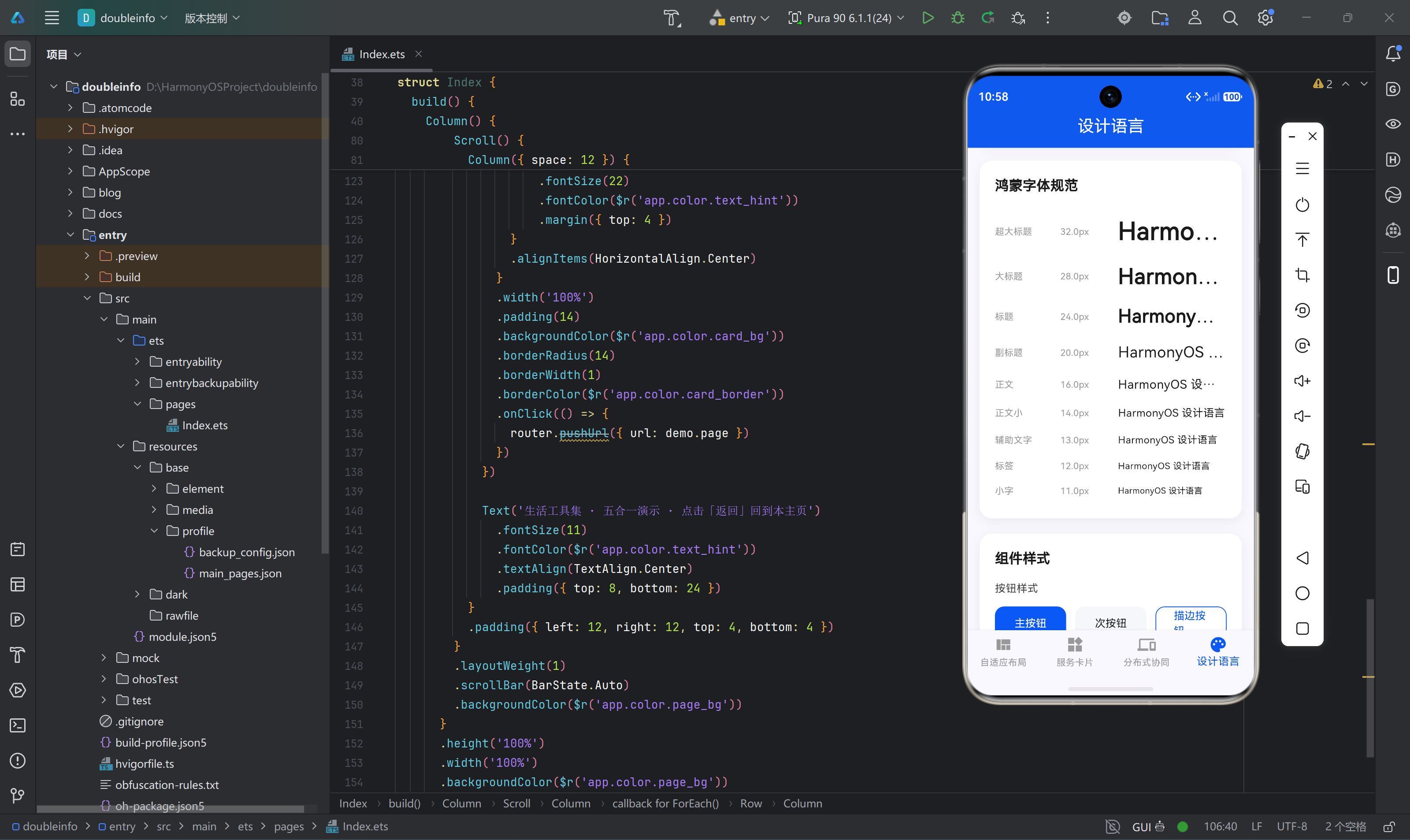
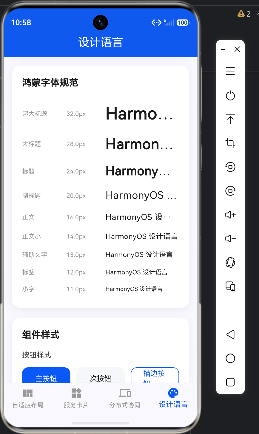
应用的设计语言页面展示了完整的鸿蒙字体规范:
┌─────────────────────────────────────────────────────────────────┐
│                      鸿蒙字体规范                                │
│                                                                 │
│  超大标题  32px  w700  HarmonyOS 设计语言                      │
│  大标题    28px  w600  HarmonyOS 设计语言                      │
│  标题      24px  w600  HarmonyOS 设计语言                      │
│  副标题    20px  w500  HarmonyOS 设计语言                      │
│  正文      16px  w400  HarmonyOS 设计语言                      │
│  正文小    14px  w400  HarmonyOS 设计语言                      │
│  辅助文字  13px  w400  HarmonyOS 设计语言                      │
│  标签      12px  w500  HarmonyOS 设计语言                      │
│  小字      11px  w400  HarmonyOS 设计语言                      │
│                                                                 │
├─────────────────────────────────────────────────────────────────┤
│                      响应式排版演示                              │
│                                                                 │
│  手机模式 (< 600px): 正文 14px, 标题 20px                      │
│  折叠屏模式 (600-840px): 正文 15px, 标题 22px                 │
│  平板模式 (> 840px): 正文 16px, 标题 24px                     │
│                                                                 │
├─────────────────────────────────────────────────────────────────┤
│                      文本溢出处理                                │
│                                                                 │
│  [这是一段非常长的文本内容,用于演示文本溢出处理效果...]          │
│                                                                 │
│  [这是一段需要显示两行的文本内容,第二行会自动截断并显示省略号...] │
│                                                                 │
└─────────────────────────────────────────────────────────────────┘
二、核心代码解析
2.1 字体规范展示组件
字体规范展示组件是设计语言页面的核心部分,展示了鸿蒙设计语言的完整字体层级系统:
Widget _buildTypographyDemo() {
  return Container(
    padding: const EdgeInsets.all(20),
    decoration: BoxDecoration(
      color: Colors.white,
      borderRadius: BorderRadius.circular(16),
      boxShadow: [
        BoxShadow(
          color: Colors.black.withValues(alpha: 0.06),
          blurRadius: 12,
          offset: const Offset(0, 4),
        ),
      ],
    ),
    child: Column(
      crossAxisAlignment: CrossAxisAlignment.start,
      children: [
        const Text(
          '鸿蒙字体规范',
          style: TextStyle(
            fontSize: 18,
            fontWeight: FontWeight.w600,
            color: Color(0xFF1A1A1A),
          ),
        ),
        const SizedBox(height: 16),
        _buildTypographyRow('超大标题', 32, FontWeight.w700),
        _buildTypographyRow('大标题', 28, FontWeight.w600),
        _buildTypographyRow('标题', 24, FontWeight.w600),
        _buildTypographyRow('副标题', 20, FontWeight.w500),
        _buildTypographyRow('正文', 16, FontWeight.w400),
        _buildTypographyRow('正文小', 14, FontWeight.w400),
        _buildTypographyRow('辅助文字', 13, FontWeight.w400),
        _buildTypographyRow('标签', 12, FontWeight.w500),
        _buildTypographyRow('小字', 11, FontWeight.w400),
      ],
    ),
  );
}
代码解析:
-
容器样式:
- 使用白色背景和圆角设计
- 添加阴影效果增强立体感
-
标题:
- 显示"鸿蒙字体规范"标题,使用18px字体和w600字重
-
字体层级:
- 调用
_buildTypographyRow方法构建9个字体层级 - 从超大标题(32px, w700)到小字(11px, w400)
- 调用
2.2 字体行组件
字体行组件展示单个字体层级的详细信息:
Widget _buildTypographyRow(String label, double fontSize, FontWeight fontWeight) {
  return Padding(
    padding: const EdgeInsets.symmetric(vertical: 8),
    child: Row(
      children: [
        SizedBox(
          width: 70,
          child: Text(
            label,
            style: const TextStyle(
              fontSize: 12,
              color: Color(0xFF999999),
            ),
          ),
        ),
        const SizedBox(width: 16),
        SizedBox(
          width: 60,
          child: Text(
            '${fontSize}px',
            style: const TextStyle(
              fontSize: 12,
              color: Color(0xFF999999),
            ),
          ),
        ),
        const SizedBox(width: 16),
        Expanded(
          child: Text(
            'HarmonyOS 设计语言',
            style: TextStyle(
              fontSize: fontSize,
              fontWeight: fontWeight,
              color: const Color(0xFF1A1A1A),
            ),
            overflow: TextOverflow.ellipsis,
            maxLines: 1,
          ),
        ),
      ],
    ),
  );
}
代码解析:
-
参数设计:
label:字体层级名称(如超大标题、正文)fontSize:字体大小(单位:px)fontWeight:字体粗细
-
布局实现:
- 使用
Row水平排列三个部分:标签、字号、示例文本 - 标签和字号使用固定宽度,示例文本使用
Expanded自适应
- 使用
-
文本样式:
- 示例文本使用指定的字体大小和粗细
- 添加
TextOverflow.ellipsis和maxLines: 1防止文本溢出
2.3 字体层级定义
在 Flutter 中,可以将字体规范定义为常量或扩展方法:
class HarmonyOSTypography {
  static const TextStyle displayLarge = TextStyle(
    fontSize: 32,
    fontWeight: FontWeight.w700,
    color: Color(0xFF1A1A1A),
    height: 1.2,
    letterSpacing: 0,
  );

  static const TextStyle displayMedium = TextStyle(
    fontSize: 28,
    fontWeight: FontWeight.w600,
    color: Color(0xFF1A1A1A),
    height: 1.25,
    letterSpacing: 0,
  );

  static const TextStyle headlineLarge = TextStyle(
    fontSize: 24,
    fontWeight: FontWeight.w600,
    color: Color(0xFF1A1A1A),
    height: 1.3,
    letterSpacing: 0,
  );

  static const TextStyle headlineMedium = TextStyle(
    fontSize: 20,
    fontWeight: FontWeight.w500,
    color: Color(0xFF1A1A1A),
    height: 1.35,
    letterSpacing: 0,
  );

  static const TextStyle bodyLarge = TextStyle(
    fontSize: 16,
    fontWeight: FontWeight.w400,
    color: Color(0xFF1A1A1A),
    height: 1.4,
    letterSpacing: 0.2,
  );

  static const TextStyle bodyMedium = TextStyle(
    fontSize: 14,
    fontWeight: FontWeight.w400,
    color: Color(0xFF1A1A1A),
    height: 1.45,
    letterSpacing: 0.2,
  );

  static const TextStyle labelLarge = TextStyle(
    fontSize: 13,
    fontWeight: FontWeight.w400,
    color: Color(0xFF666666),
    height: 1.5,
    letterSpacing: 0.3,
  );

  static const TextStyle labelMedium = TextStyle(
    fontSize: 12,
    fontWeight: FontWeight.w500,
    color: Color(0xFF434343),
    height: 1.5,
    letterSpacing: 0.3,
  );

  static const TextStyle labelSmall = TextStyle(
    fontSize: 11,
    fontWeight: FontWeight.w400,
    color: Color(0xFF999999),
    height: 1.5,
    letterSpacing: 0.3,
  );
}
代码解析:
-
字体层级命名:
- 使用 Material Design 3 的命名规范:displayLarge、displayMedium、headlineLarge 等
- 与鸿蒙设计语言的9个层级一一对应
-
字体属性:
fontSize:字体大小(11px - 32px)fontWeight:字体粗细(w400 - w700)color:字体颜色(深色用于主要文字,浅色用于辅助文字)height:行高(1.2 - 1.5)letterSpacing:字间距(0 - 0.3)
-
使用场景:
- displayLarge:超大标题,用于页面主标题
- displayMedium:大标题,用于页面副标题
- headlineLarge:标题,用于卡片标题
- headlineMedium:副标题,用于卡片副标题
- bodyLarge:正文,用于主要内容
- bodyMedium:正文小,用于次要内容
- labelLarge:辅助文字,用于描述性文字
- labelMedium:标签,用于标签和按钮文字
- labelSmall:小字,用于次要信息
2.4 响应式排版实现
响应式排版根据屏幕尺寸自动调整字体大小:
class ResponsiveTypography {
  static TextStyle getBodyText(BuildContext context) {
    final screenWidth = MediaQuery.of(context).size.width;

    if (screenWidth < 600) {
      return const TextStyle(
        fontSize: 14,
        fontWeight: FontWeight.w400,
        color: Color(0xFF1A1A1A),
      );
    } else if (screenWidth < 840) {
      return const TextStyle(
        fontSize: 15,
        fontWeight: FontWeight.w400,
        color: Color(0xFF1A1A1A),
      );
    } else {
      return const TextStyle(
        fontSize: 16,
        fontWeight: FontWeight.w400,
        color: Color(0xFF1A1A1A),
      );
    }
  }

  static TextStyle getTitleText(BuildContext context) {
    final screenWidth = MediaQuery.of(context).size.width;

    if (screenWidth < 600) {
      return const TextStyle(
        fontSize: 20,
        fontWeight: FontWeight.w600,
        color: Color(0xFF1A1A1A),
      );
    } else if (screenWidth < 840) {
      return const TextStyle(
        fontSize: 22,
        fontWeight: FontWeight.w600,
        color: Color(0xFF1A1A1A),
      );
    } else {
      return const TextStyle(
        fontSize: 24,
        fontWeight: FontWeight.w600,
        color: Color(0xFF1A1A1A),
      );
    }
  }
}
代码解析:
-
断点定义:
- 手机模式:屏幕宽度 < 600px
- 折叠屏模式:600px <= 屏幕宽度 < 840px
- 平板模式:屏幕宽度 >= 840px
-
字体大小调整:
- 正文:手机 14px,折叠屏 15px,平板 16px
- 标题:手机 20px,折叠屏 22px,平板 24px
-
使用方法:
- 在组件中调用
ResponsiveTypography.getBodyText(context)获取响应式正文样式 - 调用
ResponsiveTypography.getTitleText(context)获取响应式标题样式
- 在组件中调用
2.5 LayoutBuilder 响应式排版
使用 LayoutBuilder 实现更精确的响应式排版:
Widget build(BuildContext context) {
  return LayoutBuilder(
    builder: (context, constraints) {
      final maxWidth = constraints.maxWidth;

      TextStyle titleStyle;
      TextStyle bodyStyle;

      if (maxWidth < 600) {
        titleStyle = const TextStyle(fontSize: 20, fontWeight: FontWeight.w600);
        bodyStyle = const TextStyle(fontSize: 14, fontWeight: FontWeight.w400);
      } else if (maxWidth < 840) {
        titleStyle = const TextStyle(fontSize: 22, fontWeight: FontWeight.w600);
        bodyStyle = const TextStyle(fontSize: 15, fontWeight: FontWeight.w400);
      } else {
        titleStyle = const TextStyle(fontSize: 24, fontWeight: FontWeight.w600);
        bodyStyle = const TextStyle(fontSize: 16, fontWeight: FontWeight.w400);
      }

      return Column(
        children: [
          Text('响应式标题', style: titleStyle),
          const SizedBox(height: 8),
          Text('这是响应式正文内容,字体大小会根据屏幕宽度自动调整', style: bodyStyle),
        ],
      );
    },
  );
}
代码解析:
-
LayoutBuilder 使用:
- 获取父容器的约束条件(constraints)
- 根据
maxWidth判断当前布局模式
-
动态样式:
- 根据布局模式设置不同的标题和正文样式
- 在 build 方法中直接使用动态计算的样式
2.6 文本溢出处理
文本溢出处理是排版中的重要环节,以下是几种常见的处理方式:
Widget _buildTextOverflowDemo() {
  const longText = '这是一段非常长的文本内容,用于演示文本溢出处理效果。在实际应用中,我们经常会遇到文本内容过长的情况,需要根据设计要求进行适当的处理。';

  return Container(
    padding: const EdgeInsets.all(16),
    decoration: BoxDecoration(
      color: Colors.white,
      borderRadius: BorderRadius.circular(12),
    ),
    child: Column(
      crossAxisAlignment: CrossAxisAlignment.start,
      children: [
        const Text(
          '文本溢出处理',
          style: TextStyle(fontSize: 16, fontWeight: FontWeight.w600),
        ),
        const SizedBox(height: 12),

        Text(
          longText,
          style: const TextStyle(fontSize: 14),
          overflow: TextOverflow.ellipsis,
          maxLines: 1,
        ),
        const SizedBox(height: 8),

        Text(
          longText,
          style: const TextStyle(fontSize: 14),
          overflow: TextOverflow.ellipsis,
          maxLines: 2,
        ),
        const SizedBox(height: 8),

        Text(
          longText,
          style: const TextStyle(fontSize: 14),
          overflow: TextOverflow.fade,
          maxLines: 2,
        ),
        const SizedBox(height: 8),

        Text(
          longText,
          style: const TextStyle(fontSize: 14),
          overflow: TextOverflow.clip,
          maxLines: 2,
        ),
      ],
    ),
  );
}
代码解析:
-
TextOverflow.ellipsis:
- 超出部分显示省略号(…)
- 最常用的溢出处理方式
-
TextOverflow.fade:
- 超出部分渐隐消失
- 视觉效果较柔和
-
TextOverflow.clip:
- 直接裁剪超出部分
- 不显示省略号
2.7 Expanded 文本溢出处理
在 Row 布局中处理文本溢出:
Widget _buildRowTextOverflow() {
  return Row(
    children: [
      const Icon(Icons.info, color: Color(0xFF0A59F7)),
      const SizedBox(width: 12),
      Expanded(
        child: Text(
          '这是一段需要在 Row 布局中显示的文本内容,使用 Expanded 可以确保文本不会溢出屏幕。',
          style: const TextStyle(fontSize: 14),
          overflow: TextOverflow.ellipsis,
          maxLines: 1,
        ),
      ),
      const SizedBox(width: 8),
      const Text('详情', style: TextStyle(fontSize: 14, color: Color(0xFF0A59F7))),
    ],
  );
}
代码解析:
-
Expanded 使用:
- 将 Text 包裹在 Expanded 中
- Expanded 会占据 Row 中剩余的空间
-
溢出处理:
- 设置
overflow: TextOverflow.ellipsis和maxLines: 1 - 当文本超出可用空间时显示省略号
- 设置
2.8 Flexible 文本溢出处理
Flexible 与 Expanded 类似,但不会强制填满剩余空间:
Widget _buildFlexibleText() {
  return Row(
    children: [
      const Icon(Icons.tag, color: Color(0xFF722ED1)),
      const SizedBox(width: 12),
      Flexible(
        flex: 1,
        fit: FlexFit.loose,
        child: Text(
          '这是一段使用 Flexible 包裹的文本,它会根据内容自动调整宽度。',
          style: const TextStyle(fontSize: 14),
          overflow: TextOverflow.ellipsis,
          maxLines: 1,
        ),
      ),
      const SizedBox(width: 8),
      const Text('标签', style: TextStyle(fontSize: 14, color: Color(0xFF722ED1))),
    ],
  );
}
代码解析:
-
Flexible vs Expanded:
- Expanded 是 Flexible 的子类,强制填满剩余空间
- Flexible 默认使用
fit: FlexFit.loose,不会强制填满
-
flex 参数:
- 控制 Flexible 在 Row/Column 中的占比
- flex 值越大,占据的空间越多
三、字体规范设计原理
3.1 字体层级体系
鸿蒙设计语言的字体层级体系采用以下结构:
┌──────────────────────────────────────────────────────────────┐
│                    字体层级体系                                │
│                                                              │
│  Level 1: 超大标题 (32px, w700)                              │
│    └─ 页面主标题、品牌展示                                    │
│                                                              │
│  Level 2: 大标题 (28px, w600)                                │
│    └─ 页面副标题、重要信息                                    │
│                                                              │
│  Level 3: 标题 (24px, w600)                                  │
│    └─ 卡片标题、模块标题                                      │
│                                                              │
│  Level 4: 副标题 (20px, w500)                                │
│    └─ 卡片副标题、次要标题                                    │
│                                                              │
│  Level 5: 正文 (16px, w400)                                  │
│    └─ 主要内容、描述文字                                      │
│                                                              │
│  Level 6: 正文小 (14px, w400)                                │
│    └─ 次要内容、辅助说明                                      │
│                                                              │
│  Level 7: 辅助文字 (13px, w400)                              │
│    └─ 提示文字、占位符                                        │
│                                                              │
│  Level 8: 标签 (12px, w500)                                  │
│    └─ 标签、按钮文字、状态栏                                  │
│                                                              │
│  Level 9: 小字 (11px, w400)                                  │
│    └─ 版权信息、页脚文字                                      │
│                                                              │
└──────────────────────────────────────────────────────────────┘
3.2 字体粗细规范
字体粗细(fontWeight)的使用规范:
| 粗细值 | 名称 | 使用场景 |
|---|---|---|
| w700 | Bold | 超大标题、强调文字 |
| w600 | SemiBold | 大标题、标题、标签 |
| w500 | Medium | 副标题、按钮文字 |
| w400 | Regular | 正文、辅助文字、小字 |
使用原则:
- 层级分明:重要文字使用较粗的字体,次要文字使用较细的字体
- 对比度适中:相邻层级的字体粗细差异不宜过大,避免视觉跳跃
- 一致性:相同层级的文字使用相同的字体粗细
3.3 行高规范
行高(height)的使用规范:
| 字体大小 | 推荐行高 | 说明 |
|---|---|---|
| 32px | 1.2 | 超大标题,紧凑排版 |
| 28px | 1.25 | 大标题,适度间距 |
| 24px | 1.3 | 标题,良好可读性 |
| 20px | 1.35 | 副标题,舒适阅读 |
| 16px | 1.4 | 正文,最佳可读性 |
| 14px | 1.45 | 正文小,保持阅读体验 |
| 13px | 1.5 | 辅助文字,宽松排版 |
| 12px | 1.5 | 标签,宽松排版 |
| 11px | 1.5 | 小字,宽松排版 |
行高计算:
行高 = 字体大小 × 行高系数
例如,16px 正文的行高 = 16 × 1.4 = 22.4px
3.4 字间距规范
字间距(letterSpacing)的使用规范:
| 字体大小 | 推荐字间距 | 说明 |
|---|---|---|
| 32px | 0 | 超大标题,紧凑排列 |
| 28px | 0 | 大标题,紧凑排列 |
| 24px | 0 | 标题,紧凑排列 |
| 20px | 0 | 副标题,紧凑排列 |
| 16px | 0.2 | 正文,适度间距 |
| 14px | 0.2 | 正文小,适度间距 |
| 13px | 0.3 | 辅助文字,增加间距 |
| 12px | 0.3 | 标签,增加间距 |
| 11px | 0.3 | 小字,增加间距 |
字间距作用:
- 改善可读性:适当的字间距可以提高文字的可读性
- 视觉平衡:小字需要更大的字间距来保持视觉平衡
- 美观度:合理的字间距可以提升整体美观度
四、响应式排版技术
4.1 响应式设计原则
响应式排版遵循以下原则:
- 渐进增强:从移动端开始设计,逐步增强到桌面端
- 断点设计:定义关键的屏幕宽度断点
- 弹性布局:使用弹性布局组件实现自适应
- 内容优先:确保内容在任何屏幕尺寸下都能正常显示
4.2 断点定义
常见的响应式断点定义:
| 设备类型 | 屏幕宽度范围 | 断点名称 |
|---|---|---|
| 手机 | < 600px | sm (small) |
| 折叠屏 | 600px - 840px | md (medium) |
| 平板 | 840px - 1200px | lg (large) |
| 桌面 | > 1200px | xl (extra large) |
4.3 字体缩放策略
响应式排版的字体缩放策略:
屏幕宽度:    360px      600px      840px      1200px
              ↓          ↓          ↓          ↓
正文大小:    14px       15px       16px       18px
标题大小:    20px       22px       24px       28px
缩放比例:
- 手机到折叠屏:约 7% 增长
- 折叠屏到平板:约 7% 增长
- 平板到桌面:约 12.5% 增长
4.4 响应式排版实现方案
方案一:MediaQuery
double getFontSize(BuildContext context) {
  final screenWidth = MediaQuery.of(context).size.width;
  if (screenWidth < 600) return 14;
  if (screenWidth < 840) return 15;
  return 16;
}
方案二:LayoutBuilder
LayoutBuilder(
  builder: (context, constraints) {
    double fontSize;
    if (constraints.maxWidth < 600) fontSize = 14;
    else if (constraints.maxWidth < 840) fontSize = 15;
    else fontSize = 16;

    return Text('响应式文本', style: TextStyle(fontSize: fontSize));
  },
)
方案三:ThemeData
ThemeData buildTheme(BuildContext context) {
  final screenWidth = MediaQuery.of(context).size.width;
  double bodyFontSize;

  if (screenWidth < 600) bodyFontSize = 14;
  else if (screenWidth < 840) bodyFontSize = 15;
  else bodyFontSize = 16;

  return ThemeData(
    textTheme: TextTheme(
      bodyLarge: TextStyle(fontSize: bodyFontSize),
    ),
  );
}
五、排版最佳实践
5.1 文本溢出处理最佳实践
-
单行文本:
- 使用
TextOverflow.ellipsis和maxLines: 1 - 在 Row 中使用 Expanded 包裹 Text
- 使用
-
多行文本:
- 使用
TextOverflow.ellipsis和maxLines: N - 确保容器有明确的高度限制
- 使用
-
避免溢出的方法:
- 使用 Expanded 或 Flexible 自适应空间
- 设置合理的 maxLines
- 使用 LayoutBuilder 获取可用空间
5.2 字体使用最佳实践
-
保持一致性:
- 相同类型的文字使用相同的样式
- 遵循字体层级规范
-
避免过度使用:
- 不要在一个页面中使用过多不同的字体样式
- 保持视觉统一性
-
注意可读性:
- 正文最小字号不小于 14px
- 确保文字与背景的对比度足够
5.3 行高使用最佳实践
-
正文行高:
- 正文行高建议在 1.4 - 1.6 之间
- 过紧的行高会影响可读性
-
标题行高:
- 标题行高可以适当紧凑,建议在 1.2 - 1.3 之间
- 保持标题的紧凑感和冲击力
-
多行文本行高:
- 多行文本使用较大的行高,提高可读性
- 建议在 1.5 以上
5.4 字间距使用最佳实践
-
标题字间距:
- 标题字间距通常设置为 0
- 保持标题的紧凑感
-
正文字间距:
- 正文字间距建议在 0.1 - 0.3 之间
- 适当增加可读性
-
小字间距:
- 小字需要更大的字间距
- 建议在 0.3 - 0.5 之间
六、扩展知识
6.1 自定义字体
在 Flutter 中使用自定义字体:
-
添加字体文件:
- 将字体文件(.ttf, .otf)放入
fonts/目录
- 将字体文件(.ttf, .otf)放入
-
配置 pubspec.yaml:
flutter:
  fonts:
    - family: HarmonyOS Sans
      fonts:
        - asset: fonts/HarmonyOS_Sans_SC_Regular.ttf
          weight: 400
        - asset: fonts/HarmonyOS_Sans_SC_Medium.ttf
          weight: 500
        - asset: fonts/HarmonyOS_Sans_SC_SemiBold.ttf
          weight: 600
        - asset: fonts/HarmonyOS_Sans_SC_Bold.ttf
          weight: 700
- 使用自定义字体:
Text(
  '使用鸿蒙字体',
  style: TextStyle(
    fontFamily: 'HarmonyOS Sans',
    fontSize: 16,
    fontWeight: FontWeight.w400,
  ),
);
6.2 字体加载优化
字体加载可能会影响应用启动性能,可以使用以下优化方法:
- 预加载字体:
Future<void> preloadFonts() async {
  await Future.wait([
    DefaultAssetBundle.of(context).load('fonts/HarmonyOS_Sans_SC_Regular.ttf'),
    DefaultAssetBundle.of(context).load('fonts/HarmonyOS_Sans_SC_SemiBold.ttf'),
  ]);
}
-
使用字体子集:
- 只包含应用中使用的字符
- 减小字体文件大小
-
延迟加载:
- 对于不常用的字体,可以延迟加载
- 减少初始加载时间
6.3 动态字体大小
Flutter 支持根据系统设置动态调整字体大小:
MediaQuery.of(context).textScaleFactor;
textScaleFactor 值说明:
- 1.0:默认大小
- 0.85:小字体
- 1.15:大字体
- 1.3:超大字体
使用方法:
Text(
  '动态字体大小',
  style: TextStyle(
    fontSize: 16 * MediaQuery.of(context).textScaleFactor,
  ),
);
6.4 RichText 富文本
使用 RichText 实现富文本效果:
RichText(
  text: TextSpan(
    children: [
      TextSpan(
        text: '这是一段',
        style: TextStyle(color: Colors.black, fontSize: 14),
      ),
      TextSpan(
        text: '富文本',
        style: TextStyle(color: Color(0xFF0A59F7), fontSize: 14, fontWeight: FontWeight.w600),
      ),
      TextSpan(
        text: '内容,支持多种样式混合。',
        style: TextStyle(color: Colors.black, fontSize: 14),
      ),
    ],
  ),
);
代码解析:
- 使用
TextSpan定义不同样式的文本片段 - 多个
TextSpan组合形成富文本 - 每个
TextSpan可以独立设置样式
七、总结
本文详细讲解了「鸿蒙特性展示台」应用中字体规范和响应式排版的实现,包括:
- 字体层级:9个层级的字体大小、粗细、行高和字间距规范
- 响应式排版:根据屏幕尺寸自动调整字体大小
- 文本溢出处理:使用 Expanded、Flexible 和 TextOverflow 处理溢出
- 排版最佳实践:字体使用、行高、字间距的最佳实践
鸿蒙设计语言的字体规范为应用提供了统一的文字样式标准,通过合理使用字体层级和响应式排版技术,可以创建出在各种设备上都具有良好可读性和美观性的应用界面。

作为“人工智能6S店”的官方数字引擎,为AI开发者与企业提供一个覆盖软硬件全栈、一站式门户。
更多推荐
 0
0 0
0- 0


 已为社区贡献11条内容

所有评论(0)