
鸿蒙特性展示台_ServiceCard服务卡片组件设计与实现
一、项目概述
1.1 应用背景
服务卡片是鸿蒙操作系统的核心特性之一,它允许应用在桌面上展示关键信息和快捷操作,用户无需打开应用即可获取所需内容。服务卡片具有轻量、快捷、个性化等特点,是提升用户体验的重要方式。
本文以「鸿蒙特性展示台」应用为例,详细讲解如何使用 Flutter 实现各种类型的服务卡片组件,包括常用服务卡片、信息展示卡片、交互操作卡片和动态卡片。
1.2 技术栈
| 技术点 | 说明 |
|---|---|
| Container | 基础容器组件,用于构建卡片布局 |
| BoxDecoration | 装饰器,用于设置背景、圆角、阴影等 |
| LinearGradient | 线性渐变,用于实现渐变背景效果 |
| Row/Column | 线性布局组件,用于组织卡片内容 |
| Expanded | 弹性布局组件,用于自适应空间分配 |
| Icon | 图标组件,用于展示服务图标 |
| GestureDetector | 手势检测组件,用于实现交互效果 |
1.3 界面效果
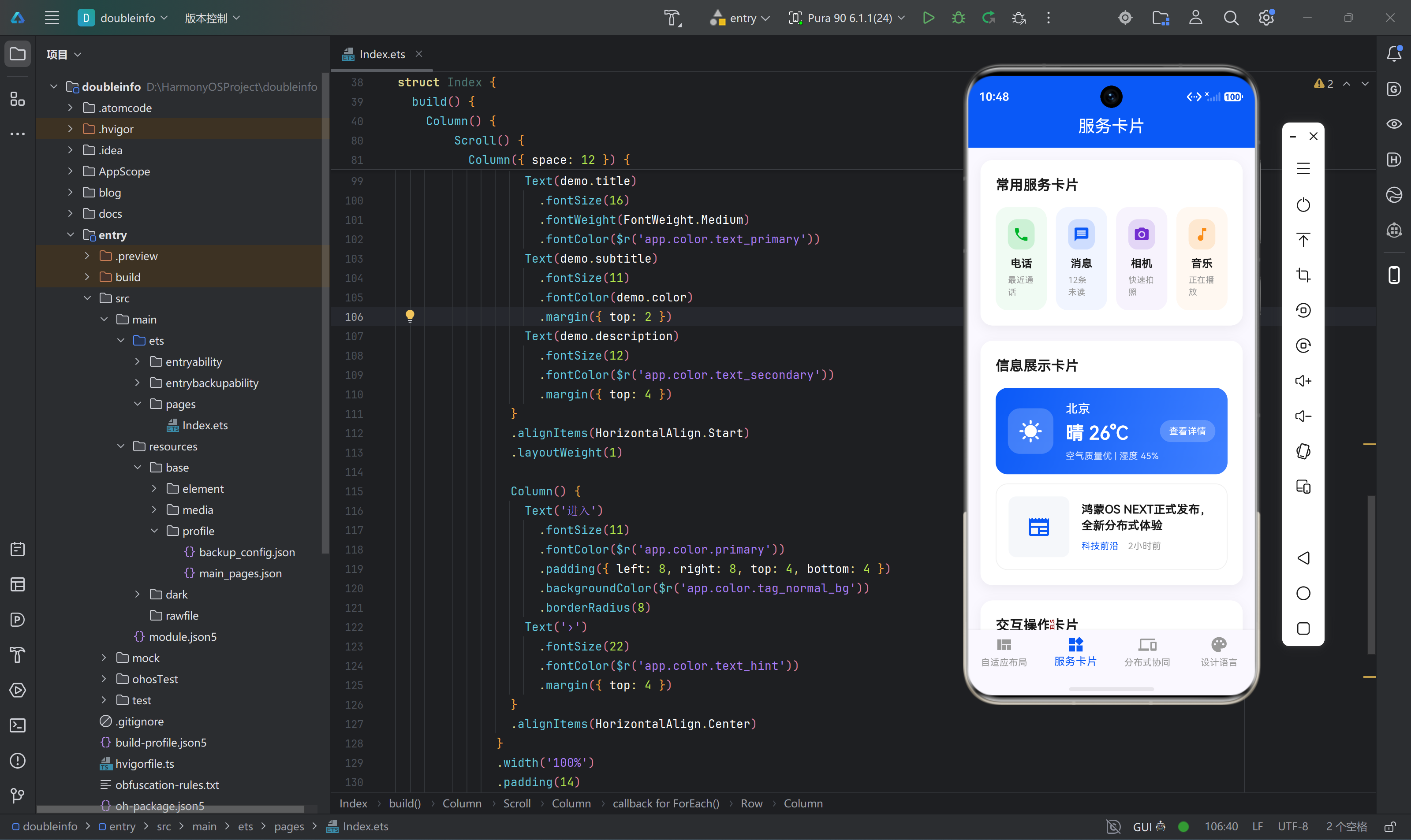
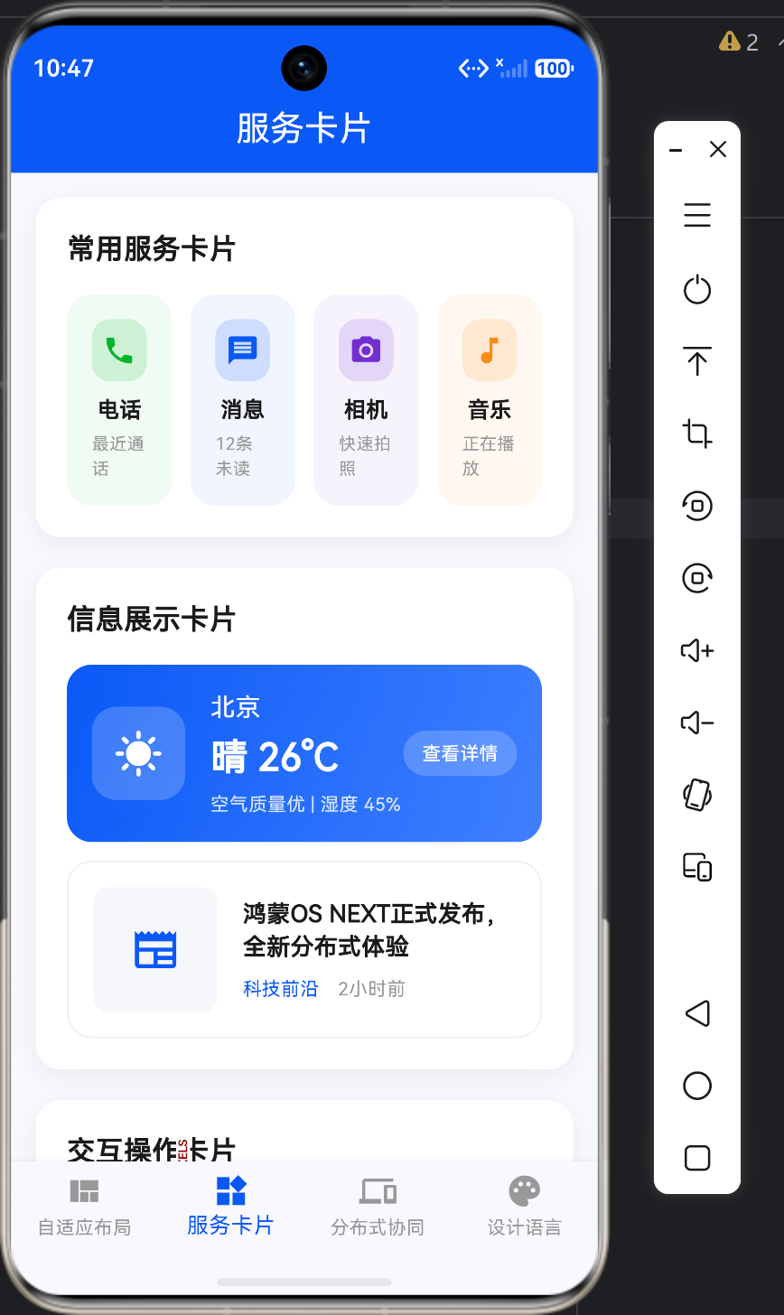
应用的服务卡片页面展示了四种类型的卡片:
┌─────────────────────────────────────────────────────────────────┐
│                      常用服务卡片                               │
│  ┌──────────┐  ┌──────────┐  ┌──────────┐  ┌──────────┐      │
│  │    📞    │  │    💬    │  │    📷    │  │    🎵    │      │
│  │   电话   │  │   消息   │  │   相机   │  │   音乐   │      │
│  │ 最近通话 │  │ 12条未读 │  │ 快速拍照 │  │ 正在播放 │      │
│  └──────────┘  └──────────┘  └──────────┘  └──────────┘      │
├─────────────────────────────────────────────────────────────────┤
│                      信息展示卡片                               │
│  ┌──────────────────────────────────────────────────────────┐   │
│  │  ☀️  北京  │  晴 26°C  │  空气质量优 | 湿度 45%  │ 查看  │   │
│  └──────────────────────────────────────────────────────────┘   │
│  ┌──────────────────────────────────────────────────────────┐   │
│  │  📰 鸿蒙OS NEXT正式发布,全新分布式体验                    │   │
│  │     科技前沿  │  2小时前                                  │   │
│  └──────────────────────────────────────────────────────────┘   │
├─────────────────────────────────────────────────────────────────┤
│                      交互操作卡片                               │
│  ┌──────────┐  ┌──────────┐  ┌──────────┐                      │
│  │    📶    │  │    🟦    │  │    🔋    │                      │
│  │   WLAN   │  │   蓝牙   │  │   电量   │                      │
│  │   已连接 │  │   已开启 │  │    85%   │                      │
│  │ Home-WiFi│  │ 设备列表 │  │ 省电模式 │                      │
│  └──────────┘  └──────────┘  └──────────┘                      │
│  ┌──────────────────────────────────────────────────────────┐   │
│  │  🌞 显示与亮度              >                            │   │
│  │  ─────────────────────────────────────────────────────── │   │
│  │  🔊 声音与振动              >                            │   │
│  │  ─────────────────────────────────────────────────────── │   │
│  │  🔔 通知与状态栏            >                            │   │
│  │  ─────────────────────────────────────────────────────── │   │
│  │  🔋 电池                    >                            │   │
│  └──────────────────────────────────────────────────────────┘   │
├─────────────────────────────────────────────────────────────────┤
│                      动态卡片                                   │
│  ┌──────────────────────────────────────────────────────────┐   │
│  │  ❤️ 今日健康  │  2024年12月25日                          │   │
│  │  ┌──────────┐  ┌──────────┐  ┌──────────┐                │   │
│  │  │   步数   │  │   心率   │  │   睡眠   │                │   │
│  │  │  8,542  │  │    72    │  │   7.5   │                │   │
│  │  │目标10,000│  │  次/分  │  │  小时   │                │   │
│  │  └──────────┘  └──────────┘  └──────────┘                │   │
│  └──────────────────────────────────────────────────────────┘   │
│  ┌──────────────────────────────────────────────────────────┐   │
│  │  📅 日程安排                                              │   │
│  │  ┌─────┐  09:00 团队会议  会议室A  ●                      │   │
│  │  ┌─────┐  14:00 产品评审  会议室B  ●                      │   │
│  │  ┌─────┐  18:00 健身      健身房    ●                      │   │
│  └──────────────────────────────────────────────────────────┘   │
└─────────────────────────────────────────────────────────────────┘
二、核心代码解析
2.1 ServiceCardPage 主组件
这是服务卡片页面的核心组件,负责组织整个页面的结构:
class ServiceCardPage extends StatelessWidget {
const ServiceCardPage({super.key});
Widget build(BuildContext context) {
return SingleChildScrollView(
padding: const EdgeInsets.all(16),
child: Column(
crossAxisAlignment: CrossAxisAlignment.start,
children: [
_buildCardSection('常用服务卡片', _buildCommonServiceCards()),
const SizedBox(height: 20),
_buildCardSection('信息展示卡片', _buildInfoCards()),
const SizedBox(height: 20),
_buildCardSection('交互操作卡片', _buildActionCards()),
const SizedBox(height: 20),
_buildCardSection('动态卡片', _buildDynamicCards()),
],
),
);
}
}
代码要点:
- SingleChildScrollView:最外层使用
SingleChildScrollView包裹,确保在小屏幕设备上内容可以滚动查看 - Column 布局:使用
Column作为主布局容器,按垂直方向排列各个卡片组 - 卡片组封装:使用
_buildCardSection统一封装每个卡片组,包含标题和内容
2.2 卡片组封装组件
_buildCardSection 是一个通用的卡片组封装组件:
Widget _buildCardSection(String title, Widget content) {
  return Container(
    padding: const EdgeInsets.all(20),
    decoration: BoxDecoration(
      color: Colors.white,
      borderRadius: BorderRadius.circular(16),
      boxShadow: [
        BoxShadow(
          color: Colors.black.withValues(alpha: 0.06),
          blurRadius: 12,
          offset: const Offset(0, 4),
        ),
      ],
    ),
    child: Column(
      crossAxisAlignment: CrossAxisAlignment.start,
      children: [
        Text(
          title,
          style: const TextStyle(
            fontSize: 18,
            fontWeight: FontWeight.w600,
            color: Color(0xFF1A1A1A),
          ),
        ),
        const SizedBox(height: 16),
        content,
      ],
    ),
  );
}
代码要点:
- 统一卡片样式:所有卡片组使用相同的白色背景、16px 圆角和浅阴影效果
- 标题+内容结构:每个卡片组包含标题和内容两部分
- 鸿蒙设计风格:使用华为设计规范中的阴影和圆角
2.3 常用服务卡片
_buildCommonServiceCards 实现了四列等宽的常用服务卡片:
Widget _buildCommonServiceCards() {
  return Row(
    children: [
      Expanded(
        child: _buildServiceCard(
          icon: Icons.phone,
          title: '电话',
          subtitle: '最近通话',
          color: const Color(0xFF00B42A),
        ),
      ),
      const SizedBox(width: 12),
      Expanded(
        child: _buildServiceCard(
          icon: Icons.message,
          title: '消息',
          subtitle: '12条未读',
          color: const Color(0xFF0A59F7),
        ),
      ),
      const SizedBox(width: 12),
      Expanded(
        child: _buildServiceCard(
          icon: Icons.camera_alt,
          title: '相机',
          subtitle: '快速拍照',
          color: const Color(0xFF722ED1),
        ),
      ),
      const SizedBox(width: 12),
      Expanded(
        child: _buildServiceCard(
          icon: Icons.music_note,
          title: '音乐',
          subtitle: '正在播放',
          color: const Color(0xFFFA8C16),
        ),
      ),
    ],
  );
}
代码要点:
- 四列等宽布局:使用
Expanded让四个服务卡片平均分配宽度 - 颜色区分:每个服务卡片使用不同的主题色,便于区分
- 间距控制:使用
SizedBox(width: 12)控制卡片之间的间距
2.4 服务卡片组件
_buildServiceCard 是单个服务卡片的实现:
Widget _buildServiceCard({
  required IconData icon,
  required String title,
  required String subtitle,
  required Color color,
}) {
  return Container(
    padding: const EdgeInsets.all(16),
    decoration: BoxDecoration(
      color: color.withValues(alpha: 0.06),
      borderRadius: BorderRadius.circular(16),
    ),
    child: Column(
      children: [
        Container(
          width: 40,
          height: 40,
          decoration: BoxDecoration(
            color: color.withValues(alpha: 0.15),
            borderRadius: BorderRadius.circular(12),
          ),
          child: Icon(
            icon,
            color: color,
            size: 22,
          ),
        ),
        const SizedBox(height: 8),
        Text(
          title,
          style: const TextStyle(
            fontSize: 14,
            fontWeight: FontWeight.w600,
            color: Color(0xFF1A1A1A),
          ),
        ),
        const SizedBox(height: 4),
        Text(
          subtitle,
          style: const TextStyle(
            fontSize: 11,
            color: Color(0xFF999999),
          ),
        ),
      ],
    ),
  );
}
代码要点:
- 背景色透明度:使用主题色的 6% 透明度作为卡片背景色
- 图标容器:图标使用 15% 透明度的背景色,形成层次感
- 字体大小层次:标题使用 14px,副标题使用 11px,突出重点
2.5 信息展示卡片
_buildInfoCards 包含天气卡片和新闻卡片:
Widget _buildInfoCards() {
  return Column(
    children: [
      _buildWeatherCard(),
      const SizedBox(height: 12),
      _buildNewsCard(),
    ],
  );
}
代码要点:
- 垂直排列:天气卡片和新闻卡片垂直排列,间距为 12px
- 独立卡片:每个卡片有独立的样式和交互逻辑
2.6 天气卡片组件
_buildWeatherCard 实现了带有渐变背景的天气信息卡片:
Widget _buildWeatherCard() {
  return Container(
    padding: const EdgeInsets.all(16),
    decoration: BoxDecoration(
      gradient: const LinearGradient(
        colors: [Color(0xFF0A59F7), Color(0xFF4080FF)],
        begin: Alignment.topLeft,
        end: Alignment.bottomRight,
      ),
      borderRadius: BorderRadius.circular(16),
    ),
    child: Row(
      children: [
        Container(
          width: 60,
          height: 60,
          decoration: BoxDecoration(
            color: Colors.white.withValues(alpha: 0.2),
            borderRadius: BorderRadius.circular(16),
          ),
          child: const Icon(
            Icons.sunny,
            color: Colors.white,
            size: 32,
          ),
        ),
        const SizedBox(width: 16),
        Expanded(
          child: Column(
            crossAxisAlignment: CrossAxisAlignment.start,
            children: [
              const Text(
                '北京',
                style: TextStyle(
                  fontSize: 16,
                  fontWeight: FontWeight.w500,
                  color: Colors.white,
                ),
              ),
              const SizedBox(height: 4),
              const Text(
                '晴 26°C',
                style: TextStyle(
                  fontSize: 24,
                  fontWeight: FontWeight.w600,
                  color: Colors.white,
                ),
              ),
              const SizedBox(height: 4),
              Text(
                '空气质量优 | 湿度 45%',
                style: const TextStyle(
                  fontSize: 12,
                  color: Color.fromARGB(204, 255, 255, 255),
                ),
              ),
            ],
          ),
        ),
        Container(
          padding: const EdgeInsets.symmetric(horizontal: 12, vertical: 6),
          decoration: BoxDecoration(
            color: Colors.white.withValues(alpha: 0.2),
            borderRadius: BorderRadius.circular(20),
          ),
          child: const Text(
            '查看详情',
            style: TextStyle(
              fontSize: 12,
              fontWeight: FontWeight.w500,
              color: Colors.white,
            ),
          ),
        ),
      ],
    ),
  );
}
代码要点:
- 渐变背景:使用
LinearGradient实现从蓝色到浅蓝色的渐变效果 - 半透明元素:图标容器和按钮使用白色的 20% 透明度,形成玻璃拟态效果
- 字体颜色层次:主标题使用纯白,副标题使用 80% 透明度的白色
- 胶囊按钮:使用
borderRadius: 20实现胶囊形状的按钮
2.7 新闻卡片组件
_buildNewsCard 实现了带有缩略图的新闻卡片:
Widget _buildNewsCard() {
  return Container(
    padding: const EdgeInsets.all(16),
    decoration: BoxDecoration(
      color: Colors.white,
      borderRadius: BorderRadius.circular(16),
      border: Border.all(
        color: const Color(0xFFF0F0F0),
        width: 1,
      ),
    ),
    child: Row(
      children: [
        Container(
          width: 80,
          height: 80,
          decoration: BoxDecoration(
            color: const Color(0xFFF5F7FA),
            borderRadius: BorderRadius.circular(10),
          ),
          child: const Icon(
            Icons.newspaper,
            color: Color(0xFF0A59F7),
            size: 32,
          ),
        ),
        const SizedBox(width: 16),
        Expanded(
          child: Column(
            crossAxisAlignment: CrossAxisAlignment.start,
            children: const [
              Text(
                '鸿蒙OS NEXT正式发布,全新分布式体验',
                style: TextStyle(
                  fontSize: 15,
                  fontWeight: FontWeight.w600,
                  color: Color(0xFF1A1A1A),
                ),
                maxLines: 2,
                overflow: TextOverflow.ellipsis,
              ),
              SizedBox(height: 8),
              Row(
                children: [
                  Text(
                    '科技前沿',
                    style: TextStyle(
                      fontSize: 12,
                      color: Color(0xFF0A59F7),
                    ),
                  ),
                  SizedBox(width: 12),
                  Text(
                    '2小时前',
                    style: TextStyle(
                      fontSize: 12,
                      color: Color(0xFF999999),
                    ),
                  ),
                ],
              ),
            ],
          ),
        ),
      ],
    ),
  );
}
代码要点:
- 边框设计:使用浅灰色边框替代阴影,适合新闻列表场景
- 图文布局:左侧缩略图,右侧文字内容
- 文本溢出处理:标题使用
maxLines: 2和overflow: TextOverflow.ellipsis - 标签设计:使用蓝色标签标识新闻分类
2.8 交互操作卡片
_buildActionCards 包含快捷操作卡片和设置卡片:
Widget _buildActionCards() {
  return Column(
    children: [
      _buildQuickActions(),
      const SizedBox(height: 12),
      _buildSettingsCard(),
    ],
  );
}
代码要点:
- 垂直排列:快捷操作和设置卡片垂直排列,间距为 12px
2.9 快捷操作卡片
_buildQuickActions 实现了三列快捷操作卡片:
Widget _buildQuickActions() {
  return Row(
    children: [
      Expanded(
        child: _buildActionCard(
          icon: Icons.wifi,
          title: 'WLAN',
          subtitle: '已连接',
          value: 'Home-WiFi',
          enabled: true,
        ),
      ),
      const SizedBox(width: 12),
      Expanded(
        child: _buildActionCard(
          icon: Icons.bluetooth,
          title: '蓝牙',
          subtitle: '已开启',
          value: '设备列表',
          enabled: true,
        ),
      ),
      const SizedBox(width: 12),
      Expanded(
        child: _buildActionCard(
          icon: Icons.battery_charging_full,
          title: '电量',
          subtitle: '85%',
          value: '省电模式',
          enabled: false,
        ),
      ),
    ],
  );
}
代码要点:
- 三列等宽布局:使用
Expanded让三个操作卡片平均分配宽度 - 启用/禁用状态:通过
enabled参数控制卡片的启用状态
2.10 操作卡片组件
_buildActionCard 是单个操作卡片的实现:
Widget _buildActionCard({
  required IconData icon,
  required String title,
  required String subtitle,
  required String value,
  required bool enabled,
}) {
  return Container(
    padding: const EdgeInsets.all(14),
    decoration: BoxDecoration(
      color: enabled ? const Color(0xFFF5F7FA) : const Color(0xFFFAFAFA),
      borderRadius: BorderRadius.circular(12),
      border: Border.all(
        color: enabled ? const Color(0xFFE8E8E8) : const Color(0xFFF0F0F0),
        width: 1,
      ),
    ),
    child: Column(
      crossAxisAlignment: CrossAxisAlignment.start,
      children: [
        Row(
          children: [
            Icon(
              icon,
              color: enabled ? const Color(0xFF0A59F7) : const Color(0xFFCCCCCC),
              size: 20,
            ),
            const SizedBox(width: 8),
            Text(
              title,
              style: TextStyle(
                fontSize: 14,
                fontWeight: FontWeight.w500,
                color: enabled ? const Color(0xFF1A1A1A) : const Color(0xFF999999),
              ),
            ),
          ],
        ),
        const SizedBox(height: 6),
        Text(
          subtitle,
          style: TextStyle(
            fontSize: 12,
            color: enabled ? const Color(0xFF666666) : const Color(0xFFCCCCCC),
          ),
        ),
        const SizedBox(height: 8),
        Text(
          value,
          style: TextStyle(
            fontSize: 12,
            fontWeight: FontWeight.w500,
            color: enabled ? const Color(0xFF0A59F7) : const Color(0xFFCCCCCC),
          ),
        ),
      ],
    ),
  );
}
代码要点:
- 启用/禁用样式:启用状态使用蓝色主题,禁用状态使用灰色主题
- 多层信息展示:包含图标+标题、状态描述、当前值三层信息
- 边框设计:使用浅灰色边框增强卡片边界感
2.11 设置卡片组件
_buildSettingsCard 实现了类似系统设置的列表卡片:
Widget _buildSettingsCard() {
  return Container(
    padding: const EdgeInsets.all(16),
    decoration: BoxDecoration(
      color: Colors.white,
      borderRadius: BorderRadius.circular(16),
      boxShadow: [
        BoxShadow(
          color: Colors.black.withValues(alpha: 0.04),
          blurRadius: 8,
          offset: const Offset(0, 2),
        ),
      ],
    ),
    child: Column(
      children: [
        _buildSettingsRow('显示与亮度', Icons.brightness_6),
        Container(
          height: 1,
          color: const Color(0xFFF0F0F0),
          margin: const EdgeInsets.symmetric(vertical: 12),
        ),
        _buildSettingsRow('声音与振动', Icons.volume_up),
        Container(
          height: 1,
          color: const Color(0xFFF0F0F0),
          margin: const EdgeInsets.symmetric(vertical: 12),
        ),
        _buildSettingsRow('通知与状态栏', Icons.notifications),
        Container(
          height: 1,
          color: const Color(0xFFF0F0F0),
          margin: const EdgeInsets.symmetric(vertical: 12),
        ),
        _buildSettingsRow('电池', Icons.battery_full),
      ],
    ),
  );
}
代码要点:
- 列表分隔线:使用
Container(height: 1)实现列表项之间的分隔线 - 统一间距:分隔线上下各留 12px 间距
- 浅阴影效果:使用更浅的阴影效果,适合设置页面场景
2.12 设置行组件
_buildSettingsRow 实现了单个设置项:
Widget _buildSettingsRow(String title, IconData icon) {
  return Row(
    children: [
      Icon(
        icon,
        color: const Color(0xFF0A59F7),
        size: 20,
      ),
      const SizedBox(width: 12),
      Text(
        title,
        style: const TextStyle(
          fontSize: 15,
          fontWeight: FontWeight.w500,
          color: Color(0xFF1A1A1A),
        ),
      ),
      const Spacer(),
      const Icon(
        Icons.chevron_right,
        color: Color(0xFFCCCCCC),
        size: 20,
      ),
    ],
  );
}
代码要点:
- Spacer 分隔:使用
Spacer()将标题和箭头分隔到两端 - 箭头指示:右侧使用
chevron_right图标表示可点击 - 统一图标颜色:所有图标使用华为蓝
#0A59F7
2.13 动态卡片
_buildDynamicCards 包含健康卡片和日历卡片:
Widget _buildDynamicCards() {
  return Column(
    children: [
      _buildHealthCard(),
      const SizedBox(height: 12),
      _buildCalendarCard(),
    ],
  );
}
代码要点:
- 垂直排列:健康卡片和日历卡片垂直排列,间距为 12px
2.14 健康卡片组件
_buildHealthCard 实现了展示健康数据的卡片:
Widget _buildHealthCard() {
  return Container(
    padding: const EdgeInsets.all(16),
    decoration: BoxDecoration(
      color: Colors.white,
      borderRadius: BorderRadius.circular(16),
      boxShadow: [
        BoxShadow(
          color: Colors.black.withValues(alpha: 0.06),
          blurRadius: 12,
          offset: const Offset(0, 4),
        ),
      ],
    ),
    child: Column(
      crossAxisAlignment: CrossAxisAlignment.start,
      children: [
        Row(
          children: [
            const Icon(
              Icons.favorite,
              color: Color(0xFFFA5151),
              size: 20,
            ),
            const SizedBox(width: 8),
            const Text(
              '今日健康',
              style: TextStyle(
                fontSize: 16,
                fontWeight: FontWeight.w600,
                color: Color(0xFF1A1A1A),
              ),
            ),
            const Spacer(),
            Text(
              '2024年12月25日',
              style: TextStyle(
                fontSize: 13,
                color: const Color(0xFF999999),
              ),
            ),
          ],
        ),
        const SizedBox(height: 16),
        Row(
          children: [
            Expanded(
              child: _buildHealthStat('步数', '8,542', '目标 10,000', const Color(0xFF00B42A)),
            ),
            const SizedBox(width: 16),
            Expanded(
              child: _buildHealthStat('心率', '72', '次/分', const Color(0xFFFA5151)),
            ),
            const SizedBox(width: 16),
            Expanded(
              child: _buildHealthStat('睡眠', '7.5', '小时', const Color(0xFF722ED1)),
            ),
          ],
        ),
      ],
    ),
  );
}
代码要点:
- 红色主题:使用红色心形图标,突出健康主题
- 日期显示:右侧显示当前日期
- 三列统计数据:步数、心率、睡眠使用不同颜色区分
2.15 健康统计项组件
_buildHealthStat 实现了单个健康数据项:
Widget _buildHealthStat(String label, String value, String unit, Color color) {
  return Container(
    padding: const EdgeInsets.all(12),
    decoration: BoxDecoration(
      color: color.withValues(alpha: 0.06),
      borderRadius: BorderRadius.circular(12),
    ),
    child: Column(
      children: [
        Text(
          label,
          style: const TextStyle(
            fontSize: 12,
            color: Color(0xFF999999),
          ),
        ),
        const SizedBox(height: 6),
        Text(
          value,
          style: TextStyle(
            fontSize: 20,
            fontWeight: FontWeight.w600,
            color: color,
          ),
        ),
        const SizedBox(height: 4),
        Text(
          unit,
          style: const TextStyle(
            fontSize: 11,
            color: Color(0xFF999999),
          ),
        ),
      ],
    ),
  );
}
代码要点:
- 三层信息结构:标签(12px)、数值(20px)、单位(11px)
- 数值突出:数值使用大号字体和主题色,突出显示
- 背景色透明度:使用主题色的 6% 透明度作为背景色
2.16 日历卡片组件
_buildCalendarCard 实现了展示日程安排的卡片:
Widget _buildCalendarCard() {
  return Container(
    padding: const EdgeInsets.all(16),
    decoration: BoxDecoration(
      color: Colors.white,
      borderRadius: BorderRadius.circular(16),
      boxShadow: [
        BoxShadow(
          color: Colors.black.withValues(alpha: 0.06),
          blurRadius: 12,
          offset: const Offset(0, 4),
        ),
      ],
    ),
    child: Column(
      crossAxisAlignment: CrossAxisAlignment.start,
      children: [
        Row(
          children: [
            const Icon(
              Icons.calendar_today,
              color: Color(0xFF0A59F7),
              size: 20,
            ),
            const SizedBox(width: 8),
            const Text(
              '日程安排',
              style: TextStyle(
                fontSize: 16,
                fontWeight: FontWeight.w600,
                color: Color(0xFF1A1A1A),
              ),
            ),
          ],
        ),
        const SizedBox(height: 16),
        _buildCalendarEvent('09:00', '团队会议', '会议室A', const Color(0xFF0A59F7)),
        const SizedBox(height: 12),
        _buildCalendarEvent('14:00', '产品评审', '会议室B', const Color(0xFF00B42A)),
        const SizedBox(height: 12),
        _buildCalendarEvent('18:00', '健身', '健身房', const Color(0xFFFA8C16)),
      ],
    ),
  );
}
代码要点:
- 蓝色主题:使用蓝色日历图标,与系统日历风格一致
- 多条日程:展示三条不同时间的日程安排
- 颜色区分:不同日程使用不同颜色标识
2.17 日历事件组件
_buildCalendarEvent 实现了单个日程事件:
Widget _buildCalendarEvent(String time, String title, String location, Color color) {
  return Row(
    children: [
      Container(
        width: 56,
        padding: const EdgeInsets.symmetric(vertical: 4),
        decoration: BoxDecoration(
          color: color.withValues(alpha: 0.06),
          borderRadius: BorderRadius.circular(6),
        ),
        child: Text(
          time,
          style: TextStyle(
            fontSize: 12,
            fontWeight: FontWeight.w500,
            color: color,
          ),
          textAlign: TextAlign.center,
        ),
      ),
      const SizedBox(width: 12),
      Expanded(
        child: Column(
          crossAxisAlignment: CrossAxisAlignment.start,
          children: [
            Text(
              title,
              style: const TextStyle(
                fontSize: 14,
                fontWeight: FontWeight.w500,
                color: Color(0xFF1A1A1A),
              ),
            ),
            const SizedBox(height: 2),
            Text(
              location,
              style: const TextStyle(
                fontSize: 12,
                color: Color(0xFF999999),
              ),
            ),
          ],
        ),
      ),
      Container(
        width: 8,
        height: 8,
        decoration: BoxDecoration(
          color: color,
          borderRadius: BorderRadius.circular(4),
        ),
      ),
    ],
  );
}
代码要点:
- 时间标签:左侧使用固定宽度的时间标签,背景色使用主题色的 6% 透明度
- 位置指示点:右侧使用圆形指示点,颜色与时间标签一致
- Expanded 内容:中间内容使用
Expanded包裹,自动填充剩余空间
三、卡片设计模式
3.1 卡片类型分类
根据功能和用途,服务卡片可以分为以下几类:
| 类型 | 特点 | 适用场景 | 示例 |
|---|---|---|---|
| 服务入口卡 | 图标+标题+副标题 | 常用功能快捷入口 | 电话、消息、相机 |
| 信息展示卡 | 图文并茂,信息丰富 | 天气、新闻、资讯 | 天气预报、新闻摘要 |
| 状态控制卡 | 显示状态,可操作 | 系统设置、快捷开关 | WLAN、蓝牙、电量 |
| 数据统计卡 | 数字为主,可视化 | 健康数据、统计图表 | 步数、心率、睡眠 |
| 列表卡片 | 多项内容,可滚动 | 设置列表、菜单列表 | 系统设置、功能菜单 |
3.2 卡片设计规范
鸿蒙设计规范中,卡片设计需要遵循以下原则:
尺寸规范:
| 属性 | 值 | 说明 |
|---|---|---|
| 卡片圆角 | 16px | 标准卡片圆角 |
| 卡片间距 | 16px | 卡片之间的间距 |
| 卡片内边距 | 16-20px | 卡片内容与边框的距离 |
| 阴影模糊 | 8-12px | 卡片阴影的模糊半径 |
| 阴影透明度 | 0.04-0.06 | 阴影颜色的透明度 |
颜色规范:
| 元素 | 颜色值 | 说明 |
|---|---|---|
| 卡片背景 | #FFFFFF | 白色背景 |
| 分隔线 | #F0F0F0 | 浅灰色分隔线 |
| 主文字 | #1A1A1A | 深黑色主文字 |
| 次文字 | #666666 | 中灰色次文字 |
| 辅助文字 | #999999 | 浅灰色辅助文字 |
| 主色调 | #0A59F7 | 华为蓝 |
字体规范:
| 用途 | 字号 | 字重 |
|---|---|---|
| 卡片标题 | 16-18px | SemiBold (w600) |
| 内容标题 | 14-15px | Medium (w500) |
| 正文内容 | 12-14px | Regular (w400) |
| 辅助文字 | 11-12px | Regular (w400) |
3.3 卡片交互设计
点击反馈:
GestureDetector(
  onTap: () {
    // 点击事件处理
  },
  child: Container(
    // 卡片内容
  ),
)
长按反馈:
GestureDetector(
  onLongPress: () {
    // 长按事件处理
  },
  child: Container(
    // 卡片内容
  ),
)
悬停效果(桌面端):
MouseRegion(
  cursor: SystemMouseCursors.click,
  onHover: (event) {
    setState(() {
      _isHovered = true;
    });
  },
  onExit: (event) {
    setState(() {
      _isHovered = false;
    });
  },
  child: Container(
    decoration: BoxDecoration(
      color: _isHovered ? Colors.grey[100] : Colors.white,
      // 其他装饰
    ),
    // 卡片内容
  ),
)
四、自定义卡片组件的最佳实践
4.1 使用参数化组件
将卡片组件设计为可复用的参数化组件:
class ServiceCard extends StatelessWidget {
final IconData icon;
final String title;
final String subtitle;
final Color color;
final VoidCallback? onTap;
const ServiceCard({
super.key,
required this.icon,
required this.title,
required this.subtitle,
required this.color,
this.onTap,
});
Widget build(BuildContext context) {
return GestureDetector(
onTap: onTap,
child: Container(
padding: const EdgeInsets.all(16),
decoration: BoxDecoration(
color: color.withValues(alpha: 0.06),
borderRadius: BorderRadius.circular(16),
),
child: Column(
children: [
Icon(icon, color: color),
Text(title),
Text(subtitle),
],
),
),
);
}
}
优点:
- 代码复用:避免重复编写相似的卡片代码
- 统一风格:所有卡片使用相同的设计规范
- 易于维护:修改卡片样式只需修改一个地方
4.2 使用 Theme 统一主题
通过 Theme.of(context) 获取主题颜色:
Container(
  color: Theme.of(context).colorScheme.primary.withValues(alpha: 0.1),
  child: Text(
    '文本内容',
    style: TextStyle(
      color: Theme.of(context).colorScheme.onPrimary,
    ),
  ),
)
优点:
- 主题切换:支持明暗主题切换
- 统一管理:所有颜色集中在
ThemeData中管理 - 品牌一致性:确保应用的品牌色彩一致
4.3 使用 ClipRRect 处理圆角
当卡片包含图片或其他需要圆角的内容时:
ClipRRect(
  borderRadius: BorderRadius.circular(16),
  child: Image.network(
    'https://example.com/image.jpg',
    fit: BoxFit.cover,
  ),
)
优点:
- 完整圆角:图片内容也会被裁剪为圆角
- 性能优化:比
BoxDecoration的borderRadius更高效
4.4 使用 Hero 实现页面跳转动画
// 源页面
Hero(
  tag: 'card-${card.id}',
  child: ServiceCard(
    // 卡片内容
  ),
)

// 目标页面
Hero(
  tag: 'card-${card.id}',
  child: DetailCard(
    // 详情内容
  ),
)
优点:
- 平滑过渡:卡片跳转到详情页时有平滑的动画效果
- 用户体验:增强用户的交互体验
五、常见问题与解决方案
5.1 问题:卡片阴影在不同设备上显示不一致
现象:在某些设备上阴影显示正常,在其他设备上阴影过深或过浅
原因:不同设备的像素密度和屏幕亮度不同
解决方案:
BoxShadow(
  color: Colors.black.withValues(alpha: 0.06),
  blurRadius: 12,
  offset: const Offset(0, 4),
)
使用较小的透明度(0.04-0.06)和合适的模糊半径(8-12)。
5.2 问题:卡片内容溢出
现象:卡片内容超出卡片边界
原因:文本内容过长或图片尺寸过大
解决方案:
Text(
  '可能很长的文本内容',
  maxLines: 2,
  overflow: TextOverflow.ellipsis,
)
设置 maxLines 和 overflow 属性。
5.3 问题:卡片点击没有反馈
现象:点击卡片没有视觉反馈
原因:没有添加点击效果
解决方案:
GestureDetector(
  onTap: () {
    // 点击处理
  },
  child: Container(
    child: const Material(
      type: MaterialType.transparency,
      child: InkWell(
        onTap: null,
        child: Text('可点击文本'),
      ),
    ),
  ),
)
使用 InkWell 组件实现波纹效果。
5.4 问题:卡片布局在小屏幕上错乱
现象:在手机上卡片布局显示正常,但在平板上布局错乱
原因:使用了固定宽度或没有考虑不同屏幕尺寸
解决方案:
Row(
  children: [
    Expanded(
      flex: 1,
      child: ServiceCard(),
    ),
    Expanded(
      flex: 2,
      child: ContentCard(),
    ),
  ],
)
使用 Expanded 和 flex 属性实现弹性布局。
六、扩展知识
6.1 鸿蒙服务卡片的原生实现
在鸿蒙原生开发中,服务卡片有专门的 API:
// 鸿蒙原生服务卡片实现
@Entry
@Component
struct ServiceCard {
  build() {
    Column() {
      Text('服务卡片标题')
        .fontSize(18)
        .fontWeight(FontWeight.Bold)
      Text('服务卡片内容')
        .fontSize(14)
    }
    .padding(16)
    .width('100%')
    .height(200)
  }
}
Flutter 实现对比:
| 特性 | 鸿蒙原生 | Flutter |
|---|---|---|
| 卡片声明 | @Entry @Component | StatelessWidget |
| 布局容器 | Column/Row | Column/Row |
| 装饰器 | .backgroundColor() | BoxDecoration |
| 圆角 | .borderRadius() | BorderRadius.circular() |
6.2 卡片动画效果
为卡片添加进入动画:
class AnimatedCard extends StatefulWidget {
final Widget child;
final int delay;
const AnimatedCard({
super.key,
required this.child,
this.delay = 0,
});
State<AnimatedCard> createState() => _AnimatedCardState();
}
class _AnimatedCardState extends State<AnimatedCard>
with SingleTickerProviderStateMixin {
late AnimationController _controller;
late Animation<double> _animation;
void initState() {
super.initState();
_controller = AnimationController(
vsync: this,
duration: const Duration(milliseconds: 500),
);
_animation = Tween<double>(begin: 0, end: 1).animate(
CurvedAnimation(
parent: _controller,
curve: Curves.easeOut,
),
);
Future.delayed(Duration(milliseconds: widget.delay), () {
_controller.forward();
});
}
void dispose() {
_controller.dispose();
super.dispose();
}
Widget build(BuildContext context) {
return FadeTransition(
opacity: _animation,
child: Transform.translate(
offset: Offset(0, _animation.value * 20),
child: widget.child,
),
);
}
}
使用方式:
AnimatedCard(
  delay: 100,
  child: ServiceCard(
    // 卡片内容
  ),
)
6.3 卡片性能优化
使用 RepaintBoundary:
RepaintBoundary(
  child: ServiceCard(
    // 卡片内容
  ),
)
使用 const 构造函数:
const ServiceCard({
  super.key,
  required this.icon,
  required this.title,
  required this.subtitle,
});
避免不必要的重建:
class ServiceCard extends StatelessWidget {
const ServiceCard({super.key});
Widget build(BuildContext context) {
return Container(
// 使用 const 避免重建
child: const Text('静态内容'),
);
}
}
七、总结
本文详细讲解了「鸿蒙特性展示台」应用中服务卡片组件的实现:
- 常用服务卡片:四列等宽布局,包含图标、标题和副标题
- 信息展示卡片:天气卡片使用渐变背景,新闻卡片使用图文布局
- 交互操作卡片:快捷操作卡片支持启用/禁用状态,设置卡片使用列表形式
- 动态卡片:健康卡片展示统计数据,日历卡片展示日程安排
- 卡片设计规范:遵循鸿蒙设计规范,统一颜色、字体和间距
- 最佳实践:使用参数化组件、Theme 主题、ClipRRect 圆角处理
服务卡片是鸿蒙生态中重要的交互元素,通过合理的设计和实现,可以提升用户体验和应用的可用性。在 Flutter 中,我们可以通过组合 Container、Row、Column 等基础组件,快速构建出符合鸿蒙设计规范的服务卡片。

作为“人工智能6S店”的官方数字引擎,为AI开发者与企业提供一个覆盖软硬件全栈、一站式门户。
更多推荐
 4
4 0
0- 0


 已为社区贡献11条内容

所有评论(0)