
鸿蒙应用开发实战【45】— 首页应用列表筛选与搜索联动
·
鸿蒙应用开发实战【45】— 首页应用列表筛选与搜索联动
本文是「号码助手全栈开发系列」第 45 篇,持续更新中…
开源社区:https://openharmonycrossplatform.csdn.net
前言
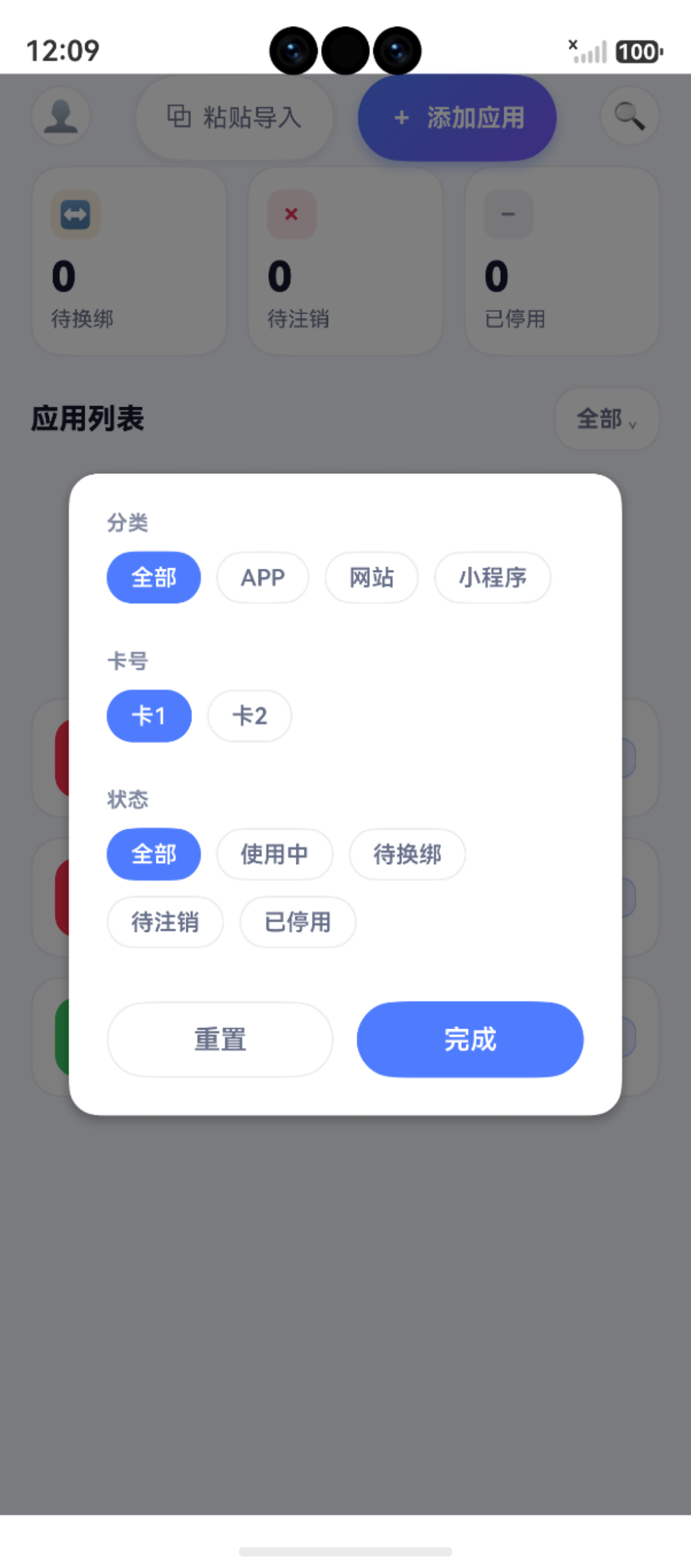
首页的应用列表支持三维筛选:分类、卡号、状态。筛选交互使用 bindPopup 内嵌面板实现,无需跳转新页面。此外,标题栏中的搜索按钮提供快速跳转到 SearchPage 的入口。
本篇涵盖:bindPopup 弹出面板用法、三维筛选 UI(分类/卡号/状态)、chip 选择器样式、筛选状态 badge 显示、重置与确认按钮、搜索入口、ForEach key 与筛选联动。
一、筛选入口
1.1 标题栏右侧筛选按钮
Row({ space: 3 }) {
  Text(this.activeFilterCount() > 0 ? `已选 ${this.activeFilterCount()}` : '全部')
    .fontSize(Size.font12).fontWeight(AppFonts.WEIGHT_SEMIBOLD)
    .fontColor(this.activeFilterCount() > 0 ? '#3E68E0' : AppColors.TEXT_2)
  Text('⌄')
    .fontSize(Size.font10)
    .fontColor(this.activeFilterCount() > 0 ? '#3E68E0' : AppColors.TEXT_3)
}
.padding({ left: 11, right: 11, top: 6, bottom: 6 })
.backgroundColor(this.activeFilterCount() > 0 ? AppColors.PRIMARY_BG : AppColors.CARD_B)
.border({ width: 1, color: this.activeFilterCount() > 0 ? '#4D4F7CFF' : AppColors.LINE, radius: 14 })
.bindPopup($$this.showFilter, {
  builder: () => { this.FilterPopoverBuilder() },
  placement: Placement.Bottom,
  popupColor: '#FFFFFF',
  enableArrow: false,
  onStateChange: (e) => { if (!e.isVisible) this.showFilter = false }
})
.onClick(() => { this.showFilter = !this.showFilter })
关键设计:
- ** 语法 ∗ ∗ : ‘ 语法**:` 语法∗∗:‘this.showFilter` 实现双向绑定,点击时切换
activeFilterCount():显示当前生效的筛选条件数- 颜色反馈:有筛选时文字/背景变为蓝色
onStateChange:面板关闭时重置showFilter,保持状态同步
二、FilterPopoverBuilder 筛选面板
2.1 面板结构
┌──────────────────────────────────┐
│ 分类                              │
│ [全部] [APP] [网站] [小程序]      │
│                                  │
│ 卡号                              │
│ [全部] [卡1] [卡2]               │
│                                  │
│ 状态                              │
│ [全部] [使用中] [待换绑] [待注销] │
│                                  │
│ [  重  置  ] [  完  成  ]        │
└──────────────────────────────────┘
2.2 分类筛选
Column() {
  Text('分类').fontSize(Size.font11).fontColor(AppColors.TEXT_3)
    .fontWeight(AppFonts.WEIGHT_SEMIBOLD)
    .alignSelf(ItemAlign.Start).margin({ bottom: 8 })
  Flex({ wrap: FlexWrap.Wrap }) {
    ForEach(CATEGORIES, (cat: string, idx: number) => {
      Text(cat)
        .fontSize(Size.font12).fontWeight(AppFonts.WEIGHT_MEDIUM)
        .fontColor(this.filterCatIdx === idx ? '#FFFFFF' : AppColors.TEXT_2)
        .padding({ left: 12, right: 12, top: 6, bottom: 6 })
        .backgroundColor(this.filterCatIdx === idx ? AppColors.PRIMARY : AppColors.CARD_B)
        .border({ width: 1, radius: 14 })
        .onClick(() => { this.filterCatIdx = idx })
    })
  }
}
chip 选择器样式:
- 未选中:白底灰字 + 灰色边框
- 选中:蓝色渐变底 + 白字 + 无边框
2.3 卡号筛选
卡号列表是动态的,来自 this.cards:
Flex({ wrap: FlexWrap.Wrap }) {
  // "全部"选项
  Text('全部')
    .fontColor(this.filterCardIdx === 0 ? '#FFFFFF' : AppColors.TEXT_2)
    .backgroundColor(this.filterCardIdx === 0 ? AppColors.PRIMARY : AppColors.CARD_B)
    .onClick(() => { this.filterCardIdx = 0 })

  // 动态卡号选项
  ForEach(this.cards, (card: CardEntity, idx: number) => {
    Text(card.label)
      .fontColor(this.filterCardIdx === idx + 1 ? '#FFFFFF' : AppColors.TEXT_2)
      .backgroundColor(this.filterCardIdx === idx + 1 ? AppColors.PRIMARY : AppColors.CARD_B)
      .onClick(() => { this.filterCardIdx = idx + 1 })
  })
}
注意:filterCardIdx 中 0 代表"全部",卡号从 1 开始索引,所以 idx + 1。
2.4 状态筛选
const STATUS_FILTERS: string[] = ['全部', '使用中', '待换绑', '待注销', '已停用']

ForEach(STATUS_FILTERS, (s: string, idx: number) => {
  Text(s)
    .fontColor(this.filterStatIdx === idx ? '#FFFFFF' : AppColors.TEXT_2)
    .onClick(() => { this.filterStatIdx = idx })
})
| 筛选维度 | 数据类型 | 选项来源 | idx=0 含义 |
|---|---|---|---|
| 分类 | string | 静态数组 CATEGORIES | 全部 |
| 卡号 | string | 动态 this.cards | 全部(idx+1 偏移) |
| 状态 | string | 静态数组 STATUS_FILTERS | 全部 |
三、重置与确认
Row({ space: 8 }) {
  // 重置:恢复三个 idx 到 0
  Button('重置', { type: ButtonType.Normal })
    .onClick(() => this.resetFilters())

  // 完成:关闭弹出面板
  Button('完成', { type: ButtonType.Normal })
    .linearGradient({ angle: 135, colors: [[AppColors.PRIMARY, 0], [AppColors.PRIMARY_2, 1]] })
    .onClick(() => { this.showFilter = false })
}
private resetFilters(): void {
  this.filterCatIdx = 0
  this.filterCardIdx = 0
  this.filterStatIdx = 0
  this.showFilter = false
}
四、筛选流水线
首页列表展示的是筛选后的结果:
private getFilteredRows(): AppRow[] {
  return this.rows.filter(r => {
    const catOk = this.filterCatIdx === 0 || r.binding.category === CATEGORIES[this.filterCatIdx]
    const cardOk = this.filterCardIdx === 0 || r.cardLabel === this.cards[this.filterCardIdx - 1]?.label
    const statOk = this.filterStatIdx === 0 || r.binding.status === STATUS_FILTERS[this.filterStatIdx]
    return catOk && cardOk && statOk
  })
}
4.1 ForEach key 与筛选联动
ForEach(this.getFilteredRows(), (row: AppRow) => {
  AppListItem({ ... })
}, (row: AppRow) => {
  const id = row.binding.id ?? 0
  return `binding_${id}_${this.filterCatIdx}_${this.filterCardIdx}_${this.filterStatIdx}`
})
key 函数将筛选参数编码进去——筛选条件变化时,key 改变,ForEach 重新渲染列表。这是 ArkUI 性能优化的关键技巧。
五、搜索入口
5.1 标题栏搜索按钮
Column() {
  Text('🔍').fontSize(Size.font15)
}
.width(Size.s32).height(Size.s32).borderRadius(Size.s16)
.backgroundColor(AppColors.CARD_B)
.border({ width: 1, color: AppColors.LINE, radius: 16 })
.justifyContent(FlexAlign.Center)
.onClick(() => {
  this.navigate('pages/SearchPage')
})
搜索图标放在标题栏右侧,与个人中心入口对称:
[ 👤 ] [ 🔍 ]
5.2 个人中心入口
Column() {
  Text('👤').fontSize(Size.font16)
}
.width(Size.s32).height(Size.s32).borderRadius(Size.s16)
.backgroundColor(AppColors.CARD_B)
.border({ width: 1, color: AppColors.LINE, radius: 16 })
.justifyContent(FlexAlign.Center)
.onClick(() => { this.navigate('pages/MePage') })
六、三级状态联动
筛选、搜索、批量模式是首页的三个核心交互维度。它们之间的联系:
筛选条件 ←→ 列表内容 ←→ 批量选择
   │                    │
   │                    ▼
   │              选择仅对筛选后的元素生效
   │
   └→ getFilteredRows() 用于全选/显示
小结
| 要点 | 说明 |
|---|---|
| bindPopup | $$ 双向绑定控制弹出/关闭 |
| 三维筛选 | 分类 + 卡号 + 状态,idx=0 表示全部 |
| chip 样式 | 选中蓝色渐变 + 白字,未选中白底灰字 |
| 筛选 badge | activeFilterCount() > 0 时显示数量 |
| ForEach key | 编码筛选条件实现自动重绘 |
| 搜索入口 | 标题栏右侧跳转到 SearchPage |
下一篇文章,我们实现首页批量操作——选择模式、全选、批量变更状态与删除。
如果这篇文章对你有帮助,欢迎点赞👍、收藏⭐、关注🔔,你的支持是我持续创作的动力!
相关资源:
- openHarmony 跨平台社区:https://openharmonycrossplatform.csdn.net
- HarmonyOS 官方文档:https://developer.huawei.com/consumer/cn/doc/
- HarmonyOS ArkUI组件参考:https://developer.huawei.com/consumer/cn/doc/harmonyos-references/arkui-ts
- HarmonyOS router API:https://developer.huawei.com/consumer/cn/doc/harmonyos-references/router

作为“人工智能6S店”的官方数字引擎,为AI开发者与企业提供一个覆盖软硬件全栈、一站式门户。
更多推荐
 4
4 0
0- 0


 已为社区贡献3条内容

所有评论(0)