
鸿蒙应用开发实战【20】— 批量操作栏:UI 选择模式完整实现
·
鸿蒙应用开发实战【20】— 批量操作栏:UI 选择模式完整实现
前言
欢迎加入开源鸿蒙跨平台社区:https://openharmonycrossplatform.csdn.net
号码助手首页支持批量操作模式:长按或点击批量按钮后,列表切换为多选模式,顶部标题栏显示「取消 / 已选 N 项 / 全选」,底部弹出「标记状态 / 删除」操作栏。这是移动端 App 最经典的批量管理交互模式。
本篇从零拆解这套 UI 的完整实现:状态机设计 → 选择行 UI → 全选/取消全选 → 批量操作底栏 → showActionMenu + showAlertDialog。
本篇涵盖:selectMode 状态机设计、SelectableRow @Builder 复选框实现、toggleSelect/toggleSelectAll 逻辑、标题栏两态切换、批量操作底栏布局、showActionMenu 改状态、showAlertDialog 确认删除、ArkTS async-onClick 陷阱。
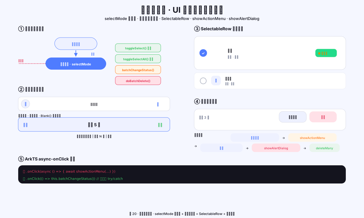
图1:批量选择模式状态机、标题栏两态切换、SelectableRow 设计、操作弹窗流程
一、状态机设计
1.1 批量模式的状态变量
// HomePage.ets — 批量模式状态
@State selectMode: boolean = false    // 是否处于批量选择模式
@State selectedIds: number[] = []     // 已选中的绑定 ID 数组
1.2 模式转换图
正常模式(selectMode=false)
    ↓  长按 AppListItem / 点击「批量」
批量模式(selectMode=true)
    ├── 点击列表行 → toggleSelect(id):切换单项选中
    ├── 点击「全选」 → toggleSelectAll():全选 / 取消全选
    ├── 点击「取消」 → 退出批量模式,清空 selectedIds
    ├── 点击「标记状态」 → showActionMenu → batchChangeStatus()
    └── 点击「删除」 → showAlertDialog → doBatchDelete()
1.3 进入/退出批量模式
// 进入批量模式(AppListItem 长按触发)
.gesture(LongPressGesture().onAction(() => {
  this.selectMode = true
}))

// 退出批量模式
Text('取消').onClick(() => {
  this.selectMode = false
  this.selectedIds = []    // 清空已选
})
二、标题栏两态切换
2.1 普通模式标题栏
// 正常模式:左侧头像,右侧搜索
Row() {
  Column() { Text('👤').fontSize(16) }
    .width(32).height(32).borderRadius(16)
    .backgroundColor(AppColors.CARD_B)
    .border({ width: 1, color: AppColors.LINE, radius: 16 })
    .justifyContent(FlexAlign.Center)
    .onClick(() => { this.navigate('pages/MePage') })

  Blank()   // 弹性空白撑开左右

  Column() { Text('🔍').fontSize(15) }
    .width(32).height(32).borderRadius(16)
    .backgroundColor(AppColors.CARD_B)
    .border({ width: 1, color: AppColors.LINE, radius: 16 })
    .justifyContent(FlexAlign.Center)
    .onClick(() => { this.navigate('pages/SearchPage') })
}
.width('100%').height(44).padding({ left: 16, right: 16 })
2.2 批量模式标题栏
// 批量模式:取消 | 已选 N 项(居中) | 全选
Row() {
  Text('取消')
    .fontSize(AppFonts.SIZE_BODY)
    .fontColor(AppColors.TEXT_2)
    .fontWeight(AppFonts.WEIGHT_MEDIUM)
    .onClick(() => {
      this.selectMode = false
      this.selectedIds = []
    })

  Text(`已选 ${this.selectedIds.length} 项`)
    .fontSize(14)
    .fontWeight(AppFonts.WEIGHT_BOLD)
    .fontColor(AppColors.TEXT)
    .layoutWeight(1)             // 占中间剩余空间
    .textAlign(TextAlign.Center) // 文字居中

  Text('全选')
    .fontSize(AppFonts.SIZE_BODY)
    .fontColor(AppColors.CYAN)
    .fontWeight(AppFonts.WEIGHT_SEMIBOLD)
    .onClick(() => this.toggleSelectAll())
}
.width('100%').height(44).padding({ left: 16, right: 16 })
2.3 用 if/else 切换两个标题栏
build() {
  Column() {
    // 标题栏——根据 selectMode 渲染不同的标题
    if (this.selectMode) {
      // 批量模式标题栏(见 2.2)
    } else {
      // 正常模式标题栏(见 2.1)
    }
    // ... 下方内容
  }
}
三、SelectableRow 可选择行
3.1 完整代码
// HomePage.ets — SelectableRow @Builder
@Builder
private SelectableRow(row: AppRow) {
  Row() {
    // ① 复选框(圆形,选中时填色 + 显示 ✓)
    Stack() {
      if (this.selectedIds.includes(row.binding.id ?? 0)) {
        Text('✓').fontSize(11).fontColor('#FFFFFF')
      }
    }
    .width(20).height(20).borderRadius(10)
    .backgroundColor(
      this.selectedIds.includes(row.binding.id ?? 0)
        ? AppColors.PRIMARY
        : Color.Transparent
    )
    .border({
      width: 2,
      color: this.selectedIds.includes(row.binding.id ?? 0)
        ? AppColors.PRIMARY
        : '#2E141E3C',
      radius: 10
    })
    .margin({ right: 10 })

    // ② 应用头像(与正常列表一致)
    AvatarBadge({
      text: row.binding.app_name.slice(0, 1),
      colorStart: row.binding.icon_key,
      colorEnd: row.binding.icon_key,
      badgeSize: 42, radius: 12, fontSize: 14
    })

    // ③ 应用名 + 分类标签
    Column() {
      Text(row.binding.app_name)
        .fontSize(AppFonts.SIZE_BODY)
        .fontWeight(AppFonts.WEIGHT_MEDIUM)
        .fontColor(AppColors.TEXT)
      Row({ space: 6 }) {
        Text(row.binding.category)
          .fontSize(AppFonts.SIZE_MINI)
          .fontColor(AppColors.TEXT_2)
          .border({ width: 1, color: AppColors.LINE, radius: 6 })
          .padding({ left: 6, right: 6, top: 1, bottom: 1 })
        if (row.cardLabel.length > 0) {
          Text(row.cardLabel)
            .fontSize(AppFonts.SIZE_MINI)
            .fontColor(AppColors.TEXT_2)
            .border({ width: 1, color: AppColors.LINE, radius: 6 })
            .padding({ left: 6, right: 6, top: 1, bottom: 1 })
        }
      }
      .margin({ top: 5 })
    }
    .alignItems(HorizontalAlign.Start)
    .layoutWeight(1)
    .margin({ left: 10 })

    // ④ 状态徽标
    StatusBadge({ status: row.binding.status })
  }
  .width('100%')
  .padding({ top: 10, bottom: 10, left: 12, right: 12 })
  .backgroundColor(AppColors.CARD)
  .border({ width: 1, color: AppColors.LINE, radius: 16 })
  .margin({ bottom: 10 })
  .onClick(() => this.toggleSelect(row.binding.id ?? 0))   // 点击切换选中
}
3.2 复选框的两态视觉
| 状态 | 边框色 | 背景色 | 内部图标 |
|---|---|---|---|
| 未选中 | #2E141E3C(淡灰) |
Transparent |
无 |
| 已选中 | AppColors.PRIMARY(蓝) |
AppColors.PRIMARY(蓝) |
✓ #FFFFFF |
四、全选/单选逻辑
4.1 单项切换
private toggleSelect(id: number): void {
  if (this.selectedIds.includes(id)) {
    // 已选中 → 取消选中(过滤掉该 id)
    this.selectedIds = this.selectedIds.filter((i: number) => i !== id)
  } else {
    // 未选中 → 加入选中(concat 产生新数组,触发 @State 更新)
    this.selectedIds = this.selectedIds.concat([id])
  }
}
4.2 全选/取消全选
private toggleSelectAll(): void {
  const filtered = this.getFilteredRows()
  const allIds = filtered
    .map((r: AppRow) => r.binding.id ?? 0)
    .filter((id: number) => id > 0)   // 过滤掉 id=0 的异常数据

  // 如果已全选 → 取消全选;否则 → 全选
  this.selectedIds = this.selectedIds.length === allIds.length ? [] : allIds
}
4.3 为什么用 concat/filter 而不是 push/splice
// ❌ 错误:push/splice 直接修改数组,ArkUI 不会检测到变化
this.selectedIds.push(id)        // @State 不触发重渲染!
this.selectedIds.splice(idx, 1)  // @State 不触发重渲染!

// ✅ 正确:产生新数组引用,@State 检测到引用变化 → 重渲染
this.selectedIds = this.selectedIds.concat([id])
this.selectedIds = this.selectedIds.filter((i: number) => i !== id)
五、ForEach key 函数(批量模式)
// 批量模式下的 ForEach key 函数
// key 必须包含"是否选中"状态,否则选中/取消选中时复选框不重渲染

ForEach(
  this.getFilteredRows(),
  (row: AppRow) => {
    this.SelectableRow(row)
  },
  (row: AppRow) => `sel_${row.binding.id ?? 0}_${
    this.selectedIds.includes(row.binding.id ?? 0) ? '1' : '0'
  }`
  // key = "sel_{id}_1" 或 "sel_{id}_0"
  // 选中状态改变时 key 变 → ArkUI 重新渲染该行 → 复选框状态更新
)
六、批量操作底栏
6.1 底栏布局
// 批量操作底栏(仅 selectMode=true 且有数据时显示)
if (this.selectMode && this.rows.length > 0) {
  Row() {
    // 左侧:已选数量提示
    Text(`已选 ${this.selectedIds.length} 项`)
      .fontSize(12)
      .fontColor(AppColors.TEXT_2)
      .fontWeight(AppFonts.WEIGHT_MEDIUM)

    Blank()   // 弹性空白,把按钮推到右侧

    // 「标记状态」按钮
    Button('标记状态', { type: ButtonType.Normal })
      .height(40)
      .padding({ left: 14, right: 14 })
      .fontSize(12)
      .fontWeight(AppFonts.WEIGHT_SEMIBOLD)
      .fontColor(AppColors.TEXT)
      .backgroundColor(AppColors.CARD_B)
      .border({ width: 1, color: AppColors.LINE, radius: 12 })
      .margin({ right: 8 })
      .onClick(() => this.batchChangeStatus())

    // 「删除」按钮(有选中时红色,无选中时灰色)
    Button('删除', { type: ButtonType.Normal })
      .height(40)
      .padding({ left: 14, right: 14 })
      .fontSize(12)
      .fontWeight(AppFonts.WEIGHT_SEMIBOLD)
      .fontColor(this.selectedIds.length > 0 ? AppColors.DANGER : AppColors.TEXT_3)
      .backgroundColor(AppColors.DANGER_BG)
      .borderRadius(12)
      .onClick(() => this.batchDeleteTap())
  }
  .width('100%')
  .padding({ left: 16, right: 16, top: 12, bottom: 20 })
  .backgroundColor('#FFFFFFFF')
  .border({ width: { top: 1 }, color: AppColors.LINE })   // 顶部分割线
}
6.2 底栏视觉规格
| 属性 | 规格 |
|---|---|
| 高度 | padding top 12 + bottom 20 + 按钮 40 = 约 72vp |
| 背景 | 纯白 #FFFFFFFF(与列表区区分) |
| 分割线 | 顶部 1px,AppColors.LINE(淡灰) |
| 标记状态按钮 | 白底+边框(次要样式) |
| 删除按钮 | 危险红背景(有选中时)/灰字(无选中时) |
七、批量改状态:showActionMenu
7.1 完整实现
private async batchChangeStatus(): Promise<void> {
  if (this.selectedIds.length === 0) {
    promptAction.showToast({ message: '请先选择应用' })
    return
  }

  // 定义按钮列表
  interface StatusBtn { text: string; color: string | Resource }
  const STATUS_OPTS: string[] = ['使用中', '待换绑', '待注销', '已停用']
  const buttons: StatusBtn[] = STATUS_OPTS.map((s: string): StatusBtn => ({
    text: s,
    color: AppColors.TEXT
  }))

  // 弹出 ActionMenu
  const result = await promptAction.showActionMenu({
    title: '批量更改状态',
    buttons: buttons as [StatusBtn, StatusBtn?, StatusBtn?, StatusBtn?]
  })

  // 根据用户选择执行更新
  const newStatus = STATUS_OPTS[result.index] as BindingStatus
  await AppBindingDao.batchUpdateStatus(this.selectedIds, newStatus, Date.now())
  promptAction.showToast({ message: `已更新 ${this.selectedIds.length} 个应用` })

  // 退出批量模式,刷新列表
  this.selectMode = false
  this.selectedIds = []
  this.loadData()
}
7.2 showActionMenu 参数说明
promptAction.showActionMenu({
  title: string,         // 弹窗标题
  buttons: [             // 最多 6 个按钮(元组类型)
    { text: '按钮1', color: '#RRGGBB' },
    { text: '按钮2', color: '#RRGGBB' },
    // ...
  ]
})
// 返回值:Promise<{ index: number }>
// index = 用户点击的按钮索引(0-based)
// 用户点击取消/外部时 Promise rejected(需 catch)
八、批量删除:showAlertDialog
8.1 触发确认弹窗
private batchDeleteTap(): void {
  if (this.selectedIds.length === 0) return

  // 使用 showAlertDialog 弹出确认提示
  this.getUIContext().showAlertDialog({
    title: '批量删除',
    message: `确定要删除所选的 ${this.selectedIds.length} 个应用绑定吗?此操作不可撤销。`,
    buttons: [
      { value: '取消', action: () => {} },
      { value: '确定删除', action: () => { this.doBatchDelete() } }
    ]
  })
}
8.2 执行删除
private async doBatchDelete(): Promise<void> {
  try {
    await AppBindingDao.deleteMany(this.selectedIds)
    promptAction.showToast({ message: `已删除 ${this.selectedIds.length} 个应用` })
    this.selectMode = false
    this.selectedIds = []
    this.loadData()
  } catch (e) {
    promptAction.showToast({ message: '删除失败,请重试' })
  }
}
8.3 showAlertDialog vs showDialog
| 方法 | 特点 | 适用场景 |
|---|---|---|
showAlertDialog |
系统风格确认弹窗 | 危险操作确认 ✅ |
showDialog |
可自定义按钮数量和颜色 | 多选项弹窗 |
showActionMenu |
底部动作菜单 | 多选项操作 ✅ |
showToast |
轻提示(自动消失) | 操作反馈 |
九、ArkTS async-onClick 陷阱
9.1 问题描述
// ❌ 危险:onClick 直接写 async 函数
.onClick(async () => {
  const result = await promptAction.showActionMenu(...)
  // 问题:如果 showActionMenu 被拒绝(用户点取消),
  // Promise rejection 不会被 ArkUI onClick 捕获,导致静默失败
})
9.2 正确写法
// ✅ 正确:onClick 调用一个有错误处理的 async 方法
.onClick(() => this.batchChangeStatus())

// 方法内部用 try/catch 处理
private async batchChangeStatus(): Promise<void> {
  try {
    const result = await promptAction.showActionMenu(...)
    // ...
  } catch (e) {
    // 用户取消 / 其他错误 — 静默处理或 toast 提示
    console.warn('ActionMenu cancelled:', JSON.stringify(e))
  }
}
十、完整流程串联
// 批量模式完整流程(状态转换视角)
// 1. 进入批量模式
this.selectMode = true    // (长按列表项触发)

// 2. 用户选择/取消选择
this.toggleSelect(id)       // 单选
this.toggleSelectAll()      // 全选/取消全选

// 3A. 批量改状态
await this.batchChangeStatus()
// → promptAction.showActionMenu → 用户选状态
// → AppBindingDao.batchUpdateStatus(ids, newStatus, now)
// → this.selectMode = false; selectedIds = []; loadData()

// 3B. 批量删除
this.batchDeleteTap()
// → showAlertDialog 确认 → this.doBatchDelete()
// → AppBindingDao.deleteMany(ids)
// → this.selectMode = false; selectedIds = []; loadData()

// 4. 取消批量模式(不操作)
this.selectMode = false; this.selectedIds = []
十一、本篇小结
| 知识点 | 核心要点 |
|---|---|
| selectMode 状态机 | boolean + selectedIds 两个变量驱动整个批量模式 |
| 标题栏两态切换 | if/else 分支,批量模式下「取消/已选N/全选」 |
| SelectableRow | 圆形复选框:Stack 内嵌 ✓,选中态蓝色填充 |
| toggleSelect | concat/filter 产生新数组(不用 push/splice) |
| ForEach key | 包含选中状态 sel_{id}_{0/1},精确触发重渲染 |
| showActionMenu | await 返回 { index } 对应用户选的按钮 |
| showAlertDialog | 危险操作确认,buttons: [{value,action}] |
| async-onClick | 不直接 async,而是调用有 try/catch 的方法 |
参考资料
- 鸿蒙应用开发实战【18】— Scroll + ForEach 列表滚动实战
- 鸿蒙应用开发实战【07】— ArkUI 状态管理全解析
- 鸿蒙应用开发实战【19】— 统计卡片颜色语义
- promptAction API 参考
- showActionMenu 文档
- showAlertDialog 文档
- @Builder 装饰器
- ForEach 渲染控制
如果这篇文章对你有帮助,欢迎点赞👍、收藏⭐、关注🔔,你的支持是我持续创作的动力!
相关资源:

作为“人工智能6S店”的官方数字引擎,为AI开发者与企业提供一个覆盖软硬件全栈、一站式门户。
更多推荐

 0
0 0
0- 0


 已为社区贡献12条内容

所有评论(0)