
鸿蒙应用开发实战【17】— bindPopup 气泡弹出与筛选面板实现
·
鸿蒙应用开发实战【17】— bindPopup 气泡弹出与筛选面板实现
前言
欢迎加入开源鸿蒙跨平台社区:https://openharmonycrossplatform.csdn.net
号码助手首页有一个「全部/已选N ⌄」筛选按钮,点击后会弹出一个气泡面板,展示分类、卡号、状态三维筛选条件。这个功能使用 ArkUI 的 bindPopup 实现——它能将一个自定义的 @Builder 内容以气泡形式浮层显示在触发元素附近,不会遮挡整个屏幕。
本篇涵盖:bindPopup 基本用法、PopupOptions 参数详解、Placement 弹出位置、自定义 @Builder builder 内容、onStateChange 状态回调、Flex + FlexWrap 实现 chip 布局、三维筛选系统完整实现。
一、bindPopup 组件预览
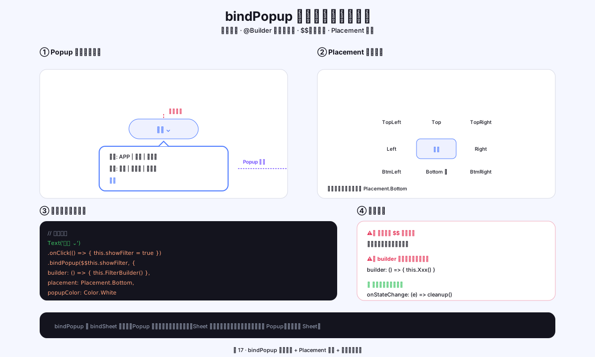
图1:bindPopup 锚点定位原理 + Placement 九宫格方位枚举
二、bindPopup 概述
2.1 bindPopup vs bindSheet 的选择
| 特性 | bindPopup | bindSheet |
|---|---|---|
| 显示位置 | 触发元素附近(气泡) | 屏幕底部 |
| 遮挡内容 | 部分遮挡(小区域) | 遮挡大部分屏幕 |
| 适合内容 | 少量选项(筛选、快捷操作) | 大量内容(列表选择) |
| 关闭方式 | 点击外部自动关闭 | 下滑或点击完成关闭 |
| 号码助手使用 | 首页筛选面板 | AddAppPage 卡号选择 |
2.2 基本语法
// 绑定在触发元素上
Button('筛选')
  .bindPopup(this.showPopup, {
    builder: this.PopupContent,     // @Builder 方法
    placement: Placement.Bottom,    // 弹出位置
    popupColor: '#FFFFFF',          // 气泡背景色
    onStateChange: (e) => {
      if (!e.isVisible) { this.showPopup = false }
    }
  })
  .onClick(() => { this.showPopup = !this.showPopup })
三、bindPopup 参数详解
3.1 完整参数
interface PopupOptions {
  builder?: CustomBuilder           // 自定义内容(@Builder 方法)
  placement?: Placement             // 弹出方向
  popupColor?: ResourceColor        // 气泡背景色
  autoCancel?: boolean              // 点击外部是否自动关闭(默认 true)
  offset?: { x: number, y: number } // 弹出偏移
  onStateChange?: (e: { isVisible: boolean }) => void  // 状态变化回调
  arrowOffset?: number              // 箭头偏移
  showInSubWindow?: boolean         // 是否在子窗口显示
  maskColor?: ResourceColor         // 遮罩颜色
  enableArrow?: boolean             // 是否显示箭头(默认 true)
}
3.2 Placement 弹出位置
// 可用的 Placement 枚举值
Placement.Top          // 触发元素上方
Placement.Bottom       // 触发元素下方(号码助手使用)✅
Placement.Left         // 触发元素左侧
Placement.Right        // 触发元素右侧
Placement.TopLeft      // 上方偏左
Placement.TopRight     // 上方偏右
Placement.BottomLeft   // 下方偏左
Placement.BottomRight  // 下方偏右

// ❌ 注意:Placement.BottomEnd 不存在!
// 正确使用 Placement.Bottom + 通过 offset 微调位置
四、首页筛选面板完整实现
4.1 触发按钮
// HomePage.ets — 筛选按钮
Row({ space: 3 }) {
  Text(this.activeFilterCount() > 0 ? `已选 ${this.activeFilterCount()}` : '全部')
    .fontSize(12)
    .fontWeight(AppFonts.WEIGHT_SEMIBOLD)
    .fontColor(this.activeFilterCount() > 0 ? '#3E68E0' : AppColors.TEXT_2)
  Text('⌄')
    .fontSize(10)
    .fontColor(this.activeFilterCount() > 0 ? '#3E68E0' : AppColors.TEXT_3)
}
.padding({ left: 11, right: 11, top: 6, bottom: 6 })
.backgroundColor(this.activeFilterCount() > 0 ? AppColors.PRIMARY_BG : AppColors.CARD_B)
.border({
  width: 1,
  color: this.activeFilterCount() > 0 ? '#4D4F7CFF' : AppColors.LINE,
  radius: 14
})
// ← bindPopup 绑定
.bindPopup(this.showFilter, {
  builder: this.FilterPopoverBuilder,
  placement: Placement.Bottom,
  popupColor: '#FFFFFF',
  onStateChange: (e) => {
    if (!e.isVisible) { this.showFilter = false }   // 点外部关闭时同步状态
  }
})
.onClick(() => { this.showFilter = !this.showFilter })
4.2 @Builder 筛选面板内容
@Builder
private FilterPopoverBuilder() {
  Column() {
    // ── 分类筛选 ──
    Column() {
      Text('分类')
        .fontSize(11).fontColor(AppColors.TEXT_3).fontWeight(AppFonts.WEIGHT_SEMIBOLD)
        .alignSelf(ItemAlign.Start).margin({ bottom: 8 })
      Flex({ wrap: FlexWrap.Wrap }) {
        ForEach(CATEGORIES, (cat: string, idx: number) => {
          Text(cat)
            .fontSize(12).fontWeight(AppFonts.WEIGHT_MEDIUM)
            .fontColor(this.filterCatIdx === idx ? '#FFFFFF' : AppColors.TEXT_2)
            .padding({ left: 12, right: 12, top: 6, bottom: 6 })
            .backgroundColor(this.filterCatIdx === idx ? AppColors.PRIMARY : AppColors.CARD_B)
            .border({
              width: 1,
              color: this.filterCatIdx === idx ? '#00000000' : AppColors.LINE,
              radius: 14
            })
            .margin({ right: 6, bottom: 6 })
            .onClick(() => { this.filterCatIdx = idx })
        }, (cat: string) => cat)
      }
    }
    .margin({ bottom: 14 }).alignItems(HorizontalAlign.Start)

    // ── 卡号筛选 ──
    Column() {
      Text('卡号')
        .fontSize(11).fontColor(AppColors.TEXT_3).fontWeight(AppFonts.WEIGHT_SEMIBOLD)
        .alignSelf(ItemAlign.Start).margin({ bottom: 8 })
      Flex({ wrap: FlexWrap.Wrap }) {
        // 「全部」选项
        Text('全部')
          .fontSize(12).fontWeight(AppFonts.WEIGHT_MEDIUM)
          .fontColor(this.filterCardIdx === 0 ? '#FFFFFF' : AppColors.TEXT_2)
          .padding({ left: 12, right: 12, top: 6, bottom: 6 })
          .backgroundColor(this.filterCardIdx === 0 ? AppColors.PRIMARY : AppColors.CARD_B)
          .border({ width: 1, color: this.filterCardIdx === 0 ? '#00000000' : AppColors.LINE, radius: 14 })
          .margin({ right: 6, bottom: 6 })
          .onClick(() => { this.filterCardIdx = 0 })
        // 各卡号选项
        ForEach(this.cards, (card: CardEntity, idx: number) => {
          Text(card.label)
            .fontSize(12).fontWeight(AppFonts.WEIGHT_MEDIUM)
            .fontColor(this.filterCardIdx === idx + 1 ? '#FFFFFF' : AppColors.TEXT_2)
            .padding({ left: 12, right: 12, top: 6, bottom: 6 })
            .backgroundColor(this.filterCardIdx === idx + 1 ? AppColors.PRIMARY : AppColors.CARD_B)
            .border({ width: 1, color: this.filterCardIdx === idx + 1 ? '#00000000' : AppColors.LINE, radius: 14 })
            .margin({ right: 6, bottom: 6 })
            .onClick(() => { this.filterCardIdx = idx + 1 })
        }, (card: CardEntity) => `fc_${card.id ?? 0}`)
      }
    }
    .margin({ bottom: 14 }).alignItems(HorizontalAlign.Start)

    // ── 状态筛选 ──
    Column() {
      Text('状态')
        .fontSize(11).fontColor(AppColors.TEXT_3).fontWeight(AppFonts.WEIGHT_SEMIBOLD)
        .alignSelf(ItemAlign.Start).margin({ bottom: 8 })
      Flex({ wrap: FlexWrap.Wrap }) {
        ForEach(STATUS_FILTERS, (s: string, idx: number) => {
          Text(s)
            .fontSize(12).fontWeight(AppFonts.WEIGHT_MEDIUM)
            .fontColor(this.filterStatIdx === idx ? '#FFFFFF' : AppColors.TEXT_2)
            .padding({ left: 12, right: 12, top: 6, bottom: 6 })
            .backgroundColor(this.filterStatIdx === idx ? AppColors.PRIMARY : AppColors.CARD_B)
            .border({ width: 1, color: this.filterStatIdx === idx ? '#00000000' : AppColors.LINE, radius: 14 })
            .margin({ right: 6, bottom: 6 })
            .onClick(() => { this.filterStatIdx = idx })
        }, (s: string) => s)
      }
    }
    .margin({ bottom: 12 }).alignItems(HorizontalAlign.Start)

    // ── 底部按钮 ──
    Row({ space: 8 }) {
      Button('重置', { type: ButtonType.Normal })
        .layoutWeight(1).height(36).fontSize(12)
        .fontColor(AppColors.TEXT).backgroundColor(AppColors.CARD_B)
        .border({ width: 1, color: AppColors.LINE, radius: 10 })
        .onClick(() => this.resetFilters())
      Button('完成', { type: ButtonType.Normal })
        .layoutWeight(1).height(36).fontSize(12)
        .fontColor('#FFFFFF').borderRadius(10)
        .linearGradient({ angle: 135, colors: [[AppColors.PRIMARY, 0], [AppColors.PRIMARY_2, 1]] })
        .backgroundColor(Color.Transparent)
        .onClick(() => { this.showFilter = false })
    }
  }
  .width(220)
  .padding(14)
}
五、Flex + FlexWrap 实现 Chip 布局
5.1 FlexWrap 自动换行
// Chip 标签自动换行布局(筛选选项数量不固定时很有用)
Flex({ wrap: FlexWrap.Wrap }) {
  Text('分类1').margin({ right: 6, bottom: 6 })
  Text('分类2').margin({ right: 6, bottom: 6 })
  Text('分类3').margin({ right: 6, bottom: 6 })
  // 超过一行时自动换行
}

// 关键参数:
// FlexWrap.Wrap:允许换行(默认 NoWrap 不换行)
// margin.right:chip 之间的水平间距
// margin.bottom:行与行之间的垂直间距
5.2 与 Row 的区别
// Row:固定单行,不自动换行(内容超出时裁剪)
Row({ space: 6 }) {
  Text('分类1')
  Text('分类2')
  Text('分类3')
}

// Flex + wrap:多行自动换行(适合数量不固定的标签)
Flex({ wrap: FlexWrap.Wrap }) {
  Text('分类1').margin(...)
  Text('分类2').margin(...)
  Text('分类3').margin(...)
}
六、筛选状态管理
6.1 筛选条件计数
private activeFilterCount(): number {
  let n = 0
  if (this.filterCatIdx !== 0) n++   // 非「全部」时 +1
  if (this.filterCardIdx !== 0) n++
  if (this.filterStatIdx !== 0) n++
  return n
}
6.2 筛选重置
private resetFilters(): void {
  this.filterCatIdx = 0
  this.filterCardIdx = 0
  this.filterStatIdx = 0
  this.showFilter = false    // 重置后关闭面板
}
6.3 三维过滤逻辑
private getFilteredRows(): AppRow[] {
  return this.rows.filter((r: AppRow) => {
    const catOk = this.filterCatIdx === 0 ||
      r.binding.category === CATEGORIES[this.filterCatIdx]
    const cardOk = this.filterCardIdx === 0 ||
      r.cardLabel === this.cards[this.filterCardIdx - 1]?.label
    const statOk = this.filterStatIdx === 0 ||
      r.binding.status === STATUS_FILTERS[this.filterStatIdx]
    return catOk && cardOk && statOk
  })
}
七、本篇小结
| 知识点 | 核心要点 |
|---|---|
| bindPopup | 气泡弹出,适合小型筛选面板 |
| Placement.Bottom | 在触发元素下方弹出 |
| onStateChange | 点击外部关闭时同步 @State |
| Flex + FlexWrap.Wrap | 标签自动换行(chip 布局) |
| 筛选三维度 | 分类/卡号/状态独立过滤,AND 关系 |
参考资料
- 鸿蒙应用开发实战【05】— 首页开发与状态管理
- 鸿蒙应用开发实战【16】— bindSheet 底部弹出面板
- bindPopup API 参考
- Placement 枚举
- Flex 容器
- FlexWrap 说明
- @Builder 装饰器
- Button 组件
如果这篇文章对你有帮助,欢迎点赞👍、收藏⭐、关注🔔,你的支持是我持续创作的动力!
相关资源:

作为“人工智能6S店”的官方数字引擎,为AI开发者与企业提供一个覆盖软硬件全栈、一站式门户。
更多推荐
 0
0 0
0- 0


 已为社区贡献15条内容

所有评论(0)