
鸿蒙应用开发实战【15】— LinearGradient 线性渐变在 ArkUI 中的应用
·
鸿蒙应用开发实战【15】— LinearGradient 线性渐变在 ArkUI 中的应用
前言
欢迎加入开源鸿蒙跨平台社区:https://openharmonycrossplatform.csdn.net
渐变色是现代移动应用 UI 中最常见的视觉元素之一。在号码助手中,FAB 悬浮按钮、添加应用按钮、AvatarBadge 头像徽标都使用了线性渐变。ArkUI 的 linearGradient 属性与 CSS 的 linear-gradient 功能高度相似,但有一些细节差异需要了解。
ArkUI 与 CSS 的关键差异:ArkUI 的
angle参数方向体系与 CSS 不同。CSS 的0deg是从下到上,ArkUI 的0也是从下到上,两者一致!但多色渐变的颜色停止点位置定义略有不同。
本篇全面讲解 ArkUI 中 linearGradient 的用法和最佳实践。
一、渐变预览图
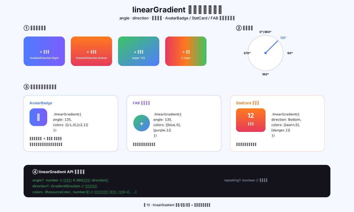
图1:linearGradient 四种基本方向 + 角度罗盘 + AvatarBadge/FAB/StatCard 三大应用场景
二、linearGradient 基本语法
2.1 参数结构
.linearGradient({
  angle: number | Direction,     // 渐变方向(角度或枚举)
  direction?: GradientDirection, // 方向枚举(与 angle 二选一)
  colors: Array<[ColorType, number]>,  // 色值数组:[颜色, 位置(0-1)]
  repeating?: boolean            // 是否重复(默认 false)
})
2.2 angle 角度说明
| angle 值 | 渐变方向 | 对应 CSS |
|---|---|---|
| 0 | 从下到上(↑) | to top |
| 45 | 从右下到左上(↖) | to top left |
| 90 | 从右到左(←) | to left |
| 135 | 从右上到左下(↙) | to bottom left |
| 180 | 从上到下(↓) | to bottom |
| 225 | 从左上到右下(↘) | to bottom right |
| 270 | 从左到右(→) | to right |
| 315 | 从左下到右上(↗) | to top right |
ArkUI 与 CSS 角度体系不同:ArkUI 的 0° 是从下到上,CSS 的 0deg 也是从下到上,两者一致!但 ArkUI 使用
angle: 135对应的视觉方向与 CSSlinear-gradient(135deg, ...)方向一致。
三、号码助手中的渐变应用
3.1 FAB 添加应用按钮(蓝紫渐变)
// 首页 FAB 悬浮按钮
Row({ space: 4 }) {
  Text('+').fontColor('#FFFFFF').fontWeight(800)
  Text('添加应用').fontColor('#FFFFFF')
}
.padding({ left: 20, right: 20, top: 13, bottom: 13 })
.borderRadius(24)
.linearGradient({
  angle: 135,                              // 左上→右下斜向渐变
  colors: [
    [AppColors.PRIMARY, 0],               // 起点:蓝色 #4F7CFF
    [AppColors.PRIMARY_2, 1]              // 终点:紫色 #7C5CFF
  ]
})
.shadow({ radius: 22, color: '#524F7CFF', offsetY: 10 })  // 彩色阴影
3.2 空状态添加按钮(同款渐变)
// 首页空状态的添加应用按钮
Row({ space: 4 }) {
  Text('+').fontSize(14).fontColor('#FFFFFF').fontWeight(AppFonts.WEIGHT_SEMIBOLD)
  Text('添加应用').fontSize(13).fontColor('#FFFFFF')
}
.layoutWeight(1)
.height(46)
.justifyContent(FlexAlign.Center)
.borderRadius(24)
.linearGradient({
  angle: 135,
  colors: [[AppColors.PRIMARY, 0], [AppColors.PRIMARY_2, 1]]
})
.shadow({ radius: 22, color: '#524F7CFF', offsetY: 10 })
3.3 AvatarBadge 头像渐变
// AvatarBadge.ets 中的渐变背景
.linearGradient({
  angle: 135,
  colors: [
    [this.colorStart, 0],    // 起点颜色(可与终点相同=纯色)
    [this.colorEnd, 1]       // 终点颜色
  ]
})
四、多色渐变
4.1 三色渐变示例
// 三色彩虹渐变
.linearGradient({
  angle: 90,    // 从右到左
  colors: [
    ['#FF2E4D', 0],      // 起点:红
    ['#FF7A1E', 0.5],    // 中点(50%处):橙
    ['#4F7CFF', 1]       // 终点:蓝
  ]
})
4.2 带不透明度的渐变
// 渐变从实色到透明(常用于渐隐效果)
.linearGradient({
  angle: 180,   // 从上到下
  colors: [
    ['#FFFFFFFF', 0],    // 起点:完全不透明白色
    ['#00FFFFFF', 1]     // 终点:完全透明(渐隐)
  ]
})
4.3 号码助手卡片渐变扩展
// AppColors.cardGradient() 方法
static cardGradient(colorKey: string): [string, string] {
  switch (colorKey) {
    case 'blue':   return [AppColors.PRIMARY, AppColors.PRIMARY_2]    // 蓝→紫
    case 'green':  return ['#3CC463', '#6BE28E']                       // 深绿→浅绿
    case 'pink':   return ['#FF2E4D', '#FF7A90']                       // 深红→浅红
    case 'orange': return ['#FF7A1E', '#FFB067']                       // 深橙→浅橙
    case 'purple': return ['#7B61FF', '#9B85FF']                       // 深紫→浅紫
    default:       return [AppColors.PRIMARY, AppColors.PRIMARY_2]
  }
}

// 使用
const [start, end] = AppColors.cardGradient(card.color)
AvatarBadge({ colorStart: start, colorEnd: end })
五、其他渐变类型
5.1 sweepGradient(扫描/角度渐变)
// 扫描渐变:以中心点为圆心,按角度分布颜色
.sweepGradient({
  center: [0.5, 0.5],    // 中心点(相对坐标,0.5=50%处)
  start: 0,              // 起始角度(度)
  end: 360,              // 结束角度(度)
  colors: [
    ['#4F7CFF', 0],
    ['#7C5CFF', 0.5],
    ['#4F7CFF', 1]
  ]
})
5.2 radialGradient(径向/放射渐变)
// 径向渐变:从中心向外辐射
.radialGradient({
  center: [0.5, 0.5],    // 圆心位置
  radius: 0.8,           // 半径(相对单位)
  colors: [
    ['#FFFFFF', 0],      // 中心:白色
    ['#4F7CFF', 1]       // 边缘:蓝色
  ]
})
六、渐变与 backgroundColor 的优先级
6.1 覆盖关系
// 同时设置 backgroundColor 和 linearGradient 时,linearGradient 优先
Row()
  .backgroundColor('#FF0000')   // 红色(被覆盖)
  .linearGradient({             // 渐变(生效)
    angle: 135,
    colors: [['#4F7CFF', 0], ['#7C5CFF', 1]]
  })
// 结果:显示蓝紫渐变,红色被完全覆盖
6.2 最佳实践:不混用
// ✅ 只用 backgroundColor(纯色)
.backgroundColor(AppColors.CARD)

// ✅ 只用 linearGradient(渐变)
.linearGradient({ angle: 135, colors: [[AppColors.PRIMARY, 0], [AppColors.PRIMARY_2, 1]] })

// ❌ 不要同时设置两者(backgroundColor 会被忽略,造成困惑)
.backgroundColor('#FF0000')
.linearGradient({ ... })
七、渐变按钮完整封装
7.1 GradientButton 通用组件
// 封装一个通用渐变按钮组件
@Component
struct GradientButton {
  @Prop label: string = '按钮'
  @Prop colorStart: string = '#4F7CFF'
  @Prop colorEnd: string = '#7C5CFF'
  @Prop height: number = 46
  onTap?: () => void

  build() {
    Row() {
      Text(this.label)
        .fontSize(14)
        .fontWeight(600)
        .fontColor('#FFFFFF')
    }
    .width('100%')
    .height(this.height)
    .justifyContent(FlexAlign.Center)
    .borderRadius(this.height / 2)    // 圆角 = 高度/2 → 完全圆润
    .linearGradient({
      angle: 135,
      colors: [[this.colorStart, 0], [this.colorEnd, 1]]
    })
    .shadow({
      radius: 20,
      color: `${this.colorStart}52`,  // 阴影颜色 = 渐变起始色 + 32% 透明度
      offsetY: 8
    })
    .onClick(() => {
      if (this.onTap) { this.onTap() }
    })
  }
}
八、性能注意事项
8.1 渐变的 GPU 加速
// linearGradient 由 GPU 渲染,性能优于图片背景
// 不需要额外优化,可以在 ForEach 中大量使用

// 但如果同一渐变出现在非常多的地方,考虑封装为组件
// 避免相同渐变参数重复书写
8.2 动态渐变
// 渐变颜色变化时会重新计算,有少量 GPU 重绘开销
// 对于静态渐变(参数不变),ArkUI 自动缓存
@State gradientAngle: number = 135
// 动态修改 gradientAngle → 触发渐变重绘
九、本篇小结
| 知识点 | 核心要点 |
|---|---|
| angle | 0°=上,90°=左,135°=斜向(号码助手全部使用 135°) |
| colors | 数组,每项 [颜色字符串, 0-1位置] |
| 多色渐变 | 可有 3 个以上色值,中间值指定位置 |
| 与 backgroundColor | 两者不混用,linearGradient 优先级更高 |
| 彩色阴影 | shadow.color 使用渐变起始色+透明度,增强立体感 |
参考资料
- 鸿蒙应用开发实战【11】— AvatarBadge 组件
- 鸿蒙应用开发实战【14】— 毛玻璃卡片颜色格式深度解析
- linearGradient API
- sweepGradient API
- radialGradient API
- shadow 属性
- 颜色类型参考
- CSS linear-gradient MDN
- HarmonyOS 视觉效果指南
- @Component 自定义组件
- @Builder 装饰器
如果这篇文章对你有帮助,欢迎点赞👍、收藏⭐、关注🔔,你的支持是我持续创作的动力!
相关资源:

作为“人工智能6S店”的官方数字引擎,为AI开发者与企业提供一个覆盖软硬件全栈、一站式门户。
更多推荐


 1
1 0
0- 0


 已为社区贡献15条内容

所有评论(0)