
鸿蒙应用开发实战【13】— AppListItem 应用列表行组件完整实现
·
鸿蒙应用开发实战【13】— AppListItem 应用列表行组件完整实现
前言
欢迎加入开源鸿蒙跨平台社区:https://openharmonycrossplatform.csdn.net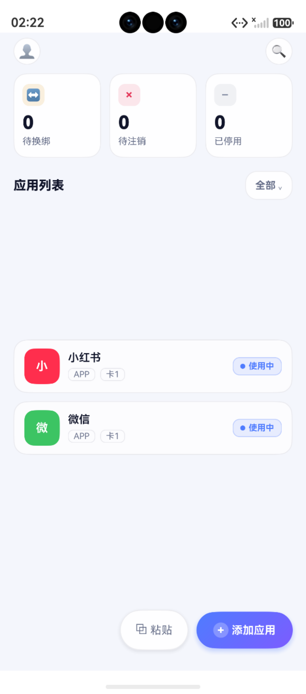
AppListItem 是号码助手中使用频率最高的组件,出现在首页应用列表、状态筛选页、搜索结果页、卡号详情页等多处。它组合了 AvatarBadge(头像)和 StatusBadge(状态标签),并处理了子组件中安全导航这个 ArkTS 的关键难题。
核心难点:子组件(非 @Entry)中使用
router.pushUrl时,需要处理 NavigationStack 不可用的问题。AppListItem 采用AppStorage+try/catch双保险方案解决。
本篇完整讲解 AppListItem 的设计与实现,包括三列弹性布局、布局权重分配、条件渲染、毛玻璃卡片样式等关键技术点。
一、AppListItem 组件预览
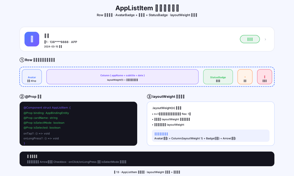
图1:AppListItem Row 弹性布局,左-中-右三列结构解析,layoutWeight 自适应
二、功能分析
2.1 视觉结构
AppListItem 采用经典的三列布局:
┌─────────────────────────────────────────────────────┐
│  ┌──────┐  应用名称                    ┌──────────┐  │
│  │ 头像 │  ──────────                 │  使用中  │  │
│  │ 图标 │  APP  · 主卡               └──────────┘  │
│  └──────┘                                           │
└─────────────────────────────────────────────────────┘
三列布局分工如下:
- 左列:
AvatarBadge(固定 42vp) - 中列:应用名 + 分类标签 + 卡号标签(弹性,占用剩余空间)
- 右列:
StatusBadge(自适应内容宽度)
2.2 @Prop 参数设计
| 参数 | 类型 | 默认值 | 说明 |
|---|---|---|---|
| appName | string | ‘’ | 应用名称(显示首字作为头像) |
| iconColor | string | ‘#4F7CFF’ | 头像背景颜色(hex) |
| category | string | ‘APP’ | 应用分类(APP/网站/小程序) |
| cardLabel | string | ‘’ | 关联卡号标签(可为空) |
| status | string | ‘使用中’ | 绑定状态 |
| bindingId | number | 0 | 绑定记录 ID(用于跳转详情) |
三、完整实现代码
3.1 组件定义
// common/components/AppListItem.ets
import { promptAction, router } from '@kit.ArkUI'
import { AppColors } from '../theme/AppColors'
import { AppFonts } from '../theme/AppFonts'
import { AvatarBadge } from './AvatarBadge'
import { StatusBadge } from './StatusBadge'

/**
 * 应用绑定列表行 — 对应设计稿 app-item
 * 复用场景:首页列表 / 状态筛选页 / 卡号详情 / 搜索页
 *
 * 导航说明:因子组件不能可靠地使用 getUIContext().getRouter(),
 * 改用直接 import router + try/catch + AppStorage 双保险传参
 */
@Component
export struct AppListItem {
  @Prop appName: string = ''
  @Prop iconColor: string = '#4F7CFF'
  @Prop category: string = 'APP'
  @Prop cardLabel: string = ''          // 空字符串时不显示卡号标签
  @Prop status: string = '使用中'
  @Prop bindingId: number = 0           // ≤0 时表示数据异常

  build() {
    Row() {
      // ── 左列:头像图标 ──
      AvatarBadge({
        text: this.appName.slice(0, 1),   // 应用名首字
        colorStart: this.iconColor,
        colorEnd: this.iconColor,          // 单色(不渐变)
        badgeSize: 42,
        radius: 12,
        fontSize: 14
      })

      // ── 中列:应用名 + 元数据标签 ──
      Column() {
        // 应用名称
        Text(this.appName)
          .fontSize(AppFonts.SIZE_BODY)
          .fontWeight(AppFonts.WEIGHT_MEDIUM)
          .fontColor(AppColors.TEXT)
          .maxLines(1)
          .textOverflow({ overflow: TextOverflow.Ellipsis })

        // 分类标签 + 卡号标签(水平排列)
        Row({ space: 6 }) {
          // 分类标签(始终显示)
          Text(this.category)
            .fontSize(AppFonts.SIZE_MINI)
            .fontColor(AppColors.TEXT_2)
            .border({ width: 1, color: AppColors.LINE, radius: 6 })
            .padding({ left: 6, right: 6, top: 1, bottom: 1 })

          // 卡号标签(只在有卡号时显示)
          if (this.cardLabel.length > 0) {
            Text(this.cardLabel)
              .fontSize(AppFonts.SIZE_MINI)
              .fontColor(AppColors.TEXT_2)
              .border({ width: 1, color: AppColors.LINE, radius: 6 })
              .padding({ left: 6, right: 6, top: 1, bottom: 1 })
          }
        }
        .margin({ top: 5 })
      }
      .alignItems(HorizontalAlign.Start)   // 左对齐
      .layoutWeight(1)                      // 弹性拉伸,占用剩余空间
      .margin({ left: 10 })               // 与头像的间距

      // ── 右列:状态徽标 ──
      StatusBadge({ status: this.status })
    }
    .width('100%')
    .padding({ top: 10, bottom: 10, left: 12, right: 12 })
    .backgroundColor(AppColors.CARD)        // 毛玻璃卡片背景
    .border({ width: 1, color: AppColors.LINE, radius: 16 })
    .margin({ bottom: 10 })               // 列表项间距
    .onClick(() => {
      if (this.bindingId <= 0) {
        promptAction.showToast({ message: '数据异常,请刷新后重试' })
        return
      }
      try {
        // 双保险传参:AppStorage 是主通道,router params 是备用
        AppStorage.setOrCreate<number>('current_binding_id', this.bindingId)
        router.pushUrl({
          url: 'pages/AppDetailPage',
          params: { bindingId: this.bindingId }
        })
      } catch (err) {
        console.error('[AppListItem] 跳转失败:', JSON.stringify(err))
        promptAction.showToast({ message: '打开失败,请重试' })
      }
    })
  }
}
3.2 组件组合关系
// 组件依赖链
AppListItem
├── AvatarBadge          // 左侧头像
│   ├── @Prop text
│   ├── @Prop colorStart/colorEnd
│   ├── @Prop badgeSize/radius/fontSize
│   └── linearGradient + Text
├── Column(中间文本区)
│   ├── Text(应用名)
│   ├── Row
│   │   ├── Text(分类标签)
│   │   └── Text(卡号标签,条件渲染)
│   └── layoutWeight(1)
└── StatusBadge           // 右侧状态徽标
    └── @Prop status
四、layoutWeight 弹性布局详解
4.1 什么是 layoutWeight
// layoutWeight 的作用:
// 在 Row 中,将剩余空间按比例分配给设置了 layoutWeight 的子组件

Row() {
  // 左列:固定宽度 42vp(AvatarBadge 内部 .width(badgeSize))
  AvatarBadge({ badgeSize: 42 })

  // 中列:layoutWeight(1) → 占用 Row 剩余宽度的全部(=总宽 - 42 - StatusBadge宽)
  Column() { ... }
  .layoutWeight(1)

  // 右列:StatusBadge 自适应内容宽度(Text 的宽度)
  StatusBadge({ ... })
}
4.2 多 layoutWeight 按比例分配
Row() {
  Column().layoutWeight(1)    // 占剩余空间的 1/3
  Column().layoutWeight(2)    // 占剩余空间的 2/3
}
// 如果 Row 总宽 = 300vp,则第一个 Column = 100vp,第二个 = 200vp
4.3 与 flexGrow 的区别
| 属性 | 适用场景 | 语法 |
|---|---|---|
| layoutWeight | ArkUI Row/Column | .layoutWeight(1) |
| flexGrow | Flex 容器 | .flexGrow(1) |
| width(‘100%’) | 铺满父容器 | .width('100%') |
推荐:在 ArkUI 的 Row 中使用
layoutWeight,在 Flex 容器中使用flexGrow。前者更简洁直观。
五、条件渲染:卡号标签的显示逻辑
5.1 if 条件渲染
// 只在有卡号时显示卡号标签
if (this.cardLabel.length > 0) {
  Text(this.cardLabel)
    .fontSize(AppFonts.SIZE_MINI)
    // ...
}
ArkUI 的 if 语句在 build() 中有特殊语义:
- 条件为 true → 创建并渲染该节点
- 条件变为 false → 销毁该节点(不是隐藏,是移除)
- 条件再变为 true → 重新创建节点
5.2 visibility vs if 的选择
// 方案A:if(节点不存在)—— AppListItem 采用
if (this.cardLabel.length > 0) {
  Text(this.cardLabel)   // 无卡号时,DOM 中没有这个节点
}

// 方案B:visibility(节点存在但不可见)
Text(this.cardLabel)
  .visibility(this.cardLabel.length > 0 ? Visibility.Visible : Visibility.None)
  // 节点始终存在,只是隐藏

// 选择原则:
// - 内容频繁切换 → Visibility(避免频繁创建销毁)
// - 初始值确定后很少变化 → if(节省内存)
// - AppListItem 的 @Prop 不变 → 选 if
六、毛玻璃卡片样式
6.1 卡片样式参数
// AppListItem 的卡片效果
.backgroundColor(AppColors.CARD)       // #B8FFFFFF(72% 透明白色)
.border({ width: 1, color: AppColors.LINE, radius: 16 })
// LINE = #14141E3C(8% 透明深色边框)
.margin({ bottom: 10 })               // 列表项间距 10vp
6.2 毛玻璃效果原理
卡片背景 = rgba(255,255,255,0.72) 半透明白色
    ↓ 叠加在页面背景(#F4F6FB 蓝灰色)之上
    ↓ 显示效果 = 略带蓝灰色调的半透明白色(毛玻璃)

加上 1px 淡色边框:增加卡片的轮廓感
加上 16vp 圆角:增加柔和感
七、在 ForEach 中使用 AppListItem
7.1 首页的完整用法
// HomePage.ets 中的 ForEach + AppListItem
Scroll() {
  Column() {
    ForEach(this.getFilteredRows(), (row: AppRow) => {
      AppListItem({
        appName: row.binding.app_name,
        iconColor: row.binding.icon_key,
        category: row.binding.category,
        cardLabel: row.cardLabel,          // cardLabelMap 中查找的卡号标签
        status: row.binding.status,
        bindingId: row.binding.id ?? 0     // ?? 0 确保不传 undefined
      })
    }, (row: AppRow) => `binding_${row.binding.id ?? 0}_${row.binding.status}`)
    //  ↑ key 函数:id + status 组合,精确识别需要更新的项
    Text('').height(90)   // 底部留空,避免 FAB 遮挡最后一项
  }
  .padding({ left: 16, right: 16 })
}
.layoutWeight(1)
7.2 key 函数设计思路
// key 函数决定 ForEach 如何复用已有节点

// ❌ 只用 id:状态改变时不重渲染(无法感知 status 变化)
(row: AppRow) => `${row.binding.id ?? 0}`

// ❌ 只用 index:删除中间项时后续全部重渲染
(row: AppRow, index: number) => `${index}`

// ✅ id + 关键状态:精确且高效
(row: AppRow) => `binding_${row.binding.id ?? 0}_${row.binding.status}`
// 当 status 变化(如从"使用中"改为"待换绑"),该 item 重新渲染
// 当 id 不变 status 不变,复用已有节点
八、本篇小结
| 知识点 | 核心要点 |
|---|---|
| Row 三列布局 | 固定宽 + layoutWeight(1) + 自适应宽 |
| layoutWeight | 弹性分配 Row/Column 剩余空间 |
| if 条件渲染 | 节点创建/销毁,适合静态条件 |
| AppStorage 传参 | 子组件导航的主通道,比 router.params 更可靠 |
| ForEach key | id + status 组合,精确渲染控制 |
| 毛玻璃卡片 | #B8FFFFFF + 1px 淡边框 + 16vp 圆角 |
参考资料
- 鸿蒙应用开发实战【08】— AppStorage 全局状态与跨页面通信
- 鸿蒙应用开发实战【11】— AvatarBadge 组件
- 鸿蒙应用开发实战【12】— StatusBadge 组件
- 鸿蒙应用开发实战【14】— 毛玻璃卡片颜色格式深度解析
- Row 容器
- layoutWeight 属性
- ForEach 渲染控制
- visibility 属性
- textOverflow 属性
如果这篇文章对你有帮助,欢迎点赞👍、收藏⭐、关注🔔,你的支持是我持续创作的动力!
相关资源:
- 开源鸿蒙跨平台社区:https://openharmonycrossplatform.csdn.net
- Row 布局参考:https://developer.huawei.com/consumer/cn/doc/harmonyos-references/ts-container-row
- ForEach 使用指南:https://developer.huawei.com/consumer/cn/doc/harmonyos-guides/arkts-rendering-control-foreach
- @Component 开发指南:https://developer.huawei.com/consumer/cn/doc/harmonyos-guides/arkts-create-custom-components
- BorderRadius API:https://developer.huawei.com/consumer/cn/doc/harmonyos-references/ts-universal-attributes-border

作为“人工智能6S店”的官方数字引擎,为AI开发者与企业提供一个覆盖软硬件全栈、一站式门户。
更多推荐


 1
1 0
0- 0


 已为社区贡献15条内容

所有评论(0)