
Row 等分布局:多个子项平分宽度 —— 鸿蒙 HarmonyOS ArkTS 原生学习指南
项目演示
目录
- 概述
- Flex 布局基础原理
- flexWeight 属性详解
- 百分比宽度等分布局
- 等分布局的常见模式
- 动态子项数量的等分布局
- 等分布局与间距控制
- 嵌套等分布局
- 性能优化策略
- 常见问题与解决方案
- 实战案例:复杂布局场景
- 总结与最佳实践
1. 概述
在鸿蒙 HarmonyOS ArkTS 开发中,Row 布局是最常用的水平布局容器之一。等分布局是指多个子组件在 Row 中平均分配可用宽度的布局方式,这是 UI 开发中非常常见的需求场景。
1.1 等分布局的应用场景
- 导航栏 Tab 切换:多个 Tab 项平均分布在导航栏中
- 功能入口网格:首页多个功能图标等宽排列
- 表单按钮组:确认、取消等按钮等宽显示
- 数据统计卡片:多个统计项并列展示
- 底部导航栏:多个导航图标等分宽度
1.2 等分布局的实现方式
在 HarmonyOS ArkTS 中,实现等分布局主要有以下几种方式:
| 方式 | 核心属性 | 适用场景 | 灵活性 |
|---|---|---|---|
| flexWeight | .flexWeight(n) |
动态分配剩余空间 | 高 |
| 百分比宽度 | .width('25%') |
固定比例分配 | 中 |
| 固定宽度 | .width(100) |
已知宽度场景 | 低 |
| Grid 布局 | Grid() |
复杂网格布局 | 高 |
1.3 API 版本要求
本文基于 HarmonyOS API 24(HarmonyOS NEXT)进行讲解,所有示例代码均符合 API 24 的语法规范。
2. Flex 布局基础原理
要理解等分布局,首先需要掌握 Flex 布局的基本原理。Row 组件本质上是一个水平方向的 Flex 容器。
2.1 Flex 布局的核心概念
2.1.1 主轴与交叉轴
- 主轴(Main Axis):Row 的主轴方向为水平方向(从左到右)
- 交叉轴(Cross Axis):Row 的交叉轴方向为垂直方向(从上到下)
2.1.2 布局属性分类
| 属性类别 | 控制方向 | 主要属性 |
|---|---|---|
| 主轴对齐 | 水平方向 | justifyContent |
| 交叉轴对齐 | 垂直方向 | alignItems |
| 子项空间分配 | 水平方向 | flexWeight |
| 子项换行 | 水平方向 | flexWrap |
2.2 Row 组件的默认行为
@Entry
@Component
struct RowDefaultBehavior {
  build() {
    Row() {
      Text('项目1')
        .backgroundColor('#FF6B6B')
        .padding(10)

      Text('项目2')
        .backgroundColor('#4ECDC4')
        .padding(10)

      Text('项目3')
        .backgroundColor('#45B7D1')
        .padding(10)
    }
    .width('100%')
    .height(100)
    .backgroundColor('#F5F5F5')
  }
}
默认行为分析:
- 子组件按内容宽度排列,不会自动扩展
- 子组件之间没有间距
- 如果内容总宽度超过 Row 宽度,会溢出或压缩
2.3 开启等分布局的关键
要实现等分布局,需要让子组件能够"抢占"剩余空间。这主要通过以下两种方式实现:
- 设置
flexWeight属性:让子组件按权重比例分配剩余空间 - 设置百分比宽度:让子组件按固定百分比占据父容器宽度
3. flexWeight 属性详解
flexWeight 是实现等分布局最核心的属性,它决定了子组件在剩余空间中的分配比例。
3.1 flexWeight 的工作原理
当 Row 中有多个子组件设置了 flexWeight 时,布局引擎会:
- 计算总权重:将所有子组件的
flexWeight值相加 - 计算可用空间:Row 宽度 - 所有子组件的固定宽度 - 子组件间距
- 按比例分配:每个子组件获得的额外空间 = 可用空间 × (子组件权重 / 总权重)
- 最终宽度:子组件原始宽度 + 额外分配空间
3.2 均匀权重等分布局示例
@Entry
@Component
struct UniformWeightLayout {
  build() {
    Column({ space: 20 }) {
      Text('均匀权重等分布局')
        .fontSize(20)
        .fontWeight(FontWeight.Bold)

      Row({ space: 10 }) {
        Text('项目1')
          .backgroundColor('#FF6B6B')
          .padding(10)
          .borderRadius(8)
          .textAlign(TextAlign.Center)
          .flexWeight(1)

        Text('项目2')
          .backgroundColor('#4ECDC4')
          .padding(10)
          .borderRadius(8)
          .textAlign(TextAlign.Center)
          .flexWeight(1)

        Text('项目3')
          .backgroundColor('#45B7D1')
          .padding(10)
          .borderRadius(8)
          .textAlign(TextAlign.Center)
          .flexWeight(1)

        Text('项目4')
          .backgroundColor('#96CEB4')
          .padding(10)
          .borderRadius(8)
          .textAlign(TextAlign.Center)
          .flexWeight(1)
      }
      .width('100%')
      .height(60)
      .backgroundColor('#F5F5F5')
      .padding(10)
      .borderRadius(12)
    }
    .width('100%')
    .height('100%')
    .padding(20)
    .backgroundColor('#FFFFFF')
  }
}
效果分析:
- 4 个子组件权重均为 1,总权重为 4
- 每个子组件获得 1/4 的剩余空间
- 最终效果是 4 个子组件等宽分布
3.3 不等权重分布示例
@Entry
@Component
struct NonUniformWeightLayout {
  build() {
    Column({ space: 20 }) {
      Text('不等权重分布')
        .fontSize(20)
        .fontWeight(FontWeight.Bold)

      Row({ space: 10 }) {
        Text('权重1')
          .backgroundColor('#FF6B6B')
          .padding(10)
          .borderRadius(8)
          .textAlign(TextAlign.Center)
          .flexWeight(1)

        Text('权重2')
          .backgroundColor('#4ECDC4')
          .padding(10)
          .borderRadius(8)
          .textAlign(TextAlign.Center)
          .flexWeight(2)

        Text('权重1')
          .backgroundColor('#45B7D1')
          .padding(10)
          .borderRadius(8)
          .textAlign(TextAlign.Center)
          .flexWeight(1)

        Text('权重3')
          .backgroundColor('#96CEB4')
          .padding(10)
          .borderRadius(8)
          .textAlign(TextAlign.Center)
          .flexWeight(3)
      }
      .width('100%')
      .height(60)
      .backgroundColor('#F5F5F5')
      .padding(10)
      .borderRadius(12)
    }
    .width('100%')
    .height('100%')
    .padding(20)
    .backgroundColor('#FFFFFF')
  }
}
效果分析:
- 总权重 = 1 + 2 + 1 + 3 = 7
- 子组件1宽度 = 原始宽度 + 剩余空间 × 1/7
- 子组件2宽度 = 原始宽度 + 剩余空间 × 2/7
- 子组件4宽度 = 原始宽度 + 剩余空间 × 3/7
3.4 flexWeight 的计算示例
假设 Row 宽度为 400vp,有 3 个子组件:
Row({ space: 10 }) {
  Text('短文本')      // 假设原始宽度 60vp,flexWeight(1)
  Text('中等长度文本') // 假设原始宽度 80vp,flexWeight(2)
  Text('较长的文本内容') // 假设原始宽度 100vp,flexWeight(1)
}
.width(400)
计算过程:
- 总权重 = 1 + 2 + 1 = 4
- 间距总和 = 10vp × 2 = 20vp
- 原始宽度总和 = 60 + 80 + 100 = 240vp
- 可用空间 = 400 - 240 - 20 = 140vp
- 子组件1额外空间 = 140 × (1/4) = 35vp
- 子组件2额外空间 = 140 × (2/4) = 70vp
- 子组件3额外空间 = 140 × (1/4) = 35vp
- 最终宽度:60+35=95vp, 80+70=150vp, 100+35=135vp
3.5 flexWeight 的常见误区
误区1:flexWeight 设置为 0 或不设置
Row() {
  Text('不设置')
    .flexWeight(0)  // 等同于不设置

  Text('权重1')
    .flexWeight(1)
}
说明:flexWeight(0) 或不设置的子组件不会参与剩余空间分配,只占用自身内容宽度。
误区2:flexWeight 与固定宽度冲突
Row() {
  Text('测试')
    .width(100)     // 固定宽度
    .flexWeight(1)  // flexWeight 会被忽略
}
说明:如果子组件设置了固定宽度(如 width(100)),则 flexWeight 不会生效,因为固定宽度优先级更高。
误区3:flexWeight 与百分比宽度混用
Row() {
  Text('测试')
    .width('50%')   // 百分比宽度
    .flexWeight(1)  // flexWeight 会被忽略
}
说明:百分比宽度和 flexWeight 不能同时生效,百分比宽度优先级更高。
4. 百分比宽度等分布局
除了 flexWeight,百分比宽度也是实现等分布局的常用方式。
4.1 百分比宽度的基本用法
@Entry
@Component
struct PercentWidthLayout {
  build() {
    Column({ space: 20 }) {
      Text('百分比宽度等分布局')
        .fontSize(20)
        .fontWeight(FontWeight.Bold)

      Row({ space: 10 }) {
        Text('25%')
          .backgroundColor('#FF6B6B')
          .padding(10)
          .borderRadius(8)
          .textAlign(TextAlign.Center)
          .width('25%')

        Text('25%')
          .backgroundColor('#4ECDC4')
          .padding(10)
          .borderRadius(8)
          .textAlign(TextAlign.Center)
          .width('25%')

        Text('25%')
          .backgroundColor('#45B7D1')
          .padding(10)
          .borderRadius(8)
          .textAlign(TextAlign.Center)
          .width('25%')

        Text('25%')
          .backgroundColor('#96CEB4')
          .padding(10)
          .borderRadius(8)
          .textAlign(TextAlign.Center)
          .width('25%')
      }
      .width('100%')
      .height(60)
      .backgroundColor('#F5F5F5')
      .padding(10)
      .borderRadius(12)
    }
    .width('100%')
    .height('100%')
    .padding(20)
    .backgroundColor('#FFFFFF')
  }
}
4.2 百分比宽度的计算方式
百分比宽度是相对于父容器的宽度进行计算的:
子组件宽度 = 父容器宽度 × 百分比
例如,父容器宽度为 400vp,子组件设置 width('25%'):
子组件宽度 = 400 × 25% = 100vp
4.3 百分比宽度与 flexWeight 的对比
| 对比维度 | flexWeight | 百分比宽度 |
|---|---|---|
| 计算依据 | 剩余空间 | 父容器总宽度 |
| 间距处理 | 自动扣除间距 | 需手动考虑间距 |
| 灵活性 | 高(动态分配) | 低(固定比例) |
| 适用场景 | 动态内容、响应式布局 | 固定比例、网格布局 |
| 子项数量变化 | 自动适应 | 需重新计算百分比 |
4.4 百分比宽度的注意事项
注意事项1:百分比总和超过 100%
Row() {
  Text('50%')
    .width('50%')

  Text('60%')
    .width('60%')  // 总和 110%,会溢出或压缩
}
说明:百分比总和超过 100% 时,子组件会被压缩以适应父容器宽度。
注意事项2:百分比宽度与间距冲突
Row({ space: 10 }) {
  Text('25%')
    .width('25%')  // 4个子组件 × 25% = 100%,但间距会导致溢出

  Text('25%')
    .width('25%')

  Text('25%')
    .width('25%')

  Text('25%')
    .width('25%')
}
说明:使用百分比宽度时,需要预留间距空间,否则会溢出。
5. 等分布局的常见模式
5.1 模式一:均匀等分布局(flexWeight 版本)
@Entry
@Component
struct UniformDistribution {
  build() {
    Row({ space: 8 }) {
      this.createFlexItem('首页', '#FF6B6B')
      this.createFlexItem('发现', '#4ECDC4')
      this.createFlexItem('消息', '#45B7D1')
      this.createFlexItem('我的', '#96CEB4')
    }
    .width('100%')
    .height(50)
    .backgroundColor('#F5F5F5')
    .padding(5)
  }

  @Builder createFlexItem(text: string, color: string) {
    Text(text)
      .fontSize(14)
      .backgroundColor(color)
      .padding({ left: 10, right: 10, top: 8, bottom: 8 })
      .borderRadius(6)
      .textAlign(TextAlign.Center)
      .flexWeight(1)
  }
}
5.2 模式二:均匀等分布局(百分比版本)
@Entry
@Component
struct UniformPercentDistribution {
  build() {
    Row({ space: 10 }) {
      Text('选项1')
        .width('22%')  // (100% - 3×10vp) / 4 ≈ 22%
        .backgroundColor('#FF6B6B')
        .padding(8)
        .borderRadius(6)
        .textAlign(TextAlign.Center)

      Text('选项2')
        .width('22%')
        .backgroundColor('#4ECDC4')
        .padding(8)
        .borderRadius(6)
        .textAlign(TextAlign.Center)

      Text('选项3')
        .width('22%')
        .backgroundColor('#45B7D1')
        .padding(8)
        .borderRadius(6)
        .textAlign(TextAlign.Center)

      Text('选项4')
        .width('22%')
        .backgroundColor('#96CEB4')
        .padding(8)
        .borderRadius(6)
        .textAlign(TextAlign.Center)
    }
    .width('100%')
    .height(50)
    .backgroundColor('#F5F5F5')
    .padding(10)
  }
}
5.3 模式三:主从布局(一个主导,其余等分)
@Entry
@Component
struct MasterSlaveLayout {
  build() {
    Row({ space: 10 }) {
      Text('主要操作')
        .backgroundColor('#FF6B6B')
        .padding(12)
        .borderRadius(8)
        .textAlign(TextAlign.Center)
        .flexWeight(2)  // 占用2份空间

      Text('次要1')
        .backgroundColor('#4ECDC4')
        .padding(12)
        .borderRadius(8)
        .textAlign(TextAlign.Center)
        .flexWeight(1)  // 占用1份空间

      Text('次要2')
        .backgroundColor('#45B7D1')
        .padding(12)
        .borderRadius(8)
        .textAlign(TextAlign.Center)
        .flexWeight(1)  // 占用1份空间

      Text('次要3')
        .backgroundColor('#96CEB4')
        .padding(12)
        .borderRadius(8)
        .textAlign(TextAlign.Center)
        .flexWeight(1)  // 占用1份空间
    }
    .width('100%')
    .height(50)
    .backgroundColor('#F5F5F5')
    .padding(10)
  }
}
效果分析:
- 总权重 = 2 + 1 + 1 + 1 = 5
- 主要操作按钮占用 2/5 的空间
- 三个次要按钮各占用 1/5 的空间
5.4 模式四:固定宽度 + 等分布局
@Entry
@Component
struct FixedFlexLayout {
  build() {
    Row({ space: 10 }) {
      Text('固定宽度')
        .backgroundColor('#FF6B6B')
        .padding(12)
        .borderRadius(8)
        .textAlign(TextAlign.Center)
        .width(100)  // 固定宽度,不参与剩余空间分配

      Text('等宽1')
        .backgroundColor('#4ECDC4')
        .padding(12)
        .borderRadius(8)
        .textAlign(TextAlign.Center)
        .flexWeight(1)

      Text('等宽2')
        .backgroundColor('#45B7D1')
        .padding(12)
        .borderRadius(8)
        .textAlign(TextAlign.Center)
        .flexWeight(1)

      Text('等宽3')
        .backgroundColor('#96CEB4')
        .padding(12)
        .borderRadius(8)
        .textAlign(TextAlign.Center)
        .flexWeight(1)
    }
    .width('100%')
    .height(50)
    .backgroundColor('#F5F5F5')
    .padding(10)
  }
}
效果分析:
- 第一个子组件固定宽度 100vp
- 剩余空间由后三个子组件均分
- 适合一侧固定、另一侧动态分配的场景
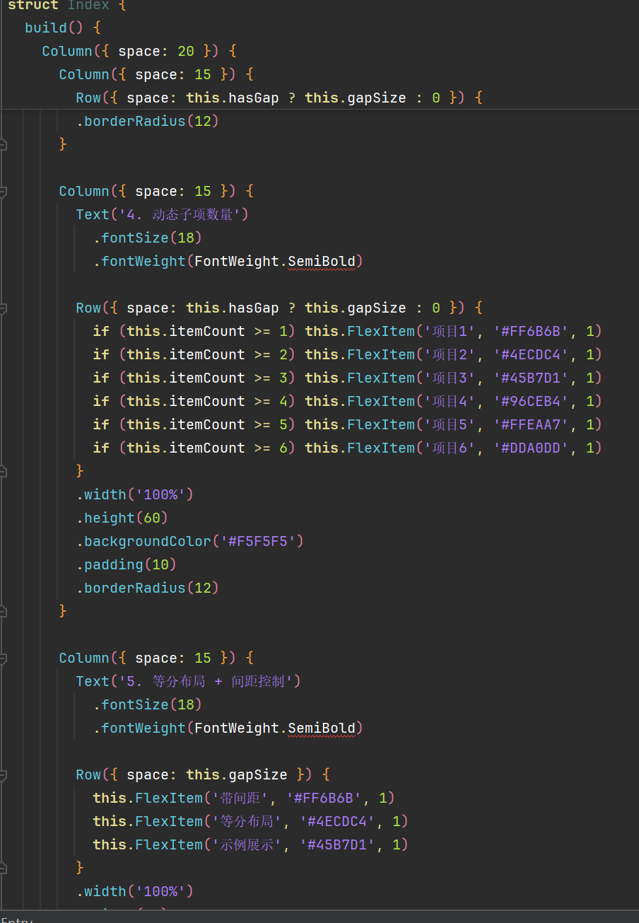
6. 动态子项数量的等分布局
在实际开发中,子项数量可能是动态变化的。flexWeight 在这种场景下表现出色。
6.1 使用条件渲染实现动态等分布局
@Entry
@Component
struct DynamicItemLayout {
  @State itemCount: number = 4
  @State items: Array<string> = ['首页', '发现', '消息', '我的']

  build() {
    Column({ space: 20 }) {
      Text('动态子项数量等分布局')
        .fontSize(20)
        .fontWeight(FontWeight.Bold)

      Row({ space: 8 }) {
        ForEach(this.items, (item: string, index: number) => {
          Text(item)
            .backgroundColor(this.getColor(index))
            .padding({ left: 10, right: 10, top: 8, bottom: 8 })
            .borderRadius(6)
            .textAlign(TextAlign.Center)
            .flexWeight(1)
        })
      }
      .width('100%')
      .height(50)
      .backgroundColor('#F5F5F5')
      .padding(10)

      Button('添加子项')
        .onClick(() => {
          const names = ['设置', '帮助', '关于', '反馈']
          if (this.items.length < 8) {
            this.items.push(names[this.items.length % names.length])
          }
        })

      Button('减少子项')
        .onClick(() => {
          if (this.items.length > 2) {
            this.items.pop()
          }
        })
    }
    .width('100%')
    .height('100%')
    .padding(20)
    .backgroundColor('#FFFFFF')
  }

  getColor(index: number): string {
    const colors = ['#FF6B6B', '#4ECDC4', '#45B7D1', '#96CEB4', '#FFEAA7', '#DDA0DD']
    return colors[index % colors.length]
  }
}
6.2 使用 ForEach 的 key 参数
在动态列表中,为了优化性能和避免状态错乱,建议使用 key 参数:
Row({ space: 8 }) {
  ForEach(
    this.items,
    (item: string, index: number) => {
      Text(item)
        .backgroundColor(this.getColor(index))
        .padding(10)
        .borderRadius(6)
        .textAlign(TextAlign.Center)
        .flexWeight(1)
    },
    (item: string, index: number) => `${item}-${index}`
  )
}
6.3 动态子项的性能优化
6.3.1 使用 LazyForEach
当子项数量非常大时,建议使用 LazyForEach 进行懒加载:
class ItemDataSource implements IDataSource {
  private items: Array<string> = []

  constructor(items: Array<string>) {
    this.items = items
  }

  totalCount(): number {
    return this.items.length
  }

  getData(index: number): string {
    return this.items[index]
  }

  registerDataChangeListener(listener: DataChangeListener): void {
  }

  unregisterDataChangeListener(listener: DataChangeListener): void {
  }
}

@Entry
@Component
struct LazyDynamicLayout {
  @State dataSource: ItemDataSource = new ItemDataSource(['首页', '发现', '消息', '我的'])

  build() {
    Row({ space: 8 }) {
      LazyForEach(
        this.dataSource,
        (item: string, index: number) => {
          Text(item)
            .backgroundColor('#FF6B6B')
            .padding(10)
            .borderRadius(6)
            .textAlign(TextAlign.Center)
            .flexWeight(1)
        },
        (item: string, index: number) => `${item}-${index}`
      )
    }
    .width('100%')
    .height(50)
    .backgroundColor('#F5F5F5')
  }
}
6.3.2 避免频繁重排
@Entry
@Component
struct OptimizedDynamicLayout {
  @State items: Array<string> = ['首页', '发现', '消息', '我的']
  @State isUpdating: boolean = false

  build() {
    Column({ space: 20 }) {
      Row({ space: 8 }) {
        ForEach(this.items, (item: string, index: number) => {
          Text(item)
            .backgroundColor('#FF6B6B')
            .padding(10)
            .borderRadius(6)
            .textAlign(TextAlign.Center)
            .flexWeight(1)
            .transition({ type: TransitionType.All })
        })
      }
      .width('100%')
      .height(50)
      .backgroundColor('#F5F5F5')

      Button('添加')
        .onClick(() => {
          if (!this.isUpdating) {
            this.isUpdating = true
            this.items.push('新选项')
            setTimeout(() => {
              this.isUpdating = false
            }, 300)
          }
        })
    }
  }
}
7. 等分布局与间距控制
间距控制是等分布局中不可或缺的一部分,它影响着整体布局的美观度和可读性。
7.1 Row 的 space 属性
space 属性用于控制子组件之间的间距:
Row({ space: 10 }) {
  Text('项目1')
    .flexWeight(1)

  Text('项目2')
    .flexWeight(1)

  Text('项目3')
    .flexWeight(1)
}
注意:space 属性会自动扣除间距后再分配剩余空间给 flexWeight 子组件。
7.2 使用 padding 控制内边距
Row({ space: 10 }) {
  Text('项目1')
    .flexWeight(1)

  Text('项目2')
    .flexWeight(1)

  Text('项目3')
    .flexWeight(1)
}
.padding({ left: 15, right: 15, top: 10, bottom: 10 })
7.3 使用 margin 控制子组件间距
Row() {
  Text('项目1')
    .flexWeight(1)
    .margin({ right: 10 })

  Text('项目2')
    .flexWeight(1)
    .margin({ right: 10 })

  Text('项目3')
    .flexWeight(1)
}
注意:使用 margin 时需要注意最后一个子组件不要设置 margin,否则会产生多余间距。
7.4 间距与 flexWeight 的配合
@Entry
@Component
struct SpacingFlexLayout {
  build() {
    Column({ space: 20 }) {
      Text('等分布局 + 间距控制')
        .fontSize(20)
        .fontWeight(FontWeight.Bold)

      Text('space 属性控制间距')
        .fontSize(14)
        .fontColor('#666666')

      Row({ space: 8 }) {
        Text('项目1')
          .backgroundColor('#FF6B6B')
          .padding(10)
          .borderRadius(6)
          .textAlign(TextAlign.Center)
          .flexWeight(1)

        Text('项目2')
          .backgroundColor('#4ECDC4')
          .padding(10)
          .borderRadius(6)
          .textAlign(TextAlign.Center)
          .flexWeight(1)

        Text('项目3')
          .backgroundColor('#45B7D1')
          .padding(10)
          .borderRadius(6)
          .textAlign(TextAlign.Center)
          .flexWeight(1)
      }
      .width('100%')
      .height(50)
      .backgroundColor('#F5F5F5')
      .padding(10)

      Text('不同间距值的效果')
        .fontSize(14)
        .fontColor('#666666')

      Row({ space: 20 }) {
        Text('大间距')
          .backgroundColor('#FF6B6B')
          .padding(10)
          .borderRadius(6)
          .textAlign(TextAlign.Center)
          .flexWeight(1)

        Text('展示')
          .backgroundColor('#4ECDC4')
          .padding(10)
          .borderRadius(6)
          .textAlign(TextAlign.Center)
          .flexWeight(1)
      }
      .width('100%')
      .height(50)
      .backgroundColor('#F5F5F5')
      .padding(10)
    }
    .width('100%')
    .height('100%')
    .padding(20)
    .backgroundColor('#FFFFFF')
  }
}
7.5 响应式间距
在不同屏幕尺寸下,间距需要自适应调整:
@Entry
@Component
struct ResponsiveSpacingLayout {
  @State spacing: number = 10

  aboutToAppear() {
    const windowWidth = uiContext.windowWidth
    if (windowWidth > 600) {
      this.spacing = 20
    } else if (windowWidth > 400) {
      this.spacing = 15
    } else {
      this.spacing = 8
    }
  }

  build() {
    Row({ space: this.spacing }) {
      Text('响应式')
        .backgroundColor('#FF6B6B')
        .padding(10)
        .borderRadius(6)
        .textAlign(TextAlign.Center)
        .flexWeight(1)

      Text('间距')
        .backgroundColor('#4ECDC4')
        .padding(10)
        .borderRadius(6)
        .textAlign(TextAlign.Center)
        .flexWeight(1)

      Text('布局')
        .backgroundColor('#45B7D1')
        .padding(10)
        .borderRadius(6)
        .textAlign(TextAlign.Center)
        .flexWeight(1)
    }
    .width('100%')
    .height(50)
    .backgroundColor('#F5F5F5')
    .padding(10)
  }
}
8. 嵌套等分布局
在复杂布局中,经常需要嵌套使用等分布局。
8.1 Row 嵌套 Row
@Entry
@Component
struct NestedRowLayout {
  build() {
    Column({ space: 20 }) {
      Text('嵌套等分布局')
        .fontSize(20)
        .fontWeight(FontWeight.Bold)

      Row({ space: 10 }) {
        Row({ space: 5 }) {
          Text('左1')
            .backgroundColor('#FF6B6B')
            .padding(8)
            .borderRadius(4)
            .textAlign(TextAlign.Center)
            .flexWeight(1)

          Text('左2')
            .backgroundColor('#4ECDC4')
            .padding(8)
            .borderRadius(4)
            .textAlign(TextAlign.Center)
            .flexWeight(1)
        }
        .flexWeight(1)
        .backgroundColor('#F0F0F0')
        .padding(5)
        .borderRadius(6)

        Row({ space: 5 }) {
          Text('右1')
            .backgroundColor('#45B7D1')
            .padding(8)
            .borderRadius(4)
            .textAlign(TextAlign.Center)
            .flexWeight(1)

          Text('右2')
            .backgroundColor('#96CEB4')
            .padding(8)
            .borderRadius(4)
            .textAlign(TextAlign.Center)
            .flexWeight(1)

          Text('右3')
            .backgroundColor('#FFEAA7')
            .padding(8)
            .borderRadius(4)
            .textAlign(TextAlign.Center)
            .flexWeight(1)
        }
        .flexWeight(2)
        .backgroundColor('#E8E8E8')
        .padding(5)
        .borderRadius(6)
      }
      .width('100%')
      .height(80)
      .backgroundColor('#F5F5F5')
      .padding(10)
    }
    .width('100%')
    .height('100%')
    .padding(20)
    .backgroundColor('#FFFFFF')
  }
}
8.2 Row 嵌套 Column
@Entry
@Component
struct RowColumnNestedLayout {
  build() {
    Column({ space: 20 }) {
      Text('Row 嵌套 Column')
        .fontSize(20)
        .fontWeight(FontWeight.Bold)

      Row({ space: 10 }) {
        Column({ space: 5 }) {
          Text('左上')
            .backgroundColor('#FF6B6B')
            .padding(8)
            .borderRadius(4)
            .textAlign(TextAlign.Center)

          Text('左下')
            .backgroundColor('#4ECDC4')
            .padding(8)
            .borderRadius(4)
            .textAlign(TextAlign.Center)
        }
        .flexWeight(1)
        .height('100%')
        .justifyContent(FlexAlign.Center)

        Column({ space: 5 }) {
          Text('中上')
            .backgroundColor('#45B7D1')
            .padding(8)
            .borderRadius(4)
            .textAlign(TextAlign.Center)

          Text('中下')
            .backgroundColor('#96CEB4')
            .padding(8)
            .borderRadius(4)
            .textAlign(TextAlign.Center)
        }
        .flexWeight(1)
        .height('100%')
        .justifyContent(FlexAlign.Center)

        Column({ space: 5 }) {
          Text('右上')
            .backgroundColor('#FFEAA7')
            .padding(8)
            .borderRadius(4)
            .textAlign(TextAlign.Center)

          Text('右下')
            .backgroundColor('#DDA0DD')
            .padding(8)
            .borderRadius(4)
            .textAlign(TextAlign.Center)
        }
        .flexWeight(1)
        .height('100%')
        .justifyContent(FlexAlign.Center)
      }
      .width('100%')
      .height(100)
      .backgroundColor('#F5F5F5')
      .padding(10)
    }
    .width('100%')
    .height('100%')
    .padding(20)
    .backgroundColor('#FFFFFF')
  }
}
8.3 多层嵌套布局
@Entry
@Component
struct MultiLevelNestedLayout {
  build() {
    Column({ space: 20 }) {
      Text('多层嵌套等分布局')
        .fontSize(20)
        .fontWeight(FontWeight.Bold)

      Row({ space: 8 }) {
        Row({ space: 4 }) {
          Column({ space: 4 }) {
            Text('1-1')
              .backgroundColor('#FF6B6B')
              .padding(6)
              .borderRadius(4)
              .textAlign(TextAlign.Center)

            Text('1-2')
              .backgroundColor('#4ECDC4')
              .padding(6)
              .borderRadius(4)
              .textAlign(TextAlign.Center)
          }
          .flexWeight(1)

          Column({ space: 4 }) {
            Text('1-3')
              .backgroundColor('#45B7D1')
              .padding(6)
              .borderRadius(4)
              .textAlign(TextAlign.Center)

            Text('1-4')
              .backgroundColor('#96CEB4')
              .padding(6)
              .borderRadius(4)
              .textAlign(TextAlign.Center)
          }
          .flexWeight(1)
        }
        .flexWeight(1)
        .backgroundColor('#F0F0F0')
        .padding(5)
        .borderRadius(6)

        Row({ space: 4 }) {
          Text('2-1')
            .backgroundColor('#FFEAA7')
            .padding(6)
            .borderRadius(4)
            .textAlign(TextAlign.Center)
            .flexWeight(1)

          Text('2-2')
            .backgroundColor('#DDA0DD')
            .padding(6)
            .borderRadius(4)
            .textAlign(TextAlign.Center)
            .flexWeight(1)

          Text('2-3')
            .backgroundColor('#98D8C8')
            .padding(6)
            .borderRadius(4)
            .textAlign(TextAlign.Center)
            .flexWeight(1)
        }
        .flexWeight(1)
        .backgroundColor('#E8E8E8')
        .padding(5)
        .borderRadius(6)

        Row({ space: 4 }) {
          Text('3-1')
            .backgroundColor('#F7DC6F')
            .padding(6)
            .borderRadius(4)
            .textAlign(TextAlign.Center)
            .flexWeight(1)

          Text('3-2')
            .backgroundColor('#BB8FCE')
            .padding(6)
            .borderRadius(4)
            .textAlign(TextAlign.Center)
            .flexWeight(1)
        }
        .flexWeight(1)
        .backgroundColor('#E0E0E0')
        .padding(5)
        .borderRadius(6)
      }
      .width('100%')
      .height(120)
      .backgroundColor('#F5F5F5')
      .padding(10)
    }
    .width('100%')
    .height('100%')
    .padding(20)
    .backgroundColor('#FFFFFF')
  }
}
9. 性能优化策略
在使用等分布局时,需要注意性能问题,特别是在复杂布局和大量子组件的场景下。
9.1 避免过度嵌套
过多的嵌套层级会影响布局性能:
// 不推荐:过度嵌套
Row() {
  Row() {
    Row() {
      Text('内容')
    }
  }
}

// 推荐:简化层级
Row() {
  Text('内容')
}
9.2 使用 @Builder 复用组件
@Entry
@Component
struct BuilderReuseLayout {
  build() {
    Row({ space: 8 }) {
      this.createFlexItem('项目1', '#FF6B6B')
      this.createFlexItem('项目2', '#4ECDC4')
      this.createFlexItem('项目3', '#45B7D1')
      this.createFlexItem('项目4', '#96CEB4')
    }
    .width('100%')
    .height(50)
    .backgroundColor('#F5F5F5')
    .padding(10)
  }

  @Builder createFlexItem(text: string, color: string) {
    Text(text)
      .fontSize(14)
      .backgroundColor(color)
      .padding({ left: 10, right: 10, top: 8, bottom: 8 })
      .borderRadius(6)
      .textAlign(TextAlign.Center)
      .flexWeight(1)
  }
}
9.3 使用 FlexLayout 替代嵌套
当布局过于复杂时,可以考虑使用 FlexLayout:
@Entry
@Component
struct FlexLayoutExample {
  build() {
    Flex({ direction: FlexDirection.Row, wrap: FlexWrap.Wrap }) {
      Text('项目1')
        .backgroundColor('#FF6B6B')
        .padding(10)
        .borderRadius(6)
        .flexBasis('25%')

      Text('项目2')
        .backgroundColor('#4ECDC4')
        .padding(10)
        .borderRadius(6)
        .flexBasis('25%')

      Text('项目3')
        .backgroundColor('#45B7D1')
        .padding(10)
        .borderRadius(6)
        .flexBasis('25%')

      Text('项目4')
        .backgroundColor('#96CEB4')
        .padding(10)
        .borderRadius(6)
        .flexBasis('25%')
    }
    .width('100%')
    .height(100)
    .backgroundColor('#F5F5F5')
    .padding(10)
  }
}
9.4 避免频繁重绘
@Entry
@Component
struct PerformanceOptimization {
  @State items: Array<string> = ['项目1', '项目2', '项目3']
  @State selectedIndex: number = -1

  build() {
    Row({ space: 8 }) {
      ForEach(this.items, (item: string, index: number) => {
        Text(item)
          .backgroundColor(this.selectedIndex === index ? '#FF6B6B' : '#E0E0E0')
          .padding(10)
          .borderRadius(6)
          .textAlign(TextAlign.Center)
          .flexWeight(1)
          .onClick(() => {
            this.selectedIndex = index
          })
      })
    }
    .width('100%')
    .height(50)
    .backgroundColor('#F5F5F5')
    .padding(10)
  }
}
9.5 使用缓存机制
@Entry
@Component
struct CachedLayout {
  @State items: Array<string> = []

  aboutToAppear() {
    this.loadItems()
  }

  loadItems() {
    setTimeout(() => {
      this.items = ['项目1', '项目2', '项目3', '项目4', '项目5']
    }, 1000)
  }

  build() {
    Row({ space: 8 }) {
      if (this.items.length > 0) {
        ForEach(this.items, (item: string, index: number) => {
          Text(item)
            .backgroundColor('#FF6B6B')
            .padding(10)
            .borderRadius(6)
            .textAlign(TextAlign.Center)
            .flexWeight(1)
        })
      } else {
        Text('加载中...')
          .padding(10)
      }
    }
    .width('100%')
    .height(50)
    .backgroundColor('#F5F5F5')
    .padding(10)
  }
}
10. 常见问题与解决方案
10.1 问题1:子组件宽度不一致
现象:设置了 flexWeight(1) 但子组件宽度不一致。
原因:子组件内容宽度不同,flexWeight 是分配剩余空间,不是均分总宽度。
解决方案:
// 方案1:设置固定宽度
Row({ space: 8 }) {
  Text('短')
    .width('25%')

  Text('较长文本')
    .width('25%')

  Text('最长的文本内容')
    .width('25%')

  Text('短')
    .width('25%')
}

// 方案2:使用 flexWeight + minWidth
Row({ space: 8 }) {
  Text('短')
    .flexWeight(1)
    .minWidth(0)

  Text('较长文本')
    .flexWeight(1)
    .minWidth(0)
}
10.2 问题2:子组件溢出
现象:子组件内容超出 Row 边界。
原因:子组件内容过长或间距设置不当。
解决方案:
Row({ space: 8 }) {
  Text('非常长的文本内容可能会溢出')
    .flexWeight(1)
    .minWidth(0)  // 允许压缩
    .maxLines(1)  // 限制行数
    .textOverflow({ overflow: TextOverflow.Ellipsis })  // 省略号
}
10.3 问题3:flexWeight 不生效
现象:设置了 flexWeight 但子组件没有扩展。
原因:可能设置了固定宽度或百分比宽度,优先级高于 flexWeight。
解决方案:
// 错误写法
Row() {
  Text('测试')
    .width(100)     // 固定宽度会覆盖 flexWeight
    .flexWeight(1)
}

// 正确写法
Row() {
  Text('测试')
    .flexWeight(1)  // 不要同时设置固定宽度
}
10.4 问题4:间距导致布局错乱
现象:添加间距后,子组件排列不正常。
原因:间距与子组件宽度计算冲突。
解决方案:
// 使用 flexWeight 时,space 会自动处理
Row({ space: 10 }) {
  Text('项目1')
    .flexWeight(1)

  Text('项目2')
    .flexWeight(1)

  Text('项目3')
    .flexWeight(1)
}

// 使用百分比宽度时,需要预留间距空间
Row({ space: 10 }) {
  Text('项目1')
    .width('30%')  // 预留间距空间

  Text('项目2')
    .width('30%')

  Text('项目3')
    .width('30%')
}
10.5 问题5:动态子项导致闪烁
现象:添加或删除子项时,布局出现闪烁。
原因:布局重排导致的视觉抖动。
解决方案:
@Entry
@Component
struct SmoothTransitionLayout {
  @State items: Array<string> = ['项目1', '项目2', '项目3']

  build() {
    Row({ space: 8 }) {
      ForEach(this.items, (item: string, index: number) => {
        Text(item)
          .backgroundColor('#FF6B6B')
          .padding(10)
          .borderRadius(6)
          .textAlign(TextAlign.Center)
          .flexWeight(1)
          .transition({
            type: TransitionType.All,
            duration: 300,
            curve: Curve.EaseInOut
          })
      })
    }
    .width('100%')
    .height(50)
    .backgroundColor('#F5F5F5')
    .padding(10)
    .transition({
      type: TransitionType.All,
      duration: 300,
      curve: Curve.EaseInOut
    })
  }
}
11. 实战案例:复杂布局场景
11.1 案例一:底部导航栏
@Entry
@Component
struct BottomNavBar {
  @State selectedIndex: number = 0
  private tabs: Array<string> = ['首页', '发现', '消息', '我的']
  private icons: Array<string> = ['home', 'search', 'message', 'user']

  build() {
    Column() {
      Text('内容区域')
        .fontSize(16)
        .flexWeight(1)
        .width('100%')
        .height('100%')
        .textAlign(TextAlign.Center)
        .backgroundColor('#F5F5F5')

      Row({ space: 0 }) {
        ForEach(this.tabs, (tab: string, index: number) => {
          Column({ space: 4 }) {
            Image(this.icons[index])
              .width(24)
              .height(24)
              .fillColor(this.selectedIndex === index ? '#FF6B6B' : '#999999')

            Text(tab)
              .fontSize(12)
              .fontColor(this.selectedIndex === index ? '#FF6B6B' : '#999999')
          }
          .flexWeight(1)
          .padding({ top: 8, bottom: 12 })
          .justifyContent(FlexAlign.Center)
          .onClick(() => {
            this.selectedIndex = index
          })
        })
      }
      .width('100%')
      .height(56)
      .backgroundColor('#FFFFFF')
      .borderRadius({ topLeft: 16, topRight: 16 })
    }
    .width('100%')
    .height('100%')
    .backgroundColor('#FFFFFF')
  }
}
11.2 案例二:功能入口网格
@Entry
@Component
struct FeatureGrid {
  private features: Array<{ name: string; color: string; icon: string }> = [
    { name: '购物', color: '#FF6B6B', icon: 'shopping' },
    { name: '美食', color: '#4ECDC4', icon: 'food' },
    { name: '出行', color: '#45B7D1', icon: 'car' },
    { name: '娱乐', color: '#96CEB4', icon: 'game' },
    { name: '理财', color: '#FFEAA7', icon: 'money' },
    { name: '医疗', color: '#DDA0DD', icon: 'health' },
    { name: '教育', color: '#98D8C8', icon: 'book' },
    { name: '更多', color: '#F7DC6F', icon: 'more' }
  ]

  build() {
    Column({ space: 20 }) {
      Text('功能入口')
        .fontSize(20)
        .fontWeight(FontWeight.Bold)
        .margin({ top: 20 })

      Column({ space: 16 }) {
        Row({ space: 16 }) {
          ForEach(this.features.slice(0, 4), (feature) => {
            this.createFeatureItem(feature)
          })
        }

        Row({ space: 16 }) {
          ForEach(this.features.slice(4, 8), (feature) => {
            this.createFeatureItem(feature)
          })
        }
      }
      .width('100%')
      .padding(20)
    }
    .width('100%')
    .height('100%')
    .backgroundColor('#F5F5F5')
  }

  @Builder createFeatureItem(feature: { name: string; color: string; icon: string }) {
    Column({ space: 8 }) {
      Stack() {
        Image(feature.icon)
          .width(24)
          .height(24)
          .fillColor('#FFFFFF')
      }
      .width(56)
      .height(56)
      .backgroundColor(feature.color)
      .borderRadius(12)

      Text(feature.name)
        .fontSize(14)
        .fontColor('#333333')
    }
    .flexWeight(1)
    .alignItems(HorizontalAlign.Center)
    .padding(8)
  }
}
11.3 案例三:表单按钮组
@Entry
@Component
struct FormButtonGroup {
  build() {
    Column({ space: 20 }) {
      Text('表单操作')
        .fontSize(20)
        .fontWeight(FontWeight.Bold)
        .margin({ top: 20 })

      Column({ space: 16 }) {
        TextInput({ placeholder: '请输入用户名' })
          .width('100%')
          .height(48)
          .backgroundColor('#FFFFFF')
          .padding({ left: 16, right: 16 })
          .borderRadius(8)

        TextInput({ placeholder: '请输入密码' })
          .width('100%')
          .height(48)
          .backgroundColor('#FFFFFF')
          .padding({ left: 16, right: 16 })
          .borderRadius(8)
          .type(InputType.Password)

        Row({ space: 12 }) {
          Button('取消')
            .width('100%')
            .height(48)
            .backgroundColor('#E0E0E0')
            .fontColor('#333333')
            .borderRadius(8)
            .flexWeight(1)

          Button('登录')
            .width('100%')
            .height(48)
            .backgroundColor('#FF6B6B')
            .fontColor('#FFFFFF')
            .borderRadius(8)
            .flexWeight(2)
        }

        Row({ space: 12 }) {
          Button('注册')
            .width('100%')
            .height(48)
            .backgroundColor('#4ECDC4')
            .fontColor('#FFFFFF')
            .borderRadius(8)
            .flexWeight(1)

          Button('忘记密码')
            .width('100%')
            .height(48)
            .backgroundColor('#45B7D1')
            .fontColor('#FFFFFF')
            .borderRadius(8)
            .flexWeight(1)

          Button('第三方登录')
            .width('100%')
            .height(48)
            .backgroundColor('#96CEB4')
            .fontColor('#FFFFFF')
            .borderRadius(8)
            .flexWeight(1)
        }
      }
      .width('100%')
      .padding(20)
    }
    .width('100%')
    .height('100%')
    .backgroundColor('#F5F5F5')
  }
}
11.4 案例四:数据统计卡片
@Entry
@Component
struct DataStatsCard {
  @State stats: Array<{ label: string; value: string; color: string }> = [
    { label: '今日访问', value: '12,345', color: '#FF6B6B' },
    { label: '新增用户', value: '567', color: '#4ECDC4' },
    { label: '订单数量', value: '89', color: '#45B7D1' },
    { label: '销售额', value: '¥123,456', color: '#96CEB4' }
  ]

  build() {
    Column({ space: 20 }) {
      Text('数据统计')
        .fontSize(20)
        .fontWeight(FontWeight.Bold)
        .margin({ top: 20 })

      Row({ space: 12 }) {
        ForEach(this.stats, (stat) => {
          Column({ space: 8 }) {
            Text(stat.value)
              .fontSize(24)
              .fontWeight(FontWeight.Bold)
              .fontColor(stat.color)

            Text(stat.label)
              .fontSize(14)
              .fontColor('#666666')
          }
          .flexWeight(1)
          .padding({ top: 16, bottom: 16 })
          .backgroundColor('#FFFFFF')
          .borderRadius(12)
          .alignItems(HorizontalAlign.Center)
        })
      }
      .width('100%')
      .padding(20)

      Row({ space: 12 }) {
        Column({ space: 8 }) {
          Text('转化率')
            .fontSize(14)
            .fontColor('#666666')

          Text('23.5%')
            .fontSize(20)
            .fontWeight(FontWeight.Bold)
            .fontColor('#FF6B6B')
        }
        .flexWeight(1)
        .padding({ top: 12, bottom: 12 })
        .backgroundColor('#FFFFFF')
        .borderRadius(12)
        .alignItems(HorizontalAlign.Center)

        Column({ space: 8 }) {
          Text('客单价')
            .fontSize(14)
            .fontColor('#666666')

          Text('¥2,345')
            .fontSize(20)
            .fontWeight(FontWeight.Bold)
            .fontColor('#4ECDC4')
        }
        .flexWeight(1)
        .padding({ top: 12, bottom: 12 })
        .backgroundColor('#FFFFFF')
        .borderRadius(12)
        .alignItems(HorizontalAlign.Center)

        Column({ space: 8 }) {
          Text('复购率')
            .fontSize(14)
            .fontColor('#666666')

          Text('45.2%')
            .fontSize(20)
            .fontWeight(FontWeight.Bold)
            .fontColor('#45B7D1')
        }
        .flexWeight(1)
        .padding({ top: 12, bottom: 12 })
        .backgroundColor('#FFFFFF')
        .borderRadius(12)
        .alignItems(HorizontalAlign.Center)
      }
      .width('100%')
      .padding({ left: 20, right: 20 })
    }
    .width('100%')
    .height('100%')
    .backgroundColor('#F5F5F5')
  }
}
12. 总结与最佳实践
12.1 核心要点总结
- flexWeight 是实现等分布局的首选方式:它能自动处理剩余空间分配,适合动态内容场景。
- 百分比宽度适合固定比例场景:当子项数量和比例固定时,使用百分比宽度更直观。
- 间距处理要注意:使用
space属性控制子组件间距,flexWeight会自动扣除间距。 - 避免混用宽度属性:不要同时设置
width和flexWeight,否则flexWeight会被忽略。 - 动态子项使用 ForEach:配合
flexWeight可以实现动态数量的等分布局。
12.2 最佳实践
实践1:统一使用 flexWeight
Row({ space: 8 }) {
  Text('项目1').flexWeight(1)
  Text('项目2').flexWeight(1)
  Text('项目3').flexWeight(1)
}
实践2:使用 @Builder 提取公共组件
@Builder FlexItem(text: string, color: string) {
  Text(text)
    .backgroundColor(color)
    .padding(10)
    .borderRadius(6)
    .textAlign(TextAlign.Center)
    .flexWeight(1)
}
实践3:响应式布局
@State spacing: number = 8

aboutToAppear() {
  if (uiContext.windowWidth > 600) {
    this.spacing = 16
  }
}

Row({ space: this.spacing }) {
  // ...
}
实践4:性能优化
- 避免过度嵌套
- 使用
@Builder复用组件 - 动态列表使用
LazyForEach - 添加过渡动画提升用户体验
12.3 常见错误汇总
| 错误 | 原因 | 解决方案 |
|---|---|---|
| flexWeight 不生效 | 设置了固定宽度 | 移除固定宽度 |
| 子组件溢出 | 内容过长 | 设置 maxLines 和 textOverflow |
| 间距导致错乱 | 百分比宽度未预留间距 | 使用 flexWeight 或调整百分比 |
| 动态子项闪烁 | 布局重排 | 添加 transition 动画 |
| 嵌套布局复杂 | 层级过多 | 简化布局结构 |
12.4 学习建议
- 深入理解 Flex 布局原理:掌握主轴、交叉轴、权重分配等核心概念。
- 多实践不同场景:尝试实现导航栏、按钮组、数据卡片等常见布局。
- 关注性能问题:在复杂布局中注意优化,避免性能瓶颈。
- 参考官方文档:及时了解 HarmonyOS ArkUI 的最新特性和 API 变化。
附录:常用布局属性速查表
Row 属性
| 属性 | 类型 | 说明 | 默认值 |
|---|---|---|---|
| space | number | 子组件间距 | 0 |
| justifyContent | FlexAlign | 主轴对齐方式 | FlexAlign.Start |
| alignItems | VerticalAlign | 交叉轴对齐方式 | VerticalAlign.Center |
| flexWrap | FlexWrap | 子组件换行方式 | FlexWrap.NoWrap |
FlexAlign 枚举
| 值 | 说明 |
|---|---|
| FlexAlign.Start | 起始对齐 |
| FlexAlign.Center | 居中对齐 |
| FlexAlign.End | 结束对齐 |
| FlexAlign.SpaceBetween | 两端对齐,间隔相等 |
| FlexAlign.SpaceAround | 分散对齐,两端有间距 |
| FlexAlign.SpaceEvenly | 均匀分布 |
VerticalAlign 枚举
| 值 | 说明 |
|---|---|
| VerticalAlign.Top | 顶部对齐 |
| VerticalAlign.Center | 居中对齐 |
| VerticalAlign.Bottom | 底部对齐 |
子组件属性
| 属性 | 类型 | 说明 |
|---|---|---|
| flexWeight | number | 权重,控制剩余空间分配 |
| width | Length | 宽度 |
| height | Length | 高度 |
| minWidth | Length | 最小宽度 |
| maxWidth | Length | 最大宽度 |

作为“人工智能6S店”的官方数字引擎,为AI开发者与企业提供一个覆盖软硬件全栈、一站式门户。
更多推荐


 0
0 0
0- 0


 已为社区贡献12条内容

所有评论(0)