
鸿蒙应用开发 @BuilderParam 使用教程:实现灵活的 UI 插槽
文章目录
这是一个使用鸿蒙技术开发的本地原生记账应用,非常适合大家用来练手。相关源码已上传至 Github,点击此处查看项目。欢迎大家交流、指正,也欢迎提交 PR。
一、引言
在鸿蒙(HarmonyOS)应用开发中,ArkUI 提供了丰富的装饰器来构建声明式 UI。@BuilderParam 是一个强大但容易被忽视的装饰器,它允许开发者将 UI 构建逻辑作为参数传递给子组件,实现类似前端框架中“插槽(Slot)”的功能。本文将深入讲解 @BuilderParam 的核心用法、注意事项及最佳实践。
二、什么是 @BuilderParam?
@BuilderParam 是 ArkUI 中用于引用 @Builder 函数的装饰器。它的核心价值在于将 UI 构建逻辑参数化,使得父组件可以灵活地决定子组件内部某一部分的 UI 渲染内容。
2.1 为什么需要它?
在组件化开发中,我们经常遇到这样的场景:一个容器组件(如卡片、列表项)的布局是固定的,但内部的部分内容需要根据使用场景动态变化。传统做法是在子组件中定义多个 @Prop 或 @State 变量来控制显示,但这会导致代码臃肿且难以维护。
@BuilderParam 的出现完美解决了这个问题,它让子组件专注于结构,而将具体的 UI 构建逻辑交给父组件。
三、核心用法详解
3.1 参数初始化方式(最常用)
这是最标准的使用方式。父组件通过属性传参,将 @Builder 函数传递给子组件的 @BuilderParam 变量。
import { promptAction } from '@kit.ArkUI';

// 子组件定义
@Component
struct ChildComponent {
  // 1. 定义一个默认的 @Builder 函数
  @Builder customBuilder() {}
  // 2. 使用 @BuilderParam 装饰变量,并指定默认值
  @BuilderParam customBuilderParam: () => void = this.customBuilder;

  build() {
    Column({space: 20}) {
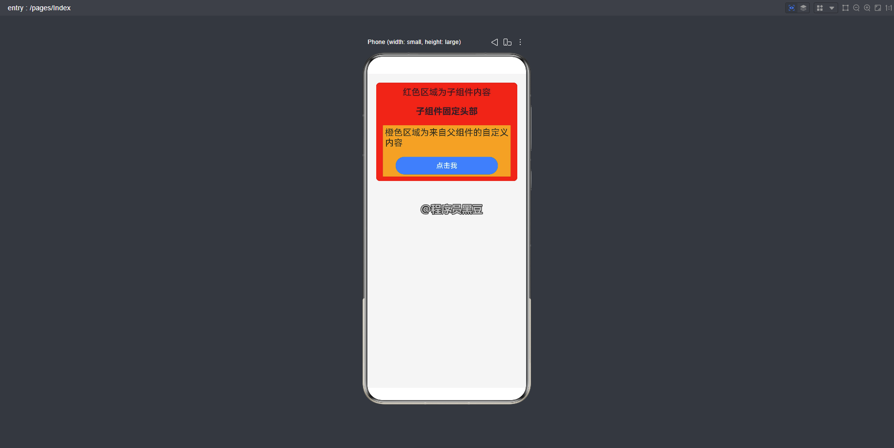
      Text('红色区域为子组件内容')
        .fontSize(20)
      Text('子组件固定头部')
        .fontSize(20)
        .fontWeight(FontWeight.Bold)
      // 3. 在组件内部调用 @BuilderParam 变量
      this.customBuilderParam()
    }
    .width('100%')
    .padding(10)
    .backgroundColor(Color.Red)
    .borderRadius(8)
  }
}

// 父组件使用
@Entry
@Component
struct ParentComponent {
  @Builder componentBuilder() {
    Column({space: 20}) {
      Text('橙色区域为来自父组件的自定义内容')
        .fontSize(20)
      Button('点击我')
        .width('80%')
        .onClick(() => {
          promptAction.showToast({
            message: '按钮被点击'
          })
        })
    }
    .padding(5)
    .backgroundColor(Color.Orange)
  }

  build() {
    Column({space: 20}) {
      // 4. 通过属性传参传递 @Builder 函数
      ChildComponent({ customBuilderParam: this.componentBuilder })
    }
    .width('100%')
    .height('100%')
    .padding(20)
    .backgroundColor('#F5F5F5')
  }
}
运行效果:
关键点:
- 子组件必须为
@BuilderParam变量提供默认值,通常指向一个空的@Builder函数。 - 父组件传递时使用
this.方法名的形式,不加括号。
3.2 尾随闭包初始化方式
当子组件只有一个 @BuilderParam 属性时,可以使用更简洁的尾随闭包语法。
// 子组件
@Component
struct CardContainer {
  @Prop title: string;
  // 注意:使用尾随闭包时,@BuilderParam 不能有参数
  @BuilderParam contentBuilder: () => void;

  build() {
    Column() {
      Text(this.title)
        .fontSize(24)
        .fontWeight(FontWeight.Bold)
        .padding(10)
      Divider()
      // 渲染闭包内容
      this.contentBuilder()
    }
    .width('90%')
    .backgroundColor(Color.White)
    .borderRadius(12)
    .shadow({ radius: 6, color: '#33000000' })
  }
}

// 父组件
@Entry
@Component
struct CardUser {
  @State headerText: string = '今日推荐';

  build() {
    Column() {
      // 使用尾随闭包,大括号内的内容自动成为 @Builder 函数
      CardContainer({ title: this.headerText }) {
        Column() {
          Text('文章标题一')
            .fontSize(18)
          Text('文章摘要内容,这里是简短的描述...')
            .fontSize(14)
            .fontColor(Color.Gray)
          Row() {
            Text('阅读更多')
              .fontColor(Color.Blue)
            Image($r('app.media.arrow_right'))
              .width(16)
              .height(16)
          }
          .margin({ top: 8 })
        }
        .padding(15)
      }
    }
    .width('100%')
    .height('100%')
    .padding(20)
    .backgroundColor('#F0F0F0')
  }
}
尾随闭包的限制:
- 子组件内只能有一个
@BuilderParam属性。 - 该
@BuilderParam属性不能有参数。 - 使用尾随闭包时,子组件不支持通用属性(如
.width()、.height()等)。
3.3 使用箭头函数改变 this 指向
这是一个非常重要的细节。直接传递 @Builder 函数时,函数内部的 this 指向接收该函数的子组件。如果需要在 @Builder 函数中访问父组件的状态或方法,必须使用箭头函数封装。
@Component
struct Child {
  @Builder customBuilder() {}
  @BuilderParam customBuilderParam: () => void = this.customBuilder;

  build() {
    Column() {
      this.customBuilderParam()
    }
  }
}

@Entry
@Component
struct Parent {
  @State parentCount: number = 0;

  @Builder parentBuilder() {
    Text(`父组件计数: ${this.parentCount}`)
      .fontSize(20)
  }

  build() {
    Column({space: 20}) {
      // ❌ 错误用法:直接传递,this 指向 Child 组件
      // Child({ customBuilderParam: this.parentBuilder })

      // ✅ 正确用法:使用箭头函数封装,this 指向 Parent 组件
      Child({
        customBuilderParam: (): void => {
          this.parentBuilder()
        }
      })

      Button('增加计数')
        .width('80%')
        .onClick(() => {
          this.parentCount++
        })
    }
    .width('100%')
  }
}
运行效果:
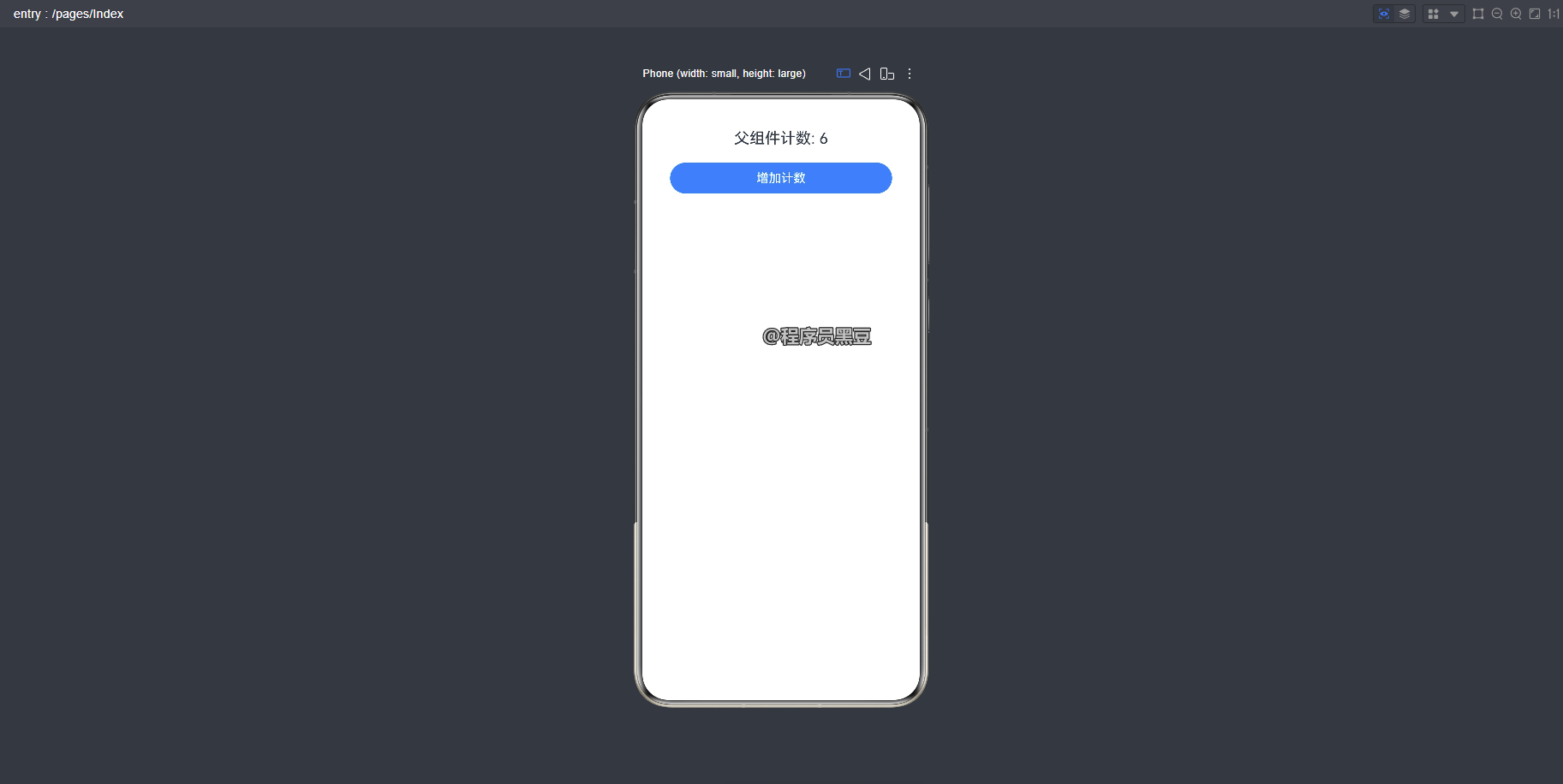
为什么需要箭头函数?
- 直接传递
this.parentBuilder时,ArkUI 会将函数绑定到子组件的上下文中。 - 使用
(): void => { this.parentBuilder() }箭头函数,会捕获当前(父组件)的this上下文。 - 这确保了
@Builder函数内部访问的@State、@Prop等变量来自正确的组件。
四、关键注意事项
4.1 this 指向问题
| 传递方式 | this 指向 | 适用场景 |
|---|---|---|
直接传递 this.method |
子组件 | 不需要访问父组件状态 |
箭头函数封装 (): void => { this.method() } |
父组件 | 需要访问父组件的状态或方法 |
使用 bind 改变上下文 |
不推荐 | 容易造成指向混乱,应避免使用 |
4.2 初始化限制
@BuilderParam 装饰的变量只能通过 @Builder 函数初始化,不能使用普通函数或方法。以下写法是错误的:
// ❌ 错误:不能使用普通函数
@BuilderParam customBuilderParam: () => void = this.normalFunction;

normalFunction() {
  // 普通函数
}
4.3 类型匹配
@BuilderParam 的参数类型必须与指向的 @Builder 方法完全一致,包括参数个数和类型。
// 子组件
@BuilderParam itemBuilder: (item: string, index: number) => void;

// 父组件传递时必须匹配
@Builder listBuilder(item: string, index: number) {
  Text(`${index + 1}. ${item}`)
}
4.4 与 @Require 联合使用
当 @Require 和 @BuilderParam 一起使用时,必须为 @BuilderParam 提供初始化值,否则编译会报错。
@Component
struct RequiredChild {
  @Require @BuilderParam requiredBuilder: () => void;
  // 必须提供默认值
  @Builder defaultBuilder() {}
  @BuilderParam safeBuilder: () => void = this.defaultBuilder;
}
五、实战案例:可复用的列表卡片组件
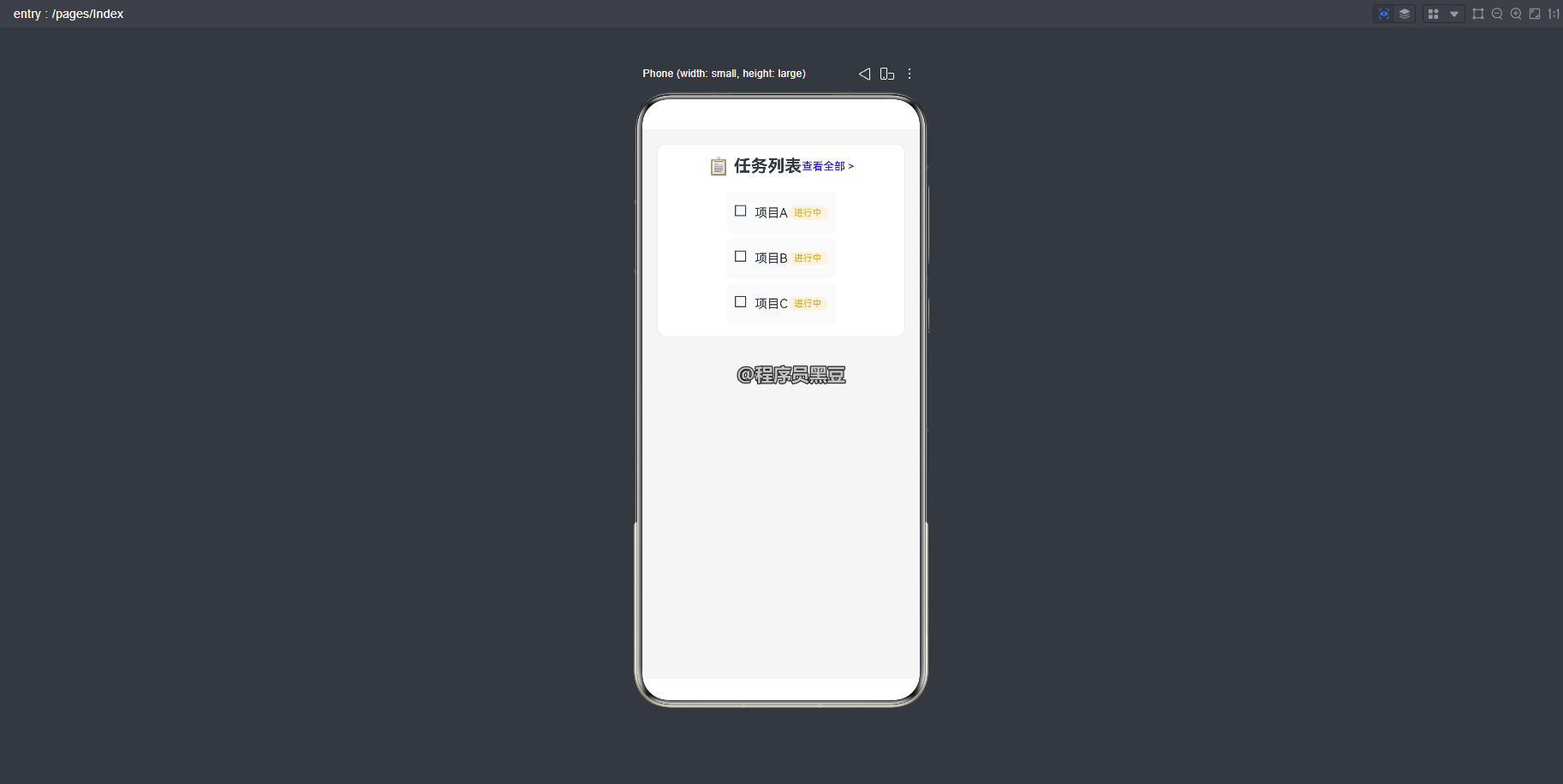
下面是一个综合示例,展示如何使用 @BuilderParam 构建一个高度可复用的列表卡片组件。
@Component
struct ListCard {
  @Prop title: string;

  @Builder defaultHeader() {}
  @Builder defaultItem() {}

  @BuilderParam headerContent: () => void = this.defaultHeader;
  @BuilderParam itemContent: (item: string) => void = this.defaultItem;

  build() {
    Column() {
      this.headerContent()
      Divider().margin({ top: 5, bottom: 5 })
      ForEach(['项目A', '项目B', '项目C'], (item: string) => {
        this.itemContent(item)
      })
    }
    .padding(15)
    .backgroundColor(Color.White)
    .borderRadius(10)
    .shadow({ radius: 4, color: '#22000000' })
  }
}

@Entry
@Component
struct ListCardDemo {
  @Builder myHeader() {
    Row() {
      Text('📋 任务列表')
        .fontSize(22)
        .fontWeight(FontWeight.Bold)
      Blank()
      Text('查看全部 >')
        .fontColor(Color.Blue)
        .fontSize(14)
    }
    .padding({ bottom: 5 })
  }

  @Builder myItem(item: string) {
    Row() {
      Text('☐')
        .fontSize(20)
        .margin({ right: 10 })
      Text(item)
        .fontSize(16)
      Blank()
      Text('进行中')
        .fontSize(12)
        .fontColor(Color.Orange)
        .backgroundColor('#FFF3E0')
        .padding({ left: 8, right: 8, top: 2, bottom: 2 })
        .borderRadius(10)
    }
    .padding(10)
    .margin({ top: 5 })
    .backgroundColor('#FAFAFA')
    .borderRadius(8)
  }

  build() {
    Column() {
      // 使用命名参数传递多个 @BuilderParam,避免尾随 lambda 冲突
      ListCard({
        title: '任务列表',
        headerContent: (): void => {
          this.myHeader()
        },
        itemContent: (item: string): void => {
          this.myItem(item)
        }
      })
    }
    .width('100%')
    .height('100%')
    .padding(20)
    .backgroundColor('#F5F5F5')
  }
}
运行效果:
六、总结
@BuilderParam 是 ArkUI 中实现组件高度复用的利器。通过本文的学习,你应该掌握了:
- 参数初始化方式:最灵活,支持多个
@BuilderParam和带参数的函数。 - 尾随闭包方式:语法简洁,但有单参数和无参数的限制。
- this 指向控制:使用箭头函数确保正确的上下文绑定。
- 关键限制:只能用
@Builder初始化、类型必须匹配、与@Require配合需提供默认值。
在实际开发中,建议优先使用参数初始化方式,它提供了最大的灵活性和可读性。当子组件只有一个插槽且不需要参数时,尾随闭包可以让代码更加简洁优雅。

作为“人工智能6S店”的官方数字引擎,为AI开发者与企业提供一个覆盖软硬件全栈、一站式门户。
更多推荐


 8
8 0
0- 0


 已为社区贡献45条内容

所有评论(0)