
鸿蒙原生ArkTS布局方式之List水平列表布局深度指南
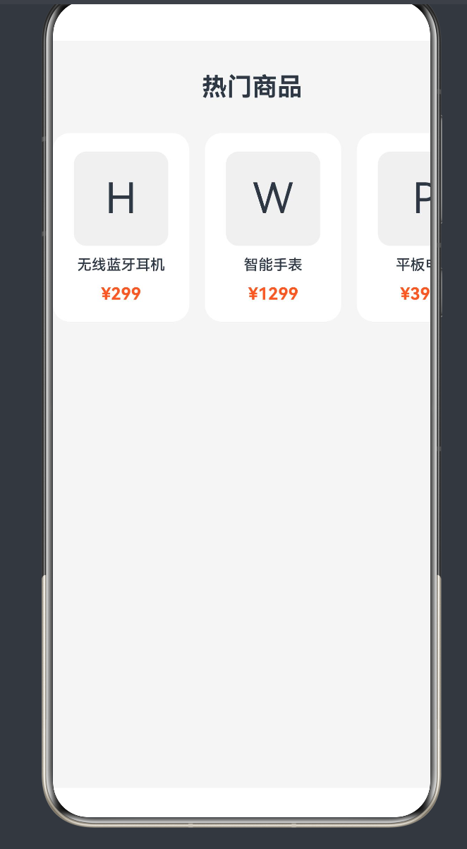
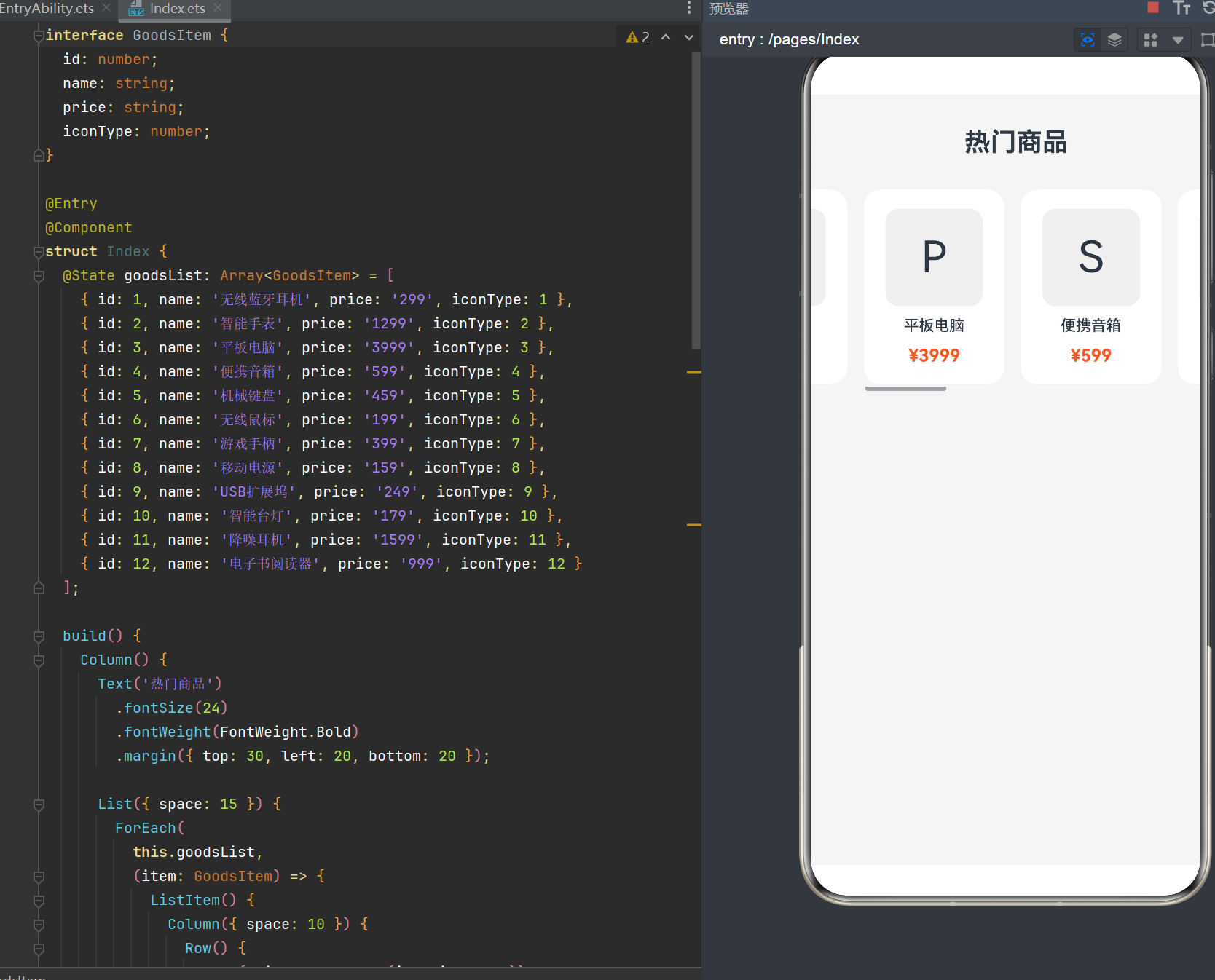
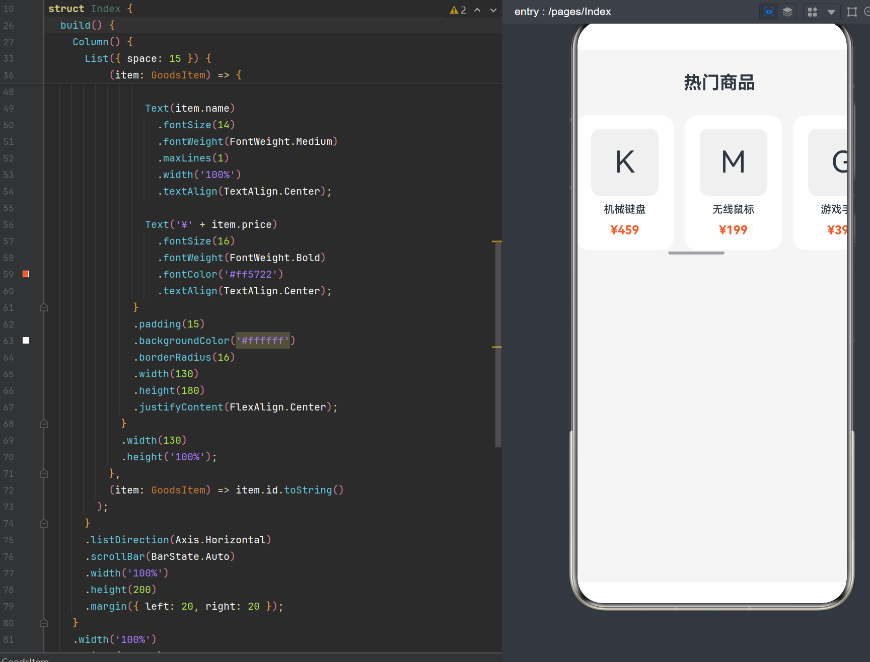
项目演示
目录
1. List 组件概述
1.1 List 组件定义与特性
List 是 HarmonyOS ArkUI 框架中的核心滚动容器组件,用于呈现连续、多行的同类数据集合。其主要特性包括:
- 自动滚动:当内容超出容器尺寸时自动提供滚动能力
- 灵活方向:支持垂直和水平两种滚动方向
- 高性能渲染:内置优化机制,支持大数据量列表的流畅展示
- 丰富交互:支持滑动、点击、长按等多种手势交互
- 分组展示:支持 ListItemGroup 实现列表分组和粘性标题
1.2 API 演进历程
| API 版本 | 新增特性 | 说明 |
|---|---|---|
| API 7 | 基础 List 组件 | 支持垂直列表、基础滚动 |
| API 9 | 卡片能力支持 | List 组件可在卡片中使用 |
| API 10 | LazyForEach 优化 | 提升大数据列表渲染性能 |
| API 11 | 元服务支持 | 支持在元服务中使用 |
| API 21 | 子组件尺寸限制 | 单个子组件最大宽高 16777216px |
| API 24 | 新特性增强 | 性能优化、新属性支持 |
1.3 List 组件接口定义
interface GoodsItem {
  id: number;
  name: string;
  price: string;
}

@Entry
@Component
struct ListOverviewExample {
  @State items: Array<GoodsItem> = [
    { id: 1, name: '商品1', price: '100' },
    { id: 2, name: '商品2', price: '200' }
  ];

  build() {
    List({ space: 10, initialIndex: 0 }) {
      ForEach(
        this.items,
        (item: GoodsItem) => {
          ListItem() {
            Text(item.name)
              .fontSize(16)
              .padding(10);
          }
        },
        (item: GoodsItem) => item.id.toString()
      );
    }
    .width('100%')
    .height(200);
  }
}
接口参数说明:
| 参数名 | 类型 | 必填 | 默认值 | 说明 |
|---|---|---|---|---|
| space | number | string | 否 | 0 | 子组件主轴方向间隔,单位 vp |
| initialIndex | number | 否 | 0 | 初始加载时显示的 item 索引 |
| scroller | Scroller | 否 | - | 滚动控制器,用于绑定和控制滚动 |
2. 水平列表布局基础
2.1 核心属性:listDirection
List 组件的主轴方向由 listDirection 属性控制,这是实现水平列表布局的核心:
interface GoodsItem {
  id: number;
  name: string;
}

@Entry
@Component
struct ListDirectionExample {
  @State items: Array<GoodsItem> = [
    { id: 1, name: '垂直列表项1' },
    { id: 2, name: '垂直列表项2' },
    { id: 3, name: '垂直列表项3' }
  ];

  build() {
    Column({ space: 20 }) {
      // 垂直列表(默认)
      Text('垂直列表')
        .fontSize(18)
        .fontWeight(FontWeight.Bold);

      List() {
        ForEach(
          this.items,
          (item: GoodsItem) => {
            ListItem() {
              Text(item.name)
                .fontSize(16)
                .padding({ left: 15, top: 10, bottom: 10 });
            }
          },
          (item: GoodsItem) => item.id.toString()
        );
      }
      .width('100%')
      .height(150)
      .backgroundColor('#f5f5f5');

      // 水平列表(核心配置)
      Text('水平列表')
        .fontSize(18)
        .fontWeight(FontWeight.Bold);

      List() {
        ForEach(
          this.items,
          (item: GoodsItem) => {
            ListItem() {
              Text(item.name)
                .fontSize(16)
                .padding({ left: 15, right: 15, top: 10, bottom: 10 });
            }
            .width(120);
          },
          (item: GoodsItem) => item.id.toString()
        );
      }
      .listDirection(Axis.Horizontal)  // 关键配置
      .width('100%')
      .height(80)
      .backgroundColor('#f5f5f5');
    }
    .width('100%')
    .height('100%')
    .padding(20);
  }
}
2.2 Axis 枚举说明
| 枚举值 | 说明 | 适用场景 |
|---|---|---|
| Axis.Vertical | 垂直方向(默认) | 通讯录、新闻列表、设置项等 |
| Axis.Horizontal | 水平方向 | 商品轮播、横向导航、图片画廊等 |
2.3 垂直与水平列表对比
| 对比维度 | 垂直列表 | 水平列表 |
|---|---|---|
| 滚动方向 | 上下滚动 | 左右滚动 |
| ListItem 宽度 | 默认撑满父容器 | 必须显式设置 |
| ListItem 高度 | 由内容决定 | 默认撑满父容器 |
| 适用场景 | 文本列表、设置项 | 图片画廊、商品卡片 |
| 内容密度 | 较高,可显示更多条目 | 较低,侧重视觉展示 |
2.4 水平列表布局的关键要点
要点一:ListItem 必须设置宽度
// 错误示例 - 水平列表中未设置 ListItem 宽度
ListItem() {
  Text('商品名称')
}
// 结果:ListItem 会挤压或撑满,无法正常展示

// 正确示例 - 显式设置宽度
ListItem() {
  Text('商品名称')
}
.width(120)  // 必须设置固定宽度
要点二:List 必须设置明确高度
List() {
  // ListItem 内容...
}
.listDirection(Axis.Horizontal)
.width('100%')
.height(200)  // 必须设置高度,否则内容无法显示
要点三:空间间隔配置
// 方式一:通过 List 构造参数设置
List({ space: 15 }) {
  // ListItem 内容...
}

// 方式二:通过 ListItem 的 margin 属性设置
ListItem() {
  // 内容...
}
.margin({ right: 15 })
3. ListItem 尺寸约束详解
3.1 水平列表中的尺寸计算
在水平列表布局中,ListItem 的尺寸约束遵循以下规则:
interface ItemSizeModel {
  mainAxisSize: string;      // 主轴尺寸(水平方向为宽度)
  crossAxisSize: string;     // 交叉轴尺寸(水平方向为高度)
  mainAxisAlignment: string; // 主轴对齐方式
  crossAxisAlignment: string; // 交叉轴对齐方式
}
主轴(水平方向)约束:
- ListItem 宽度必须显式设置,否则会导致布局异常
- 推荐使用固定数值(如 120vp)或百分比(如 ‘20%’)
- 多个 ListItem 宽度之和超过 List 宽度时,自动启用滚动
交叉轴(垂直方向)约束:
- ListItem 高度默认撑满 List 高度(‘100%’)
- 可通过
.height()属性自定义高度 - 当 ListItem 高度小于 List 高度时,可通过
alignListItem属性控制对齐方式
3.2 lanes 属性:多列布局
API 9+ 引入的 lanes 属性支持在水平列表中实现多行布局:
interface GoodsItem {
  id: number;
  name: string;
  price: string;
  icon: string;
}

@Entry
@Component
struct HorizontalMultiLaneExample {
  @State goodsList: Array<GoodsItem> = [
    { id: 1, name: '商品1', price: '100', icon: 'A' },
    { id: 2, name: '商品2', price: '200', icon: 'B' },
    { id: 3, name: '商品3', price: '300', icon: 'C' },
    { id: 4, name: '商品4', price: '400', icon: 'D' },
    { id: 5, name: '商品5', price: '500', icon: 'E' },
    { id: 6, name: '商品6', price: '600', icon: 'F' }
  ];

  build() {
    Column() {
      Text('水平列表 - 双列布局')
        .fontSize(18)
        .fontWeight(FontWeight.Bold)
        .margin({ bottom: 15 });

      List() {
        ForEach(
          this.goodsList,
          (item: GoodsItem) => {
            ListItem() {
              Column({ space: 5 }) {
                Text(item.icon)
                  .fontSize(32)
                  .fontColor('#ff5722');
                Text(item.name)
                  .fontSize(14);
                Text('¥' + item.price)
                  .fontSize(14)
                  .fontColor('#ff5722');
              }
              .padding(10)
              .backgroundColor('#ffffff')
              .borderRadius(8)
              .width('100%')
              .alignItems(HorizontalAlign.Center);
            }
          },
          (item: GoodsItem) => item.id.toString()
        );
      }
      .listDirection(Axis.Horizontal)
      .lanes(2, 10)  // 2列,列间距10vp
      .width('100%')
      .height(180)
      .backgroundColor('#f5f5f5');
    }
    .width('100%')
    .height('100%')
    .padding(20);
  }
}
lanes 属性参数说明:
| 参数 | 类型 | 说明 |
|---|---|---|
| value | number | LengthConstrain | 列数或自适应约束 |
| gutter | Dimension | 列间距,可选参数 |
自适应列数配置:
List() {
  // ListItem 内容...
}
.lanes({ minLength: 150, maxLength: 200 })  // 自适应列数
3.3 alignListItem 属性:交叉轴对齐
alignListItem 属性控制 ListItem 在交叉轴方向的对齐方式:
interface GoodsItem {
  id: number;
  name: string;
  height: number;
}

@Entry
@Component
struct AlignListItemExample {
  @State items: Array<GoodsItem> = [
    { id: 1, name: '短内容', height: 60 },
    { id: 2, name: '中等内容', height: 80 },
    { id: 3, name: '较长内容展示', height: 100 }
  ];

  build() {
    Column({ space: 20 }) {
      // 首部对齐(默认)
      List() {
        ForEach(
          this.items,
          (item: GoodsItem) => {
            ListItem() {
              Text(item.name)
                .fontSize(14)
                .padding(10);
            }
            .width(100)
            .height(item.height)
            .backgroundColor('#ffffff');
          },
          (item: GoodsItem) => item.id.toString()
        );
      }
      .listDirection(Axis.Horizontal)
      .alignListItem(ListItemAlign.Start)
      .width('100%')
      .height(120)
      .backgroundColor('#f5f5f5');

      // 居中对齐
      List() {
        ForEach(
          this.items,
          (item: GoodsItem) => {
            ListItem() {
              Text(item.name)
                .fontSize(14)
                .padding(10);
            }
            .width(100)
            .height(item.height)
            .backgroundColor('#ffffff');
          },
          (item: GoodsItem) => item.id.toString()
        );
      }
      .listDirection(Axis.Horizontal)
      .alignListItem(ListItemAlign.Center)
      .width('100%')
      .height(120)
      .backgroundColor('#f5f5f5');

      // 尾部对齐
      List() {
        ForEach(
          this.items,
          (item: GoodsItem) => {
            ListItem() {
              Text(item.name)
                .fontSize(14)
                .padding(10);
            }
            .width(100)
            .height(item.height)
            .backgroundColor('#ffffff');
          },
          (item: GoodsItem) => item.id.toString()
        );
      }
      .listDirection(Axis.Horizontal)
      .alignListItem(ListItemAlign.End)
      .width('100%')
      .height(120)
      .backgroundColor('#f5f5f5');
    }
    .width('100%')
    .height('100%')
    .padding(20);
  }
}
ListItemAlign 枚举值:
| 枚举值 | 说明 | 适用场景 |
|---|---|---|
| ListItemAlign.Start | 首部对齐(默认) | 列表项高度一致时 |
| ListItemAlign.Center | 居中对齐 | 列表项高度不一致,需视觉平衡 |
| ListItemAlign.End | 尾部对齐 | 底部对齐的卡片布局 |
4. 数据绑定与渲染控制
4.1 ForEach 渲染控制
ForEach 是 ArkTS 中最常用的列表渲染方式,适用于中等数据量的列表:
interface Product {
  id: number;
  name: string;
  price: string;
  image: string;
}

@Entry
@Component
struct ForEachHorizontalList {
  @State products: Array<Product> = this.generateProducts();

  private generateProducts(): Array<Product> {
    const result: Array<Product> = [];
    const names = ['无线耳机', '智能手表', '平板电脑', '蓝牙音箱', '机械键盘'];
    const prices = ['299', '1299', '3999', '599', '459'];
    const images = ['🎧', '⌚', '📱', '🔊', '⌨️'];

    for (let i = 0; i < 10; i++) {
      result.push({
        id: i + 1,
        name: names[i % names.length] + ' ' + (i + 1),
        price: prices[i % prices.length],
        image: images[i % images.length]
      });
    }
    return result;
  }

  build() {
    Column() {
      Text('水平列表 - ForEach 渲染')
        .fontSize(18)
        .fontWeight(FontWeight.Bold)
        .margin({ bottom: 15 });

      List({ space: 12 }) {
        ForEach(
          this.products,
          (item: Product) => {
            ListItem() {
              Column({ space: 8 }) {
                Text(item.image)
                  .fontSize(40);
                Text(item.name)
                  .fontSize(14)
                  .maxLines(1);
                Text('¥' + item.price)
                  .fontSize(16)
                  .fontWeight(FontWeight.Bold)
                  .fontColor('#ff5722');
              }
              .padding(15)
              .backgroundColor('#ffffff')
              .borderRadius(12)
              .width(130)
              .height(180)
              .justifyContent(FlexAlign.Center)
              .alignItems(HorizontalAlign.Center);
            }
            .width(130)
            .height('100%');
          },
          (item: Product) => item.id.toString()
        );
      }
      .listDirection(Axis.Horizontal)
      .width('100%')
      .height(200)
      .backgroundColor('#f5f5f5');
    }
    .width('100%')
    .height('100%')
    .padding(20);
  }
}
ForEach 参数说明:
| 参数 | 类型 | 必填 | 说明 |
|---|---|---|---|
| arr | Array | 是 | 数据源数组 |
| itemGenerator | (item, index) => void | 是 | 列表项构建函数 |
| keyGenerator | (item, index) => string | 否 | 唯一标识生成函数 |
keyGenerator 的重要性:
- 用于列表项的唯一性标识
- 优化列表更新时的渲染性能
- 避免状态混乱和布局异常
4.2 LazyForEach 懒加载渲染
当列表数据量较大(超过 100 条)时,推荐使用 LazyForEach 进行懒加载渲染:
interface LargeDataItem {
  id: number;
  title: string;
  subtitle: string;
}

class LargeDataSource implements IDataSource {
  private data: Array<LargeDataItem> = [];
  private listeners: Array<DataChangeListener> = [];

  constructor(count: number) {
    for (let i = 0; i < count; i++) {
      this.data.push({
        id: i,
        title: '条目 ' + (i + 1),
        subtitle: '副标题内容 ' + (i + 1)
      });
    }
  }

  totalCount(): number {
    return this.data.length;
  }

  getData(index: number): LargeDataItem {
    return this.data[index];
  }

  registerDataChangeListener(listener: DataChangeListener): void {
    if (this.listeners.indexOf(listener) < 0) {
      this.listeners.push(listener);
    }
  }

  unregisterDataChangeListener(listener: DataChangeListener): void {
    const pos = this.listeners.indexOf(listener);
    if (pos >= 0) {
      this.listeners.splice(pos, 1);
    }
  }
}

@Entry
@Component
struct LazyForEachHorizontalList {
  private dataSource: LargeDataSource = new LargeDataSource(1000);

  build() {
    Column() {
      Text('水平列表 - LazyForEach 懒加载')
        .fontSize(18)
        .fontWeight(FontWeight.Bold)
        .margin({ bottom: 15 });

      List({ space: 10 }) {
        LazyForEach(
          this.dataSource,
          (item: LargeDataItem) => {
            ListItem() {
              Column({ space: 5 }) {
                Text(item.title)
                  .fontSize(16)
                  .fontWeight(FontWeight.Medium);
                Text(item.subtitle)
                  .fontSize(12)
                  .fontColor('#999999');
              }
              .padding(12)
              .backgroundColor('#ffffff')
              .borderRadius(8)
              .width(150)
              .height(80);
            }
            .width(150)
            .height('100%');
          },
          (item: LargeDataItem) => item.id.toString()
        );
      }
      .listDirection(Axis.Horizontal)
      .cachedCount(5)  // 缓存前后各5项
      .width('100%')
      .height(100)
      .backgroundColor('#f5f5f5');
    }
    .width('100%')
    .height('100%')
    .padding(20);
  }
}
LazyForEach 与 ForEach 对比:
| 对比维度 | ForEach | LazyForEach |
|---|---|---|
| 渲染方式 | 一次性渲染全部 | 按需渲染可见项 |
| 内存占用 | 较高 | 较低 |
| 数据量支持 | 中小规模(< 100) | 大规模(> 100) |
| 实现复杂度 | 简单 | 较复杂(需实现 IDataSource) |
| 适用场景 | 短列表、配置项 | 长列表、大数据展示 |
4.3 Repeat 渲染控制(API 10+)
API 10 引入的 Repeat 组件提供了更简洁的重复渲染方式:
interface TagItem {
  id: number;
  name: string;
}

@Entry
@Component
struct RepeatHorizontalList {
  @State tags: Array<TagItem> = [
    { id: 1, name: '热门' },
    { id: 2, name: '推荐' },
    { id: 3, name: '最新' },
    { id: 4, name: '精选' },
    { id: 5, name: '限时' }
  ];

  build() {
    Column() {
      Text('水平列表 - Repeat 渲染')
        .fontSize(18)
        .fontWeight(FontWeight.Bold)
        .margin({ bottom: 15 });

      List({ space: 8 }) {
        Repeat(this.tags, (item: TagItem, index: number) => {
          ListItem() {
            Text(item.name)
              .fontSize(14)
              .padding({ left: 16, right: 16, top: 8, bottom: 8 })
              .backgroundColor('#ffffff')
              .borderRadius(20)
              .fontColor('#333333');
          }
          .width((item.name.length + 2) * 24);
        });
      }
      .listDirection(Axis.Horizontal)
      .width('100%')
      .height(60)
      .backgroundColor('#f5f5f5');
    }
    .width('100%')
    .height('100%')
    .padding(20);
  }
}
5. 样式定制与视觉优化
5.1 分割线样式
使用 divider 属性为水平列表添加分割线:
interface GoodsItem {
  id: number;
  name: string;
}

@Entry
@Component
struct DividerHorizontalList {
  @State items: Array<GoodsItem> = [
    { id: 1, name: '商品1' },
    { id: 2, name: '商品2' },
    { id: 3, name: '商品3' },
    { id: 4, name: '商品4' }
  ];

  build() {
    Column() {
      List() {
        ForEach(
          this.items,
          (item: GoodsItem) => {
            ListItem() {
              Text(item.name)
                .fontSize(16)
                .padding(15);
            }
            .width(100);
          },
          (item: GoodsItem) => item.id.toString()
        );
      }
      .listDirection(Axis.Horizontal)
      .divider({
        strokeWidth: 1,
        color: '#dddddd',
        startMargin: 10,
        endMargin: 10
      })
      .width('100%')
      .height(80)
      .backgroundColor('#ffffff');
    }
    .width('100%')
    .height('100%')
    .padding(20);
  }
}
divider 参数说明:
| 参数 | 类型 | 必填 | 默认值 | 说明 |
|---|---|---|---|---|
| strokeWidth | number | 是 | - | 分割线宽度 |
| color | ResourceColor | 否 | - | 分割线颜色 |
| startMargin | number | 否 | 0 | 分割线起始边距 |
| endMargin | number | 否 | 0 | 分割线结束边距 |
5.2 滚动条控制
使用 scrollBar 属性控制滚动条的显示状态:
interface Item {
  id: number;
  name: string;
}

@Entry
@Component
struct ScrollBarExample {
  @State items: Array<Item> = [];

  aboutToAppear() {
    for (let i = 0; i < 20; i++) {
      this.items.push({ id: i, name: '条目 ' + (i + 1) });
    }
  }

  build() {
    Column({ space: 20 }) {
      // 自动显示滚动条
      List() {
        ForEach(
          this.items,
          (item: Item) => {
            ListItem() {
              Text(item.name)
                .fontSize(14)
                .padding(10);
            }
            .width(80);
          },
          (item: Item) => item.id.toString()
        );
      }
      .listDirection(Axis.Horizontal)
      .scrollBar(BarState.Auto)  // 触摸时显示,2秒后消失
      .width('100%')
      .height(60)
      .backgroundColor('#f5f5f5');

      // 始终显示滚动条
      List() {
        ForEach(
          this.items,
          (item: Item) => {
            ListItem() {
              Text(item.name)
                .fontSize(14)
                .padding(10);
            }
            .width(80);
          },
          (item: Item) => item.id.toString()
        );
      }
      .listDirection(Axis.Horizontal)
      .scrollBar(BarState.On)  // 常驻显示
      .width('100%')
      .height(60)
      .backgroundColor('#f5f5f5');

      // 隐藏滚动条
      List() {
        ForEach(
          this.items,
          (item: Item) => {
            ListItem() {
              Text(item.name)
                .fontSize(14)
                .padding(10);
            }
            .width(80);
          },
          (item: Item) => item.id.toString()
        );
      }
      .listDirection(Axis.Horizontal)
      .scrollBar(BarState.Off)  // 不显示
      .width('100%')
      .height(60)
      .backgroundColor('#f5f5f5');
    }
    .width('100%')
    .height('100%')
    .padding(20);
  }
}
BarState 枚举值:
| 枚举值 | 说明 | 适用场景 |
|---|---|---|
| BarState.Off | 不显示 | 隐藏滚动条,保持界面简洁 |
| BarState.On | 常驻显示 | 需要明确提示用户可滚动 |
| BarState.Auto | 按需显示 | 默认值,触摸时显示 |
5.3 边缘效果
使用 edgeEffect 属性控制列表滚动到边缘时的效果:
interface Item {
  id: number;
  name: string;
}

@Entry
@Component
struct EdgeEffectExample {
  @State items: Array<Item> = [];

  aboutToAppear() {
    for (let i = 0; i < 5; i++) {
      this.items.push({ id: i, name: '条目 ' + (i + 1) });
    }
  }

  build() {
    Column({ space: 20 }) {
      // 弹性效果(默认)
      List() {
        ForEach(
          this.items,
          (item: Item) => {
            ListItem() {
              Text(item.name)
                .fontSize(16)
                .padding(15);
            }
            .width(120);
          },
          (item: Item) => item.id.toString()
        );
      }
      .listDirection(Axis.Horizontal)
      .edgeEffect(EdgeEffect.Spring)  // 弹性效果
      .width('100%')
      .height(80)
      .backgroundColor('#f5f5f5');

      // 无效果
      List() {
        ForEach(
          this.items,
          (item: Item) => {
            ListItem() {
              Text(item.name)
                .fontSize(16)
                .padding(15);
            }
            .width(120);
          },
          (item: Item) => item.id.toString()
        );
      }
      .listDirection(Axis.Horizontal)
      .edgeEffect(EdgeEffect.None)  // 无效果
      .width('100%')
      .height(80)
      .backgroundColor('#f5f5f5');

      // 发光效果
      List() {
        ForEach(
          this.items,
          (item: Item) => {
            ListItem() {
              Text(item.name)
                .fontSize(16)
                .padding(15);
            }
            .width(120);
          },
          (item: Item) => item.id.toString()
        );
      }
      .listDirection(Axis.Horizontal)
      .edgeEffect(EdgeEffect.Fade)  // 发光效果
      .width('100%')
      .height(80)
      .backgroundColor('#f5f5f5');
    }
    .width('100%')
    .height('100%')
    .padding(20);
  }
}
EdgeEffect 枚举值:
| 枚举值 | 说明 | 适用场景 |
|---|---|---|
| EdgeEffect.Spring | 弹性效果(默认) | 标准滚动体验 |
| EdgeEffect.None | 无效果 | 自定义边缘行为 |
| EdgeEffect.Fade | 发光效果 | 视觉增强需求 |
6. 滚动控制与交互增强
6.1 Scroller 滚动控制器
Scroller 用于手动控制列表的滚动行为:
interface Product {
  id: number;
  name: string;
}

@Entry
@Component
struct ScrollerExample {
  private scroller: Scroller = new Scroller();
  @State products: Array<Product> = [];

  aboutToAppear() {
    for (let i = 0; i < 30; i++) {
      this.products.push({ id: i, name: '商品 ' + (i + 1) });
    }
  }

  build() {
    Column({ space: 15 }) {
      // 控制按钮区域
      Row({ space: 10 }) {
        Button('滚动到顶部')
          .onClick(() => {
            this.scroller.scrollToIndex(0);
          });

        Button('滚动到底部')
          .onClick(() => {
            this.scroller.scrollToIndex(this.products.length - 1);
          });

        Button('滚动到第10项')
          .onClick(() => {
            this.scroller.scrollToIndex(9);
          });

        Button('平滑滚动')
          .onClick(() => {
            this.scroller.scrollTo({ xOffset: 500, yOffset: 0, animation: { duration: 500 } });
          });
      }
      .padding(10);

      // 水平列表
      List({ scroller: this.scroller, space: 8 }) {
        ForEach(
          this.products,
          (item: Product) => {
            ListItem() {
              Text(item.name)
                .fontSize(14)
                .padding({ left: 12, right: 12, top: 8, bottom: 8 })
                .backgroundColor('#ffffff')
                .borderRadius(6);
            }
            .width(100);
          },
          (item: Product) => item.id.toString()
        );
      }
      .listDirection(Axis.Horizontal)
      .width('100%')
      .height(60)
      .backgroundColor('#f5f5f5');
    }
    .width('100%')
    .height('100%')
    .padding(20);
  }
}
Scroller 常用方法:
| 方法 | 说明 | 参数 |
|---|---|---|
| scrollToIndex(index) | 滚动到指定索引 | index: number |
| scrollTo(params) | 滚动到指定位置 | params: { xOffset, yOffset, animation? } |
| scrollEdge(Edge) | 滚动到边缘 | Edge.Start/End |
| scrollPage(ScrollDirection) | 滚动一页 | Forward/Backward |
| currentOffset() | 获取当前滚动偏移 | - |
| scrollToItem(params) | 滚动到指定项 | params: { index, align } |
6.2 滚动事件监听
通过 onScrollIndex 和 onScroll 监听滚动事件:
interface Item {
  id: number;
  name: string;
}

@Entry
@Component
struct ScrollEventExample {
  @State currentIndex: number = 0;
  @State scrollOffset: number = 0;
  @State items: Array<Item> = [];

  aboutToAppear() {
    for (let i = 0; i < 20; i++) {
      this.items.push({ id: i, name: '条目 ' + (i + 1) });
    }
  }

  build() {
    Column({ space: 15 }) {
      // 滚动状态显示
      Text('当前索引: ' + this.currentIndex)
        .fontSize(14)
        .fontColor('#666666');

      Text('滚动偏移: ' + this.scrollOffset + ' px')
        .fontSize(14)
        .fontColor('#666666');

      // 水平列表
      List({ space: 10 }) {
        ForEach(
          this.items,
          (item: Item) => {
            ListItem() {
              Text(item.name)
                .fontSize(14)
                .padding(12)
                .backgroundColor(this.currentIndex === item.id ? '#ff5722' : '#ffffff')
                .fontColor(this.currentIndex === item.id ? '#ffffff' : '#333333')
                .borderRadius(8);
            }
            .width(100);
          },
          (item: Item) => item.id.toString()
        );
      }
      .listDirection(Axis.Horizontal)
      .onScrollIndex((start: number, end: number) => {
        this.currentIndex = start;
      })
      .onScroll((xOffset: number, yOffset: number) => {
        this.scrollOffset = Math.round(xOffset);
      })
      .width('100%')
      .height(60)
      .backgroundColor('#f5f5f5');
    }
    .width('100%')
    .height('100%')
    .padding(20);
  }
}
6.3 滑动操作(SwipeAction)
通过 swipeAction 属性为列表项添加侧滑操作:
interface MessageItem {
  id: number;
  title: string;
  content: string;
}

@Entry
@Component
struct SwipeActionExample {
  @State messages: Array<MessageItem> = [
    { id: 1, title: '消息1', content: '这是一条消息内容' },
    { id: 2, title: '消息2', content: '这是第二条消息内容' },
    { id: 3, title: '消息3', content: '这是第三条消息内容' }
  ];

  build() {
    Column() {
      Text('水平列表 - 侧滑操作')
        .fontSize(18)
        .fontWeight(FontWeight.Bold)
        .margin({ bottom: 15 });

      List({ space: 10 }) {
        ForEach(
          this.messages,
          (item: MessageItem) => {
            ListItem() {
              Column({ space: 5 }) {
                Text(item.title)
                  .fontSize(16)
                  .fontWeight(FontWeight.Medium);
                Text(item.content)
                  .fontSize(12)
                  .fontColor('#999999');
              }
              .padding(15)
              .backgroundColor('#ffffff')
              .borderRadius(8)
              .width(150)
              .height(80);
            }
            .width(150)
            .height('100%')
            .swipeAction({
              end: {
                builder: () => {
                  Column() {
                    Text('删除')
                      .fontSize(14)
                      .fontColor('#ffffff');
                  }
                  .width(60)
                  .height('100%')
                  .backgroundColor('#ff3b30')
                  .justifyContent(FlexAlign.Center);
                },
                onClick: () => {
                  this.messages = this.messages.filter(msg => msg.id !== item.id);
                }
              }
            });
          },
          (item: MessageItem) => item.id.toString()
        );
      }
      .listDirection(Axis.Horizontal)
      .width('100%')
      .height(100)
      .backgroundColor('#f5f5f5');
    }
    .width('100%')
    .height('100%')
    .padding(20);
  }
}
swipeAction 参数说明:
| 参数 | 类型 | 说明 |
|---|---|---|
| start | SwipeActionOptions | 起始侧滑操作 |
| end | SwipeActionOptions | 结束侧滑操作 |
SwipeActionOptions 结构:
| 字段 | 类型 | 说明 |
|---|---|---|
| builder | () => void | 侧滑区域构建函数 |
| onClick | () => void | 点击回调 |
| type | SwipeActionType | 操作类型 |
7. 性能优化策略
7.1 懒加载机制
对于大数据量列表,使用 LazyForEach 实现懒加载:
interface DataItem {
  id: number;
  content: string;
}

class DataSource implements IDataSource {
  private data: Array<DataItem> = [];

  constructor(count: number) {
    for (let i = 0; i < count; i++) {
      this.data.push({ id: i, content: '数据项 ' + (i + 1) });
    }
  }

  totalCount(): number {
    return this.data.length;
  }

  getData(index: number): DataItem {
    return this.data[index];
  }

  registerDataChangeListener(listener: DataChangeListener): void {
    // 实现注册逻辑
  }

  unregisterDataChangeListener(listener: DataChangeListener): void {
    // 实现注销逻辑
  }
}

@Entry
@Component
struct LazyLoadOptimization {
  private dataSource: DataSource = new DataSource(10000);

  build() {
    List({ space: 8 }) {
      LazyForEach(
        this.dataSource,
        (item: DataItem) => {
          ListItem() {
            Text(item.content)
              .fontSize(14)
              .padding(10)
              .backgroundColor('#ffffff')
              .borderRadius(4);
          }
          .width(120);
        },
        (item: DataItem) => item.id.toString()
      );
    }
    .listDirection(Axis.Horizontal)
    .cachedCount(5)  // 缓存前后各5项
    .width('100%')
    .height(60);
  }
}
7.2 缓存策略
通过 cachedCount 属性控制预加载的列表项数量:
List() {
  // ListItem 内容...
}
.cachedCount(5)  // 缓存前后各5项,共10项
cachedCount 取值建议:
| 场景 | 建议值 | 说明 |
|---|---|---|
| 简单列表项 | 3-5 | 文本为主的列表 |
| 复杂列表项 | 5-10 | 包含图片的列表 |
| 大图列表 | 10-15 | 包含大图的列表 |
7.3 组件复用
避免在 ListItem 中创建复杂的嵌套结构:
// 优化前 - 复杂嵌套
ListItem() {
  Column() {
    Row() {
      Image('icon.png')
        .width(40)
        .height(40);
      Column() {
        Text('标题')
          .fontSize(16);
        Text('副标题')
          .fontSize(12);
      }
    }
    .width('100%');
    Row() {
      Text('标签1')
        .fontSize(12);
      Text('标签2')
        .fontSize(12);
    }
    .width('100%');
  }
  .width(200);
}

// 优化后 - 简化结构
@Builder
ItemContent(item: Item) {
  Column({ space: 8 }) {
    Row({ space: 10 }) {
      Image(item.icon)
        .width(40)
        .height(40);
      Column({ space: 2 }) {
        Text(item.title)
          .fontSize(16);
        Text(item.subtitle)
          .fontSize(12);
      }
    }
    .width('100%');

    Row({ space: 8 }) {
      Text(item.tag1)
        .fontSize(12);
      Text(item.tag2)
        .fontSize(12);
    }
    .width('100%');
  }
  .width(200);
}

ListItem() {
  this.ItemContent(item);
}
7.4 图片优化
对于包含图片的水平列表,采用以下优化策略:
interface ImageItem {
  id: number;
  url: string;
  title: string;
}

@Entry
@Component
struct ImageOptimizationExample {
  @State images: Array<ImageItem> = [
    { id: 1, url: 'https://example.com/image1.jpg', title: '图片1' },
    { id: 2, url: 'https://example.com/image2.jpg', title: '图片2' }
  ];

  build() {
    List({ space: 10 }) {
      ForEach(
        this.images,
        (item: ImageItem) => {
          ListItem() {
            Column({ space: 5 }) {
              Image(item.url)
                .width(150)
                .height(100)
                .objectFit(ImageFit.Cover)  // 保持比例裁剪
                .interpolation(ImageInterpolation.High)  // 高质量插值
                .placeholder($r('app.media.placeholder'))  // 占位图
                .onComplete((msg: { width: number; height: number; componentWidth: number; componentHeight: number }) => {
                  // 图片加载完成回调
                });
              Text(item.title)
                .fontSize(14);
            }
            .width(150)
            .height(130);
          }
          .width(150)
          .height('100%');
        },
        (item: ImageItem) => item.id.toString()
      );
    }
    .listDirection(Axis.Horizontal)
    .width('100%')
    .height(150);
  }
}
图片优化要点:
| 优化项 | 说明 |
|---|---|
| objectFit | 使用 Cover 保持比例,避免拉伸 |
| interpolation | 使用 High 提升缩放质量 |
| placeholder | 设置占位图,提升加载体验 |
| 缓存策略 | 启用图片缓存,减少重复请求 |
8. 实战案例:商品横向展示
8.1 需求分析
实现一个电商应用中的商品横向展示模块,包含以下功能:
- 水平滚动展示商品卡片
- 商品卡片包含图片、名称、价格、评分
- 支持点击商品跳转详情页
- 支持滚动到指定位置
- 响应式布局适配
8.2 数据模型设计
interface Product {
  id: number;
  name: string;
  price: number;
  originalPrice: number;
  rating: number;
  sales: number;
  image: string;
  tags: Array<string>;
}

interface Category {
  id: number;
  name: string;
  products: Array<Product>;
}
8.3 完整实现代码
interface Product {
  id: number;
  name: string;
  price: number;
  originalPrice: number;
  rating: number;
  sales: number;
  image: string;
  tags: Array<string>;
}

@Entry
@Component
struct ProductHorizontalList {
  private scroller: Scroller = new Scroller();
  @State products: Array<Product> = this.generateProducts();

  private generateProducts(): Array<Product> {
    const result: Array<Product> = [];
    const names = [
      '无线蓝牙耳机 Pro',
      '智能手表 Ultra',
      '平板电脑 Air',
      '蓝牙音箱 Mini',
      '机械键盘 RGB',
      '无线鼠标 Silent',
      '游戏手柄 Pro',
      '移动电源 20000mAh',
      'USB扩展坞 7合1',
      '智能台灯护眼版',
      '降噪耳机 Max',
      '电子书阅读器'
    ];
    const prices = [299, 1299, 3999, 599, 459, 199, 399, 159, 249, 179, 1599, 999];
    const images = ['🎧', '⌚', '📱', '🔊', '⌨️', '🖱️', '🎮', '🔋', '🔌', '💡', '🎤', '📖'];
    const tagsList = [
      ['热销', '限时'],
      ['新品'],
      ['爆款'],
      ['特惠'],
      ['推荐'],
      ['热销'],
      ['新品', '特惠'],
      ['爆款'],
      ['推荐'],
      ['限时'],
      ['热销', '推荐'],
      ['新品']
    ];

    for (let i = 0; i < names.length; i++) {
      result.push({
        id: i + 1,
        name: names[i],
        price: prices[i],
        originalPrice: Math.round(prices[i] * 1.2),
        rating: 4.5 + Math.random() * 0.5,
        sales: Math.floor(Math.random() * 10000) + 100,
        image: images[i],
        tags: tagsList[i]
      });
    }
    return result;
  }

  @Builder
  ProductCard(product: Product) {
    Column({ space: 8 }) {
      // 图片区域
      Stack() {
        Column() {
          Text(product.image)
            .fontSize(50);
        }
        .width('100%')
        .height(120)
        .backgroundColor('#f8f8f8')
        .justifyContent(FlexAlign.Center)
        .borderRadius(8);

        // 标签
        if (product.tags.length > 0) {
          Row({ space: 4 }) {
            ForEach(
              product.tags,
              (tag: string) => {
                Text(tag)
                  .fontSize(10)
                  .fontColor('#ffffff')
                  .padding({ left: 4, right: 4, top: 2, bottom: 2 })
                  .backgroundColor('#ff5722')
                  .borderRadius(2);
              },
              (tag: string) => tag
            );
          }
          .margin({ top: 5, left: 5 });
        }
      }
      .width('100%');

      // 商品名称
      Text(product.name)
        .fontSize(14)
        .fontWeight(FontWeight.Medium)
        .maxLines(2)
        .width('100%')
        .fontColor('#333333');

      // 评分和销量
      Row({ space: 8 }) {
        Row({ space: 2 }) {
          Text('★')
            .fontSize(12)
            .fontColor('#ffc107');
          Text(product.rating.toFixed(1))
            .fontSize(12)
            .fontColor('#666666');
        };

        Text('已售 ' + product.sales + '+')
          .fontSize(12)
          .fontColor('#999999');
      }
      .width('100%');

      // 价格区域
      Row() {
        Text('¥' + product.price)
          .fontSize(18)
          .fontWeight(FontWeight.Bold)
          .fontColor('#ff5722');

        Text('¥' + product.originalPrice)
          .fontSize(12)
          .fontColor('#999999')
          .decoration({ type: TextDecorationType.LineThrough })
          .margin({ left: 6 });
      }
      .width('100%');
    }
    .padding(12)
    .backgroundColor('#ffffff')
    .borderRadius(12)
    .width(140)
    .height(220)
    .onClick(() => {
      // 跳转到商品详情页
      console.info('点击商品: ' + product.name);
    });
  }

  build() {
    Column() {
      // 头部区域
      Row() {
        Text('猜你喜欢')
          .fontSize(20)
          .fontWeight(FontWeight.Bold)
          .fontColor('#333333');

        Blank();

        Text('查看更多')
          .fontSize(14)
          .fontColor('#ff5722')
          .onClick(() => {
            // 跳转到更多商品页面
            console.info('查看更多');
          });
      }
      .width('100%')
      .padding({ left: 20, right: 20, top: 20, bottom: 15 });

      // 水平列表
      List({ scroller: this.scroller, space: 15 }) {
        ForEach(
          this.products,
          (item: Product) => {
            ListItem() {
              this.ProductCard(item);
            }
            .width(140)
            .height('100%');
          },
          (item: Product) => item.id.toString()
        );
      }
      .listDirection(Axis.Horizontal)
      .scrollBar(BarState.Auto)
      .cachedCount(3)
      .width('100%')
      .height(240)
      .margin({ left: 20, right: 20 });

      // 控制按钮
      Row({ space: 20 }) {
        Button('← 上一组')
          .fontSize(14)
          .onClick(() => {
            this.scroller.scrollPage(ScrollDirection.Backward);
          });

        Button('下一组 →')
          .fontSize(14)
          .onClick(() => {
            this.scroller.scrollPage(ScrollDirection.Forward);
          });
      }
      .width('100%')
      .justifyContent(FlexAlign.Center)
      .margin({ top: 20 });
    }
    .width('100%')
    .height('100%')
    .backgroundColor('#f5f5f5');
  }
}
8.4 代码解析
@Builder 装饰器的使用:
使用 @Builder 将商品卡片封装为可复用的组件,提高代码可读性和维护性。
数据生成函数:
generateProducts() 方法生成模拟数据,便于演示水平列表的效果。
交互事件处理:
- 商品卡片点击跳转到详情页
- 查看更多按钮跳转到完整商品列表
- 上一组/下一组按钮实现分页滚动
9. 常见问题与解决方案
9.1 问题一:水平列表不滚动
现象: List 设置了 listDirection(Axis.Horizontal),但列表无法滚动。
原因分析:
- ListItem 未设置宽度,导致所有列表项挤在一行
- List 未设置高度,导致内容无法显示
- ListItem 宽度之和小于 List 宽度,不需要滚动
解决方案:
List() {
  ForEach(
    this.items,
    (item: Item) => {
      ListItem() {
        Text(item.name)
      }
      .width(100);  // 必须设置固定宽度
    },
    (item: Item) => item.id.toString()
  );
}
.listDirection(Axis.Horizontal)
.width('100%')
.height(200);  // 必须设置高度
9.2 问题二:列表项布局错乱
现象: 水平列表中的 ListItem 宽度不一致,布局错乱。
原因分析:
- ListItem 宽度设置不一致
- 内容宽度超过 ListItem 宽度
- 使用了百分比宽度但父容器宽度未确定
解决方案:
ListItem() {
  Column() {
    Text('固定宽度内容')
      .maxLines(1);  // 防止内容换行导致高度变化
  }
  .width('100%');  // 子组件宽度撑满 ListItem
}
.width(120);  // 统一设置 ListItem 宽度
9.3 问题三:滚动卡顿
现象: 水平列表滚动时出现卡顿、丢帧。
原因分析:
- 数据量过大,未使用懒加载
- ListItem 结构过于复杂
- 图片未优化,加载耗时过长
- 缺少缓存配置
解决方案:
List() {
  LazyForEach(
    this.dataSource,
    (item: Item) => {
      ListItem() {
        // 简化的列表项结构
      }
      .width(120);
    },
    (item: Item) => item.id.toString()
  );
}
.listDirection(Axis.Horizontal)
.cachedCount(5)  // 增加缓存数量
.width('100%')
.height(200);
9.4 问题四:样式属性不生效
现象: 设置的样式属性(如 fontSize、fontColor)不生效。
原因分析:
- 属性名称错误(如使用 textColor 而非 fontColor)
- 属性链顺序错误
- 子组件样式覆盖了父组件样式
解决方案:
// 正确写法
Text('内容')
  .fontSize(16)
  .fontColor('#333333')  // 使用 fontColor,而非 textColor
  .fontWeight(FontWeight.Bold);

// 错误写法
Text('内容')
  .textColor('#333333');  // textColor 不是 Text 组件的有效属性
9.5 问题五:TypeScript 语法兼容问题
现象: 使用某些 TypeScript 语法导致编译错误。
原因分析:
- 使用了 ArkTS 不支持的高级类型(如 Record、typeof)
- 使用了 any/unknown 类型
- 使用了未定义的枚举或常量
解决方案:
// 正确写法 - 使用 interface 定义类型
interface GoodsItem {
  id: number;
  name: string;
}

// 正确写法 - 使用 if-else 替代 Record
private getIcon(iconType: number): string {
  if (iconType === 1) {
    return 'A';
  } else if (iconType === 2) {
    return 'B';
  }
  return 'C';
}

// 错误写法
const iconMap: Record<string, string> = { '1': 'A', '2': 'B' };  // ArkTS 不支持 Record
10. API 24 新特性前瞻
10.1 性能优化增强
API 24 引入了多项性能优化:
- 智能预加载:根据滚动速度和方向智能预加载列表项
- GPU 加速渲染:列表项渲染支持 GPU 加速,提升流畅度
- 内存管理优化:更高效的列表项回收机制
10.2 交互能力增强
- 滚动吸附:支持滚动到指定位置后自动吸附对齐
- 惯性滚动控制:可自定义惯性滚动参数
- 滚动动画:支持滚动时的过渡动画效果
10.3 样式扩展
- 渐变背景:ListItem 支持渐变背景色
- 阴影效果:增强的阴影配置选项
- 圆角优化:更精细的圆角控制
10.4 响应式布局
- 自适应列数:根据屏幕尺寸自动调整 lanes 数量
- 断点适配:支持不同屏幕尺寸的布局断点
附录:完整 API 参考
List 组件属性
| 属性名 | 类型 | 说明 | API 版本 |
|---|---|---|---|
| listDirection | Axis | 列表方向 | 7+ |
| lanes | number | LengthConstrain | 交叉轴列数 | 9+ |
| gutter | Dimension | 列间距 | 9+ |
| alignListItem | ListItemAlign | 交叉轴对齐 | 7+ |
| divider | { strokeWidth, color?, startMargin?, endMargin? } | 分割线 | 7+ |
| scrollBar | BarState | 滚动条状态 | 7+ |
| edgeEffect | EdgeEffect | 边缘效果 | 7+ |
| cachedCount | number | 缓存数量 | 10+ |
| initialIndex | number | 初始显示索引 | 7+ |
ListItem 组件属性
| 属性名 | 类型 | 说明 | API 版本 |
|---|---|---|---|
| swipeAction | { start?, end? } | 侧滑操作 | 8+ |
| sticky | StickyStyle | 粘性效果 | 9+ |
Scroller 方法
| 方法名 | 参数 | 说明 |
|---|---|---|
| scrollToIndex | index: number | 滚动到指定索引 |
| scrollTo | { xOffset, yOffset, animation? } | 滚动到指定位置 |
| scrollEdge | Edge | 滚动到边缘 |
| scrollPage | ScrollDirection | 滚动一页 |
| currentOffset | - | 获取当前偏移 |
| scrollToItem | { index, align } | 滚动到指定项 |
结语
水平列表布局是 HarmonyOS ArkTS 开发中常用的布局方式,广泛应用于商品展示、横向导航、图片画廊等场景。通过 listDirection(Axis.Horizontal) 属性,我们可以轻松实现水平滚动效果。
在实际开发中,需要注意以下几点:
- ListItem 必须设置宽度,否则会导致布局异常
- 合理选择渲染方式,ForEach 适用于短列表,LazyForEach 适用于长列表
- 关注性能优化,通过缓存、懒加载、简化结构等方式提升滚动流畅度
- 遵循 ArkTS 语法规范,避免使用不兼容的 TypeScript 语法
希望本文能帮助开发者深入理解水平列表布局的核心技术和最佳实践,在实际项目中灵活运用。
本文档基于 HarmonyOS NEXT API 24 编写,如有更新请参考官方文档。

作为“人工智能6S店”的官方数字引擎,为AI开发者与企业提供一个覆盖软硬件全栈、一站式门户。
更多推荐



 5
5 0
0- 0


 已为社区贡献42条内容

所有评论(0)