
鸿蒙原生ArkTS布局方式之Swiper+onChange监听切换布局
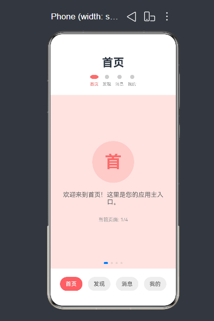
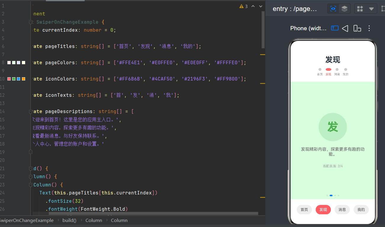
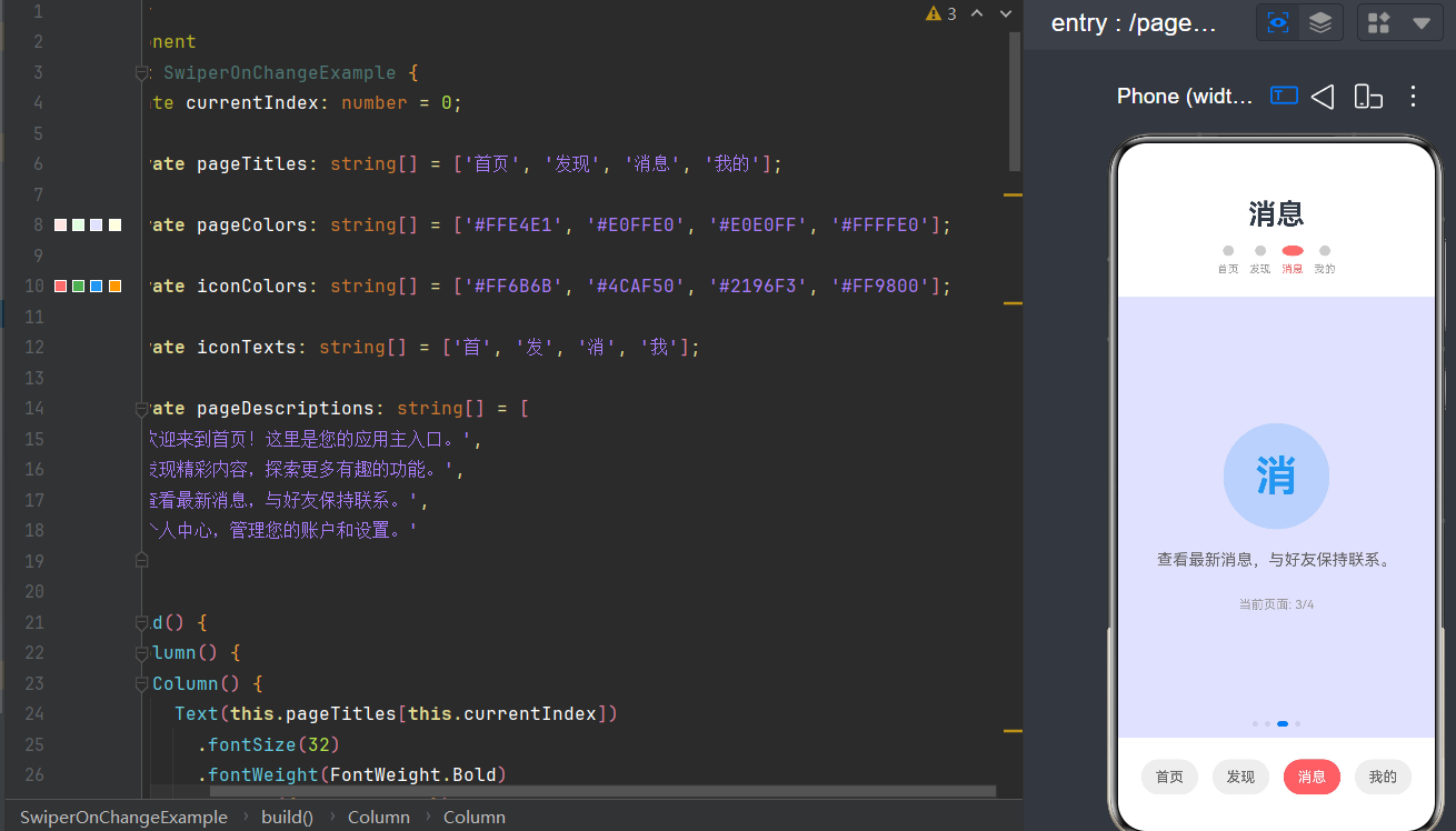
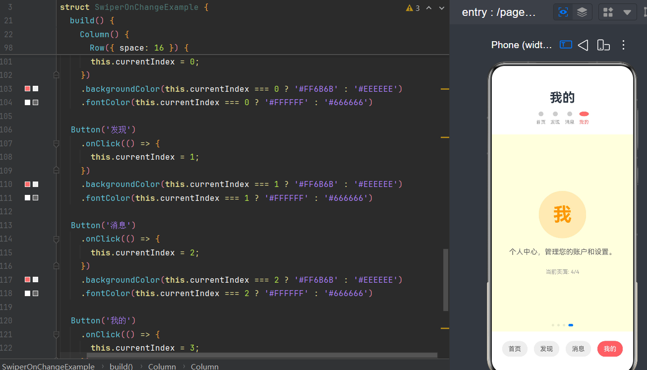
项目演示
目录
- 引言
- Swiper组件概述(API Level 24)
- @State状态管理机制
- onChange事件详解
- 联动布局原理
- 完整示例解析
- 高级场景应用
- 性能优化策略
- 常见问题与解决方案
- 总结
1. 引言
在鸿蒙HarmonyOS应用开发中,页面切换和内容轮播是最常见的交互模式之一。用户期望获得流畅的滑动体验,同时希望页面切换时能联动其他组件产生协同效果,如导航栏状态变化、底部Tab切换、指示器联动等。
本文将深入探讨鸿蒙原生ArkTS布局方式中Swiper + onChange监听切换布局的核心技术原理和实践应用。我们将从组件基础开始,逐步深入到状态管理、事件监听、联动机制,最终通过完整示例展示如何构建一个功能完善、交互流畅的联动布局应用。
1.1 技术背景
随着HarmonyOS NEXT的发布,ArkTS语言和ArkUI框架迎来了重大升级。API Level 24作为最新的API版本,对Swiper组件进行了全面优化,提供了更丰富的属性和更灵活的事件处理机制。
1.2 核心技术点
- Swiper组件:实现页面滑动切换的核心组件
- onChange事件:监听页面切换的关键回调
- @State状态管理:驱动UI响应式更新的核心机制
- 联动布局:实现组件间状态同步的设计模式
1.3 适用场景
- 首页轮播图展示
- Tab页面切换
- 商品详情多图浏览
- 应用引导页
- 内容卡片滑动浏览
2. Swiper组件概述(API Level 24)
2.1 Swiper组件简介
Swiper是HarmonyOS ArkUI框架中用于实现页面滑动切换的核心组件。它允许用户通过手势滑动在多个页面之间切换,支持横向和纵向滑动,提供了丰富的自定义选项和动画效果。
2.2 API Level 24中的Swiper变化
在API Level 24中,Swiper组件进行了重要升级:
2.2.1 构造函数变更
// API Level 23及之前
Swiper(currentIndex: number) { ... }

// API Level 24
Swiper() { ... }
在API Level 24中,Swiper不再支持构造函数传入currentIndex参数,改为通过.index()属性方法设置当前页面索引。
2.2.2 核心属性方法
| 属性方法 | 类型 | 说明 |
|---|---|---|
.index(value: number) |
number | 设置当前页面索引 |
.loop(value: boolean) |
boolean | 是否开启循环滑动 |
.autoPlay(value: boolean) |
boolean | 是否自动播放 |
.interval(value: number) |
number | 自动播放间隔时间(毫秒) |
.indicator(value: boolean) |
boolean | 是否显示指示器 |
.onChange(event: (index: number) => void) |
function | 页面切换回调 |
2.2.3 移除的属性
在API Level 24中,以下属性已被移除或变更:
.direction(Axis)- Swiper默认横向滑动,该属性已移除.duration(value: number)- 滑动动画时长设置方式变更
2.3 基本使用示例
@Entry
@Component
struct BasicSwiperExample {
  @State currentIndex: number = 0;

  build() {
    Column() {
      Swiper() {
        Text('页面1')
          .width('100%')
          .height('100%')
          .backgroundColor('#FFE4E1')
          .textAlign(TextAlign.Center)

        Text('页面2')
          .width('100%')
          .height('100%')
          .backgroundColor('#E0FFE0')
          .textAlign(TextAlign.Center)

        Text('页面3')
          .width('100%')
          .height('100%')
          .backgroundColor('#E0E0FF')
          .textAlign(TextAlign.Center)
      }
      .width('100%')
      .height('50%')
      .index(this.currentIndex)
      .loop(true)
      .onChange((index: number) => {
        this.currentIndex = index;
      })
    }
    .width('100%')
    .height('100%')
  }
}
2.4 Swiper组件的布局特性
2.4.1 页面尺寸自适应
Swiper的每个子组件会自动填充Swiper的完整尺寸,无需手动设置宽高。
2.4.2 滑动手势处理
Swiper内置了完整的手势处理逻辑,包括:
- 触摸开始识别
- 滑动距离计算
- 速度检测
- 惯性滚动
- 边界回弹
2.4.3 动画效果
Swiper提供了流畅的滑动动画,包括:
- 页面切换动画
- 淡入淡出效果
- 缩放效果
3. @State状态管理机制
3.1 状态管理概述
在HarmonyOS ArkUI中,状态管理是实现响应式UI的核心机制。通过状态装饰器标记的变量,当值发生变化时会自动触发相关组件的UI刷新。
3.2 @State装饰器详解
3.2.1 @State的基本用法
@State currentIndex: number = 0;
@State装饰器用于标记组件内部的状态变量。当变量值改变时,使用该变量的组件会自动重新渲染。
3.2.2 @State的响应范围
- 组件内部:同一组件内所有使用该状态的UI元素都会响应变化
- 子组件:通过参数传递给子组件时,子组件不会自动响应变化(需要使用@Link或@Prop)
3.2.3 @State的更新机制
@State count: number = 0;

// 直接赋值会触发UI更新
this.count = 1;

// 对象属性修改不会触发更新
@State user: User = { name: 'Tom', age: 18 };
this.user.name = 'Jerry'; // 不会触发更新

// 需要重新赋值才能触发更新
this.user = { ...this.user, name: 'Jerry' };
3.3 状态管理装饰器对比
| 装饰器 | 作用域 | 数据流向 | 适用场景 |
|---|---|---|---|
| @State | 组件内部 | 内部读写 | 组件私有状态 |
| @Link | 父子组件 | 双向同步 | 父子状态共享 |
| @Prop | 父子组件 | 单向传递 | 父传子,子不回传 |
| @Provide/@Consume | 跨层级 | 双向同步 | 祖孙状态共享 |
| @ObjectLink | 对象属性 | 双向同步 | 对象属性响应 |
3.4 @State与Swiper的配合
在Swiper+onChange布局模式中,@State扮演着核心角色:
@State currentIndex: number = 0;

Swiper() {
  // ...
}
.index(this.currentIndex)
.onChange((index: number) => {
  this.currentIndex = index; // 更新状态,触发联动组件刷新
})
当Swiper页面切换时,onChange回调会更新@State变量,所有绑定该变量的UI组件都会自动刷新。
4. onChange事件详解
4.1 onChange事件定义
onChange是Swiper组件提供的页面切换回调事件,当用户滑动切换页面时触发。
.onChange((index: number) => {
  // index为切换后的页面索引
  console.info(`页面切换到: ${index}`);
})
4.2 onChange事件触发时机
onChange事件在以下场景触发:
- 手势滑动完成:用户通过手势滑动切换到新页面
- 自动播放切换:开启autoPlay后,自动切换页面时触发
- index属性变更:通过代码修改index属性值时触发
4.3 onChange事件的参数
| 参数 | 类型 | 说明 |
|---|---|---|
| index | number | 切换后的页面索引,从0开始 |
4.4 onChange与其他事件的配合
4.4.1 与onTouch事件配合
Swiper() {
  // ...
}
.onTouch((event: TouchEvent) => {
  if (event.type === TouchType.Down) {
    console.info('触摸开始');
  } else if (event.type === TouchType.Up) {
    console.info('触摸结束');
  }
})
.onChange((index: number) => {
  console.info('页面切换完成');
})
4.4.2 与onAnimationStart/onAnimationEnd配合
Swiper() {
  // ...
}
.onAnimationStart(() => {
  console.info('动画开始');
})
.onAnimationEnd(() => {
  console.info('动画结束');
})
.onChange((index: number) => {
  console.info('页面切换完成');
})
4.5 onChange事件的执行顺序
触摸开始 → 滑动中 → 动画开始 → 页面切换 → onChange回调 → 动画结束 → 触摸结束
5. 联动布局原理
5.1 联动布局概念
联动布局是指多个组件之间通过共享状态实现协同变化的布局模式。当一个组件的状态发生变化时,其他关联组件会自动响应并更新。
5.2 Swiper联动布局的核心原理
┌─────────────────────────────────────────────────────────┐
│                    状态管理层                            │
│              @State currentIndex: number                │
└─────────────────────────────────────────────────────────┘
                           │
        ┌──────────────────┼──────────────────┐
        ▼                  ▼                  ▼
┌───────────────┐  ┌───────────────┐  ┌───────────────┐
│   Swiper组件  │  │   指示器组件  │  │   Tab按钮组件 │
│              │  │              │  │              │
│ .index(state)│  │ 根据state渲染│  │ 根据state渲染 │
│ .onChange()  │  │              │  │              │
└───────────────┘  └───────────────┘  └───────────────┘
        │                  │                  │
        └──────────────────┼──────────────────┘
                           ▼
                   用户操作/状态变更
5.3 联动布局的实现步骤
步骤1:定义共享状态
@State currentIndex: number = 0;
步骤2:绑定状态到Swiper
Swiper() { ... }
.index(this.currentIndex)
.onChange((index: number) => {
  this.currentIndex = index;
})
步骤3:在联动组件中使用状态
// 指示器组件
Row() {
  ForEach(this.pageTitles, (item: string, index: number) => {
    Ellipse()
      .width(this.currentIndex === index ? 24 : 12)
      .height(12)
      .fill(this.currentIndex === index ? '#FF6B6B' : '#CCCCCC')
  })
}

// Tab按钮组件
Button('首页')
  .backgroundColor(this.currentIndex === 0 ? '#FF6B6B' : '#EEEEEE')
  .fontColor(this.currentIndex === 0 ? '#FFFFFF' : '#666666')
5.4 双向联动机制
5.4.1 Swiper驱动联动
用户滑动Swiper → onChange触发 → currentIndex更新 → 指示器/Tab按钮更新
5.4.2 外部操作驱动联动
用户点击Tab按钮 → onClick触发 → currentIndex更新 → Swiper切换页面 + 指示器更新
5.5 联动布局的优势
- 状态统一管理:所有联动组件共享同一状态源,避免状态不一致
- 自动响应更新:状态变化自动触发UI刷新,无需手动操作
- 代码简洁:减少事件绑定和手动DOM操作
- 性能优化:框架内部优化渲染流程,减少不必要的重绘
6. 完整示例解析
6.1 示例概述
本示例实现一个包含四个页面的Swiper联动布局应用,主要功能包括:
- Swiper页面滑动切换
- 顶部标题联动更新
- 自定义指示器联动
- 底部Tab按钮联动
- 页面背景色联动变化
6.2 完整代码
@Entry
@Component
struct SwiperOnChangeExample {
  // 当前页面索引,使用@State装饰器实现状态响应式管理
  @State currentIndex: number = 0;

  // 页面标题数组,用于联动显示当前页面的标题
  private pageTitles: string[] = ['首页', '发现', '消息', '我的'];

  // 页面背景颜色数组,用于联动切换页面背景
  private pageColors: string[] = ['#FFE4E1', '#E0FFE0', '#E0E0FF', '#FFFFE0'];

  // 页面图标颜色数组,用于联动切换图标显示
  private iconColors: string[] = ['#FF6B6B', '#4CAF50', '#2196F3', '#FF9800'];

  // 页面图标文字数组,用于显示页面首字图标
  private iconTexts: string[] = ['首', '发', '消', '我'];

  // 页面内容描述数组
  private pageDescriptions: string[] = [
    '欢迎来到首页!这里是您的应用主入口。',
    '发现精彩内容,探索更多有趣的功能。',
    '查看最新消息,与好友保持联系。',
    '个人中心,管理您的账户和设置。'
  ];

  build() {
    // 使用Column布局作为根容器
    Column() {
      // ========== 顶部联动区域 ==========
      // 当Swiper切换页面时,此区域会联动更新
      Column() {
        // 当前页面标题,根据currentIndex动态显示
        Text(this.pageTitles[this.currentIndex])
          .fontSize(32)
          .fontWeight(FontWeight.Bold)
          .margin({ bottom: 16 })
          .transition({ type: TransitionType.All })

        // 指示器区域,显示当前页面位置
        Row({ space: 12 }) {
          // 遍历页面标题,生成对应数量的指示器圆点
          ForEach(this.pageTitles, (item: string, index: number) => {
            Column() {
              // 指示器圆点,根据currentIndex切换样式
              Ellipse()
                .width(this.currentIndex === index ? 24 : 12)
                .height(12)
                .fill(this.currentIndex === index ? '#FF6B6B' : '#CCCCCC')
                .transition({ type: TransitionType.All })

              // 页面名称标签
              Text(this.pageTitles[index])
                .fontSize(12)
                .fontColor(this.currentIndex === index ? '#FF6B6B' : '#999999')
                .margin({ top: 8 })
                .transition({ type: TransitionType.All })
            }
          })
        }
      }
      .width('100%')
      .padding(24)
      .alignItems(HorizontalAlign.Center)
      .backgroundColor('#FFFFFF')
      .shadow({ radius: 8, color: '#00000010', offsetY: 4 })

      // ========== Swiper 主区域 ==========
      // Swiper组件是核心,用于实现页面滑动切换
      Swiper() {
        // 遍历页面数组,生成对应数量的Swiper页面
        ForEach(this.pageColors, (color: string, index: number) => {
          // 每个页面使用Column布局,展示不同的内容
          Column() {
            // 页面图标区域,使用自定义图形替代图片资源
            Stack() {
              // 外层圆形背景
              Circle()
                .width(120)
                .height(120)
                .fill(this.iconColors[index])
                .opacity(0.2)

              // 内层图标文字
              Text(this.iconTexts[index])
                .fontSize(48)
                .fontWeight(FontWeight.Bold)
                .fontColor(this.iconColors[index])
            }
            .margin({ bottom: 24 })

            // 页面内容描述
            Text(this.pageDescriptions[index])
              .fontSize(18)
              .fontColor('#666666')
              .textAlign(TextAlign.Center)
              .padding({ left: 32, right: 32 })

            // 当前页面索引提示
            Text(`当前页面: ${index + 1}/${this.pageColors.length}`)
              .fontSize(14)
              .fontColor('#999999')
              .margin({ top: 32 })
          }
          // 设置页面背景颜色,根据索引动态变化
          .width('100%')
          .height('100%')
          .backgroundColor(color)
          .justifyContent(FlexAlign.Center)
          .alignItems(HorizontalAlign.Center)
        })
      }
      // Swiper属性设置
      .width('100%')
      .height('70%')
      // 设置当前页面索引,与@State绑定实现双向联动
      .index(this.currentIndex)
      // 开启循环滑动
      .loop(true)
      // 关键:onChange事件监听器,当页面切换时触发
      .onChange((index: number) => {
        // 更新currentIndex状态,触发联动组件的UI刷新
        this.currentIndex = index;
        // 可以在这里添加更多联动逻辑,如数据加载、动画效果等
        console.info(`页面切换到: ${index}`);
      })

      // ========== 底部联动操作区 ==========
      // 点击按钮可直接跳转到指定页面
      Row({ space: 16 }) {
        Button('首页')
          .onClick(() => {
            this.currentIndex = 0;
          })
          .backgroundColor(this.currentIndex === 0 ? '#FF6B6B' : '#EEEEEE')
          .fontColor(this.currentIndex === 0 ? '#FFFFFF' : '#666666')

        Button('发现')
          .onClick(() => {
            this.currentIndex = 1;
          })
          .backgroundColor(this.currentIndex === 1 ? '#FF6B6B' : '#EEEEEE')
          .fontColor(this.currentIndex === 1 ? '#FFFFFF' : '#666666')

        Button('消息')
          .onClick(() => {
            this.currentIndex = 2;
          })
          .backgroundColor(this.currentIndex === 2 ? '#FF6B6B' : '#EEEEEE')
          .fontColor(this.currentIndex === 2 ? '#FFFFFF' : '#666666')

        Button('我的')
          .onClick(() => {
            this.currentIndex = 3;
          })
          .backgroundColor(this.currentIndex === 3 ? '#FF6B6B' : '#EEEEEE')
          .fontColor(this.currentIndex === 3 ? '#FFFFFF' : '#666666')
      }
      .width('100%')
      .padding(24)
      .justifyContent(FlexAlign.Center)
      .backgroundColor('#FFFFFF')
    }
    // 根容器属性设置
    .width('100%')
    .height('100%')
    .backgroundColor('#F5F5F5')
  }
}
6.3 代码解析
6.3.1 状态定义
@State currentIndex: number = 0;
currentIndex是整个联动布局的核心状态,控制所有联动组件的显示状态。
6.3.2 数据准备
private pageTitles: string[] = ['首页', '发现', '消息', '我的'];
private pageColors: string[] = ['#FFE4E1', '#E0FFE0', '#E0E0FF', '#FFFFE0'];
private iconColors: string[] = ['#FF6B6B', '#4CAF50', '#2196F3', '#FF9800'];
private iconTexts: string[] = ['首', '发', '消', '我'];
private pageDescriptions: string[] = [...]
这些数组存储了四个页面的配置数据,通过索引与currentIndex对应。
6.3.3 顶部联动区域
Column() {
  Text(this.pageTitles[this.currentIndex])
    .fontSize(32)
    .fontWeight(FontWeight.Bold)
    .margin({ bottom: 16 })
    .transition({ type: TransitionType.All })

  Row({ space: 12 }) {
    ForEach(this.pageTitles, (item: string, index: number) => {
      Column() {
        Ellipse()
          .width(this.currentIndex === index ? 24 : 12)
          .height(12)
          .fill(this.currentIndex === index ? '#FF6B6B' : '#CCCCCC')
          .transition({ type: TransitionType.All })

        Text(this.pageTitles[index])
          .fontSize(12)
          .fontColor(this.currentIndex === index ? '#FF6B6B' : '#999999')
          .margin({ top: 8 })
          .transition({ type: TransitionType.All })
      }
    })
  }
}
顶部区域包含两个联动元素:
- 页面标题:根据currentIndex动态显示
- 指示器:通过ForEach遍历生成,根据currentIndex切换样式
6.3.4 Swiper主区域
Swiper() {
  ForEach(this.pageColors, (color: string, index: number) => {
    Column() {
      Stack() {
        Circle()
          .width(120)
          .height(120)
          .fill(this.iconColors[index])
          .opacity(0.2)

        Text(this.iconTexts[index])
          .fontSize(48)
          .fontWeight(FontWeight.Bold)
          .fontColor(this.iconColors[index])
      }
      .margin({ bottom: 24 })

      Text(this.pageDescriptions[index])
        .fontSize(18)
        .fontColor('#666666')
        .textAlign(TextAlign.Center)
        .padding({ left: 32, right: 32 })

      Text(`当前页面: ${index + 1}/${this.pageColors.length}`)
        .fontSize(14)
        .fontColor('#999999')
        .margin({ top: 32 })
    }
    .width('100%')
    .height('100%')
    .backgroundColor(color)
    .justifyContent(FlexAlign.Center)
    .alignItems(HorizontalAlign.Center)
  })
}
.width('100%')
.height('70%')
.index(this.currentIndex)
.loop(true)
.onChange((index: number) => {
  this.currentIndex = index;
  console.info(`页面切换到: ${index}`);
})
Swiper区域是核心,通过ForEach遍历生成四个页面,每个页面包含:
- 图标区域(圆形背景+文字)
- 内容描述
- 页码提示
关键配置:
.index(this.currentIndex):绑定当前页面索引.loop(true):开启循环滑动.onChange():页面切换时更新状态
6.3.5 底部联动操作区
Row({ space: 16 }) {
  Button('首页')
    .onClick(() => {
      this.currentIndex = 0;
    })
    .backgroundColor(this.currentIndex === 0 ? '#FF6B6B' : '#EEEEEE')
    .fontColor(this.currentIndex === 0 ? '#FFFFFF' : '#666666')

  // ... 其他按钮类似
}
底部区域包含四个按钮,点击按钮可以直接切换到对应页面,按钮样式根据currentIndex联动变化。
6.4 运行效果
运行应用后,用户可以:
- 通过手势滑动Swiper切换页面
- 顶部标题和指示器会同步更新
- 底部按钮会高亮当前页面
- 点击底部按钮可以直接跳转到对应页面
- Swiper支持循环滑动
7. 高级场景应用
7.1 数据懒加载
在实际应用中,Swiper的页面内容可能需要从网络获取。可以利用onChange事件实现数据懒加载:
@State currentIndex: number = 0;
@State pageData: string[] = ['', '', '', ''];
private isLoading: boolean[] = [false, false, false, false];

build() {
  Column() {
    Swiper() {
      ForEach(this.pageData, (data: string, index: number) => {
        Column() {
          if (this.pageData[index] === '') {
            Text('加载中...')
              .fontSize(18)
          } else {
            Text(data)
              .fontSize(18)
          }
        }
        .width('100%')
        .height('100%')
        .backgroundColor(this.pageColors[index])
        .justifyContent(FlexAlign.Center)
      })
    }
    .width('100%')
    .height('70%')
    .index(this.currentIndex)
    .onChange((index: number) => {
      this.currentIndex = index;
      this.loadPageData(index);
    })
  }
}

loadPageData(index: number) {
  if (!this.isLoading[index] && this.pageData[index] === '') {
    this.isLoading[index] = true;
    // 模拟网络请求
    setTimeout(() => {
      this.pageData[index] = `页面${index + 1}的内容已加载`;
      this.isLoading[index] = false;
    }, 1000);
  }
}
7.2 动态页面数量
支持根据数据动态生成Swiper页面:
@State currentIndex: number = 0;
@State pages: PageData[] = [];

build() {
  Column() {
    Swiper() {
      ForEach(this.pages, (page: PageData, index: number) => {
        Column() {
          Text(page.title)
            .fontSize(24)
            .fontWeight(FontWeight.Bold)

          Text(page.content)
            .fontSize(16)
            .margin({ top: 16 })
        }
        .width('100%')
        .height('100%')
        .backgroundColor(page.color)
        .justifyContent(FlexAlign.Center)
      })
    }
    .width('100%')
    .height('70%')
    .index(this.currentIndex)
    .onChange((index: number) => {
      this.currentIndex = index;
    })
  }
}

interface PageData {
  title: string;
  content: string;
  color: string;
}
7.3 嵌套Swiper
实现嵌套滑动效果:
@State outerIndex: number = 0;
@State innerIndex: number = 0;

build() {
  Column() {
    Swiper() {
      Column() {
        Text('外层页面1')
          .fontSize(24)

        Swiper() {
          Text('内层页面1-1')
            .width('100%')
            .height(200)
            .backgroundColor('#FFE4E1')

          Text('内层页面1-2')
            .width('100%')
            .height(200)
            .backgroundColor('#E0FFE0')
        }
        .width('100%')
        .height(200)
        .index(this.innerIndex)
        .onChange((index: number) => {
          this.innerIndex = index;
        })
      }
      .width('100%')
      .height('100%')

      Text('外层页面2')
        .width('100%')
        .height('100%')
        .backgroundColor('#E0E0FF')
    }
    .width('100%')
    .height('70%')
    .index(this.outerIndex)
    .onChange((index: number) => {
      this.outerIndex = index;
    })
  }
}
7.4 Swiper与页面路由结合
实现Swiper滑动切换不同的功能页面:
@State currentIndex: number = 0;

build() {
  Column() {
    Swiper() {
      HomePage()
      DiscoverPage()
      MessagePage()
      ProfilePage()
    }
    .width('100%')
    .height('70%')
    .index(this.currentIndex)
    .onChange((index: number) => {
      this.currentIndex = index;
    })

    Row({ space: 16 }) {
      Button('首页')
        .onClick(() => { this.currentIndex = 0; })
      Button('发现')
        .onClick(() => { this.currentIndex = 1; })
      Button('消息')
        .onClick(() => { this.currentIndex = 2; })
      Button('我的')
        .onClick(() => { this.currentIndex = 3; })
    }
  }
}
8. 性能优化策略
8.1 减少不必要的状态更新
.onChange((index: number) => {
  // 避免重复更新
  if (this.currentIndex !== index) {
    this.currentIndex = index;
  }
})
8.2 使用renderGroup优化动画性能
对于包含复杂子组件的动画,设置renderGroup(true)可以减少渲染批次:
Column() {
  // 复杂子组件
}
.renderGroup(true)
8.3 避免在动画过程中改变布局属性
// 错误做法
Text('内容')
  .width(this.currentIndex === 0 ? '100%' : '50%') // 动画过程中改变宽度

// 正确做法
Text('内容')
  .width('100%')
  .opacity(this.currentIndex === 0 ? 1 : 0.5) // 使用opacity替代布局属性
8.4 使用懒加载优化内存
Swiper() {
  ForEach(this.pages, (page: PageData, index: number) => {
    // 只渲染当前页面和前后各一个页面
    if (Math.abs(index - this.currentIndex) <= 1) {
      PageItem({ data: page })
    } else {
      // 占位组件
      Column().width('100%').height('100%')
    }
  })
}
8.5 优化ForEach性能
// 为ForEach添加keyGenerator
ForEach(
  this.pageTitles,
  (item: string, index: number) => {
    // ...
  },
  (item: string, index: number) => {
    return index.toString(); // 返回唯一标识
  }
)
9. 常见问题与解决方案
9.1 问题1:Swiper页面切换时联动组件不更新
原因:状态变量未正确绑定或未使用@State装饰器
解决方案:
@State currentIndex: number = 0; // 必须使用@State装饰器

Swiper() { ... }
.index(this.currentIndex) // 绑定状态
.onChange((index: number) => {
  this.currentIndex = index; // 更新状态
})
9.2 问题2:transition动画不生效
原因:API Level 24中transition参数格式变更
解决方案:
// API Level 23及之前
.transition({ duration: 300, curve: Curve.EaseInOut })

// API Level 24
.transition({ type: TransitionType.All })
9.3 问题3:Swiper构造函数报错
原因:API Level 24中Swiper不再支持构造函数传入参数
解决方案:
// API Level 23及之前
Swiper(this.currentIndex) { ... }

// API Level 24
Swiper() { ... }
.index(this.currentIndex)
9.4 问题4:direction属性报错
原因:API Level 24中已移除direction属性
解决方案:
// API Level 23及之前
.direction(Axis.Horizontal)

// API Level 24 - 默认横向,无需设置
// 如需纵向,使用其他布局方式
9.5 问题5:ForEach回调中使用下划线报错
原因:ArkTS不支持使用下划线作为参数名
解决方案:
// 错误做法
ForEach(this.pageTitles, (_, index: number) => { ... })

// 正确做法
ForEach(this.pageTitles, (item: string, index: number) => { ... })
9.6 问题6:页面切换时数据丢失
原因:状态更新时机不正确
解决方案:
.onChange((index: number) => {
  this.currentIndex = index;
  // 在onChange中保存当前页面状态
  this.savePageState(index);
})
9.7 问题7:滑动不流畅
原因:页面内容过于复杂或存在性能瓶颈
解决方案:
- 简化页面布局
- 使用renderGroup优化
- 实现数据懒加载
- 减少不必要的动画
10. 总结
10.1 核心要点回顾
- Swiper组件:API Level 24中构造函数变更,使用
.index()方法设置当前页面 - onChange事件:页面切换时触发,是实现联动的关键
- @State状态管理:响应式状态驱动UI更新
- 联动布局:通过共享状态实现组件间协同变化
10.2 实践建议
- 统一状态管理:使用@State管理所有联动组件的共享状态
- 合理使用ForEach:为列表渲染提供唯一标识,优化性能
- 注意API版本差异:API Level 24有多处API变更,需特别注意
- 优化性能:合理使用renderGroup、懒加载等优化手段
10.3 未来发展
随着HarmonyOS生态的不断发展,Swiper组件和状态管理机制将持续优化,为开发者提供更强大、更高效的开发体验。建议开发者关注官方文档更新,及时掌握最新技术动态。
10.4 学习资源推荐

作为“人工智能6S店”的官方数字引擎,为AI开发者与企业提供一个覆盖软硬件全栈、一站式门户。
更多推荐
 0
0 0
0- 0


 已为社区贡献21条内容

所有评论(0)