
鸿蒙原生 ArkTS 布局之道:Shadow 阴影浮层布局深度解析
项目演示
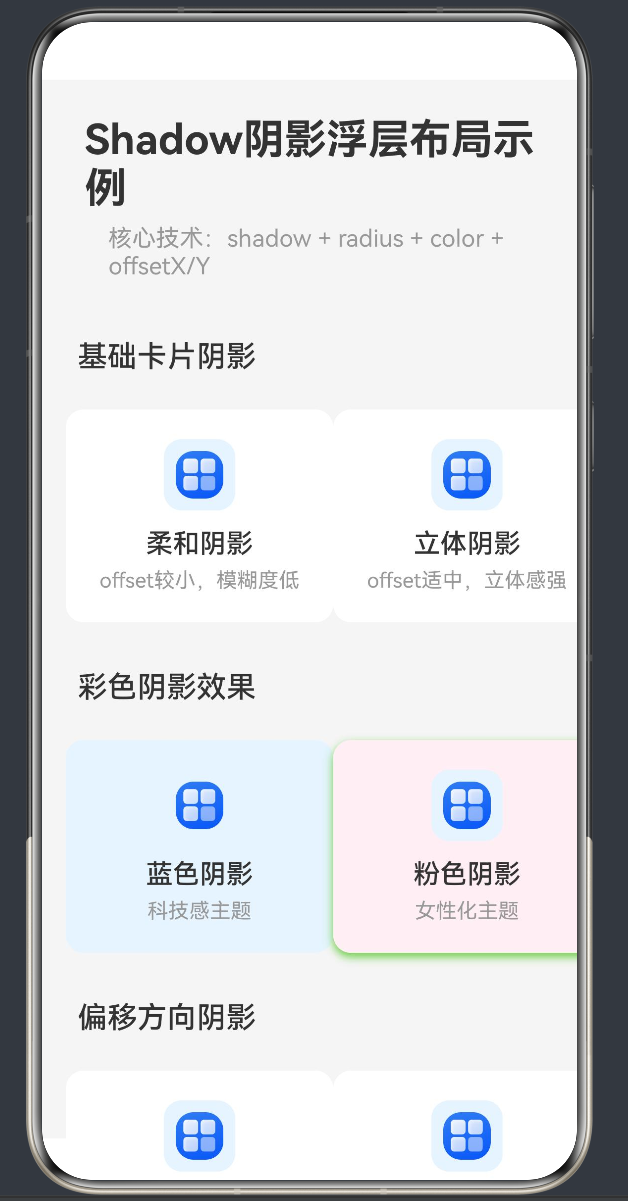
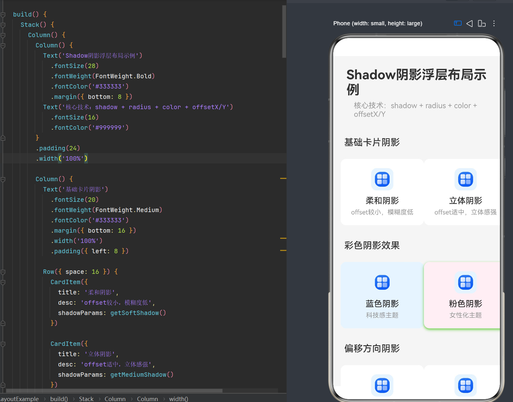
目录
- 引言:阴影在现代 UI 设计中的价值
- HarmonyOS NEXT 阴影系统架构
- ShadowOptions 深度剖析
- ShadowStyle 预置阴影样式
- elevation 属性与 Z 轴层级
- 卡片阴影浮层布局实战
- 弹窗阴影浮层布局实战
- 彩色阴影与创意效果
- 阴影性能优化策略
- 常见问题与解决方案
- 最佳实践总结
1. 引言:阴影在现代 UI 设计中的价值
1.1 从平面到立体的视觉革命
在移动应用开发的早期阶段,界面设计普遍采用扁平化风格。随着技术的进步和用户审美的提升,纯粹的扁平化设计已经无法满足现代应用对视觉层次和交互体验的需求。阴影(Shadow)作为一种关键的视觉设计元素,应运而生。
阴影不仅仅是一种装饰效果,它承载着以下核心功能:
- 视觉层级构建:通过阴影的深浅、大小、方向,建立清晰的界面元素层级关系
- 用户注意力引导:突出重要操作区域,引导用户关注关键信息
- 交互状态反馈:通过阴影的变化,提供按钮按压、卡片选中等交互反馈
- 空间感营造:在二维屏幕上模拟三维空间,增强界面的沉浸感
1.2 Material Design 的 elevation 理念
Google 的 Material Design 设计语言将「elevation(高度)」作为核心设计原则。在 Material Design 中,每个组件都有一个虚拟的 Z 轴高度,高度越高,阴影越大越明显。这种设计理念为用户提供了直观的视觉反馈:
- 悬浮按钮(Floating Action Button):最高 elevation,最大阴影
- 卡片(Card):中等 elevation,中等阴影
- 按钮(Button):较低 elevation,较小阴影
- 文本(Text):最低 elevation,无阴影
1.3 HarmonyOS NEXT 的阴影系统
HarmonyOS NEXT(API 24)在 ArkUI 框架中提供了完整且强大的阴影系统,支持以下三种核心 API:
| API | 类型 | 作用 | 典型场景 |
|---|---|---|---|
shadow(style: ShadowStyle) |
方法调用 | 使用系统预置的阴影样式,自动配置参数 | 常规卡片、列表项、弹窗 |
shadow(options: ShadowOptions) |
方法调用 | 手动指定阴影的模糊半径、颜色、偏移量 | 需要特殊颜色或自定义效果 |
elevation(value: number) |
链式属性 | 设置组件的 Z 轴高度,影响阴影视觉效果 | 搭配 shadow 使用,强化层级感 |
2. HarmonyOS NEXT 阴影系统架构
2.1 技术架构层次
HarmonyOS 的阴影系统采用分层架构设计,从底层到上层依次为:
┌─────────────────────────────────────────────────────────────────┐
│ 应用层 (Application)                                            │
│ ArkUI 组件声明式调用 → .shadow() .elevation()                    │
├─────────────────────────────────────────────────────────────────┤
│ 框架层 (Framework)                                              │
│ ShadowOptions / ShadowStyle / elevation                          │
│ ├─ 预置阴影样式枚举                                               │
│ ├─ 自定义阴影参数配置                                             │
│ └─ Z轴高度计算                                                   │
├─────────────────────────────────────────────────────────────────┤
│ 图形服务层 (ArkGraphics)                                         │
│ ArkGraphics 2D / 合成器                                          │
│ ├─ ShadowLayer 绘制                                              │
│ ├─ GPU 加速渲染                                                  │
│ └─ 图层合成与混合                                                 │
├─────────────────────────────────────────────────────────────────┤
│ 硬件层 (Hardware)                                                │
│ GPU / Vulkan / OpenGL                                            │
└─────────────────────────────────────────────────────────────────┘
2.2 核心组件关系
在 ArkUI 中,阴影系统的三个核心 API 相互配合:
// 基础用法:单独使用 shadow
Column() {
  Text('带阴影的卡片')
}
.width(200)
.height(100)
.backgroundColor(Color.White)
.borderRadius(12)
.shadow({ radius: 8, color: '#00000020', offsetX: 0, offsetY: 4 })

// 进阶用法:shadow + elevation 组合
Column() {
  Text('带层级的卡片')
}
.width(200)
.height(100)
.backgroundColor(Color.White)
.borderRadius(12)
.elevation(8)
.shadow({ radius: 12, color: '#00000030', offsetX: 2, offsetY: 6 })
2.3 API Level 24 新增特性
API Level 24(对应 HarmonyOS 6.1.1)在阴影系统方面带来了以下增强:
- 更丰富的阴影参数配置:支持 fill 内部填充属性
- ColoringStrategy 智能取色:支持自动提取背景色生成阴影
- 性能优化:引入 shadow batching 批量渲染机制
- 编译规则严格化:禁止未类型化对象字面量,提升代码健壮性
3. ShadowOptions 深度剖析
3.1 ShadowOptions 接口定义
ShadowOptions 是自定义阴影效果的核心接口,定义如下:
interface ShadowOptions {
  radius: number | Resource;      // 阴影模糊半径
  type?: ShadowType;              // 阴影类型
  color?: Color | string | Resource | ColoringStrategy;  // 阴影颜色
  offsetX?: number | Resource;    // X轴偏移量
  offsetY?: number | Resource;    // Y轴偏移量
  fill?: boolean;                 // 是否内部填充
}
3.2 核心参数详解
3.2.1 radius(模糊半径)
radius 是阴影效果中最关键的参数,决定了阴影的模糊程度:
- 取值范围:
[0, +∞)(API 26.0.0 之前),(-∞, +∞)(API 26.0.0 开始,负值不绘制阴影) - 单位:px(像素),可使用
vp2px()转换 vp 单位 - 视觉效果:值越大,阴影边缘越模糊柔和;值越小,阴影边缘越清晰锐利
// 不同 radius 值的效果对比
Column() {
  // 锐利阴影(小半径)
  Column() { Text('锐利阴影') }
    .width(120)
    .height(60)
    .backgroundColor(Color.White)
    .borderRadius(8)
    .shadow({ radius: 2, color: '#00000040', offsetX: 0, offsetY: 2 })

  // 柔和阴影(中等半径)
  Column() { Text('柔和阴影') }
    .width(120)
    .height(60)
    .backgroundColor(Color.White)
    .borderRadius(8)
    .shadow({ radius: 8, color: '#00000030', offsetX: 0, offsetY: 4 })

  // 扩散阴影(大半径)
  Column() { Text('扩散阴影') }
    .width(120)
    .height(60)
    .backgroundColor(Color.White)
    .borderRadius(8)
    .shadow({ radius: 20, color: '#00000020', offsetX: 0, offsetY: 8 })
}
.justifyContent(FlexAlign.SpaceEvenly)
3.2.2 color(阴影颜色)
color 参数决定了阴影的颜色和透明度:
- 类型支持:
Color枚举、十六进制字符串、Resource资源引用、ColoringStrategy智能取色 - 透明度控制:通过颜色的 alpha 通道控制,如
#00000030表示 18.75% 透明度的黑色 - 视觉效果:深色阴影增加厚重感,浅色/彩色阴影增加轻盈感和创意性
// 不同颜色阴影的效果
Column() {
  // 黑色阴影(经典)
  Column() { Text('黑色阴影') }
    .width(120)
    .height(60)
    .backgroundColor(Color.White)
    .shadow({ radius: 10, color: '#00000030', offsetX: 0, offsetY: 4 })

  // 蓝色阴影(科技感)
  Column() { Text('蓝色阴影') }
    .width(120)
    .height(60)
    .backgroundColor('#E8F4FF')
    .shadow({ radius: 10, color: '#0066FF40', offsetX: 0, offsetY: 4 })

  // 粉色阴影(女性化)
  Column() { Text('粉色阴影') }
    .width(120)
    .height(60)
    .backgroundColor('#FFF0F5')
    .shadow({ radius: 10, color: '#FF66CC40', offsetX: 0, offsetY: 4 })
}
3.2.3 offsetX / offsetY(偏移量)
offsetX 和 offsetY 控制阴影相对于组件的偏移方向:
- offsetX:水平偏移量,正值向右偏移,负值向左偏移
- offsetY:垂直偏移量,正值向下偏移,负值向上偏移
- 单位:px(像素)
偏移量决定了光源的方向:
// 不同偏移方向的阴影效果
Column() {
  // 右下偏移(默认光源方向)
  Column() { Text('右下偏移') }
    .width(100)
    .height(100)
    .backgroundColor(Color.White)
    .shadow({ radius: 10, color: '#00000030', offsetX: 4, offsetY: 4 })

  // 右上偏移
  Column() { Text('右上偏移') }
    .width(100)
    .height(100)
    .backgroundColor(Color.White)
    .shadow({ radius: 10, color: '#00000030', offsetX: 4, offsetY: -4 })

  // 居中无偏移(四周扩散)
  Column() { Text('居中阴影') }
    .width(100)
    .height(100)
    .backgroundColor(Color.White)
    .shadow({ radius: 15, color: '#00000020', offsetX: 0, offsetY: 0 })
}
3.2.4 fill(内部填充)
fill 参数控制阴影是否填充到组件内部:
- 默认值:
false,阴影仅显示在组件外部 - 设为 true:阴影会填充到组件内部,产生发光效果
// fill 参数效果对比
Column() {
  // 默认:外部阴影
  Column() { Text('外部阴影') }
    .width(120)
    .height(60)
    .backgroundColor(Color.White)
    .shadow({ radius: 15, color: '#0066FF50', offsetX: 0, offsetY: 0 })

  // fill: true:内部填充阴影(发光效果)
  Column() { Text('发光效果') }
    .width(120)
    .height(60)
    .backgroundColor('#E8F4FF')
    .shadow({ radius: 15, color: '#0066FF50', offsetX: 0, offsetY: 0, fill: true })
}
3.2.5 type(阴影类型)
type 参数指定阴影的渲染类型:
- ShadowType.COLOR:颜色阴影(默认),基于颜色混合渲染
- ShadowType.BLUR:模糊阴影,基于高斯模糊渲染
// 不同阴影类型效果
Column() {
  // COLOR 类型(默认)
  Column() { Text('COLOR 阴影') }
    .width(100)
    .height(60)
    .backgroundColor(Color.White)
    .shadow({ radius: 10, color: '#00000030', type: ShadowType.COLOR })

  // BLUR 类型
  Column() { Text('BLUR 阴影') }
    .width(100)
    .height(60)
    .backgroundColor(Color.White)
    .shadow({ radius: 10, color: '#00000030', type: ShadowType.BLUR })
}
3.3 ShadowOptions 使用模式
3.3.1 基础模式:最小参数
// 只设置 radius,使用默认颜色和偏移
.shadow({ radius: 8 })
3.3.2 标准模式:完整参数
// 设置所有核心参数
.shadow({
  radius: 12,
  color: '#00000026',
  offsetX: 4,
  offsetY: 8
})
3.3.3 高级模式:包含 fill 和 type
// 完整配置
.shadow({
  radius: 20,
  type: ShadowType.COLOR,
  color: '#0066FF40',
  offsetX: 0,
  offsetY: 0,
  fill: true
})
4. ShadowStyle 预置阴影样式
4.1 ShadowStyle 枚举定义
ShadowStyle 提供了系统预置的阴影样式,可以快速应用常见的阴影效果:
enum ShadowStyle {
  OUTER_DEFAULT_XS,   // 超小阴影
  OUTER_DEFAULT_SM,   // 小阴影
  OUTER_DEFAULT_MD,   // 中阴影
  OUTER_DEFAULT_LG,   // 大阴影
  OUTER_FLOATING_SM,  // 浮动小阴影
  OUTER_FLOATING_MD,  // 浮动中阴影
  OUTER_FLOATING_LG,  // 浮动大阴影
  INNER_DEFAULT_XS,   // 内阴影超小
  INNER_DEFAULT_SM,   // 内阴影小
  INNER_DEFAULT_MD,   // 内阴影中
  INNER_DEFAULT_LG    // 内阴影大
}
4.2 预置样式对比
| 样式枚举 | 视觉效果 | 适用场景 |
|---|---|---|
| OUTER_DEFAULT_XS | 极轻微阴影 | 列表项、分割线 |
| OUTER_DEFAULT_SM | 轻微阴影 | 按钮、小卡片 |
| OUTER_DEFAULT_MD | 中等阴影 | 普通卡片、容器 |
| OUTER_DEFAULT_LG | 明显阴影 | 弹窗、浮层 |
| OUTER_FLOATING_SM | 轻微浮动阴影 | 悬浮按钮、标签 |
| OUTER_FLOATING_MD | 中等浮动阴影 | 操作面板、下拉菜单 |
| OUTER_FLOATING_LG | 强烈浮动阴影 | 模态弹窗、全屏遮罩 |
4.3 ShadowStyle 使用示例
@Entry
@Component
struct ShadowStyleDemo {
  build() {
    Column({ space: 16 }) {
      Text('预置阴影样式演示')
        .fontSize(20)
        .fontWeight(FontWeight.Bold)

      // 外部阴影系列
      Column({ space: 8 }) {
        Text('外部阴影')
          .fontSize(14)
          .fontColor('#666666')

        Row({ space: 12 }) {
          Column() { Text('XS') }
            .width(80)
            .height(40)
            .backgroundColor(Color.White)
            .borderRadius(8)
            .shadow(ShadowStyle.OUTER_DEFAULT_XS)

          Column() { Text('SM') }
            .width(80)
            .height(40)
            .backgroundColor(Color.White)
            .borderRadius(8)
            .shadow(ShadowStyle.OUTER_DEFAULT_SM)

          Column() { Text('MD') }
            .width(80)
            .height(40)
            .backgroundColor(Color.White)
            .borderRadius(8)
            .shadow(ShadowStyle.OUTER_DEFAULT_MD)

          Column() { Text('LG') }
            .width(80)
            .height(40)
            .backgroundColor(Color.White)
            .borderRadius(8)
            .shadow(ShadowStyle.OUTER_DEFAULT_LG)
        }
      }

      // 浮动阴影系列
      Column({ space: 8 }) {
        Text('浮动阴影')
          .fontSize(14)
          .fontColor('#666666')

        Row({ space: 12 }) {
          Column() { Text('FLOAT SM') }
            .width(80)
            .height(40)
            .backgroundColor(Color.White)
            .borderRadius(8)
            .shadow(ShadowStyle.OUTER_FLOATING_SM)

          Column() { Text('FLOAT MD') }
            .width(80)
            .height(40)
            .backgroundColor(Color.White)
            .borderRadius(8)
            .shadow(ShadowStyle.OUTER_FLOATING_MD)

          Column() { Text('FLOAT LG') }
            .width(80)
            .height(40)
            .backgroundColor(Color.White)
            .borderRadius(8)
            .shadow(ShadowStyle.OUTER_FLOATING_LG)
        }
      }
    }
    .width('100%')
    .height('100%')
    .padding(24)
    .backgroundColor('#F5F5F5')
  }
}
5. elevation 属性与 Z 轴层级
5.1 elevation 概念
elevation 属性用于设置组件在 Z 轴上的高度,单位为 vp(虚拟像素)。在 Material Design 设计语言中,elevation 决定了组件的视觉层级:
- elevation 值越大,组件看起来越"浮"在界面上方
- elevation 会影响阴影的大小和模糊程度
5.2 elevation 与 shadow 的关系
elevation 和 shadow 可以独立使用,也可以组合使用:
- 单独使用 elevation:系统自动计算阴影效果,但无法自定义颜色和偏移
- 单独使用 shadow:完全自定义阴影效果,但不影响 Z 轴层级
- 组合使用:最佳实践,elevation 控制层级,shadow 控制视觉效果
// elevation 单独使用
Column() { Text('仅 elevation') }
  .width(120)
  .height(60)
  .backgroundColor(Color.White)
  .borderRadius(8)
  .elevation(8)

// shadow 单独使用
Column() { Text('仅 shadow') }
  .width(120)
  .height(60)
  .backgroundColor(Color.White)
  .borderRadius(8)
  .shadow({ radius: 10, color: '#00000030', offsetX: 0, offsetY: 4 })

// 组合使用(推荐)
Column() { Text('elevation + shadow') }
  .width(120)
  .height(60)
  .backgroundColor(Color.White)
  .borderRadius(8)
  .elevation(8)
  .shadow({ radius: 10, color: '#00000030', offsetX: 0, offsetY: 4 })
5.3 elevation 取值参考
根据 Material Design 设计规范,推荐的 elevation 取值如下:
| 组件类型 | elevation 值(vp) | 说明 |
|---|---|---|
| 底部导航栏 | 8 | 固定在底部的导航组件 |
| 卡片 | 2-8 | 普通内容卡片 |
| 悬浮按钮 | 6-12 | 浮动操作按钮 |
| 菜单 | 8-16 | 下拉菜单、操作菜单 |
| 对话框 | 24 | 模态对话框 |
| 底部抽屉 | 16 | 底部弹出的面板 |
| Snackbar | 6 | 短暂提示消息 |
5.4 Z 轴层级管理最佳实践
在复杂界面中,合理管理组件的 Z 轴层级至关重要:
// 层级管理示例
Stack() {
  // 底层:背景层
  Column() { ... }
    .width('100%')
    .height('100%')
    .elevation(0)

  // 中层:内容卡片
  Column() { ... }
    .width('90%')
    .height(200)
    .backgroundColor(Color.White)
    .borderRadius(12)
    .elevation(4)
    .shadow({ radius: 8, color: '#00000020', offsetX: 0, offsetY: 4 })

  // 上层:悬浮按钮
  Button('+')
    .width(56)
    .height(56)
    .borderRadius(28)
    .backgroundColor('#0066FF')
    .fontColor(Color.White)
    .fontSize(24)
    .elevation(8)
    .shadow({ radius: 12, color: '#0066FF40', offsetX: 0, offsetY: 4 })
}
6. 卡片阴影浮层布局实战
6.1 场景描述
卡片是移动应用中最常见的 UI 组件之一。通过阴影效果,可以让卡片从背景中"浮"起来,提升视觉层次。
6.2 实现思路
- 使用
Column作为卡片容器 - 设置卡片背景色为白色
- 添加圆角
borderRadius,使阴影边缘更自然 - 使用
shadow属性添加阴影效果 - 配合
elevation设置 Z 轴高度
6.3 完整代码实现
@Entry
@Component
struct CardShadowDemo {
  @State cardList: CardData[] = [
    {
      title: '今日推荐',
      desc: '精选优质内容,每日更新',
      icon: '🌟',
      bgColor: '#FFF8E1'
    },
    {
      title: '热门话题',
      desc: '大家都在讨论的话题',
      icon: '🔥',
      bgColor: '#FFEBEE'
    },
    {
      title: '最新动态',
      desc: '关注的内容有新更新',
      icon: '💬',
      bgColor: '#E3F2FD'
    }
  ]

  build() {
    Column({ space: 16 }) {
      // 页面标题
      Column() {
        Text('卡片阴影浮层布局')
          .fontSize(28)
          .fontWeight(FontWeight.Bold)
          .fontColor('#333333')
        Text('通过阴影提升卡片的视觉层级')
          .fontSize(16)
          .fontColor('#999999')
      }
      .padding(24)

      // 卡片列表
      Column({ space: 16 }) {
        ForEach(this.cardList, (item: CardData) => {
          CardItem({ data: item })
        })
      }
      .padding({ left: 24, right: 24 })
    }
    .width('100%')
    .height('100%')
    .backgroundColor('#F5F5F5')
  }
}

interface CardData {
  title: string
  desc: string
  icon: string
  bgColor: string
}

@Component
struct CardItem {
  data: CardData = { title: '', desc: '', icon: '', bgColor: '#FFFFFF' }

  build() {
    Row({ space: 16 }) {
      // 图标区域
      Column() {
        Text(this.data.icon)
          .fontSize(28)
      }
      .width(56)
      .height(56)
      .backgroundColor(this.data.bgColor)
      .borderRadius(12)
      .justifyContent(FlexAlign.Center)

      // 内容区域
      Column({ space: 4 }) {
        Text(this.data.title)
          .fontSize(18)
          .fontWeight(FontWeight.Medium)
          .fontColor('#333333')

        Text(this.data.desc)
          .fontSize(14)
          .fontColor('#999999')
      }
      .flexGrow(1)

      // 箭头图标
      Text('›')
        .fontSize(24)
        .fontColor('#CCCCCC')
    }
    .width('100%')
    .padding(16)
    .backgroundColor(Color.White)
    .borderRadius(16)
    // 关键:阴影配置
    .shadow({
      radius: 12,           // 中等模糊半径
      color: '#00000026',   // 半透明黑色
      offsetX: 0,           // 水平无偏移
      offsetY: 4            // 轻微向下偏移,产生悬浮感
    })
    .elevation(4)           // 设置 Z 轴高度
  }
}
6.4 阴影参数解析
.shadow({
  radius: 12,           // 模糊半径 12px,产生柔和的阴影边缘
  color: '#00000026',   // 15.29% 透明度的黑色(十六进制:26 = 38/255 ≈ 15%)
  offsetX: 0,           // 水平方向居中
  offsetY: 4            // 垂直向下偏移 4px,模拟光源从上方照射
})
.elevation(4)           // Z 轴高度 4vp,增强层级感
6.5 效果对比
// 无阴影(扁平)
.backgroundColor(Color.White)
.borderRadius(16)

// 有阴影(浮层效果)
.backgroundColor(Color.White)
.borderRadius(16)
.shadow({ radius: 12, color: '#00000026', offsetX: 0, offsetY: 4 })
.elevation(4)
7. 弹窗阴影浮层布局实战
7.1 场景描述
弹窗是应用中常用的交互组件,用于提示信息、确认操作或展示详情。通过强烈的阴影效果,可以让弹窗从背景中"剥离"出来,强调其当前操作的焦点地位。
7.2 实现思路
- 使用
Stack作为根容器,实现遮罩层和弹窗内容的叠加 - 遮罩层使用半透明黑色背景,营造沉浸感
- 弹窗内容使用白色背景 + 大圆角 + 强烈阴影
- 通过
@State变量控制弹窗的显示/隐藏
7.3 完整代码实现
@Entry
@Component
struct PopupShadowDemo {
  @State showPopup: boolean = false

  build() {
    Stack() {
      // 主内容区域
      Column() {
        Text('弹窗阴影浮层布局')
          .fontSize(28)
          .fontWeight(FontWeight.Bold)
          .fontColor('#333333')
          .margin({ bottom: 8 })

        Text('点击按钮弹出带阴影浮层效果的弹窗')
          .fontSize(16)
          .fontColor('#999999')
          .margin({ bottom: 32 })

        Button('打开弹窗')
          .width(200)
          .height(48)
          .backgroundColor('#0066FF')
          .fontColor(Color.White)
          .fontSize(18)
          .borderRadius(24)
          .onClick(() => {
            this.showPopup = true
          })
      }
      .width('100%')
      .height('100%')
      .justifyContent(FlexAlign.Center)
      .backgroundColor('#F5F5F5')

      // 弹窗层(条件渲染)
      if (this.showPopup) {
        Stack() {
          // 遮罩层
          Column() {
            Blank()
              .width('100%')
              .height('100%')
              .backgroundColor('#00000050')
          }
          .width('100%')
          .height('100%')
          .onClick(() => {
            this.showPopup = false
          })

          // 弹窗内容
          Column() {
            Text('这是一个阴影弹窗')
              .fontSize(24)
              .fontWeight(FontWeight.Bold)
              .fontColor('#333333')
              .margin({ bottom: 12 })

            Text('通过 shadow 属性设置较大的模糊半径和偏移量,\n配合圆角实现浮层效果,\n使弹窗在视觉上脱离底层内容。')
              .fontSize(16)
              .fontColor('#666666')
              .textAlign(TextAlign.Center)
              .margin({ bottom: 24 })
              .lineHeight(24)

            Button('关闭弹窗')
              .width(160)
              .height(40)
              .backgroundColor('#0066FF')
              .fontColor(Color.White)
              .fontSize(16)
              .borderRadius(20)
              .onClick(() => {
                this.showPopup = false
              })
          }
          .width(300)
          .padding(32)
          .backgroundColor(Color.White)
          .borderRadius(16)
          // 关键:强烈的阴影配置
          .shadow({
            radius: 20,           // 较大的模糊半径
            color: '#00000040',   // 25% 透明度的黑色
            offsetX: 0,           // 水平居中
            offsetY: 10           // 明显的向下偏移
          })
          .elevation(24)          // 高 Z 轴高度
        }
        .width('100%')
        .height('100%')
      }
    }
    .width('100%')
    .height('100%')
  }
}
7.4 弹窗阴影参数解析
.shadow({
  radius: 20,           // 大模糊半径,产生柔和扩散的阴影
  color: '#00000040',   // 25% 透明度的黑色,既明显又不突兀
  offsetX: 0,           // 水平方向无偏移
  offsetY: 10           // 较大的垂直偏移,增强悬浮感
})
.elevation(24)          // Z 轴高度 24vp,符合 Material Design 对话框规范
7.5 遮罩层设计要点
遮罩层的设计对于弹窗体验至关重要:
// 遮罩层配置
.backgroundColor('#00000050')  // 31.4% 透明度的黑色
.onClick(() => { this.showPopup = false })  // 点击遮罩关闭弹窗
透明度的选择需要平衡:
- 透明度太高(如
#00000020):背景内容过于清晰,弹窗层次不明显 - 透明度太低(如
#00000080):背景内容完全不可见,可能丢失上下文
推荐值:#00000040 ~ #00000060(25% ~ 37.5% 透明度)
8. 彩色阴影与创意效果
8.1 彩色阴影的应用场景
传统的阴影通常是黑色或灰色的,但在创意设计中,彩色阴影可以带来独特的视觉效果:
- 科技感界面:蓝色、青色阴影
- 女性化应用:粉色、紫色阴影
- 自然主题:绿色、棕色阴影
- 节日氛围:金色、红色阴影
8.2 彩色阴影实现
@Entry
@Component
struct ColorShadowDemo {
  build() {
    Column({ space: 24 }) {
      Text('彩色阴影效果')
        .fontSize(24)
        .fontWeight(FontWeight.Bold)

      Row({ space: 16 }) {
        // 蓝色阴影
        Column() {
          Text('科技蓝')
            .fontSize(16)
            .fontColor('#0066FF')
        }
        .width(120)
        .height(80)
        .backgroundColor('#E8F4FF')
        .borderRadius(12)
        .shadow({ radius: 15, color: '#0066FF40', offsetX: 0, offsetY: 8 })

        // 粉色阴影
        Column() {
          Text('浪漫粉')
            .fontSize(16)
            .fontColor('#FF66CC')
        }
        .width(120)
        .height(80)
        .backgroundColor('#FFF0F5')
        .borderRadius(12)
        .shadow({ radius: 15, color: '#FF66CC40', offsetX: 0, offsetY: 8 })

        // 绿色阴影
        Column() {
          Text('自然绿')
            .fontSize(16)
            .fontColor('#00CC66')
        }
        .width(120)
        .height(80)
        .backgroundColor('#F0FFF4')
        .borderRadius(12)
        .shadow({ radius: 15, color: '#00CC6640', offsetX: 0, offsetY: 8 })
      }

      Row({ space: 16 }) {
        // 橙色阴影
        Column() {
          Text('活力橙')
            .fontSize(16)
            .fontColor('#FF9933')
        }
        .width(120)
        .height(80)
        .backgroundColor('#FFF8E7')
        .borderRadius(12)
        .shadow({ radius: 15, color: '#FF993340', offsetX: 0, offsetY: 8 })

        // 紫色阴影
        Column() {
          Text('神秘紫')
            .fontSize(16)
            .fontColor('#9933FF')
        }
        .width(120)
        .height(80)
        .backgroundColor('#F5EEFF')
        .borderRadius(12)
        .shadow({ radius: 15, color: '#9933FF40', offsetX: 0, offsetY: 8 })

        // 金色阴影
        Column() {
          Text('尊贵金')
            .fontSize(16)
            .fontColor('#CC9900')
        }
        .width(120)
        .height(80)
        .backgroundColor('#FFFDE7')
        .borderRadius(12)
        .shadow({ radius: 15, color: '#CC990040', offsetX: 0, offsetY: 8 })
      }
    }
    .width('100%')
    .height('100%')
    .padding(24)
    .backgroundColor('#F5F5F5')
    .justifyContent(FlexAlign.Center)
  }
}
8.3 发光效果(fill: true)
当 fill 参数设为 true 时,阴影会填充到组件内部,产生发光效果:
@Entry
@Component
struct GlowEffectDemo {
  build() {
    Column({ space: 24 }) {
      Text('发光效果演示')
        .fontSize(24)
        .fontWeight(FontWeight.Bold)

      Row({ space: 24 }) {
        // 蓝色发光
        Column() {
          Text('蓝色发光')
            .fontSize(14)
            .fontColor(Color.White)
        }
        .width(100)
        .height(100)
        .backgroundColor('#1E88E5')
        .borderRadius(16)
        .shadow({
          radius: 25,
          color: '#1E88E580',
          offsetX: 0,
          offsetY: 0,
          fill: true
        })

        // 紫色发光
        Column() {
          Text('紫色发光')
            .fontSize(14)
            .fontColor(Color.White)
        }
        .width(100)
        .height(100)
        .backgroundColor('#7E57C2')
        .borderRadius(16)
        .shadow({
          radius: 25,
          color: '#7E57C280',
          offsetX: 0,
          offsetY: 0,
          fill: true
        })

        // 绿色发光
        Column() {
          Text('绿色发光')
            .fontSize(14)
            .fontColor(Color.White)
        }
        .width(100)
        .height(100)
        .backgroundColor('#43A047')
        .borderRadius(16)
        .shadow({
          radius: 25,
          color: '#43A04780',
          offsetX: 0,
          offsetY: 0,
          fill: true
        })
      }
    }
    .width('100%')
    .height('100%')
    .padding(24)
    .backgroundColor('#1A1A2E')
    .justifyContent(FlexAlign.Center)
  }
}
8.4 多方向阴影创意
通过设置不同的 offsetX 和 offsetY,可以创建多方向的阴影效果:
@Entry
@Component
struct MultiDirectionShadowDemo {
  build() {
    Column({ space: 24 }) {
      Text('多方向阴影效果')
        .fontSize(24)
        .fontWeight(FontWeight.Bold)

      Row({ space: 20 }) {
        // 右上偏移
        Column() { Text('右上') }
          .width(80)
          .height(80)
          .backgroundColor(Color.White)
          .borderRadius(8)
          .shadow({ radius: 10, color: '#00000026', offsetX: 6, offsetY: -6 })

        // 右下偏移
        Column() { Text('右下') }
          .width(80)
          .height(80)
          .backgroundColor(Color.White)
          .borderRadius(8)
          .shadow({ radius: 10, color: '#00000026', offsetX: 6, offsetY: 6 })

        // 左下偏移
        Column() { Text('左下') }
          .width(80)
          .height(80)
          .backgroundColor(Color.White)
          .borderRadius(8)
          .shadow({ radius: 10, color: '#00000026', offsetX: -6, offsetY: 6 })

        // 左上偏移
        Column() { Text('左上') }
          .width(80)
          .height(80)
          .backgroundColor(Color.White)
          .borderRadius(8)
          .shadow({ radius: 10, color: '#00000026', offsetX: -6, offsetY: -6 })

        // 居中扩散
        Column() { Text('居中') }
          .width(80)
          .height(80)
          .backgroundColor(Color.White)
          .borderRadius(8)
          .shadow({ radius: 15, color: '#00000020', offsetX: 0, offsetY: 0 })
      }
    }
    .width('100%')
    .height('100%')
    .padding(24)
    .backgroundColor('#F5F5F5')
    .justifyContent(FlexAlign.Center)
  }
}
9. 阴影性能优化策略
9.1 阴影性能影响因素
虽然 ArkUI 的阴影效果基于 GPU 加速,但不合理的使用仍然会影响性能:
- 模糊半径 (radius):值越大,GPU 计算量越大
- 阴影数量:界面中阴影组件的数量
- 阴影颜色:复杂颜色混合增加计算开销
- 动画阴影:动态变化的阴影需要实时重绘
9.2 优化策略
9.2.1 控制模糊半径
避免使用过大的模糊半径:
// 推荐:合理的模糊半径
.shadow({ radius: 12, color: '#00000026', offsetX: 0, offsetY: 4 })

// 不推荐:过大的模糊半径
.shadow({ radius: 100, color: '#00000026', offsetX: 0, offsetY: 4 })
9.2.2 使用 shadow batching
对于多个相似的阴影组件,可以使用 useShadowBatching 批量渲染:
Column() {
  ForEach(this.cardList, (item) => {
    Column() { Text(item.title) }
      .width(100)
      .height(60)
      .backgroundColor(Color.White)
      .borderRadius(8)
      .shadow({ radius: 8, color: '#00000026', offsetX: 0, offsetY: 4 })
  })
}
.useShadowBatching(true)  // 启用阴影批量渲染
9.2.3 避免动画中的阴影变化
在动画中频繁改变阴影参数会导致性能下降:
// 不推荐:动画中改变阴影
Column() { ... }
  .shadow({ radius: this.animatedRadius, color: '#00000026' })
  .animation({ duration: 1000 })

// 推荐:使用 elevation 替代
Column() { ... }
  .elevation(this.animatedElevation)
  .shadow({ radius: 8, color: '#00000026' })
9.2.4 合理使用阴影层级
避免过度使用阴影,保持界面简洁:
// 推荐:有层次地使用阴影
.elevation(0)    // 背景层:无阴影
.elevation(4)    // 内容层:轻微阴影
.elevation(12)   // 浮层:明显阴影
.elevation(24)   // 弹窗:强烈阴影

// 不推荐:所有组件都加阴影
.shadow({ radius: 8, ... })  // 滥用阴影
9.3 性能监控
使用 DevEco Studio 的性能分析工具监控阴影渲染性能:
- 打开 DevEco Studio 的 Profiler 工具
- 选择 GPU 渲染分析
- 观察阴影组件的渲染耗时
- 优化耗时过长的阴影配置
10. 常见问题与解决方案
10.1 问题:阴影不显示
原因分析:
- color 的透明度为 0
- radius 设为 0
- 组件背景色与阴影颜色相同
解决方案:
// 错误:透明度为 0,无阴影
.shadow({ radius: 10, color: '#00000000' })

// 正确:设置合适的透明度
.shadow({ radius: 10, color: '#00000030' })
10.2 问题:阴影被裁剪
原因分析:
- 父组件设置了
clip(true) - 组件的 padding 或 margin 不足
- 阴影超出了布局边界
解决方案:
// 错误:阴影被裁剪
Column() {
  Column() { ... }
    .width('100%')
    .shadow({ radius: 20, ... })
}
.width('100%')
.clip(true)  // 裁剪了阴影

// 正确:移除裁剪或增加内边距
Column() {
  Column() { ... }
    .width('90%')
    .shadow({ radius: 20, ... })
}
.width('100%')
.padding(20)  // 为阴影留出空间
10.3 问题:Blank 组件报错
原因分析:
- Blank 组件只能嵌套在 Row、Column、Flex 父组件中
- 不能直接作为 Stack 的子组件
解决方案:
// 错误:Blank 直接作为 Stack 子组件
Stack() {
  Blank()
    .width('100%')
    .height('100%')
}

// 正确:将 Blank 包裹在 Column 中
Stack() {
  Column() {
    Blank()
      .width('100%')
      .height('100%')
  }
  .width('100%')
  .height('100%')
}
10.4 问题:对象字面量类型错误
原因分析:
- API 24 编译规则严格化,禁止未类型化对象字面量
- 直接传递对象字面量给组件参数
解决方案:
// 错误:未类型化对象字面量
CardItem({
  shadowParams: { radius: 8, color: '#00000026', offsetX: 0, offsetY: 4 }
})

// 正确:定义 interface 并使用函数返回
interface ShadowParams {
  radius: number
  color: string
  offsetX: number
  offsetY: number
}

function getDefaultShadow(): ShadowParams {
  return { radius: 8, color: '#00000026', offsetX: 0, offsetY: 4 }
}

CardItem({
  shadowParams: getDefaultShadow()
})
10.5 问题:build 方法多根节点
原因分析:
- ArkTS 要求 build() 方法只能有一个根节点
- 在 build() 中直接返回多个同级组件
解决方案:
// 错误:多根节点
build() {
  Column() { ... }  // 第一个根节点
  Stack() { ... }   // 第二个根节点
}

// 正确:使用 Stack 包裹
build() {
  Stack() {
    Column() { ... }
    Stack() { ... }
  }
}
11. 最佳实践总结
11.1 阴影参数配置指南
| 场景 | radius | color | offsetX | offsetY | elevation |
|---|---|---|---|---|---|
| 列表项 | 4-6 | #00000015 | 0 | 2-3 | 2 |
| 普通按钮 | 4-8 | #00000020 | 0 | 2-4 | 2-4 |
| 卡片 | 8-12 | #00000026 | 0 | 4-6 | 4-8 |
| 悬浮按钮 | 10-16 | #0066FF40 | 0 | 4-8 | 6-12 |
| 菜单/下拉框 | 12-16 | #00000030 | 0 | 6-8 | 8-16 |
| 弹窗 | 16-24 | #00000040 | 0 | 8-12 | 16-24 |
11.2 设计原则
- 光源一致性:保持阴影偏移方向一致,模拟真实光源
- 层级分明:重要组件使用更强的阴影,次要组件使用较弱的阴影
- 色彩协调:彩色阴影应与组件背景色或主题色协调
- 适度留白:为阴影留出足够的空间,避免被裁剪
- 响应式适配:在不同屏幕尺寸下保持阴影比例一致
11.3 代码规范
// 推荐:定义阴影配置常量
const ShadowPresets = {
  CARD: { radius: 10, color: '#00000026', offsetX: 0, offsetY: 4 },
  POPUP: { radius: 20, color: '#00000040', offsetX: 0, offsetY: 10 },
  BUTTON: { radius: 6, color: '#00000020', offsetX: 0, offsetY: 2 }
}

// 使用示例
Column() { ... }
  .shadow(ShadowPresets.CARD)
  .elevation(4)
11.4 架构建议
在大型项目中,建议将阴影配置集中管理:
// shadow.config.ets
export interface ShadowConfig {
  radius: number
  color: string
  offsetX: number
  offsetY: number
}

export const ShadowPresets: Record<string, ShadowConfig> = {
  XS: { radius: 4, color: '#00000015', offsetX: 0, offsetY: 2 },
  SM: { radius: 8, color: '#00000020', offsetX: 0, offsetY: 4 },
  MD: { radius: 12, color: '#00000026', offsetX: 0, offsetY: 6 },
  LG: { radius: 16, color: '#00000033', offsetX: 0, offsetY: 8 },
  XL: { radius: 24, color: '#00000040', offsetX: 0, offsetY: 12 }
}

export function createShadow(config: ShadowConfig) {
  return {
    radius: config.radius,
    color: config.color,
    offsetX: config.offsetX,
    offsetY: config.offsetY
  }
}
11.5 总结
鸿蒙 HarmonyOS NEXT(API 24)的阴影系统提供了强大而灵活的视觉效果能力。通过合理使用 shadow、ShadowStyle 和 elevation 属性,开发者可以轻松构建具有层次感和沉浸感的现代化 UI 界面。
关键要点:
shadow(ShadowOptions)用于自定义阴影效果shadow(ShadowStyle)用于快速应用预置样式elevation用于控制 Z 轴层级- 阴影参数需要根据组件类型和重要性进行合理配置
- 注意性能优化,避免滥用阴影
掌握阴影浮层布局技术,将为您的鸿蒙应用增添独特的视觉魅力和卓越的用户体验。

作为“人工智能6S店”的官方数字引擎,为AI开发者与企业提供一个覆盖软硬件全栈、一站式门户。
更多推荐



 0
0 0
0- 0


 已为社区贡献9条内容

所有评论(0)