
鸿蒙应用开发之@Styles 装饰器:定义可复用的组件样式
文章目录
一、引言
在鸿蒙应用开发中,UI 组件的样式编写是日常开发中最频繁的操作之一。当多个组件需要共享相同的样式配置时,重复书写相同的属性链不仅降低了代码可读性,也增加了维护成本。ArkUI 框架提供的 @Styles 装饰器正是为解决这一问题而生——它允许开发者将一组通用属性和事件封装成可复用的方法,在组件声明处直接调用,实现"一次定义,多处复用"。
本文将系统讲解 @Styles 的两种定义方式(全局与组件内)、如何访问组件状态变量、使用注意事项,以及与其他样式复用方案的对比选型,帮助你在实际项目中高效运用这一特性。
二、@Styles 的两种定义方式
@Styles 支持在全局和组件内部两种作用域下定义,其语法和使用方式略有不同。
2.1 全局定义
在方法名前加 function 关键字,定义在组件外部,可被当前文件中任意组件使用:
// 全局定义
@Styles function globalButtonStyle() {
  .width(150)
  .height(50)
  .backgroundColor(Color.Pink)
  .borderRadius(10)
}
2.2 组件内定义
不加 function 关键字,定义在 @Component 内部,只能在本组件内使用,但可以通过 this 访问组件的状态变量和常量:
@Entry
@Component
struct MyComponent {
  @Styles myStyle() {
    .width(200)
    .height(100)
    .backgroundColor(Color.Yellow)
  }

  build() {
    Column() {
      Button('全局样式').globalButtonStyle()
      Button('组件内样式').myStyle()
    }
    .width('100%')
  }
}
运行效果:
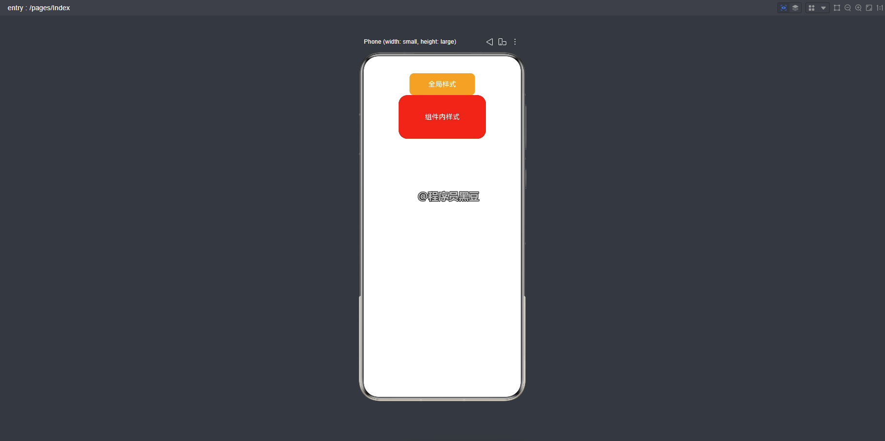
💡 调用规则:在
build()方法中,直接以方法名(不带@前缀)调用样式方法,如.myStyle()、.globalButtonStyle()。
三、访问组件状态变量
在组件内定义的 @Styles 方法可以通过 this 访问当前组件的 @State、@Prop 等状态变量,甚至可以在事件回调中修改状态,实现动态样式的更新:
@Entry
@Component
struct FancyUse {
  @State heightValue: number = 50

  @Styles
  fancy() {
    .height(this.heightValue)
    .backgroundColor(Color.Orange)
    .onClick(() => {
      this.heightValue = 100
    })
  }

  build() {
    Column() {
      Button('change height')
        .fontSize(20)
        .fancy()
      Text(`当前高度: ${this.heightValue}`)
        .fontSize(20)
        .margin({ top: 10 })
    }
    .width('100%')
  }
}
运行效果:
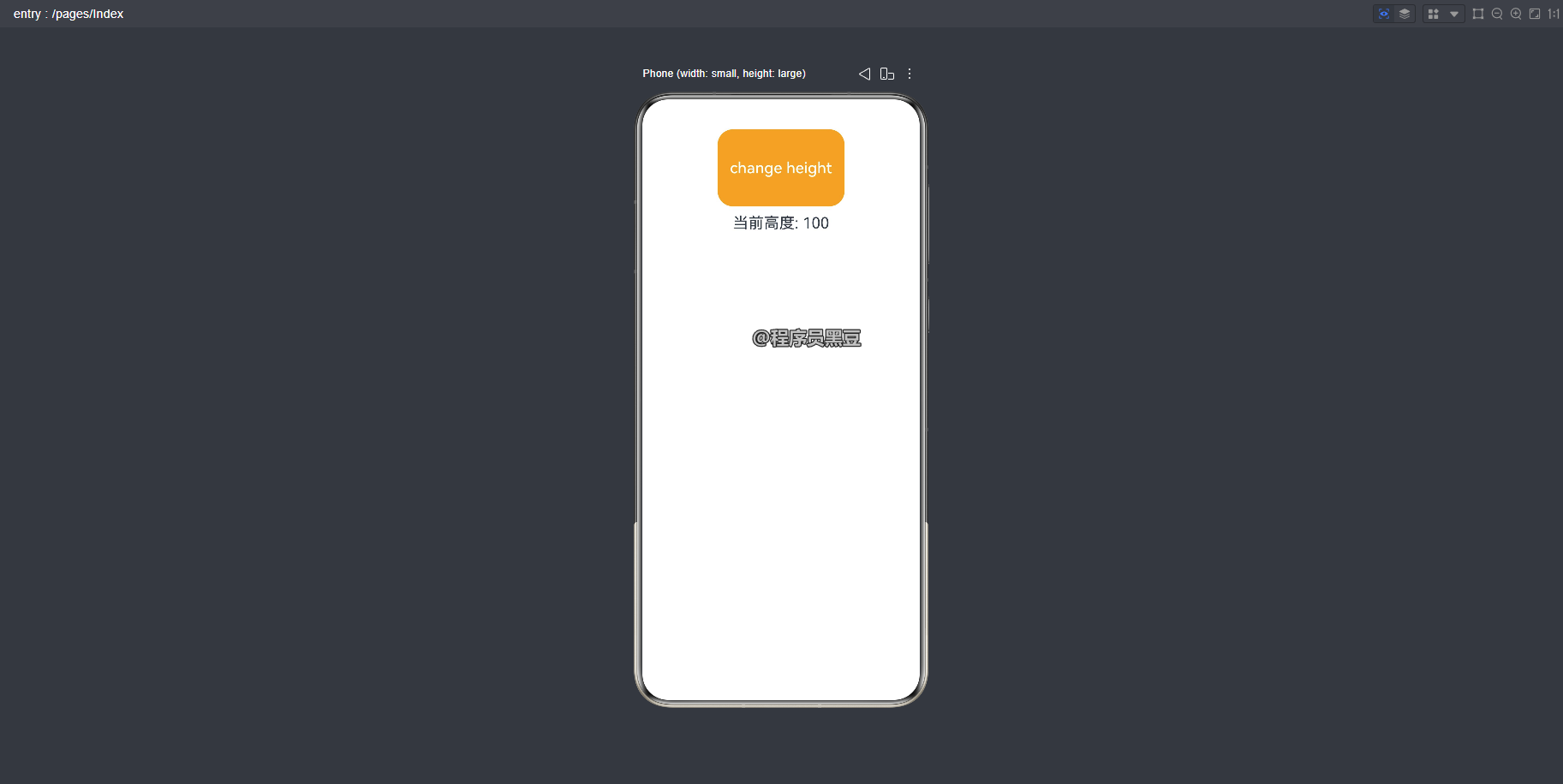
以上代码中,fancy() 方法内的 onClick 事件修改了 heightValue 状态,下次渲染时组件高度会自动更新为 100。
四、实现表单按钮统一风格
下面通过一个实际的表单场景,展示 @Styles 如何让代码更整洁。
@Styles function formButtonBase() {
  .width(200)
  .height(48)
  .borderRadius(24)
}

@Entry
@Component
struct LoginPage {
  @State username: string = ''
  @State password: string = ''

  // 组件内样式 - 可访问状态变量实现禁用态
  @Styles
  submitButtonStyle() {
    .width(200)
    .height(48)
    .borderRadius(24)
    .backgroundColor(this.username.length > 0 && this.password.length > 0 ?
      Color.Blue : Color.Gray)
    .enabled(this.username.length > 0 && this.password.length > 0)
  }

  build() {
    Column({ space: 16 }) {
      TextInput({ placeholder: '请输入用户名' })
        .onChange((val) => { this.username = val })

      TextInput({ placeholder: '请输入密码' })
        .type(InputType.Password)
        .onChange((val) => { this.password = val })

      Button('取消')
        .fontSize(16)
        .fontWeight(FontWeight.Medium)
        .formButtonBase()

      Button('提交')
        .fontSize(16)
        .fontWeight(FontWeight.Medium)
        .submitButtonStyle()
    }
    .padding(24)
    .width('100%')
    .alignItems(HorizontalAlign.Center)
  }
}
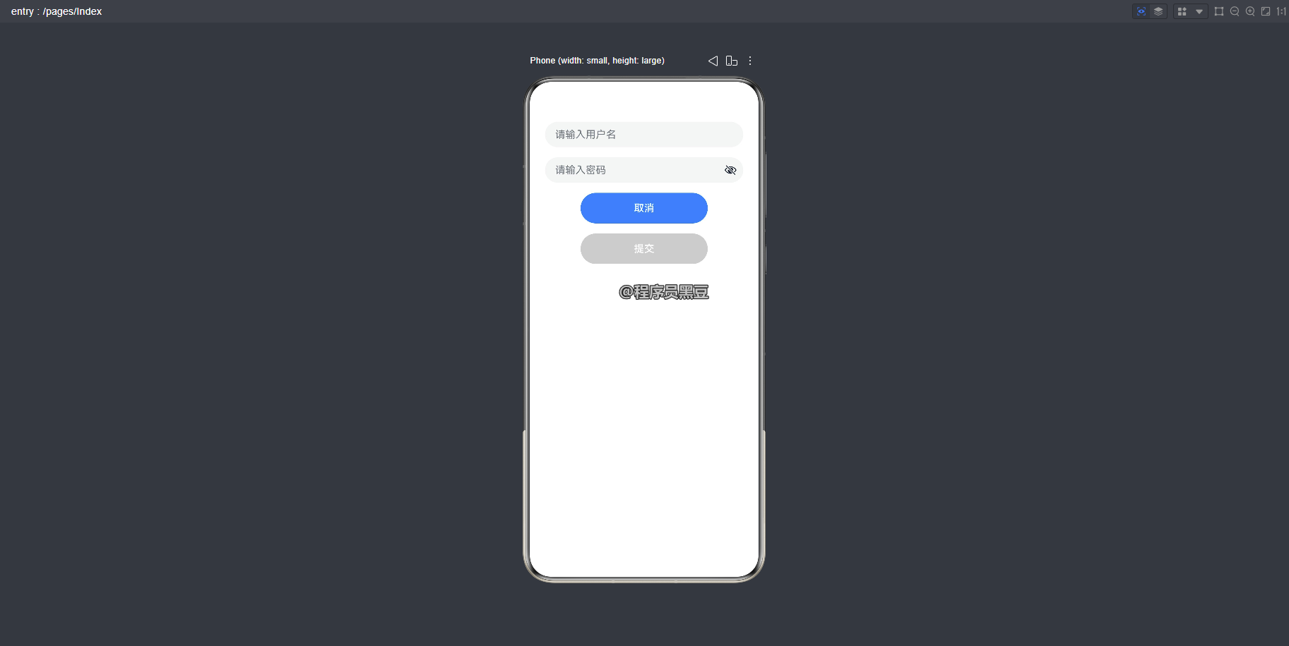
运行效果:
五、注意事项与常见误区
使用 @Styles 时,需要牢记以下约束,避免踩坑:
5.1 仅支持通用属性和通用事件
@Styles 方法内部只能使用通用属性(如 .width()、.backgroundColor())和通用事件(如 .onClick())。不能使用组件特有的私有属性,例如 Text 组件的 .fontColor()、Button 组件的 .fontSize() 等。若需定义包含私有属性的样式,请使用 @Extend 装饰器。
// ❌ 错误:fontColor 是 Text 组件的私有属性
@Styles function badTextStyle() {
  .fontColor(Color.Red)   // 编译报错
}

// ✅ 正确:使用 @Extend 扩展 Text 组件
@Extend(Text) function goodTextStyle() {
  .fontColor(Color.Red)
}
5.2 不支持参数
@Styles 方法不能带任何参数:
// ❌ 错误:带参数会导致编译报错
@Styles function flexibleStyle(color: Color) {  // 编译报错
  .backgroundColor(color)
}
若需要参数化样式,请改用 @Extend 或 AttributeModifier。
5.3 不支持逻辑组件
方法内部不能包含 if、ForEach、LazyForEach 等逻辑组件或逻辑语句:
// ❌ 错误:@Styles 内部不能使用 if
@Styles function invalidStyle() {
  .width(100)
  if (true) {    // 逻辑组件不生效
    .backgroundColor(Color.Red)
  }
}
5.4 作用域限制
@Styles 只能在当前文件内使用,不支持 export 导出。如需跨文件复用样式,推荐使用 AttributeModifier。
5.5 同名优先级
当全局和组件内定义了同名的 @Styles 方法时,组件内定义优先级更高,框架会优先查找并使用组件内的样式。
@Styles function commonStyle() {
  .backgroundColor(Color.Pink)
}

@Entry
@Component
struct Demo {
  @Styles commonStyle() {   // 覆盖全局的 commonStyle
    .backgroundColor(Color.Green)
  }

  build() {
    // 实际生效的是组件内的 .backgroundColor(Color.Green)
    Button('测试').commonStyle()
  }
}
六、@Styles vs @Extend vs AttributeModifier
当需要定义可复用样式时,ArkUI 提供了三种方案,各有适用场景:
| 特性 | @Styles | @Extend | AttributeModifier |
|---|---|---|---|
| 支持通用属性 | ✅ | ✅ | ✅ |
| 支持私有属性 | ❌ | ✅ | ✅ |
| 支持参数 | ❌ | ✅ | ✅ |
| 支持状态变量 | ✅(组件内) | ❌ | ✅ |
| 跨文件复用 | ❌ | ❌ | ✅ |
| 定义复杂度 | 低 | 低 | 中 |
选型建议:
- 仅需通用属性、当前文件内复用 → @Styles
- 需要私有属性或参数化样式 → @Extend
- 需要跨文件复用或动态样式组合 → AttributeModifier
七、总结
@Styles 装饰器是 ArkUI 中定义可复用样式的轻量方案,通过将通用属性和事件封装为方法,有效减少了样式代码的重复编写。掌握它的全局/组件内定义方式、状态变量访问能力以及使用限制,能让你写出更简洁、更易维护的鸿蒙 UI 代码。
在实际项目中,建议根据样式复用的范围和需求,灵活组合 @Styles、@Extend 和 AttributeModifier,构建清晰、可维护的样式体系。

作为“人工智能6S店”的官方数字引擎,为AI开发者与企业提供一个覆盖软硬件全栈、一站式门户。
更多推荐

 0
0 0
0- 0


 已为社区贡献34条内容

所有评论(0)