
鸿蒙实战:交互反馈动画 — 按压缩放效果
鸿蒙实战:交互反馈动画 — 按压缩放效果(第 61 篇)
前言(必读)
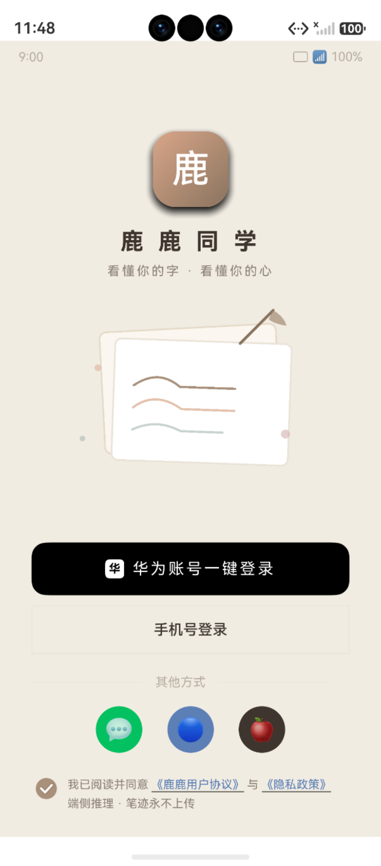
图:鸿蒙实战:交互反馈动画 — 按压缩放效果(第 61 篇) 运行效果截图(HarmonyOS NEXT)
优秀的交互反馈是提升应用品质感的「点睛之笔」。用户按下一个按钮时,如果没有视觉反馈,会感觉像在「按一块玻璃」。本项目在所有可交互元素上实现了按压缩放(Press-to-Scale)效果——按下时微微缩小,松开时弹回。本文深入分析这种设计模式的标准化实现。
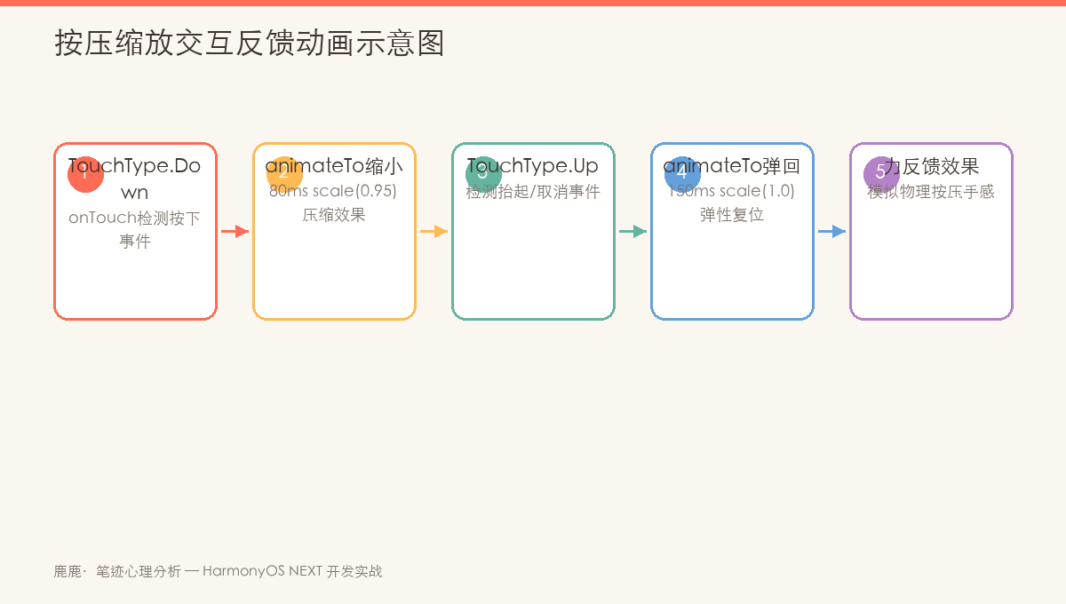
图:按压缩放效果——scale: 1.0→0.95 带弹性曲线的交互反馈时序
一、按压缩放的核心模式
1.1 标准实现模板
@State btnScale: number = 1.0    // 初始缩放

// UI 绑定
Button('按钮')
  .scale({ x: this.btnScale, y: this.btnScale })
  .animation({ duration: 150, curve: Curve.EaseOut })
  .onTouch((e: TouchEvent) => {
    if (e.type === TouchType.Down) {
      animateTo({ duration: 80 }, () => { this.btnScale = 0.95 })
    } else if (e.type === TouchType.Up || e.type === TouchType.Cancel) {
      animateTo({ duration: 150, curve: Curve.EaseOut }, () => { this.btnScale = 1.0 })
    }
  })
1.2 关键设计参数
| 参数 | 值 | 说明 |
|---|---|---|
scaleDown |
0.95 | 按下后缩放到 95% |
scaleDownDuration |
80ms | 按下动画时长(快) |
scaleUpDuration |
150ms | 弹起动画时长(慢一点) |
scaleUpCurve |
EaseOut |
弹起时使用减速曲线 |
1.3 为什么要这样设计?
人机交互心理学原理:

按下(Down)阶段:
  - 用户施加力 → 立即(80ms)反馈
  - 0.95 的缩放足够小让用户「感觉」到,又不会影响可读性

弹起(Up)阶段:
  - 松开后弹性恢复 → 稍慢(150ms)且使用 EaseOut 曲线
  - 模拟真实世界的「弹性」——按下有阻力,弹回有余韵
二、项目中的全面应用
2.1 按钮类
// CapturePage.ets - 重拍按钮
@State retakeScale: number = 1.0

Button('重拍')
  .scale({ x: this.retakeScale, y: this.retakeScale })
  .animation({ duration: 150, curve: Curve.EaseOut })
  .onTouch((e: TouchEvent) => {
    if (e.type === TouchType.Down) {
      animateTo({ duration: 80 }, () => { this.retakeScale = 0.95 })
    } else if (e.type === TouchType.Up || e.type === TouchType.Cancel) {
      animateTo({ duration: 150, curve: Curve.EaseOut }, () => { this.retakeScale = 1.0 })
    }
  })

// CapturePage.ets - 确认使用按钮
@State confirmScale: number = 1.0

Button('确认使用')
  .scale({ x: this.confirmScale, y: this.confirmScale })
  .animation({ duration: 150, curve: Curve.EaseOut })
  .onTouch((e: TouchEvent) => {
    if (e.type === TouchType.Down) {
      animateTo({ duration: 80 }, () => { this.confirmScale = 0.95 })
    } else if (e.type === TouchType.Up || e.type === TouchType.Cancel) {
      animateTo({ duration: 150, curve: Curve.EaseOut }, () => { this.confirmScale = 1.0 })
    }
  })
2.2 卡片类
// HomePage.ets - 最近报告卡片
@State recentCardScale: number = 1.0

Column() {
  // 卡片内容...
}
.scale({ x: this.recentCardScale, y: this.recentCardScale })
.animation({ duration: 150, curve: Curve.EaseOut })
.onTouch((e: TouchEvent) => {
  if (e.type === TouchType.Down) {
    this.recentCardScale = 0.96    // 卡片缩放略小(比按钮更克制)
  } else if (e.type === TouchType.Up || e.type === TouchType.Cancel) {
    this.recentCardScale = 1.0
  }
})
2.3 Hero 按钮
// HomePage.ets - Hero CTA 按钮
@State heroBtnScale: number = 1.0

// 按钮本身
Text('📷 立即开始')
  .scale({ x: this.heroBtnScale, y: this.heroBtnScale })
  .animation({ duration: 150, curve: Curve.EaseOut })

// 按钮的父容器(整体 Stack 响应触摸)
Stack() { /* ... */ }
.onTouch((e: TouchEvent) => {
  if (e.type === TouchType.Down) {
    animateTo({ duration: 80 }, () => { this.heroBtnScale = 0.95 })
  } else if (e.type === TouchType.Up || e.type === TouchType.Cancel) {
    animateTo({ duration: 150, curve: Curve.EaseOut }, () => { this.heroBtnScale = 1.0 })
  }
})
2.4 TabBar 项
// HomePage.ets + TrendPage.ets - TabBar 项
@State tabScale: number = 1.0     // HomePage 共用
@State tabScales: number[] = [1.0, 1.0, 1.0, 1.0]  // TrendPage 数组

Column() {
  Text(icon).fontSize(18)
  Text(label).fontSize(10)
}
.width(60)
.height('100%')
.justifyContent(FlexAlign.Center)
.scale({ x: this.tabScale, y: this.tabScale })
.animation({ duration: 150, curve: Curve.EaseOut })
.onTouch((e: TouchEvent) => {
  if (e.type === TouchType.Down) {
    animateTo({ duration: 80 }, () => { this.tabScale = 0.92 })  // Tab 按得更深
  } else if (e.type === TouchType.Up || e.type === TouchType.Cancel) {
    animateTo({ duration: 150, curve: Curve.EaseOut }, () => { this.tabScale = 1.0 })
  }
})
三、按压缩放的应用矩阵
| 页面 | 交互元素 | @State 变量 | 按下值 | 按住时行为 |
|---|---|---|---|---|
| HomePage | Hero 按钮 | heroBtnScale |
0.95 | 不阻塞 |
| HomePage | TabBar 项 | tabScale |
0.92 | 标签未切换 |
| HomePage | 最近卡片 | recentCardScale |
0.96 | 手指抬起跳转 |
| CapturePage | 重拍按钮 | retakeScale |
0.95 | 手指抬起触发 |
| CapturePage | 确认按钮 | confirmScale |
0.95 | 手指抬起触发 |
| ReportDetailPage | 分享按钮 | shareScale |
0.95 | 手指抬起跳转 |
| ReportDetailPage | 收藏按钮 | saveScale |
0.95 | 手指抬起触发 |
| ReportDetailPage | 对比按钮 | compareScale |
0.95 | 手指抬起提示 |
| TrendPage | TabBar 项 | tabScales[i] |
0.92 | 标签未切换 |
| SharePage | 分享渠道 | channelScales |
0.92 | 手指抬起分享 |
四、声明式 vs 命令式的混合用法
本项目在按压缩放效果上同时使用了两种方式:
方式 1:属性动画(声明式)
// 只绑定 .animation(),状态值变化时自动过渡
Column()
  .scale({ x: this.cardScale, y: this.cardScale })
  .animation({ duration: 150, curve: Curve.EaseOut })
方式 2:显式动画(命令式)
// 在 onTouch 中手动控制动画
.onTouch((e: TouchEvent) => {
  if (e.type === TouchType.Down) {
    animateTo({ duration: 80 }, () => { this.cardScale = 0.95 })
  } else {
    animateTo({ duration: 150, curve: Curve.EaseOut }, () => { this.cardScale = 1.0 })
  }
})
两者配合的原理
onTouch 事件触发:
  Down: animateTo(80ms) → btnScale = 0.95
                           ↓
                        scale = 0.95
                           ↓
                        .animation(150ms) 自动过渡
                        (但当 animateTo 覆盖时,以 animateTo 为准)

  Up:   animateTo(150ms) → btnScale = 1.0
                           ↓
                        scale = 1.0
注意:
animateTo是命令式动画,animation是声明式动画。当两者同时作用时,animateTo覆盖animation。这里的.animation()实际上起到的是兜底保护的作用——如果手动动画因为某些原因未触发,属性动画会确保状态变化不会生硬跳变。
五、Press-to-Scale 的变体
5.1 连接符按钮(无 text 按钮)
SharePage 的操作按钮只显示图标,通过缩放提供反馈:
// SharePage.ets
@State channelScales: number[] = [1.0, 1.0, 1.0, 1.0]

ForEach(this.channels, (channel: ShareChannel, index?: number) => {
  Column() {
    Text(channel.icon).fontSize(28)
    Text(channel.label).fontSize(11).margin({ top: 4 })
  }
  .scale({ x: this.channelScales[index ?? 0], y: this.channelScales[index ?? 0] })
  .animation({ duration: 150, curve: Curve.EaseOut })
  .onTouch((e: TouchEvent) => {
    const arr = [...this.channelScales]
    if (e.type === TouchType.Down) {
      arr[index ?? 0] = 0.92
    } else {
      arr[index ?? 0] = 1.0
    }
    this.channelScales = arr  // 不可变更新触发 @State 刷新
  })
})
5.2 进度层叠中的按压缩放
ReportDetailPage 底部三个操作按钮使用独立的缩放状态:
@State shareScale: number = 1.0
@State saveScale: number = 1.0
@State compareScale: number = 1.0

Row({ space: 10 }) {
  // 分享
  Column() {
    Text('↗').fontSize(16)
    Text('分享').fontSize(11)
  }
  .scale({ x: this.shareScale, y: this.shareScale })
  .onTouch((e) => {
    if (e.type === TouchType.Down) this.shareScale = 0.95
    else if (e.type === TouchType.Up || e.type === TouchType.Cancel) this.shareScale = 1.0
  })

  // 收藏
  Column() {
    Text('⭐').fontSize(16)
    Text('收藏').fontSize(11)
  }
  .scale({ x: this.saveScale, y: this.saveScale })
  .onTouch((e) => {
    if (e.type === TouchType.Down) this.saveScale = 0.95
    else if (e.type === TouchType.Up || e.type === TouchType.Cancel) this.saveScale = 1.0
  })

  // 对比
  Column() {
    Text('↔').fontSize(16)
    Text('对比').fontSize(11)
  }
  .scale({ x: this.compareScale, y: this.compareScale })
  .onTouch((e) => {
    if (e.type === TouchType.Down) this.compareScale = 0.95
    else if (e.type === TouchType.Up || e.type === TouchType.Cancel) this.compareScale = 1.0
  })
}
六、设计考量
6.1 缩放值的选择
| 元素类型 | 缩放值 | 原因 |
|---|---|---|
| 主要按钮 | 0.95 | 标准按压力度反馈 |
| 卡片 | 0.96-0.97 | 卡片较大,过度的缩放显得夸张 |
| TabBar | 0.92 | Tab 较小,需要更明显的反馈 |
| 图标 | 0.92 | 图标区域小,更大的缩放帮助感知 |
6.2 没有使用 TouchableOpacity
Android/iOS 中常见的 TouchableOpacity(按下变透明)在本项目中未被使用,原因:
缩放 vs 透明度反馈对比:
  缩放 (Scale):   ✅ 保留了按钮的全部可见性
                   ✅ 给用户「三维按下去」的感觉
                   ✅ 与 Material Design 设计语言一致

  透明度 (Opacity):❌ 按下时文本/图标变淡,可读性降低
                    ❌ 感觉像「消失」而非「按下」
                    ❌ 在浅色背景上效果不明显
6.3 无障碍考量
// 确保按压反馈不影响无障碍功能
Column()
  .scale({ x: this.btnScale, y: this.btnScale })
  .accessibilityText('立即开始拍照分析')
  .accessibilityLevel('auto')
七、最佳实践总结
// 终极按压缩放模板(可直接复用)
import { AppAnimations } from '../common/theme/AppAnimations'

@State btnScale: number = 1.0

build() {
  Column()
    .scale({ x: this.btnScale, y: this.btnScale })
    .animation({
      duration: AppAnimations.PRESS_SCALE_UP_DURATION,
      curve: AppAnimations.CURVE_SMOOTH
    })
    .onTouch((e: TouchEvent) => {
      if (e.type === TouchType.Down) {
        animateTo({
          duration: AppAnimations.PRESS_SCALE_DOWN_DURATION
        }, () => {
          this.btnScale = AppAnimations.PRESS_SCALE_TARGET
        })
      } else if (e.type === TouchType.Up || e.type === TouchType.Cancel) {
        animateTo({
          duration: AppAnimations.PRESS_SCALE_UP_DURATION,
          curve: AppAnimations.CURVE_SMOOTH
        }, () => {
          this.btnScale = 1.0
        })
      }
    })
}
| 实践 | 建议 |
|---|---|
| 每个交互元素一个独立的 @State | 避免共用变量导致拉扯 |
| 始终处理 Cancel 事件 | 手指滑出区域时应恢复状态 |
| Down 用 fast,Up 用 smooth | 按下反应快,弹起有弹性 |
| 与 onClick 配合 | onTouch 只处理视觉反馈,onClick 处理业务逻辑 |
| 数组状态用不可变更新 | 扩展运算符 [...arr] 触发 @State 刷新 |
八、注意事项与常见问题
8.1 开发注意事项
说明: 以下注意事项基于 HarmonyOS NEXT 实际项目开发经验整理,建议在动手开发前仔细阅读,可有效避免常见坑点。
在正式开发前,建议按以下步骤完成环境准备与前置检查:
- 版本确认:检查 DevEco Studio 与 SDK 版本,确保满足目标 API Level 要求
- 权限声明:在
module.json5的requestPermissions字段中提前声明所有需要的系统权限 - 设备能力检查:调用前验证设备是否支持目标能力(相机、NFC、传感器等)
- 异步封装:所有耗时操作(数据库、文件 I/O、网络请求)统一使用
async/await处理 - 资源释放:在组件
aboutToDisappear()生命周期钩子中及时释放系统资源,防止内存泄漏
8.2 常见错误与解决方案
常见问题快速排查表:
| 问题类型 | 排查方向 | 参考方法 |
|---|---|---|
| 应用崩溃 | 查看 hilog 错误日志 | hilog.error(TAG, "...", e.message) |
| 状态丢失 | 检查 AppStorage 键名拼写 | 统一使用常量管理键名 |
| 动画不流畅 | 避免在 animateTo 回调中执行 I/O | 动画与数据操作分离 |
提示: 建议在 DevEco Studio 中开启 ArkTS Lint 静态检查,大部分编译期问题可在开发阶段发现。
总结
本文系统讲解了按压缩放交互反馈的设计与实现:
- ✅ 核心模式:
@State scale+onTouch(Down/Up)+animateTo - ✅ 项目全览:12+ 个交互元素的不同缩放值设计
- ✅ 声明式 vs 命令式:
.animation()与animateTo的混合使用 - ✅ 变体实现:数组状态管理、进度层叠中的独立缩放
- ✅ 设计考量:缩放值选择、透明度 vs 缩放的对比、无障碍适配
- ✅ 最佳实践模板:直接可复用的标准模式
下一篇将深入呼吸脉冲动画,分析 CapturePage 拍照按钮的循环缩放效果。
📌 收藏提示:如果您觉得本系列对您有帮助,欢迎点赞 + 关注,也欢迎在评论区交流鸿蒙动画开发的问题!
相关资源:

作为“人工智能6S店”的官方数字引擎,为AI开发者与企业提供一个覆盖软硬件全栈、一站式门户。
更多推荐



 6
6 0
0- 0


 已为社区贡献2条内容

所有评论(0)